Responsive Web Design, Part 1 (2015)
Building Advanced Responsive Modules With Flexbox
Reordering Boxes
A slightly more complex (and perhaps cooler) way to get the logo in the middle of the list of links is to move it there with the flexbox order property.
The order property specifies the order in which browsers lay out flex items in their container. You can think of it like assigning the items a position number in a line. By default, all flex items are in position zero, and since they’re in the same position they simply follow the source order. But, if sibling flex items have different order values from each other, browsers will lay them out in ascending order of those values.
To use order on the nav bar, the logo needs to become a sibling flex item of the links; in other words, it has to go in the <ul> too. I think this is fine, semantically-speaking, as the logo is functioning as a home link.
<nav role="navigation">
<ul class="menu">
<li class="logo menu-item"><a href="index.html"><img src="img/logo.png" alt="Home"></a></li>
<li class="menu-item"><a href="...">Publications</a></li>
<li class="menu-item"><a href="...">Shop</a></li>
<li class="menu-item"><a href="...">News</a></li>
<li class="menu-item"><a href="...">Events</a></li>
<li class="menu-item"><a href="...">Your Account</a></li>
<li class="menu-item"><a href="...">Contact Us</a></li>
</ul>
</nav>

The logo is the first item in the list in the HTML.
Now I can divide up the nav bar into order groups. The first three text links need to come first, so they’ll need the lowest order value; I’ll just keep them with the default of 0. The logo needs to come next, so it gets the next highest order value, 1. The last three text links need to come after the logo, so they get the next highest order value, 2.
.menu-item {
order: 0; /* default */
}
.logo {
order: 1;
}
.menu-item:nth-child(n+5) {
order: 2;
}
This does indeed move the logo into the middle of the list, but I haven’t added the auto margin to one of the links to split the nav bar at that spot. I can’t simply add the margin to the fourth text link, as I did in the last nav bar example, because with every last bit of extra space on the line to its left, the logo will be stuck with the first three links on the left side, rather than in the middle.

With margin-left:auto on the fourth link, all of the extra space in the line goes to its left, leaving the logo squished on the left side.
To fix this, I can use two auto margins and browsers will simply divide the extra space on the line evenly between the two items with those margins.
.logo {
order: 1;
margin-left: auto;
}
.menu-item:nth-child(5) {
margin-left: auto;
}

Half the extra space goes on the left side of the logo, half on the left side of the Events link, and, therefore, the logo is moved to the center.
A SOLUTION FOR RWD’S STACKING ORDER PROBLEM?
Not being tied to source order any more makes responsive layout so much easier. Sometimes, the order you want your content to stack in vertically on narrow screens is not the same order that you need the boxes to be in to make floating or display:table-cell work for wider screen layouts.
Using a very simple example, let’s say you want your content to stack in the order of: header, main, sidebar, subnav, and footer on mobile. That needs to be your source order, then. But, perhaps on a wider screen layout, you need either the subnav or sidebar element (or both) to come before the main element, not after it, so that you can float it to the side of the main box and create a three-column layout.
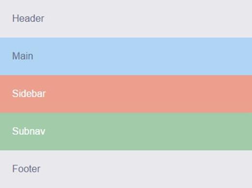
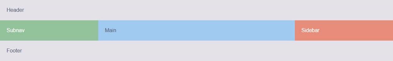
We want Main to come before Sidebar and Subnav when narrow, but be in between them when wide.
Since this is a simple example, this source order problem can be worked around in various ways, such as using negative margins with floats. But most layouts in the real world are far from this simple and can require quite tricky maneuvers to make a single source order work for all layouts across all viewports.
The flexbox order property affords more source-order independence, making this problem a lot easier to solve. You can pick the source order that makes the most sense for your content, from a semantic and accessibility point of view, and then adjust the visual order that the boxes appear in as needed.
Since flexbox currently has better support on mobile than on desktop browsers, and because simple mobile layouts are more suited to flexbox, I’d advise placing your major content blocks in the source order that’s needed for the wide layout — provided it’s a logical, accessible order — and continuing to use non-flexbox layout methods there. The desktop layout will just use the default HTML source order. But on mobile, you can turn to flexbox and use the order property to override the source order and get the stacking order you’re after.
Using the simple three-column layout example again, here’s how I could structure the HTML to make the desktop layout easy to create with floats or display:table-cell.
<body class="container">
<header class="header">Header</header>
<nav class="subnav" role="navigation">Subnav</nav>
<main class="main" role="main">Main</main>
<aside class="sidebar" role="complementary">Sidebar</aside>
<footer class="footer">Footer</footer>
</body>
In the mobile styles outside the first media query, I can turn on flexbox, then simply turn it off in the widescreen media query.
.container {
display: flex;
flex-direction: column;
}
@media (min-width:50em) {
.container {
display: block;
}
}
With flexbox on for mobile, there are a couple of ways I could use the order property to rearrange the default stacking order. One would be to explicitly assign each box a position number.
.header { order: 0; }
.main { order: 1; }
.sidebar { order: 2; }
.subnav { order: 3; }
.footer { order: 4; }
I don’t think this is wise to do, however. What if I later add another box to the HTML? I’ll need to renumber all the order values for all the boxes so that I can assign the new one its proper place in line. This is similar to how people used to use tabindex to give every link and form field an explicit, hard-coded tab-stop position in the tabbing order of a page. It’s inflexible and not very future-proof.
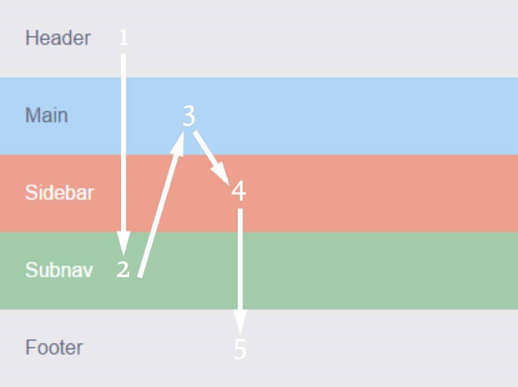
A better approach, I think, is to keep as many items using the default order as possible and only assign order properties to the few items that need to move out of the default order. In this case, it’s really just the subnav box that I need to pull out from its native place line and place lower in the stack. I can keep the header, main and sidebar boxes in this same order by simply keeping them all with the default order value of 0, and assign order:1 just to subnav and footer.
.subnav,
.footer {
order: 1;
}
Header, main, and sidebar are in the first group, and subnav and footer are in the second group. Since I’ve only assigned two of my five boxes an explicit order, if I later add more boxes, there’s much less chance that I will need to renumber the existing boxes to accommodate them in the stacking order.
POTENTIAL PITFALLS WITH THE ORDER PROPERTY
Your mind may be spinning with all of the possibilities brought to web layout by being able to move content anywhere, regardless of source order. But before you get too excited, let me point out a few issues with the flexbox orderproperty that might make you think twice about using it widely.
The first issue is that the flexbox order property can only reorder sibling elements — flex items directly within the same flex container. This means that the source order still has some hold on your visual order. You can’t use the flexbox order property to move content literally anywhere; it’s limited and more suited to smaller layout shifts. Other CSS layout modules like Grid Layout are going to do the heavy lifting when it comes to visual reordering.
As an example of the sibling restriction on flexbox reordering, consider a flex container with four child items. You could rearrange these four with one another to your heart’s content, but you couldn’t pull out the sidebar-item-highlight block from within <aside> and place it above <main> using order:-1 or any value. The sidebar-item-highlight block is simply not a sibling of <main>.
<div class="flex-container">
<header>...</header>
<main>...</main>
<aside>
<div class="sidebar-item">...</div>
<div class="sidebar-item sidebar-item-highlight">...</div>
<div class="sidebar-item">...</div>
</aside>
<footer>...</footer>
</div>
Even if <aside> is a flex container too, the order count basically starts over within each flex container. Only the children of that flex container can be reordered in relation to one another.
Even when you don’t have a sibling issue and can achieve the layout shift you’re after using order, you’ll have to be very careful to make sure that the layout degrades well in older browsers without flexbox support. When you use flexbox to center some content vertically, for instance, it’s not a big deal if the small minority of users with old browsers see it top-aligned instead: it’s purely aesthetic. But if you use flexbox to rearrange entire sections of content, it could potentially be confusing or less usable if the content appears in a different order from the one you intended; order is often tied to meaning, not just aesthetics. You’ll need to make sure that both orders — the default HTML one and the visual one you’ve created with flexbox — are logical and usable, so that users both with and without flexbox all have a good experience.
This can be tricky to achieve when you factor in accessibility. Flexbox only changes the order visually, but screen readers still read out content in its HTML order. Plus, most browsers keep the tabbing order based on the HTML, not the visual order. (The exception to this, currently, is Firefox, which does change the tabbing order to match the visual order, although this violates the spec.) That means that sighted non-mouse users, such as people who use a keyboard or other device because of mobility limitations, might have a really confusing time trying to navigate through the page, depending on how you’ve used the order property.
For instance, in the earlier example where I moved the subnav <div> above the footer, a user tabbing through the page would first go through all the links in the header, then jump down to the subnav, then jump back up to the main and sidebar sections, and then jump back down to the footer. Seeing the focus outline jump around the page in a seemingly arbitrary way as you tab through the content would be a very confusing and frustrating experience.
The tab order would follow this illogical path since I’ve moved the <div>s only visually, not in the HTML.
This layout is just for narrow mobile screens, where tabbing isn’t used nearly as much, which minimizes the problem a lot. But we can’t consider it a non-issue and write it off entirely. People do use keyboards on mobile devices, as well as other input devices that simulate tabbing. You still need to ensure keyboard navigation is usable on mobile sites.
These accessibility issues are why the spec states explicitly that you must use the order property only for visual, not logical, reordering of content.
USING ORDER PROGRESSIVELY AND ACCESSIBLY
I probably seem like a complete tease right now. A wet blanket, ruining your beautiful dreams of being able to move content around the page willy-nilly, without care or consequence.
But don’t despair. It is possible to use order in a way that doesn’t affect accessibility and degrades gracefully in old browsers. Let me give you one example of using order in a progressive enhancement sort of way.
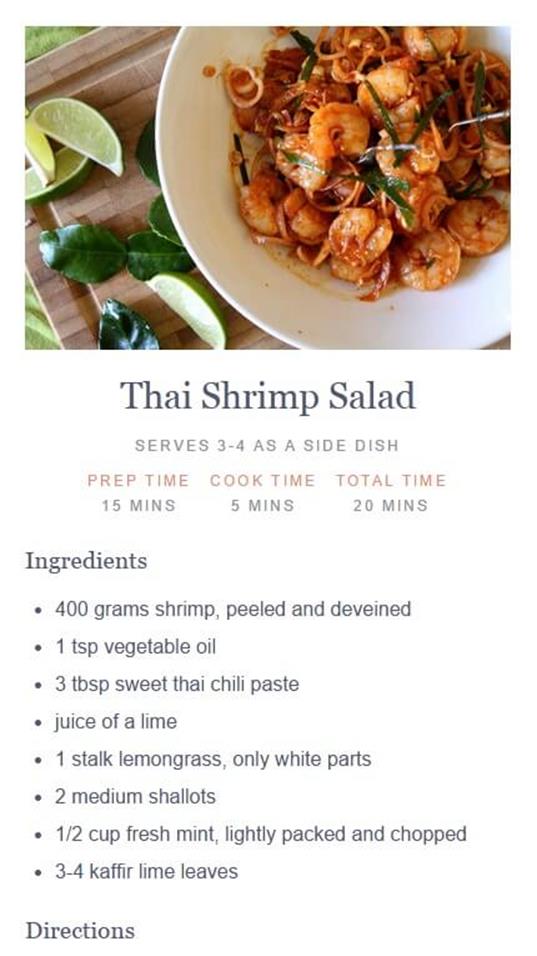
Here’s a recipe, with its photo placed in the middle of the text so that on wider screens I can float it next to the ingredients list. But perhaps on the single-column narrow view I don’t want the photo above the ingredients. I could use the order property to move the photo above the recipe title on mobile only.
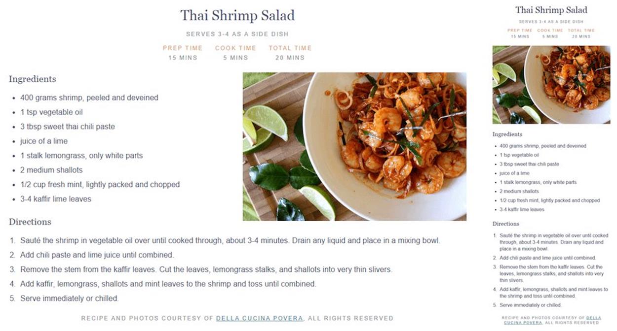
I need to place the photo before the ingredients list to float it to the right of the list (see image on the left). The default stacking order based on the HTML order, with the photo before the ingredients list, is shown in the narrow mobile view before flexbox is added (see image on the right). (Recipe and photo courtesy of Della Cucina Povera12.)
In the styles outside any media queries, I set flex-direction to column to stack all the pieces of the recipe in a single column, and then set the order value of the image to -1. All the other flex items inside the recipe container have the default order value of 0. -1 is smaller, so the image will come first; that is, move up to the top of the stack.
.recipe {
display: flex;
flex-direction: column;
}
.recipe-photo {
order: -1;
}
.recipe-photo img {
width: 100%;
}
The photo has the lowest order value, so it is placed before its siblings and displays before all the text.
In the wide media query for the desktop view, I simply turn off flexbox by setting the recipe’s display back to block. That puts the image back in normal flow order, where I can then float it to the right of the ingredients list.
@media screen and (min-width:800px) {
.recipe {
display: block;
}
.recipe-photo {
float: right;
width: 50%;
}
}
There’s no need to worry about desktop browser support for flexbox since I’m not using it there, and any mobile browsers that don’t support flexbox will simply see the image before the ingredients — a little different in appearance, but not wrong or confusing. Plus, there are no accessibility problems in moving the photo because the reordered content doesn’t have any text or links within it. Both reading order and tabbing order will be the same with and without flexbox. This is a visual enhancement that doesn’t hurt user agents that can’t interpret it.
You can use the order property in this same progressive way on articles, product listings and other similar page components that include decorative content that can appear in multiple places and still make sense. It’s fine to have text within the reordered content as long as the text makes sense when read in both the HTML order and the visual flexbox order, such as a photo caption that could be read before or after an introductory paragraph. And if you can avoid having any links or form fields in the reordered content, your accessibility will be even better.
OTHER WAYS TO CHANGE VISUAL ORDER
We’ve made it through all the flexbox properties now (yay!), but before we wrap up, I wanted to mention that it’s also possible to affect the visual order of your content using the flex-direction and flex-wrap properties that I covered near the start of the chapter. Both of these have reverse values which place the content in the opposite direction than the default flow.
For instance, the Guardian’s responsive website13 uses flex-direction:row-reverse in its widescreen layout to place story blocks side by side, but run them from right to left instead of left to right (see below). This creates a different visual order from the one you see on narrow screens, where the content stacks in its default HTML order; the topmost content doesn’t become the farthest left content as you might expect.
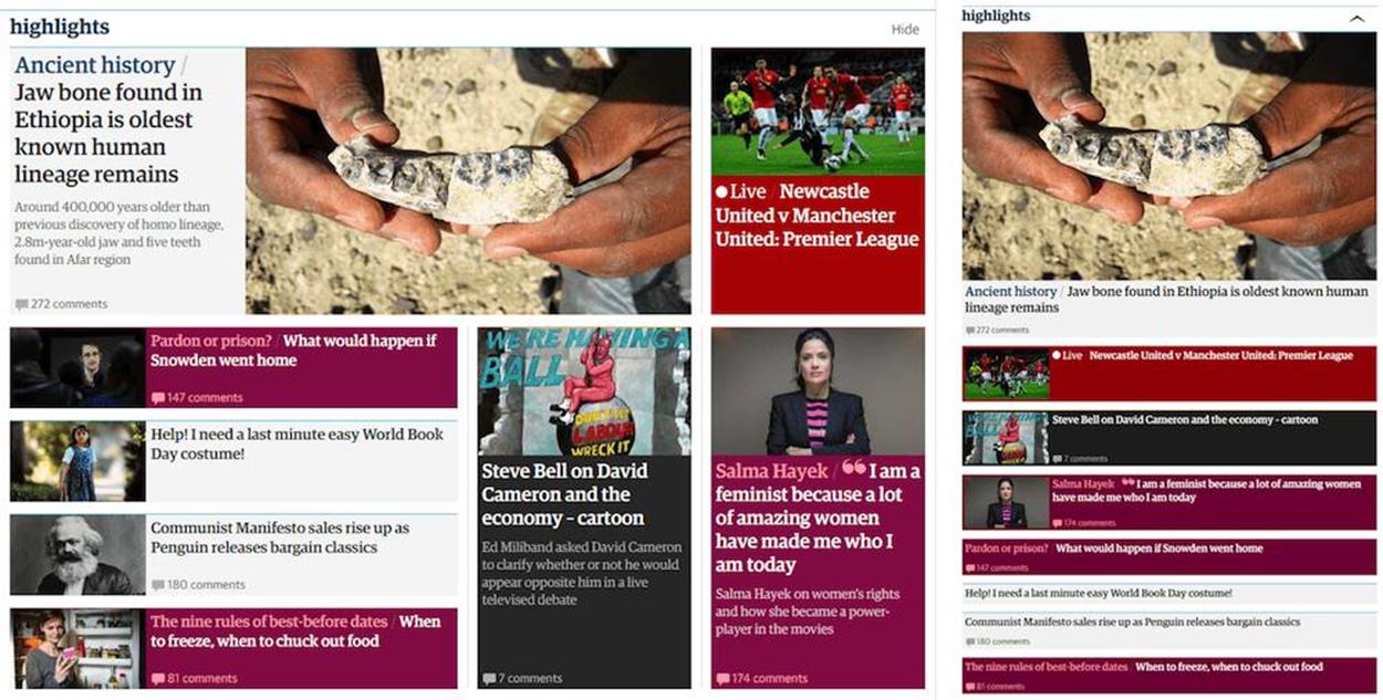
The Guardian widescreen layout (see left) uses flex-direction:row-reverse within the main story and on the bottom row to place blocks from right to left. The narrow layout (see right) keeps the content in the default HTML order. For instance, the main story photo comes before its text block, not after it, as you might expect from looking at the widescreen layout.
You face the same accessibility issues when reordering with flex-direction and flex-wrap as you do with the order property, but they give you a couple of other options for manipulating visual placement in a simple way.