Responsive Web Design, Part 1 (2015)
The Modern Responsive Designer’s Workflow
Assemble
The hard work in building a great, modern responsive site is in figuring out what you want to make. You figure that out through smart planning, exploratory inventorying, and uninhibited sketching. That stuff takes the most mental and physical effort. Then you put it together, which is the easiest and least time-consuming part — if you’ve done it right.
In cooking, there’s a principle called mise en place, which translates literally to “putting in place.” Ask any good chef, and they’ll stress the importance of good prep. You don’t start chopping the onions when the chicken’s already in the pan. You do all your preparation long before service. You chop your onions and slice your cheese; you put your peas in a bowl and strain your soup. When you’re ready to cook the dish, you pick up the ingredient you need, throw it into the pan or sprinkle it on afterwards and the meal is finished — much quicker.
We can apply this principle to the way we think about our work. If we’ve prepared everything well — the planning, inventorying and sketching — then all we need to do is assemble the pieces.
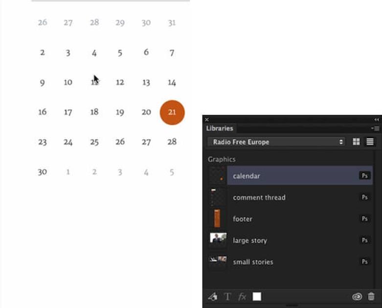
Libraries in Photoshop allows you to store particular components and then drag them in when you are building a website.
One of the greatest new tools I use is a new Adobe Creative Cloud feature called Libraries23. It allows you to store and share elements, so you can simply drag them in from a panel when creating a screen.
WhenI’m putting together an element collage or a style guide, I design all the pieces — comment threads, headers, footers and so on — and I store them in the library. Then I can just drag them in as I’m designing, say, small-screen comps, and within a matter of seconds I’ve created a comp. I might have to change an asset here or there, but that’s not difficult once I’ve got all the parts — I can just assemble it. That’s a fantastic way to work, because I’ve spent all the time planning and figuring out the components earlier on; now I just test how they work together. I’m building pages in minutes, as opposed to days or weeks.
Atomic design24 is an approach to building design systems, rather than a loose set of pages. The design process starts with designing and building components, and as you combine components, you start building parts of the website. At some point you have enough components, so you can start building a page. The page isn’t something we start with, but rather a result of what we are building.
If you prefer code, Pattern Lab25 is a great tool that replicates this idea. Front-end engineer Brad Frost created it while we were working on the TechCrunch and Entertainment Weekly projects together. The main idea behind Pattern Lab is very similar to the process I outlined above, except that it’s done in code. You identify the smallest building blocks — atoms — and you combine atoms together to form molecules. You combine molecules into organisms, and then templates and, eventually, pages. On the technical side, it can be done with any templating language; for example, a series of includes in PHP.
When I worked with Radio Free Europe, our team was surprised how receptive the client was to the entire idea behind atomic design. Throughout the project, we worked through an assembly list at a spreadsheet level, listing all the atoms we were going to have on the site, and combining them into molecules, and then organisms. Instead of talking about comps or pages, we had discussions about each organism, each molecule, within the spreadsheet itself. It allowed us to reach actual results way, way faster. We did our planning in the knowledge of what we were going to assemble at the end.
Remember “highest fidelity, shortest amount of time”? We asked ourselves what was the deliverable that we could have the conversation about that wouldn’t require us to spend two or three or eight weeks working on. We listed all the patterns and atoms and molecules and organisms, and we wrote a little explanation for each, explaining what it did and how it was helpful. Then, for every molecule, we wrote down the atoms required, and all the atoms and molecules required within each organism; this established the relationship between the different components of the site — the very nature of a bulletproof design system.
We started to map the site this way. Although not right for every client, Radio Free Europe was a great client to have this conversation with. This framework gives us the ability to have discussions about elements before we get into Pattern Lab before we have to revise code, even before we start coding. We just had a couple of slides with comments, where the client started to annotate the spreadsheet and ask questions like “Do we need this organism? Isn’t this organism the same as that one? What about these molecules: could we integrate them here?”
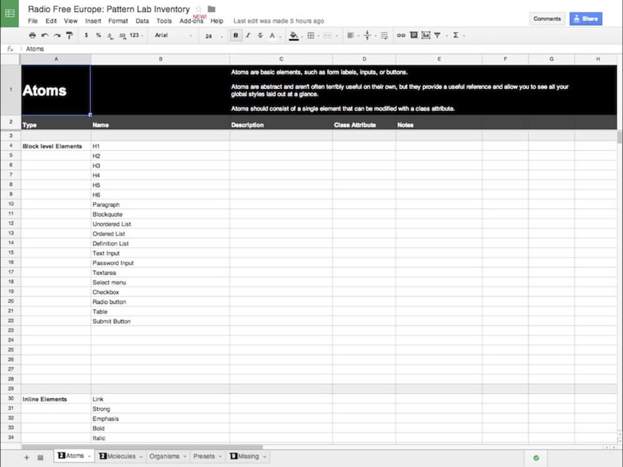
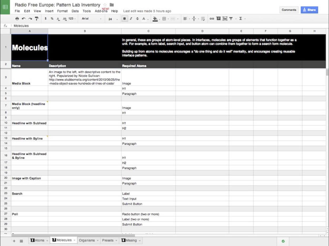
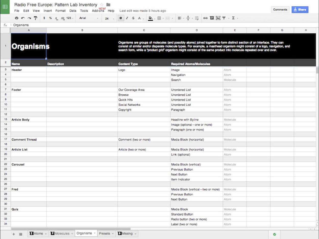
Atomic design principles for Radio Free Europe with PatternLab in place, discussed using basic spreadsheets.
The critical point here is that we started having this discussion about development before starting development, which significantly sped up the entire workflow. For us, doing a very quick two-hour inventory rather than taking a day to set up Pattern Lab, allowed us to have a conversation that would profoundly influence our work a lot sooner. It was an incredibly robust and quick process, and it saved us a lot of time and a lot of headaches.
Our assembling tools, then, include Creative Cloud libraries and Pattern Lab, mechanisms to help us bring together elements under the mise en place concept. Each element should be in its place so that when the time comes to serve it, all we need to do is put them properly together, spice them up a little bit and assemble them in the way that works best for the clients and their users.
A Workflow, Before And After
It’s been a long journey, but let’s take a closer look at the design process before and after. Before, our output as designers was just comps — that’s pretty much all we were responsible for. With responsive design and mobile, designing comps is becoming far too slow and time-consuming. But if you take out the only thing we had, what else do we do?
The evolution I’ve outlined provides great opportunities. If you look at the deliverables that we might create, like manifestos, libraries and visual inventories, you can see that they greatly expand our output and get us thinking more holistically about how we can build websites better, and be more useful to our co-workers and our clients.
All our previous tools were layout tools. But if we start combining tools like Typecast, Notational Velocity, Illustrator, HTML5, and Excel, we can find a different way to create more value for our clients and co-workers.
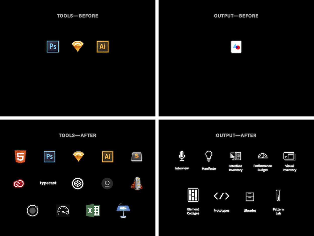
Not only our tools, but also the output of our creative work has changed. Our workflow and our design process have to adapt, too.
You don’t have to be a master of all of these things. If you’re a designer, you don’t have to become an information architect or a developer. But an appreciation and understanding of what other people do and the tools they use can certainly make you better at your work.
Michael Jackson was considered the king of pop, but he didn’t play any instrument. Yet he’s still considered one of the greatest musicians out there because he understood all those instruments intrinsically. There’s a great demo clip of Michael Jackson writing the arrangement for Beat It26. He sings every part: the lead vocal, background vocals, bass line, and minor percussion.
What’s so striking is that it’s not perfect; it’s a sketch of a song. There are times he goes flat when he hits the tonic, but it doesn’t matter. He’s demonstrating empathy. He understands what every contributor to the song is doing, what they need to do, and how he can make them better.
I’m not suggesting that we need to reinvent our roles. What I’m talking about is a natural evolution for a designer. We live in a very different world than we did only a decade ago. People access the Internet from devices that fit in the palms of their hands all the way to giant billboards in Times Square and everything in between.
My challenge to you: expand your tools and expand your output. Now you know what to make.
All materials on the site are licensed Creative Commons Attribution-Sharealike 3.0 Unported CC BY-SA 3.0 & GNU Free Documentation License (GFDL)
If you are the copyright holder of any material contained on our site and intend to remove it, please contact our site administrator for approval.
© 2016-2026 All site design rights belong to S.Y.A.