Responsive Web Design, Part 1 (2015)
The Modern Responsive Designer’s Workflow
Sketch
Planning first, inventorying second: what’s next? The third piece of my framework is sketching. I don’t necessarily mean sketching with pencil and paper, although that’s certainly useful as well. By sketching, I mean being able to generate and refine ideas quickly.
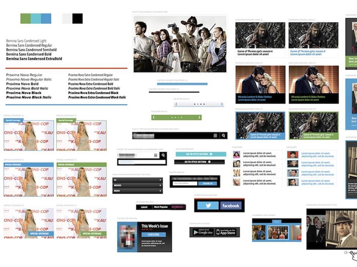
ELEMENT COLLAGES
Two years ago, I worked on a project with an organization called Reading Is Fundamental15 (RIF). They have one simple mission: to give books to kids who had never had books. RIF found a significant correlation between communities with low literacy and low-income levels, high crime rates, and high welfare payments. By increasing literacy, crime rates fall, incomes and graduation rates rise, and the government pays less welfare in the affected areas.
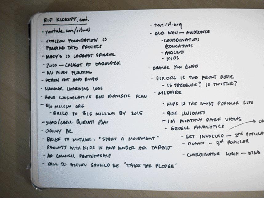
Listening at the first meeting. These keywords will be used later as visual hooks to transform ideas into an actual design element.
During our kickoff meeting, our team spent a lot of time listening, asking questions and sketching. The photo above is a shot of my notebook sketches from that meeting. I always try to pay attention to important keywords and recurring themes that arise in the conversations. The RIF team repeatedly mentioned particular words and phrases that were important to them. They kept saying “electric” when referring to their brand. They also repeated the words “shape,” “book,” “heart,” and “bubble.” They kept saying “visual book lists,” “pages themed in books,” and “turn the page for step two.” Those words alone brought rich imagery and metaphors to my mind.
As you design more elements, the element collage becomes more refined and detailed.
We weren’t scheduled to start the design phase for another couple of weeks; we were going to do some content work first and understand the structure of the site a little bit more. When I got home, however, I couldn’t help but hear their words in my head. I opened Photoshop and created an empty canvas. I just wanted to illustrate, to do some sketches of what these concepts could look like.
Obviously, at this point I had no idea what the art direction would be. I didn’t know whether the color was right or the typeface appropriate. But it didn’t really matter at that point. I just wanted to get a few ideas out of my head and into pixels.
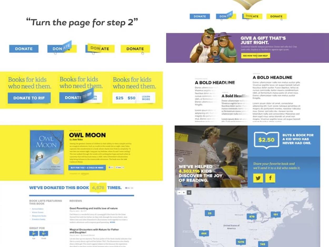
What does “turn the page for step two” look like? Maybe it’s a button that flips over like a page turn when you roll over it. That led me to think about what could be displayed on the other side. A color change? Suggested donation amounts?
The same goes for “visual book lists”: what would that look like? An interface that allowed kids and parents to browse the site visually, and find books they like — what would be a good representation look like? “Pages themed in books”? How could I play on affection and nostalgia for stories like Harry Potter or Goldilocks and the Three Bears and get people to donate or take action based on that?
I’m no copywriter, but I had a lot of fun writing copy for those elements.
One of my favorite parts of designing an element collage is that it gives me a chance to design the things I’m excited about without worrying about the rest. When you create a comp, you might not have an idea for the footer of a site, but you can’t just skip it; without the footer, your comp is incomplete. With an element collage, however, you can really just focus on the things you’re most passionate about.
The other nice thing about an element collage is that it gives you the opportunity to show your clients how well you listen. Clients often have ideas that they’ve been refining in their head for a long time; an element may be your first opportunity to help them visualize it. One of my favorite parts of every project is helping turn clients’ powerful phrases into visual hooks. Clients will tell you what’s important to them — sometimes we just don’t listen for it. If you listen hard enough, they’ll tell you exactly what they want to see.
After I had all the different elements for RIF placed on a Photoshop canvas, I created a new document and placed all these elements down the center as if it was a long scrolling webpage. That page included a variety of elements, from carousel states to typographic explorations, donation ideas, book reviews, and more. Frankly, I didn’t know if we were even going to have book reviews on the site at that point, but this visual exploration helped me discover a direction for the site that influenced every phase of the project.
Getting these ideas out of my head led me to helpful conversations that influenced the information architecture. A typical waterfall process for web design tends to start with information architecture leading into graphic design and then development, but a framework that allows every piece to influence the others is an incredibly powerful opportunity. The element collage I did for RIF allowed our team to sort out some information architecture decisions. In a new responsive framework, all of those things can be rearranged to great benefit: you could have IA influencing design, but also design influencing IA. You strike a nice balance, a nice back-and-forth between all the disciplines involved in the design workflow.
When I showed the element collage to the clients they said, “Obviously this isn’t a website, but I see how it could be one”—a great client’s perfect response to a modern design deliverable. At every stage of the web design process, we ask our clients to imagine the next one. We explain ideas and expect them to imagine what the site will look like. We show wireframes and expect them to imagine what they will look like after we’ve applied typography, color and layout. We show a layout and expect them to imagine how the rollover states will work. When a client tells you they can easily imagine, you’re in a great place.
The most successful projects are the ones where we’ve successfully asked our clients to imagine, and they can. The feedback I’ve received from clients tells me that it’s possible and that this approach is helpful in achieving that.
To approach the complexity of today’s web, we need to be strategic in how we craft websites. We need to build scalable, flexible design systems. By deconstructing the design into simpler components and elements, we build a solid foundation for responsive design — but most importantly, we can create this foundation quickly without spending too much time polishing comps.
Showing an element collage to a client instead of a comp might sound like a scary proposition. But the main problem with a comp is that it’s a moment in time, one that may never exist for a particular user. When you make a deliverable like an element collage, you’re intentionally removing the context of a specific moment in time and instead replacing it with a collection of moments. You’re helping your clients understand the overall narrative and asking them to imagine the chapters. Rather than showing them every screen at multiple sizes, you’re teaching them how to imagine it on their own. That’s a much more valuable offering that you can deliver.
A useful detail that helps clients understand the idea behind element collages is displaying interaction states, like rollovers or animation states. Since we aren’t showing a webpage, those kinds of “visual tricks” are a very good way to make it clear to clients that what they’re looking at isn’t an actual webpage. This reduces confusion and helps avoid conversations like, “What page of the site is this?”
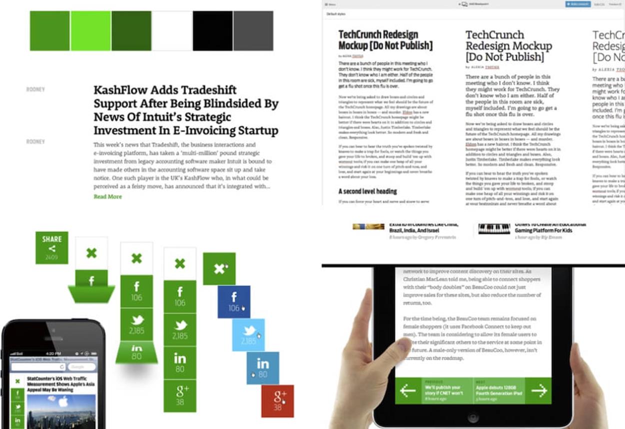
An element collage for TechCrunch, containing type treatments, social media buttons and more.
Once I started using element collages, I began to discover more and more situations and responsive projects where they made sense — and significantly sped up the design workflow. For the next project I worked on, the TechCrunch redesign16, we also created an element collage. Because TechCrunch is a technology news site, we spent a lot of time exploring typography and type combinations to make sure that the type was beautiful yet also very functional. TechCrunch publishes 80 to 100 articles a day, so we knew that typography and the reading experience were critical.
It wasn’t enough to rely on tools like Photoshop, Illustrator or Sketch. We needed to set type in the browser and have access to a huge catalog of typefaces. We used Typecast17, a tool that increased our access to typefaces we didn’t have. I love buying typefaces, but there are only so many I can buy without going broke.
With Typecast we knew that whenever we applied a typeface, the result was literally what it would look like at the final stage. Showing the typeface in the environment where it would be read was a huge benefit. Working within the medium helped us avoid wrong decisions and notice the smallest inconsistencies right away in its native environment. I was able to design some components in Photoshop, set typography online in Typecast, take screenshots and then bring them into Photoshop and work with them there. Going back and forth between browser and Photoshop worked really well.
For TechCrunch, we looked specifically at things like sharing clusters and breaking news elements. Through this process, we were able to refine a typographic hierarchy even before we did anything with the layout of the site. We spent a lot of time on typography, nailing down the nuances of what articles, headlines, body copy, and all the typographic elements would look like — and eventually putting everything into a growing element collage.
HORIZONTAL ELEMENT COLLAGES
More designers and agencies are starting to use element collages these days, including UK design agency Clearleft. In one project, the Clearleft team sent an element collage to a client, only for the client to believe they were looking at a half-finished webpage. To fix this, Jon Aizlewood at Clearleft adopted a wide horizontal canvas instead and increased the size of some elements, “so that the discussion revolves around the overall visual aesthetic, rather than the pixel precision and font sizing of certain components.”18
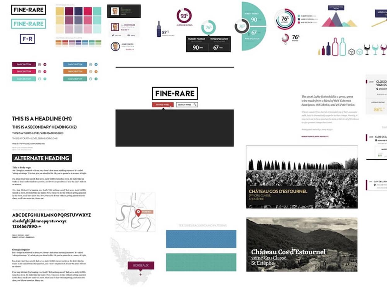
An horizontal of a vertical element collage.
This change helped the clients move away from the webpage paradigm towards a clearer canvas view with a distinct connected system of components that will comprise a page later in the process. This early stage is an exploration of compound units of a design, and it shouldn’t be confused with an actual output.
A horizontal element collage for Entertainment Weekly.
I loved that horizontal approach, so I decided to try it out in my next project. When we worked with Entertainment Weekly19 on the design of their mobile site20, we decided to produce a horizontal element collage, which worked well for everyone involved. We had very productive conversations about the elements, and we never once had to explain the purpose or goal of the canvas. First, we had the right conversations with the client, so when we showed them the collage it felt like a natural part of the process — it was pretty much what they expected and didn’t cause any confusion. The client had no difficulty understanding those elements as building blocks of an upcoming page. If you want to make it very clear that what you’re designing isn’t anything close to an actual webpage, horizontal element collages are a great choice.
ON DESIGNING IN THE BROWSER
Not every designer (and not every client) will feel comfortable with designing element collages instead of webpages — at least at first. I spoke with Paul Lloyd, one of the designers at Clearleft at the time, about this process as well. When I talked to him about what he liked about element collages, he said:
“You know when you’re in Photoshop, and right before you send something to a client, you turn off a bunch of the layers, because they’re the ones that you don’t want them to see? Element collages are like giving your client a peek at all those hidden layers. You’re showing them all the different variations of things; you’re not just showing them the final thing that you’ve decided to reveal. You’re making them part of the process.”
You might be thinking, “Well, element collages are really good, but why bother with that stuff and design it all in the browser instead?” Well, I’ve got a couple of qualms about designing in the browser.
When people talk about designing in the browser, they often mean just skipping the design phase entirely and jumping straight into building something. Construction workers need blueprints. CGI artists rely on sketches, previs, and small-scale models. Design isn’t just theming or skinning components in the browser — it’s about honing a concept, and that’s difficult to do in the browser.
Most importantly, sites designed in the browser look like no one considered the visual treatment, or the art direction, colors, and typography. You can’t just color a wireframe and call it good design.
To be fair, I don’t think that’s anybody’s fault. It’s the fault of our tools. We don’t have the right tools to allow us to design in the browser in the way that we could. Consider for a minute the way that we code. We open up a code editor, and we type. We don’t see what we’re doing. We save, and we switch to a browser and refresh — and it’s always a surprising jack-in-the-box moment. Sometimes we see something we like, but more often we see something else, perhaps due to a bug, so we go back to the code and revise it and then — jack-in-the-box again. That’s a problem with the way we use our tools; it’s a problem with the way we code.
In a presentation called “Inventing on Principle21” given in January 2012, Bret Victor talks through a code editor prototype he built that shows changes in realtime. He shows a particular tool that gives him an accidental idea about the functionality and experience of the game he’s building. “How would I ever have discovered that [animation idea] if I had to compile and run each and every change? So much of creation is discovery, and you can’t discover anything if you can’t see what you’re doing.”
Perhaps rather than designing in the browser, we could be deciding in the browser. We often regard Photoshop as the primary tool where all design decisions are finalized, but I think we should treat Photoshop as the place where ideas can be initiated, and the browser as the place where those ideas can be finessed. We could think of our tools as lying across a spectrum, not simply as a binary choice. The earlier in the process, the more useful an expressive tool like Photoshop; later on, the more useful a production tool like Sublime Text or the web inspector.
PROTOTYPING
Here’s how I think designing in the browser should really work. I worked on a project with my friend Jamie Kosoy22, and Jamie has a unique way of writing code. He refers to himself as a developer, but I think he’s very much a designer — he just uses code to do it.
What I love about working with Jamie is that he’s not one of those developers who waits for the design to be done and then just codes what’s been delivered in the comp. When we work together, I start my work on day one and he starts his work on day one, too.
How does it work? Jamie has very specific guidelines for sketching in code:
1. Each prototype must take less than one hour to make. If a prototype takes longer than an hour to create, it’s not a prototype anymore — you’re building something, and that’s not the point of sketching, whether in code or not.
2. The first prototype should be something that anybody can build. The second prototype gets increasingly more complex, as does the third and the fourth and so on. More on this in a minute.
Crude sketching in code.
3. Build ugly. If you take a look at the screenshot above, what you see on the right-hand side is the comp, and what you see on the left-hand side is a fully functioning, ugly prototype.
When most people build prototypes, they end up being so similar to a finished product that it’s “good enough.”No one ever goes back to put the final polish on “good enough.” You’ve got bigger fish to fry, and, hey, it’s “good enough.”
If you build ugly though, you have to go back. You cannot launch an audio player that’s a bunch of lime green boxes and Comic Sans text, even if it’s full functional. You’re forced to go back and finish it. That’s the value of building ugly.
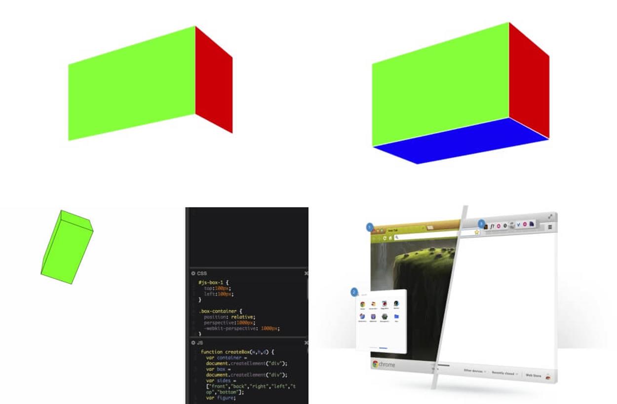
An evolution of a sketch: from a crude early mockup to refined working prototypes.
Two years ago, Jamie and I worked on a project for a big technology company that rhymes with Moogal (you probably have never heard of them). As we do, we brainstormed together before doing anything else and ended up with the idea that you should be able to see the product “from all angles.” We didn’t specify whether that meant metaphorically or physically or literally. From there, we both started exploring different options and routes we could take in our own ways.
I went off and designed the sketch above. I didn’t have any navigation; I didn’t even know if that was the right copy. It was just a starting point. If you look at the image above, on the left you see my sketch and on the right is Jamie started with this sketch. Remember guideline #2: something that anyone can do. It was a green <div> that had a width and a height. That’s prototype number one, and it’s finished.
Once he had this first prototype, Jamie moved on. Second prototype: skewing it with CSS transforms. Something that anyone can do, but with a little bit more knowledge.
Third prototype: adding another face.
Fourth prototype: adding a third face to create a 3-D box. This is something that most people who write HTML and CSS can do, but it’s a little bit more advanced than just putting a <div> on the screen. Every single prototype was another step taken, another decision made.
If Jamie ever has to bring another developer into the project and they don’t know how to do what Jamie’s doing, they can figure it out by tracing the steps in his prototypes. Normally, that’s just lost in the Git history. By seeing all the prototypes, you can go through the history and get a better idea of what’s happening behind the scenes. Every prototype has a unique URL, so you can go to 001 and 002 and 003 and 004 and see all of the prototypes right there. Each prototype is designed to solve one and only one problem, and once it’s solved, Jamie moves on to the next one.
After working this way for a few days or a few weeks, Jamie will have hundreds of prototypes that do one thing and one thing only. Prototype #76 will have solved using the History API. Prototype #25 works out a unique navigation interaction. Prototype #98 is a demo of the animation in the footer. Once you have everything worked out individually, you can start to put them together. Combine prototypes #11 and #52. Combine #29, #41, and #6. Finally, once you combine enough prototypes, you realize you actually built an entire site. That leads us to our last piece of the framework: assembly.
All materials on the site are licensed Creative Commons Attribution-Sharealike 3.0 Unported CC BY-SA 3.0 & GNU Free Documentation License (GFDL)
If you are the copyright holder of any material contained on our site and intend to remove it, please contact our site administrator for approval.
© 2016-2026 All site design rights belong to S.Y.A.