Responsive Web Design, Part 2 (2015)
Testing And Debugging Responsive Web Design
Phase 2: Getting Better At Making, Testing And Debugging Responsive Websites
I don’t know any single developer who thinks responsive web design has made everything easier. I do know great front-end developers who have had enough and retreated to working only on back-end, server-side programming. The complexity of front-end development has increased to keep up with the diversity we have to support. Like all types of programming, though, the easier your front-end code is to understand and work with, the easier it will be to debug. You have to fight the constant creep of complexity; you have to put effort into maintaining and structuring it sensibly. I always try to apply two key programming principles when building websites: simplicity and predictability.
Simplicity is the opposite of complexity. This means creating HTML, CSS and JavaScript that are modular, scalable and consistent. Predictability means that the outcomes of any changes you make are obvious and expected. When you make a change to a complex system, the outcome can be unpredictable and hard to control.
Here are some of the ways that you can improve how you practice responsive web design:
•Building predictable, simple CSS
•Easy-to-follow naming conventions
•Directory structures
•Media queries
•Keeping clear separations of concern
•Use testing to stop bugs getting on to your live site
•Use visual regression tools to speed up testing responsive websites
BUILDING PREDICTABLE, SIMPLE CSS: EASY-TO-FOLLOW NAMING CONVENTIONS
The key to making anything easy to maintain and debug is to concentrate on keeping it simple to understand, and ensuring any outcomes from changes are predictable. Pain points with CSS come from the global nature of the language. It’s very easy to build a complicated cascade of inherited styles which then causes problems with the priority of selectors.
BEM (block, element, modifier) is a technique for naming selectors that addresses this problem. It’s a popular way to implement CSS, and as a reader of a Smashing book I’d expect you to have heard about it already. At the BBC, we use an adaptation of BEM:
.block__element--modifier
Using double delimiters allows us to use hyphens within each part of the naming convention and still maintain readability. We also add modifiers directly to the block:
.comments-and-analysis { /* ... */ }
.comments-and-analysis--highlighted { /* ... */ }
.comments-and-analysis__para { /* ... */ }
.comments-and-analysis__para--bottom { /* ... */ }
Using BEM notations gives us some solid benefits:
•As all selectors use class names, every selector has the same specificity, the global nature of CSS stops being a problem.
•The cascade in your CSS structure becomes obvious, making it easier to maintain and understand what is going on.
•A predictable, modular pattern for extending existing CSS emerges.
A valid criticism of BEM is that it adds more noise to your HTML; elements’ class name values are much more prominent than other parts of the markup. I agree that BEM isn’t perfect, but I strongly believe that it’s much better than any other current alternative. When it comes to HTML and CSS, you need a certain number of hooks to define the relationship between element and style. These hooks can make either your HTML or CSS more complicated. It’s better to add this complexity to your HTML because a BEM style selector acts as a unique key in both your HTML and CSS, making it easy to trace the relationship in either direction. The verbosity of BEM is what makes it predictable and easy to work with.
BEM’s verbose use of class names always attracts strong opinions. Here are three opposing ideas about how to use class names.
1. CLASS NAMES SHOULD DESCRIBE THE CONTENT SEMANTICALLY
Traditionally thought of as best practice, this naming convention actually provides very few benefits and affords us no room to maneuver to create maintainable CSS structures. Before responsive web design I was a firm believer in deriving semantic meaning from class names, and I would always highlight the CSS Zen Garden website4 as an example of the ability to use semantically appropriate class names while maintaining a firm control over the design. But I was wrong. The truth of the matter is CSS Zen Garden is just a tech demo; its designs are derived from what is possible within the confines of the markup. Nobody makes CSS separately from HTML. In a development team, you don’t have the HTML guy sat next to the CSS guy delivering their responsibilities in isolation of each other. HTML and CSS are always written together at the same time. It serves no real purpose either, as web browsers, search engines, and screen readers will ignore the values in the class attribute. The only computational benefit is for microformats.
2. PURELY SEMANTIC HTML WITHOUT CLASS NAMES SHOULD BE USED
It sounds impossible, right? A great argument for this has been written by Heydon Pickering in his article “Semantic CSS With Intelligent Selectors5”. Heydon’s argument is that if you write your markup semantically enough then you don’t need classes and can use intelligent selectors instead. Here’s an example:
// HTML
<a href="/previous-article-snippet/" rel="prev" class="prev">previous page</a>
// CSS
a[rel=prev]:before {
content: '2190'; /* encoding for a left-pointing arrow ("←") */
}
Because the hyperlink in the code above has been given a rel attribute, we can use a selector that is unique enough to target and style this element. rel="prev" gives us the same hook as the class name alternative class="prev" for our styling, but it gives the hyperlink contextual value. Again, I think this approach is a little too idealistic. It works at the atomic scale of a design (navigation elements and forms, for example), but when it comes to building the layout of a page there aren’t enough unique elements and properties to hook your CSS to. If you take a design like the Guardian newspaper’s homepage, there will be promos to story pages that semantically are identical, yet they will be presented very differently.
This approach also doesn’t lend itself well to some of the advantages afforded to us by progressive enhancement (PE). Using PE we can change a hyperlink into a button and use AJAX to pull the linked content directly into the page. In this case, we may want to make the hyperlink look like a button.
Heydon correctly criticizes BEM methodology for being too verbose, adding too much noise to the HTML document, and breaking the single responsibility principle (HTML for content, CSS for presentation).
3. CLASS NAMES ARE FOR DESCRIBING THE SEMANTICS OF PRESENTATION
The BEM approach. All class names have semantic meaning, but that meaning is not applied to the content6. The primary goal for an element’s class attribute is a hook for the developer to apply styling and interaction. Classes are there purely for developers to take advantage of. I’m not suggesting that we start using class names like big-bold-header — we should still use semantic names, but the names should give us presentational semantic value. Using BEM’s naming convention to define modular HMTL and CSS components is the best naming strategy.
BUILDING PREDICTABLE, SIMPLE CSS: ORGANIZING SASS FILES
Following conventions in your code is one thing, but even if your classes are well named, you need to order them properly to make sense of the structures you create. Defining your CSS as modules has many advantages. It promotes reuse throughout your code, meaning you can reduce the amount of CSS required (as you accurately guessed, this is referred to as being DRY — don’t repeat yourself — in programming) and it makes the structure of your CSS highly maintainable. Thanks to CSS preprocessors like Sass we can separate CSS into logical divisions and keep them in separate files. If you follow BEM methodology, it will give you an obvious idea of how to break your CSS into separate files. Each block that you define with BEM can become a CSS module and live in its own file.
When devising your file structure, it’s important to think about how other developers (and you in six months’ time) will use it. Deeply nested directories with vague sounding names will make searching for code and interpreting your intent difficult. For example, here is a limited example of the current responsive BBC News Sass directory structure:
sass/
partials/
components/
_block-e/
_block-f/
_block-g/
_block-h/
fixes/
_old-ie-fixes.scss
helpers/
_horizontal-divider.scss
_url64.scss
pages/
elections/
_colors.scss
_election-results.scss
_layout.scss
live/
_base.scss
views/
partials/
_block-a/
_block-b/
_block-c/
_block-d/
_compact.scss
_core.scss
_shared.scss
_tablet.scss
_wide.scss
services/
news/
_config.scss
feature.scss
smart.scss
tablet.scss
wide.scss
arabic/
_config.scss
feature.scss
smart.scss
tablet.scss
wide.scss
It all seems a bit random, doesn’t it? We never intended this, but as the codebase has evolved over time, more features and developers have been added to the project. Managing this growth has been hard. Of all the different parts of the responsive news codebase (which includes large amounts of PHP, Ruby, HTML, JavaScript and CSS) we’ve refactored the CSS the most. This is because it’s very hard to build large amounts of CSS.
To be fair to my development team, we do go through periods of mass feature development followed by a technical debt catch-up, where necessary refactors will be undertaken. At the time of authoring this chapter, we are once again refactoring our CSS to be more component-focused. A shallow-nested, wide file structure is a better strategy than the one exhibited above, as it will make it easier to scan the structure of your CSS. We could take the list above and change it to this:
sass/
browser-fixes/
_old-ie.scss
components/
_block-a/
_block-b/
_block-c/
_block-d/
_block-e/
_block-f/
_block-g/
_block-h/
content-sections/
elections.scss
mixins/
_horizontal-divider.scss
_url64.scss
services/
news/
_config.scss
feature.scss
smart.scss
tablet.scss
wide.scss
arabic/
_config.scss
feature.scss
smart.scss
tablet.scss
wide.scss
The example is a little contrived as the number of subdirectories within components/ would be much higher, but you should get the gist of what I’m trying to achieve. The fixes/ and helpers/ subdirectories are moved to the top and renamed to browser-fixes/ and mixins/. The vague-sounding partials/ is removed completely and replaced with components/, which is much more obvious. Another vaguely named directory, pages/, is correctly renamed content-sections/, which denotes additional styling that is not based on page type but, rather, content.
Changes like this have helped the BBC News development team in the following ways:
•We’ve moved towards working with a living style guide. When we first started the site in 2012, it was fairly simple. The CSS was structured to work with just three page types, each containing a small number of components. As the amount of page types and components have increased, the importance of components has come to the fore, and we are now structuring our CSS around that.
•As more developers joined the team, we’ve had to make the structure much more modular to allow multiple contributions. A developer is now much more likely to work on a component than a page type, so atomizing the CSS into components also matches how we work.
•Swapping out or replacing components with new versions is easier now there is a single, obvious place to edit the CSS for each component.
There’s one final important thing to note. A Sass convention is used for naming files that are not to be changed into equivalent CSS files. Any file name that starts with an underscore (e.g. _horizontal-divider.scss) will never be converted into a CSS file. This handy visual indicator immediately tells you if a Sass file is to be consumed by other Sass files.
BUILDING PREDICTABLE, SIMPLE CSS: USING MEDIA QUERIES
When building a responsive site there are elements of your design that you need to consider when the layout adapts to a change in viewport size:
•Typography: size, leading and measure of the text all need to stay relative to one another.
•White space: margins and padding will need to change to help you specify the relationships of elements in your interface as well as the intended content hierarchy.
•Positioning: you need to make the most of the space available to your content.
By using media queries in our CSS, we can control when styles are applied at specific viewport widths. Although media queries are an essential part of realizing a responsive design, the declaration of selectors is too verbose. Look at the example below. Applying a default value to a style and overriding it at two viewport sizes requires us to declare the selector three times:
body {
background: red;
}
@media (min-width: 320px) {
body {
background: white;
}
}
@media (min-width: 768px) {
body {
background: blue;
}
}
A nice feature of Sass is the ability to nest media queries within selectors themselves. This syntax isn’t available in native CSS, but it’s really useful because it reduces the amount of code you need to write. Using Sass we can make the example above much terser and more readable using nested media queries:
body {
background: red;
@media (min-width: 320px) {
background: white;
}
@media (min-width: 768px) {
background: blue;
}
}
Don’t repeat yourself is a good programming principle being applied here: the body selector is used only once. The physical space on the screen between the media query and the style properties is reduced. If you think about it, we’re using a visual design affordance: implying a relationship by placing two items closer together, and so making the brain work less to decipher the code.
When you start to interpret a responsive design you should put a good deal of effort into thinking about how you are going to build the site. There are typically two strategies you can pursue when using media queries:
•Define breakpoints up front and apply them globally across a site. This strategy effectively builds vertical silos of designs for you to apply styling to. We can refer to this technique as using macro media queries.
•Add media queries into your CSS as and when you need them. This can be thought of as using micro media queries.
These two strategies map nicely onto two different mental models designers use to shape a responsive design:
•Content out: adding breakpoints as and when they are required.
•Device first: Defining the canvas size of devices and adding content to fit into these predefined constraints.
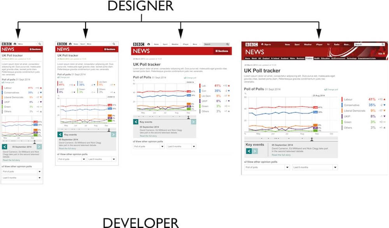
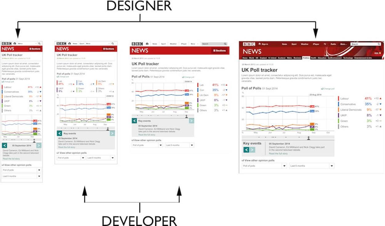
While the first is a much more holistic approach to responsive web design, it’s a much harder paradigm to understand. Designers and developers coming from a typical desktop-only background often struggle to come to terms with the content-out approach. Pointing at two different designs and saying, “This is what mobile users will see, and this will be what tablet users will see” is a very simple and easy to understand way of communicating to customers, project managers and other potentially non-technical stakeholders.
At BBC News, our designers have typically created four versions of every design: feature phone, smartphone, tablet, and desktop designs. Using a device-first approach works for us as there are many people involved in the initial design stage. Having documents we can refer to and have conversations around is essential.
Unfortunately, the four designs don’t translate into code as easily as we hope (see the aside “Changing How We Work” for more information about this). A good developer will use the four designs as guides to how they are supposed to work rather than interpreting them as strict instructions.
ASIDE: CHANGING HOW WE WORK
As we learn more about responsive web design and improve how we practice it, the BBC News development team has started to change how designers and developers work together. We’ve come from a typical development practice that meant designers spent a long time working out a design before presenting it to a developer to build. While it’s important for everyone to get an understanding of what will be built, we’ve found it can be detrimental to your productivity to do too much design work before developers get involved.
Static designs do not consider many of the challenges the web brings us. Static designs won’t tell you how to deal with:
•Hostile experiences in browsers: there are many different rendering engines and loading conditions we have to cater for.
•Massive variation of screen sizes: defining four breakpoints up front before the problem has been fully explored means you put form before function.
•Connection speeds: balancing performance against the amount of content and functionality in a design is impossible to do if the design is finished before any development concerns have been thought about.
•The variability of interaction types: the correlation between screen size and input type is quickly blurring. There is no longer any guarantee that small screens equal touch and large screens equal mouse.
To combat these challenges, we’re slowly changing to a more collaborative way of working. In some teams designers work directly with developers, quickly mocking up designs for developers to turn into code. It’s only then that the team decides which parts of the design work in browsers. Other teams have found it easier to produce the largest and smallest designs in Photoshop and Illustrator, and hand over only those to development, allowing the developer to work out the designs between.
The most interesting approach has been in the BBC News visual journalism team. Some journalists have produced very rough working prototypes to explore an idea. This prototype is then handed over to a designer who improves the interaction and layout. Once the journalist and designer are happy, the prototype is handed to a developer, who rebuilds the prototype to create a robust and responsive codebase that works across the entire spectrum of supported browsers and devices.
These different ways of working depend not just on the type of work being done (creating templates for CMSs as well as quickly built interactive infographics), but also on the skill sets available to each team. Some designers at BBC News will have good HTML and CSS abilities and will be able to create prototypes or even fully functioning, production-ready code; others will be comfortable working purely in Photoshop and Illustrator. The same, too, goes for developers. I like to use the term “UX developer” (which I consider myself to be) to describe a developer who has an appreciation for UX and can interpret designs and use them as a guide. Other developers will be most comfortable translating a design directly into code without trying to interpret it.
Of all the different changes responsive web design has forced on us, the largest and hardest one to adapt to has been the change to how we all work together. When we first built the responsive version of the BBC News site in 2012, we adapted how we worked as a small team very quickly. But since then, we’ve had to integrate these changes in working practices with the rest of the business. In a business as large as BBC News, this transition can take a long time.
When translating designs into code, you can continue to follow either of the two approaches mentioned earlier:
•Define your media queries up front, splitting the output into separate width-based files. Using Sass @if statements to break each CSS component becomes a distinct pattern in your code. This can be thought of as using macro breakpoints.
•Or, add media queries to each component as and when needed. Think of these as micro breakpoints.
DEVICE-CENTRIC (MACRO) MEDIA QUERIES
A device-first approach to your CSS will require some up-front thinking and Sass plumbing. You’ll need to decide what your macro breakpoints are going to be. Typically, people think of these around device types: mobile, tablet and desktop. You’ll need to use some Sass syntax to get this to work. Here’s an example:
// tablet.scss
$tablet: true;
@import 'components/block-a';
// _block-a.scss
.block-a {
background: gainsborough;
@if $feature {
width: 240px;
font-size: 18px;
}
@if $smart {
width: 320px;
font-size: 20px;
}
@if $tablet {
width: 768px;
font-size: 24px;
}
@if $desktop {
width: 1008px;
font-size: 20px;
}
}
// outputted tablet.css
.block-a {
background: gainsborough;
width: 768px;
font-size: 24px;
}
While this approach still allows you to share styling across each macro breakpoint (look at the properties with @if statements in the example above), you will need to think about how each generated CSS file is loaded into the browser. A good rule of thumb with responsive web design is to only download what you are going to use, so we can use a JavaScript function to help us do this:
function decideWhichCSSToLoad () {
var width = document.clientWidth;
if (width >= 1008) {
loadCSS('desktop.css');
return;
}
if (width >= 600) {
loadCSS('tablet.css');
}
if (width =< 599) {
loadCSS('smart.css');
}
}
ASIDE: LAZY LOADING CONTENT INTO THE PAGE
One technique the responsive BBC News website executes well is loading non-primary content into the page using AJAX. We refer to this process as “transclusion.” To transclude is to load one hypertext document into another. We label content as primary if it’s related to the URL of the document. Any content on the page that is not related to the URL is secondary. The secondary content is fetched from endpoints linked to from the page. JavaScript scans through the DOM, replacing any hyperlink with its linked to document if it has the class .fetch. This works well for old, feature-poor browsers. Because we don’t serve these browsers any JavaScript, the page they render is much lighter and simpler. The users of these browsers can still see all of the content, but they need to make additional clicks.
Making multiple subsequent requests, especially for small fragments of HTML can have a negative impact on performance. To tackle this we do what we call a “super transclude.” If we know what all of the requests for secondary content are going to be, we create an additional endpoint for the JavaScript to pull down all the extra content in one request. JavaScript can then break the single response up into its constituent parts and add them to the correct areas of the DOM.
When executed at page load, this JavaScript function will correctly load the right CSS file to match the user’s viewport size. However, as soon as a user changes the orientation of their device, the width of the viewport may increase or decrease dramatically (especially as 16:9 aspect ratios are very common on smartphones) and will require a different CSS file. We could handle this using JavaScript to listen for changes in orientation:
window.addEventListener('resize', decideWhichCSSToLoad);
Loading the newly required CSS via a JavaScript event will produce a noticeable delay as the browser will need to wait for the requested resource to download and be rendered. This lag will be even more noticeable on a mobile connection because first, they are typically slower than broadband, and second, to reduce battery drain mobile devices will disable their radio connection to the mobile network (i.e. the closest mobile phone mast) once a page has finished downloading, so requests made after the fact have to wait for the device to reestablish an internet connection.
ASIDE: CACHING
One way to deal with having to make requests for external asset files (CSS, JavaScript, etc.) is to get the browser to cache the responses once they’ve been downloaded. Browsers now have various strategies you can use for caching other than setting the expiry date on the file; for example, throwing the content of files into localStorage or using the appCache API. Regardless of how you cache the file it’s important to understand how long you will need to cache the contents for and also what content to cache.
With non-responsive, small sites we can normally store all of the required styling for a site into one CSS file. Users will need to download the file on the first page they visit, but subsequent pages and visits will benefit as the file will be loaded from the cache. This may not be the best strategy for a responsive site, however, as the amount of styling needed for an entire responsive site may be very large. Deciding how to cut up your CSS into separate files always involves balancing the benefits of caching for subsequent pages versus the download time for the initial page.
Personally I’d always opt for downloading payloads as small as possible for the following reasons:
•The initial impression your user gets when they first come to the site is important. If this experience is too poor, then they won’t continue around your site, so you won’t benefit from caching anything up front.
•The size of caches varies massively on mobile devices, and they’re much less reliable than caches on desktop browsers. Even if you do tell mobile browsers to cache a file, there’s no guarantee it will actually happen.
•When a new version of the site is available, you need to break the browser cache and force the user to re-download any cached assets. If you work on a product that practices continual delivery (i.e. you are releasing multiple versions of your CSS or JavaScript every day), then you’re more likely to need to break the cache more frequently than the frequency of your users’ visits.
Macro breakpoints do have advantages. I find that the four designs I am handed by a designer give me around 80% of the layout that I will end up needing in browsers. However, I am an experienced developer with a good knowledge of UX and can generally work out the last 20% on my own. Less assertive or inexperienced developers might struggle with this approach.
A device-first approach is also becoming less relevant to our industry. Two years ago you could definitely place all devices into one of three buckets: mobile phone, tablet, computer; but today the distinction is less obvious. Phones, tablets, and laptops are diverging every year, diluting the differences between them. The tipping point is the iPhone 6 Plus. It’s a very popular device that is somewhere between a phone and a tablet. It doesn’t really fit into either category, and if we were to use our device-first media query strategy it wouldn’t match any of the macro breakpoints.
The wrong reaction to the iPhone 6 Plus would be for designers to start producing five designs, because sometime in the next 18 months a new device we don’t know about will come out that won’t fit into any of the five macro breakpoints. The only way to stay future-friendly is to be device-agnostic; that is, always take into account the massive variance of combinations of browser, connection speed, screen size and input type our users have. Trent Walton wrote an excellent blog post on this issue called “Device-Agnostic7.” Trent writes about this topic so elegantly that I highly recommend that you read his article right now before carrying on with this chapter. While I think it’s still good practice for designers to produce four designs to help the team understand the intent of the design, when these designs are implemented they need to be coded in a way that doesn’t use the designs as constraints.
CONTENT-OUT (MICRO) MEDIA QUERIES
Designing content out means thinking about your design without the constraints of a device. This is hard to do as we typically contextualize our designs by thinking of the way they work on a phone or tablet. The responsive web doesn’t really have edges, there’s no set width or consistent fold; defining your layout from your content is the only way to be truly responsive. However, designing in this fashion is hard if you are used to working only in Photoshop or Illustrator, as the only way to see when the layout starts to break is by looking at the design as code in a browser.
If you are able to work in this fashion, then you will be able to code each CSS module to its own specific requirements independent of other modules. For example, width properties can be set to the exact pixel values required by the layout for each module separately:
// _block-a.scss
.block-a {
width: 100%;
@media (min-width: 320px) {
width: 320px;
}
@media (min-width: 768px) {
max-width: 768px;
}
@media (min-width: 1008px) {
width: 1008px;
}
}
// _block-b.scss
.block-b {
width: 100%;
@media (min-width: 575px) {
width: 575px;
}
@media (min-width: 768px) {
width: 768px;
}
@media (min-width: 977px) {
width: 882px;
}
}
While the device-first approach creates a uniform consistency of breakpoints across all of your modules that may seem preferable (especially as you can define them using variables to reposition a breakpoint with one quick edit), over time, treating each component with its own targeted breakpoints becomes more maintainable. There are two reasons for this:
•As you have to support an ever increasing diversity of device screen sizes, a content-out approach means you would already have thought about and catered for your design at viewport sizes that aren’t currently popular.
•Giving each component its own breakpoints effectively decouples components from one another. You could update and release a small portion of your CSS to cater for new devices, without having to make large, global changes to your CSS (as we will discuss later on: small changes are easier to test than large changes).
Structuring your CSS content out lends itself nicely to some increasingly popular front-end strategies. Development teams are starting to create living style guides of HTML and CSS: pattern libraries that are maintained and contributed to independent of the pages that consume them. Think of these as an organization’s own version of Twitter Bootstrap. The ability to develop components in isolation becomes critical as the number of components in a library increases. A component’s ability to remain consistent regardless of the others in the page is essential as it reduces the complexity of the overall system.
Another increasingly popular strategy is to place inline a certain percentage of the CSS required for a page, typically the CSS that defines the beginning of the content (see the aside “Defining the Fold in a Responsive Design” for an explanation of this). While putting JavaScript and CSS assets inline is generally considered bad practice (owing to the decrease in caching capability and a blurring of separations of concern), this strategy takes into account and prioritizes the perceived rendering performance of a page over the actual rendering performance. De-normalizing a selection of your CSS by inlining it allows the user to immediately start consuming the content and not notice that the page is still loading (see “CSS and the critical path8” by Patrick Hamann for more information on this technique).
ASIDE: DEFINING THE FOLD IN A RESPONSIVE DESIGN
Typically, the fold is the line in a webpage defined by the bottom of the user’s screen. Before responsive web design this was quite clear-cut: a 1,024×764 monitor resolution meant the fold was somewhere around the 650px mark. The name of this cut-off point derives from print design. When presented in a newsstand, a newspaper will usually be folded in half. It became a standard design practice for newspapers to place attention-grabbing content above the fold.
The idea of a physical fold is incompatible with responsive web design. The context of a fold is too dependent on the user’s device and so is meaningless in a world of multiple devices. Prioritizing the rendering of the beginning of the content is an interesting idea though, especially considering the complex nature of performance that responsive web design gives us. If we thought of the fold as a limit in size of content rather than rendered length of content on the screen, then we can actually define a fold across all devices for us to target.
You could measure this responsive fold in either kilobytes or time to render. Once you have an idea of where your responsive fold is, you can then de-normalize the loading of your CSS (i.e. place it inline) to speed up the rendering of the beginning of your content.
How you decide to use media queries in your CSS is up to you. Personally, I’d opt for a content-out approach as it’s the most future-friendly, but I’d lean towards a device-first approach under the following conditions:
•Your team has well-defined development and design roles, does large amounts of design work up front, and works with external stakeholders.
•The interface is very simple and straightforward, lending itself to stretching out across viewport sizes. Large bodies of text work well in this respect, as large changes in whitespace on either side of a collection of paragraphs won’t distract someone from consuming the content.
•When you know you definitely only have to cater for a limited number of devices. If the business proposition was only for smartphones, then you’re looking at viewport sizes ranging from about 320px up to 480px in portrait mode, and 600px to 700px for landscape mode — so you can make assumptions about required breakpoints. Be careful, however; browser and device support requirements often change throughout the life cycle of a project. Even if you think you only have to support iPhones, then this is already non-trivial as iPhones 4, 5, 6 and 6 Plus all have different viewport sizes.
A nice compromise between the two approaches is to instruct your designer to create designs at the two extremes of the device widths you want to support, and then let the developer work out how the design adapts between them. Producing designs for the smallest screen size and the largest will allow you to split your workflow into two distinct design and development phases, giving your designer the time to go and explore the problem, without spending too long on designs that might not work at medium viewport sizes.
Designing for multiple viewports takes up valuable time without giving you feedback on the feasibility of the design.
An alternative to this is to design at the extremes and let the developer (with your assistance) work out the design for the viewports between the extremes. This will work well if your developer has an understanding of UX.
When starting a new project, I always try to make big decisions based on the lifetime of a codebase. In my experience, a codebase lasts roughly three years before it’s considered legacy and will need to be replaced wholesale. Think about how your users will behave over that three-year period. Will they still be using IE8? Will they try to access your site via an Apple Watch or a kind of device that hasn’t even been invented yet? In three years’ time, the only certainty is that the problem will be even more complex, so a content-out approach to structuring your CSS is definitely the best strategy. However, it is the hardest way of designing and building websites.
Designing in the browser is a great way to work if you can do it, but don’t be dismayed if you struggle. Web development is a multifaceted discipline often involving teams of people. It’s much more important to be able to work together in this mixed discipline team. Whether you are designing in Photoshop or browsers, the essential thing to do is look at how your webpage behaves in browsers and then make a definitive design choice. Dan Mall (a co-author of this book) coined the phrase “decide in the browser” as a better way to describe this approach: design wherever you want, but don’t make the final decision until you’ve seen a working prototype in a browser.
KEEPING CLEAR SEPARATION OF CONCERNS
Presentational logic at the extremes of responsive web design can get complicated. When you’re designing content to work on massively different screen dimensions — say, a Sony Experia Tipo phone (320×480 pixels) and a 27″ iMac (2,560×1,440 pixels) — the layout can change radically. It’s easy to fall into the trap of quickly appending a CSS fix into JavaScript to deal with an obscure edge case or bug that crops up towards the end of a project. Such fixes quickly build up and make your code hard to manage. Keeping a clear separation of concerns — JavaScript for behavior and CSS for style — is vital to keep your code maintainable.

The Sony Experia Tipo comes with a recent version of Android. With a screen resolution of 320×480px, it’s one of the smallest smartphones available.
An all-rounder who works on websites almost entirely on their own might not see a clear separation in what they build. By mixing these concerns in your code, not only are you hurting maintainability but the code also becomes difficult to test. With a small change to your coding style, we can very quickly make your code much more testable. Here are a few lines of JavaScript, for a button that makes an element appear on the screen:
$('.button').bind('click', function () {
$('.element').show();
});
This is a perfectly valid way to apply this logic, and you could test it appropriately like so:
$('.button').trigger('click');
expect($('.element')[0].display == 'block').toBeTruthy();
But the JavaScript here is mixing up different concerns. Not only is it applying interaction, it’s also directly adding styles to the element in the DOM. Another code smell is the need for the test to trigger a DOM interaction. What we really want to test is the code we write, yet to initiate our code we have to get the browser to fire an event. Here’s a better way:
function showElement () {
$.('.element').addClass('show');
}
$('.button').bind('click', showElement);
We’d now test our functionality like this:
showElement();
expect($('.button').hasClass('show')).toBeTruthy();
This is much nicer code because:
•There is a true separation of concerns. JavaScript applies no styling, but a hook for CSS is added.
•Our code uses an event to bind our business logic to an interaction in the DOM, yet we can test our business logic separately without ever worrying about the browser’s event logic.
•The code reads much more clearly.
This change makes our code less implicit and more declarative. Declarative code is better because we state what we want, rather than implicitly try to apply it (the execution is extracted away in the function showElement).
This separation makes the application of our business logic more concise and easy to read. The execution of our business logic is isolated into a single function that can be reused but, more importantly, is easier to test. Concise, predictable and easy to read code should be a core objective when you are writing JavaScript. Ideally, you should only add comments to your code when you need to. Note the following line:
$('.button').bind('click', showElement);
It almost sounds like an English sentence. When you read it (“button bind click show element”), you can understand what it is doing, so you don’t need to comment it. The line in our test reads even better: “expect button has class show to be truthy.”
Code can get complex quickly. if statements and looping control blocks aren’t really important and get in the way of understanding the real purpose of coding: what you’re trying to achieve. By writing JavaScript in a style that separates our three concerns (content, style, and interaction) we can improve the maintainability of our JavaScript.
This change in how we write JavaScript is very relevant to responsive web design. For example, I built a responsive version of the “clickable guide” format for the BBC News website. Because the proposition of the content is very much dependent on the background image, it doesn’t really scale down to mobile phone sizes very well. This interactive element essentially has two modes that we call “interactive” and “list.” When the viewport is too small to display the background, we list the content in the page.
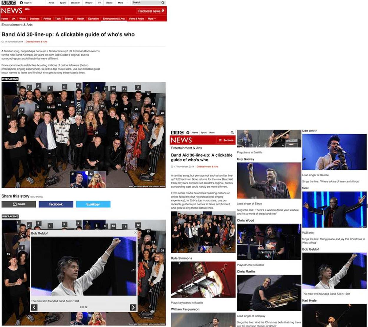
When viewports are wide enough, the clickable guide renders a large image with hotspots. Clicking a hotspot reveals additional content (see image on the left). Viewports smaller than the main image still get all the content, but it’s listed on the page (see image on the right).
Switching between the two layout modes is done via JavaScript by adding and removing two classes on the top-level element:
function switchLayoutMode () {
if ($(window).width() >= 976) {
clickableGuideElm.addClass('interactive-mode');
clickableGuideElm.removeClass('list-mode');
}
else {
clickableGuideElm.addClass('list-mode');
clickableGuideElm.removeClass('interactive-mode');
}
}
window.addEventListener('resize', switchLayoutMode);
At no time do we directly manipulate a style via JavaScript. We keep a strict separation of concerns using classes as hooks between JavaScript and CSS. We use BEM methodology in our CSS. When it comes to switching between layout modes we break with the general BEM convention of not nesting classes within each other:
.interactive-mode {
.clickable-guide__main-image-holder {
display: block;
}
}
.layout-mode {
.clickable-guide__main-image-holder {
display: none;
}
}
Developing and debugging the different modes of this responsive interactivity was simple because I could switch between them by changing the width of the browser window. However, debugging other types of responsive interactive content, like a quiz with different interface states that can take up to 10 clicks to reach, can be more tricky.
Making a small change, hitting the refresh button and then having to go through a sequence of 10 clicks to see that change can be very time-consuming and frustrating. Being able to use JavaScript to quickly change the setting of your quiz to its end state will solve this frustration. You can add a line of debugging JavaScript to help you default the quiz to its end state:
$('.quiz').addClass('end-page');
Debugging the end state now becomes much simpler.
IMPROVE YOUR KNOWLEDGE OF TESTING
It’s important to get a feel for when testing becomes a necessity and what types and levels of testing need to be implemented. There are two conditions that guide my decision about when to start testing.
First, the most important factor is how much trouble you are likely to get into if a bug creeps its way onto your live site. The more severe the outcome is for a bug, the more important it becomes to write tests. If you’re making a banking website where users pass sensitive information, start writing tests. If the income of your company depends on the website, start writing tests. But if you’re making fluffy stuff, say an interactive map that highlights the most popular breed of dog in a particular area, then testing becomes less important.
Second, the bigger a project becomes, the more invested I would be in testing. This is true for size when it comes to the amount of code, features, and team members. When constantly iterating through a site’s features it’s easy to create regressions, breaking or altering pre-existing functionality. It’s vital to have a suite of automated tests you can run to prove previously created features still work as expected. Members of development teams change, people take knowledge with them when they leave. A suite of tests will provide your team with documentation of how features are supposed to work.
Once you’ve decided that it’s time to create tests for your product, you then have to decide how you want to test. The testing discipline offers many different techniques — it’s easy to become dogmatic and write too many tests. Testing takes time and energy, so you aren’t going to deliver code as fast as you used to. The trade-off is that the quality of your work improves immensely. You need to find the right balance between code quality and time to deliver. Again, think about the potential severity of an outcome.
For instance, if I were responsible for an e-commerce site, I would probably put more effort into testing the payment processing web forms than the search listings. Releasing small rendering errors to a listing page will result in the user’s search experience becoming slightly worse. We could create high-level visual regression tests (explained in more detail below) to compare the current version of the page with its previous iterations. This would be a quick and cheap way to tell you if something has changed without you having to write complex code tests.
But an error for the checkout form might result in the user paying too much by accident, or not being able to purchase at all, so I’d make sure that the web form was covered by unit and functional tests. These are harder to create but prove that the web form works every time you run them.
After you’ve identified what you want to test, it’s time to look at the different ways we can test code and layout. Once we’ve done this, we can start to put together a test plan. Here are some typical ways a responsive site may be tested.
MANUAL TESTING, OR BROWSER AND DEVICE TESTING
This is as basic as we’re going to get with testing. Responsive web design makes this different, though, as we now have multiple types of devices to test. Having a list of all the features or pages of your site and their functions is important. The list informs the tester of what it is they actually need to test and whether your site is achieving its objectives. If you don’t have any kind of requirements list, then the tester won’t know if anything is missing or whether the site matches your intentions. Responsive web design makes this type of testing hard because you need to check everything several times on different devices as well as different browsers.
EXPLORATORY TESTING
Instead of going through your site confirming that specific parts of it work as expected, with exploratory testing we randomly go through the site looking for problems. Professional testers will be particularly good at exploratory testing as they will know of common issues or patterns to test for: does your payment system web form work with negative numbers? Will your webmail client work if you right-click on a link and open in a new window? Will the JavaScript plugin for parallax scrolling cause IE8 to burst into flames? Does anything work in the Nokia Ovi browser?
FUNCTIONAL TESTING
Functional testing takes a more formal approach to manual testing. It involves creating test use cases to verify specific functionality. Functional testing introduces us to the concept of testing frameworks: programs or online services that will run our functional tests against a website or codebase to confirm that the tests are passed. (Selenium is a popular testing framework.) Functional testing shouldn’t cause too much trouble in responsive design if you follow the content parity paradigm, meaning that all functionality is provided at some level to all visitors of your site. However, you will run into issues if you do not provide the same functionality to all users irrespective of their device.
UNIT TESTING
Here we look at the absolute smallest testable part of an application and test it in isolation: testing components of the page instead of the whole page itself. A framework will be used based on the programming language you want to test. For example, JavaScript has many different unit testing frameworks, the most popular being Qunit. Because we are testing parts of our application in isolation, there may be other parts of the code that are required for the unit of code to be tested. These dependencies can be substituted for mocked alternatives. You can use unit testing to visually test individual parts of CSS using PhantomCSS.
VISUAL REGRESSION TESTING
Comparing two screenshots of the same URL and visually highlighting the difference between them is visual regression testing. It quickly shows you what changes have happened to the page. This is a great way to test for changes or regressions in the layout of a webpage, especially if there are subtle differences in your layout depending on viewport size. Even minor changes like a 1px difference in whitespace can be picked up. When you think about how much time manually testing a responsive website could take, then you can start to see the benefits of this way of testing.
AUTOMATED TESTING
The ultimate goal of all testers, and it should be yours too, is to automate as much testing as possible. You can’t automate manual or exploratory testing, but you can automate functional, unit and visual regression testing.
Most of these testing techniques can be defined and implemented by a tester. Unit testing is slightly different, though, as it is highly dependent on the structure of code. It’s more typical for a developer to create their own unit tests using development techniques like TDD (test-driven development) and BDD (behavior-driven development). An outcome of TDD is a suite of unit tests that can be automated. An outcome of BDD will be a mixture of unit and functional tests that can also be automated.
The ideal situation to be in is to have a suite of tests you can run automatically to ascertain that your code and the layout of your site are in good working order. It’s unrealistic to expect this test suite to give you full coverage of code and layout. There are just too many variants when it comes to responsive web design: multiple browser rendering engines, devices with different default font and viewport sizes, and users who change the default settings (like zoom, for example). Even if you could test all of the different variants, it would make your test suite take too long to run. And if it takes a long time to test your code, you’ll be less inclined to test.
You’ll never be able to automatically test all of the different circumstances webpages face in the wild, but you should try to get yourself into a situation where you have a minimum amount of tests that give you a high enough level of confidence that you won’t deploy any more than minor mistakes.
Confidence is the key to all this. Make the change, then run the tests. If we automate as much as possible, then it frees up more time to spend manually testing aspects of our codebase that are hard to automate. Elements of your codebase that you should try to automate testing for are:
•layout (in a single browser rendering engine)
•code
•business logic
We can automate the testing of layout, code and business logic using what I like to call the holy trinity of automated testing. Here’s a Venn diagram to explain:
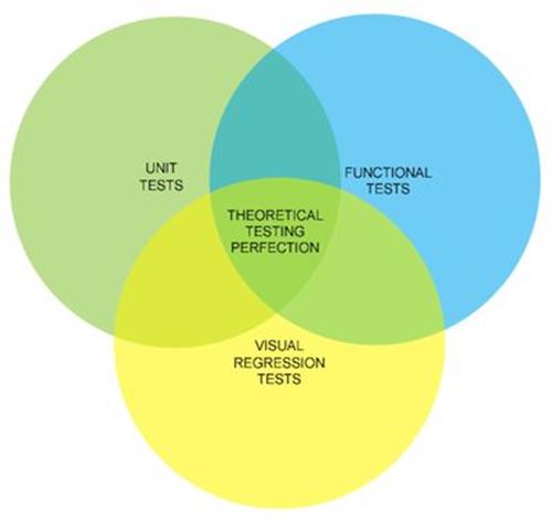
Holy trinity testing.
Mapped to client-side technologies, this roughly translates to:
•functional tests covering content (HTML)
•unit tests covering behavior (JavaScript)
•visual regression tests covering presentation (CSS)
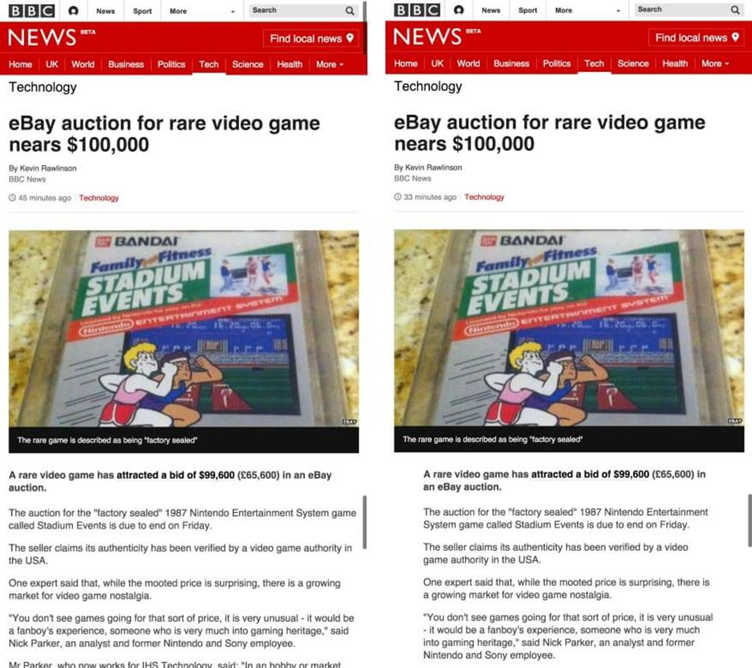
ASIDE: AUTOMATING THE TESTING OF THE BBC NEWS QUIZ COMPONENT
The functional tests of the quiz format made sure that the title of the quiz and the base element were rendered correctly.
The quiz format was originally a one-off interactive that we had made the previous year to cover the Iranian presidential election. We asked our users a number of questions about themselves to see if they would be a valid candidate for president. It was successful, so we reused the code for two additional quiz interactives, adding more functionality along the way. When we decided to make the quiz available as a standard component type in our CMS, we formalized the functionality of the quiz by creating a mixture of functional and unit tests to develop against. These tests became the business logic for the quiz.
The functional tests were very high-level, there really just to confirm that our server-side logic (PHP and database) correctly built the HTML that served as the starting point for the quiz. The functional tests made sure that the title of the quiz and the base element where questions would appear in the page were rendered correctly. We also used the functional tests to make sure edge cases worked properly. For example, as the quiz is rendered using a PHP application, we needed to make sure that the correct error responses were displayed. If the application threw a 500 (problem with the code) or a 404 (quiz not found) error then we’d need to ensure the user received not only the correct error response but also the right caching metadata. (We cache 404 responses the same as 200 responses — for 60 seconds — because that’s the expected response when requesting an asset that doesn’t exist. We do not cache 500 responses as we never intend for errors to happen, so we do not want that type of response hanging around in our cache.)
Because the quiz is mostly interactive content — a basic HTML form with content that changes when you press a button — most of our testing effort was put into unit testing the JavaScript. We completely refactored the JavaScript and CSS from the original interactive. The original and subsequent iterations were made to very tight deadlines so the code was rushed and not as good as it could have been. We used TDD (our library of choice was Jasmine9) to define how the quiz would work. Once enough JavaScript had been written to pass the unit tests, we could refactor and add additional features to the quiz. As long as the unit tests were passed we would know we had not broken any of the existing functionality, so we could refactor with confidence.
Finally, we used Wraith10 to visually check for any regressions to the styling of the quiz (Wraith is built and maintained by BBC News). This is an important step as the team responsible for the quiz is a different team than maintains the story pages that the quiz appears in. This final step ensures that any layout changes caused by updates to the story page or the quiz will be flagged to our testers. Sometimes these changes will be deliberate because of a new feature, but sometimes they will be an unintentional regression caused by an integration issue.
All three types of testing can be run automatically to check for:
•changes to the HTML output and any errors with the rendering layer (PHP and database)
•changes or errors with the JavaScript
•changes to CSS
Developers and testers in the team run these tests locally. The tests are also run every time a developer makes a new commit to our code repository. We can also run the tests against any of our development environments (integration, test, stage and live).
Doing this will allow you to concentrate your manual testing on the aspects of responsive web design that are hard to automate: multi-browser testing and client-side performance.
No matter how good the dev tools in Chrome become, we will always need to test our code in other browsers. Unfortunately, this is hard to automate. You can always use testing services like BrowserStack11, but the problem with this is that you’re at a remove from the devices’ browsers. It’s impossible to test the performance of your site if a browser or device is on the end of an API or only available to you as a screenshot on a website.
ASIDE: WHEN SMALL CHANGES GO BAD (A WAR STORY FROM THE TRENCHES)
The BBC News website is made by many designers and developers working in different teams, all with their own areas of responsibility. Among the teams are: the news core team (general ownership of the responsive site, looking after index and story pages), and the visual journalism team (infographics and interactive content, building mostly components to go into pages). In October 2014, the news core team made a change to the story page to improve the reading experience. At viewport sizes of 600px and above (roughly speaking, tablets and desktops), the whitespace on either side of the main body was increased. This extra whitespace increased the legibility of the text.
The extra whitespace created by adding a ghost column increased the legibility of the text.
To increase the horizontal whitespace around the main column, its width had to be decreased. At tablet and desktop widths, we apply a 12-column grid to the page. We reduced the size of the main column by 1 column on either side. Shrinking the main text by two grid columns meant a 624px column would shrink to 493px.
The change in the design tested really well and, when released to production, was a great improvement to the site. Unfortunately, it caused a problem with the clickable guide component (used for displaying contextual information about an image) owned by the visual journalism team.
Although the change in the design was a great improvement, it caused a problem with the clickable guide component.
Why This Happened
There are two reasons why this error occurred. First, the clickable guide component was too coarse. Each version of the clickable guide (976px, 624px and 464px wide) required a minimum amount of width to render. The 624px version, for instance, will render all of its contents as a list up to a 671px breakpoint. At 671px, there was enough room in the previous design to change the layout of the content from a list to the interactive infographic. Although we were able to use a media query to correctly work out what the viewport size was, it didn’t inform us that the available space in the DOM had shrunk by 16%.
Second, there wasn’t enough communication about the change. By the time the news core team had pushed the change to production, there was nothing the visual journalism team could do about it. While both teams did test their changes before each release, they performed their tests in isolation.
How We Solved It
The long-term solution would be to make the clickable guide component’s design more robust; to make the interface scalable so it would fit in a greater number of available slot sizes. While this large piece of work will happen in the future, we applied a quick fix to the problem. Clickable guides 976px wide push the secondary column below the central column. We decided to add a single column mode to the BBC News website, regardless of the available space in the viewport. You can see this in action independent of a clickable guide: go to a story page and add the class name full-width-mode to the body element. For clickable guides 624px wide we made the image break out of the narrower column and fill the whole width of the main column.
We also improved our testing to make sure we’d catch this problem before it would make its way to the live site again. Using Wraith12 (the visual regression tool created by BBC News) we now automatically check the visual rendering of a BBC News story page with a clickable guide in it. Every time one of the teams makes a change to either the clickable guide or the story page, we are alerted to any differences in the way the component renders in the page.
A third, more controversial way of solving this problem was to avoid making clickable guides at 624px resolutions. It sounds bizarre to solve a problem in this way, but when you’re working in a business with many teams and people using multiple production tools and ways of working, sometimes avoiding the problem can be the simplest solution.
Future Solutions
A big lesson I learned from this is that when you’re contributing code into pages where you have no control of the layout and don’t know when or if the layout will change, then you need to make sure what you’re putting into the page is flexible enough to render at any width. Don’t build the component to a fixed width; make the design scale to fit any available size.
As discussed in the section “Adding Third-Party Code Always Causes Issues” of this chapter, right now my best suggestion would be to use an iframe. Unfortunately, if you are building an interface from a collection of independently built components, then a whole page made up of iframes isn’t a great solution, so your mileage may vary with this advice. A good rule of thumb is to only use an iframe for content on the page if you are only going to do it once in that page, or if the component is not primary content (that is, it’s a part of the page that isn’t related to the URL of the page, like a comments system, for example).
Currently, what our industry is really missing is a way to apply styles based on the width of the DOM element our component resides in, rather than the viewport width. I hope in 2015 we’ll see the first implementation of element media queries. Element media queries look like the final missing part for building components in isolation, especially as another web technology, web components, is now beginning to be supported and will give us an improved packaging solution for third-party code.
Performance isn’t just about total page rendering time. Our users now expect fast, native experiences. We have to deliver delightful, app-like experiences via our webpages. The only way to ensure you are delivering this is to test your code in these devices. You need to make sure pages download fast, but you also need to check that scrolling and interactions are running at a smooth 60 frames per second.
Building up a test suite involving all three types of testing will mean learning how to practice TDD and BDD. If you write a lot of code you should very seriously learn more about these techniques, but if you are more of an HTML and CSS person who likes to write small amounts of JavaScript then you’re better off only understanding how these two techniques work, and should concentrate on learning visual regression testing.
USE VISUAL REGRESSION TOOLS TO SPEED UP TESTING RESPONSIVE WEBSITES
When you deal with large amounts of HTML and CSS, it’s easy to accidently make a change that you didn’t intend. Sometimes these changes can be obvious, like removing the entire navigation across your website; sometimes they can be subtle, like an increase in whitespace or a change in the order of items in a list. Before I release a website, I will visually check the site for these kinds of errors. I’ll look at each page, scrolling down to ensure everything is how it should be.
Responsive web design makes this visual inspection process much harder. The inspection of each page is no longer a simple scroll with visual check. Instead, I have to inspect the page multiple times, changing the viewport size of the browser window for each pass. It’s now easier than ever to miss a change. This process gets laborious very quickly — it’s not a task a human is particularly good at. Lucky for us, there is a solution to automate this process.
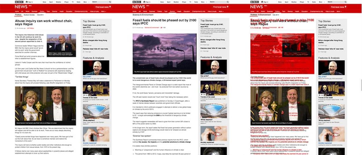
Visual regression testing is a process to automate the visual check of your site that a tester would normally do manually. There are many tools that you can download free to perform this for you. The process involves taking an initial screenshot of a webpage and then comparing it against subsequent screenshots every time you make a change. Any differences between the two screenshots will be flagged up. This makes visually checking your site for any changes or regressions very simple. It doesn’t do the manual testing for you, but it does tell you where you need to concentrate your efforts. This can be priceless when you have a large amount of testing to do and very little time (or patience).
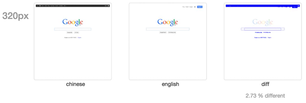
In the example above, the UK and Chinese homepages of Google are compared.
Visual regression testing is a popular subject, and if you were to Google for resources you’d find many options. Choosing the right one for you depends on your circumstances. Here are a few things I think you should consider:
•Your runtime environment
Although we should all be aiming to be polyglot programmers (knowing more than one programming language), homogenizing your technology does have its benefits. If all of your code is in Node, for example, then I think it makes sense to choose a visual regression tool that is installable via npm.
•Type of comparisons made
Do you want holistic comparisons made across your entire website? Do you only want to test individual components? Do you want to test the same webpage but at multiple viewport sizes or at different points of the user’s experience?
•Fitting into your existing workflow
A key objective of any testing step in your workflow should be to be as least disruptive as possible. We don’t want production to ground to a halt because we have to test. Some visual regression tools are completely standalone processes while others are testing frameworks in their own right or are extensions of existing testing frameworks. Also, think about how your tests are run: for example, do you need command line integration?
•Configuration
Can you configure the page during the test? Can you run the tests across multiple browser rendering engines? Can you define which plugin is used to make the image diff?
Once you have made a list of your testing requirements it’s time to choose what visual regression tool you are going to use. There are many options out there, and three really good ones are:
•Wraith13, by BBC News (disclaimer: I work with the people who built this)
•PhantomCSS14, by Huddle15
•dpxdt16 (pronounced Depicted), by Google
VISUAL REGRESSION BEST PRACTICES
Regardless of which one you choose there are a few best practices and gotchas you need to think about when using a visual regression tool.
BE WARY OF FALSE POSITIVES
You need to make sure your tests are as deterministic as possible. A visual regression tool will point out any differences, so if you have a component on your page that always changes (a date, a time) then this will always be different and your test will flag a change. The time a page takes to render can also falsely flag as a difference; if an element takes too long to load or fails to load then this will signal a change, too. Most tools give you the option to add additional JavaScript or CSS into the page before testing. Use this to hide troublesome elements before capturing screenshots.
BE DELIBERATE IN YOUR TESTS
It’s better to test parts of your UI in isolation. Having one single test that can break because of many different things in a page can make it hard to work out what is going wrong. Finer granularity can help with automated test reports, too. However, this doesn’t mean that you should never test complete pages. It’s a legitimate way to test, will result in fast tests (as fewer comparisons are being made), and you need to test the complete layout.
TEST CONSISTENTLY
Always make sure you test the same content. You don’t want to have to manage your tests — if the content changes every week you’ll find yourself having to constantly update your tests. If you are testing a web application, then expose ways to set content using either mocked or fixed content. This way you are testing the changes to your code as opposed to changes to the content itself.
Make sure you test the same content. This way you are testing the changes to your code as opposed to changes to the content itself.
DON’T COMPARE A BROKEN PAGE WITH ANOTHER BROKEN PAGE
Visual regression testing compares images. Two screenshots with the same part broken in the same way will pass a regression test. If you find a problem with a page using visual regression testing, either make sure the problem is resolved and retest or make a note to yourself to manually check this next time.
WATCH OUT FOR COMMON DEPENDENCIES
If you are comparing the test version of your site against the live version, and they both rely on the same dependency (this could be third-party social media tools or a service you built yourself that is consumed over HTTP), errors caused by the common dependency will be replicated and will not be noticed in the visual comparison. If this error originates with a third party, then it will probably be a low priority for you as you have no control over it. But if you own the dependency, then you will need to conduct additional testing to make sure you don’t miss the problem.
OFFLINE VERSIONS OF THE DESIGN OR SITE ARE STILL IMPORTANT
Even with visual regression testing in place you still need to know how the site is intended to look. Visual regression testing is a tool, not a magic bullet. Testers need to be able to manually test a site without this tool in place, so they need a visual reference.