Responsive Web Design, Part 2 (2015)
Responsive Email Design
The Email Development Landscape
Good development requires that you know as much as possible about the environment you’re working in. In email development, that can be a daunting prospect because of the large number of email clients, including some that have been around for at least a decade. Each client tends to work differently from another depending on their platform or OS, which can make it even more difficult to achieve consistent rendering for a single email.
WRITING HTML FOR EMAIL
Knowing how to write HTML for email is one of the first stumbling blocks that any newcomer to email development will encounter. In essence, there’s one major, giant, unmissable difference between building an email and building a website.
You know those <div> elements you like so much? Yeah. Ain’t gonna happen. Sorry. Building emails requires you to take a trip down memory lane, and build your layouts using <table> elements instead.
There are a few reasons for this difference, though it stems primarily from the fact that many email clients don’t fully adhere to web standards established by the W3C, and thus don’t have equal support for HTML elements and CSS properties among them. Setting two <div>s side by side, for instance, is impossible in a number of major webmail and desktop clients, because they don’t support the float property, meaning that the creation of a two-column layout depends on a table built with two <td> elements.
There are a few reasons why clients behave this way, but the particulars aren’t especially important. It all boils down to the fact that to get the most consistent layout rendering between clients, you must use tables in your build — especially for multi-column layouts.
Beyond this significant difference, the HTML written for email works in much the same way as that for websites. CSS, however, is a different story.
CSS IN EMAIL
While the CSS you’ll use in email tends to be pretty straightforward and familiar, there are notable differences that can run counter to established practices and wisdom present in modern web design.
These differences aren’t just limited to which CSS properties are or aren’t supported. One of the most notable contradictions to modern web design practice involves where the CSS goes. While the external style sheet is the most used way to serve the styles of a site, in email linking an external style sheet is a point of failure, since some email clients strip <link> elements from the markup. And even if a client leaves <link> alone, there’s no guarantee that your style sheet will be pulled in and rendered correctly. There are email clients that strip either the <head> or <style> elements when an email’s markup is rendered, leaving the entire thing unstyled — of these, Gmail is the most notable. This means the only way to write CSS and have it affect the markup properly is to write it inline.
Thankfully, this incredibly tedious task isn’t something you have to handle yourself, since some email service providers (ESPs) will automatically handle CSS inlining for you as long as an external style sheet exists or CSS is written in a <style> element. Unfortunately, you can’t always rely on an ESP to do this work, so that’s where CSS inliners come in:
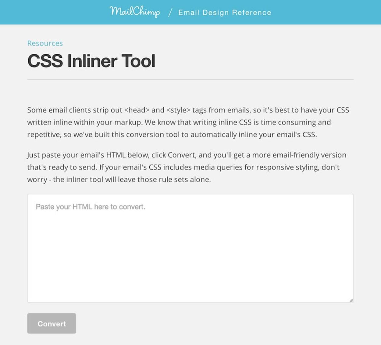
HTML goes in; email comes out. You can’t explain that. Image: http://templates.mailchimp.com/resources/inline-css/2
All they require is for you to paste your markup, with CSS attached via <link> or placed in <style>, and the inlining is done for you, sparing you the nasty job of having to do it all by hand.
If you prefer to write all of the CSS yourself, however, you need to keep a few things in mind regarding syntax. Because some clients don’t parse them correctly, it’s a good idea to avoid shorthand in the CSS you write. For hex color declarations, use #EEEEEE in favor of #EEE, and don’t use shorthand properties like font or background; stick with writing out each individual property (i.e. font-family and background-color) instead.
Now that you know where to put your CSS, you can go to town, right? Not exactly. CSS support in email is a huge point of frustration for developers because of how wildly different its handling can be from client to client. Properties that any one client might support can vary depending on the rendering engine of the client, or, in the case of webmail clients, their code sanitizers. There are also differences in style rendering based on the HTML element a particular CSS property is used on; padding, for instance, is supported on a <td> in Outlook 2013, but not on an <h1>. Some email clients, and web clients in particular, add their own styles to markup elements, with some going far enough to force style overrides that can’t be overcome even by the mighty !important. These issues can sometimes be compounded by the browser itself; you’re forced to account for how the email client renders HTML and CSS, and also how the browser that client is viewed in renders HTML and CSS. An email viewed in Gmail in Firefox, for example, can look different from one in Gmail in Internet Explorer 10.
All that being said, the CSS2.1 specification is going to provide you with the most stability and rendering consistency, as that was the most current version at the time many email clients were built and released to the public. As a general rule, it offers the best foundation for styling in an email. Even then, there are some email clients that don’t fully support this older spec — Lotus/IBM Notes, for instance — and that means you could be doing a lot of attribute-based styling if you’re required to support these older clients, which many large and slow-to-update corporations still rely on; outdated desktop clients like Lotus Notes or Outlook 2000 are still prevalent across many email lists.