Learning iOS Development: A Hands-on Guide to the Fundamentals of iOS Programming (2014)
Chapter 4. Auto Layout
Apps on the iPhone and iPod touch can display their content in either portrait or landscape. And the devices come with either 3.5-inch or 4-inch displays. This makes four different layouts: portrait and landscape in each of two screen sizes. The interface you built in Chapter 3, “Introducing Storyboards,” is specifically for 4-inch portrait displays.
Even with a visual editor, creating an app to support four different layouts can be a challenge, especially when you have dynamic screen elements and, as you will see in Chapter 5, “Localization,” even different lengths for labels when the language changes. The result can be lots of customization code, as well as multiple view controllers for the same screen on your storyboard.
Auto layout is a constraint-based engine that lets you describe the relationships between views. Auto layout takes those descriptions, or constraints, and figures out how to position and size your app views for the current screen size and orientation. With it, you can create just one view controller per screen and tame the code.
This chapter shows you how to incorporate auto layout into your app design and development process. You start by discovering the key concepts of auto layout and using them to design constraints for your add/view scene. Next, you go through the process of modifying add/view to work in portrait for both screen sizes. You do this using practical design, layout, and debugging techniques. Finally, you create your own constraints and use the power of dynamically updating a controller’s constraints to add landscape support.
By the time you are done with the chapter, you will have the tools you need to design and add auto layout to any scene; you will be able to create apps that adapt to different device sizes and orientations.
Auto Layout Basics
When there is just one screen size in one orientation, designing a scene means determining what view elements are needed, then placing those elements in the view, or perhaps, in a hierarchy of views. Adding rotation increases the complexity, though it is still manageable. But as soon as you add different screen sizes in addition to interface orientations, things get more complex. Earlier versions of iOS gave you some flexibility in specifying how views adjusted when their container changed size, but usually layouts with view dependencies or mildly complex hierarchies took code. Often that code required complex calculations and updating of many views.
For example, consider running an app on different-height portrait displays. You need to know the difference in height, which views can move and/or resize, and how far they can move and/or resize. Then you need to choose which views actually move and/or resize. If the difference in height requires moving more than one view, you probably need to write code.
Rotating between portrait and landscape is even more complex. To understand this, think about the portrait interface of your favorite iPhone app that supports rotation. Now imagine how the individual view elements move as the device is rotated to landscape and back again. Look at this on a device as the rotation happens and note how much movement happens. You can see that there is a lot of work going on in a continuously changing environment. Each view goes through multiple steps. And even though the interim steps are done for you, imagine calculating the end position and size of each view. There could be so much recalculation that it would be easier to create a different layout.
Figure 4-1 shows differences in the view car area for the CarValet app in the two portrait screen sizes. The highlighted rectangles show where the two screens differ. In this case, the difference in screens is entirely contained in one text view. This works because the smaller screen size has more than enough room to show all the car details. As you create more complex apps, you rarely find just one view that can absorb the difference. You usually have to start by identifying the areas with the greatest flexibility in size, then the next greatest, and so on until you have enough of a size difference to effectively display on each screen size.
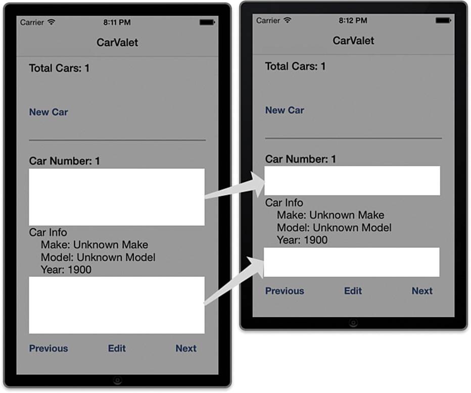
Figure 4-1 Changes in the view car area for different screen heights
Assuming that the layout is created for a 4-inch screen, you need to detect a 3.5-inch screen, calculate the difference in size, move the buttons, and resize the Car Info label. Some pseudo-code for implementing the changes follows:
if (!is4InchDisplay && (deltaHeight > 0.0)) {
carInfoLabel.frame.size.height = deltaHeight / 2.0;
previousButton.frame.origin.y -= deltaHeight;
editButton.frame.origin.y -= deltaHeight;
nextButton.frame.origin.y -= deltaHeight;
}
This is not valid Objective-C; real code would be longer. Even the pseudo-code does a lot of work for this simple case, and it is not immediately clear what the code is doing. Worse, any modification to the visual layout requires code modification.
It would be easier for you to describe how the views, or in this case groups of views, are related. The description uses three groups: Add car contains the total cars label and new car button; the separator view is by itself; and the view car group contains the rest of the elements:
 The add car group height is fixed, and it is the iOS standard distance from the top of its container.
The separator view is a fixed distance from the top of its container and it has a fixed height.
The view car group is the standard distance from the bottom and sides of the container view, and the top is a fixed distance from the divider view.
These descriptions create a view car group that can grow or shrink, based on the height of the screen. The “standard distance” refers to the recommended insets and spacing given by Apple. Since the view car group can change, you need to specify how the component views are related. The Car Info label has enough white space on top and bottom to adjust for the screen height:
The Car Number label is fixed to the top of its container view (the view car group).
Each button is fixed to the bottom of its container view.
The top of the Car Info label is the standard distance from the bottom of the Car Number label, and the bottom is the standard distance from the top of the Previous button.
When the view car group grows or shrinks, the Car Number label and buttons stay fixed. The Car Info label changes height as needed. With some other descriptions, you can specify the entire scene.
With auto layout, you can create these kinds of descriptions, and iOS uses them to figure out how to position and size your views for the current screen size. The system takes care of adapting your interface to different screen heights and orientations. You can even force the system to recalculate if, for example, views are expanded or inserted.
Each relationship is a constraint for how one attribute of a user interface (UI) element is related to an attribute on another. It takes more than one constraint to express all the relationships between two views. For all the power of auto layout, there are only a few new methods and just one class,NSLayoutConstraint, for describing the constraints.
Constraints
The descriptions in the preceding section are constraints on the relationship between views. Sometimes the relationship is contained in the same view, sometimes between siblings, and sometimes between a view and its container. You can even specify relationships between views in different containers. For instance, you can say that the New Car button is the same width as the Previous button.
Pixels and Points
Before looking at constraints, it is important to understand the difference between pixels and points. Pixels are the physical hardware-addressable elements that show individual elements of color on the screen. They determine the resolution of the screen, and the number of pixels in a given area, or pixel density, determines how sharp objects on the screen appear.
To date, iOS units come with two pixel densities: normal and retina. Because retina has twice the pixel density, an image will show up correctly in normal density but at only half the size on retina. There are similar issues for correctly placing other screen elements, such as views. And there are screens with many different pixel densities. Writing code to deal with all possibilities would be a lot of effort.
Instead, Apple uses points, a pixel-independent representation of the drawing area of the screen. They take care of all the hard work for you. Coordinates on the screen, distance between elements, and values for constraints are all expressed in points, not pixels. And images can be provided in both normal and retina versions.
Constraint Relations
The simplest kind of constraint relates a feature of one view to itself, such as a fixed height of 44 points. You can express that constraint in an equation like this (note that this is not Objective-C code yet, just a way to think about constraints):
View1.height == 44.0
A more common relationship is the relationship of an attribute of one view to the attribute of another, such as the top of view 1 is in the same location as the bottom of view 2:
View1.top == View2.bottom
Look carefully at the two pseudo-code constraint relationships. They are not using the assignment operator, =. Instead they are using the equality operator, ==. This is an important part of constraints. They are not an assignment. The system can find a solution by changing either or both sides of the statement. For example, in the relationship above, the system can change both the top of View1 and the bottom of View2. As you will see later, this is a powerful way to build adaptive interfaces, especially as it is possible to indicate which constraints must be satisfied versus a relative ordering of those that the system can change.
In the examples in the previous section, there are places where the constraint relationship adds an offset, typically the standard separator distance. This would be the equation for the bottom of the view car group in the first constraint in the preceding section:
ViewCarView.bottom == ContainerView.bottom - StandardSystemDistance
Constraints define how the attribute of one view is related to the attribute of another view. Attributes are ways to describe view geometry and include the following:
The leading and trailing edges of the view. These are alternatives to left and right when the relationship sense needs to change between left-to-right languages and right-to-left ones such as Hebrew or Arabic. For example, in English, leading is left, and trailing isright. In Arabic, leading is right, and trailing is left. You use these attributes in Chapter 5.
The left, right, top, and bottom edges of the view.
The width and height of the view.
centerX and centerY for the X and Y centers of the view.
The baseline of the view. This is used in views that show text, and is a typographical term corresponding to an imaginary line drawn under the bottom of characters that have no descenders. (When you are writing on a piece of lined paper, the descender is the piece of a letter that goes below the line. For example, a has no descender, but p and g do.)
This is the more general form of the constraint equation:
view1.attribute == (view2.attribute * scaleFactor) + offset
view1.attribute and view2.attribute are the two views and their attributes, scaleFactor is the amount of the second value to use, and offset is a constant added to the relationship. For example, relationship 1 above has two constraints. The first specifies the height of the view. Assuming that the height is 102 points, this is the constraint equation:
addCarView.height == 102.0
Notice that no other view is needed for the relationship. The scale factor is effectively 0.
An example of using the scale factor is doubling the width of a view:
someView.width == someView.width * 2.0
In this case, the offset is 0.
Finally, the relationship does not have to be equal. It can also be one of the following:
Less than or equal to
Greater than or equal to
For example, if you want to give the car info label a minimum height, you could show this with the following:
carInfoLabel.height >= MinimumHeightForContent
The formula is a way to think about how constraints are specified. Though you can make a call that creates the constraints using all the elements of the formula, it is the hardest way to do so. The next section shows an easier way to create constraints.
Creating Constraints
Now that you know what constraints are, how do you create them? You can create them in three ways:
Using Interface Builder (IB)
Using Visual Constraint Language (VCL)
Specifying all the parts of the relationship equation
IB requires the least work to create constraints, VCL requires more work, and specifying the relationship equation takes the most work. You can even have IB automatically create the minimum number of constraints needed for a layout, but you are likely to want to change things. For this chapter, you use IB to create your own constraints by using visual tools.
For the last two ways of creating constraints, you use class methods of NSLayoutConstraint. In VCL, you use strings in a special format to specify how two views are related. One visual description usually results in multiple constraints. When you use the third method to create constraints, you create each part of just one relationship equation in a format that is long and difficult to read.
Exploring Constraints in IB
The best way to see how constraints are created in IB is adding some of your own. To do that, create a new single view application project in Xcode named LayoutTest. Remember, to create a project, you can choose File > New > Project or press Cmd-Shift-N.
When the project opens, select Main_iPhone.storyboard and select the File inspector. You do this either by selecting View > Utilities > Show File Inspector, pressing Cmd-Option-1, or selecting the utilities area and then the left-most icon in the control tab at the top of the utilities area. (InFigure 2-5, the utilities area is indicated by the number 8.)
The Use Autolayout box is checked. By default, storyboards are created with auto layout turned on. You could turn it off by unchecking the box.
Drag a UILabel onto the scene and align it with the lower left Xcode guidelines, as shown in Figure 4-2. Make sure the simulator target is a 4-inch retina iPhone and run the app. You see the label in the lower-left corner.
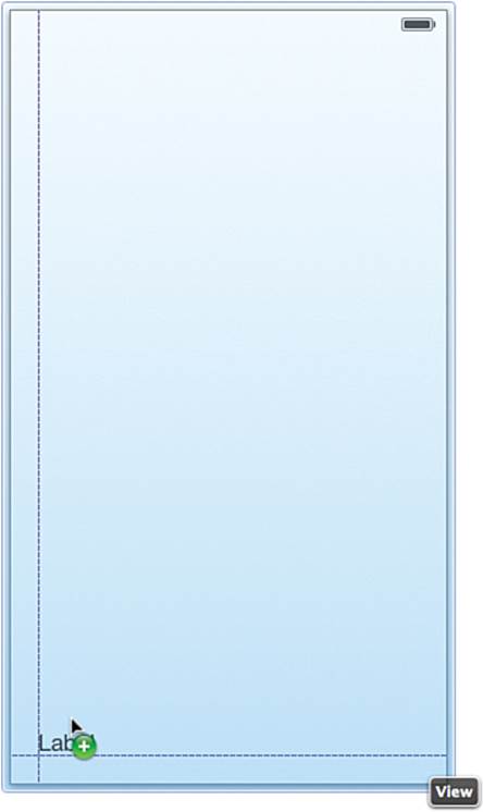
Figure 4-2 Aligning the label
Stop the app, change the target to a 3.5-inch retina iPhone, and run the project again. The label is gone. To convince yourself the label is still around, use IB to change the top coordinate to 488. You can do this by selecting the label, opening the Size inspector, and changing the Y value.
You can confirm the label is in the correct place by selecting the label, moving the mouse out of the label, and holding down the option key. You should see something like Figure 4-3. The combination of lines and numbers tells you the distance between that edge of the label and the edge of the container. For example, the label is 80 points from the bottom of the screen and 20 from the left, or leading edge.
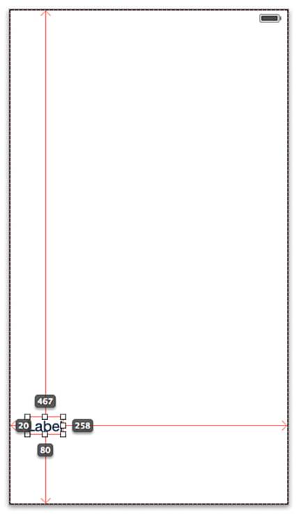
Figure 4-3 Showing distance to edges with the option key
Run the app again in the 3.5-inch retina iPhone simulator. This time you can see part of the label at the bottom of the screen.
Pixel-Perfect Help
The storyboard is set to use auto layout, so what happened? Xcode was trying to do what you asked. By placing the label at a specific location with a specific width and height, you are telling Xcode that is where you want that UI element. It does not matter how big the device is or what the screen orientation is.
To make sure the element shows up exactly where you want, the compiler generates the appropriate constraints. When you start adding your own constraints, they will take priority. That is, the compiler will not generate any placeholder constraints to override yours.
You may think this is not helpful, but actually it is exactly what you want. By making sure that elements are pixel-perfect until you say otherwise, you can quickly prototype layouts and easily try different combinations of constraints.
To see this, add a constraint for the distance between the label and the bottom of its container. Do this by selecting the label and then choosing Editor > Pin > Bottom Space to Superview, as seen in Figure 4-4.
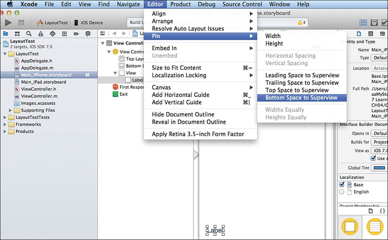
Figure 4-4 Using the Editor menu to set a constraint
You can tell the new constraint was added in one of three ways. Figure 4-5 highlights each way:
There is a new Constraint item in IB’s left-hand list of view elements.
The selected label on the IB canvas shows an i-beam for the constraint.
The Size inspector for the label shows the constraint.
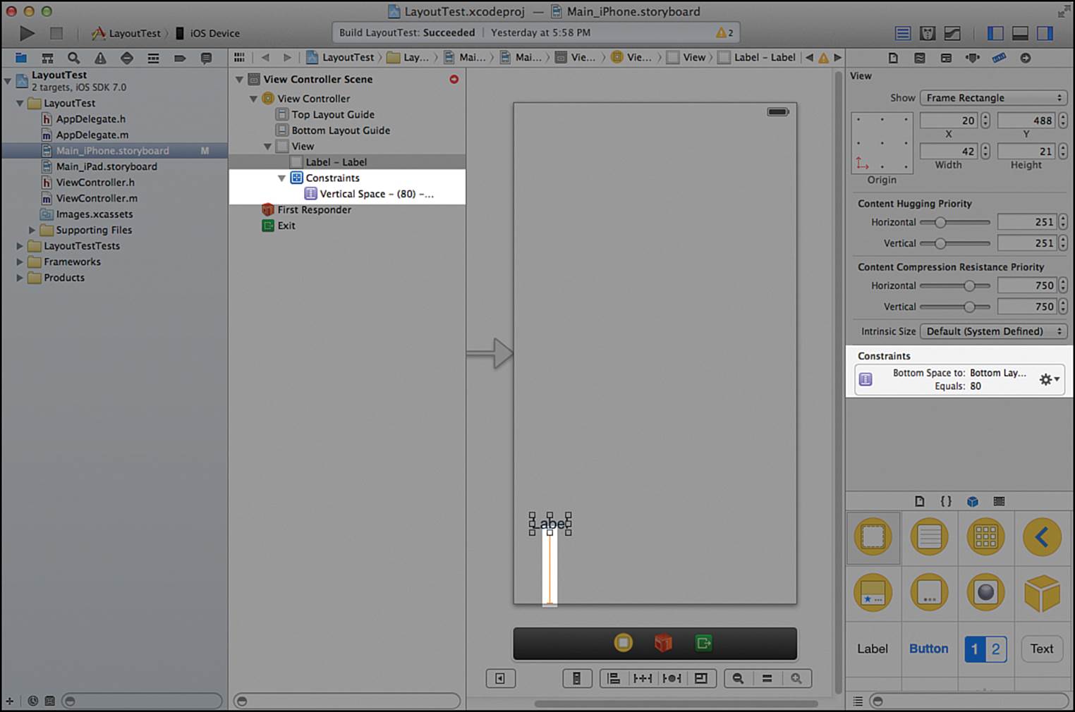
Figure 4-5 The three ways IB shows constraints
Now run the app, first on the 3.5-inch and then the 4-inch displays. You will see that the label is now the same height from the bottom of the screen on both displays.
Adding Constraints from the Toolbar
The Editor menu is one of three ways to add constraints in IB. The toolbar at the lower right of the IB canvas provides another way. Shown in Figure 4-6, the toolbar is divided into three groups. The first group has only one item and lets you quickly toggle all the view controllers on the canvas between the 4-inch and 3.5-inch screens. The figure shows the 4-inch screen setting.
Figure 4-6 IB toolbar
The third group lets you zoom the contents of the storyboard in and out. It is used for getting an overview of larger storyboards.
The middle group is for constraints. Each of the first three items in that group roughly corresponds to an item in the Editor menu: The first item is for alignment, the second for pinning, and the third for resolving auto layout issues. Resolving issues is covered later in the chapter.
Most of the alignment constraints are relationships between siblings. Two of them are used for centering a single view horizontally or vertically in a container. To see this, perform the following steps:
1. Drag another UILabel into the scene.
2. Double-click the label and change the string to “Center Y.”
3. With the label still selected, click the alignment item in the toolbar to show the alignment popup.
4. Check the boxes for vertical and horizontal centering in the container. (You can see these options checked near the bottom of Figure 4-7.)
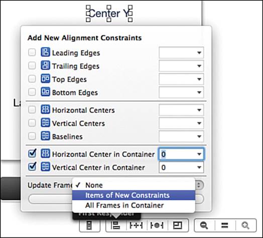
Figure 4-7 The alignment constraint popup
5. Open the Update Frames popup and choose to update Items of New Constraints as shown in Figure 4-7.
6. Click the button to add the constraints.
The label moves to the center of the screen and shows two blue i-beams, one for each constraint. Now use the popup to align the leading edges of both labels:
1. Select the Center Y label, then the original label.
2. Open the alignment popup on the toolbar and check Leading Edges.
3. Again select the popup to update frames of new constraints.
4. Add the constraint.
The original label moves over until its left (or leading) edge is aligned with the centered label. In addition, a new constraint i-bar is added between the leading edge of both labels.
The Pin Toolbar Item
The second item in the constraints section of the toolbar has the same items as those in the Editor > Pin submenu. But just like the alignment popup, the pin popup gives you much more flexibility. To see this, add another label and align it to the top leading edge of the container:
1. Add a UILabel to the scene.
2. Select the label and change the name to “Top Label.”
3. With the label still selected, click the Pin item in the middle group in the toolbar to open the pin popup shown in Figure 4-8.
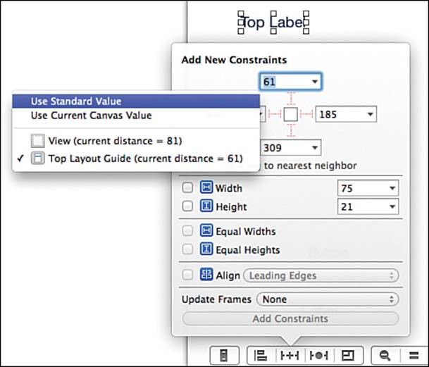
Figure 4-8 The pin constraint popup
4. Use the dropdown triangle in the value boxes to set the Standard Value for the top edge constraint, also shown in Figure 4-8.
5. Now set the distance for the leading edge to the standard value.
6. Set the popup to update the frames of any items with new constraints and add the new constraints.
The new constraints are added and the label moves to the top-left area of the scene.
The third item in the toolbar constraint area is for resolving constraint issues. You will see more on this later in the chapter. The last item of the group is how changes in constraints flow through the hierarchy when views are resized and is beyond the scope of this book.
Changing Constraint Values
Using the toolbar constraint popups is a great way to add both the constraints and any constants such as the standard distance from a container or an offset between two views. But what happens when you need to change those values?
One way is to select the view and open the Size inspector. Try this by selecting the Center Y label. The Size inspector shows you a list of all the related constraints. On the right side of each constraint is a gear that brings up a constraint editing dropdown shown in Figure 4-9. From here, you can delete or edit the constraint. What you can edit depends on the constraint. You will see more detail as you continue through this chapter.
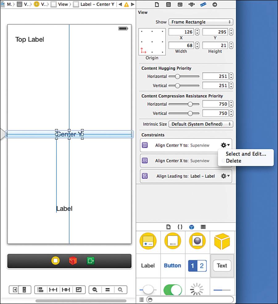
Figure 4-9 Constraints in the Size inspector
Another way to edit constraints is double-clicking on a constraint on the IB canvas:
1. Select Top Label.
2. Make sure the Attributes inspector is selected in the utilities area.
3. There are two constraints, one to the left of the label, one on top. Double-click the left constraint.
After you double-click, two changes happen as shown in Figure 4-10. The first is a quick editor pops up close to the selected constraint. You can see that editor on the left side of the figure. This editor is useful for quickly changing attributes shared by all constraints. On the left side, the Attributes inspector adds any constraint-specific editable items. As you work through the chapter, you learn more about the generally editable attributes as well as items associated with some types of constraints.
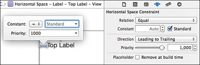
Figure 4-10 Popup constraint editor
In addition to editing constraints, you can use the details to verify that the constraints are giving you the correct positioning for the current screen size and rotation. Distances between views as well as edge alignments are also shown by using the Option key, just as you did previously.
This is because the Option key shows you the distances between the selected view and the view currently under the cursor. In Figure 4-3, there was only one other view...the superview. Now that you have more than one view, try selecting one of them and then hold down the Option key and move the mouse over other views. You will see the information change as you move between sibling views and the parent, or superview.
Dragging Out Constraints
The final way to specify constraints in IB is Ctrl-dragging (or right-mouse-button-dragging) from a view. When you complete the Ctrl-drag, IB offers a popup with possible choices for constraints. You can select one constraint or hold down the Shift key to select multiple constraints.
Try Ctrl-dragging from the Center Y label toward the right edge of the scene and let the mouse up soon after it exits the label. You see a constraints popup like the one on the left side of Figure 4-11. The right side of the figure shows the result of Ctrl-dragging from the bottom label and releasing in the Center Y label.
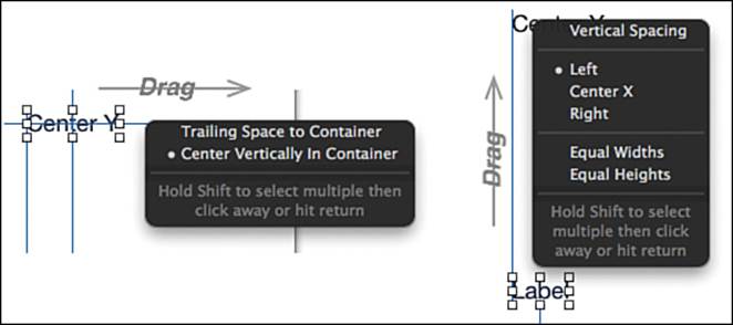
Figure 4-11 The Ctrl-drag constraint popup
Each popup shows the constraints that make sense given the direction of the drag and participating views. The left side of Figure 4-11 shows only two possible constraints: one from the trailing edge of the label to the trailing edge of the container of that label and the other to center the label in a vertical direction.
The right side of Figure 4-11 shows more options because the views are siblings. The first two sections of the popup are all constraints based on vertical relationships. The first section sets a vertical distance constraint. The next section keeps the original label at the same distance and sets how the positioning of the views is related, aligning their left, center, or right locations. The third section is not related to either vertical or horizontal relationships. Instead, it sets views to the same width or height.
In both popups, you see a white circle in front of a constraint. This indicates an existing constraint between the views. For example, on the left side of Figure 4-11, the dot is for the labels’ vertical centering constraint. On the right side, the white dot says there is already an align-left constraint between the two views.
Now try clicking and dragging in a diagonal line from the label on the bottom of the scene and releasing in the label on the top. When you do this, you get a constraint popup with a much larger selection of constraints, as seen in Figure 4-12.
Figure 4-12 Constraints for a diagonal drag
Ctrl-dragging is the fastest way to add constraints. The list of constraints shown in the menu depends on a combination of three things:
The general direction of the drag
The distance dragged
The view where the drag ended
Xcode uses these three things to generate a likely list of possible constraints. In general, drags in a roughly horizontal direction show horizontal constraints. Drags in a vertical direction show vertical constraints, and diagonal drags show both types of constraints. Double-clicking the newly created constraint lets you quickly modify constants or other constraint-specific information.
Now it is time to use these skills and add constraints to CarValet.
Perfecting Portrait
There are models of the iPhone and iPod touch with different screen heights. Auto layout lets you create one set of constraints that works for all geometries and sizes. Right now, your layout is pixel-perfect for a 4-inch portrait display. In this section, you add constraints so it works with both 4-inch and 3.5-inch portrait displays.
Designing and adding constraints are part of the flow of designing and creating your user experience (UX). Figure 4-13 shows the general phases. First, you design your screen mockups, usually as part of the initial app specifications. When you start development, you do simple initial layout without using constraints. This is what you have done up to now with CarValet. In practice, initial designs tend to be modified during implementation, so it is best not to invest too much time creating constraints until the interface is fairly stable.
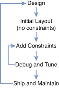
Figure 4-13 Constraint editing cycle
Eventually you start designing and adding the constraints. As you test your interface in various screen sizes and orientations, you usually find some problems. This gives you a cycle of adding some constraints, trying them, debugging, tuning, and then adding more constraints.
At some point, you have all the constraints you need as part of a fully functional app. At that point, you ship the app, as well as do any ongoing maintenance...and start designing the next release.
Thinking in Constraints
If you want to effectively use constraints, you need to change the way you think about designing and laying out your interface. The typical way is to think about the rectangles enclosing view elements in a coordinate system. Design is a matter of translating the look into the right coordinates and adding any code or additional layouts to adjust the look for different screen sizes and orientations.
With constraints, you think about your interface in a completely new way: How do the visual elements on your screen relate to each other? The goal is to find a set of constraints (relationships between views) that enable iOS to adapt the views to any of the supported screen sizes and orientations. It is not just how one view relates to another but also how to group views and how those groups relate. This can include relationships of views in one hierarchy to views in another.
Although this sounds complex, the key is to focus on the relationships. The constraints come from those relationships. And the easiest way to express the relationships is in language.
Before you start a design, it is important to understand that the set of constraints for a screen must meet two conditions. First, the constraints should combine to specify one and only one layout for a given screen size—that is, they should not be ambiguous. Second, the constraints must notconflict.
With conflicting constraints, there is no way to satisfy the highest priority constraints. Each constraint has a priority between 0 and 1000. 1000 is the default value and means the constraint must be satisfied. For instance, the Previous button cannot be both a fixed width at a priority of 1000and a width that adapts to content also at a priority of 1000. Reducing the priority on either constraint or removing one constraint resolves the conflict. Conflicts cause runtime exceptions that might crash your app. Xcode usually gives warnings about possibly conflicting constraints, usually as you develop, as well as during compilation.
Ambiguity can be harder to find at design time. Unlike conflicts, the constraint system can position the affected views. However, it can position them in more than one way. A typical way ambiguity shows up is that when you change orientation and then change back, one or more views are not in the same place they were before the rotation.
As you will see when you start adding constraints, IB provides robust tools to identify both conflicts and ambiguity.
What Makes a Complete Specification
How do you know when you are done with your layout? For auto layout to unambiguously position all the views in an interface, it needs to find an origin and size for every view. To do that, every view must be part of one or more relationships that specify four constraints: two for the system to calculate the horizontal position and size, and two for the vertical position and size.
As you saw earlier in this chapter, constraints can be built using many parts of the view geometry. Table 4-1 shows what constraints unambiguously specify the Total Cars label. The completeness table is another example of an excellent tool for design. You can create tables like this for any level in the view hierarchy of a scene. Although there can be cross-hierarchy relationships, you should focus on checking completeness for one level of a hierarchy before moving deeper to the next one. As you will see later, IB shows constraints with problems in orange and uses blue for complete ones.
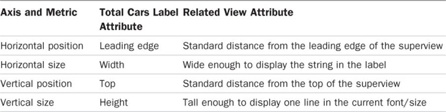
Table 4-1 Constraint Completeness for the Total Cars Label
A good rule of thumb is to start checking completeness for the children of the main view, and after that is done, move on to checking the hierarchies of each child. In computer algorithm terms, you perform a depth-first traversal.
The Total Cars label can act as an anchor view—that is, a view with completely specified constraints for any given screen size, usually near an edge or edges of the screen or group. You can use it to help specify other views, such as the New Car button. When designing constraints, looking for anchor views is a good starting point.
As you look at the constraints, you might wonder how the system knows how to set the width and height of the label—especially since you could change the text of any label at runtime.
Intrinsic Content Size
The content of certain UI elements has a natural size. For images, it is the size of the image; for labels, the amount of space required to display the text in the current font; switches have their own size, and so on. This natural, or intrinsic, size is used by the constraint system when figuring out the width and/or height of a view.
In Table 4-1, both the width and height have an intrinsic value: the amount of space required to show the text for the label in the font used by the label.
UView includes an intrinsicContentSize method returning a CGSize—that is, a width and a height. The default is to return UIViewNoIntrinsicMetric—that is, no intrinsic value, for each component. Some view system classes that override the method include UILabel,UIImageView, UISwitch, and UIButton.
Adding/Viewing Cars: Designing and Implementing the Constraints
Before you added any constraints to LayoutTest, you moved the label, ran it on a 3.5-inch screen, and only saw part of the label. Figure 4-14 shows CarValet running on the smaller screen. This is because Xcode adds compile time constraints for any views you have not constrained. These added constraints are just enough to make sure your interface matches exactly what is on the IB canvas, resulting in the bottom row of buttons being cut off. You need to design a set of constraints that works on both screen sizes, something you could do as you design your UX.
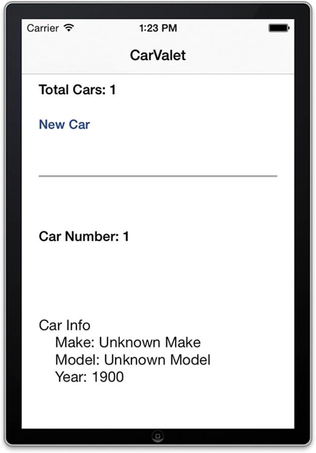
Figure 4-14 CarValet on a 3.5-inch screen
The following is a good process for integrating constraints into the design of an interface:
1. Specify what the user can do on the screen (that is, what the behaviors are).
2. Choose visual elements that support the behaviors and create a rough layout.
3. Break up the visual elements into relevant groups, based on screen functionality. There might be only one group if the behavior is simple.
4. Do an initial design of how the visual elements are arranged in the groupings.
5. Design how the groupings relate to each other in the different layouts: portrait and landscape in both 3.5- and 4-inch screen sizes. For now, you look at only a general solution to landscape, and you work on a more detailed design later.
6. Iterate through steps 3, 4, and 5 until you have something that works on the target layouts. Sometimes this may change steps 1 or 2.
7. Express the constraints in natural language.
Steps 1 and 2, and possibly 3 and 4, are part of any UX design; the rest are constraint-specific.
You designed the scene behaviors in Chapter 3 (step 1). The interface elements already exist (step 2), and you have already effectively grouped the scene into three parts (step 3):
An add car group
A separator view
A view car group
The separator view is not connected with any behaviors. It is the kind of visual element used to support visual clarity. Other kinds of nonbehavioral elements can provide decoration or other ways of potentially delighting the customer. The key is to keep these elements to a minimum. Think carefully about each one and be clear on why it is being added.
In a normal project flow, designing the constraints along with groups of views would be done before writing any constraint-related code. Ideally, it is done before laying out the scene, though more often it is done after the layout becomes stable. Although early design is not always possible, and the scene might be modified as the app progresses, doing more upfront design work can save a significant amount of time laying out the interface, as well as in debugging constraints later on.
The Three Add/View Car Groups
Modifying your add/view scene to effectively use constraints for portrait is a good exercise in adding constraints to an existing scene. It also gives some practice in designing the constraints, solving interim problems, and learning other techniques you can use for your own projects.
There are only two views in the add car group, and they each have simple relationships. The Total Cars label is at the top on the leading (or, in English, left) side. The bottom of the New Car button is attached to the bottom of the area and aligned with the leading edge. This layout should work for both portrait and landscape, with the only difference being how wide and tall the area is.
The separator view is even simpler. It is a 2 points high (portrait) or wide (landscape) line that separates the add and view areas. It stretches across the view along the appropriate axis for portrait or landscape. The separator is visually halfway between the add and view car groups.
There is no direct way of specifying that an attribute of a view is halfway between two other views, so you have three basic options here:
If the attribute of the halfway view is between two views with fixed positions on the relevant axis (or axes), you can use a spacing constraint between the closest appropriate edge of a fixed view and the edge of the separator. For the vertical axis, the constraint would be from the top to bottom or the bottom to top edges. The constant value of the constraint corresponds to the distance.
You can insert a new container view that is pinned to the relevant sides of the two views, put the halfway view inside the new container, and set a constraint to center it horizontally and/or vertically in this new container.
You can calculate the constraint yourself at runtime and either update an existing constraint or add a new constraint to the appropriate container view. This might involve removing some of the automatic constraints that IB added or even ones you added in code.
In this case, you can use the first solution because the top of the add view area is a fixed distance from the top of the container. And as you will see, the view car area has a variable height based on the height of the screen. The distance from the bottom of the add car group to the separator is the same as the distance from the separator to the top of the view car group.
Halfway Approach 2: The Invisible Pinned Container
Sometimes you can use an invisible container view for correctly placing a view element halfway between two others. Follow these steps to do this for portrait in the add/view scene:
1. Add a UIView to the top-level view container between the add car and view car groups.
2. Add a constraint to pin the top of the new view to the bottom of the add car group.
3. Add a constraint to pin the bottom of the new view to the top of the view car group.
4. Set the width of the new view to be equal to the add group.
5. Move the separator view inside the new view and add constraints to set the separator height to 2.0 and set the width to the same as the container view.
6. Add a constraint to vertically center the separator in the new container.
7. Set the background color of the new container to the main background color. If the background color is not consistent, you can set it to clear, though there is a slight performance penalty when you do this.
When you use IB to visually edit the constraints, you might end up with more views and constraints than when you specify them in code. However, it can be more obvious and easier to maintain.
The view car group is slightly more complex than the add car one. The Car Number label is at the top on the leading edge. What do you do about the Car Info label and buttons? The expectation for iOS applications is that controls for data element navigation and editing are near the bottom of the data they control. Based on that, it would make sense to have the buttons “attached” to the bottom of the container and evenly spread out.
That leaves the Car Info label. In portrait view on both screen sizes, there is considerably more vertical space than needed to show the info. This indicates a prime location for adding or removing vertical space. In Figure 4-1, the Car Info label grows or shrinks based on the vertical screen size. In landscape, there is enough vertical space to show the Car Number label, Car Info label, and button row. That just leaves the question of horizontal space, and as you see later, there is enough.
There is one more important decision to make before designing the constraints. Does it make sense to encapsulate the views for each functional group in their own container? In other words, do you add a UIView for the add car group and put the Total Cars label and New Car button in that view? Similarly, do you add a UIView for the view car group and move all the related labels and buttons inside?
The answer lies in what happens in landscape. It is easiest to put the add car group on the leading edge of the screen, the view car group on the trailing edge, and the visual separator between them. You could do this by changing the relevant constraints for every label, button, and the separator, but that is a lot of work. It is better to minimize the number of changing constraints. In this case, it is easier to change the constraints on the container views which minimizes the changes required by the subviews of those groups.
Designing the Top-Level View Constraints
Now that you have a rough idea of the top-level constraints and view area groupings, it is time to start designing the constraints. You work down the hierarchy—that is, start with the top-level views and groups of views, move to the visual elements that make up those groups, and so on. The goal is to create descriptions of the constraints in your native written language that include all the relevant parts of the constraint equation.
As mentioned earlier, you should look for anchor views, specify their constraints, and keep adding more descriptions until you have a complete specification: a set of unambiguous descriptions that have no conflicts. You can perform this cycle for the top-level groups, then for the views in each group hierarchy, and finally for any cross-hierarchy constraints.
The simplest description for the three areas is that the add car group should be anchored to the top of the superview, the view car group anchored to the bottom of the superview, and the separator halfway between the two. That is a good start, but it is not precise enough to implement. If you look at both screen sizes in Figure 4-1, you see a few important details:
Description 1: The add car group is the standard distance from the top and sides of the superview.
Description 2: The add car group is a fixed height.
Description 3: The separator is a fixed distance from the bottom of the add car group and the standard distance from the sides.
Description 4: The view car group is the standard distance from the bottom and sides of the superview.
In most cases, these descriptions are sufficient to create constraints. For example, description 1 contains three pseudo-constraint equations:
AddCarGroup.top == AddCarGroup.Container.top + StandardSystemDistance
AddCarGroup.leading == AddCarGroup.Container.leading + StandardSystemDistance
AddCarGroup.trailing == AddCarGroup.Container.trailing - StandardSystemDistance
Some parts of the description are missing important details, such as the actual height in description 2 and the distance in description 3. You can get those numbers by looking at the Size inspector for the elements in IB or selecting the relevant view, holding down the Option key, and moving the mouse over the target views. More importantly, the list does not give a complete list of constraints. For example, although there is a constraint for the bottom of the view car group, there is no indication of the top or height.
One way to know if you have a complete set of constraints is to make a completeness table similar to Table 4-1 showing each view and the constraints that specify horizontal and vertical position and size. Table 4-2 does this for the three top-level views. After you make such a table, you can quickly see what constraints are missing.
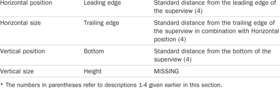
Table 4-2 Constraints for Top-Level Views
You can see from Table 4-2 that there are missing constraints for both the separator view and the view car area. Adding a description for the height of the separator is easy:
Description 5: The separator is a fixed height of 2 points.
The view car group is the most challenging because the height can vary depending on the height of the screen. So far, each group has one constraint that determines the height. Using a single fixed height constraint for the view car area would mean switching constants for the 3.5-and 4-inch screens. But that defeats the purpose of using constraints. Imagine if Apple released an iPhone with a 5-inch screen. Suddenly your constraints would stop working, as the view car area would be too short. It is better if the system does the work for you.
And that is where the answer lies. The constraint system does not just read a set of constant value constraints; it uses the constraint equations to find a solution that works. This is very powerful when you understand that the runtime can change values on both sides of the equations. It is not just answering a set of questions with known left-hand-side values. It is solving a set of equations, finding values for both sides that result in positions and sizes for all views. For the mathematically inclined, the runtime is solving a system of linear equations.
The system might go through constraints multiple times, trying out combinations that work to satisfy the left- and right-hand sides of each equation. (Okay, it is more technical than this, but you get the idea.) This means you can use multiple constraints that are combined to specify one or more of the positions or sizes.
Here is one description you could add that, when combined with description 4, allows the system to consistently calculate the height:
Description 6: The top of the view car area is a fixed height (22 points) from the bottom of the separator view.
This works because there is enough information to calculate the height. Both the top and bottom locations are specified in relation to anchor views. Because the superview is the top level app view, it is fully specified. Because of this, setting the bottom of the car view group in relation to the superview is also fully specified.
Figuring out the height relies on a chain of relations to an anchor view. The add car group has a fixed height and is anchored to the top of the superview, the root view of the application. Then the separator is a fixed distance from that group. Next, the separator has a fixed height, so the bottom of the separator is unambiguously specified relative to the enclosing root view. Now the top of the view car group is set a fixed distance from the bottom of the separator. Both the top and bottom of the view car group are fully specified. The height is a simple matter of subtraction:
viewCarArea.height = viewCarArea.bottom.y – viewCarArea.top.y
Use CH04 CarValet Starter: A Brief Excursion in Becoming Modern
In 2012, Apple introduced Modern Objective-C, a set of syntactical shortcuts that make code clearer and easier to write. Up until now, the code in this book has used whatever syntax helped in learning a concept.
By this point, you have seen the longer syntax for things such as creating arrays, accessing items in arrays, and the alloc/init pattern. From now on, the code in this book uses the Modern Objective-C syntax. All source files in CH04 CarValet Starter have been updated to Modern Objective-C, including updating the properties in Car.h.
Note that if you want to check or convert a project, you can use Edit > Refactor > Convert to Modern Objective-C Syntax.
Implementing the Top-Level View Constraints
You have designed a set of constraints for a screen, including how to effectively use invisible view containers to create subgroups. Now it is time to create those constraints in the UI. Again, you start with the top-level constraints and work your way down.
Table 4-2 along with descriptions 5 and 6 from the previous section specify the constraints you need to add. Start by adding the container view for the add car area. Ideally you would have designed the grouping views before starting work with IB. That way you can add the top level grouping views and then add their children. This example is likely to be more work than your own projects because you would have started with the grouping views. Instead, you have to create the groups and move in existing views:
1. Open CH04 CarValet Starter project and select the Main_iPhone.storyboard file.
2. Add a UIView to the main view controller and drag it into the upper-left corner of the main view below the navigation bar.
3. With the view still selected, open the pin constraint popup from the IB toolbar.
4. Figure 4-15 shows setting the constraints for the Add Car grouping view:
The top of the view is the standard distance from the container, as are the leading and trailing edges.
The height is fixed at 102.
Update Frames is set to update items of new constraints.
5. When your pin popup matches the one in Figure 4-15, click to add the constraints. You should see the Total Cars label and Add Car buttons disappear on the IB canvas. This is because the new view is opaque, higher in the hierarchy, and occupies the same space.
Note that if the grouping view disappears or you see other strange behaviors, such as red or orange lines, press Undo twice and make sure the view is really at the top left. The pin popup sets constraints to the nearest neighbor, and you want to make sure that neighbor is the root view of the controller.
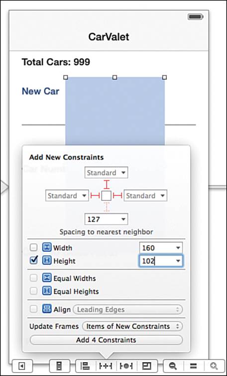
Figure 4-15 Setting the Add Car grouping view constraints
6. On the left-hand list of views in IB, double-click the name of the new view and change it to Add Car Group. Then move the new view to the top of the hierarchy. When you do this, the Total Cars label and New Car button appear.
7. Still using the left-hand list of views, move the Total Cars label and New Car button into the newly added view. When you move the elements in, they are centered in the container. You set constraints for them later.
Next, set up the constraints for the separator view based on Table 4-2 and description 5. Once again, the pin constraint popup makes this easy, allowing you to set all three constraints:
Standard distance from the leading edge
Standard distance from the trailing edge
22 points from nearest top neighbor above the separator, that is, the add car group
The configured pin popup will look like Figure 4-16.
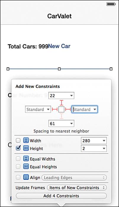
Figure 4-16 Setting the separator view constraints
Now add the view and associated constraints for the view car group. The constraints are based on Table 4-2 and description 6:
The leading, trailing, and bottom edges of the grouping view are the standard distance from the superview.
The top edge of the grouping view is 22 points from the bottom of the separator view.
To use the pin constraint popup, follow these steps:
1. Drag a UIView to the main view controller so that its left and bottom edges are the standard distance from the superview.
2. Move all the components of the view car group into the grouping view. These are all top-level views except for the add car group and the view separator.
3. With the View Car grouping view selected, open the pin constraint popup.
4. Enter 22 for the top space to nearest neighbor constraint. This is to the separator view.
5. Choose Standard Value for the left (leading), right (trailing), and bottom distances.
6. Make sure to choose to update frames of new constraints and add the constraints.
When you have finished, the top-level views and their constraints should look like those shown in Figure 4-17.
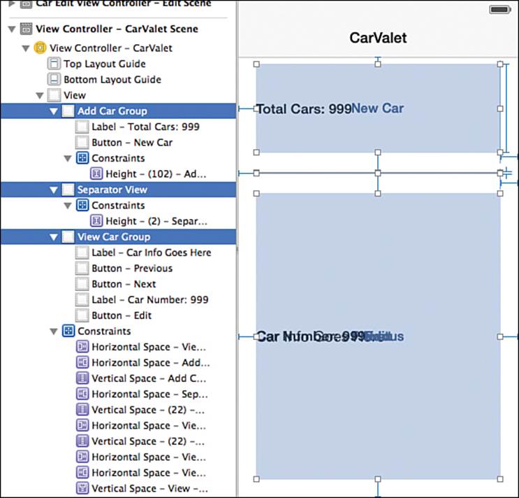
Figure 4-17 Top-level view constraints finished
Previewing Constraints
The grouping views and constraints have all been added to a 4-inch screen. Now you need to make sure they will work with a 3.5-inch one. There are three basic ways to so this:
1. Run the app on a 3.5-inch screen simulator and/or device.
2. Change the view controller in IB to a 3.5-inch size.
3. Use the IB Preview mode to show how the constraints will work with any desired device screen sizes and orientations.
Of the three methods, running on a physical device is a critical step before you release an app. However, during development you can get a good idea from running on the simulator. You can choose both a real device and different simulator sizes using the right side of the scheme popup (see item 2 in Figure 2-5).
As you are adding the constraints, you can get quick feedback either by switching the view controller on the IB canvas between the two screen sizes (number 2 previously) or by using a preview window (number 3).
On the canvas, you can change the size and orientation of an individual view controller using the Attributes inspector shown on the left side of Figure 4-18. Just select the view controller and then select the appropriate value from the size and/or orientation popup. The view controller changes in IB, and views are updated based on their constraints.
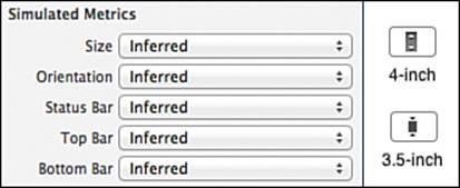
Figure 4-18 Toggling screen size and orientation for view controllers
The other way to quickly toggle between the two screen sizes is with the screen-size toggle button. Clicking the button toggles the size of all top-level view controllers on the current IB canvas. The right side of Figure 4-18 shows the button as it looks when displaying the two different screen sizes.
The most flexible way to view the effect of constraints is using the assistant editor preview mode. This will show you how the current controller will look in one selected screen size and orientation. Additionally, the preview dynamically updates as you change constraints in the main IB editing window.
You can change the size, orientation, or even iOS version of the device screen in a preview pane, and you are not limited to just one preview. With a large screen, you can view the IB editor and then at least two preview panes, one for each size. In fact, the larger screens let you show not only sizes but rotations as well.
Before you open a preview pane, use the attributes editor to set the background color of each grouping view to light gray. This helps you see how they do or do not resize as you change screen size.
Opening Two Assistant Previews
The easiest way to open the assistant preview is by choosing where the view opens. You can select where a view opens using the placement panel, an Xcode helper that opens whenever you hold Option-Shift when choosing to open a new view.
To show the preview, select the related files icon in the upper left of the IB window, hold down Option-Shift, and select the Preview item for the file you are editing. Figure 4-19 shows selecting the preview item with the related files icon in the upper left. The icon has been highlighted to make it stand out.
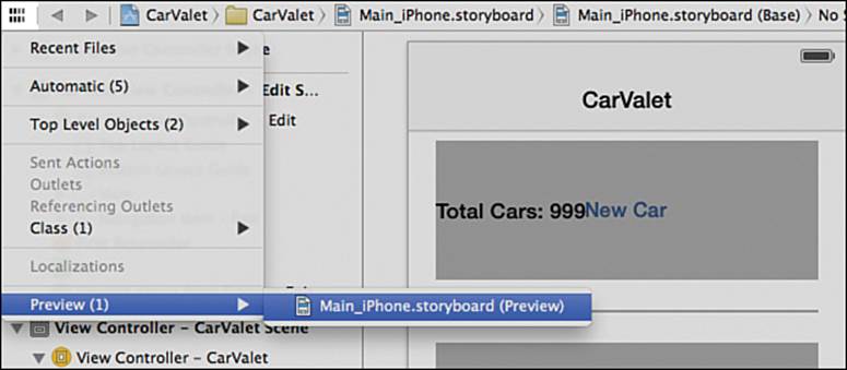
Figure 4-19 Opening an assistant preview from the related files menu
When you have selected the preview while holding Option-Shift, you are shown the placement panel seen at the top of Figure 4-20. This panel gives you a great deal of flexibility when opening any new views.
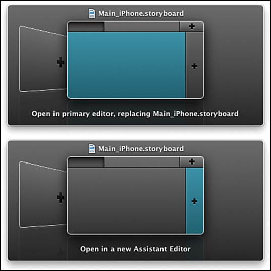
Figure 4-20 Placing the first assistant preview panel
There are three basic parts to the placement panel. The title of the panel is the file you are placing. On the bottom of the panel is a description of what the placement panel does if you press Return. You can dismiss the panel at any time by pressing Escape.
The middle area lets you choose where to place the contents of the file. You can replace the content of an existing pane, put the content in a new pane by selecting an area with a +, or even in a whole new window by selecting the background item with the +.
The blue area on the left-hand panel is the current IB window. You want to open the preview in a new assistant pane, so select the area with the + to the right of the blue area. The bottom of Figure 4-20 shows what the placement panel looks like after selecting this area. Notice that the text on the bottom of the panel has changed to say it will open a new assistant editor. Also note that you can use the placement pane when opening any file, not just preview windows.
After you press Return, a preview is added in an assistant pane next to the existing IB canvas, as shown in Figure 4-21. The main contents of the new pane look similar to the canvas. Updating items on the canvas updates the preview pane. To see an example, select the Total Cars label in the add car group and use the pin constraint popup to set the distance to the top of the superview to 0. Make sure that you choose to update frames for new constraints.
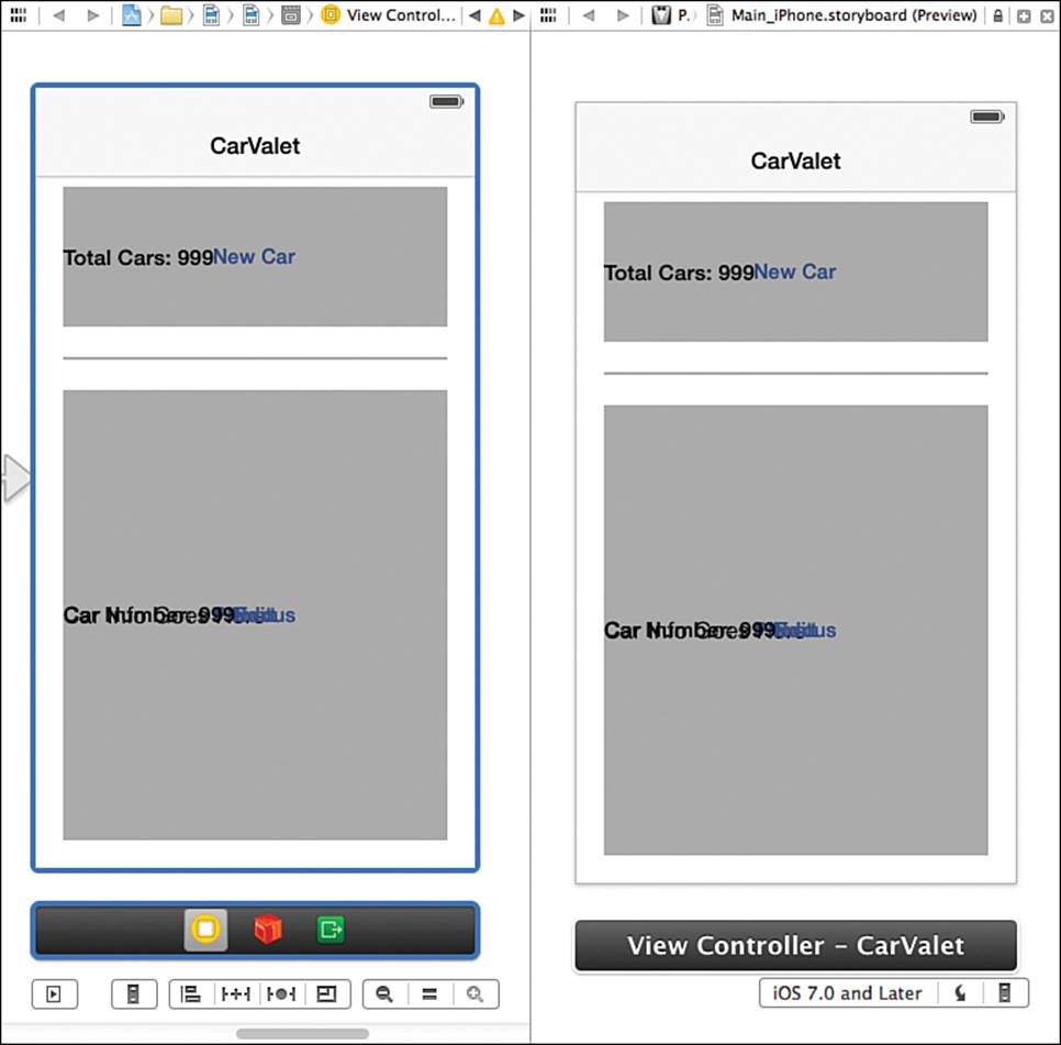
Figure 4-21 Placing the first assistant preview panel
Because the set of constraints for the label are ambiguous, there are many different things the label could do, including disappear off the screen. The key is that it does it in both the canvas and the preview.
The preview pane also has some differences in the surrounding controls. The first things to notice are two small buttons in the upper right. The one with the + lets you add another assistant editor below the current one. The other button with the “x” closes the pane.
The true power of preview comes from the control bar at the bottom of the pane. Try clicking the far-left button. Just like the Size button on the main IB canvas, this switches the preview between 4- and 3.5-inch screens. The middle button rotates the screen. The first button shows the screen as it would look on different OS versions. This is useful if your app needs to support iOS versions, such as iOS 6.1, that use different interface elements for things like buttons.
A simple way to save time as you add constraints is to show a preview of both the 3.5- and 4-inch screens. You do this by opening a second preview pane and placing it below the first one. This is done in almost the same way as adding the first preview pane, except when the placement panel comes up.
Figure 4-22 shows the resulting panel before and after selecting the location for the new pane. Notice that the initial state of the placement panel is different from Figure 4-20. This time there is a pane with a star. The star is how the placement panel indicates that you are opening the same thing and can either shift focus to the existing content pane or add another copy.
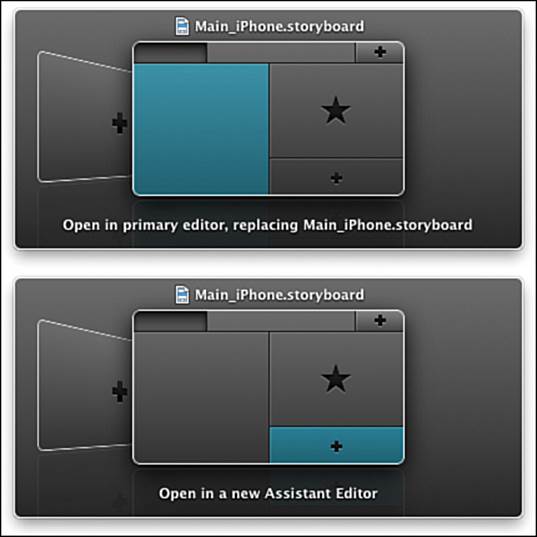
Figure 4-22 Placing the second assistant preview panel
Select the + below the existing pane, as shown on the bottom of Figure 4-22, and a new preview pane opens up below the existing one. Each preview pane can have different settings, though they are all previewing the same thing.
One important thing to remember about preview panes is that they only show the results of constraints added in IB. They do not show any constraints added or changed in code. For that, you need to use the simulator or a device.
Designing and Implementing the Add Car Constraints
You have finished adding the constraint relationships for the top-level groups. Now you can add relationships for their subviews. The process of completing all constraints for the highest level and then working down the hierarchy is one you will use repeatedly. It is the most effective way both to create the initial constraints, as well as flow through changes.
The views in your add car area seem to have simple constraints. The Total Cars label is pinned to the top and leading edge of the container and is high enough for one line of content. The New Car button is pinned to the bottom and leading edge of the container and is high and wide enough to show the button title and be an effective touch target.
Finding Constraint Issues
You have already added one of the constraints for the views in the add car group when you pinned the total cars label top edge to the top edge of the superview. At the moment, the constraints do not work. IB shows you when there are constraint issues in three main ways. First, when you select the total cars label, the i-bar for the top constraint is orange, indicating there is an issue.
The second way is by showing a triangular yellow caution icon in the address bar above the IB canvas. Because there are also constraint issues with the contents of the view car group, you can already see this caution icon in the address bar above the IB canvas in Figure 4-21. The icon is roughly in the middle of the top bar in the figure and looks the same as each of the yellow triangles in Figure 4-23.
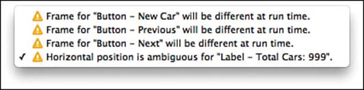
Figure 4-23 Constraint issues in the IB view list
Clicking the icon brings up a list of issues, as you can see in Figure 4-23. Selecting the line for the Total Cars label selects that label. You can also navigate through the issues using the forward and backward buttons on either side of the yellow caution icon in the address bar.
The third way is a red circle with a white arrow in IB’s left-hand list of view controllers, as shown on the left in Figure 4-24. Clicking the arrow shows details for any constraints that have issues, as shown on the right in the figure. There is an item in that list for every view that has some sort of problem.
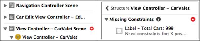
Figure 4-24 Constraint issues in the IB view list
Each item includes the view with the issue, a brief description of the issue, and a quick fix button (the red octagonal button with the circle). Clicking the quick fix button opens a popup with a recommended fix and a button to either apply the fix or cancel.
You can get general information and help on the problem by moving the mouse over the item. When you do that, an info button appears, as seen after the words “Missing Constraints” in Figure 4-24. Clicking that usually gives you a short description of the issue as well as general approaches to find and/or solve the issue.
To complete the constraints for the children of the add car and view car groups, you need to know about two more types of constraints: the content hugging priority and the content compression resistance priority.
Constraints and View Content
As you saw earlier, elements containing strings, images, and so on, have an intrinsic content size, a size that best fits the content. When you build apps with labels, buttons, and other elements, you need to think about how auto layout will display that content, especially as the size of the container changes. As you see in Chapter 5, strings can be especially tricky as you adapt the interface to different languages. The question is how to specify constraints related to content.
Open the Size inspector for the Total Cars label shown in Figure 4-25. Roughly in the middle are two areas called Content Hugging Priority and Content Compression Resistance Priority.
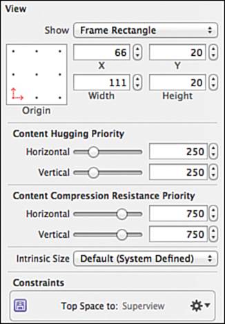
Figure 4-25 Content constraint priority editors
Content hugging tells the system how important it is to avoid excess padding around the content along a particular axis. This is usually used for views that contain strings or images. For the Total Cars label, you want the view to be as wide as required to show the string but no wider. In other words, you want to hug the content in the horizontal direction.
Content compression resistance refers to staying large enough to show all the content along an axis. If you want a label to show as much of the string as possible, increase the vertical content compression resistance, and then set Lines to 1 in the Attributes inspector to make sure only one line of text is shown. If the resistance is too low, your string is likely to get clipped. Instead of showing “Total Cars: 23,” it might show “Tota...”
The most important thing to understand about priority is that only the relative difference matters, not the magnitude. The system only looks for values that are different from the norm, and it stack ranks those values only if there is a conflict. For example, if there are three labels with compression resistance priorities of 751, 752, and 753, and the system can satisfy all those requirements, the priorities are ignored. If the system can satisfy only one content hugging request, the one with a priority of 753 wins. It makes no difference if the priority is 999 instead of 753; only the relative value matters.
The only time the actual value makes a difference is when resolving competing constraints. In other words, it does not matter if you set the horizontal content hugging priority of the Total Cars label to 251 or 1000, unless there are other content hugging priorities that interact with the label.
The safest practice is to use an increment or decrement of 1 unless you know there is some possible conflict. This applies to both content hugging and compression resistance.
If you are not sure that the label is showing the content at the intrinsic size, there is one more step to using either of these settings. Tell IB to set the current size to fit the content by selecting the element and either choosing Editor > Size to Fit Content from the menu or pressing Cmd-=. This ensures the system will use the priorities as part of adjusting the element.
You use the following steps to set up the constraints for the Total Cars label and New Car button:
1. Use the pin constraint popup to set the leading edge of the total cars label to the leading edge of the container. That is, set the distance constraint for the left edge to 0. Again, remember to update frames.
Notice that setting the leading edge constraint turns both constraints blue and the orange arrow disappears from the left-hand views list. That means the constraints completely specify how to position and size the label.
2. With the label selected, use the Size inspector to increment the content hugging and content compression resistance by 1 for each axis. This says the label should be just as large as it needs to be to show the label, and no larger.
3. Select the New Car button and open the pin constraint popup.
4. Set both the leading edge and bottom edge constraints to 0. That is, to no distance between the button and the nearest neighbor, in this case, the superview.
5. Increment the horizontal and vertical compression resistance but not the content hugging resistance. This allows you to set equal widths for buttons if needed, providing larger and consistent tap targets.
Designing and Implementing the View Car Constraints
When you adapt an interface to different screen sizes, you need to enable some view or views to grow or shrink. In your app, the view car area is a good example of a complex view group that adapts to changes in screen height. Most of the constraints are straightforward.
The Car Number label constraints are identical to the Total Cars label; however, there is one issue. Because all the views are centered in the view car group, how do you make sure you select the right view before applying constraints?
The answer is using another Xcode key combination: Hold Ctrl-Shift and click in the center of the stack of views in the view car group. You get a popup similar to the one in Figure 4-26 that lets you choose one of the views in that location.
Figure 4-26 View selector popup
Select the Car Number label from the popup and set it to the same constraints as the Total Cars label. Use the pin constraint popup to set the top and leading constraints to 0. Then set the content hugging and compression priorities.
Select the Previous Car button and set it to the same constraints as the New Car button from the add car group. The Next Car button is almost identical: The bottom edge is adjacent to the bottom of the container, but it is the trailing edge of the Next Car button adjacent to the superview’s trailing edge. Add those constraints. Remember to add both the pin constraints and the content compression resistance priorities.
Caution: Pin Popup Constrains to Nearest View
Sometimes using the pin constraint popup does not place the target view where you expect. This is because the constraints are to the nearest view for that particular constraint, not to the parent. That is, if you want the bottom of view A constrained to the parent, and there is some view B between the bottom of view A and the parent, the pin popup sets the bottom constraint to view B. You might encounter this with the Next Car or Edit buttons.
If this problem occurs, undo the constraints and move the view you are trying to constrain so that there are no other views between it and the target of the constraint. You can also try adding one constraint at a time, again moving the view closer to the target view.
One last caution: This chapter was created using a pre-release version of Xcode 5. One of the things that changed in Xcode 5 pre-releases was the way IB created constraints. Those of you who register your book can check for errata and/or supplemental content.
Now select the Edit button. You need to use the pin and align popups to correctly position this view. This time you are going to do something slightly different with each popup—you are not going to update frames for new constraints:
Use the align constraint popup to horizontally center the button in the container, and remember, do not update frames.
Open the pin constraint popup and set the distance to nearest bottom neighbor (the superview) to 0. Leave update frames set to none and add the constraint.
When you add the centering constraint, the vertical centering constraint appears in orange. There were also some orange rectangles. Pinning the button to the bottom turns the centering constraint blue but results in another orange line with a number, as well as another orange rectangle, as shown in Figure 4-27. (Note that the background for the grouping view is set to white to make the figure easier to see. Your grouping view should still be light gray.)
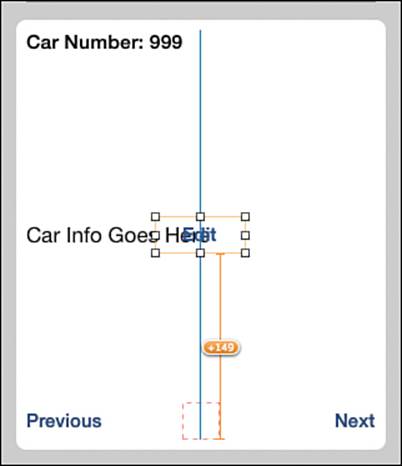
Figure 4-27 Orange constraint problems in IB
This is how IB tells you that there is a conflict between the existing frame and the frame that is generated by the relevant constraints. IB also uses a yellow circle with an arrow, much like the red one on the left side of Figure 4-24. Yellow indicates the constraints are incomplete, versus red, which indicates a conflict or other serious issue. Clicking the yellow arrow shows problem details similar to the right side of Figure 4-24.
The problem detail shows that the Edit button is a misplaced view. It also shows you the specific values with problems. Looking at the expected and actual y values, you can see where the +149 in Figure 4-27 comes from. The view is 149 points away from where it should be.
There are a few ways you can fix this issue. One is to remove or undo the added constraints and then redo them, making sure to update frames. However, there are at least two other ways to fix the issue. This is important because sometimes you end up with misplaced views because of how constraints interact.
Because you are already viewing the problem detail, another way to fix the constraints is to click the yellow triangle with the circle that is part of the misplaced view detail. Doing this gives you a popup with a number of choices:
Update frame—Update the frame in IB to match the constraints.
Update constraints—Update the constraints to match the existing frame.
Reset to suggested constraints—Sets the constraints based on what the system thinks they should be.
There is also an option to apply any changes to all views in the container. This last choice can have ripple effects through all your existing constraints and should be used with care.
Resolve Auto Layout Issues Popup
The fastest way to resolve constraints is using the third item in IB’s constraint toolbar. It is next to the pin constraint popup and has a black circle instead of a +. When you open the Auto Layout Issues button with the Edit button selected, you see something similar to Figure 4-28.
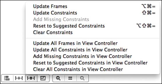
Figure 4-28 Auto layout issues popup
The top choices are the same as those in the popup you opened by clicking on the yellow triangle in the problem details area. The bottom choices affect the entire view controller, not just the particular view or groups of views you are working with.
If your view controller is already laid out the way you want and you have not yet added any constraints, the bottom part of this menu is a quick way to have Xcode add a complete set of constraints that results in the current layout. Of course, it might not support other screen sizes or orientations, but it can provide a good starting point. Combined with the item to reset to suggested constraints, it provides a great way to explore what sets of consistent constraints look like and how various modifications affect the view controller as a whole.
For now, all you need to do is update the frames. Choose the top item in the popup menu or press Cmd-Option-=. The Edit button moves so that it is centered at the bottom of the view car group container. Use the Size inspector to check the constraints for the Edit button to confirm they are what you wanted: centered horizontally in the container with the bottom edge at the same place as the bottom edge of the container.
Adjusting for Screen Height
You are close to making portrait work for both screen sizes. The top-level views already resize correctly. Adjust the size of your preview pane by clicking the far-left screen height button. The app almost looks correct. The only issue is the car info area. The height of that area has not changed, so the centered car info placeholder text is shown toward the bottom of the view car group.
Because there is more than enough space on the smaller screen to show car info, all you need to do is set the constraints for the car info label so that it changes height when its container, the view car group, changes height.
You do that by attaching the top and bottom of the label to other view elements in the group. When the view car group gets shorter, the Edit button moves up because it is attached to the bottom of the group. If the bottom of the car label is related to the top of the Edit button, it too will move up.
Use the pin constraint popup to set the leading and trailing edge constraints to 0 and the top and bottom edge constraints to standard. Remember that a shortcut for setting a constraint to standard is deleting the current contents of the value for that constraint. Make sure to update frames.
Now use the Size inspector to reduce the Content Hugging Priority to 249 in the vertical direction. Finally, with the Car Info label selected, use the Layout Issues item to update Frames.
When you add those constraints, the preview pane changes to show the Car Info label in the center of the car view group. You now have a set of portrait constraints that works for both screen sizes.
Edit Car: An Initial Look
Most of the work of adapting your edit car scene is left for the Challenges at the end of this chapter. You might think there is little work because there appears to be plenty of room on both screen sizes for all the fields. And there is—until you tap in a field. A tap in a field brings up the keyboard and drastically reduces the space you have to work with.
On the 4-inch display, there is space between the bottom of the last label and the top of the keyboard. That is not the case with the 3.5-inch display. Based on what you already know, you could change both screens to use standard Apple spacing both between the title and first text entry line and then between the text entry lines. That would work on the smaller screen. Alternatively, you could dynamically change the constraints based on the size of the screen.
Neither of these is a great alternative, especially because in landscape, it is not possible to prevent the keyboard from covering up input lines.
It is possible to create code that sets up a way to shift the input lines up and down based on some user event, such as a button press. However, this does not really give the user control of which input lines he or she is seeing, and it doesn’t even give an indication that there could be more input lines above or below. The solution is to scroll the view with the input lines, which you do in Chapter 6, “Scrolling.” For now, leave the portrait layout as it is.
Adding Landscape
Some apps support only one orientation. However, you will write apps supporting both portrait and landscape. In this section, you add support for rotating between two orientations, in the process learning more about designing and using constraints. You will also add constraints using both VCL and create individual constraints. In an actual project, you would choose which orientations to support and then design the scenes and their constraints before implementing the screens. Here, you get the additional experience of adapting an existing portrait interface to landscape.
The CarValet project is already enabled for both landscape left and right, as you can see in Figure 4-29. Quickly check how the app will appear in landscape using a preview pane. Adjust the screen to 3.5 inches high and rotate the screen using the rotation arrow in the control bar. As you can see in Figure 4-30, although the add car group is fine, the view car group has almost no room.
Figure 4-29 Supported app orientations
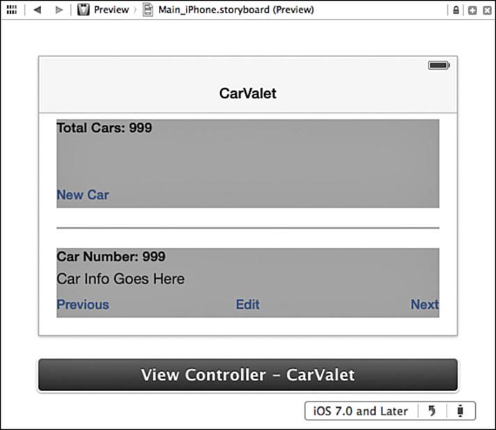
Figure 4-30 Preview pane landscape
In this case, auto layout is using the same constraints you built earlier to lay out the landscape screen. The add car and separator areas are at fixed locations and sizes. The view car area adjusts to the new vertical height. Inside the view area, the Car Number label and buttons are in fixed positions relative to the area’s top and bottom, and the Car Info label adjusts based on the height—or in this case, lack of height. In other words, the constraints do not work for landscape. You need to design new constraints for landscape and put them in place at the right time.
The right time for updating has to do with enabling the system to build the rotation animation. When the device rotates, the system remembers the current layout, gives you a chance to change the constraints, generates a new layout, and then creates animations for views that changed location and/or size. Putting the right constraints in place requires two steps:
1. Remove any constraints that do not work for landscape.
2. Add any constraints required to generate the landscape interface.
Rotating back to portrait means reversing the process: Remove the landscape-specific constraints and add back the portrait-specific ones. You can use the willAnimateRotationToInterfaceOrientation:duration: method of UIViewController for removing and adding constraints, but first you need to know what constraints to change.
Adding and Viewing Cars: Designing the Landscape Constraints
Sometimes landscape might have different functionality from portrait, as in the Apple Stocks and Calendar apps. Each of these apps has two different scenes, each with its own constraints. In your app, landscape has the same behavior, visual elements, and grouping as portrait, so there is just one scene. Either way, you design landscape constraints the same way you do portrait constraints.
Your first design decisions are how the add and view groups look in portrait and where the separator view goes. When you know the desired layout, you can design the constraints and see how they differ from portrait.
The simplest approach is to change to a left-to-right (that is, leading-to-trailing) layout from a top-to-bottom one. This works because there is enough screen width on a 3.5-inch device to show all the visual elements and still leave sufficient white space. Figure 4-31 shows your target landscape layouts on 4- and 3.5-inch screens.
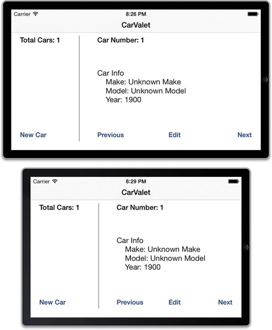
Figure 4-31 Landscape layout
Mocking Up Apps and Screens
In several places, this book shows target screen layouts in the simulator. Figure 4-31 is a good example. It is important to understand that the scene was not originally designed using Xcode and the simulator. Before writing a line of code or even creating the project, the app went through a design process that included the following:
Writing down the overall goal of the app and its target audience.
Creating an outline of app functionality that was then expanded and broken down into major functional tasks.
Grouping the functionality into possible screens and the associated actions for those screens (including navigational actions).
Creating sketches of the UI, starting with simple wireframes on paper and then mockups in Keynote as they became closer to finalized. A great help for mocking up screens is a set of iOS UI elements in Photoshop made freely available by Teehan+LAX. A big thanks to Geoff and Jon. You can find the files at www.teehanlax.com/tools/.
AppCooker is an iPad tool for mockups and more. The app takes you from idea to demo-capable mockup. It also has tools for designing the icons, prototyping the App Store listing, figuring out pricing, and more. You can find more info on the App Store and atwww.appcooker.com.
Briefs is a similar tool for Mac OS and includes an iOS App for showing the mockups. You can find information at http://giveabrief.com.
The previous tasks are not so much a sequential flow of steps as a back and forth. During design, some small Xcode projects might be used to test particular functionality or a certain look. However, architecting, designing, and implementing the code for the app does not start until some level of product specifications and mockups exist.
The next step would normally be to design the constraints starting at the top of the view hierarchy and working your way down the hierarchy of each container. If you want more practice designing constraints, take some time to design all the constraints for landscape before continuing.
Constraint Differences for Top-Level Views
Your groups of views make the landscape design process easier. Keep this in mind when you design groups in other apps, by thinking how the information can be presented in both portrait and landscape. When done well, groups minimize the number of constraints you need to change as your app switches between portrait and landscape.
When you have groups, designing the landscape constraints focuses on the changes you need at each level in the view hierarchy. You need to identify portrait constraints that do not work and create landscape constraints that are missing. At this stage of design, you can still use language-based descriptions of constraints. Later on, you will need to find and create actual constraint objects.
The obvious change for the three top-level views is that the layout now goes from leading to trailing. Any constraints that position or size the views for a top-to-bottom layout do not work. For each view, follow these steps:
1. Identify constraints that “attach” the view to its container, both horizontally and vertically.
2. Create the constraints needed for the new orientation.
3. List the constraints from step 1 that do not work or that need to be changed and eliminate any duplicate constraints created in step 2.
4. Identify the constraints that determine the size of the view both horizontally and vertically.
5. Create the constraints needed for the new orientation.
6. List the constraints from step 1 that do not work or that need to be changed and eliminate any duplicate constraints created in step 5.
For the add car group, the attached sides in portrait are top, leading, and trailing. For landscape, they need to be top, leading, and bottom. That makes one difference between portrait and landscape: For landscape, you have to remove the trailing edge constraint and add the bottom one.
The add car group has one size constraint that makes it 102 points high. There are two problems with this constraint. It prevents the system from calculating the correct height using the top and bottom constraints, and it also conflicts. A view cannot be both the standard distance from the top and bottom of its container and be fixed at 102 points high. That makes one more change: Remove the fixed height for landscape.
The separator view changes to a vertical orientation with a fixed width. Every constraint that contains the separator view needs to change. It needs to be the standard distance from top and bottom, a fixed width of 2 points, and the leading edge will be a fixed distance from the trailing edge of the add car group.
The view car group is still used to adapt to different screen sizes, but this time the change is in horizontal space—in the width not the height. In portrait, the area is the standard distance from the top, bottom, and trailing edge of its container. In landscape, it needs to be attached to the top, bottom, and trailing edge.
In portrait, the vertical size of the view car group is calculated. The top of the group is a fixed distance below the separator view. The bottom is the standard distance from the bottom of the screen, though this coordinate will vary depending on screen size. In landscape, the vertical size is calculated from attachments to both top and bottom. The horizontal size is variable. You need to replace the vertical relationship with the separator view with a horizontal one.
Table 4-3 shows how the constraints differ between portrait and landscape. It is also an example of another useful design tool for your own projects. In some cases, constraints for one orientation are not required, and the attribute is calculated. In Challenge 1 at the end of the chapter, you use information from Table 4-3 to show how the constraints for the top level grouping views are complete.
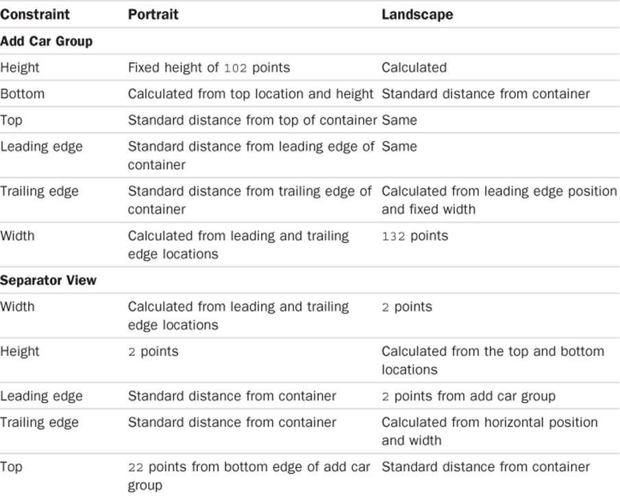
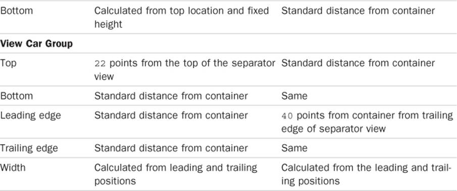
Table 4-3 Comparing Portrait and Landscape Constraints
With the top-level view constraints done, it is time to check constraints for the children of those views. Before reading on, take some time to look at the constraints and jot down what, if any, changes are required.
The label and button for the add car group stay in their same relative positions. The same is true for the view car group. The Car Number label stays at the top, the buttons are evenly spaced along the bottom, and the Car Info label fills up the space between (less the standard distances from the label and buttons). There are no changes or additions.
This is why using views to group areas can save a lot of time and effort. For the cost of two invisible views and a few extra constraints, you have significantly reduced the work to handle rotation. Without those groups, you would have to remove and add constraints for every label and button as well as the separator.
Finding the Constraint Objects to Change
Next, you need to create references to all the portrait constraints you identified in the last section. You need a reference to any portrait constraints in Table 4-3 that change or need to be removed. When you use auto layout to handle rotation, most of the time changing constraints means you remove ones that do not work and add new ones. Sometimes you can simply change a constant value for a constraint without removing it. For this project, you are only removing some constraints and adding others.
The constraint itself is not quite enough. Removing a constraint requires sending a message to the view that owns the constraint. That same view reference is used to add the constraint back.
As you saw earlier, constraints are attached to, or owned by, the lowest common parent in the hierarchy. This means a constraint affecting more than one view could be attached to either of those views or somewhere higher up the chain.
The easiest way to find the owner for a constraint is to select the constraint and then look at the left-hand list of view elements in IB. The constraint is highlighted in the left-hand list, which is expanded as necessary. The constraint is under the Constraint item for a particular view, the owning view.
As you saw in the earlier section, “Changing Constraint Values,” there are multiple ways to select a constraint. In this case, use the Size inspector to find and select the fixed height constraint for the add car group. When selected, the left-hand list changes as shown in Figure 4-32. You now know the constraint is attached to the add car area because it shows up in the Constraints list for that view. You have found one constraint and one unique view.
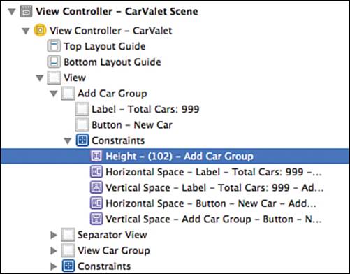
Figure 4-32 Selected fixed height constraint
Find the next constraint, the trailing edge for the add car group, by selecting it on the IB canvas:
1. Select the add car group view.
2. Select the i-bar for the trailing edge constraint.
3. Look at the left-hand list.
This time the constraint is attached to the root view. That makes a total of two constraints and two unique views. The other two portrait constraints for the add car group are calculated, so there are no more to find.
The separator view has six lines in the table of which four are uniquely portrait constraints. Select the separator view and then select the 2-point height constraint. It is attached to the separator view. Select each of the other three constraints in turn and you see they are all attached to the root view. That makes three views and six constraints.
Finally, find the two portrait constraints for the view car area. Both constraints are attached to the root view. This makes a total of eight constraints and three views.
Adding References to the Changing Constraints
You have already used IBOutlets for dragging connections to IB objects. This does work, but it can be hard to maintain as the UI is changed over time and the constraints change. It also can increase coding errors as you forget to use all eight outlets in every place.
It would be easier if you could group constraints together by their attached view. You can do this with a special type of IBOutlet called an IBOutletCollection. These outlets collect multiple item references in an array. You need one collection for each view that has constraints to remove.
The general way to define an IBOutletConnection in code is the following:
@property <Optional Property Qualifiers> IBOutletConnection(CollectionElementClass)
<Variable Declaration>
The optional first part is used to declare property qualifiers such as weak. Next is the definition of the collection. The optional class in parentheses tells the compiler what kind of elements can be in the collection. When you drag out connections in IB, it only lets you connect to elements of any class you set. If you specify UIView, you can connect to any kind of views, including buttons, labels, and just plain views. If you specify UIButton instead, you can only connect to buttons. The final part declares the actual variable and must be some kind (class or subclass) ofNSArray.
Add the following properties to ViewController.h between the existing property and method declarations. The new code is shown in bold:
@property (weak, nonatomic) IBOutlet UILabel *carInfoLabel;
@property (strong, nonatomic) IBOutletCollection(NSLayoutConstraint)
NSArray *addCarViewPortraitConstraints;
@property (strong, nonatomic) IBOutletCollection(NSLayoutConstraint)
NSArray *separatorViewPortraitConstraints;
@property (strong, nonatomic) IBOutletCollection(NSLayoutConstraint)
NSArray *rootViewPortraitConstraints;
- (IBAction)newCar:(id)sender;
Each new property is an outlet collection that can contain an array of NSLayoutConstraint objects. There is one collection for each view containing constraints you need to remove: addCarViewPortraitConstraints for the add car group, separatorViewPortrait-Constraints for the separator view, and rootViewPortraitConstraints for the root view of ViewController.
Add each of the constraints you have found to the correct outlet collection. The simplest way to do this is to show all the constraints in the left-hand list of view elements in IB, and then click and drag from the dot next to each property in the .h file to the relevant constraints. Figure 4-33shows adding the leading edge constraint of the separator view to rootViewPortraitConstraints.
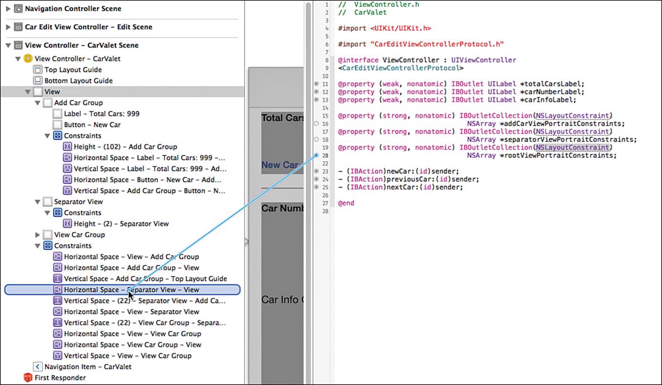
Figure 4-33 Adding the leading separator constraint to the collection
Another way to access the properties of a view controller is by Ctrl-clicking or second-mouse-button-clicking the view controller in the left-hand list. You can use the circles in this floating view instead of the .h file. You can also use it to confirm the outlet collections are correct.
When you have added all the constraints, the Outlet Collections area looks something like Figure 4-34. The order of the items might be different, depending on the order in which you added the constraints. The important thing is that all the constraints are there in the correct collections. Note that all the other areas in the view have been collapsed, as shown by the left-pointing triangles next to items such as Triggered Segues and Outlets.
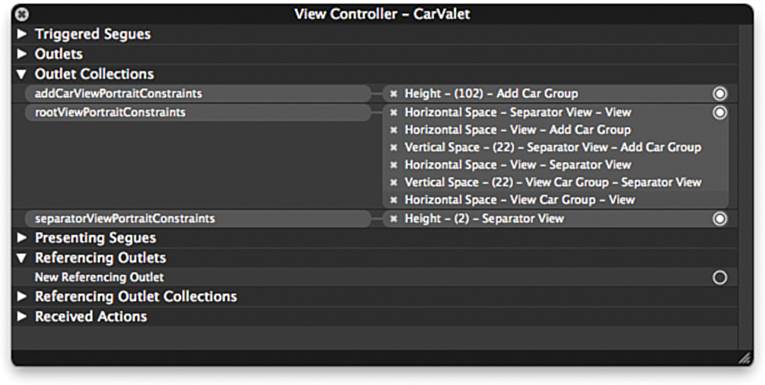
Figure 4-34 Collections of removable portrait constraints
Why use collections for the add car and separator views if there is only one constraint for each of them? There are two main reasons. First, you can use the same code for whatever operations you perform. This allows you to abstract out what will become an increasingly common operation. The second reason is to allow for future changes that result in the need to remove multiple portrait constraints. If you had just used an outlet, you would need to change both the property type and all associated code.
Creating Landscape Constraints: Visual Constraint Language
For more complex layouts, you are likely to create your own constraints. You cannot do this in IB because any constraint you create is attached to an existing view, at least as of the writing of this book. You create your own constraints in code by using either VCL, or a method that has arguments for each component of the constraint equation. Both ways use methods of the NSLayoutConstraint class.
constraintWithItem:attribute:relatedBy:toItem:attribute:multiplier:constant: is the least preferred way of creating a single constraint. As the length of the method signature implies, there are lots of arguments—one for each part of the constraint relationship equation. You get a lot of control, but you sacrifice readability and maintainability.
VCL is much easier to use and far more readable. VCL uses strings to construct horizontal or vertical constraints, and each string can result in multiple constraints. Here is a simple example:
@"H:[addCarView]-2-[separatorView]"
Expressed in language, this string says that the leading edge of the separator view is 2 points from the trailing edge of the add car view. VCL is a step between using IB and using code to create each constraint.
The VCL string creates leading/trailing or left/right (horizontal) or top/bottom (vertical) constraints depending on the letter at the start of the string: H: is horizontal, and V: is vertical. Names in square brackets refer to specific views. A dash (-) by itself refers to the standard distance. A number between two dashes is a specific value. -2- makes the leading edge ([) of the separator view 2 points after the trailing edge (]) of the add car view. You can also specify values for a particular view by including them in parentheses inside the reference to a view. In the previous string, (2) sets the width of the separator view.
Using VCL makes it much easier to see what constraints you are generating, and takes up less space than the more complex single constraint creation method. It is the preferred way for creating constraints in code. Unfortunately, there are some constraints that cannot be expressed in VCL.
The Cocoa Auto Layout Guide, part of the Xcode documentation, contains a full guide to the syntax and parts of VCL. For a deeper discussion, see Auto Layout Demystified by Erica Sadun. The description of VCL begins in the section “Visual Format Constraints” though the whole book is useful for understanding other ways to use auto layout.
The previous format string specifies two of the four separator view constraints from the Landscape column in Table 4-3. That leaves the two vertical constraints to set the standard distance from the top and bottom of its container. In a format string, a pipe symbol (|) stands for the container view. You have already seen the symbol for standard distance, and this is a vertical constraint string:
@"V:|-[separatorView]-|"
The string generates two constraints. One sets the top of the separator view to the standard distance from the top of its container view. The other sets the bottom of the separator view the standard distance from the container’s bottom.
Now you need the two add car view constraints. The first constraint places the view’s bottom the standard distance from its container:
@"V:[addCarView]-|"
The second constraint sets the width to 132 points:
@"H:[addCarView(132)]"
Finally, there are three constraints for the view car area that can be implemented with two strings. The first is a vertical constraint for the top edge:
@"V:|-[viewCarView]"
And the second is the horizontal constraints for the leading edge position:
@"[separatorView]-40-[viewCarView]-|"
You might think there are two typos in the last string. However, it points out a couple things about visual constraint strings. First, the default constraint axis specified by a string is horizontal. Although you can put H: in the string, you do not need to. The second is that adding a constraint that already exists has no effect. In this case, the string specifies that the trailing edge of the view car area should be the standard distance from its superview. This constraint is already specified using IB and is not removed when a rotation occurs.
VCL Versus Full Specification
You might wonder what the difference is between using VCL and the longer class method. @"H:[addCarView(132)]" is one of the constraint strings you used earlier. The following is the same constraint, using the more complete class method:
NSLayoutConstraint *constraint;
constraint = [NSLayoutConstraint
constraintWithItem:addCarView
attribute:NSLayoutAttributeWidth
relatedBy:NSLayoutRelationEqual
toItem:nil
attribute:nil
multiplier:0.0
constant:132.0];
As you can see, there is considerably more code, and it is harder to read. The format string makes the relationships very clear, almost at a glance. The preceding code is hard to read and not nearly as easy to translate into language. Worse, if you need to change the width, or even the relationship, you would be changing several arguments. The string makes it immediately obvious what to change and how to change it.
Having said that, there is far more flexibility with the complete method. There are relationships you can specify that are impossible to create using either IB or VCL. One simple example is access to the multiplier for things like scaling or even pulsing a view.
Creating Landscape Constraints: Code
Whenever you switch between constraints, you need a reference to each constraint. In CarValet, when the device rotates back to portrait, you remove any landscape constraints you added. That means keeping a reference to any generated landscape constraints. And as with the portrait constraints, you need to associate each constraint with a view. Your first task is to figure out which view hosts each of the new landscape constraints.
To find the host view, you look for the lowest view in the hierarchy that contains both members of the constraint relationship. The simplest case is a constraint with only one member, such as specifying a fixed size. The most complex is where the members are in different hierarchies, such as an equal-width constraint between the New Car and Edit buttons. In this case, the host is the main view, or root view, of ViewController. Table 4-4 shows all the format strings, their member views, and the lowest view in the hierarchy that contains all those members.
Table 4-4 Container Views for Visual Format Strings
One thing to notice is there are multiple ways to specify constraints. As an example, you could combine the first and last items in Table 4-4 into one string for a few reasons as all the constraints:
Along the same axis (horizontal)
Attached to the main view
Specify related views, including a shared view
The modified string would be as follows:
@"|-[addCarView]-2-[separatorView]-40-[viewCarView]-|"
This string has some extra information, but it also very clearly specifies the horizontal contents of some portion of the view: an add car view the standard distance from the leading edge of the superview, followed by 2 points of space, a separator view, then 40 points of space, and a view car view that is also the standard distance from the trailing edge.
One important thing to notice is the string does not contain the width for the separator view. The ones generated by the string are all attached to the container view. But the width of the separator view is a relationship between the separator view and itself. The constraint is attached to the separator view.
Adding the Landscape Constraints
There are only two unique hosts for the landscape constraints: the add car and main views. You need to add two arrays to ViewController.m to hold the constraints. Declare the arrays just after the implementation; the new code is shown in bold:
@implementation ViewController
{
NSMutableArray *arrayOfCars;
NSInteger displayedCarIndex;
NSArray *rootViewLandscapeConstraints;
NSArray *addCarViewLandscapeConstraints;
NSArray *separatorViewLandscapeConstraints;
}
Before you can use a VCL string to generate constraints, you need references to any used views. You use these references to generate what is called a dictionary of variable bindings. This dictionary sets up a binding between a text-based view name and a reference to a UIView object. You need a reference to each unique view in the Component Views column of Table 4-4.
Add an IBOutlet for connecting each component view in the variable-binding dictionary. viewController.view is already a reference to the main view, so you only need three outlets. Note that you could declare these variables elsewhere using properties. The changes are shown in bold:
NSArray *addCarViewLandscapeConstraints;
__weak IBOutlet UIView *addCarView;
__weak IBOutlet UIView *separatorView;
__weak IBOutlet UIView *viewCarView;
}
Since you do not own the UIView objects, you use __weak to avoid retain loops, as you saw in the section “A Brief Diversion on Memory Management” in Chapter 3. Now use IB to drag connections from each of the three new outlets to the associated view. Connect the following:
addCarView to the add car group view
separatorView to the separator view
viewCarView to the view car group view
You can use the same popup panel shown in Figure 4-34 to make the connections. When you bring up the panel, expand the Outlets section if it is not already expanded. You see each of the new outlets in that list. Drag from the dot to the appropriate view in either the list on the left of IB or on the canvas. If you use the canvas, make sure you are connecting to the right view. Check the name of the item added in the popup after the connection. It should correspond to the name in the left-hand column of views.
To generate constraints from a string, you use constraintsWithVisualFormat:options:metrics:views:. It is important to remember that each call creates an array of constraints, even if it is an array of one. The more complex class method shown earlier creates an individual constraint object. Add the setupLandscapeConstraints method from Listing 4-1 to ViewController.m.
Listing 4-1 setupLandscapeConstraints Method
- (void)setupLandscapeConstraints {
NSDictionary *views; // 1
views = NSDictionaryOfVariableBindings(addCarView,
separatorView,
viewCarView);
NSMutableArray *tempRootViewConstraints = [NSMutableArray new]; // 2
NSArray *generatedConstraints; // 3
generatedConstraints = // 4
[NSLayoutConstraint
constraintsWithVisualFormat:@"H:[addCarView]-2-[separatorView]"
options:0
metrics:nil
views:views];
[tempRootViewConstraints addObjectsFromArray:generatedConstraints]; // 5
generatedConstraints =
[NSLayoutConstraint
constraintsWithVisualFormat:@"V:|-[separatorView]-|"
options:0
metrics:nil
views:views];
[tempRootViewConstraints addObjectsFromArray:generatedConstraints];
generatedConstraints =
[NSLayoutConstraint
constraintsWithVisualFormat:@"V:[addCarView]-|"
options:0
metrics:nil
views:views];
[tempRootViewConstraints addObjectsFromArray:generatedConstraints];
generatedConstraints =
[NSLayoutConstraint
constraintsWithVisualFormat:@"V:|-[viewCarView]"
options:0
metrics:nil
views:views];
[tempRootViewConstraints addObjectsFromArray:generatedConstraints];
generatedConstraints =
[NSLayoutConstraint
constraintsWithVisualFormat:@"[separatorView]-40-[viewCarView]-|"
options:0
metrics:nil
views:views];
[tempRootViewConstraints addObjectsFromArray:generatedConstraints];
rootViewLandscapeConstraints = [NSArray // 6
arrayWithArray:tempRootViewConstraints];
addCarViewLandscapeConstraints = // 7
[NSLayoutConstraint
constraintsWithVisualFormat:@"H:[addCarView(132)]"
options:0
metrics:nil
views:views];
separatorViewLandscapeConstraints = // 8
[NSLayoutConstraint
constraintsWithVisualFormat:@"H:[separatorView(2)]"
options:0
metrics:nil
views:views];
}
Here’s what happens in the numbered lines in Listing 4-1:
1. Set up a dictionary of variable bindings used in generating constraints from the strings.
2. Create a temporary mutable array to hold generated constraints that are attached to the main view.
3. Set up a reusable reference to the returned array of generated constraints.
4. Generate the constraints associated with the first string in Table 4-4. Notice that the views dictionary can contain more views than needed for a constraint string. That makes it possible to set up one views dictionary for the whole method.
5. Add the generated constraints to the temporary array of main view constraints. Then generate the rest of the main view constraints, adding each new set to the temporary array.
6. Initialize the rootViewLandscapeConstraints instance variable to the contents of the mutable array of generated constraints.
7. Initialize the addCarViewLandscapeConstraints instance variable to an array containing the width constraint for the add car view.
8. Initialize the separatorViewLandscapeConstraints instance variable to an array containing the constraint for width of the separator view.
Since the visual elements of the screen are static, you need to set up the landscape constraints only once. Add a call to [self setupLandscapeConstraints] in viewDidLoad:, just after the call to [super viewDidLoad].
Putting It All Together
You have all the elements you need to respond to device rotations: You know the set of constraints unique to portrait and to landscape, you know what views each constraint is attached to, and you have references to the constraints. When a rotation occurs and the new orientation is landscape, you remove the portrait constraints and then add the landscape ones. When the new orientation is landscape, you remove the landscape constraints and add back portrait.
willAnimateRotationToInterfaceOrientation:duration: is called when the device rotates. First, check the orientation and then add and remove the appropriate constraints. Use Listing 4-2 to update your project.
Listing 4-2 Changing Constraints for Device Rotation
- (void)willAnimateRotationToInterfaceOrientation:
(UIInterfaceOrientation)toInterfaceOrientation
duration:(NSTimeInterval)duration {
[super willAnimateRotationToInterfaceOrientation:toInterfaceOrientation
duration:duration];
if (UIInterfaceOrientationIsPortrait(toInterfaceOrientation)) { // 1
[self.view removeConstraints:rootViewLandscapeConstraints]; // 2
[addCarView removeConstraints:addCarViewLandscapeConstraints];
[separatorView removeConstraints:separatorViewLandscapeConstraints];
[self.view addConstraints:self.rootViewPortraitConstraints]; // 3
[addCarView addConstraints:self.addCarViewPortraitConstraints];
[separatorView addConstraints:self.separatorViewPortraitConstraints];
} else { // 4
[self.view removeConstraints:self.rootViewPortraitConstraints]; // 5
[addCarView removeConstraints:self.addCarViewPortraitConstraints];
[separatorView removeConstraints:self.separatorViewPortraitConstraints];
[self.view addConstraints:rootViewLandscapeConstraints]; // 6
[addCarView addConstraints:addCarViewLandscapeConstraints];
[separatorView addConstraints:separatorViewLandscapeConstraints];
}
}
Here’s what happens in the numbered lines in Listing 4-2:
1. After calling the superclass method, find out what the new orientation is. UIInterfaceOrientationPortrait is a system macro that is true for any portrait orientation.
2. This is portrait, so remove the landscape constraints, starting with the main view. It is fine to call removeConstraints: with constraints that are not already attached to the view.
3. Add all the portrait constraints. Adding an existing constraint is ignored.
4. If it is not portrait, it is landscape.
5. Remove any portrait-specific constraints.
6. Add the landscape-specific constraints.
Run the app in the simulator and rotate the device. Everything should work. This is also a good time to see a common error when there are conflicting constraints. To do this, you need to modify the code entered from Listing 4-2.
The current code removes any old constraints and then adds any new ones. Instead, modify the code to first add the new constraints and then remove the old ones. The first modification is to move the three lines starting with numbered line 2 below the three lines starting with numbered line 3. Similarly, move the three lines starting with numbered line 5 below the three starting with number line 6.
Now run the app in the simulator and rotate the device to the left and watch the debugger output. As the device rotates, the debugger output window shows an error message with a lot of content. And when the screen is rotated, it does not look quite right.
First, look at the debugger output. The key line is the following:
2013-08-15 11:01:36.633 CarValet[55429:a0b] Unable to simultaneously satisfy
constraints.
This is a warning that at least two of the constraints conflict. Because the app does not crash, the system is able to layout the screen. The body of the error shows how it was able to recover by breaking a constraint:
Will attempt to recover by breaking constraint
<NSLayoutConstraint:0xa163120 V:[_UILayoutGuide:0xa162800]-(NSSpace(8))-
[UIView:0xa11b740]>
As long as the system can recover, your application continues to work. If the system cannot recover, your application crashes.
To find the source of the error, look at the main body of the debugger message (the part between the key and breaking constraints line previously):
Probably at least one of the constraints in the following list is one you don't
want. Try this: (1) look at each constraint and try to figure out which you
don't expect; (2) find the code that added the unwanted constraint or
constraints and fix it. (Note: If you're seeing
NSAutoresizingMaskLayoutConstraints that you don't understand, refer to the
documentation for the UIView property translatesAutoresizingMaskIntoConstraints)
(
"<NSLayoutConstraint:0x8c9f4a0 V:[_UILayoutGuide:0x8c9eb80]-(NSSpace(8))
-[UIView:0x8c9b2e0]>",
"<_UILayoutSupportConstraint:0x8c990b0 V:[_UILayoutGuide:0x8c9eb80(52)]>",
"<_UILayoutSupportConstraint:0x8c9a700 V:|-(0)-[_UILayoutGuide:0x8c9eb80]
(Names: '|':UIView:0x8c9e970 )>",
"<NSLayoutConstraint:0x8c594b0 V:|-(NSSpace(20))-[UIView:0x8c9b2e0] (Names:
'|':UIView:0x8c9e970 )>"
)
If you see this message at other times, especially as you are developing your app, it might be an indication that your current constraints are ambiguous, incomplete, or incorrect. Narrowing down the problem requires finding the views that are having issues. The error message only gives you pointer addresses. However, there is a trick you can use to figure out which view is which.
Doing that requires getting the app to pause when the constraint problem is first reported. For that, you will use a special type of breakpoint that stops the app whenever an exception occurs. For now, just follow the directions to set the breakpoint. You see more about breakpoints, exceptions, and related information in Chapter 14, “Instruments and Debugging.”
Refer to Figure 4-35 and follow these steps:
1. Select the debug navigator in the left panel. You should see something like the top part of Figure 4-35, minus the popup menu.
Figure 4-35 Adding an all exceptions breakpoint
2. Click the + button on the lower left.
3. Use the menu that appears to add an exception breakpoint. The menu is shown on the bottom of Figure 4-35.
4. An All Exceptions breakpoint appears in the navigator panel nested below the CarValet project.
Now stop and re-run the app from Xcode. The simulator should already be rotated to the left so the app should stop. If the simulator is in portrait once the app is running, rotate it to the left. You get the same kind of error as shown earlier, with a list of conflicting constraints and all the views identified by the current memory address.
Now enter this text at the debugger prompt, which looks like “(lldb),” and press Return:
po [[UIWindow keyWindow] _autolayoutTrace]
This prints out a sideways hierarchical list of all the views in the current window. Each view includes its type and, more importantly, its memory address. The output looks similar to the following:
*<UIWindow:0x8c58420> - AMBIGUOUS LAYOUT
| <UIView:0x8c4dd00>
| | <UIView:0x8c911a0>
| | <UIView:0x8c94a10>
| | <UIView:0x8c94ac0>
| | <UIView:0x8c94b50>
| *<UILayoutContainerView:0x8c8f3a0>
| | *<UINavigationTransitionView:0x8c91930>
| | | *<UIViewControllerWrapperView:0x8ca0690>
| | | | *<UIView:0x8c9e970>
| | | | | *<UIView:0x8c9b2e0> - AMBIGUOUS LAYOUT
| | | | | | *<UILabel:0x8c9b370>
| | | | | | *<UIButton:0x8c99d40> - AMBIGUOUS LAYOUT
| | | | | | | <UIButtonLabel:0x8caea80>
| | | | | *<UIView:0x8c9ea00> - AMBIGUOUS LAYOUT
| | | | | *<UIView:0x8c9dc50>
| | | | | | *<UILabel:0x8c9dce0>
| | | | | | *<UIButton:0x8c9ae00>
| | | | | | | <UIButtonLabel:0x8caddf0>
| | | | | | *<UIButton:0x8c9a5e0>
| | | | | | | <UIButtonLabel:0x8cad170>
| | | | | | *<UILabel:0x8c9e1d0>
| | | | | | *<UIButton:0x8c9aa20>
| | | | | | | <UIButtonLabel:0x8cabcc0>
| | | | | *<_UILayoutGuide:0x8c9eb80> - AMBIGUOUS LAYOUT
| | | | | *<_UILayoutGuide:0x8c9f050> - AMBIGUOUS LAYOUT
| | <UINavigationBar:0x8c87d70>
| | | <_UINavigationBarBackground:0x8c8d300>
| | | | <_UIBackdropView:0x8c87ff0>
| | | | | <_UIBackdropEffectView:0x8c4e230>
| | | | | <UIView:0x8c900c0>
| | | | <UIImageView:0x8c8d600>
| | | <UINavigationItemView:0x8c88420>
| | | | <UILabel:0x8c888a0>
| | | <_UINavigationBarBackIndicatorView:0x8c97670>
You can use the list to find each view in the error message. For instance, the last constraint in the error list is this string:
"<NSLayoutConstraint:0x8c594b0 V:|-(NSSpace(20))-[UIView:0x8c9b2e0] (Names:
'|':UIView:0x8c9e970 )>"
This string refers to a vertical constraint between two views. The top edge of the first one with a class and memory address of UIView:0x8c9b2e0 is 20 points from the top of its container. The second listed view is the superview: UIView:0x8c9e970.
Looking at the hierarchy, you can see that the first view is the add car group, a UIView with a label and a button. The other is the main view, the one containing each of the three groups. There are other views listed, including the top-level window and system-generated views for handling the transition animation between portrait and landscape.
There are also two views with a class of _UILayoutGuide, one of which is listed in three of the conflicting constraints. And that guide is the source of the problem. Make sure that you change back the code to the original Listing 4-2.
Constraining to the Top or Bottom of Containers
When you first added the constraints for the add car group in the “Implementing the Top-Level View Constraints” section, you used the pin constraint popup to set it a standard distance from its container. But actually, it was not a relative to the container but to the closest neighbor. And it is not the neighbor you think.
Look at the left-hand list of views in IB, and you see two special views just below the view controller. These are the top and bottom layout guides. They are there because the actual top of the container view is usually underneath any bars shown in the interface, including the navigation bar.
You can see this by finishing the rotation. For now, the easiest way to do this is to disable the all exceptions breakpoint you just created. For that, open the breakpoint navigator and click the breakpoint symbol next to the All Exceptions breakpoint. It will turn from a dark blue to a lighter grayed-out color.
Now rerun the app and rotate to landscape if needed. Look carefully at the navigation bar, and you should see the top of the separator, as well as the Total Cars and Car Number labels, under the bar.
The added constraints use the pipe symbol for the top of the container view. But when you laid out the views in IB, you actually were not constraining them to the top of their superview. Pin constraints work with the nearest neighbor in the relevant direction.
The nearest neighbor at the top of the view is really the Top Layout Guide. This is a special item that lets older interfaces that do not support a true full screen still work with constraints. It is a special system-created view whose bottom edge is aligned with the bottom edge of the navbar.
The source of the ambiguity is trying to align the top of the add car group with both the top layout guide and the top of the main view. You can see this in the body of the ambiguous constraints error. In order, the constraints mean the following:
1. Set the top edge of the add car group 8 points below the top guide:
UILayoutGuide:0x8c9eb80.
2. The top guide is 52 points high.
3. The top edge of the guide is 0 points from the top edge of the superview.
4. The top edge of the add car group is also 20 points from the top of the superview.
The top edge of the add car group cannot be both 52 and 20 points from the top edge of the superview.
Fixing the issue means changing both the IB and VCL constraints to use the same top for constraints. Later you use the full superview, including space under the navigation bar. For now, change the VCL constraints to use the top layout guide.
This is as easy as adding the top layout as a member of the dictionary of variable bindings for views and using that view where you currently use the pipe (|) for the top of the main superview. Make the following changes in setupLandscapeConstraints:
1. Replace the definition of the view dictionary near the top of the method with the following code:
id topGuide = self.topLayoutGuide;
id bottomGuide = self.bottomLayoutGuide;
views = NSDictionaryOfVariableBindings(topGuide,
bottomGuide,
addCarView,
separatorView,
viewCarView);
2. Change the VCL string for the second constraint by replacing the pipe with [topGuide]. The string will look like the following:
@"V:[topGuide]-[separatorView]-[bottomGuide]"
3. Make the same change for the next constraint in the list. The constraint string will be as follows:
@"V:[topGuide]-[addCarView]-[bottomGuide]"
4. Finally, change the fourth constraint string to the following:
@"V:[topGuide]-[viewCarView]"
Before you run the app, change the background color of the add and view car groups back to default using the Attributes inspector in IB. After that, run the app and try rotating. This time everything should work correctly with the landscape screen looking like one of those in Figure 4-31.
Note that topLayoutGuide only exists in iOS 7. Using it means you cannot build and run this code on earlier iOS versions. There are ways to check the version at runtime for conditionally executing code, but that is beyond the scope of this book.
One Last Problem to Solve
You have adapted each scene of CarValet for both portrait and landscape. No matter what scene is showing, changing the device orientation rotates the views to their new positions. But there is still one last issue to solve. To see the issue, follow these steps:
1. Run the app.
2. Edit a car.
3. On the edit screen, rotate to landscape.
4. Tap the back button.
Although your add/view scene is in landscape, the layout is completely wrong. This happens because rotation messages are only sent to visible view controllers. When the rotation happens, the add/view scene is not being shown. No rotation messages are sent, so the set of constraints is for the last orientation—in this case, portrait. As you saw previously, those constraints do not work for landscape.
The solution is to keep track of the last orientation shown by the view controller and check it against the current device orientation when the view is shown. If the two orientations are not the same, you can perform the appropriate rotation before displaying. You therefore need to add orientation detection to the add/view scene:
1. Open ViewController.m and add a new instance variable inside the curly braces below the @implementation statement. This tracks what orientation the view constraints are set up to show, with YES meaning portrait and NO meaning landscape:
BOOL isShowingPortrait;
2. Add the following lines of code to viewDidLoad:, just after the call to the superclass method:
UIInterfaceOrientation currOrientation = [[UIApplication sharedApplication]
statusBarOrientation];
isShowingPortrait = UIInterfaceOrientationIsPortrait(currOrientation);
3. Modify viewWillAppear: to the code in Listing 4-3 to ViewController.m. This is where the real work takes place. This code detects the device orientation, compares it against the current orientation for the view controller, and updates the layout if needed.
4. Modify willAnimateRotationToInterfaceOrientation:duration: by adding the bold code shown in Listing 4-4. The new code keeps isShowingPortrait up to date with the current view controller orientation.
Listing 4-3 viewWillAppear: for ViewController.m
- (void)viewWillAppear:(BOOL)animated {
[super viewWillAppear:animated];
UIInterfaceOrientation currOrientation = [[UIApplication sharedApplication]
statusBarOrientation]; // 1
BOOL currIsPortrait = UIInterfaceOrientationIsPortrait(currOrientation); // 2
if ((isShowingPortrait && !currIsPortrait) || // 3
(!isShowingPortrait && currIsPortrait)) {
[self willAnimateRotationToInterfaceOrientation:currOrientation // 4
duration:0.0f];
}
}
Here’s what happens in the numbered lines in Listing 4-3:
1. Find the current device orientation.
2. Is the current device orientation portrait?
3. Is the last orientation for the controller different from the current device orientation? For more advanced programmers, the if statement could XOR (that is, exclusive or) the two variables instead of the longer statement:
if (isShowingPortrait ^ currIsPortrait)...
4. The orientations are different, so use the existing method to update the layout. The duration is 0 because there is no animation. All the changes take place before the view appears to the user.
Listing 4-4 willAnimateRotationToInterfaceOrientation:duration:
- (void)willAnimateRotationToInterfaceOrientation:
(UIInterfaceOrientation)toInterfaceOrientation
duration:(NSTimeInterval)duration {
...
[separatorView addConstraints:self.separatorViewPortraitConstraints];
isShowingPortrait = YES;
} else {
...
isShowingPortrait = NO;
}
}
Run the code again and go through the same steps that caused the problem. The main screen now has the correct layout. It also works if you start from the main screen in landscape and rotate to portrait in the edit view.
You can add the same code to any view controllers that might be offscreen when the device is rotated.
Summary
Auto layout minimizes the amount of work and code you need for creating interfaces that adapt to different screen sizes and orientations. You can use the techniques you learned here in every app you write.
In this chapter, you used auto layout to adapt your app to different screen sizes and orientations. You designed the constraints with a method you can use in any application. As part of the method, you learned how to use grouping views and hierarchies to minimize the work of adapting layouts. You also learned how to tell if a set of constraints is complete. You used the design to create constraints in IB, again using the idea of hierarchy and groups to make implementation easier.
When you added landscape, you created constraints in code, using both VCL and the more complex single-constraint class call. Along the way, you used IBOutletCollection, a special kind of collection that is useful for a group of related connections. In this chapter, you usedcollections for related constraints, but you can just as easily use collections for views you want to show or hide, to update, or even move with a fancy graphics effect.
As you continue to work with auto layout, you will discover there is much more you can do, up to and including animations. Auto Layout Demystified by Erica Sadun goes much deeper into many aspects of auto layout as well as providing great tools for implementing and debugging.
Auto layout is also helpful for localization. Chapter 5 explores the basics of localization and why leading/trailing is different from left/right.
Challenges
1. Create a table that shows how the landscape constraints for the top-level views are complete. You can base it on Table 4-2, although you might want to put the vertical constraints before the horizontal ones. Use Table 4-3 as a source of information.
2. Create a design for the landscape version of the edit car scene.
3. Use the design from Challenge 2 to create the required landscape constraints. Then make a list of what portrait constraints need to be removed and what landscape constraints need to be added.
4. Implement rotation of the edit car scene using the work from Challenges 2 and 3.
5. Add constraints to make all the buttons equal widths. Hint: You cannot use the canvas to select views in different hierarchies; try the left-hand list.