C# 6.0 and the .NET 4.6 Framework (2015)
PART VII
Windows Presentation Foundation
CHAPTER 27
Programming with WPF Controls
Chapter 26 provided a foundation for the WPF programming model, including an examination of the Window and Application classes, the grammar of XAML, and the use of code files. Chapter 26 also introduced you to the process of building WPF applications using the designers of Visual Studio. In this chapter, you will dig into the construction of more sophisticated graphical user interfaces using several new controls and layout managers, learning about additional features of the WPF designers of Visual Studio along the way.
This chapter will also examine some important related WPF control topics such as the data-binding programming model and the use of control commands. You will also learn how to use the Ink and Documents APIs, which allow you to capture stylus (or mouse) input and build rich text documents using the XML Paper Specification, respectively.
 Note Previous editions of this text made use of a product named Microsoft Expression Blend to facilitate building GUIs using the WPF API. However, the latest version of Visual Studio provides sufficient functionality to build WPF UIs for the topics examined in this text. If you would like to learn the details of working with Expression Blend, check out Andrew’s book Pro Expression Blend 4 (2011, Apress).
A Survey of the Core WPF Controls
Unless you are new to the concept of building graphical user interfaces (which is fine), the general purpose of the major WPF controls should not raise too many issues. Regardless of which GUI toolkit you might have used in the past (e.g., VB 6.0, MFC, Java AWT/Swing, Windows Forms, Mac OS X [Cocoa], or GTK+/GTK# [among others]), the core WPF controls listed in Table 27-1 are likely to look familiar.
Table 27-1. The Core WPF Controls
|
WPF Control Category |
Example Members |
Meaning in Life |
|
Core user input controls |
Button, RadioButton, ComboBox, CheckBox, Calendar, DatePicker, Expander, DataGrid, ListBox, ListView, ToggleButton, TreeView, ContextMenu, ScrollBar, Slider,TabControl, TextBlock, TextBox, RepeatButton, RichTextBox, Label |
WPF provides an entire family of controls you can use to build the crux of a user interface. |
|
Window and control adornments |
Menu, ToolBar, StatusBar, ToolTip, ProgressBar |
You use these UI elements to decorate the frame of a Window object with input devices (such as the Menu) and user informational elements (e.g., StatusBar and ToolTip). |
|
Media controls |
Image, MediaElement, SoundPlayerAction |
These controls provide support for audio/video playback and image display. |
|
Layout controls |
Border, Canvas, DockPanel, Grid, GridView, GridSplitter, GroupBox, Panel, TabControl, StackPanel, Viewbox, WrapPanel |
WPF provides numerous controls that allow you to group and organize other controls for the purpose of layout management. |
The WPF Ink Controls
In addition to the common WPF controls listed in Table 27-1, WPF defines additional controls for working with the digital Ink API. This aspect of WPF development is useful during Tablet PC development because it lets you capture input from the stylus. However, this is not to say a standard desktop application cannot leverage the Ink API because the same controls can capture input using the mouse.
The System.Windows.Ink namespace of PresentationCore.dll contains various Ink API support types (e.g., Stroke and StrokeCollection); however, a majority of the Ink API controls (e.g., InkCanvas and InkPresenter) are packaged up with the common WPF controls under the System.Windows.Controls namespace in the PresentationFramework.dll assembly. You’ll work with the Ink API later in this chapter.
The WPF Document Controls
WPF also provides controls for advanced document processing, allowing you to build applications that incorporate Adobe PDF-style functionality. Using the types within the System.Windows.Documents namespace (also in the PresentationFramework.dll assembly), you can create print-ready documents that support zooming, searching, user annotations (sticky notes), and other rich text services.
Under the covers, however, the document controls do not use Adobe PDF APIs; rather, they use the XML Paper Specification (XPS) API. To the end user, there will really appear to be no difference because PDF documents and XPS documents have an almost identical look-and-feel. In fact, you can find many free utilities that allow you to convert between the two file formats on the fly. You’ll work with some aspects of the document controls in an upcoming example.
WPF Common Dialog Boxes
WPF also provides you with a few common dialog boxes such as OpenFileDialog and SaveFileDialog. These dialog boxes are defined within the Microsoft.Win32 namespace of the PresentationFramework.dll assembly. Working with either of these dialog boxes is a matter of creating an object and invoking the ShowDialog() method, like so:
using Microsoft.Win32;
namespace WpfControls
{
public partial class MainWindow : Window
{
public MainWindow()
{
InitializeComponent();
}
private void btnShowDlg_Click(object sender, RoutedEventArgs e)
{
// Show a file save dialog.
SaveFileDialog saveDlg = new SaveFileDialog();
saveDlg.ShowDialog();
}
}
}
As you would hope, these classes support various members that allow you to establish file filters and directory paths, and gain access to user-selected files. You will put these file dialogs to use in later examples; you will also learn how to build custom dialog boxes to gather user input.
The Details Are in the Documentation
Despite what you might be thinking, the intent of this chapter is not to walk through each and every member of each and every WPF control. Rather, you will receive an overview of the various controls with an emphasis on the underlying programming model and key services common to most WPF controls.
To round out your understanding of the particular functionality of a given control, be sure to consult the .NET Framework 4.6 SDK documentation—specifically, the Control Library section of the help system, which you can find at https://msdn.microsoft.com/en-us/library/bb613551(v=vs.100).aspx.
Note At the time of this writing, the WPF documentation is somewhat lacking, as you will discover when you navigate to the aforementioned link. The current documentation is for .NET 4.5. The good news is that there are very few changes in WPF between .NET 4.5 and .NET 4.6 (mostly performance improvements).
Here you will find full details of each control, various code samples (in XAML, as well as C#), and information regarding a control’s inheritance chain, implemented interfaces, and applied attributes. Make sure you take time to look up the controls examined in this chapter for complete details.
A Brief Review of the Visual Studio WPF Designer
A majority of these standard WPF controls have been packaged up in the System.Windows.Controls namespace of the PresentationFramework.dll assembly. When you build a WPF application using Visual Studio, you will find most of these common controls contained in the toolbox, provided you have a WPF designer open as the active window (see Figure 27-1).
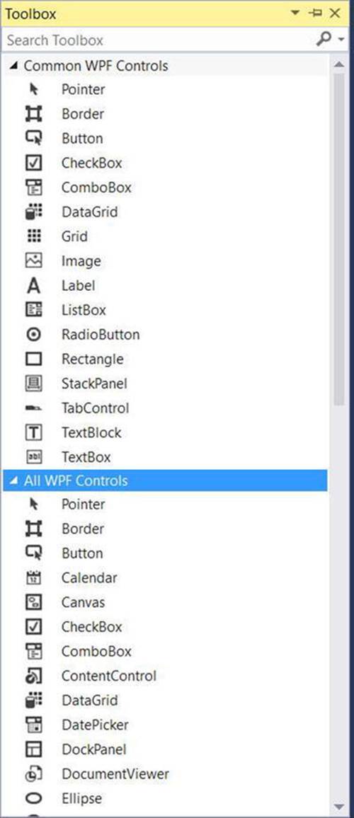
Figure 27-1. The Visual Studio toolbox exposes the many commonly used WPF controls
Similar to other UI frameworks created with Visual Studio, you can drag these controls onto the WPF window designer and configure them using the Properties window (which you learned about in Chapter 26). While Visual Studio will generate a good amount of the XAML on your behalf, it is not uncommon to edit the markup yourself manually. Let’s review the basics.
Working with WPF Controls Using Visual Studio
You might recall from Chapter 26 that when you place a WPF control onto the Visual Studio designer, you want to set the x:Name property through the Properties window because this allows you to access the object in your related C# code file. You might also recall that you can use the Events tab of the Properties window to generate event handlers for a selected control. Thus, you could use Visual Studio to generate the following markup for a simple Button control:
<Button x:Name="btnMyButton" Content="Click Me!" Height="23" Width="140"
Click="btnMyButton_Click" />
Here, you set the Content property of the Button to a simple string with the value "Click Me!". However, thanks to the WPF control content model, you could fashion a Button that contains the following complex content:
<Button x:Name="btnMyButton" Height="121" Width="156" Click="btnMyButton_Click">
<Button.Content>
<StackPanel Height="95" Width="128" Orientation="Vertical">
<Ellipse Fill="Red" Width="52" Height="45" Margin="5"/>
<Label Width="59" FontSize="20" Content="Click!" Height="36" />
</StackPanel>
</Button.Content>
</Button>
You might also recall that the immediate child element of a ContentControl-derived class is the implied content; therefore, you do not need to define a <Button.Content> scope explicitly when specifying complex content. You could simply author the following:
<Button x:Name="btnMyButton" Height="121" Width="156" Click="btnMyButton_Click">
<StackPanel Height="95" Width="128" Orientation="Vertical">
<Ellipse Fill="Red" Width="52" Height="45" Margin="5"/>
<Label Width="59" FontSize="20" Content="Click!" Height="36" />
</StackPanel>
</Button>
In either case, you set the button’s Content property to a <StackPanel> of related items. You can also author this sort of complex content using the Visual Studio designer. After you define the layout manager for a content control, you can select it on the designer to serve as a drop target for the internal controls. At this point, you can edit each using the Properties window. If you were to use the Properties window to handle the Click event for the Button control (as seen in the previous XAML declarations), the IDE would generate an empty event handler, to which you could add your own custom code, like so:
private void btnMyButton_Click(object sender, RoutedEventArgs e)
{
MessageBox.Show("You clicked the button!");
}
Working with the Document Outline Editor
You should also be aware that the Document Outline window of Visual Studio (which you can open using the View  Other Windows menu) is useful when designing a WPF control that has complex content. Notice in Figure 27-2 how the logical tree of XAML is displayed for the Windowyou are building. If you click any of these nodes, it is automatically selected in the designer for editing.
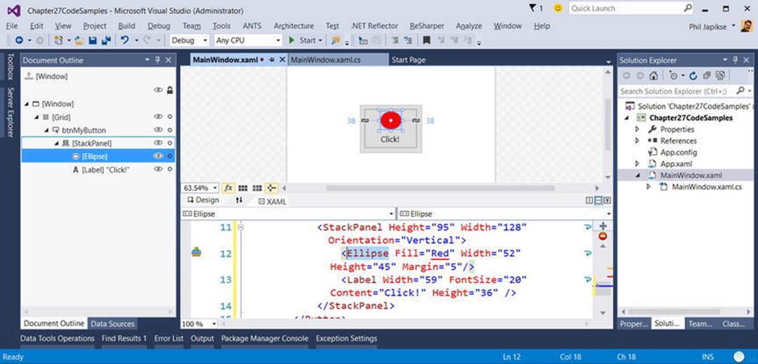
Figure 27-2. The Visual Studio Document Outline window can help you navigate complex content
With the current edition of Visual Studio, the Document Outline editor has a few additional features that you might find useful. To the right of any node you will find an icon that looks similar to an eyeball. When you toggle this button, you can opt to hide or show an item on the designer, which can be helpful when you want to focus in on a particular segment to edit (note that this will not hide the item at runtime; this is only hides items on the designer surface).
Right next to the “eyeball icon” is a second toggle that allows you to “lock” an item on the designer. As you might guess, this can be very helpful when you want to make sure you (or your coworkers) do not accidently change the XAML for a given item. In effect, locking an item makes it read-only at design time (however, you can obviously change the object’s state at runtime).
Controlling Content Layout Using Panels
A WPF application invariably contains a good number of UI elements (e.g., user input controls, graphical content, menu systems, and status bars) that need to be well organized within various windows. After you place the UI elements, you need to make sure they behave as intended when the end user resizes the window or possibly a portion of the window (as in the case of a splitter window). To ensure your WPF controls retain their position within the hosting window, you can take advantage of a good number of panel types (also known as layout managers).
By default, a new WPF Window created with Visual Studio will use a layout manager of type <Grid> (more details in just a bit). However, for now, assume a Window with no declared layout manager, like so:
<Window x:Class="MyWPFApp.MainWindow"
xmlns="http://schemas.microsoft.com/winfx/2006/xaml/presentation"
xmlns:x="http://schemas.microsoft.com/winfx/2006/xaml"
...
Title="Fun with Panels!" Height="285" Width="325">
</Window>
When you declare a control directly inside a window that doesn’t use panels, the control is positioned dead-center in the container. Consider the following simple window declaration, which contains a single Button control. Regardless of how you resize the window, the UI widget is always equidistant from all four sides of the client area. The Button’s size is determined by the assigned Height and Width properties of the Button.
<!- This button is in the center of the window at all times ->
<Window x:Class="MyWPFApp.MainWindow"
xmlns="http://schemas.microsoft.com/winfx/2006/xaml/presentation"
xmlns:x="http://schemas.microsoft.com/winfx/2006/xaml"
...
Title="Fun with Panels!" Height="285" Width="325">
<Button x:Name="btnOK" Height = "100"
Width="80" Content="OK"/>
</Window>
You might also recall that if you attempt to place multiple elements directly within the scope of a <Window>, you will receive markup and compile-time errors. The reason for these errors is that a window (or any descendant of ContentControl for that matter) can assign only a single object to its Content property. Therefore, the following XAML yields markup and compile time errors:
<!- Error! Content property is implicitly set more than once! ->
<Window x:Class="MyWPFApp.MainWindow"
xmlns="http://schemas.microsoft.com/winfx/2006/xaml/presentation"
xmlns:x="http://schemas.microsoft.com/winfx/2006/xaml"
...
Title="Fun with Panels!" Height="285" Width="325">
<!- Error! Two direct child elements of the <Window>! ->
<Label x:Name="lblInstructions" Width="328" Height="27"
FontSize="15" Content="Enter Information"/>
<Button x:Name="btnOK" Height = "100" Width="80" Content="OK"/>
</Window>
Obviously, a window that can only contain a single control is of little use. When a window needs to contain multiple elements, those elements must be arranged within any number of panels. The panel will contain all of the UI elements that represent the window, after which the panel itself is used as the single object assigned to the Content property.
The System.Windows.Controls namespace provides numerous panels, each of which controls how subelements are maintained. You can use panels to establish how the controls behave if the end user resizes the window, if the controls remain exactly where they were placed at design time, if the controls reflow horizontally from left-to-right or vertically from top-to-bottom, and so forth.
You can also intermix panel controls within other panels (e.g., a DockPanel that contains a StackPanel of other items) to provide a great deal of flexibility and control. Table 27-2 documents the role of some commonly used WPF panel controls.
Table 27-2. Core WPF Panel Controls
|
Panel Control |
Meaning in Life |
|
Canvas |
Provides a classic mode of content placement. Items stay exactly where you put them at design time. |
|
DockPanel |
Locks content to a specified side of the panel (Top, Bottom, Left, or Right). |
|
Grid |
Arranges content within a series of cells, maintained within a tabular grid. |
|
StackPanel |
Stacks content in a vertical or horizontal manner, as dictated by the Orientation property. |
|
WrapPanel |
Positions content from left-to-right, breaking the content to the next line at the edge of the containing box. Subsequent ordering happens sequentially from top-to-bottom or from right-to-left, depending on the value of the Orientation property. |
In the next few sections, you will learn how to use these commonly used panel types by copying some predefined XAML data into the MyXamlPad.exe application you created in Chapter 26 (you could also load this data into kaxaml.exe, if you so choose). You can find all these loose XAML files contained inside the PanelMarkup subfolder of your Chapter 27 code download folder (see Figure 27-3).
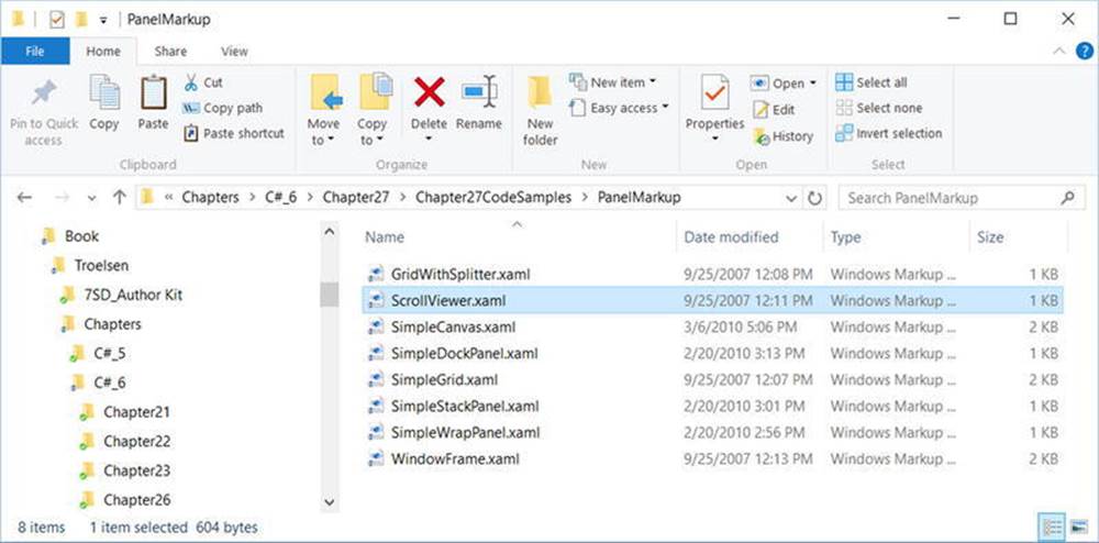
Figure 27-3. You will be loading the supplied XAML data into your MyXamlPad.exe appliction to test various layouts
Positioning Content Within Canvas Panels
You will probably feel most at home with the Canvas panel because it allows for absolute positioning of UI content. If the end user resizes the window to an area that is smaller than the layout maintained by the Canvas panel, the internal content will not be visible until the container is stretched to a size equal to or larger than the Canvas area.
To add content to a Canvas, you begin by defining the required controls within the scope of the opening <Canvas> and closing </Canvas> tags. Next, specify the upper-left corner for each control; this is where the rendering should begin using the Canvas.Top andCanvas.Left properties. You can specify the bottom-right area indirectly in each control by setting its Height and Width properties, or directly by using the Canvas.Right and Canvas.Bottom properties.
To see Canvas in action, open the provided SimpleCanvas.xaml file using a text editor and copy the content into MyXamlPad.exe (or kaxaml.exe). You should see the following Canvas definition:
<Window
xmlns="http://schemas.microsoft.com/winfx/2006/xaml/presentation"
xmlns:x="http://schemas.microsoft.com/winfx/2006/xaml"
...
Title="Fun with Panels!" Height="285" Width="325">
<Canvas Background="LightSteelBlue">
<Button x:Name="btnOK" Canvas.Left="212" Canvas.Top="203"
Width="80" Content="OK"/>
<Label x:Name="lblInstructions" Canvas.Left="17" Canvas.Top="14"
Width="328" Height="27" FontSize="15"
Content="Enter Car Information"/>
<Label x:Name="lblMake" Canvas.Left="17" Canvas.Top="60"
Content="Make"/>
<TextBox x:Name="txtMake" Canvas.Left="94" Canvas.Top="60"
Width="193" Height="25"/>
<Label x:Name="lblColor" Canvas.Left="17" Canvas.Top="109"
Content="Color"/>
<TextBox x:Name="txtColor" Canvas.Left="94" Canvas.Top="107"
Width="193" Height="25"/>
<Label x:Name="lblPetName" Canvas.Left="17" Canvas.Top="155"
Content="Pet Name"/>
<TextBox x:Name="txtPetName" Canvas.Left="94" Canvas.Top="153"
Width="193" Height="25"/>
</Canvas>
</Window>
Clicking your View Xaml button causes the window shown in Figure 27-4 to display on the screen.
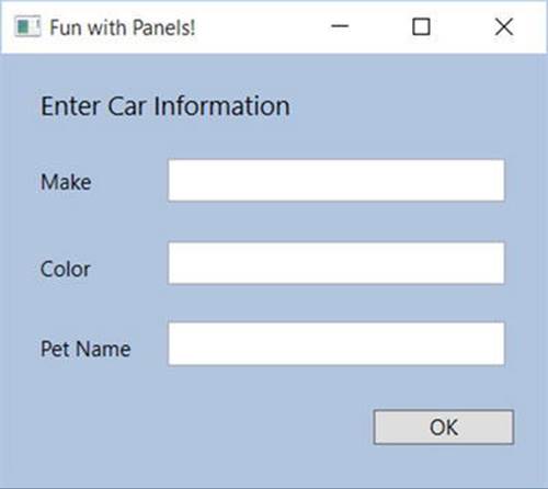
Figure 27-4. The Canvas layout manager allows for absolute positioning of content
Note that the order you declare content within a Canvas is not used to calculate placement; instead, placement is based on the control’s size and the Canvas.Top, Canvas.Bottom, Canvas.Left, and Canvas.Right properties.
Note If subelements within a Canvas do not define a specific location using attached property syntax (e.g., Canvas.Left and Canvas.Top), they automatically attach to the extreme upper-left corner of Canvas.
Using the Canvas type might seem like the preferred way to arrange content (because it feels so familiar), but this approach does suffer from some limitations. First, items within a Canvas do not dynamically resize themselves when applying styles or templates (e.g., their font sizes are unaffected). Second, the Canvas will not attempt to keep elements visible when the end user resizes the window to a smaller surface.
Perhaps the best use of the Canvas type is for positioning graphical content. For example, if you were building a custom image using XAML, you certainly would want the lines, shapes, and text to remain in the same location, rather than see them dynamically repositioned as the user resizes the window! You’ll revisit Canvas in Chapter 28 when you examine WPF’s graphical rendering services.
Positioning Content Within WrapPanel Panels
A WrapPanel allows you to define content that will flow across the panel as the window is resized. When positioning elements in a WrapPanel, you do not specify top, bottom, left, and right docking values as you typically do with Canvas. However, each subelement is free to define aHeight and Width value (among other property values) to control its overall size in the container.
Because content within a WrapPanel does not dock to a given side of the panel, the order in which you declare the elements is important (content is rendered from the first element to the last). If you were to load the XAML data found within the SimpleWrapPanel.xaml file, you would find it contains the following markup (enclosed within a <Window> definition):
<WrapPanel Background="LightSteelBlue">
<Label x:Name="lblInstruction" Width="328"
Height="27" FontSize="15" Content="Enter Car Information"/>
<Label x:Name="lblMake" Content="Make"/>
<TextBox x:Name="txtMake" Width="193" Height="25"/>
<Label x:Name="lblColor" Content="Color"/>
<TextBox x:Name="txtColor" Width="193" Height="25"/>
<Label x:Name="lblPetName" Content="Pet Name"/>
<TextBox x:Name="txtPetName" Width="193" Height="25"/>
<Button x:Name="btnOK" Width="80" Content="OK"/>
</WrapPanel>
When you load this markup, the content looks out of sorts as you resize the width because it flows from left-to-right across the window (see Figure 27-5).
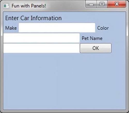
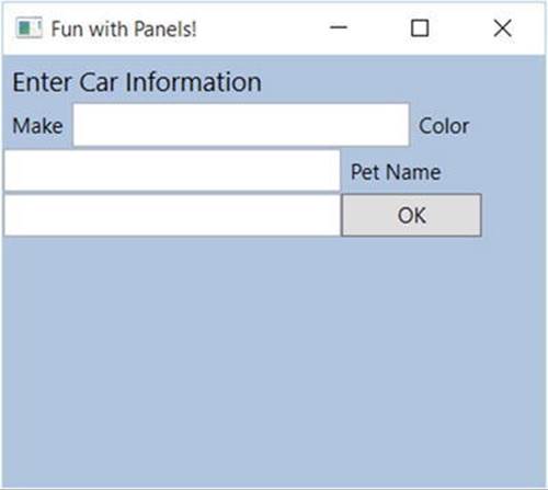
Figure 27-5. Content in a WrapPanel behaves much like a traditional HTML page
By default, content within a WrapPanel flows from left-to-right. However, if you change the value of the Orientation property to Vertical, you can have content wrap in a top-to-bottom manner.
<WrapPanel Background="LightSteelBlue" Orientation ="Vertical">
You can declare a WrapPanel (as well as some other panel types) by specifying ItemWidth and ItemHeight values, which control the default size of each item. If a subelement does provide its own Height and/or Width value, it will be positioned relative to the size established by the panel. Consider the following markup:
<WrapPanel Background="LightSteelBlue" Orientation ="Horizontal" ItemWidth ="200" ItemHeight ="30">
<Label x:Name="lblInstruction"
FontSize="15" Content="Enter Car Information"/>
<Label x:Name="lblMake" Content="Make"/>
<TextBox x:Name="txtMake"/>
<Label x:Name="lblColor" Content="Color"/>
<TextBox x:Name="txtColor"/>
<Label x:Name="lblPetName" Content="Pet Name"/>
<TextBox x:Name="txtPetName"/>
<Button x:Name="btnOK" Width ="80" Content="OK"/>
</WrapPanel>
The rendered code looks like Figure 27-6 (notice the size and position of the Button control, which has a specified unique Width value).
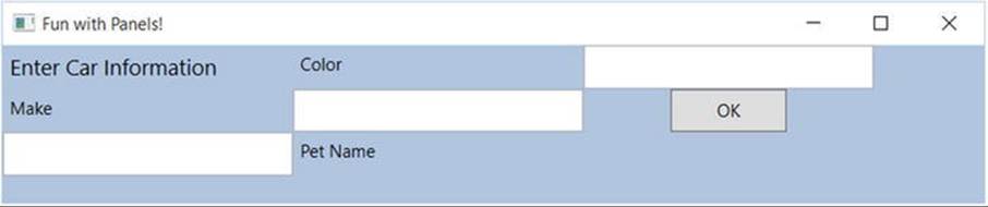
Figure 27-6. A WrapPanel can establish the width and height of a given item
As you might agree after looking at Figure 27-6, a WrapPanel is not typically the best choice for arranging content directly in a window because its elements can become scrambled as the user resizes the window. In most cases, a WrapPanel will be a subelement to another panel type, allowing a small area of the window to wrap its content when resized (e.g., a ToolBar control).
Positioning Content Within StackPanel Panels
Like a WrapPanel, a StackPanel control arranges content into a single line that can be oriented horizontally or vertically (the default), based on the value assigned to the Orientation property. The difference, however, is that the StackPanel will not attempt to wrap the content as the user resizes the window. Rather, the items in the StackPanel will simply stretch (based on their orientation) to accommodate the size of the StackPanel itself. For example, the SimpleStackPanel.xaml file contains the following markup, which results in the output shown inFigure 27-7:
<StackPanel Background="LightSteelBlue">
<Label x:Name="lblInstruction"
FontSize="15" Content="Enter Car Information"/>
<Label x:Name="lblMake" Content="Make"/>
<TextBox Name="txtMake"/>
<Label x:Name="lblColor" Content="Color"/>
<TextBox x:Name="txtColor"/>
<Label x:Name="lblPetName" Content="Pet Name"/>
<TextBox x:Name="txtPetName"/>
<Button x:Name="btnOK" Width ="80" Content="OK"/>
</StackPanel>
Figure 27-7. Vertical stacking of content
If you assign the Orientation property to Horizontal as follows, the rendered output will match that shown in Figure 27-8:
<StackPanel Background="LightSteelBlue" Orientation="Horizontal">
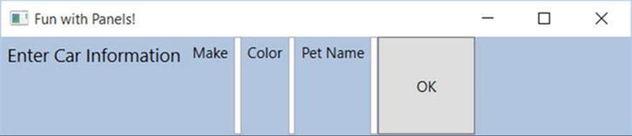
Figure 27-8. Horizontal stacking of content
Again, as is the case with the WrapPanel, you will seldom want to use a StackPanel to arrange content directly within a window. Instead, you should use StackPanel as a subpanel to a master panel.
Positioning Content Within Grid Panels
Of all the panels provided with the WPF APIs, Grid is far and away the most flexible. Like an HTML table, the Grid can be carved up into a set of cells, each one of which provides content. When defining a Grid, you perform three steps.
1. Define and configure each column.
2. Define and configure each row.
3. Assign content to each cell of the grid using attached property syntax.
Note If you do not define any rows or columns, the <Grid> defaults to a single cell that fills the entire surface of the window. Furthermore, if you do not assign a cell value for a subelement within a <Grid>, it automatically attaches to column 0, row 0.
You achieve the first two steps (defining the columns and rows) by using the <Grid.ColumnDefinitions> and <Grid.RowDefinitions> elements, which contain a collection of <ColumnDefinition> and <RowDefinition> elements, respectively. Each cell within a grid is indeed a true .NET object, so you can configure the look-and-feel and behavior of each cell as you see fit.
Here is a <Grid> definition (that you can find in the SimpleGrid.xaml file) that arranges your UI content as shown in Figure 27-9:
<Grid ShowGridLines ="True" Background ="LightSteelBlue">
<!- Define the rows/columns ->
<Grid.ColumnDefinitions>
<ColumnDefinition/>
<ColumnDefinition/>
</Grid.ColumnDefinitions>
<Grid.RowDefinitions>
<RowDefinition/>
<RowDefinition/>
</Grid.RowDefinitions>
<!- Now add the elements to the grid’s cells ->
<Label x:Name="lblInstruction" Grid.Column ="0" Grid.Row ="0"
FontSize="15" Content="Enter Car Information"/>
<Button x:Name="btnOK" Height ="30" Grid.Column ="0"
Grid.Row ="0" Content="OK"/>
<Label x:Name="lblMake" Grid.Column ="1"
Grid.Row ="0" Content="Make"/>
<TextBox x:Name="txtMake" Grid.Column ="1"
Grid.Row ="0" Width="193" Height="25"/>
<Label x:Name="lblColor" Grid.Column ="0"
Grid.Row ="1" Content="Color"/>
<TextBox x:Name="txtColor" Width="193" Height="25"
Grid.Column ="0" Grid.Row ="1" />
<!- Just to keep things interesting, add some color to the pet name cell ->
<Rectangle Fill ="LightGreen" Grid.Column ="1" Grid.Row ="1" />
<Label x:Name="lblPetName" Grid.Column ="1" Grid.Row ="1" Content="Pet Name"/>
<TextBox x:Name="txtPetName" Grid.Column ="1" Grid.Row ="1"
Width="193" Height="25"/>
</Grid>
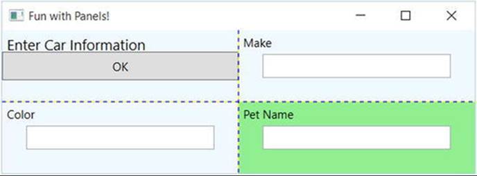
Figure 27-9. The Grid panel in action
Notice that each element (including a light green Rectangle element thrown in for good measure) connects itself to a cell in the grid using the Grid.Row and Grid.Column attached properties. By default, the ordering of cells in a grid begins at the upper left, which you specify using Grid.Column="0" Grid.Row="0". Given that your grid defines a total of four cells, you can identify the bottom-right cell using Grid.Column="1" Grid.Row="1".
Grids with GridSplitter Types
Grid objects can also support splitters. As you might know, splitters allow the end user to resize rows or columns of a grid type. As this is done, the content within each resizable cell will reshape itself based on how the items have been contained. Adding splitters to a Grid is easy to do; you simply define the <GridSplitter> control, using attached property syntax to establish which row or column it affects.
Be aware that you must assign a Width or Height value (depending on vertical or horizontal splitting) for the splitter to be visible on the screen. Consider the following simple Grid type with a splitter on the first column (Grid.Column = "0"). The contents of the providedGridWithSplitter.xaml file look like this:
<Grid Background ="LightSteelBlue">
<!- Define columns ->
<Grid.ColumnDefinitions>
<ColumnDefinition Width ="Auto"/>
<ColumnDefinition/>
</Grid.ColumnDefinitions>
<!- Add this label to cell 0 ->
<Label x:Name="lblLeft" Background ="GreenYellow"
Grid.Column="0" Content ="Left!"/>
<!- Define the splitter ->
<GridSplitter Grid.Column ="0" Width ="5"/>
<!- Add this label to cell 1 ->
<Label x:Name="lblRight" Grid.Column ="1" Content ="Right!"/>
</Grid>
First and foremost, notice that the column that will support the splitter has a Width property of Auto. Next, notice that the <GridSplitter> uses attached property syntax to establish which column it is working with. If you were to view this output, you would find a five-pixel splitter that allows you to resize each Label (marked with the red arrow). Note that the content fills up the entire cell because you have not specified Height or Width properties for either Label (see Figure 27-10).
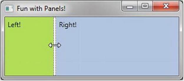
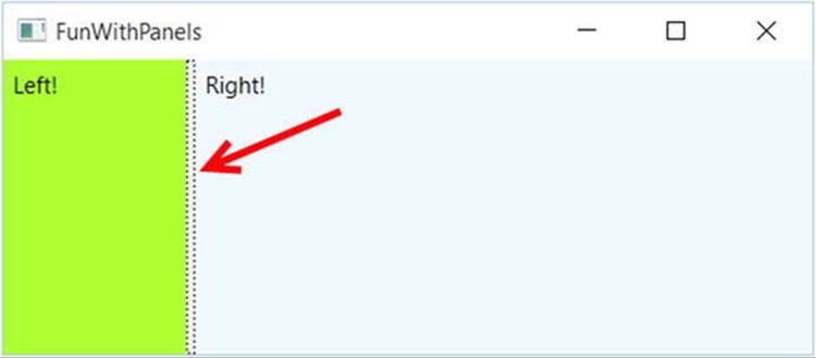
Figure 27-10. Grid types containing splitters
Positioning Content Within DockPanel Panels
DockPanel is typically used as a container that holds any number of additional panels for grouping related content. DockPanels use attached property syntax (as seen with the Canvas or Grid types) to control where each item docks itself within the DockPanel.
The SimpleDockPanel.xaml file defines the following simple DockPanel definition that results in the output shown in Figure 27-11:
<DockPanel LastChildFill ="True">
<!- Dock items to the panel ->
<Label x:Name="lblInstruction" DockPanel.Dock ="Top"
FontSize="15" Content="Enter Car Information"/>
<Label x:Name="lblMake" DockPanel.Dock ="Left" Content="Make"/>
<Label x:Name="lblColor" DockPanel.Dock ="Right" Content="Color"/>
<Label x:Name="lblPetName" DockPanel.Dock ="Bottom" Content="Pet Name"/>
<Button x:Name="btnOK" Content="OK"/>
</DockPanel>
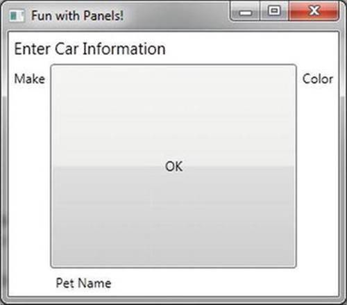
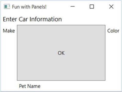
Figure 27-11. A simple DockPanel
Note If you add multiple elements to the same side of a DockPanel, they will stack along the specified edge in the order that they are declared.
The benefit of using DockPanel types is that, as the user resizes the window, each element remains connected to the specified side of the panel (through DockPanel.Dock). Also notice that the opening <DockPanel> tag in this example sets the LastChildFill attribute totrue. Given that the Button control is indeed the “last child” in the container, it will therefore be stretched within the remaining space.
Enabling Scrolling for Panel Types
It is worth pointing out that WPF supplies a ScrollViewer class, which provides automatic scrolling behaviors for data within panel objects. The ScrollViewer.xaml file defines the following:
<ScrollViewer>
<StackPanel>
<Button Content ="First" Background = "Green" Height ="40"/>
<Button Content ="Second" Background = "Red" Height ="40"/>
<Button Content ="Third" Background = "Pink" Height ="40"/>
<Button Content ="Fourth" Background = "Yellow" Height ="40"/>
<Button Content ="Fifth" Background = "Blue" Height ="40"/>
</StackPanel>
</ScrollViewer>
You can see the result of the previous XAML definition in Figure 27-12 (notice the scroll bar on the right since the window isn’t sized to show all five buttons).
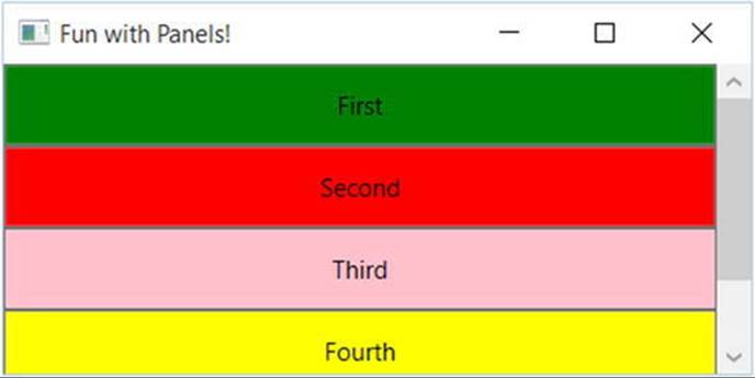
Figure 27-12. Working with the ScrollViewer type
As you would expect, each panel provides numerous members that allow you to fine-tune content placement. On a related note, many WPF controls support two properties of interest (Padding and Margin) that allow the control itself to inform the panel how it wishes to be treated. Specifically, the Padding property controls how much extra space should surround the interior control, while Margin controls the extra space around the exterior of a control.
This wraps up this chapter’s look at the major panel types of WPF, as well as the various ways they position their content. Next, you’ll learn how to use the Visual Studio designers to create layouts.
Configuring Panels Using the Visual Studio Designers
Now that you have been given a walkthrough of the XAML used to define some common layout managers, you will be happy to know that Visual Studio has some very good design-time support for constructing your layouts. The key to doing so lies with the Document Outline window described earlier in this chapter. To illustrate some of the basics, create a new WPF application project named VisualLayoutTesterApp.
Notice how your initial Window makes use of a Grid layout by default:
<Window x:Class="VisualLayoutTesterApp.MainWindow"
xmlns="http://schemas.microsoft.com/winfx/2006/xaml/presentation"
xmlns:x="http://schemas.microsoft.com/winfx/2006/xaml"
xmlns:d="http://schemas.microsoft.com/expression/blend/2008"
xmlns:mc="http://schemas.openxmlformats.org/markup-compatibility/2006"
xmlns:local="clr-namespace:VisualLayoutTesterApp"
mc:Ignorable="d"
Title="MainWindow" Height="350" Width="525">
<Grid>
</Grid>
</Window>
If you are happy using the Grid layout system, notice in Figure 27-13 that you can easily carve out and resize the grid’s cells using the visual layout. To do so, first select the Grid component in your Document Outline window, and then click the grid’s border to create new rows and columns.
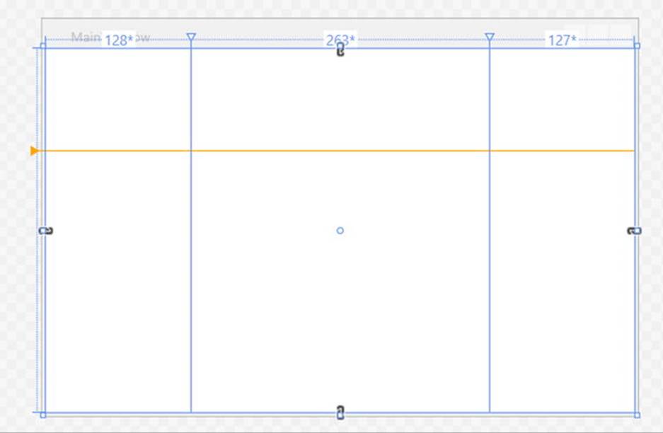
Figure 27-13. The Grid control can be visually cut into cells using the IDE’s designer
Now, let’s say you have defined a grid with some number of cells. You can then drag and drop controls into a given cell of the layout system, and the IDE will automatically set the Grid.Row and Grid.Column properties of the control in question. Here is some possible markup generated by the IDE after dragging a Button into a predefined cell:
<Button x:Name="button" Content="Button" Grid.Column="1" HorizontalAlignment="Left" Margin="21,21.4,0,0" Grid.Row="1" VerticalAlignment="Top" Width="75"/>
Now, let’s say you would rather not use a Grid at all. If you right-click any layout node in the Document Outline window, you will find a menu option that allows you to change the current container into another (see Figure 27-14). Be very aware that when you do so, you will (most likely) radically change the positioning of the controls because the controls will conform to the rules of the new panel type.
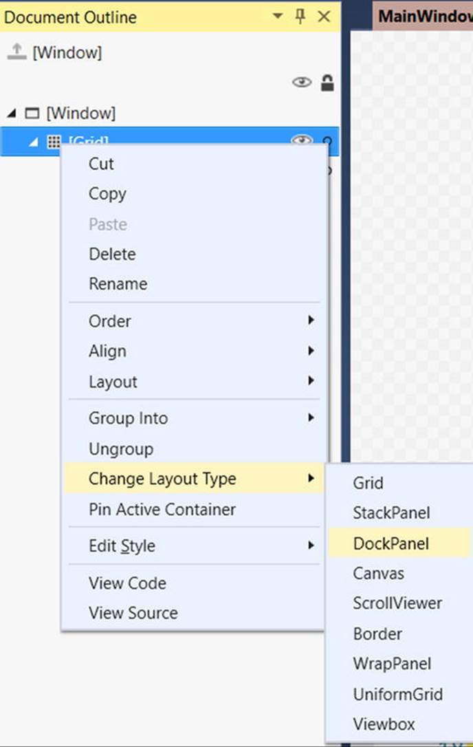
Figure 27-14. The Document Outline window allows you to convert to new panel types
Another handy trick is the ability to select a set of controls on the visual designer and group them into a new, nested layout manager. Assume you have a Canvas that defines a set of random objects (if you want to try, convert the initial Grid to a Canvas using the technique shown in the Figure 27-14). Now, select a set of items on the designer by holding down the CTRL key and clicking each item with the left mouse button. If you then right-click the selection, you can group the selected items into a new subpanel (see Figure 27-15).
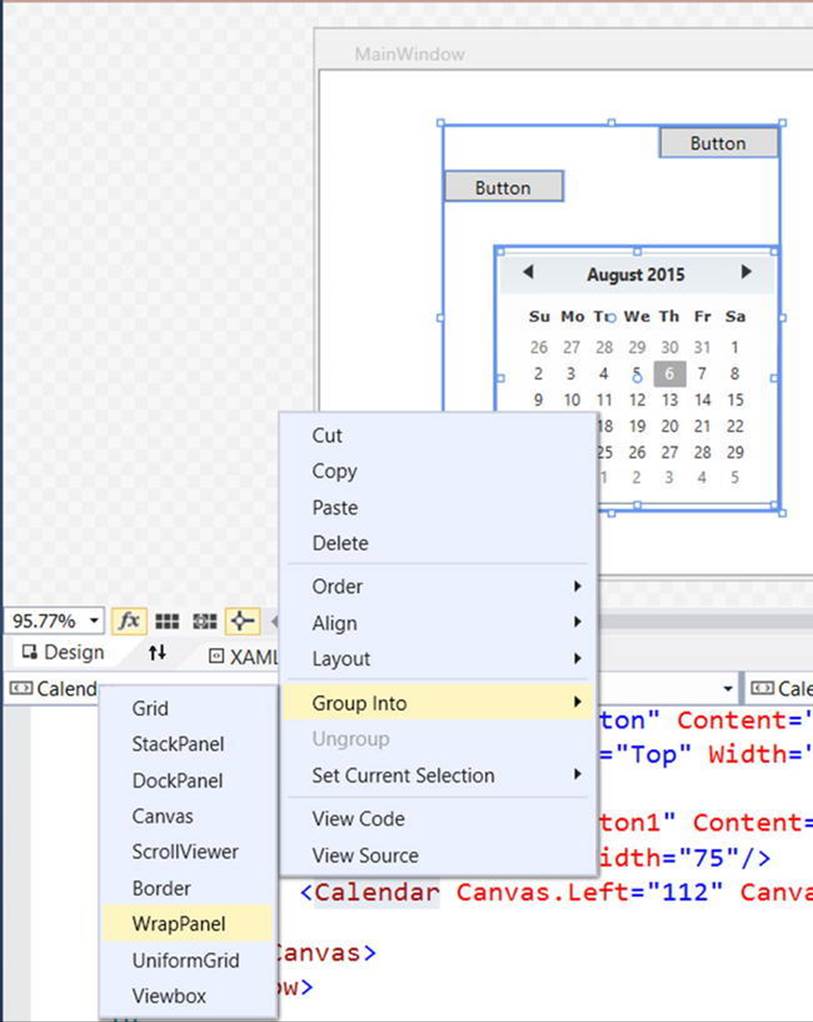
Figure 27-15. Grouping items into a new subpanel
After you have done so, examine the Document Outline window once again to verify the nested layout system. As you build full-featured WPF windows, you will most likely always need to make use of a nested layout system, rather than simply picking a single panel for all of the UI display (in fact, the remaining WPF examples in the text will typically do so). On a final note, the nodes in the Document Outline window are all drag and droppable. For example, if you wanted to move a control currently in the Canvas into the parent panel, you could do so as suggested inFigure 27-16.
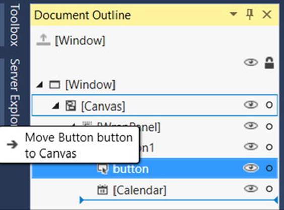
Figure 27-16. Relocating items via the Document Outline window
As you work through the remaining WPF chapters, I’ll point out additional layout shortcuts where possible. However, it’s definitely worth your time to experiment and test out various features yourself. To keep us moving in the right direction, the next example in the chapter will illustrate how to build a nested layout manager for a custom text processing application (with spell checking!).
Building a Window’s Frame Using Nested Panels
As mentioned, a typical WPF window will not use a single panel control, but instead will nest panels within other panels to gain the desired layout system. Begin by creating a new WPF application named MyWordPad.
Your goal is to construct a layout where the main window has a topmost menu system, a toolbar under the menu system, and a status bar mounted on the bottom of the window. The status bar will contain a pane to hold text prompts that are displayed when the user selects a menu item (or toolbar button), while the menu system and toolbar will offer UI triggers to close the application and display spelling suggestions in an Expander widget. Figure 27-17 shows the initial layout you are shooting for; it also displays spelling suggestions for “XAML.”
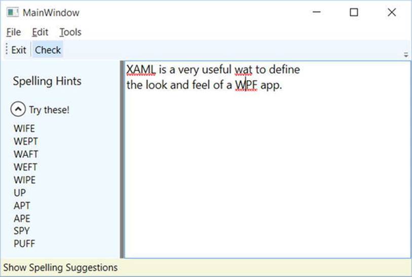
Figure 27-17. Using nested panels to establish a window’s UI
Notice that the two toolbar buttons are not supporting an expected image, but a simple text value. This would not be sufficient for a production-level application, but assigning images to toolbar buttons typically involves using embedded resources, a topic that you will examine in Chapter 28 (so text data will do for now). Also note that, as the mouse button is placed over the Check button, the mouse cursor changes and the single pane of the status bar displays a useful UI message.
To begin building this UI, update the initial XAML definition for your Window type so it uses a <DockPanel> child element, rather than the default <Grid>, as follows:
<Window x:Class="MyWordPad.MainWindow"
xmlns="http://schemas.microsoft.com/winfx/2006/xaml/presentation"
xmlns:x="http://schemas.microsoft.com/winfx/2006/xaml"
xmlns:d="http://schemas.microsoft.com/expression/blend/2008"
xmlns:mc="http://schemas.openxmlformats.org/markup-compatibility/2006"
xmlns:local="clr-namespace:MyWordPad"
mc:Ignorable="d"
Title="My Spell Checker" Height="350" Width="525">
<!- This panel establishes the content for the window ->
<DockPanel>
</DockPanel>
</Window>
Building the Menu System
Menu systems in WPF are represented by the Menu class, which maintains a collection of MenuItem objects. When building a menu system in XAML, you can have each MenuItem handle various events. The most notable of these events is Click, which occurs when the end user selects a subitem. In this example, you begin by building the two topmost menu items (File and Tools; you will build the Edit menu later in this example), which expose Exit and Spelling Hints subitems, respectively.
In addition to handling the Click event for each subitem, you also need to handle the MouseEnter and MouseExit events, which you will use to set the status bar text in a later step. Add the following markup within your <DockPanel> scope (feel free to use Properties window of Visual Studio to handle each event; see Chapter 26 for a walkthrough on how to do so):
<!-- Dock menu system on the top -->
<Menu DockPanel.Dock ="Top"
HorizontalAlignment="Left" Background="White" BorderBrush ="Black">
<MenuItem Header="_File">
<Separator/>
<MenuItem Header ="_Exit" MouseEnter ="MouseEnterExitArea"
MouseLeave ="MouseLeaveArea" Click ="FileExit_Click"/>
</MenuItem>
<MenuItem Header="_Tools">
<MenuItem Header ="_Spelling Hints"
MouseEnter ="MouseEnterToolsHintsArea"
MouseLeave ="MouseLeaveArea" Click ="ToolsSpellingHints_Click"/>
</MenuItem>
</Menu>
Notice that you dock the menu system to the top of the DockPanel. Also, you use the <Separator> element to insert a thin horizontal line in the menu system, directly before the Exit option. Also notice that the Header values for each MenuItem contain an embedded underscore token (e.g., _Exit). You use this token to establish which letter will be underlined when the end user presses the Alt key (for keyboard shortcuts). This is a change from the & character used in Windows Forms since XAML is based on XML, and the & character has meaning in XML.
So far you’ve implemented the complete the menu system definition; next, you need to implement the various event handlers. First, you have the File Exit handler, FileExit_Click(), which simply closes the window, which in turn terminates the application because this is your topmost window. The MouseEnter and MouseExit event handlers for each subitem will eventually update your status bar; however, for now, you will simply provide shells. Finally, the ToolsSpellingHints_Click() handler for the Tools Spelling Hints menu item will also remain a shell for the time being. Here are the current updates to your code-behind file:
public partial class MainWindow : Window
{
public MainWindow()
{
InitializeComponent();
}
protected void FileExit_Click(object sender, RoutedEventArgs args)
{
// Close this window.
this.Close();
}
protected void ToolsSpellingHints_Click(object sender, RoutedEventArgs args)
{
}
protected void MouseEnterExitArea(object sender, RoutedEventArgs args)
{
}
protected void MouseEnterToolsHintsArea(object sender, RoutedEventArgs args)
{
}
protected void MouseLeaveArea(object sender, RoutedEventArgs args)
{
}
}
Building Menus Visually
While it is always good to know how to manually define items in XAML, it can be a tad on the tedious side. Visual Studio supports visual design support for menu systems, toolbars, status bars, and many other UI controls. By way of a quick example, assume you had a fresh Menu control on a new Window (you might want to insert a test Window via the Project Add Window menu option and follow along). Now, if you right-click the Menu control, you will notice an Add MenuItem option (see Figure 27-18).
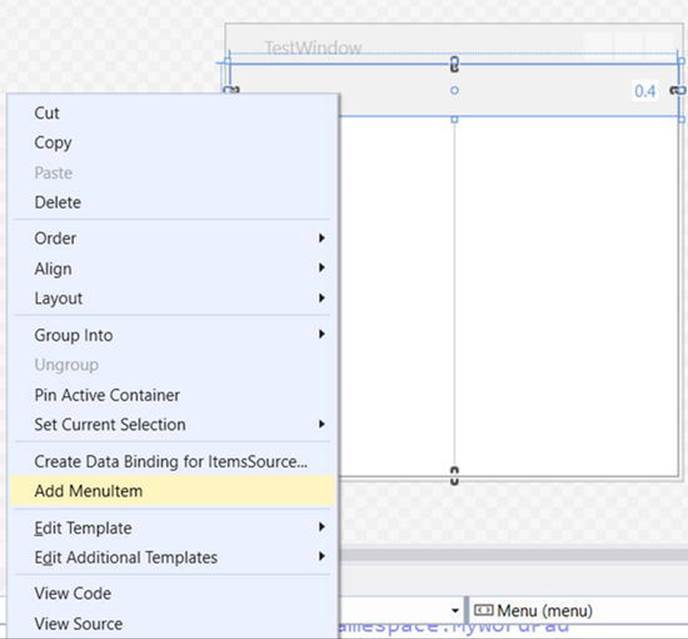
Figure 27-18. Visually adding items to a Menu object
After you have added a set of topmost items, you can then add submenu items, separators, expand or collapse the menu itself, and perform other menu-centric operations via a second right-click. Figure 27-19 shows one possible way to visually design a simple menu system (be sure you examine the generated XAML).
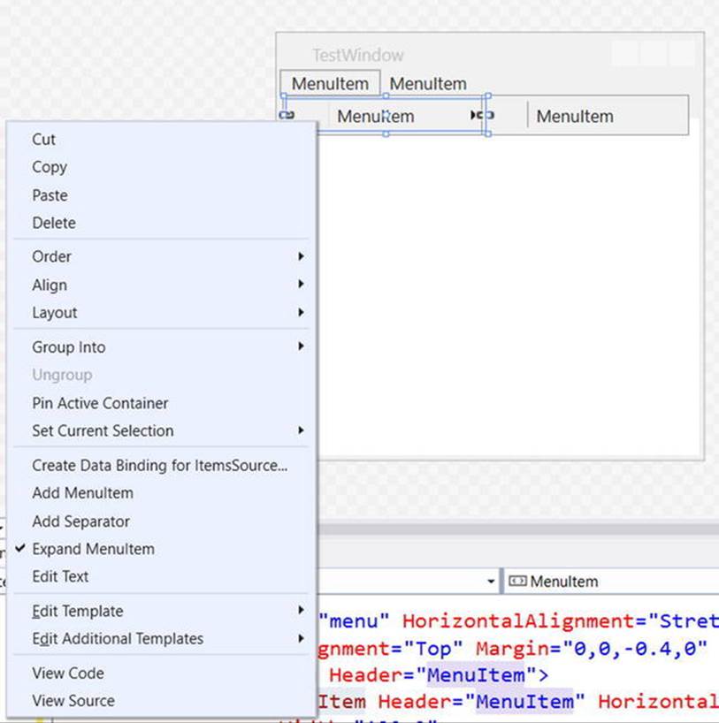
Figure 27-19. Visually adding items to a MenuItem object
As you read over the reminder of the current MyWordPad example, I’ll typically show you the final generated XAML; however, do take the time to experiment with the visual designers to simplify the task at hand.
Building the ToolBar
Toolbars (represented by the ToolBar class in WPF) typically provide an alternative manner for activating a menu option. Add the following markup directly after the closing scope of your <Menu> definition:
<!-- Put Toolbar under the Menu -->
<ToolBar DockPanel.Dock ="Top" >
<Button Content ="Exit" MouseEnter ="MouseEnterExitArea"
MouseLeave ="MouseLeaveArea" Click ="FileExit_Click"/>
<Separator/>
<Button Content ="Check" MouseEnter ="MouseEnterToolsHintsArea"
MouseLeave ="MouseLeaveArea" Click ="ToolsSpellingHints_Click"
Cursor="Help" />
</ToolBar>
Your ToolBar control consists of two Button controls, which just so happen to handle the same events and are handled by the same methods in your code file. Using this technique, you can double-up your handlers to serve both menu items and toolbar buttons. Although this toolbar uses the typical push buttons, you should appreciate that the ToolBar type “is-a” ContentControl; therefore, you are free to embed any types into its surface (e.g., drop-down lists, images, and graphics). The only other point of interest here is that the Check button supports a custom mouse cursor through the Cursor property.
Note You can optionally wrap the ToolBar element within a <ToolBarTray> element, which controls layout, docking, and drag-and-drop operations for a set of ToolBar objects. Consult the .NET Framework 4.6 SDK documentation for details.
Building the StatusBar
A StatusBar control will be docked to the lower portion of the <DockPanel> and contain a single <TextBlock> control, which you have not used prior to this point in the chapter. You can use a TextBlock to hold text that supports numerous textual annotations, such as bold text, underlined text, line breaks, and so forth. Add the following markup directly after the previous ToolBar definition:
<!-- Put a StatusBar at the bottom -->
<StatusBar DockPanel.Dock ="Bottom" Background="Beige" >
<StatusBarItem>
<TextBlock Name="statBarText" Text="Ready"/>
</StatusBarItem>
</StatusBar>
Finalizing the UI Design
The final aspect of your UI design is to define a splittable Grid that defines two columns. On the left, place an Expander control that will display a list of spelling suggestions, wrapped within a <StackPanel>. On the right, place a TextBox control that supports multiple lines and scrollbars, and includes enabled spell checking. You mount the entire <Grid> to the left of the parent <DockPanel>. Add the following XAML markup directly under the markup describing the StatusBar to complete the definition of your window’s UI:
<Grid DockPanel.Dock ="Left" Background ="AliceBlue">
<!-- Define the rows and columns -->
<Grid.ColumnDefinitions>
<ColumnDefinition />
<ColumnDefinition />
</Grid.ColumnDefinitions>
<GridSplitter Grid.Column ="0" Width ="5" Background ="Gray" />
<StackPanel Grid.Column="0" VerticalAlignment ="Stretch" >
<Label Name="lblSpellingInstructions" FontSize="14" Margin="10,10,0,0">
Spelling Hints
</Label>
<Expander Name="expanderSpelling" Header ="Try these!"
Margin="10,10,10,10">
<!-- This will be filled programmatically -->
<Label Name ="lblSpellingHints" FontSize ="12"/>
</Expander>
</StackPanel>
<!-- This will be the area to type within -->
<TextBox Grid.Column ="1"
SpellCheck.IsEnabled ="True"
AcceptsReturn ="True"
Name ="txtData" FontSize ="14"
BorderBrush ="Blue"
VerticalScrollBarVisibility="Auto"
HorizontalScrollBarVisibility="Auto">
</TextBox>
</Grid>
Implementing the MouseEnter/MouseLeave Event Handlers
At this point, the UI of your window is complete. The only remaining tasks are to provide an implementation for the remaining event handlers. Begin by updating your C# code file so that each of the MouseEnter, MouseLeave, and MouseExit handlers set the text pane of the status bar with a fitting message to help the end user, like so:
public partial class MainWindow : System.Windows.Window
{
...
protected void MouseEnterExitArea(object sender, RoutedEventArgs args)
{
statBarText.Text = "Exit the Application";
}
protected void MouseEnterToolsHintsArea(object sender, RoutedEventArgs args)
{
statBarText.Text = "Show Spelling Suggestions";
}
protected void MouseLeaveArea(object sender, RoutedEventArgs args)
{
statBarText.Text = "Ready";
}
}
At this point, you can run your application. You should see your status bar change its text based on which menu item/toolbar button you hover your mouse over.
Implementing the Spell Checking Logic
The WPF API ships with built-in spell checker support, which is independent of Microsoft Office products. This means you don’t need to use the COM interop layer to use the spell checker of Microsoft Word; instead, you can easily add the same type of support with only a few lines of code.
You might recall that when you defined the <TextBox> control, you set the SpellCheck.IsEnabled property to true. When you do this, misspelled words are underlined with a red squiggle, just as they are in Microsoft Office. Even better, the underlying programming model gives you access to the spell- checker engine, which allows you to get a list of suggestions for misspelled words. Add the following code to your ToolsSpellingHints_Click() method:
protected void ToolsSpellingHints_Click(object sender, RoutedEventArgs args)
{
string spellingHints = string.Empty;
// Try to get a spelling error at the current caret location.
SpellingError error = txtData.GetSpellingError(txtData.CaretIndex);
if (error != null)
{
// Build a string of spelling suggestions.
foreach (string s in error.Suggestions)
{
spellingHints += $"{s}\n";
}
// Show suggestions and expand the expander.
lblSpellingHints.Content = spellingHints;
expanderSpelling.IsExpanded = true;
}
}
The preceding code is quite simple. You simply figure out the current location of the caret in the text box by using the CaretIndex property to extract a SpellingError object. If there is an error at said location (meaning the value is not null), you loop over the list of suggestions using the aptly named Suggestions property. After you have all of the suggestions for the misspelled word, you connect the data to the Label in the Expander.
So there you have it! With only a few lines of procedural code (and a healthy dose of XAML), you have the beginnings of a functioning word processor. An understanding of control commands can help you add a bit more pizzazz.
Understanding WPF Commands
Windows Presentation Foundation provides support for what might be considered control-agnostic events via the command architecture. A typical .NET event is defined within a specific base class and can be used only by that class or a derivative thereof. Therefore, normal .NET events are tightly coupled to the class in which they are defined.
In contrast, WPF commands are event-like entities that are independent from a specific control and, in many cases, can be successfully applied to numerous (and seemingly unrelated) control types. By way of a few examples, WPF supports copy, paste, and cut commands, which you can apply to a wide variety of UI elements (e.g., menu items, toolbar buttons, and custom buttons), as well as keyboard shortcuts (e.g., Ctrl+C and Ctrl+V).
While other UI toolkits (such as Windows Forms) provided standard events for such purposes, using them typically left you with redundant and hard-to-maintain code. Under the WPF model, you can use commands as an alternative. The end result typically yields a smaller and more flexible code base.
The Intrinsic Command Objects
WPF ships with numerous built-in control commands, all of which you can configure with associated keyboard shortcuts (or other input gestures). Programmatically speaking, a WPF command is any object that supports a property (often called Command) that returns an object implementing the ICommand interface, as shown here:
public interface ICommand
{
// Occurs when changes occur that affect whether
// or not the command should execute.
event EventHandler CanExecuteChanged;
// Defines the method that determines whether the command
// can execute in its current state.
bool CanExecute(object parameter);
// Defines the method to be called when the command is invoked.
void Execute(object parameter);
}
WPF provides various command classes, which expose close to 100 command objects, out of the box. These classes define numerous properties that expose specific command objects, each of which implements ICommand. Table 27-3 documents some of the standard command objects available (be sure to consult the .NET Framework 4.6 SDK documentation for complete details).
Table 27-3. The Intrinsic WPF Control Command Objects
|
WPF Class |
Command Objects |
Meaning in Life |
|
ApplicationCommands |
Close, Copy, Cut, Delete, Find, Open, Paste, Save, SaveAs, Redo, Undo |
Various application-level commands |
|
ComponentCommands |
MoveDown, MoveFocusBack, MoveLeft, MoveRight, ScrollToEnd, ScrollToHome |
Various commands common to UI components |
|
MediaCommands |
BoostBase, ChannelUp, ChannelDown, FastForward, NextTrack, Play, Rewind, Select, Stop |
Various media-centric commands |
|
NavigationCommands |
BrowseBack, BrowseForward, Favorites, LastPage, NextPage, Zoom |
Various commands relating to the WPF navigation model |
|
EditingCommands |
AlignCenter, CorrectSpellingError, DecreaseFontSize, EnterLineBreak, EnterParagraphBreak, MoveDownByLine, MoveRightByWord |
Various commands relating to the WPF Documents API |
Connecting Commands to the Command Property
If you want to connect any of the WPF command properties to a UI element that supports the Command property (such as a Button or MenuItem), you have very little work to do. You can see how to do this by updating the current menu system so it supports a new topmost menu item named Edit and three subitems to account for copying, pasting, and cutting of textual data, like so:
<Menu DockPanel.Dock ="Top"
HorizontalAlignment="Left"
Background="White" BorderBrush ="Black">
<MenuItem Header="_File" Click ="FileExit_Click" >
<MenuItem Header ="_Exit" MouseEnter ="MouseEnterExitArea"
MouseLeave ="MouseLeaveArea" Click ="FileExit_Click"/>
</MenuItem>
<!-- New menu item with commands! -->
<MenuItem Header="_Edit">
<MenuItem Command ="ApplicationCommands.Copy"/>
<MenuItem Command ="ApplicationCommands.Cut"/>
<MenuItem Command ="ApplicationCommands.Paste"/>
</MenuItem>
<MenuItem Header="_Tools">
<MenuItem Header ="_Spelling Hints"
MouseEnter ="MouseEnterToolsHintsArea"
MouseLeave ="MouseLeaveArea"
Click ="ToolsSpellingHints_Click"/>
</MenuItem>
</Menu>
Notice that each of the subitems on the Edit menu has a value assigned to the Command property. Doing this means that the menu items automatically receive the correct name and shortcut key (e.g., Ctrl+C for a cut operation) in the menu item UI; it also means that the application is nowcopy, cut, and paste-aware with no procedural code!
If you run the application and select some of text, you can use your new menu items out of the box. As a bonus, your application is also equipped to respond to a standard right-click operation to present the user with the same options (see Figure 27-20).
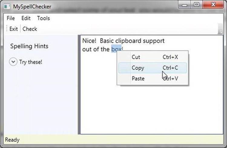
Figure 27-20. Command objects provide a good deal of built-in functionality for free
Connecting Commands to Arbitrary Actions
If you want to connect a command object to an arbitrary (application-specific) event, you will need to drop down to procedural code. Doing so is not complex, but it does involve a bit more logic than you see in XAML. For example, assume that you want to have the entire window respond to the F1 key, so that when the end user presses this key, he will activate an associated help system. Also, assume your code file for the main window defines a new method named SetF1CommandBinding() , which you call within the constructor after the call toInitializeComponent() .
public MainWindow()
{
InitializeComponent();
SetF1CommandBinding();
}
This new method will programmatically create a new CommandBinding object, which you can use whenever you need to bind a command object to a given event handler in your application. Here, you configure your CommandBinding object to operate with theApplicationCommands.Help command, which is automatically F1-aware:
private void SetF1CommandBinding()
{
CommandBinding helpBinding = new CommandBinding(ApplicationCommands.Help);
helpBinding.CanExecute += CanHelpExecute;
helpBinding.Executed += HelpExecuted;
CommandBindings.Add(helpBinding);
}
Most CommandBinding objects will want to handle the CanExecute event (which allows you to specify whether the command occurs based on the operation of your program) and the Executed event (which is where you can author the content that should occur once the command occurs). Add the following event handlers to your Window-derived type (note the format of each method, as required by the associated delegates):
private void CanHelpExecute(object sender, CanExecuteRoutedEventArgs e)
{
// Here, you can set CanExecute to false if you want to prevent the
// command from executing.
e.CanExecute = true;
}
private void HelpExecuted(object sender, ExecutedRoutedEventArgs e)
{
MessageBox.Show("Look, it is not that difficult. Just type something!",
"Help!");
}
In the preceding snippet, you implemented CanHelpExecute() so it always allows F1 help to launch; you do this by simply returning true. However, if you have certain situations where the help system should not display, you can account for this and return false when necessary. Your “help system” displayed within HelpExecuted() is little more than a message box. At this point, you can run your application. When you press the F1 key on your keyboard, you will see your (less than helpful, if not a bit insulting) user-guidance system (see Figure 27-21).
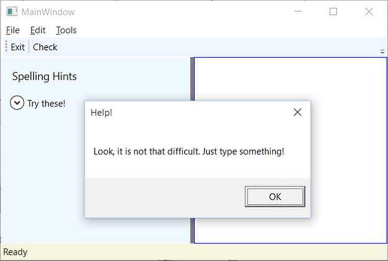
Figure 27-21. Your custom help system (which might not be as helpful as the user would hope)
Working with the Open and Save Commands
To complete the current example, you will add functionality to save your text data to an external file and open up *.txt files for editing. If you want to take the long road, you can manually add programming logic that enables or disables new menu items based on whether your TextBoxhas data inside it. Once again, however, you can use commands to decrease your burden.
Begin by updating the <MenuItem> element that represents your topmost File menu by adding the following two new submenus that use the Save and Open ApplicationCommands objects:
<MenuItem Header="_File">
<MenuItem Command ="ApplicationCommands.Open"/>
<MenuItem Command ="ApplicationCommands.Save"/>
<Separator/>
<MenuItem Header ="_Exit"
MouseEnter ="MouseEnterExitArea"
MouseLeave ="MouseLeaveArea" Click ="FileExit_Click"/>
</MenuItem>
Again, remember that all command objects implement the ICommand interface, which defines two events (CanExecute and Executed). Now you need to enable the entire window, so it can check whether it is currently okay to fire these commands; if so, you can define an event handler to execute the custom code.
You do this by populating the CommandBindings collection maintained by the window. To do so in XAML requires that you use property element syntax to define a <Window.CommandBindings> scope in which you place two <CommandBinding> definitions. Update your<Window> like this:
<Window x:Class="MyWordPad.MainWindow"
xmlns="http://schemas.microsoft.com/winfx/2006/xaml/presentation"
xmlns:x="http://schemas.microsoft.com/winfx/2006/xaml"
Title="MySpellChecker" Height="331" Width="508"
WindowStartupLocation ="CenterScreen" >
<!-- This will inform the Window which handlers to call,
when testing for the Open and Save commands. -->
<Window.CommandBindings>
<CommandBinding Command="ApplicationCommands.Open"
Executed="OpenCmdExecuted"
CanExecute="OpenCmdCanExecute"/>
<CommandBinding Command="ApplicationCommands.Save"
Executed="SaveCmdExecuted"
CanExecute="SaveCmdCanExecute"/>
</Window.CommandBindings>
<!-- This panel establishes the content for the window -->
<DockPanel>
...
</DockPanel>
</Window>
Now right-click each of the Executed and CanExecute attributes in your XAML editor and pick the Navigate to Event Handler menu option. As you might recall from Chapter 26, this will automatically generate stub code for the event itself. At this point, you should have four empty handlers in the C# code file for the window.
The implementation of CanExecute event handlers will tell the window that it is okay to fire the corresponding Executed events at any time by setting the CanExecute property of the incoming CanExecuteRoutedEventArgs object.
private void OpenCmdCanExecute(object sender, CanExecuteRoutedEventArgs e)
{
e.CanExecute = true;
}
private void SaveCmdCanExecute(object sender, CanExecuteRoutedEventArgs e)
{
e.CanExecute = true;
}
The corresponding Executed handlers perform the actual work of displaying the open and save dialog boxes; they also send the data in your TextBox to a file. Begin by making sure that you import the System.IO and Microsoft.Win32 namespaces into your code file. The following completed code is straightforward:
private void OpenCmdExecuted(object sender, ExecutedRoutedEventArgs e)
{
// Create an open file dialog box and only show XAML files.
var openDlg = new OpenFileDialog { Filter = "Text Files |*.txt"};
// Did they click on the OK button?
if (true == openDlg.ShowDialog())
{
// Load all text of selected file.
string dataFromFile = File.ReadAllText(openDlg.FileName);
// Show string in TextBox.
txtData.Text = dataFromFile;
}
}
private void SaveCmdExecuted(object sender, ExecutedRoutedEventArgs e)
{
var saveDlg = new SaveFileDialog { Filter = "Text Files |*.txt"};
// Did they click on the OK button?
if (true == saveDlg.ShowDialog())
{
// Save data in the TextBox to the named file.
File.WriteAllText(saveDlg.FileName, txtData.Text);
}
}
Note Chapter 30 will take a much deeper look into the WPF command system. In it, you will create custom commands base on ICommand as well as RelayCommands.
That wraps up this example and your initial look at working with WPF controls. Here, you learned how to work with basic commands, menu systems, status bars, toolbars, nested panels, and a few basic UI controls, such as TextBox and Expander. The next example will work with some more exotic controls, while examining several important WPF services at the same time.
Source Code You can find the MyWordPad project in the Chapter27 subdirectory.
Understanding Routed Events
You might have noticed the RoutedEventArgs parameter instead of EventArgs in the previous code example. The routed events model is a refinement of the standard CLR event model designed to ensure that events can be processed in a manner that is fitting for XAML’s description of a tree of objects. Assume you have a new WPF application project named WPFRoutedEvents. Now, update the XAML description of the initial window by adding the following <Button> control, which defines some complex content:
<Button Name="btnClickMe" Height="75" Width = "250"
Click ="btnClickMe_Clicked">
<StackPanel Orientation ="Horizontal">
<Label Height="50" FontSize ="20">Fancy Button!</Label>
<Canvas Height ="50" Width ="100" >
<Ellipse Name = "outerEllipse" Fill ="Green" Height ="25"
Width ="50" Cursor="Hand" Canvas.Left="25" Canvas.Top="12"/>
<Ellipse Name = "innerEllipse" Fill ="Yellow" Height = "15" Width ="36"
Canvas.Top="17" Canvas.Left="32"/>
</Canvas>
</StackPanel>
</Button>
Notice in the <Button>’s opening definition you have handled the Click event by specifying the name of a method to be called when the event is raised. The Click event works with the RoutedEventHandler delegate, which expects an event handler that takes an object as the first parameter and a System.Windows.RoutedEventArgs as the second. Implement this handler as so:
public void btnClickMe_Clicked(object sender, RoutedEventArgs e)
{
// Do something when button is clicked.
MessageBox.Show("Clicked the button");
}
If you run your application, you will see this message box display, regardless of which part of the button’s content you click (the green Ellipse, the yellow Ellipse, the Label, or the Button’s surface). This is a good thing. Imagine how tedious WPF event handling would be if you were forced to handle a Click event for every one of these subelements. Not only would the creation of separate event handlers for each aspect of the Button be labor intensive, you would end up with some mighty nasty code to maintain down the road.
Thankfully, WPF routed events take care of ensuring that your single Click event handler will be called regardless of which part of the button is clicked automatically. Simply put, the routed events model automatically propagates an event up (or down) a tree of objects, looking for an appropriate handler.
Specifically speaking, a routed event can make use of three routing strategies. If an event is moving from the point of origin up to other defining scopes within the object tree, the event is said to be a bubbling event. Conversely, if an event is moving from the outermost element (e.g., aWindow) down to the point of origin, the event is said to be a tunneling event. Finally, if an event is raised and handled only by the originating element (which is what could be described as a normal CLR event), it is said to be a direct event.
The Role of Routed Bubbling Events
In the current example, if the user clicks the inner yellow oval, the Click event bubbles out to the next level of scope (the Canvas), then to the StackPanel, and finally to the Button where the Click event handler is handled. In a similar way, if the user clicks the Label, the event is bubbled to the StackPanel and then finally to the Button element.
Given this bubbling routed event pattern, you have no need to worry about registering specific Click event handlers for all members of a composite control. However, if you want to perform custom clicking logic for multiple elements within the same object tree, you can do so.
By way of illustration, assume you need to handle the clicking of the outerEllipse control in a unique manner. First, handle the MouseDown event for this subelement (graphically rendered types such as the Ellipse do not support a Click event; however, they can monitor mouse button activity via MouseDown, MouseUp, etc.).
<Button Name="btnClickMe" Height="75" Width = "250"
Click ="btnClickMe_Clicked">
<StackPanel Orientation ="Horizontal">
<Label Height="50" FontSize ="20">Fancy Button!</Label>
<Canvas Height ="50" Width ="100" >
<Ellipse Name = "outerEllipse" Fill ="Green"
Height ="25" MouseDown ="outerEllipse_MouseDown"
Width ="50" Cursor="Hand" Canvas.Left="25" Canvas.Top="12"/>
<Ellipse Name = "innerEllipse" Fill ="Yellow" Height = "15" Width ="36"
Canvas.Top="17" Canvas.Left="32"/>
</Canvas>
</StackPanel>
</Button>
Then implement an appropriate event handler, which for illustrative purposes will simply change the Title property of the main window, like so:
public void outerEllipse_MouseDown(object sender, MouseButtonEventArgs e)
{
// Change title of window.
this.Title = "You clicked the outer ellipse!";
}
With this, you can now take different courses of action depending on where the end user has clicked (which boils down to the outer ellipse and everywhere else within the button’s scope).
Note Routed bubbling events always move from the point of origin to the next defining scope. Thus, in this example, if you click the innerEllipse object, the event will be bubbled to the Canvas, not to the outerEllipse because they are both Ellipse types within the scope ofCanvas.
Continuing or Halting Bubbling
Currently, if the user clicks the outerEllipse object, it will trigger the registered MouseDown event handler for this Ellipse object, at which point the event bubbles to the button’s Click event. If you want to inform WPF to stop bubbling up the tree of objects, you can set theHandled property of the EventArgs parameter to true, as follows:
public void outerEllipse_MouseDown(object sender, MouseButtonEventArgs e)
{
// Change title of window.
this.Title = "You clicked the outer ellipse!";
// Stop bubbling!
e.Handled = true;
}
In this case, you would find that the title of the window is changed, but you will not see the MessageBox displayed by the Click event handler of the Button. In a nutshell, routed bubbling events make it possible to allow a complex group of content to act either as a single logical element (e.g., a Button) or as discrete items (e.g., an Ellipse within the Button).
The Role of Routed Tunneling Events
Strictly speaking, routed events can be bubbling (as just described) or tunneling in nature. Tunneling events (which all begin with the Preview suffix—e.g., PreviewMouseDown) drill down from the topmost element into the inner scopes of the object tree. By and large, each bubbling event in the WPF base class libraries is paired with a related tunneling event that fires before the bubbling counterpart. For example, before the bubbling MouseDown event fires, the tunneling PreviewMouseDown event fires first.
Handling a tunneling event looks just like the processing of handling any other events; simply assign the event handler name in XAML (or, if needed, use the corresponding C# event-handling syntax in your code file) and implement the handler in the code file. Just to illustrate the interplay of tunneling and bubbling events, begin by handling the PreviewMouseDown event for the outerEllipse object, like so:
<Ellipse Name = "outerEllipse" Fill ="Green" Height ="25"
MouseDown ="outerEllipse_MouseDown"
PreviewMouseDown ="outerEllipse_PreviewMouseDown"
Width ="50" Cursor="Hand" Canvas.Left="25" Canvas.Top="12"/>
Next, retrofit the current C# class definition by updating each event handler (for all objects) to append data about the current event into a string member variable named mouseActivity, using the incoming event args object. This will allow you to observe the flow of events firing in the background.
public partial class MainWindow : Window
{
string _mouseActivity = string.Empty;
public MainWindow()
{
InitializeComponent();
}
public void btnClickMe_Clicked(object sender, RoutedEventArgs e)
{
AddEventInfo(sender, e);
MessageBox.Show(_mouseActivity, "Your Event Info");
// Clear string for next round.
_mouseActivity = "";
}
private void AddEventInfo(object sender, RoutedEventArgs e)
{
_mouseActivity += string.Format(
"{0} sent a {1} event named {2}.\n", sender,
e.RoutedEvent.RoutingStrategy,
e.RoutedEvent.Name);
}
private void outerEllipse_MouseDown(object sender, MouseButtonEventArgs e)
{
AddEventInfo(sender, e);
}
private void outerEllipse_PreviewMouseDown(object sender, MouseButtonEventArgs e)
{
AddEventInfo(sender, e);
}
}
Notice that you are not halting the bubbling of an event for any event handler. If you run this application, you will see a unique message box display based on where you click the button. Figure 27-22 shows the result of clicking the outer Ellipse object.
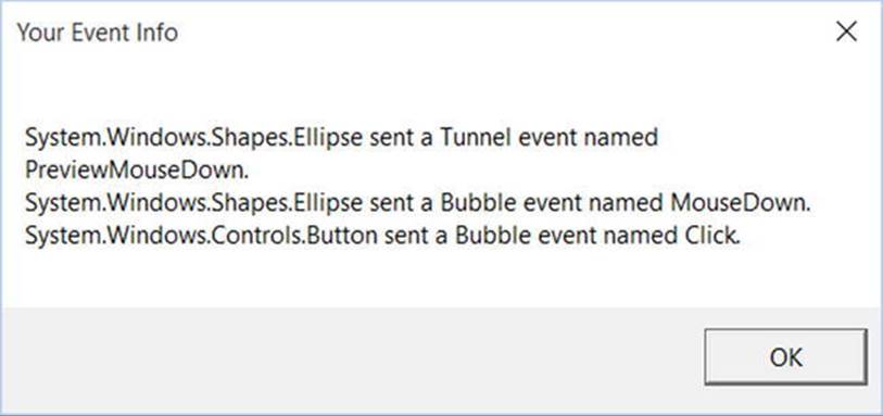
Figure 27-22. Tunneling first, bubbling second
So, why do WPF events typically tend to come in pairs (one tunneling and one bubbling)? The answer is that by previewing events, you have the power to perform any special logic (data validation, disable bubbling action, etc.) before the bubbling counterpart fires. By way of an example, assume you have a TextBox that should contain only numerical data. You could handle the PreviewKeyDown event, and if you see the user has entered nonnumerical data, you could cancel the bubbling event by setting the Handled property to true.
As you would guess, when you are building a custom control that contains custom events, you could author the event in such a way that it can bubble (or tunnel) through a tree of XAML. For the purpose of this chapter, I will not be examining how to build custom routed events (however, the process is not that different from building a custom dependency property). If you are interested, check out the topic “Routed Events Overview” within the .NET Framework 4.5 SDK documentation. In it you will find a number of tutorials that will help you on your way.
Source Code The WPFRoutedEvents project is included in the Chapter27 subdirectory.
A Deeper Look at WPF APIs and Controls
The remainder of this chapter will give you a chance to build a brand-new WPF application using Visual Studio. The goal is to create a UI that consists of a TabControl widget containing a set of tabs. Each tab will illustrate some new WPF controls and interesting APIs you might want to make use of in your software projects. Along the way, you will also learn additional features of the Visual Studio WPF designers.
Working with the TabControl
To get started, create a new WPF application named WpfControlsAndAPIs. As mentioned, your initial window will contain a TabControl with four different tabs, each of which shows off a set of related controls and/or WPF APIs. Locate the TabControl control in the Visual Studio toolbox, drop one onto your designer, resize the component to take up a majority of the display area, and rename this UI element to myTabSystem.
You will notice that you are given two tab items automatically. In order to add additional tabs, you simply need to right-click the TabControl node in the Document Outline window and select the Add TabItem menu option (you can also right-click the TabControl on the designer to activate the same menu option). Add two additional tabs using either approach (Figure 27-23 shows the Designer approach).
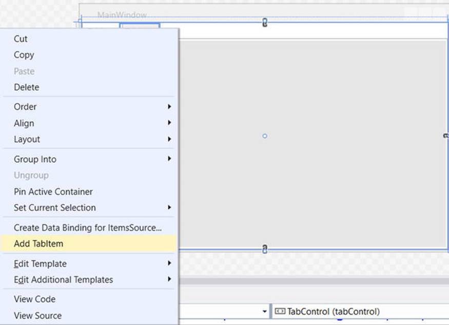
Figure 27-23. Visually adding TabItems
Now, select each TabItem control (on the designer or via the Document Outline window) and change the Header property for each tab, naming them Ink API, Documents, Data Binding, and DataGrid. At this point, your window designer should look like what you see inFigure 27-24.
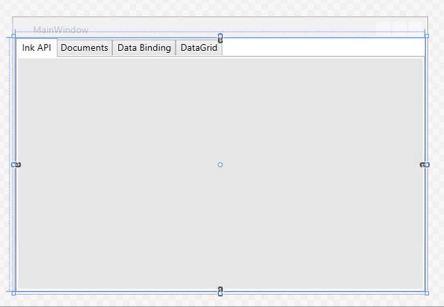
Figure 27-24. The initial layout of the tab system
Now click each tab again and use the Properties window to give each tab a unique, proper name. Be aware that when you select a tab for editing, that tab becomes the active tab, and you can design that tab by dragging controls from the Toolbox window. Before you begin to design each tab, take a peek at the XAML that the IDE generates on your behalf. You should see markup similar to the following (your markup might differ based on the properties you set):
<TabControl x:Name="myTabControl" HorizontalAlignment="Left" Height="280"
Margin="10,10,0,0" VerticalAlignment="Top" Width="489">
<TabItem Header="Ink API">
<Grid Background="#FFE5E5E5"/>
</TabItem>
<TabItem Header="Documents">
<Grid Background="#FFE5E5E5"/>
</TabItem>
<TabItem Header="Data Binding" HorizontalAlignment="Left" Height="20"
VerticalAlignment="Top" Width="95" Margin="-2,-2,-36,0">
<Grid Background="#FFE5E5E5"/>
</TabItem>
<TabItem Header="DataGrid" HorizontalAlignment="Left" Height="20"
VerticalAlignment="Top" Width="74" Margin="-2,-2,-15,0">
<Grid Background="#FFE5E5E5"/>
</TabItem>
</TabControl>
Now that you have the core TabControl defined, you can work out the details tab by tab, and learn more features of the WPF API along the way.
Building the Ink API Tab
The first tab shows the overall role of WPF’s digital Ink API, which allows you to incorporate painting functionality into a program easily. Of course, the application does not literally need to be a painting application; you can use this API for a wide variety of purposes, including capturing handwriting input with a stylus for a Tablet PC.
Begin by locating the node that represents the Ink API tab in your Document Outline area and expand it. You should see that the default layout manager for this TabItem is a <Grid>. Right-click this and change it to a StackPanel (see Figure 27-25).
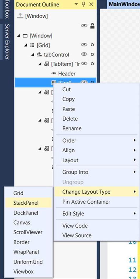
Figure 27-25. Changing the layout manager of the first tab item
Designing the ToolBar
Ensure that the StackPanel is the currently selected node in the Document Outline editor and insert a new ToolBar control named inkToolbar. Next, select the inkToolbar for editing and set the Height of the Toolbar control to 60 (the current Width value should be fine). Now find the Common section of the Properties window and click the ellipse button for the Items (Collection) property (see Figure 27-26).
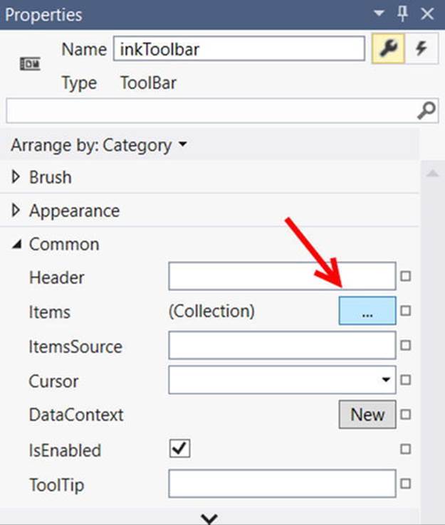
Figure 27-26. Populating the ToolBar with items begins here
After you click this button, you are presented with a dialog box that allows you to select the controls you want to add to the ToolBar. Click the drop-down list box on the bottom center of the dialog, and add three RadioButton controls. You can use the embedded Properties editor of this dialog to give each RadioButton a Height of 50 and a Width of 100 (again, you can find these properties in the Layout area). Also, set the Content property (located in the Common area) of each RadioButton to the values Ink Mode!, Erase Mode!, and Select Mode! (see Figure 27-27).
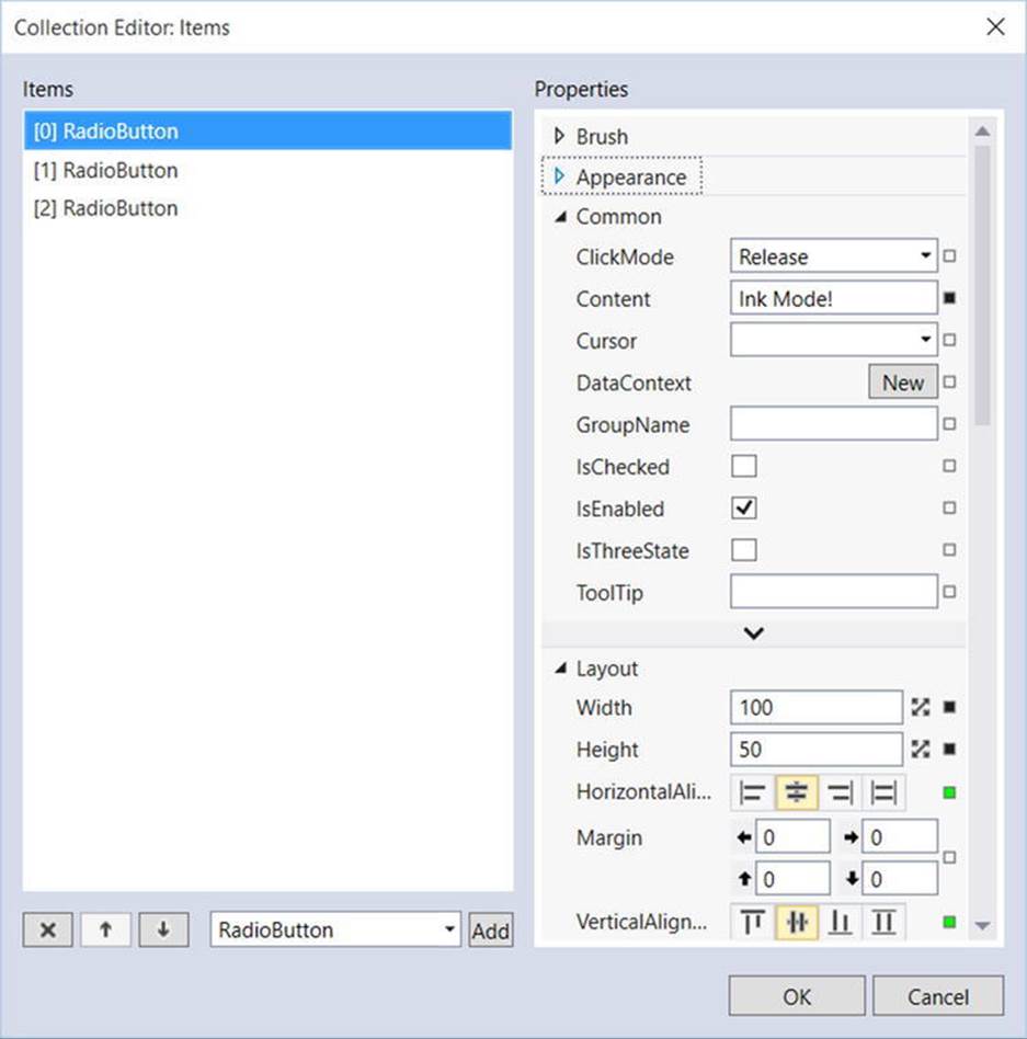
Figure 27-27. Configuring each RadioButton
After you add your three RadioButton controls, add a Separator control using the drop-down list of the Items editor. Now you need to add the final ComboBox (not ComboBoxItem) control listed in the drop-down. When you need to insert nonstandard controls using the Items dialog, just select the <Other Type> option from the drop-down. This opens the Select Object editor, where you can type in the name of the control you want. Make sure the Show all assemblies option is checked, and then do a search for your control of interest (see Figure 27-28).
Figure 27-28. Using the Select Object editor to add unique items to the toolbar
Set the Width property of the ComboBox to 100 and add three ComboBoxItem objects to the ComboBox using the Items (Collection) property (again) in the Common section of the Properties editor. Set the Content property of each ComboBoxItem to the strings Red,Green, and Blue.
After you do this, close the editor to return to the window designer. The last task for this section is to use the Name property to assign variable names to your new items. Name your three RadioButton controls inkRadio, selectRadio, and eraseRadio. Also, name yourComboBox control comboColors. When all is said and done, the XAML for your first TabItem control should look similar to the following (you might need to adjust the width and height):
<TabItem Header="Ink API">
<StackPanel Background="#FFE5E5E5">
<ToolBar x:Name="inkToolbar" HorizontalAlignment="Left" Width="479" Height="60">
<RadioButton x:Name="inkRadio" Content="Ink Mode!" Height="50" Width="100"/>
<RadioButton x:Name="selectRadio" Content="Erase Mode!" Height="50" Width="100"/>
<RadioButton x:Name="eraseRadio" Content="Select Mode!" Height="50" Width="100"/>
<Separator/>
<ComboBox x:Name="comboColors" Width="100">
<ComboBoxItem Content="Red"/>
<ComboBoxItem Content="Green"/>
<ComboBoxItem Content="Blue"/>
</ComboBox>
</ToolBar>
</StackPanel>
</TabItem>
Note As you built your toolbar using the IDE, you might have thought to yourself how much quicker your task would be if you could simply edit the XAML by hand. If you feel comfortable typing in the markup directly, you are certainly free to do so. However, I do encourage you to spend time becoming comfortable with the Visual Studio WPF Properties editor. As you will see, a number of advanced features are exposed via this editor.
The RadioButton Control
In this example, you want these three RadioButton controls to be mutually exclusive. In other GUI frameworks, ensuring that a group of related controls (such as radio buttons) were mutually exclusive required that you place them in the same group box. You don’t need to do this under WPF. Instead, you can simply assign them all to the same group name. This is helpful because the related items do not need to be physically collected in the same area, but can be anywhere in the window.
Do this by selecting each RadioButton on the designer (you can select all three using a Shift-Click operation), and then setting the GroupName property (located in the Common Properties area of the Properties window) to InkMode.
When a RadioButton control is not placed inside of a parent panel control, it will take on a UI identical to a Button control! However, unlike a Button, the RadioButton class includes an IsChecked property, which toggles between true and false when the end user clicks the UI element. Furthermore, RadioButton provides two events (Checked and Unchecked) that you can use to intercept this state change.
To configure your RadioButton controls to look like typical radio buttons, select each control on the designer using a Shift+Click operation, then right-click the selection and pick the Group Into Border menu option (see Figure 27-29).
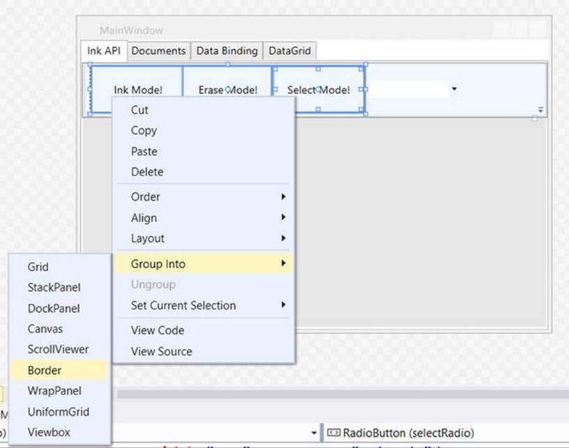
Figure 27-29. Grouping items in a Border control
At this point, you’re ready to test the program, which you can do by pressing the F5 key. You should now see three mutually exclusive radio buttons and a combo box with three selections (see Figure 27-30).
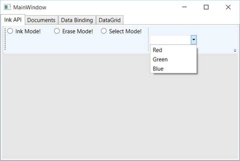
Figure 27-30. The completed toolbar system
Handling Events for the Ink API Tab
The next step for the Ink API tab is to handle the Click event for each RadioButton control. As you have done in other WPF projects in this book, simply select the Lightning Bolt button of the Visual Studio Properties editor to enter the names of event handlers. Using this approach, route the Click event for each button to the same handler, named RadioButtonClicked. After you handle all three Click events, handle the SelectionChanged event of the ComboBox using a handler named ColorChanged. When you finish, you should have the following C# code:
public partial class MainWindow : Window
{
public MainWindow()
{
this.InitializeComponent();
// Insert code required on object creation below this point.
}
private void RadioButtonClicked(object sender,RoutedEventArgs e)
{
// TODO: Add event handler implementation here.
}
private void ColorChanged(object sender,SelectionChangedEventArgs e)
{
// TODO: Add event handler implementation here.
}
}
You will implement these handlers in a later step, so leave them empty for the time being.
The InkCanvas Control
To finish the UI of this tab, you need to place an InkCanvas control into the StackPanel so it appears below the Toolbar you just created. Unfortunately, the Visual Studio toolbox will not show you every possible WPF component by default. While you could simply type in the necessary XAML, you should know that you can indeed update the items to be displayed in the toolbox.
To do so, right-click anywhere in the Toolbox area and select the Choose Items menu option. After a moment or two, you will see a list of possible components to add to the toolbox. For your purposes, you are interested in adding the InkCanvas control (see Figure 27-31).
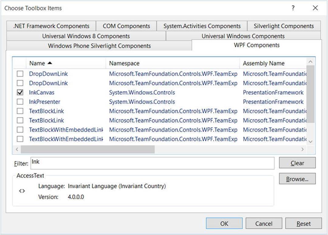
Figure 27-31. Adding new components to the Visual Studio toolbox
Select the StackPanel for the tabInk object in the Document Outline editor, and then add an InkCanvas named myInkCanvas. Resize this new control so that it takes up a majority of the tab area. Also, you might opt to use the Brushes editor to give your InkCanvas a unique background color (you’ll learn much more about the Brushes editor in the next chapter). After you do this, run your program by pressing the F5 key. You will see that the canvas is already able to draw data when you click-and-drag the left-mouse button (see Figure 27-32).
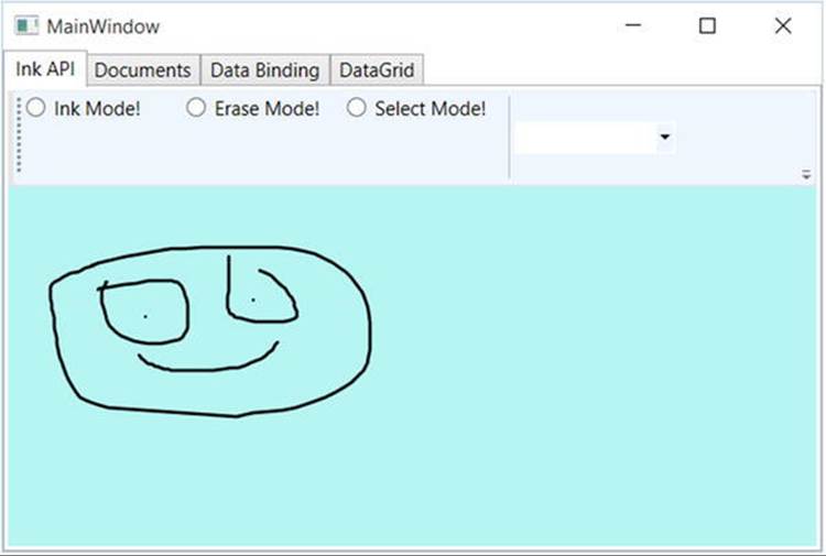
Figure 27-32. The InkCanvas in action
The InkCanvas does more than draw mouse (or stylus) strokes; it also supports a number of unique editing modes, controlled by the EditingMode property. You can assign this property any value from the related InkCanvasEditingMode enumeration. For this example, you are interested in Ink mode, which is the default option you just witnessed; Select mode, which allows the user to select a region with the mouse to move or resize; and EraseByStoke, which will delete the previous mouse stroke.
Note A stroke is the rendering that takes place during a single mouse down/mouse up operation. The InkCanvas stores all strokes in a StrokeCollection object, which you can access using the Strokes property.
Update your RadioButtonClicked() hander with the following logic, which places the InkCanvas in the correct mode, based on the selected RadioButton:
private void RadioButtonClicked(object sender,RoutedEventArgs e)
{
// Based on which button sent the event, place the InkCanvas in a unique
// mode of operation.
switch((sender as RadioButton)?.Content.ToString())
{
// These strings must be the same as the Content values for each
// RadioButton.
case "Ink Mode!":
this.myInkCanvas.EditingMode = InkCanvasEditingMode.Ink;
break;
case "Erase Mode!":
this.myInkCanvas.EditingMode = InkCanvasEditingMode.EraseByStroke;
break;
case "Select Mode!":
this.myInkCanvas.EditingMode = InkCanvasEditingMode.Select;
break;
}
}
Also, set the mode to Ink by default in the window’s constructor. And while you are at it, set a default selection for the ComboBox (more details on this control in the next section), as follows:
public MainWindow()
{
this.InitializeComponent();
// Be in Ink mode by default.
this.myInkCanvas.EditingMode = InkCanvasEditingMode.Ink;
this.inkRadio.IsChecked = true;
this.comboColors.SelectedIndex = 0;
}
Now run your program again by pressing F5. Enter Ink mode and draw some data. Next, enter Erase mode and remove the previous mouse stroke you entered (you’ll notice the mouse icon automatically looks like an eraser). Finally, enter Select mode and select some strokes by using the mouse as a lasso.
After you circle the item, you can move it around the canvas and resize its dimensions. Figure 27-33 shows your edit modes at work.
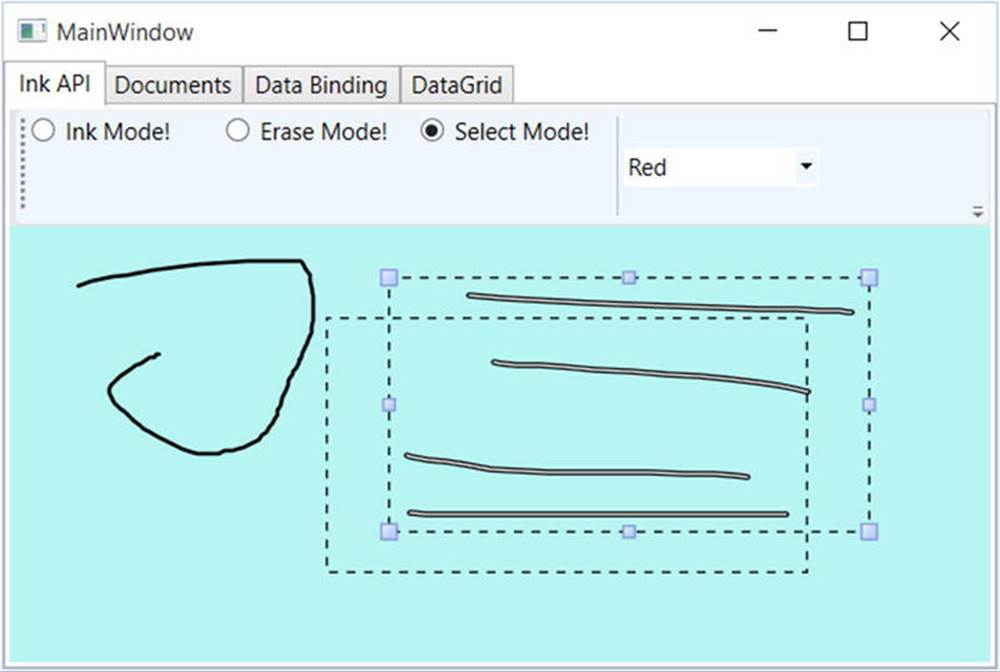
Figure 27-33. The InkCanvas in action, with edit modes!
The ComboBox Control
After you populate a ComboBox control (or a ListBox), you have three ways to determine the selected item. First, if you want to find the numerical index of the item selected, you can use the SelectedIndex property (which is zero-based; a value of -1 represents no selection). Second, if you want to obtain the object within the list that has been selected, the SelectedItem property fits the bill. Third, the SelectedValue allows you to obtain the value of the selected object (typically obtained using a call to ToString()).
You need to add the last bit of code for this tab to change the color of the strokes entered on the InkCanvas. The DefaultDrawingAttributes property of InkCanvas returns a DrawingAttributes object that allows you to configure numerous aspect of the pen nib, including its size and color (among other settings). Update your C# code with this implementation of the ColorChanged() method:
private void ColorChanged(object sender, SelectionChangedEventArgs e)
{
// Get the selected value in the combo box.
string colorToUse =
(this.comboColors.SelectedItem as ComboBoxItem)?.Content.ToString();
// Change the color used to render the strokes.
this.myInkCanvas.DefaultDrawingAttributes.Color =
(Color)ColorConverter.ConvertFromString(colorToUse);
}
Now recall that the ComboBox has a collection of ComboBoxItems. If you view the generated XAML, you’ll see the following definition:
<ComboBox x:Name="comboColors" Width="100" SelectionChanged="ColorChanged">
<ComboBoxItem Content="Red"/>
<ComboBoxItem Content="Green"/>
<ComboBoxItem Content="Blue"/>
</ComboBox>
When you call SelectedItem, you grab the selected ComboBoxItem, which is stored as a general Object. After you cast the Object as a ComboBoxItem, you pluck out the value of the Content, which will be the string Red, Green, or Blue. This string is then converted to a Color object using the handy ColorConverter utility class. Now run your program again. You should be able to change between colors as you render your image.
Note that the ComboBox and ListBox controls can contain complex content as well, rather than a list of text data. You can get a sense of some of the things that are possible by opening the XAML editor for your window and changing the definition of your ComboBox so it contains a set of <StackPanel> elements, each of which contains an <Ellipse> and a <Label> (notice that the Width of the ComboBox is 200).
<ComboBox x:Name="comboColors" Width="200" SelectionChanged="ColorChanged">
<StackPanel Orientation ="Horizontal" Tag="Red">
<Ellipse Fill ="Red" Height ="50" Width ="50"/>
<Label FontSize ="20" HorizontalAlignment="Center"
VerticalAlignment="Center" Content="Red"/>
</StackPanel>
<StackPanel Orientation ="Horizontal" Tag="Green">
<Ellipse Fill ="Green" Height ="50" Width ="50"/>
<Label FontSize ="20" HorizontalAlignment="Center"
VerticalAlignment="Center" Content="Green"/>
</StackPanel>
<StackPanel Orientation ="Horizontal" Tag="Blue">
<Ellipse Fill ="Blue" Height ="50" Width ="50"/>
<Label FontSize ="20" HorizontalAlignment="Center"
VerticalAlignment="Center" Content="Blue"/>
</StackPanel>
</ComboBox>
Notice that each StackPanel assigns a value to its Tag property, which is a simple, fast, and convenient way to discover which stack of items has been selected by the user (there are better ways to do this, but this will do for now). With this adjustment, you need to change the implementation of your ColorChanged() method, like this:
private void ColorChanged(object sender, SelectionChangedEventArgs e)
{
// Get the Tag of the selected StackPanel.
string colorToUse = (this.comboColors.SelectedItem
as StackPanel).Tag.ToString();
...
}
Now run your program again and take note of your unique ComboBox (see Figure 27-34).
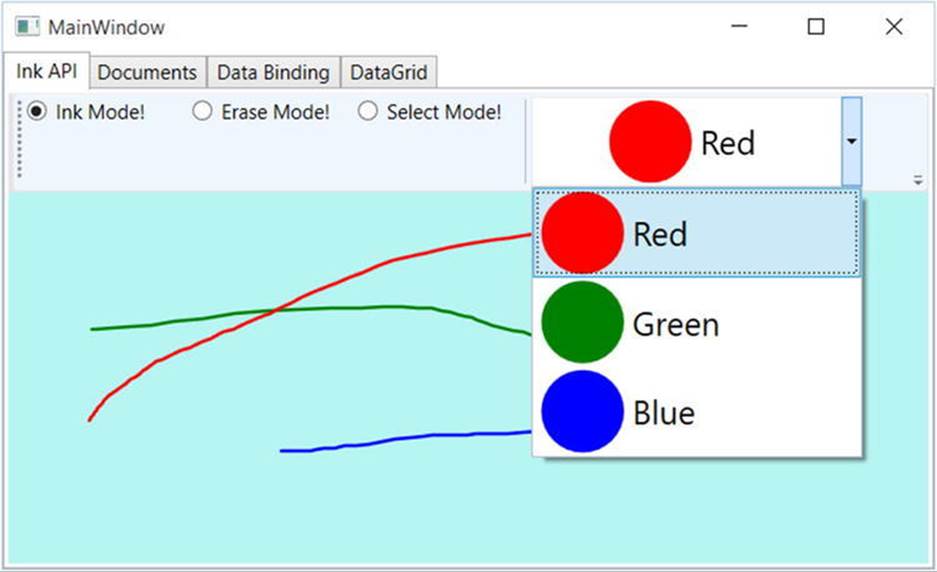
Figure 27-34. A custom ComboBox, thanks to the WPF content model
Saving, Loading, and Clearing InkCanvas Data
The last part of this tab will enable you to save and load your canvas data, as well as clear it of all content. At this point in the chapter, you might feel a bit more comfortable designing a UI, so the instructions will be short and sweet.
Begin by importing the System.IO and System.Windows.Ink namespaces to your code file. Now add three more Button controls to your ToolBar named btnSave, btnLoad, and btnClear. Next, handle the Click event for each control, then implement the handlers, like this:
private void SaveData(object sender, RoutedEventArgs e)
{
// Save all data on the InkCanvas to a local file.
using (FileStream fs = new FileStream("StrokeData.bin", FileMode.Create))
{
this.myInkCanvas.Strokes.Save(fs);
fs.Close();
}
}
private void LoadData(object sender, RoutedEventArgs e)
{
// Fill StrokeCollection from file.
using(FileStream fs = new FileStream("StrokeData.bin",
FileMode.Open, FileAccess.Read))
{
StrokeCollection strokes = new StrokeCollection(fs);
this.myInkCanvas.Strokes = strokes;
}
}
private void Clear(object sender, RoutedEventArgs e)
{
// Clear all strokes.
this.myInkCanvas.Strokes.Clear();
}
You should now be able to save your data to a file, load it from the file, and clear the InkCanvas of all data. That wraps up the first tab of the TabControl, as well as your examination of the WPF digital Ink API. To be sure, there is more to say about this technology; however, you should be in a good position to dig into the topic further if that interests you. Next, you will learn how to use the WPF Documents API.
Introducing the Documents API
WPF ships with many controls that allow you to capture or display simple blurbs of textual data, including Label, TextBox, TextBlock, and PasswordBox. These controls are useful, but some WPF applications require the use of sophisticated, highly formatted text data, similar to what you might find in an Adobe PDF file. The Documents API of WPF provides such functionality; however, it uses the XML Paper Specification (XPS) format rather than the PDF file format.
You can use the Documents API to construct a print-ready document by leveraging several classes from the System.Windows.Documents namespace. Here you will find a number of types that represent pieces of a rich XPS document, such as List, Paragraph, Section,Table, LineBreak, Figure, Floater, and Span.
Block Elements and Inline Elements
Formally speaking, the items you add to an XPS document belong to one of two broad categories: block elements and inline elements. This first category, block elements, consists of classes that extend the System.Windows.Documents.Block base class. Examples of block elements include List, Paragraph, BlockUIContainer, Section, and Table. You use classes from this category to group together other content (e.g., a list containing paragraph data, and a paragraph containing subparagraphs for different text formatting).
The second category, inline elements, consists of classes that extend the System.Windows.Documents.Inline base class. You nest inline elements within another block item (or possibly within another inline element inside a block element). Some common inline elements includeRun, Span, LineBreak, Figure, and Floater.
These classes possess names that you might encounter when building a rich document with a professional editor. As with any other WPF control, you can configure these classes in XAML or through code. Therefore, you can either declare an empty <Paragraph> element that is populated at runtime (you’ll see how to do such tasks in this example) or define a populated <Paragraph> element with static text.
Document Layout Managers
You might think you can simply place inline and block elements directly into a panel container such as a Grid; however, you need to wrap them in a <FlowDocument> element or a <FixedDocument> element.
It is ideal to place items in a FlowDocument when you want to let your end user change the way the data is presented on the computer screen. The user can do this by zooming text or changing how the data is presented (e.g., a single long page or a pair of columns). You’re better off using FixedDocument for true print-ready (WYSIWYG), unchangeable document data.
For this example, you will only concern yourself with the FlowDocument container. After you insert inline and block items to your FlowDocument, the FlowDocument object is placed in one of four specialized XPS-aware layout managers, listed in Table 27-4.
Table 27-4. XPS Control Layout Managers
|
Panel Control |
Meaning in Life |
|
FlowDocumentReader |
Displays data in a FlowDocument and adds support for zooming, searching, and content layout in various forms. |
|
FlowDocumentScrollViewer |
Displays data in a FlowDocument; however, the data is presented as a single document viewed with scrollbars. This container does not support zooming, searching, or alternative layout modes. |
|
RichTextBox |
Displays data in a FlowDocument and adds support for user editing. |
|
FlowDocumentPageViewer |
Displays the document page by page, one page at a time. Data can also be zoomed, but not searched. |
The most feature-rich way to display a FlowDocument is to wrap it within a FlowDocumentReader manager. When you do this, the user can alter the layout, search for words in the document, and zoom in on the data using the provided UI. The one limitation of this container (as well as of FlowDocumentScrollViewer and FlowDocumentPageViewer) is that the content you display with it is read-only. However, if you do want to allow the end user to enter new information to the FlowDocument, you can wrap it in a RichTextBox control.
Building the Documents Tab
Click the Documents tab of your TabItem and use the designer to open this control for editing. You should already have a default <Grid> control as the direct child of the TabItem control; however, change it to a StackPanel here using the Document Outline window. This tab will be used to display a FlowDocument that allows the user to highlight selected text, as well as add annotations using the Sticky Notes API.
Begin by defining the following ToolBar control, which has three simple (and unnamed!) Button controls. You will be rigging up a few new commands to these controls later on, so you do not need to refer to them in code (feel free to enter the XAML directly, or use the IDE if you prefer).
<TabItem x:Name="tabDocuments" Header="Documents" VerticalAlignment="Bottom"
Height="20">
<StackPanel>
<ToolBar>
<Button BorderBrush="Green" Content="Add Sticky Note"/>
<Button BorderBrush="Green" Content="Delete Sticky Notes"/>
<Button BorderBrush="Green" Content="Highlight Text"/>
</ToolBar>
</StackPanel>
</TabItem>
If you want, you can update the toolbox of Visual Studio to include a FlowDocumentReader control (using the same technique as you did when adding the InkCanvas), or update the current TabItem manually using the XAML editor.
In either case, add a FlowDocumentReader into your StackPanel, rename it to myDocumentReader, and stretch it out over the surface of your StackPanel. To this new component, add an empty <FlowDocument>.
<FlowDocumentReader x:Name="myDocumentReader" Height="269.4">
<FlowDocument/>
</FlowDocumentReader>
At this point, you can add document classes (e.g., List, Paragraph, Section, Table, LineBreak, Figure, Floater, and Span) to the <FlowDocument> element. Here is one possible way to configure the FlowDocument:
<FlowDocumentReader x:Name="myDocumentReader" Height="269.4">
<FlowDocument>
<Section Foreground = "Yellow" Background = "Black">
<Paragraph FontSize = "20">
Here are some fun facts about the WPF Documents API!
</Paragraph>
</Section>
<List/>
<Paragraph/>
</FlowDocument>
</FlowDocumentReader>
If you run your program now (hit the F5 key), you should already be able to zoom your document (using the lower-right slider bar), search for a keyword (using the lower-left search editor), and display the data in one of three manners (using the layout buttons).
Before moving to the next step, you might want to edit your XAML to use a different FlowDocument container, such as the FlowDocumentScrollViewer or a RichTextBox, rather than the FlowDocumentReader. After you have done this, run the application again and notice the different ways the document data is handled. Be sure to roll back to the FlowDocumentReader type when you finish this task.
Populating a FlowDocument Using Code
Now, let’s build the List block and the remaining Paragraph block in code. This is important because you might need to populate a FlowDocument based on user input, external files, database information, or what have you. Before you do so, use the XAML editor to give the List andParagraph elements proper names, so you can access them in code.
<List x:Name="listOfFunFacts"/>
<Paragraph x:Name="paraBodyText"/>
In your code file, define a new private method named PopulateDocument(). This method first adds a set of new ListItems to the List, each of which has a Paragraph with a single Run. Also, your helper method dynamically builds a formatted paragraph using three separateRun objects, as in the following example:
private void PopulateDocument()
{
// Add some data to the List item.
this.listOfFunFacts.FontSize = 14;
this.listOfFunFacts.MarkerStyle = TextMarkerStyle.Circle;
this.listOfFunFacts.ListItems.Add(new ListItem( new
Paragraph(new Run("Fixed documents are for WYSIWYG print ready docs!"))));
this.listOfFunFacts.ListItems.Add(new ListItem(
new Paragraph(new Run("The API supports tables and embedded figures!"))));
this.listOfFunFacts.ListItems.Add(new ListItem(
new Paragraph(new Run("Flow documents are read only!"))));
this.listOfFunFacts.ListItems.Add(new ListItem(new Paragraph(new Run
("BlockUIContainer allows you to embed WPF controls in the document!")
)));
// Now add some data to the Paragraph.
// First part of sentence.
Run prefix = new Run("This paragraph was generated ");
// Middle of paragraph.
Bold b = new Bold();
Run infix = new Run("dynamically");
infix.Foreground = Brushes.Red;
infix.FontSize = 30;
b.Inlines.Add(infix);
// Last part of paragraph.
Run suffix = new Run(" at runtime!");
// Now add each piece to the collection of inline elements
// of the Paragraph.
this.paraBodyText.Inlines.Add(prefix);
this.paraBodyText.Inlines.Add(infix);
this.paraBodyText.Inlines.Add(suffix);
}
Make sure you call this method from your window’s constructor. After you do this, you can run the application and see your new, dynamically generated document content, shown in Figure 27-35.
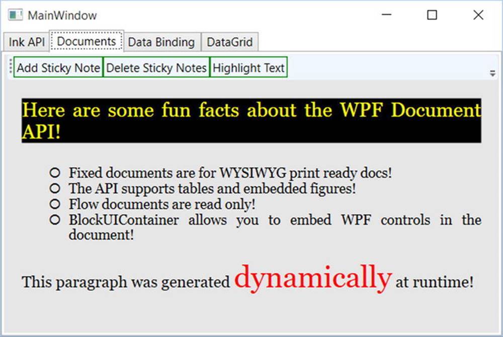
Figure 27-35. The document reader control
Enabling Annotations and Sticky Notes
So far, so good. You can now build a document with interesting data using XAML and C# code; however, you still need to address the three buttons on your toolbar for the Documents tab. WPF ships with a set of commands that are used specifically with the Documents API. You can use these commands to allow the user to select a part of a document for highlighting or to add sticky note annotations. Best of all, you can add all of this with a few lines of code (and a tad of markup).
You can find the command objects for the Documents API bundled in the System.Windows.Annotations namespace of PresentationFramework.dll. Thus, you need to define a custom XML namespace in the opening element of the <Window> to use such objects in XAML (notice that the tag prefix is a), like so:
<Window
...
xmlns:a=
"clr-namespace:System.Windows.Annotations;assembly=PresentationFramework"
x:Class="WpfControlsAndAPIs.MainWindow"
x:Name="Window"
Title="MainWindow"
Width="856" Height="383" mc:Ignorable="d"
WindowStartupLocation="CenterScreen" >
...
</Window>
Now update your three <Button> definitions to set the Command property to three of the supplied annotation commands, as follows:
<ToolBar>
<Button BorderBrush="Green" Content="Add Sticky Note"
Command="a:AnnotationService.CreateTextStickyNoteCommand"/>
<Button BorderBrush="Green" Content="Delete Sticky Notes"
Command="a:AnnotationService.DeleteStickyNotesCommand"/>
<Button BorderBrush="Green" Content="Highlight Text"
Command="a:AnnotationService.CreateHighlightCommand"/>
</ToolBar>
The last thing you need to do is to enable annotation services for the FlowDocumentReader object, which you named myDocumentReader. Add another private method in your class named EnableAnnotations(), which is called from the constructor of the window. Now import the following namespaces:
using System.Windows.Annotations;
using System.Windows.Annotations.Storage;
Next, implement this method:
private void EnableAnnotations()
{
// Create the AnnotationService object that works
// with our FlowDocumentReader.
AnnotationService anoService = new AnnotationService(myDocumentReader);
// Create a MemoryStream that will hold the annotations.
MemoryStream anoStream = new MemoryStream();
// Now, create an XML-based store based on the MemoryStream.
// You could use this object to programmatically add, delete,
// or find annotations.
AnnotationStore store = new XmlStreamStore(anoStream);
// Enable the annotation services.
anoService.Enable(store);
}
The AnnotationService class allows a given document layout manger to opt in to annotation support. Before you call the Enable() method of this object, you need to provide a location for the object to store annotation data, which in this example is a chunk of memory represented by a MemoryStream object. Notice that you connect the AnnotationService object with the Stream using the AnnotationStore.
Now, run your application. When you select some text, you can click the Add Sticky Note button and type in some information. Also, when you select some text, you can highlight data (the color is yellow by default). Finally, you can delete created notes by selecting them and clicking the Delete Sticky Note button. Figure 27-36 shows a test run.
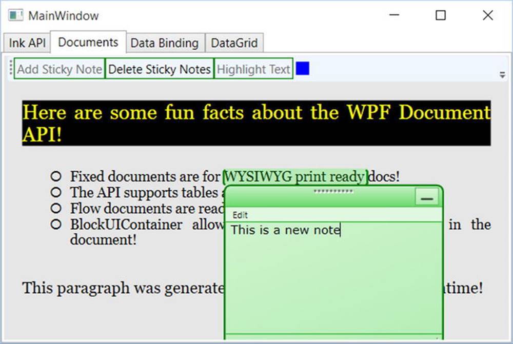
Figure 27-36. Sticky notes!
Saving and Loading a Flow Document
Let’s wrap up this look at the Documents API by looking at how simple it is to save a document out to a file and to read a document in from a file. Recall that, unless you wrap your FlowDocument object in a RichTextBox, the end user cannot edit the document; however, part of the document was created dynamically at runtime, so you might like to save it for later use. The ability to load an XPS-style document could also be useful in many WPF applications because you might want to define a blank document and load it all on the fly.
This next snippet assumes you will add two new Buttons to the toolbar of the Documents tab, which you declare like this (note that you did not handle any events in your markup):
<Button x:Name="btnSaveDoc" HorizontalAlignment="Stretch"
VerticalAlignment="Stretch" Width="75" Content="Save Doc"/>
<Button x:Name="btnLoadDoc" HorizontalAlignment="Stretch"
VerticalAlignment="Stretch" Width="75" Content="Load Doc"/>
Now, in the constructor of your window, author the following lambda expressions to save and load the FlowDocument data (you’ll need to import the System.Windows.Markup namespace to gain access to the XamlReader and XamlWriter classes):
public MainWindow()
{
...
// Rig up some Click handlers for the save/load of the flow doc.
btnSaveDoc.Click += (o, s) =>
{
using(FileStream fStream = File.Open(
"documentData.xaml", FileMode.Create))
{
XamlWriter.Save(this.myDocumentReader.Document, fStream);
}
};
btnLoadDoc.Click += (o, s) =>
{
using(FileStream fStream = File.Open("documentData.xaml", FileMode.Open))
{
try
{
FlowDocument doc = XamlReader.Load(fStream) as FlowDocument;
this.myDocumentReader.Document = doc;
}
catch(Exception ex) {MessageBox.Show(ex.Message, "Error Loading Doc!");}
}
};
}
That is all you need to do to save the document (note that you did not save any annotations; however, you can also accomplish that using annotation services). If you click your Save button, you will see a new *.xaml file in your \bin\Debug folder. This file contains your document data.
That wraps up your look at the WPF Documents API. To be sure, there is more to this API than you have seen here; but at this point, you know a good deal about the basics. To wrap up this chapter, you will look at a handful of data-binding topics and complete the current application.
Introducing the WPF Data-Binding Model
Controls are often the target of various data-binding operations. Simply put, data binding is the act of connecting control properties to data values that might change over the course of your application’s lifetime. Doing so lets a user interface element display the state of a variable in your code. For example, you might use data binding to accomplish the following:
· Check a CheckBox control based on a Boolean property of a given object.
· Display data in DataGrid objects from a relational database table.
· Connect a Label to an integer that represents the number of files in a folder.
When you use the intrinsic WPF data-binding engine, you must be aware of the distinction between the source and the destination of the binding operation. As you might expect, the source of a data-binding operation is the data itself (e.g., a Boolean property or relational data), while the destination (target) is the UI control property that uses the data content (e.g., a property on a CheckBox or TextBox control).
Truth be told, using the WPF data-binding infrastructure is always optional. If you were to roll your own data-binding logic, the connection between a source and destination typically would involve handling various events and authoring procedural code to connect the source and destination. For example, if you had a ScrollBar on a window that needed to display its value on a Label type, you might handle the ScrollBar’s ValueChanged event and update the Label’s content accordingly.
However, you can use WPF data binding to connect the source and destination directly in XAML (or use C# code in your code file) without the need to handle various events or hard-code the connections between the source and destination. Also, based on how you set up your data-binding logic, you can ensure that the source and destination stay in sync if either of their values changes.
Building the Data Binding Tab
Using the Document Outline editor, change the Grid of your third tab to a StackPanel. Now, use the Toolbox and Properties editor of Visual Studio to build the following initial layout:
<TabItem x:Name="tabDataBinding" Header="Data Binding">
<StackPanel Width="250">
<Label Content="Move the scroll bar to see the current value"/>
<!-- The scrollbar’s value is the source of this data bind. -->
<ScrollBar x:Name="mySB" Orientation="Horizontal" Height="30"
Minimum = "1" Maximum = "100" LargeChange="1" SmallChange="1"/>
<!-- The label’s content will be bound to the scroll bar! -->
<Label x:Name="labelSBThumb" Height="30" BorderBrush="Blue"
BorderThickness="2" Content = "0"/>
</StackPanel>
</TabItem>
Notice that the <ScrollBar> object (named mySB here) has been configured with a range between 1 and 100. The goal is to ensure that, as you reposition the thumb of the scrollbar (or click the left or right arrow), the Label will automatically update with the current value. Currently, the Content property of the Label control is set to the value "0"; however, you will change this via a data-binding operation.
Establishing Data Bindings Using Visual Studio
The glue that makes it possible to define a binding in XAML is the {Binding} markup extension. If you would like to establish a binding between controls using Visual Studio, you can do so easily. For this example, locate the Content property of the labelSBThumb Label object (in the Common area of the Properties window) and click the small square next to the property to open a context menu. From here, select Create Data Binding (see Figure 27-37).
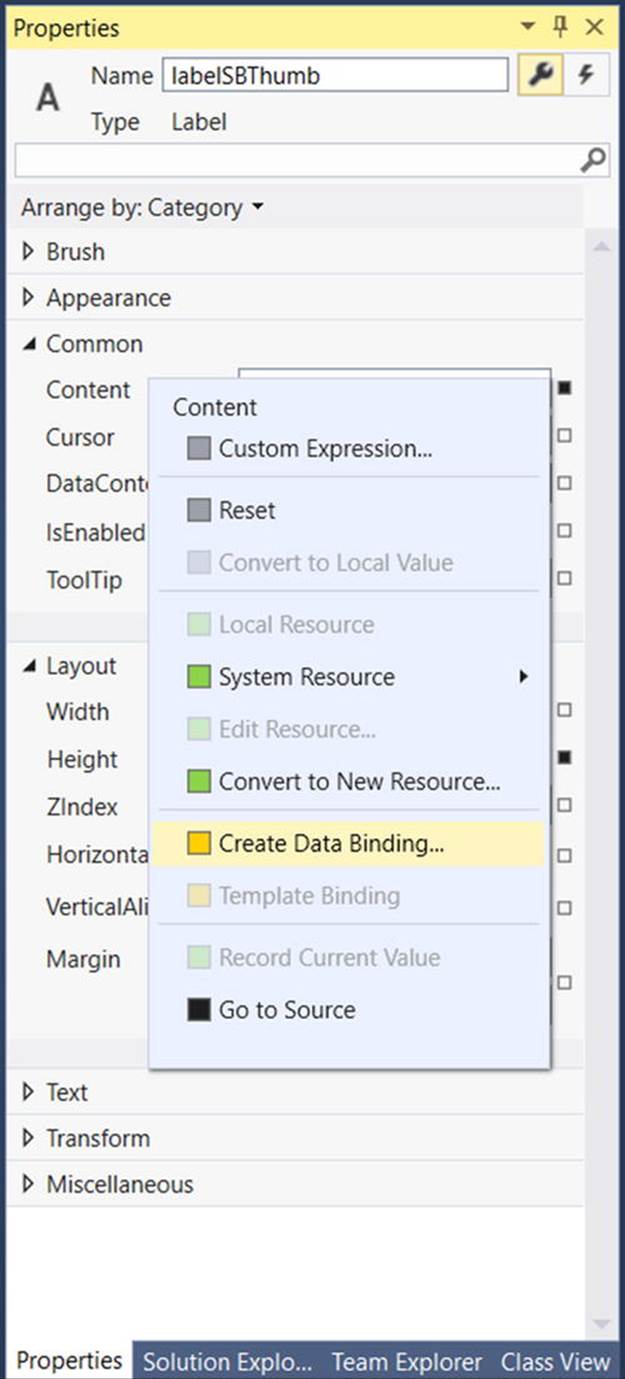
Figure 27-37. Configuring a data-binding operation
Next, select the ElementName option from the Binding Type drop-down list, which will give you a list of all items in your XAML file that can be selected as the source of the data-binding operation. In the Element Name tree control, find your ScrollBar object (named mySB). In the Path tree, find the Value property (see Figure 27-38). Click the OK button once you do this.
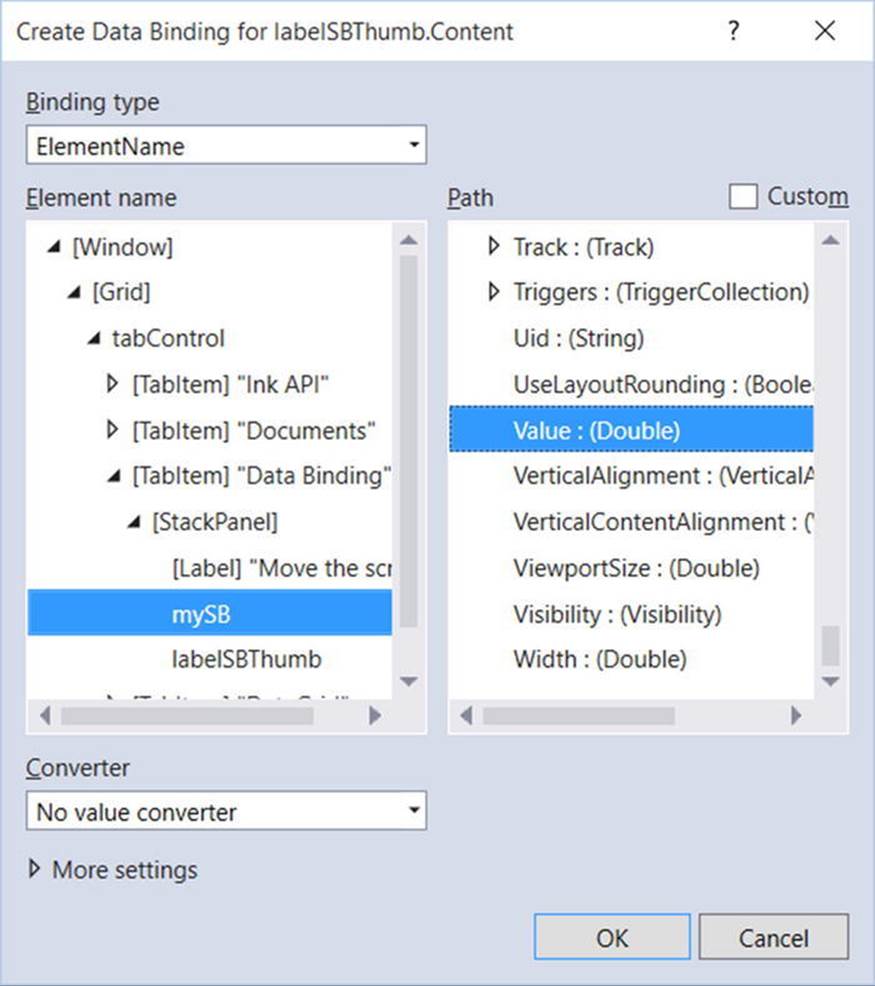
Figure 27-38. Selecting the source object and the property on the object
If you run your program again, you will find that the content of the label updates based on the scrollbar value as you move the thumb! Now look at the following XAML the data-binding tool generated on your behalf:
<Label x:Name="labelSBThumb" Height="30" BorderBrush="Blue" BorderThickness="2"
Content = "{Binding Value, ElementName=mySB}"/>
Note the value assigned to the Label’s Content property. Here, the ElementName value represents the source of the data-binding operation (the ScrollBar object), while the first item after the Binding keyword (Value) represents (in this case) the property of the element to obtain.
If you have worked with WPF data binding previously, you might expect to see the use of the Path token to set the property to observe on the object. For example, the following markup would also update the Label correctly:
<Label x:Name="labelSBThumb" Height="30" BorderBrush="Blue"
BorderThickness="2" Content = "{Binding Path=Value, ElementName=mySB }"/>
By default, the Path= aspect of the data-binding operation is omitted unless the property is a subproperty of another object (e.g., myObject.MyProperty.Object2.Property2).
The DataContext Property
You can define a data-binding operation in XAML using an alternative format, where it is possible to break out the values specified by the {Binding} markup extension by explicitly setting the DataContext property to the source of the binding operation, as follows:
<!-- Breaking object/value apart via DataContext -->
<Label x:Name="labelSBThumb" Height="30" BorderBrush="Blue"
BorderThickness="2"
DataContext = "{Binding ElementName=mySB}"
Content = "{Binding Path=Value}" />
In the current example, the output would be identical if you were to modify the markup in this way. Given this, you might wonder when you would want to set the DataContext property explicitly. Doing so can be helpful because subelements can inherit its value in a tree of markup.
In this way, you can easily set the same data source to a family of controls, rather than having to repeat a bunch of redundant "{Binding ElementName=X, Path=Y}" XAML values to multiple controls. For example, assume you have added the following new Button to the<StackPanel> of this tab (you’ll see why it is so large in just a moment):
<Button Content="Click" Height="140"/>
You could use Visual Studio to generate data bindings for multiple controls, but instead try entering the modified markup manually using the XAML editor, like so:
<!-- Note the StackPanel sets the DataContext property. -->
<StackPanel Width="250" DataContext = "{Binding ElementName=mySB}">
<Label Content="Move the scroll bar to see the current value"/>
<ScrollBar Orientation="Horizontal" Height="30" Name="mySB"
Maximum = "100" LargeChange="1" SmallChange="1"/>
<!-- Now both UI elements use the scrollbar’s value in unique ways. -->
<Label x:Name="labelSBThumb" Height="30" BorderBrush="Blue" BorderThickness="2"
Content = "{Binding Path=Value}"/>
<Button Content="Click" Height="200"
FontSize = "{Binding Path=Value}"/>
</StackPanel>
Here, you set the DataContext property on the <StackPanel> directly. Therefore, as you move the thumb, you see not only the current value on the Label, but also see the font size of the Button grow and shrink accordingly, based on the same value (see Figure 27-39 shows one possible output).
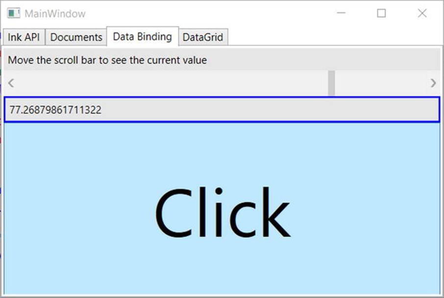
Figure 27-39. Binding the ScrollBar value to a Label and a Button
Data Conversion Using IValueConverter
The ScrollBar type uses a double to represent the value of the thumb, rather than an expected whole number (e.g., an integer). Therefore, as you drag the thumb, you will find various floating-point numbers displayed within the Label (e.g., 61.0576923076923). The end user would find this rather unintuitive because he is most likely expecting to see whole numbers (e.g., 61, 62, and 63).
If you want to convert the value of a data-binding operation into an alternative format, you could create a custom class that implements the IValueConverter interface of the System.Windows.Data namespace. This interface defines two members that allow you to perform the conversion to and from the target and destination (in the case of a two-way data binding). After you define this class, you can use it to qualify further the processing of your data-binding operation.
Assuming that you want to display whole numbers within the Label control, you can build the following custom conversion class. Activate the Project Add Class menu and insert a class named MyDoubleConverter. Next, add the following:
class MyDoubleConverter : IValueConverter
{
public object Convert(object value, Type targetType, object parameter,
System.Globalization.CultureInfo culture)
{
// Convert the double to an int.
double v = (double)value;
return (int)v;
}
public object ConvertBack(object value, Type targetType, object parameter,
System.Globalization.CultureInfo culture)
{
// You won’t worry about "two-way" bindings
// here, so just return the value.
return value;
}
}
The Convert() method is called when the value is transferred from the source (the ScrollBar) to the destination (the Text property of the TextBox). You will receive many incoming arguments, but you only need to manipulate the incoming object for this conversion, which is the value of the current double. You can use this type to cast the type into an integer and return the new number.
The ConvertBack() method will be called when the value is passed from the destination to the source (if you have enabled a two-way binding mode). Here, you simply return the value straightaway. Doing so lets you type a floating-point value into the TextBox (e.g., 99.9) and have it automatically convert to a whole number value (e.g., 99) when the user tabs off the control. This “free” conversion happens due to the fact that the Convert() method is called again, after a call to ConvertBack(). If you were simply to return null from ConvertBack(), your binding would appear to be out of sync because the text box would still be displaying a floating-point number.
Establishing Data Bindings in Code
With this class in place, you are ready to register your custom converter with any control that wishes to use it. You could accomplish this exclusively in XAML; however, to do so, you would need to define some custom object resources, which you will not learn how to do until the next chapter. For now, you can register your data conversion class in code. Begin by cleaning up the current definition of the <Label> control in your data binding tab, so that it no longer uses the {Binding} markup extension.
<Label x:Name="labelSBThumb" Height="30" BorderBrush="Blue"
BorderThickness="2" Content = "0"/>
In your window’s constructor, call a new private helper function called SetBindings() . In this method, add the following code (and make sure to call it from the constructor):
private void SetBindings()
{
// Create a Binding object.
Binding b = new Binding();
// Register the converter, source, and path.
b.Converter = new MyDoubleConverter();
b.Source = this.mySB;
b.Path = new PropertyPath("Value");
// Call the SetBinding method on the Label.
this.labelSBThumb.SetBinding(Label.ContentProperty, b);
}
The only part of this function that probably looks a bit off is the call to SetBinding(). Notice that the first parameter calls a static, read-only field of the Label class named ContentProperty. As you will learn later in this chapter, you are specifying what is known as adependency property. For the time being, just know that when you set bindings in code, the first argument will nearly always require you to specify the name of the class that wants the binding (the Label, in this case), followed by a call to the underlying property with the Property suffix. In any case, running the application illustrates that the Label only prints out whole numbers.
Building the DataGrid Tab
The previous data-binding example illustrated how to configure two (or more) controls to participate in a data-binding operation. While this is helpful, it is also possible to bind data from XML files, database data, and in-memory objects. To complete this example, you will design the final tab of your tab control so it displays data obtained from the Inventory table of the AutoLot database.
As with the other tabs, you begin by changing the current Grid to a StackPanel. Do this by directly updating the XAML using Visual Studio. Now define a DataGrid control in your new StackPanel named gridInventory, like so:
<TabItem x:Name="tabDataGrid" Header="DataGrid">
<StackPanel>
<DataGrid x:Name="gridInventory" Height="288"/>
</StackPanel>
</TabItem>
Use NuGet package manager to add Entity Framework to your project. Next, reference the AutoLotDAL.dll assembly you created in Chapter 23 (where you used the Entity Framework). This will update the app.config file for Entity Framework except for the connection string. This you will have to add in manually. I’ve listed the connection string for my machine here for your reference:
<connectionStrings>
<add name="AutoLotConnection" connectionString="data source=.\SQLEXPRESS2014;initial catalog=AutoLot;integrated security=True;MultipleActiveResultSets=True;App=EntityFramework" providerName="System.Data.SqlClient" />
</connectionStrings>
Open the code file for your window and add a final helper function called ConfigureGrid() ;make sure you call this from your constructor. Assuming that you did import the AutoLotDAL namespace, all you need to do is add a few lines of code, like so:
private void ConfigureGrid()
{
using (var repo = new InventoryRepo())
{
// Build a LINQ query that gets back some data from the Inventory table.
gridInventory.ItemsSource =
repo.GetAll().Select(x=>new { x.CarId,x.Make,x.Color,x.PetName});
}
}
Notice that you do not directly bind context.Inventories to the grid’s ItemsSource collection; instead, you build a LINQ query that appears to ask for the same data in the entities. The reason for this approach: the Inventory object set also contains additional EF (Entity Framework) properties that would appear on the grid, but which don’t map to the physical database.
If you were to run the project as is, you would see an extremely plain grid. To make the grid a bit less of an eyesore, use the Visual Studio Properties window to edit the Rows category of the DataGrid. At a minimum, set the AlternationCount property to 2 and pick a custom brush using the integrated editor for the AlternatingRowBackground and RowBackground properties. You can see the final tab for this example in Figure 27-40.
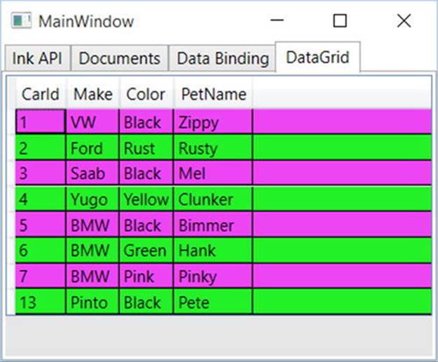
Figure 27-40. The final tab of your project
That wraps up the current example. You’ll use some other controls in action during later chapters; at this point, however, you should feel comfortable with the process of building UIs in Visual Studio and manually using XAML and C# code.
Source Code You can find the WpfControlsAndAPIs project in the Chapter27 subdirectory.
Understanding the Role of Dependency Properties
Like any .NET API, WPF makes use of each member of the .NET type system (classes, structures, interfaces, delegates, enumerations) and each type member (properties, methods, events, constant data, read-only fields, etc.) within its implementation. However, WPF also supports a unique programming concept termed a dependency property.
Like a “normal” .NET property (often termed a CLR property in the WPF literature), dependency properties can be set declaratively using XAML or programmatically within a code file. Furthermore, dependency properties (like CLR properties) ultimately exist to encapsulate data fields of a class and can be configured as read-only, write-only, or read-write.
To make matters more interesting, in almost every case you will be blissfully unaware that you have actually set (or accessed) a dependency property as opposed to a CLR property! For example, the Height and Width properties that WPF controls inherit from FrameworkElement, as well as the Content member inherited from ControlContent, are all, in fact, dependency properties.
<!-- Set three dependency properties! -->
<Button x:Name = "btnMyButton" Height = "50" Width = "100" Content = "OK"/>
Given all of these similarities, why does WPF define a new term for such a familiar concept? The answer lies in how a dependency property is implemented within the class. You’ll see a coding example in just a little bit; however, from a high level, all dependency properties are created in the following manner:
· First, the class that defined a dependency property must have DependencyObject in its inheritance chain.
· A single dependency property is represented as a public, static, read-only field in the class of type DependencyProperty. By convention, this field is named by suffixing the word Property to the name of the CLR wrapper (see final bullet point).
· The DependencyProperty variable is registered via a static call to DependencyProperty.Register(), which typically occurs in a static constructor or inline when the variable is declared.
· Finally, the class will define a XAML-friendly CLR property, which makes calls to methods provided by DependencyObject to get and set the value.
Once implemented, dependency properties provide a number of powerful features that are used by various WPF technologies including data binding, animation services, styles, templates, and so forth. In a nutshell, the motivation of dependency properties is to provide a way to compute the value of a property based on the value of other inputs. Here is a list of some of these key benefits, which go well beyond those of the simple data encapsulation found with a CLR property:
· Dependency properties can inherit their values from a parent element’s XAML definition. For example, if you defined a value for the FontSize attribute in the opening tag of a <Window>, all controls in that Window would have the same font size by default.
· Dependency properties support the ability to have values set by elements contained within their XAML scope, such as a Button setting the Dock property of a DockPanel parent. (Recall from Chapter 28 that attached properties do this very thing because attached properties are a form of dependency properties.)
· Dependency properties allow WPF to compute a value based on multiple external values, which can be very important for animation and data-binding services.
· Dependency properties provide infrastructure support for WPF triggers (also used quite often when working with animation and data binding).
Now remember, in many cases you will interact with an existing dependency property in a manner identical to a normal CLR property (thanks to the XAML wrapper). In the last section, which covered data binding, you saw that if you need to establish a data binding in code, you must call the SetBinding() method on the object that is the destination of the operation and specify the dependency property it will operate on, like so:
private void SetBindings()
{
Binding b = new Binding();
b.Converter = new MyDoubleConverter();
b.Source = this.mySB;
b.Path = new PropertyPath("Value");
// Specify the dependency property!
this.labelSBThumb.SetBinding(Label.ContentProperty, b);
}
You will see similar code when you examine how to start an animation in code in Chapter 29.
// Specify the dependency property!
rt.BeginAnimation(RotateTransform.AngleProperty, dblAnim);
The only time you need to build your own custom dependency property is when you are authoring a custom WPF control. For example, if you are building a UserControl that defines four custom properties and you want these properties to integrate well within the WPF API, you should author them using dependency property logic.
Specifically, if your properties need to be the target of a data-binding or animation operation, if the property must broadcast when it has changed, if it must be able to work as a Setter in a WPF style, or if it must be able to receive their values from a parent element, a normal CLR property will not be enough. If you were to use a normal CLR property, other programmers may indeed be able to get and set a value; however, if they attempt to use your properties within the context of a WPF service, things will not work as expected. Because you can never know how others might want to interact with the properties of your custom UserControl classes, you should get in the habit of always defining dependency properties when building custom controls.
Examining an Existing Dependency Property
Before you learn how to build a custom dependency property, let’s take a look at how the Height property of the FrameworkElement class has been implemented internally. The relevant code is shown here (with my included comments):
// FrameworkElement is-a DependencyObject.
public class FrameworkElement : UIElement, IFrameworkInputElement,
IInputElement, ISupportInitialize, IHaveResources, IQueryAmbient
{
...
// A static read-only field of type DependencyProperty.
public static readonly DependencyProperty HeightProperty;
// The DependencyProperty field is often registered
// in the static constructor of the class.
static FrameworkElement()
{
...
HeightProperty = DependencyProperty.Register(
"Height",
typeof(double),
typeof(FrameworkElement),
new FrameworkPropertyMetadata((double) 1.0 / (double) 0.0,
FrameworkPropertyMetadataOptions.AffectsMeasure,
new PropertyChangedCallback(FrameworkElement.OnTransformDirty)),
new ValidateValueCallback(FrameworkElement.IsWidthHeightValid));
}
// The CLR wrapper, which is implemented using
// the inherited GetValue()/SetValue() methods.
public double Height
{
get { return (double) base.GetValue(HeightProperty); }
set { base.SetValue(HeightProperty, value); }
}
}
As you can see, dependency properties require quite a bit of additional code from a normal CLR property! And in reality, a dependency can be even more complex than what you see here (thankfully, many implementations are simpler than Height).
First and foremost, remember that if a class wants to define a dependency property, it must have DependencyObject in the inheritance chain because this is the class that defines the GetValue() and SetValue() methods used in the CLR wrapper. BecauseFrameworkElement is-a DependencyObject, this requirement is satisfied.
Next, recall that the entity that will hold the actual value of the property (a double in the case of Height) is represented as a public, static, read-only field of type DependencyProperty. The name of this field should, by convention, always be named by suffixing the wordProperty to the name of the related CLR wrapper, like so:
public static readonly DependencyProperty HeightProperty;
Given that dependency properties are declared as static fields, they are typically created (and registered) within the static constructor of the class. The DependencyProperty object is created via a call to the static DependencyProperty.Register() method. This method has been overloaded many times; however, in the case of Height, DependencyProperty.Register() is invoked as follows:
HeightProperty = DependencyProperty.Register(
"Height",
typeof(double),
typeof(FrameworkElement),
new FrameworkPropertyMetadata((double)0.0,
FrameworkPropertyMetadataOptions.AffectsMeasure,
new PropertyChangedCallback(FrameworkElement.OnTransformDirty)),
new ValidateValueCallback(FrameworkElement.IsWidthHeightValid));
The first argument to DependencyProperty.Register() is the name of the normal CLR property on the class (Height, in this case), while the second argument is the type information of the underlying data type it is encapsulating (a double). The third argument specifies the type information of the class that this property belongs to (FrameworkElement, in this case). While this might seem redundant (after all, the HeightProperty field is already defined within the FrameworkElement class), this is a very clever aspect of WPF in that it allows one class to register properties on another (even if the class definition has been sealed!).
The fourth argument passed to DependencyProperty.Register() in this example is what really gives dependency properties their own unique flavor. Here, a FrameworkPropertyMetadata object is passed that describes various details regarding how WPF should handle this property with respect to callback notifications (if the property needs to notify others when the value changes) and various options (represented by the FrameworkPropertyMetadataOptions enum) that control what is effected by the property in question (Does it work with data binding?, Can it be inherited?, etc.). In this case, the constructor arguments of FrameworkPropertyMetadata break down as so:
new FrameworkPropertyMetadata(
// Default value of property.
(double)0.0,
// Metadata options.
FrameworkPropertyMetadataOptions.AffectsMeasure,
// Delegate pointing to method called when property changes.
new PropertyChangedCallback(FrameworkElement.OnTransformDirty)
)
Because the final argument to the FrameworkPropertyMetadata constructor is a delegate, note that its constructor parameter is pointing to a static method on the FrameworkElement class named OnTransformDirty(). I won’t bother to show the code behind this method, but be aware that any time you are building a custom dependency property, you can specify a PropertyChangedCallback delegate to point to a method that will be called when your property value has been changed.
This brings me to the final parameter passed to the DependencyProperty.Register() method, a second delegate of type ValidateValueCallback, which points to a method on the FrameworkElement class that is called to ensure the value assigned to the property is valid.
new ValidateValueCallback(FrameworkElement.IsWidthHeightValid)
This method contains logic you might normally expect to find in the set block of a property (more information on this point in the next section).
private static bool IsWidthHeightValid(object value)
{
double num = (double) value;
return ((!DoubleUtil.IsNaN(num) && (num >= 0.0))
&& !double.IsPositiveInfinity(num));
}
After the DependencyProperty object has been registered, the final task is to wrap the field within a normal CLR property (Height, in this case). Notice, however, that the get and set scopes do not simply return or set a class-level double-member variable, but do so indirectly using the GetValue() and SetValue() methods from the System.Windows.DependencyObject base class, as follows:
public double Height
{
get { return (double) base.GetValue(HeightProperty); }
set { base.SetValue(HeightProperty, value); }
}
Important Notes Regarding CLR Property Wrappers
So, just to recap the story thus far, dependency properties look like normal everyday properties when you get or set their values in XAML or code, but behind the scenes they are implemented with much more elaborate coding techniques. Remember, the whole reason to go through this process is to build a custom control that has custom properties that need to integrate with WPF services that demand communication with a dependency property (e.g., animation, data binding, and styles).
Even though part of the implementation of a dependency property includes defining a CLR wrapper, you should never put validation logic in the set block. For that matter, the CLR wrapper of a dependency property should never do anything other than call GetValue() or SetValue().
The reason is that the WPF runtime has been constructed in such a way that when you write XAML that seems to set a property, such as
<Button x:Name="myButton" Height="100" .../>
the runtime will completely bypass the set block of the Height property and directly call SetValue()! The reason for this odd behavior has to do with a simple optimization technique. If the WPF runtime were to call the set block of the Height property, it would have to perform runtime reflection to figure out where the DependencyProperty field (specified by the first argument to SetValue()) is located, reference it in memory, and so forth. The same story holds true if you were to write XAML that retrieves the value of the Height property—GetValue() would be called directly.
Since this is the case, why do you need to build this CLR wrapper at all? Well, WPF XAML does not allow you to call functions in markup, so the following markup would be an error:
<!-- Nope! Can’t call methods in WPF XAML! -->
<Button x:Name="myButton" this.SetValue("100") .../>
In effect, when you set or get a value in markup using the CLR wrapper, think of it as a way to tell the WPF runtime, “Hey! Go call GetValue()/SetValue() for me, since I can’t directly do it in markup!” Now, what if you call the CLR wrapper in code like so:
Button b = new Button();
b.Height = 10;
In this case, if the set block of the Height property contained code other than a call to SetValue(), it would execute because the WPF XAML parser optimization is not involved.
The basic rule to remember is that when registering a dependency property, use a ValidateValueCallback delegate to point to a method that performs the data validation. This ensures that the correct behavior will occur, regardless of whether you use XAML or code to get/set a dependency property.
Building a Custom Dependency Property
If you have a slight headache at this point in the chapter, this is a perfectly normal response. Building dependency properties can take some time to get used to. However, for better or worse, it is part of the process of building many custom WPF controls, so let’s take a look at how to build a dependency property.
Begin by creating a new WPF application named CustomDepPropApp. Now, using the Project menu, activate the Add User Control menu option, and create a control named ShowNumberControl.xaml (see Figure 27-41).
Figure 27-41. Inserting a new custom UserControl
Note You will learn more details about the WPF UserControl in Chapter 29, so just follow along as shown for now.
Just like a window, WPF UserControl types have a XAML file and a related code file. Update the XAML of your user control to define a single Label control in the Grid, like so:
<UserControl x:Class="CustomDepPropApp.ShowNumberControl"
xmlns="http://schemas.microsoft.com/winfx/2006/xaml/presentation"
xmlns:x="http://schemas.microsoft.com/winfx/2006/xaml"
xmlns:mc="http://schemas.openxmlformats.org/markup-compatibility/2006"
xmlns:d=http://schemas.microsoft.com/expression/blend/2008
xmlns:local="clr-namespace:CustomDepPropApp"
mc:Ignorable="d"
d:DesignHeight="300" d:DesignWidth="300">
<Grid>
<Label x:Name="numberDisplay" Height="50" Width="200" Background="LightBlue"/>
</Grid>
</UserControl>
In the code file of this custom control, create a normal, everyday .NET property that wraps an int and sets the Content property of the Label with the new value, as follows:
public partial class ShowNumberControl : UserControl
{
public ShowNumberControl()
{
InitializeComponent();
}
// A normal, everyday .NET property.
private int _currNumber = 0;
public int CurrentNumber
{
get { return _currNumber; }
set
{
_currNumber = value;
numberDisplay.Content = CurrentNumber.ToString();
}
}
}
Now, update the XAML definition of your window to declare an instance of your custom control within a StackPanel layout manger. Because your custom control is not part of the core WPF assembly stack, you will need to define a custom XML namespace that maps to your control. Here is the required markup:
<Window x:Class="CustomDepPropApp.MainWindow"
xmlns="http://schemas.microsoft.com/winfx/2006/xaml/presentation"
xmlns:x="http://schemas.microsoft.com/winfx/2006/xaml"
xmlns:d="http://schemas.microsoft.com/expression/blend/2008"
xmlns:mc="http://schemas.openxmlformats.org/markup-compatibility/2006"
xmlns:myCtrls="clr-namespace:CustomDepPropApp"
xmlns:local="clr-namespace:CustomDepPropApp"
mc:Ignorable="d"
Title="Simple Dependency Property App" Height="150" Width="250"
WindowStartupLocation="CenterScreen">
<StackPanel>
<myCtrls:ShowNumberControl x:Name="myShowNumberCtrl" CurrentNumber="100"/>
</StackPanel>
</Window>
As you can see, the Visual Studio designer appears to correctly display the value that you set in the CurrentNumber property (see Figure 27-42).
Figure 27-42. It appears your property works as expected
However, what if you want to apply an animation object to the CurrentNumber property so that the value changes from 100 to 200 over a period of 10 seconds? If you wanted to do so in markup, you might update your <myCtrls:ShowNumberControl> scope as so:
<myCtrls:ShowNumberControl x:Name="myShowNumberCtrl" CurrentNumber="100">
<myCtrls:ShowNumberControl.Triggers>
<EventTrigger RoutedEvent = "myCtrls:ShowNumberControl.Loaded">
<EventTrigger.Actions>
<BeginStoryboard>
<Storyboard TargetProperty = "CurrentNumber">
<Int32Animation From = "100" To = "200" Duration = "0:0:10"/>
</Storyboard>
</BeginStoryboard>
</EventTrigger.Actions>
</EventTrigger>
</myCtrls:ShowNumberControl.Triggers>
</myCtrls:ShowNumberControl>
If you run your application, the animation object cannot find a proper target, so it is ignored. The reason is that the CurrentNumber property has not been registered as a dependency property! To fix matters, return to the code file of your custom control, and completely comment out the current property logic (including the private backing field). Now, position your mouse cursor within the scope of the class and type in the propdp code snippet. After you have typed propdp, press the Tab key twice. You will find the snippet expands to give you the basic skeleton of a dependency property as follows:
public int MyProperty
{
get { return (int)GetValue(MyPropertyProperty); }
set { SetValue(MyPropertyProperty, value); }
}
// Using a DependencyProperty as the backing store for MyProperty. This enables animation, styling, binding, etc...
public static readonly DependencyProperty MyPropertyProperty =
DependencyProperty.Register("MyProperty", typeof(int), typeof(ownerclass), new PropertyMetadata(0));
Update the entered template to match the following code:
public partial class ShowNumberControl : UserControl
{
public int CurrentNumber
{
get { return (int)GetValue(CurrentNumberProperty); }
set { SetValue(CurrentNumberProperty, value); }
}
public static readonly DependencyProperty CurrentNumberProperty =
DependencyProperty.Register("CurrentNumber",
typeof(int),
typeof(ShowNumberControl),
new UIPropertyMetadata(0));
...
}
This is similar to what you saw in the implementation of the Height property; however, the code snippet registers the property inline rather than within a static constructor (which is fine). Also notice that a UIPropertyMetadata object is used to define the default value of the integer (0) rather than the more complex FrameworkPropertyMetadata object. This is the simplest version of CurrentNumber as a dependency property.
Adding a Data Validation Routine
Although you now have a dependency property named CurrentNumber, you still won’t see your animation take hold. The next adjustment you might want to make is to specify a function to call to perform some data validation logic. For this example, assume that you need to ensure that the value of CurrentNumber is between 0 and 500.
To do so, add a final argument to the DependencyProperty.Register() method of type ValidateValueCallback, which points to a method named ValidateCurrentNumber.
ValidateValueCallback is a delegate that can only point to methods returning bool and take an object as the only argument. This object represents the new value that is being assigned. Implement ValidateCurrentNumber to return true or false, if the incoming value is within the expected range.
public static readonly DependencyProperty CurrentNumberProperty =
DependencyProperty.Register("CurrentNumber",
typeof(int),
typeof(ShowNumberControl),
new UIPropertyMetadata(100),
new ValidateValueCallback(ValidateCurrentNumber));
public static bool ValidateCurrentNumber(object value)
{
// Just a simple business rule. Value must be between 0 and 500.
if (Convert.ToInt32(value) >= 0 && Convert.ToInt32(value) <= 500)
return true;
else
return false;
}
Responding to the Property Change
Okay, so now you have a valid number, but still no animation. The final change you need to make is to specify a second argument to the constructor of UIPropertyMetadata, which is a PropertyChangedCallback object. This delegate can point to any method that takes aDependencyObject as the first parameter and a DependencyPropertyChangedEventArgs as the second. First, update your code as so:
// Note the second param of UIPropertyMetadata construtor.
public static readonly DependencyProperty CurrentNumberProperty =
DependencyProperty.Register("CurrentNumber", typeof(int), typeof(ShowNumberControl),
new UIPropertyMetadata(100,
new PropertyChangedCallback(CurrentNumberChanged)),
new ValidateValueCallback(ValidateCurrentNumber));
Within the CurrentNumberChanged() method, your ultimate goal is to change the Content of the Label to the new value assigned by the CurrentNumber property. You have one big problem, however: the CurrentNumberChanged() method is static, as it must be to work with the static DependencyProperty object. So how are you supposed to gain access to the Label for the current instance of ShowNumberControl? That reference is contained in the first DependencyObject parameter. You can find the new value using the incoming event arguments. Here is the necessary code that will change the Content property of the Label:
private static void CurrentNumberChanged(DependencyObject depObj,
DependencyPropertyChangedEventArgs args)
{
// Cast the DependencyObject into ShowNumberControl.
ShowNumberControl c = (ShowNumberControl)depObj;
// Get the Label control in the ShowNumberControl.
Label theLabel = c.numberDisplay;
// Set the Label with the new value.
theLabel.Content = args.NewValue.ToString();
}
Whew! That was a long way to go just to change the output of a label. The benefit is that your CurrentNumber dependency property can now be the target of a WPF style, an animation object, the target of a data-binding operation, and so forth. If you run your application once again, you should now see the value change during execution.
That wraps up your look at WPF dependency properties. While I hope you have a much better idea about what these constructs allow you to do and have a better idea of how to make your own, please be aware that there are many details I have not covered here.
If you find yourself in a position where you are building a number of custom controls that support custom properties, please look up the topic “Properties” under the “WPF Fundamentals” node of the .NET Framework 4.6 SDK documentation. In it you will find many more examples of building dependency properties, attached properties, various ways to configure property metadata, and a slew of other details.
 Source Code The CustomDepPropApp project is included in the Chapter27 subdirectory.
Summary
This chapter examined several aspects of WPF controls, beginning with an overview of the control toolkit and the role of layout managers (panels). The first example gave you a chance to build a simple word processor application that illustrated the integrated spell-checking functionality of WPF, as well as how to build a main window with menu systems, status bars, and toolbars.
More importantly, you examined how to use WPF commands. Recall that you can attach these control-agnostic events to a UI element or an input gesture to inherit out-of-the-box services automatically (e.g., clipboard operations).
You also learned quite a bit about using Visual Studio to build out UIs via the integrated visual designers. Specifically, you built a complex user interface using numerous aspects of the tool, and you learned about the WPF Ink and Document APIs at the same time. You also received an introduction to WPF data-binding operations, including how to use the WPF DataGrid class to display data from your custom AutoLot database.
Finally, you investigated how WPF places a unique spin on traditional .NET programming primitives, specifically properties and events. As you have seen, a dependency property allows you to build a property that can integrate within the WPF set of services (animations, data bindings, styles, and so on). On a related note, routed events provide a way for an event to flow up or down a tree of markup.
All materials on the site are licensed Creative Commons Attribution-Sharealike 3.0 Unported CC BY-SA 3.0 & GNU Free Documentation License (GFDL)
If you are the copyright holder of any material contained on our site and intend to remove it, please contact our site administrator for approval.
© 2016-2026 All site design rights belong to S.Y.A.