C# 6.0 and the .NET 4.6 Framework (2015)
PART VII
Windows Presentation Foundation
CHAPTER 28
WPF Graphics Rendering Services
In this chapter, we’ll examine the graphical rendering capabilities of WPF. As you’ll see, WPF provides three separate ways to render graphical data: shapes, drawings, and visuals. After you understand the pros and cons of each approach, you will start learning about the world of interactive 2D graphics using the classes within System.Windows.Shapes. After this, you’ll see how drawings and geometries allow you to render 2D data in a more lightweight manner. And last but not least, you’ll learn how the visual layer gives you the greatest level of power and performance.
Along the way, you will explore a number of related topics, such as the creation of custom brushes and pens, how to apply graphical transformations to your renderings, and how to perform hit-test operations. In particular, you’ll see how the integrated tools of Visual Studio, and an additional tool named Inkscape, can simplify your graphical coding endeavors.
 Note Graphics are a key aspect of WPF development. Even if you are not building a graphics-heavy application (such as a video game or multimedia application), the topics in this chapter are critical when you work with services such as control templates, animations, and data-binding customization.
Understanding WPF’s Graphical Rendering Services
WPF uses a particular flavor of graphical rendering that goes by the term retained-mode graphics. Simply put, this means that since you are using XAML or procedural code to generate graphical renderings, it is the responsibility of WPF to persist these visual items and ensure that they are correctly redrawn and refreshed in an optimal manner. Thus, when you render graphical data, it is always present, even when the end user hides the image by resizing or minimizing the window, by covering the window with another, and so forth.
In stark contrast, previous Microsoft graphical rendering APIs (including Windows Form’s GDI+) were immediate-mode graphical systems. In this model, it was up to the programmer to ensure that rendered visuals were correctly “remembered” and updated during the life of the application. For example, in a Windows Forms application, rendering a shape such as a rectangle involved handling the Paint event (or overriding the virtual OnPaint() method), obtaining a Graphics object to draw the rectangle and, most important, adding the infrastructure to ensure that the image was persisted when the user resized the window (for example, creating member variables to represent the position of the rectangle and calling Invalidate() throughout your program).
The shift from immediate-mode to retained-mode graphics is indeed a good thing, as programmers have far less grungy graphics code to author and maintain. However, I’m not suggesting that the WPF graphics API is completely different from earlier rendering toolkits. For example, like GDI+, WPF supports various brush types and pen objects, techniques for hit-testing, clipping regions, graphical transformations, and so on. So, if you currently have a background in GDI+ (or C/C++-based GDI), you already know a good deal about how to perform basic renderings under WPF.
WPF Graphical Rendering Options
As with other aspects of WPF development, you have a number of choices regarding how to perform your graphical rendering, beyond the decision to do so via XAML or procedural C# code (or perhaps a combination of both). Specifically, WPF provides the following three distinct ways to render graphical data:
· Shapes: WPF provides the System.Windows.Shapes namespace, which defines a small number of classes for rendering 2D geometric objects (rectangles, ellipses, polygons, etc.). While these types are very simple to use, and very powerful, they do come with a fair amount of memory overhead if used with reckless abandon.
· Drawings and Geometries: The WPF API provides a second way to render graphical data, using descendants from the System.Windows.Media.Drawing abstract class. Using classes such as GeometryDrawing or ImageDrawing (in addition to variousgeometry objects) you can render graphical data in a more lightweight (but less feature-rich) manner.
· Visuals: The fastest and most lightweight way to render graphical data under WPF is using the visual layer, which is accessible only through C# code. Using descendants of System.Windows.Media.Visual, you can speak directly to the WPF graphical subsystem.
The reason for offering different ways to do the exact same thing (i.e., render graphical data) has to do with memory use and, ultimately, application performance. Because WPF is such a graphically intensive system, it is not unreasonable for an application to render hundreds or even thousands of different images on a window’s surface, and the choice of implementation (shapes, drawings, or visuals) could have a huge impact.
Do understand that when you build a WPF application, chances are good you’ll use all three options. As a rule of thumb, if you need a modest amount of interactive graphical data that can be manipulated by the user (receive mouse input, display tooltips, etc.), you’ll want to use members in the System.Windows.Shapes namespace.
In contrast, drawings and geometries are more appropriate when you need to model complex, generally non-interactive, vector-based graphical data using XAML or C#. While drawings and geometries can still respond to mouse events, hit-testing, and drag-and-drop operations, you will typically need to author more code to do so.
Last but not least, if you require the fastest possible way to render massive amounts of graphical data, the visual layer is the way to go. For example, let’s say you are using WPF to build a scientific application that can plot out thousands of points of data. Using the visual layer, you can render the plot points in the most optimal way possible. As you will see later in this chapter, the visual layer is only accessible via C# code, and is not XAML-friendly.
No matter which approach you take (shapes, drawings and geometries, or visuals) you will make use of common graphical primitives such as brushes (which fill interiors), pens (which draw exteriors), and transformation objects (which, well, transform the data). To begin the journey, you will start working with the classes of System.Windows.Shapes.
Note WPF also ships with a full-blown API that can be used to render and manipulate 3D graphics, which is not addressed in this edition of the text. Please consult the .NET Framework 4.6 SDK documentation if you are interested in incorporating 3D graphics into your applications.
Rendering Graphical Data Using Shapes
Members of the System.Windows.Shapes namespace provide the most straightforward, most interactive, yet most memory-intensive way to render a two-dimensional image. This namespace (defined in the PresentationFramework.dll assembly) is quite small and consists of only six sealed classes that extend the abstract Shape base class: Ellipse, Rectangle, Line, Polygon, Polyline, and Path.
Create a new WPF Application named RenderingWithShapes, and change the title of MainWindow.xaml to “Fun with Shapes!” Now, if you locate the abstract Shape class in the Visual Studio object browser (see Figure 28-1) and expand each of the parent nodes, you can see that each descendant of Shape receives a great deal of functionality up the inheritance chain.
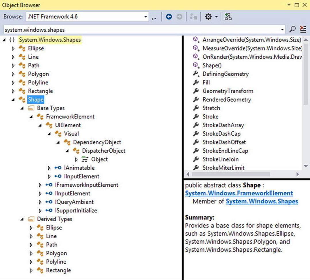
Figure 28-1. The Shape base class receives a good deal of functionality from its parent classes
Now, given your work in the previous two chapters, some of these parent classes might ring a bell. Recall, for example, that UIElement defines numerous methods to receive mouse input and deal with drag-and-drop events, while FrameworkElement defines members to deal with sizing, tooltips, mouse cursors, and whatnot. Given this inheritance chain, be aware that when you render graphical data using Shape-derived classes, the objects are just about as functional (as far as user interactivity is concerned) as a WPF control!
For example, determining whether the user has clicked on your rendered image is no more complicated than handling the MouseDown event. By way of a simple example, if you authored this XAML of a Rectangle object in the Grid of your initial Window
<Rectangle x:Name="myRect" Height="30" Width="30"
Fill="Green" MouseDown="myRect_MouseDown"/>
you could implement a C# event handler for the MouseDown event that changes the rectangle’s background color when clicked, like so:
private void myRect_MouseDown(object sender, MouseButtonEventArgs e)
{
// Change color of Rectangle when clicked.
myRect.Fill = Brushes.Pink;
}
Unlike with other graphical toolkits you may have used, you do not need to author a ton of infrastructure code that manually maps mouse coordinates to the geometry, manually calculates hit-testing, renders to an off-screen buffer, and so forth. The members ofSystem.Windows.Shapes simply respond to the events you register with, just like a typical WPF control (e.g., Button, etc.).
The downside of all this out-of-the-box functionality is that the shapes do take up a fair amount of memory. Again, if you’re building a scientific application that plots thousands of points on the screen, using shapes would be a poor choice (essentially, it would be about as memory-intensive as rendering thousands of Button objects!). However, when you need to generate an interactive 2D vector image, shapes are a wonderful choice.
Beyond the functionality inherited from the UIElement and FrameworkElement parent classes, Shape defines a number of members for each of the children; some of the more useful ones are shown in Table 28-1.
Table 28-1. Key Properties of the Shape Base Class
|
Properties |
Meaning in Life |
|
DefiningGeometry |
Returns a Geometry object that represents the overall dimensions of the current shape. This object contains only the plot points that are used to render the data, and has no trace of the functionality from UIElement or FrameworkElement. |
|
Fill |
Allows you to specify a “brush object” to render the interior portion of a shape. |
|
GeometryTransform |
Allows you to apply transformations to a shape before it is rendered on the screen. The inherited RenderTransform property (from UIElement) applies the transformation after it has been rendered on the screen. |
|
Stretch |
Describes how to fill a shape within its allocated space, such as its position within a layout manager. This is controlled using the corresponding System.Windows.Media.Stretch enumeration. |
|
Stroke |
Defines a brush object, or in some cases, a pen object (which is really a brush in disguise) that is used to paint the border of a shape. |
|
StrokeDashArray, StrokeEndLineCap, StrokeStartLineCap, StrokeThickness |
These (and other) stroke-related properties control how lines are configured when drawing the border of a shape. In a majority of cases, these properties will configure the brush used to draw a border or line. |
Note If you forget to set the Fill and Stroke properties, WPF will give you “invisible” brushes and, therefore, the shape will not be visible on the screen!
Adding Rectangles, Ellipses, and Lines to a Canvas
Later in this chapter, you will learn to use Expression Design to generate XAML descriptions of graphical data. For now, you will build a WPF application that can render shapes using XAML and C#, and while doing so, learn a bit about the process of hit-testing. First, remove the currentRectangle description and the C# event handler logic. Now, update the initial XAML of the <Window> to define a <DockPanel> containing a (now empty) <ToolBar> and a <Canvas>. Note that each contained item has a fitting name via the Name property.
<DockPanel LastChildFill="True">
<ToolBar DockPanel.Dock="Top" Name="mainToolBar" Height="50">
</ToolBar>
<Canvas Background="LightBlue" Name="canvasDrawingArea"/>
</DockPanel>
Now, populate the <ToolBar> with a set of <RadioButton> objects, each of which contains a specific Shape-derived class as content. Notice that each <RadioButton> is assigned to the same GroupName (to ensure mutual exclusivity) and is also given a fitting name.
<ToolBar DockPanel.Dock="Top" Name="mainToolBar" Height="50">
<RadioButton Name="circleOption" GroupName="shapeSelection">
<Ellipse Fill="Green" Height="35" Width="35" />
</RadioButton>
<RadioButton Name="rectOption" GroupName="shapeSelection">
<Rectangle Fill="Red" Height="35"
Width="35" RadiusY="10" RadiusX="10" />
</RadioButton>
<RadioButton Name="lineOption" GroupName="shapeSelection">
<Line Height="35" Width="35"
StrokeThickness="10" Stroke="Blue"
X1="10" Y1="10" Y2="25" X2="25"
StrokeStartLineCap="Triangle" StrokeEndLineCap="Round" />
</RadioButton>
</ToolBar>
As you can see, declaring Rectangle, Ellipse, and Line objects in XAML is quite straightforward and requires little comment. Recall that the Fill property is used to specify a brush to paint the interior of a shape. When you require a solid-colored brush, just specify a hard-coded string of known values, and the underlying type converter will generate the correct object. One interesting feature of the Rectangle type is that it defines RadiusX and RadiusY properties to allow you to render curved corners.
Line represents its starting and end points using the X1, X2, Y1, and Y2 properties (given that height and width make little sense when describing a line). Here you are setting up a few additional properties that control how to render the starting and ending points of the Line, as well as how to configure the stroke settings. Figure 28-2 shows the rendered toolbar, as seen through the Visual Studio WPF designer.
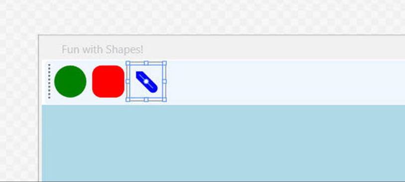
Figure 28-2. Using Shapes as content for a set of RadioButtons
Now, using the Properties window of Visual Studio, handle the MouseLeftButtonDown event for the Canvas, and the Click event for each RadioButton. In your C# file, your goal is to render the selected shape (a circle, square, or line) when the user clicks within the Canvas. First, define the following nested enum (and corresponding member variable) within your Window-derived class:
public partial class MainWindow : Window
{
private enum SelectedShape
{ Circle, Rectangle, Line }
private SelectedShape _currentShape;
...
}
Within each Click event handler, set the currentShape member variable to the correct SelectedShape value. For example, the following is the implementation code for the Click event of the circleOption RadioButton. Implement the remaining two Click handlers in a similar manner.
private void circleOption_Click(object sender, RoutedEventArgs e)
{
_currentShape = SelectedShape.Circle;
}
private void rectOption_Click(object sender, RoutedEventArgs e)
{
_currentShape = SelectedShape.Rectangle;
}
private void lineOption_Click(object sender, RoutedEventArgs e)
{
_currentShape = SelectedShape.Line;
}
With the MouseLeftButtonDown event handler of the Canvas, you will render out the correct shape (of a predefined size), using the X,Y position of the mouse cursor as a starting point. Here is the complete implementation, with analysis to follow:
private void canvasDrawingArea_MouseLeftButtonDown(object sender, MouseButtonEventArgs e)
{
Shape shapeToRender = null;
// Configure the correct shape to draw.
switch (_currentShape)
{
case SelectedShape.Circle:
shapeToRender = new Ellipse() { Fill = Brushes.Green, Height = 35, Width = 35 };
break;
case SelectedShape.Rectangle:
shapeToRender = new Rectangle()
{ Fill = Brushes.Red, Height = 35, Width = 35, RadiusX = 10, RadiusY = 10 };
break;
case SelectedShape.Line:
shapeToRender = new Line()
{
Stroke = Brushes.Blue,
StrokeThickness = 10,
X1 = 0, X2 = 50, Y1 = 0, Y2 = 50,
StrokeStartLineCap= PenLineCap.Triangle,
StrokeEndLineCap = PenLineCap.Round
};
break;
default:
return;
}
// Set top/left position to draw in the canvas.
Canvas.SetLeft(shapeToRender, e.GetPosition(canvasDrawingArea).X);
Canvas.SetTop(shapeToRender, e.GetPosition(canvasDrawingArea).Y);
// Draw shape!
canvasDrawingArea.Children.Add(shapeToRender);
}
Note You might notice that the Ellipse, Rectangle, and Line objects being created in this method have the same property settings as the corresponding XAML definitions! As you might hope, you can streamline this code, but that requires an understanding of the WPF object resources, which you will examine in Chapter 29.
As you can see, you are testing the currentShape member variable to create the correct Shape-derived object. After this point, you set the top-left value within the Canvas using the incoming MouseButtonEventArgs. Last but not least, you add the new Shape-derived type to the collection of UIElement objects maintained by the Canvas. If you run your program now, you should be able to click anywhere in the canvas and see the selected shape rendered at the location of the left mouse-click.
Removing Rectangles, Ellipses, and Lines from a Canvas
With the Canvas maintaining a collection of objects, you might wonder how you can dynamically remove an item, perhaps in response to the user right-clicking on a shape. You can certainly do this using a class in the System.Windows.Media namespace called theVisualTreeHelper. Chapter 29 will explain the roles of “visual trees” and “logical trees” in some detail. Until then, you can handle the MouseRightButtonDown event on your Canvas object and implement the corresponding event handler like so:
private void canvasDrawingArea_MouseRightButtonDown(object sender, MouseButtonEventArgs e)
{
// First, get the X,Y location of where the user clicked.
Point pt = e.GetPosition((Canvas)sender);
// Use the HitTest() method of VisualTreeHelper to see if the user clicked
// on an item in the canvas.
HitTestResult result = VisualTreeHelper.HitTest(canvasDrawingArea, pt);
// If the result is not null, they DID click on a shape!
if (result != null)
{
// Get the underlying shape clicked on, and remove it from
// the canvas.
canvasDrawingArea.Children.Remove(result.VisualHit as Shape);
}
}
This method begins by obtaining the exact X,Y location the user clicked in the Canvas, and performs a hit-test operation via the static VisualTreeHelper.HitTest() method. The return value, a HitTestResult object, will be set to null if the user does not click on aUIElement within the Canvas. If HitTestResult is not null, you can obtain the underlying UIElement that was clicked via the VisualHit property, which you are casting into a Shape-derived object (remember, a Canvas can hold any UIElement, not just shapes!). Again, you’ll get more details on exactly what a “visual tree” is in the next chapter.
Note By default, VisualTreeHelper.HitTest() returns the topmost UIElement clicked on, and does not provide information on other objects below that item (e.g., objects overlapping by Z-order).
With this modification, you should be able to add a shape to the canvas with a left mouse-click and delete an item from the canvas with a right mouse-click! Figure 28-3 shows the functionality of the current example.
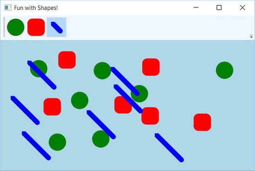
Figure 28-3. Fun with shapes
So far, so good. At this point, you have used Shape-derived objects to render content on RadioButtons using XAML and populated a Canvas using C#. You will add a bit more functionality to this example when you examine the role of brushes and graphical transformations. On a related note, a different example in this chapter will illustrate drag-and-drop techniques on UIElement objects. Until then, let’s examine the remaining members of System.Windows.Shapes.
Working with Polylines and Polygons
The current example used only three of the Shape-derived classes. The remaining child classes (Polyline, Polygon, and Path) are extremely tedious to render correctly without tool support (such as Expression Blend or other tools that can create vector graphics), simply because they require a large number of plot points to represent their output. You’ll learn about the role of Expression Design in just a moment, but until then, here is an overview of the remaining Shapes types.
The Polyline type lets you define a collection of (x, y) coordinates (via the Points property) to draw a series of line segments that do not require connecting ends. The Polygon type is similar; however, it is programmed so that it will always close the starting and ending points and fill the interior with the specified brush. Assume you have authored the following <StackPanel> in the Kaxaml editor, or better yet, in the custom XAML editor you created in Chapter 26:
<!-- Polylines do not automatically connect the ends. -->
<Polyline Stroke ="Red" StrokeThickness ="20" StrokeLineJoin ="Round"
Points ="10,10 40,40 10,90 300,50"/>
<!-- A Polygon always closes the end points. -->
<Polygon Fill ="AliceBlue" StrokeThickness ="5" Stroke ="Green"
Points ="40,10 70,80 10,50" />
Figure 28-4 shows the rendered output in MyXAMLPad.
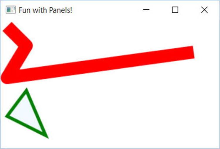
Figure 28-4. Polygons and polylines
Working with Paths
Using the Rectangle, Ellipse, Polygon, Polyline, and Line types alone to draw a detailed 2D vector image would be extremely complex, as these primitives do not allow you to easily capture graphical data such as curves, unions of overlapping data, and so forth. The finalShape-derived class, Path, provides the ability to define complex 2D graphical data represented as a collection of independent geometries. After you have defined a collection of such geometries, you can assign them to the Data property of the Path class, where this information will be used to render your complex 2D image.
The Data property takes a System.Windows.Media.Geometry-derived class, which contains the key members described in Table 28-2.
Table 28-2. Select Members of the System.Windows.Media.Geometry Type
|
Member |
Meaning in Life |
|
Bounds |
Establishes the current bounding rectangle containing the geometry. |
|
FillContains() |
Determines whether a given Point (or other Geometry object) is within the bounds of a particular Geometry-derived class. This is useful for hit-testing calculations. |
|
GetArea() |
Returns the entire area a Geometry-derived type occupies. |
|
GetRenderBounds() |
Returns a Rect that contains the smallest possible rectangle that could be used to render the Geometry-derived class. |
|
Transform |
Assigns a Transform object to the geometry to alter the rendering. |
The classes that extend Geometry (see Table 28-3) look very much like their Shape-derived counterparts. For example, EllipseGeometry has similar members to Ellipse. The big distinction is that Geometry-derived classes do not know how to render themselves directly because they are not UIElements. Rather, Geometry-derived classes represent little more than a collection of plot-point data, which say in effect “If a Path uses my data, this is how I would render myself.”
Table 28-3. Geometry-Derived Classes
|
Geometry Class |
Meaning in Life |
|
LineGeometry |
Represents a straight line |
|
RectangleGeometry |
Represents a rectangle |
|
EllipseGeometry |
Represents an ellipse |
|
GeometryGroup |
Allows you to group together several Geometry objects |
|
CombinedGeometry |
Allows you to merge two different Geometry objects into a single shape |
|
PathGeometry |
Represents a figure composed of lines and curves |
Note Path is not the only class in WPF that can use a collection of geometries. For example, DoubleAnimationUsingPath, DrawingGroup, GeometryDrawing, and even UIElement can all use geometries for rendering, using the PathGeometry, ClipGeometry,Geometry, and Clip properties, respectively.
The following is a Path that makes use of a few Geometry-derived types. Notice that you are setting the Data property of Path to a GeometryGroup object that contains other Geometry-derived objects such as EllipseGeometry, RectangleGeometry, andLineGeometry. Figure 28-5 shows the output.
<!-- A Path contains a set of geometry objects,
set with the Data property. -->
<Path Fill = "Orange" Stroke = "Blue" StrokeThickness = "3">
<Path.Data>
<GeometryGroup>
<EllipseGeometry Center = "75,70"
RadiusX = "30" RadiusY = "30" />
<RectangleGeometry Rect = "25,55 100 30" />
<LineGeometry StartPoint="0,0" EndPoint="70,30" />
<LineGeometry StartPoint="70,30" EndPoint="0,30" />
</GeometryGroup>
</Path.Data>
</Path>
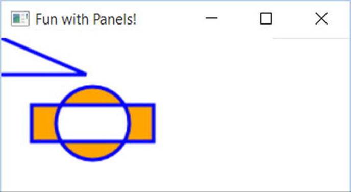
Figure 28-5. A Path containing various Geometry objects
The image in Figure 28-5 could have been rendered using the Line, Ellipse, and Rectangle classes shown earlier. However, this would have put various UIElement objects in memory. When you use geometries to model the plot points of what to draw, and then place the geometry collection into a container that can render the data (Path, in this case), you reduce the memory overhead.
Now recall that Path has the same inheritance chain as any other member of System.Windows.Shapes, and therefore has the ability to send the same event notifications as other UIElements. Thus, if you were to define this same <Path> element in a Visual Studio project, you could determine whether the user clicked anywhere in the sweeping line simply by handling a mouse event (remember, Kaxaml does not allow you to handle events for the markup you have authored).
The Path Modeling “Mini-Language”
Of all the classes listed in Table 28-3, PathGeometry is the most complex to configure in terms of XAML or code. This has to do with the fact that each segment of the PathGeometry is composed of objects that contain various segments and figures (for example, ArcSegment,BezierSegment, LineSegment, PolyBezierSegment, PolyLineSegment, PolyQuadraticBezierSegment, etc.). Here is an example of a Path object whose Data property has been set to a <PathGeometry> composed of various figures and segments:
<Path Stroke="Black" StrokeThickness="1" >
<Path.Data>
<PathGeometry>
<PathGeometry.Figures>
<PathFigure StartPoint="10,50">
<PathFigure.Segments>
<BezierSegment
Point1="100,0"
Point2="200,200"
Point3="300,100"/>
<LineSegment Point="400,100" />
<ArcSegment
Size="50,50" RotationAngle="45"
IsLargeArc="True" SweepDirection="Clockwise"
Point="200,100"/>
</PathFigure.Segments>
</PathFigure>
</PathGeometry.Figures>
</PathGeometry>
</Path.Data>
</Path>
Now, to be perfectly honest, very few programmers will ever need to manually build complex 2D images by directly describing Geometry- or PathSegment-derived classes. Later on in this chapter, you will learn how to convert vector graphics into path statements that can be used in XAML.
Even with the assistance of these tools, the amount of XAML required to define a complex Path object would be ghastly, as the data consists of full descriptions of various Geometry- or PathSegment-derived classes. In order to produce more concise and compact markup, the Pathclass has been designed to understand a specialized “mini-language.”
For example, rather than setting the Data property of Path to a collection of Geometry- and PathSegment-derived types, you can set the Data property to a single string literal containing a number of known symbols and various values that define the shape to be rendered. Here is a simple example, and the resulting output is shown in Figure 28-6:
<Path Stroke="Black" StrokeThickness="3"
Data="M 10,75 C 70,15 250,270 300,175 H 240" />
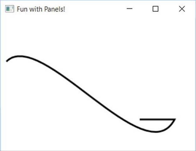
Figure 28-6. The path mini-language allows you to compactly describe a Geometry/PathSegment object model
The M command (short for move) takes an X,Y position that represents the starting point of the drawing. The C command takes a series of plot points to render a curve (a cubic Bézier curve to be exact), while H draws a horizontal line.
Now, to be perfectly honest, the chances that you will ever need to manually build or parse a string literal containing path mini-language instructions are slim to none. However, at the very least, you will no longer be surprised when you view XAML-generated dedicated tools. If you are interested in examining the details of this particular grammar, look up “Path Markup Syntax” in the .NET Framework 4.6 SDK documentation.
WPF Brushes and Pens
Each of the WPF graphical rendering options (shape, drawing and geometries, and visuals) makes extensive use of brushes, which allow you to control how the interior of a 2D surface is filled. WPF provides six different brush types, all of which extendSystem.Windows.Media.Brush. While Brush is abstract, the descendants described in Table 28-4 can be used to fill a region with just about any conceivable option.
Table 28-4. WPF Brush-Derived Types
|
Brush Type |
Meaning in Life |
|
DrawingBrush |
Paints an area with a Drawing-derived object (GeometryDrawing, ImageDrawing, or VideoDrawing) |
|
ImageBrush |
Paints an area with an image (represented by an ImageSource object) |
|
LinearGradientBrush |
Paints an area with a linear gradient |
|
RadialGradientBrush |
Paints an area with a radial gradient |
|
SolidColorBrush |
Paints a single color, set with the Color property |
|
VisualBrush |
Paints an area with a Visual-derived object (DrawingVisual, Viewport3DVisual, and ContainerVisual) |
The DrawingBrush and VisualBrush classes allow you to build a brush based on an existing Drawing- or Visual-derived class. These brush classes are used when you are working with the other two graphical options of WPF (drawings or visuals) and will be examined later in this chapter.
ImageBrush, as the name suggests, lets you build a brush that displays image data from an external file or embedded application resource, by setting the ImageSource property. The remaining brush types (LinearGradientBrush and RadialGradientBrush) are quite straightforward to use, though typing in the required XAML can be a tad verbose. Thankfully, Visual Studio supports integrated brush editors that make it simple to generate stylized brushes.
Configuring Brushes Using Visual Studio
Let’s update your WPF drawing program, RenderingWithShapes, to use some more interesting brushes. The three shapes you’ve employed so far to render data on your toolbar use simple, solid colors, so you can capture their values using simple string literals. To spice things up a tad, you will now use the integrated brush editor. Ensure that the XAML editor of your initial window is the open window within the IDE, and select the Ellipse element. Now, in the Properties window, locate the Brush category and then click Fill property listed on the top (see Figure 28-7).
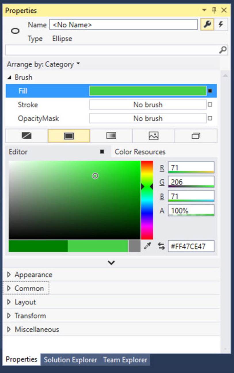
Figure 28-7. Any property that requires a brush can be configured with the integrated brush editor
At the top of the Brushes editor, you will see a set of properties that are all “brush compatible” for the selected item (i.e., Fill, Stroke, and OpacityMask). Below this, you will see a series of tabs that allow you to configure different types of brushes, including the current solid color brush. You can use the color selector tool, as well as the ARGB (alpha, red, green, and blue, where “alpha” controls transparency) editors to control the color of the current brush. Using these sliders and the related color selection area, you can create any sort of solid color. Use these tools to change the Fill color of your Ellipse, and view the resulting XAML. You’ll notice the color is stored as a hexadecimal value, such as
<Ellipse Fill="#FF47CE47" Height="35" Width="35" />
More interestingly, this same editor allows you to configure gradient brushes, which are used to define a series of colors and transition points. Recall that this Brushes editor provides you with a set of tabs, the first of which lets you set a null brush for no rendered output. The other four allow you to set up a solid color brush (what you just examined), gradient brush, tile brush, or image brush.
Click the gradient brush button and the editor will display a few new options (see Figure 28-8). The three buttons on the lower left allow you to pick a linear gradient, a radial gradient, or to reverse the gradient stops. The bottommost strip will show you the current color of each gradient stop, each of which is marked by a “thumb” on the strip. As you drag these thumbs around the gradient strip, you can control the gradient offset. Furthermore, when you click on a given thumb, you can change the color for that particular gradient stop via the color selector. Finally, if you click directly on the gradient strip, you can add additional gradient stops.
Take a few minutes to play around with this editor to build a radial gradient brush containing three gradient stops, set to your colors of choice. Figure 28-8 shows the brush you just constructed, using three different shades of green.
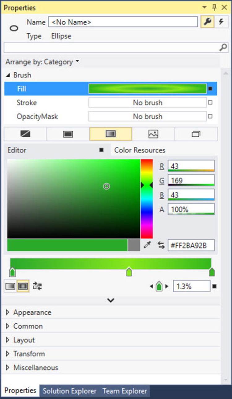
Figure 28-8. The Visual Studio brush editor allows you to build basic gradient brushes
When you are done, the IDE will update your XAML with a custom brush, set to a brush-compatible property (the Fill property of the Ellipse in this example) using property-element syntax, such as
<Ellipse Height="35" Width="35">
<Ellipse.Fill>
<RadialGradientBrush>
<GradientStop Color="#FF87E71B" Offset="0.589" />
<GradientStop Color="#FF2BA92B" Offset="0.013" />
<GradientStop Color="#FF34B71B" Offset="1" />
</RadialGradientBrush>
</Ellipse.Fill>
</Ellipse>
Configuring Brushes in Code
Now that you have built a custom brush for the XAML definition of your Ellipse, the corresponding C# code is out of date, in that it will still render a solid green circle. To sync things back up, update the correct case statement to use the same brush you just created. The following is the necessary update, which looks more complex than you might expect, just because you are converting the hexadecimal value to a proper Color object via the System.Windows.Media.ColorConverter class (see Figure 28-9 for the modified output):
case SelectedShape.Circle:
shapeToRender = new Ellipse() { Height = 35, Width = 35 };
// Make a RadialGradientBrush in code!
RadialGradientBrush brush = new RadialGradientBrush();
brush.GradientStops.Add(new GradientStop(
(Color)ColorConverter.ConvertFromString("#FF87E71B"), 0.589));
brush.GradientStops.Add(new GradientStop(
(Color)ColorConverter.ConvertFromString("#FF2BA92B"), 0.013));
brush.GradientStops.Add(new GradientStop(
(Color)ColorConverter.ConvertFromString("#FF34B71B"), 1));
shapeToRender.Fill = brush;
break;
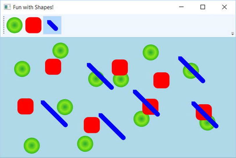
Figure 28-9. Drawing circles with a bit more pizzazz!
By the way, you can build GradientStop objects by specifying a simple color as the first constructor parameter using the Colors enumeration, which returns a configured Color object.
GradientStop g = new GradientStop(Colors.Aquamarine, 1);
Or, if you require even finer control, you can pass in a configured Color object, like so:
Color myColor = new Color() { R = 200, G = 100, B = 20, A = 40 };
GradientStop g = new GradientStop(myColor, 34);
Of course, the Colors enum and Color class are not limited to gradient brushes. You can use them anytime you need to represent a color value in code.
Configuring Pens
In comparison with brushes, a pen is an object for drawing borders of geometries, or in the case of the Line or PolyLine class, the line geometry itself. Specifically, the Pen class allows you to draw a specified thickness, represented by a double value. In addition, a Pen can be configured with the same sort of properties seen in the Shape class, such as starting and stopping pen caps, dot-dash patterns, and so forth. For example, you can add the following markup to a shape to define the pen attributes:
<Pen Thickness="10" LineJoin="Round" EndLineCap="Triangle" StartLineCap="Round" />
In many cases, you won’t need to directly create a Pen object because this will be done indirectly when you assign a value to properties, such as StrokeThickness to a Shape-derived type (as well as other UIElements). However, building a custom Pen object is very handy when working with Drawing-derived types (described later in the chapter). Visual Studio does not have a pen editor, per se, but it does allow you to configure all of the stroke-centric properties of a selected item using the Properties window.
Applying Graphical Transformations
To wrap up our discussion of using shapes, let’s address the topic of transformations. WPF ships with numerous classes that extend the System.Windows.Media.Transform abstract base class. Table 28-5 documents many of the key out-of-the-box Transform-derived classes.
Table 28-5. Key Descendants of the System.Windows.Media.Transform Type
|
Type |
Meaning in Life |
|
MatrixTransform |
Creates an arbitrary matrix transformation that is used to manipulate objects or coordinate systems in a 2D plane |
|
RotateTransform |
Rotates an object clockwise about a specified point in a 2D (x, y) coordinate system |
|
ScaleTransform |
Scales an object in the 2D (x, y) coordinate system |
|
SkewTransform |
Skews an object in the 2D (x, y) coordinate system |
|
TranslateTransform |
Translates (moves) an object in the 2-D (x-y) coordinate system |
|
TransformGroup |
Represents a composite Transform composed of other Transform objects |
Transformations can be applied to any UIElement (e.g., descendants of Shape as well as controls such as Buttons, TextBoxes, and the like). Using these transformation classes, you can render graphical data at a given angle, skew the image across a surface, and expand, shrink, or flip the target item in a variety of ways.
Note While transformation objects can be used anywhere, you will find them most useful when working with WPF animations and custom control templates. As you will see later in the chapter, you can use WPF animations to incorporate visual cues to the end user for a custom control.
Transformations (or a whole set of them) can be assigned to a target object (e.g., Button, Path, etc.) using two common properties, LayoutTransform and RenderTransform.
The LayoutTransform property is helpful in that the transformation occurs before elements are rendered into a layout manager, and therefore the transformation will not affect z-ordering operations (in other words, the transformed image data will not overlap).
The RenderTransform property, on the other hand, occurs after the items are in their container, and therefore it is quite possible that elements can be transformed in such a way that they could overlap each other, based on how they were arranged in the container.
A First Look at Transformations
You will add some transformational logic to your RenderingWithShapes project in just a moment. However, to see transformation objects in action, open Kaxaml (or your custom XAML editor) and define a simple <StackPanel> in the root <Page> or <Window>, and set theOrientation property to Horizontal. Now, add the following <Rectangle>, which will be drawn at a 45-degree angle using a RotateTransform object:
<!-- A Rectangle with a rotate transformation. -->
<Rectangle Height ="100" Width ="40" Fill ="Red">
<Rectangle.LayoutTransform>
<RotateTransform Angle ="45"/>
</Rectangle.LayoutTransform>
</Rectangle>
Here is a <Button> that is skewed across the surface by 20 degrees, using a <SkewTransform>:
<!-- A Button with a skew transformation. -->
<Button Content ="Click Me!" Width="95" Height="40">
<Button.LayoutTransform>
<SkewTransform AngleX ="20" AngleY ="20"/>
</Button.LayoutTransform>
</Button>
And for good measure, here is an <Ellipse> that is scaled by 20 degrees with a ScaleTransform (note the values set to the initial Height and Width), as well as a <TextBox> that has a group of transformation objects applied to it:
<!-- An Ellipse that has been scaled by 20%. -->
<Ellipse Fill ="Blue" Width="5" Height="5">
<Ellipse.LayoutTransform>
<ScaleTransform ScaleX ="20" ScaleY ="20"/>
</Ellipse.LayoutTransform>
</Ellipse>
<!-- A TextBox that has been rotated and skewed. -->
<TextBox Text ="Me Too!" Width="50" Height="40">
<TextBox.LayoutTransform>
<TransformGroup>
<RotateTransform Angle ="45"/>
<SkewTransform AngleX ="5" AngleY ="20"/>
</TransformGroup>
</TextBox.LayoutTransform>
</TextBox>
Note that when a transformation is applied, you are not required to perform any manual calculations to correctly respond to hit-testing, input focus, or whatnot. The WPF graphics engine handles such tasks on your behalf. For example, in Figure 28-10, you can see that the TextBox is still responsive to keyboard input.
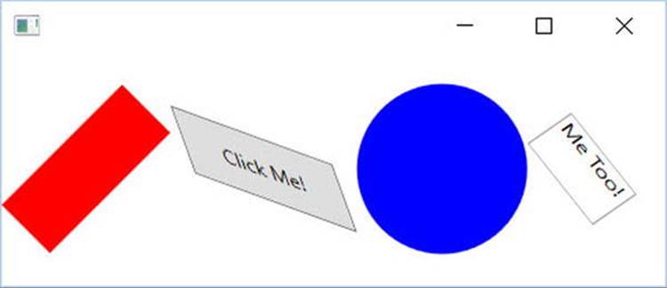
Figure 28-10. The results of graphical transformation objects
Transforming Your Canvas Data
Now, let’s incorporate some transformational logic into your RenderingWithShapes example. In addition to applying a transformation object to a single item (e.g., Rectangle, TextBox, etc.), you can also apply transformation objects to a layout manager in order to transform all of the internal data. You could, for example, render the entire <DockPanel> of the main window at an angle:
<DockPanel LastChildFill="True">
<DockPanel.LayoutTransform>
<RotateTransform Angle="45"/>
</DockPanel.LayoutTransform>
...
</DockPanel>
This is a bit extreme for this example, so let’s add a final (less aggressive) feature that allows the user to flip the entire Canvas and all contained graphics. Begin by adding a final <ToggleButton> to your <ToolBar>, defined as follows:
<ToggleButton Name="flipCanvas" Click="flipCanvas_Click" Content="Flip Canvas!"/>
Within the Click event handler, create a RotateTransform object and connect it to the Canvas object via the LayoutTransform property if this new ToggleButton is clicked. If the ToggleButton is not clicked, remove the transformation by setting the same property tonull.
private void flipCanvas_Click(object sender, RoutedEventArgs e)
{
if (flipCanvas.IsChecked == true)
{
RotateTransform rotate = new RotateTransform(-180);
canvasDrawingArea.LayoutTransform = rotate;
}
else
{
canvasDrawingArea.LayoutTransform = null;
}
}
Run your application and add a bunch of graphics throughout the canvas area. If you click your new button, you will find that the shape data flows outside of the boundaries of the canvas! This is because you have not defined a clipping region (see Figure 28-11).
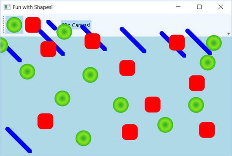
Figure 28-11. Oops! Your data is flowing outside of the canvas after the transformation!
Fixing this is trivial. Rather than manually authoring complex clipping-logic code, simply set the ClipToBounds property of the <Canvas> to true, which prevents child elements from being rendered outside the parent’s boundaries. If you run your program again, you’ll find the data will not bleed off the canvas boundary.
<Canvas ClipToBounds = "True" ... >
The last tiny modification to make has to do with the fact that when you flip the canvas by pressing your toggle button, and then click the canvas to draw a new shape, the point at which you click is not the point where the graphical data is applied. Rather, the data is rendered above the mouse cursor.
To resolve this issue, check out the solution code for this example. The key is to add one final Boolean member variable (isFlipped), which will apply the same transformation object to the shape being draw before the rendering occurs (via RenderTransform). Here is the crux of the code:
private bool _isFlipped = false;
private void canvasDrawingArea_MouseLeftButtonDown(object sender, MouseButtonEventArgs e)
{
Shape shapeToRender = null;
...
// isFlipped is a private boolean field. This is toggled when the
// toggle button is clicked.
if (_isFlipped)
{
RotateTransform rotate = new RotateTransform(-180);
shapeToRender.RenderTransform = rotate;
}
// Set top/left to draw in the canvas.
Canvas.SetLeft(shapeToRender, e.GetPosition(canvasDrawingArea).X);
Canvas.SetTop(shapeToRender, e.GetPosition(canvasDrawingArea).Y);
// Draw shape!
canvasDrawingArea.Children.Add(shapeToRender);
}
private void flipCanvas_Click(object sender, RoutedEventArgs e)
{
if (flipCanvas.IsChecked == true)
{
RotateTransform rotate = new RotateTransform(-180);
canvasDrawingArea.LayoutTransform = rotate;
}
else
{
canvasDrawingArea.LayoutTransform = null;
}
}
This wraps up your examination of System.Windows.Shapes, brushes, and transformations. Before looking at the role of rendering graphics using drawings and geometries, let’s see how Visual Studio can be used to simplify how you work with primitive graphics.
Source Code The RenderingWithShapes project can be found in the Chapter 28 subdirectory.
Working with the Visual Studio Transform Editor
In the previous example, you applied various transformations by manually entering markup and authoring some C# code. While this is certainly useful, you will be happy to know that the latest version of Visual Studio ships with an integrated transformation editor. It is not as powerful as the tooling in Expression Blend, but it does allow you to easily generate the necessary transformational markup using integrated tools. Recall that any UI element can be the recipient of transformational services, including a layout system containing various UI elements. To illustrate the use of Visual Studio’s transform editor, create a new WPF Application named FunWithTransforms.
Building the Initial Layout
First, split your initial Grid into two columns using the integrated grid editor (the exact size does not matter). Now, locate the StackPanel control within your Toolbox and add this item to take up the entire space of the first column of the Grid, like so:
<Grid>
<Grid.ColumnDefinitions>
<ColumnDefinition Width="*"/>
<ColumnDefinition Width="*"/>
</Grid.ColumnDefinitions>
<StakPanelGrid.Row="0" Grid.Columne="0"></StackPanel>
</Grid>
Next, select your new StackPanel in the Document Outline panel and add three Button controls to the StackPanel container (see Figure 28-12).
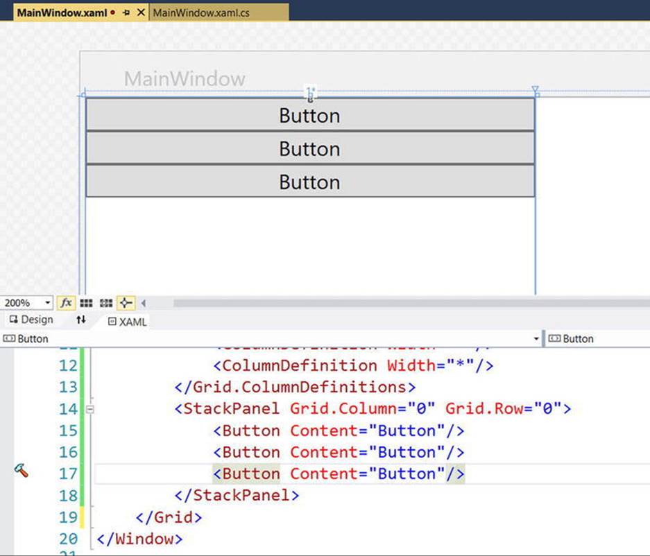
Figure 28-12. A StackPanel of Button controls
Now, select each Button, one at a time, and change the Content property (located in the Common Properties section of the Properties window) to the values Skew, Rotate, and Flip. As well, use the Name area of the Properties panel to given each button a proper name, such asbtnSkew, btnRotate, and btnFlip; and using the Events tab of the Properties panel, handle the Click event for each Button. You will implement these handlers in just a bit.
To finalize the UI, create a graphic of your choosing (using any of the techniques seen in this chapter) defined in the second column of the Grid. Figure 28-13 shows the final layout. Here, there are two Ellipse controls grouped into a Canvas control, which has been namedmyCanvas.
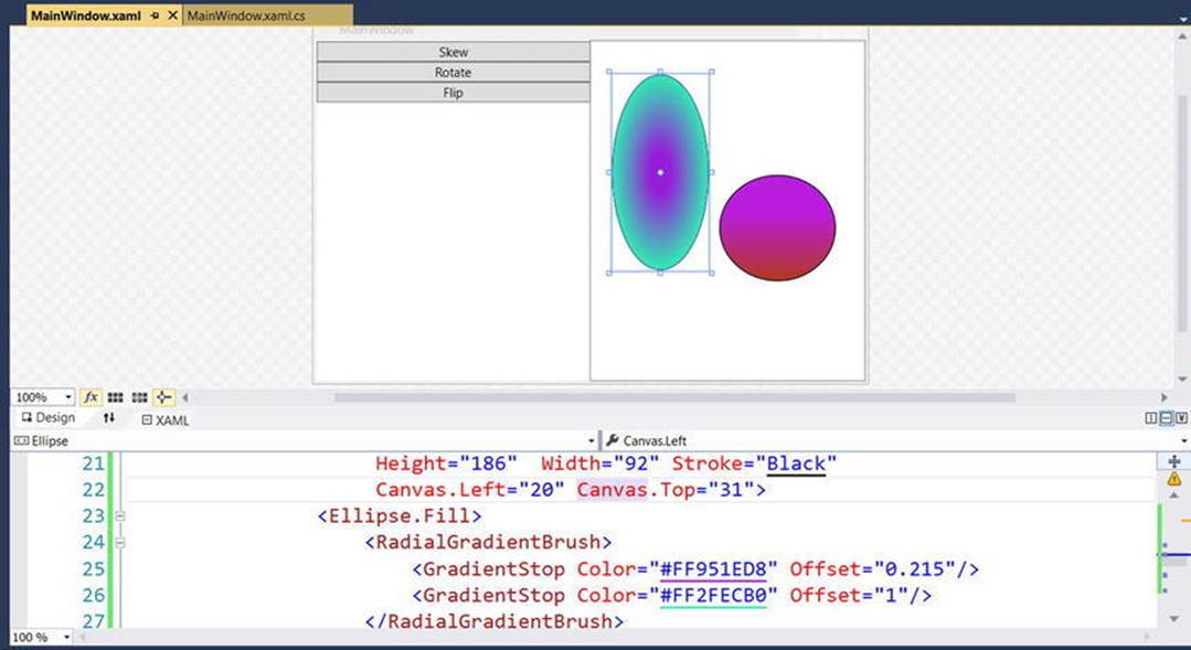
Figure 28-13. The layout of your transformation example
The markup used in the sample is listed here:
<Canvas x:Name="myCanvas" Grid.Column="1" Grid.Row="0">
<Ellipse HorizontalAlignment="Left" VerticalAlignment="Top"
Height="186" Width="92" Stroke="Black"
Canvas.Left="20" Canvas.Top="31">
<Ellipse.Fill>
<RadialGradientBrush>
<GradientStop Color="#FF951ED8" Offset="0.215"/>
<GradientStop Color="#FF2FECB0" Offset="1"/>
</RadialGradientBrush>
</Ellipse.Fill>
</Ellipse>
<Ellipse HorizontalAlignment="Left" VerticalAlignment="Top"
Height="101" Width="110" Stroke="Black"
Canvas.Left="122" Canvas.Top="126">
<Ellipse.Fill>
<LinearGradientBrush EndPoint="0.5,1" StartPoint="0.5,0">
<GradientStop Color="#FFB91DDC" Offset="0.355"/>
<GradientStop Color="#FFB0381D" Offset="1"/>
</LinearGradientBrush>
</Ellipse.Fill>
</Ellipse>
</Canvas>
Applying Transformations at Design Time
As mentioned, Visual Studio provides an integrated Transform editor, which can be found in the Properties panel. Locate this area, and make sure you expand the Transform section to view the RenderTransform and LayoutTransform sections of the editor (see Figure 28-14).
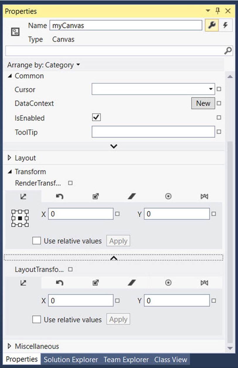
Figure 28-14. The Transform editor
Similar to the Brushes section, the Transform section provides a number of tabs to configure various types of graphical transformation to the currently selected item. Table 28-6 describes each transformation option, listed in the order of evaluating each tab left to right.
Table 28-6. Blend Transformation Options
|
Transformation Option |
Meaning in Life |
|
Translate |
Allows you to offset the location of an item on an X, Y position. |
|
Rotate |
Allows you to rotate an item on a 360-degree angle. |
|
Scale |
Allows you to grow or shrink an item by a factor in the X and Y directions. |
|
Skew |
Allows you to skew the bounding box containing the selected item by a factor in the X and Y directions. |
|
Center Point |
When you rotate or flip an object, the item moves relative to a fixed point, called the object’s center point. By default, an object’s center point is located at the object’s center; however, this transformation allows you to change an object’s center point in order to rotate or flip the object around a different point. |
|
Flip |
Flips a selected item based on an X or Y center point. |
I suggest you test each of these transformations using your custom shape as a target (just press Ctrl+Z to undo the previous operation). Like many other aspects of the Transform Properties panel, each transformation section has a unique set of configuration options, which should become fairly understandable as you tinker. For example, the Skew transform editor allows you to set the X and Y skew values, the Flip transform editor allows you to flip on the X or Y axis, and so forth.
Transforming the Canvas in Code
The implementation of each Click event handler will be more or less the same. You will configure a transformation object and assign it to the myCanvas object. Then, when you run the application, you can click a button to see the result of the applied transformation. Here is the complete code for each event handler (notice that you are setting the LayoutTransform property so the shape data remains positioned relative to the parent container):
private void btnFlip_Click(object sender, System.Windows.RoutedEventArgs e)
{
myCanvas.LayoutTransform = new ScaleTransform(-1, 1);
}
private void btnRotate_Click(object sender, System.Windows.RoutedEventArgs e)
{
myCanvas.LayoutTransform = new RotateTransform(180);
}
private void btnSkew_Click(object sender, System.Windows.RoutedEventArgs e)
{
myCanvas.LayoutTransform = new SkewTransform(40, -20);
}
Source Code The FunWithTransformations project can be found in the Chapter 28 subdirectory.
Rendering Graphical Data Using Drawings and Geometries
While the Shape types allow you to generate any sort of interactive two-dimensional surface, they entail quite a bit of memory overhead due to their rich inheritance chain. And though the Path class can help remove some of this overhead using contained geometries (rather than a large collection of other shapes), WPF provides a sophisticated drawing and geometry programming interface that renders even more lightweight 2D vector images.
The entry point into this API is the abstract System.Windows.Media.Drawing class (in PresentationCore.dll), which on its own does little more than define a bounding rectangle to hold the rendering. Figure 28-15 shows that the inheritance chain of the Drawing class is significantly more lightweight than Shape, given that neither UIElement nor FrameworkElement is in the inheritance chain.
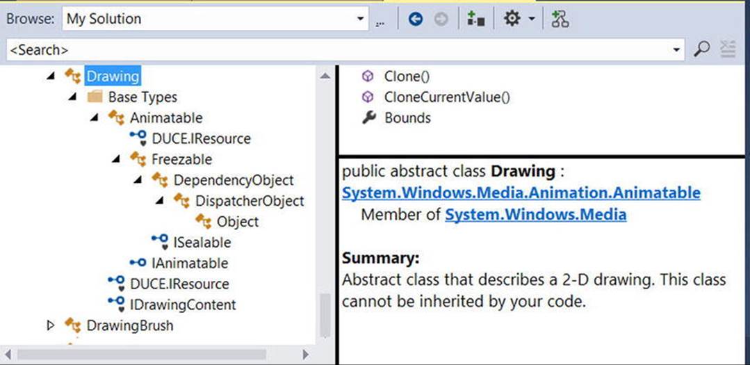
Figure 28-15. The Drawing class is more lightwight than Shape
WPF provides various classes that extend Drawing, each of which represents a particular way of drawing the content, as described in Table 28-7.
Table 28-7. WPF Drawing-Derived Types
|
Type |
Meaning in Life |
|
DrawingGroup |
Used to combine a collection of separate Drawing-derived objects into a single composite rendering. |
|
GeometryDrawing |
Used to render 2D shapes in a very lightweight manner. |
|
GlyphRunDrawing |
Used to render textual data using WPF graphical rendering services. |
|
ImageDrawing |
Used to render an image file, or geometry set, into a bounding rectangle. |
|
VideoDrawing |
Used to play an audio file or video file. This type can only be fully exploited using procedural code. If you would like to play videos via XAML, the MediaPlayer type is a better choice. |
Because they are more lightweight, Drawing-derived types do not have intrinsic support for handling input events, as they are not UIElements or FrameworkElements (although it is possible to programmatically perform hit-testing logic).
Another key difference between Drawing-derived types and Shape-derived types is that Drawing-derived types have no ability to render themselves, as they do not derive from UIElement! Rather, derived types must be placed within a hosting object (specifically, DrawingImage,DrawingBrush, or DrawingVisual) to display their content.
DrawingImage allows you to place drawing and geometries inside a WPF Image control, which typically is used to display data from an external file. DrawingBrush allows you to build a brush based on a drawing and its geometries, in order to set a property that requires a brush. Finally, DrawingVisual is used only in the “visual” layer of graphical rendering, which is driven completely via C# code.
Although using drawings is a bit more complex than using simple shapes, this decoupling of graphical composition from graphical rendering makes the Drawing-derived types much more lightweight than the Shape-derived types, while still retaining key services.
Building a DrawingBrush Using Geometries
Earlier in this chapter, you filled a Path with a group of geometries, like so:
<Path Fill = "Orange" Stroke = "Blue" StrokeThickness = "3">
<Path.Data>
<GeometryGroup>
<EllipseGeometry Center = "75,70"
RadiusX = "30" RadiusY = "30" />
<RectangleGeometry Rect = "25,55 100 30" />
<LineGeometry StartPoint="0,0" EndPoint="70,30" />
<LineGeometry StartPoint="70,30" EndPoint="0,30" />
</GeometryGroup>
</Path.Data>
</Path>
By doing this, you gain interactivity from Path but are still fairly lightweight given your geometries. However, if you want to render the same output and have no need for any (out-of-the-box) interactivity, you can place the same <GeometryGroup> inside a DrawingBrush, like this:
<DrawingBrush>
<DrawingBrush.Drawing>
<GeometryDrawing>
<GeometryDrawing.Geometry>
<GeometryGroup>
<EllipseGeometry Center = "75,70"
RadiusX = "30" RadiusY = "30" />
<RectangleGeometry Rect = "25,55 100 30" />
<LineGeometry StartPoint="0,0" EndPoint="70,30" />
<LineGeometry StartPoint="70,30" EndPoint="0,30" />
</GeometryGroup>
</GeometryDrawing.Geometry>
<!-- A custom pen to draw the borders. -->
<GeometryDrawing.Pen>
<Pen Brush="Blue" Thickness="3"/>
</GeometryDrawing.Pen>
<!-- A custom brush to fill the interior. -->
<GeometryDrawing.Brush>
<SolidColorBrush Color="Orange"/>
</GeometryDrawing.Brush>
</GeometryDrawing>
</DrawingBrush.Drawing>
</DrawingBrush>
When you place a group of geometries into a DrawingBrush, you also need to establish the Pen object used to draw the boundaries because you no longer inherit a Stroke property from the Shape base class. Here, you created a <Pen> with the same settings used in the Strokeand StrokeThickness values of the previous Path example.
Furthermore, since you no longer inherit a Fill property from Shape, you also need to use property element syntax to define a brush object to use for the <DrawingGeometry>, which here is a solid colored orange brush, just like the previous Path settings.
Painting with the DrawingBrush
Now that you have a DrawingBrush, you can use it to set the value of any property requiring a brush object. For example, if you are authoring this markup in Kaxaml, you could use property-element syntax to paint your drawing over the entire surface of a Page, like so:
<Page
xmlns="http://schemas.microsoft.com/winfx/2006/xaml/presentation"
xmlns:x="http://schemas.microsoft.com/winfx/2006/xaml">
<Page.Background>
<!-- Same DrawingBrush as seen above. -->
<DrawingBrush>
...
</DrawingBrush>
</Page.Background>
</Page>
Or, you can use this <DrawingBrush> to set a different brush-compatible property, such as the Background property of a Button:
<Page
xmlns="http://schemas.microsoft.com/winfx/2006/xaml/presentation"
xmlns:x="http://schemas.microsoft.com/winfx/2006/xaml">
<Button Height="100" Width="100">
<Button.Background>
<!-- Same DrawingBrush as seen above. -->
<DrawingBrush>
...
</DrawingBrush>
</Button.Background>
</Button>
</Page>
No matter which brush-compatible property you set with your custom <DrawingBrush>, the bottom line is you are rendering a 2D vector image with much less overhead than the same 2D image rendered with shapes.
Containing Drawing Types in a DrawingImage
The DrawingImage type allows you to plug your drawing geometry into a WPF <Image> control. Consider the following:
<Page
xmlns="http://schemas.microsoft.com/winfx/2006/xaml/presentation"
xmlns:x="http://schemas.microsoft.com/winfx/2006/xaml">
<Image Height="100" Width="100">
<Image.Source>
<DrawingImage>
<DrawingImage.Drawing>
<GeometryDrawing>
<GeometryDrawing.Geometry>
<GeometryGroup>
<EllipseGeometry Center = "75,70"
RadiusX = "30" RadiusY = "30" />
<RectangleGeometry Rect = "25,55 100 30" />
<LineGeometry StartPoint="0,0" EndPoint="70,30" />
<LineGeometry StartPoint="70,30" EndPoint="0,30" />
</GeometryGroup>
</GeometryDrawing.Geometry>
<!-- A custom pen to draw the borders. -->
<GeometryDrawing.Pen>
<Pen Brush="Blue" Thickness="3"/>
</GeometryDrawing.Pen>
<!-- A custom brush to fill the interior. -->
<GeometryDrawing.Brush>
<SolidColorBrush Color="Orange"/>
</GeometryDrawing.Brush>
</GeometryDrawing>
</DrawingImage.Drawing>
</DrawingImage>
</Image.Source>
</Image>
</Page>
In this case, your <GeometryDrawing> has been placed into a <DrawingImage>, rather than a <DrawingBrush>. Using this <DrawingImage>, you can set the Source property of the Image control.
Working with Vector Images
As you might agree, it would be quite challenging for a graphic artist to create a complex vector-based image using the tools and techniques provided by Visual Studio. Graphic artists have their own set of tools that can produce amazing vector graphics. Neither Visual Studio nor its companion Expression Blend for Visual Studio have that type of design power. Before you can import vector images into WPF application, they must be converted into Path expressions. At that point, you can program against the generated object model using Visual Studio.
Note Previous editions of this text demonstrated a software package named Expression Design. Expression Design was one of the products within Expression Studio, and unfortunately the whole suite is no longer being updated. While you can still access the software if you have a MSDN subscription, in this edition of this book I am using open source software and a printer trick to convert vector graphics to the required path information for XAML rendering. The image being used (laser_sign.svg) as well as the exported path (laser_sign.xaml) data are included in the Chapter 28 folder of the download files. The image is originally from Wikipedia, located in this article: https://en.wikipedia.org/wiki/Hazard_symbol.
Converting a Sample Vector Graphic File into XAML
Before you can import complex graphical data (such as vector graphics) into a WPF application, you need to convert the graphics into path data. As an example of how to do this, start with a sample .svg image file, such as the laser sign referenced in the preceding note. Then download and install an open source tool called Inkscape (located at www.inkscape.org). Using Inkscape, open the laser_sign.svg file from the chapter download. You should see something that resembles Figure 28-16.
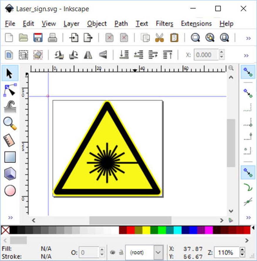
Figure 28-16. The laser sign sample graphic in InkScape
Note ImageMagick (www.ImageMagick.org) is also a very good free image handling tool. Unfortunately, the trick that you will learn shortly doesn’t work on Windows 10 with ImageMagick.
The next steps will seem a bit odd at first, but once you get over the oddity, it is a simple way to convert vector images to XAML. When you have the image the way you want it, select the File  Print menu option. Next, select the Microsoft XPS Document Writer as the printer target, and then click Print (see Figure 28-17). On the next screen, enter a file name and select where the file should be saved, then click Save. Now you have a complete *.xps (or *.oxps) file.
Note Depending on a number of variables with your system configuration, the generated file will have either the .xps or .oxps extension. Either way, the process works the same.
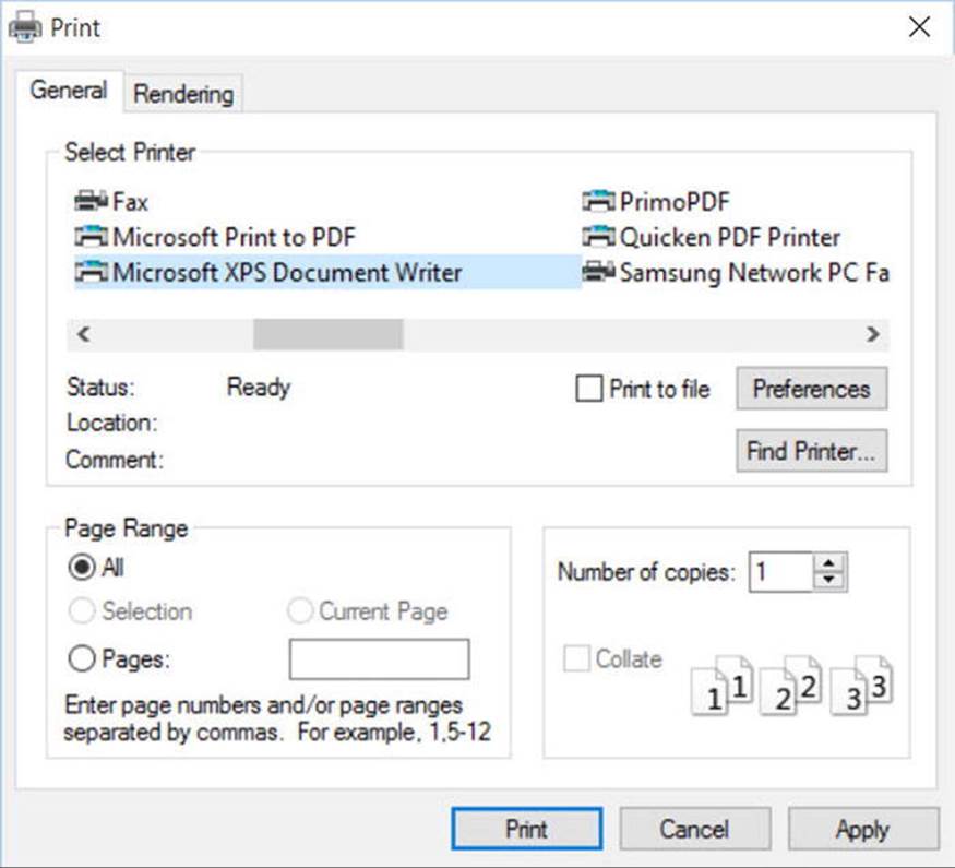
Figure 28-17. Printing the graphic to the Microsoft XPS Document Printer
The *.xps and *.oxps formats are actually a zip file. Rename the extension of the file to .zip and you can open the file in File Explorer (or 7-zip, or your favorite archive tool). You will see that it contains the hierarchy shown in Figure 28-18.
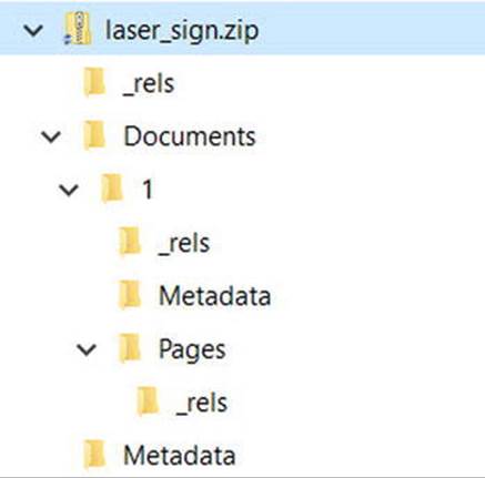
Figure 28-18. The folder hierarchy of the printed XPS file
The file that you need is in the Pages directory (Documents/1/Pages) and is named 1.fpage. Open the file with a text editor and copy everything except the <FixedPage> open and closing tags. The path data can then be copied into the MyXAMLPad (that you wrote earlier), and placed inside a Canvas in the main Window. Click the View XAML button, and you will see your vector graphic reproduced in XAML! Figure 28-19 shows the rendered image using MyXamlPad.
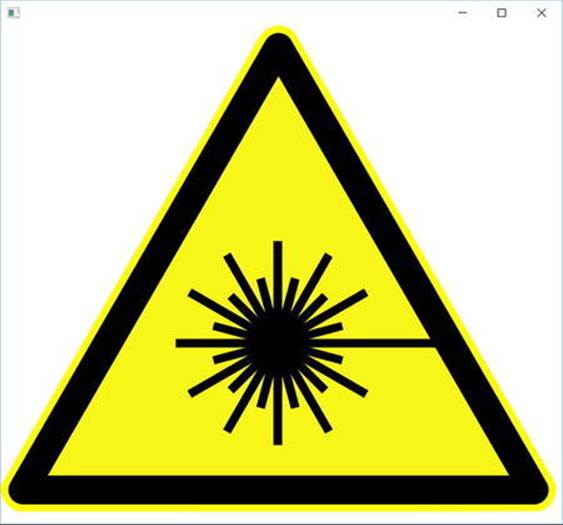
Figure 28-19. The vector graphic rendered in XAML
Importing the Graphical Data into a WPF Project
At this point, create a new WPF Application named InteractiveLaserSign. Resize the dimensions of the Window to the following height and width, and delete the initial Grid control and replace it with a Canvas:
<Window x:Class="InteractiveTeddyBear.MainWindow"
xmlns="http://schemas.microsoft.com/winfx/2006/xaml/presentation"
xmlns:x="http://schemas.microsoft.com/winfx/2006/xaml"
Title="MainWindow" Height="625" Width="675">
<Canvas>
</Canvas>
</Window>
Copy the entire XAML from MyXamlPad (excluding the outer Canvas) and paste into the MainWindow Canvas control. View the Window in design mode, and you will see the sign reproduced in your application!
If you view the Document Outline, you will see that each XAML element is present and accounted for. The goal here is to locate a couple of the lines and give each item a name. While you could manually hunt for the correct objects (which would be very tedious), a better way is to click these items using the visual designer. This will automatically highlight the correct node in the Document Outline editor. This particular graphic uses two objects to make up each line, so click one of the lines in the graphic and see where it is represented in the document editor. Check the object above and below to discover which pair are matched, and then name them Line1_1 and Line1_2. Repeat this process with another line, and name the pair Line2_1 and Line2_2. To make the interaction easier, change the Brush for Line1_1 and Line2_1 to another color besides black by selecting the object in the Document Outline, selecting Brush in the properties, and changing the color (just like you’ve done earlier in this chapter).
Interacting with the Sign
Now you will handle click events for the objects. Select Line1_1 and Line2_1 on the designer, activate the Events area of the Properties window, and enter the event handler names as required. For the current example, handle the MouseLeftButtonDown event for each object, specifying a unique method name each time.
Here is some simple C# code that will change the look and feel of each object when clicked (if you don’t feel like typing all the code seen here, you can simply add a MessageBox.Show() statement for each handler, and display a fitting message):
private void Line1_1_MouseLeftButtonDown(object sender, MouseButtonEventArgs e)
{
// Change the color when clicked.
Line1_2.Fill = new SolidColorBrush(Colors.Red);
}
private void Line2_1_MouseLeftButtonDown(object sender, MouseButtonEventArgs e)
{
// Blur when clicked.
System.Windows.Media.Effects.BlurEffect blur =
new System.Windows.Media.Effects.BlurEffect();
blur.Radius = 10;
Line2_1.Effect = blur;
}
Now, run your application. Click the lines to see the effects. The results should resemble Figure 28-20.
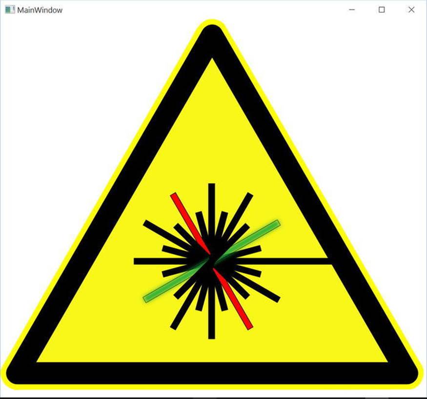
Figure 28-20. Interacting with complex graphical data
You now understand the process of generating Path data for complex graphics and how to interact with the graphical data in code. As you might agree, the ability for professional graphic artists to generate complex graphical data and export the data as XAML is extremely powerful. Once the graphical data has been generated, developers can import the markup and program against the object model.
Source Code The InteractiveLaserSign project can be found in the Chapter 28 subdirectory.
Rendering Graphical Data Using the Visual Layer
The final option for rendering graphical data with WPF is termed the visual layer. As mentioned, you can only gain access to this layer through code (it is not XAML-friendly). While a vast majority of your WPF applications will work just fine using shapes, drawings, and geometries, the visual layer does provide the fastest possible way to render huge amounts of graphical data. Oddly, this very low-level graphical layer can also be useful when you need to render a single image over a very large area. For example, if you need to fill the background of a window with a plain, static image, the visual layer is the fastest way to do so. It can also be useful if you need to change between window backgrounds very quickly, based on user input or whatnot.
We won’t spend too much time delving into the details of this aspect of WPF programming, but let’s build a small sample program to illustrate the basics.
The Visual Base Class and Derived Child Classes
The abstract System.Windows.Media.Visual class type supplies a minimal set of services (rendering, hit-testing, transformations) to render graphics, but it does not provide support for additional nonvisual services, which can lead to code bloat (input events, layout services, styles, and data binding). Notice the simple inheritance chain of the Visual type shown in Figure 28-21.
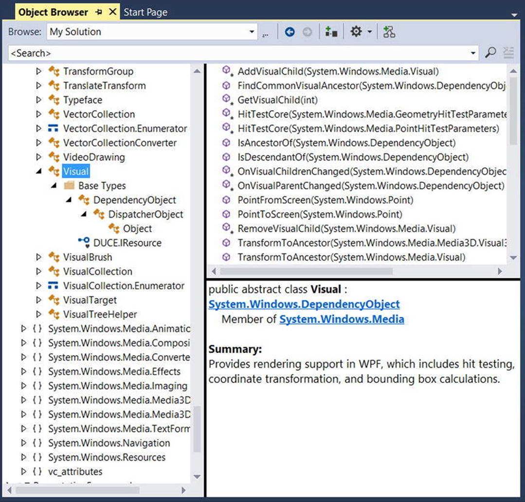
Figure 28-21. The Visual type provides basic hit-testing, coordinate transformation, and bounding box calculations
Given that Visual is an abstract base class, you need to use one of the derived types to perform actual rendering operations. WPF provides a handful of subclasses, including DrawingVisual, Viewport3DVisual, and ContainerVisual.
In this example, you will focus only on DrawingVisual, a lightweight drawing class that is used to render shapes, images, or text.
A First Look at Using the DrawingVisual Class
To render data onto a surface using DrawingVisual, you need to take the following basic steps:
· Obtain a DrawingContext object from the DrawingVisual class.
· Use the DrawingContext to render the graphical data.
These two steps represent the bare minimum necessary for rendering some data to a surface. However, if you want the graphical data you’ve rendered to be responsive to hit-testing calculations (which would be important for adding user interactivity), you will also need to perform these additional steps:
· Update the logical and visual trees maintained by the container upon which you are rendering.
· Override two virtual methods from the FrameworkElement class, allowing the container to obtain the visual data you have created.
You will examine these final two steps in a bit. First, to illustrate how you can use the DrawingVisual class to render 2D data, create a new WPF application with Visual Studio named RenderingWithVisuals. Your first goal is to use a DrawingVisual to dynamically assign data to a WPF Image control. Begin by updating the XAML of your window, like so:
<Window x:Class="RenderingWithVisuals.MainWindow"
xmlns="http://schemas.microsoft.com/winfx/2006/xaml/presentation"
xmlns:x="http://schemas.microsoft.com/winfx/2006/xaml"
Title=" Fun with the Visual Layer" Height="350" Width="525"
Loaded="Window_Loaded" WindowStartupLocation="CenterScreen">
<StackPanel Background="AliceBlue" Name="myStackPanel">
<Image Name="myImage" Height="80"/>
</StackPanel>
</Window>
Notice that your <Image> control does not yet have a Source value because that will happen at runtime. Also notice that you are handling the Loaded event of the window, which will do the work of building the in-memory graphical data, using a DrawingBrush object. Here is the implementation of the Loaded event handler:
private void Window_Loaded(object sender, RoutedEventArgs e)
{
const int TextFontSize = 30;
// Make a System.Windows.Media.FormattedText object.
FormattedText text = new FormattedText("Hello Visual Layer!",
new System.Globalization.CultureInfo("en-us"),
FlowDirection.LeftToRight,
new Typeface(this.FontFamily, FontStyles.Italic,
FontWeights.DemiBold, FontStretches.UltraExpanded),
TextFontSize,
Brushes.Green);
// Create a DrawingVisual, and obtain the DrawingContext.
DrawingVisual drawingVisual = new DrawingVisual();
using(DrawingContext drawingContext = drawingVisual.RenderOpen())
{
// Now, call any of the methods of DrawingContext to render data.
drawingContext.DrawRoundedRectangle(Brushes.Yellow, new Pen(Brushes.Black, 5),
new Rect(5, 5, 450, 100), 20, 20);
drawingContext.DrawText(text, new Point(20, 20));
}
// Dynamically make a bitmap, using the data in the DrawingVisual.
RenderTargetBitmap bmp = new RenderTargetBitmap(500, 100, 100, 90,
PixelFormats.Pbgra32);
bmp.Render(drawingVisual);
// Set the source of the Image control!
myImage.Source = bmp;
}
This code introduces a number of new WPF classes, which I will briefly comment on here (be sure to check the .NET Framework 4.6 SDK documentation for full details if you are interested). The method begins by creating a new FormattedText object that represents the textual portion of the in-memory image you are constructing. As you can see, the constructor allows you to specify numerous attributes such as font size, font family, foreground color, and the text itself.
Next, you obtain the necessary DrawingContext object via a call to RenderOpen() on the DrawingVisual instance. Here, you are rendering a colored, rounded rectangle into the DrawingVisual, followed by your formatted text. In both cases, you are placing the graphical data into the DrawingVisual using hard-coded values, which is not necessarily a great idea for production, but is fine for this simple test.
Note Be sure to look up the DrawingContext class within the .NET Framework 4.6 SDK documentation to view all rendering members. If you have worked with the Windows Forms Graphics object in the past, DrawingContext should look very similar.
The last few statements map the DrawingVisual into a RenderTargetBitmap object, which is a member of the System.Windows.Media.Imaging namespace. This class will take a visual object and transform it into an in-memory bitmap image. After this point, you set theSource property of the Image control, and sure enough, you will see the output in Figure 28-22.
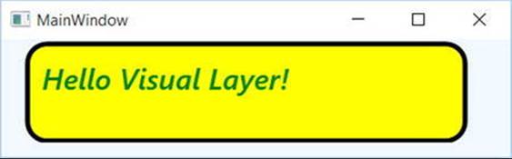
Figure 28-22. Using the visual layer to render an in-memory bitmap
Note The System.Windows.Media.Imaging namespace contains a number of additional encoding classes that let you save the in-memory RenderTargetBitmap object to a physical file in a variety of formats. Check out the JpegBitmapEncoder class (and friends) for more information.
Rendering Visual Data to a Custom Layout Manager
While it is interesting to use DrawingVisual to paint onto the background of a WPF control, it is perhaps more common to build a custom layout manager (Grid, StackPanel, Canvas, etc.) that uses the visual layer internally to render its content. After you have created such a custom layout manager, you can plug it into a normal Window (or Page, or UserControl) and have a part of the UI using a highly optimized rendering agent, while the noncritical aspects of the hosting Window use shapes and drawings for the remainder of the graphical data.
If you don’t require the extra functionality provided by a dedicated layout manager, you could opt to simply extend FrameworkElement, which does have the necessary infrastructure to also contain visual items. To illustrate how this could be done, insert a new class to your project named CustomVisualFrameworkElement. Extend this class from FrameworkElement and import the System.Windows, System.Windows.Input, and System.Windows.Media namespaces.
This class will maintain a member variable of type VisualCollection, which contains two fixed DrawingVisual objects (of course, you could add new members to this collection via a mouse operation, but this example will keep it simple). Update your class with the following new functionality:
class CustomVisualFrameworkElement : FrameworkElement
{
// A collection of all the visuals we are building.
VisualCollection theVisuals;
public CustomVisualFrameworkElement()
{
// Fill the VisualCollection with a few DrawingVisual objects.
// The ctor arg represents the owner of the visuals.
theVisuals = new VisualCollection(this);
theVisuals.Add(AddRect());
theVisuals.Add(AddCircle());
}
private Visual AddCircle()
{
DrawingVisual drawingVisual = new DrawingVisual();
// Retrieve the DrawingContext in order to create new drawing content.
using (DrawingContext drawingContext = drawingVisual.RenderOpen())
{
// Create a circle and draw it in the DrawingContext.
Rect rect = new Rect(new Point(160, 100), new Size(320, 80));
drawingContext.DrawEllipse(Brushes.DarkBlue, null, new Point(70, 90), 40, 50);
}
return drawingVisual;
}
private Visual AddRect()
{
DrawingVisual drawingVisual = new DrawingVisual();
using (DrawingContext drawingContext = drawingVisual.RenderOpen())
{
Rect rect = new Rect(new Point(160, 100), new Size(320, 80));
drawingContext.DrawRectangle(Brushes.Tomato, null, rect);
}
return drawingVisual;
}
}
Now, before you can use this custom FrameworkElement in your Window, you must override two key virtual methods mentioned previously, both of which are called internally by WPF during the rendering process. The GetVisualChild() method returns a child at the specified index from the collection of child elements. The read-only VisualChildrenCount property returns the number of visual child elements within this visual collection. Both methods are easy to implement because you can delegate the real work to the VisualCollection member variable.
protected override int VisualChildrenCount
{
get { return theVisuals.Count; }
}
protected override Visual GetVisualChild(int index)
{
// Value must be greater than zero, so do a sainity check.
if (index < 0 || index >= theVisuals.Count)
{
throw new ArgumentOutOfRangeException();
}
return theVisuals[index];
}
You now have just enough functionality to test your custom class. Update the XAML description of the Window to add one of your CustomVisualFrameworkElement objects to the existing StackPanel. Doing so will require you to build a custom XML namespace that maps to your .NET namespace.
<Window x:Class="RenderingWithVisuals.MainWindow"
xmlns="http://schemas.microsoft.com/winfx/2006/xaml/presentation"
xmlns:x="http://schemas.microsoft.com/winfx/2006/xaml"
xmlns:custom="clr-namespace:RenderingWithVisuals"
Title="Fun with the Visual Layer" Height="350" Width="525"
Loaded="Window_Loaded" WindowStartupLocation="CenterScreen">
<StackPanel Background="AliceBlue" Name="myStackPanel">
<Image Name="myImage" Height="80"/>
<custom:CustomVisualFrameworkElement/>
</StackPanel>
</Window>
If all is well, you should see something similar to Figure 28-23 when you run your program.
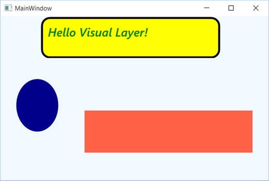
Figure 28-23. Using the visual layer to render data to a custom FrameworkElement
Responding to Hit-Test Operations
Because DrawingVisual does not have any of the infrastructure of UIElement or FrameworkElement, you will need to programmatically add in the ability to calculate hit-test operations. Thankfully, this is fairly easy to do in the visual layer because of the concept of logical andvisual trees. As it turns out, when you author a blob of XAML, you are essentially building a logical tree of elements. However, behind every logical tree is a much richer description known as the visual tree, which contains lower-level rendering instructions.
Chapter 29 will delve into these trees in more detail but for now, just understand that until you register your custom visuals with these data structures, you will not be able to perform hit-testing operations. Luckily, the VisualCollection container does this on your behalf (which explains why you needed to pass in a reference to the custom FrameworkElement as a constructor argument).
First, update the CustomVisualFrameworkElement class to handle the MouseDown event in the class constructor using standard C# syntax, like so:
this.MouseDown += MyVisualHost_MouseDown;
The implementation of this handler will call the VisualTreeHelper.HitTest() method to see whether the mouse is within the boundaries of one of the rendered visuals. To do this, you specify as a parameter to HitTest() a HitTestResultCallback delegate that will perform the calculations. If you click on a visual, you will toggle between a skewed rendering of the visual and the original rendering. Add the following methods to your CustomVisualFrameworkElement class:
void MyVisualHost_MouseDown(object sender, MouseButtonEventArgs e)
{
// Figure out where the user clicked.
Point pt = e.GetPosition((UIElement)sender);
// Call helper function via delegate to see if we clicked on a visual.
VisualTreeHelper.HitTest(this, null,
new HitTestResultCallback(myCallback), new PointHitTestParameters(pt));
}
public HitTestResultBehavior myCallback(HitTestResult result)
{
// Toggle between a skewed rendering and normal rendering,
// if a visual was clicked.
if (result.VisualHit.GetType() == typeof(DrawingVisual))
{
if (((DrawingVisual)result.VisualHit).Transform == null)
{
((DrawingVisual)result.VisualHit).Transform = new SkewTransform(7, 7);
}
else
{
((DrawingVisual)result.VisualHit).Transform = null;
}
}
// Tell HitTest() to stop drilling into the visual tree.
return HitTestResultBehavior.Stop;
}
Now, run your program once again. You should now be able to click either rendered visual and see the transformation in action! While this is just a very simple example of working with the visual layer of WPF, remember that you make use of the same brushes, transformations, pens, and layout managers as you would when working with XAML. As a result, you already know quite a bit about working with this Visual-derived classes.
Source Code The RenderingWithVisuals project can be found in the Chapter 28 subdirectory.
That wraps up your investigation of the graphical rendering services of Windows Presentation Foundation. While you learned a number of interesting topics, the reality is that you have only scratched the surface of WPF’s graphical capabilities. I will leave it in your hands to dig deeper into the topics of shapes, drawings, brushes, transformations, and visuals (and, to be sure, you will see some additional details of these topics in the remaining WPF chapters).
Summary
Because Windows Presentation Foundation is such a graphically intensive GUI API, it comes as no surprise that we are given a number of ways to render graphical output. This chapter began by examining each of three ways a WPF application can do so (shapes, drawings, and visuals) and discussed various rendering primitives such as brushes, pens, and transformations.
Remember that when you need to build interactive 2D renderings, shapes make the process very simple. However, static, non-interactive renderings can be rendered in a more optimal manner by using drawings and geometries, while the visual layer (accessible only in code) gives you maximum control and performance.
All materials on the site are licensed Creative Commons Attribution-Sharealike 3.0 Unported CC BY-SA 3.0 & GNU Free Documentation License (GFDL)
If you are the copyright holder of any material contained on our site and intend to remove it, please contact our site administrator for approval.
© 2016-2026 All site design rights belong to S.Y.A.