C# 6.0 and the .NET 4.6 Framework (2015)
PART VII
Windows Presentation Foundation
CHAPTER 29
WPF Resources, Animations, Styles, and Templates
This chapter introduces you to three important (and interrelated) topics that will deepen your understanding of the Windows Presentation Foundation (WPF) API. The first order of business is to learn the role of logical resources. As you will see, the logical resource (also known as an object resource) system is a way to name and refer to commonly used objects within a WPF application. While logical resources are often authored in XAML, they can also be defined in procedural code.
Next, you will learn how to define, execute, and control an animation sequence. Despite what you might think, WPF animations are not limited to video game or multimedia applications. Under the WPF API, animations can be as subtle as making a button appear to glow when it receives focus, or expanding the size of a selected row in a DataGrid. Understanding animations is a key aspect of building custom control templates (as you’ll see in later in this chapter).
You’ll then explore the role of WPF styles and templates. Much like a web page that uses CSS or the ASP.NET theme engine, a WPF application can define a common look and feel for a set of controls. You can define these styles in markup and store them as object resources for later use, and you can also apply them dynamically at runtime. The final example will teach you how to build custom control templates.
Understanding the WPF Resource System
Your first task is to examine the topic of embedding and accessing application resources. WPF supports two flavors of resources. The first is a binary resource, and this category typically includes items most programmers consider a resource in the traditional sense (embedded image files or sound clips, icons used by the application, and so on).
The second flavor, termed object resources or logical resources, represents a named .NET object that can be packaged and reused throughout the application. While any .NET object can be packaged as an object resource, logical resources are particularly helpful when working with graphical data of any sort, given that you can define commonly used graphic primitives (brushes, pens, animations, etc.) and refer to them when required.
Working with Binary Resources
Before we get to the topic of object resources, let’s quickly examine how to package up binary resources such as icons or image files (e.g., company logos or images for an animation) into your applications. If you’d like to follow along, create a new WPF application namedBinaryResourcesApp using Visual Studio. Update the markup for your initial window to handle the Window Loaded event and to use a DockPanel as the layout root, like so:
<Window x:Class="BinaryResourcesApp.MainWindow"
xmlns="http://schemas.microsoft.com/winfx/2006/xaml/presentation"
xmlns:x="http://schemas.microsoft.com/winfx/2006/xaml"
xmlns:d="http://schemas.microsoft.com/expression/blend/2008"
xmlns:mc="http://schemas.openxmlformats.org/markup-compatibility/2006"
xmlns:local="clr-namespace:BinaryResourcesApp"
mc:Ignorable="d"
Title="Fun with Binary Resources" Height="500" Width="649"
Loaded="MainWindow_OnLoaded">
<DockPanel LastChildFill="True">
</DockPanel>
</Window>
Now, let’s say your application needs to display one of three image files inside part of the window, based on user input. The WPF Image control can be used to not only display a typical image file (*.bmp, *.gif, *.ico, *.jpg, *.png, *.wdp, or *.tiff) but also data in aDrawingImage (as you saw in Chapter 28). You might build a UI for your window that supports a DockPanel containing a simple toolbar with Next and Previous buttons. Below this toolbar you can place an Image control, which currently does not have a value set to the Sourceproperty, like so:
<Window x:Class="BinaryResourcesApp.MainWindow"
xmlns="http://schemas.microsoft.com/winfx/2006/xaml/presentation"
xmlns:x="http://schemas.microsoft.com/winfx/2006/xaml"
xmlns:d="http://schemas.microsoft.com/expression/blend/2008"
xmlns:mc="http://schemas.openxmlformats.org/markup-compatibility/2006"
xmlns:local="clr-namespace:BinaryResourcesApp"
mc:Ignorable="d"
Title="Fun with Binary Resources" Height="500" Width="649">
Loaded="MainWindow_OnLoaded">
<DockPanel LastChildFill="True">
<ToolBar Height="60" Name="picturePickerToolbar" DockPanel.Dock="Top">
<Button x:Name="btnPreviousImage" Height="40" Width="100" BorderBrush="Black"
Margin="5" Content="Previous" Click="btnPreviousImage_Click"/>
<Button x:Name="btnNextImage" Height="40" Width="100" BorderBrush="Black"
Margin="5" Content="Next" Click="btnNextImage_Click"/>
</ToolBar>
<!-- We will fill this Image in code. -->
<Border BorderThickness="2" BorderBrush="Green">
<Image x:Name="imageHolder" Stretch="Fill" />
</Border>
</DockPanel>
</Window>
Please note that the Click event has been handled for each Button object. Assuming you have used the IDE to handle these events, you will have three empty methods in your C# code file. So, how can you code the Click event handlers to cycle through the image data? More importantly, do you want to have the image data located on the user’s hard drive or embedded in your compiled assembly? Let’s examine your options.
Including Loose Resource Files in a Project
Let’s assume you want to ship your image files as a set of loose files in a subdirectory of the application install path. Using the Solution Explorer window of Visual Studio, you can right-click your project node and select the Add  New Folder menu option to create such a subdirectory, which you should call Images.
Now, when you right-click this folder, you can select the Add Existing Item menu option to copy the image files into the new subdirectory. In the downloadable source code for this project, you will find three image files named Deer.jpg, Dogs.jpg, and Welcome.jpg that you can include in this project, or you can add three image files of your choice. Figure 29-1 shows the current setup.
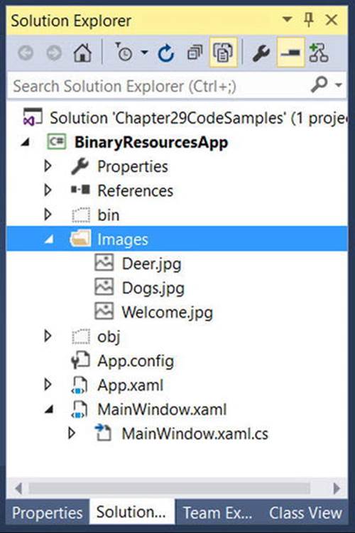
Figure 29-1. A new subdirectory that contains image data in your WPF project
Configuring the Loose Resources
When you want Visual Studio to copy project content to your output directory, you need to adjust a few settings using the Properties window. To ensure that the content of your \Images folder is copied to the \bin\Debug folder, begin by selecting each image in the Solution Explorer. Now, with these images still selected, use the Properties window to set the Build Action property to Content, and the Copy to Output Directory property to Copy always (see Figure 29-2).
 Note You could also select Copy if Newer, which will save you time if you’re building large projects with a lot of content. For this example, Copy always works just fine.
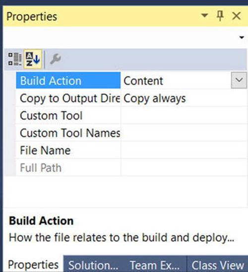
Figure 29-2. Configuring the image data to be copied to your output directory
If you recompile your program, you can now click the Show all Files button of the Solution Explorer and view the copied Image folder under your \bin\Debug directory (you might need to click the Refresh button). See Figure 29-3.
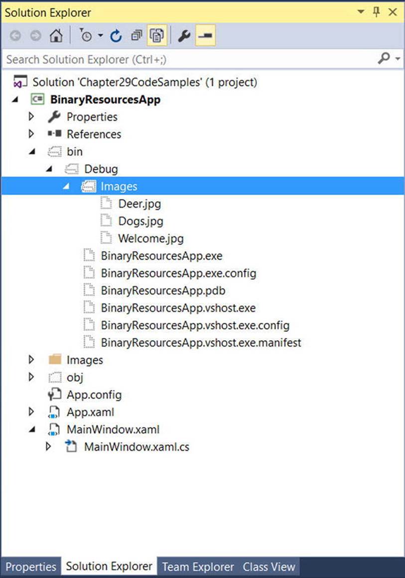
Figure 29-3. The copied data
Programmatically Loading an Image
WPF provides a class named BitmapImage, which is part of the System.Windows.Media.Imaging namespace. This class allows you to load data from an image file whose location is represented by a System.Uri object. It’s now time to handle the Loaded event of your window, filling a List<T> of BitmapImages like so:
public partial class MainWindow : Window
{
// A List of BitmapImage files.
List<BitmapImage> _images = new List<BitmapImage>();
// Current position in the list.
private int _currImage = 0;
private const int MAX_IMAGES = 2;
private void MainWindow_OnLoaded(object sender, RoutedEventArgs e)
{
try
{
string path = Environment.CurrentDirectory;
// Load these images when the window loads.
_images.Add(new BitmapImage(new Uri($@"{path}\Images\Deer.jpg")));
_images.Add(new BitmapImage(new Uri($@"{path}\Images\Dogs.jpg")));
_images.Add(new BitmapImage(new Uri($@"{path}\Images\Welcome.jpg")));
// Show first image in the List<>.
imageHolder.Source = _images[_currImage];
}
catch (Exception ex)
{
MessageBox.Show(ex.Message);
}
}
...
}
Notice that this class also defines an int member variable (_currImage) that will allow the Click event handlers to loop through each item in the List<T> and display it in the Image control by setting the Source property. (Here, your Loaded event handler sets the Sourceproperty to the first image in the List<T>.) In addition, your MAX_IMAGES constant will let you test for upper and lower limits as you iterate over the list. Here are the Click handlers that do exactly this:
private void btnPreviousImage_Click(object sender, RoutedEventArgs e)
{
if (--_currImage < 0)
_currImage = MAX_IMAGES;
imageHolder.Source = _images[_currImage];
}
private void btnNextImage_Click(object sender, RoutedEventArgs e)
{
if (++_currImage > MAX_IMAGES)
_currImage = 0;
imageHolder.Source = _images[_currImage];
}
At this point, you can run your program and flip through each picture.
Embedding Application Resources
If you’d rather configure your image files to be compiled directly into your .NET assembly as binary resources, select the image files in Solution Explorer (in the \Images folder, not in the \bin\Debug\Images folder). Then change the Build Action property to Resource, and the Copy to Output Directory property to Do not copy (see Figure 29-4).
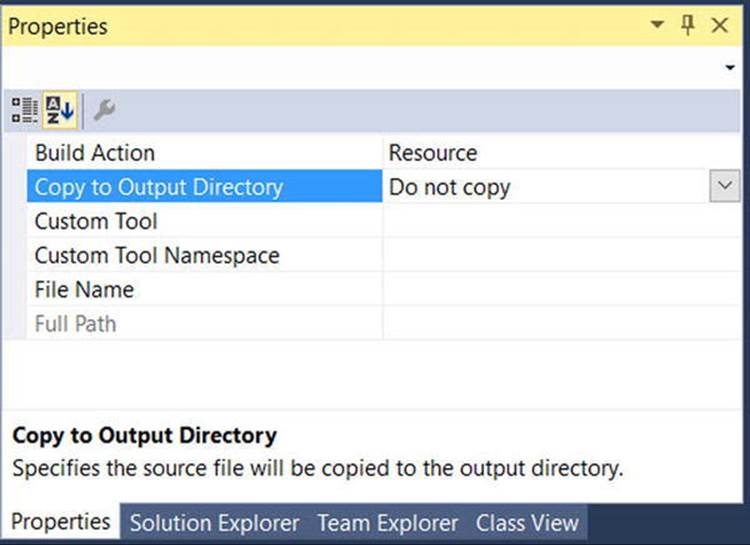
Figure 29-4. Configuring the images to be embedded resources
Now, using Visual Studio’s Build menu, select the Clean Solution option to wipe out the current contents of \bin\Debug\Images, and then rebuild your project. Refresh the Solution Explorer, and observe the absence of data in your \bin\Debug\Images directory. With the current build options, your graphical data is no longer copied to the output folder and is now embedded within the assembly itself.
With this adjustment, you now need to modify your code to load these images by extracting them from the compiled assembly:
private void MainWindow_OnLoaded(object sender, RoutedEventArgs e)
{
try
{
_images.Add(new BitmapImage(new Uri(@"/Images/Deer.jpg", UriKind.Relative)));
_images.Add(new BitmapImage(new Uri(@"/Images/Dogs.jpg", UriKind.Relative)));
_images.Add(new BitmapImage(new Uri(@"/Images/Welcome.jpg", UriKind.Relative)));
imageHolder.Source = _images[_currImage];
}
catch (Exception ex)
{
MessageBox.Show(ex.Message);
}
}
In this case, you no longer need to determine the installation path and can simply list the resources by name, which takes into account the name of the original subdirectory. Also notice, when you create your Uri objects, you specify a UriKind value of Relative. In any case, at this point your executable is a stand-alone entity that can be run from any location on the machine, as all compiled data is within the binary. Figure 29-5 shows the completed application.
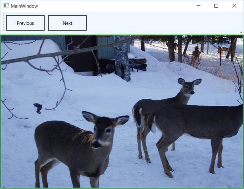
Figure 29-5. Your simple picture viewer
Source Code The BinaryResourcesApp can be found in the Chapter 29 subdirectory.
Working with Object (Logical) Resources
When you are building a WPF application, it is very common to define a blurb of XAML to use in multiple locations within a window, or perhaps across multiple windows or projects. For example, say you have created the perfect linear gradient brush, which consists of ten lines of markup. Now, you want to use that brush as the background color for every Button control in the project (which consists of eight windows) for a total of 16 Buttons.
The worst thing you could do is to copy and paste the XAML to every control. Clearly, this would be a nightmare to maintain, as you would need to make numerous changes anytime you wanted to tweak the look and feel of the brush.
Thankfully, object resources allow you to define a blob of XAML, give it a name, and store it in a fitting dictionary for later use. Like a binary resource, object resources are often compiled into the assembly that requires them. However, you don’t need to tinker with the Build Action property to do so. As long as you place your XAML into the correct location, the compiler will take care of the rest.
Working with object resources is a big part of WPF development. As you will see, object resources can be far more complex than a custom brush. You can define a XAML-based animation, a 3D rendering, a custom control style, data template, control template, and more, and package each one as a reusable resource.
The Role of the Resources Property
As mentioned, object resources must be placed in a fitting dictionary object in order to be used across an application. As it stands, every descendant of FrameworkElement supports a Resources property. This property encapsulates a ResourceDictionary object that contains the defined object resources. The ResourceDictionary can hold any type of item because it operates on System.Object types and may be manipulated via XAML or procedural code.
In WPF, all controls, Windows, Pages (used when building navigation applications or XBAP programs), and UserControls extend FrameworkElement, so just about all widgets provide access to a ResourceDictionary. Furthermore, the Application class, while not extending FrameworkElement, supports an identically named Resources property for the same purpose.
Defining Window-Wide Resources
To begin exploring the role of object resources, create a new WPF application named ObjectResourcesApp using Visual Studio and change the initial Grid to a horizontally aligned StackPanel layout manager. Into this StackPanel, define two Button controls like so (you really don’t need much to illustrate the role of object resources, so this will do):
<Window x:Class="ObjectResourcesApp.MainWindow"
xmlns="http://schemas.microsoft.com/winfx/2006/xaml/presentation"
xmlns:x="http://schemas.microsoft.com/winfx/2006/xaml"
xmlns:d="http://schemas.microsoft.com/expression/blend/2008"
xmlns:mc="http://schemas.openxmlformats.org/markup-compatibility/2006"
xmlns:local="clr-namespace:ObjectResourcesApp"
mc:Ignorable="d"
Title="Fun with Object Resources" Height="350" Width="525">
<StackPanel Orientation="Horizontal">
<Button Margin="25" Height="200" Width="200" Content="OK" FontSize="20"/>
<Button Margin="25" Height="200" Width="200" Content="Cancel" FontSize="20"/>
</StackPanel>
</Window>
Now, select the OK button and set the Background color property to a custom brush type using the integrated brush editor (discussed in Chapter 28). After you’ve done so, notice how the brush is embedded within the scope of the <Button> and </Button> tags, as shown here:
<Button Margin="25" Height="200" Width="200" Content="OK" FontSize="20">
<Button.Background>
<RadialGradientBrush>
<GradientStop Color="#FFC44EC4" Offset="0" />
<GradientStop Color="#FF829CEB" Offset="1" />
<GradientStop Color="#FF793879" Offset="0.669" />
</RadialGradientBrush>
</Button.Background>
</Button>
To allow the Cancel button to use this brush as well, you should promote the scope of your <RadialGradientBrush> to a parent element’s resource dictionary. For example, if you move it to the <StackPanel>, both buttons can use the same brush because they are child elements of the layout manager. Even better, you could package the brush into the resource dictionary of the window itself, so all aspects of the window’s content (nested panels, etc.) can freely make use of it.
When you need to define a resource, you use the property element syntax to set the Resources property of the owner. You also give the resource item an x:Key value, which will be used by other parts of the window when they want to refer to the object resource. Be aware that x:Keyand x:Name are not the same! The x:Name attribute allows you to gain access to the object as a member variable in your code file, while the x:Key attribute allows you to refer to an item in a resource dictionary.
Visual Studio allows you to promote a resource to a higher scope using its respective Properties window. To do so, first identify the property that has the complex object you want to package as a resource (the Background property, in this example). Next to the property is a small white square that, when clicked, will open a pop-up menu. From it, select the Convert to New Resource option (see Figure 29-6).
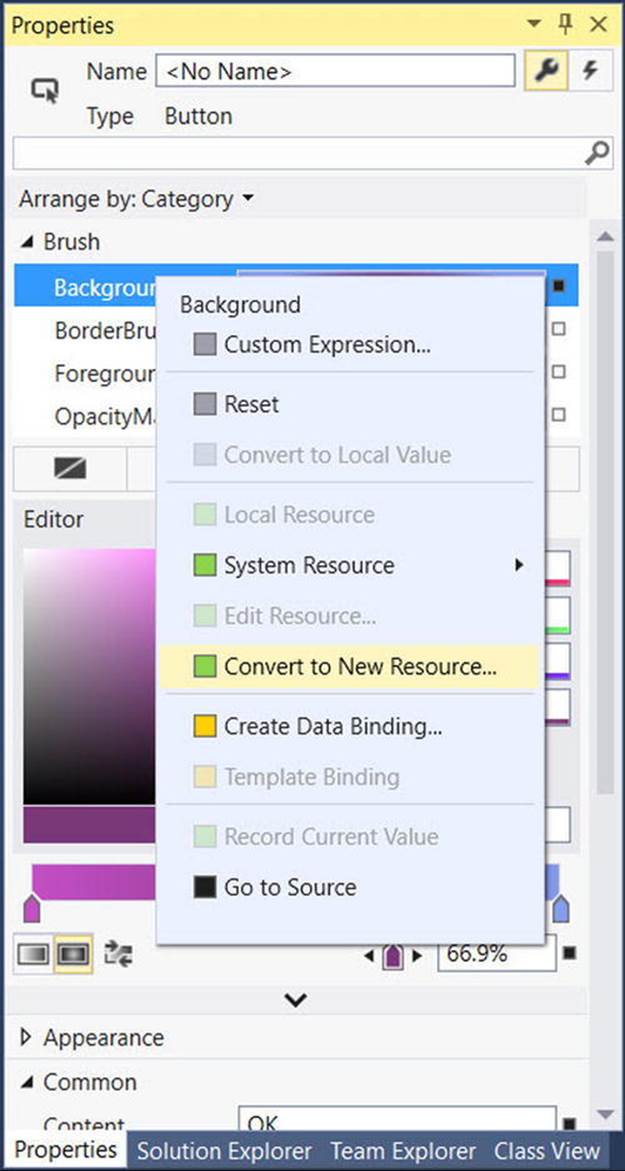
Figure 29-6. Moving a complex object into a resource container
You are asked to name your resource (myBrush) and specify where to place it. For this example, leave the default selection of the current document (see Figure 29-7).
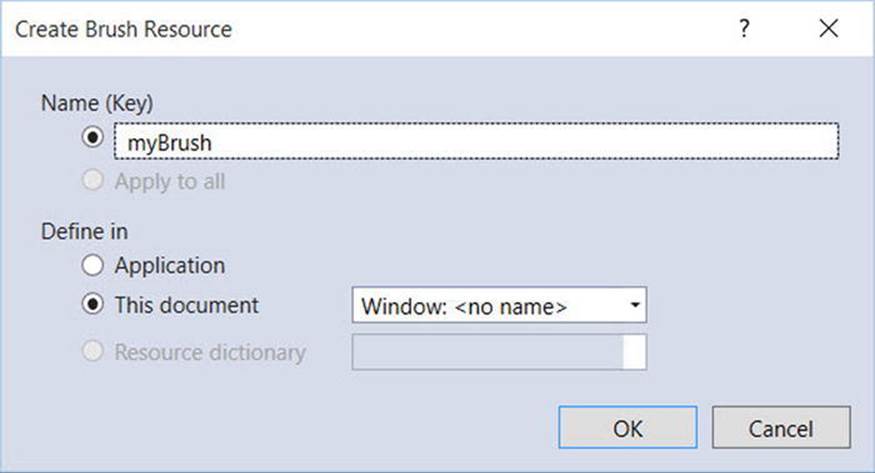
Figure 29-7. Naming the object resource
When you’re done, the markup will be restructured like this:
<Window x:Class="ObjectResourcesApp.MainWindow"
xmlns="http://schemas.microsoft.com/winfx/2006/xaml/presentation"
xmlns:x="http://schemas.microsoft.com/winfx/2006/xaml"
xmlns:d="http://schemas.microsoft.com/expression/blend/2008"
xmlns:mc="http://schemas.openxmlformats.org/markup-compatibility/2006"
xmlns:local="clr-namespace:ObjectResourcesApp"
mc:Ignorable="d"
Title="Fun with Object Resources" Height="350" Width="525">
<Window.Resources>
<RadialGradientBrush x:Key="myBrush">
<GradientStop Color="#FFC44EC4" Offset="0" />
<GradientStop Color="#FF829CEB" Offset="1" />
<GradientStop Color="#FF793879" Offset="0.669" />
</RadialGradientBrush>
</Window.Resources>
<StackPanel Orientation="Horizontal">
<Button Margin="25" Height="200" Width="200" Content="OK"
FontSize="20" Background="{DynamicResource myBrush}"/>
<Button Margin="25" Height="200" Width="200" Content="Cancel" FontSize="20"/>
</StackPanel>
</Window>
Notice the new <Window.Resources> scope, which now contains the RadialGradientBrush object, which has a key value of myBrush. The Create Resource wizard creates the new resource as a DynamicResource. You will learn about DynamicResources later in the text, but for now, change it to a StaticResource, like this:
<Button Margin="25" Height="200" Width="200" Content="OK"
FontSize="20" Background="{StaticResource myBrush}"/>
<Button Margin="25" Height="200" Width="200" Content="Cancel" FontSize="20"/>
The {StaticResource} Markup Extension
The other change that took place when you extracted your object resource was that the property that was the target of the extraction (again, Background) now makes use of the {StaticResource} markup extension. As you can see, the key name is specified as an argument. Now, if the Cancel button opts to use the same brush to paint its background, it is free to do so. Or, if the Cancel button had some complex content, any sub-element of that Button could also use the window-level resource, such as the Fill property of an Ellipse.
<StackPanel Orientation="Horizontal">
<Button Margin="25" Height="200" Width="200" Content="OK" FontSize="20"
Background="{StaticResource myBrush}">
</Button>
<Button Margin="25" Height="200" Width="200" FontSize="20">
<StackPanel>
<Label HorizontalAlignment="Center" Content= "No Way!"/>
<Ellipse Height="100" Width="100" Fill="{StaticResource myBrush}"/>
</StackPanel>
</Button>
</StackPanel>
The {DynamicResource} Markup Extension
It is also possible for a property to use the {DynamicResource} markup extension when connecting to a keyed resource. To understand the difference, name your OK button btnOK and handle the Click event. In this event handler, use the Resources property to obtain the custom brush, and then change some aspect of it, like so:
private void btnOK_Click(object sender, RoutedEventArgs e)
{
// Get the brush and make a change.
var b = (RadialGradientBrush)Resources["myBrush"];
b.GradientStops[1] = new GradientStop(Colors.Black, 0.0);
}
Note You are using the Resources indexer to locate a resource by name here. Be aware, however, that this will throw a runtime exception if the resource can’t be found. You could also use the TryFindResource() method, which will not throw a runtime error; it will simply returnnull if the specified resource can’t be located.
If you run this application and click the OK button, you will see that the brush’s change is accounted for and each button updates to render the modified brush. However, what if you completely changed the type of brush specified by the myBrush key? For example,
private void btnOK_Click(object sender, RoutedEventArgs e)
{
// Put a totally new brush into the myBrush slot.
Resources["myBrush"] = new SolidColorBrush(Colors.Red);
}
This time, when you click the button, neither updates as expected. This is because the {StaticResource} markup extension applies the resource only once and stays “connected” to the original object during the life of the application. However, if you change each occurrence of{StaticResource} to {DynamicResource} in your markup, you find your custom brush has been replaced with the expected solid red brush.
Essentially, the {DynamicResource} markup extension is able to detect whether the underlying keyed object has been replaced with a new object. As you might guess, this requires some extra runtime infrastructure, so you should typically stick to using {StaticResource} unless you know you have an object resource that will be swapped with a different object at runtime, and you want all items using that resource to be informed.
Application-Level Resources
When you have object resources in a window’s resource dictionary, all items in the window are free to make use of it, but other windows in the application cannot. Give your Cancel button a name of btnCancel and handle the Click event. Insert a new window into your current project (named TestWindow.xaml) that contains a single Button, which, when clicked, will close the window.
public partial class TestWindow : Window
{
public TestWindow()
{
InitializeComponent();
}
private void btnClose_Click(object sender, RoutedEventArgs e)
{
Close();
}
}
Now, in the Click handler of the Cancel button on your first window, just load and display this new window, like so:
private void btnCancel_Click(object sender, RoutedEventArgs e)
{
var w = new TestWindow();
w.Owner = this;
w.WindowStartupLocation = WindowStartupLocation.CenterOwner;
w.ShowDialog();
}
So, if the new window wants to use myBrush, it currently won’t be able to because it is not within the correct “scope.” The solution is to define the object resource at the application level, rather than at the level of a specific window. There is no way to automate this within Visual Studio, so simply cut the current brush object out of the <Windows.Resources> scope, and place it in the <Application.Resources> scope in your App.xaml file.
<Application x:Class="ObjectResourcesApp.App"
xmlns="http://schemas.microsoft.com/winfx/2006/xaml/presentation"
xmlns:x=http://schemas.microsoft.com/winfx/2006/xaml
xmlns:local="clr-namespace:ObjectResourcesApp"
StartupUri="MainWindow.xaml">
<Application.Resources>
<RadialGradientBrush x:Key="myBrush">
<GradientStop Color="#FFC44EC4" Offset="0" />
<GradientStop Color="#FF829CEB" Offset="1" />
<GradientStop Color="#FF793879" Offset="0.669" />
</RadialGradientBrush>
</Application.Resources>
</Application>
Now your TestWindow is free to use this same brush to paint its background. If you want to find the Background property for this new Window, click the Brush Resources tab (all the way on the right) to view your application-level resources (see Figure 29-8).
Figure 29-8. Applying application-level resources
Defining Merged Resource Dictionaries
Application-level resources are a good starting point, but what if you need to define a set of complex (or not so complex) resources that need to be reused across multiple WPF projects? In this case, you want to define what is known as a merged resource dictionary. This is nothing more than a .xaml file that contains a collection of object resources. A single project can have as many of these files as required (one for brushes, one for animations, and so forth), each of which can be inserted using the Add New Item dialog box activated via the Project menu (see Figure 29-9).
Figure 29-9. Inserting a new merged resource dictionary
In the new MyBrushes.xaml file, cut the current resources in the Application.Resources scope and move them into your dictionary, like so:
<ResourceDictionary xmlns=http://schemas.microsoft.com/winfx/2006/xaml/presentation
xmlns:local="clr-namespace:ObjectResourcesApp"
xmlns:x="http://schemas.microsoft.com/winfx/2006/xaml">
<RadialGradientBrush x:Key="myBrush">
<GradientStop Color="#FFC44EC4" Offset="0" />
<GradientStop Color="#FF829CEB" Offset="1" />
<GradientStop Color="#FF793879" Offset="0.669" />
</RadialGradientBrush>
</ResourceDictionary>
Now, even though this resource dictionary is part of your project, you will get runtime errors. The reason is that all resource dictionaries must be merged (typically at the application level) into an existing resource dictionary. To do this, use the following format in the App.xaml file (note that multiple resource dictionaries can be merged by adding multiple <ResourceDictionary> elements within the <ResourceDictionary.MergedDictionaries> scope):
<Application x:Class="ObjectResourcesApp.App"
xmlns="http://schemas.microsoft.com/winfx/2006/xaml/presentation"
xmlns:x=http://schemas.microsoft.com/winfx/2006/xaml
xmlns:local="clr-namespace:ObjectResourcesApp"
StartupUri="MainWindow.xaml">
<!-- Bring in the logical resources
from the MyBrushes.xaml file. -->
<Application.Resources>
<ResourceDictionary>
<ResourceDictionary.MergedDictionaries>
<ResourceDictionary Source = "MyBrushes.xaml"/>
</ResourceDictionary.MergedDictionaries>
</ResourceDictionary>
</Application.Resources>
</Application>
Defining a Resource-Only Assembly
Last but not least, it is possible to create .NET class libraries that contain nothing but dictionaries of object resources. This can be useful if you have defined a set of themes that need to be used on a machine-wide level. You could package up the object resource into a dedicated assembly, and then applications that need to make use of them could load them into memory.
The easiest way to build a resource-only assembly is to actually begin with a WPF User Control Library project. Add such a project (named MyBrushesLibrary) to your current solution via the Add New Project menu option of Visual Studio (see Figure 29-10).
Figure 29-10. Adding a User Control Library as a starting point for a resource-only library
Now, completely delete the UserControl1.xaml file from the project (the only items you really want are the referenced WPF assemblies). Next, drag and drop the MyBrushes.xaml file into your MyBrushesLibrary project and delete it from the ObjectResourcesAppproject. Finally, open MyBrushes.xaml in the MyBrushesLibrary project, and change the x:local namespace in the file to clr-namespace:MyBrushesLibrary. Your Solution Explorer should now look like Figure 29-11.
Figure 29-11. Moving the MyBrushes.xaml file into your new library project
Compile your User Control Library project. Next, reference this library from the ObjectResourcesApp project using the Add Reference dialog box. Now, merge these binary resources into the application-level resource dictionary of the ObjectResourcesApp project. Doing so, however, requires some rather funky syntax, shown here:
<Application.Resources>
<ResourceDictionary>
<ResourceDictionary.MergedDictionaries>
<!-- The syntax is /NameOfAssembly;Component/NameOfXamlFileInAssembly.xaml -->
<ResourceDictionary Source = "/MyBrushesLibrary;Component/MyBrushes.xaml"/>
</ResourceDictionary.MergedDictionaries>
</ResourceDictionary>
</Application.Resources>
First, be aware that this string is space-sensitive. If you have extra white space around your semicolon or forward slashes, you will generate runtime errors. The first part of the string is the friendly name of the external library (no file extension). After the semicolon, type in the wordComponent followed by the name of the compiled binary resource, which will be identical to the original XAML resource dictionary.
That wraps up our examination of WPF’s resource management system. You will make good use of these techniques for most of your applications. Next up, let’s investigate the integrated animation API of Windows Presentation Foundation.
Source Code The ObjectResourcesApp project can be found in the Chapter 29 subdirectory.
Understanding WPF’s Animation Services
In addition to the graphical rendering services you examined in Chapter 28, WPF supplies a programming interface to support animation services. The term animation may bring to mind visions of spinning company logos, a sequence of rotating image resources (to provide the illusion of movement), text bouncing across the screen, or specific types of programs such as video games or multimedia applications.
While WPF’s animation APIs could certainly be used for such purposes, animation can be used any time you want to give an application additional flair. For example, you could build an animation for a button on a screen that magnifies slightly when the mouse cursor hovers within its boundaries (and shrinks back once the mouse cursor moves beyond the boundaries). Or you could animate a window so that it closes using a particular visual appearance, such as slowly fading into transparency. In fact, WPF’s animation support can be used within any sort of application (a business application, multimedia programs, video games, etc.) whenever you want to provide a more engaging user experience.
As with many other aspects of WPF, the notion of building animations is nothing new. What is new is that, unlike other APIs you might have used in the past (including Windows Forms), developers are not required to author the necessary infrastructure by hand. Under WPF, there’s no need to create the background threads or timers used to advance the animation sequence, define custom types to represent the animation, erase and redraw images, or bother with tedious mathematical calculations. Like other aspects of WPF, we can build an animation entirely using XAML, entirely using C# code, or using a combination of the two.
Note Visual Studio has no support for authoring animations using GUI animation tools. If you author an animation with Visual Studio, you will do so by typing in the XAML directly. However, Blend for Visual Studio (the companion product that ships with Visual Studio 2015) does indeed have a built-in animation editor that can simplify your life a good deal.
The Role of the Animation Class Types
To understand WPF’s animation support, you must begin by examining the animation classes within the System.Windows.Media.Animation namespace of PresentationCore.dll. Here you will find over 100 different class types that are named using the Animation token.
All of these classes can be placed into one of three broad categories. First, any class that follows the name convention DataTypeAnimation (ByteAnimation, ColorAnimation, DoubleAnimation, Int32Animation, etc.) allows you to work with linear interpolation animations. This enables you to change a value smoothly over time from a start value to a final value.
Next, the classes that follow the naming convention DataTypeAnimationUsingKeyFrames (StringAnimationUsingKeyFrames, DoubleAnimationUsingKeyFrames, PointAnimationUsingKeyFrames, etc.) represent “key frame animations,” which allow you to cycle through a set of defined values over a period of time. For example, you could use key frames to change the caption of a button by cycling through a series of individual characters.
Finally, classes that follow the DataTypeAnimationUsingPath naming convention (DoubleAnimationUsingPath, PointAnimationUsingPath, among others) are path-based animations that allow you to animate objects to move along a path you define. By way of an example, if you were building a GPS application, you could use a path-based animation to move an item along the quickest travel route to the user’s destination.
Now, obviously, these classes are not used to somehow provide an animation sequence directly to a variable of a particular data type (after all, how exactly could you animate the value “9” using an Int32Animation?).
For example, consider the Label type’s Height and Width properties, both of which are dependency properties wrapping a double. If you wanted to define an animation that would increase the height of a label over a time span, you could connect a DoubleAnimation object to the Height property and allow WPF to take care of the details of performing the actual animation itself. By way of another example, if you wanted to transition the color of a brush type from green to yellow over a period of five seconds, you could do so using the ColorAnimation type.
To be very clear, these Animation classes can be connected to any dependency property of a given object that matches the underlying types. As explained in Chapter 27, dependency properties are a specialized form of property required by many WPF services including animation, data binding, and styles.
By convention, a dependency property is defined as a static, read-only field of the class, and is named by suffixing the word Property to the normal property name. For example, the dependency property for the Height property of a Button would be accessed in code usingButton.HeightProperty.
The To, From, and By Properties
All Animation classes define the following handful of key properties that control the starting and ending values used to perform the animation:
· To: This property represents the animation’s ending value.
· From: This property represents the animation’s starting value.
· By: This property represents the total amount by which the animation changes its starting value.
Despite the fact that all Animation classes support the To, From, and By properties, they do not receive them via virtual members of a base class. The reason for this is that the underlying types wrapped by these properties vary greatly (integers, colors, Thickness objects, etc.), and representing all possibilities using a single base class would result in very complex coding constructs.
On a related note, you might also wonder why .NET generics were not used to define a single generic animation class with a single type parameter (e.g., Animate<T>). Again, given that there are so many underlying data types (colors, vectors, ints, strings, etc.) used to animated dependency properties, it would not be as clean a solution as you might expect (not to mention XAML has only limited support for generic types).
The Role of the Timeline Base Class
Although a single base class was not used to define virtual To, From, and By properties, the Animation classes do share a common base class: System.Windows.Media.Animation.Timeline. This type provides a number of additional properties that control the pacing of the animation, as described in Table 29-1.
Table 29-1. Key Members of the Timeline Base Class
|
Properties |
Meaning in Life |
|
AccelerationRatio, DecelerationRatio, SpeedRatio |
These properties can be used to control the overall pacing of the animation sequence. |
|
AutoReverse |
This property gets or sets a value that indicates whether the timeline plays in reverse after it completes a forward iteration (the default value is false). |
|
BeginTime |
This property gets or sets the time at which this timeline should begin. The default value is 0, which begins the animation immediately. |
|
Duration |
This property allows you to set a duration of time to play the timeline. |
|
FillBehavior, RepeatBehavior |
These properties are used to control what should happen once the timeline has completed (repeat the animation, do nothing, etc.). |
Authoring an Animation in C# Code
Specifically, you will build a Window that contains a Button, which has the odd behavior of spinning in a circle (based on the upper-left corner) whenever the mouse enters its surface area. Begin by creating a new WPF application named SpinningButtonAnimationApp, using Visual Studio. Update the initial markup to the following (note you are handling the button’s MouseEnter event):
<Window x:Class="SpinningButtonAnimationApp.MainWindow"
xmlns="http://schemas.microsoft.com/winfx/2006/xaml/presentation"
xmlns:x="http://schemas.microsoft.com/winfx/2006/xaml"
xmlns:d="http://schemas.microsoft.com/expression/blend/2008"
xmlns:mc="http://schemas.openxmlformats.org/markup-compatibility/2006"
xmlns:local="clr-namespace:SpinningButtonanimationApp"
mc:Ignorable="d"
Title="Animations in C# code" Height="350"
Width="525" WindowStartupLocation="CenterScreen">
<Grid>
<Button x:Name="btnSpinner" Height="50" Width="100" Content="I Spin!"
MouseEnter="btnSpinner_MouseEnter"/>
</Grid>
</Window>
Now, import the System.Windows.Media.Animation namespace and add the following code in the window’s C# code file:
public partial class MainWindow : Window
{
private bool _isSpinning = false;
private void btnSpinner_MouseEnter(object sender, MouseEventArgs e)
{
if (!_isSpinning)
{
_isSpinning = true;
// Make a double animation object, and register
// with the Completed event.
var dblAnim = new DoubleAnimation();
dblAnim.Completed += (o, s) => { _isSpinning = false; };
// Set the start value and end value.
dblAnim.From = 0;
dblAnim.To = 360;
// Now, create a RotateTransform object, and set
// it to the RenderTransform property of our
// button.
var rt = new RotateTransform();
btnSpinner.RenderTransform = rt;
// Now, animation the RotateTransform object.
rt.BeginAnimation(RotateTransform.AngleProperty, dblAnim);
}
}
}
The first major task of this method is to configure a DoubleAnimation object, which will start at the value 0 and end at the value 360. Notice that you are handling the Completed event on this object as well, to toggle a class-level bool variable that is used to ensure that if an animation is currently being performed, you don’t “reset” it to start again.
Next, you create a RotateTransform object that is connected to the RenderTransform property of your Button control (btnSpinner). Last but not least, you inform the RenderTransform object to begin animating its Angle property using your DoubleAnimationobject. When you are authoring animations in code, you typically do so by calling BeginAnimation(), and pass in the underlying dependency property you would like to animate (remember, by convention, this is a static field on the class), followed by a related animation object.
Let’s add another animation to the program, which will cause the button to fade into invisibility when clicked. First, handle the Click event of the btnSpinner object, and then add the following code in the resulting event handler:
private void btnSpinner_Click(object sender, RoutedEventArgs e)
{
var dblAnim = new DoubleAnimation
{
From = 1.0,
To = 0.0
};
btnSpinner.BeginAnimation(Button.OpacityProperty, dblAnim);
}
Here, you are changing the Opacity property value to fade the button out of view. Currently, however, this is hard to do, as the button is spinning very fast! How, then, can you control the pace of an animation? Glad you asked.
Controlling the Pace of an Animation
By default, an animation will take approximately one second to transition between the values assigned to the From and To properties. Therefore, your button has one second to spin around a full 360-degree angle, while the button will fade away to invisibility (when clicked) over the course of one second.
If you want to define a custom amount of time for an animation’s transition, you may do so via the animation object’s Duration property, which can be set to an instance of a Duration object. Typically, the time span is established by passing a TimeSpan object to the Duration’s constructor. Consider the following update that will give the button a full four seconds to rotate:
private void btnSpinner_MouseEnter(object sender, MouseEventArgs e)
{
if (!_isSpinning)
{
_isSpinning = true;
// Make a double animation object, and register
// with the Completed event.
var dblAnim = new DoubleAnimation();
dblAnim.Completed += (o, s) => { _isSpinning = false; };
// Button has four seconds to finish the spin!
dblAnim.Duration = new Duration(TimeSpan.FromSeconds(4));
...
}
}
With this adjustment, you should have a fighting chance of clicking the button while it is spinning, at which point it will fade away.
Note The BeginTime property of an Animation class also takes a TimeSpan object. Recall that this property can be set to establish a wait time before starting an animation sequence.
Reversing and Looping an Animation
You can also tell Animation objects to play an animation in reverse at the completion of the animation sequence by setting the AutoReverse property to true. For example, if you want to have the button come back into view after it has faded away, you could author the following:
private void btnSpinner_Click(object sender, RoutedEventArgs e)
{
DoubleAnimation dblAnim = new DoubleAnimation
{
From = 1.0,
To = 0.0
};
// Reverse when done.
dblAnim.AutoReverse = true;
btnSpinner.BeginAnimation(Button.OpacityProperty, dblAnim);
}
If you’d like to have an animation repeat some number of times (or to never stop once activated), you can do so using the RepeatBehavior property, which is common to all Animation classes. If you pass in a simple numerical value to the constructor, you can specify a hard-coded number of times to repeat. On the other hand, if you pass in a TimeSpan object to the constructor, you can establish an amount of time the animation should repeat. Finally, if you want an animation to loop ad infinitum, you can simply specify RepeatBehavior.Forever. Consider the following ways you could change the repeat behaviors of either of the DoubleAnimation objects used in this example:
// Loop forever.
dblAnim.RepeatBehavior = RepeatBehavior.Forever;
// Loop three times.
dblAnim.RepeatBehavior = new RepeatBehavior(3);
// Loop for 30 seconds.
dblAnim.RepeatBehavior = new RepeatBehavior(TimeSpan.FromSeconds(30));
That wraps up your investigation about how to animate aspects of an object using C# code and the WPF animation API. Next, you will learn how to do the same using XAML.
Source Code The SpinningButtonAnimationApp project can be found in the Chapter 29 subdirectory.
Authoring Animations in XAML
Authoring animations in markup is similar to authoring them in code, at least for simple, straightforward animation sequences. When you need to capture more complex animations, which may involve changing the values of numerous properties at once, the amount of markup can grow considerably. Even if you use a tool to generate XAML-based animations, it is important to know the basics of how an animation is represented in XAML because this will make it easier for you to modify and tweak tool-generated content.
Note You will find a number of XAML files in the XamlAnimations folder of the downloadable source code. As you go through the next several pages, copy these markup files into your custom XAML editor or into the Kaxaml editor to see the results.
For the most part, creating an animation is similar to what you have already seen. You still configure an Animation object and associate it to an object’s property. One big difference, however, is that WPF is not function call–friendly. As a result, instead of callingBeginAnimation(), you use a storyboard as a layer of indirection.
Let’s walk through a complete example of an animation defined in terms of XAML, followed by a detailed breakdown. The following XAML definition will display a window that contains a single label. As soon as the Label object loads into memory, it begins an animation sequence in which the font size increases from 12 points to 100 over a period of four seconds. The animation will repeat for as long as the Window object is loaded in memory. You can find this markup in the GrowLabelFont.xaml file, so copy it into your MyXamlPad.exe application (or Kaxaml) and observe the 'margin-top:12.0pt;margin-right:0cm;margin-bottom: 12.0pt;margin-left:0cm;line-height:normal'><Window
xmlns="http://schemas.microsoft.com/winfx/2006/xaml/presentation"
xmlns:x="http://schemas.microsoft.com/winfx/2006/xaml"
Height="200" Width="600" WindowStartupLocation="CenterScreen" Title="Growing Label Font!">
<StackPanel>
<Label Content = "Interesting...">
<Label.Triggers>
<EventTrigger RoutedEvent = "Label.Loaded">
<EventTrigger.Actions>
<BeginStoryboard>
<Storyboard TargetProperty = "FontSize">
<DoubleAnimation From = "12" To = "100" Duration = "0:0:4"
RepeatBehavior = "Forever"/>
</Storyboard>
</BeginStoryboard>
</EventTrigger.Actions>
</EventTrigger>
</Label.Triggers>
</Label>
</StackPanel>
</Window>
Now, let’s break this example down, bit by bit.
The Role of Storyboards
Working from the innermost element outward, you first encounter the <DoubleAnimation> element, which makes use of the same properties you set in procedural code (From, To, Duration, and RepeatBehavior).
<DoubleAnimation From = "12" To = "100" Duration = "0:0:4"
RepeatBehavior = "Forever"/>
As mentioned, Animation elements are placed within a <Storyboard> element, which is used to map the animation object to a given property on the parent type via the TargetProperty property, which in this case is FontSize. A <Storyboard> is always wrapped in a parent element named <BeginStoryboard>.
<BeginStoryboard>
<Storyboard TargetProperty = "FontSize">
<DoubleAnimation From = "12" To = "100" Duration = "0:0:4"
RepeatBehavior = "Forever"/>
</Storyboard>
</BeginStoryboard>
The Role of Event Triggers
After the <BeginStoryboard> element has been defined, you need to specify some sort of action that will cause the animation to begin executing. WPF has a few different ways to respond to runtime conditions in markup, one of which is termed a trigger. From a high level, you can consider a trigger a way of responding to an event condition in XAML, without the need for procedural code.
Typically, when you respond to an event in C#, you author custom code that will execute when the event occurs. A trigger, however, is just a way to be notified that some event condition has happened (“I’m loaded into memory”, “The mouse is over me!”, “I have focus!”).
Once you’ve been notified that an event condition has occurred, you can start the storyboard. In this example, you are responding to the Label being loaded into memory. Because it is the Label’s Loaded event you are interested in, the <EventTrigger> is placed in the Label’s trigger collection.
<Label Content = "Interesting...">
<Label.Triggers>
<EventTrigger RoutedEvent = "Label.Loaded">
<EventTrigger.Actions>
<BeginStoryboard>
<Storyboard TargetProperty = "FontSize">
<DoubleAnimation From = "12" To = "100" Duration = "0:0:4"
RepeatBehavior = "Forever"/>
</Storyboard>
</BeginStoryboard>
</EventTrigger.Actions>
</EventTrigger>
</Label.Triggers>
</Label>
Let’s see another example of defining an animation in XAML, this time using a key frame animation.
Animation Using Discrete Key Frames
Unlike the linear interpolation animation objects, which can only move between a starting point and an ending point, the key frame counterparts allow you to create a collection of specific values for an animation that should take place at specific times.
To illustrate the use of a discrete key frame type, assume you want to build a Button control that animates its content so that over the course of three seconds the value “OK!” appears, one character at a time. You’ll find the following markup in the AnimateString.xaml file. Copy this markup into your MyXamlPad.exe program (or Kaxaml) and view the results:
<Window xmlns="http://schemas.microsoft.com/winfx/2006/xaml/presentation"
xmlns:x="http://schemas.microsoft.com/winfx/2006/xaml"
Height="100" Width="300"
WindowStartupLocation="CenterScreen" Title="Animate String Data!">
<StackPanel>
<Button Name="myButton" Height="40"
FontSize="16pt" FontFamily="Verdana" Width = "100">
<Button.Triggers>
<EventTrigger RoutedEvent="Button.Loaded">
<BeginStoryboard>
<Storyboard>
<StringAnimationUsingKeyFrames RepeatBehavior = "Forever"
Storyboard.TargetProperty="Content"
Duration="0:0:3">
<DiscreteStringKeyFrame Value="" KeyTime="0:0:0" />
<DiscreteStringKeyFrame Value="O" KeyTime="0:0:1" />
<DiscreteStringKeyFrame Value="OK" KeyTime="0:0:1.5" />
<DiscreteStringKeyFrame Value="OK!" KeyTime="0:0:2" />
</StringAnimationUsingKeyFrames>
</Storyboard>
</BeginStoryboard>
</EventTrigger>
</Button.Triggers>
</Button>
</StackPanel>
</Window>
First, notice that you have defined an event trigger for your button to ensure that your storyboard executes when the button has loaded into memory. The StringAnimationUsingKeyFrames class is in charge of changing the content of the button, via theStoryboard.TargetProperty value.
Within the scope of the <StringAnimationUsingKeyFrames> element, you define four DiscreteStringKeyFrame elements, which change the button’s Content property over the course of two seconds (note that the duration established byStringAnimationUsingKeyFrames is a total of three seconds, so you will see a slight pause between the final “!” and looping “O”).
Now that you have a better feel for how to build animations in C# code and XAML, let’s look at the role of WPF styles, which make heavy use of graphics, object resources, and animations.
Source Code These loose XAML files can be found in the XamlAnimations subdirectory of Chapter 29.
Understanding the Role of WPF Styles
When you are building the UI of a WPF application, it is not uncommon for a family of controls to require a shared look and feel. For example, you might want all button types have the same height, width, background color, and font size for their string content. Although you could handle this by setting each button’s individual properties to identical values, such an approach makes it difficult to implement changes down the road because you would need to reset the same set of properties on multiple objects for every change.
Thankfully, WPF offers a simple way to constrain the look and feel of related controls using styles. Simply put, a WPF style is an object that maintains a collection of property/value pairs. Programmatically speaking, an individual style is represented using theSystem.Windows.Style class. This class has a property named Setters, which exposes a strongly typed collection of Setter objects. It is the Setter object that allows you to define the property/value pairs.
In addition to the Setters collection, the Style class also defines a few other important members that allow you to incorporate triggers, restrict where a style can be applied, and even create a new style based on an existing style (think of it as “style inheritance”). In particular, be aware of the following members of the Style class:
· Triggers: Exposes a collection of trigger objects, which allow you to capture various event conditions within a style.
· BasedOn: Allows you to build a new style based on an existing style.
· TargetType: Allows you to constrain where a style can be applied.
Defining and Applying a Style
In almost every case, a Style object will be packaged as an object resource. Like any object resource, you can package it at the window or application level, as well as within a dedicated resource dictionary (this is great because it makes the Style object easily accessible throughout your application). Now recall that the goal is to define a Style object that fills (at minimum) the Setters collection with a set of property/value pairs.
Create a new WPF application named WpfStyles using Visual Studio. Let’s build a style that captures the basic font characteristics of a control in your application. Open your App.xaml file and define the following named style:
<Application x:Class="WpfStyles.App"
xmlns="http://schemas.microsoft.com/winfx/2006/xaml/presentation"
xmlns:x="http://schemas.microsoft.com/winfx/2006/xaml"
xmlns:d="http://schemas.microsoft.com/expression/blend/2008"
xmlns:mc="http://schemas.openxmlformats.org/markup-compatibility/2006"
xmlns:local="clr-namespace:WpfStyles"
mc:Ignorable="d"
StartupUri="MainWindow.xaml">
<Application.Resources>
<Style x:Key ="BasicControlStyle">
<Setter Property = "Control.FontSize" Value ="14"/>
<Setter Property = "Control.Height" Value = "40"/>
<Setter Property = "Control.Cursor" Value = "Hand"/>
</Style>
</Application.Resources>
</Application>
Notice that your BasicControlStyle adds three Setter objects to the internal collection. Now, let’s apply this style to a few controls in your main window. Because this style is an object resource, the controls that want to use it still need to use the {StaticResource} or{DynamicResource} markup extension to locate the style. (As you know from the earlier discussion on static vs. dynamic resources, static ones are a tad bit more efficient, but are limited in how they get updated, so choose the one that best fits your needs.) When they find the style, they will set the resource item to the identically named Style property. Consider the following <Window> definition:
<Window x:Class="WpfStyles.MainWindow"
xmlns="http://schemas.microsoft.com/winfx/2006/xaml/presentation"
xmlns:x="http://schemas.microsoft.com/winfx/2006/xaml"
xmlns:d="http://schemas.microsoft.com/expression/blend/2008"
xmlns:mc="http://schemas.openxmlformats.org/markup-compatibility/2006"
xmlns:local="clr-namespace:WpfStyles"
mc:Ignorable="d"
Title="A Window with Style!" Height="229"
Width="525" WindowStartupLocation="CenterScreen">
<StackPanel>
<Label x:Name="lblInfo" Content="This style is boring..."
Style="{StaticResource BasicControlStyle}" Width="150"/>
<Button x:Name="btnTestButton" Content="Yes, but we are reusing settings!"
Style="{StaticResource BasicControlStyle}" Width="250"/>
</StackPanel>
</Window>
If you run this application, you’ll find that both controls support the same cursor, height, and font size.
Overriding Style Settings
Here you have a Button and Label that have both opted in to the constraints enforced by your style. Of course, if a control wants to apply a style and then change some of the defined settings, that’s fine. For example, the Button will now use the Help cursor (rather than the Hand cursor defined in the style):
<Button x:Name="btnTestButton" Content="Yes, but we are reusing settings!"
Cursor="Help" Style="{StaticResource BasicControlStyle}" Width="250" />
Styles are processed before the individual property settings of the control using the style; therefore, controls can “override” settings on a case-by-case basis.
Limiting Application of a Style with TargetType
Currently, your style is defined in such a way that any control can adopt it (and has to do so explicitly by setting the control’s Style property), given that each property is qualified by the Control class. For a program that defines dozens of settings, this would entail a good amount of repeated code. One way to clean this style up a bit is to use the TargetType attribute. When you add this attribute to a Style’s opening element, you can mark exactly once where it can be applied (in this example, in App.XAML).
<Style x:Key ="BasicControlStyle" TargetType="Control">
<Setter Property = "FontSize" Value ="14"/>
<Setter Property = "Height" Value = "40"/>
<Setter Property = "Cursor" Value = "Hand"/>
</Style>
Note When you build a style that uses a base class type, you needn’t be concerned if you assign a value to a dependency property not supported by derived types. If the derived type does not support a given dependency property, it is ignored.
This is somewhat helpful, but you still have a style that can apply to any control. The TargetType attribute is more useful when you want to define a style that can be applied to only a particular type of control. Add the following new style to the application’s resource dictionary:
<Style x:Key ="BigGreenButton" TargetType="Button">
<Setter Property = "FontSize" Value ="20"/>
<Setter Property = "Height" Value = "100"/>
<Setter Property = "Width" Value = "100"/>
<Setter Property = "Background" Value = "DarkGreen"/>
<Setter Property = "Foreground" Value = "Yellow"/>
</Style>
This style will work only on Button controls (or a subclass of Button). If you apply it to an incompatible element, you will get markup and compiler errors. If the Button uses this new style,
<Button x:Name="btnTestButton" Content="OK!"
Cursor="Help" Style="{StaticResource BigGreenButton}" Width="250" />
you’ll see output like that shown in Figure 29-12.
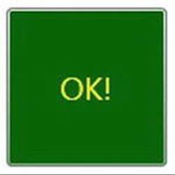
Figure 29-12. Controls with different styles
Another effect of TargetType is that the style will get applied to all elements of that type within the scope of the style definition as long as the x:Key property doesn’t exist. More on this shortly.
Automatically Applying a Style with TargetType
Assume you need to ensure that all TextBox controls have the same look and feel. Now assume you have defined a style as an application-level resource, so all windows in the program have access to it. While this is a step in the right direction, if you have numerous windows with numerousTextBox controls, you’ll need to set the Style property numerous times!
WPF styles can be implicitly applied to all controls within a given XAML scope. To create such a style, you use the TargetType property but you don’t assign the Style resource an x:Key value. This “unnamed style” now applies to all controls of the correct type. Here is another application-level style that will apply automatically to all TextBox controls in the current application:
<!-- The default style for all text boxes. -->
<Style TargetType="TextBox">
<Setter Property = "FontSize" Value ="14"/>
<Setter Property = "Width" Value = "100"/>
<Setter Property = "Height" Value = "30"/>
<Setter Property = "BorderThickness" Value = "5"/>
<Setter Property = "BorderBrush" Value = "Red"/>
<Setter Property = "FontStyle" Value = "Italic"/>
</Style>
You can now define any number of TextBox controls and they will automatically get the defined look. If a given TextBox does not want this default look and feel, it can opt out by setting the Style property to {x:Null}. For example, txtTest will get the default unnamed style, while txtTest2 is doing things its own way:
<TextBox x:Name="txtTest"/>
<TextBox x:Name="txtTest2" Style="{x:Null}" BorderBrush="Black"
BorderThickness="5" Height="60" Width="100" Text="Ha!"/>
Subclassing Existing Styles
You can also build new styles using an existing style, via the BasedOn property. The style you are extending must have been given a proper x:Key in the dictionary, as the derived style will reference it by name using the {StaticResource} or {DynamicResource} markup extension. Here is a new style based on BigGreenButton, which rotates the button element by 20 degrees:
<!-- This style is based on BigGreenButton. -->
<Style x:Key ="TiltButton" TargetType="Button" BasedOn = "{StaticResource BigGreenButton}">
<Setter Property = "Foreground" Value = "White"/>
<Setter Property = "RenderTransform">
<Setter.Value>
<RotateTransform Angle = "20"/>
</Setter.Value>
</Setter>
</Style>
This time the output appears as in Figure 29-13.
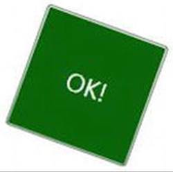
Figure 29-13. Using a derived style
Defining Styles with Triggers
WPF styles can also contain triggers by packaging up Trigger objects within the Triggers collection of the Style object. Using triggers in a style allows you to define certain <Setter> elements in such a way that they will be applied only if a given trigger condition is true. For example, perhaps you want to increase the size of a font when the mouse is over a button. Or maybe you want to make sure that the text box with the current focus is highlighted with a given color. Triggers are very useful for these sorts of situations, in that they allow you to take specific actions when a property changes, without the need to author explicit C# code in a code-behind file.
Here is an update to the TextBox style that ensures that when a TextBox has the input focus, it will receive a yellow background:
<!-- The default style for all text boxes. -->
<Style TargetType="TextBox">
<Setter Property = "FontSize" Value ="14"/>
<Setter Property = "Width" Value = "100"/>
<Setter Property = "Height" Value = "30"/>
<Setter Property = "BorderThickness" Value = "5"/>
<Setter Property = "BorderBrush" Value = "Red"/>
<Setter Property = "FontStyle" Value = "Italic"/>
<!-- The following setter will be applied only when the text box is
in focus. -->
<Style.Triggers>
<Trigger Property = "IsFocused" Value = "True">
<Setter Property = "Background" Value = "Yellow"/>
</Trigger>
</Style.Triggers>
</Style>
If you test this style, you’ll find that as you tab between various TextBox objects, the currently selected TextBox has a bright yellow background (provided it has not opted out by assigning {x:Null} to the Style property).
Property triggers are also very smart, in that when the trigger’s condition is not true, the property automatically receives the default assigned value. Therefore, as soon as a TextBox loses focus, it also automatically becomes the default color without any work on your part. In contrast, event triggers (examined when you looked at WPF animations) do not automatically revert to a previous condition.
Defining Styles with Multiple Triggers
Triggers can also be designed in such a way that the defined <Setter> elements will be applied when multiple conditions are true. Let’s say you want to set the background of a TextBox to Yellow only if it has the active focus and the mouse is hovering within its boundaries. To do so, you can make use of the <MultiTrigger> element to define each condition, like so:
<!-- The default style for all text boxes. -->
<Style TargetType="TextBox">
<Setter Property = "FontSize" Value ="14"/>
<Setter Property = "Width" Value = "100"/>
<Setter Property = "Height" Value = "30"/>
<Setter Property = "BorderThickness" Value = "5"/>
<Setter Property = "BorderBrush" Value = "Red"/>
<Setter Property = "FontStyle" Value = "Italic"/>
<!-- The following setter will be applied only when the text box is
in focus AND the mouse is over the text box. -->
<Style.Triggers>
<MultiTrigger>
<MultiTrigger.Conditions>
<Condition Property = "IsFocused" Value = "True"/>
<Condition Property = "IsMouseOver" Value = "True"/>
</MultiTrigger.Conditions>
<Setter Property = "Background" Value = "Yellow"/>
</MultiTrigger>
</Style.Triggers>
</Style>
Animated Styles
Styles can also incorporate triggers that kick off an animation sequence. Here is one final style that, when applied to Button controls, will cause the controls to grow and shrink in size when the mouse is inside the button’s surface area:
<!-- The growing button style! -->
<Style x:Key = "GrowingButtonStyle" TargetType="Button">
<Setter Property = "Height" Value = "40"/>
<Setter Property = "Width" Value = "100"/>
<Style.Triggers>
<Trigger Property = "IsMouseOver" Value = "True">
<Trigger.EnterActions>
<BeginStoryboard>
<Storyboard TargetProperty = "Height">
<DoubleAnimation From = "40" To = "200"
Duration = "0:0:2" AutoReverse="True"/>
</Storyboard>
</BeginStoryboard>
</Trigger.EnterActions>
</Trigger>
</Style.Triggers>
</Style>
Here, the triggers collection is on the lookout for the IsMouseOver property to return true. When this occurs, you define a <Trigger.EnterActions> element to execute a simple storyboard that forces the button to grow to a Height value of 200 (and then return to a Heightof 40) over two seconds. If you want to perform other property changes, you could also define a <Trigger.ExitActions> scope to define any custom actions to take when IsMouseOver changes to false.
Assigning Styles Programmatically
Recall that a style can be applied at runtime as well. This can be helpful if you want to let end users choose how their UI looks and feels, or if you need to enforce a look and feel based on security settings (e.g., the DisableAllButton style) or what have you.
During this project, you have defined a number of styles, many of which can apply to Button controls. So, let’s retool the UI of your main window to allow the user to pick from some of these styles by selecting names in a ListBox. Based on the user’s selection, you will apply the appropriate style. Here is the new (and final) markup for the <Window> element:
<Window x:Class="WpfStyles.MainWindow"
xmlns:d="http://schemas.microsoft.com/expression/blend/2008"
xmlns:mc="http://schemas.openxmlformats.org/markup-compatibility/2006"
xmlns:local="clr-namespace:WpfStyles"
mc:Ignorable="d"
Height="350" Title="A Window with Style!"
Width="525" WindowStartupLocation="CenterScreen">
<DockPanel >
<StackPanel Orientation="Horizontal" DockPanel.Dock="Top">
<Label Content="Please Pick a Style for this Button" Height="50"/>
<ListBox x:Name ="lstStyles" Height ="80" Width ="150" Background="LightBlue"
SelectionChanged ="comboStyles_Changed" />
</StackPanel>
<Button x:Name="btnStyle" Height="40" Width="100" Content="OK!"/>
</DockPanel>
</Window>
The ListBox control (named lstStyles) will be filled dynamically within the window’s constructor, like so:
public MainWindow()
{
InitializeComponent();
// Fill the list box with all the Button
// styles.
lstStyles.Items.Add("GrowingButtonStyle");
lstStyles.Items.Add("TiltButton");
lstStyles.Items.Add("BigGreenButton");
lstStyles.Items.Add("BasicControlStyle");}
}
The final task is to handle the SelectionChanged event in the related code file. Notice in the following code how you are able to extract the current resource by name, using the inherited TryFindResource() method:
private void comboStyles_Changed(object sender, SelectionChangedEventArgs e)
{
// Get the selected style name from the list box.
var currStyle = (Style)TryFindResource(lstStyles.SelectedValue);
if (currStyle == null) return;
// Set the style of the button type.
this.btnStyle.Style = currStyle;
}
When you run this application, you can pick from one of these four button styles on the fly. Figure 29-14 shows your completed application.
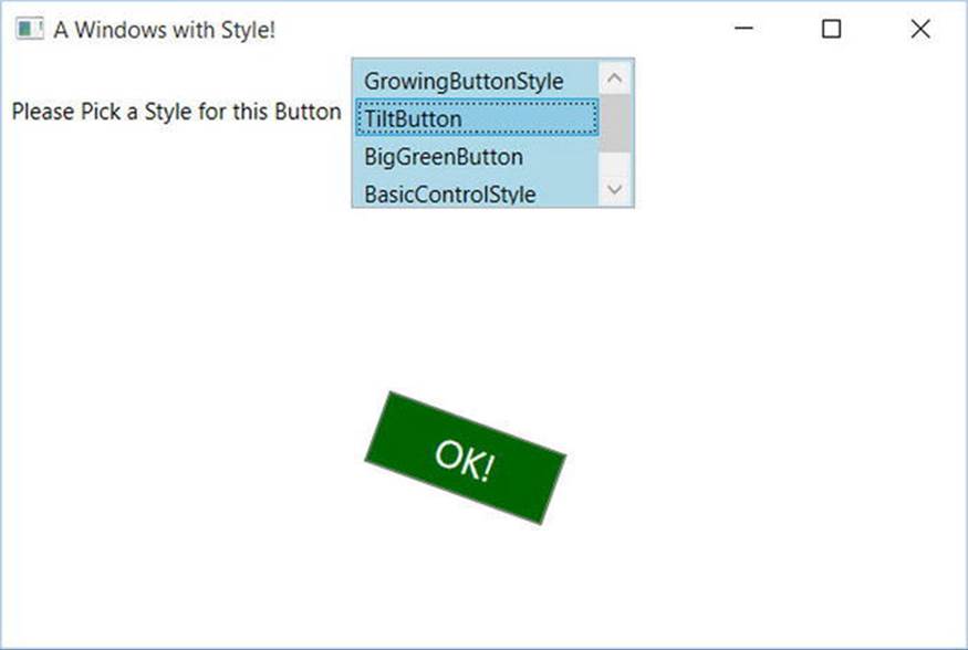
Figure 29-14. Controls with different styles
Source Code The WpfStyles project can be found in the Chapter 29 subdirectory.
Logical Trees, Visual Trees, and Default Templates
Now that you understand styles and resources, there are a few more preparatory topics to investigate before you begin learning how to build custom controls. Specifically, you need to learn the distinction between a logical tree, a visual tree, and a default template. When you are typing XAML into Visual Studio, or a tool such as kaxaml.exe, your markup is the logical view of the XAML document. As well, if you author C# code that adds new items to a StackPanel control, you are inserting new items into the logical tree. Essentially, a logical view represents how your content will be positioned within the various layout managers for a main Window (or another root element, such as Page or NavigationWindow).
However, behind every logical tree is a much more verbose representation termed a visual tree, which is used internally by WPF to correctly render out elements onto the screen. Within any visual tree, there will be full details of the templates and styles used to render out each object, including any necessary drawings, shapes, visuals, and animations.
It is useful to understand the distinction between logical and visual trees because when you are building a custom control template, you are essentially replacing all or part of the default visual tree of a control and inserting your own. Therefore, if you want a Button control to be rendered as a star shape, you could define a new star template and plug it into the Button’s visual tree. Logically, the Button is still of type Button, and it supports all of the properties, methods, and events as expected. But visually, it has taken on a whole new appearance. This fact alone makes WPF an extremely useful API, given that other toolkits would require you to build a brand new class to make a star-shaped button. With WPF, you simply need to define new markup.
Note WPF controls are often described as lookless. This refers to the fact that the look and feel of a WPF control is completely independent (and customizable) from its behavior.
Programmatically Inspecting a Logical Tree
While analyzing a window’s logical tree at runtime is not a tremendously common WPF programming activity, it is worth mentioning that the System.Windows namespace defines a class named LogicalTreeHelper, which allows you to inspect the structure of a logical tree at runtime. To illustrate the connection between logical trees, visual trees, and control templates, create a new WPF application named TreesAndTemplatesApp.
Update the markup for your window so that it contains two Button controls and a large read-only TextBox with scrollbars enabled. Make sure you use the IDE to handle the Click event of each button. The following XAML will do nicely:
<Window x:Class="TreesAndTemplatesApp.MainWindow"
xmlns:d="http://schemas.microsoft.com/expression/blend/2008"
xmlns:mc="http://schemas.openxmlformats.org/markup-compatibility/2006"
xmlns:local="clr-namespace:TreesAndTemplatesApp"
mc:Ignorable="d"
Title="Fun with Trees and Templates" Height="518"
Width="836" WindowStartupLocation="CenterScreen">
<DockPanel LastChildFill="True">
<Border Height="50" DockPanel.Dock="Top" BorderBrush="Blue">
<StackPanel Orientation="Horizontal">
<Button x:Name="btnShowLogicalTree" Content="Logical Tree of Window"
Margin="4" BorderBrush="Blue" Height="40" Click="btnShowLogicalTree_Click"/>
<Button x:Name="btnShowVisualTree" Content="Visual Tree of Window"
BorderBrush="Blue" Height="40" Click="btnShowVisualTree_Click"/>
</StackPanel>
</Border>
<TextBox x:Name="txtDisplayArea" Margin="10" Background="AliceBlue" IsReadOnly="True"
BorderBrush="Red" VerticalScrollBarVisibility="Auto"
HorizontalScrollBarVisibility="Auto" />
</DockPanel>
</Window>
Within your C# code file, define a string member variable named _dataToShow. Now, within the Click handler for the btnShowLogicalTree object, call a helper function that calls itself recursively in order to populate the string variable with the logical tree of the Window. To do so, you will call the static GetChildren() method of LogicalTreeHelper. Here is the code:
private string _dataToShow = string.Empty;
private void btnShowLogicalTree_Click(object sender, RoutedEventArgs e)
{
_dataToShow = "";
BuildLogicalTree(0, this);
txtDisplayArea.Text = _dataToShow;
}
void BuildLogicalTree(int depth, object obj)
{
// Add the type name to the dataToShow member variable.
_dataToShow += new string(’ ’, depth) + obj.GetType().Name + "\n";
// If an item is not a DependencyObject, skip it.
if (!(obj is DependencyObject))
return;
// Make a recursive call for each logical child.
foreach (var child in LogicalTreeHelper.GetChildren(
(DependencyObject)obj))
{
BuildLogicalTree(depth + 5, child);
}
}
If you run your application and click this first button, you will see a tree print out in the text area, which is just about an exact replica of the original XAML (see Figure 29-15).
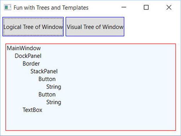
Figure 29-15. Viewing a logical tree at runtime
Programmatically Inspecting a Visual Tree
A Window’s visual tree can also be inspected at runtime using the VisualTreeHelper class of System.Windows.Media. Here is a Click implementation of the second Button control (btnShowVisualTree), which performs similar recursive logic to build a textual representation of the visual tree:
private void btnShowVisualTree_Click(object sender, RoutedEventArgs e)
{
_dataToShow = "";
BuildVisualTree(0, this);
txtDisplayArea.Text = _dataToShow;
}
void BuildVisualTree(int depth, DependencyObject obj)
{
// Add the type name to the dataToShow member variable.
_dataToShow += new string(’ ’, depth) + obj.GetType().Name + "\n";
// Make a recursive call for each visual child.
for (int i = 0; i < VisualTreeHelper.GetChildrenCount(obj); i++)
{
BuildVisualTree(depth + 1, VisualTreeHelper.GetChild(obj, i));
}
}
As you can see in Figure 29-16, the visual tree exposes a number of lower-level rendering agents such as ContentPresenter, AdornerDecorator, TextBoxLineDrawingVisual, and so forth.
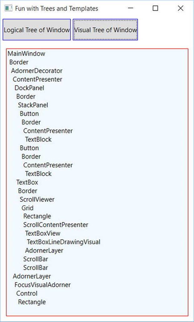
Figure 29-16. Viewing a visual tree at runtime
Programmatically Inspecting a Control’s Default Template
Recall that a visual tree is used by WPF to understand how to render a Window and all contained elements. Every WPF control stores its own set of rendering commands within its default template. Programmatically speaking, any template can be represented as an instance of theControlTemplate class. As well, you can obtain a control’s default template by using the aptly named Template property, like so:
// Get the default template of the Button.
Button myBtn = new Button();
ControlTemplate template = myBtn.Template;
Likewise, you could create a new ControlTemplate object in code and plug it into a control’s Template property as follows:
// Plug in a new template for the button to use.
Button myBtn = new Button();
ControlTemplate customTemplate = new ControlTemplate();
// Assume this method adds all the code for a star template.
MakeStarTemplate(customTemplate);
myBtn.Template = customTemplate;
While you could build a new template in code, it is far more common to do so in XAML. However, before you start building your own templates, let’s finish the current example and add the ability to view the default template of a WPF control at runtime. This can be a really useful way to take a look at the overall composition of a template. First, update the markup of your window with a new StackPanel of controls docked to the left side of the master DockPanel, defined as so (placed just before the <TextBox> element):
<Border DockPanel.Dock="Left" Margin="10" BorderBrush="DarkGreen"
BorderThickness="4" Width="358">
<StackPanel>
<Label Content="Enter Full Name of WPF Control" Width="340" FontWeight="DemiBold" />
<TextBox x:Name="txtFullName" Width="340" BorderBrush="Green"
Background="BlanchedAlmond" Height="22"
Text="System.Windows.Controls.Button" />
<Button x:Name="btnTemplate" Content="See Template" BorderBrush="Green"
Height="40" Width="100" Margin="5"
Click="btnTemplate_Click" HorizontalAlignment="Left" />
<Border BorderBrush="DarkGreen" BorderThickness="2" Height="260"
Width="301" Margin="10" Background="LightGreen" >
<StackPanel x:Name="stackTemplatePanel" />
</Border>
</StackPanel>
</Border>
Do take note of the empty StackPanel, stackTemplatePanel, because you will refer to it in code. Add an empty event handler function for the btnTemplate_Click event like this:
private void btnTemplate_Click(object sender, RoutedEventArgs e)
{
}
Now your window should now look something like Figure 29-17.
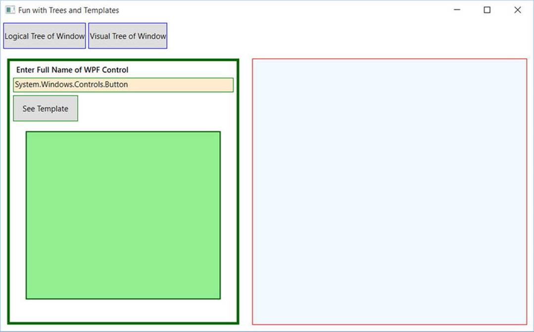
Figure 29-17. The updated UI of your window
The upper-left text area allows you to enter in the fully qualified name of a WPF control located in the PresentationFramework.dll assembly. Once the library is loaded, you will dynamically create an instance of the object and display it in the large square in the bottom left. Last but not least, the control’s default template will be displayed in the right-hand text area. First, add a new member variable to your C# class of type Control, like so:
private Control _ctrlToExamine = null;
Here is the remaining code, which will require you to import the System.Reflection, System.Xml, and System.Windows.Markup namespaces:
private void btnTemplate_Click(object sender, RoutedEventArgs e)
{
_dataToShow = "";
ShowTemplate();
txtDisplayArea.Text = _dataToShow;
}
private void ShowTemplate()
{
// Remove the control that is currently in the preview area.
if (_ctrlToExamine != null)
stackTemplatePanel.Children.Remove(_ctrlToExamine);
try
{
// Load PresentationFramework, and create an instance of the
// specified control. Give it a size for display purposes, then add to the
// empty StackPanel.
Assembly asm = Assembly.Load("PresentationFramework, Version=4.0.0.0," +
"Culture=neutral, PublicKeyToken=31bf3856ad364e35");
_ctrlToExamine = (Control)asm.CreateInstance(txtFullName.Text);
_ctrlToExamine.Height = 200;
_ctrlToExamine.Width = 200;
_ctrlToExamine.Margin = new Thickness(5);
stackTemplatePanel.Children.Add(_ctrlToExamine);
// Define some XML settings to preserve indentation.
var xmlSettings = new XmlWriterSettings{Indent = true};
// Create a StringBuilder to hold the XAML.
var strBuilder = new StringBuilder();
// Create an XmlWriter based on our settings.
var xWriter = XmlWriter.Create(strBuilder, xmlSettings);
// Now save the XAML into the XmlWriter object based on the ControlTemplate.
XamlWriter.Save(_ctrlToExamine.Template, xWriter);
// Display XAML in the text box.
_dataToShow = strBuilder.ToString();
}
catch (Exception ex)
{
_dataToShow = ex.Message;
}
}
The bulk of the work is just tinkering with the compiled BAML resource to map it into a XAML string. Figure 29-18 shows your final application in action, displaying the default template of the System.Windows.Controls.DatePicker control. The image shows the Calendar, which is accessed by clicking the button on the right-hand side of the control.
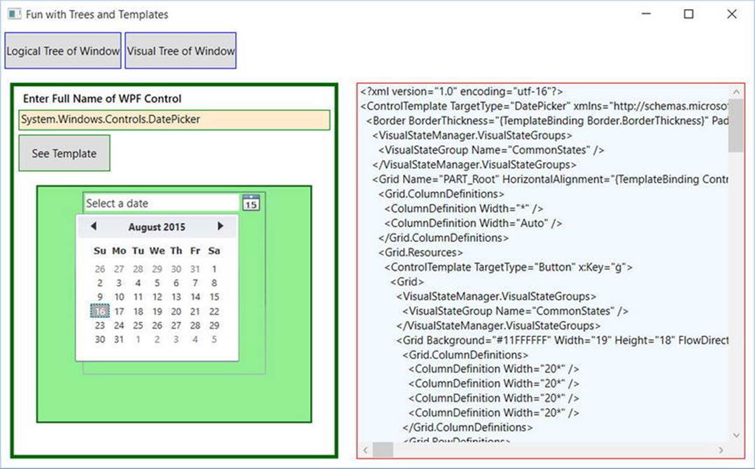
Figure 29-18. Investigating a ControlTemplate at runtime
Great! Hopefully you have a better idea about how logical trees, visual trees, and control default templates work together. Now you can spend the remainder of this chapter learning how to build custom templates and user controls.
Source Code The TreesAndTemplatesApp project is included in the Chapter 29 subdirectory.
Building a Control Template with the Trigger Framework
When you build a custom template for a control, you could do so with nothing but C# code. Using this approach, you would add data to a ControlTemplate object and then assign it to a control’s Template property. Most of the time, however, you will define the look and feel of aControlTemplate using XAML and add bits of code (or possible quite a bit of code) to drive the runtime behavior.
In the remainder of this chapter, you will examine how to build custom templates using Visual Studio. Along the way, you will learn about the WPF trigger framework and the Visual State Manager (VSM), and you’ll see how to use animations to incorporate visual cues for the end user. Using Visual Studio alone to build complex templates can entail a fair amount of typing and a bit of heavy lifting. To be sure, production-level templates will benefit from the use of Expression Blend for Visual Studio, the (now) free companion install to Visual Studio. However, given that this edition of the text does not include coverage of Blend, it’s time to roll up your sleeves and pound out some markup.
To begin, create a new WPF application named ButtonTemplate. For this project, you are more interested in the mechanics of creating and using templates, so the markup for this main window is very simple.
<Window x:Class="ButtonTemplate.MainWindow"
xmlns="http://schemas.microsoft.com/winfx/2006/xaml/presentation"
xmlns:x="http://schemas.microsoft.com/winfx/2006/xaml"
xmlns:d="http://schemas.microsoft.com/expression/blend/2008"
xmlns:mc="http://schemas.openxmlformats.org/markup-compatibility/2006"
xmlns:local="clr-namespace:ButtonTemplate"
mc:Ignorable="d"
Title="Fun with Templates" Height="350" Width="525">
<StackPanel>
<Button x:Name="myButton" Width="100" Height="100"
Click="myButton_Click"/>
</StackPanel>
</Window>
In the Click event handler, simply display a message box (via MessageBox.Show()) that displays a message confirming the clicking of the control. Remember, when you build custom templates, the behavior of the control is constant but the look may vary.
Currently, this Button is rendered using the default template, which, as the last example illustrated, is a BAML resource within a given WPF assembly. When you want to define your own template, you essentially replace this default visual tree with your own creation. To begin, update the definition of the <Button> element to specify a new template using the property element syntax. This template will give the control a round appearance.
<Button x:Name="myButton" Width="100" Height="100"
Click="myButton_Click">
<Button.Template>
<ControlTemplate>
<Grid x:Name="controlLayout">
<Ellipse x:Name="buttonSurface" Fill = "LightBlue"/>
<Label x:Name="buttonCaption" VerticalAlignment = "Center"
HorizontalAlignment = "Center"
FontWeight = "Bold" FontSize = "20" Content = "OK!"/>
</Grid>
</ControlTemplate>
</Button.Template>
</Button>
Here, you have defined a template that consists of a named Grid control containing a named Ellipse and a Label. Because your Grid has no defined rows or columns, each child stacks on top of the previous control, allowing you to have centering of content. If you run your application now, you will notice that the Click event will fire only when the mouse cursor is within the bounds of the Ellipse (i.e., not in the corners around the edges of the ellipse)! This is a great feature of the WPF template architecture: you do not need to recalculate hit-testing, bounds checking, or any other low-level detail. So, if your template used a Polygon object to render some oddball geometry, you can rest assured that the mouse hit-testing details are relative to the shape of the control, not the larger bounding rectangle.
Templates as Resources
Currently, your template is embedded to a specific Button control, which limits your reuse options. Ideally, you would place your template into a resource dictionary so you can reuse your round button template between projects, or at minimum, move it into the application resource container for reuse within this project. Let’s move the local Button resource to the application level. First, locate the Template property for your Button in the Properties editor (you’ll find it under the Miscellaneous section). Now, click on the small black square icon and select “Convert to New Resource.”
From the resulting dialog box, define a new template named RoundButtonTemplate, which is stored at the Application level (i.e., in App.xaml; see Figure 29-19).
Figure 29-19. Placing your resource into App.xaml
At this point, you will find the following data in your Application object’s markup:
<Application x:Class="ButtonTemplate.App"
xmlns="http://schemas.microsoft.com/winfx/2006/xaml/presentation"
xmlns:x="http://schemas.microsoft.com/winfx/2006/xaml"
xmlns:local="clr-namespace:ButtonTemplate"
StartupUri="MainWindow.xaml">
<Application.Resources>
<ControlTemplate x:Key="RoundButtonTemplate" TargetType="{x:Type Button}>
<Grid x:Name="controlLayout">
<Ellipse x:Name="buttonSurface" Fill = "LightBlue"/>
<Label x:Name="buttonCaption" VerticalAlignment = "Center"
HorizontalAlignment = "Center"
FontWeight = "Bold" FontSize = "20" Content = "OK!"/>
</Grid>
</ControlTemplate>
</Application.Resources>
</Application>
Now, because this resource is available for the entire application, you can define any number of round buttons. Create two additional Button controls that use this template for testing purposes (no need to handle the Click event for these new items).
<StackPanel>
<Button x:Name="myButton" Width="100" Height="100"
Click="myButton_Click"
Template="{StaticResource RoundButtonTemplate}"></Button>
<Button x:Name="myButton2" Width="100" Height="100"
Template="{StaticResource RoundButtonTemplate}"></Button>
<Button x:Name="myButton3" Width="100" Height="100"
Template="{StaticResource RoundButtonTemplate}"></Button>
</StackPanel>
Visual Studio 2015 and .NET 4.6 defaults to using DynamicResources. I prefer StaticResources as the default; I move to Dynamic when the need arises. For these examples, make sure to change the default DynamicResources to StaticResources.
Incorporating Visual Cues Using Triggers
When you define a custom template, all of the visual cues of the default template are removed as well. For example, the default button template contains markup that informs the control how to look when certain UI events occur, such as when it receives focus, when it is clicked with the mouse, when it is enabled (or disabled), and so on. Users are quite accustomed to these sort of visual cues because it gives the control somewhat of a tactile response. However, your RoundButtonTemplate does not define any such markup, so the look of the control is identical regardless of the mouse activity. Ideally, your control should look slightly different when clicked (maybe via a color change or drop shadow) to let the user know the visual state has changed.
When WPF was first released, the way to add in such visual cues was to add to the template any number of triggers that would typically change values of object properties or start a storyboard animation (or both) when the trigger condition was true. By way of example, update yourRoundButtonTemplate with the following markup, which will change the color of the control to blue and the foreground color to yellow when the mouse is over the surface:
<ControlTemplate x:Key="RoundButtonTemplate" TargetType="Button" >
<Grid x:Name="controlLayout">
<Ellipse x:Name="buttonSurface" Fill="LightBlue" />
<Label x:Name="buttonCaption" Content="OK!" FontSize="20" FontWeight="Bold"
HorizontalAlignment="Center" VerticalAlignment="Center" />
</Grid>
<ControlTemplate.Triggers>
<Trigger Property = "IsMouseOver" Value = "True">
<Setter TargetName = "buttonSurface" Property = "Fill" Value = "Blue"/>
<Setter TargetName = "buttonCaption" Property = "Foreground"
Value = "Yellow"/>
</Trigger>
</ControlTemplate.Triggers>
</ControlTemplate>
If you run the program yet again, you should find the color does toggle based on whether or not the mouse is within the Ellipse area. Here is another trigger, which will shrink the size of the Grid (and, therefore, all child elements) when the control is pressed via the mouse. Add this to your <ControlTemplate.Triggers> collection:
<Trigger Property = "IsPressed" Value="True">
<Setter TargetName="controlLayout"
Property="RenderTransformOrigin" Value="0.5,0.5"/>
<Setter TargetName="controlLayout" Property="RenderTransform">
<Setter.Value>
<ScaleTransform ScaleX="0.8" ScaleY="0.8"/>
</Setter.Value>
</Setter>
</Trigger>
The Role of the {TemplateBinding} Markup Extension
Your template can only be applied to Button controls and, therefore, it would stand to reason that you could set properties on the <Button> element that will cause the template to render itself in a unique manner. For example, right now the Fill property of the Ellipse is hard-coded to be blue and the Content of the Label is always set to the string value “OK”. If you want buttons of different colors and text values, you could define the following buttons in your main window:
<StackPanel>
<Button x:Name="myButton" Width="100" Height="100"
Background="Red" Content="Howdy!"
Click="myButton_Click"
Template="{StaticResource RoundButtonTemplate}" />
<Button x:Name="myButton2" Width="100" Height="100"
Background="LightGreen" Content="Cancel!"
Template="{StaticResource RoundButtonTemplate}" />
<Button x:Name="myButton3" Width="100" Height="100"
Background="Yellow" Content="Format"
Template="{StaticResource RoundButtonTemplate}" />
</StackPanel>
However, regardless of the fact that each Button is setting a unique Background and Content value, you still end up with three blue buttons that contain the text “OK”. The problem is that the properties of the control using the template (Button) have properties that do not match identically with the items on the template (such as the Fill property of the Ellipse). As well, although the Label does have a Content property, the value defined in the <Button> scope is not automatically routed to the internal child of the template.
You can solve these issues by using the {TemplateBinding} markup extension when you build your template. This allows you to capture property settings defined by the control using your template and use them to set values in the template itself. Here is a reworked version ofRoundButtonTemplate, which now uses this markup extension to map the Background property of the Button to the Fill property of the Ellipse; it also makes sure the Content of the Button is indeed passed to the Content property of the Label:
<ControlTemplate x:Key="RoundButtonTemplate" TargetType="Button">
<Grid x:Name="controlLayout">
<Ellipse x:Name="buttonSurface" Fill="{TemplateBinding Background}"/>
<Label x:Name="buttonCaption" Content="{TemplateBinding Content}"
FontSize="20" FontWeight="Bold"
HorizontalAlignment="Center" VerticalAlignment="Center" />
</Grid>
<ControlTemplate.Triggers>
...
</ControlTemplate.Triggers>
</ControlTemplate>
With this update, you can now create buttons of various colors and textual values (see Figure 29-20). The example XAML is shown here:
<Button x:Name="myButton" Width="100" Height="100" Background="Red" Content="Howdy!"
Click="myButton_Click" Style="{StaticResource RoundButtonStyle}" />
<Button x:Name="myButton2" Width="100" Height="100" Background="LightGreen" Content="Cancel!"
Style="{StaticResource RoundButtonStyle}" />
<Button x:Name="myButton3" Width="100" Height="100" Background="Yellow" Content="Format"
Style="{StaticResource RoundButtonStyle}" />
Figure 29-20. Template bindings allow values to pass through to the internal controls
The Role of ContentPresenter
When you designed your template, you used a Label to display the textual value of the control. Like the Button, the Label supports a Content property. Therefore, given your use of {TemplateBinding}, you could define a Button that contains complex content beyond that of a simple string. For example,
<Button x:Name="myButton4" Width="100" Height="100" Background="Yellow"
Template="{StaticResource RoundButtonTemplate}">
<Button.Content>
<ListBox Height="50" Width="75">
<ListBoxItem>Hello</ListBoxItem>
<ListBoxItem>Hello</ListBoxItem>
<ListBoxItem>Hello</ListBoxItem>
</ListBox>
</Button.Content>
</Button>
For this particular control, things work just as hoped. However, what if you need to pass in complex content to a template member that does not have a Content property? When you want to define a generalized content display area in a template, you can use the ContentPresenterclass as opposed to a specific type of control (Label or TextBlock). There is no need to do so for this example; however, here is some simple markup that illustrates how you could build a custom template that uses ContentPresenter to show the value of the Content property of the control using the template:
<!-- This button template will display whatever is set
to the Content of the hosting button. -->
<ControlTemplate x:Key="NewRoundButtonTemplate" TargetType="Button">
<Grid>
<Ellipse Fill="{TemplateBinding Background}"/>
<ContentPresenter HorizontalAlignment="Center"
VerticalAlignment="Center"/>
</Grid>
</ControlTemplate>
Incorporating Templates into Styles
Currently, your template simply defines a basic look and feel of the Button control. However, the process of establishing the basic properties of the control (content, font size, font weight, etc.) is the responsibility of the Button itself.
<!-- Currently the Button must set basic property values, not the template. -->
<Button x:Name ="myButton" Foreground ="Black" FontSize ="20" FontWeight ="Bold"
Template ="{StaticResource RoundButtonTemplate}" Click ="myButton_Click"/>
If you want, you could establish these values in the template. By doing so, you can effectively create a default look and feel. As you might have already realized, this is a job for WPF styles. When you build a style (to account for basic property settings), you can define a template within the style! Here is your updated application resource in the application resources in App.xaml, which has been rekeyed as RoundButtonStyle:
<!-- A style containing a template. -->
<Style x:Key ="RoundButtonStyle" TargetType ="Button">
<Setter Property ="Foreground" Value ="Black"/>
<Setter Property ="FontSize" Value ="14"/>
<Setter Property ="FontWeight" Value ="Bold"/>
<Setter Property="Width" Value="100"/>
<Setter Property="Height" Value="100"/>
<!-- Here is the template! -->
<Setter Property ="Template">
<Setter.Value>
<ControlTemplate TargetType ="Button">
<Grid x:Name="controlLayout">
<Ellipse x:Name="buttonSurface" Fill="{TemplateBinding Background}"/>
<Label x:Name="buttonCaption" Content ="{TemplateBinding Content}"
HorizontalAlignment="Center" VerticalAlignment="Center" />
</Grid>
<ControlTemplate.Triggers>
<Trigger Property = "IsMouseOver" Value = "True">
<Setter TargetName = "buttonSurface" Property = "Fill" Value = "Blue"/>
<Setter TargetName = "buttonCaption" Property = "Foreground" Value = "Yellow"/>
</Trigger>
<Trigger Property = "IsPressed" Value="True">
<Setter TargetName="controlLayout"
Property="RenderTransformOrigin" Value="0.5,0.5"/>
<Setter TargetName="controlLayout" Property="RenderTransform">
<Setter.Value>
<ScaleTransform ScaleX="0.8" ScaleY="0.8"/>
</Setter.Value>
</Setter>
</Trigger>
</ControlTemplate.Triggers>
</ControlTemplate>
</Setter.Value>
</Setter>
</Style>
With this update, you can now create button controls by setting the Style property as so:
<Button x:Name="myButton" Background="Red" Content="Howdy!"
Click="myButton_Click" Style="{StaticResource RoundButtonStyle}"/>
While the rendering and behavior of the button are identical, the benefit of nesting templates within styles is that you are able to provide a canned set of values for common properties. That wraps up your look at how to use Visual Studio and the trigger framework to build custom templates for a control. While there is still much more about the Windows Presentation Foundation API than has been examined here, you should be in a solid position for further study.
Source Code The ButtonTemplate project can be found in the Chapter 29 subdirectory.
Summary
The first part of this chapter examined the resource management system of WPF. You began by looking at how to work with binary resources, and then you examined the role of object resources. As you learned, object resources are named blobs of XAML that can be stored at various locations in order to reuse content.
Next, you learned about WPF’s animation framework. Here you had a chance to create some animations using C# code, as well as with XAML. You learned that if you define an animation in markup, you use <Storyboard> elements and triggers to control execution. You then looked at the WPF style mechanism, which makes heavy use of graphics, object resources, and animations.
You examined the relationship between a logical tree and a visual tree. The logical tree is basically a one-to-one correspondence of the markup you author to describe a WPF root element. Behind this logical tree is a much deeper visual tree that contains detailed rendering instructions.
The role of a default template was then examined. Remember, when you are building custom templates, you are essentially ripping out all (or part) of a control’s visual tree and replacing it with your own custom implementation.
All materials on the site are licensed Creative Commons Attribution-Sharealike 3.0 Unported CC BY-SA 3.0 & GNU Free Documentation License (GFDL)
If you are the copyright holder of any material contained on our site and intend to remove it, please contact our site administrator for approval.
© 2016-2026 All site design rights belong to S.Y.A.