C# 6.0 and the .NET 4.6 Framework (2015)
PART VII
Windows Presentation Foundation
CHAPTER 30
Notifications, Commands, Validation, and MVVM
This chapter will conclude your investigation of the WPF programming model by introducing you to the Observable pattern and the notification system built into WPF. You’ll also expand your knowledge of commands and validation. These three items are the foundation for implementing the Model-View-ViewModel (MVVM) pattern in WPF.
The first section covers observable models and observable collections. When classes and collections implement INotifyPropertyChanged and INotifyCollectionChanged (respectively), the binding manager keeps the values in the UI in sync with the bound data. Having the data in the UI accurately portray the current state of the data automatically improves the user experience significantly and reduces the manual coding required in older technologies (such as WinForms) to achieve the same result.
Building on the Observable pattern, you will examine the mechanisms to add validation into your application. Validation is a vital part of any application–not only letting the user know that something is wrong, but also letting them know what is wrong. To inform the user what the error is, you will also learn how to incorporate validation into the view markup.
Next, you will take a deeper dive into the WPF command system and create custom commands to encapsulate program logic, much as you did in Chapter 27 with the built-in commands. There are several advantages to creating custom commands, including (but not limited to) enabling code reuse, logic encapsulation, and cleaner code.
Finally, you will learn about the Model-View-ViewModel (MVVM) pattern, and how all of this material fits together to support the pattern. Figure 30-1 shows the application that you will build throughout this chapter.
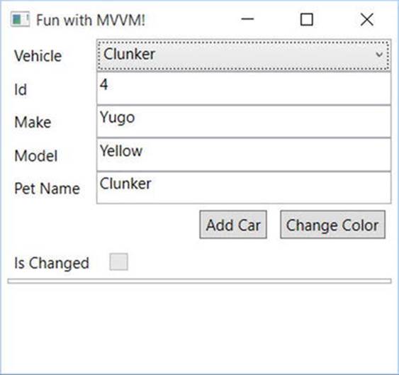
Figure 30-1. Fun with MVVM!
Introducing Model-View-ViewModel
Before you dive into notifications, validations, and commands in WPF, it would be good to understand the end goal of this chapter, which is the Mode-View-ViewModel pattern (MVVM).
Derived from Martin Fowler’s Presentation Model pattern, MVVM leverages the XAML-specific capabilities, discussed in this chapter, to make your WPF development faster and cleaner. The name itself describes the main components of the pattern: Model, View, ViewModel.
Model
The Model is the object representation of your data. In the samples from this chapter, the Model is the Inventory class. This doesn’t mean the actual data store (such as SQL Server), but the classes that represent the data that is stored in the persistence layer.
Models usually have validation built in (as you will see later in this chapter in the Validation section) and are configured as observables, covered later in this chapter as well.
View
The View is the UI of the application, and it is designed to be very lightweight. Think of the menu board at a drive-thru restaurant. The board displays menu items and prices, and it has a mechanism so the user can communicate with the back-end systems. However, there isn’t any intelligence built into the board, unless it is isolated from the restaurant itself, in which case it might have a light sensor that will turn on the lights if it gets dark.
MVVM Views should be developed with the same goals in mind. Any intelligence should be built into the application elsewhere. The only code in the code-behind file (e.g. MainWindow.xaml.cs) should be directly related to manipulating the UI. It should not be based on business rules or anything that needs to be persisted for future use. While not the goal of MVVM, very little code in the code-behind (if any) is a pleasant side effect.
ViewModel
In WPF and other XAML technologies, the ViewModel serves two purposes:
· The ViewModel provides a single stop for all of the data needed by the view. This doesn’t mean that the ViewModel is responsible for getting the actual data; instead it calls the relevant code (such as EF repositories) to get all of the data together where it’s easily accessible. Because of this, there is typically a one-to-one correlation between Windows and ViewModels in my code, but architectural differences exist, and your mileage may vary.
· The second job is to act as the controller for the View. Just like the menu board, the ViewModel takes direction from the user, and calls the code to make sure the proper actions are taken. This code is typically in the form of commands.
Anemic Models or ViewModels
In the early days of WPF, when developers were still working out how best to implement the MVVM pattern, there were significant (and sometimes heated) discussions about where to implement items like validation and the observable patterns. One camp (the Anemic Model camp) argued that it all should be in the ViewModel, since adding those capabilities to the model broke separation of concerns. The other camp (the Anemic ViewModel camp) argued it should all be in the Models, since that reduced duplication of code.
The real answer is, of course, it depends. When INotifyPropertyChanged, IDataErrorInfo, and INotifyDataErrorInfo are implemented on the model classes, this ensures that the relevant code is close to the target of the code (as you will see in this chapter), and is only implemented once for each model. That being said, there are times when your ViewModel classes will need to be developed as observables themselves. At the end of the day, you need to determine what makes the most sense, without over-complicating your code or sacrificing the benefits of MVVM.
 Note There are multiple MVVM frameworks available for WPF, such as MVVMLite, Caliburn.Micro, and Prism (although Prism is much more than just an MVVM framework). Each framework has its merits and (to some extent) detractions. This chapter discusses the MVVM pattern and the features in WPF that support implementing the pattern. I leave it to you, the reader, to examine the different frameworks and select the one that best matches your app needs.
The WPF Binding Notification System
A significant shortcoming in the binding system for WinForms is a lack of notifications. If the data in the data source changes, the UI does not get automatically updated. Instead, the developer needs to call Refresh on the control before the control will reload the data from the data source. This can lead to more calls to Refresh than are actually necessary because most developers want to make sure the UI and the data do not get out of sync. While not a significant performance issue to include too many, if you don’t include enough, the experience for the user could be affected negatively.
The binding system built into XAML-based applications corrects this problem by enabling you to hook your data objects into a notification system. Classes and collections that hook into this system are referred to as observable models and observable collections, or collectively as observables. Whenever a property’s value changes on an observable model or the collection changes (e.g. items are added, removed, or reordered) on an observable collection, they raise an event (either NotifyPropertyChanged or NotifyCollectionChanged). The binding framework automatically listens for those events to occur, and updates the bound controls when they fire. Even better, as a developer, you have control over which properties raise the notifications. Sounds perfect, right? Well, it’s not quite perfect, as you shall soon see. There is a fair amount of code involved in setting this up for observable models if you are doing it all by hand. Fortunately, there is an open source framework that makes it much simpler, as you shall soon see.
Observable Models and Collections
In this section, you will create an application that uses observable models and collections. To get started, create a new WPF application named Notifications. The form will be a Master Detail form, allowing the user to select a specific car using the ComboBox, and then the details for that car will be displayed in the TextBoxes below. Update MainWindow.xaml to the following markup:
<Window x:Class="Notifications.MainWindow"
xmlns="http://schemas.microsoft.com/winfx/2006/xaml/presentation"
xmlns:x="http://schemas.microsoft.com/winfx/2006/xaml"
xmlns:d="http://schemas.microsoft.com/expression/blend/2008"
xmlns:mc="http://schemas.openxmlformats.org/markup-compatibility/2006"
xmlns:local="clr-namespace:Notifications"
mc:Ignorable="d"
Title="Fun with Notifications!" Height="225" Width="325"
WindowStartupLocation="CenterOwner">
<Grid IsSharedSizeScope="True" Margin="5,0,5,5">
<Grid.RowDefinitions>
<RowDefinition Height="Auto"/>
<RowDefinition Height="Auto"/>
</Grid.RowDefinitions>
<Grid Grid.Row="0">
<Grid.ColumnDefinitions>
<ColumnDefinition Width="Auto" SharedSizeGroup="CarLabels"/>
<ColumnDefinition Width="*"/>
</Grid.ColumnDefinitions>
<Label Grid.Column="0" Content="Vehicle"/>
<ComboBox Name="cboCars" Grid.Column="1" DisplayMemberPath="PetName" />
</Grid>
<Grid Grid.Row="1">
<Grid.ColumnDefinitions>
<ColumnDefinition Width="Auto" SharedSizeGroup="CarLabels"/>
<ColumnDefinition Width="*"/>
</Grid.ColumnDefinitions>
<Grid.RowDefinitions>
<RowDefinition Height="Auto"/>
<RowDefinition Height="Auto"/>
<RowDefinition Height="Auto"/>
<RowDefinition Height="Auto"/>
</Grid.RowDefinitions>
<Label Grid.Column="0" Grid.Row="0" Content="Make"/>
<TextBox Grid.Column="1" Grid.Row="0" />
<Label Grid.Column="0" Grid.Row="1" Content="Color"/>
<TextBox Grid.Column="1" Grid.Row="1" />
<Label Grid.Column="0" Grid.Row="2" Content="Pet Name"/>
<TextBox Grid.Column="1" Grid.Row="2" />
<StackPanel Grid.Column="0" Grid.ColumnSpan="2" Grid.Row="3"
HorizontalAlignment="Right" Orientation="Horizontal" Margin="0,5,0,5">
<Button x:Name="btnAddCar" Content="Add Car" Margin="5,0,5,0" Padding="4, 2" />
<Button x:Name="btnChangeColor" Content="Change Color" Margin="5,0,5,0"
Padding="4, 2"/>
</StackPanel>
</Grid>
</Grid>
</Window>
Your window will resemble Figure 30-2.
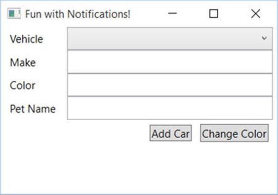
Figure 30-2. Master Detail window displaying inventory details
Next, right-click the project name in Solution Explorer, select Add  New Folder named Models, and in this new folder, create a class named Inventory. The initial class is listed here:
public class Inventory
{
public int CarId { get; set; }
public string Make { get; set; }
public string Color { get; set; }
public string PetName { get; set; }
}
Adding Bindings and Data
The next step is to add the binding statements for the controls. To do this, add a DataContext to the Grid holding the text boxes and label. Set the DataContext to the SelectedItem property of the ComboBox. Update the Grid that holds the detail controls to the following:
<Grid Grid.Row="1" DataContext="{Binding ElementName=cboCars, Path=SelectedItem}">
As a reminder, controls will navigate up the element tree for a DataContext if one isn’t specified. This enables you to just specify the path for the binding in the TextBoxes. Add the appropriate text attributes and related bindings to the TextBoxes, like so:
<TextBox Grid.Column="1" Grid.Row="0" Text="{Binding Path=Make}" />
<TextBox Grid.Column="1" Grid.Row="1" Text="{Binding Path=Color}" />
<TextBox Grid.Column="1" Grid.Row="2" Text="{Binding Path=PetName}" />
Finally, add data to the ComboBox. In MainWindow.xaml.cs, create a new list of Inventory records, and set the ItemsSource for the ComboBox to the list. Also add the using statement for the Notifications.Models namespace.
using Notifications.Models;
public class MainWindow : Window
{
readonly IList<Inventory> _cars;
public MainWindow()
{
InitializeComponent();
_cars = new List<Inventory>
{
new Inventory {CarId=1,Color="Blue",Make="Chevy",PetName="Kit" },
new Inventory {CarId=2,Color="Red",Make="Ford",PetName="Red Rider" },
};
cboCars.ItemsSource = _cars;
}
}
Run the app. You’ll see that the vehicle selector has two cars to choose from. Choose one of them, and the text boxes will be automatically populated with the vehicle detail, as shown in Figure 30-3. Change the color of one of the vehicles, select the other vehicle, and then go back to the vehicle you edited. You will see the new color is indeed still attached to the vehicle. This isn’t anything remarkable; you’ve seen the power of XAML databinding in previous examples.
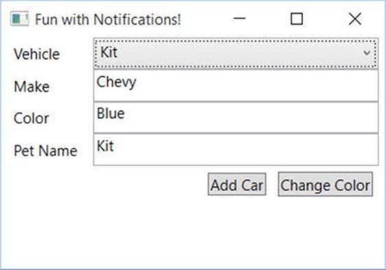
Figure 30-3. The window with data
Programmatically Changing the Vehicle Data
While the previous example works as expected, if the data is changed programmatically, the UI will not reflect the changes unless you program the app to refresh the data. To demonstrate this, add an event handler for the btnChangeColor Button, like so:
<Button x:Name="btnAddCar" Content="Add Car" Margin="5,0,5,0" Padding="4, 2" Click="btnAddCar_Click"/>
Create (or have Visual Studio create it for you) the event handler for the btnChangeColor_Click event, as follows:
private void btnChangeColor_Click(object sender, RoutedEventArgs e)
{
}
In the event handler, use the SelectedItem property of the ComboBox to locate the selected record from the cars list. If a match is found, change the color to Pink. The code is listed here:
private void btnChangeColor_Click(object sender, RoutedEventArgs e)
{
var car = _cars.FirstOrDefault(x => x.CarId == ((Inventory)cboCars.SelectedItem)?.CarId);
if (car != null)
{
car.Color = "Pink";
}
}
Run the app, select a vehicle, and click the Change Color button. Nothing changes visibly. Select the other vehicle and go back to your originally selected vehicle. Now you will see the updated value. This is not a very good experience for the user!
Now add an event handler to the btnAddCar button, like this:
<Button x:Name="btnAddCar" Content="Add Car" Margin="5,0,5,0" Padding="4,2" Click="btnAddCar_Click"/>
Add the event handler (or let Visual Studio create it for you) for the btnAddCar_Click event handler, like this:
private void btnAddCar_Click(object sender, RoutedEventArgs e)
{
}
In the btnAddCar_Click event handler, add a new record to the Inventory list.
private void btnAddCar_Click(object sender, RoutedEventArgs e)
{
var maxCount = _cars?.Max(x => x.CarId) ?? 0;
_cars?.Add(new Inventory { CarId=++maxCount,Color="Yellow",Make="VW",PetName="Birdie"});
}
Run the app, click the Add Car button, and examine the contents of the ComboBox. Even though you know there are three cars in the list, only two are displayed!
To correct both of these problems, you will use observable models and an observable collection. These changes are covered in the next sections.
Observable Models
The problem of data changing on a property of your model and not being displayed in the UI is resolved by implementing the INotifyPropertyChanged interface on your Inventory model class. The INotifyPropertyChanged interface only exposes a single event: thePropertyChangedEvent. The XAML binding engine listens for this event for each bound property as long as the class implements the INotifyPropertyChanged interface. The interface is shown here:
public interface INotifyPropertyChanged
{
event PropertyChangedEventHandler PropertyChanged;
}
The PropertyChanged event takes an object reference and a new instance of the PropertyChangedEventArgs class, like this:
PropertyChanged?.Invoke(this, new PropertyChangedEventArgs("Model"));
The first parameter is the object instance that is raising the event. The PropertyChangedEventArgs constructor takes a string that indicates the property that was changed and needs to be updated. When the event is raised, the binding engine looks for any controls bound the named property on that instance. If you pass string.Empty into the PropertyChangedEventArgs, all of the bound properties of the instance are updated.
You control which properties are enlisted in the automatic updates by raising the PropertyChanged event in the setter for the properties that you want to have automatically updated. This is usually all of the properties on your model classes, but you have the option of omitting certain properties based on your application’s requirements. Instead of raising the event directly in the setter for each of the enlisted properties, a common pattern is to create a helper method (typically named OnPropertyChanged) that raises the event on behalf of the properties, usually in a base class for your models.
In versions of .NET prior to 4.5, you had to pass the string name of the property into your helper method. If the property name of your class changed, you had to remember to update the string passed into helper method, or the update would not work. Starting in .NET 4.5, you can take advantage of the [CallerMemberName] attribute. This attribute assigns the name of the method (your property setter) that calls into your helper method to the propertyName parameter. Add a method to the Inventory class (named OnPropertyChanged) and raise thePropertyChangedEvent like this:
internal void OnPropertyChanged([CallerMemberName] string propertyName = "")
{
PropertyChanged?.Invoke(this, new PropertyChangedEventArgs(propertyName));
}
Next, update each of the automatic properties in the Inventory class to have a full getter and setter with a backing field. When the value is changed, call the OnPropertyChanged helper method . Here is the CarId property updated:
private int _carId;
public int CarId
{
get { return _carId; }
set
{
if (value == _carId) return;
_carId = value;
OnPropertyChanged();
}
}
There have been several changes to the Inventory class, including implementing the INotifyPropertyChanged event, raising the PropertyChanged event, and converting all of the automatic properties to explicit properties with backing fields. The updated class is listed here:
using System.ComponentModel;
using System.Runtime.CompilerServices;
namespace Notifications.Models
{
public class Inventory : INotifyPropertyChanged
{
private int _carId;
public int CarId
{
get { return _carId; }
set
{
if (value == _carId) return;
_carId = value;
OnPropertyChanged();
}
}
private string _make;
public string Make
{
get { return _make; }
set
{
if (value == _make) return;
_make = value;
OnPropertyChanged();
}
}
private string _color;
public string Color
{
get { return _color; }
set
{
if (value == _color) return;
_color = value;
OnPropertyChanged();
}
}
private string _petName;
public string PetName
{
get { return _petName; }
set
{
if (value == _petName) return;
_petName = value;
OnPropertyChanged();
}
}
public event PropertyChangedEventHandler PropertyChanged;
internal void OnPropertyChanged([CallerMemberName] string propertyName = "")
{
PropertyChanged?.Invoke(this, new PropertyChangedEventArgs(propertyName));
}
}
}
Run the app again. Select a vehicle and click the Change Color button. You will immediately see the change show up in the UI. First problem solved!
Using nameof
A new feature in C# 6 is the nameof operator, which provides the string name of the item passed into the nameof method . You can use this in the calls to OnPropertyChanged in your setters, like this:
private string _color;
public string Color
{
get { return _color; }
set
{
if (value == _color) return;
_color = value;
OnPropertyChanged(nameof(Color));
}
}
Note that you don’t have to remove the CallerMemberName attribute from the OnPropertyChanged when you use the nameof method (although it becomes unnecessary). In the end, whether you use the nameof method or the CallerMemberName attribute comes down to a matter of personal choice.
Observable Collections
The next problem to resolve is updating the UI when the contents of a collection change. This is done by implementing the INotifyCollectionChanged interface. Like the INotifyPropertyChanged interface, this interface exposes one event, the CollectionChanged event. Unlike the INotifyPropertyChanged event, implementing this interface by hand is more than just calling a method in the setter. You need to create a full List implementation and raise the CollectionChanged event any time your list changes.
The CollectionChanged event takes one parameter, a new instance of the CollectionChangedEventArgs. The CollectionChangedEventArgs takes one or more parameters in its constructor, based on the operation. The first parameter is always one of theNotifyCollectionChangedAction enum values, which informs the binding engine what changed with the list. The values for the NotifyCollectionChangedAction enum are shown in Table 30-1.
Table 30-1. NotifyCollectionChangedAction enum Values
|
Member |
Meaning in Life |
|
Add |
One or more times were added to the collection. |
|
Move |
One or more items moved in the collection. |
|
Remove |
One or more items were removed from the collection. |
|
Replace |
One or more items were replaced in the collection. |
|
Reset |
So much changed that the best option is to start over and rebind everything related to the collection. |
The options for the constructor of the NotifyCollectionChangedEventArgs vary based on the action being announced. Table 30-2 lists the operations and the additional parameters sent into the constructor.
Table 30-2. NotifyCollectionChangedEventArgs Constructor Options
|
Operation |
Additional Parameters |
|
Reset |
None |
|
Add (single) |
Item to be added, [optional] index of location for add |
|
Add (List) |
Items to be added, [optional] index of location for add |
|
Remove (single) |
Item to be removed, [optional] index of item to be removed |
|
Remove (List) |
Items to be removed, [optional] start index of location for removal |
|
Move (Single) |
Item to be moved, original index, destination index |
|
Move (List) |
Items to be moved, start original index, destination index |
|
Replace (single) |
Item to be added, item to be removed, [optional] index of change |
|
Replace (List) |
Items to be added, items to be removed, [optional] starting index of change |
There are a lot of variations in play here. The next section shows the options that apply to an IList<T> in action.
Building Custom IList<Inventory>
To see an example of this, create a new class in your Models directory and name the class InventoryList. Implement the IList<Inventory> and INotifyCollectionChanged interfaces, which when stubbed out, result in the following code:
public class InventoryList : IList<Inventory>, INotifyCollectionChanged
{
public IEnumerator<Inventory> GetEnumerator()
{
throw new System.NotImplementedException();
}
IEnumerator IEnumerable.GetEnumerator()
{
return GetEnumerator();
}
public void Add(Inventory item)
{
throw new System.NotImplementedException();
}
public void Clear()
{
throw new System.NotImplementedException();
}
public bool Contains(Inventory item)
{
throw new System.NotImplementedException();
}
public void CopyTo(Inventory[] array, int arrayIndex)
{
throw new System.NotImplementedException();
}
public bool Remove(Inventory item)
{
throw new System.NotImplementedException();
}
public int Count { get; }
public bool IsReadOnly { get; }
public int IndexOf(Inventory item)
{
throw new System.NotImplementedException();
}
public void Insert(int index, Inventory item)
{
throw new System.NotImplementedException();
}
public void RemoveAt(int index)
{
throw new System.NotImplementedException();
}
public Inventory this[int index]
{
get { throw new System.NotImplementedException(); }
set { throw new System.NotImplementedException(); }
}
public event NotifyCollectionChangedEventHandler CollectionChanged;
}
Start updating this class by adding a helper method named OnCollectionChanged for the CollectionChanged event. In this method, if the CollectionChanged is not null, invoke it, like this:
public event OnCollectionChangedEventHandler CollectionChanged;
private void OnCollectionChanged(NotifyCollectionChangedEventArgs args)
{
CollectionChanged?.Invoke(this, args);
}
Next, add a private field named _inventories of type IList<Inventory>, and a new constructor that takes an IList<Inventory> and initializes the field, like this:
private readonly IList<Inventory> _inventories;
public InventoryList(IList<Inventory> inventories)
{
_inventories = inventories;
}
Next, add in some of the plumbing methods for list. These methods don’t change the state of the list, but are necessary for implementing IList<T>, and are shown here:
public IEnumerator<Inventory> GetEnumerator() => _inventories.GetEnumerator();
IEnumerator IEnumerable.GetEnumerator() => GetEnumerator();
public bool Contains(Inventory item) => _inventories.Contains(item);
public void CopyTo(Inventory[] array, int arrayIndex)
{
_inventories.CopyTo(array, arrayIndex);
}
public int Count => _inventories.Count;
public bool IsReadOnly => _inventories.IsReadOnly;
public int IndexOf(Inventory item) => _inventories.IndexOf(item);
The first method to flush out is the Add method. Add the item to the _inventories list, and call the OnCollectionChanged method, passing in the NotificationCollectionChangedAction.Add value and the new item to be added. The updated code is shown here:
public void Add(Inventory item)
{
_inventories.Add(item);
OnCollectionChanged(new NotifyCollectionChangedEventArgs(NotifyCollectionChangedAction.Add, item));
}
The Insert method adds a record at a specified index. In the method, insert the item to the _inventories list at the correct index. Then call the OnCollectionChanged method, passing in the NotificationCollectionChangedAction.Add value, the new item to be added, and the index of the change. The updated code is shown here:
public void Insert(int index, Inventory item)
{
_inventories.Insert(index, item);
OnCollectionChanged(new NotifyCollectionChangedEventArgs(NotifyCollectionChangedAction.Add, item, index));
}
To execute a replace-with-the-indexer method, pass in the NotifyCollectionChangedAction.Replace value in the OnCollectionChanged call and the updated item:
public Inventory this[int index]
{
get { return _inventories?[index]; }
set
{
_inventories[index] = value;
OnCollectionChanged(new NotifyCollectionChangedEventArgs(
NotifyCollectionChangedAction.Replace, _inventories[index]));
}
}
Next, update the Remove method. Remove the item from the _inventories list, and call the OnCollectionChanged method, passing in the NotificationCollectionChangedAction.Remove value and the item to be removed. The updated code is shown here:
public bool Remove(Inventory item)
{
var removed = _inventories.Remove(item);
if (removed)
{
OnCollectionChanged(new NotifyCollectionChangedEventArgs(
NotifyCollectionChangedAction.Remove, item));
}
return removed;
}
Next, update the RemoveAt method. The RemoveAt method on the IList<T> interface only accepts an index, and there isn’t a version of the NotifyCollectionEventArgs constructor that takes just an index. Therefore, you need to get a reference to the correct object from the_inventories list first, before removing it from the list. Next, remove the item from the _inventories list using the supplied index value. Finally, call the OnCollectionChanged method, passing in the NotificationCollectionChangedAction.Remove value, the item to be removed, and the index.
Note If you did not get a reference to the correct object, you have to pass NotifyCollectionChangedEventArgs.Reset to the event, which could have a performance impact, since it refreshes everything in the UI that is bound to this list.
The updated code is shown here:
public void RemoveAt(int index)
{
var itm = _inventories[index];
_inventories.RemoveAt(index);
OnCollectionChanged(new NotifyCollectionChangedEventArgs(
NotifyCollectionChangedAction.Remove,itm,index));
}
Finally, update the Clear method. Since this is completely changing the list, you pass in NotifyCollectionChangedAction.Reset, as shown here:
public void Clear()
{
_inventories.Clear();
OnCollectionChanged(new NotifyCollectionChangedEventArgs(NotifyCollectionChangedAction.Reset));
}
Now that you have created a custom IList<Inventory> that also implements INotifyCollectionChanged, it’s time to use it in your app. Open up MainForm.xaml.cs, and change the type of the _cars variable to InventoryList and update the constructor to create a new InventoryList, as follows:
private readonly InventoryList _cars;
public MainWindow()
{
InitializeComponent();
_cars = new InventoryList(new List<Inventory>
{
//IsChanged must be last in the list
new Inventory {CarId=1,Color="Blue",Make="Chevy",PetName="Kit", IsChanged = false},
new Inventory {CarId=2,Color="Red",Make="Ford",PetName="Red Rider", IsChanged = false },
});
cboCars.ItemsSource = _cars;
}
Run the app, click the Add Car button, and verify that the number of cars in the combo box does indeed increase. Now test removing records by adding a new button after the Change Color button. Name the new button btnRemoveCar, set the content to “Remove Car”, and set theClick event to btnRemoveCar_Click, as follows:
<Button x:Name="btnRemoveCar" Content="Remove Car" Margin="5,0,5,0" Padding="4,2" Click="btnRemoveCar_Click"/>
Create the event handler (or let Visual Studio create it for you), and add a call to remove the first record from the _cars list. The code is listed here:
private void btnRemoveCar_Click(object sender, RoutedEventArgs e)
{
_cars.RemoveAt(0);
}
Run the app, click the Remove Car button, and verify that the number of cars in the combo box does indeed decrease. The problem of collections changing and not updating the UI is indeed solved, but that was a fair amount of code to write.
Using ObservableCollections
Fortunately, there is a much easier way than creating your own collections. The ObservableCollection<T> class implements INotifyCollectionChanged, INotifyPropertyChanged, and Collection<T>, and it is part of the framework. No extra work! To demonstrate this, add a using statement for System.Collections.ObjectModel, then update the private field for _cars and the constructor in MainWindow.xaml.cs to the following:
readonly ObservableCollection<Inventory> _cars;
public MainWindow()
{
InitializeComponent();
_cars = new ObservableCollection<Inventory>
{
new Inventory {CarId=1,Color="Blue",Make="Chevy",PetName="Kit" },
new Inventory {CarId=2,Color="Red",Make="Ford",PetName="Red Rider" },
};
cboCars.ItemsSource = _cars;
}
Run the app again, and click the Add Car and Remove Car buttons. You will see the new records appear (and disappear) appropriately.
Implementing a Dirty Flag
Another advantage of observable models is tracking state changes. While some Object Relational Mappers (ORMS) like Entity Framework provide some rudimentary state tracking, with observable models, dirty tracking (tracking when one or more of an object’s values have changed) is trivial. Add a bool property named IsChanged to the Inventory class. Make sure to call OnPropertyChanged just like the other properties in the Inventory class.
private bool _isChanged;
public bool IsChanged {
get { return _isChanged;}
set
{
if (value == _isChanged) return;
_isChanged = value;
OnPropertyChanged();
}
}
Open MainWindows.xaml, and add an additional RowDefinition to the Grid that contains the details TextBoxes. The start of the Grid is shown here:
<Grid Grid.Row="1" DataContext="{Binding ElementName=cboCars, Path=SelectedItem}">
<Grid.ColumnDefinitions>
<ColumnDefinition Width="Auto" SharedSizeGroup="CarLabels"/>
<ColumnDefinition Width="*"/>
</Grid.ColumnDefinitions>
<Grid.RowDefinitions>
<RowDefinition Height="Auto"/>
<RowDefinition Height="Auto"/>
<RowDefinition Height="Auto"/>
<RowDefinition Height="Auto"/>
<RowDefinition Height="Auto"/>
</Grid.RowDefinitions>
At the end of that Grid, add a Label and a CheckBox, and then bind the CheckBox to the IsChanged property as follows:
<Label Grid.Column="0" Grid.Row="4" Content="Is Changed"/>
<CheckBox Grid.Column="1" Grid.Row="4" VerticalAlignment="Center"
Margin="10,0,0,0" IsEnabled="False" IsChecked="{Binding Path=IsChanged}" />
You need to set the IsChanged property to true anytime another property changes. The best place to do this is in the OnPropertyChanged helper method, since it is called any time a property changes. You also need to make sure that you aren’t setting IsChanged to true whenIsChanged is changed, or you will hit a stack overflow exception! Open Inventory.cs and update the OnPropertyChanged method to the following (which uses the nameof method discussed earlier):
protected virtual void OnPropertyChanged([CallerMemberName] string propertyName = "")
{
if (propertyName != nameof(IsChanged))
{
IsChanged = true;
}
PropertyChanged?.Invoke(this, new PropertyChangedEventArgs(propertyName));
}
If you were run the app now, you would see that every single record shows up as changed, even though you haven’t changed anything! This is because object creation sets property values, and setting any values calls OnPropertyChanged. This sets the object’s IsChanged property. To correct this, set the IsChanged property to false as the last property in the object initialization code. Open MainWindow.xaml.cs and change code to create the list to the following:
_cars = new ObservableCollection<Inventory>
{
//IsChanged must be last in the list
new Inventory {CarId=1,Color="Blue",Make="Chevy",PetName="Kit", IsChanged = false},
new Inventory {CarId=2,Color="Red",Make="Ford",PetName="Red Rider", IsChanged = false },
};
Run the app again, select a vehicle, and click the Change Color button. You will see the check box get checked along with the new color, as shown in Figure 30-4.
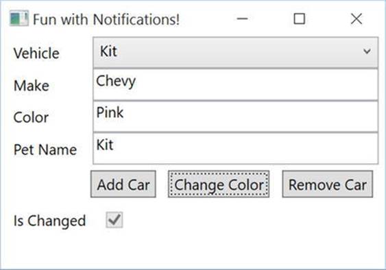
Figure 30-4. Showing the IsDirty flag
Updating the Source Through UI Interaction
You might notice that if you type text into the UI, the Is Changed check box doesn’t actually get checked until you tab out of the control being edited. This is due to the UpdateSourceTrigger property on the TextBox bindings. The UpdateSourceTrigger determines what event (such as changing the value, tabbing out, etc.) causes the UI to update the underlying data. There are four options, as shown in Table 30-3.
Table 30-3. UpdateSourceTrigger Values
|
Member |
Meaning in Life |
|
Default |
Set to the default for the control (e.g. LostFocus for TextBoxes). |
|
Explicit |
Updates source object only when the UpdateSource method is called. |
|
LostFocus |
Updates when the control loses focus. Default for TextBoxes. |
|
PropertyChanged |
Updates as soon as the property changes. Default for CheckBoxes. |
The default for TextBoxes is LostFocus. Change this to PropertyChanged by updating the binding for the Color TextBox to the following XAML:
<TextBox Grid.Column="1" Grid.Row="1"
Text="{Binding Path=Color, UpdateSourceTrigger=PropertyChanged}" />
Now, when you run the app and start typing into the Color text box, the Is Changed check box is immediately checked. You might ask why the default is set to LostFocus for TextBoxes. Any validation (covered in the next section) for a model fires every time thePropertyChanged event is raised. For a TextBox, this would then potentially cause errors continually flashing until the user entered in the correct values. For example, if the validation rules don’t allow less than five characters in a TextBox, the error would show on each keystroke until the user got five or more entered. In those cases, it’s best to wait for the user to tab out of the TextBox (after completing the change to the text) to fire the PropertyChanged event.
The Final Word
Using INotifyPropertyChanged and INotifyCollectionChanged improves your app’s user experience by keeping the data and the UI in sync. While neither interface is complicated, they do require updates to your code. Fortunately, Microsoft has included theObservableCollection class to handle all of the plumbing to create observable collections. Unfortunately, you have to provide all of the plumbing yourself for observable models. While it’s not a difficult task, it means you need to touch every setter in your model. This can be problematic if you are creating your models from an existing database, using an ORM (like Entity Framework), because your models will be overwritten when you regenerate your model classes. Fortunately, there is a solution to this via an open source library, which you will use later in this chapter.
Source Code The Notifications project can be found in the Chapter 30 subdirectory.
Validation
Now that you’ve implemented INotifyPropertyChanged and are using an ObservableCollection, it’s time to add validations to your application. Applications need to validate user input and provide feedback to the user when the data entered is incorrect. This section covers the most common validation mechanisms for modern WPF applications, but these are still just a portion of the capabilities built into WPF.
Note For a full explanation of all of the validations methods in WPF, please see Matthew McDonald’s Pro WPF in C# 4.5, available from Apress at www.apress.com/9781430243656.
Validation occurs when a data binding attempts to update the data source. In addition to built-in validations, such as exceptions in a properties setter, you can create custom validation rules. If any validation rule (built-in or custom) fails, the Validation class, discussed later, comes into play.
Updating the Sample for the Validation Examples
For the validation examples, you can continue working in the same project. Update the MainWindow.xaml to add an additional row to contain a Label and TextBox for the CarId property. The best way to do this is to open the designer for the window, and use the mouse to add another row. Make sure to select the bottom Grid in the Document Outline, and hover the mouse close to the left side of the it. Click the mouse as close to the top with the yellow line showing (Figure 30-5).
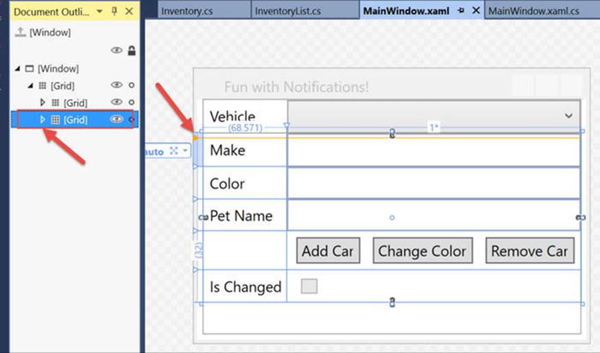
Figure 30-5. Adding a new Grid row with the designer
This will create a new row in the Grid and will increase the row number of each element in higher rows by one. You will have to clean up the markup and remove the margins and other values inserted by the designer, but this is the easiest way to add a new row early in the Grid. In the new row, add a Label with the content set to “Id” and a TextBox bound to the CarId property. The markup for the new controls is shown here:
<Label Grid.Column="0" Grid.Row="0" Content="Id"/>
<TextBox Grid.Column="1" Grid.Row="0" Text="{Binding Path=CarId}" />
When you run the app and select a record, the Id text box is automatically populated with the primary key value (as expected). The updated window should look like Figure 30-6.
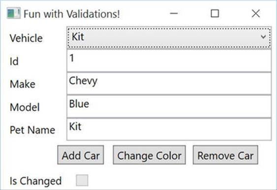
Figure 30-6. Updated to show CardId
Now that you have updated the core application, it’s time to explore validations in WPF.
The Validation Class
Before adding validations to your project, it’s important to understand the Validation class. This class is part of the validation framework, and it provides methods and attached properties that can be used to display validation results. There are three main properties of the Validationclass commonly used when handling validation errors (shown in Table 30-4). You will use each of these through the rest of this section of the chapter.
Table 30-4. Key Members of the Validation Class
|
Member |
Meaning in Life |
|
HasError |
Attached property indicating that a validation rule failed somewhere in the process |
|
Errors |
Collection of all active ValidationError objects |
|
ErrorTemplate |
Control template that becomes visible and adorns the bound element when HasError is set to true |
Validation Options
As mentioned, XAML technologies have several mechanisms for incorporating validation logic into your application. You will examine three of the most commonly used validation choices in the next sections.
Notify on Exceptions
While exceptions should not be used to enforce business logic, exceptions can and do happen, and they should be handled appropriately. In case they aren’t handled in code, the user should receive visual feedback of the problem. One change in WPF from WinForms is that binding exceptions are (by default) not displayed to the user, but instead “swallowed.” You, as the developer, must opt in to show errors.
To test this, run the app, select a record from the ComboBox, and clear out the Id value. Recall from the definition of the CarId property that you added earlier, that it is defined as an int (not a nullable int), so a numeric value is required. When you tab out of the Id field, an empty string is sent to the CarId property by the binding framework, and since an empty string can’t be converted to an int, an exception in thrown in the setter. However, there isn’t any indication to the user since you haven’t yet opted in to displaying exceptions.
Doing so is easy; all you need to do is add ValidatesOnExceptions = true to the binding statements. Update the binding statements in MainWindow.xaml to include ValidatesOnExceptions = true, as shown here:
<TextBox Grid.Column="1" Grid.Row="0"
Text="{Binding Path=CarId, ValidatesOnExceptions=True}" />
<TextBox Grid.Column="1" Grid.Row="1"
Text="{Binding Path=Make, ValidatesOnExceptions=True}" />
<TextBox Grid.Column="1" Grid.Row="2"
Text="{Binding Path=Color, ValidatesOnExceptions=True}" />
<TextBox Grid.Column="1" Grid.Row="3"
Text="{Binding Path=PetName, ValidatesOnExceptions=True}" />
Run the app again, select a vehicle, and once more clear out the Id text box. When you tab out from the Id text box, a red box surrounds it. Since you’ve updated the binding statements to validate on exceptions, the error is shown by a red box adorning the Id text box (shown in Figure 30-7).
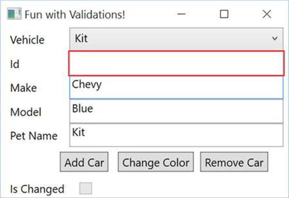
Figure 30-7. The default error template
The red box is the ErrorTemplate property of the Validation object and acts as an adorner for the bound control. While the default look and feel shows that there is indeed an error, there isn’t any indication as to what is wrong. The good news is that the ErrorTemplate is completely customizable, as you will see later in this chapter.
IDataErrorInfo
The IDataErrorInfo interface provides a mechanism for you to add validation to your model classes. Since you add the interface directly to your model classes and the validation code is placed inside your model classes (or in partial classes), this helps to reduce repeating validation code in your project. In WinForms, for example, validation was typically done in the UI itself, which meant every form that used the Inventory class (in this example) would have to add the same validation code. If the rules changed, each of these forms would have to be updated. The fact that the implementation can be in a separate file as a partial class prevents your code from being overwritten when reverse engineering your models from an existing database (as shown in Chapter 23).
The IDataErrorInfo interface, shown below, contains two properties, an indexer and a string property named Error. Note that the WPF binding engine doesn’t use the Error property.
public interface IDataErrorInfo
{
string this[string columnName] { get; }
string Error { get; }
}
You will be adding the Inventory partial class shortly, but first you need to update the Inventory.cs class and mark it as partial. Next, add another class to the Models directory named InventoryPartial.cs. Rename this class Inventory, make sure the class is marked aspartial, and add the IDataErrorInfo interface. Finally, implement the API for the interface. The initial code is listed here:
public partial class Inventory : IDataErrorInfo
{
public string this[string columnName]
{
get { return string.Empty; }
}
public string Error { get; }
}
The indexer gets called each time the PropertyChanged event is raised on the object. The property name from the event is used as the columnName parameter in the indexer. If the indexer returns string.Empty, the framework assumes that all validations passed, and no error condition exists. If the indexer returns anything but string.Empty, an error is presumed to exist on the property for that object instance, and each control that is bound to this property (and this specific instance of the class) is considered to have an error. One caveat is that the control will only enlist the Validation class if ValidatesOnDataErrors is set to true in the binding statement. If it isn’t (just like exceptions in the setter in the previous example), the validation error is swallowed, and the user is not notified. If ValidatesOnDataErrors is set to true, theHasError property of the Validation object is set to true, and the ErrorTemplate adorner is activated.
Next, you will add some simple validation logic to the indexer in InventoryPartial.cs. The validation rules are simple:
· If Make equals ModelT, set the error equal to “Too Old”.
· If Make equals Chevy and Color equals Pink, set the error equal to $”{Make}’s don’t come in {Color}”.
Start by adding a switch statement for each of the properties. To avoid using magic strings in the case statements, you will again use the nameof method. If the code falls through the switch statement, return string.Empty. The code is shown here:
public string this[string columnName]
{
get
{
switch (columnName)
{
case nameof(CarId):
break;
case nameof(Make):
break;
case nameof(Color):
break;
case nameof(PetName):
break;
}
return string.Empty;
}
}
Next, add in the validation rules. In the proper case statements, add a check of the property value based on the rules listed above. In the case statement for the Make property, first check to make sure the value isn’t ModelT. If it is, return the error. If that passes, the next line will call into a helper method that returns an error if the second rule is violated, or return string.Empty if it is not. In the case statement for the Color property, also call the helper method. The code is as follows:
public string this[string columnName]
{
get
{
switch (columnName)
{
case nameof(CarId):
break;
case nameof(Make):
if (Make == "ModelT")
{
return "Too Old";
}
return CheckMakeAndColor();
case nameof(Color):
return CheckMakeAndColor();
case nameof(PetName):
break;
}
return string.Empty;
}
}
internal string CheckMakeAndColor()
{
if (Make == "Chevy" && Color == "Pink")
{
return $"{Make}’s don’t come in {Color}";
//AddError(nameof(Color), $"{Make}’s don’t come in {Color}");
//hasError = true;
}
return string.Empty;
}
As the final step, update the Binding statements to include ValidatesOnDataErrors = true, as in the following code:
<TextBox Grid.Column="1" Grid.Row="0"
Text="{Binding Path=CarId, ValidatesOnExceptions=True, ValidatesOnDataErrors=True}" />
<TextBox Grid.Column="1" Grid.Row="1"
Text="{Binding Path=Make, ValidatesOnExceptions=True, ValidatesOnDataErrors=True}" />
<TextBox Grid.Column="1" Grid.Row="2"
Text="{Binding Path=Color, ValidatesOnExceptions=True, ValidatesOnDataErrors=True}" />
<TextBox Grid.Column="1" Grid.Row="3"
Text="{Binding Path=PetName, ValidatesOnExceptions=True, ValidatesOnDataErrors=True}" />
Run the app, select the Red Rider vehicle (the Ford), and change the Make to ModelT. Once you tab out of the field, the red error decorator appears. Now select Kit (which is a Chevy) from the drop-down, and click the Change Color button to change the color to Pink. Immediately the red error adorner appears on the Color field, but doesn’t appear on the Make text box. Now, change the Make to Ford, tab out of the text box, and note that the red adorner does not disappear!
This is because the indexer only runs when the PropertyChanged event is fired for a property. As discussed in the “Notifications” section, the PropertyChanged event fires when the source object’s property changes, and this happens either through code (such as clicking the Change Color button) or through user interaction (the timing of this is controlled through the UpdateSourceTrigger). When you changed the color, the Make property did not change, so the event did not fire for the Make property. Since the event didn’t fire, the indexer did not get called, so the validation for the Make property didn’t run.
There are two ways to fix this. The first is to change the PropertyChangedEventArgs to update every bound property by passing in string.Empty instead of a field name. As discussed, this causes the binding engine to update every property on that instance. Update theOnPropertyChanged method to this:
protected virtual void OnPropertyChanged([CallerMemberName] string propertyName = "")
{
if (propertyName != nameof(IsChanged))
{
IsChanged = true;
}
//PropertyChanged?.Invoke(this, new PropertyChangedEventArgs(propertyName));
PropertyChanged?.Invoke(this, new PropertyChangedEventArgs(string.Empty));
}
Now, when you run the same test, you see that both the Make and the Color text boxes are adorned with the error template when one of them is updated. So why not always raise the event in this manner? It’s largely a matter of performance. It’s possible that refreshing every property on an object could hamper performance. Of course, there’s no way to know without testing, and your mileage may (and probably will) vary.
The other solution is to raise the PropertyChanged event for the other dependent field(s) when one changes. The downside to using this mechanism is that you (or other developers that support your app) must know that in the InventoryPartial.cs class, the Make and Colorproperties are related through the validation code. To implement the change, add the following calls to the OnPropertyChanged method in the setters for Make and Color:
private string _make;
public string Make
{
get { return _make; }
set
{
if (value == _make) return;
_make = value;
OnPropertyChanged(nameof(Make);
OnPropertyChanged(nameof(Color));
}
}
private string _color;
public string Color
{
get { return _color; }
set
{
if (value == _color) return;
_color = value;
OnPropertyChanged(nameof(Color));
OnPropertyChanged(nameof(Make));
}
}
Run the app again, select a Chevy, and click the Change Color button. Now, both Make and Color get the error adorner. Change the make to something other than a Chevy, and when you tab out of the Make text box, the adorner is removed for both text boxes.
INotifyDataErrorInfo
The INotifyDataErrorInfo interface introduced in .NET 4.5, builds on the IDataErrorInfo interface, and adds additional capabilities for validation. Of course, with additional power comes additional work! In a drastic shift from prior validation techniques that you had to specifically opt into, the ValidatesOnNotifyDataErrors binding property defaults to true, so adding the property to your binding statements is optional.
The INotifyDataErrorInfo interface is extremely small, but does take a significant amount of plumbing code, as you will see shortly. The interface is shown here:
public interface INotifyDataErrorInfo
{
bool HasErrors { get; }
event EventHandler<DataErrorsChangedEventArgs> ErrorsChanged;
IEnumerable GetErrors(string propertyName);
}
The HasErrors property is used by the binding engine to determine if there are any errors on any of the instance’s properties that are binding sources. If the GetErrors method is called with a null or empty string for the propertyName parameter, it returns all errors that exist in the instance. If a propertyName is passed into the method, only the errors for that particular property are returned. The ErrorsChanged event (like the PropertyChanged and CollectionChanged events) notifies the binding engine to update the UI.
Implementing the Supporting Code
To implement this, it takes a fair amount of plumbing code. The good news is that all of this code can be pushed down into a base model class, and needs only be written once. Start by replacing IDataErrorInfo with INotifyDataErrorInfo to the InventoryPartial.cs class (you can leave the code from IDataErrorInfo in the class; it won’t get in the way).
After adding the interface members, add a private variable that will hold any errors. The current status of the code is shown here:
private readonly Dictionary<string,List<string>> _errors = new Dictionary<string, List<string>>();
public IEnumerable GetErrors(string propertyName)
{
throw new NotImplementedException();
}
public bool HasErrors
{
get
{
throw new NotImplementedException();
}
}
public event EventHandler<DataErrorsChangedEventArgs> ErrorsChanged;
The HasErrors property should return true if there are any errors in the dictionary. This is easily accomplished like this:
public bool HasErrors => _errors.Count != 0;
Next, create a helper method to raise the ErrorsChanged event (just like raising the PropertyChanged event) like this:
private void OnErrorsChanged(string propertyName)
{
ErrorsChanged?.Invoke(this, new DataErrorsChangedEventArgs(propertyName));
}
The GetErrors method should return any and all errors in the dictionary if the parameter is empty or null. If a valid propertyName is passed in, it will return any errors found for that property. If the parameter doesn’t match (or there aren’t any errors for a property), then the method will return null.
public IEnumerable GetErrors(string propertyName)
{
if (string.IsNullOrEmpty(propertyName))
{
return _errors.Values;
}
return _errors.ContainsKey(propertyName) ? _errors[propertyName] : null;
}
The final set of helpers will add one or more errors for a property or clear all of the errors for a property. Any time the dictionary changes, remember to call the OnErrorsChanged helper method:
protected void ClearErrors(string propertyName = "")
{
_errors.Remove(propertyName);
OnErrorsChanged(propertyName);
}
private void AddError(string propertyName, string error)
{
AddErrors(propertyName,new List<string> {error});
}
private void AddErrors(string propertyName, IList<string> errors)
{
var changed = false;
if (!_errors.ContainsKey(propertyName))
{
_errors.Add(propertyName, new List<string>());
changed = true;
}
errors.ToList().ForEach(x =>
{
if (_errors[propertyName].Contains(x)) return;
_errors[propertyName].Add(x);
changed = true;
});
if (changed)
{
OnErrorsChanged(propertyName);
}
}
The binding engine listens for the ErrorsChanged event, and will update the UI if there is a change in the errors collection for a binding statement. This removes the need to call PropertyChanged or CollectionChanged just to update the UI with error conditions, as you did when implementing IDataErrorInfo. This means that the extra calls to raise PropertyChanged in the Make and Color setters (to make sure the errors are displayed when the other property changes) are no longer needed. Of course, you still need to raise PropertyChanged andCollectionChanged for the UI to respond to data changes, just not error changes. Remove the additional calls to OnPropertyChanged in the setters for Make and Color, like this:
private string _make;
public string Make
{
get { return _make; }
set
{
if (value == _make) return;
_make = value;
OnPropertyChanged(nameof(Make);
}
}
private string _color;
public string Color
{
get { return _color; }
set
{
if (value == _color) return;
_color = value;
OnPropertyChanged(nameof(Color));
}
}
Using INotifyDataErrorInfo for Validations
Now that you have all of the support code in place, it’s time to add the validations back into your app using INotifyDataErrorInfo. Even though you have implemented the code to support INotifyDataErrorInfo, you still have to determine where and when to check for errors and add the errors to the errors list. One place to check for errors is in the property setters, like the following example, simplified to just check for the ModelT validation:
public string Make
{
get { return _make; }
set
{
if (value == _make) return;
_make = value;
if (Make == "ModelT")
{
AddError(nameof(Make), "Too Old");
}
else
{
ClearErrors(nameof(Make));
}
OnPropertyChanged(nameof(Make));
//OnPropertyChanged(nameof(Color));
}
}
One of the issues with this approach is that the class will be overwritten if you update your model from an existing database, causing you to lose all of you validation code. Even if you are using the code-first approach to generate and update your database, you have still muddled together model code with validation code, making your code harder to support.
You saw in the previous section that IDataErrorInfo can be added to a partial class, which means you don’t have to update your setters. This cleans up your model code, leaving only the call to raise PropertyChanged in the setters. Combining IDataErrorInfo andINotifyDataErrorInfo provides you with the additional features for validations from INotifyDataErrorInfo, and the separation from the setters provided by IDataErrorInfo.
Add the IDataErrorInfo interface back onto the Inventory class that is in InventoryPartial.cs.
public partial class Inventory : IDataErrorInfo, INotifyDataErrorInfo
The purpose of using IDataErrorInfo is not to run validations, but to make sure your validation code that leverages INOtifyDataErrorInfo gets called every time PropertyChanged is raised on your object. Since you aren’t using IDataErrorInfo for validation, always return string.Empty because the ErrorsChanged event is now responsible for notifying the binding engine when there are errors. Update the indexer and the CheckMakeAndColor helper method to the following code:
public string this[string columnName]
{
get
{
bool hasError = false;
switch (columnName)
{
case nameof(CarId):
break;
case nameof(Make):
hasError = CheckMakeAndColor();
if (Make == "ModelT")
{
AddError(nameof(Make),"Too Old");
hasError = true;
}
if (!hasError) ClearErrors(nameof(Make));
break;
case nameof(Color):
hasError = CheckMakeAndColor();
if (!hasError) ClearErrors(nameof(Color));
break;
case nameof(PetName):
break;
}
return string.Empty;
}
}
internal bool CheckMakeAndColor()
{
if (Make == "Chevy" && Color == "Pink")
{
//return $"{Make}’s don’t come in {Color}";
AddError(nameof(Make), $"{Make}’s don’t come in {Color}");
AddError(nameof(Color), $"{Make}’s don’t come in {Color}");
return true;
}
return false;
}
Run the app, select the Chevy, and change the color to Pink. In addition to the red adorners around the Make and Model text boxes, you will also see a red box adorner around the entire grid that holds the Inventory details fields (shown in Figure 30-8). This is another advantage of usingINotifyDataErrorInfo. As a reminder, the data context is set to the selected item in the ComboBox. This sets the data source for the Grid and all of its child controls. When PropertyChange is raised, the data context calls the GetErrors method to check if there are any errors on the object instance, and if so, activates the Validation class.
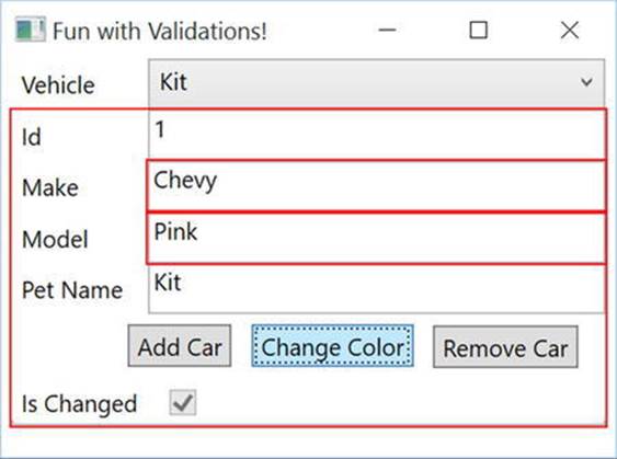
Figure 30-8. The updated error adorner
Showing All Errors
The Errors property on the Validation class returns all of the validation errors on a particular object. The property returns a list of ValidationError objects, and each ValidationError object has an ErrorContent property that contains the list of error messages for each property. Since the actual error messages you want to display are in this list within a list, you need to create a DataTemplate on a ListBox that holds a ListBox. It sounds a bit recursive, but it makes sense once you see it.
Start by adding another row to the Grid and increase the Height of the Window to 300. Add a ListBox in the last row, and bind the ItemsSource of the ListBox to the Grid, using Validation.Errors for the path, as follows:
<ListBox Grid.Row="6" Grid.Column="0" Grid.ColumnSpan="2"
ItemsSource="{Binding ElementName=testGrid, Path=(Validation.Errors)}">
</ListBox>
Add a DataTemplate, and in the DataTemplate, add a ListBox that is bound to the ErrorContent property. The data context for each ListBoxItem in this case is a ValidationError object, so you don’t need to set the data context, just the path. Set the binding path toErrorContent, like this:
<ListBox.ItemTemplate>
<DataTemplate>
<ListBox ItemsSource="{Binding Path=ErrorContent}"/>
</DataTemplate>
</ListBox.ItemTemplate>
The final markup is shown here:
<ListBox Grid.Row="6" Grid.Column="0" Grid.ColumnSpan="2"
ItemsSource="{Binding ElementName=testGrid, Path=(Validation.Errors)}">
<ListBox.ItemTemplate>
<DataTemplate>
<ListBox ItemsSource="{Binding Path=ErrorContent}"/>
</DataTemplate>
</ListBox.ItemTemplate>
</ListBox>
Run the app, select the Chevy, and set the color to Pink. You will see the errors displayed in Figure 30-9.
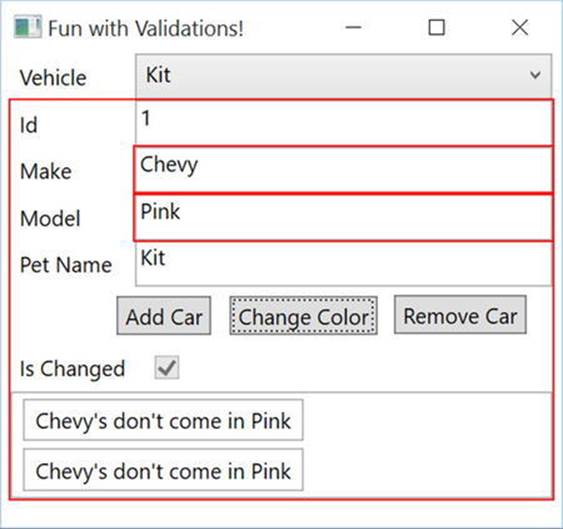
Figure 30-9. Showing the errors collection
Move the Support Code to a Base Class
As you probably noticed, there is a lot of code now in the InventoryPartial.cs class. Since this example only has one model class, this isn’t terrible. But, as you add models to a real application, you don’t want to have to add in all of that plumbing into each partial class for your models. The best thing to do is to push all of that supporting code down to a base class. You will do that now.
Add a new class file to the Models folder named EntityBase.cs. Add usings for System.Collections and System.ComponentModel. Make the class public, and add the INotifyDataErrorInfor interface, like this:
using System;
using System.Collections;
using System.Collections.Generic;
using System.ComponentModel;
using System.Linq;
namespace Validations.Models
{
public class EntityBase : INotifyDataErrorInfo
}
Move all of the code from InventoryPartial.cs that relates to INofityDataErrorInfo into the new class. Any private methods need to be made protected. The updated code is shown here:
public class EntityBase : INotifyDataErrorInfo
{
//INotifyDataErrorInfo
protected readonly Dictionary<string, List<string>> _errors = new Dictionary<string, List<string>>();
protected void ClearErrors(string propertyName = "")
{
_errors.Remove(propertyName);
OnErrorsChanged(propertyName);
}
protected void AddError(string propertyName, string error)
{
AddErrors(propertyName, new List<string> { error });
}
protected void AddErrors(string propertyName, IList<string> errors)
{
var changed = false;
if (!_errors.ContainsKey(propertyName))
{
_errors.Add(propertyName, new List<string>());
changed = true;
}
errors.ToList().ForEach(x =>
{
if (_errors[propertyName].Contains(x)) return;
_errors[propertyName].Add(x);
changed = true;
});
if (changed)
{
OnErrorsChanged(propertyName);
}
}
public IEnumerable GetErrors(string propertyName)
{
if (string.IsNullOrEmpty(propertyName))
{
return _errors.Values;
}
return _errors.ContainsKey(propertyName) ? _errors[propertyName] : null;
}
public bool HasErrors => _errors.Count != 0;
public event EventHandler<DataErrorsChangedEventArgs> ErrorsChanged;
protected void OnErrorsChanged(string propertyName)
{
ErrorsChanged?.Invoke(this, new DataErrorsChangedEventArgs(propertyName));
}
}
Next, remove the INotifyDataErrorInfo interface from the InventoryPartial.cs class, and add EntityBase as a base class, as follows:
public partial class Inventory : EntityBase, IDataErrorInfo
{
//removed for brevity
}
Now, any additional model classes you create will inherit all of the INotifyDataErrorInfo plumbing code. There is more that you can push down into the base class, most notably the INotifyPropertyChanged code, but you will do that later in this chapter.
Using Data Annotations
As you learned in Chapter 23, EF makes heavy use of Data Annotations. WPF can leverage these as well for UI validation. Let’s add some Data Annotations to the Inventory model.
Adding Data Annotations
Add a project reference to System.ComponentModel.DataAnnotations, and then open up Inventory.cs and add a using for System.ComponentModel.DataAnnotations. Add the [Required] attribute to the CarId, Make, and Color properties, and[StringLength(50)] to Make, Color, and PetName. The Required attribute adds a validation rule that the property must not be null (admittedly, this is redundant for the CarId property since it is not a nullable int). The StringLength attribute adds a validation rule that the property cannot be longer than 30 characters. An abbreviated view of the code is shown here:
[Required]
public int CarId
[Required, StringLength(50)]
public string Make
[Required, StringLength(50)]
public string Color
[StringLength(50)]
public string PetName
Checking for Data Annotation-Based Validation Errors
Now that the additional validation rules have been added, they need to be added into the validation process. Unlike ASP.NET MVC and ASP.NET Web Forms (both of which can automatically check the model for validation errors based on Data Annotations), in WPF you have to programmatically check for Data Annotation-based validation errors.
Before you add the code to check for validation errors, there are a couple of objects that need to be discussed. The first is the ValidationContext. This provides a context for checking a class for validation errors using the Validator class. The Validator class allows you to check an object for attribute-based errors within a ValidationContext.
Open EntityBase.cs, and add a using for System.ComponentModel.DataAnnotations. Next, create a new method named GetErrorsFromAnnotations. This method is generic, takes a string property name, and a value of type T as the parameters, and returns a string array. Make sure the method is marked as protected. The signature is listed here:
protected string[] GetErrorsFromAnnotations<T>(string propertyName, T value)
In the method, create a List<ValidationResult> variable that will hold the results of validation checks. Next, create a ValidationContext scoped to the property name passed into the method. When you have those two items in place, callValidate.TryValidateProperty, which returns a bool. If everything passes (in regards to Data Annotations validations), it returns true. If not, it returns false, and populates the List<ValidationResult> with the errors. The complete code is shown here:
protected string[] GetErrorsFromAnnotations<T>(string propertyName, T value)
{
var results = new List<ValidationResult>();
var vc = new ValidationContext(this, null, null) { MemberName = propertyName };
var isValid = Validator.TryValidateProperty(value, vc, results);
return (isValid)?null:Array.ConvertAll(results.ToArray(), o => o.ErrorMessage);
}
Now you can update the indexer method to check for any errors based on Data Annotations. If any errors are found, add them to the errors collection supporting INotifyDataErrorInfo. The updated indexer code is shown here:
public string this[string columnName]
{
get
{
string[] errors = null;
bool hasError = false;
switch (columnName)
{
case nameof(CarId):
errors = GetErrorsFromAnnotations(nameof(CarId), CarId);
break;
case nameof(Make):
hasError = CheckMakeAndColor();
if (Make == "ModelT")
{
AddError(nameof(Make), "Too Old");
hasError = true;
}
errors = GetErrorsFromAnnotations(nameof(Make), Make);
break;
case nameof(Color):
hasError = CheckMakeAndColor();
errors = GetErrorsFromAnnotations(nameof(Color), Color);
break;
case nameof(PetName):
errors = GetErrorsFromAnnotations(nameof(PetName), PetName);
break;
}
if (errors != null && errors.Length != 0)
{
AddErrors(columnName, errors);
hasError = true;
}
if (!hasError) ClearErrors(columnName);
return string.Empty;
}
}
Run the app, select one of the vehicles, and add text for the model that is longer than 50 characters. When you tab out, the StringLength Data Annotation reports a validation error via the GetErrorsFromAnnotations method. These errors are reported byINotifyDataErrorInfo, and cause the error template adorner to appear, as well as the ListBox to show the message (shown in Figure 30-10).
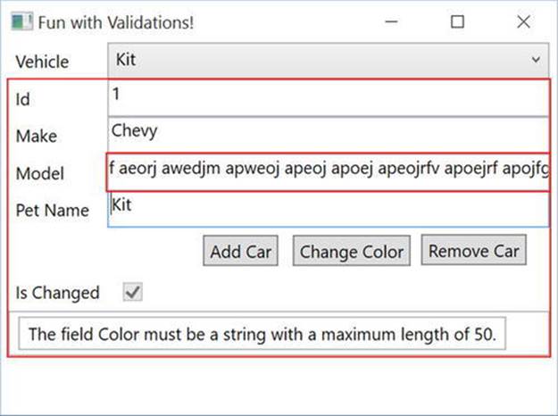
Figure 30-10. Validating the required Data Annotation
Customizing the ErrorTemplate
The final topic is to update the ErrorTemplate in order for the controls to display more meaningful information regarding errors with the data. As you learned in Chapter 29, controls are customizable through their control templates. As you learned earlier in this chapter, theValidation class has an ErrorTemplate that is used to adorn a control that has a binding error.
Start by adding a new style in the Windows Resources section of MainWindow.xaml with a target type of TextBox, as follows:
<Window.Resources>
<Style TargetType="{x:Type TextBox}">
</Style>
</Window.Resources>
Next, add a trigger on the style that sets properties when Validation.HasError is set to true. The properties and the values to set are Background (Pink), Foreground (Black), and Tooltip to the ErrorContent. The Background and Foreground setters are nothing new, but the ToolTip needs some explanation. The binding points back to the TextBox that this style is executed on as the data source. The path is the first ErrorContent value of the Validation.Errors collection. The markup is as follows:
<Style TargetType="{x:Type TextBox}">
<Style.Triggers>
<Trigger Property="Validation.HasError" Value="true">
<Setter Property="Background" Value="Pink" />
<Setter Property="Foreground" Value="Black" />
<Setter Property="ToolTip"
Value="{Binding RelativeSource={RelativeSource Self},
Path=(Validation.Errors)[0].ErrorContent}"/>
</Trigger>
</Style.Triggers>
</Style>
Next, you will update the ErrorTemplate of the Validation class to show a red exclamation mark, and set the ToolTips for the exclamation mark. Place a setter immediately after the Style.Triggers closing tag within the style you just created. You will be creating a control template that consists of a TextBlock (to show the exclamation mark) and a BorderBrush to surround the TextBox that contains the error(s). There is a special tag in XAML for the control that is being adorned with the ErrorTemplate named AdornedElementPlaceholder. By adding a name to this control, you can access the errors that are associated with the control. In this example, you want to access the Validation.Errors property so you can get the ErrorContent (just like you did in the Style.Trigger). Here is the full markup for the setter:
<Setter Property="Validation.ErrorTemplate">
<Setter.Value>
<ControlTemplate>
<DockPanel LastChildFill="True">
<TextBlock Foreground="Red" FontSize="20" Text="!"
ToolTip="{Binding ElementName=controlWithError,
Path=AdornedElement.(Validation.Errors)[0].ErrorContent}"/>
<Border BorderBrush="Red" BorderThickness="1">
<AdornedElementPlaceholder Name="controlWithError" />
</Border>
</DockPanel>
</ControlTemplate>
</Setter.Value>
</Setter>
Run the app, and create an error condition. The result will be similar to Figure 30-11.
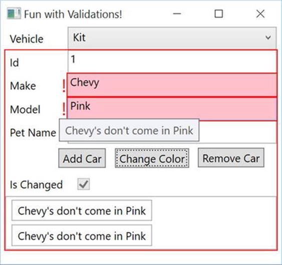
Figure 30-11. Showing a custom ErrorTemplate
Source Code The Validations project can be found in the Chapter 30 subdirectory.
Creating Custom Commands
As you learned in Chapter 27, commands are an integral part of WPF. Commands can be hooked up to WPF controls (such as Buttons and MenuItems) to handle user events, such as the click. Instead of creating an event handler directly, the Execute method of the command is executed when the event fires. The CanExecute method is used to enable or disable the control based on your custom code. In addition to the built-in commands you used in Chapter 27, you can create your own custom commands by implementing the ICommand interface. By using commands instead of event handlers, you gain the benefit of encapsulating application code, as well as automatically enabling and disabling controls based on business logic.
Implementing the ICommand Interface
As a quick review from Chapter 27, the ICommand interface is listed here:
public interface ICommand
{
event EventHandler CanExecuteChanged;
bool CanExecute(object parameter);
void Execute(object parameter);
}
Now you will create a command that changes the color of an Inventory object. Start by right-clicking the project name in Solution Explorer and creating a new folder named Cmds. Add a new class named ChangeColorCommand.cs. Add the ICommand interface to the class, implement the members, and add a using for Validations.Models. Your code should look like this:
public class ChangeColorCommand : ICommand
{
public bool CanExecute(object parameter)
{
throw new NotImplementedException();
}
public void Execute(object parameter)
{
throw new NotImplementedException();
}
public event EventHandler CanExecuteChanged;
}
The parameter passed into the CanExecute and Execute methods is sent from the UI through the CommandParameter property set on binding statements. You will make this change later in this section. For now, you just need to know that, in this example, the object is expected to be of type Inventory. If the object is null or not an Inventory object, then the CanExecute method must return false, and any controls bound to the command are disabled. If it is not null, and is an Inventory object, then the method must return true, and any controls bound to the command are enabled. Update the CanExecute method to the following:
public override bool CanExecute(object parameter) => (parameter as Inventory) != null;
The parameter for the Execute method works exactly the same as the parameter for the CanExecute method. The Execute method only fires if the user clicks a control bound to the command, and the user can only click the control if the CanExecute method returns true. The type is of type object, so you still have to cast the parameter to an Inventory object. After casting the parameter, change the color of the car to Pink. Update the Execute method to the following:
public override void Execute(object parameter)
{
((Inventory)parameter).Color="Pink";
}
Updating MainWindow.xaml.cs
The next change is to create an instance of this class that the Button can access. For now, you will place this in the code-behind file for the MainWindow (later in this chapter you will move this into a ViewModel). Open MainWindow.xaml.cs and delete the click event handler for the Change Color button, since you will replace this functionality with your command implementation.
Next, add a public property named ChangeColorCmd of type ICommand with a backing field. In the expression body for the property, return the backing property (make sure to instantiate a new instance of the ChangeColorCommand if the backing field is null).
private ICommand _changeColorCommand = null;
public ICommand ChangeColorCmd => _changeColorCommand ?? (_changeColorCommand = new ChangeColorCommand());
Updating MainWindow.xaml
As you saw in Chapter 27, clickable controls in WPF (like Buttons) have a Command property that allows you to assign a command object to the control. Once the command object is connected to a control, the CanExecute method determines if the control is enabled, and the click event is attached to the Execute method.
Start by connecting your command instantiated in the code-behind to the btnChangeColor button. Since the property for the command is on the MainWindow class, you use the RelativeSourceMode binding syntax to get to the Window that contains the Button, as follows:
Command="{Binding Path=ChangeColorCmd,
RelativeSource={RelativeSource Mode=FindAncestor, AncestorType={x:Type Window}}}"
The Button still needs to send in an Inventory object as the parameter for the CanExecute and Execute methods. There is another property on the clickable controls named CommandParameter. You set this to the SelectedItem of the cboCars ComboBox, as follows:
CommandParameter="{Binding ElementName=cboCars, Path=SelectedItem}"
The complete markup for the button is shown here:
<Button x:Name="btnhangeColor" Content="Change Color" Margin="5,0,5,0" Padding="4,2"
Command="{Binding Path=ChangeColorCmd,
RelativeSource={RelativeSource Mode=FindAncestor, AncestorType={x:Type Window}}}"
CommandParameter="{Binding ElementName=cboCars, Path=SelectedItem}"/>
Attaching Command to the CommandManager
If you were to run the app now, you would see that the Change Color button is not enabled when the Window first loads. This is what we expected because the SelectedItem for the combo box is null. Since this is the value that gets passed into the CanExectue and Execute methods, the control is disabled. If you select a record from the combo box, you would expect the button to become enabled since the SelectedItem property is no longer null. However, you see that the button is still disabled.
This is because the CanExecute method fires when the Window first loads and then when the command manager instructs it to fire. Each command class has to opt in to the command manager. This is done with the CanExecuteChanged event, and is as simple as adding the following code to your ChangeColorCommand.cs class:
public event EventHandler CanExecuteChanged
{
add { CommandManager.RequerySuggested += value; }
remove { CommandManager.RequerySuggested -= value; }
}
Creating the CommandBase Class
This code needs to be in every custom command that you build, so it’s best to create an abstract base class to hold it. Create a new class in the Cmds folder named CommandBase, set the class to abstract, add the ICommand interface, and implement the interface. Add a using for theSystem.Windows.Input namespace, and change the Execute and CanExecute methods to abstract. Finally, add in the CanExecuteChanged you just wrote. The full implementation is listed here:
public abstract class CommandBase : ICommand
{
public abstract void Execute(object parameter);
public abstract bool CanExecute(object parameter);
public event EventHandler CanExecuteChanged
{
add { CommandManager.RequerySuggested += value; }
remove { CommandManager.RequerySuggested -= value; }
}
}
Updating the ChangeColorCommand Class
Open ChangeColorCommand.cs, and add CommandBase as the base class. Delete the CanExecuteChanged code, and add override to the CanExecute and Execute methods, like this:
internal class ChangeColorCommand : CommandBase
{
public override void Execute(object parameter)
{
((Inventory)parameter).Color="Pink";
}
public override bool CanExecute(object parameter) =>
(parameter as Inventory) != null;
}
Testing the Application
Run the application. You will see that the Change Color command is not enabled, as shown in Figure 30-12, since there isn’t a vehicle selected.
Figure 30-12. A window with nothing selected
Now, select a vehicle, and the button will become enabled, as shown in Figure 30-13.
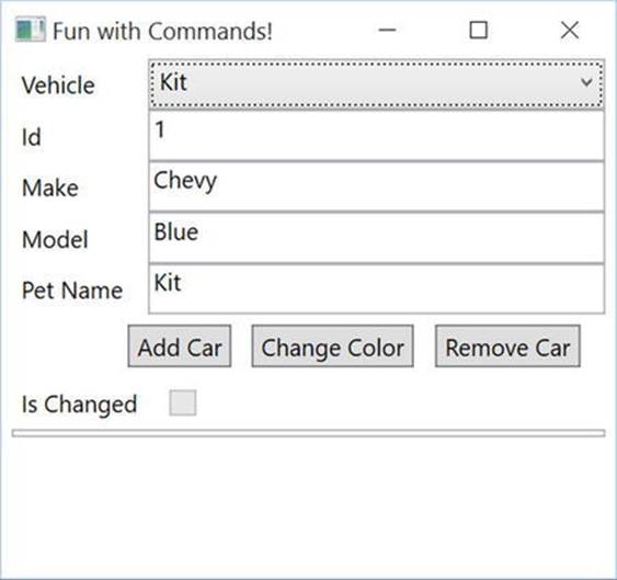
Figure 30-13. A window with a vehicle selected
Adding the Remaining Commands
Now that you understand commands, you are going to replace the remaining two button click events with commands.
Adding the RemoveCarCommand
Just like the ChangeColorCommand, the RemoveCarCommand has a C# component as well as a XAML component. Start by removing the btnRemoveCar_Click event handler in the MainWindow.xaml.cs class.
Adding the Command Class
Next, add another class to the Cmds folder named RemoveCarCommand, make the class internal, and derive from CommandBase. This command will be acting on the list of Inventory records in the View, so create a field for an IList<Inventory> named _cars and a constructor to accept an existing list. The code should look like this:
internal class RemoveCarCommand : CommandBase
{
private readonly IList<Inventory> _cars;
public RemoveCarCommand(IList<Inventory> cars)
{
_cars = cars;
}
}
Just like the Execute method of the ChangeColorCommand, this method receives an Inventory record as the parameter. Override the Execute method, cast the parameter to an Inventory object, and then remove it from the list, as follows:
public override void Execute(object parameter)
{
_cars.Remove((Inventory)parameter);
}
Finally, override the CanExecute method, and add the same code as you did for the ChangeColorCommand: to return false if the parameters is null or not an inventory object, and return true otherwise. The code looks like this:
public override bool CanExecute(object parameter) =>
(parameter as Inventory) != null && _cars != null && _cars.Count != 0;
}
Updating the XAML
Remove the Click attribute from the btnRemoveCar Button, and add the Command and CommandParameter properties, as follows:
<Button x:Name="btnRemoveCar" Content="Remove Car" Margin="5,0,5,0" Padding="4,2"
Command="{Binding Path=RemoveCarCmd,
RelativeSource={RelativeSource Mode=FindAncestor, AncestorType={x:Type Window}}}"
CommandParameter="{Binding ElementName=cboCars, Path=SelectedItem}"/>
Adding the AddCarCommand
Remove the AddCar_Click event handler in the MainWindow.xaml.cs file.
Adding the Command Class
Start by adding another class to the Cmds folder named AddCarCommand, make the class internal, and derive from CommandBase. This command will also be acting on the list of Inventory records in the View, so create a field for an IList<Inventory> named _cars, and a constructor to accept an existing list. The code should look like this:
internal class AddCarCommand : CommandBase
{
private readonly IList<Inventory> _cars;
public RemoveCarCommand(IList<Inventory> cars)
{
_cars = cars;
}
}
Unlike the other commands that you have created, you will not be receiving any values from the View. This means that you can ignore the parameter in both the CanExecute and Execute methods. In the Execute method, add another entry into the _cars list.
public override void Execute(object parameter)
{
var maxCount = _cars?.Max(x => x.CarId) ?? 0;
_cars?.Add(new Inventory { CarId = ++maxCount, Color = "Yellow", Make = "VW", PetName = "Birdie",
IsChanged = false });
}
Override the CanExecute method and just return true, like this:
public override bool CanExecute(object parameter) => true;
Updating the XAML
Finally, update the XAML to remove the Click attribute and add the Command attribute, as follows:
<Button x:Name="btnAddCar" Content="Add Car" Margin="5,0,5,0" Padding="4,2"
Command="{Binding Path=AddCarCmd,
RelativeSource={RelativeSource Mode=FindAncestor, AncestorType={x:Type Window}}}"/>
Source Code The Commands project can be found in the Chapter 30 subdirectory.
Fully Implementing MVVM
The final exercise with this sample is to finish converting it to MVVM. You might ask why I chose to say “finish” converting. The reason is that everything you have done in this chapter is all related to how MVVM works in WPF, and it is all intertwined in the pattern. Start by adding a new folder called ViewModels. In this folder, add a class named MainWindowViewModel.
Note A popular convention is to name the view models after the window they support. However, like any pattern or convention, this isn’t a rule, and you will find a wide range of opinions on this.
Moving the Data Source Out of the View
If you recall from the explanation of the MVVM pattern, the only code in the code-behind should be directly related to the UI. Any data needed by the View should be exposed to the View from the ViewModel (and optimally brought to the ViewModel from a repository). In your current project, the data is hard-coded in the code-behind, so the first step is to move the Cars collection from the code-behind to the View Model.
Start by adding a public property of type IList<Inventory> named Cars. In the constructor for the ViewModel, set the Cars property to a new ObservableCollection<Inventory>.
Note In a real application, this would usually be a call to a repository class or a web service to get the data.
Your class should look like this:
public class MainWindowViewModel
{
public IList<Inventory> Cars { get; set; }
public MainWindowViewModel()
{
Cars = new ObservableCollection<Inventory>
{
new Inventory {CarId=1,Color="Blue",Make="Chevy",PetName="Kit", IsChanged = false},
new Inventory {CarId=2,Color="Red",Make="Ford",PetName="Red Rider", IsChanged = false },
};
}
}
In MainWindow.xaml.cs, delete the old creation of the list (in the constructor), and the line setting the ItemSource for the ComboBox to the list. Leave the backing field (_cars) for now; you don’t need it, but two of the commands require it, and deleting it now would make the compile fail. The only code left in your constructor should be InitializeComponent, like this:
public MainWindow()
{
InitializeComponent();
}
Recall that if a binding expression doesn’t specify a data context, it walks up the element tree until it finds a data context. In MVVM, the ViewModel class serves as the data context for the entire Window, so set the Window’s data context to the ViewModel in the constructor. Add ausing for MVVM.ViewModels, like this:
using MVVM.ViewModels;
public partial class MainWindow:Window
{
public MainWindow()
{
InitializeComponent();
this.DataContext = new MainWindowViewModel();
}
}
The final change to make to the Window is to add the ItemSource back to the ComboBox. Open MainWindow.xaml, add the ItemsSource attribute to the ComboBox, and bind it to the Cars property on the ViewModel. You don’t have to specify the data source since the ViewModel is the data context for the Window. Your markup should look like this:
<ComboBox Name="cboCars" Grid.Column="1" DisplayMemberPath="PetName"
ItemsSource="{Binding Path=Cars}"/>
Run the app, and see that indeed the combo box is populated with the initial Cars collection. After you test the app, delete the _cars field from MainWindow.xaml.cs. Next, you will move the commands and related code to the ViewModel.
Moving the Commands to the ViewModel
Cut and paste the commands from MainWindow.xaml.cs into MainWindowViewModel.cs. You will have to update the constructor for AddCarCommand and RemoveCarCommand to use the Cars property instead of the _cars field. Add a using statement for MVVM.Cmds. Your code in the MainWindowViewModel will look like this:
private ICommand _changeColorCommand = null;
public ICommand ChangeColorCmd =>
_changeColorCommand ?? (_changeColorCommand = new ChangeColorCommand());
private ICommand _addCarCommand = null;
public ICommand AddCarCmd =>
_addCarCommand ?? (_addCarCommand = new AddCarCommand(Cars));
private ICommand _removeCarCommand = null;
public ICommand RemoveCarCmd =>
_removeCarCommand ?? (_removeCarCommand = new RemoveCarCommand(Cars));
private bool CanAddCar() => Cars != null;
Finally, open MainWindow.xaml, and add DataContext to the Path for each of the Button Command binding statements.
<Button x:Name="cmdAddCar" Content="Add Car" Margin="5,0,5,0" Padding="4,2"
Command="{Binding Path=DataContext.AddCarCmd,
RelativeSource={RelativeSource Mode=FindAncestor, AncestorType={x:Type Window}}}"/>
<Button x:Name="cmdChangeColor" Content="Change Color" Margin="5,0,5,0" Padding="4,2"
Command="{Binding Path=DataContext.ChangeColorCmd,
RelativeSource={RelativeSource Mode=FindAncestor, AncestorType={x:Type Window}}}"
CommandParameter="{Binding ElementName=cboCars, Path=SelectedItem}"/>
<Button x:Name="btnRemoveCar" Content="Remove Car" Margin="5,0,5,0" Padding="4,2"
Command="{Binding Path=DataContext.RemoveCarCmd,
RelativeSource={RelativeSource Mode=FindAncestor, AncestorType={x:Type Window}}}"
CommandParameter="{Binding ElementName=cboCars, Path=SelectedItem}"/>
Run the app, and you will see that the buttons work as expected. The code-behind file now only has two lines in it, for the InitializeComponent and to set the DataContext.
Source Code The MVVM project can be found in the Chapter 30 subdirectory.
Updating AutoLotDAL for MVVM
You are probably thinking at this point “Great, if I ever need to build an app with one model and fake data, I know exactly how to do it!” Well, it’s time to bring real data back into the mix. There are a few optimizations to make before you plug AutoLotDAL into an MVVM app.
Updating the AutoLotDAL Models
The first thing that you need to do is update all of the models with the validation code that you created to support IDataErrorInfo and INotifyDataErrorInfo. Since much of this code is already in a base class, there are only a few changes to make.
Updating the Base Class
You already created a base class in the previous examples. You will add that base class to AutoLotDAL, and you will make some changes to it. However, first make a copy of the final AutoLotDAL project from Chapter 23 (or from the MVVMFinal project in the Chapter 30 downloads) to your WPF examples. Right-click the Models folder in Solution Explorer, select Add Existing item, and pick the EntityBase file from the previous section’s example. Make sure to change the namespace to AutoLotDAL.Models, and add usings forSystem.ComponentModel.DataAnnotations and System.ComponentModel.DataAnnotations.Schema. Next, add the TimeStamp property, like this:
[Timestamp]
public byte[] Timestamp { get; set; }
Next, add the IsChanged property, like this (remember to add the NotMapped attribute since this property won’t get stored in the database):
[NotMapped]
public bool IsChanged { get; set; }
The final change for the EntityBase.cs class is to add the IDataErrorInfo interface to the class and implement the interface. Make sure to mark the indexer method as virtual, since the actual implementation will be in the Model classes:
public virtual string this[string columnName] { get { throw new NotImplementedException(); } }
public string Error { get; }
Next, open each of the model classes (Inventory, Customer, Order, and CreditRisk), delete the TimeStamp field, and add the EntityBase as the base class for all of them. In a real application, you usually create partial classes for each model class and add theEntityBase base class there. For the sake of simplicity, in this example, you are just adding them to the model classes instead of creating partial classes.
Updating the Inventory Partial
Copy the string indexer from the InventoryPartial.cs class from the Commands example into the InventoryPartial.cs class of AutoLotDAL. It should look like this:
public string this[string columnName]
{
get
{
string[] errors = null;
bool hasError = false;
switch (columnName)
{
case nameof(CarId):
errors = GetErrorsFromAnnotations(nameof(CarId), CarId);
break;
case nameof(Make):
hasError = CheckMakeAndColor();
if (Make == "ModelT")
{
AddError(nameof(Make), "Too Old");
hasError = true;
}
errors = GetErrorsFromAnnotations(nameof(Make), Make);
break;
case nameof(Color):
hasError = CheckMakeAndColor();
errors = GetErrorsFromAnnotations(nameof(Color), Color);
break;
case nameof(PetName):
errors = GetErrorsFromAnnotations(nameof(PetName), PetName);
break;
}
if (errors != null && errors.Length != 0)
{
AddErrors(columnName, errors);
hasError = true;
}
if (!hasError) ClearErrors(columnName);
return string.Empty;
}
}
This has (for the most part) brought the features you’ve learned about in this chapter into AutoLotDAL. The one item that is missing is INotifyPropertyChanged, which you will add next.
Implementing INotifyPropertyChanged
You might have noticed that you didn’t add INotifyPropertyChanged to the EntityBase class or any of your model classes. If you add INotifyPropertyChanged to the models, you have to update each and every setter to raise the PropertyChangedEvent (or call into the OnPropertyChanged event). This is not a huge task for a project as small as this, but it becomes a major pain in projects of any significant size. You also run the risk of losing all of your work if your model classes are generated from an ORM and they need to be regenerated.
Fortunately, some very smart minds have solved this predicament. There is an open source project called PropertyChanged.Fody that addresses this very concern. This project is an extension for Fody (https://github.com/Fody/Fody/), an open source tool for weaving .NET assemblies. Weaving is the process of manipulating the IL generated during the build process. PropertyChanged.Fody adds in all of the plumbing code for INotifyPropertyChanged for you, and if you have a property named IsChanged, it will be updated when another property changes, just as you did manually in the earlier example in this chapter.
Note You can find more information about the PropertyChanged project at https://github.com/Fody/PropertyChanged.
To install the necessary packages, right-click your project name, select Manage NuGet packages, and search for “propertychanged.fody”. You will see something similar to Figure 30-14 (the version might be different based on when you are reading this).
Figure 30-14. Installing PropertyChanged.Fody
Once that is done, open up ModelBase, and add the attribute [ImplementPropertyChanged] at the class level. That’s all you have to do!
Full MVVM Example
Now that you have updated AutoLotDAL, you will integrate real data into the last example. Copy the project from the Fully Implementing MVVM section to a new location. Open the project, and add AutoLotDAL by right-clicking the project name in the Solution Explorer and selecting Add Existing Project.
Add a reference to the AutoLotDAL from your WPF project. Add EntityFramework to the WPF project by right-clicking the solution and selecting Manage NuGet Packages for Solution. Select EntityFramework (by filtering on Installed if necessary), and select the WPF project for install. Update the app.config to add the ConnectionStrings node and the ConnectString for your database. Your exact string might vary, but it should look something like this:
<connectionStrings>
<add name="AutoLotConnection" connectionString="data source=.\SQLEXPRESS2014;initial catalog=AutoLot;integrated security=True;MultipleActiveResultSets=True;App=EntityFramework" providerName="System.Data.SqlClient" />
</connectionStrings>
Open the MainWindowViewModel.cs file, and add usings for AutoLotDAL.Models and AutoLotDAL.Repos. Update the constructor to get all of the Inventory records from the InventoryRepo class, instead of manually creating the list. The new constructor should look like this:
public MainWindowViewModel()
{
Cars = new ObservableCollection<Inventory>(new InventoryRepo().GetAll());
}
Open all of the command classes, update the namespaces to use AutoLotDAL.Models, and remove the MVVM.Models namespace (or whatever the namespace is in your example). Finally, delete all of the classes in the Models directory of the WPF project.
Run the app, and you will see all of the records in the drop-down, as shown in Figure 30-15.
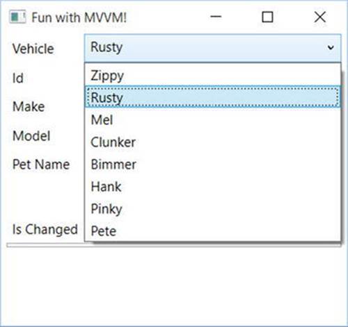
Figure 30-15. Pulling data from the database
One problem you might notice is that every vehicle has the IsChanged check box checked. This is because EF materializes each record by setting the properties, which of course triggers the PropertyChanged code and sets the IsChanged flag. In the next section, you will learn how to handle this gracefully in EF.
Using ObjectMaterialized with Entity Framework
If you recall from Chapter 23, the ObjectMaterialized event fires every time EF is done reconstituting an object from the database. Open up AutoLotEntities.cs, and in the OnObjectMaterialized event handler, check to see if the Entity property of theObjectMaterializedEventArgs is of type EntityBase. If it is, then set the IsChanged property to false. The code will look like this:
private void OnObjectMaterialized(object sender, ObjectMaterializedEventArgs e)
{
var model = (e.Entity as EntityBase);
if (model != null)
{
model.IsChanged = false;
}
}
Run the app. Select a record from the drop-down, and you will see that the IsChanged flag is no longer set when the form first loads. If you edit a field, the IsChanged flag still gets set correctly.
Summary
This chapter examined the WPF topics that support the Model-View-ViewModel (MVVM) pattern. You started off learning how to tie model classes and collections into the notification system in the binding manager. You implemented INotifyPropertyChanged, and usedObservableCollections to keep the UI in sync with the bound data. Later in the chapter, you learned how to use PropertyChanged.Fody to do this work automatically.
Next, you added validation code to the Model using IDataErrorInfo, INotifyDataErrorInfo, and checked for Data Annotation errors. You then displayed any validation errors in the UI so the user would know what the problem is and how to fix it.
Finally, you put it all together by adding a ViewModel, and you cleaned up the UI markup and code-behind file to increase separation of concerns. You updated AutoLotDAL to add validation and notifications, and used ObjectMaterialized to clean up the objects as they materialize.
All materials on the site are licensed Creative Commons Attribution-Sharealike 3.0 Unported CC BY-SA 3.0 & GNU Free Documentation License (GFDL)
If you are the copyright holder of any material contained on our site and intend to remove it, please contact our site administrator for approval.
© 2016-2026 All site design rights belong to S.Y.A.