C# 24-Hour Trainer (2015)
Section I
The Visual Studio IDE and Controls
Lesson 3
Making Controls Arrange Themselves
Lesson 2 explained how to add controls to a form and arrange them nicely. Using those techniques, you can create forms like the one shown in Figure 3.1. (Although we haven't covered the code behind that program's form yet.)
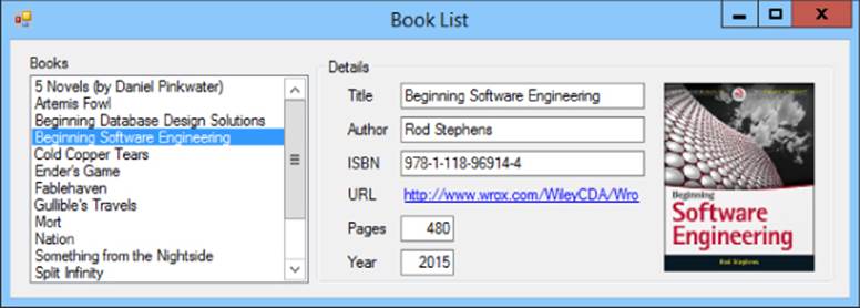
Figure 3.1
That form looks okay in Figure 3.1, but what if the user enlarges the form as shown in Figure 3.2? Pretty lame, huh? Although the form is bigger, the areas that contain data are not.
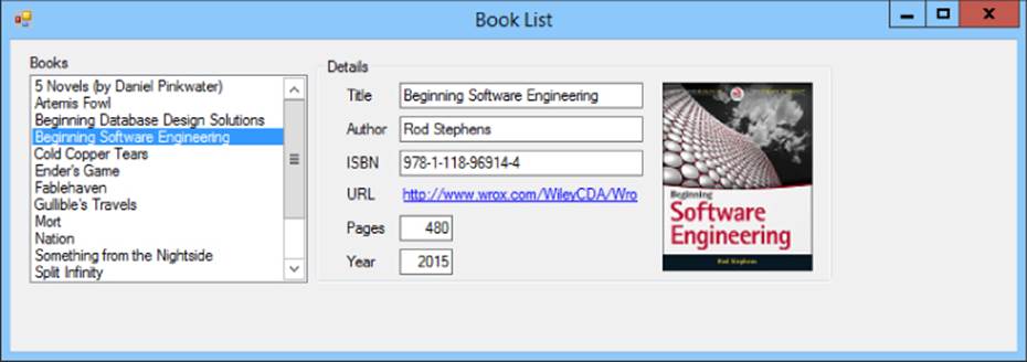
Figure 3.2
The URL for the book selected in Figure 3.2 is too long to fit within the GroupBox, so it is truncated even though the form has extra wasted space on the right. The ListBox isn't big enough to display all of its items even though there's wasted space at the bottom. It would be nice if the controls rearranged themselves to use the available space and display the entire URL and more list items.
Figure 3.3 shows another problem with this form. If the user shrinks the form, the TextBoxes and URL LinkLabel are chopped off, the Year Label and TextBox are chopped in half vertically, the ListBox doesn't fit, and the cover picture is completely missing.
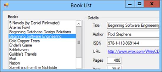
Figure 3.3
The program would look nicer if the controls were shrunk so you could at least see their edges. Some of the values still wouldn't fit, but at least the form wouldn't look so amateurish. You could even make the form refuse to shrink so it's too short to display the Year controls.
This lesson explains some simple ways you can make controls rearrange themselves to take advantage of whatever space is available, and how to give the form minimum and maximum sizes so the user can't resize it until it's completely useless.
Restricting Form Size
Forms (and in fact all controls) have MinimumSize and MaximumSize properties that you can use to restrict the form's size. Simply set these properties to a width and height (or set their Width and Height sub-properties) and the form does the rest.
For example, to prevent the user from making the form shown in Figure 3.3 too small, you can set the form's MinimumSize property to 663, 233.
Using Anchor Properties
The MinimumSize property prevents the user from making a form too small but it doesn't solve the problem shown in Figure 3.2. When the user resizes a form, it would be nice if the controls changed their sizes to match.
The Anchor property lets a Windows Forms control resize itself when its container resizes. This property can take one or more of the values Top, Bottom, Left, and Right, in any combination. These values indicate that the control's edge should remain the same distance from the corresponding edge of its container.
For example, initially a control's Anchor property is set to Top, Left so it remains the same distance from its container's top and left edges. If you resize the form, the control doesn't move.
For a more interesting example, suppose you place a TextBox on a form, set its Multiline property to True, arrange it so its edges are 12 pixels from the edges of the form, and set its Anchor property to Top, Bottom, Left, Right. Then when you resize the form, the TextBoxresizes itself so all of its edges remain 12 pixels from the form's corresponding edges.
NOTE
If an Anchor's values don't include either Left/Right or Top/Bottom, the control moves to keep itself the same distance from the middle of the form. For example, if a Button's Anchor property is Bottom, it moves so it remains the same distance from the horizontal middle of the form.
This fact lets you keep one or more controls centered. For example, place several Buttons near the bottom of a form and choose Format  Center in Form
  Horizontally to center them horizontally. Now if you set their Anchor properties to Bottom, the group of Buttons remains centered when the form resizes.
NOTE
The Anchor property cannot resize a control such as a Label or LinkLabel if that control has AutoSize set to True. In that case, the control has its own ideas about how big it should be.
To set the Anchor property at design time, you can type a value like Top, Left, Right into the Properties window or you can use the Properties window's Anchor editor.
To use the editor, click the Anchor property in the Properties window. Then click the dropdown arrow to the right to make the editor shown in Figure 3.4 appear. Click the skinny rectangles to select or deselect the anchors that you want to use. (In Figure 3.4 the top, bottom, and right anchors are selected.) When you're finished, press Enter to accept your changes or Esc to cancel them.
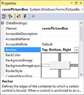
Figure 3.4
Using the Anchor property, you can solve the problem shown in Figure 3.2. Table 3.1 gives the Anchor property values used by the controls to let them take advantage of the form's available space.
Table 3.1
|
Control |
Anchor Property |
|
booksListBox |
Top, Bottom, Left |
|
detailsGroupBox |
Top, Bottom, Left, Right |
|
titleTextBox |
Top, Left, Right |
|
authorTextBox |
Top, Left, Right |
|
isbnTextBox |
Top, Left, Right |
|
urlLinkLabel |
Top, Left, Right |
|
coverPictureBox |
Top, Bottom, Right |
Now when the form resizes:
· The ListBox stretches vertically to match the form's height.
· The GroupBox stretches vertically and horizontally to use as much of the form's width and height as possible.
· The TextBoxes and LinkLabel stretch horizontally to be as wide as possible while still fitting inside the GroupBox.
· The PictureBox moves with the GroupBox's right edge so it leaves as much room as possible to the left for the TextBoxes and LinkLabel. It also stretches vertically as much as possible while fitting inside the GroupBox.
Figure 3.5 shows the result. Now the ListBox is big enough to show all of its items and the LinkLabel is big enough to show the entire URL.
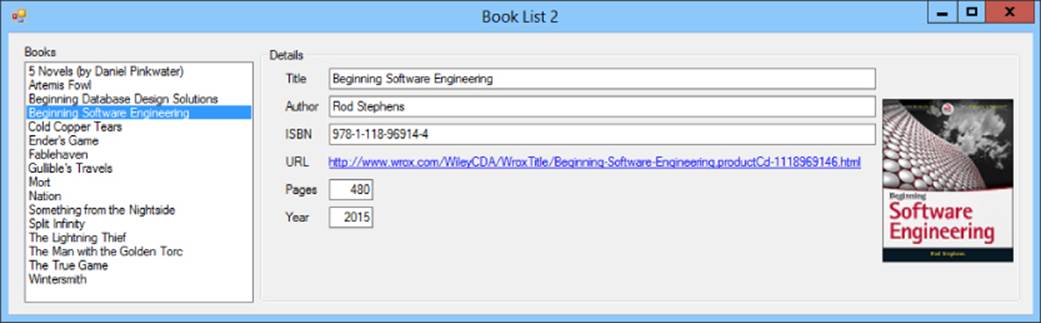
Figure 3.5
Note that the TextBoxes and LinkLabel do not stretch horizontally when the form resizes; they stretch when the GroupBox that contains them resizes. In this example, when the form stretches, the GroupBox stretches, and when the GroupBox stretches, the TextBoxes andLinkLabel stretch, so the result is the same.
Using Dock Properties
The Anchor property can handle most of your arranging needs, but some combinations of Anchor values are so common that C# provides another property to let you handle these situations more easily: Dock. The Dock property lets you tell a control to attach itself to one of the edges of its container.
For example, a menu typically stretches across the top of a form. You could provide that behavior by setting the menu's Anchor property to Top, Left, Right, but setting Dock to Top is even easier.
The Dock property can take one of six values. Left, Right, Top, and Bottom attach the control to the corresponding edge of its container. Fill makes the control take up any space left over after any other controls' Dock properties have had their way. None detaches the control so its Anchor property can take over.
NOTE
The Dock property cannot resize a control such as a Label or LinkLabel if that control has AutoSize set to True.
The Dock property processes positioning requests in a first-come-first-served order based on the controls' stacking order on the form. In other words, it positions the first control that it draws first. The second control positions itself in whatever space is left over. Then the third control positions itself in the remaining space, and so on.
Normally the stacking order is determined by the order in which you add controls to the form, but you can change the order by right-clicking a control and selecting Bring to Front or Send to Back. However, if you're working with a complicated set of Dock properties and the stacking order gets messed up, it's often easier to delete all of the controls and start over from scratch.
Figure 3.6 shows a form holding five docked Labels (with AutoSize = False). The numbers in the controls' Text properties give the order in which they were created, which is also their stacking order.
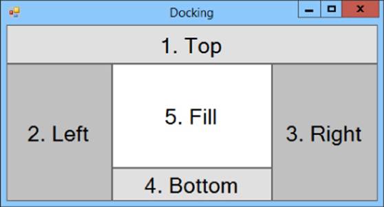
Figure 3.6
The following list explains how the form's space was divvied up among the Labels:
1. The first Label has Dock = Top, so it took the full width of the top part of the form.
2. The second Label has Dock = Left, so it took the left edge of the remaining area (after the first Label was positioned).
3. The third Label has Dock = Right, so it took the right edge of the remaining area.
4. The fourth Label has Dock = Bottom, so it took the bottom edge of the remaining area.
5. The final Label has Dock = Fill, so it filled all of the remaining area.
Docked Menus
In one typical docking scenario, a form contains a MenuStrip with Dock = Top and a container such as a Panel with Dock = Fill so it takes up the rest of the form. All of the other controls are placed inside the Panel.
You can also add ToolStrips, ToolStripContainers, and StatusBars with the appropriate Dock properties to put those controls in their correct places. Figure 3.7 shows a form holding a MenuStrip (Dock = Top), a ToolStripContainer (Dock = Top) containing twoToolStrips, a StatusStrip (Dock = Bottom), and a Panel (Dock = Fill). I made the Panel slightly darker so it's easy to see where it is.
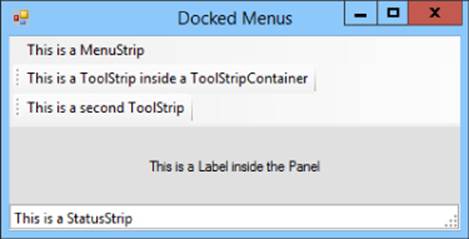
Figure 3.7
Layout Containers
Visual Studio provides several controls that arrange the child controls that they contain in different ways. For example, the WPF Grid control can arrange controls in rows and columns.
The following sections summarize layout containers for Windows Forms and WPF applications.
Windows Forms Controls
Windows Forms applications use only a few layout controls. Often most of a form's controls are placed directly on the form.
The following list summarizes the most useful Windows Forms layout controls.
· Form—The form itself is a layout container that lets you arrange controls by setting their Top, Left, Width, Height, Anchor, and Dock properties.
· FlowLayoutPanel—Arranges controls left to right, right to left, top to bottom, or bottom to top, wrapping to new rows or columns if necessary.
· Panel—Lets you arrange controls much as a form does by setting their Top, Left, Width, Height, Anchor, and Dock properties.
· TableLayoutPanel—Lets you arrange controls in rows and columns. Set a control's RowSpan and ColumnSpan properties to let it span multiple rows or columns.
Those few controls let you arrange controls very flexibly.
WPF Controls
NOTE
If you're focusing on Windows Forms applications for now, skip this section and come back to it later.
WPF applications use a different control arrangement philosophy than the one used by Windows Forms applications. In a Windows Forms application, a control's Anchor and Dock properties arrange that control as needed. In contrast, a WPF application typically uses containers to arrange controls.
For example, in a Windows Forms application, you might make a collection of Labels and TextBoxes and line them up neatly in two columns and five rows. In contrast, in a WPF application you might create a Grid control with two columns and five rows. You would then place Labels and TextBoxes inside the Grid's rows and columns. When the Grid's rows and columns resize, the controls they contain resize.
The following list summarizes some of the most useful WPF container controls:
· Canvas—A simple control that lets you specify a control's X and Y positions.
· DockPanel—Lets you dock child controls to the left, right, top, and bottom edges. If the LastChildFill property is True, the last child fills the remaining area.
· Grid—Lets you arrange controls in rows and columns.
· StackPanel—Arranges child controls vertically in a column or horizontally in a row.
· WrapPanel—Arranges child controls vertically or horizontally much as a StackPanel does except it wraps to a new column or row if necessary.
For example, to make a layout similar to the one shown in Figure 3.5, you might use a Grid that defines two columns. The left column could hold a vertical StackPanel containing a Label and the ListBox. The right column could hold a GroupBox containing a second Gridthat uses rows and columns to arrange the Labels, TextBoxes, and Image.
NOTE
You can click a Grid's borders to define rows and columns, but it's sometimes easier to edit them in the XAML Code Editor. For example, that lets you easily make rows have exactly the same size.
Set a row or column's size to * to make it use any space not claimed by other rows or columns. If multiple rows/columns have * sizes, they split the available space. For example, if one row has a height of * and another has a height of 2*, then the first gets a third of the available space and the second gets two thirds of the available space.
After you define the StackPanels, Grids, and other containers, you can add Labels, TextBoxes, and other content controls to them.
Set a control's Margin property to make it resize with its container. For example, Margin="10,7,10,0" keeps a control's left, top, right, and bottom distances 10, 7, 10, and 0 pixels from its container's corresponding edges.
Set a control's Width and Height properties to give it a fixed size.
When you resize controls in the Window editor, you can click the symbols by the edges of a control's container to lock the sides of the control to the container's sides.
Arranging controls in this way can take a lot of work. Sometimes it's easier to just type XAML code in the Code Editor instead of using the interactive Window editor. However, the result is usually quite flexible and allows the controls to resize when the window resizes.
Try It
In this Try It, you get to practice using the Anchor and Dock properties by building the application shown in Figure 3.8.
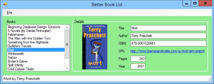
Figure 3.8
When the window resizes, the TextBoxes and LinkLabel stretch horizontally, and the PictureBox stretches vertically. Notice in Figure 3.8 that the cover image is rather tall and thin. When the PictureBox grows taller, it can display a larger version of the cover image. The control displays the image as large as possible without distorting it.
Note that the program you build won't actually do anything except sit there looking pretty and resizing controls when the form resizes. The techniques you need to make it respond to list selections are covered in later lessons.
Lesson Requirements
In this lesson, you:
· Create the program's three main controls: a MenuStrip, a StatusStrip, and a Panel. Use Dock properties to make these three controls stay in their proper positions.
· Add controls to the Panel.
· Use the Anchor property to make the ListBox stretch vertically when the form resizes.
· Use Anchor properties to make the TextBoxes and LinkLabel stretch horizontally when the form resizes.
· Use Anchor properties to make the PictureBox resize vertically when the form resizes.
NOTE
You can download the code and resources for this lesson from the website at www.wrox.com/go/csharp24hourtrainer2e.
Hints
· Remember that the TextBoxes and LinkLabel stretch with the GroupBox that contains them, not with the form itself. If you don't make the GroupBox stretch, the controls it contains won't either.
· To make the File menu, add a MenuStrip to the form, select it, click the Type Here box that appears, and type &File. (The ampersand makes the “F” underlined.) Making the menu do something useful is covered in Lesson 5, so don't worry about that right now.
· To make the status strip label, add a StatusStrip to the form and select it. Click the little dropdown arrow on the StatusStrip and select StatusLabel. Click the new StatusLabel and use the Properties window to set its Text to This is a StatusStrip.
· Add some items to the ListBox, add a picture to the PictureBox, and add text to the other controls, but don't worry about making the program take any actions.
Step-by-Step
· Create the program's three main controls: a MenuStrip, a StatusStrip, and a Panel. Use Dock properties to make these three controls stay in their proper positions.
1. Start a new project named Better Book List. Set the form's Size and MinimumSize properties to 726, 286.
2. Add a MenuStrip to the form. (Notice that by default the MenuStrip has Dock = Top.) Use the MenuStrip hint from the “Hints” section of this lesson to create the empty File menu.
3. Add a StatusStrip to the form. (Notice that by default the StatusStrip has Dock = Bottom.) Use the StatusStrip hint from the “Hints” section of this lesson to create the This is a StatusStrip label.
4. Add a Panel to the form. Set its Dock property to Fill. Set its BackColor property to light green.
· Add controls to the Panel.
1. Add controls to the form in roughly the positions shown in Figure 3.8.
2. Set the LinkLabel's AutoSize property to False and make it the same size as the TextBoxes.
3. Enter some Text values in the TextBoxes and LinkLabel so you have something to look at. Enter enough items in the ListBox so they won't all fit when the form has its initial size.
4. Set the PictureBox's SizeMode property to Zoom. Place a relatively tall, thin image in its Image property.
· Use the Anchor property to make the ListBox stretch vertically when the form resizes.
1. Set the ListBox's Anchor property to Top, Bottom, Left.
· Use Anchor properties to make the TextBoxes and LinkLabel stretch horizontally when the form resizes.
1. Set the GroupBox's Anchor property to Top, Bottom, Left, Right.
2. Set the TextBoxes' and the LinkLabel's Anchor properties to Top, Left, Right.
· Use Anchor properties to make the PictureBox resize vertically when the form resizes.
1. Set the PictureBox's Anchor property to Top, Bottom, Left.
Run the program and see what happens when you resize the form.
Exercises
1. [WPF] Repeat the Try It with a WPF application.
2. Make a New Customer dialog similar to the one shown in Figure 3.9. Make the First Name, Last Name, Street, City, and Email TextBoxes resize horizontally when the form resizes. Use the OK and Cancel buttons as the form's accept and cancel buttons, and attach them to the form's lower-right corner.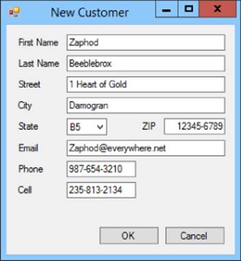
Figure 3.9
3. [WPF, Hard] Repeat Exercise 2 with a WPF application. Hints:
· Replace the window's initial Grid with a DockPanel. Add a Menu (docked to the top), a StatusBar (docked to the bottom), and a Grid (filling the rest of the DockPanel).
· Use the XAML editor to add a StatusBarItem inside the StatusBar. Inside the StatusBarItem add a Label.
· Give the Grid two columns. In the left column, place a Label and a ListBox. Set the ListBox's Height = Auto and use its Items property editor to add several ListBoxItems. Then use the XAML editor to add Labels to the ListBoxItems. For example, one of theListBoxItems might look like this:
· <ListBoxItem>
· <Label Content="Beginning Database Design Solutions"/>
</ListBoxItem>
· Add a GroupBox to the Grid's right column. A GroupBox can have only a single child control. Make it a Grid and give it the rows and columns you need to display the Image, Labels, and TextBoxes.
A final tip: often it's easier to make one control just the way you want it and then copy and paste it in the XAML Code Editor. Don't forget to change the new control's name so you don't have two controls with the same name.
4. [SimpleEdit] Create a new project named SimpleEdit. Give it a MenuStrip and StatusStrip with appropriate (default) Dock values. Add a RichTextBox control and set its Dock property to Fill. (That's all for now. In later lessons you'll add features to this program.)
5. [WPF, SimpleEdit] Repeat Exercise 4 with a WPF application.
6. The SplitContainer control displays two areas separated by a splitter. The user can drag the splitter to divide the available space between the two areas. Make a program similar to the one shown in Figure 3.10. Feel free to use a different picture and information. Make the PictureBox display its image as large as possible without distortion. Set the bottom TextBox's MultiLine property to True and make it stretch vertically and horizontally as the form resizes. Make the other TextBoxes stretch horizontally. Set theSplitContainer's Panel1MinSize and Panel2MinSize properties to 100.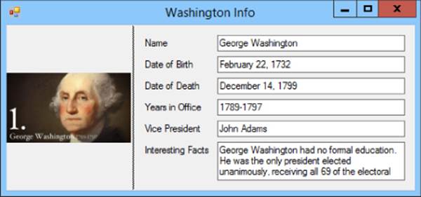
Figure 3.10
7. [WPF] Repeat Exercise 6 with a WPF application. Hints: To make a splitter in WPF, create a Grid control. Then add a GridSplitter to one of its rows or columns. The user can drag the GridSplitter to resize the rows or columns on either side of it.
For this program, make a Grid with three columns that have widths 1*, 5, and 2*. Place an Image in the left column, a GridSplitter in the middle column, and another Grid in the right column.
Then make the GridSplitter's XAML code look like this:
<GridSplitter Grid.Column="1" Margin="0,0,0,0"
HorizontalAlignment="Stretch" VerticalAlignment="Stretch"/>
Place the appropriate Labels and TextBoxes in the Grid on the right. Use the “Interesting Facts” Label's Margin and VerticalContentAlignment properties to make its text stay centered in its area when you resize the form.
8. Make a form similar to the one shown in Figure 3.11. When the form resizes, the three ListBoxes should be as large as possible and the three columns should divide the form evenly. (Hint: Use a TableLayoutPanel.)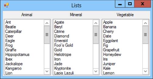
Figure 3.11
9. [WPF] Repeat Exercise 8 with a WPF application.
10.[WPF] One of the cooler new controls in WPF is the Expander. It displays a header and an expander arrow. When the user clicks the arrow, the Expander expands to display a child control, which is normally a Grid.
Make a WPF program similar to the one shown in Figure 3.12. In that figure, the Expander for Jupiter is expanded and the Expanders for the other planets are collapsed. (Hints: The Window in Figure 3.12 contains a StackPanel that contains Expanders holding Grids. First create the StackPanel. Next make the Expander and child controls for Mercury. Then copy and paste that Expander in the XAML editor to make the Expanders for the other planets.)
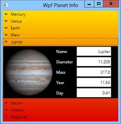
Figure 3.12
NOTE
Please select the videos for Lesson 3 online at www.wrox.com/go/csharp24hourtrainer2evideos.
All materials on the site are licensed Creative Commons Attribution-Sharealike 3.0 Unported CC BY-SA 3.0 & GNU Free Documentation License (GFDL)
If you are the copyright holder of any material contained on our site and intend to remove it, please contact our site administrator for approval.
© 2016-2026 All site design rights belong to S.Y.A.