C# 24-Hour Trainer (2015)
Section I
The Visual Studio IDE and Controls
Lesson 6
Making Tool Strips and Status Strips
Not every program needs a tool strip or status strip, but they can make the user's life easier, particularly for complicated programs. This lesson explains how to add tool strips and status strips to your applications.
Using Tool Strips
Usually a tool strip sits below a form's menu bar and displays a series of small buttons that let the user easily perform frequently executed tasks. Usually the buttons duplicate functions that are also available in menus, but placing them on the tool strip makes it easier for the user to find and use them.
Place only the most frequently used commands in the tool strip so it doesn't become cluttered.
Recall from Lesson 5 that you should also give most if not all of your menu items accelerators, and you can give the most important commands shortcuts. That means the user can access the most important and useful commands in at least four ways: mouse menu navigation, accelerators, shortcuts, and tool strip buttons.
To create a single tool strip, simply double-click the Toolbox's ToolStrip tool. By default, the ToolStrip docks to the top of the form so you don't need to position it manually.
NOTE
Recall from Lesson 3 that docked controls are drawn in their stacking order, which by default is the same as their creation order. To avoid confusion, if a form should contain a main menu and a tool strip, create the menu first so the tool strip appears below it and not above it.
When you select a ToolStrip, the Form Designer displays a little icon with a dropdown arrow. Click the arrow to display a list of items that you might want to add to the ToolStrip, as shown in Figure 6.1.
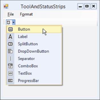
Figure 6.1
As you can see from Figure 6.1, you can add the following types of objects to a ToolStrip:
· Button
· Label
· SplitButton
· DropDownButton
· Separator
· ComboBox
· TextBox
· ProgressBar
The SplitButton and DropDownButton are new controls that you haven't seen before in the Toolbox so they deserve a little explanation.
The SplitButton normally displays a button holding an icon and a dropdown arrow. (You can change its DisplayStyle property to make it display text instead of an image, both, or neither.) If the user clicks the button, its Click event fires. If the user clicks the dropdown arrow, a menu appears. As is the case with all menus, if the user selects an item, that item's Click event fires.
One way you might use a SplitButton would be to have the menu items perform some action and then change the button's icon to match the action. Clicking the button would perform the action again.
Another way to think of this would be that the button represents a tool and clicking it activates the current tool. Selecting an item from the dropdown menu selects a new tool and activates it.
Like the SplitButton, the DropDownButton normally displays an icon with a dropdown arrow. (And as is the case with the SplitButton, you can use the DropDownButton's DisplayStyle property to make it display an image, text, both, or neither.) If the user clicks the dropdown arrow, a menu appears. This control is similar to the SplitButton except it doesn't provide a button that the user can click to repeat the previous command.
Although they can contain many different kinds of controls, ToolStrips look best when they are not too cluttered and confusing. For example, a ToolStrip that contains only Buttons and Separators is easy to understand and use. DropDownButtons and SplitButtons are the next easiest controls to understand in a ToolStrip, and they don't clutter things up too much so you can add them if necessary.
Avoid using Labels in a ToolStrip to provide status information. Instead, place status information in a StatusStrip.
Using Tool Strip Containers
A ToolStripContainer displays areas on a form's top, left, bottom, and right edges that can hold ToolStrips. At run time, the user can drag ToolStrips back and forth within and among these areas.
The center of the ToolStripContainer is a content panel that can hold one or more other controls.
In a typical configuration for these controls, a form optionally contains a MenuStrip and StatusStrip docked to the form's top and bottom, respectively. A ToolStripContainer is docked to fill the rest of the form, and its content panel contains the rest of the program's controls.
Figure 6.2 shows a form that contains a MenuStrip at the top, a StatusStrip at the bottom, and a ToolStripContainer filling the rest of the form. The ToolStripContainer contains three ToolStrips and a RichTextBox docked to fill its content panel.
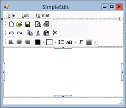
Figure 6.2
Figure 6.3 shows this program at run time. Here I have dragged two of the ToolStrips to the ToolStripContainer's left and right edges.
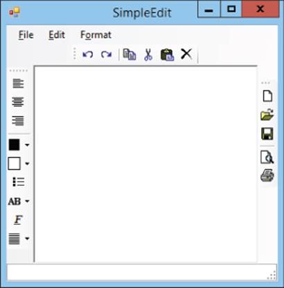
Figure 6.3
Two things in Figure 6.2 are of particular note. First, notice the thin rectangles holding arrows on the middle of the content panel's sides. If you click one of these, the control adds room on that edge so you can insert another ToolStrip.
The second thing of note in Figure 6.2 is the smart tag shown as a little square holding an arrow in the control's upper-right corner. If you click the smart tag, the smart tag panel shown in Figure 6.4 appears.
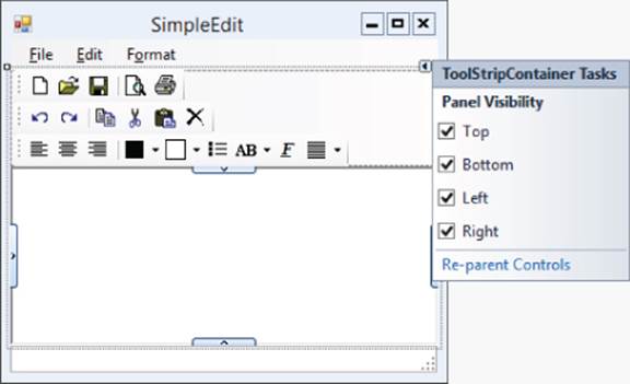
Figure 6.4
In general, smart tags provide quick ways to perform common tasks for a control. In this example, the smart tag panel lets you decide which panels the control should allow. If you uncheck one of the panels, the user cannot drag ToolStrips to that edge of theToolStripContainer at run time.
NOTE
You can also determine which panels are available by setting the control's LeftToolStripPanelVisible, RightToolStripPanelVisible, TopToolStripPanelVisible, and BottomToolStripPanelVisible properties in the Properties window, but using the smart tag is easier.
After you build the ToolStripContainer, simply place ToolStrips on it and build their items as usual.
Using Status Strips
A status strip is normally docked to a form's bottom and displays labels, status bars, and other controls to give the user a quick summary of the application's status. This area should be reserved for status information and should generally not include buttons and other controls that make the application perform an action. Those commands belong in menus and tool strips.
NOTE
Although the current time is sort of a piece of status information, don't add a clock to the status bar. A user who wants a clock can display one in the system's taskbar. The taskbar clock is more convenient because it provides options (such as display format) that you probably don't want to reproduce in your program, and it also can't be hidden by other programs. If the system provides a convenient tool, there's no need for you to reproduce it in your program.
To create a status strip, simply double-click the Toolbox's StatusStrip tool. By default, the StatusStrip docks to the bottom of the form so you don't need to position it manually.
When you select a StatusStrip, the Form Designer displays a little icon with a dropdown arrow similar to the one it displays for a ToolStrip. Click the arrow to display a list of items that you might want to add to the StatusStrip, as shown in Figure 6.5.
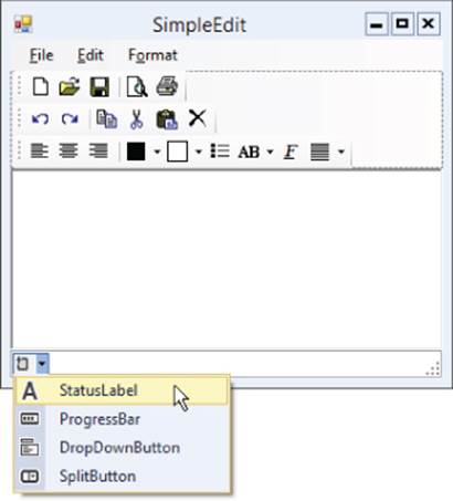
Figure 6.5
As you can see from Figure 6.5, you can add the following types of objects to a ToolStrip:
· StatusLabel
· ProgressBar
· DropDownButton
· SplitButton
The only new control, StatusLabel, behaves like a normal Label.
Try It
In this Try It, you create a MenuStrip (covered in Lesson 5) and a ToolStrip, both containing commands to change a RichTextBox control's ForeColor and BackColor properties. You also create a StatusStrip to show the currently selected colors. (Yes, I know this is redundant because the values are shown in the ToolStrip and in the text itself.) Figure 6.6 shows the program in action.
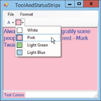
Figure 6.6
Lesson Requirements
In this lesson, you:
· Create the form shown in Figure 6.6.
· Create the MenuStrip. The menu's hierarchy should be:
1. File
1. Exit
2. Format
1. Text Color
1. Black
2. Red
3. Green
4. Blue
2. Background Color
1. White
2. Pink
3. Light Green
4. Light Blue
· Initially check the Text Color menu's Black choice and the Background Color menu's White choice.
· Give the Background Color menu items Images that display samples of the colors.
· Create the ToolStrip with buttons that duplicate the menu hierarchy. The ToolStrip should hold two ToolStripDropDownButtons.
· Name the first tool foreColorButton and make it display the text “A.” Give it the items Black, Red, Green, and Blue. Each item should have the ForeColor property set to its color.
· Name the second tool backColorButton and make it initially display a white color sample. Give it the items White, Pink, Light Green, and Light Blue. Make each of these display an Image showing a sample of the color.
· Give the StatusStrip a ToolStripStatusLabel named colorLabel with Text = Text Colors.
· Add event handlers.
· Make the File menu's Exit item close the form.
· Make event handlers for each of the Text Color menu items.
· Make event handlers for each of the Background Color menu items.
· Make the tool strip Buttons use the corresponding menu items' event handlers.
Duplicate Code
As you will probably notice, this lesson's Try It includes event handlers that duplicate the same code with minor differences. In general, if large pieces of code do almost the same things with minor changes, then there's probably something wrong with the program's design.
In cases such as this, you should extract the common code into a method. You can use if, switch, and other C# statements to let the code take different actions for different situations, allowing one method to handle multiple situations.
Unfortunately, you don't know how to do any of that yet, but you will learn. Lesson 18 describes statements such as if and switch, and Lesson 20 explains how to write methods. Until then, you're stuck with some duplicate code.
After you read Lessons 18 and 20, you can revisit this code to remove the redundant code if you like, making it easier to maintain in the future. (The process of restructuring existing code to make it more reliable, easier to read, easier to maintain, or otherwise better without changing its functionality is called refactoring.)
NOTE
You can download the code and resources for this lesson from the website at www.wrox.com/go/csharp24hourtrainer2e.
Hints
· Recall that the Exit menu item can close the program's form by calling Close().
· Place the RichTextBox inside the ToolStripContainer's content panel.
· You may be able to save a lot of typing by making one event handler and then copying and pasting it.
Step-by-Step
· Create the form shown in Figure 6.6.
1. Start a new project.
2. Add a MenuStrip to the form.
3. Add a StatusStrip to the form.
4. Add a ToolStripContainer to the form.
5. Add a RichTextBox named contentRichTextBox inside the ToolStripContainer's content panel.
· Create the MenuStrip.
1. Add the indicated menu items to the MenuStrip. Remember to give them good names and appropriate accelerator keys.
· Initially check the Text Color menu's Black choice and the Background Color menu's White choice.
1. Set the Text Color  Black menu item's Checked property to True.
2. Set the Background Color White menu item's Checked property to True.
· Give the Background Color menu items Images that display samples of the color.
1. Set the Image properties of these menu items to samples of their colors. (Use Microsoft Paint or some other graphical editor to make small colored images.)
· Create the ToolStrip with buttons that duplicate the menu hierarchy. The ToolStrip should hold two ToolStripDropDownButtons.
· Name the first tool foreColorButton and make it display the text “A.” Give it the items Black, Red, Green, and Blue. Each item should have ForeColor property set to its color.
1. Create the ToolStripDropDownButton.
2. Below that item, add the items Black, Red, Green, and Blue.
3. Set the ForeColor property for each of these items to show its color. (For example, set the Black item's ForeColor property to black.)
· Name the second tool backColorButton and make it initially display a white color sample. Give it the items White, Pink, Light Green, and Light Blue. Make each of these display an Image showing a sample of the color.
1. Create the ToolStripDropDownButton.
2. Below that item, add the items White, Pink, Light Green, and Light Blue.
3. Set the Image property for each of these items to show samples of their colors.
· Give the StatusStrip a ToolStripStatusLabel named colorLabel with Text = Text Colors.
1. Create the ToolStripStatusLabel. Set its Name and Text properties.
· Add event handlers.
· Make the File menu's Exit item close the form.
1. Type the bold line of code so the event handler looks like this:
2. private void fileExitMenuItem_Click(object sender, EventArgs e)
3. {
4. Close();
}
· Make event handlers for each of the Text Color menu items.
1. For the Text Color Black menu item, type the bold code so the event handler looks like this:
2. private void blackForeColorMenuItem_Click(object sender, EventArgs e)
3. {
4. contentRichTextBox.ForeColor = blackForeColorButton.ForeColor;
5. foreColorMenuItem.ForeColor = blackForeColorButton.ForeColor;
6. foreColorButton.ForeColor = blackForeColorButton.ForeColor;
7. colorLabel.ForeColor = blackForeColorButton.ForeColor;
8. blackForeColorMenuItem.Checked = true;
9. redForeColorMenuItem.Checked = false;
10. greenForeColorMenuItem.Checked = false;
11. blueForeColorMenuItem.Checked = false;
12. blackForeColorButton.Checked = true;
13. redForeColorButton.Checked = false;
14. greenForeColorButton.Checked = false;
15. blueForeColorButton.Checked = false;
}
16.Enter similar code for the other Text Color menu items.
· Make event handlers for each of the Background Color menu items.
1. For the Background Color White menu item, type the bold code so the event handler looks like this:
2. private void whiteBackColorMenuItem_Click(object sender, EventArgs e)
3. {
4. contentRichTextBox.BackColor = Color.White;
5. backColorMenuItem.Image = whiteBackColorMenuItem.Image;
6. backColorButton.Image = whiteBackColorMenuItem.Image;
7. colorLabel.BackColor = Color.White;
8. whiteBackColorMenuItem.Checked = true;
9. pinkBackColorMenuItem.Checked = false;
10. lightGreenBackColorMenuItem.Checked = false;
11. lightBlueBackColorMenuItem.Checked = false;
12. whiteBackColorButton.Checked = true;
13. pinkBackColorButton.Checked = false;
14. lightGreenBackColorButton.Checked = false;
15. lightBlueBackColorButton.Checked = false;
}
16.Enter similar code for the other Background Color menu items.
· Make event handlers for each of the Background Color menu items.
1. Repeat the steps you used for the Text Color menu items except use BackColor instead of ForeColor.
· Make the tool strip Buttons use the corresponding menu items' event handlers.
0. Click the Properties window's Events button.
1. For each tool strip button:
a. Click the button in the Form Editor.
b. On the Properties window, select the Click event. Then click the dropdown arrow to the right.
c. Select the appropriate menu event handler. For example, for the blackFore-ColorButton tool strip button, select the blackForeColorMenuItem_Click event handler.
Exercises
1. [SimpleEdit] Copy the SimpleEdit program you built in Lesson 5, Exercise 10 (or download Lesson 5's version from the book's website) and add the tool strips, buttons, and separators shown in Figure 6.7. Hints:
Figure 6.7
· Delete the RichTextBox control, add a ToolStripContainer, and then re-add the RichTextBox inside the ToolStripContainer's content panel. Then add the ToolStrips.
· The black button (fourth from the left on the third tool strip row) is a ToolStripSplitButton that lets the user pick a text color. It contains the choices Black, White, Red, Green, and Blue.
· The white button next to the text color button is another ToolStripSplitButton that lets the user pick a background color. It contains the choices Black, White, Pink, Light Green, Light Blue, and Yellow.
· The button that says “AB” is a ToolStripDropDownButton that provides the same options as the Format menu's Offset submenu: Normal, Superscript, and Subscript.
2. [WPF, SimpleEdit] Copy the program you built in Lesson 5, Exercise 12 (or download Lesson 5's version from the book's website) and repeat Exercise 1. Hints:
· Dock a ToolBarTray to the top of the DockPanel control below the menus.
· Add ToolBars to the ToolBarTray. Set a ToolBar's Band property to indicate its row in the ToolBarTray. Set its BandIndex property to indicate its ordering within the band.
· Add Buttons and Separators to the ToolBars.
· For the split buttons, use ComboBoxes containing ComboBoxItems that hold Images. Set one ComboBoxItem's IsSelected property to True to set a ComboBox's initial selection.
· Dock a StatusBar at the bottom of the DockPanel. Give it a StatusBarItem containing a Label.
3. [SimpleEdit] Copy the SimpleEdit program you built for Exercise 1 and add menu item code to manage the new tool strip buttons. Add code to synchronize corresponding menu, context menu, and tool strip button items. For example, the following shows the new code for the Align Left menu item:
4. private void formatAlignLeftMenuItem_Click(object sender, EventArgs e)
5. {
6. formatAlignLeftMenuItem.Checked = true;
7. formatAlignRightMenuItem.Checked = false;
8. formatAlignCenterMenuItem.Checked = false;
9. alignLeftContextMenuItem.Checked = true;
10. alignRightContextMenuItem.Checked = false;
11. alignCenterContextMenuItem.Checked = false;
12. alignLeftButton.Checked = true;
13. alignRightButton.Checked = false;
14. alignCenterButton.Checked = false;
15. MessageBox.Show("Align Left");
}
16.[WPF, SimpleEdit] Repeat Exercise 3 with the WPF application you built for Exercise 2. Hints:
· In WPF Buttons don't have Checked or IsChecked properties, so you can't check and uncheck the alignment toolbar buttons. Instead, make separate images to represent the checked state. Place checked and unchecked images in Image controls with the Visibilityproperties set to Collapsed. Then use code similar to the following to set a Button's image at run time:
alignLeftImage.Source = alignLeftUncheckedImage.Source;
· Use a similar trick for the bullet button. Use code similar to the following to set the button's Image property. (Sorry but I couldn't think of a way to handle this easily without using if-else statements, which you learn about in Lesson 18.)
· if (formatBulletMenuItem.IsChecked)
· bulletImage.Source = bulletCheckedImage.Source;
· else
bulletImage.Source = bulletUncheckedImage.Source;
· To handle the offset toolbar items, give names to the offset ComboBoxItems. Then set the selected item as in the following code. (You don't need to set this to false for the items that are not selected.)
superscriptOffsetComboBoxItem.IsSelected = true;
· Handle the indent toolbar ComboBox the same way you handle the offset ComboBox.
17.[SimpleEdit] Copy the SimpleEdit program you built for Exercise 3 and attach the tool strip controls to the corresponding event handlers. (Don't worry about the color controls just yet.)
18.[WPF, SimpleEdit] Repeat Exercise 5 with the WPF application you built for Exercise 4. Hints:
· Handle the Selected events for the offset and indentation ComboBoxItems.
· When the window loads, it raises the Selected events for the initially selected ComboBoxItems. Unfortunately the window hasn't finished loading all of its controls yet, and the program crashes if it tries to set values for controls that aren't yet loaded. To prevent that, begin the event handlers for the initially selected ComboBoxItems with the following statement. (The statement basically means, “If the window isn't loaded yet, exit the event handler.”)
if (!IsLoaded) return;
· You may notice that the ComboBoxItem event handlers execute twice if you select one of the corresponding menu or context menu items. That's a bit inefficient, but don't worry about it for now. We'll fix it later.
19.[SimpleEdit] Copy the SimpleEdit program you built for Exercise 5 and add code to display the appropriate image in the Text Color and Background tool strip buttons. For example, use code similar to the following for the green text color choice:
20. private void fgGreenButton_Click(object sender, EventArgs e)
21. {
22. fgButton.Image = fgGreenButton.Image;
23. MessageBox.Show("Text Color Green");
}
24.[WPF, SimpleEdit] Copy the SimpleEdit program you built for Exercise 6 and add placeholder code to display message boxes when the user selects a Text Color or Background tool strip button. For example, use code similar to the following for the green text color choice:
25. private void greenForeColorComboBoxItem_Selected(object sender,
26. RoutedEventArgs e)
27. {
28. MessageBox.Show("Text Color Green");
}
29.[SimpleEdit] Menu items and normal buttons can display text explaining what they do, but toolbar buttons usually display images that may not be intuitively obvious. To help the user understand what toolbar buttons do, you should give them tooltips. Copy the SimpleEdit program you built for Exercise 7. Set each toolbar item's Text property to a meaningful name. For example, set the new button's Text to “New.” That should automatically set each button's tooltip to the same value.
30.[WPF, SimpleEdit] Repeat Exercise 9 with the WPF application you built for Exercise 8. (Hint: Set the ToolTip properties for the Button, ComboBox, and ComboBoxItem controls.)
31.[Games] Copy the tic-tac-toe (or naughts-and-crosses) program you built for Exercise 2-3 (or download Lesson 2's version from the book's website). Make these modifications:
· Add a StatusStrip with a ToolStripStatusLabel named turnLabel. Set its initial Text to Xs Turn.
· When the user takes a square for X, hide the little X and O buttons for that square and make the status label say Os Turn.
· When the user takes a square for O, hide the little X and O buttons for that square and make the status label say Xs Turn.
· Add a File menu with two new commands:
§ New resets all of the program's controls to start a new game.
§ Exit closes the program.
32.[WPF, Games] Repeat Exercise 11 with the program you wrote for Exercise 2-4. Hints:
· To hide a control in WPF, set its Visibility property to Visibility.Hidden.
· To change the status label's text, set its Content property.
33.[Games] Copy the program you built for Exercise 11 and make the following modifications:
· Initially disable the little O buttons.
· When the user clicks an X button, disable all of the X buttons and enable all of the O buttons. (Hint: Write the code for one of the X buttons, make sure it's correct, and then copy and paste that code for the other X buttons. Copying and pasting code like this isn't good programming practice, but we'll fix it in Lesson 20.)
· When the user clicks an O button, disable all of the O buttons and enable all of the X buttons. (Hint: Use the technique you used for the X buttons.)
34.[WPF, Games] Repeat Exercise 13 with the program you wrote for Exercise 12.
35.[Drawing] Build the Scribbler program shown in Figure 6.8. Give it a ToolStripContainer and two ToolStrips.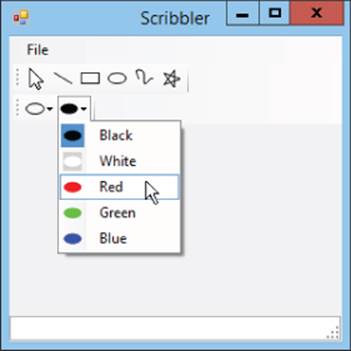
Figure 6.8
· Give the first ToolStrip buttons representing arrow, line, rectangle, ellipse, curve, and star tools. Make these tools exclusive choices so if the user selects one, the others deselect.
· Give the second ToolStrip two ToolStripDropDownButtons to represent foreground and background colors. Make the entries in each dropdown exclusive choices and make the choices display their images on their ToolStripDropDownButtons.
36.[WPF, Drawing] Repeat Exercise 15 with a WPF application.
37.[Drawing] Copy the program you built for Exercise 15 and add tooltips to the toolbar tools.
38.[WPF, Drawing] Repeat Exercise 17 with the program you built for Exercise 17.
NOTE
Please select the videos for Lesson 6 online at www.wrox.com/go/csharp24hourtrainer2evideos.