C# 24-Hour Trainer (2015)
Section I
The Visual Studio IDE and Controls
Lesson 5
Making Menus
In addition to buttons, labels, and textboxes, menus are one of the most common user interface elements in interactive programs. This lesson explains how to add menus and context menus to forms. It also explains how to catch their events so your program can take action when the user selects menu items.
Creating Menus
To create a menu, simply drop a MenuStrip control on a form. By default, the MenuStrip is docked to the top of the form so you don't really need to position it carefully. Just double-click the Toolbox's MenuStrip tool and you're set.
Unlike most controls, the MenuStrip appears in the Component Tray below the form in addition to appearing on the form itself. Figure 5.1 shows the SimpleEdit program in the Form Designer. Below the form you can see the Component Tray containing a MenuStripand a StatusStrip.
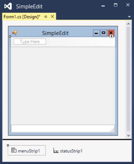
Figure 5.1
When you select a MenuStrip in the Form Designer, either on the form's surface or in the Component Tray, the menu bar at the top of the form displays a Type Here box. Click that box and type the menu's caption to create a main menu.
If you create a main menu entry and then click it to select it, the Form Designer displays a new Type Here box to let you create menu items. Figure 5.2 shows the top of the Form Designer after I created the top-level File menu.
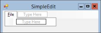
Figure 5.2
You can continue clicking menu items to add submenus as deeply as you like. Continue entering text in the Type Here boxes to build the whole menu structure. Figure 5.3 shows the Edit menu for a new version of the SimpleEdit program. Notice that the menu contains several cascading submenus. The Offset submenu is expanded in Figure 5.3.
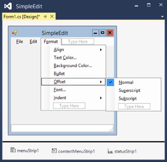
Figure 5.3
You can use the Type Here boxes to create submenus to any depth, although in practice three levels (as in Edit  Offset Subscript) are about all the user can stomach.
In addition to menu items, you can place Separators, TextBoxes, and ComboBoxes in menus. TextBoxes and ComboBoxes are unusual in menus, so I won't cover them here. Separators, however, are quite useful for grouping related menu items.
To create a Separator, right-click an item, open the Insert submenu, and select Separator. Alternatively, you can create a normal menu item and set its Text to a single dash (-).
Setting Menu Properties
The items in a menu are ToolStripMenuItems, and like other controls, they have properties that determine their appearance and behavior. Table 5.1 summarizes the most useful ToolStripMenuItem properties.
Table 5.1
|
Property |
Purpose |
|
Checked |
Determines whether the item is checked. In Figure 5.3, the Normal item is checked. (See also CheckOnClick.) |
|
CheckOnClick |
If you set this to True, the item automatically toggles its checked state when the user selects it. |
|
Enabled |
Indicates whether the item is enabled. |
|
Name |
The ToolStripMenuItem's name. Normally you should give a good name to any menu item that makes the program do something at run time so your code can refer to it. |
|
ShortcutKeys |
Indicates the item's shortcut key combination (if any). Either type a value such as Ctrl+N or click the dropdown arrow to the right to display the shortcut editor shown in Figure 5.4. |
|
Text |
The text that the item displays. Place an ampersand before the character that you want to use as the item's accelerator (if any). For example, if you set an item's Text to &Open, the item appears as Open in its menu and the user can activate it by pressing Alt+O while the menu is open. |
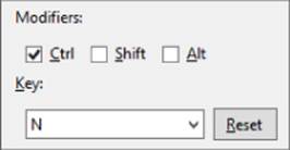
Figure 5.4
Essential Ellipses
By convention, if a menu item opens a dialog or requires some other input from the user before proceeding, its Text should end with an ellipsis (…). If the menu item starts an action immediately, it should not include an ellipsis.
For example, the Open …menu item displays a file open dialog, so its caption ends with an ellipsis. In contrast, the Edit menu's Copy item immediately copies the selected text so it doesn't need an ellipsis.
Accelerators allow the user to navigate menus with the keyboard instead of the mouse. When the user presses Alt, the menu's items display underlines below their accelerator keys. For example, if the File menu appears as File, the user can press Alt+F to open that menu and then use other accelerators to select the menu's items.
NOTE
Recent versions of the Windows operating system typically don't underline menu accelerators until you press the Alt key.
You should give accelerators to most if not all of your program's menus, submenus, and menu items. Experienced users can often navigate a menu system faster by using accelerators than they can by using the mouse.
WARNING
Be sure not to give the same accelerator character to two items in the same menu. For example, in the File menu, don't have Save and Save As menu items.
Shortcuts allow the user to instantly activate a menu item. For example, in many programs Ctrl+O opens a file and Ctrl+S saves the current file. (You can remember the difference between accelerators and shortcuts by realizing that “accelerator” and the Alt key both begin with the letter “a.”)
WARNING
Be extra sure not to give two menu items the same shortcut!
TIP
Use standard accelerators and shortcuts to help users learn how to use your application more quickly and with fewer mistakes. The web pages support.microsoft.com/kb/126449 and windows.microsoft.com/en-us/windows/keyboard-shortcuts list some shortcuts that Microsoft uses. I haven't seen a good list of standard accelerators, but you can try to make yours match those used by other common applications such as Visual Studio and Word.
Handling Menu Events
When the user clicks a menu item, its control raises a Click event exactly as a clicked Button does, and you can handle it in the same way. You can even create default event handlers in the same way: by double-clicking the control.
Creating Context Menus
A context menu appears when you right-click a particular control. In a Windows Forms application, using a context menu is almost as easy as using a main menu. Figure 5.5 shows an application displaying a context menu.
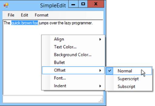
Figure 5.5
Start by dropping a ContextMenuStrip on the form. Like a MenuStrip, a ContextMenuStrip appears below the form in the Component Tray so you can just double-click the Toolbox's ContextMenuStrip tool and not worry about positioning it.
Unlike a MenuStrip, a ContextMenuStrip does not appear at the top of the form. In the Form Designer, you can click a MenuStrip either on the form or in the Component Tray to select it. To select a ContextMenuStrip, you must click it in the Component Tray.
After you select the ContextMenuStrip, you can edit it much as you can a MenuStrip. The big difference is that a ContextMenuStrip does not have top-level menus, just submenu items.
Figure 5.6 shows the Form Designer with a ContextMenuStrip selected. By now the menu editor should look familiar.
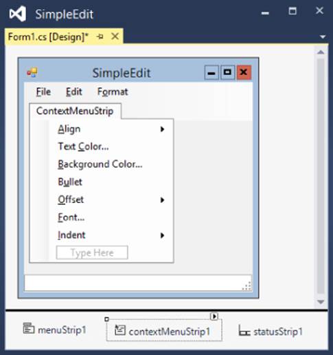
Figure 5.6
After you create a ContextMenuStrip, you need to associate it with the control that should display it. To do that, simply set the control's ContextMenuStrip property to the ContextMenuStrip. To do that, select the control's ContextMenuStrip property in the Properties window, click the dropdown arrow on the right, and select the ContextMenuStrip. The rest is automatic. When the user right-clicks the control, it automatically displays the ContextMenuStrip.
WPF Menus
To create a menu in a WPF application, add a Menu control to the window and use your preferred method to make it attach itself to the top. For example, if the window contains a Grid, you can make the Menu fill the Grid's top row. Alternatively, if the window contains aDockPanel, you can dock the Menu to the top.
After you create the Menu, you can add items to it in two ways. First, you can use the Properties window's menu editor. Select the Menu, find the Menu's Items property in the Properties window, and click the ellipsis to the right to open the editor shown in Figure 5.7.
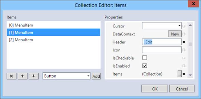
Figure 5.7
Use the editor to add and modify the items in the menu. Set a menu item's Header property to the text that you want it to display. Place an underscore in front of the character that you want the item to use as an accelerator key. For example, the menu item in Figure 5.5 has Header set to _Edit so when you press Alt at run time, it will appear as Edit.
To make a submenu, click the ellipsis to the right of the Items property in the menu item editor (in the bottom right in Figure 5.5).
NOTE
You can put practically anything inside a WPF menu. A menu could hold CheckBoxes, RadioButtons, ComboBoxes, Sliders, even a Grid containing a whole slew of other controls.
However, that's not what users expect to see in a menu, so adding too many unusual items can make a menu confusing. Normally menus should contain only MenuItems and Separators.
The second way you can create a menu hierarchy is to edit the XAML code manually. That may seem intimidating, but it's actually not too hard, particularly if you make a few menu items and then copy and paste their code.
The following code shows the XAML code for a menu structure that contains File and Format menus. Notice that the Format menu has two submenus, Align and Offset:
<Menu x:Name="menu" VerticalAlignment="Top" DockPanel.Dock="Top">
<MenuItem Header="_File">
<MenuItem Header="_New"/>
<MenuItem Header="_Open…"/>
<MenuItem Header="_Save"/>
</MenuItem>
<MenuItem Header="_Format">
<MenuItem Header="_Align">
<MenuItem Header="_Left" IsChecked="True"/>
<MenuItem Header="_Right"/>
<MenuItem Header="_Center"/>
</MenuItem>
<MenuItem Header="_Offset">
<MenuItem Header="_Normal" IsChecked="True"/>
<MenuItem Header="Su_perscript"/>
<MenuItem Header="Su_bscript"/>
</MenuItem>
</MenuItem>
</Menu>
If you click a menu item in the XAML editor, the Window Designer opens to show that item. You can then double-click the item to give it a Click event handler.
WPF Context Menus
Like Windows Forms applications, WPF applications let you associate a context menu with a control. When the user right-clicks the control at run time, the context menu appears.
To add a context menu to a control, first select the control. Then in the Properties window, find the ContextMenu property (in the Miscellaneous section), and click the New button to its right.
After you create a ContextMenu, you can edit it much as you can edit a main menu. The items inside a ContextMenu are MenuItems just as they are inside a Menu. In the Properties window, you can click the ellipsis next to its Items property to open the menu item editor. Alternatively, you can edit the ContextMenu's XAML code.
WPF Commanding
WPF has a whole system for handling standard commands such as Open, New, and Copy. You can even define your own commands.
The idea is that you might want to allow several different methods for invoking the same command. For example, you might allow the user to click a Button, select a MenuItem, or check a CheckBox to invoke the Save command. The commands provide a central location for invoking the appropriate behaviors.
You can define code to execute when a command is invoked. Then you can assign a MenuItem (or Button or CheckBox or whatever) to a command so when the user clicks the control, it invokes the command. You can even assign gestures to a command. For example, you could make the Ctrl+L gesture invoke a custom LeftAlign command.
Gestures are quite powerful, but they're also fairly complicated so I'm not going to cover them in this book. You can learn more about them in the article “Commanding Overview” at msdn.microsoft.com/en-us/library/ms752308.
Meanwhile, you can just create Click event handlers for menu items.
Try It
In this Try It, you create a main menu and a context menu. The main menu includes an Exit command that closes the form. Both menus contain commands that let you change the appearance of a TextBox on the form. Figure 5.8 shows the finished program displaying its context menu.
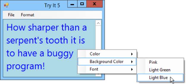
Figure 5.8
Lesson Requirements
In this lesson, you:
· Create the form shown in Figure 5.8.
· Create the following main menu structure (note the accelerator keys and shortcuts):
1. File
1. Exit
2. Format
1. Color
1. Red Ctrl+R
2. Green Ctrl+G
3. Blue Ctrl+B
2. Background Color
1. Pink
2. Light Green
3. Light Blue
3. Font
1. Small Ctrl+S
2. Normal Ctrl+N
3. Large Ctrl+L
· Add code behind the main menu items.
· Make the context menu duplicate the main menu's Format submenu.
· Attach the context menu items to the same event handlers used by the main menu.
· Attach the context menu to the TextBox.
NOTE
You can download the code and resources for this lesson from the website at www.wrox.com/go/csharp24hourtrainer2e.
Hints
· The Exit menu item can close the program's form by calling this.Close().
· Creating a font isn't trivial (and I haven't covered that yet). It's much easier to keep a sample of a font in a control somewhere on the form and then set the TextBox's Font property equal to that control's Font property. And what better control to store the font than the menu item itself?
Step-by-Step
· Create the form shown in Figure 5.8.
1. Create the main menu by double-clicking the Toolbox's MenuStrip tool.
2. Add a TextBox to the form. Type some text into its Text property and set its properties: Name = contentsTextBox, MultiLine = True, Dock = Fill, ScrollBars = Both.
3. Create the context menu by double-clicking the Toolbox's ContextMenuStrip tool.
· Create the main menu structure.
1. Select the MenuStrip. Click the Type Here box and type &File.
2. In the Type Here box below the File menu, type E&xit.
NOTE
By convention, the Exit command uses X as its accelerator. It never has a shortcut because it would be too easy to accidentally close the program while banging your head on the keyboard (or if you fat-finger the keys, the keyboard is hit by a flying tennis ball, or your cat walks across the keyboard).
3. Click the File item again. In the Type Here box to the right, type F&ormat. (You can't use the F character as this menu's accelerator because it's already used by the File menu.)
4. Use the Type Here boxes below the Format menu to create the format menu items and their submenus.
5. Use the Properties window to set the font sizes for the Font menu's Small, Normal, and Large items to 6, 9, and 20, respectively.
6. Give the Color and Font submenu items appropriate shortcuts.
7. Give the menu items that take action appropriate names. For example, name the Font menu's Small item formatFontSmallMenuItem.
· Add code behind the main menu items.
1. Double-click the Exit menu item and type the bold line in the following code so the event handler looks like this:
2. private void fileExitMenuItem_Click(object sender, EventArgs e)
3. {
4. this.Close();
}
The keyword this means “the object currently executing this code,” which in this case means the current form, so this line of code tells the current form to close itself.
5. Double-click the Format Color Red menu item and type the bold line in the following code so the event handler looks like this:
6. private void formatColorRedMenuItem_Click(object sender, EventArgs e)
7. {
8. contentsTextBox.ForeColor = Color.Red;
}
9. Repeat step 2 for the Green and Blue menu items.
10.Repeat step 2 for the Format Background Color menu items.
11.Double-click the Format Font Small menu item and type the bold line in the following code so the event handler looks like this:
12. private void formatFontSmallMenuItem_Click(object sender, EventArgs e)
13. {
14. contentsTextBox.Font = formatFontSmallMenuItem.Font;
}
15.Repeat step 5 for the Normal and Large menu items.
· Make the context menu duplicate the main menu's Format submenu.
Do either 1 or 2:
1. Build the structure from scratch. (This is straightforward but slow.)
a. Click the ContextMenuStrip in the Component Tray to open it for editing.
b. Use steps similar to the ones you used to build the main menu's structure to build the context menu's structure. End context menu item names with ContextMenuItem, as in colorRedContextMenuItem.
2. Copy the Format menu's structure. (This is sneakier and faster, and therefore much cooler!)
a. Click the MenuStrip in the Component Tray to open it for editing. Expand the Format menu. Click the Color item and then shift-click the Font item to select all of the menu's items. Press Ctrl+C to copy the menu items into the clipboard.
b. Click the ContextMenuStrip in the Component Tray to open it for editing. Press Ctrl+V to paste the menu items into the context menu.
c. Give appropriate names to the new menu items.
· Attach the context menu items to the event handlers used by the main menu.
1. Open the ContextMenuStrip for editing. Expand the Color submenu and click the Red item. In the events page of the Properties window, select the Click event. Open the dropdown on the right and select formatColorRedMenuItem_Click.
2. Repeat step 1 for the ContextMenuStrip's other items, attaching them to the correct event handlers.
· Attach the context menu to the TextBox.
1. Click the TextBox. In the Properties window, set its ContextMenuStrip property to formatContextMenu.
Exercises
1. [WPF] Repeat the Try It with a WPF application Hints:.
· You might save time by building some menus and then copying and pasting them in the XAML Code Editor.
· Set the TextBox's colors as in contentsTextBox.Foreground = Brushes.Red.
· Set the TextBox's font size as in contentsTextBox.FontSize = formatFontSmallMenuItem.FontSize.
2. [SimpleEdit] Copy the SimpleEdit program you started in Lesson 3, Exercise 4 (or download Lesson 3's version from the book's website at www.wrox.com) and add the following menu structure. Set the Checked property of the bold items to True.
1. File
1. New Ctrl+N
2. Open… Ctrl+O
3. Save Ctrl+S
4. Save As…
5. -
6. Print Preview…
7. Print… Ctrl+P
8. -
9. Exit
2. Edit
1. Undo Ctrl+Z
2. Redo Ctrl+Y
3. -
4. Copy Ctrl+C
5. Cut Ctrl+X
6. Paste Ctrl+V
7. Delete Del
8. -
9. Select All Ctrl+A
3. Format
1. Align
1. Left
2. Right
3. Center
2. Text Color…
3. Background Color…
4. Bullet
5. Offset
1. Normal
2. Subscript
3. Superscript
6. Font…
7. Indent
1. None
2. Hanging
3. Left
4. Right
5. Both
Add the code behind the Exit item, but don't worry about the other items yet.
Eventually the user will be able to use the Bullet menu item to toggle whether a piece of text is bulleted. To allow C# to toggle this item for you, set the menu item's CheckOnClick property to True.
Add a ContextMenuStrip that duplicates the Format menu and use it for the TextBox's ContextMenuStrip property.
3. [WPF, SimpleEdit] Repeat Exercise 2 with a WPF application. Hint: To check a menu item, set its IsChecked property to True.
4. [SimpleEdit] Copy the SimpleEdit program you built for Exercise 1 and add images to its menu and context menu items. (You can find suitable image files in the PngFiles directory of the Lesson 4 downloads available on the book's website.) Figure 5.9 shows what the menus should look like when you're finished.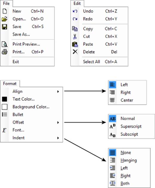
Figure 5.9
5. [WPF, SimpleEdit] Repeat Exercise 4 with the WPF application you built for Exercise 3. The Properties window in the version of Visual Studio I'm using doesn't seem to allow you to set a menu item's Icon property, but this isn't too hard to do in the XAML editor. First use the Project menu's Add Existing Item command to add the image files to the project. Then use XAML code similar to the following to add icons to the appropriate menu items:
6. <MenuItem Header="_New" Name="fileNewMenuItem">
7. <MenuItem.Icon>
8. <Image Source="New.png" />
9. </MenuItem.Icon>
</MenuItem>
10.[SimpleEdit] Copy the SimpleEdit program you built for Exercise 4 and add placeholder routines for the menu items' event handlers. The routines should display simple message boxes indicating what they should really do. For example, the following code shows the File menu's Save event handler:
11. private void fileSaveMenuItem_Click(object sender, EventArgs e)
12. {
13. MessageBox.Show("Save");
}
Add placeholders for all menu items (except separators) that do not contain items. For example, add a placeholder for the Format  Align Left item but not for Format Align because it contains items.
Attach the context menu's items to the same event handlers except give the context menu's Bullet item its own event handler. (If you make these two share the same event handler, they will interfere with each other because of their toggling behavior.)
14.[WPF, SimpleEdit] Repeat Exercise 6 with the WPF application you built for Exercise 5. Hints:
· If you click a menu item's XAML code to select it, then you can double-click it in the Window Designer to create an event handler for it.
· You may need to edit the XAML code directly to define its event handler, as in Click="alignLeftContextMenuItem_Click". Then you can right-click the event handler's name and select Go To Definition to create the event handler.
15.[SimpleEdit] Copy the SimpleEdit program you built for Exercise 7 and add code to manage exclusive selections in the Format menu's Align, Offset, and Indent submenus. For example, the user can select only one of the Align submenu's choices at a time.
Modify the items' placeholder code so when the user selects a choice, the code:
. Checks the selected submenu item
a. Unchecks the other submenu items
b. Checks the corresponding context menu item
c. Unchecks the other context menu items
For example, the following code executes when the user selects the Align submenu's Left choice:
private void formatIndentLeftMenuItem_Click(object sender, EventArgs e)
{
formatIndentNoneMenuItem.Checked = false;
formatIndentHangingMenuItem.Checked = false;
formatIndentLeftMenuItem.Checked = true;
formatIndentRightMenuItem.Checked = false;
formatIndentBothMenuItem.Checked = false;
indentNoneContextMenuItem.Checked = false;
indentHangingContextMenuItem.Checked = false;
indentLeftContextMenuItem.Checked = true;
indentRightContextMenuItem.Checked = false;
indentBothContextMenuItem.Checked = false;
MessageBox.Show("Indent Left");
}
16.[WPF, SimpleEdit] Repeat Exercise 8 with the WPF application you built for Exercise 7. (Hint: In WPF you need to set the IsChecked property instead of the Checked property.)
17.[SimpleEdit] Copy the SimpleEdit program you built for Exercise 8 and add code to make the Format Bullet menu item and the bullet context menu item check and uncheck each other. (Hint: Set one item's Checked property equal to the other item's Checkedproperty.)
18.[WPF, SimpleEdit] Unlike Windows Forms, WPF's MenuItem control doesn't have a CheckOnClick property, so the Bullet menu items won't check and uncheck themselves when the user clicks them.
Add code to make those menu items check and uncheck themselves by setting each control's IsChecked property equal to the negation of its current value. The ! character takes the logical negation of a value. In other words, !true is false and !false is true. For example, the following code toggles whether the Format menu's Bullet item is checked:
formatBulletMenuItem.IsChecked = !formatBulletMenuItem.IsChecked;
19.[WPF, SimpleEdit] Repeat Exercise 10 with the WPF application you built for Exercise 11. (Hint: In WPF you need to set the IsChecked property instead of the Checked property.)
20.[WPF] In WPF, a menu can contain just about anything. Build an application similar to the one shown in Figure 5.10. (Although I'm not saying this is a good idea in an actual program.)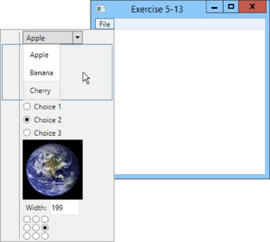
Figure 5.10
The program's File menu should contain:
· A ComboBox with three choices.
· A ListBox with three choices.
· Three RadioButtons.
· An Image.
· A StackPanel holding a Label and a TextBox.
· A Grid containing a 3 × 3 arrangement of RadioButtons.
21.Make a Windows Forms program with five levels of nested menus. In other words, make a menu File  Level 1 Level 2 Level 3 Level 4 Level 5. Make the bottommost menu item display a message box. (Again, I'm not saying this is a good idea in an actual program.)
22.[WPF] Repeat Exercise 14 with a WPF application.
23.A useful user interface technique is to not allow the user to do things that are inappropriate at the time. In a drawing application, for example, if the user isn't editing a drawing, you should disable the drawing tools.
Write a program that has three menus: File, Customers, and Employees. Give them each one menu item: Exit (and give it code), New Customer, and New Employee.
Give the program's form three RadioButtons labeled General, Manage Customers, and Manage Employees. When the user clicks a RadioButton, enable and disable the appropriate menus. (Some applications hide inappropriate menus, but that can be confusing to users who know a menu should exist but can't find it.)
For example, when the user clicks the Manage Customers button, enable the Customers menu and disable the Employees menu. Disable both menus when the user clicks the General button. (Hint: Make sure the program starts with the correct menus enabled.)
24.[WPF] Repeat Exercise 16 with a WPF application.
25.Generally it's better to use as little code as possible so you have less to program, debug, and maintain over time. Copy the application you wrote for Exercise 5-16 and change it so all three RadioButtons share a single event handler.
26.[WPF] Repeat Exercise 18 with the WPF application you wrote for Exercise 17. (Hint: IsChecked.Value tells whether a RadioButton is checked.)
NOTE
Please select the videos for Lesson 5 online at www.wrox.com/go/csharp24hourtrainer2evideos.