Sams Teach Yourself C# 5.0 in 24 Hours (2013)
Part IV: Building an Application Using Visual Studio
Hour 17. Building a Windows Application
What You’ll Learn in This Hour
• Understanding WPF
• Creating a WPF application
• Styling the layout
Now that you have completed the first three parts of this book, you should be familiar with the .NET Framework and C# language. You have learned the fundamental differences between reference and value types, including how to create your own types. You learned about language features, such as extension methods, automatic properties, lambdas, events, and exceptions. You now know how to create and query collections of data and work with files and directories in the file system, XML, and databases. In short, you should now have all the essential language skills necessary to create complex applications that take advantage of the user interface libraries provided by the .NET Framework.
Although the .NET Framework provides two different class libraries for developing Windows applications, the Windows Forms and Windows Presentation Foundation (WPF) libraries, WPF provides a much more complete and unified model for building rich Windows applications. In this hour, you learn how to build a basic WPF application. You see how to do this visually using the visual design tools and through Extensible Application Markup Language (XAML). Finally, you learn about styling your application using WPF visual styles to build an application that can be easily customized.
Understanding WPF
Windows Presentation Foundation (WPF) provides a unified programming model enabling you to build Windows applications that incorporate user interface elements, media, and documents. WPF, however, goes beyond just user interfaces. It is a next-generation presentation system enabling you to create a wide range of visually rich standalone and browser-hosted applications. At the center of WPF is a resolution-independent, vector-based rendering engine designed to take advantage of modern graphics hardware. WPF is part of the .NET Framework and most of the types you need are located in the System.Windows namespace.
Working with Markup and Code-Behind
If you have previously developed ASP.NET applications, the idea of markup and code-behind should already be familiar. In a WPF application, you use a markup language to implement the appearance of the application; you implement the behavior using a programming language, such as C#, “behind” the markup. This enables a clean separation between appearance and behavior, providing the following benefits:
• Development and maintenance costs are reduced.
• Development is more efficient, allowing the application’s appearance to be created simultaneously with other developers who are implementing the application’s behavior.
• Multiple design tools can create and share the markup.
Introducing the Extensible Application Markup Language
WPF uses Extensible Application Markup Language (XAML), which is an XML-based compositional markup language. Because XAML is XML based, the user interface (UI) you compose with it is assembled in an element tree, which is a hierarchy of nested elements. The element tree provides a logical way to create and manage the user interface.
Figure 17.1 shows a simple WPF application written completely in XAML. Specifically, the XAML defines a window and a button using the Window and Button elements, respectively, and then sets various attributes to specify the text, sizes, and so on.
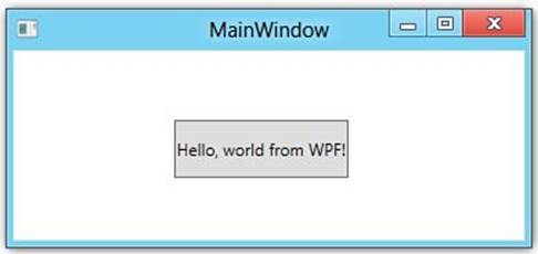
Figure 17.1. “Hello World” in WPF.
Listing 17.1 shows the XAML necessary to produce the application shown in Figure 17.1.
Listing 17.1. Simple XAML
<Window x:Class="WpfApplication1.MainWindow"
xmlns="http://schemas.microsoft.com/winfx/2006/xaml/presentation"
xmlns:x="http://schemas.microsoft.com/winfx/2006/xaml"
Title="Hello World" Height="162" Width="328">
<Grid Height="111" Width="303">
<Button Content="Hello, world from WPF!"
Margin="82,37,93,32"
Name="button1"
Height="42"
HorizontalAlignment="Center"
VerticalAlignment="Center" />
</Grid>
</Window>
Caution: The x:Class Attribute
The x:Class attribute specifies the name of the class, not the name of the file that contains the class. If you rename the class using the built-in refactoring support, Visual Studio updates the XAML, but it won’t change the actual filename. If you rename the file, Visual Studio will not automatically rename the class. To help avoid confusion, your filenames and class names should always match.
Code-Behind
Although this simple application contains a button, it isn’t very functional. The application provides no behavior that responds to user interactions, such as responding to events, calling business logic, or accessing data. This behavior is generally implemented in code associated with the markup, known as code-behind.
You can respond to the Click event of the button by adding the following attribute to the Button element:
Click="button1_Click"
This simply creates the association in the markup between the event and a method in the code-behind file. The actual code-behind required is shown in Listing 17.2. In this example, the code-behind implements a class named MainWindow that derives from the Window class. The x:Class attribute in the markup associates the markup with its code-behind class. A default public constructor that calls InitializeComponent is also automatically generated for you. The button1_Click method implements the event handler for the button’s Click event.
Note: Routed Events
A routed event is one that can invoke handlers on multiple listeners in an element tree, not just on the element that raised the event. Because of the compositional nature of WPF and WPF enabling users to interact with more than just traditional user interface elements, many events in WPF are routed events. Following are three different strategies used to route events:
• Bubbling, in which event handlers on the event source are invoked. The event then routes to successive parent elements until the root of the tree is reached.
• Direct, in which only event handlers on the event source are invoked. This is analogous to the way events in Windows Forms applications behave.
• Tunneling, in which event handlers on the event source are invoked. The event then routes to successive parent elements until the root of the tree is reached or one of the elements specifically indicates the event has been handled and no other event handlers should respond to the event.
Listing 17.2. Code-Behind Class
public partial class MainWindow : Window
{
public MainWindow()
{
InitializeComponent();
}
private void button1_Click(object sender, RoutedEventArgs e)
{
MessageBox.Show("You clicked the button!");
}
}
Figure 17.2 shows the result when the button is clicked.
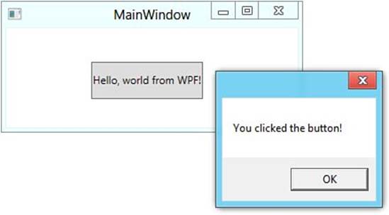
Figure 17.2. Handling the button’s Click event.
Applications
The types and services required for packaging your XAML-based content and delivering it to users as an application are part of what WPF calls the application model. Through the application model, you can create both standalone and browser-hosted applications.
Because standalone applications and browser-hosted applications are often complex and require application-scoped services, such as shared properties and startup management, WPF provides the Application class. Just like other WPF-based resources, the Application class is made up of markup and code-behind. Listing 17.3 shows the XAML that makes up the Application markup for the simple application from Listing 17.1.
Listing 17.3. Application XAML
<Application x:Class="WpfApplication1.App"
xmlns="http://schemas.microsoft.com/winfx/2006/xaml/presentation"
xmlns:x="http://schemas.microsoft.com/winfx/2006/xaml"
StartupUri="MainWindow.xaml">
<Application.Resources>
</Application.Resources>
</Application>
You already saw an example of a standalone application in the previous section. These applications use the Window class to create windows and dialog boxes that are accessed through menus, toolbars, and other UI elements. The primary purpose of a window is to host and display content, such as media, XAML pages, web pages, and documents.
Browser-hosted applications, also known as XAML browser applications (XBAPs), use pages (from the Page class) and page functions (from the PageFunction<T> class). With XBAPs, you can navigate between pages using hyperlinks. Because XBAPs are hosted in a browser (Internet Explorer 6 or later), they use a partial-trust security sandbox to enforce restrictions similar to those imposed on HTML-based applications. XBAPs can run under a full-trust sandbox, but users are prompted with a security warning dialog box, enabling them to decide if they want to run the application.
Understanding WPF Layouts
Creating a user interface requires you to arrange controls by location and size, forming a layout that must adapt to changes in window size and display settings. WPF provides a robust layout and rendering system that handles these complexities for you. The layout system is based on relative positioning rather than fixed positioning and manages the interactions between controls to determine the layout. WPF provides several layout controls for you, and you can extend the layout system with your own customized layout controls. The default layout controls follow:
• Canvas—You can think of a Canvas layout as an artist’s canvas. All child controls of a Canvas must provide their own layout. Canvas should be used with caution because it provides no inherent layout characteristics and uses exact positioning. The layout system provided by a Canvas is similar to that of Windows Forms or other layout systems that use exact x and y coordinates to position controls.
• DockPanel—The child controls are aligned to the edges of the panel. By default, the last control of a DockPanel fills the remaining space.
• Grid—The child controls are positioned by rows and columns, much like a table.
• StackPanel—The child controls are stacked either vertically or horizontally.
• WrapPanel—The child controls are arranged in a left-to-right order and wrapped to the next line when there are more controls than will display in the space provided. A WrapPanel also supports a top-to-bottom order, in which controls are wrapped to the next column when there are more controls than will display in the available space.
Figure 17.3 shows an example of using a DockPanel. The XAML for this layout is shown in Listing 17.4.
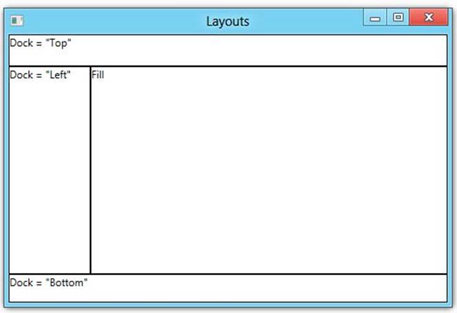
Figure 17.3. A DockPanel layout.
Listing 17.4. XAML Creating a Layout Using DockPanel
<Window x:Class="WpfApplication1.Layouts"
xmlns="http://schemas.microsoft.com/winfx/2006/xaml/presentation"
xmlns:x="http://schemas.microsoft.com/winfx/2006/xaml"
Title="Layouts" Height="182" Width="272">
<Grid>
<DockPanel>
<Border DockPanel.Dock="Top" BorderThickness="1" BorderBrush="Black">
<TextBlock Height="35">Dock = "Top"</TextBlock>
</Border>
<Border DockPanel.Dock="Bottom" BorderThickness="1" BorderBrush="Black">
<TextBlock Height="31" >Dock = "Bottom"</TextBlock>
</Border>
<Border DockPanel.Dock="Left" BorderThickness="1" BorderBrush="Black">
<TextBlock Width="93" >Dock = "Left"</TextBlock>
</Border>
<Border BorderThickness="1" BorderBrush="Black">
<TextBlock>Fill</TextBlock>
</Border>
</DockPanel>
</Grid>
</Window>
Like all WPF elements, layouts can be nested inside each other, allowing you to create complex layouts.
Using Graphics, Animation, and Media
WPF provides a flexible and rich graphics environment featuring resolution- and device-independent graphics, improved precision, advanced graphics and animation support, and support for hardware acceleration. All graphics measurements in WPF use pixels (1/96th of an inch), no matter what the actual screen resolution might be.
WPF provides support for the following:
• 2D shapes, like rectangles and ellipses
• 2D geometries to create custom shapes
• 2D effects, such as gradients, painting with videos, rotation, and scaling
• 3D rendering, which integrates with 2D graphics, enabling you to show 2D images rendered onto 3D shapes
In addition to the 2D and 3D graphics capabilities, WPF also provides animation support. This enables you to make controls grow, shake, spin, or fade, creating unique and interesting transition effects.
WPF directly supports using media, such as images, video, and audio, to convey information. Many controls, including an Image control, implicitly know how to display images. Audio and video are both supported through the MediaElement control, which is powerful enough to be the basis for a custom media player.
Understanding Text, Typography, and Documents
High-quality text rendering and manipulation are supported through OpenType font support and ClearType enhancements. WPF also has intrinsic support for working with flow documents, fixed documents, and XML Paper Specification (XPS) documents.
Flow documents optimize viewing and readability by dynamically reflowing content as the window size and display settings change. Fixed documents can be used when a precise presentation is required, such as in desktop publishing applications. XPS is an open, cross-platform document format, and support for XPS documents in WPF is built on the support for fixed documents.
Data Binding
Data binding in WPF is handled through a sophisticated and flexible binding engine that enables you to bind a control (the target) to data (the source). This binding engine provides a simple and consistent way to present and interact with data. Many controls have built-in support for displaying single data items or collections of data items, and controls can be bound to a variety of data sources, including .NET objects and XML. The data binding support in WPF is so powerful that many things that were previously only possible in code are now possible directly in XAML.
Creating a WPF Application
In the rest of this hour, you work with a Visual Studio project that has been provided as part of the book downloads, which serves as a starting point for the Desktop photo viewer application you will work on. This is the same project that you have modified during some of the previous hours. However, if you want to create a new Windows application, you would use the New Project dialog box, as shown in Figure 17.4, and choose the WPF Application template.
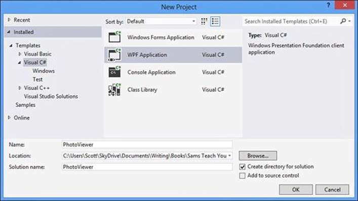
Figure 17.4. New Project dialog box.
Just as it does with console applications, Visual Studio creates a solution and project for you. In this case, both the XAML file layout file and the generated C# code-behind file are opened for you, as shown in Figure 17.5.
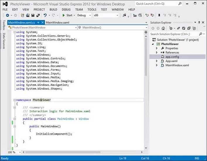
Figure 17.5. Visual Studio after creating a WPF application.
The visual designer for XAML-based user interfaces is split into two sections. By default, the top half shows the visual representation of the layout and the bottom half shows the XAML. You can make changes in both portions, and changes made in one will be reflected in the other. Figure 17.6 shows a more detailed view of the XAML designer.
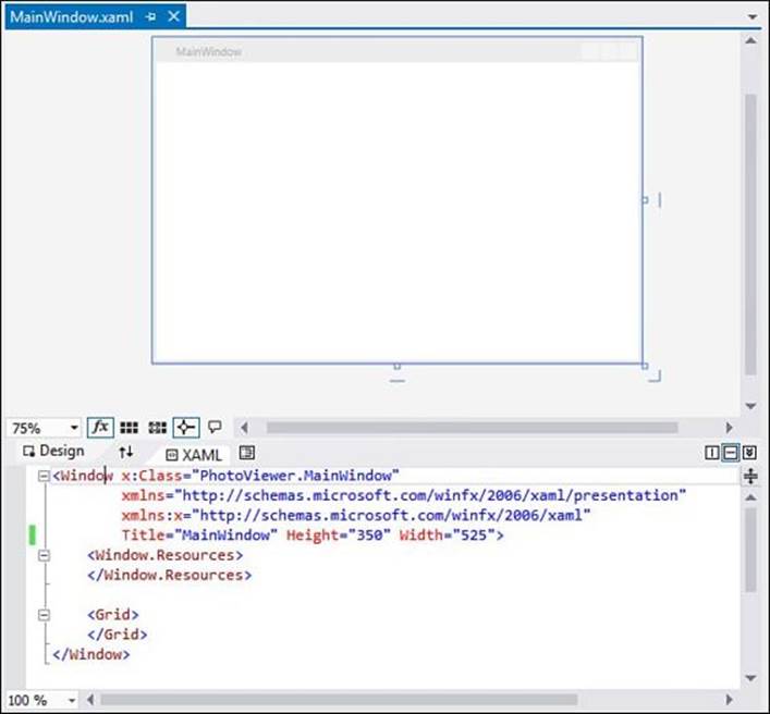
Figure 17.6. Detailed view of the XAML editing surface.
You can easily switch between the XAML and Design panes, including swapping them, using the tabs and the Swap Panes button (shown circled), as shown in Figure 17.7.
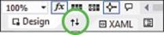
Figure 17.7. Design and XAML tabs.
You can also change the orientation of the panes, switching between a horizontal (which is the default) or vertical layout, and collapse the XAML pane entirely using the buttons on the right side of the Design and XAML tabs, as shown in Figure 17.8.
Figure 17.8. XAML pane Orientation buttons.
The button to the right of the XAML tab displays the Document Outline tool window, shown in Figure 17.9, which is a tree-oriented view showing all of the visual elements in the window and their relationships to each other. In this example, the Document Outline is not interesting because the window has no other elements. However, when you start adding controls and creating complex layouts, the Document Outline and selected element outline both become helpful for navigating through your layout.
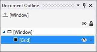
Figure 17.9. Document Outline.
If you look at the XAML generated by Visual Studio, the x:Class attribute specifies the fully qualified name of the class that implements the window. In this case, the class is MainWindow in the PhotoViewer namespace. The window Title, Width, and Height are also specified. These can be changed directly in the XAML or by using the Properties window, as shown in Figure 17.10.
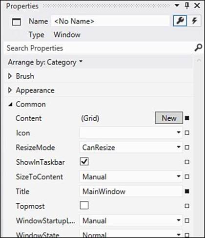
Figure 17.10. Properties window.
The xmlns namespace attributes define the schemas used by WPF. These schemas include definitions for all the controls and other items you can incorporate into a WPF application.
Creating the Layout
You are now ready to start creating the layout for the photo viewer application. If you look at the XAML again, you notice that the Window already includes a child element named Grid. In this case, the Grid doesn’t explicitly define any rows or columns, so it is a 1×1 table. For the photo viewer application, you need a grid structure containing one row and two columns.
If you click on the large area of whitespace in the Design tab, click on the blank line between the Grid element in the XAML, or click the Grid in the Document Outline, the Grid becomes the selected element. You can visually design the table structure using the mouse by moving the mouse cursor over the blue-shaded edge of the grid in the Design pane. This displays a light orange guideline across the grid showing where the row or column will be created. When the guideline is in the correct place, you can click the left mouse button to create the row or column. An example of what this would look like is shown in Figure 17.11.
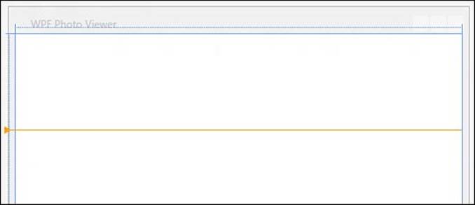
Figure 17.11. Creating a row visually.
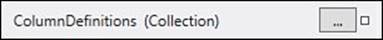
You can also edit the structure using the ColumnDefinitions and RowDefinitions properties of the Grid through the Properties window, as shown in Figure 17.12. These properties are available when you show the advanced Layout properties.
Figure 17.12. ColumnDefinitions property.
This displays a Collection Editor dialog box, shown in Figure 17.13, enabling you to easily add rows and columns and configure their properties at the same time. Using the Collection Editor is generally the easiest way to add or edit rows and columns, particularly if you are adding a lot ofrows or columns. In fact, if you need to change anything about an existing row or column, you must do so using either the Collection Editor or directly in the XAML.
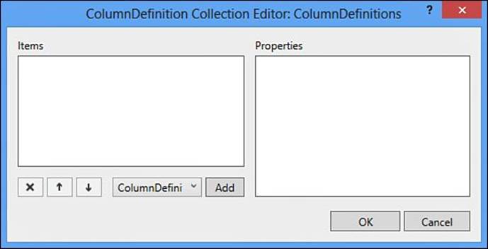
Figure 17.13. Collection Editor.
No matter if you visually create the row and column definitions or use the Collection Editor, both methods make changes to the XAML. This means that you can also edit the XAML directly to create the row and column definitions. If you have already created your rows and columns, make sure the generated XAML looks like that shown in Listing 17.5. Otherwise, add the row and column definitions shown in that listing inside the Grid element tags in the XAML.
Listing 17.5. Grid Row and Column Definitions
<Grid.RowDefinitions>
<RowDefinition Height="*" />
</Grid.RowDefinitions>
<Grid.ColumnDefinitions>
<ColumnDefinition />
<ColumnDefinition Width="350" />
</Grid.ColumnDefinitions>
Note: Height and Width Sizing
Everything in WPF is rendered in a resolution-independent manner using pixels as the unit of measurement. Although width and height are normally thought of as just numeric values, WPF has some special values it understands as well.
By providing an actual numeric value, you are telling WPF that the width or height should be exactly that size. However, if you want WPF to automatically distribute space evenly based on content, you should enter a value of Auto.
To distribute rows or columns proportionally (using the remaining space if there are also fixed or auto-sized rows or columns), you can use what is called star sizing. To use star sizing, you specify the asterisk symbol (*) as the value. When using star sizing, you can indicate a weighting value that controls how much of the available space is given to that element. For example, a row using * for height would receive one times the available space, and a row using 2* would receive two times the available space.
Now that you have the frame of the layout constructed, you need to start adding controls to it. The left side of the window contains a ListBox control that displays the photos and a Slider control, enabling you to resize the images displayed in the list box. The right side of the window contains a Grid consisting of a series of TextBlock controls to display the properties about the selected photo. The completed layout should look like Figure 17.14.
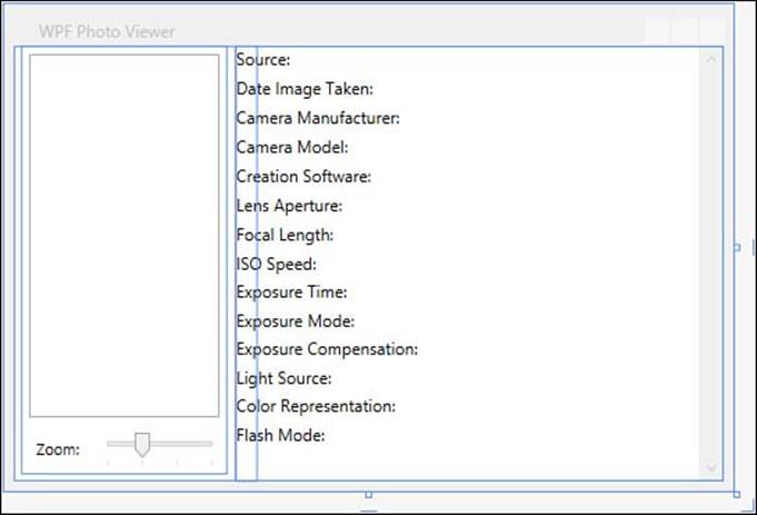
Figure 17.14. The completed MainWindow.xaml.
The XAML required for this is shown in Listing 17.6 and would be added to the Grid control, just after the row and column definitions.
Caution: WPF and Windows Runtime Controls
Although you don’t learn about the Windows Runtime and Windows Store apps until Hour 19, “Building Windows Store Apps,” not all of the WPF controls are available in the Windows Runtime. For example, the DockPanel and Label controls are not supported.
If there is a possibility of porting your Desktop application to a Windows Store app, you should choose the WPF controls so that as many as possible are supported by both environments to minimize the amount of redesign that will be required.
Listing 17.6. XAML for the Photo Viewer Layout
<DockPanel Grid.Row="0" Grid.Column="0" Margin="5,0,7,5">
<DockPanel DockPanel.Dock="Bottom" Margin="5">
<TextBlock DockPanel.Dock="Left">Zoom:</TextBlock>
<Slider Name="ZoomSlider" Margin="10,0,0,0" Orientation="Horizontal"
Minimum="80" Maximum="320" Value="160" TickFrequency="80"
TickPlacement="BottomRight" SmallChange="5" LargeChange="20" />
</DockPanel>
<ScrollViewer VerticalScrollBarVisibility="Auto"
HorizontalScrollBarVisibility="Disabled">
<ListBox IsSynchronizedWithCurrentItem="True" x:Name="photosListBox"
Margin="5" SelectionMode="Extended" SelectedIndex="0" />
</ScrollViewer>
</DockPanel>
<GridSplitter Grid.Column="1" Grid.RowSpan="2" HorizontalAlignment="Left"
VerticalAlignment="Stretch" Width="15" Background="Transparent"
ShowsPreview="True" />
<ScrollViewer Grid.Row="1" Grid.Column="1">
<Grid x:Name="metadataPanel">
<Grid.RowDefinitions>
<RowDefinition />
<RowDefinition />
<RowDefinition />
<RowDefinition />
<RowDefinition />
<RowDefinition />
<RowDefinition />
<RowDefinition />
<RowDefinition />
<RowDefinition />
<RowDefinition />
<RowDefinition />
<RowDefinition />
<RowDefinition />
<RowDefinition />
</Grid.RowDefinitions>
<Grid.ColumnDefinitions>
<ColumnDefinition />
<ColumnDefinition />
</Grid.ColumnDefinitions>
<TextBlock Grid.Row="0" Grid.Column="0">Source:</TextBlock>
<TextBlock Grid.Row="1" Grid.Column="0">Date Image Taken:</TextBlock>
<TextBlock Grid.Row="2" Grid.Column="0">Camera Manufacturer:</TextBlock>
<TextBlock Grid.Row="3" Grid.Column="0">Camera Model:</TextBlock>
<TextBlock Grid.Row="4" Grid.Column="0">Creation Software:</TextBlock>
<TextBlock Grid.Row="5" Grid.Column="0">Lens Aperture:</TextBlock>
<TextBlock Grid.Row="6" Grid.Column="0">Focal Length:</TextBlock>
<TextBlock Grid.Row="7" Grid.Column="0">ISO Speed:</TextBlock>
<TextBlock Grid.Row="8" Grid.Column="0">Exposure Time:</TextBlock>
<TextBlock Grid.Row="9" Grid.Column="0">Exposure Mode:</TextBlock>
<TextBlock Grid.Row="10" Grid.Column="0">Exposure Compensation:</TextBlock>
<TextBlock Grid.Row="11" Grid.Column="0">Light Source:</TextBlock>
<TextBlock Grid.Row="12" Grid.Column="0">Color Representation:</TextBlock>
<TextBlock Grid.Row="13" Grid.Column="0">Flash Mode:</TextBlock>
<TextBlock Grid.Row="0" Grid.Column="1" />
<TextBlock Grid.Row="1" Grid.Column="1" />
<TextBlock Grid.Row="2" Grid.Column="1" />
<TextBlock Grid.Row="3" Grid.Column="1" />
<TextBlock Grid.Row="4" Grid.Column="1" />
<TextBlock Grid.Row="5" Grid.Column="1" />
<TextBlock Grid.Row="6" Grid.Column="1" />
<TextBlock Grid.Row="7" Grid.Column="1" />
<TextBlock Grid.Row="8" Grid.Column="1" />
<TextBlock Grid.Row="9" Grid.Column="1" />
<TextBlock Grid.Row="10" Grid.Column="1" />
<TextBlock Grid.Row="11" Grid.Column="1" />
<TextBlock Grid.Row="12" Grid.Column="1" />
<TextBlock Grid.Row="13" Grid.Column="1" />
</Grid>
</ScrollViewer>
Although this might seem like a lot of work to create a user interface that isn’t very functional at the moment, it has several significant advantages over more traditional user interface development. The simplest, yet probably most significant, is that you can deliver the XAML file to a graphics-oriented person who can apply styles and other visual resources to make the application stand out while you can continue developing the core functionality of the application. As long as the underlying user interface controls aren’t changed, the designer and the developer can both continue working without impacting the other.
Tip: The Name Attribute in XAML
If you look at the ListBox and Grid definitions in Listing 17.6, you should notice an x:Name attribute. By including this attribute, the compiler actually generates a field representing that control, allowing you to reference it directly in the code-behind.
Styling the Layout
Styling a layout can actually mean a variety of different things, each with varying degrees of complexity. On one end of the spectrum is simply applying colors, background images, and various other visual elements directly to the controls. On the other end is creating complete style sheets (similar to Cascading Style Sheets [CSS] for web development) and data templates that can transform controls with an entirely new look.
Every WPF Window and Application can contain resources that define the style and data templates. Resources defined in a Window are placed in a Window.Resources element and are local only to that window. If you need resources available to the entire application, they can be placed in theApplication.Resources element in your App.xaml file.
Because style and data templates can become rather large, WPF also supports the idea of resource dictionaries. A resource dictionary is simply a XAML file containing style and data templates within a ResourceDictionary element. To include a resource dictionary, you simply add aResourceDictionary element to either Window.Resources or Application.Resources and provide it the XAML file containing the resources.
Add a new Resource Dictionary item to the project named Resources.xaml and include it in the Application.Resources element of the App.xaml file, as shown in Listing 17.7.
Listing 17.7. App.xaml with a Resource Dictionary
<Application x:Class="PhotoViewer.App"
xmlns="http://schemas.microsoft.com/winfx/2006/xaml/presentation"
xmlns:x="http://schemas.microsoft.com/winfx/2006/xaml"
StartupUri="MainWindow.xaml">
<Application.Resources>
<ResourceDictionary Source="Resources.xaml"/>
</Application.Resources>
</Application>
The complete resource dictionary definition is shown in Listing 17.8. The x:Key attribute defines the name of the style. You use this name when applying it to user interface elements in your XAML files. The TargetType defines the type name of the class the style will be applied to.
Listing 17.8. Resources.xaml Resource Dictionary
<ResourceDictionary
xmlns="http://schemas.microsoft.com/winfx/2006/xaml/presentation"
xmlns:x="http://schemas.microsoft.com/winfx/2006/xaml">
<Style x:Key="BasicTextStyle" TargetType="TextBlock">
<Setter Property="TextTrimming" Value="WordEllipsis"/>
<Setter Property="TextWrapping" Value="Wrap"/>
<Setter Property="Typography.StylisticSet20" Value="True"/>
<Setter Property="Typography.DiscretionaryLigatures" Value="True"/>
<Setter Property="Typography.CaseSensitiveForms" Value="True"/>
</Style>
<Style x:Key="BaselineTextStyle" TargetType="TextBlock"
BasedOn="{StaticResource BasicTextStyle}">
<Setter Property="LineHeight" Value="20"/>
<Setter Property="LineStackingStrategy" Value="BlockLineHeight"/>
<Setter Property="RenderTransform">
<Setter.Value>
<TranslateTransform X="-1" Y="4"/>
</Setter.Value>
</Setter>
</Style>
<Style x:Key="BodyTextStyle" TargetType="TextBlock"
BasedOn="{StaticResource BaselineTextStyle}">
<Setter Property="FontWeight" Value="Light"/>
</Style>
<Style TargetType="{x:Type ListBox}" x:Key="PhotoListBoxStyle">
<Setter Property="Foreground" Value="White" />
<Setter Property="Template">
<Setter.Value>
<ControlTemplate TargetType="{x:Type ListBox}" >
<WrapPanel Margin="5" IsItemsHost="True"
Orientation="Horizontal"
ItemHeight="{Binding ElementName=ZoomSlider, Path='Value'}"
ItemWidth="{Binding ElementName=ZoomSlider, Path='Value'}"
VerticalAlignment="Top" HorizontalAlignment="Stretch" />
</ControlTemplate>
</Setter.Value>
</Setter>
</Style>
</ResourceDictionary>
Apply the BodyTextStyle style to each of the TextBlock controls, by adding the following attribute:
Style="{StaticResource BodyTextStyle}"
Similarly, add the PhotoListBoxStyle to the ListBox control as well.
If you run the application again, you should see the new styles, as shown in Figure 17.15.
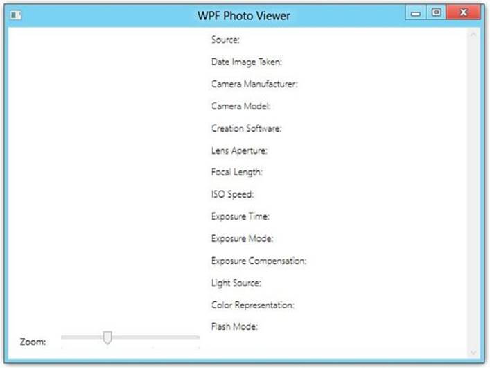
Figure 17.15. The restyled application.
Summary
In this hour, you had a quick overview of Windows Presentation Foundation and what it enables you to do. You created a simple WPF application and added code to respond to user events. Finally, you learned how to create styles for your application, completely changing the look with relative ease.
At this point, the application works and looks good but doesn’t actually do anything yet. You learn how to put the remaining pieces together in the next hour when you learn about the data-binding capabilities provided by WPF in more detail.
Q&A
Q. What is Windows Presentation Foundation?
A. Windows Presentation Foundation (WPF) is a presentation technology that provides a unified programming model enabling you to build Windows applications that incorporate user interface elements, media, and documents.
Q. What is the benefit to developing with the markup and code-behind style?
A. This enables a clean separation between appearance and behavior, providing the following benefits:
a. Development and maintenance costs are reduced.
b. Development is more efficient, allowing the application’s appearance to be created simultaneously with other developers who are implementing the application’s behavior.
c. Multiple design tools can be used to create and share the markup.
Workshop
Quiz
1. What is star sizing for rows and columns in a Grid?
2. What is a routed event?
Answers
1. To distribute rows or columns proportionally (using the remaining space if there are also fixed or auto-sized rows or columns), you can use what is called star sizing. To use star sizing, you specify the asterisk symbol (*) as the value. When using star sizing, you can indicate a weighting value that controls how much of the available space is given to that element. For example, a row using * for height would receive one times the available space, and a row using 2* would receive two times the available space.
2. A routed event is one that can invoke handlers on multiple listeners in an element tree, not just on the element that raised the event.
Exercises
1. If you haven’t already modified the PhotoViewer project to include the resource dictionary shown in Listing 17.8, applied the appropriate styles to the ListBox and TextBlock controls, and modified the MainWindow.xaml so that it implements the layout defined in Listing 17.5 and Listing 17.6, do so now.
All materials on the site are licensed Creative Commons Attribution-Sharealike 3.0 Unported CC BY-SA 3.0 & GNU Free Documentation License (GFDL)
If you are the copyright holder of any material contained on our site and intend to remove it, please contact our site administrator for approval.
© 2016-2026 All site design rights belong to S.Y.A.