Geocomputation: A Practical Primer (2015)
PART I
DESCRIBING HOW THE WORLD LOOKS
1
SPATIAL DATA VISUALISATION WITH R
James Cheshire and Robin Lovelace
Introduction
What is R?
R is a free and open source computer program for processing data. It runs on all major operating systems and relies primarily on the command line for data input (www.r.project.org). This means that instead of interacting with the program by clicking on different parts of the screen via a graphical user interface (GUI), users type commands for the operations they wish to complete. For new users this might seem a little daunting at first, but the approach has a number of benefits, as highlighted by Gary Sherman (2008: 283), developer of the popular geographical information system (GIS) QGIS:
With the advent of ‘modern’ GIS software, most people want to point and click their way through life. That’s good, but there is a tremendous amount of flexibility and power waiting for you with the command line. Many times you can do something on the command line in a fraction of the time you can do it with a GUI.
A key benefit is that commands sent to R can be stored and repeated from scripts. This facilitates transparent and reproducible research by removing the need for software licences and encouraging documentation of code. Furthermore, access to R’s source code and the provision of a framework for extensions has enabled many programmers to improve on the basic, or ‘base’, R functionality. As a result, there are now more than 5000 official add-on packages, allowing R to tackle almost any numerical problem. If there is a useful function that R cannot currently perform, it is likely that someone is working on a solution. One area where extension of R’s basic capabilities have been particularly successful in recent years is the addition of a wide variety of spatial analysis and visualisation tools (Bivand et al., 2013). The latter will be the focus of this chapter.
Why R for spatial data visualisation?
R was conceived ‒ and is still primarily known ‒ for its capabilities as a ‘statistical programming language’ (Bivand and Gebhardt, 2000). Statistical analysis functions remain core to the package, but there is broadening functionality to reflect a growing user base across disciplines. It has become ‘an integrated suite of software facilities for data manipulation, calculation and graphical display’ (Venables et al., 2013). Spatial data analysis and visualisation is an important growth area within this increased functionality. The map of Facebook friendships produced by Paul Butler, for example, is iconic in this regard and has reached a global audience (Butler, 2010). It shows linkages between friends as lines passing across the curved surface of the Earth (using the geosphere package). The secret to the success of this map was the time taken to select the appropriate colour palette, line widths and transparency for the plot. As we discuss later in this chapter, the importance of such details cannot be overstated. They can be the difference between a stunning graphic and an impenetrable chart.
Arguably Butler’s map helped inspire the R community to produce more ambitious graphics, a process fuelled by an increased demand for data visualisation and the development of packages that augment R’s preinstalled ‘base graphics’. Thus R has become a key tool for analysis and visualisation used by the likes of Twitter, the New York Times and Google. Thousands of consultants, design houses and journalists also rely on R – it is not the preserve of academic research, and many graduate jobs now list R as a desirable skill.
It is worth noting that there are a few key differences between R and traditional desktop GIS software. While dedicated GIS programs handle spatial data by default and display the results in a single way, there are various options in R that must be decided by the user.
One example of this is the choice between R’s base graphics and a dedicated graphics package such as ggplot2. The former option requires no additional packages and can provide very quick feedback about the nature of the dataset in question with the generic plot() function. The ggplot2 option, by contrast, requires a new package to be loaded but opens up a very wide range of functions for visualising data, beyond the base graphics. ggplot2 also has sensible defaults for grid axes, legends and other features, allowing the user to create complex and beautiful graphics with minimal effort. We encourage users to try both but, following the focus on visualisation, have used ggplot2 for all but the first two plots presented in this chapter.
An innovative feature of this chapter is that all of the graphics presented in it are reproducible (see the next section for how). We encourage users not only to reproduce the graphics presented here but also to play around with the code, taking advantage of the wide range of visual analysis options opened up by R. Indeed, it is this flexibility, illustrated by the custom map of shipping routes presented later in this chapter, that makes R an attractive visualisation solution.
All of the results presented in this chapter can be reproduced (and modified) by typing the short code snippets that are presented into R. Elsewhere in this book, these principles are extended in the context of reproducible geographic information science.
A practical primer on spatial data in R
This section introduces those steps required to get started with processing spatial data in R. The chapter focuses on the visualisation of so-called vector data (common in socio-economic examples), but R also provides functionality for the analysis and visualisation of raster data (see supporting materials). For users completely new to R, we would recommend beginning with an introductory tutorial, such as Torfs and Brauer (2014) or Lovelace and Cheshire (2014). Both are available free online.
The first stage is to obtain and load the data used for the examples into R. These data have been uploaded into an online repository that also provides a detailed tutorial to accompany this chapter: http://github.com/geocomPP/sdvwR.1
In any data analysis project, spatial or otherwise, it is important to have a strong understanding of the dataset before progressing. R is able to import a very wide range of spatial data formats by linking with the Geospatial Data Abstraction Library (GDAL). An interface to this library is contained in the rgdal package: install and load it by entering install.packages("rgdal") followed by library(rgdal) on separate lines. The former only needs to be typed once to install the package; however, the latter must be run for each new R session that requires use of the functions contained within the package.
The world map that we use is available from the Natural Earth website and a slightly modified version of it (entitled ‘world’) is loaded using the following code (see Figure 1.1).2

The above block of code loads the rgdal library, creates and then plots a new object called wrld (Figure 1.1). This operation should be fast on most computers because wrld has a small file size. Spatial data can, however, get very large as the number and complexity of zones increases. We recommend keeping track of the size of spatial objects and to simplify them when necessary prior to visualisation.3
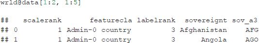
When spatial data are imported into R, they are saved in a spatial object class using the sp package (Bivand et al., 2013). The spatial data are divided into a series of different slots, storing the attribute and geometry data separately.4 To view the slot names of an object you can use the function slotNames(), with the object name written within the brackets.
The contents of ‘slots’ within spatial data objects can be accessed using the ‘@’ symbol. In the example below, the first two rows of the data slot are displayed, and can be treated as a standard data frame.
Fundamentals of spatial data visualisation
Good maps can have an enormous impact on understanding of spatial patterns, from initial exploratory data analysis through to the communication of results. Graphics do, however, need to be refined and calibrated, and this section describes such considerations. It should be noted that not all good maps and graphics must contain all the features discussed: they should be seen as suggestions rather than firm principles.
Effective map-making is a difficult process. As Krygier and Wood (2011: 6) put it: ‘there is a lot to see, think about, and do’. We use ggplot2 as the package of choice to produce most of the maps presented in this chapter because it facilitates good practice in data visualisation. The ‘gg’ in its name stands for ‘Grammar of Graphics’, a set of rules developed by Wilkinson (2005). Grammar in the context of graphics works in much the same way as it does in language: providing structure to the presented material. The ggplot2 package was developed by Hadley Wickham, and includes a syntax for building graphics in layers using the + symbol (see Wickham, 2010). This layering component is especially useful in the context of spatial data since it is conceptually the same as map layers in a conventional GIS.
In the following analysis, the previously loaded map of the world will be used to demonstrate a series of cartographic principles. This spatial object contains 35 columns of data; however, for our purposes, we are only really interested in population ("pop_est"). Typing summary(wrld$pop_est) provides basic descriptive statistics on population.
Before progressing, we will reproject the data.5 The coordinate reference system of the world shapefile (named wrld) is WGS84, which is a very common latitude and longitude format. Without projecting the data when plotted, this format distorts the size of countries close to the North and South poles (at the top and bottom of the Figure 1.1 (left)). Instead, the Robinson projection (see Figure 1.1 (right)) can be used to provide a better compromise between areal distortion and shape preservation. Changes of projection can be accomplished using spTransform() with the projection required set with the CRS (coordinate reference system) parameter.
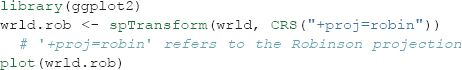
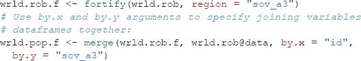
Plotting the reprojected spatial object results in a world map that is better proportioned. As such, when adding detail to the representation, salient patterns will be presented more clearly to end users. Figure 1.1 was created with R’s base graphics. However, the remaining examples will use the ggplot2 package introduced above. This requires the data to be in a slightly different format than base R and should be converted using the fortify function. This step discards the attribute data associated with the spatial object and so this needs to be reattached using the merge function.
FIGURE 1.1 A basic map of the world in geographic (cartesian) coordinates (left) and the Robinson projection (right)
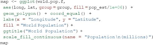
Now that the R object is in the correct format to be plotted with ggplot2, the code that follows produces a choropleth map coloured by the population variable. This demonstrates the syntax of ggplot2 by first linking together a series of plot commands, and assigning them to a single R object called map. If you type map into the command line, R will then execute the code and generate the plot shown in Figure 1.2. By specifying the fill variable within the aes()(short for ‘aesthetics’) argument, ggplot2 colours the countries using a default colour palette and automatically generates a legend. geom_polygon() tells ggplot2 to plot polygons. As will be shown later, these defaults can be altered to change a map’s appearance.
Colour has a large impact on how people perceive a graphic. Adjusting a colour palette from yellow to red or from green to blue, for example, can alter the readers’ response. In addition, the use of colour to highlight particular regions or de-emphasise others is an important trick in cartography that should not be overlooked. For more information about the importance of different features of a map for its interpretation, see Monmonier (1996).
ggplot2 recognises the difference between continuous and categorical (nominal) variables and will automatically assign an appropriate colour palette accordingly (see Figure 1.3). The default colour palettes are a good place to start, but users can specify them, for example, to print a map in black and white. The scale_fill() (for areas) and scale_colour() (for lines and points) family of commands enable such customisation. For categorical data, for example, scale_fill_discrete() can be used. The full range of options can be seen within RStudio by typing scale_fill followed by the tab key.
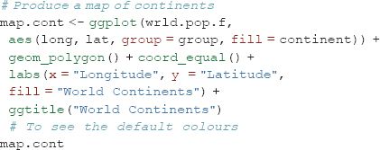
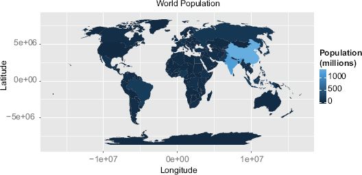
FIGURE 1.2 World population map
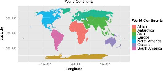
FIGURE 1.3 A map of the continents using default colours
Colours can be specified manually, either using words, as illustrated in the example, or more flexibly, such as through the use of hexadecimal colour codes:
![]()
The command scale_fill_continuous() is used to set a continuum-based colour scheme:
![]()
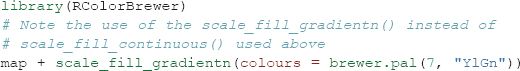
Choosing an appropriate colour palette is difficult and there are a variety of considerations, such as the intended destination of a graphic (computer screen, print, etc.), the likely audience and visual impairments such as colour blindness. There is a large body of literature associated with colour perception, and this forms the basis to the Color Brewer palettes developed by Cynthia Brewer (see http://colorbrewer2.org). These are designed to be colour-blind safe and perceptually uniform such that no one colour jumps out more than any others. This latter characteristic is important when trying to produce impartial maps. R has a package that contains these colour palettes and they can be easily accessed by ggplot2.
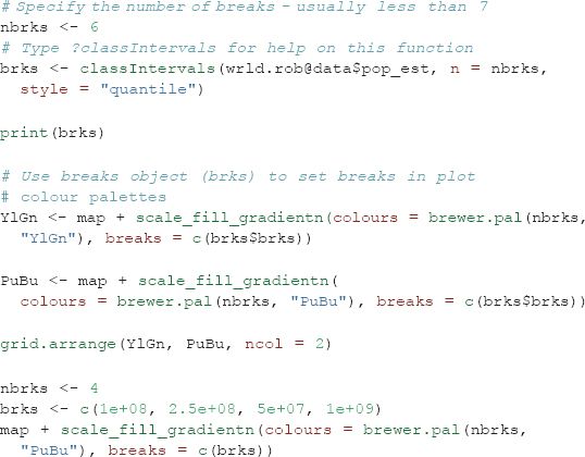
In addition to altering the colour palette used to represent a continuous dataset, it may also be desirable to adjust the breaks at which the colour transitions occur. There are many ways to select both the optimum number of breaks and the locations in the dataset at which they occur. This is important for the comprehension of a graphic since it alters the colours associated with each value. The classINT package contains many ways to automatically create these breaks. We use the grid.arrange() function from the gridExtra package to display a series of maps side by side, illustrating different break choices.
Line colour and width are also important parameters for enhancing the legibility of a graphic (see Figure 1.4). The code below demonstrates it is possible to adjust these using the colour and lwd arguments. The impact of different line widths will vary depending on screen size and resolution. Also, if you save the plot to pdf (e.g. using the ggsave() command), this will also alter the relative line widths. As such, it is often useful to generate and check plots in the desired output format, and then adjust the code until these are appropriate.
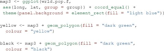
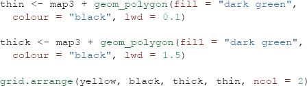
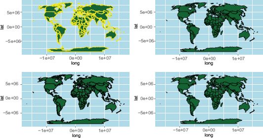
FIGURE 1.4 The impact of line width
There are other parameters, such as layer transparency (use the alpha parameter for this), that can be applied to all aspects of the plot – both points, lines and polygons. Space does not permit full exploration here, but more information is available in the ggplot2 package documentation (see http://ggplot2.org).
Map adornments
Map adornments and annotations orientate the viewer and provide context. They include grids (also known as ‘graticules’), orientation arrows, scale bars and graphical overlays. None are required on a single map; indeed, it is often best that they are used sparingly to avoid unnecessary clutter (Monkhouse and Wilkinson, 1971). With ggplot2, axes and legends are provided by default, but they can be customised or removed.
The maps created so far have concerned a single dataset. However, it is possible to layer separate datasets together to create a single map. This is something required to create both the north arrow and scale bar since they are, in effect, data that are not stored in the same R object used to produce the plot (in this case only a couple of coordinate pairs). This process can therefore be replicated with additional R objects and not just for map adornments. It first requires an empty plot, meaning that each new layer must be defined with its own dataset, and as such, the syntax is a little different from that presented previously. Although more code is needed, it does enable much greater flexibility with regard to what can be included as new layer content. Another possibility is to use geom_segment() to add a rudimentary arrow (see ?geom_segment for refinements):
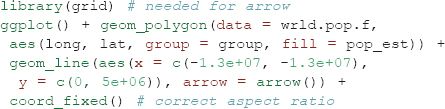
The scale bar capabilities of ggplot2 are perhaps the least advanced element of the package. To create a scale bar the spatial data will need to be in a projected coordinate system to ensure there are no distortions as a result of the curvature of the earth. In the case of the world map the distances at the equator in terms of degrees east to west are very different from those further north or south. Any line drawn using the the simple approach below would therefore be inaccurate. For maps covering large areas – such as the entire world – leaving the axis labels on will enable them to act as a graticule to indicate distance. The following example uses a shapefile of London’s boroughs.
Legends are added automatically, but can be customised in a number of ways. They are an important adornment of any map since they describe what attributes the colours reference. As a general rule, legends with values that go to a large number of significant figures should be avoided. The following code moves the legend from the default position to the top of the map (see Figure 1.5).
![]()
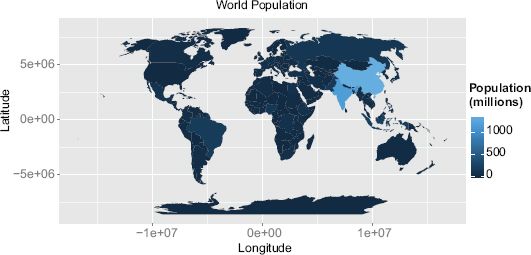
FIGURE 1.5 Formatting the legend
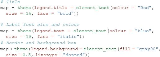
Many more options are available, such as adding a title, adjusting the font size or colour, and controlling other aspects such as the map borders. These are illustrated by the following code.
Plotting over a base map
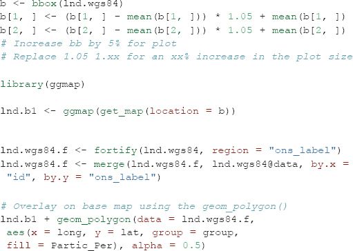
The ggmap package extends the ggplot2 package to integrate online mapping services such as Google Maps and OpenStreetMap (OSM) for base cartography. By using image tiles derived from these services, spatial data can be placed in context as users can easily orientate themselves to streets and landmarks. In the following examples, data on London sports participation are used. The data were originally projected in British National Grid, which pertains to a different referencing system than that used in the Google or OSM online map services. This is a common problem and one that is easily overcome using the reprojection function outlined above.
After importing the boundary data and reprojecting, a bounding box of the lnd.wgs84 object was calculated to identify the geographic extent of the map. This information is used to request an appropriate base map from a selected map tile service. The first block of code in the snippet below retrieves the bounding box and then adds 5% so there is a little space around the edges of the data to be plotted. This is then fed into the get_map() function as the location parameter. The code actually utilises two nested functions, ggmap() and get_map,() which are required to produce the plot and provides the base map data. You will notice from the code snippet below that ggmap follows the same syntax structures as ggplot2 and so can easily be integrated with the other examples included here. The example data object contains spatial polygons but spatial points and lines can also be plotted.
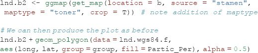
The resulting map looks reasonable, but it would be improved with a simpler base map. A design firm called stamen provide the tiles we need and they can be brought into the plot with the get_map() function. This produces a much clearer map and enables readers to focus on the data rather than the cartography of the base map. The integration of data and services from third parties is a growing trend within R and one of its key strengths: users are not constrained to proprietary or paid-for services, they can make full use of the open data sources that are now available.
Case Study
As an illustrative example, this final section describes the creation of a map depicting eighteenth-century shipping flows. The data used in this visualisation have been obtained from the Climatological Database for the World’s Oceans and represent a sample of digitised ships’ logs from the eighteenth century. We are using a very small sample of the full dataset, which is available from http://pendientedemigracion.ucm.es/info/cliwoc/. The example has been chosen to demonstrate a range of plotting capabilities within ggplot2, and illustrate those ways in which they can be applied to produce high-quality maps that are reproducible with only a few lines of code.
The example uses the png package to load in a series of map annotations stored as png graphics files. These have been created in image editing software and will add a historic feel to the map. We are also loading in a world boundary shapefile and the shipping data itself.
The first few lines in the bdata object contain seven columns, with each row reporting a single point on the ship’s course. The first step is to specify the format for a number of plot parameters that will remove the axis labels.
![]()
The next step is to prepare the world coastlines for input into ggplot2 with the fortify() command, and then combined with background data to create the plot. In the following code, this sets the extents of the plot window and provides a blank canvas on which layers can be built (Figure 1.6). The first layer created is the wrld object; the code is wrapped in c() to prevent it from executing by simply storing it as the plot’s parameters.
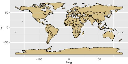
FIGURE 1.6 World map
The code snippet below creates the plot layer containing the shipping routes. The geom path() function is used to string together the coordinates to form the routes. You can see within the aes() that this specifies the longitude and latitude, plus, pasted together, the trp and group.regroup variables to identify the unique paths.

We now have all we need to generate the final plot, shown in Figure 1.7, by building the layers together with the + sign as shown in the code overleaf. The first three arguments are the plot layers, and the parameters within theme()are changing the background colour to sea blue. annotation_raster() plots the png map adornments loaded in earlier. This requires the bounding box of each image to be specified. In this case we use latitude and longitude (in WGS84), and we can use these parameters to change the png’s position and also its size. The final two arguments fix the aspect ratio of the plot and remove the axis labels.
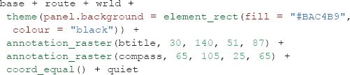
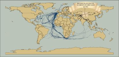
FIGURE 1.7 World shipping
In the plot example we have chosen the colours carefully to give the appearance of a historic map. An alternative approach could be to use a satellite image as a base map. It is possible to use the readPNG() function to import NASA’s ‘Blue Marble’ image for this purpose. Given that the route information is the same projection as the image, it is very straightforward to set the image extent to span –180 to 180 degrees and –90 to 90 degrees and have it align with the shipping data. Producing the plot (Figure 1.8) is accomplished using the code below. This offers a good example of where functionality designed without spatial data in mind can be harnessed for the purposes of producing interesting maps. Once you have produced the plot, alter the code to recolour the shipping routes to make them appear more clearly against the blue marble background.
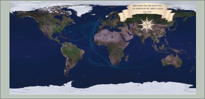
FIGURE 1.8 World shipping with raster background
Conclusion
There are infinite combinations of colour, adornments and line widths that could be applied to a map (or any other data visualisation), so do not feel constrained by the examples presented in this chapter. Take inspiration from maps and graphics you have seen and liked, and experiment. The process is iterative, usually taking multiple attempts to arrive at a satisfactory output. To give your maps a final polish you may wish to export them as a pdf using the ggsave() function and then add additional customisations using external graphics programs such as Adobe Illustrator or Inkscape.
The beauty of producing maps in a programming environment as opposed to a GUI, offered by the majority of GIS programs, lies in the fact that each line of code can be easily adapted to a different purpose. Users can create a series of scripts that act as templates and simply reuse them when required. This can save time in the long run and has the added advantage that all outputs can have a consistent style.
This chapter has covered a variety of techniques for the preparation and visualisation of spatial data in R. While this is only the tip of the iceberg in terms of R’s spatial capabilities, the simple worked examples lay the foundations for further exploration of spatial data in R, using the multitude of spatial packages. These can be discovered online, through R’s internal help (we recommend frequent use of R queries such as ?plot) and other published work on the subject. It is hoped that the techniques and examples covered in this chapter will help communicate the results of spatial data analysis to the target audience in a compelling and effective way. As the R community grows, so will R’s range of spatial applications and functions. The supportive online communities surrounding large open source programs such as R are one of their greatest assets. We recommend you become an active ‘open source’ citizen rather than merely a passive consumer of new software (Ramsey and Dubovsky, 2013). As R continues its ascent as a spatial analysis and data visualisation platform, the opportunities to create beautiful and useful maps are only set to grow.
FURTHER READING
R is constantly evolving, and as its user community grows the number of online resources is set to increase. An up-to-date resource on R for mapping, with further examples of its spatial functionalities is the online Creating-maps-in-R project: github.com/Robinlovelace/Creating-maps-in-R (Lovelace and Cheshire, 2014). For more on raster datasets, we would recommend the Raster vignette from the raster package. We also recommend “ggmap: Spatial Visualization with ggplot2” (Kahle and Wickham, 2013), available free online, for a more advanced introduction to mapping with ggplot2.
Map projections are a complex and important topic that we only touch on here. The following two web pages offer some further context and technical information: http://spatial.ly/2011/03/flattening-the-earth/ and http://en.wikipedia.org/wiki/Map_projection.
To stay abreast of current developments and tutorials in R we recommend http://www.r-bloggers.com, a feed aggregator about R, and the https://rpubs.com/ code repository.
1To download the data that will allow the examples to be reproduced, click on the ‘Download ZIP’ button on the right-hand side of the page, and unzip this to a convenient place on your computer (e.g. the Desktop). This should result in a folder called ‘sdvwR-master’ being created.
2A common problem preventing the data being loaded correctly is that R is not set with the correct working directory. For more information, refer to the online tutorial hosted at http://github.com/geocomPP/sdvwR.
3R makes this easy; see the tutorial that accompanies this chapter (http://github.com/geocomPP/sdvwR).
4For more detail on this topic, see ‘The structure of spatial data in R’ in the online tutorial.
5For more information on referencing systems, see the links in the supporting materials.
All materials on the site are licensed Creative Commons Attribution-Sharealike 3.0 Unported CC BY-SA 3.0 & GNU Free Documentation License (GFDL)
If you are the copyright holder of any material contained on our site and intend to remove it, please contact our site administrator for approval.
© 2016-2026 All site design rights belong to S.Y.A.