Mastering Gephi Network Visualization (2015)
Chapter 8. Dynamic Networks
Dynamic Network Analysis (DNA), is an emergent field within the larger area of network analysis. At its simplest level, DNA adds a time element to the usual network structure, facilitating temporal analysis of the data.
There are many potential variables introduced when we add a time element to the network. Relationships between network nodes may strengthen, weaken, or even disappear as time unfolds. We may also witness physical movements in the network, the entry of new members, or the removal of existing nodes for a variety of reasons. In short, the network becomes increasingly complex.
What we can deduce from the preceding definition is that dynamic networks afford the possibility for greater exploration compared to traditional networks. We can see how networks are likely to evolve, witness the appearance and disappearance of links, and understand how a network changes (or is likely to change) over time. Here's what we'll cover in this chapter:
· When to use DNA
· The process of preparing data for DNA analysis in Gephi
· How to implement and view graphs within Gephi
· How to create GEXF files outside of Gephi
Let's begin by discussing when we should use dynamic network analysis.
When to use DNA
There are a host of potential applications for DNA, including the following:
· Social media analysis, where friends and contacts are frequently changing
· Communication networks, such as corporate e-mail systems, where evolving patterns emerge over the course of days and weeks
· Political networks that change over time as entities gain or lose power
· Terrorist cells with frequent changes in structure driven by increasing membership and evolving network connections
· Disease modeling, where contagion rates can force rapid changes in the status of nodes within a network
In short, any network with relatively frequent changes over time will be a good candidate for DNA. Networks with infrequent or very slow changes (perhaps tenured faculty at a university or power grid infrastructure networks, to name just two examples) are often adequately addressed by static networks, as temporal analysis adds complexity while shedding little additional insight into network behavior.
There are two distinct types of DNA that can be created, as described here:
· A dynamic topological network, where member nodes can change positions, and appear or disappear at specific time intervals. This approach can be used to observe network growth achieved via new entrants, and to witness changes in structure due to movements within the network. If your wish is to see changes to an overall network, this is probably the direction to pursue.
· A network with dynamic attributes is different, with the focus being on changes to the nodes themselves, rather than the structure of the network. In this case we might observe the degree of growth of specific nodes across multiple time intervals. This approach is somewhat more challenging to implement, as it involves repeating each node at multiple stages rather than the customary single instance, which will require your source data to have a somewhat different structure. We'll take a look at how to do this later in the chapter.
It is important to note that the two types highlighted above are not mutually exclusive. They can be combined to detail the evolution of complex network behaviors where nodes and relationships emerge and vanish, but also change in stature over time.
Our first look will be focused on the processes needed to create common topology-based examples of dynamic network analysis. Later in the chapter, we'll take a similar walk to develop and create projects for attribute-based DNA.
Topology-based DNA
Let's begin our exploration with the dynamic topology approach, using the following as our guidelines. We'll begin with an example instance before moving on to creating our own working examples using a few simple steps:
1. We'll start by exploring the concept of DNA using the graph generators familiarized in Chapter 4, Network Patterns. We'll begin with the dynamic graph example, which will be used to illustrate a very simple example of a dynamic network.
2. Next, we'll start preparing the data for use in a DNA project, which will allow us to leverage Gephi's built-in capabilities to create time intervals that facilitate dynamic networks.
3. Then we'll move on to the process of implementing, and ultimately working with, a dynamic network analysis example in Gephi.
4. Finally, we'll end the section with a discussion on what we learned from our example and how we might apply this process to other network datasets.
So without further delay, let's look at a very basic example of DNA as provided using the dynamic graph example from the generators menu.
Generating a dynamic network
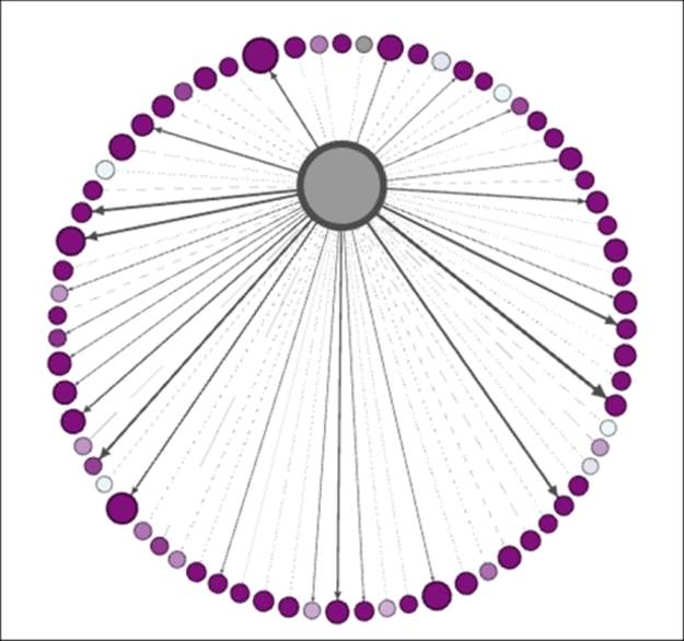
To begin this process, navigate to File | Generate | Dynamic Graph Example from the Gephi menu system. Selecting this option will create a network with 50 nodes and somewhere upwards of 50 edges (this will vary somewhat randomly). In your workspace, you should see something simple along these lines:
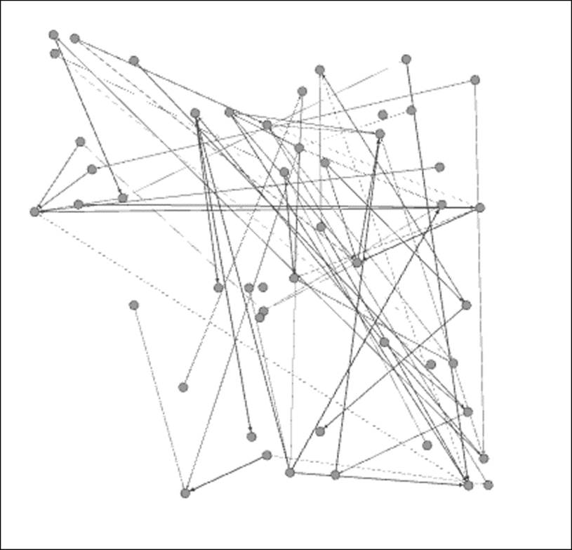
Generated dynamic network graph
This particular graph has 50 nodes and 64 edges, a small, sparse network that will nonetheless illustrate a simple instance of DNA quite effectively. At first glance, this looks like any other network we might see in Gephi, but there is something hidden in the data that is not present in the static graphs. For a quick illustration of how the data differs, take a look at the Nodes tab in the Data Laboratory window:
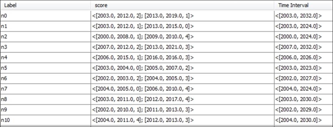
Time intervals for dynamic networks in the Nodes tab
Understanding time intervals
Take a look at the score and Time Interval attributes, where each node has more complex information sets. If you are familiar with XML, or have become acquainted with GEXF (a graph-based variant of XML), you will recognize the data layouts for these attributes. If not, don't worry, as it will be quite easy to understand. What we see here is quite basic—starting with a time interval value that shows when each individual node enters or exits the network, say [2004.0, 2024.0]. In this example, node n7 will appear in the graph in 2004 and remain visible through 2024.
The score attribute will also change in this case, giving us a preview of dynamic attributes, which will be covered in greater detail later in the chapter. For node n7, we see the values [2004.0, 2005.0, 0]; [2006.0, 2010.0, 4], which translates to a score of 0 in the period between 2004 and 2005, followed by a score of 4 for 2006 through 2010. No information is provided for the years through 2024 in this case, although that could also be added.
Now take a look at the Edges tab, specifically the Weight attribute in the following screenshot. Notice the higher level of complexity here, as the relationships between nodes change over time, alternately strengthening or weakening of their respective connections.
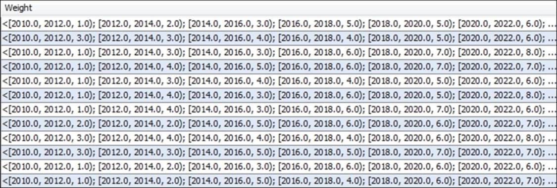
Time intervals across edge weights
Note that the time intervals use both brackets and parentheses for parsing the data. Each interval begins with a bracket, and all end with a closing parenthesis—except for the final interval, which uses a closing bracket to signify the end of the data for a given row.
Now that the data is at least somewhat familiar, it's time to see how this extends to the network graph visualization, using a timeline. This is the key Gephi option for viewing dynamic networks, one which we'll spend more time on in a moment. For now, recognize that the timeline will use our time interval data to build a dynamic network.
Working with timelines
Open the timeline by selecting it in your Overview window (it's found at the bottom of the window). You'll see a timeline extending from the start point of 2000 all the way out to about 2037. In its default mode, the entire graph will be displayed. To see how this works, grab the right edge of the timeline and drag it to 2005, and see how the results reflect only those nodes present in the network at that time:
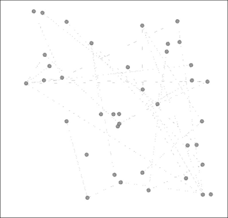
Viewing a network at a point in time with the timeline feature
Now drag the right edge as far to the left as possible, so your entire network is reduced to just those nodes present at the start of the network period. This should leave you with just 6 nodes out of the original 50. Next, click on the large arrow to the left of the timeline to see how the network evolves over the nearly 40-year period. What do we see? Nodes enter the network, connections are formed, nodes leave, connections are broken, and we wind up with just a handful of surviving members in the final years.
If you find the graph changing too rapidly (or too slowly), click on the icon at the bottom-left corner of the timeline, pick the Set play settings option, and change the values using the ensuing dialog screen.
While you might find the dynamic graph example to be less than realistic in its depiction of the way most networks behave, it nevertheless provides a useful foundation for our own explorations. To create our own more sophisticated examples, we can follow a series of steps that result in a final graph that can tell a compelling story.
Preparing and importing data for DNA
One essential ingredient for a dynamic network analysis is to have some sort of attribute or attributes that describe one or more units of time. These fields can be in the form of integers, dates, or timestamps, and should correspond with the events in the network at a node level. Here are just a few ideas for what could be represented by one or more of these fields:
· A birth date
· A deceased date
· Date of entry into a network
· Date of removal from a network
· Timestamp of a Twitter tweet
You probably get the idea—virtually any sort of time-related event can be included in a network dataset to help describe specific events, relationships, network entry or exit, network growth, and so on. In cases where networks are fluid, it is very helpful to have attributes representing both start and end points of key behaviors. In the case of dynamic attributes, we will also perhaps want to include some information that reflects changes in stature at a node or edge level.
You needn't worry about merging the data beforehand (although you could use a GEFX format prior to importing to Gephi; more on GEFX later in the chapter), as Gephi makes it very simple to merge individual fields into a time range (start date and end date for example) that can be used to view changes in the network over a span of time. It would be a good idea to populate your network with as many time elements as possible, giving yourself the opportunity to view multiple scenarios in Gephi before deciding which one tells the most compelling story.
Think carefully about what you would like to see in your network graph, as this can save considerable time spent iterating through multiple data pulls. Once you have settled on your general goal for the visualization, there are a few simple guidelines that can make the process as straightforward as possible, especially if the data source is a .csv or other generic file format:
· Make sure your node's file is recognizable when you import it into Gephi. This applies to static as well as dynamic network projects. A critical part of this process is to correctly identify the data type for each attribute. In many instances, Gephi might assume that your data is a string type, even when it actually represents numerical values. Rectifying field types after the import is possible, but it is much more easily done at the outset.
· Your edges table must have source and target values, even when importing an undirected network. Most networks will also benefit with the edge weight values in the data source file.
· If you have multiple node attributes beyond the standard label and ID fields, be sure to import the nodes table before you load an edges table. Otherwise, Gephi will automatically create a nodes table based on the edges data, which will make it very difficult to update your nodes table. Nodes first, edges second.
· Assuming you plan to create time intervals for a DNA (you should be if you are reading this chapter!), be sure to have start and stop points that can be used to build these intervals. Depending on the network you are working with, it is possible to have an open-ended graph, in which case only a start date is required. However, for most networks you will want to have nodes appear and disappear as the graph evolves, so multiple dates are a general requirement.
· Dates can be provided in both a date format that resides in one or more fields in your source data, or they can be manually entered as a calendar date or timestamp when you import timeframes.
We'll see how this all works in a moment as we begin importing files to create our own dynamic networks. Let's begin by taking a look at how to create time intervals using existing attributes, putting into practice some powerful Gephi capabilities.
Implementing and viewing a dynamic network
We're going to use the Red Sox player network familiar to you from Chapter 7, Segmenting and Partitioning a Graph, to illustrate some basic yet powerful capabilities within Gephi. The data can be found at https://app.box.com/s/177yit0fdovz1czgcecp.
Our first section will work with Gephi timelines to display changes in a network.
Note
Note that you will always require a starting point to enable a timeline, while the end point is not required, although it can add significant value to a graph when available.
We'll look at two different ways to make our network dynamic:
· First, from an existing project within Gephi. In other words, we don't need to alert Gephi to the fact that our network has dynamic fields when we initially import the data. All it takes is a few simple steps to convert either date or integer values to time intervals that communicate when nodes are added or removed from the network.
· Second, when we are creating a new project, Gephi provides an option to identify time interval values. If we know from the start that certain attributes will be used for dynamic graphs, this option allows a single process to get the job done.
In either case, our dataset has two fields that will serve as both a starting point and an end point in the following examples. The first, birthYear, represents the calendar year in which an individual was born. Our second field is titled deathYear, and tells us the year a player died, with a null value for those individuals still living.
We'll begin with the existing project approach, followed by a walk through the new project steps.
Creating time intervals in an existing project
Adding time intervals to an existing Gephi project is quite simple, provided your dataset already has some date or integer values (months or years, for example) you wish to utilize. We're going to walk through a simple case where we use the birthYear anddeathYear attributes to create a time interval attribute.
Here are the simple steps to create an interval from the two existing data fields:
1. Navigate to the Data Laboratory window.
2. Select the Merge Columns icon at the bottom of the window. This will open a dialog box similar to this:
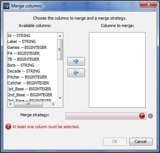
Creating a time interval by merging columns
3. Choose the appropriate fields to merge—in this case birthYear and deathYear are the two attributes we wish to combine.
4. Next, select the Create time interval option from the drop-down menu and click on OK.
5. Now you should see a window similar to this one:
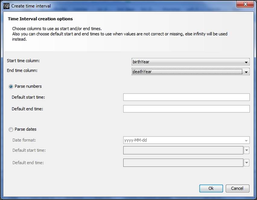
Specifying start and end times for time intervals
6. Specify your start and ending time fields—in this case birthYear and then deathYear, and allow Gephi to use the Parse numbers option. Alternatively, you could specify your start and end times, assuming you are familiar with the dataset. This will allow you to set start and end times that could extend beyond the actual time values, which will act as a bit of a fade-in and fade-out for the timeline; Or the interval could be set to start at a midpoint relative to the time values, enabling you to manipulate the number of nodes shown at the start of the timeline process. That's it—you now have a time interval attribute to perform temporal analysis on your network.
This process has put us in position to begin using timelines that power all dynamic networks in Gephi. So at this stage, you are poised to create and view a dynamic network. We'll resume from this point in a few moments, after we have examined some other approaches to move dynamic network data into Gephi. For our next case, we'll assume that you're working with a new project, and would like to specify some time-based attributes from the start.
Adding time intervals to a new project
There are a couple of ways to incorporate time intervals in a new project. The first approach is to have a GEXF file that already has the presence of time intervals—we'll take a look at how to create simple GEXF files later in the chapter. For now, our approach will be to use an already existing one created in Gephi. The second option is to import a series of static network files that can be identified as timeframes, enabling Gephi to recognize time intervals and act accordingly. We'll look at that process as well.
Using an existing GEXF file
We'll begin with the GEXF option, which involves the import of a single file that is already designed with time intervals. For this example, we'll take the previously used Red Sox player file and save it as a GEXF file, using the Graph file menu located at File |Export, and then select the .gexf option from the list. We now have a file titled redsox_timeline.gexf that can be loaded into Gephi to illustrate the process.
We're going to start a new project with the GEXF file. Proceed to the Open menu under File, and filter on GEXF files if needed until the correct file is located. We'll open the file, which loads the following dialog screen:
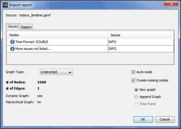
Importing a dynamic network
Notice that Gephi has already identified the presence of a time format while recognizing this is a dynamic network. This will be the case for any GEXF files that include time intervals. We can now begin working with the file using all of the available Gephi tools such as partitioning, clustering, filtering, and so on, and we will also have an immediately available timeline. All we have to do is enable the timeline, just as we did in the dynamic graph example shared earlier in this chapter.
Now that we have seen how easy it is to add time intervals in Gephi, it's time to begin working with them to tell a story. We'll pick up with the existing open project and our already created time interval.
Adding multiple timeframes
The second option is to layer a series of static networks as timeframes for Gephi to create a dynamic network. Suppose in our case that we have various snapshots of the baseball player file we have been using, taken at specific points in time. In this instance, we'll work with a series of three files, titled redsox1.gexf, redsox2.gexf, and redsox3.gexf. We could also follow this process using .csv or other file formats.
Let's start the process by opening the first of these three files. By navigating to the File | Open menu, we'll locate the redsox1.gexf file and begin the process. Notice how Gephi handles this static file differently than our prior dynamic file:
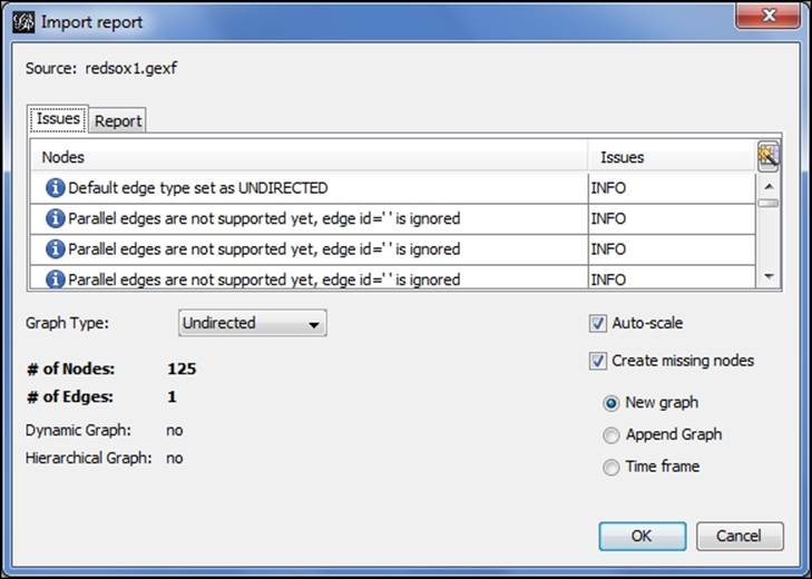
Loading a file as a timeframe
The file is correctly recognized as not dynamic since there is not yet a time interval attribute. Notice also that we have three options at the lower-right of the screen—New graph, Append Graph, and Time frame. In a nondynamic situation, we would typically proceed with the New graph selection, but for dynamic networks we choose the Time frame radio button. This selection gives us the ability to convert static files to a file with time intervals that can subsequently be viewed using the timeline feature. After completing this process, a second dialog is presented, which looks like this:
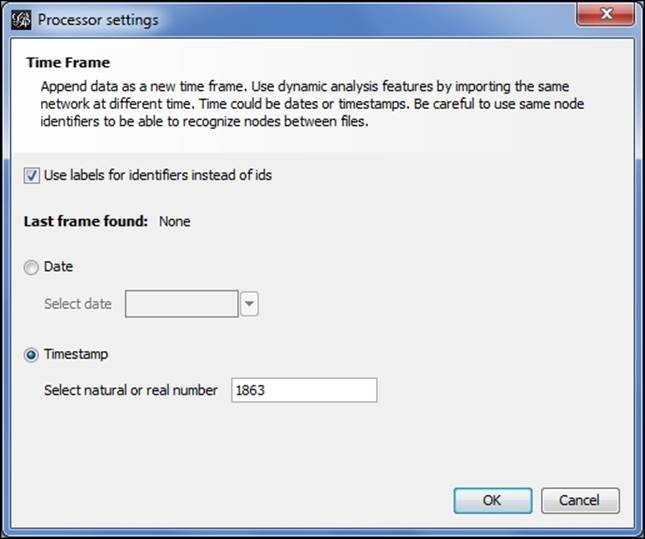
Manually specifying a timestamp for a timeframe
This will help Gephi to orient the timeline based on the underlying time intervals. In this case, I have selected the Timestamp option (the screen defaults to the Date option) and specified the year 1863 to represent the starting point for this layer of the network. After completing this screen, Gephi loads the data as with any other new project, with the exception of the application of time intervals to each of the data fields. A quick examination of the Nodes tab in the Data Laboratory window confirms this process.
The process is then repeated for the second and third files, identifying each as a timeframe, and adjusting the timestamp accordingly. Each subsequent timestamp must be higher than the existing values; for this example, I simply entered 1873 and 1883 for the second and third files, although we could certainly be more precise depending on our underlying data. You might have noticed after importing the second timeframe that the timeline became available, as Gephi now recognizes the presence of time intervals across multiple timeframes. After the final layer is loaded, we can enable the timeline and proceed as in our previous examples.
What we've done here is to build a timeline that starts at 1863 and ends at 1883, and displays the network members relative to those time parameters. In this example, the first file had only players who began their Red Sox career from 1900 to 1909, the second has those from 1910 to 1919, and the third file covers 1920 through 1929. So we are layering their birth year with the start of their individual playing careers, which tells Gephi how to visualize each node throughout the timeline. Some nodes will be present at the start of the graph before disappearing, while others enter the network at later intervals. Here is a glimpse of our data in the Data Laboratory window:
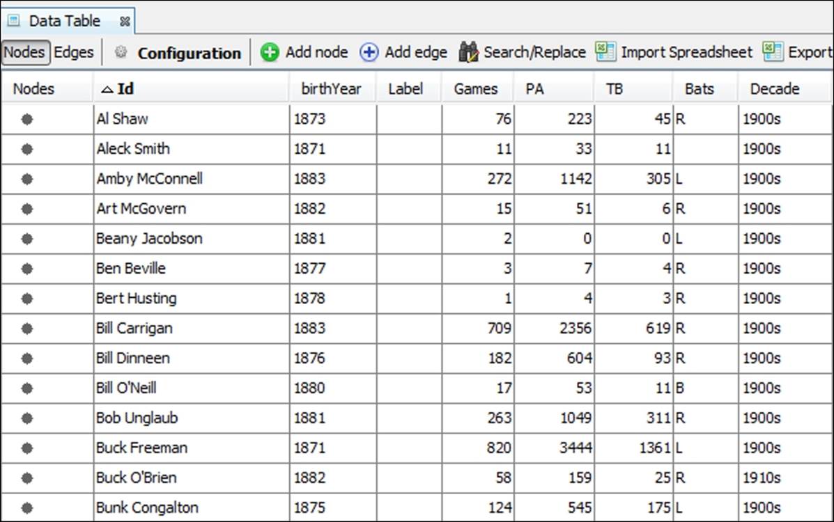
Data Laboratory view with timeline set to 1863 through 1883
Working with timelines
Now that we have seen a couple of examples that incorporated timelines, let's have a more focused discussion for how and why we should use them. Timelines are an ideal way to view changes in the structure of a network, based on the time-based entry or exit of members from a network. There are multiple potential uses of timelines, including the following:
· Timelines help to understand the rate at which nodes enter or exit a network. We can thus address questions about how a network evolved, and whether it continues to grow or is deteriorating. Note that you can also run force-directed layouts while the animated graph is playing.
· A timeline can also help us to identify larger patterns, especially when used in conjunction with a layout algorithm or clustering method applied to the network. This gives us the ability to see if new entrants into the network are linked based on their entry time, or whether they disperse across the graph.
· We can also make judgments about how nodes eventually leave a network, and whether this happens in individual or group fashion—do we see entire clusters defecting from the network at a given point in time?
· Finally, timelines can be used as a filter that allows us to quickly investigate portions of the network using time as a driver of network growth or contraction. As we'll see in a moment, timelines cleverly use Gephi's capable filtering and query windows to restrict the graph display to the selected interval.
Consider some of the types of data that might be abetted by the use of timelines—disease contagion networks, Twitter tweet dispersion, retail shopping patterns, and transportation networks, to name but a few. The list of potential applications is virtually unlimited, as you can undoubtedly come up with many more instances where timelines add to the richness of the network analysis.
Another critical factor for the adoption of timelines lies in their intuitive nature. Just as maps make it much easier to understand geographic patterns, timelines convey a similar sense through the simple left to right time flow. For most cultures, this is consistent with the general concept of time movement and facilitates an easy understanding of the evolution of the network.
Now that we have established some of the potential uses and strengths of timelines, let's create one of our own using the previously created time interval. We'll examine some further uses for the timeline as we proceed through the next section.
Applying the timeline
Working with timelines in Gephi is very straightforward, as we'll demonstrate in this section. To launch the timeline (if it isn't already visible), simply click on the Timeline menu offering under Window. This will load a timeline bar at the bottom of the screen, viewable in all of the primary work areas. You will see text that states Enable Timeline, accompanied by a plus sign. Click on the underlying button, and your previously created timeline will appear, showing the full range of values from 1863 through 2013.
By default, the timeline opens with all values populated, which means you should see a full graph if you are in the Preview window. We'll now work through some quick examples for how to use the timeline to scroll through the graph programmatically and then see how it can be used for some quick filtering.
For our first example, grab the right edge of the timeline using your mouse and drag it as far to the left as possible. This will bring your entire timeline back to the earliest starting values and will leave you with a virtually empty graph. This also sets us up to watch how the network evolves, which we'll do by clicking on the arrow button to the left of the timeline. Click on the arrow and watch our graph change through time, growing as players are born across the years, while also losing members as they die. You can see the entire evolution of the network in a few short seconds.
As you might have anticipated, the network was at its peak somewhere in the mid to late ranges between 1863 and 2013, as the growth in the number of new players being born far exceeded the death rate of those leaving the network. As we near the end of the time range, the size of the network diminishes, due to many of the earlier players dying. You can in fact determine the peak period by stopping the timeline at various intervals (click on the arrow key to pause, then again to resume) and viewing the status of the network in the Context tab.
Let's look at a few stopping points along the way to see how the timeline can help us assess our network at various intervals, noting that the narrowest interval Gephi allows appears to be in the two-year range for this graph (we'll see how to adjust this manually in the section Timelines as filters later in the chapter):
|
Starting Interval |
Nodes |
Edges |
|
1875 |
44 |
444 |
|
1900 |
412 |
8,917 |
|
1925 |
735 |
18,337 |
|
1950 |
909 |
23,495 |
|
1975 |
1,119 |
31,210 |
|
2000 |
996 |
30,763 |
A quick glance at the table tells us that the network might have peaked in size somewhere near 1975, with more than 1,100 of the total 1,668 nodes present, and over 31,000 of 51,000 edges active. We can become more precise by examining periods on either side of 1975, but this at least provides a general understanding that the network has in fact shrunk and that it likely peaked in or around the 1970s.
Looking at sheer numbers is far from the only pattern we might wish to examine in any network. Viewing the network at specific intervals could also allow us to see critical junctures in either the growth or dissolution of a network. For instance, what happens to the network if a centrally located member (perhaps a hub) leaves the network? Do others follow en masse, or do they reorient themselves to seek out a replacement for the departed member?
In the case of a contagion, viewing the spread of a pathogen might help to inform researchers about the likely path of future diseases, and how changes in a network structure might alter the path, for better or worse. Nodes that are likely to be key transmitters of thedisease could potentially be quarantined for a brief period until the threat of contagion passes.
Timelines can also allow us to see the impact of geography or language on the spread of an idea, an invention, a Twitter hashtag, and many more possibilities. For the moment, let's take a look at how timelines double as filters in Gephi, and learn how to take advantage of that functionality.
Timelines as filters
As we noted earlier, timelines invoke the Gephi filtering and querying logic, which then allow us to become more precise with setting filter values. In theory, we could get down to a single date in the evolution of a network, perhaps a single hour if our date format permits. In an instance where the timeline is built on a single Twitter hashtag, the ability to view the growth of a network might need to be viewed in hours or even minutes to be useful.
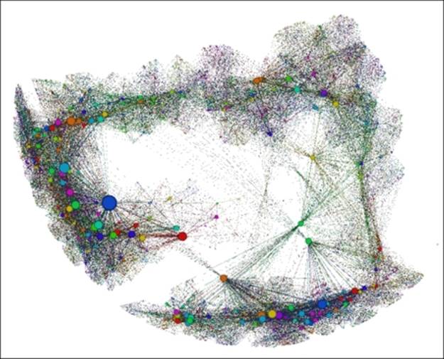
Using our aforementioned baseball player network, let's examine a few of these cases, and see the potential for creatively using timelines together with additional filtering possibilities. To begin, we're going to view the network for players who were alive between 1925 and 1930 to start understanding other attributes within the dataset. Drag both edges (one at a time) of the timeline to define this period, and notice that the Dynamic Range filter is active in the queries window. Here's a view of those members:
Viewing the player network from 1925-1930
We have 777 members remaining of the 1,668 in our total network. We can now treat our timeline filter just as we would any other filter by adding additional conditions from the filter tab. Now let's assume that we wish to see only those players who started their Red Sox career in the 1950s. To do this, drag an Equal filter for the Decade attribute down to the Queries window (as we learned in Chapter 5, Working with Filters) and make it a subfilter of the dynamic range filter already in place. We are now left with just 101 of the 777 nodes.
At this point, we could add further conditions to our filters or even change our timeline settings to view the same conditions for a different time interval, or we could leave things as they are. In either case we should recognize that timelines used as filters provide one more powerful tool for our Gephi toolkit.
Attribute-based DNA
We have explored in detail how to prepare and implement dynamic networks that are topology-based. Now it's time to learn more about implementing attribute-based dynamic networks. We'll begin with a brief review of the fundamental differences between the two, and why we would go to the extra effort of creating dynamic attributes.
As you can recall, in our earlier discussion on topologies we were primarily focused on the changes taking place across and within a network. This included viewing network growth, emerging patterns, changes to the network structure, and perhaps, eventual dissolution of the network. At the risk of oversimplifying, our goal was to understand the collective network, rather than focusing on changes to its individual members.
In contrast, the dynamic attribute approach is heavily oriented toward seeing changes within individual nodes and their relationships to others in the network. To be sure, we can also see some more wholesale changes to the entire network, but the goal is to understand changes at the individual node level. A few of the questions we might ask include:
· When did the node enter the network?
· Did it grow over time, and if so at what rate?
· Was the node a hub through which other nodes connected?
· Did it maintain a relationship with other nodes over a long period, or did it become associated with an entirely different peer group at some point in the network evolution?
With these somewhat different facets to focus on, our approach to create and prepare the network dataset will differ slightly. The general concept is identical, but we need be certain about what we are seeking to understand, with respect to the node behavior.
Preparing the data
We previously walked through how to prepare the data for a dynamic network based on topological changes. Let's follow a similar process for dynamic attribute analysis, making adjustments where needed.
Rather than merely focusing on specific dates where changes occur, we are now highly interested in the level of change; in other words, when Node A changed status at Time B, how significant was the change? To do this, our dataset will require measurable fields such as scores, weights, degrees, or some other quantifiable value that can be shown through color or size changes in Gephi.
These changes will still need to be associated with time intervals in order to create the dynamic network, but our focus has clearly shifted toward viewing individual changes versus network-wide shifts. Consistent with this shift, there are a few considerations to bear in mind when preparing data for an attribute-based dynamic network.
As you might have guessed, if we are to view changes in the structure of network attributes such as nodes and edges, we will need to be certain that our source data has the necessary elements. Now, in addition to the still critical time values, we will want to add other values that are essential to reflect the changing nature of the network. A few possible time-based values to think about include:
· Values that reflect changes in the stature of individual nodes. These could be in the form of weights, sizes, dollar values, populations, or any of hundreds of other measurable values that could be found in a network. These values are most often displayed through changes in the size of nodes, but could also be used to show color changes.
· Values that affect the status (as opposed to stature) of a node can be effectively used in a dynamic network analysis. These might reflect shifts from one category to another, or could also be used to reflect the relative level of some measurable value, perhaps on a 0-100 scale. These types of values will frequently be seen through changes in color.
· Dynamic edge weights can also be used effectively to show structural changes within a network over time. Changes to the relationships between individual nodes or node neighborhoods can be more easily detected if edge weights are calibrated to reflect these shifts.
Exactly what these nodes and edges measure is up to you, but you will likely want to use variables that show enough relative change that can be viewed within the graph.
Implementing and viewing dynamic attribute networks
Given the higher degree of focus on the behavior of individual nodes within a network, we're going to spend some time on a variety of techniques that will highlight changes at the node and edge levels. Much of this will involve using color and size as measures of change, both positive and negative.
So let's begin with nodes, as they will often show changes that are easier to detect when first viewing a dynamic network. We'll walk through a couple of examples—one dealing with changes in size, as dictated by a measurable attribute of the node, followed by another that uses changes in color intensity to display changes in a second attribute.
Let's return to our Red Sox player network and illustrate how to use dynamic sizes in a simple case where an individual player has a single size value that is combined with the time intervals we saw previously. We'll then move to a more complex example where values change for many of the individual nodes.
For our initial instance, we're going to look at the number of seasons played by each individual who ever suited up for the team. Remember that we still have the time intervals that govern when each node appears and disappears (or not), based on each individual's birth and death years. We are now simply adding a size-based variable based on the number of seasons played. So let's begin.
Make sure you have the Red Sox detail timeline file loaded if you wish to follow along. Once the project is loaded, we're going to follow these steps:
1. Move to the Ranking window, and select the Nodes tab.
2. Find the SeasonsInteger field in the drop-down list. We're going to focus on size rather than color, so make sure you're in the size window.
3. You will notice that the data values range from 1 to 23, based on the number of seasons played. Set the Min size value to 2 and the Max size value to 50.
Note
Note that this will overstate the differences in the node size, but for now we want to make sure we are seeing those nodes with higher values.
4. Now click on the very small icon to the left of the Apply button. This will enable the Auto Apply option, which will ensure that time-based values change at the appropriate time interval. For this example, this will be less critical, but for future cases where a single node might have many values, this is a critical step.
5. Click on the Auto Apply button.
6. Drag the timeline to the far left of the window, and make it as small as possible by dragging the right edge until it stops. This will give you a small window of about two years duration.
7. Start the timeline animation by clicking on the large arrow. Here's how your settings should look:
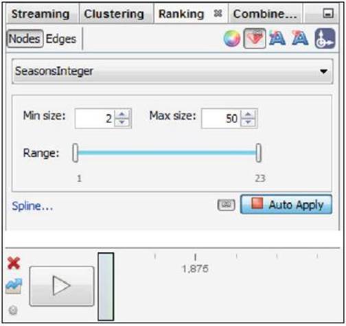
Settings for dynamic network graph example
Now you can watch the dynamic network evolve, seeing both the evolution of the network, as we saw previously, as well as the players who logged many seasons appearing as outsized nodes in the graph. If the network is moving too rapidly for your taste, select the small icon to the left of the timeline arrow and adjust the time settings accordingly.
As we saw earlier, we also have the ability to stop the network animation at any point by clicking a second time on the timeline arrow. We can also take snapshots of the network by manipulating the timeline to include the time interval we desire. Let's have a look at how this works, by dragging the left and right edges to show us the graph from 1920 to 1930. Here's the result:
Viewing the player network from 1920-1930
This shows us all the players who were alive in the 1920 to 1930 window, regardless of whether they were retired, active, or future players. We can also see a few prominent nodes who will or already did play many seasons for the team.
If we shift the timeline from 1940 to 1950, the graph grows accordingly, as many of the older players are still alive, and many additional younger players have now been born:
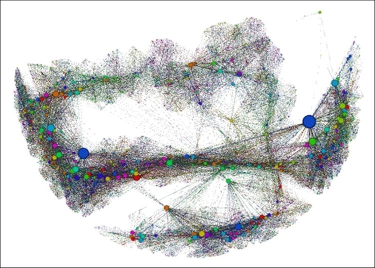
Viewing the player network from 1940-1950
Most of the prior network is still visible, and a sizable section has grown to the right of the earlier graph. In particular, there is a highly visible large hub node present in the new area of the graph. Let's view one more, encompassing from 1970 to 1980, and see the results:
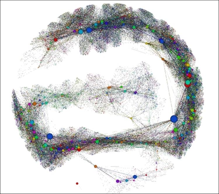
Viewing the player network from 1970-1980
Now the graph has grown to show many more nodes, although a portion of the earlier ones have departed the network. These snapshots show some of the power of using time intervals and the timeline itself, but the real power comes in interacting with the graph in Gephi, exploring, animating, and learning more about your network the entire time.
Once you have this sort of dynamic template set up you can always substitute another variable in place of seasons, as long as it is in the correct numeric format. Then just repeat the above process to see how the new variable changes relative to time.
This was a simple example, in that each node had a static value from the time it entered the network until it is either removed or the timeline simply comes to an end. So we're not completely dynamic yet; for that to happen we need to change the values that correspond with time intervals at the node level. So let's move on to a more complex network, at least from the perspective of changing node values.
Let's look at another example that incorporates changing attribute values across multiple time periods. For this illustration, we're going to use some airline data made available through the US Department of Transportation website athttp://www.rita.dot.gov/bts/sites/rita.dot.gov.bts/files/subject_areas/airline_information/index.html.
This site plays host to a variety of transportation statistics. What we'll be working with is the data that tabulates travel patterns between US airports by both domestic and international carriers. These files can be very large depending on the data variables you choose to download. For this example, we're going to reduce the data to examine travel patterns originating at a single airport over the course of three calendar months. This will provide us with enough data to make for an interesting graph, but not so much as to lose focus on our goal of showing dynamic attributes. The files are available at https://app.box.com/s/177yit0fdovz1czgcecp for you to download if you wish to follow along.
Our goals for the network graph can be summarized as follows:
· We want to be able to understand the general passenger volume patterns flying from our base airport to dozens of destinations
· We would like to see changes by time period in the number of passengers flying to specific destinations
· We would also like to understand how many carriers are flying from the host airport to each destination
· Finally, it would be nice to detect changes in the number of carriers from one time period to the next
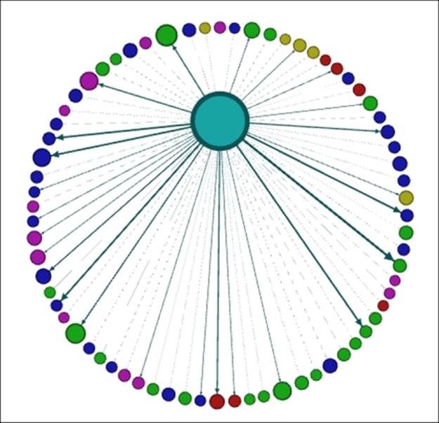
The data I've selected for this example is designed to accommodate each of these goals. It is comprised of a single host airport (Baltimore Washington International (BWI) in this case) that flies passenger flights to more than 70 domestic locations. This should enable us to fulfill our goal.
The dataset includes three time periods—January, February, and March 2014 calendar months. Thus, we should be able to detect any significant changes in passenger volume by calibrating node sizes to these volumes. This will address our second goal.
If we use the number of carriers to set edge weights (that is, how many airlines fly from BWI to Atlanta) then we should be able to address the third goal as well as the fourth, assuming there are any changes in the number of carriers within this limited timeframe.
The process we will follow is to manipulate the data files to create node and edge files for each of the three time periods, using an identical format in each case. These files can then be processed using Gephi to create three individual timeframes for our eventual dynamic network. So let's begin with the process, starting with the January file. I happened to use Excel for this process, but feel free to use whichever tool you feel comfortable with to create the .csv files.
We'll follow the familiar process for loading these files using the Gephi's capabilities of Import spreadsheet found in Data laboratory:
1. Import the node file first. This includes fields for Label, ID, Passengers, Distance, and Distance Group, a categorization used to classify flights by relative distance.
2. Now import the edges table. This will include just three fields—Source, Target, and Weight, which is based on the number of carriers flying a route, as discussed a moment ago.
3. Go to the Overview window and select a layout. For this example, the Layered layout seems appropriate, using the Distance Category (1-5) to construct an easy-to-understand network structure. Apply this layout.
4. Size your nodes in the Ranking tab, using Passengers as the attribute value. Adjust the scaling accordingly—I reduced the upper bound so the overall volume associated with the host airport doesn't affect the sizes of the destination airport nodes.
When you've completed each of these steps, your graph should resemble this:
First look at an airline destination network
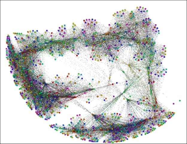
We can see BWI in the center, surrounded by concentric rings based on the relative distances from the host airport—those with a distance category of 1 are in close proximity, while airports with a 5 are at the far edges of the graph. We can also see by the edge thickness which airports have the most carriers arriving from BWI. The node sizes also tell us where customers are flying. All in all, this is a fairly informative graph. However, our job is not complete—we need to repeat this process for the following two months to answer the remaining questions posed earlier.
Before moving to the February data, be sure to export your current work as a .gexf file, so it can be loaded as one of our three timeframes. Then repeat the exact process using the February and March files. After each of these is exported to a .gexf format, we'll have the three time-based components for our dynamic network.
Now we move on to the fun part, where we layer the three .gexf files into a single Gephi project. Following these steps will result in a useful dynamic graph that shows month over month changes in the flight patterns emanating from BWI.
1. Open a new project in Gephi.
2. Use Open under File and locate your respective .gexf files.
3. Import the January file by following the screen prompts. Set Date to January 1, 2014 using the built-in calendar.
4. Repeat the process for the February and March files, setting Date to February 1, 2014 and March 1, 2014 respectively. This will give the Gephi timeline the parameters for applying time intervals.
When all of the steps have been completed, enable your timeline. Remember to apply Passengers as the node size attribute in the Ranking tab, and make certain that this will be applied across all time intervals using the Enable auto transformation icon to the left of the Apply button. As you can recall from earlier in this chapter, this will activate the Auto Apply button that enables attribute changes across time intervals.
At this point you can elect to change your layout, apply colors using a partition, and so on. In certain cases, you will even be able to check dynamic graph statistics, although that capability is especially geared to more granular time elements, as opposed to the simple monthly categories used here. Nonetheless, four useful measures can be found in the Statistics | Dynamic tab:
· The # Nodes statistic will track the growth (or decline) in the number of nodes at various intervals within the timeline
· Similarly, the # Edges statistic will do the same for edge counts
· The Degree calculation will look at the number of degrees at a given interval and can be set to simply provide the average degree level
· Finally, the Clustering Coefficient measure can provide insight into how the network is evolving over time, based on clustering levels
Each of these will provide time series views over the specified time window set using the timeline.
In this instance, I opted to change the layout to a Dual Circle layout, using BWI as the only member of the inner circle, resulting in the following graph:
Dynamic airline network snapshot using dual circle layout
One further tweak was to partition the graph using the aforementioned distance group field, resulting in six distinct colors—one for BWI, and a total of five for all the destination airports. The result is similar to the preceding snapshot:
Dynamic airline network partitioned by distance group
You can verify dynamic changes in the graph by running the timeline and observing small changes in node and edge sizes as January changes to February and February to March. While the changes here are slow and somewhat subtle, I hope this provides a bit of insight into what can be done using smaller units of time, such as weeks, days, hours, minutes, and even seconds. The possibilities are almost infinite, depending only on the detail in your data and the processing power of your computer.
We've now seen a few examples of how to visualize networks with dynamic attributes, using files that were previously imported to and enhanced in Gephi. Next, we'll take a brief look at how to create your own GEXF files that will support the creation of dynamic networks.
Creating dynamic GEXF files
While Gephi can be used to create GEXF files, it can be advantageous in many cases to have the file already prepared prior to importing data into Gephi. For any reader acquainted with XML, the formatting and structure will appear very familiar. If you aren't an XML expert, we'll walk through some of the GEXF basics to help you get started.
The code in this section is based on the examples from the http://gexf.net/format/ site, which provides a general primer for how to structure the data. At a very basic level, the GEXF file is designed to represent a single graph, although that graph might contain many nodes and edges. For a very basic example with two nodes and a single edge between them, the GEXF code would look like this:
<?xml version="1.0" encoding="UTF-8"?>
<gexf xmlns="http://www.gexf.net/1.2draft" version="1.2">
<meta lastmodifieddate="2009-03-20">
<creator>Gexf.net</creator>
<description>A Web network not changing over time</description>
</meta>
<graph mode="static" defaultedgetype="directed">
<nodes>
<node id="0" label="Hello" />
<node id="1" label="Word" />
</nodes>
<edges>
<edge id="0" source="0" target="1" />
</edges>
</graph>
</gexf>
This file would deliver a simple static graph, which is not what we're after in this chapter. So let's move on to creating a more complex file with time intervals and changing attribute values.
Here's a somewhat more advanced example from the gexf.net site, incorporating time intervals and value changes. We'll break this code into four distinct sections and provide brief descriptions for what is being achieved.
The first section provides basic descriptive information about the file and its format, as well as simple information about who created the file and how it should be described:
<?xml version="1.0" encoding="UTF-8"?>
<gexf xmlns="http://www.gexf.net/1.2draft" xmlns:xsi="http://www.w3.org/2001/XMLSchema-instance" xsi:schemaLocation="http://www.gexf.net/1.2draft http://www.gexf.net/1.2draft/gexf.xsd" version="1.2">
<meta lastmodifieddate="2009-03-20">
<creator>Gexf.net</creator>
<description>A Web network changing over time</description>
</meta>
Our second section of code pertains to the graph structure, providing the capability for individual nodes to be static or dynamic. Note also that the default edge type (directed) has also been specified:
<graph mode="dynamic" defaultedgetype="directed" timeformat="date">
<attributes class="node" mode="static">
<attribute id="0" title="url" type="string"/>
<attribute id="1" title="frog" type="boolean">
<default>true</default>
</attribute>
</attributes>
<attributes class="node" mode="dynamic">
<attribute id="2" title="indegree" type="float"/>
</attributes>
The third section provides detail about how individual nodes will function, including their respective start and end dates for a dynamic network:
<nodes>
<node id="0" label="Gephi" start="2009-03-01">
<attvalues>
<attvalue for="0" value="http://gephi.org"/>
<attvalue for="2" value="1"/>
</attvalues>
</node>
<node id="1" label="Network">
<attvalues>
<attvalue for="2" value="1" end="2009-03-01"/>
<attvalue for="2" value="2" start="2009-03-01" end="2009-03-10"/>
<attvalue for="2" value="1" start="2009-03-10"/>
</attvalues>
</node>
<node id="2" label="Visualization">
<attvalues>
<attvalue for="2" value="0" end="2009-03-01"/>
<attvalue for="2" value="1" start="2009-03-01"/>
</attvalues>
<spells>
<spell end="2009-03-01"/>
<spell start="2009-03-05" end="2009-03-10" />
</spells>
</node>
<node id="3" label="Graph">
<attvalues>
<attvalue for="1" value="false"/>
<attvalue for="2" value="0" end="2009-03-01"/>
<attvalue for="2" value="1" start="2009-03-01"/>
</attvalues>
</node>
</nodes>
Finally, we see the edge parameters, again with start and end values set where appropriate:
<edges>
<edge id="0" source="0" target="1" start="2009-03-01"/>
<edge id="1" source="0" target="2" start="2009-03-01" end="2009-03-10"/>
<edge id="2" source="1" target="0" start="2009-03-01"/>
<edge id="3" source="2" target="1" end="2009-03-10"/>
<edge id="4" source="0" target="3" start="2009-03-01"/>
</edges>
</graph>
</gexf>
Note a few changes in the code between the two examples:
· The graph mode value has changed from static to dynamic
· The second example has now declared node attributes to be either static or dynamic
· Start and/or end dates have been specified for certain nodes and edges
· Values relative to time windows are now specified at the node level
These changes will take us from a simple static graph to a living dynamic graph that shows changes over a time continuum and thus adds a far more insightful view of the network. There are additional structures that can be created using GEXF; for further examples please visit the site at http://gexf.net/format/.
The other option for creating your own dynamic GEXF files is to import data into Gephi using .csv or other protocols; make your necessary adjustments and customization, and then export the data to a .gexf format. This is the process we used in our dynamic attribute example earlier in the chapter. Note that other graph formats can also be created if you are planning to utilize software other than Gephi.
One of the significant advantages of creating a GEXF file is that you will be saving custom analysis performed on a network—colors, sizes, and other attributes can then be easily imported into Gephi at a future date. Similarly, other users could import your network into Gephi and will be able to benefit from your existing work.
It is not essential that you know how to create GEXF files outside of Gephi, as Gephi will do much of the heavy lifting for you within the application. You can certainly continue to load data into Gephi from other formats, enhance it within the application, and eventually output the GEXF format. However, for those who like to do their own coding, or can create processes that download data into an XML framework, there is great potential value in understanding how GEXF functions.
Summary
In this chapter, we covered a lot of ground in understanding how and when to use dynamic networks, and how to implement them in Gephi. Specifically, we discussed the following concepts which have prepared you for effectively creating your own dynamic networks.
We learned how and when to use DNA to view your network data. Next, we addressed how dynamic topology networks differ from dynamic attribute networks, and how to effectively prepare and implement both types in Gephi. We also noted how these two forms can be combined in a single dynamic graph.
Next, we discovered how to use Gephi's timeline functionality to maximize the effectiveness of all types of dynamic networks. Finally, we discussed using GEXF to create dynamic network files outside of Gephi.
Next, we'll look at moving your network analysis beyond the Gephi desktop in Chapter 9, Taking Your Graph Beyond Gephi. We'll examine different methods to export your Gephi network graphs to both static- and web-based interactive formats. After providing an overview of many available tools, we'll export some network graphs using the multiple export formats.
All materials on the site are licensed Creative Commons Attribution-Sharealike 3.0 Unported CC BY-SA 3.0 & GNU Free Documentation License (GFDL)
If you are the copyright holder of any material contained on our site and intend to remove it, please contact our site administrator for approval.
© 2016-2026 All site design rights belong to S.Y.A.