Mastering Gephi Network Visualization (2015)
Chapter 2. A Network Graph Framework
As one embarks on the task of creating a network graph, it quickly becomes apparent that neither is there a shortage of topics to visualize, nor is there a lack of data detailing many potential sets of network relationships. The more difficult task is to determine what we choose to visualize and how to move from a simple idea to a finished graph. In this chapter, you will be exposed to a proposed framework that details how this author goes through the entire process from the initial idea to a final published graph. The chapter will then take you through an actual example, where we can begin creating a network graph together.
In the following sections, I will discuss my personal approach to create a finished graph using the following:
· Identifying an idea or topic to pursue
· Determining the final output
· Identifying the data source(s) needed to populate the graph
· Formatting the data for Gephi according to the required naming conventions
· Importing data into Gephi to begin working on the graph
· Viewing the initial network created by Gephi to help understand the network structure
· Selecting a layout that will be appropriate for the network
· Analyzing the graph using a variety of Gephi filters and statistics
· Modifying the graph with color, size, and other features provided within Gephi
· Exporting the graph to external formats for additional customization or deployment (optional)
After completing the process, we'll create and export our own graph. By the end of the chapter, you should be comfortable with a general process to prepare and create network graphs using either the steps presented in this chapter, or through using a flow of your own creation.
A proposed process flow
This process might seem like a lot of steps, but it is meant merely to provide a framework to move an idea from your imagination to a final published graph. In fact, you might find a better approach or might already be using a different workflow that suits your particular style or specific needs. By all means, if it works for you, keep using it. On the other hand, if you are new to this discipline and need some direction, then follow this process to get started. I have found that especially in cases where there are multiple graphs to be created around a common theme or dataset, this process can make graph creation more efficient to move from start to finish. So let's get started, and we can ultimately get to the best part—actually creating and publishing some graphs.
Identifying an idea or topic
The world around us is literally filled with examples of networks, ranging from our own social media connections through very complex webs of information, such as the connections between millions of websites. What story do you want to tell the world, and how would you propose going about it? Think of your graph as you would if you were writing a paper or preparing a speech. Do you want to inform, persuade, educate, or entertain? While it is possible to create a graph that serves multiple functions, it will still be useful to narrow our focus to one of these possibilities, as it will help us reduce the level of complexity to a slightly more manageable scope.
Now, we need to find a more specific idea or topic that we feel comfortable working with, as that will make the process of creating graphs easier. While it is certainly possible to take a previously unfamiliar topic and create an exceptional graph, it is typically far simpler to start with a familiar subject. Think of your hobbies, professional interests, personal networks, or educational background. Are there potential network topics in one of these areas where you already have a high degree of knowledge? Allow me to digress for a moment and describe how I would proceed using the upcoming topics in which I have either professional or personal experience.
My personal list of potential topics is as follows:
· Wine: I have been in the business for several years—mostly as an interested consumer—and I also have a respectable collection of books on many aspects of the wine business
· Baseball: I have spent many years performing statistical and visual analysis, attending games, and collecting a considerable library on the subject
· Jazz: I have been listening to recorded music, attending concerts, and reading jazz histories for 25 years
There are perhaps others, but if I start with these three topics that I feel very comfortable with, they are likely to make the process of ideation, data gathering, graph creation, and so on much easier, as opposed to attempting to work with a less familiar topic. In addition, while I cannot be considered one of the true experts in any of these areas, I do have enough background to lend credibility to my work and be able to address potential questions that might be encountered during the creation process.
Here are a couple examples of graphs that I created using this approach:
|
Topic |
Graph |
Location |
|
Miles Davis studio album network |
Bi-partite graph with 351 nodes and 581 edges |
http://visual-baseball.com/gephi/jazz/miles_davis/ |
|
Detroit Tigers player network |
Complete network with 1566 nodes and 47905 edges |
http://visual-baseball.com/gephi/teams/tigers_network/ |
Enough about me and my interests! What is it that you would feel comfortable pursuing? Do you avidly follow political issues, a particular sport, or a specific aspect of history? One of the beauties of networks is that they can be found in almost every endeavor if one looks for them. So, start considering your own interests, make a list if needed, and then begin to narrow down the possibilities to the one idea that sparks your interest at the moment. It is important to keep the list manageable initially. There will always be time to return to your backup choices; the goal at this point is to get started with an idea. Don't worry about viability just yet—you might find out that the data you need is not available, although this is becoming less and less of an issue due to the remarkable array of data sources made available through the Web.
Determining the final output
After developing your topic, the next logical question concerns the final format: who will view the graph and how? This will help you make decisions along the way about how to use layouts, color, sizes, and so on. For example, if this is simply a project intended for personal use, then design considerations will most likely take a different direction versus a project to be displayed on the Web or exported to a PDF format for high-resolution printing.
Consider some of these questions and how it will have an impact on your graph:
· Will my project be interactive or static? If the answer is interactive, then you have the luxury of allowing users to navigate and discover the network, so the network can be quite dense while still telling a good story. If, however, the output is static, then special formatting such as size, color, and text might be needed to help guide users through the story.
· Where will the final network output reside? If you wish to post to a blog, Facebook, or Twitter, then a simple PNG output will suffice, although you might need to give users a larger version to click through to, depending on the complexity of the graph.
· Will the graph need further enhancement beyond what can be done in Gephi? Is there a need for textboxes, callouts, legends, or other adornments using an editing tool such as Illustrator or Inkscape? If this is likely to be the case, then exporting to an SVG or PDF format is a logical choice. My personal choice is to use a PDF format that can be fully disassembled in Inkscape for detailed editing and then easily reassembled for the final output.
· If the graph is intended to be navigated via the Web, then Gephi offers multiple options, including Seadragon, Sigma.js, and the Loxa Web Site exporter. If you have geographic data, then the Google Earth export is yet another option.
There are a few other options besides those listed in the preceding bullet list. The main point is to begin thinking about your end goal to display and share the network. In many cases, your network will translate well to several of these methods, giving you a bit more freedom and the ability to produce multiple versions for different audiences. In other cases, such as a network with tens of thousands of nodes, you might find that a static image yields dismal results, so you might need to orient your project toward an interactive version early on. There are no hard and fast rules that dictate the final decision; instead, the best solution will come through trial and error coupled with visual assessment.
Identifying the data sources
Courtesy of the Web, we live in a magnificent era of data availability and transportability, with ever faster processing and connection speeds. This has had an enormous impact on the ability of both theorists and practitioners to create complex graphs that were unimaginable just a generation ago. There are tens of thousands of sites that provide rich datasets, and many of them are free of charge. All that's required is a local device, a web connection, a bit of tenacity, and some innate curiosity.
To help you get started, I have listed a variety of available (and free) data sources in Appendix, Data Sources and Other Web Resources, but the list is far from exhaustive. Take some time to scan the Web for data sources in your interest areas—you will almost certainly find some sources to download and begin preparing for Gephi.
While there is an incredible number of datasets available, not all will be suitable for network analysis and graphing. You will need to find resources that provide some sort of relationship data or at least data that can be converted into relationships. Think of datasets that can be structured this way or that can be adapted to show the connections within a network. Relatively few data sources will be fully prepared for this purpose, but with a little tweaking and an understanding of the objective, many can quickly be converted intopowerful resources for network graphing. If you would like to begin with some prepared data, the Gephi wiki is a good place to start, or you could visit Stanford Large Network Dataset Collection, which is found at http://snap.stanford.edu/data/.
Formatting the data for Gephi
To work with data in Gephi, it must be in the form of nodes and edges. Otherwise, there will be no possibility to create a network graph. In theory, you could have nodes only, but this defeats the point of creating and analyzing a network. Gephi provides the ability to convert an edge-only source into nodes, saving you a potential step. However, this approach has some limitations from a node perspective, particularly if you are working with supplemental fields that hold incidental node information to be used for partitioning, ranking, filtering, or any other possible use.
Fortunately, it isn't difficult to prepare data for use with Gephi as long as the basic Gephi naming conventions are followed. At a minimum, the following fields are required by the nodes and edges sheets in Gephi:
|
Attribute |
Required |
Optional |
|
Nodes |
Nodes, ID, and label |
Other fields that provide information about individual nodes |
|
Edges |
Source, target, and type, ID |
Label, weight, and other descriptive information |
Note
Note that in cases where data is entered directly into Gephi, some fields will be automatically populated based on the initial entry. However, this will not be the typical data entry process, so our focus will be on structuring the data for import into Gephi. The simplest way to do this is by employing these naming conventions in your data source file, making for a seamless process on the Gephi side.
Importing data into Gephi
Gephi provides multiple options to import data from other sources, including spreadsheets, databases (MySQL), GraphML files, Pajek NET files, GEXF data, RDF files, and several additional formats. The Gephi website provides further details on how to create many of these data files as well as some examples showing the required structure for each type. Start with https://gephi.github.io/users/supported-graph-formats/
Probably the easiest way to get data ready for Gephi is to create a pair of simple .csv files, using one file for nodes and another for edges. As I mentioned in Chapter 1, Fundamentals of Complex Networks and Gephi, Gephi will create a nodes table if you first import an edge file, but this approach will limit your options, so it's a good idea to create both the node and edge files using a spreadsheet tool. In cases where you have no node data beyond the basics (ID or label), this might be fine. However, if your dataset has additional node information, start your import with the node file to preserve all of your data. This will enable the creation of ad hoc fields that are relevant to your nodes.
Likewise, MySQL can be used to create both node and edge tables that can be pulled into Gephi by providing database connection parameters. This approach has the advantage of porting data directly from an existing source if you happen to be a MySQL user. Other options exist, although they require some extra effort using an appropriate database wrapper.
If you choose to work with existing datasets, there are many examples on the Web that are already in one of the available graph formats, such as CSV, GEXF, GML, GraphML, and others. Gephi will be indifferent to your data format once the import is complete and will allow you to export your network data to many of these same formats. Just remember to create the required fields—the source, target, and type for edges and the node and label fields for the node file. For a CSV file, you can do your work in any spreadsheet platform, such as Excel or OpenOffice Calc.
Viewing the initial graph layout
Once the data has been successfully imported by Gephi, an initial graph will appear in the graph window. This will be a barebones random graph to be certain, but it does provide us with a starting point to assess some basic features inherent in the data. Some of the questions we can address at this point include:
· Does the graph have enough nodes to make a simple visual analysis difficult or impossible?
· Are the nodes loosely or densely connected?
· Is the network fully connected via a single giant component, or are there a number of disconnected nodes?
· Is there some sort of observable network structure, or do things appear to be random? Do we see a small world effect and/or considerable clustering?
Some of these points will become easier to detect after employing some sort of layout algorithm, but we still might get a glimpse prior to that stage. Gephi allows you to zoom in using a mouse wheel or tracking pad, which can help us answer some basic questions about the network. If the graph is too large or complex, it might be difficult to answer some of these questions without resorting to some more advanced techniques, which will be discussed in subsequent chapters. For now, let's address each of these points from a theoretical perspective. Later in this chapter, we'll use actual network data that will further illustrate these ideas.
Now on to the question of nodes, more specifically, what we mean when we say that a network has a lot of nodes. For instance, a network might have a few dozen nodes, or it might have tens of thousands (or even more). So, when we pose the question about assessing the number of nodes, it is somewhat relative as well as subjective. Certainly, a network with 20 nodes will always be thought of as small, and a network of 10,000 nodes will be thought of as large, but what about those points in between? Is 200 nodes a lot? What about 500? From a practical perspective, if your screen display feels crowded, with very little spacing between any nodes, then you might consider that network to have a lot of nodes, and thus, a high degree of complexity. Again, the size of your display, the intent of your graph, and the final format (paper/screen or static/interactive) all play roles in determining the visual density of your graph. If it feels too crowded to you, the creator, then users will almost invariably find the graph difficult to navigate.
What of the connectedness of the network, then? When we speak of connected nodes, we refer to the edges between two nodes, either undirected or directed. In some cases, the number of connections relative to nodes is rather low, which is an indication of a sparse or loosely connected network. In other instances, the graph will have many nodes with high degrees, leading to a considerable number of edges populating the graph. The former instance is related to the concept of random graphs, while the latter is more aligned with real-world graphs exhibiting the small-world phenomenon.
What about disconnected versus fully connected networks? Some networks will have multiple small clusters that are distinct from a single large component connecting many of the nodes. In some cases, there might not even be a large component but rather a series of small clusters. In either case, these are termed disconnected networks, as discussed briefly in Chapter 1, Fundamentals of Complex Networks and Gephi. There are many examples in literature that show this type of network, with one of the more notable recent examples showing the romantic relationships at a single high school, titled Chains of Affection (http://www.soc.duke.edu/~jmoody77/chains.pdf). In other cases, including many examples from the social network analysis field, networks are fully connected, with all nodes having the ability to traverse the graph and link directly or indirectly to every node in the network.
Finally, and in a slightly more subjective vein, we'll talk about the subject of network structure. In some cases, it is quite simple to view a network and see patterns defined by association, homophily, or some other network behavior. Many of these graphs will have multiple clusters that connect to one another through a single node that acts as a conduit between otherwise unconnected groups. However, in many cases, determining whether a graph is random or has a more defined structure is not so easily done; therefore, we rely on tools such as Gephi to aid in discovering the underlying structure. In certain cases, we will see visual evidence of networks where the power law distribution is at work, resulting in a small number of high degree hubs surrounded by a large number of less influential members. These structures can be confirmed by examining the degree distribution of a network. One very simple approach is to size nodes according to degree; another is to simply browse the node table using the data laboratory.
Now that we have walked through a brief primer on what to look for when viewing a network, the next step is to find the best way to display the graph to take advantage of the underlying network structure. This is also a somewhat subjective decision, although we can apply a degree of rigor to the process by testing many of the varied layout options provided in Gephi.
Selecting a layout
One of the most critical steps to create a network graph is to make sure that we select a layout that helps us tell the story most effectively. Technically speaking, any layout will perform the basic function of showing you the network; at the same time, some will be far more effective than others, and it is not an exact science to determine which layout will yield the best results. For one dataset, a Force Atlas algorithm might be ideal, while for another network, a different approach will create far better results.
Note
The technical results (centrality measures, network diameter, and so on) will be the same regardless of the selected layout. It is only the visual result that will differ, so we must rely on our visual assessment of the graph to determine which layout is most powerful.
As it is unlikely that you will be totally satisfied with your initial attempt at creating a perfect graph, I recommend an iterative approach, which is otherwise known as trial and error. Gephi makes this process quite painless, although certain algorithms will take a bit of time to run depending on the complexity of the network. Unless you are working with a familiar data structure you have previously graphed to your satisfaction, it is a good practice to try a minimum of three or four algorithms before selecting a favored approach.
Network complexity and structure are other factors that will help determine your final layout selection. If your dataset is small, and the goal is to show the known relationships between entities (perhaps members of specific groups), then your choices will be quite different than for a network where the goal is to explore and discover the interactions between nodes. For the former, some of the circular layouts might prove ideal, as they will allow ordering using a specific criterion. However, this would not be suitable in the second case; here is where algorithms based on spring mechanisms such as repulsion and attraction are probably far more useful in drawing the network.
In the end, it will be your visual inspection of the graph that rules the day. So, given that the final layout selection will be highly dependent on this visual inspection, what is it that should be inspected? The next section will walk you through some of the more critical criteria to be examined when judging the effectiveness of a graph.
Analyzing the graph
Regardless of which layout is selected, recognize that the graph might not be in a finished state and will most likely require multiple modifications. In fact, it would be surprising if this weren't the case, as even the most appropriate layout algorithm cannot possibly define everything we wish to see in the finished graph. With that in mind, let's discuss some of the nuances we are looking for when we analyze the graph, starting with this list:
· Is the graph cluttered? Many graphs, even when they have a rich underlying dataset, are hampered by the so-called hairball effect, which renders them visually unintelligible to most viewers. This can be seen as a virtually impenetrable concentration of nodes and edges that are typically concentrated near the center of the graph. One of the critical steps to produce a finished graph is to prevent this effect using a wise algorithm choice coupled with some custom settings. This will often involve adjusting the default settings for attraction, repulsion, and gravity depending on the choices provided by the individual algorithm. Ironically, many well-known network graphs suffer from an excess of clutter, although this can be offset to a degree through user interaction, such as panning and zooming.
· Do distinct features of the dataset stand out? For instance, if the network has a number of large hubs, are we able to see that in the graph? Gephi provides opportunities to make these hubs stand out from the clutter using size and color options in addition to the previously mentioned settings that help space out the network properly.
· Are important connections in the network visible? If the relationships between particular nodes are critical to the story, viewers should be able to easily determine that from the graph. Gephi enables edges to be sized to reflect the strength of a connection, making it more easily seen by the end user. Edges are the guilty party in many of the aforementioned hairballs, so it is essential to minimize those that are not critical to the story. This can be done through effective weighting, the use of opacity, and subtle edge coloring.
· Are there key groups, segments, or partitions that should stand out in the network? If so, there are several approaches to make these stand out, including colors, labeling, and special formatting. Gephi provides both native and plugin-based features to address this using partitions or clusters to identify the groups within the dataset.
There are additional considerations, but paying attention to the ones just shared will go a long way toward making your graphs more attractive and powerful. So, now that we've discussed a few of the important factors in making a graph more effective, we'll look at what can be done within Gephi to achieve these outcomes.
Modifying the graph
Graph modification is the final step prior to exporting or publishing your network, and it can be done both manually and programmatically. On the manual side, there are an endless number of small tweaks that can be made within Gephi using a variety of toolbar and plugin components. Here are a few options that can be performed manually in Gephi:
· The Painter function: This function on the toolbar can be used for color-specific nodes, making them stand out or recede from the remainder of the network. This is a quick method that you can use when there are a small number of nodes you wish to edit; if you wish to color a large number of nodes, there are other options (we'll touch on them shortly).
· The Sizer function: This function will enable the resizing of individual nodes in much the same fashion as how the Painter icon enables recoloring. This is particularly effective if nodes in the network are not already sized based on the degree and you simply want to call out important members within the graph.
· The Brush function: This function makes it easy to see diffusion patterns relative to a selected node, allowing you to highlight neighbors (first degree), neighbors of neighbors (second degree), predecessors, and successors. This is an effective way to understand behavior within the network while highlighting network behaviors for viewers through the use of specific colors.
· The Node Pencil and Edge Pencil tools: These tools enable users to create new nodes or edges, respectively, without the need to manually add these features in the data laboratory.
There are other tools within Gephi and its plugins that will also facilitate the manual manipulation of your graph—take time to explore each of these features to see how to best leverage them for your network. All changes made using these tools persist between theOverview and Preview tabs and into the final output regardless of format.
There is one step remaining in our process, assuming you wish to share your work with others through the Web or some other outlet. Now that all the graph modifications are complete, it is time to export your work from Gephi to a more universal output format such as PNG, SVG, or PDF, or publish it to the Web using one of several available tools.
Exporting the graph
So, you've arrived at the point where your graph is ready to be shared. The next question, if you haven't already considered it, is what do you intend to do with your work. If the goal is to share it through social media or on a blog, then you might well be content to export your work as an image using the .png format made available by Gephi. However, if you intend to make it interactive or plan to do some additional modification using Illustrator or Inkscape, then other options need to be considered.
Let's walk through a number of available export options, and the use cases associated with each one, using the following table. Note that this list isn't exhaustive and isn't intended to provide great detail for each approach. The Gephi website and discussion forums provide additional insight into these and other export methods.
|
Format/tool |
Potential uses |
Strengths |
Weaknesses |
|
.png |
Sharing via e-mail, blog post, Facebook, Twitter, and Flickr |
Quick, compact, web friendly |
No interaction, not editable, and thus, limited value for complex networks |
|
.svg |
Post-Gephi editing, embedding in a web page |
Scalability, small file size for large networks, editable, panning, zooming, and higher quality image |
Not as familiar for many viewers |
|
|
Sharable in PDF format, additional edits in Illustrator or Inkscape |
A widely available format for users and possibility for further editing |
Limited interactivity |
|
Seadragon |
Interactive network for users to navigate |
Zooming, panning capabilities, and easy creation |
Limited functionality and no additional customization |
|
Sigma.js |
Interactive network for users to navigate |
Searching, filtering, zooming, panning, and customization using template approach |
Web browser only. Won't work locally with Chrome or IE generally. Can use the rgexf package in R to work around this limitation |
|
Loxa Web exporter |
Interactive network for users to navigate |
Searching, filtering, zooming, panning, and exporting.gexf settings |
Web browser only. Will not work locally with Chrome or IE |
|
Graph file |
Suitable for use with a variety of other network analysis tools, including Pajek, Tulip, GraphML, and others. Can also be exported to a .kmz file when geocoding is part of the dataset for further use in Google Maps and Google Earth |
Allows use in other tools for portability and further exploration |
Not a visual network export in the sense of the other options listed here |
Creating an example graph
Now that we've been through the process, it's time to have a little fun by following the preceding steps from start to finish using actual network data. Think of this as a bit of a case study where we put the theoretical process to work with a real dataset. The goal here is to get you acquainted with many of the capabilities within Gephi and to see how they might be used when you create your own graphs first hand.
So let's follow the process outlined earlier, walking through each step. Only this time, we're going to come up with an idea, retrieve the data for it, and create a network graph.
Identifying the topic
Choosing a topic for a network graph is not an easy task, given the hundreds of thousands of possibilities available to us, courtesy the Web and its numerous datasets. Even when a topic area is narrowed down to a specific genre (say, infrastructure networks), there are often multiple potential networks that could be created. Let's pursue the infrastructure network idea for this illustration and then find a suitable dataset that we can work with to create a compelling graphic.
Note
This is a very broad topic, as infrastructure is manifested in many different settings and places and can have multiple meanings. For our purposes, it is merely referring to a set of physical places (nodes) that connect to form a network. This could be a series of connected routers that physically enable the Internet, a set of physical plants and connections forming a power grid, and so on.
Finding the data source
There are many places where infrastructure network data can be found, but for the sake of simplicity, we'll work with an example available on the Gephi website. This dataset examines a Power Grid, specifically referred to by Watts and Strogatz as "An undirected, unweighted network representing the topology of the Western States Power Grid of the United States". The file can be found on multiple locations across the Web, including https://gephi.org/datasets/power.gml.zip.
Once this file is unzipped, you'll note that it is in the .gml Graph Modeling Language (GML) format, which is another form of the XML-style graph formats that are frequently used for the creation of networks using one of many tools that support this format.
Formatting the data for Gephi
In the current situation, the data is already neatly formatted for us in the .gml format, making the import step extremely simple. Prior to completing the import, let's examine the file in a text editor to get a better idea of the structure of .gml, as it is often encountered when searching for network datasets.
Here's a glance at the beginning of the file:
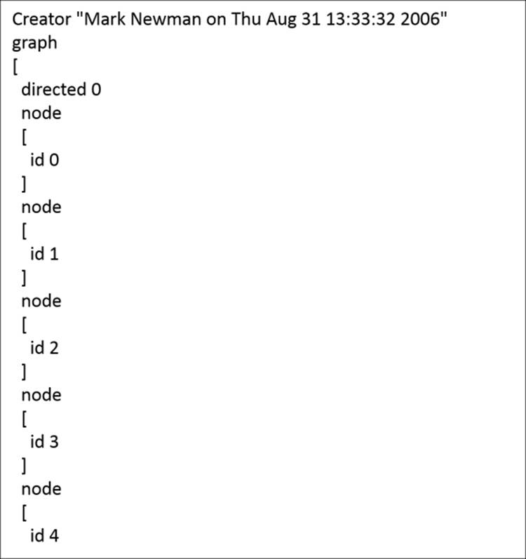
For those of you acquainted with XML or JSON, this will have a familiar look to it, with the highest level representing the graph, followed by the attribute level, which then incorporates each individual node. Likewise, when we move further into the file, we see how the nodes are connected to one another using edge attributes:
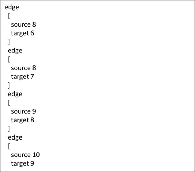
Note how each edge contains two previously created nodes and simultaneously provides the source and target attributes required by Gephi. Based on the node and edge values, we can also detect this as a barebones dataset without labels, weights, color fields, or any other sort of identifier values. Therefore, we'll need to add any of these values once we've brought the data into Gephi. That's alright for this example, but there's a good chance that you'll want future datasets to be richer prior to importing them into Gephi, as opposed to making manual edits using the Gephi data laboratory.
Importing the data
Now that we've had a preview of the data, it's time to launch the import process. Depending on the data type, there are different approaches to import the data. We won't spend a lot of time on this, as there is plenty of information available on the Gephi site and in the discussion forums. Here are some quick tips to import your data file based on the formats:
· For MySQL data, simply navigate to File | Import Database | Edge List, and set up the database driver and location information.
· For multiple CSV files (one for nodes and another for edges), navigate to Data Laboratory | Import Spreadsheet and follow the prompts for both node and edge tables.
· The Excel and CSV files can also be imported using the Excel/CSV Converter plugin. Once that has been installed, navigate to File | Import Spigot and follow the prompts.
· If you are working from graph file formats, including output from other network graph software, simply navigate to File | Open and locate your source file. This is where you can import anything, such as .gml, GraphML, Pajek .net files, Tulip .tlp files, and several additional formats. A graph information window will follow, allowing you to identify the column attributes that are being imported.
For our example, we'll use the last option, which will create a Gephi graph directly from the .gml file. So, let's proceed with that step and then move on to view the actual graph.
Viewing the initial network
Network data loaded into Gephi will not look very interesting at first glance. If our dataset runs into the hundreds or thousands of nodes, the initial view will appear very crowded and certainly won't shed a great deal of insight into the structure of the network. You need not worry about this—Gephi provides a multitude of options to rectify this very quickly.
Let's take a first look at the network after importing the data:
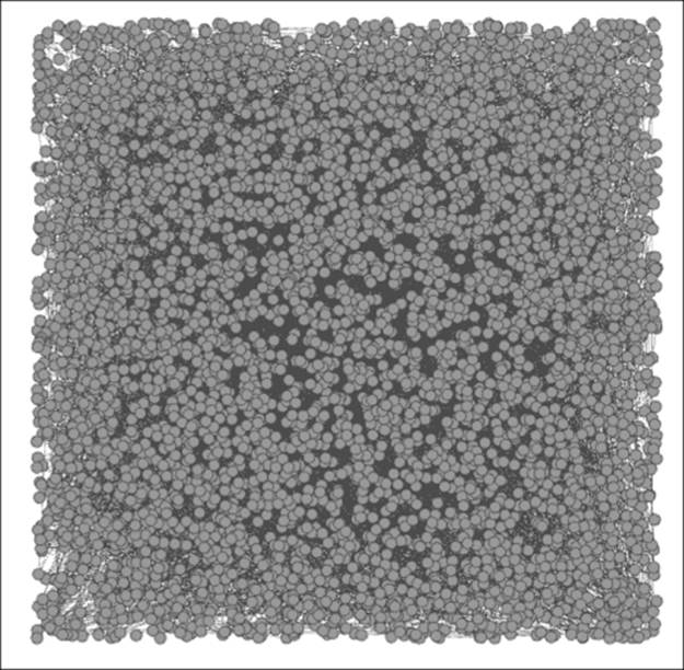
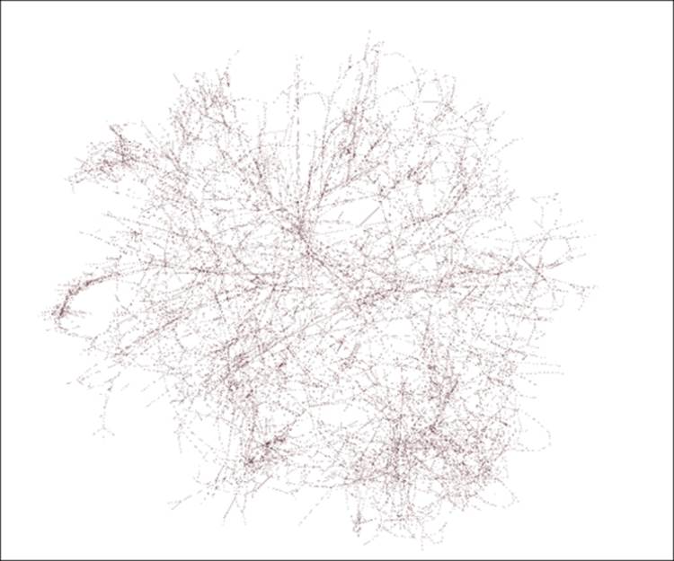
The initial network view
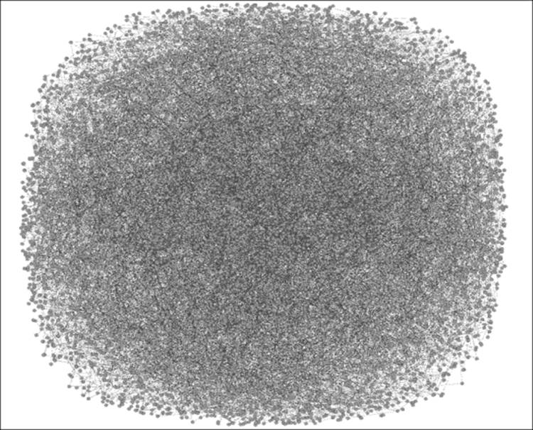
This looks much like what we might have anticipated, given the nearly 5,000 nodes and more than 6,500 edges in the network (as shown in Gephi's Context tab, which is often located in the upper-right corner of the workspace). The initial shape doesn't provide a clue to the network structure either, as Gephi simply created an incredibly congested square. This square layout, without an apparent form or function will, however, provide a great opportunity to utilize many of the capabilities within Gephi.
Selecting an appropriate layout
Let's take an opportunity here to see how this network looks using several different layout algorithms. We'll take a deeper look at layouts in Chapter 3, Selecting the Layout, but viewing some of the layouts now will help us see some quick examples of how they work with this data. Rather than moving directly to an effective layout, it might be more useful to survey a handful of approaches with our dataset.
Gephi makes it exceptionally simple to test multiple layout algorithms, which can be observed doing their work in real time. Over the next few pages, we'll see the results generated by a few different algorithms in an effort to make some sense out of the network. Feel free to replicate the results using your own version of Gephi, and by all means, don't feel constrained by the layouts selected here; try a few others on your own, play with some of the settings, and learn more about your network through different approaches.
If you installed the recommended plugins from Chapter 1, Fundamentals of Complex Networks and Gephi, your version of Gephi will have each of the following layout options available already. If not, you can install them now or simply follow along with the text andget the plugins at a future date. The following layouts will be shown in an order:
· Force Atlas (the faster Force Atlas 2 will be explored in Chapter 3, Selecting the Layout)
· Fruchterman-Reingold
· Radial Axis
· Yifan Hu
· ARF
At the end of this exercise, we will select a single layout that seems to provide the best initial results and then begin modifying the graph to make it tell a more effective story. So, let's begin with our survey of layout algorithms.
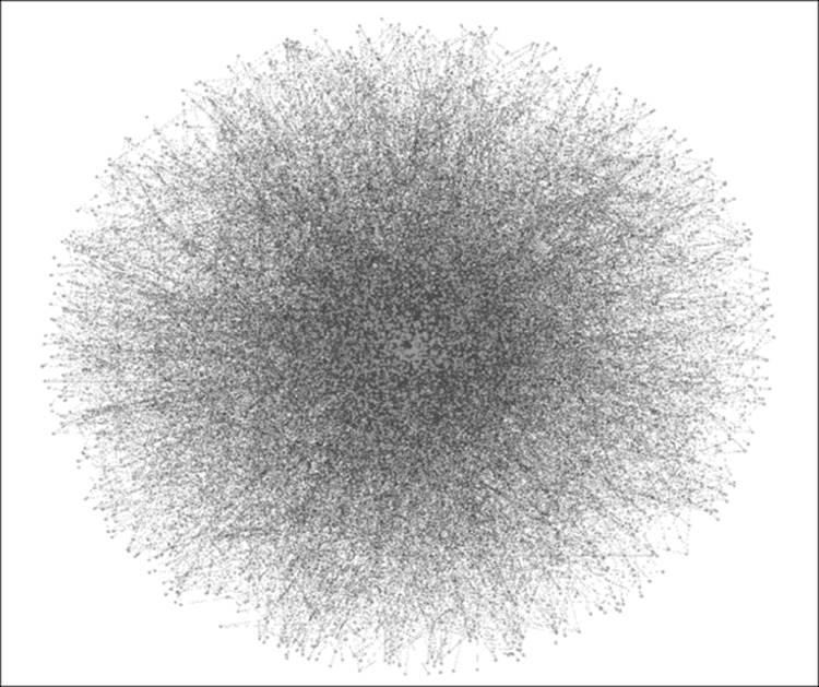
The Force Atlas layout
The Force Atlas layout is a classic force-based algorithm that draws linked nodes closer while pushing unrelated nodes farther apart. For this illustration, we'll retain the default settings, although we have the ability to tweak attraction, repulsion, and gravity criteria, among others. Chapter 3, Selecting the Layout, will take a deeper look at how to work with many of these settings to optimize a graph, but for now, let's run with the default. Also, be aware that many force-based algorithms will run indefinitely if allowed to, but in many cases, you will notice very little incremental improvement beyond a few minutes of runtime depending on the size of the network.
Let's take a look at the network after 10 minutes of runtime on my own laptop. Note that your time might vary considerably depending on the processing power of your machine; more processors are better, as network algorithms are very demanding! Take a look at the following:
The Force Atlas layout
There's certainly improvement compared to where we started, yet there is still a very high level of density in the center of the graph. On a positive note, the edge of the graph is showing connected nodes that have been pushed out from the center. However, our results might have been improved by increasing the default repulsion setting in order to spread the graph out or by reducing the gravity criteria, which would move nodes away from the center of the graph.
The Fruchterman-Reingold layout
Next is the Fruchterman-Reingold layout, which is another force-based approach that has slightly different settings available. While we are still working with the defaults, it is possible to adjust settings for this algorithm—although not to the same degree as with the Force Atlas model. The primary adjustments we can make here involve the graph size area and the gravity. Thus, a dense network can be forced to spread out by manipulating the graph area rather than adjusting repulsion or attraction settings. Here's the result using the same 10 minutes allotted to the Force Atlas method:
The Fruchterman-Reingold layout
A first appraisal suggests that the Fruchterman-Reingold layout was not very effective with this dataset, as it failed to spread out the network as effectively as the Force Atlas layout managed. Instead, we are left with the dreaded hairball effect, potentially overcome by some clever interactivity and modifications to color or node size, but overall, this method was not particularly effective for this network.
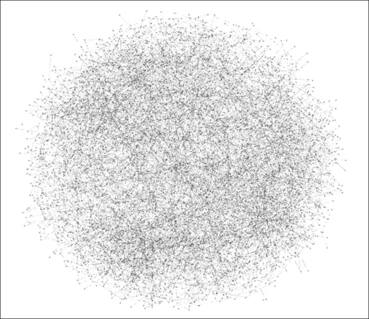
The Radial Axis layout
One of the beauties of working with Gephi lies in the sheer number of layout algorithms as well as the variety of options. In cases where traditional force-based methods are not as effective as we would like, Gephi provides the ability to turn to other approaches, including the Radial Axis layout. This algorithm positions nodes along radial axes using a predetermined number of radians. This method is not force-based, giving it a significant speed advantage. Instead, users specify how they wish to group nodes, how the nodes should be laid out, and several additional selections. Here is the same network seen through the Radial Axis approach:
The Radial Axis layout
Note
Note how the use of forced axes spreads the nodes out, enabling far greater visibility of the edges running between each pair of nodes. This might or might not be the best algorithm for this network, but it clearly demonstrates another option as we seek to portray the network in the most flattering light.
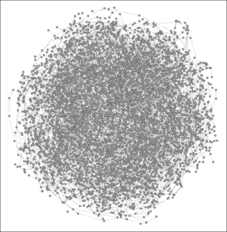
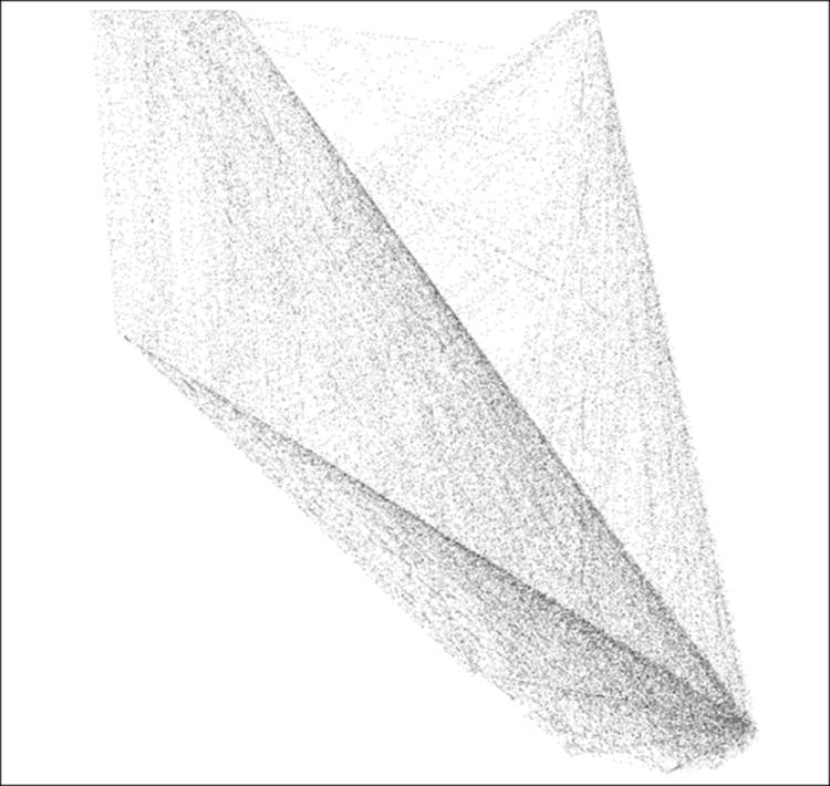
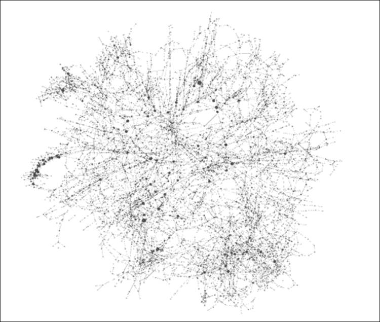
The Yifan Hu layout
Yifan Hu is another force-based algorithm but one that is designed to run more quickly than many of the other force-based algorithms while still providing a reasonably accurate result. Yifan Hu also has the advantage of shutting itself down after optimizing the network. The following result was achieved in just over 2 minutes of runtime:
The Yifan Hu layout
Now we seem to be making more progress, as our network has spread out considerably, allowing some separation of nodes and edges and becoming considerably more understandable than some of our prior efforts. This is still certainly nowhere near a finished work, but it has done a better job of illustrating the network structure.
ARF
Finally, we'll turn to the Attractive and Repulsive Forces (ARF) ARF algorithm. This, as you might have guessed, is another force-based algorithm, which allows users to adjust settings to better optimize the network display. In this case, as with the other layouts, the default settings will be applied.
As these layouts have helped demonstrate, a network of this nature is not easily drawn due its complex structure. In contrast, many social networks, web networks, and citation networks will have far greater levels of clustering, more hubs, and additional attributes that often make them far easier to graph. In our infrastructure example, where there are nearly as many nodes as edges, it becomes far more difficult to spread the network out, as there are few, if any, hubs that dominate the graph, and clustering is effectively nonexistent:
The ARF layout
Running the ARF algorithm for 10 minutes spreads the graph out at the edges but leaves a dense cluster in the center of the graph, which makes it very difficult to detect connections between nodes. Setting the repulsion value higher might have improved the output, but the default settings have left us with a bit of a hairball in the center of the network.
After assessing each of the five layouts, it looks as though Yifan Hu has provided the clearest picture of the network, so we will use it for the remainder of this chapter. The Radial Axis layout also cleaned up the network but feels less intuitive with the current network, where we would hope to see all connections across the power grid as opposed to groupings of connections based on selected attributes, which is the approach taken by the Radial Axis layout. This is not a negative commentary on the other methods; in fact, in another situation with a different dataset, our choice might be completely different.
Analyzing the graph
Now that we have settled upon a layout, let's take some time to perform a cursory analysis of the network to see what patterns can be identified and begin understanding relationships within the network. In Chapter 4, Network Patterns, and Chapter 6, Graph Statistics, we'll venture much further into analyzing some graphs from both visual and technical perspectives, but let's get a head start on the process.
Here's the Yifan Hu layout we saw previously:
The Yifan Hu layout
Let your eyes scan the graph for a few moments to understand more about the network. Ready? Here are a few things you might have noticed:
· The graph is still somewhat difficult to navigate
· A number of nodes have been forced away from the center and appear to have single edges in many cases
· There are no obvious hubs (high degree nodes) to be seen
· Several linear connections appear, with several nodes connected in sequence— although this is only evident when zooming into the graph
Now let's use some automated approaches provided by Gephi to learn a bit more about this network. To begin this process, go to the Statistics tab in your Gephi workspace. Chapter 6, Graph Statistics, will provide additional details about a number of critical statistical functions, but for now, we'll get acquainted with a few of the common ones. Let's start with the Network Diameter option, as this provides three distinct measures that serve as important windows into every network's structure. Be sure to select theUnDirected option before you run your statistics.
The output screen gives you a few telling statistics, followed by some distribution graphs. This graph has a diameter of 46, which simply means that it would take 46 steps to traverse the graph between its two most distant points. This is a far cry from the notion of a small world graph, which is often known through the six degrees of separation term. Clearly, power grid networks are very different from social networks in structure. We also note an average path length just under 19; the typical node in this grid is about 19 steps away from any other point in the graph.
Scrolling down to the third graph (we'll bypass the first two for now; there's more in Chapter 6, Graph Statistics), we can see a very informative distribution on the eccentricity measure, which is shown by a bell-shaped curve. Eccentricity refers to the distance of a single point in the graph to its most distant point. Note that the minimum value here is 23, with very few nodes represented. These nodes can be thought of as being the most central within the structure of the network, as they require fewer steps to traverse the entire network. The mode value here is 33, with nearly 600 nodes requiring 33 steps to connect to the most distant point. Finally, the maximum value is 46, which is equivalent to the diameter of the network. These are the least central nodes in the structure and are very likely to be represented on the perimeter of most layouts.
Let's visit another simple statistic: Average Degree (we'll cover many more in Chapter 6, Graph Statistics). This measure will help any visual impressions we might already have about hubs and perhaps clustering by informing us about the typical number of neighbors per node. In this case, the answer is displayed via another distribution chart, where we can see that the overwhelming majority of nodes have either one, two, or three degrees, with an average of nearly 2.7. Again, we can contrast this with the familiar social network examples, where average degrees will often be in excess of 100.
For a final statistic, let's examine the clustering coefficients for this graph, which will give us a very clear indication of the graph density. The traditional clustering coefficient measured at the network level turns out to have a value of just 0.08, which means just eight percent of all possible graph triangles are complete. This indicates a graph that is not very dense. The average clustering coefficient, with more emphasis on local cliques, measures slightly higher at 0.107. In both cases, we confirm that the network is low density.
Now let's move on to the Filters tab, where some further network insight can be developed using a range of tools. Filtering is especially helpful when working with a dense graph, such as our power grid example; therefore, let's examine a couple of the most useful functions here with Chapter 5, Working with Filters, which is devoted to a deeper exploration of these capabilities. For these examples, go to the Topology folder within the Filters tab.
Assume that we want to focus on only the most highly connected nodes in the network, given that these points might serve as some sort of hub (albeit small ones in this network) with a high degree of importance. If we select the Degree Range option and drag it to the Queries portion of the tab, we see that nodes might have degrees ranging from a minimum of 1 to a maximum of 19. Using the slider bar and then clicking on the Filter button, we can then restrict the display to show only nodes with degrees of five and above, 10 and above, or whichever setting is selected. This can help dramatically reduce clutter in the graph and allow us to focus on the most important details while potentially identifying additional patterns in the network.
Next, we'll navigate to Attributes | Range and select the Eccentricity option. Recall our from earlier discovery that eccentricity values ranged between 23 and 46, with the most frequent value at 33. Let's suppose we wish to see only nodes with an eccentricity level below 30, representative of the nodes with the shortest paths across the network. Following the same process of dragging the Eccentricity attribute to the Queries space and then setting the maximum value to 30, we now see a graph with a greatly reduced number of nodes on display. If even more precision is needed, the maximum value can be set to 25, or any value of your choice, using either the slider bar or by manually entering a value.
Now that we have seen some of the basic functionalities with statistics and filters, it is time to move on to the process of modifying the graph for user consumption. The goal is to take actions to make the graph more navigable for users. Let's examine some of these actions in the next section.
Modifying the graph
No network graph is ever perfect, no matter how much time one spends tweaking it, but every graph can be substantially improved from the original output, whether you are using Gephi or any other graph analysis tool. Even a well-selected algorithm using carefully prepared data is unlikely to provide the exact output we seek. This is why the final modifications, either manually applied or executed using some broad criteria (clusters, partitions, and so on), invariably add more power to the finished graph. Whether the modifications address aesthetic, technical, or navigational aspects of the network, these final tweaks will lead to a better output than that provided by total dependence on the data and the layout algorithm.
Recall our earlier selection of the Yifan Hu output for the power grid network display. While the network had improved considerably from its original version, there are still some simple actions that will make the network far more useful for viewers. Let's begin with the simple steps to adjust the size of nodes based on their level of influence.
The first step is to find the Ranking tab, which is found on the left-hand side of the workspace in the default Gephi settings. The Size/Weight icon (second from the left-hand side) will enable adjustments of either the nodes or edges based on the tab that is selected. In this case, select the Nodes tab, click on the Size/Weight icon, and select Degree from the listbox. As there are so many nodes in this network with low degree levels, it helps if we increase the size settings. Let's try a range of 20 to 100 and see how it looks:
The network with size and color modifications
Notice how much more easily we can spot patterns in the network simply by employing these two changes. Now it is easy to see a cluster of high degree nodes to the extreme left of the graph (perhaps all interconnected) as well as a number of other high degree nodes that might serve as some sort of localized hub. These two findings alone can help in learning more about the network in an efficient manner, as opposed to a completely random approach.
We will make one more small change, and then we'll move on to learn more about exporting the graph. In this case, we'll focus on the cluster of nodes just identified in the prior step and apply one more modification to make them stand out. Recall that we just colored all nodes based on their respective degree levels. Now, for this selected group, we can apply a different color to draw attention to this part of the graph (this is most easily done by zooming in to that section of the graph) using the Painter tool on the main toolbar. Select a distinct color, and then click on each node while the Painter icon is highlighted to see something like this:
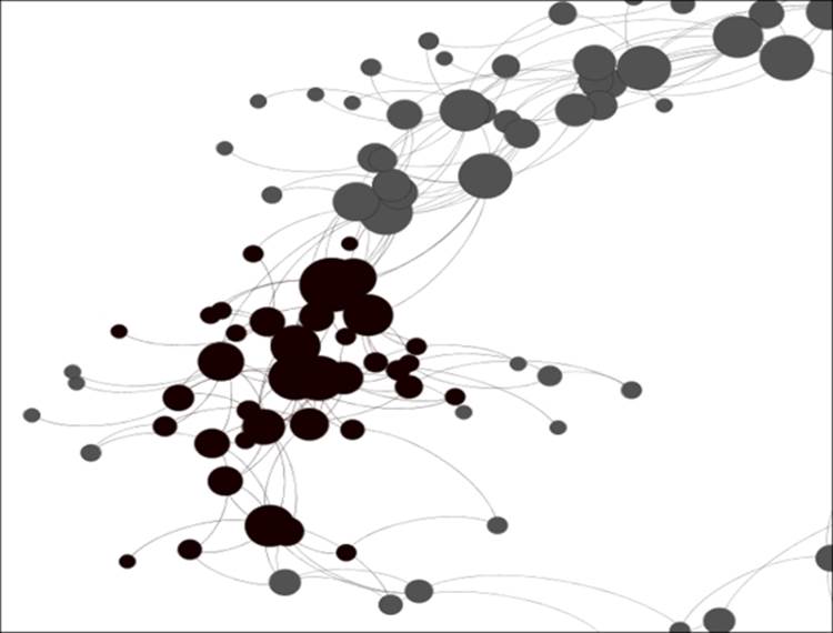
Manual coloring of specific nodes
Now, this portion of the graph has been more clearly identified for eventual users of the graph without the need to do postediting in Illustrator or Inkscape.
We'll explore the topic of modifications further in Chapter 3, Selecting the Layout and again in Chapter 7, Segmenting and Partitioning a Graph, but I hope this little exercise has helped show you the power of making some simple cosmetic changes to the graph.
Exporting the graph
Now we need to think back to the start of this process, when we were considering what our visualization was intended to do and how it would ultimately be used. For now, let's assume we don't want an interactive graph but simply a static network in two versions: one for quick display and another that can be modified for future use. Chapter 9, Taking Your Graph Beyond Gephi, will explore the interactive options in considerable detail as well as delve a bit further into the default static types.
There are two quick ways in which we can export a static version of the network graph. The first is to navigate to File | Export | SVG/PDF/PNG file, which will load a dialog window with some basic options available dependent on the export type selected. An alternative way to arrive at the same place is to use the SVG/PDF/PNG button available at the bottom of the Preview window.
The PNG option will create a simple graph image suitable for sharing through e-mail or social media. Both the PDF and SVG selections will allow for further editing using Inkscape or Adobe Illustrator and will also provide higher image quality. We'll explore these options further in Chapter 9, Taking Your Graph Beyond Gephi.
Summary
In this chapter, we discussed and learned how to think through the process of creating a graph, starting with the initial idea and then following a process through to a completed project. This has given us the opportunity to begin understanding how Gephi works with network data, how to visually assess the network, and how to select an appropriate layout based on the visual output of several approaches.
Once the layout type was settled on, we then discussed some approaches to analyze the network, both visually and programmatically, using some simple graph statistics and filters. We then explored the utility of making some simple modifications to the graph, providing viewers with a much clearer view of the network. Finally, we learned about using some simple export options that take the network beyond the Gephi application and into general use formats such as .png and .pdf.
With a basic understanding of networks and how to work with them in Gephi, it is now time to move on to more highly detailed sections of the book, starting with the next chapter, which will explore the growing number of interesting layout options available for Gephi. We'll walk through the pros and cons of many layout algorithms and determine which options can work best depending on specific network attributes.
All materials on the site are licensed Creative Commons Attribution-Sharealike 3.0 Unported CC BY-SA 3.0 & GNU Free Documentation License (GFDL)
If you are the copyright holder of any material contained on our site and intend to remove it, please contact our site administrator for approval.
© 2016-2026 All site design rights belong to S.Y.A.