Mastering Gephi Network Visualization (2015)
Chapter 3. Selecting the Layout
The nature of your dataset, coupled with the goals you defined earlier, will go a long way to help you select a layout algorithm. It is important to note that while the patterns and statistics within your data will remain unchanged by your layout selection, the impression your graph makes can be remarkably different depending on your selected algorithm. As you become more experienced in creating graphs, your ability to filter these choices will likely be enhanced, and you will instantly reject some approaches as inappropriate for your data. However, there will still be multiple options to choose from, particularly when many of the exceptional layout plugins are used. Your final choice might become evident only after a significant period of experimentation and visual assessment.
In this chapter, we will look at several critical steps that will help and guide you toward a final choice that fits both your data and the intent of your graphical output. Remember, there are no absolute right or wrong answers here; some portion of your final selection will be determined subjectively, using your own visual judgment. So let's begin walking through the steps that will help you make an informed choice about using actual data in order to move from the theoretical to the practical realm.
Overviewing the layout types
This section will neither attempt to answer all questions about each layout, nor will it dive into the technical aspects of how each algorithm works. For those answers, the Gephi website has resources to be explored at your leisure. Instead, we will provide a synopsis of many of the layout options available with Gephi, along with the strengths and weaknesses of each algorithm and some tips on when and where a specific layout is appropriate.
I recommend you consider your options from a holistic point of view. The end goal is to create a network graph that is not only comprehensible, but also tells a compelling story. If the layout looks impressive while achieving these goals, even better! However, any perusal of the literature and online world will quickly reveal that many graphs look impressive while failing to communicate the underlying stories within the network, and many are so dense that they are effectively unreadable. Do not fall prey to creating something impressive for its own sake—always remember that you are communicating with the graph viewer, and make every attempt to communicate clearly.
Now that we have these priorities straight, we can move on to the examination of many of the Gephi layout offerings, which reflect a number of the primary methods used in the network graph world. There are some popular graph types that are not directly covered by Gephi—arc layouts. However, Gephi does provide multiple examples within genres, such as force-based and circular layouts, that provide network analysts with a rich toolkit for creating powerful graphs.
There are several primary types of layouts used in Gephi, with a few of these containing multiple variations within the broader theme, as just noted earlier. The following sections will examine the general types, how they work, and when they might be the best method to use in your network analysis. Our discussion will focus on the practical application of these layouts, rather than any deep technical understanding. Additional technical specifications can be found in the document available at http://sebastien.pro/gephi-esnam.pdf.
Let's start our overview with probably the most frequently encountered network graph approach, the force-based (or force-directed) layouts, for which Gephi provides multiple alternatives.
Force-based layouts
The force-based (or force-directed) algorithms constitute one of the most popular layout categories, often using some combination of methods based on attraction, repulsion, and gravity. Here are the brief definitions for each of the three terms:
· Attraction: This refers to the process of drawing nodes closer together based on their similarity or relatedness. Direct connections will draw nodes together, as will indirect connections through common neighbors. Many algorithms allow you to adjust the attraction settings to pull nodes closer together based on their similarity. Many force-based layouts use the concept of springs that can be used to pull nodes closer together or force them apart. Higher attraction settings will typically pull nodes closer together by minimizing the value of the springs.
· Repulsion: This is a process that forces unrelated or distantly related nodes further apart from one another, which helps to space a graph and makes it easier to see relationships within the network. As with attraction, many layouts provide the ability to adjust this setting to force nodes away from one another. Higher repulsion levels will use the aforementioned springs to force nodes apart.
· Gravity: These settings allow users to define how nodes are drawn relative to the center of the graph. Lower gravity levels will disperse nodes toward the perimeter of the graph, with higher settings pulling points into the center.
Even when these settings are not explicitly available, the general idea is similar; with individual nodes springing closer or farther from one another based on their shared (or unshared) characteristics. Some of these layouts enable additional enhancements using spacing or size parameters to help make a graph more navigable.
The following force-based layouts are available either in base Gephi or through an installed plugin. For each layout, we'll use the same small network dataset and the default layout settings, so you can see the difference in how the various algorithms portray an identical network. The summaries provided are not focused on the technical aspects of each algorithm (many resources are available via the Web and published papers), but are rather focused on how they display a graph based on your network data. We will look at these from a user-centric view—what will the graph appearance look like, and will it help me to create a powerful story using my selected dataset?
The ARF layout
The ARF layout is one of the many force-based methods offered in Gephi, and operates in a similar fashion to others in this genre, while providing its own distinct settings. Here is a quick overview of several available options, and how they function:
· Neighbor attraction force: This is used to pull neighboring nodes closer together, or conversely, further apart. The default setting is 3.0 and can be adjusted downward to spread neighbors apart, or can be set higher in an effort to pull connected nodes into a tighter space. This option can be used in tandem with the general attraction force to set differing behaviors based on relatedness within the network, a feature not available to a number of force-directed algorithms.
· General attraction force: This is applied to all nodes in a network, without regard for their neighbor status. This can be used to spread the network out or draw it closer together, independent of how the neighboring nodes relate to one another. The default setting is 0.2, which will tend to create a small graph with all nodes close together. Changing this setting to 0.1 will have a dramatic impact on the scale of the graph, and the spacing nodes considerably move further apart from one another.
· Repulsive force: This option is another means to spread the network apart. In this option higher settings will force the nodes away from one another, especially in cases where they are not closely related. Again, this setting can be used together with the pair of attraction options to optimize the spacing in your network and to be consistent with the story you are aiming to tell.
· Precision: To make your graph as accurate as possible, adjust this setting to a higher level. High levels of precision will result in a longer running time and harder work for the layout algorithm, as it will try to maximize accuracy, and at some point, of maximum necessary precision there will be minimal benefit derived. As with the other options, it is wise to experiment with this level; you might find that the default setting is sufficient for your network.
Force Atlas
Force Atlas is a classic force-directed approach that uses the principles of repulsion, attraction, and gravity to provide a high degree of accuracy for small to fairly large datasets. On the downside, this accuracy comes at the cost of speed, with Force Atlas being one of the slowest layout methods in Gephi. Fortunately, Gephi makes it possible for us to stop a layout before completion if you sense the results are not what you intended.
There are many settings available for this algorithm, but we'll focus on the primary ones that will help to draw your network. For additional information on the methodology, refer to the Gephi forums. Here are the brief overviews of several options that can help you create an effective network graph.
Repulsion strength is a measure to determine how strongly each node rejects other nodes, similar to what we just discussed in the ARF layout settings. Higher levels force stronger rejection levels and tend to create a graph that has greater spacing between nodes, all else equal. As with other force-directed layouts, this option can be used together with the opposing attraction effect, which is discussed next.
Higher levels of attraction strength will draw connected nodes together, leading to a network that is potentially more clustered, depending of course, on the underlying dataset. If your goal is to create a network graph that is dependent on isolated groups within the network, then a high attraction setting coupled with a high repulsion setting can help us to achieve this result.
Gravity settings play an important role to achieve the look you desire from your network. Higher settings will draw nodes toward the center of the graph, preventing extreme dispersion at the perimeter, while lower settings can help the network to spread in cases where extreme crowding exists at the center of the network.
Another useful feature, especially when nodes are sized according to their importance (based on centrality or degree levels), is the Adjust by Sizes checkbox, a simple toggle that tells the algorithm to avoid overlapping of nodes, or conversely, not to be concerned with the node size. This is highly useful when we have a network with large hubs that could easily land atop smaller nodes, despite our best efforts to spread the graph. This could be done manually of course, but this option makes for less work on this front.
Finally, the Speed function works in much the same manner as the Precision setting in the ARF options. Higher speed sacrifices accuracy, so it will be up to you to determine the proper trade-off, which will be highly dependent on the nature and complexity of your network.
Force Atlas 2
Force Atlas 2 is a faster, updated version of Force Atlas that replaces the attraction and repulsion settings with a single scaling setting, which allows users to set a repulsion level that spreads the graph out for better readability. Once again, there are many available options, but our discussion here will focus on those most likely to be used for designing your layout. For a complete overview of this methodology, refer to http://www.medialab.sciences-po.fr/publications/Jacomy_Heymann_Venturini-Force_Atlas2.pdf.
We'll begin with the Threads number setting, which lets you take advantage of multicore processing when it's available, giving you more dedicated processing power to run the layout. The default setting is 2, but can obviously be raised based on the capabilities of your local machine.
Another unique option is to position hubs away from the graph center using the Dissuade Hubs checkbox. When the checked box is set to yes, the algorithm will tend to push hubs away from the center of the network, providing a rather different perspective than the traditional layouts. The result can be of a very different view of your network, again this is highly dependent on its data structure.
The Prevent Overlap setting can be used to keep larger nodes from obscuring our view of other components in the network, again through a simple checkbox selection.
Another interesting option is to use the Edge Weight Influence setting to control the appearance of your network. A setting of 1.0 equates to a normal influence, while 0 tells the algorithm not to refer to the edge weights at all in the layout computation. Levels above one will become increasingly dependent on the edge weights, resulting in strongly connected nodes being pulled closer together than would otherwise be the case.
We mentioned in the introduction to this method that explicit repulsion levels are specified using the Scaling function. As with all repulsion settings, higher levels will create a sparser graph with greater spacing between nodes.
As with the most force-directed layouts, Force Atlas 2 contains a Gravity option, which gives users the ability to pull nodes toward the center of the graph (through higher settings) or push them away from the center when better visibility in the middle of the network is required. The settings selected will once again depend heavily on the density and structure of your dataset. As usual, the recommendation is to experiment until you achieve a satisfactory result.
Force Atlas 3D
The Force Atlas 3D layout is identical to Force Atlas 2, with the additional option of setting the graph to 3D via a simple checkbox selection. If you have a benefit to display your graph in three dimensions, then use this layout; but beware that 3D graphs can lead to certain nodes being obscured from view. The differences between the two versions are often quite minimal, mostly related to how the nodes are visually depicted.
The Fruchterman-Reingold algorithm
Another force-directed alternative is the Fruchterman-Reingold method, considered as one of the standard approaches, but is also saddled by lengthy runtimes. The implementation of this layout in Gephi provides a few simple options, which we'll review here.
Instead of repulsion and attraction settings, Fruchterman-Reingold uses a single Area function, which acts as a surrogate for both, by spreading the network farther apart or by drawing it closer together. Providing a single function in place of two or even three distinct choices places more dependence on the algorithm and less on the end user, so this is a bit of a limitation if you choose this approach.
Once again, we encounter a Gravity function, which works in the same manner as the previously discussed version in other layouts, where higher values pull the network in toward the center of the graph.
The one remaining selection is Speed, which can be used to hasten the convergence of the network at the cost of higher levels of accuracy.
The OpenOrd algorithm
OpenOrd is an algorithm expressly intended for very large networks that operate at a very high rate of speed while providing a medium degree of accuracy. This is often a nice trade-off for large networks, but is often not desirable for smaller graphs where the loss of accuracy can be substantial compared to other layout approaches.
Many preferences can be set using OpenOrd, with several trying to optimize the time allocation of the algorithm across five distinct stages. We will not go into great detail on how each of these stages work, instead you can refer to the literature for this methodology at http://www.researchgate.net/publication/253087985_OpenOrd_an_open-source_toolbox_for_large_graph_layout/file/3deec5205279e8c66a.pdf.
In order, the five stages are Liquid, Expansion, Cooldown, Crunch, and Simmer. Each can be allocated a percentage of the total process, totaling to 100 percent in all. This full process controls the levels of attraction and repulsion while also determining node locations within the network, by varying parameters in an attempt to optimize results. The default settings are based on extensive research done by the authors of the algorithm, but you can choose to vary the settings to see if there is a tangible impact on your network layout.
The remaining settings include a concept called Edge Cut (or Edge Cutting in the paper), which gives users the ability to dictate how long the edges are handled. A value of 0 corresponds to the Fruchterman-Reingold approach, and can potentially result in clusters abutting or overlapping one another. Setting higher values allows the layout to increase white space between clusters and to become more visually appealing.
Num Threads and Num Iterations both affect how the layout is processed, first by allowing greater processing power, and then to employ additional optimization to occur through a higher number of iterations. Going beyond the default iteration levels is only recommended (or even useful) for very large networks.
The Yifan Hu algorithm
The original Yifan Hu produces faster results compared to other force-directed methods by focusing on attraction and repulsion at the neighborhood (rather than the entire network) level, thus placing a far lower computational burden on the local machine. It also has the advantage of stopping itself by using adaptive cooling, so that it can generally run much more quickly than methods such as Force Atlas.
Among the multiple options for Yifan Hu is its ability to set Optimal Distance levels, with higher values pushing nodes farther apart, without explicitly setting a repulsion level. This is a more generic way to set the lengths of the springs used to space the network.
For repulsion and attraction preferences, Yifan Hu employs a combined ratio titled Relative Strength, which measures the relationship between repulsion and attraction levels. The default setting for this is 0.2; increasing this number puts a relatively higher weight on repulsion, and will spread nodes apart. Changing the setting to a value of 0.1 will invariably draw nodes closer together, as attraction is given much greater weight than repulsion.
The Yifan Hu Proportional layout
All options for the Yifan Hu Proportional layout are identical to the original Yifan Hu, with the only difference being a different displacement scheme. One of the benefits of this model versus other force-based approaches is that this model has a better optimization of distances between nodes, with outer nodes and central nodes spaced appropriately. Some of the traditional force-based algorithms are biased in this respect, with outer nodes being placed closely relative to central nodes, even when the graph distances should be equivalent.
The Yifan Hu multilevel approach
This approach provides another option for very large graphs that speeds up the processing, which results in a slightly coarser graph. A couple of new settings are critical for this layout, which will be further discussed in detail. One of the great benefits of the Yifan Hu models is their rapid computational speed, achieved by working with nodes at a neighborhood level, rather than across the entire network, for each iteration. From an end user standpoint, this results in an exceptionally fast graph creation paired with relatively high accuracy.
The Minimum level size and Minimum coarsening rate options are both intended to set the number and structure of levels in the model, resulting in optimized layouts. Minimum level enables the users to specify a threshold level for nodes per level. The higher this value is set, the fewer levels will be created by the algorithm.
Minimum coarsening dictates the relative differences between levels; a value close to 1 will create more levels, as it implies smaller steps from one level to the next. Conversely, to have fewer levels in your layout, set this value closer to 0 (the default is 0.75), which will force a higher level of coarsening to occur. This could result in a somewhat less accurate graph, although the difference might scarcely be noticeable, again depending on the structure of your network. Experimentation is in order if you wish to understand the impact of these settings.
More technical information on this approach can be found at http://yifanhu.net/PUB/graph_draw_small.pdf.
Tree layouts
Tree layouts are frequently seen in the network literature, although not to the same level as force-based networks. Certainly, this is reflected by the limited number of available layouts in Gephi, with many options for force-based graphs and a scarcity of algorithms for displaying trees. While tree layouts are useful in portraying selected network structures, it is reasonable to question how often this is the case. Organizational structures are traditionally portrayed in this fashion, but anyone who has spent time working in a large organization knows that this is not an accurate representation of who talks to whom or even for how things actually get accomplished.
Nonetheless, there is a place in network analysis for this type of graph, especially if the algorithm provides the flexibility to modify the tree structure into something that more accurately reflects the underlying data, rather than an artificial construct. In Gephi, the DAG layout can be used to create this type of network graph, as we will discuss in the following section.
DAG layout
DAG is an acronym for Directed Acyclic Graphs, and is designed to handle datasets that are nonlooping; the resulting network will resemble (to a certain extent) an organizational chart, with a top to bottom flow. This will likely not resemble a true tree structure, unless the data forces that behavior. It will, however, provide a top to bottom view that can help to show the relationships in the network. In certain instances, this will help illustrate the network structure more effectively than we might get from a force-directed approach, as edge crossings and node placements should be optimized in a vertical plane.
Just four settings are available in the Gephi DAG implementation, which we'll cover in brief. The X Distance option is used to create either a narrow (by decreasing the value) or wide horizontal axis, and is highly dependent on the size and structure of the network. The default setting of results is set to 100 results in a relatively narrow horizontal view, which might be optimal in some instances; be sure to test your network at different levels.
Similarly, the Y Distance function is used to set vertical (y axis) spacing, and will again be heavily dependent on the size and depth of your network.
Speed is used here to vary the animation speed of the graph, and can be set to a value between 0 and 1. Finally, we have Random Optimizations per Pass, which can be raised from the default level in an effort to find the best solution.
To learn more about the general method, refer to https://www.cs.umd.edu/class/sum2005/cmsc451/topology.pdf.
Circular layouts
Circular layouts provide an intuitive structure for networks with a limited number of nodes, although there are variations that allow slightly more complex structures. Nonetheless, these are generally not suitable for graphs with hundreds or thousands of nodes, due to the inefficient use of space whenever circular structures are employed. On the other hand, for relatively small networks with a high degree of connectedness, a circular layout provides a familiar, intuitive framework for viewers of a particular graph.
Gephi provides several circular options, with three easy to use methods discussed in the following sections. We'll briefly discuss each of these layouts and then show how they display the Les Miserables network found on the Gephi website.
The Circular layout
The Circular layout can be used effectively to display a network with a limited number of nodes, especially when there is an intuitive sorting pattern in the data, using either degree values or alphanumeric labels, for example. The diameter of a circle can be set manually to create very compact displays as well as larger ones that can accommodate dozens of nodes. Once we get into the hundreds of nodes, other layouts tend to make more sense from a user's perspective.
The individual options provided in Gephi include several options, beginning with Node Layout Direction, which simply tells the algorithm to arrange your nodes in either a clockwise or counter clockwise manner. This might not be meaningful in some cases, but if your graph is sorted by labels or even by degrees, then a clockwise display will likely feel more intuitive to the end users.
Prevent Node Overlap is available in a number of Gephi layouts, and can be essential in cases where your network nodes are in close proximity, or have significant size variations, with large nodes prone to obscuring smaller nodes.
The Fixed Diameter and Diameter size options are used in tandem to predetermine the size of a graph. In order to have a custom diameter display, the Fixed Diameter checkbox must be checked. Also understand that in cases where you have elected to prevent node overlapping, the graph will rescale itself to accommodate this request, thus overriding the specific diameter size.
To sort your graph using some meaningful criteria (alphanumeric label, node size, and so on), specify the selection using the Order Nodes by criteria. This will enable you to tailor the graph using one of the many possible choices based on the data in your nodes file.
There are also a couple of transitions criteria we won't cover here, but feel free to investigate these as well. Their main purpose is simply how to go about drawing the graph.
The Concentric layout
The Concentric layout allows users to select a root node to build the network around, with the remaining nodes surrounding the target at multiple distances, based on the degree distance from the selected node. This is an effective approach in cases where there is a specific network element to be highlighted. As with many of the circular layouts, this is best suited for relatively small networks, although several circles can be used to display up to several hundred nodes without difficulty.
Here's an overview of the key settings that will help you optimize a graph using this layout—quite simple in this case. Distance sets the value between consecutive circle, allowing cases where there is a need to show multiple rings within a limited space. Knowing the graph diameter is critical for this layout. If your selected node is within three degrees of the most distant member of the network, the distance setting can be high, as it will not significantly increase the size of the graph. If, however, the maximum distance is six or seven degrees away, then distance settings might need to be minimized in order to create a full display within a reasonable screen size.
The Node option requires a target node to be set at the center of the graph. If you fail to enter a value, Gephi will select one for you, and most likely it will not be the node you wish to analyze (the odds are not very favorable!). Find the Node ID in the Data Laboratory tab, or by displaying the node information in the Preview window.
The Speed and Coverage settings each affect how the layout is constructed and should not have a material impact on the final graph.
The Dual Circle layout
The Dual Circle layout bridges the gap between the Circular and Concentric layouts we reviewed in the last two sections, allowing the users to specify the number of upper order nodes to place either inside or outside the main circle. This can be an effective layout when there are a specific number of nodes to be focused on as part of the story, as we can visually isolate them from the others. For example, if our story wants to focus on the three most connected characters in Les Miserables, we could sort them by degree and place only these nodes in the center of the larger circle.
Several settings are made available to optimize this layout, with some related to selections in the Circle layout. There are, however, some options unique to this layout that play an essential role in creating a finished network. These are the ones we'll focus on in the following sections.
The Upper Order Nodes Outside checkbox gives users the alternative of placing the selected group of nodes outside the primary circle, rather than the default inner setting. Thus, our three selected nodes reside toward the outer edge of the network. In most cases, this is not the typical display, which might be why the default setting is unchecked, leaving the selected nodes in the inner circle.
We have already discussed the use of upper nodes; now we can take a step back and see how to specify the number to place in this status, using the Upper Order Count function. There is no real rule for how high this value can be set, although an error message will appear if it happens to exceed the total number of nodes. What should this value be, you may ask? The answer, as usual, is that it depends on the specific network. This might mean a value of one, in a case where the focus is on a single member of the network. Or it could be equivalent to the number of nodes in a specific cluster—perhaps the members of a single crime family or some other defining criteria. Think about the goal of your analysis, and then find the appropriate value to enter here.
Radial layouts
Gephi provides a couple of radial layouts that can be used to display networks in a similar fashion to the circular networks discussed earlier. Radial layouts present some interesting advantages than other approaches, although they will not always be appropriate. However, if your data has some natural partitions or clusters, a radial layout can often display these groups quite effectively, by giving users the ability to specify certain graph settings.
The radial layouts resemble circular ones, in the sense that radians extend out from the center of the graph, although in this case, rather than forming a connected circle, the radians extend out in a series of lines defined by the user. For instance, if there are eight distinct clusters in a network, it might be instructive to view each one along its own axis. A circle is not capable of this, nor is a force-directed method. This is an advantage offered by a radial approach.
Another advantage lies in the ability of radial axis layouts to minimize edge crossings by ensuring the positioning of nodes along their respective axes. This can have the desirable effect of ordering the network such that we don't wind up with a high degree of clutter in the center of the network. Let's examine two offerings available in Gephi—the Hiveplot and Radial Axis layouts.
The Hiveplot layout
The Hiveplot layout is considered highly accurate as well as very fast and provides a way to improve networks that might otherwise suffer from considerable clutter at the center of the graph—the so-called hairball effect. User settings differ a bit from most other layout algorithms, so let's walk through them to gain a clear understanding of how to use them.
The first option is the Refresh button, which simply resets the available fields for other selections. In some cases, these fields will not load automatically; click on the Refresh button to address this. Next, the algorithm provides you a choice (using the Nominal axis assignment property) between assigning a nominal axis (by selecting the radio button) such as ID or Label, versus another field in the dataset (perhaps a cluster or partition). To see a network based on a grouping variable, make sure the radio button is not selected.
The Axis Assignment Property option provides the fields that can be used for drawing the graph—typically ID and Label for the nominal, than whatever other fields can be used to aggregate the network when the nominal option is not selected. This is followed by the On-Axis Ordering Property option, which effects how the network is displayed after the axis assignments have been made. Think of this as a two-step process:
1. Define how to draw the axes.
2. Decide how they should be sorted or arranged.
Finally, there are a series of axis settings to define. I recommend that you adjust the axis settings a few times to understand how they affect the display of your graph.
A paper providing the full details of the Hiveplot layout is available at http://www.hiveplot.net/talks/hive-plot.pdf.
The Radial Axis layout
The Radial Axis layout differs considerably in execution from the just discussed Hiveplot, yet it delivers a vaguely similar output in some cases. However, in many ways, this layout is far more closely related to the various circular layouts, and will in fact deliver the network in a circular form in some cases.
There are many settings that can be leveraged using this algorithm, some already familiar and others unique to this method. We'll begin with the familiar Scaling Width, which simply adjusts the size of the entire network. Adjusting the default setting from 1.2 to 2.0 (or other larger value) will enlarge the graph, while smaller values do just the opposite.
The next couple of items—Resize Nodes and Node Size—each address node sizing, the first dependent on the value set in the second. These options allow us to resize all nodes to a common value, which can be useful in some cases, but might undo some of your prior work if each node is independently sized based on the data values. So be careful not to create more work for yourself, although it is relatively easy to rectify this using the Ranking tab.
Five items are provided in the next section and all are geared to generate node placement on the graph. The first two of these should be somewhat familiar: Group Nodes by and Node Layout Direction. As a refresher, the first of these lets you determine the grouping criteria for your network (by degree, ID, cluster, and so on), while the second is simply a clockwise versus counter clockwise selection. On the slightly less familiar side, but still quite intuitive, is the Order Nodes in Spar/Axis by option, which follows the same logic as the recently learned Hiveplot technique for on-axis ordering.
The remaining selections in this section are Ascending Order of Spar/Axis and Draw Spar/Axis as Spiral. In the first case, we decide whether to sort along each axis in ascending or descending order, using the attribute just selected to order the axis. The spiral option is used in an effort to increase the readability of edges between nodes along the same axis, which can often be a bit challenging in a highly connected network.
Geographic layouts
In cases where your network data has a geographic component, such as latitude and longitude (or at least country), Gephi provides several choices to leverage this information in order to create a geo-based network. These networks can take advantage of the users' innate ability to view and interpret spatial data by overlaying networks on a geographic foundation. We'll take a look at two such layouts; others are available as well from the Gephi marketplace at https://marketplace.gephi.org/plugin_categories/plugin-layout/.
The Geo layout
The Geo Layout offers several parameters that can be adjusted to fit your geo-based network file. The first and foremost parameter to use this layout is the presence of latitude and longitude data in your network. The field names are not critical, as you will have the ability to point each of these options to the matching values in your node file.
Like many other algorithms, the Geo layout offers a simple Scale value for sizing the graph. More important for this algorithm is the Projection function, which offers eight distinct map projections to display your data. It is not in the scope of this book to discuss map projections, but here is an external resource for that purpose http://www.csiss.org/map-projections/.
The Maps of Countries layout
With the Maps of Countries layout, users have the ability to show all countries of the world or alternatively, specific ones by region and subregion. The idea behind this tool is to synchronize geo-based network data from your own network with the mapping capability delivered by the layout. Several options are available to do this, including the following ones discussed here.
The Country, Region, and Subregion options provide the functionality one would anticipate—the ability to draw maps of the world, region, subregion, and country levels. There is also the Projection functionality found in the Geo layout (with the same eight projections), with Scale and Center functions.
Latitude and longitude data can also be accommodated via the Geo layout offering, although the fields must use precise field names (lat, lng) in order to work.
Additional layouts
Gephi offers some additional layouts that don't fit neatly into a specific category, or else they are the only representative of their category, so they are included in this section. Each of these layouts offers at least some specific capabilities that are not present in our previously covered layouts.
The Isometric layout
The Isometric layout gives Gephi users the ability to add a third dimension (z) to their datasets, making it possible to display a network beyond a simple x, y space. Users simply need to have a node field containing the character (z) that indicates the presence of this additional dimension. The advantage of this algorithm lies in its ability to effectively stack data points in a vertical fashion, indicating rank levels or something similar.
Several menu items can be set, including Z-Maximum Level, which tells the algorithm the total number of levels available in the network, based on the underlying data. Each level will correspond with a unique node cluster; a maximum level of five will lead to a graph with five levels, and so on. Next in line is Z-Distance, which sets the distance between each layer for display purposes. Higher values will lead to greater vertical spacing, but this will need to be weighed against the number of levels for best results.
Scale is once again included and functions as it does elsewhere, while Horizontal Z-Axis lets users flip the graph on its side for a lateral display. Finally, Reverse 0-Level Origin inverts the ordering of the levels, placing Level 0 at the top (or far right), with the highest z values at the graph origin.
The Multipartite layout
The Multipartite layout arranges the data in a series of distinct levels with nodes that connect between (but not within) levels. Think for example, of professors in a large university, with each professor linked only to their own department, but not to other professors. This would constitute a bipartite graph which can be used to show the relationship between professors and departments, but not to one another.
The objective of the Gephi Multipartite layout is to minimize edge crossings by optimizing the node arrangement. There are just two available settings to work with in the Gephi Multipartite layout: Speed, which controls how rapidly the algorithm executes, and Layer Attr. (short form for attribute) where users select the data field that will parse the graph along multipartite lines. For example, in a dataset with ten departments, the result would be a graph with all the professors pointing to one of the ten opposing nodes.
The Layered layout
The Layered layout is another simple algorithm that splits the graph using some sort of partitioning or clustering provided by one of the original (or calculated) data fields. Just three selections for a Layered layout are provided for users: Attribute, Layer Distance, and Adjust.
The Attribute parameter is where we determine how to segment the graph; if, for example, we have a dataset with eight clusters, the algorithm will create a network with eight distinct layers. Layer Distance is simply a device to create distance between layers, and will be largely contingent on the number of layers in the network. Finally, the Adjust mechanism provides a toggle where users decide whether to utilize size as an additional criterion.
Network Splitter 3D
The Network Splitter layout uses settings similar to what we just reviewed for the Isometric layout, incorporating a z axis variable to parse the network into multiple levels. Four settings are available, shown as follows:
Z-Maximum Level uses a data field to set the number of levels for splitting the graph along a vertical axis. This number could range from 0 (no split will occur) to 10 or more, although practical viewing considerations might limit this number. The Z-Distance Factorspaces each layer using the specific value entered by the user. You can increase or decrease this value to adjust the network to best fit the viewing area.
Z-Scale sets the number of pixels to use for the vertical scale; a value of 100 provides a vertical axis of 100 pixels. Again, this should be sized to optimize the viewing space of your graph. Too small of a value will fail to take advantage of the strengths of the algorithm.
Additional layout tools
Gephi also provides some simple tools that don't qualify as layouts, but do assist in creating optimal network graphs. These options provide you with the ability to adjust spacing, rotate the graph, and customize label settings. These functions are included here, as they are found in the same location as full layout algorithms. Unlike various alternatives available within specific layout settings, each of the following are layout agnostic:
The Clockwise Rotate tool lets you rotate the graph by specifying the number of degrees of rotation using the Angle specification. This is useful for repositioning your graph to a desirable viewing perspective, perhaps based on a specific node or cluster to be featured. Counter Clockwise Rotate, as you might expect, turns the graph in the opposite direction.
Graph displays can be resized using the Contraction function and its Scale factor setting. Contrary to the name of the function, displays can be both reduced or enlarged, simply by specifying a decimal value (say 0.8 or 1.3). Expansion works in the same fashion.
Noverlap enables better spacing within a network, using the Ratio and Margin settings, while Label Adjust also contributes to an improved layout by positioning all labels so that they can be easily read without overlapping.
Assessing your graphing needs
Now that you have seen the broad array of available layout options and a bit of their respective capabilities, it is time to step back and reconsider what story you want to tell through the data. As you have just seen, there are many directions you can take within Gephi, and there is no absolute standard for right or wrong in your layout selection. However, there are some simple guidelines that can be followed to help narrow the choices.
If you are experienced with Gephi or another network analysis tool, you might wish to dive directly into the next section and begin assessing each layout type using your very own dataset; I will not attempt to convince you otherwise. This is a great way to quickly learn the basics of every layout offering and can be a great experience. On the other hand, if you wish to take a more focused approach, I will offer you a brief checklist of considerations that might help to narrow your pool of layout candidates, allowing you to spend more time with those likely to provide the best results. Think of this as akin to shopping for clothes —you could try on every type of clothing on the rack, or you can quickly narrow your choices based on certain criteria—body type, complementary colors, preferred styles, and so on. So let's have a look at some of the basic points to consider while shopping for an appropriate layout:
· What is the goal of your analysis? Are you attempting to show complementarity within the network, as in the relationships between nodes or sets of nodes, or is the goal to display divisions within the data? Does geography play a critical role in the network? Perhaps you are seeking to sort or rank networks based on some attribute within the data. Each of these factors can play a determining role in which layout algorithm is best for your specific network.
· Is the dataset small, medium, or large? Admittedly, this is a subjective criteria, but we can put some general bounds around these definitions. In my mind, if the number of nodes is measured in tens or dozens, then this is likely a small dataset that can be easily displayed in a conventional space—the Gephi workspace window or a simple letter-sized paper for a printed version. If, however, the nodes run into the hundreds, we are now moving away from a very simple network and potentially reducing the number of practical layout options. When the number of nodes in a network moves into the thousands and beyond, we have what can practically be considered a large network, at least for display considerations. With datasets of this scope, additional display considerations come into play, such as judicious use of filters, layers, and interactivity.
· How densely connected is the network? In our previous example using the power grid data, we had a fairly large dataset numbering in the thousands, but one that was not highly connected, at least as compared to social networks. In that case, we might have an easier time selecting and applying an effective layout, while the highly connected nature of social networks presents an additional challenge.
· Does the network exhibit certain measurable behaviors such as clustering and homophily? In some cases, we might not know this until the network has been visually and programmatically analyzed, but in others we might already know that the data is likely to cluster based on certain attributes that influence the network structure, including geographic proximity, alumni networks, professional associations, and a host of other possibilities. Knowing some of these in advance might help guide us either toward or away from specific layout types.
· Will the network be displayed on a single level, or will it be bipartite or multipartite? In this case, as covered briefly in Chapter 1, Fundamentals of Complex Networks and Gephi, some networks might be hierarchical, with individuals (for example) linking only to an organization, and not to other individuals in the network. There are many instances where we will wish to present hierarchical networks in this fashion. This could be used to display corporate structures, academic hierarchies, player to team relationships, and so on, and requires some different considerations than networks without this structure.
· Does the data have a temporal element? In simple terms, will the story be told more effectively by viewing network changes over time? This can be very effective in showing diffusion/contagion patterns, random growth, and simple shifts in behavior within a network, for example—were Thomas and James friends at T1, but no longer so at T3 (where T equals time)? If our data has a specific time element, this leads to identify layouts that will best display these changes and tell an effective story.
· Will the network be interactive on the user end, or will it be static? This can ultimately lead to a different layout selection when users have the ability to navigate a network via the Web.
You might have additional considerations, including the speed of the layout algorithm, but the preceding list should help you to narrow the list of practical layouts, allowing you to test the remaining candidates.
Actual example – the Miles Davis network
Let's walk through a process following the preceding guidelines, and applying them to a project previously created by me. This will help us migrate from the theoretical constructs above to a practical application of many of these principles. The project I'll use as our example traces the studio albums recorded by the legendary jazz trumpeter, Miles Davis—48 in all. Here are the details for this project, following the above progression.
Analysis goal
The goal of the analysis was to inform viewers, who might or might not be jazz fans, about the remarkable, far reaching recording legacy of Miles Davis. Since the career of Davis moved through many stages, he crossed paths with and employed an incredible number of artists across a diverse range of instruments that ranged far beyond the normal jazz instrumentation. Therefore, part of the goal of the analysis was to expose viewers to this great diversity, and give them the ability to see changes and patterns within the scope of his career.
Dataset parameters
The dataset in this case is not insignificant—while 48 albums would represent a small network if left on its own, we know from the data that there are typically at least four musicians per recording, and often far more, numbering into the 20s in some cases. Many of the musicians are represented on multiple recordings, but there is still a multiplicative impact on the size of the network, which turns out to have about 350 nodes. While this certainly doesn't rival the enormous datasets often seen in social networks, it is large enough that we need to be thoughtful about the layout and how users will interact with the project.
Here is a look at some of the underlying data for the nodes:
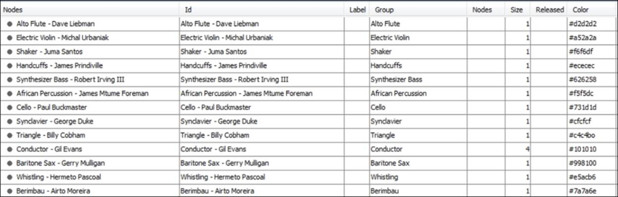
Miles Davis nodes
Notice that the nodes are a combination of an individual musician and a specific instrument, since so many of these musicians play a second (or even third) instrument. The data is then grouped by instrument, which allows you to partition and custom color the data.
Now, the following figure illustrates a partial view of the edge's data:
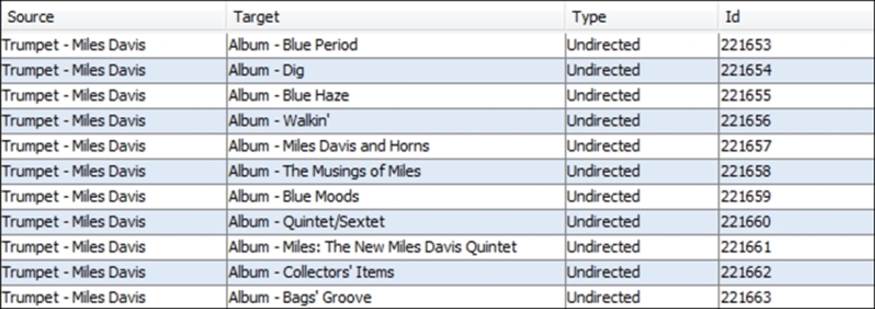
Miles Davis data edges
In the preceding screenshot, we see only album level connections, with Miles Davis as the source and each album as the target, although the edges are left undirected. If we move further into the edge's data, we can see how the network is structured a bit more clearly:
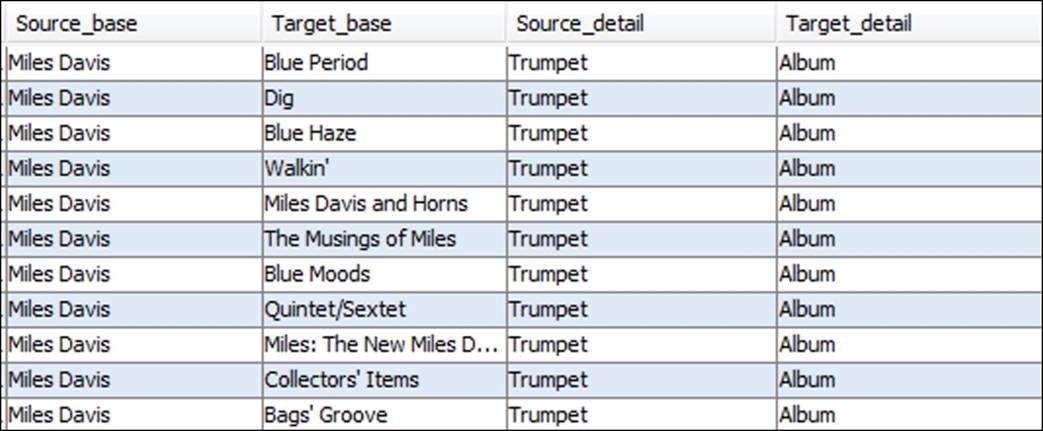
Miles Davis data edge details
This data shows some of the musician level connections to specific recordings, as well as the instrument played on that album. This completes the basic structure of the network, as each musician will have an edge connecting them to any and all albums they played on. So this gives us a basic understanding of how the data will be represented in the network—Miles at the core, all albums at a second level, followed by every contributing musician at a tertiary level.
Network density
We have all seen many highly connected networks with edges crossing between nodes or groups within a graph that become virtually impenetrable for the viewer. Fortunately, this was not a major concern with this network, given its relatively modest size, but it could still play a role in the final layout selection. As always, the goal is to provide clarity and understanding, regardless of the relative size of the network, so minimizing visual clutter is always a priority.
Network behaviors
Examining the network behaviors can be an interesting exercise, as it often leads us to findings that were not necessarily anticipated. In the case of this project, we know from viewing the data that Miles played with certain musicians on a frequent basis, but would then often play with an entirely new group during his next phase, before switching yet again to a completely unrelated group of musicians. In other words, there were multiple aggregations of musicians who only occasionally intersected with one another. This is very nearly a proxy for homophily, with distinct clusters connected to each other through a single node (Miles Davis in this case) or perhaps a small subset of network members who act as bridges between various clusters.
Based on this knowledge, we would anticipate a highly clustered network with a significant level of connectedness within a given cluster, and a limited set of connections between clusters. The next decision to make was how best to display this network.
Network display
We just saw the underlying data structure, which had a bipartite nature to it, with each musician connecting to one or more albums, rather than to other musicians. Given this type of network, we want to select a layout that eases our ability to see not only the connections between Miles Davis and each recording, but also from each album to all of the participating musicians. This will require a layout that provides enough empty space to make for clear viewing, but also one that manages to combine this with a minimal number of edge crossings. Remember that many of these musicians played on multiple recordings, so they must be positioned in proximity to several albums at the same time, without adding to a cluttered look.
After testing several layouts, some of which simply didn't work effectively with the above two needs, I settled on the ARF algorithm for its visual clarity to display this particular network. The ability to see patterns within the network, even prior to adding interactivity, is a plus; if the network passes that test, it should be very effective once users interact with the information.
Temporal elements
Another interesting aspect of the network that could have been utilized was the timeline for the recordings. With more than four decades of recordings, this could have provided a wealth of information about changes over time in the musicians' network and instrumentation on each album. This element was not highlighted, but it does make its presence felt in the final network, with albums from one period with a consistent cast of musicians occupying one sector of the graph, while other types of albums with many infrequently used musicians land in another area.
Interactivity
The final decision was whether to make the network interactive, giving users the ability to learn more through self-navigation of the graph. This was considered important from the very start, so that the viewers could see not only the body of work represented by the 48 recordings, but also the evolution of which musicians were involved, as well as shining a light on the wide array of instruments used as Miles' career evolved.
After each of these considerations was evaluated, and through a period of testing the network using multiple layouts, I settled on the ARF force-directed layout coupled with the Sigma.js plugin for interactivity. Here's a look at the final output, which includes options using the Sigma.js plugin:
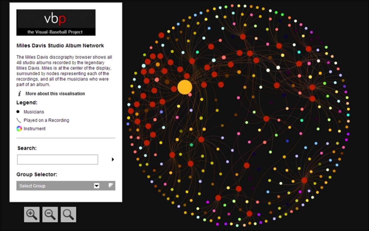
The Miles Davis network graph
The link to the project can be found at http://visual-baseball.com/gephi/jazz/miles_davis/.
I hope this example helps to generate some ideas or at least opens up the possibilities for what Gephi is capable of creating, and that the process illustrated earlier helps to provide at least a foundation for your own work. The data files used for this project are also available at the link in the Web Resources section of the book, so you can create your own version—and perhaps improve on the original!
Layout strengths and weaknesses
We've walked through an overview of many layouts in this chapter and provided a number of external links for those who wish to learn the full technical details of a specific algorithm. What we have not done to this point is compare these approaches to give you a bit of guidance in how and when to use various layouts, and what their relative strengths and weaknesses are. The following table will attempt to remedy this, giving you a fairly high level overview across a few broad categories. Remember, there are few absolutes in this space, and there are no substitutes for trial and error and visual evaluation, but it is hoped that the following will provide some guidance as you evaluate various layouts:
|
Algorithm name |
Type |
Strengths |
Weaknesses |
When to use |
|
ARF |
Force-directed |
|||
|
Circular layout |
Circular |
This is simple, easy to interpret, and easy to set parameters |
This is limited to small networks for easy viewing; it has potential for excessive edge crossing |
This layout can be used in cases where you have a particular order in mind for the data—by clusters, size, and so on |
|
Concentric layout |
Circular |
This is good for focusing on a single node within a network |
This is not ideal for large diameter networks as graph size increases geometrically |
This is useful for featuring a single node at the center and displaying their neighbors in descending order from direct to distant |
|
DAG layout |
Tree |
Ordering hierarchical data |
This is impractical for very large networks |
This can be used in cases where you wish to see levels of data in a top to bottom order |
|
Dual Circle layout |
Circular |
This has the ability to focus on a group of nodes within the larger network |
This layout results in very large networks that might create viewing issues |
This layout can be used in instances where a second circle is desirable to focus on a limited group of nodes |
|
Force Atlas |
Force-directed |
This includes many options and has a high level of accuracy |
This can be very slow and is not suited to large networks |
This layout is useful for network analysis and discovery, and for measuring network behavior |
|
Force Atlas 2 |
Force-directed |
This is faster than original Force Atlas and handles very large networks |
This suffers slightly on overall accuracy |
This is used as a good tool for network analysis and discovery, and for detecting behavioral patterns |
|
Fruchterman-Reingold |
Force-directed |
This is accurate, and tends to be easy for viewers |
This is very slow and not suited for large networks |
This is good for a generalized view of small-to medium-sized networks |
|
Geo layout |
Geographic |
This uses lat/lon data for geo-based networks |
This is limited to geographic data, and must have lat/lon attributes |
This can be used with any geo-based data |
|
Hiveplot layout |
Radial |
This provides a good solution for network hairballs by spreading connections along radial axes |
Can be difficult to see interactions within groups along each axis |
This is ideal for viewing cross-group interactions in small-to medium-sized networks |
|
Isometric layout |
Layered |
Adds third (z) dimension to help spread crowded networks |
More difficult to determine relative positioning of nodes within the larger network |
Useful for cases where the network has natural groupings or layers |
|
Layered layout |
Layered |
This is an easy way to view a network with distinct layering patterns based on clusters or groupings |
This has very few options for setting layer behavior and layout |
Useful for simple graph creation where layers are a key part of the story |
|
Maps of Countries |
Geographic |
This provides a background of countries and regions for use with other networks; this also works with lat/lon overlays |
This requires country-level data to be useful |
This is used in cases where national affiliations are part of the story—perhaps author networks or research collaborations |
|
Multipartite layout |
Multipartite |
Minimizes edge crossings, best suited to multitier network structures |
This has few options to customize the graph |
This is best used when the network data shows linkages between individuals and organizations or other level of aggregation |
|
Network Splitter 3D |
Layered |
This adds a third (z) dimension to help in viewing crowded networks with natural layers |
This separates layers, making it more difficult to perceive the whole network |
This is ideal for splitting crowded networks along a specific criteria, such as clusters or groups |
|
OpenOrd |
Force-directed |
This is very fast, and can handle large networks |
This is not highly accurate on smaller networks |
This is used for a rapid understanding of large network structure |
|
Radial Axis layout |
Radial/Circular |
This is flexible, and is a good layout for clustered datasets |
This can be challenging with large networks, and is not ideal for viewing intragroup connections |
This is ideal for viewing connections across groups |
|
Yifan Hu |
Force-directed |
This is fast compared to other force-directed algorithms |
This lacks separate repulsion and attraction variables |
This has an easy to understand approach for rapidly viewing small to medium networks |
|
Yifan Hu Proportional |
Force-directed |
This handles relatively large networks; and has fast graph creation |
This has moderate quality versus other force-based layouts |
This has an easy to understand approach for rapidly viewing small-to-medium networks |
|
Yifan Hu Multilevel |
Force-directed |
This handles very large graphs, fast |
Quality is sacrificed as a trade-off for processing speed |
Very fast method for viewing large networks |
Testing layouts
In my experience, selecting a perfect layout on the first attempt is highly unlikely; even if the best possible algorithm is chosen, it is almost a certainty that the graph display can be improved through adjusting the base settings, not to mention all of the downstream cosmetic enhancements. Knowing this makes it essential to sample multiple layouts for your network data, which can be a very efficient process for all but the largest networks.
In the next few sections, we will walk through the process of testing a few layouts using the same dataset, and will go into greater detail compared to our exercise in Chapter 2, A Network Graph Framework, by modifying settings within each algorithm to demonstrate the resulting impact on the network graph. We'll work with the Les Miserables dataset found in the Gephi samples (available when you open Gephi), as it provides an interesting network to work with, while still being small enough to easily interpret.
Our focus during this process will be limited to the actions that we can control primarily from the layout algorithms, in the hope that there will be sufficient differences that favor certain layouts over others. In later chapters, there will be a focus on additional modification that can be made once the base layout has been selected.
For this exercise, we will visit algorithms from several of the main categories discussed earlier—force-based, circular, and radial, and walk through a simple testing process. The goal is to not overwhelm you with image after image of each layout type, but rather to select a few layouts and then work within the layout to adjust settings and improve the graph appearance. This will be a nonjudgmental process as well, which will allow you to choose the layout that works best per your individual perception.
Testing the ARF layout
While there are many options for the force-directed layouts, the ARF algorithm provides a fast, simple, and easy to interpret layout that will aid in understanding the fundamentals of the force-based layouts. If you wish to follow along, use the Les Miserables dataset from the Gephi samples to get started. This is an undirected network that shows the interaction between characters in the famed novel.
Here's a look at what we see after opening the network in Gephi:
Les Miserables network from the .gexf format
Not bad as networks go—this one has obviously been worked on to some degree, with sized and colored nodes, weighted edges, and some sort of clustering tied into the colors. Still, we will work with our layout algorithms to see what improvements can be made.
Now, select the ARF layout if you choose to follow along (as you can recall, this must be installed as a plugin). Here are the default settings we'll use for the first iteration:
· Neighbor attraction force = 3.0
· General attraction force = 2.0
· Repulsive force = 8.0
· Precision = 2.0
· Maximum force = 7.0
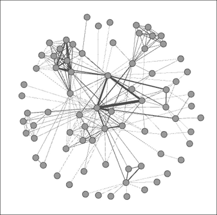
Here is the result, after letting ARF run for about a minute:
Les Miserables in ARF
Notice that the network has actually drawn closer together compared to the original, making it more difficult to interpret. To remedy this, we'll adjust the repulsive force higher—say from 8.0 to 20.0, in an effort to spread the graph out by putting greater distance between unrelated nodes:
Les Miserables in ARF (Step 1)
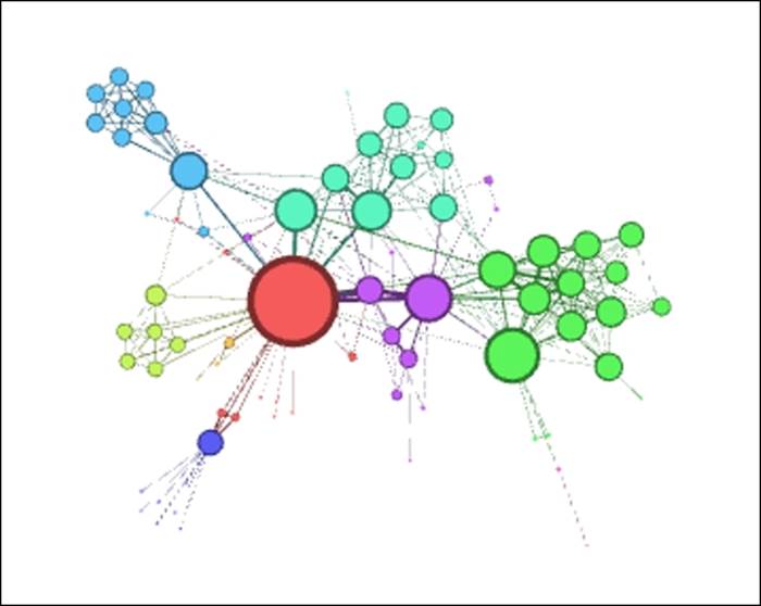
That's much better, although it still hasn't really surpassed the original, given that we have a few overlapping nodes that require attention. Let's give it one more try, this time adjusting the general attraction from 0.2 to 0.1. Reducing this value will minimize the likelihood that nodes are drawn together, thus preventing the overlapping (we hope!):
Les Miserables in ARF (Step 2)
This is definitely an improvement over our first two attempts. The clustered nodes group together better than before, there are no overlaps, and peripheral characters have been pushed further toward the perimeter of the network, thus minimizing edge crossings and making for a cleaner layout. This final version feels like a good foundation we could take to subsequent stages in Gephi, assuming that we prefer the result versus the upcoming layouts we're about to view.
The Concentric layout
Our next effort will focus on the Concentric layout, available again as a Gephi plugin. The Les Miserables data provides an interesting use case for a concentric graph, given the dominance of a single character, Jean Valjean. If you are unfamiliar with the story, Valjean is the central character, and is thus represented by the largest node in the network, based on the number of connections to other characters. As you can recall from earlier, a single node is featured at the center of a concentric network, with other nodes spaced based on the number of degrees they are away from the selected node (for example, direct connections are represented in the innermost circle).
In theory, this would make a concentric layout an attractive option for telling this story, assuming that Valjean is at the center of our story. Let's have a look at whether this is as effective as it sounds. The default settings are as follows:
· Distance = 100
· Node = 0
· Speed = 10.0
· Coverage = 0.6
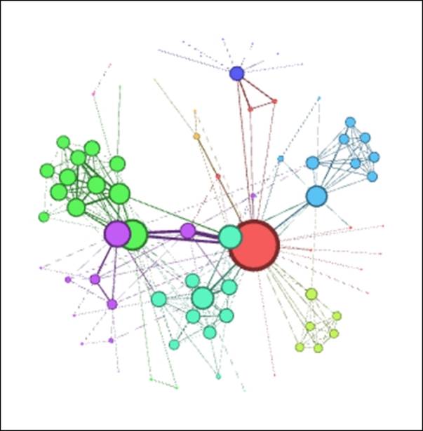
One change we do need to make is to set the node to Valjean's ID, which happens to be 11. Otherwise, the algorithm will do the selection for us, forcing an extra iteration to get things right. The initial result looks like this:
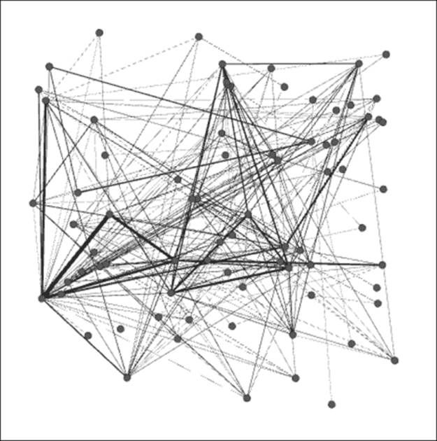
Les Miserables Concentric layout
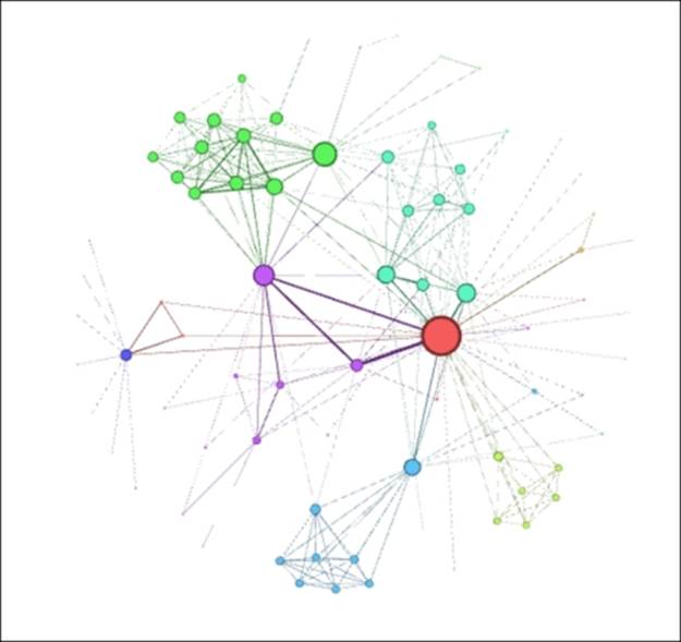
These settings result in a very crowded graph that won't be effective in telling any sort of story. Perhaps if the nodes were not previously sized, this might work better, but we would then lose the impact conveyed by the multiple sizes. So let's increase the distance settings from 100 to 500 to spread the rings out from one another. Note that this is easily done given the small diameter of the network.
Les Miserables Concentric layout (Step 1)
Much improved! Now we can clearly see the structure of the network, and the fact that virtually all nodes are within two steps of the central character, with only a couple of instances three degrees out from the center. On the downside, the concentric approach isn't as effective in grouping the clusters compared to the ARF method, but at least it now presents a viable option for further use.
Testing the Radial Axis layout
A Radial Axis layout resembles circular layouts to a considerable degree, but presents another option to consider that is different in one critical sense. The difference lies in the manner in which nodes are arranged and displayed using a series of axes rather than one or more circles. This would appear to be a reasonable approach for our current dataset, especially given the existing clusters in the network. Let's have a look at where this approach leads us, once again starting with default settings as follows:
· Scaling Width = 1.2
· Group Nodes by = Degree
We'll leave the remainder of the settings untouched for now, although there are several more selections that could be used to tweak the layout. Here's the initial network graph:
Les Miserables Radial Axis
As with the other layout selections, the default settings have created a crowded graph, albeit somewhat more readable than our previous examples. Still, there are a couple of simple choices we can make to improve the layout quickly. Our first step, as with the other layouts, will be to spread the graph out for easier interpretation. Let's raise the Scaling Width option from 1.2 to 2.5 and see whether that level is sufficient for our purposes.
Les Miserables Radial Axis (Step 1)
This is certainly an improvement, although a slightly higher setting might be even better, especially if we need to draw attention to some of the smaller nodes. For now, let's stick with this setting while making an important adjustment to the Group Nodes by option. Rather than using the default setting of Degrees, we're going to change this to group based on the clustered nodes, here shown as Modularity Class (Attribute). Let's check out the results of this change:
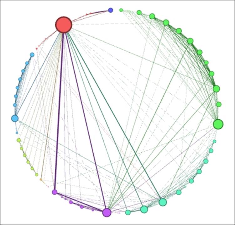
Les Miserables Radial Axis (Step 2)
Interesting—our Radial Axis layout has formed a circle, confirming our earlier statement about the similarities between circular and radial layouts. Also note how clean and easily followed the network is, with the various clusters ordered by size around the perimeter, and the Valjean node easily seen at the upper-left corner of the graph. This layout also highlights the strongest connections in the network, seen here through weighted edges between Valjean and some other prominent characters in the story.
While this layout worked quite well in this instance, note that it would probably be far less effective if we had 500 nodes rather than a mere 76 in this network. This is where your trained eye needs to make some decisions about how much is too much within a specific layout context, guided by how the network will ultimately be deployed.
Layout selection criteria
Now that you've had the opportunity to see the impact of different layouts and settings on the same network data, it's time to determine what the best option is before proceeding with your graph. This is not always an easy task, and can certainly be influenced by subjective factors such as differing layout preferences among individuals, different layout needs (for example, print versus interactive), and personal decisions on what story to tell with the network graph. After all, the same data can often lend itself to many narratives, depending on the perspective of the individual analyst.
Even with the above caveats in mind, there are certain criterias that are at least somewhat objective, and can thus help in making the graph selection process a bit easier. Here are a few measures we might start with to select an appropriate layout:
· Does the network graph communicate any sort of story when you examine how it appears in a specific layout? After all, if even the creator of the graph has a difficulty in perceiving the meaning from the network, then users who are unfamiliar with the data are likely to have an even more difficult go at interpreting the story. If you have spent considerable time in tweaking and adjusting the layout, and it still fails to reveal further meaning from the data, then you should find a layout that is more effective for your network.
· If you do see evident patterns within the data that lend themselves to a story, but find they are being crowded out by comparatively meaningless clutter (a common issue with dense graphs), there is still hope for using that particular layout. If you haven't already attempted some of the available spacing options, by all means begin working with these. Set your attraction settings lower and/or your repulsion settings higher to help spread the graph in a meaningful fashion. Many layouts allow you to adjust the gravity setting, which will pull nodes toward the center or, alternatively, push them out towards the perimeter of the graph.
· If the network has the dreaded hairball appearance, with large numbers of nodes and edges creating a dense, difficult to read graph, then it is likely that your layout is either a poor choice for the selected data, or that it has yet to be optimized. There are opportunities to segment dense networks using a layered or partitioned approach or through the use of intelligent filtering to focus attention on the relevant relationships within the graph. In instances with very large datasets, it is often difficult to completely avoid the hairball effect regardless of the chosen layout, but there are still ways to work around it, using the suggested approaches.
· Will the final layout be interactive or static? If the network will be navigable for end users, then a higher degree of complexity is possible, although this should not be used as an excuse for failing to optimize the layout. Regardless of the final output, the goal should be to create the best (and often simplest) graph that tells the story. An interactive format will typically allow you to explore a larger graph, but it should adhere to the same basic principles we use to produce a graph for the printed page.
Keep these guidelines in mind when you are assessing the viability of a layout, and trust your own judgment as well. This is certainly an area where experience is a valuable asset. By following this process, or something similar to it, you will build a level of confidence while viewing future network graphs, and will be able to make better, faster decisions for future network layouts.
Graph aesthetics
Part of what makes certain graphs memorable goes far beyond the data or the layout algorithm used by the analyst. What takes these graphs to the next level is often some relatively simple tweaking of graph attributes using styling options within Gephi. The intelligent use of spacing, sizing, coloring, and labeling can elevate a graph from being merely informative to being both, informative and aesthetically pleasing, and indeed eye-catching. We should not set out to create the graph simply as a work of art, compromising the relationships in the network, but we can and should make the graph visually attractive, in order to successfully convey the meaning of the data. Use aesthetics to enhance, not obscure, the meaning of the data.
In this spirit, we can learn from the information visualization approaches of Edward Tufte and Stephen Few, albeit with some appropriate caveats that apply specifically to network graphs. Some readers will consider their approaches to be rather Spartan, and indeed that might be the case when taken at face value. However, it is the basic principle, suggested by Tufte and Few, as well as Cleveland, Bertin, and other data visualization experts, that we are concerned with, and how best to integrate their ideas into the world of network graph design.
Subsequent chapters focusing on filtering (Chapter 5, Working with Filters) and partitioning (Chapter 7, Segmenting and Partitioning a Graph) will take this to another level, but in the meantime there are some simple steps that can be taken to enhance the appearance of our graph. In the following sections, we'll walk through a makeover process where a plain, uninspiring graph is elevated step by step to a much higher level, simply by using some basic Gephi functions.
Working example of graph aesthetics
For this example, we'll begin with an unadorned dataset, and then make step-by-step modifications using only the tools in the Gephi Preview toolbars. The idea is to demonstrate how easily we can make a graph more attractive, even without utilizing more sophisticated clustering, ranking, and filtering tools. Think of this as graph aesthetics 101, where we will learn to take advantage of base Gephi functionality. Some of you might find this information very basic, and might want to skip ahead to the next chapter, but if you are not in this group, then join me in this basic example.
We're going to use the Les Miserables dataset again, but this time it won't be in the neat form we've previously used, but rather in a simple, unformatted version, available from the Gephi website. This can be found in the Gephi wiki under datasets in a .gml format. After opening the file in Gephi, the result is a very plain, somewhat undecipherable network:
Les Miserables .gml
Perform the following steps:
1. Our first step will be to choose a layout; at this point, nearly any choice should improve the graph. We'll work with the ARF algorithm, which creates this result:
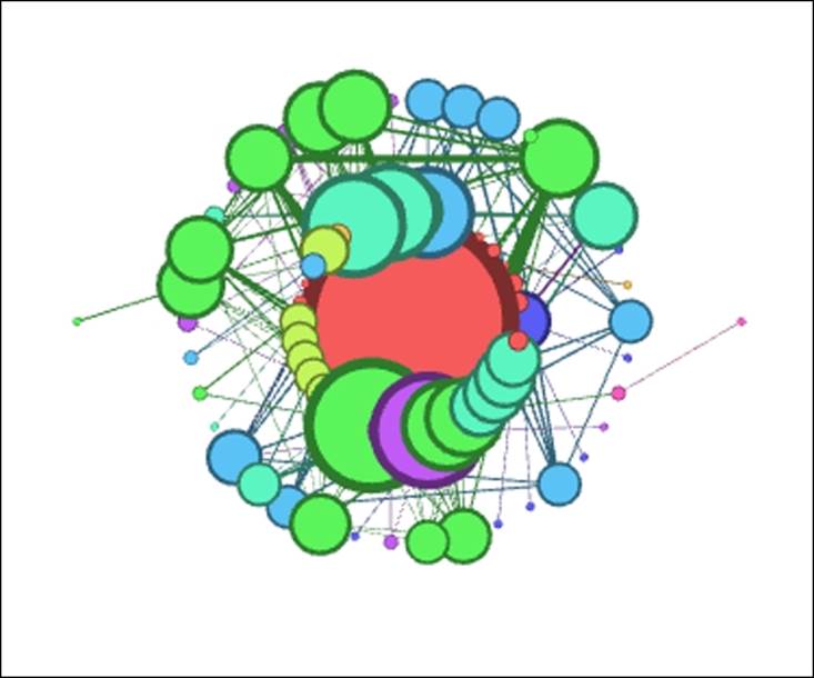
Les Miserables .gml ARF
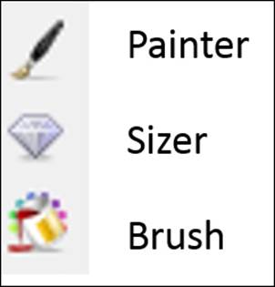
2. For the second step, let's size and color a selected node; in this instance, we'll choose node 55, the character Marius (full name Marius Pontmercy). We'll assume that our story revolves around this important character, so all efforts will be made to highlight his network position and connections. These simple steps can be done by using the Sizer tool followed by the Painter tool, both located on the toolbar to the left of the Preview window:
Styling elements in Gephi toolbar
Now we at least have an element that stands out from the remainder of the network:
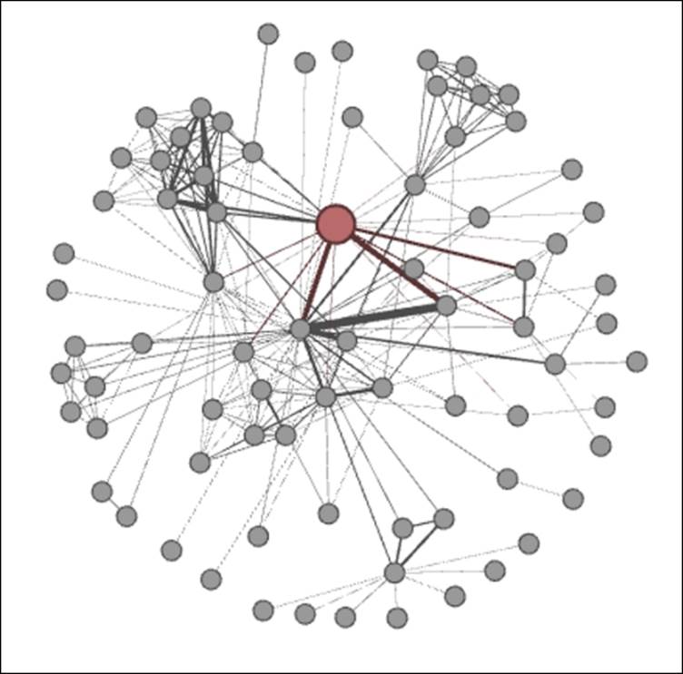
Les Miserables .gml ARF (Step 1)
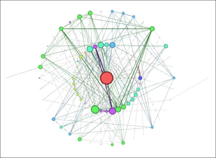
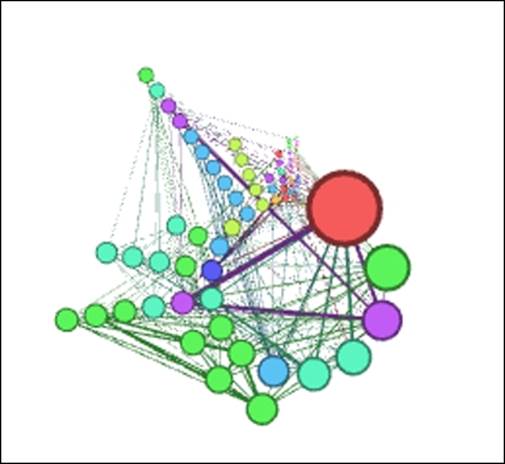
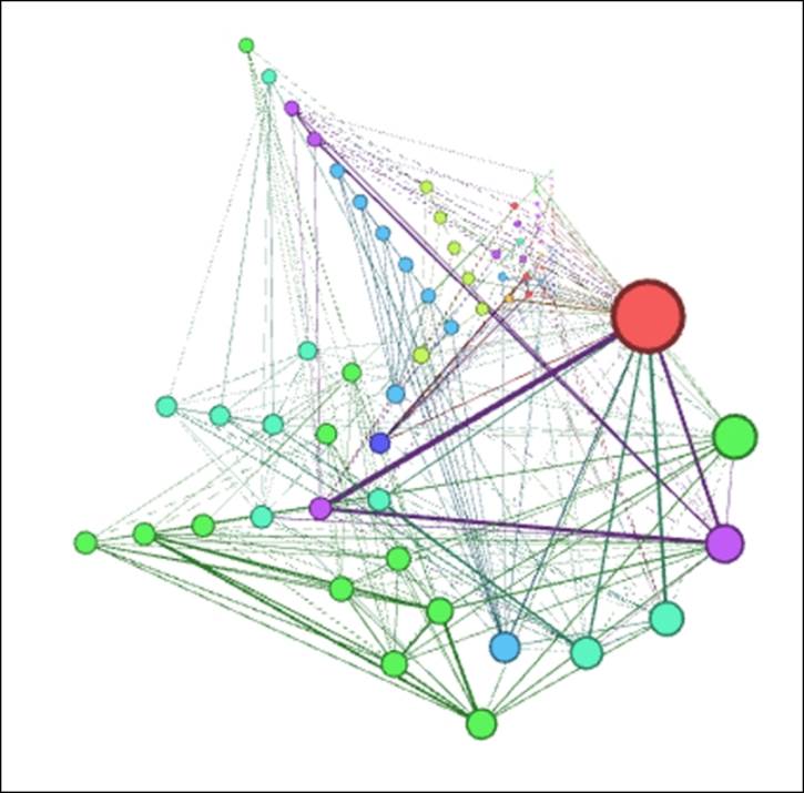
3. Marius now stands out from the remainder of the network, by virtue of his size and color, which helps to identify him from the more generic nodes that comprise the remainder of the network. Let's learn a bit more about Marius and his connections by using theBrush function, which enhances our graph even further:
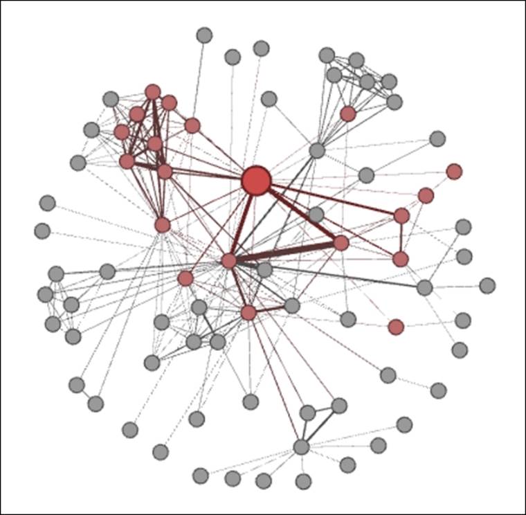
Les Miserables .gml ARF (Step 2)
4. All the closest neighbors of Marius are now highlighted and stand out from the remainder of the network, providing a clearer picture of his direct influence within the network.
We just created a graph that lays the foundation for a story, all in four simple steps. Imagine what you could do beyond this, using labels, shortest paths, edge coloring, and more. Remember, we haven't even ventured into any of the more sophisticated techniques, yet we have quickly created a useful network graph.
Summary
In this chapter, you were exposed to many of the available layout algorithms made available for Gephi, and received a brief overview for how they work, and how changing certain values can have a significant impact on your network graph.
You were then asked to step back and assess your graph needs, and think about which layouts might be most appropriate to perform your network analysis. Following this, you were given a table that laid out the various strengths and weaknesses of each layout type, to help you make a more informed layout selection.
You also learned how to go through a simple testing process, demonstrated using three different algorithms, and adjusting settings for each algorithm for it to result in an improved network graph. This was followed by some advice on the criteria for selecting an optimal layout, and some of the pitfalls to work around. Finally, we introduced the topic of graph aesthetics, and provided some simple steps to visually enhance a simple graph.
In the next chapter, we will explore network patterns and gain a better understanding of phenomena such as contagion, diffusion, homophily, and other network behaviors.
All materials on the site are licensed Creative Commons Attribution-Sharealike 3.0 Unported CC BY-SA 3.0 & GNU Free Documentation License (GFDL)
If you are the copyright holder of any material contained on our site and intend to remove it, please contact our site administrator for approval.
© 2016-2026 All site design rights belong to S.Y.A.