Mastering Gephi Network Visualization (2015)
Chapter 4. Network Patterns
One of the most critical roles of networks is their use in identifying various behaviors, regardless of whether they originate from social networks, disease tracking, idea diffusion, or any one of many other sources. There is a large and growing body of literature dedicated to network analysis that can be applied to a wide range of behavior across multiple realms, merging theory with real life examples to help you provide solutions to critical needs.
In this chapter, we will initially examine several of the most critical concepts, providing general overviews as well as external resources that examine each of these concepts more thoroughly. The topics covered in this chapter are as follows:
· Contagion and diffusion
· Clustering and homophily
· Network growth patterns
· Using Gephi generators
· Viewing a contagion network
· Viewing network diffusion
· Identifying homophily
After covering the theoretical foundations, we'll then move onto how to identify and apply these ideas using Gephi. The chapter will conclude with a section on traversing networks that will incorporate the previously noted concepts.
A significant portion of this chapter will be spent working with example datasets that can be used to illustrate various theories, demonstrate how Gephi can be leveraged to create and then to understand each of these network behaviors. So you are encouraged to join in using the same datasets used in the chapter and to replicate the steps used here in your own version of Gephi.
Contagion and diffusion
Contagion and diffusion are related concepts that are often best understood through network analysis. The use of network graphs can help you provide considerable insight into the potential spread of a disease as well as the success of a new innovation. This is done by exposing the structure of the underlying network. Densely connected networks can be effective in both of these realms, which can have both positive and negative effects, depending on whether we are viewing the diffusion of a positive innovation, or conversely, the spread of an infectious disease.
Contagion
One of the most intriguing and potentially valuable ways of using networks is to examine how disease transmission works within a network, and how the structure of a network can either promote or limit the spread of the disease. If the transmission pattern can be altered through some sort of intervention, such as vaccination or even simple avoidance (for example, not contacting a friend if there is a high likelihood of contagion), then the spread of the disease can be significantly reduced and perhaps stopped altogether.
We'll begin our discussion of contagion at a theoretical level by laying the groundwork for a practical approach later in the chapter, and using Gephi to demonstrate how network structures give rise to contagion levels, or conversely, how they might prevent further spread of a disease.
So what is the definition of contagion we'll be using in this chapter? Out of the multiple definitions using the Merriam-Webster dictionary, here are the two that best represent the concept for our purposes:
· The transmission of a disease by direct or indirect contact
· An influence that spreads rapidly
David Easley and Jon Kleinberg also allude to the similarities between diffusion and contagion in their book, Networks, Crowds, and Markets: Reasoning About a Highly Connected World, Cambridge University Press (published in 2010).
Easley and Kleinberg highlight the primary difference between the two when it comes to modeling:
"…the biggest difference between biological and social contagion lies in the process by which one person "infects" another. With social contagion, people are making decisions to adopt a new idea or innovation…With diseases, on the other hand, not only is there a lack of decision-making in the transmission of the disease from one person to another, but the process is sufficiently complex and unobservable at the person-to-person level that it is most useful to model it as random."
In other words, contagion is often best expressed using random models, given the unpredictable contact patterns that often spread a disease. Diffusion (or social contagion), is typically the result of a network structure and the interaction between members of a network, and can thus be modeled using methods with a higher degree of sophistication compared to a random model.
Contagion, in its biological form, requires close physical contact to propagate, although there are some caveats to this rule. In many cases, direct contact is required, but in other instances, merely being in the same place where infectious germs remain from a prior occupant (a bathroom, bus station, escalator, and so on) is sufficient to spread the disease. Even in these cases, there are limiting factors that will halt the spread of the disease, at least for the moment. The most critical element here is time. Suppose two strangers ride the same train on the same day and occupy the same seat just 15 minutes apart. Infectious germs left by Stranger A might well survive long enough to infect Stranger B. Stranger C, who occupies the same seat 4 hours later, is highly unlikely to be exposed to the same germs, simply due to the difference in time. Here, we are witness to a bit of the randomness characterized by Easley and Kleinberg.
One of the ways in which the contagion can spread is through a simple branching network, where the individual carrying the disease enters a population and transmits it to each person he or she makes contact with. Note that there is always a probability associated with this event, as not everyone will contract the disease. The probability might range from a relatively low 0.10, with one of 10 contacts picking up the disease, to something much higher, contingent on both the infectiousness of the disease coupled with the immunity levels of the members in the network. In cases with a high level of infectiousness combined with relatively low immunity levels, the probability of each individual being infected can be very high. The inverse is true if there is a low contagion level paired with high immunity levels.
The branching network works quite simply. Let's assume a 30 percent (0.3) probability that members of the first individual's contacts will also get the disease. For simplicity, we'll assume this represents three individuals. This is the first wave in the spread of the disease. These three infected persons then go out into their respective (albeit somewhat random) networks, and further spread the disease to roughly one of every three persons they meet. This is the second wave of the disease. Finally, each subsequent wave is spread in the same fashion, making the branching process potentially infinite; although in practice, it will tend to die out well before this occurs.
For the next few graphs we used CmapTools, which is available at http://cmap.ihmc.us/. Let's track this initial scenario using a simple diagram to help you understand the spread of the disease through its first several waves:
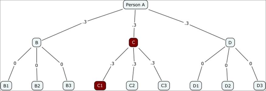
Contagion branching network with 0.3 probability
Notice how quickly the contagion fades in this instance, with just two of the 12 possible nodes getting infected. This obviously changes dramatically in the case of a highly infectious disease where the probability of transmission is 0.7, as shown in the following diagram:
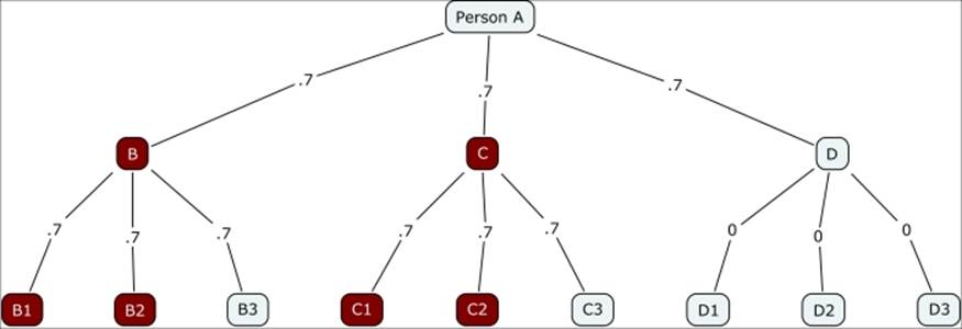
Contagion branching network with 0.7 probability
Instead of just two of 12 being infected, now half of the susceptible nodes have contracted the infection. This begins to illustrate the influence of individual nodes close to the source and demonstrates the downstream impact they can have. In this instance, even with a high transmission rate, those who come in contact with D have no chance of contracting the virus, given that D had some sort of immunity not present for either B or C.
Now let's move onto a brief discussion of three epidemic models discussed by Easley and Kleinberg in Networks, Crowds, and Markets: Reasoning About a Highly Connected World, Cambridge University Press (published in 2010), that provide further insight into the spread of disease and how network structure plays a critical role in the progression of an epidemic.
The SIR model
The SIR model offers three distinct stages for each node in a network: Susceptible, Infectious, and Removed. This can be viewed in temporal fashion, as follows:

A brief definition of each stage is provided here:
· Susceptible: This refers to the stage where an individual node could potentially be the recipient of an infection, as they neither have it currently nor do they have immunity. This does not mean that infection is inevitable, as that depends on other factors such as the strength of the virus, the immune system of the potential recipient, and the timing of contact with an infected node.
· Infectious: This simply describes nodes who currently have the infection and have the ability to transmit it to those in the susceptible stage. In the SIR model, those who have been in the infectious stage wind up as part of the removed population, as they cannot acquire the same infection for a second time.
· Removed: These nodes are those persons who have already been in the infectious stage and have now recovered. In the SIR model, they cannot be infected a second time and can therefore eventually bring the contagion process to a halt through their acquired immunity.
The SIS model
In a SIS model, the removed status has been replaced by a second instance of susceptible, as this model assumes the case that individuals are not immune from a disease simply because they were previously exposed to the infection. In this case, after leaving an infectious state, each member will become susceptible once again, which is represented as follows:

The single difference between SIR and SIS is the ability of previously infected persons to be reinfected; in other words, there is no immunity built up simply as a result of having had the infection. A SIS cycle has the potential to last almost indefinitely, as an infection can be passed back and forth through repeated exposure to infected individuals.
The SIRS model
A third case is presented that merges the first two models, resulting in the SIRS model, with a fourth stage where individuals have temporary immunity from the infection, but eventually re-enter the susceptible stage. It is represented as follows:
![]()
In this instance, persons coming out of the infectious stage are removed, as they are in the SIR model, but for only a finite time period. Once this period has ended, individuals revert back to the susceptible stage, where they can be infected for a second (or greater) time. We would anticipate that a contagion process will die off faster in this situation compared to the SIS model, but has the potential to run considerably longer than a contagion under the SIR model.
I hope this discussion has provided you with a fundamental understanding of how the theory behind contagion works, and how we might be able to use Gephi to understand the process further. Specifically, we can start down this path by working with dynamic networks in Gephi. A very quick approach will be to navigate to the Generate | Dynamic Graph Example..., which will create a relatively simple network. From there, we can choose to edit that file, or create our own dynamic dataset using time elements (start time, end time) for use in Gephi. We'll address this topic more specifically in Chapter 8, Dynamic Networks.
Diffusion
While contagion is often viewed through the lens of an infectious disease and other direct contact effects, diffusion can be thought of in a somewhat different manner. We'll use the following definition to best describe this process from a network analysis context:
Diffusion is the process or state of something spreading more widely.
Note how this is related to contagion, in the sense of something spreading (an idea, an innovation, and so on), but has a much broader definition that goes beyond the spread of disease. We should also recognize that while contact plays a role in the process of diffusion, it might not be the same sort of direct contact implied by contagion. For instance, the behavior within a network of Facebook friends can certainly enable a diffusion process through sharing and forwarding a particular post. No direct physical contact is required for this process to succeed.
We assume from our preceding example that one of these Facebook friends has recently contracted a flu virus. This virus will not spread through his or her Facebook network regardless of how many posts are shared, unless he or she also has direct physical contact with the same group of friends. This brings us to another critical distinction between the two processes: diffusion generally requires some sort of social contact or influence to take root, while contagion is dependent on physical proximity, regardless of whether others are part of your social or professional network. Diffusion can be witnessed in the spread of a specific good across a network. This might or might not be a physical product; it can just as easily be the spread of digital property (music files, videos, images, and so on) or even a concept or new idea. The Web has certainly aided the diffusion process in many cases, but is not the sole channel for propagation. Traditional media, advertising, word of mouth, and industry events are just a few other means for initiating a diffusion process.
The concept of preferential attachment, addressed earlier in the book, also plays a significant role in diffusion (as well as contagion). Networks that are defined by the presence of a relatively small number of influential hubs enable more rapid diffusion of many products or processes. For instance, when one of the large hubs promotes the latest cat video, it will soon be found in millions of Facebook feeds, regardless of whether the user is fond of cats. In contrast, try to picture this same process in a highly fragmented low density network. The diffusion process in this situation will have difficulty in establishing any momentum, and the process is likely to stop almost as quickly as it started.
Many of the ideas presented in this section are based on the work of Easley and Kleinberg in their book, Networks, Crowds, and Markets: Reasoning About a Highly Connected World, Cambridge University Press (published in 2010). Their work will help in providing a general overview of how network diffusion works, which will then be translated into examples using Gephi. The process of how diffusion takes place within networks can be fascinating, as it is frequently tied to both global and local structures within a given network. These structures can either promote or discourage diffusion, which we will demonstrate through some examples in the following sections.
Diffusion, as we noted earlier, is concerned primarily with the spread of ideas, innovations, and other concepts that do not necessarily require close physical proximity. Proximity can play a role, but it is generally not essential to the spread of something, quite the opposite of contagion. We might, in fact, find cases where physical location is critical—say the opening of an independent coffee house in Minneapolis, where the reputation of the store is only relevant to the customers living (or visiting) within a short distance of the store. So there can be a physical component to diffusion, but in this sort of case, it is likely to be a limiting factor that is dependent on network members in a small geographic area.
Contrast this with the spread of ideas and innovations in our twenty-first century world. Early adopters of the latest Apple or Samsung product might quickly become critical to the diffusion pattern of the product, with glowing reviews likely to lead to an accelerated adoption of the product, while a spate of negative reviews might well serve to limit the diffusion process. Similarly, ideas can also be spread rapidly via the Web, social media, texting, or other means of inexpensive, rapid communication.
You might have detected a physical element to diffusion that is not always addressed. Products or services that are inexpensive, or lightweight and easily shipped, are far more likely to have explosive diffusion patterns than large physical entities that are either immobile, expensive, or both. At its most extreme, think of the rapid spread of a simple video (probably involving cats) across the Web. The cost is low, access to the video is high, and thus diffusion is widespread and rapid, assuming the video is well-received.
In contrast, think of a spectacular new audio component (perhaps a revolutionary new speaker design) that has been developed in Boston and is available in just five high-end audio specialists at the outset. Perhaps all of the audiophiles in your personal network are very excited by this new product and wish to own it someday. The reviews might be spectacular, the desire to own the product is high, but the price, limited availability, and high cost of delivery beyond the Boston market will quickly restrict the diffusion of the product, at least until a comprehensive distribution system becomes available. Even then, the spread of the product will pale in comparison to the aforementioned cat video, where the cost of ownership is effectively zero, and where the distribution network (YouTube, Facebook, and so on) is already constructed.
We have thus established that the rapid diffusion of a product or service is not necessarily related to its quality, even in cases where an underlying peer network exists. Better products and innovations might well lose out to inferior ones, largely dependent on the ability of each product to access appropriate levels within a network and then to spread from there.
Now, let's take a brief look at what diffusion process might look like in theory, and then later in the chapter we'll examine this process using Gephi. Here's a case where we have the following criteria:
· Node B purchases a new product.
· Node G is considering purchasing the product, but needs to reach an aggregate threshold of at least 0.6 before making the purchase for himself/herself.
· Each number on the chart indicates a relative influence level one node has on another. So we can see that G is influenced by B, D, and F, who are themselves subjected to influences from other network members.
Here's our network:
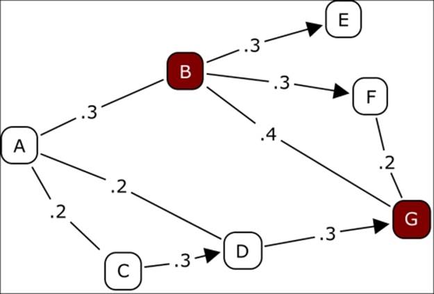
A simple diffusion example
Notice that based on the threshold level of 0.6, it is not enough for G to see that B owns the product. He also needs to know that either D or F also has purchased the item before feeling confident enough to also make the purchase. So G is dependent on the decisions of D and F as well as B. At least two of the three must own the product before G will elect to buy.
While this clearly represents a simplification of the diffusion process, it does illustrate an important concept that is crucial to both product adoption and more generally to the spread of information. We will return to this concept by building some examples in Gephi in the Viewing Network Diffusion section of this chapter.
Clustering and homophily
The two related concepts of clustering and homophily are essential components of network analysis in which they can provide key insights into network behavior. In simple terms, clustering refers to groupings of individuals (or entities) that are tied together by some common attribute (or multiple attributes). This can represent virtually anything, as long as it is effective in defining and differentiating individual clusters. The goal is to identify a common linkage that separates one group from another. This commonality might be based on geography, shopping patterns, age, type of vehicles driven, preferred genres of movies, and so on. It might well be a combination of these attributes that distinguishes clusters from one another. Let's take a look at an example.
Suppose we use the attributes identified earlier, and wind up with the following distinct clusters:
· Cluster 1 is composed primarily of Midwest Ford pickup drivers who shop at Target
· Cluster 2 is primarily East Coast Mercedes drivers who shop at Nordstrom
· Cluster 3 is made up of Chevy pickup drivers from Texas who shop at Sears
Each of these groups are self-identified using certain lifestyle attributes and are thus more likely to construct networks of others like themselves. If the preceding attributes clearly define each group, they will likely have little contact with each of the other clusters (although members at the fringe can form bridges to another cluster). Most of their interaction within a network is likely to occur at a local level, as opposed to a more global level.
There will also be cases where the clusters are still tangible, but perhaps less isolated from one another, with many members freely associating with the persons in different clusters on the basis of other shared attributes (religious beliefs, political affiliation, age, and so on). In this case, our network graph will show a greater degree of interconnectedness and will require fewer bridge members to connect disparate clusters.
In the first case, we have what is commonly known as homophily, a critical concept in understanding the formation of networks, the diffusion of innovations, and how information travels across a network. Miller McPherson, Lynn Smith-Lovin, and James M. Cook define homophily in their paper Birds of a Feather: Homophily in Social Networks as follows:
|
"Homophily is the principle that a contact between similar people occurs at a higher rate than among dissimilar people" |
||
|
--Birds of a Feather: Homophily in Social Networks by Miller McPherson, Lynn Smith-Lovin, and James M. Cook |
||
Homophily can actually inhibit the spread of ideas, innovations, and information due to its segregated structure. Information sharing tends to be within the clusters rather than between the clusters, thus limiting its flow. If the individual serving as a bridge between Cluster A and Cluster B fails to pass on specific information, the flow of that information will cease, at least for that portion of the network. Networks with high levels of homophily based on one or more attributes (gender, income, job status, and so on) are often said to be assortative on those elements, as in assortative on income.
In the second case, there are likely to be multiple contact points between clusters, leading to a greater sharing of information and innovation, and thus encouraging greater diffusion versus the network with a high degree of homophily. This can have a profound impact on information flow, product adoption rates, and other scenarios that are dependent on network communication. It is therefore critical to identify whether homophily exists, and if so, to what degree, in order to gain a more informed perspective about how communication will flow through a network. We can then begin to understand where barriers and potential failure points exist.
Let's take a closer look at how these concepts work in theory, and then later in the chapter we'll use Gephi to create some visual examples. We'll begin with the general principle of clustering.
Clustering
Clusters are certainly not unique to network graphs; they are a critical component in statistical analysis as well. There is even a specific set of methods devoted to their analysis, widely known as cluster analysis. However, the goal is the same, as it is in network analysis. We are simply attempting to understand how certain groups within our datasets are similar or different from one another (cluster analysis has methods that use either similarity or dissimilarity to build clusters) based on a single or, more typically, multiple attributes. These attributes can be in the form of observable physical characteristics, or they may be behavioral-based. In any case, they can be combined to form distinct clusters of individuals who form groups that can be further analyzed.
There is one essential difference between the two, even when the end result might be similar. In network graphs, the clusters require some sort of direct connection, which might or might not be true in traditional cluster analysis. When we view clusters in a network, they will almost invariably be based on the level of connectedness between neighbor nodes.
Our network graphs might have significant clustering, or perhaps the clustering is rather loose. In some cases, there might be no meaningful clusters at all, although as we will see later in this chapter clusters can be forced based on some common categorical attribute. These distinctions can have significant effects on the structure of a graph and certainly on the resulting visual display.
Let's refer to our very simple examples from the earlier section, where we used vehicle brand as a potential clustering attribute. This single distinction can create clusters that have little interaction with one another. To take the example a step further, we can use the population of pickup buyers in Texas, with Ford, Chevrolet, and Dodge representing the three vehicle brands most frequently purchased. These individuals can be very alike across multiple attributes—certainly geographic location, probably on average income level, perhaps very similar marital status, number of children, and so on. Yet they are often known to be fiercely loyal to the brand of truck they prefer, so it would be very unwise for marketers to treat them as a single group. The vehicle brand thus becomes a rational attribute to be used for clustering.
In a nutshell, whether we are using statistical analysis methods or performing network analysis, clustering is a critical concept in understanding information flow, product diffusion, and general behavioral patterns. In many cases, clusters will be closely related to one another and can potentially be aggregated for some purposes. In other instances, the clusters become so well-defined that it leads to the phenomenon known as homophily, which we will now discuss in some detail.
Homophily
Homophily refers to the likelihood that people with similar backgrounds, beliefs, or social status will tend to form groups that associate primarily within the group. This is often known colloquially as the birds of a feather phenomenon. Many studies have confirmed the widespread presence of homophily within networks, and it can certainly be observed anecdotally through casual observation of societal patterns. In this section, I'll walk you through a bit more on the theoretical side of homophily to be followed by some visual examples later in the chapter.
One of the key considerations with homophily, as mentioned previously, is its potentially profound impact on the rate of diffusion or even contagion. Groups that are so tightly knit as to be almost impervious to external influence are much less likely to adopt widespread innovations from outside the group. In many cases, there might be a lack of awareness of the latest developments, which of course will limit any sort of adoption rate.
Some of the most frequent sources of homophily in modern society come about through race and ethnicity, as individuals with these attributes in common might fail to venture beyond the comfort of associating with those who look, sound, and perhaps act most like themselves. Wimmer and Lewis have authored a paper on this topic (Beyond and Below Racial Homophily: ERG Models of a Friendship Network Documented on Facebook, 2010), available at http://www.princeton.edu/~awimmer/WimmerLewis.pdf.
Networks with high degrees of homophily might be easy to spot, although this is not necessarily the case. It is possible for small portions of the network to exhibit this behavior, without the entire network being subjected to the same sort of pattern.
We will dwell on this subject more by showing some examples of homophily in the Identifying Homophily section.
Network growth patterns
Network analysis literature is filled with many examples of how networks grow over time. Multiple models have been developed to explain the growth of networks, as these patterns differ substantially depending on the sort of network we are analyzing. Network growth has been the subject of a great deal of research and analysis and will not be covered to the same degree in this book. In its place, I will provide an overview of some of the primary growth theories, and set the table for further exploration using Gephi later in this chapter.
What we attempt to understand through observing and predicting network growth is how networks form, how they are likely to grow, and what sort of patterns they exhibit as they are growing. Multiple models exist that attempt to predict network growth using different algorithms, ranging from extremely simple (random graph models) through much more sophisticated approaches that use concepts such as preferential attachment and popularity scores.
Many studies have been done proving that a few systems actually grow in a completely random fashion. So although the random graph models make a useful construct, they do not often mirror real-world networks, except perhaps in some of the contagion scenarios. In these cases, random public contact might occur without intent on the part of either party. We should not dismiss random models too quickly, as they can be used for certain situations; but we should also be aware that their application is limited, and that other approaches are able to simulate or predict the growth of networks far more effectively.
One way to begin exploring network growth is through the use of Gephi generators. These are simple tools that allow you to create different scenarios that can ultimately help you in understanding your own network data, and they can be used as building blocks for in-depth analysis of network patterns. The generators are available as a plugin (Complex Generators) from the Gephi marketplace and can be installed using the same process as other Gephi plugins. To install this or any other plugin, simply navigate to the Tools |Plugins menu and follow the process. Additional information can be found in the Gephi wiki and forums.
Now let's take a look at how these generators can be used to gain an improved understanding of network behavior.
Using Gephi generators
Gephi provides a wide range of network generators that can be used to better understand the formation and growth patterns forecast by some of the most prominent models in the network literature. These generators are valuable for building some knowledge for how different models work, and what happens to a network when we change various assumptions. In this section, we'll cover several of the most prominent models from the network graph literature, and then share examples from Gephi that will help further our understanding for how each model works.
If you're familiar with some of the network literature from Easley and Kleinberg, Barabasi, Strogatz and Watts, Newman, or any other good source, you will be familiar with most, if not all, of the following methods. Do not be concerned if you are not familiar with these sources. We will not be discussing the methods at any sort of deep technical level; that is both beyond the scope of this book and can be better learned from the creators and practitioners of the models. Many resources are provided in the Appendix, Data Sources and Other Web Resources, of this book.
The idea behind the various generators is to provide insight into how each of the methods work, using assumptions developed within each model. Gephi provides you with the ability to adjust different assumptions and to quickly view the results, helping to create a sort of interactive visual learning course without having to venture beyond the software. So with that minimal background, let's move into some of the generators, where I will provide a brief synopsis of the model and then share a sample output.
We'll begin with a simple random graph found by navigating to the File | Generate | Random Graph... menu location. This is the most basic of all network models that is built on the assumption that any single node has the same probability of connecting with any other node in the graph. We can adjust the probability level in Gephi as well as the number of nodes to be generated. The higher we set the probability, the denser the network will become. With a level of 0.05 and 50 nodes, I generated the first graph followed by a second graph with a 0.10 probability level (note that you must delete the first workspace prior to creating a new graph, otherwise Gephi will place them all in the same window). The first three of these graphs use the Force Atlas 2 model to effectively show the network patterns. Here, we are with just a 0.05 connection probability, as shown in the following diagram:
Random graph with .05 probability
Notice how the network is not fully connected—we have a single large component as well as a few nodes with no edges at all. Now, the following diagram illustrates the network with a 0.10 connection probability:
Random graph with 0.10 probability
Notice how the increased probability created far more connections between nodes, resulting in a much denser, yet still random graph.
Next, we'll take a look at the Barabasi-Albert scale free model (there are three other Barabasi-Albert models to play with), once again using 50 nodes, but added one at a time. Each new node will also have a single edge when it is created, in theory, which can be connected to any existing node in the network. What we would anticipate seeing with this model is the emergence of hubs with large degrees surrounded by many nodes with a lower-level of connectedness. While this doesn't fully comprehend all the nuances ofpreferential attachment, it takes us in that direction, with earlier nodes that have more opportunities to be connected to by later nodes, and thus to become hubs (high degree nodes) within the network. Let's take a look at the following diagram:
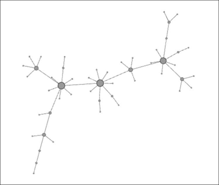
Barabasi-Albert scale free model
I elected to size the nodes based on degrees, making it easier to spot the network hubs. Here, it is easy to see the presence of multiple hubs in the network, akin to an airline industry hub and spoke model. It is interesting to see several secondary hubs that are often (but not always) directly connected to the primary one. One of the strengths of the Barabasi-Albert model is that it more closely models existing network structures, such as the Web, compared to any sort of random model. However, in this case, time of entry into the network is the single most critical growth criterion; we know from the real world that this is just one of many factors that determine the hub and spoke system seen here.
Another interesting category of models are the so-called small world networks made famous through the idea of six degrees of separation, where no two people on the planet, regardless of distance or dissimilarity are more than six degrees away from one another. While the number has varied in various experiments and real-world situations, the answer has not strayed far from the original figure. We are indeed living in a relatively small world, in spite of the physical distance between people.
We have three generators within this category: two from Watts and Strogatz, and one from Kleinberg. For this discussion, I'll work with the Watts-Strogatz small world Alpha model, although each of the three will illustrate the principle of small worlds very effectively. In this case, the number of nodes has been set to 50 for consistency with an average number of degrees equal to 4 and an alpha setting of 3.5. Small world patterns are often masked by the force-directed algorithms, so I have opted for a simple circular layout. Here's the result:
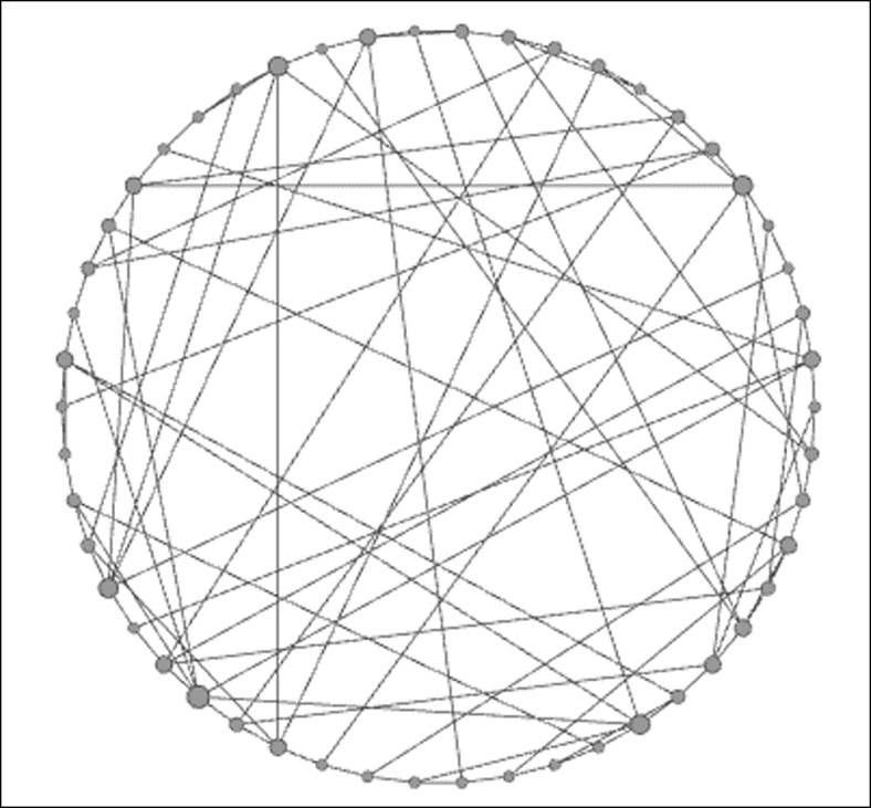
Watts-Strogatz small world model
Notice the difference in this model relative to both the random and scale free models shown previously. Even though I have once again sized the nodes to reflect their degree, the level of variation is much smaller than in the scale free model. In simple terms, there are no hubs in the graph, and in their place are a lot of well-connected nodes, and importantly, no isolated members of the network. Also, notice that many of the edges connect distant points on the graph rather than being restricted to more localized connections. This is the essence of small world models—member nodes are highly interconnected, have limited numbers (if any) of hubs, and are typically not subjected to a high degree of homophily, which would make traversing the graph far more difficult.
It is also important to understand the implications of a small world network for the diffusion of ideas, information, and innovation. Small worlds tend to be very effective at sharing and dispersing information and connecting persons who are physically remote. This obviously has a significant impact on information flow, whether it is trivial (cat videos going viral) or more serious (information about NSA surveillance). While a small world network clearly has profound consequences with respect to information flow, it typically has a smaller effect in spreading contagion given that the latter requires more direct physical contact than the former. However, there are still potential instances where a small world network can influence the spread of disease, often related to the ability to travel the globe far more easily than in previous eras. Today, individuals are more likely than ever before to have first degree relationships with others in another country or even on a different continent. As much as these relationships lead to overseas travel, the potential rises for the spread of once localized disease strains to be transmitted to new regions and to eventually impact a far larger population than was previously available.
Now that we have walked through several network models, we'll use Gephi to construct and analyze some contagion networks, where we can merge various network models with some contagion scenarios.
Viewing a contagion network
Now it's time to use Gephi for creating and viewing a network where we begin to understand the spread of a contagious disease. It is critical to view more than a single network instance to best understand the contagion process. We'll view a single network at multiple points in time, given the temporal nature of infectious disease, to understand how nodes act within a specific time window (the contagious stage of the disease) in spreading the infection. As we noted earlier, even then, the spread of the disease is not inevitable, as it is dependent on the probability of transmission throughout a network.
Let's outline the necessary elements we'll need to build a useful contagion network:
· A network of nodes with some level of contact within a given period: For our example, let's set the number of nodes to 50, so we have some ability to view the spread of the disease without making our network overly complex. We'll use the Random Graph...generator in Gephi as a proxy for the sort of random contacts a network of individuals might encounter in a single day.
· Several time-based (temporal) views of a single network: These views might contain the same member nodes in each case, or more realistically, an evolving network of nodes based on the time element. In this case, we'll take a look at a single network of contacts and assume a 72-hour period where each member node is susceptible to the disease. This will replicate the SIR model discussed earlier with each node falling into one of three states—susceptible, infected, or removed. We will also make the assumption that the duration of the infection is one day (24 hours), and any nodes that have previously been infected enter into the removed state after the infection period expires.
· A probability of disease transmission: This will be a number ranging between 0 and 1, with 0 representing no chance of transmission and 1 indicating a 100 percent transmission level. Let's set the threshold to 0.5 (50 percent) for our example.
This will give us a basic version for analyzing contagion within networks. For a more thorough discussion on contagion, there are many available resources, some of which are noted in the Appendix, Data Sources and Other Web Resources, of this book.
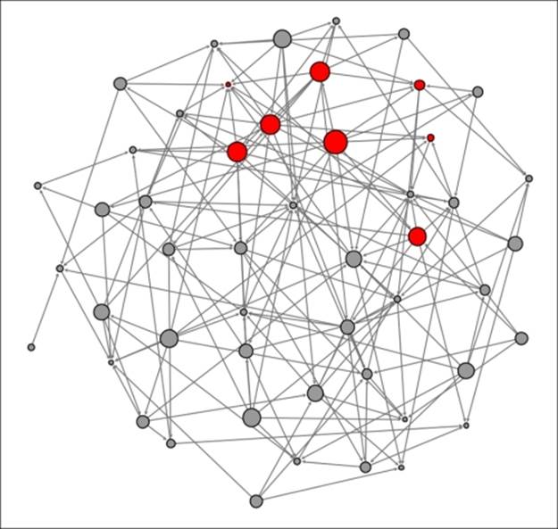
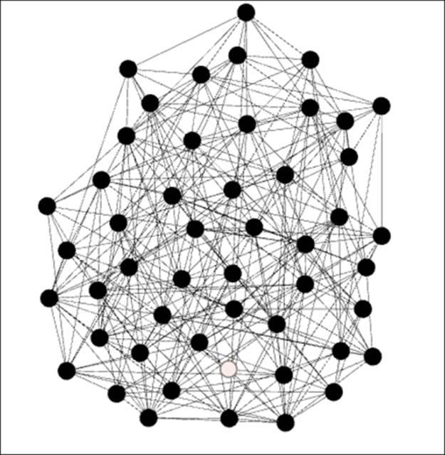
Let's start at the beginning of the 72-hour period, refer to this time as t0, and assume that a single node is infected, as shown by the dark coloring within the node. Susceptible nodes will remain lightly colored, while removed members will be depicted with no shading (note that none exist at the outset).
Here, we see the network at t0 as follows:
Contagion network at t0
Note the single node in an infected state. This individual is well-connected within the network, which will hasten the spread of the contagion. In this instance, there are seven direct contacts (assume that all these represent contacts made at t+1) of which approximately 50 percent will be infected. We'll assume that four of the seven are vulnerable to the infection, leaving us in this stage at the end of the first 24-hour period:
Contagion network at t+1
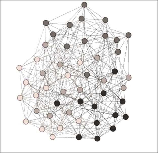
The original node that kicked off the contagion process is now removed from the eligible population, having already been infected, while the four newly infected nodes become the new transmitters of the disease. This process will repeat itself in the second 24-hour period (t+2) with the four infected nodes now immune and thus entering the removed state after having infected a new set of people:
Contagion network at t+2
This is getting interesting, as we can see that some of the previously infected individuals have a few physical contacts, limiting the spread of the contagion. A few new nodes are now infected, but the disease is not spreading rapidly due to the limited contact levels. Finally, let's see what our network looks like at t+3:
Contagion network at t+3
Note how the relative lack of contacts for some individuals managed to limit the spread of the contagion in our small network example. In the real world, this is certainly a possibility, but there is also a very high probability that the contagion will accelerate through densely connected networks, resulting in rapid spreading of the disease. This should help you understand how the structure of a network is critical to the transmission of many things, including infectious diseases.
I hope this provided you with some insight into how we can use Gephi to illustrate a simple contagion network. While this was a simple manual example, Gephi can be used with more comprehensive datasets with defined time periods and node statuses at each of these times. Some examples of this process are provided in Chapter 8, Dynamic Networks.
Viewing network diffusion
While diffusion and contagion are not identical, there are certainly some shared elements we can leverage for our analysis prior to jumping into a visual assessment using Gephi. Remember, in our contagion discussion, the importance of physical contact coupled with the probability of transmission as critical elements in spreading the disease. With diffusion, we recognize that physical contact is not necessarily required for spreading information, but there is still a probability element at work, especially when product adoption is involved. I'll illustrate this briefly before we move onto the graphs.
Suppose a new tablet is planned for upcoming release, supported by a large marketing campaign and plenty of insider buzz about the virtues of the product. Some of your friends have talked about getting the new tablet, but you are unsure whether it's worth the investment, as you already have a perfectly capable unit purchased just 12 months earlier. What factors will sway you in one direction (purchase) or the other (don't purchase)? It might well be the behavior of your closest friends who will be the primary influence in your purchase decision. How does all of this relate to contagion? It relates through our use of probability. As with the contagion examples, there are probabilities associated with your decision to purchase or not to purchase. If many of your friends decide to buy the new tablet, it is more likely that you will also make this decision, as your collective probability has increased. In this sense, it is akin to the transmission of an infectious disease, albeit without (perhaps) the physical contact. A higher purchase probability leads to further spread of the new product, and the product sales continue to increase as it spreads further into the market.
Now it's time to see how this process can unfold using some examples from Gephi. As we did with our contagion illustration, we'll walk you through a rather simple example using a random network of 50 nodes; although in this case, we'll increase the connectivity level so that the network consists of a single giant component. Our case will be based on the release of a new cell phone that provides an attractive feature set that will influence some consumers to replace their old phones.
We will make some assumptions about our network:
· Our network will consist of 50 individuals who are all connected to at least one or the other node within the network. We'll again use the Random Graph generator in Gephi to build a simple network to illustrate the diffusion process.
· Each individual in the network will invest in the new phone only if at least one-third of their direct contacts also purchase the phone. For example, a person with four direct contacts, but just one who has purchased the phone, will not be influenced enough to purchase the phone themselves. However, if two or more of his/her friends already have the phone, then he/she will also make the purchase.
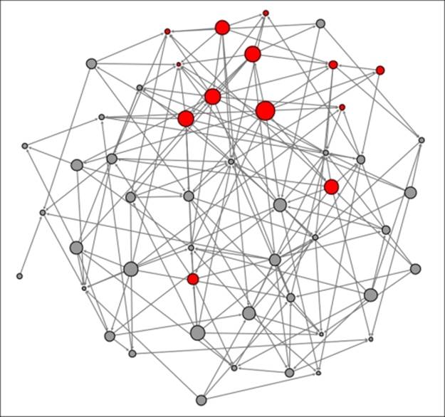
Let's begin to examine the diffusion process for this product. We're using the Out-degree measure to define who the primary influencers are within this network and sizing the nodes to reflect this influence. Our initial graph will reflect t0, when a few early adopters have elected to purchase the new phone. These adopters are identified using darker shading, as shown in the following diagram:
Diffusion network at t0
As alluded to earlier, we see four early adopters who appear to have significant influence levels within the network based on their number of out degrees (as depicted by node size). Just how influential they are remains to be seen as we iterate through time periods. For the sake of this discussion, let's assume that each snapshot represents a weekly interval, as potential buyers need some time to consider their purchase likelihood. For this example, we will show all purchasers in a cumulative manner, as they will be unlikely to consider a new tablet for another year or two.
One week later at t+1 several new purchasers have appeared, as at least one-third of their direct contacts have purchased the phone previously:
Diffusion network at t+1
Four new buyers have appeared, while others have yet to purchase the phone, opting to wait for a higher proportion of their friends to make a purchase. Now let's take a look at t+2 to see how many incremental buyers have been sufficiently influenced by their friend's purchase decision:
Diffusion network at t+2
Another four people have elected to purchase the new phone based on their friends' behavior, including two buyers with more distant but still direct connections. After just two weeks, nearly 25 percent of the network members have elected to buy this phone; while this might not equate to the diffusion level of a viral video on the Web; it does appear to represent a successful level of product adoption through the diffusion process.
This represents a very basic diffusion example; there are additional factors that can be employed in displaying the diffusion process, many of which can be discovered through resources listed in the Appendix, Data Sources and Other Web Resources. Also, as we mentioned in the discussion on contagion, some more dynamic examples of diffusion will be shared in Chapter 8, Dynamic Networks, which employ datasets with time elements.
Network clustering
Earlier in this chapter, we discussed the concept of clustering in a network, and some of the ramifications for network structure and information flow. In this section, we'll use Gephi to provide you with some illustrations of networks with varying degrees of clustering, and add some further discussion on how Gephi can be leveraged to identify and measure clustering.
In the interest of clarity, I would like to take a moment to define clustering. When I refer to clustering in this section, it indicates the patterns that exist within a network, not the practice of creating clusters from the data. While the two instances are frequently related, this section is devoted to understanding why these patterns exist, and how they might affect the flow of information within a network. Later in this book we'll examine how to create clusters or partitions within the network through the use of defining characteristics in the data. These topics will be addressed in Chapter 7, Segmenting and Partitioning a Graph.
The best way to detect clustering within a network is to provide some visual examples of networks with varied levels of grouping, ranging from virtually none at all (a random network), all the way to a network with a high proportion of completed triangles, and confirming the presence of significant levels of clustering. Our key statistics to detect clustering can be found in the Statistics tab. We'll now use Gephi to present three examples that show detailed networks on low clustering, moderate clustering, and heavy clustering. This should help you quickly convey what we are looking for when we speak of clustering within a network.
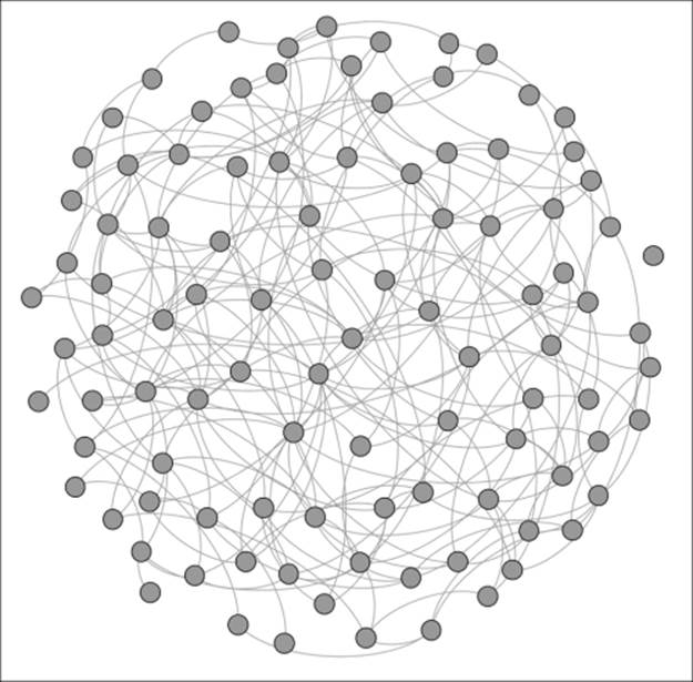
For these examples, we'll use one of the Erdos-Renyi generators, which is found by navigating to the File | Generate | Erdos-Renyi G(n,m) model option. In each case, we'll set our network to 50 nodes while changing the number of edges from 100 to 200, and finally to 300. In doing so, we should anticipate higher levels of clustering as the number of edges grow. We'll begin with the graph of 50 nodes with just 100 edges—a rather sparse network:
Erdos-Renyi network with low clustering
Note the presence of several colored nodes, indicating either one or two completed triangles. The vast majority of nodes have no complete triangles—the friends of a given node are typically not friends with one another. The average clustering coefficient for this network turns out to be just 0.022, which means that just over 2 percent of possible triangles are actually realized. When we increase the number of edges to 200, the network changes dramatically, as shown in the following diagram:
Erdos-Renyi network with significant clustering
We now see a much denser network, since the number of edges has doubled. This doubling has had an even more pronounced impact on clustering, as the average clustering coefficient has now grown to 0.164. One of every six possible triangles is now complete, compared to the one in 45 as seen in our first graph. The dark nodes indicate at least three completed triangles per member; note that there are just a couple of areas of the graph where the member nodes don't reach this threshold.
Finally, we'll take a look at the same model with 300 edges:
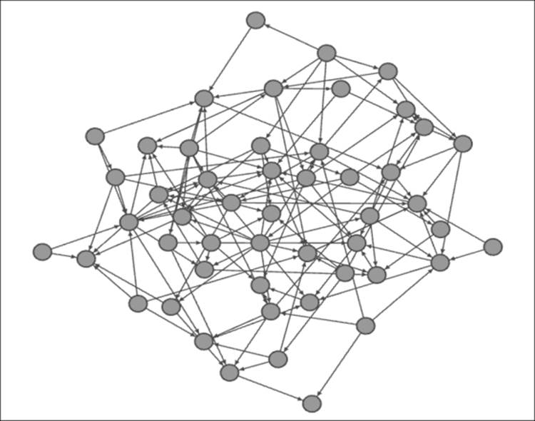
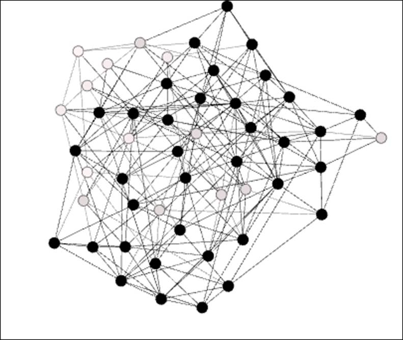
Erdos-Renyi network with high clustering
Our network is now growing quite dense with many members connected to each other. Note just a single node (at the center bottom) that falls short of the three completed triangle criteria from the prior graph. Being consistent with these patterns, we now have an average clustering coefficient of 0.253—one of every four possible triangles is complete.
We have used the clustering coefficients to tell us when clustering is present, but this has not shown us which nodes form communities based on the clustering patterns. For this, we can turn to a couple of options. Several Gephi plugins exist that can be used to detect clusters based on connection patterns and community structures. The Chinese Whispers plugin is a very capable option if we choose this path. For this example, we'll simply use the Modularity option found in the Network Overview section of the Statisticstab. After running this function, we can then apply the results as colors to our graph and get a very nice look at where the clusters exist. Let's take a look at our final Erdos-Renyi network:
Clustering using the modularity function
Now we can see four distinct clusters ranging from light to dark. We see some limited overlap, but we can now easily view clustering patterns in the network. Cluster 4 (the darkest nodes) occupies the lower-right position, while Cluster 3 (the dark gray nodes) is dominant at the top of the graph. These relative positions might change depending on the algorithm used, but should remain visually distinct.
This last point is particularly important to understand our data; each algorithm will depict the data according to its particular settings. Even within each layout selection, we have multiple options for setting spacing through attraction and repulsion settings. This topic is covered in more detail in Chapter 3, Selecting the Layout. It is essential that you experiment with different settings so that your data conveys the story it was supposed to tell, and network clustering is a component of this process. If there are natural clusters within the network, graph viewers must be able to detect them. Otherwise, the graph conveys an incomplete if not an inaccurate story, which is something to avoid if at all possible. Better to not tell the story at all rather than be misleading.
Identifying homophily
As we noted earlier, homophily is an extreme form of clustering, where groups within a network are more likely to be highly interconnected within the group, but remain largely disconnected from the outside world. This can be driven by many factors such as geography, religious or political preferences, or perhaps some very specific shared interests that are restricted to a small segment of the overall network. In this section, we'll employ Gephi to illustrate a few examples of homophily and highlight the impact it has within the scope of the entire network.
What is critical to remember about homophily is the way it can restrict the flow of information, innovation, and even infection within a network. Since many individuals within specific groups have little exposure beyond the group, there is an increased probability that they will not have access to all the latest information and that they might be more reluctant to adopt new technologies (at least until others in their group do). On the positive side, they might be at lower risk for acquiring infectious diseases, especially if the homophily is related to physical patterns (remote geographic location, limited exposure to public places, and so on).
Now that we fully understand the importance of homophily within a network, it is time to identify specific cases within network structures. For this exercise, we will return to Gephi, and use some fictional small networks I have created for this purpose:
· Network A will represent a very homogenous small town population where a significant majority of the people have shared characteristics, resulting in very low homophily
· Network B will be a cross section of a mid-sized urban area where many residents have the same shared values, but where some smaller groups differ significantly on religious grounds and thus do not interact significantly with the majority of the residents
· Network C will be a subset of a large urban population that is home to multiple ethnic, racial, and religious groups that have tended to form their own enclosed communities
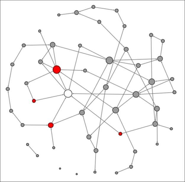
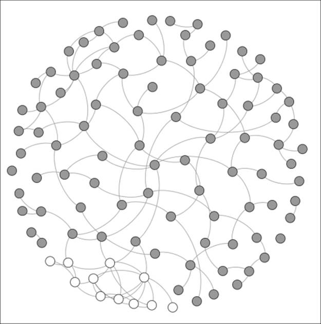
Here is Network A:
A network with no homophily
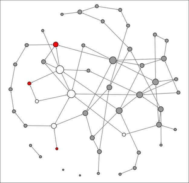
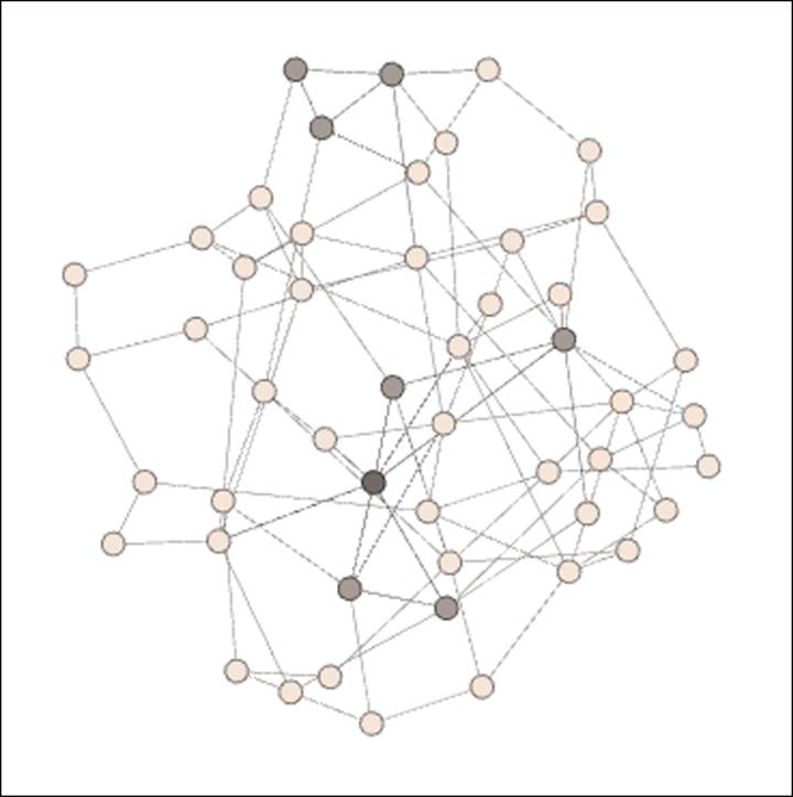
Notice the general connectedness across the network with little in the way of obvious groupings or clusters. The shared characteristics of this population have resulted in a homogenous network. Now let's take a look at Network B, where the population base is a bit more diverse:
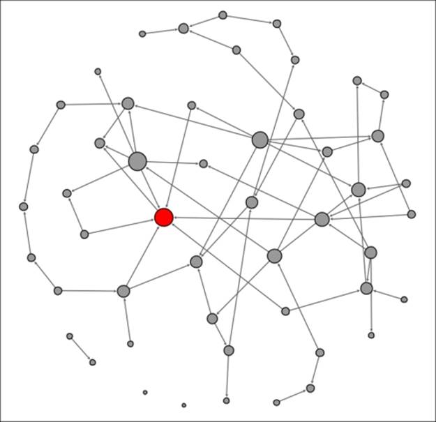
A network with minimal homophily
Here, we begin to see some homophily at the lower left of the graph, which is shown by the white nodes. This cluster of individuals is highly connected within the small group (based on their religious affiliation), but many of its members have no connections beyond their local neighborhood. Information flowing into this part of the network will have to pass through the two or three individuals with some level of connectedness to the remainder of the network.
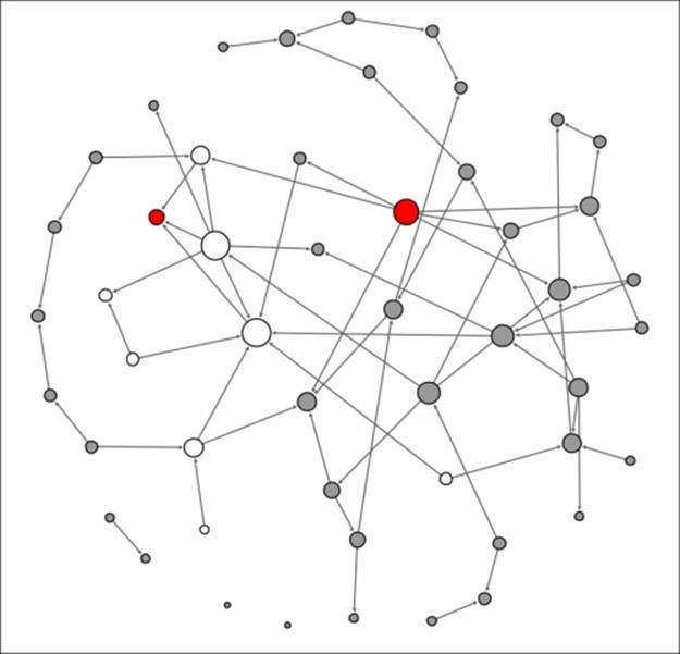
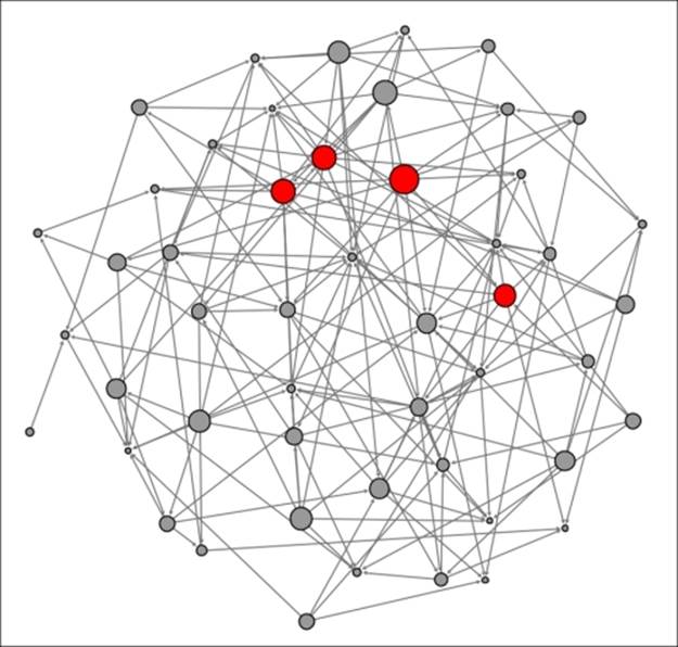
Finally, our big city network, where many diverse groups coexist, is shown as follows:
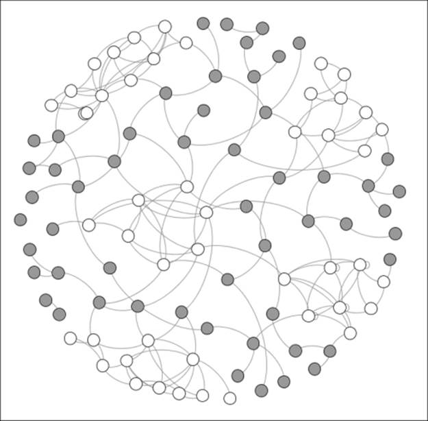
A network with high levels of homophily
We now see some serious homophily with five distinct groups that are each densely connected within their own neighborhoods, but have little in the way of external linkages. These groups have tended to self-segregate based on religious, racial, and ethnic characteristics. Information flow or product adoption now has a much higher friction level as it must pass through the influencers who are connected beyond the local clusters in order to reach other individuals within the group.
Summary
In this chapter, you have seen numerous examples of some of the primary patterns that are fundamental to the study of network graph analysis.
We began the chapter with theoretical discussions on the critical processes of contagion, diffusion, clustering, homophily, and network growth. A number of network growth examples were created using the Complex Generators plugin, providing a fundamental understanding of how to use this tool to construct and analyze multiple network models.
In the last few sections of this chapter, our focus was on implementation of some of these concepts using the Gephi workspace. We first created a contagion network that viewed the progression of an infection over a three-day time period, followed by a simple diffusion process that tracked product adoption within a small network. Finally, we addressed network clustering and homophily, showing some examples that illustrated relative levels of each of these within a network.
Our next chapter will be devoted to mastering Gephi filters, a powerful set of tools that can be used to provide focus and develop insights when working with large datasets.
All materials on the site are licensed Creative Commons Attribution-Sharealike 3.0 Unported CC BY-SA 3.0 & GNU Free Documentation License (GFDL)
If you are the copyright holder of any material contained on our site and intend to remove it, please contact our site administrator for approval.
© 2016-2026 All site design rights belong to S.Y.A.