Mastering Gephi Network Visualization (2015)
Chapter 7. Segmenting and Partitioning a Graph
Being able to view a network graph and understand the component parts is a critical aspect of network analysis. There are a number of approaches we can take to do this, including the use of clustering algorithms, data partitioning, or simply through the creative application of colors and sizing of specific portions of the graph. The end goal is typically the same—to tell an effective story through the use of visual elements.
· We'll begin by exploring the various partitioning and clustering options available in Gephi
· We'll then share several examples using some of the clustering and partitioning tools
· In the final section, we'll walk through some cases where we take a more free form approach to visual clustering, using variations in size and color to direct the audience's attention
Let's begin with a tour through some of the many available clustering and partitioning options that are part of the Gephi core or available through a host of plugins.
Partitioning and clustering options
Before moving into specific methods to partition our network graphs, we should understand why we choose to do so. There are at least two main reasons for segmenting our graphs in this fashion:
· To highlight patterns in the data based on underlying statistical or behavioral patterns. This can be especially essential when we have a dense network where patterns are not obvious to the naked eye.
· To make a network more visually attractive through the use of size and coloring options.
Note that these two are not mutually exclusive aims, but can be used to great advantage together. So the end goal of the efforts taken for partitioning or clustering should be to enhance the viewer's ability to interpret the graph. Clustering methods will do this through specialized algorithms that interpret network patterns into distinct groupings (clusters) of similar nodes. Partitioning is typically more manual, but also seeks to deconstruct the network into meaningful groupings based on categorical data.
With this in mind, Gephi provides multiple options to segment a network graph, which includes the following selections:
· The Partition tab enables the segmentation of a graph using a variety of attributes or statistical measures applied to both nodes and edges. As we will see in a moment, partitioning differs in approach from clustering, even when the end goal might be the same.
· Sizing and coloring options can be created using the Ranking tab. A typical approach is to have scaled coloring based on a measurable attribute, with darker colors corresponding to higher values. The same approach can be applied using node size to scale values according to their degree level.
· Manual sizing and coloring is an option in cases where we need to step outside of categorical or value-based partitioning. For instance, we might have five individual nodes we wish to focus on; Gephi enables custom coloring or sizing for these cases. This can be useful when we wish to draw attention to a specific set of nodes based on some salient characteristic.
· The Chinese Whispers clustering plugin is a community detection algorithm that provides you with the ability to customize a number of parameters. The goal of this method is to find groups of nodes that broadcast the same message to their neighbors, hence the use of the Chinese Whispers children's game as the title.
· Markov Clustering is one more option available as a Gephi plugin. This is an easy-to-use plugin that does not require a lot of intervention, although a few settings can be adjusted. With Markov Clustering, the approach is based on a comparison of random walks (a succession of random steps of varying lengths) to actual patterns found within the graph, resulting in the identification of clusters where patterns vary significantly from a simple random walk expectation.
At this point, let's clarify a significant difference between partitioning and clustering. While the aim of both is to separate a network into easily understood groups, each approach goes about this in different ways. When we partition a graph, it is typically through an arbitrary selection of one or more attributes or measures, an a priori segmenting of the network. This enables us to see how nodes or edges are categorized across a specific dimension. On the other hand, clustering is typically performed by an algorithm—we might have the ability to adjust the settings, but the individual method analyzes the network data to create clustered groupings. We can also reference the concept of community detection, where overlapping (or non-overlapping) communities are defined based on their connection patterns. In the case of overlapping communities, the resulting graph might be more complex than in either partitioning or clustering, as individual nodes might be members of multiple communities. The Link Communities statistic can also provide insight into these patterns.
One instance where the partitioning and clustering approaches interact is when we use a clustering method to classify the graph, and then elect to display it using the Partition function. This gives us the ability to create clusters using one or more algorithmic approaches, followed by the ability to partition the graph using data attributes or the newly created cluster values. The partition method makes it very easy to select the color scheme for our network groups, regardless of whether they are manually defined partitions or algorithmically created clusters.
The Partition tab
We're going to start this section with the Partition tab, often located above the Layout tab in the Gephi Overview window. This is a very powerful option in Gephi, as it can be quickly applied using many different fields in a network dataset. These fields can be part of the source data—perhaps gender, class, country, or any of a long list of values that can be used to visually segment your graph display.
Like many other options in Gephi, it is quite simple to change the partitioning variable—just navigate to the Partition tab and select a new attribute (you might need to refresh these on occasion by clicking on the green colored refresh icon). In most cases, this will be done using the Nodes option, but there might be instances where you wish to perform partitioning using edges.
As noted above, the primary goal of partitioning is to visually segment a network to help identify patterns based on categorical or integer-based attributes. Be careful not to use this approach when too many possible values are available, as it will only cause visual chaos, as 30, 40, 50 or more distinct colors might be introduced to the graph. The best use of partitioning is when you have a handful of possible values—anywhere from two to perhaps 15 or 20. Anything beyond this point might lead to confusion rather than clarification.
The Ranking tab
The Ranking tab allows value-based manipulation of the graph that employs both color and sizing options. This method can be highly effective to create visual segmentation based on numerical values, including both data attributes (such as number of games played, number of visitors, and so on) as well as calculated attributes (degrees, centrality measures, and more).
Unlike traditional partitioning, you will not be able to examine categorical variables in this fashion, so you might wish to utilize the two approaches as complements to one another.
Manual settings
Gephi provides users the ability to manually adjust virtually any aspect of a network graph, including resizing and recoloring graph nodes. This can be an effective route to choose when just a few modifications are needed to tell a specific story. In some instances, categorical or computational clusters might fail to tell the story we are seeking, forcing us to shift to more manual methods. Whatever the use case, Gephi provides the requisite tools to aid in customizing our graph. The next section will demonstrate these capabilities using a simple example.
Chinese Whispers
The Chinese Whispers algorithm, named after the children's game, is a useful plugin that can help to segment your graph by identifying similarities (and differences) across network members. The results are returned as specific clusters, with each node in a graph assigned to one of the groupings. For a detailed understanding of the methodology, here is the link to the paper describing the approach: http://wortschatz.uni-leipzig.de/~cbiemann/pub/2006/BiemannTextGraph06.pdf.
In simple terms, the algorithm is used to partition undirected, weighted graphs. Similar to the children's game of the same name, the goal is to understand which nodes are able to broadcast the same message to their neighbors. Nodes with very similar patterns are then grouped into clusters based on these similarities.
There are a couple of limitations to the approach:
· Component boundaries cannot be crossed. If your graph has a single giant component with no secondary components, then the algorithm works as designed.
· Nodes with no edges are removed from the clustering process, leaving any such nodes outside of the partitioning structure. These nodes are simply unclustered and are referred to as singletons.
In the next section, we'll demonstrate the value of the Chinese Whispers approach in helping to develop stories based on network patterns.
Markov clustering
This plugin is based on the work of Stijn van Dongen, with his thesis available at http://www.micans.org/mcl/. This approach uses the theory of random walks in determining how the graph should be clustered. Two operators known as expansion and inflation areused to simulate the random walks. At a simple level, a random walk should have low probability of crossing from one cluster to another, resulting in a graph with natural splits based on the existing network structure. We won't dive into the mathematical constructs here (refer to the preceding link for more details), but will view some examples later in this chapter.
One caveat with the Markov approach—it can be very demanding computationally, so be certain to tweak your settings appropriately for the network in question, or prepare to receive memory errors. We'll look at this a bit more while running through some examples later in this chapter.
Partitioning and clustering examples
Over the next few sections we'll walk through multiple examples using a single dataset, starting with the basic partitioning approach, followed by each of our clustering techniques discussed a moment ago. We'll then conclude the section with a recap of what we learned from these examples.
Partitioning
In the next several pages, we will look at some partitioning examples using a new dataset, which is a network derived from some historical baseball data, specifically involving the Boston Red Sox. This dataset covers all seasons from 1901 through 2013 and has a handful of string attributes that can be used for partitioning purposes. There are also a number of numeric variables that can be employed for filtering and other uses, but these are not available for partitioning. Here are the steps to get started:
1. To download the data files, go to this location: https://app.box.com/s/177yit0fdovz1czgcecp.
2. Import the files using the Gephi Data Laboratory and the Import Spreadsheet functionality. You will wind up with a node table of 1,668 records, and an edges table of more than 51,000 rows.
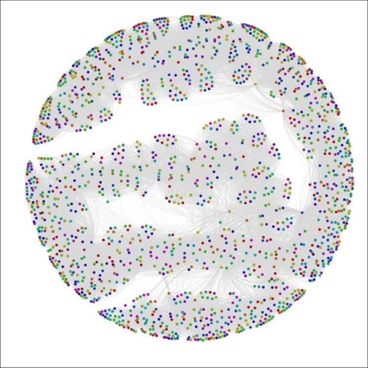
We'll work with multiple partitioning options so that you become familiar with more than one approach. Before we get into any of the partitioning examples, we should take a look at how the network sets up on its own. I will let an ARF process run for about 25 minutes to achieve the following graph, but depending on your preference (and CPU) another layout type might be preferred. I find the ARF layout ideal for visualizing relatively sparse mid-sized networks like this one as it seems to make node clusters highly visible.
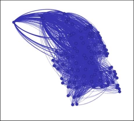
Here's my initial instance of the network:
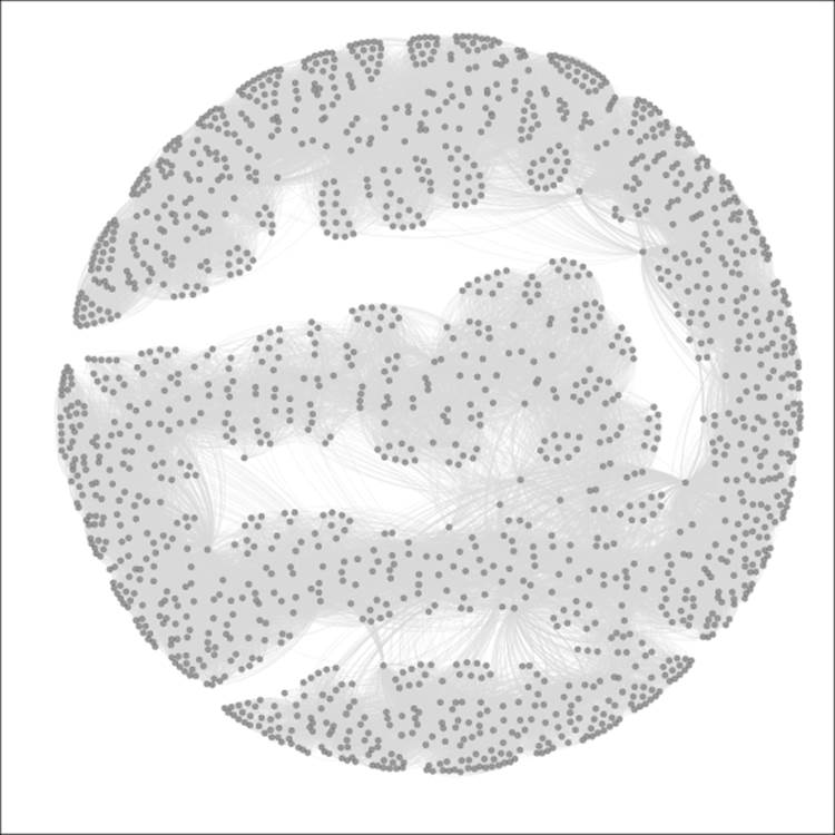
The Red Sox player network
So we have a much more complex network than we used in the previous chapters, but one that is nonetheless manageable, with fewer than 1,700 nodes. Still, this complexity level could prevent us from learning more about the network unless we elect to partition it into meaningful pieces. Let's run through a few examples for fun. If you want to follow along, just remember that you might need to reset the colors after each iteration, using the Reset Colors rectangle icon in the Overview window (you can find this icon at the bottom-left of the graph area). This will return the nodes to a single default color—the color currently seen within the rectangle. Also note that I am sharing each of these using the Preview window, which gives us more refined imagery.
For the first case, we'll look at the Decade attribute, which informs us in which decade a player first played for the Red Sox.
Note
Note that the Partition tab will display decades ranked by proportion, as opposed to their data order.
Gephi will also select the colors for you, although you can modify these individually after the update has been applied. So select the Decade attribute from the Partition | Nodes tab, click on the Apply button, and have a look to see the following output:
The Red Sox player network partitioned by Decade
We now have a graph that is visually segmented into 12 groups, each representing 5 percent or more of nodes in the network. As noted a moment ago, the color legend appears in the partition window and allows you to manually edit by selecting a specific rectangle and right-clicking to load the color palette.
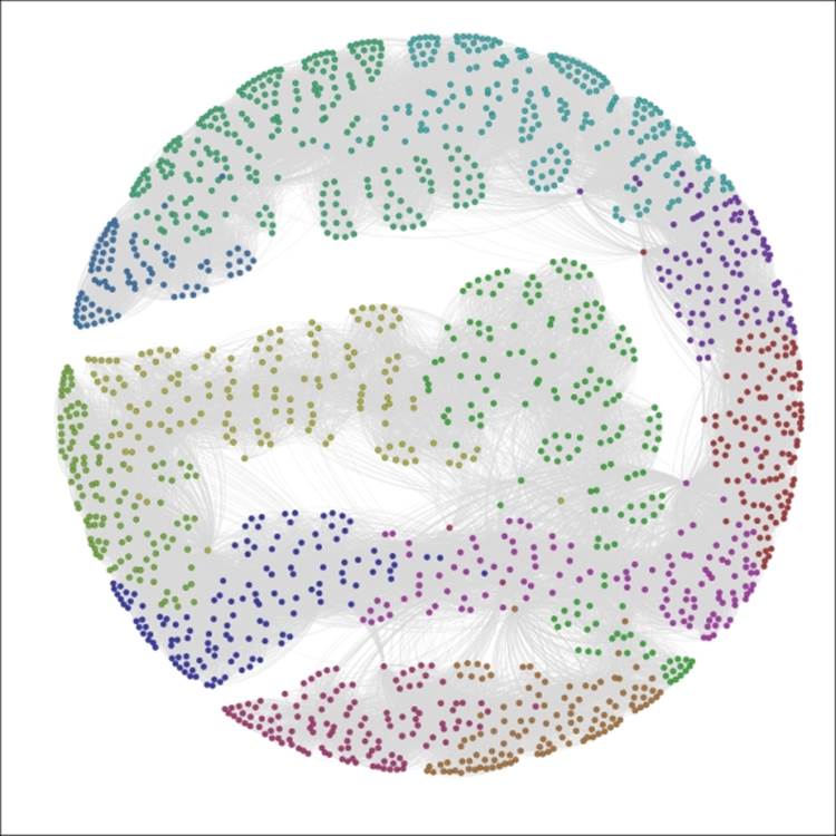
What if we prefer something other than Decades as our partitioning variable? Let's suppose that our goal is to understand birth country patterns. This can be easily done by selecting the birthCountry attribute in the Partition window, as seen in this screenshot:
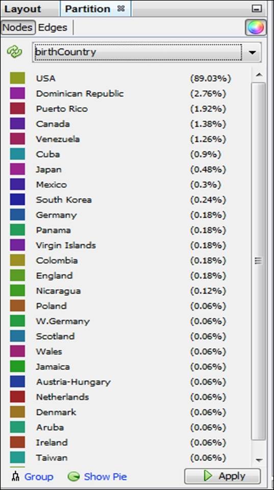
Partition results using the birthCountry attribute
Applying the settings will update the legend and graph colors to look like this:
The Red Sox player network partitioned by birthCountry
We now have a graph that is dominated by a single color, as close to 90 percent of all the players in the network were born in the United States. This pattern would change significantly if we were to select only the most recent decades which have seen a major increase in the proportion of players born outside the US.
Let's have one more look, this time in an effort to understand calendar month birth patterns. To do this, select the birthMonth attribute in the Partition window, and click on Apply to see the following results:
The Red Sox player network partitioned by birthMonth
Now we can see that August (8) and September (9) appear to be the dominant birth months for Red Sox players throughout their history, while June (6) is the least likely month to produce major league baseball players, at least for the Red Sox organization.
I think you have the idea by now that partitioning in Gephi is a straightforward yet powerful process that can help us to quickly spot some patterns in our network. Go ahead and play with some other attributes if you wish, and adjust a few colors to get a feel of that process.
We'll now move on to adjusting the graph using the ranking functions, working on numerical rather than categorical attributes.
Working with the Ranking tab
The Ranking tab, as noted earlier in this chapter, enables us to segment our graph based on the numerical values derived from data attributes and statistical measures. This method provides different results than the partitioning approach just discussed. Partitioning works on categorical values and colors the node values according to a specific value in that data field. Ranking takes a different approach by examining numerical values, and colors or sizes these values on a sliding scale without distinct breakpoints (although this can be implemented using the Spline settings, as detailed here).
To adjust the distribution of the size settings automatically, use the Spline option in the Ranking tab. This function provides multiple settings to size the nodes according to some predefined distribution curves, which can also be customized by moving the x- and y-axis settings in the Spline Editor window.
Let's look at some illustrations that are using ranking, which can then be contrasted with the examples we saw in the prior section. We'll continue using the same network graph of Red Sox players.
Using color and size options
In cases where we intend to create custom partitions, Gephi offers the ability to use color and size options to help visually classify a network graph. This process would not fall under the usual guidelines for partitioning (or clustering, for that matter), but is simply an automated or manual means to customize your network to highlight specific patterns.
Let's suppose that we wish to draw special attention to specific elements in the graph that are not addressed through the use of partitions. You might have noticed already that partitions apply only to non-numeric elements. In this particular case, many of our most interesting data fields are integer-based, including the number of games played, home runs hit, or total bases earned. Fortunately, Gephi provides the ability to replicate partitions by ranking our graph nodes according to numeric values. We'll walk through some examples of this, sharing the resulting graphs.
A bit of a caveat before we begin—if your field type is BigInteger, you will be unable to follow this process. To rectify this, you can either make a copy of this field in the data laboratory, setting the type to Integer, or you could also recast the column (using the Recast column plugin) to the integer type.
For our first instance, let's assume that we wish to see which players played the most seasons in a Red Sox uniform. Follow these steps to create a graph that is sized based on the tenure:
1. Go to the Ranking tab (often at the upper-left of your screen) and select the Nodes tab.
2. Choose Seasons (or whatever your equivalent integer-based field is named) from the listbox.
3. Apply the sizing based on the values in the data. In this case, we have a minimum of 1 and a maximum of 23. To be consistent with good data practices, we should size the area of each circle using the radius, as opposed to the circumference, which equates to roughly a 5:1 ratio in this example (as the circle with size 1 has a radius of approximately 0.57 while the circle of size 23 has a radius of 2.7 approximately). So we'll use a minimum value of 4 and a maximum of 20 for better visibility while maintaining the 5:1 ratio.
4. Apply your settings.
You should wind up with a graph that resembles the following screenshot:
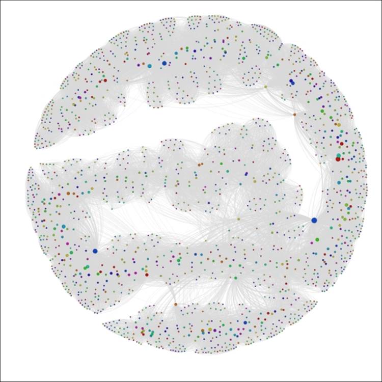
The Red Sox player network ranked by seasons
We can now see a handful of nodes that stand out from the remainder of the graph based on their career longevity, as measured by seasons played. A similar approach could be applied to any integer-based data attribute in the network. One of the nice aspects of this approach is that it lets us see how our graph can change based on the application of measurable data attributes, as opposed to the categorical approach delivered by partitioning.
Let's view one more example before moving onto manual partitioning. In this case, we'll follow the same procedures we used a moment ago, replacing Seasons with 3rd_Base. Make sure your field has integer values or create a copy that does. Follow the same steps as before, but this time adjust the sizing to a minimum of 0.5 (0 is not allowed even when the data value is zero) to 44, based on the high value of 1,521. This should provide great clarity within the graph for which players had the greatest number of games at the third base position, as shown in the following screenshot:
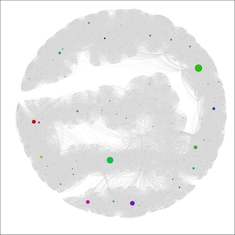
The Red Sox player network ranked by games at third base
Now we can see very clear results, with most of the graph receding to the background while a mere handful of nodes are very prominent. This provides us with great insight into who played most often at that position, without having to deal with a lot of visual clutter. This could also be considered something of an alternative to filtering, with the difference of seeing the remainder of the graph in the background. We should also note that we could have used coloring to rank the games played—typically as a gradient ranging from light (lower values) to dark (higher values).
Manual graph segmentation
We have already seen two ways in which we can visually partition a graph in Gephi using built-in functionality to work on either categorical or numeric values. Let's take a brief look at a third method, one which involves a bit more manual effort to create a specific look for our graph. We'll return the graph to its original state by resetting the size and color values, resulting in an unembellished graph where all nodes have identical appearances.
For this example, let's assume that we wish to focus the reader's attention only on players who began their tenure during the 1980s. We already know that we could do this using the partitioning approach working with the Decade variable, as illustrated earlier in this chapter. That approach will give the 1980s nodes a unique color, but we want something more to draw attention to the member nodes who meet this criterion.
Here are the steps we'll follow to arrive at our goal:
1. Go to the Filters | Equal | Decade filter and drag it to the Queries window. You should be familiar with this process from Chapter 5, Working with Filters.
2. Enter the value 1980s and run the Select and Filter processes using the appropriate buttons. This will take our graph to an intermediate stage where only nodes that correspond to the 1980s decade value will be displayed, as shown in the following screenshot:
The Red Sox player network filtered by decade equal to 1980s
3. Use the Rectangle selection tool from the workspace toolbar—it's represented by a dotted rectangle icon—to select all the nodes displayed on the graph. By the way, this selection will also limit the visible nodes in the data laboratory, allowing you to calculate new statistics or other actions only on the chosen nodes.
4. Recolor these nodes using the Reset colors icon on the toolbar.
5. Increase the node size using the Reset size icon on the same toolbar—a value of 10 should be sufficient. This results in the following output:
The Red Sox player network filtered and colored using decade equal to 1980s
6. Remove the filter, and then open the graph in the Preview window to see the final result; make sure the edges color is set to use the source value:
The complete graph showing highlighted decade equal to 1980s
We now have a graph that begins to tell a story by drawing immediate visual attention to the items of interest.
We have just highlighted a few powerful methods to partition or otherwise visually segment a graph using existing or calculated data values. It's now time to take a look at another approach, wherein various Gephi plugins work to create clusters derived from the intersections of these variables and their values. The next few sections will examine some clustering approaches and the visual results they yield.
Using the Chinese Whispers plugin
The Chinese Whispers plugin is an easy-to-use tool that creates distinct clusters from the values in our network dataset. Several options are provided that will affect the outcome of the algorithm and the resulting cluster structure. In this section, we'll first examine the available options and then work with our familiar Red Sox player network to show how the results differ depending on the settings chosen. You'll find the Chinese Whispers plugin on the Clustering tab.
Let's start by examining the available options, as shown in the screenshot:
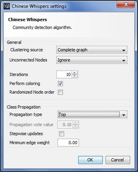
Chinese Whispers options
Starting from the top, here are the choices:
· For the clustering source, either a Complete graph or Visible graph setting can be selected. These are somewhat self-explanatory, based on whether any filters are being applied to limit the visible portion of the network.
· We can choose how to treat unconnected nodes in the case where there are multiple graph components.
· The number of iterations can be adjusted in an effort to increase accuracy. Coloring and node order options are also available.
· Four propagation options exist—Top, Distance, Log Distance, and Vote. We'll examine how they differ using the example illustrations.
· We can also select a minimum edge weight and stepwise updates.
My recommendation is to play with these settings on your own graphs to better understand the impact of each selection. We'll vary a few of these settings in the following examples to help you gain a feel of their application. Changing the propagation setting is the primary means for returning different results, so that's what we'll play with in the following example.
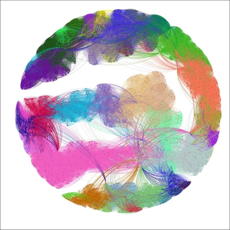
Now let's return to our base graph, with all nodes treated equally. This will give us a clean slate to start applying the clustering. For our first example, we'll use the complete graph with 10 iterations and a Top propagation type. We'll have the algorithm performing the coloring as well, since that will save us a step. Here's our result:
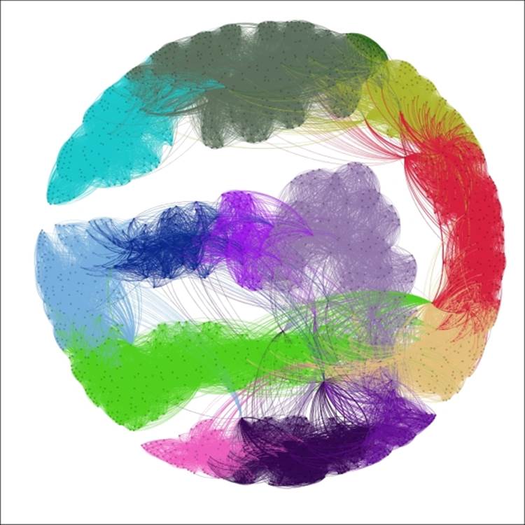
Chinese Whispers using top propagation
These settings segmented the graph into 14 distinct clusters, colored accordingly. The Top method creates clusters based on a summation of neighborhood patterns. It would be interesting to see how closely these clusters correlate with the Decade variable, as they appear to follow a roughly similar pattern.
Now let's apply the Distance setting for the propagation type, and see how our graph differs:
Chinese Whispers using distance propagation
Now instead of 14 clusters, we have 42; a significant increase that might deliver a higher degree of precision for this particular network. Individual clusters range in size from just 7 nodes all the way to 104 members. The distance setting differs from the top method by looking at individual neighbors and reducing their level of influence. In this case, it feels as though the algorithm might be detecting relationships (players who played together) at a more granular-level as opposed to the broad neighborhood-based patterns of the first approach.
What if we use the Log Distance option? Interestingly, this returns us much closer to the first instance, as we now have 17 clusters to work with, ranging in size from 15 to 214 members. This makes sense considering that taking a log of individual distances will minimize the extreme influence of specific nodes in the network. Here's what our graph looks like using the log distance:
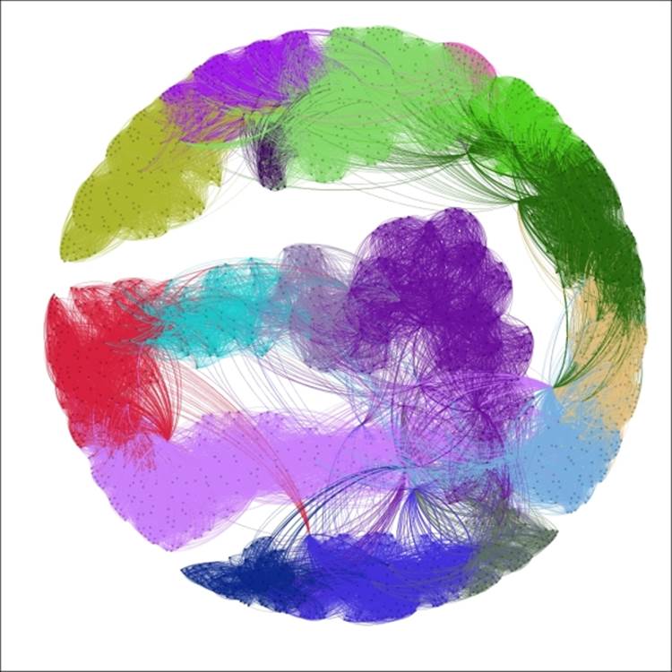
Chinese Whispers using log distance propagation
A cursory examination reveals that the clustering patterns for the Log Distance option resemble those from our initial top propagation.
The fourth and final method uses the Vote method, which works the same as the top approach with the exception of the use of a numerical parameter for creating class changes. In this case, setting the propagation vote value to 0.01 yields a 14 cluster result, just as we previously saw with the Top method. If we increase this value to 0.02, the resulting graph still has 14 clusters, but at 0.03, the number of clusters is reduced to just 7. At values between 0.02 and 0.03, the number of clusters will range between 7 and 14, contingent of the specific value.
If you have been following along with these examples, or using your own data in a similar fashion, you will have noticed the speed of the Chinese Whispers process. This encourages us to test and tinker with the settings to customize the number and size of clusters identified in the network.
Remember that the end goal of using a clustering approach such as Chinese Whispers is to better understand patterns and relationships within your network. For the Red Sox network we just used, each setting provided significantly different results in the number and size of clusters. There is no absolute right or wrong answer in this case—you should take a closer look at your network structure before determining which settings provided the most satisfactory results. In the above examples, I would perhaps stick to the lower-end of the cluster scale, as shown by the first and last examples (14 and 17 clusters, respectively), as the 42 clusters might be over-segmenting the network and separating nodes that should remain together.
We'll now examine an alternative clustering approach using the Markov Clustering plugin.
Using the Markov Clustering plugin
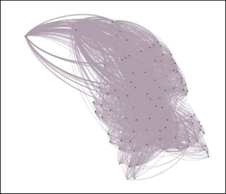
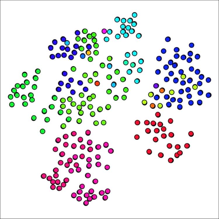
Another clustering option is found in the Markov Clustering plugin, which differs in approach from Chinese Whispers, but should yield generally similar results. We'll walk through a similar process to illustrate how to use this method. We're going to return to the primary school network for this example, as the Gephi version of this algorithm seems most effective with relatively smaller datasets, at least working with the moderate CPU and memory settings on my personal machine.
To start, select the Markov Clustering option from the Clustering tab, and click on Settings to see the default screen:
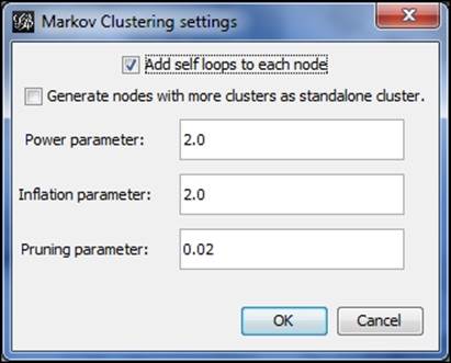
Markov Clustering options
We'll start with the default settings and then customize them to see the difference in our graph results. Here's what the defaults yield, with the edges removed from view for better visibility:
Primary school network with 12 clusters using default Markov settings
No great surprises here, as the 12 generated clusters line up reasonably well with node placement on the graph, suggesting that the school classes are highly predictive of cluster structures. There are a few spots where we might be able to improve results, such as the upper-right area which shows considerable overlap between two clusters. Note that we also have a single node cluster near the top of the graph.
Now let's adjust the settings to increase or decrease the number of clusters. There are a few ways we can achieve this goal:
1. Raise or lower Power parameter
2. Raise or lower Inflation parameter
3. Adjust Pruning parameter to be more or less selective in determining clusters
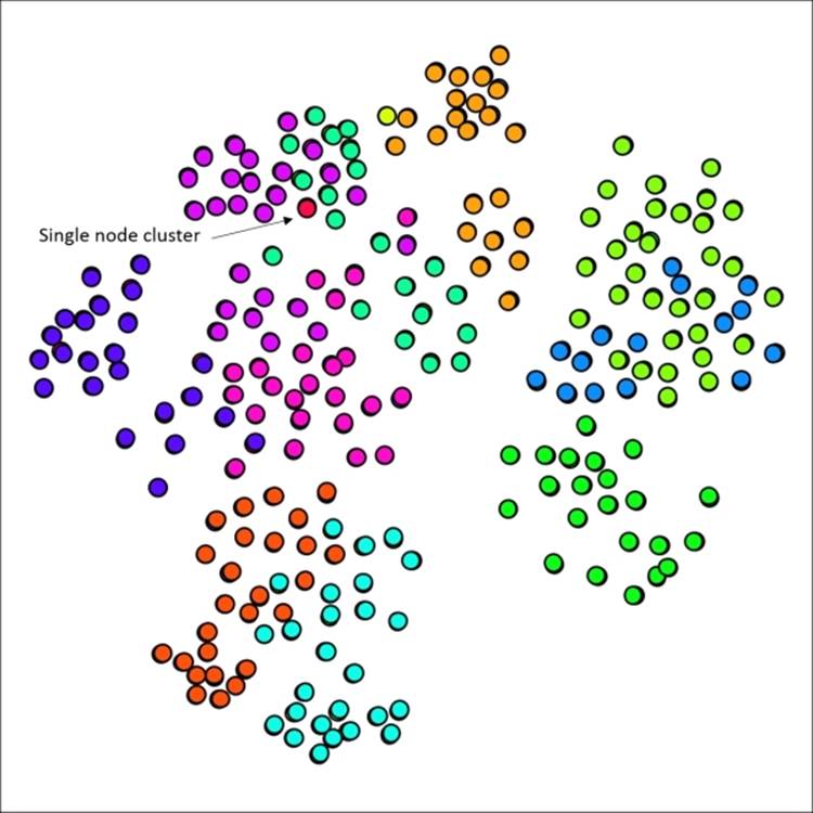
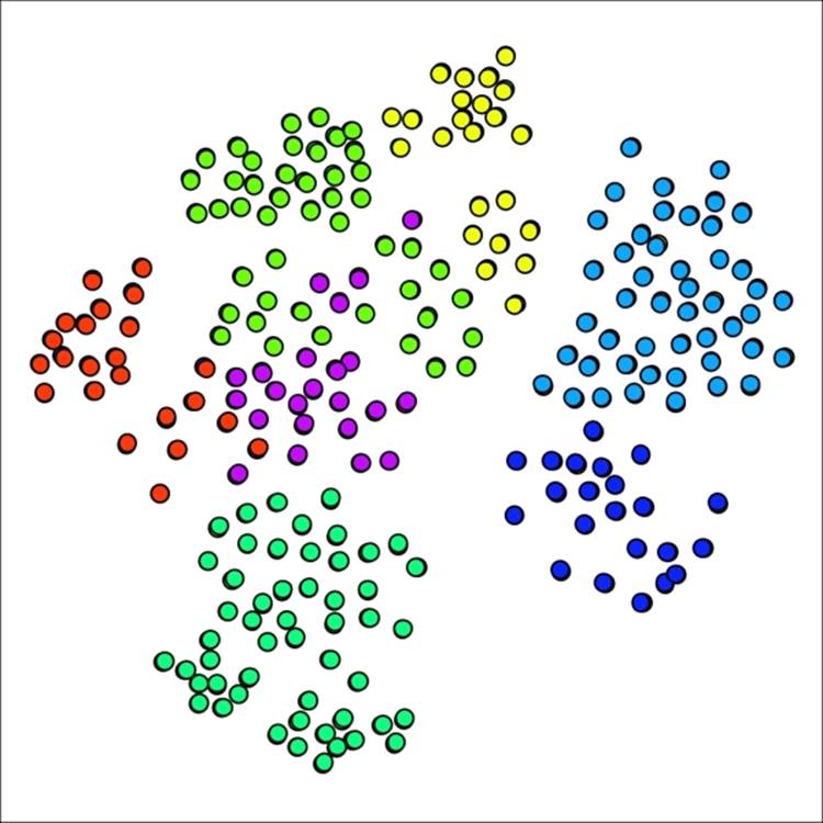
Lowering the Power and/or Inflation parameters will yield a higher number of clusters, assuming the pruning level is left untouched. Let's start there, by changing each value from 2.0 to 1.8, while leaving the pruning parameter at 0.02. Our new graph looks a bit different, with 18 clusters, versus the 12 we had a moment ago:
Primary school network with 18 clusters using reduced power and inflation values
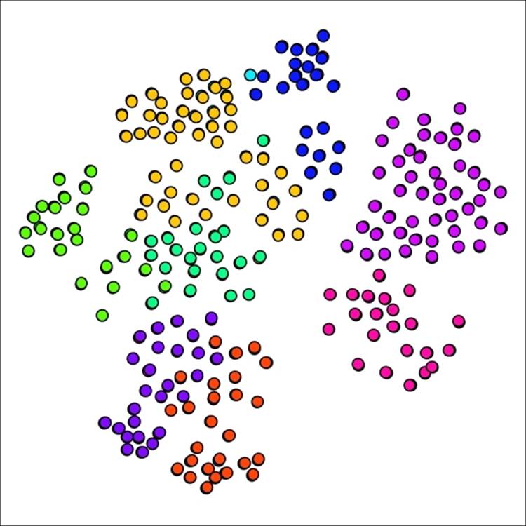
If you recall the graph results from our original example, you might remember that the graph had only a single cluster with just one member. In our new graph, there are five cases with a single node. Perhaps this is representative in some fashion, but it feels as though we have possibly gone too far in segmenting the graph. Let's see what happens when both the power and inflation parameters are returned to the original level while the pruning parameter is lowered to 0.015. This should result in slightly larger groups, thus decreasing the number of clusters.
Our network now has just seven clusters using this approach—we have made it easier for nodes to join existing clusters:
Primary school network with seven clusters using lower pruning setting
Our smallest cluster is now composed of 22 nodes, a far cry from the single member present earlier. We might have gone too far in the opposite direction, although the graph results display minimal overlap between clusters, generally a good indicator. Let's make one more attempt, this time setting the pruning parameter to 0.175, splitting the difference between our original and revised levels.
As anticipated, our new graph has fallen between the 7 and 12 cluster graphs, yielding nine distinct clusters in this case. What is most interesting is the return of a single cluster with just one member, providing a good illustration for just how sensitive the network can be to small parameter adjustments.
Primary school network with nine clusters after adjusting pruning setting
The Markov Clustering method is another useful tool for understanding network behavior using a clustering approach. I recommend you to adjust the settings and test results on each network you analyze, as opposed to simply relying on the default settings. Trust your eyes when comparing any clustering or partitioning results, and adjust the settings until you see something that makes visual sense.
Summary
In this chapter, you witnessed a variety of approaches that will help you to tell better stories using Gephi and network graphs. Here's a brief recap of the five approaches we examined.
We began with partitioning, and learned how to use both existing data attributes as well as calculated values. Our next step was to illustrate the use of ranking in sizing and coloring graphs for visual impact.
Manual editing of graphs was also explained, where we used filtering to make this process both more effective and efficient to highlight portions of a graph.
The Chinese Whispers plugin was used in a series of examples to illustrate the power of applying clustering methods to a graph.
We concluded with a series of illustrations using the Markov Clustering method and learned how to adjust settings to improve our graph output.
In our next chapter, Chapter 8, Dynamic Networks, we'll begin to look at how to create time-based visualizations using Gephi. We'll also learn how to create time intervals and use existing ones to create dynamic network graphs, and begin to understand how to implement individual node and edge values that change over time.
All materials on the site are licensed Creative Commons Attribution-Sharealike 3.0 Unported CC BY-SA 3.0 & GNU Free Documentation License (GFDL)
If you are the copyright holder of any material contained on our site and intend to remove it, please contact our site administrator for approval.
© 2016-2026 All site design rights belong to S.Y.A.