Learning Highcharts 4 (2015)
Chapter 10. Highcharts APIs
Highcharts offers a small set of APIs designed for plotting charts with dynamic interactions. In order to understand how the APIs work, we must first familiarize ourselves with the chart's internal objects and how they are organized inside a chart. In this chapter, we will learn about the chart class model and how to call the APIs by referencing the objects. Then we build a simple stock price application with PHP, jQuery, and jQuery UI to demonstrate the use of Highcharts APIs. After that, we turn our attention to four different ways of updating a series. We experiment with all the series update methods with the purpose of building an application to illustrate variations in visual effects, and the difference in CPU performance between them. Finally, we investigate performance when updating a series with popular web browsers, in terms of different sizes of datasets. In this chapter, we will cover the following topics:
· Understanding the Highcharts class model
· Getting data in Ajax and displaying new series with Chart.addSeries
· Displaying multiple series with simultaneous Ajax calls
· Using Chart.getSVG to format SVG data into an image file
· Using the Chart.renderer methods
· Exploring different methods to update series and their performance
· Experimenting with Highcharts performance with large datasets
Understanding the Highcharts class model
The relationship between Highcharts classes is very simple and obvious. A chart is composed of five different classes—Chart, Axis, Series, Point, and Renderer. Some of these classes contain an array of lower-level components and an object property to back-reference to a higher level-owner component. For example, the Point class has the series property pointing back to the owner Series class. Each class also has a set of methods for managing and displaying its own layer. In this chapter, we will focus on the set of APIs for dynamically modifying charts. The following class diagram describes the association between these classes:
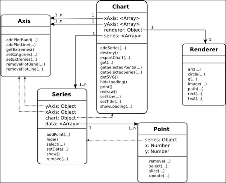
The Chart class is the top level class representing the whole chart object. It contains method calls to operate the chart as a whole—for example, exporting the chart into SVG or other image formats and setting the dimension of the chart. The Chart class has multiple arrays of Axis and Series objects; that is, a chart can have one or more x axes, y axes, and series. The Renderer class is a utility class that has a one-to-one relationship per chart and provides a common interface for drawing in SVG and VML-based browsers.
The Series class has an array of Point objects. The class has back-reference properties towards the Chart and Axis objects (see the dotted lines in the previous diagram) and provides functions for managing its list of Point objects. The yAxis and xAxis properties in the Series class are necessary, as a chart can have multiple axes.
The Point class is just a simple object containing x and y values and a back-reference to its series object (see the dotted line). The APIs are for managing the data points in the chart.
Highcharts constructor – Highcharts.Chart
Needless to say, the most important method in the APIs is the Highcharts.Chart method, with which we have seen plenty of action so far. However, there is more to this constructor call. Highcarts.Chart creates and returns a chart object but it also has a second optional parameter known as callback:
Chart(Object options, [ Function callback ])
The callback function is called when a chart is created and rendered. Inside the function, we can either call the component methods or access the properties inside the chart object. The newly created chart object is passed via the only callback function parameter. We can also use the 'this' keyword inside the callback function, which also refers to the chart object. Instead of using the Highcharts.Chart callback parameter, we can achieve the same result by declaring our code inside the chart.events.load handler, which will be explored in the next chapter.
Navigating through Highcharts components
In order to use the Highcharts API, we must navigate to the right object inside the class hierarchy. There are several ways to traverse within the chart object: through the chart hierarchy model, retrieving the component directly with the Chart.get method, or a mixture of both.
Using the object hierarchy
Suppose that the chart object is created, as follows:
<script type="text/javascript">
$(document).ready(function() {
var chart = new Highcharts.Chart({
chart: {
renderTo: "container"
},
yAxis: [{
min: 10,
max: 30
}, {
min: 40,
max: 60
}],
series: [{
data: [ 10, 20 ]
}, {
data: [ 50, 70 ],
yAxis: 1
}],
subtitle: {
text: "Experiment Highcharts APIs"
}
});
}, function() {
...
});
</script>
We can then access the first position of the series' object with the index 0 from the chart. Inside the callback handler, we use the this keyword to refer to the chart object as follows:
var series = this.series[0];
Suppose there are two y axes in the configuration. To retrieve the second y axis, we can do as follows:
var yAxis = this.yAxis[1];
To retrieve the third data point object from the second series of the chart, type the following:
var point = this.series[1].data[2];
Supposing multiple charts are created on the page, a chart object can be accessed via the Highcharts namespace:
var chart = Highcharts.charts[0];
We can also retrieve the chart's container element through the container option:
var container = chart.container;
To examine the options structure of a created chart, use the options property:
// Get the chart subtitle
var subtitle = chart.options.subtitle.text;
Using the Chart.get method
Instead of cascading down the object hierarchy, we can directly retrieve the component using the Chart.get method (the get method is only available at the chart level, not in each component class). Assigning components with IDs will allow you to access them directly using the get method instead of traversing nodes in the object's hierarchical structure. The configuration uses the option key id, so this value must be unique.
Suppose we have created a chart with the following configuration code:
xAxis: {
id: 'xAxis',
categories: [ ... ]
},
series: [{
name: 'UK',
id: 'uk',
data: [ 4351, 4190,
{ y: 4028, id: 'thirdPoint' },
... ]
}]
We can retrieve the components as follows:
var series = this.get('uk');
var point = this.get('thirdPoint');
var xAxis = this.get('xAxis');
If the id option is not previously configured, we can use the JavaScript filter method to search for the item based on the property:
this.series.filter(function(elt) {return elt.name == 'uk';})[0];
Using both the object hierarchy and the Chart.get method
It is cumbersome to define the id option for every component inside the chart. Alternatively, we can navigate through the components using both approaches, as follows:
var point = this.get('uk').data[2];
Using the Highcharts APIs
In this section, we will build an example using jQuery, jQuery UI, and Highcharts to explore each component's APIs. All the example code from here on will be using the object hierarchy to access chart components, that is, chart.series[0].data[0]. The user interface used here has a very minimal look and is far from perfect, as the main purpose of this exercise is to examine the Highcharts APIs.
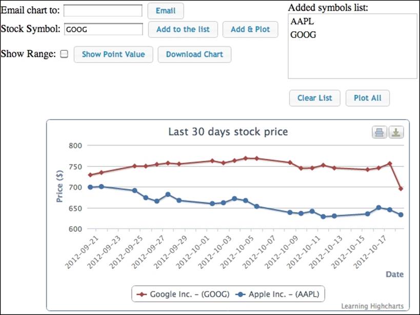
First, let's see the usage of this user interface; then we will dissect the code to understand how the operations are performed. The following is the final UI screenshot that will be created in this section:
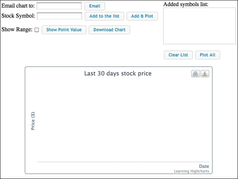
This is a simple web frontend for plotting the stock data chart for the past 30 days. The top part is a group of buttons for setting the stock symbols, getting the stock price, and retrieving the chart image by downloading it or via e-mail. The Add to the list button is for adding a stock symbol straight to the list without getting the stock prices and plotting the data. The Plot All button is for launching multiple stock price queries from the symbol list simultaneously, and to plot the data when all the results arrive. Alternatively, Add & Plot is a quick option for plotting a single stock symbol.
The bottom half contains a chart that we have already created. The chart is displayed with empty data and axes with titles (setting the showAxes option to true). The whole idea is to reuse the existing chart rather than recreating a new chart object every time new results arrive. Therefore, there is no flickering effect when the chart is destroyed and created and it appears as a smooth update animation. This also provides better performance without running extra code to regenerate the chart object.
This example is also available online at http://www.joekuan.org/Learning_Highcharts/Chapter_10/Example_1.html.
Chart configurations
The following is the chart configuration used for the example. Once a stock query is made, the server-side script will request the stock prices for the last 30 days and format the results into days in units of milliseconds. Hence, the x axis is configured as a datetimetype with intervals on a daily basis:
var chart = new Highcharts.Chart({
chart: {
renderTo: 'container',
showAxes: true,
borderWidth: 1
},
title: { text: 'Last 30 days stock price' },
credits: { text: 'Learning Highcharts' },
xAxis: {
type: 'datetime',
tickInterval: 24 * 3600 * 1000,
dateTimeLabelFormats: { day: '%Y-%m-%d' },
title: {
text: 'Date',
align: 'high'
},
labels: {
rotation: -45,
align : 'center',
step: 2,
y: 40,
x: -20
}
},
yAxis: {
title: { text: 'Price ($)' }
},
plotOptions: {
line: { allowPointSelect: true }
}
});
Getting data in Ajax and displaying a new series with Chart.addSeries
Let's examine the action behind the Add & Plot button, defined as the following HTML syntax:
Stock Symbol: <input type=text id='symbol' />
<input type='button' value='Add to the list' id='addStockList' /> <input type='button' value='Add & Plot' id='plotStock'>
....
Added symbols list:
<ol id='stocklist'>
</ol>
The jQuery code for the button action is listed, as follows:
$('#plotStock').button().click(
function(evt) {
// Get the input stock symbol, empty the
// list andinsert the new symbol into the list
$('#stocklist').empty();
var symbol = $('#symbol').val();
$('#stocklist').append($("<li/>").append(symbol));
// Kick off the loading screen
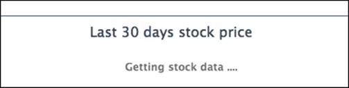
chart.showLoading("Getting stock data ....");
// Launch the stock query
$.getJSON('./stockQuery.php?symbol=' +
symbol.toLowerCase(),
function(stockData) {
// parse JSON response here
.....
}
);
}
);
The previous code defines the event handler for the Add & Plot button's click event. First, it empties all the entries in the stock symbol list box that have IDs as stocklist. Then, it retrieves the stock symbol value from the input field symbol and appends the symbol to the list. The next step is to initiate a loading message screen on the chart by calling the chart.showLoading method. The following screenshot shows the loading message screen:
The next call is to launch a jQuery Ajax call, $.getJSON, to query the stock price. The stockQuery.php server script (of course, any other server-side language can be used) does two tasks: it resolves the symbol into the full name of the organization, launches the symbol query from another website (http://ichart.finance.yahoo.com/table.csv?s=BATS.L) for the past stock price data, then packs the data into rows and encodes them into JSON format. The following is the code in the stockQuery.php file:
<?php
$ch = curl_init();
curl_setopt($ch, CURLOPT_RETURNTRANSFER, true);
// Get the stock symbol name
curl_setopt($ch, CURLOPT_URL, "http://download.finance.yahoo.com/d/quotes.csv?s={$_GET['symbol']}&f=n");
$result = curl_exec($ch);
$name = trim(trim($result), '"');
// Get from now to 30 days ago
$now = time();
$toDate = localtime($now, true);
$toDate['tm_year'] += 1900;
$fromDate = localtime($now - (86400 * 30), true);
$fromDate['tm_year'] += 1900;
$dateParams = "a={$fromDate['tm_mon']}&b={$fromDate['tm_mday']}&c={$fromDate['tm_year']}" ."&d={$toDate['tm_mday']}&e={$toDate['tm_mday']}&f={$toDate['tm_year']}";
curl_setopt($ch, CURLOPT_URL, "http://ichart.finance.yahoo.com/table.csv?s={$_GET['symbol']}&{$dateParams}&g=d");
$result = curl_exec($ch);
curl_close($ch);
// Remove the header row
$lines = explode("\n", $result);
array_shift($lines);
$stockResult['rows'] = array();
// Parse the result into dates and close value
foreach((array) $lines as $ln) {
if (!strlen(trim($ln))) {
continue;
}
list($date, $o, $h, $l, $c, $v, $ac) =
explode(",", $ln, 7);
list($year, $month, $day) = explode('-', $date, 3);
$tm = mktime(12, 0, 0, $month, $day, $year);
$stockResult['rows'][] =
array('date' => $tm * 1000,
'price' => floatval($c));
}
$stockResult['name'] = $name;
echo json_encode($stockResult);
?>
The following is the result returned from the server side in the JSON format:
{"rows":[ {"date":1348138800000,"price":698.7},
{"date":1348225200000,"price":700.09},
... ],
"name": "Apple Inc."
}
Once the JSON result arrives, the data is passed to the definition of the handler of getJSON and parsed into an array of rows. The following are the details of the handler code:
$.getJSON('./stockQuery.php?symbol=' +
symbol.toLowerCase(),
function(stockData) {
// Remove all the chart existing series
while (chart.series.length) {
chart.series[0].remove();
}
// Construct series data and add the series
var seriesData = [];
$.each(stockData.rows,
function(idx, data) {
seriesData.push([ data.date, data.price ]);
}
);
var seriesOpts = {
name: stockData.name + ' - (' + symbol +')',
data: seriesData,
// This is to stop Highcharts rotating
// the color and data point symbol for
// the series
color: chart.options.colors[0],
marker: {
symbol: chart.options.symbols[0]
}
};
chart.hideLoading();
chart.addSeries(seriesOpts);
}
);
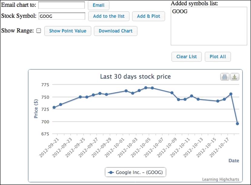
First of all, we remove all the existing series displayed in the chart by calling Series.remove. We then construct a series option with a data array of date (in UTC time) and price. We then remove the loading screen with Chart.hideLoading and display a new series with the Chart.addSeries methods. The only minor issue is that the default color and point marker for the series change when the series is reinserted; the internal indices in chart.options.colors and chart.options.symbols are incremented when a series is removed and added back to the chart. We can explicitly set the series color and point symbol to resolve this issue.
Alternatively, we can call Series.setData to achieve the same result but, once the name (subject) of a series is assigned and the series is created, it is not allowed to change. Therefore, we stick to Chart.addSeries and Series.remove in this example.
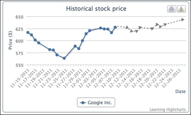
The following is a screenshot of a single stock query:
Displaying multiple series with simultaneous Ajax calls
The next part is to explore how to launch multiple Ajax queries simultaneously and plot series together when all the results have been returned. The implementation is pretty much the same as plotting a single stock query, except that we build up the series array option as we gather the results and plot them only when the last result arrives:
// Query all the stocks simultaneously and
// plot multipleseries in one go
$('#plotAll').button().click(
function(evt) {
// Kick off the loading screen
chart.showLoading("Getting multiple stock data ....");
// Get the list of stock symbols and launch
// the query foreach symbol
var total = $('#stocklist').children().length;
// start Ajax request for each of the items separately
$.each($('#stocklist').children(),
function(idx, item) {
var symbol = $(item).text();
$.getJSON('./stockQuery.php?symbol=' +
symbol.toLowerCase(),
function(stockData) {
// data arrives, buildup the series array
$.each(stockData.rows,
function(idx, data) {
$.histStock.push([ data.date,
data.price ]);
}
);
seriesOpts.push({
name: stockData.name + ' - (' +
symbol +')',
data: $.histStock,
// This is to stop Highcharts
// rotating the colorfor the series
color: chart.options.colors[idx],
marker: {
symbol: chart.options.symbols[idx]
}
});
// Plot the series if this result
// is the last one
if (seriesOpts.length == total) {
// Remove all the chart existing series
while (chart.series.length) {
chart.series[0].remove()
}
chart.hideLoading();
$.each(seriesOpts,
function(idx, hcOption) {
chart.addSeries(hcOption,
false);
}
);
chart.redraw();
} // else – do nothing,
// not all results came yet
} // function(stockData)
); // getJSON
}); // $.each($('#stocklist')
}); // on('click'
The second Boolean parameter of Chart.addSeries, redraw, is passed as false. Instead, we finalize all the updates in one single call, Chart.redraw, to save CPU time. The following is the screenshot for the multiple stock queries:
Extracting SVG data with Chart.getSVG
In this section, we will learn how to extract chart output and deliver it via e-mail or file download. Although we can rely on the exporting module and call the exportChart method to export the chart into the desired image format, it would be beneficial to see the whole process from formatting the original SVG content to creating an image file. After that, it is just a matter of calling different utilities to deliver the image file on the server side.
To extract the data underneath SVG from the displaying chart, the getSVG method is called, available when the exporting module is loaded. This method is similar to exportChart: it accepts the chartOptions parameter, which is used for applying configurations to the export chart output.
Here is the client-side jQuery code for handling both the Download and Email buttons.
Here, we use the protocol variable to specify the action for the chart and both buttons call the defined common function, deliverChart:
// Export chart into SVG and deliver it to the server
function deliverChart(chart, protocol, target) {
// First extracts the SVG markup content from the
// displayed chart
var svg = chart.getSVG();
// Send the whole SVG to the server and url
$.post('./deliverChart.php', {
svg: svg,
protocol: protocol,
target: target
},
function(result) {
var message = null;
var title = null;
switch (protocol) {
// Create a dialog box to show the
// sent status
case 'mailto':
message = result.success ?
'The mail has been sent successfully' :
result.message;
title = 'Email Chart';
break;
// Uses hidden frame to download the
// image file created on the server side
case 'file':
// Only popup a message if error occurs
if (result.success) {
$('#hidden_iframe').attr("src",
"dlChart.php");
} else {
message = result.message;
title = 'Download Chart';
}
break;
}
if (message) {
var msgDialog = $('#dialog');
msgDialog.dialog({ autoOpen: false,
modal: true, title: title});
msgDialog.text(message);
msgDialog.dialog('open');
}
}, 'json');
}
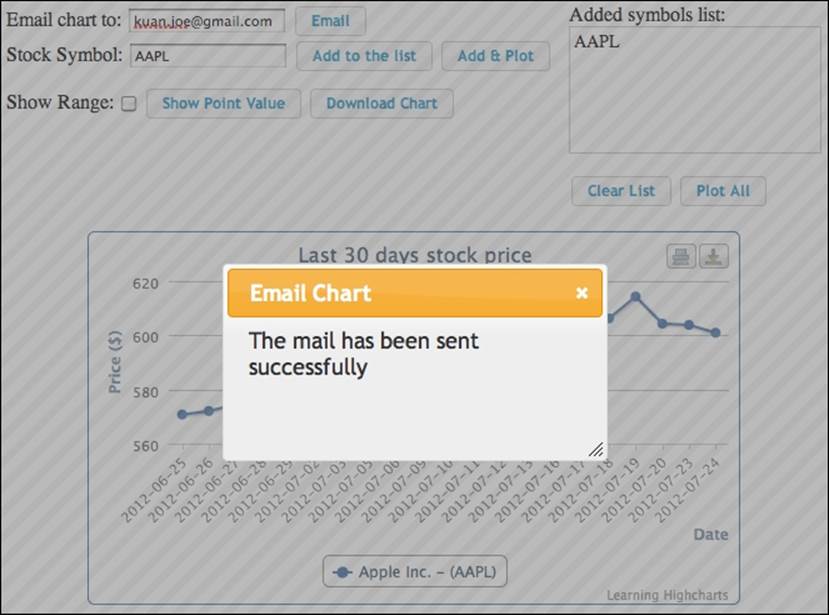
The deliverChart method first calls the Highcharts API getSVG to extract the SVG content, then launches a POST call with both SVG data and action parameters. When $.post returns with a task status value, it shows a message dialog. As for the download chart, we create a hidden <iframe> to download the chart image file upon the successful return of the task status value.
The following is a simple server-side script for converting the SVG content and delivering the exported file:
<?php
$svg = $_POST['svg'];
$protocol = $_POST['protocol'];
$target = $_POST['target'];
function returnError($output) {
$result['success'] = false;
$result['error'] = implode("<BR/>", $output);
echo json_encode($result);
exit(1);
}
// Format the svg into an image file
file_put_contents("/tmp/chart.svg", $svg);
$cmd = "convert /tmp/chart.svg /tmp/chart.png";
exec($cmd, $output, $rc);
if ($rc) {
returnError($output);
}
// Deliver the chart image file according to the url
if ($protocol == 'mailto') {
$cmd = "EMAIL='{$target}' mutt -s 'Here is the chart' -a /tmp/chart.png -- {$protocol}:{$target} <<.
Hope you like the chart
.";
exec($cmd, $output, $rc);
if ($rc) {
returnError($output);
}
$result['success'] = true;
} else if ($protocol == 'file') {
$result['success'] = true;
}
echo json_encode($result);
?>
Note
The web server is running on a Linux platform (Ubuntu 12.04). As for the e-mail action, we use two command-line utilities to help us. The first is a fast image conversion tool, convert, that is part of the ImageMagick package (see the package website for more details at http://www.imagemagick.org/script/index.php). Inside the script, we save the SVG data from the POST parameter into a file and then run the convert tool to format it into a PNG image. The convert tool supports many other image formats and comes with a myriad of advanced features. Alternatively, we can use Batik to do a straightforward conversion by issuing the following command:
java -jar batik-rasterizer.jar /tmp/chart.svg
The given command also converts an SVG file and outputs /tmp/chart.png automatically. For the sake of implementing the e-mail feature quickly, we will launch an e-mail tool, mutt (see the package website for more details at http://www.mutt.org), instead of using the PHP mail extension. Once the PNG image file is created, we use mutt to send it as an attachment and use a heredoc to specify the message body.
Tip
A heredoc is a quick way of inputting strings in a Unix command line with new lines and white spaces. See http://en.wikipedia.org/wiki/Here_document.
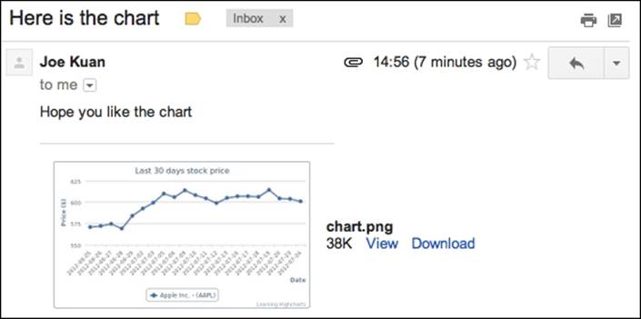
The following is the screenshot of the e-mail that is sent:
The following is the screenshot of the attachment e-mail that arrived in my e-mail account:
Selecting data points and adding plot lines
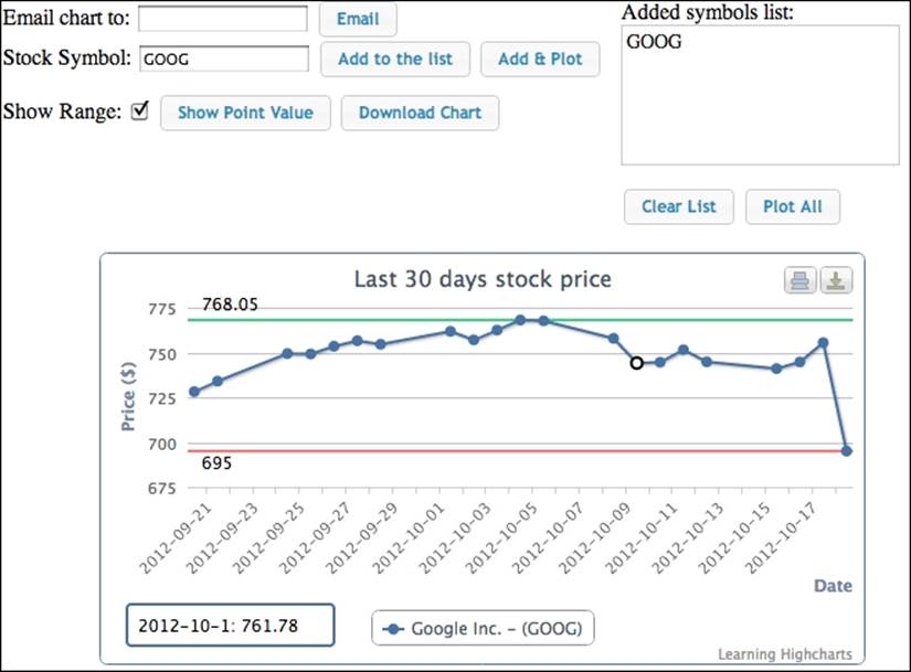
The next part is to implement the Show Range checkbox and the Show Point Value button. The Show Range option displays plot lines along the highest and lowest points in the chart, whereas Show Point Value displays a box with the value at the bottom left-hand side if a point is selected. The following screenshot demonstrates how both are enabled in the chart:
Note
Although it is more natural for the Show Point Value checkbox to show the selected point display, this will become a callback implementation to every point select event. Instead, we use a button here, so that we can directly call the Chart.getSelectedPointsmethod.
Using Axis.getExtremes and Axis.addPlotLine
The Axis.getExtremes method not only returns the axis current minimum and maximum range in display, but also the highest and the lowest values for the data points. Here, we use the method to combine with the Axis.addPlotLine function to add a pair of plot lines along the y axis. The addPointLine routine expects a plot line configuration.
In this example, we specify a data label as well as an id name, so that we can remove lines at both high and low ends when the Show Range option is unchecked or plot lines need to be redisplayed with a new value. The following is the code for the Show Rangeaction:
// Show the highest and lowest range in the plotlines.
var showRange = function(chart, checked) {
if (!chart.series || !chart.series.length) {
return;
}
// Checked or not checked, we still need to remove
// any existing plot lines first
chart.yAxis[0].removePlotLine('highest');
chart.yAxis[0].removePlotLine('lowest');
if (!checked) {
return;
}
// Checked - get the highest & lowest points
var extremes = chart.yAxis[0].getExtremes();
// Create plot lines for the highest & lowest points
chart.yAxis[0].addPlotLine({
width: 2,
label: {
text: extremes.dataMax,
enabled: true,
y: -7
},
value: extremes.dataMax,
id: 'highest',
zIndex: 2,
dashStyle: 'dashed',
color: '#33D685'
});
chart.yAxis[0].addPlotLine({
width: 2,
label: {
text: extremes.dataMin,
enabled: true,
y: 13
},
value: extremes.dataMin,
zIndex: 2,
id: 'lowest',
dashStyle: 'dashed',
color: '#FF7373'
});
};
Using the Chart.getSelectedPoints and Chart.renderer methods
The Show Point Value button makes use of the Chart.getSelectedPoints method to retrieve the data point that is currently selected. Note that this method requires the series option allowPointSelect to be enabled in the first place. Once a data point is selected and the Show Point Value button is clicked, we use functions provided by the Chart.renderer method to draw a tooltip-like box showing the selected value. We can use the Renderer.path or Renderer.rect methods to draw the rounded box, then Renderer.text for the data value.
Tip
Highcharts also supports multiple data point selection, which can be done by clicking on the left mouse button while holding down the Ctrl key.
Additionally, we use the Renderer.g routine to group the SVG box and value string together and add the resulting group element into the chart. The reason for that is so that we can re-display the box with a new value by removing the old group object as a whole instead of each individual element:
$('#showPoint').button().click(function(evt) {
// Remove the point info box if exists
chart.infoBox && (chart.infoBox =
chart.infoBox.destroy());
// Display the point value box if a data point
// is selected
var selectedPoint = chart.getSelectedPoints();
var r = chart.renderer;
if (selectedPoint.length) {
chart.infoBox = r.g();
r.rect(20, 255, 150, 30, 3).attr({
stroke: chart.options.colors[0],
'stroke-width': 2,
fill: 'white'
}).add(chart.infoBox);
// Convert selected point UTC value to date string
var tm = new Date(selectedPoint[0].x);
tm = tm.getFullYear() + '-' +
(tm.getMonth() + 1) + '-' + tm.getDate();
r.text(tm + ': ' + selectedPoint[0].y,
28, 275).add(chart.infoBox);
chart.infoBox.add();
}
});
Highcharts' Renderer class also comes with other methods to draw simple SVG shapes on the chart, such as arc, circle, image, rect, text, g, and path. For more advanced shapes, we can use the path method, which accepts the SVG path syntax and has limited support on VML paths. Moreover, the Renderer class can be used independently from a chart—that is, we can call methods of the Renderer class without creating a chart beforehand and add SVG contents to an HTML element:
var renderer = new Highcharts.Renderer($('#container')[0], 200, 100);
This creates a Renderer object that allows us to create SVG elements inside the container element, with an area 200 pixels wide and 100 pixels high.
Exploring series update
The series update is one of the most frequent tasks performed in charts. In this section, we investigate it in high definition. In Highcharts, there are several approaches to updating a series. Generally, we can update a series from a series or data point level. Then, the update method itself can either be actually changing the value, or reinserting it. We will discuss each approach and create a comprehensive example to experiment with all the techniques.
In order to compare each approach, we will continue to use stock market data but we will change the user interface this time to enable replaying the historical stock price. The following is the screenshot of the example in action:
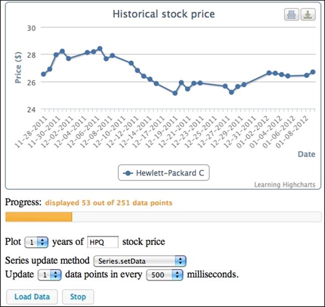
As we can see, there are multiple selection boxes to choose from: how many years of historical stock price to replay, how many data points to update in each iteration, and how long the wait is in between each update. Most importantly, we can choose which series update method should be used; it is interesting to observe the behavioral difference between them, especially during the whole replay. This demo is also available on my website at http://www.joekuan.org/Learning_Highcharts/Chapter_10/Example_2.html. I strongly recommend readers give it a go. Before we look into each update approach, let's find out how to construct this continuous series update process.
Continuous series update
Once we enter a stock symbol and select the number of years of stock prices to replay, we can click on the Load Data button to retrieve the price data. Once the data arrives, a confirmation dialog pops up with a Start button to kick-start the process. The following is the action code for the Start button:
// Create a named space to store the current user
// input field values and the timeout id
$.histStock = {};
$('#Start').button().click(function() {
chart.showLoading("Loading stock price ... ");
// Remove old timeout if exists
$.histStock.timeoutID &&
clearTimeout($.histStock.timeoutID);
var symbol =
encodeURIComponent($('#symbol').val().toLowerCase());
var years = encodeURIComponent($('#years').val());
// Remember current user settings and initialise values
// for the run
$.histStock = {
// First loop start at the beginning
offset: 0,
// Number of data pts to display in each iteration
numPoints: 30,
// How long to wait in each iteration
wait: parseInt($('#updateMs').val(), 10),
// Which Highcharts method to update the series
method: $('#update').val(),
// How many data points to update in each iteration
update: parseInt($('#updatePoints').val(), 10)
};
// Clean up old data points from the last run
chart.series.length && chart.series[0].setData([]);
// Start Ajax query to get the stock history
$.getJSON('./histStock.php?symbol=' + symbol +
'&years=' + years,
function(stockData) {
// Got the whole period of historical stock data
$.histStock.name = stockData.name;
$.histStock.data = stockData.rows;
chart.hideLoading();
// Start the chart refresh
refreshSeries();
}
);
})
We first create a variable, histStock, under the jQuery namespace, that is accessed by various parts within the demo. The histStock variable holds the current user's inputs and the reference to the refresh task. Any changes from the user interface update$.histStock, so the series update responds accordingly.
Basically, when the Start button is clicked, we initialize the $.histStock variable and start an Ajax query with the stock symbol and number-of-years parameters. Then, when the stock price data returns from the query, we store the result into the variable. We then call refreshSeries, which calls itself by the setting via a timer routine. The following code is the simplified version of the method:
var refreshSeries = function() {
var i = 0, j;
// Update the series data according to each approach
switch ($.histStock.method) {
case 'setData':
....
break;
case 'renewSeries':
....
break;
case 'update':
....
break;
case 'addPoint':
....
break;
}
// Shift the offset for the next update
$.histStock.offset += $.histStock.update;
// Update the jQuery UI progress bar
....
// Finished
if (i == $.histStock.data.length) {
return;
}
// Setup for the next loop
$.histStock.timeoutID =
setTimeout(refreshSeries, $.histStock.wait);
};
Inside refreshSeries, it inspects the settings inside the $.histStock variable and updates the series depending on the user's choice. Once the update is done, we increment the offset value, which is at the start position for copying the stock result data into the chart. If the counter variable i hits the end of the stock data, then it simply exits the method. Otherwise, it will call the JavaScript timer function to set up the next loop. The next goal is to review how each update method is performed.
Testing the performance of various Highcharts methods
There are four techniques for updating the series data: Series.setData, Series.remove/Chart.addSeries, Point.update, and Series.addPoint. We measure the performance for all four techniques in terms of CPU and memory usage with the Resource Monitor tool. Each method is timed when replaying the stock prices for the past year along with 0.5 seconds of waiting time between each update. We repeated the same run twice and recorded the average. The experiment is repeated on a selection of browsers: Firefox, Chrome, Internet Explorer 8 and 11, and Safari. Although IE 8 does not support SVG and only supports VML, it is important to use it in the experiment because Highcharts' implementation is compatible with IE 8. One thing that we instantly notice is the same chart on IE8 is not as appealing as in SVG.
Note
The whole experiment is running on a PC with Windows 7 Ultimate installed, and the hardware is 4GB RAM Core 2 Duo 3.06 GHz with an Intel G41 Graphics chipset.
The browser versions are Firefox 31.0, Chrome 36.0.1985, IE11 11.0.9600, Safari 5.1.7, and IE8 8.0.6001. Safari may not be a true performance indicator as it is rather old for a PC platform.
It is no longer possible to install/run IE8 on Windows 7, as Microsoft has discontinued support. Although we can set the user agent on IE11 to IE8 and conduct the experiment, it doesn't offer a true reflection of IE8 performance. Therefore, we set up another system running Windows XP with IE8 on identical hardware.
In the following sections, each series update approach is explained and a performance comparison is presented between the browsers. Readers must not use the result as a guide to the browser's general performance, which is derived from running a myriad of tests in a number of areas. What we are experimenting with here is simply how Highcharts performs on each browser in terms of SVG animations.
Note
Note that the results are different compared to what was presented in the previous edition. This is mainly due to using a more up-to-date version of Highcharts: we use 4.0.3 in this experiment, whereas 2.2.24 is documented in the previous edition.
Applying a new set of data with Series.setData
We can apply a new set of data to an existing series using the Series.setData method:
setData (Array<Mixed> data, [Boolean redraw])
The data can be an array of one dimensional data, an array of x and y value pairs, or an array of data point objects. Note that this method is the simplest form of all the approaches, and doesn't provide any animation effects at all. Here is how we use the setDatafunction in our example:
case 'setData':
var data = [];
// Building up the data array in the series option
for (i = $.histStock.offset, j = 0;
i < $.histStock.data.length &&
j < $.histStock.numPoints; i++, j++) {
data.push([
$.histStock.data[i].date,
$.histStock.data[i].price ]);
}
if (!chart.series.length) {
// Insert the very first series
chart.addSeries({
name: $.histStock.name,
data: data
});
} else {
// Just update the series with
// the new data array
chart.series[0].setData(data, true);
}
break;
There are two sets of animations appearing in the chart: x-axis labels moving from the center of the chart and the data points in the series. Although the series scrolls smoothly, the movement of the x-axis labels appears too quickly and becomes choppy. The following graph shows the performance comparison when using the setData method across the browsers:
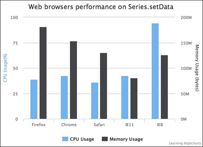
There are minor differences in terms of CPU usage, except for IE8 that runs on VML instead of SVG. IE8 consumed much higher CPU usage and took much longer to finish. The animation lagged throughout the experiment. Among the browsers, Safari is marginally the best. Out of all the browsers, Firefox has the highest memory footprint, whereas IE 11 had the smallest. Perhaps a slight surprise is that Safari has a better performance than Firefox and is also very close to Chrome.
Using Series.remove and Chart.addSeries to reinsert series with new data
Alternatively, we can remove the whole series with the Series.remove method, then rebuild the series options with the data and reinsert a new series using Chart.addSeries. The downside of this approach is that the internal index for the default colors and point symbols is incremented, as we found in the earlier example. We can compensate for that by specifying the color and the marker options. Here is the code for the addSeries method:
case 'renewSeries':
var data = [];
for (i = $.histStock.offset, j = 0;
i < $.histStock.data.length &&
j < $.histStock.numPoints; i++, j++) {
data.push([ $.histStock.data[i].date,
$.histStock.data[i].price ]);
}
// Remove all the existing series
if (chart.series.length) {
chart.series[0].remove();
}
// Re-insert a new series with new data
chart.addSeries({
name: $.histStock.name,
data: data,
color: chart.options.colors[0],
marker: {
symbol: chart.options.symbols[0]
}
});
break;
In this experiment, we use the refresh rate for every half-second, which is shorter than the time span of the default animation. Therefore the series update appears erratic without much animation, as in setData. However, if we change the refresh rate to 3 seconds or more, then we can see the series being redrawn from the left-hand to the right-hand side in each update. Unlike other methods, the x-axis labels are updated without any animations:
The following graph shows the performance comparison when using the addSeries method across the browsers:
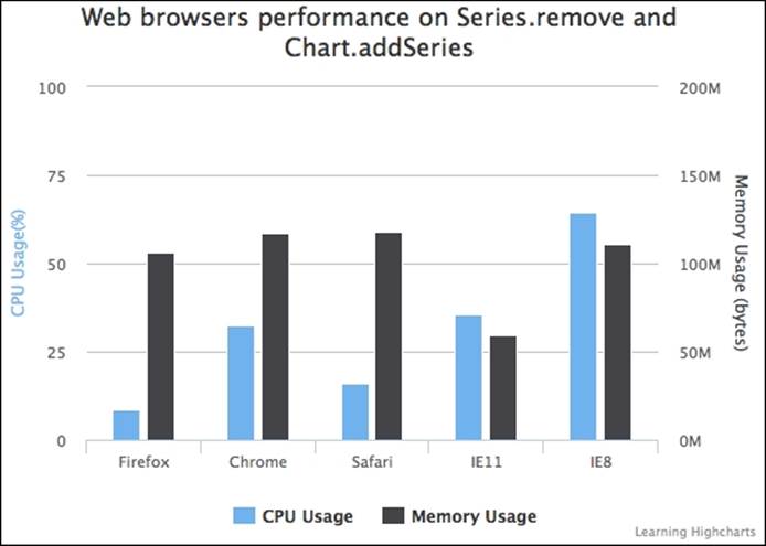
Since this approach seems to have the least animation, the CPU usage levels are relatively low across all the browsers, as is the memory usage. As expected, IE8 consumes the most resources. Next is IE11, which is roughly on a par with Chrome. The most unusual result is that Firefox requires significantly less CPU usage than both Chrome and Safari when there is little animation. We will investigate this further in a later section.
Updating data points with Point.update
We can update individual data points with the Point.update method. The update method has a similar prototype to setData, which accepts a single value, an array of x and y values, or a data point object. Each update call can be redrawn into the chart with or without animation:
update ([Mixed options], [Boolean redraw], [Mixed animation])
Here is how we use the Point.update method: we traverse through each point object and call its member function. In order to save CPU time, we set the redraw parameter to false and call Chart.redraw after the last data point is updated:
case 'update':
// Note: Series can be already existed
// at start if we click 'Stop' and 'Start'
// again
if (!chart.series.length ||
!chart.series[0].points.length) {
// Build up the first series
var data = [];
for (i = $.histStock.offset, j = 0;
i < $.histStock.data.length &&
j < $.histStock.numPoints; i++, j++) {
data.push([
$.histStock.data[i].date,
$.histStock.data[i].price ]);
}
if (!chart.series.length) {
chart.addSeries({
name: $.histStock.name,
data: data
});
} else {
chart.series[0].setData(data);
}
} else {
// Updating each point
for (i = $.histStock.offset, j = 0;
i < $.histStock.data.length &&
j < $.histStock.numPoints; i++, j++) {
chart.series[0].points[j].update([
$.histStock.data[i].date,
$.histStock.data[i].price ],
false);
}
chart.redraw();
}
break;
Point.update animates each data point vertically. It gives a wavy effect overall as the graph is progressively updated. In the same way as the setData method, the labels approach the x-axis line diagonally. The following graph shows the performance comparison of the Point.update method across the browsers:
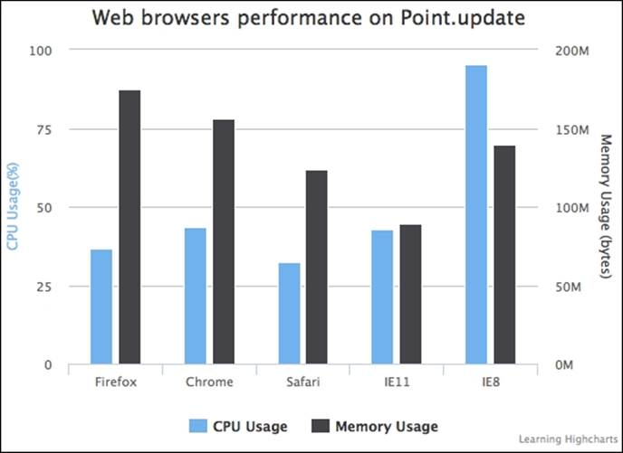
As the animations are pretty much the same as the setData approach, the performance shown in the preceding chart is very close to the results of the setData performance experiment.
Removing and adding data points with Point.remove and Series.addPoint
Instead of updating each individual data point, we can use Point.remove to remove data points within the series.data array and use Series.addPoint to add new data points back into the series:
remove ([Boolean redraw], [Mixed animation])
addPoint (Object options, [Boolean redraw], [Boolean shift],
[Mixed animation])
As for the time series data, we can use addPoint along with the shift parameter set to true, which will automatically shift the series point array:
case 'addPoint':
// Note: Series can be already existed at
// start if we click 'Stop' and 'Start' again
if (!chart.series.length ||
!chart.series[0].points.length) {
// Build up the first series
var data = [];
for (i = $.histStock.offset, j = 0;
i < $.histStock.data.length &&
j < $.histStock.numPoints; i++, j++) {
data.push([
$.histStock.data[i].date,
$.histStock.data[i].price ]);
}
if (!chart.series.length) {
chart.addSeries({
name: $.histStock.name,
data: data
});
} else {
chart.series[0].setData(data);
}
// This is different, we don't redraw
// any old points
$.histStock.offset = i;
} else {
// Only updating the new data point
for (i = $.histStock.offset, j = 0;
i < $.histStock.data.length &&
j < $.histStock.update; i++, j++) {
chart.series[0].addPoint([
$.histStock.data[i].date,
$.histStock.data[i].price ],
false, true );
}
chart.redraw();
}
break;
The following graph shows the performance comparison of the addPoint method across the browsers:
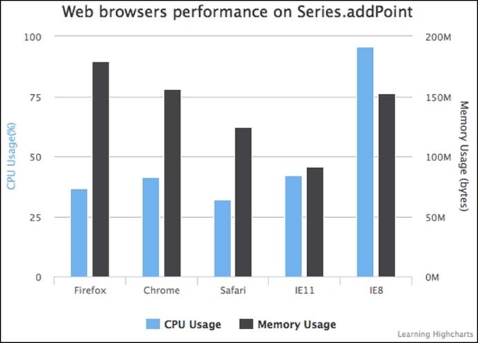
There is hardly any difference between the addPoint method, setData, and update in terms of both CPU and memory usage.
Exploring SVG animation performance on browsers
So far, we have seen that the level of CPU usage increased with animations. However, the question left unanswered is why Safari had lower CPU consumption than Chrome and Firefox. A number of browser benchmark suites have been run on the test machine to confirm the general consensus that the Firefox and Chrome browsers have overall better performance than Safari.
Note
All browsers were benchmarked with SunSpider http://www.webkit.org/perf/sunspider/sunspider.html, Google's V8 Benchmark suite http://octane-benchmark.googlecode.com/svn/latest/index.html, and Peacekeeper http://peacekeeper.futuremark.com/.
Nonetheless, there is one particular area where Safari has better performance than the other browsers: SVG animations; this is reflected in our previous experiments. Here, we use a benchmark test, written by Cameron Adams, that is especially designed to measure SVG animations with bouncing particles in frames per second. The test (HTML5 versus Flash: Animation Benchmarking http://www.themaninblue.com/writing/perspective/2010/03/22/) was originally written to compare various HTML5 animation technologies against Flash. Here, we run the SVG test with the Chrome and Safari browsers. The following is a Safari screenshot running with a 500-particle test:
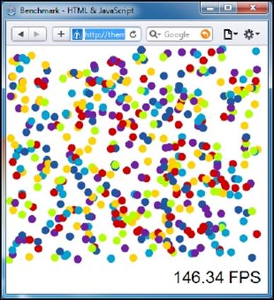
As for Chrome, the test is running at around 165 FPS. We repeat the assessment with various numbers of particles on both browsers. The following graph summarizes the performance difference with regard to SVG animations:
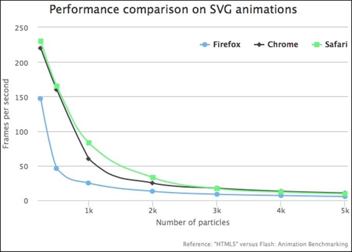
As we can see, Safari manages a higher frame rate with particles fewer than 3,000. After that, the Safari performance starts to degrade in parallel with Chrome. Firefox has a consistently lower frame rate and the frame rate drops considerably compared to the others.
This leads to another inevitable question: why is there such a difference, given that both browsers run with the same code base of webkit? It is difficult to pinpoint where the discrepancy lies. However, one of the few differences between both products is the JavaScript engines, which may affect that area, or possibly it is caused by the minor difference in the webkit version. In addition, other specific SVG performance tests in http://jsperf.com have also been run, in which Safari again had a higher score than Chrome.
In the next section, we will see how Highcharts' performance corresponds to the data size.
Comparing Highcharts' performance on large datasets
Our final test is to observe how Highcharts performs with large data sets. In this experiment, we are going to plot scatter series across various data sizes and observe the time taken to display the data. We chose to use the scatter series because, when there is a very large data set with tens of thousands of samples, the user is likely to plot only data points on the chart. Here is the simplified code illustrating how we do it:
var data = [];
// Adjust for each experiment
var num = 0;
if (location.match(/num=/)) {
var numParam = location.match(/num=([^&]+)/)[1];
num = parseInt(numParam, 10);
}
for (var i = 0; i < num; i ++) {
data.push([ Math.random() * 1000000000, Math.random() * 50000 ]);
}
var start = new Date().getTime();
var chart = new Highcharts.Chart({
chart: {
renderTo: 'container',
showAxes: true,
animation: false,
....
},
series: [{
type: 'scatter',
data: data
}],
tooltips: {
enabled: false
},
plotOptions: {
series: {
turboThreshold: 1,
animation: false,
enableMouseTracking: false
}
}
}, function() {
var stop = new Date().getTime();
// Update the time taken label
$('#time').append(((stop - start) / 1000) + " sec");
});
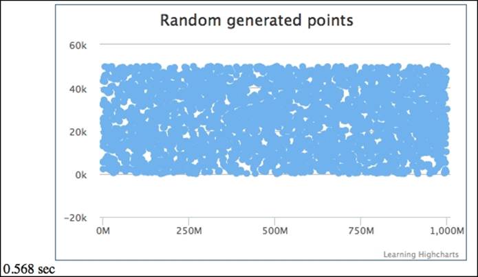
The page is loaded with URL parameters to specify the dataset size. We start timing before the chart object is created and stop at the callback handler in the constructor, Chart, method. We repeat the experiment with the same dataset size on each browser used in the previous benchmarking experiments. Once the page is loaded on a browser, the dataset is randomly generated. Then, timing begins just before the chart object is constructed and stops at the callback method in Highcharts. The chart function is executed when the chart is finally displayed onto the screen. The following screenshot shows the time taken to display 3,000 data points on the Safari browser:
The following graph illustrates Highcharts' performance on different browsers with various dataset sizes. The lower the line, the less time it takes to display the number of data points, which indicates better performance:
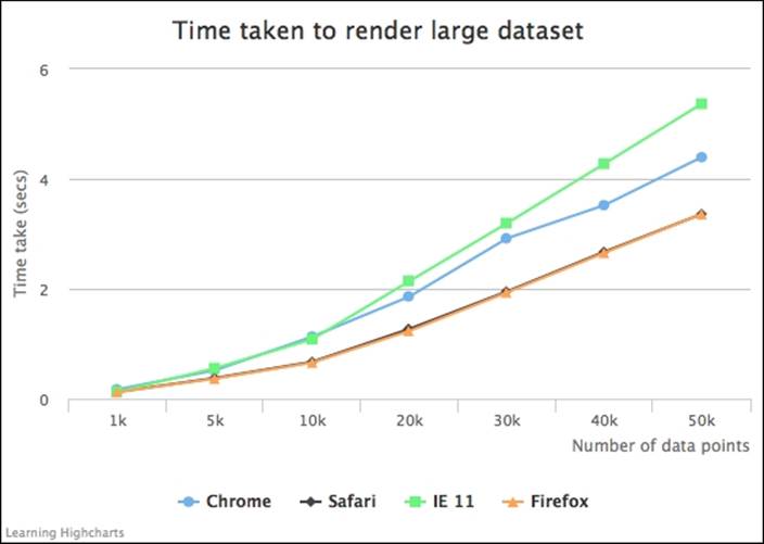
None of the browsers take particularly long to display large datasets. This shows the impressive scalable performance of Highcharts. Even IE 11, which is consistently slower in all tests, only takes 5.3 seconds to render 50,000 data points. As for smaller datasets, there is hardly any difference in timing. Both Firefox and Safari have very similar results, although Firefox is marginally better. This is due to the fact that there is no animation in scatter series and Firefox generally performs better without SVG animation. This also supports our findings in the least animated addSeries experiment, where Firefox required less CPU usage. As for Chrome, its performance is roughly equidistant between Safari/Firefox and IE 11.
From all these experiments, we can conclude that Safari performs the best with Highcharts (on a Windows PC), particularly when there are a lot of SVG animations in the chart. If a chart is static, then Firefox gives the best performance. IE 11 has the best memory utilization among the browsers but runs slower. Chrome achieves a consistent mid-range performance. We must stress that SVG is only one of the many areas of performance testing and Chrome has outperformed other browsers in the benchmark score.
Summary
In this chapter, we studied the Highcharts APIs, from the class model to applying them in applications. Then we performed a comprehensive study of the different techniques for updating a chart series in Highcharts, and carried out an experiment to analyze the difference in their performance. Finally, the chapter finished by analyzing the speed of different web browsers when rendering data points with regard to different sizes of large datasets.
In the next chapter, we will look into Highcharts events handling, which is closely related to Highcharts APIs.
All materials on the site are licensed Creative Commons Attribution-Sharealike 3.0 Unported CC BY-SA 3.0 & GNU Free Documentation License (GFDL)
If you are the copyright holder of any material contained on our site and intend to remove it, please contact our site administrator for approval.
© 2016-2026 All site design rights belong to S.Y.A.