Learning Highcharts 4 (2015)
Chapter 4. Bar and Column Charts
In this chapter, we will start off by learning about column charts and their plotting options. Then, we will apply more advanced options for stacking and grouping columns together. After that, we will move on to bar charts by following the same example. Then, we will learn how to polish up a bar chart and apply tricks to turn a bar chart into mirror and gauge charts. Finally, a web page of multiple charts will be put together as a concluding exercise. In this chapter, we will cover the following:
· Introducing column charts
· Stacking and grouping a column chart
· Adjusting column colors and data labels
· Introducing bar charts
· Constructing a mirror chart
· Converting a single bar chart into a horizontal gauge chart
· Sticking the charts together
Note
Most of the content in this chapter remains the same as the first edition. All the examples have been run through with the latest version of Highcharts. Apart from the different color schemes, the resulting charts look the same as the screenshots presented in this chapter.
Introducing column charts
The difference between column and bar charts is trivial. The data in column charts is aligned vertically, whereas it is aligned horizontally in bar charts. Column and bar charts are generally used for plotting data with categories along the x axis. In this section, we are going to demonstrate plotting column charts. The dataset we are going to use is from the U.S. Patent and Trademark Office.
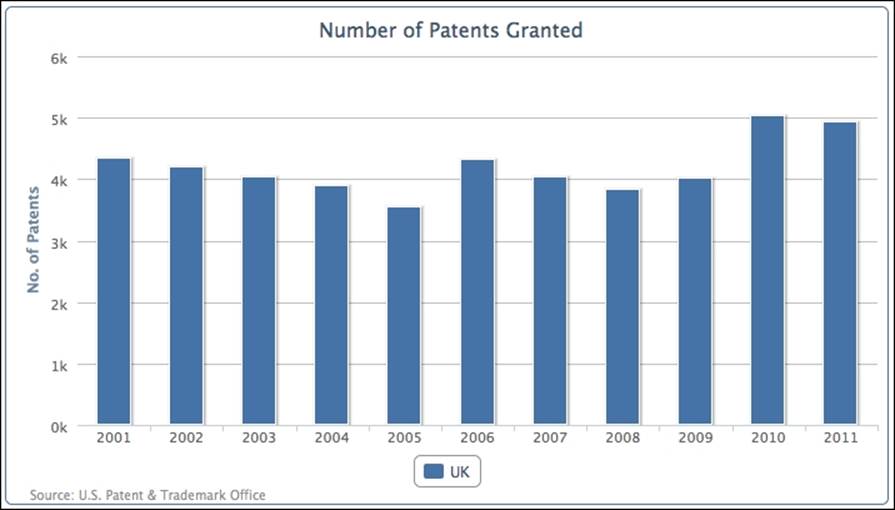
The graph just after the following code snippet shows a column chart for the number of patents granted in the United Kingdom over the last 10 years. The following is the chart configuration code:
chart: {
renderTo: 'container',
type: 'column',
borderWidth: 1
},
title: {
text: 'Number of Patents Granted',
},
credits: {
position: {
align: 'left',
x: 20
},
href: 'http://www.uspto.gov',
text: 'Source: U.S. Patent & Trademark Office'
},
xAxis: {
categories: [
'2001', '2002', '2003', '2004', '2005',
'2006', '2007', '2008', '2009', '2010',
'2011' ]
},
yAxis: {
title: {
text: 'No. of Patents'
}
},
series: [{
name: 'UK',
data: [ 4351, 4190, 4028, 3895, 3553,
4323, 4029, 3834, 4009, 5038, 4924 ]
}]
The following is the result that we get from the preceding code snippet:
Note
This data can be found in the online report All Patents, All Types Report by the Patent Technology Monitoring Team at http://www.uspto.gov/web/offices/ac/ido/oeip/taf/apat.htm.
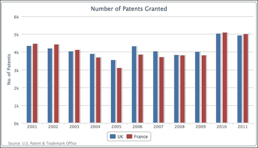
Let's add another series, France:
series: [{
name: 'UK',
data: [ 4351, 4190, 4028, .... ]
}, {
name: 'France',
data: [ 4456, 4421, 4126, 3686, 3106,
3856, 3720, 3813, 3805, 5100, 5022 ]
}]
The following chart shows both series aligned with each other side by side:
Overlapped column chart
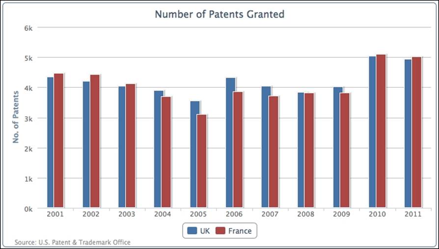
Another way to present multi-series columns is to overlap the columns. The main reason for this type of presentation is to avoid columns becoming too thin and over-packed if there are too many categories in the chart. As a result, it becomes difficult to observe the values and compare them. Overlapping the columns provides more space between each category, so each column can still retain its width.
We can make both series partially overlap each other with the padding options, as follows:
plotOptions: {
series: {
pointPadding: -0.2,
groupPadding: 0.3
}
},
The default setting for padding between columns (also for bars) is 0.2, which is a fraction value of the width of each category. In this example, we are going to set pointPadding to a negative value, which means that, instead of having padding distance between neighboring columns, we bring the columns together to overlap each other. groupPadding is the distance of group values relative to each category width, so the distance between the pair of UK and France columns in 2005 and 2006. In this example, we have set it to 0.3 to make sure the columns don't automatically become wider, because overlapping produces more space between each group. The following is the screenshot of the overlapping columns:
Stacking and grouping a column chart
Instead of aligning columns side by side, we can stack the columns on top of each other. Although this will make it slightly harder to visualize each column's values, we can instantly observe the total values of each category and the change of ratios between the series. Another powerful feature with stacked columns is to group them selectively when we have more than a couple of series. This can give a sense of proportion between multiple groups of stacked series.
Let's start a new column chart with the UK, Germany, Japan, and South Korea.
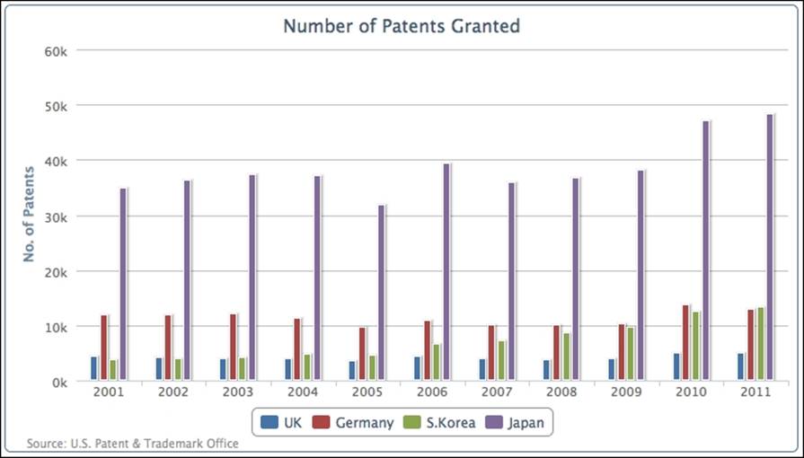
The number of patents granted for Japan is off-the-scale compared to the other countries. Let's group and stack the multiple series into Europe and Asia with the following series configuration:
plotOptions: {
column: {
stacking: 'normal'
}
},
series: [{
name: 'UK',
data: [ 4351, 4190, 4028, .... ],
stack: 'Europe'
}, {
name: 'Germany',
data: [ 11894, 11957, 12140, ... ],
stack: 'Europe'
}, {
name: 'S.Korea',
data: [ 3763, 4009, 4132, ... ],
stack: 'Asia'
}, {
name: 'Japan',
data: [ 34890, 36339, 37248, ... ],
stack: 'Asia'
}]
We declare column stacking in plotOptions as 'normal' and then for each column series assign a stack group name, 'Europe' and 'Asia', which produces the following graph:
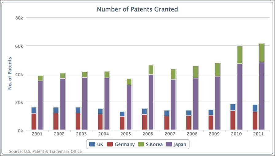
As we can see, the chart reduces four vertical bars into two and each column comprises two series. The first vertical bar is the 'Europe' group and the second one is 'Asia'.
Mixing the stacked and single columns
In the previous section, we acknowledged the benefit of grouping and stacking multiple series. There are also occasions when multiple series can belong to a group but there are also individual series in their own groups. Highcharts offers the flexibility to mix stacked and grouped series with single series.
Let's look at an example of mixing a stacked column and a single column together. First, we remove the stack group assignment in each series, as the default action for all the column series is to remain stacked together. Then, we introduce a new column series, US, and manually declare the stacking option as null in the series configuration to override the default plotOptions setting:
plotOptions: {
column: {
stacking: 'normal'
}
},
series: [{
name: 'UK',
data: [ 4351, 4190, 4028, .... ]
}, {
name: 'Germany',
data: [ 11894, 11957, 12140, ... ]
}, {
name: 'S.Korea',
data: [ 3763, 4009, 4132, ... ]
}, {
name: 'Japan',
data: [ 34890, 36339, 37248, ... ]
}, {
name: 'US',
data: [ 98655, 97125, 98590, ... ],
stacking: null
}
}]
The new series array produces the following graph:
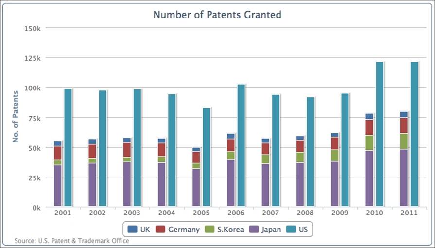
The first four series, UK, Germany, S. Korea, and Japan, are stacked together as a single column and US is displayed as a separate column. We can easily observe by stacking the series together that the number of patents from the other four countries put together is less than two-thirds of the number of patents from the US (the US is nearly 25 times that of the UK).
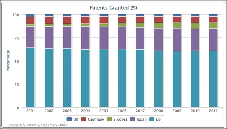
Comparing the columns in stacked percentages
Alternatively, we can see how each country compares in columns by normalizing the values into percentages and stacking them together. This can be achieved by removing the manual stacking setting in the US series and setting the global column stacking as'percent':
plotOptions: {
column: {
stacking: 'percent'
}
}
All the series are put into a single column and their values are normalized into percentages, as shown in the following screenshot:
Adjusting column colors and data labels
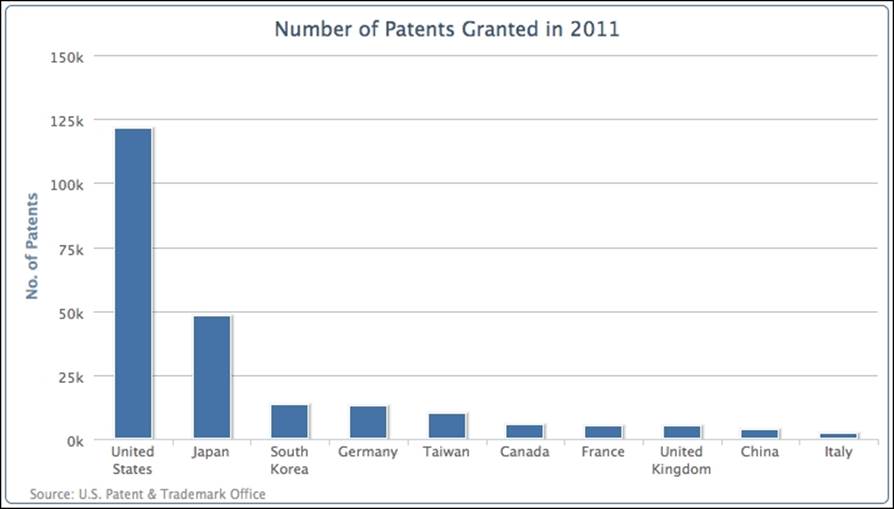
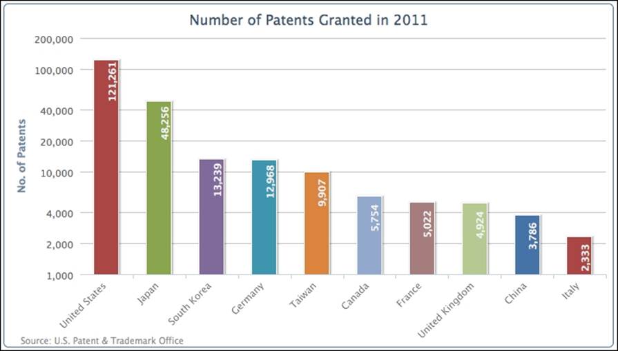
Let's make another chart; this time we will plot the top ten countries with patents granted. The following is the code to produce the chart:
chart: {
renderTo: 'container',
type: 'column',
borderWidth: 1
},
title: {
text: 'Number of Patents Granted in 2011'
},
credits: { ... },
xAxis: {
categories: [
'United States', 'Japan',
'South Korea', 'Germany', 'Taiwan',
'Canada', 'France', 'United Kingdom',
'China', 'Italy' ]
},
yAxis: {
title: {
text: 'No. of Patents'
}
},
series: [{
showInLegend: false,
data: [ 121261, 48256, 13239, 12968, 9907,
5754, 5022, 4924, 3786, 2333 ]
}]
The preceding code snippet generates the following graph:
There are several areas that we would like to change in the preceding graph. First, there are word wraps in the country names. In order to avoid that, we can apply rotation to the x-axis labels, as follows:
xAxis: {
categories: [
'United States', 'Japan',
'South Korea', ... ],
labels: {
rotation: -45,
align: 'right'
}
},
Secondly, the large value from 'United States' has gone off the scale compared to values from other countries, so we cannot easily identify their values. To resolve this issue we can apply a logarithmic scale onto the y axis, as follows:
yAxis: {
title: ... ,
type: 'logarithmic'
},
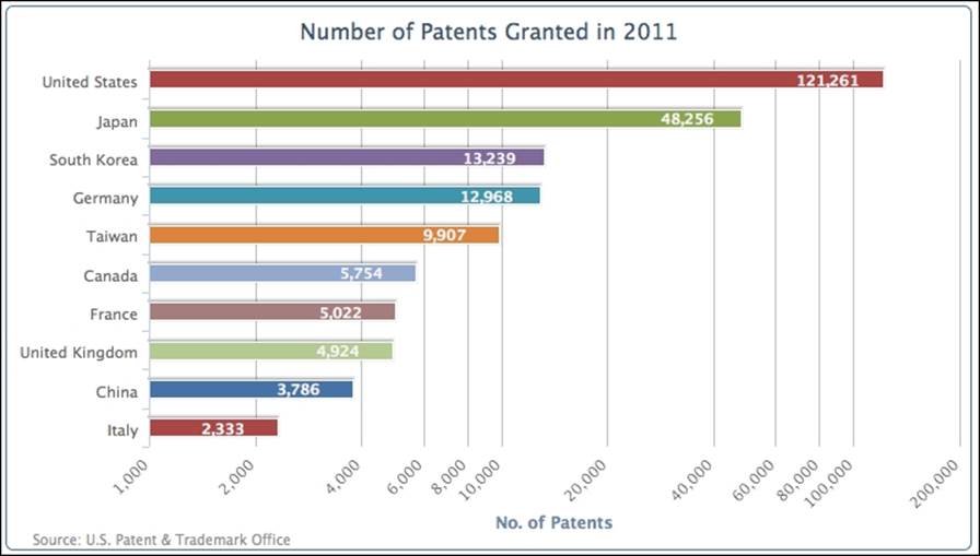
Finally, we would like to print the value labels along the columns and decorate the chart with different colors for each column, as follows:
plotOptions: {
column: {
colorByPoint: true,
dataLabels: {
enabled: true,
rotation: -90,
y: 25,
color: '#F4F4F4',
formatter: function() {
return
Highcharts.numberFormat(this.y, 0);
},
x: 10,
style: {
fontWeight: 'bold'
}
}
}
},
The following is the graph showing all the improvements:
Introducing bar charts
In Highcharts, there are two ways to specify bar charts—setting the series type to 'bar' or setting the chart.inverted option to true with column series (also true for switching from bar to column). Switching between column and bar is simply a case of swapping the display orientation between the y and x axes; all the label rotations are still intact. Moreover, the actual configurations still remain in the x and y axes. To demonstrate this, we will use the previous example along with the inverted option set to true, as follows:
chart: {
.... ,
type: 'column',
inverted: true
},
The preceding code snippet produces a bar graph, as follows:
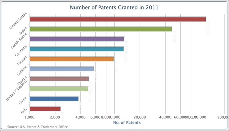
The rotation of the country name and the logarithmic axis labels still remains the same. In fact, now the value labels are muddled together and the category names are not aligned properly with the bars. The next step is to reset the label orientations to restore the graph to a readable form. We will simply swap the label setting from the y axis to the x axis:
xAxis: {
categories: [ 'United States',
'Japan', 'South Korea', ... ]
},
yAxis: {
.... ,
labels: {
rotation: -45,
align: 'right'
}
},
Then we will reset the default column dataLabel settings by removing the rotation option and re-adjusting the x and y positioning to align inside the bars:
plotOptions: {
column: {
..... ,
dataLabels: {
enabled: true,
color: '#F4F4F4',
x: -50,
y: 0,
formatter: ....,
style: ...
}
}
The following is the graph with fixed data labels:
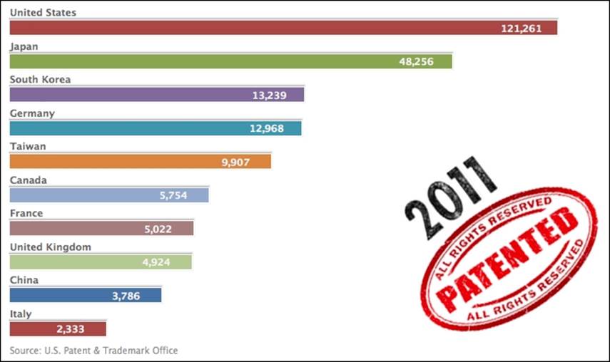
Giving the bar chart a simpler look
Here, we are going to strip the axes back to a minimal, bare presentation. We remove the whole y axis and adjust the category name above the bar. To strip off the y axis we will use the following code snippet:
yAxis: {
title: {
text: null
},
labels: {
enabled: false
},
gridLineWidth: 0,
type: 'logarithmic'
},
Then, we move the country labels above the bars. This is accompanied by removing the axis line and the interval tick line, then changing the label alignments and their x and y positioning as follows:
xAxis: {
categories: [ 'United States', 'Japan',
'South Korea', ... ],
lineWidth: 0,
tickLength: 0,
labels: {
align: 'left',
x: 0,
y: -13,
style: {
fontWeight: 'bold'
}
}
},
Since we changed the label alignments to go above the bars, the horizontal position of the bars (plot area) has shifted to the left-hand side of the chart to take over the old label positions. Therefore, we need to increase the spacing on the left to avoid the chart looking too packed. Finally, we add a background image, chartBg.png, to the plot area just to fill up the empty space, as follows:
chart: {
renderTo: 'container',
type: 'column',
spacingLeft: 20,
plotBackgroundImage: 'chartBg.png',
inverted: true
},
title: {
text: null
},
The following screenshot shows the new simple look of our bar chart:
Constructing a mirror chart
Using a mirror chart is another way of comparing two column series. Instead of aligning the two series as columns adjacent to each other, mirror charts align them in bars opposite to each other. Sometimes, this is used as a preferred way for presenting the trend between the two series.
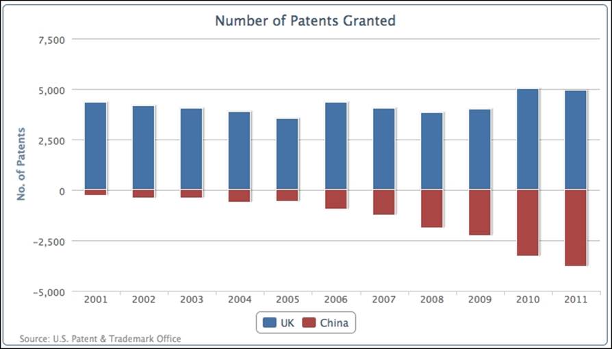
In Highcharts, we can make use of a stacked bar chart and change it slightly into a mirror chart for comparing two sets of data horizontally side by side. To do that, let's start with a new data series from Patents Granted, which shows the comparison between the United Kingdom and China with respect to the number of patents granted for the past decade.
The way we configure the chart is really a stacked-column bar chart, with one set of data being positive and another set being manually converted to negative values, so that the zero value axis is in the middle of the chart. Then we invert the column chart into a bar chart and label the negative range as positive. To demonstrate this concept, let's create a stacked column chart first, with both positive and self-made negative ranges, as follows:
chart: {
renderTo: 'container',
type: 'column',
borderWidth: 1
},
title: {
text: 'Number of Patents Granted'
},
credits: { ... },
xAxis: {
categories: [ '2001', '2002', '2003', ... ]
},
yAxis: {
title: {
text: 'No. of Patents'
}
},
plotOptions: {
series: {
stacking: 'normal'
}
},
series: [{
name: 'UK',
data: [ 4351, 4190, 4028, ... ]
}, {
name: 'China',
data: [ -265, -391, -424, ... ]
}]
The following screenshot shows the stacked-column chart with the zero value in the middle of the y axis:
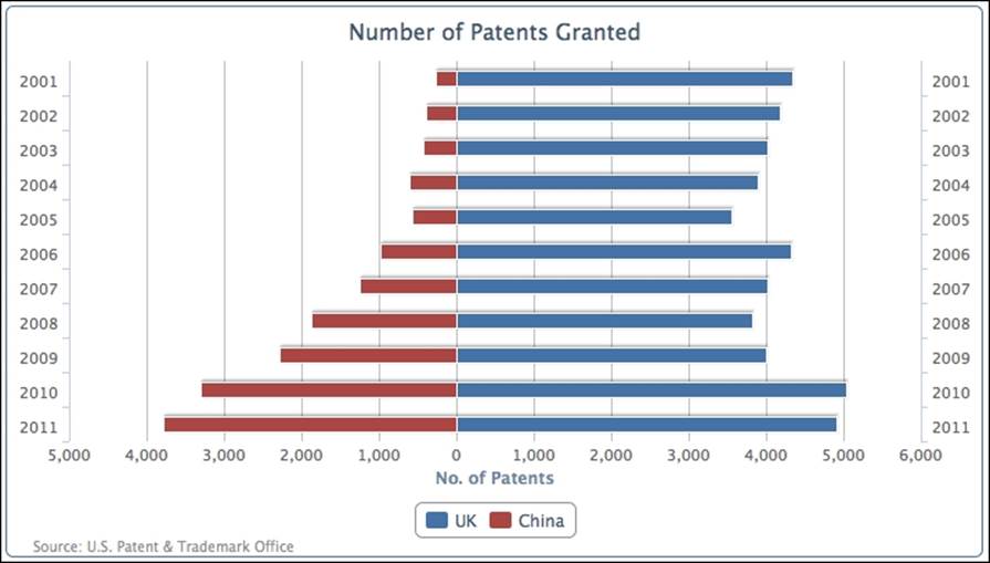
Then, we change the configuration into a bar chart with two x axes showing on each side with the same range. The last step is to define the y-axis label's formatter function to turn the negative labels into positive ones, as follows:
chart: {
.... ,
type: 'bar'
},
xAxis: [{
categories: [ '2001', '2002', '2003', ... ]
}, {
categories: [ '2001', '2002', '2003', ... ],
opposite: true,
linkedTo: 0
}],
yAxis: {
.... ,
labels: {
formatter: function() {
return
Highcharts.numberFormat(Math.abs(this.value), 0);
}
}
},
The following is the final bar chart for comparing the number of patents granted between the UK and China for the past decade:
Extending to a stacked mirror chart
We can also apply the same principle from the column example to stacked and grouped series charts. Instead of having two groups of stacked columns displayed next to each other, we can have all the series stacked together with the zero value to divide both groups. The following screenshot demonstrates the comparison between the European and Asian stacked groups in a bar chart:
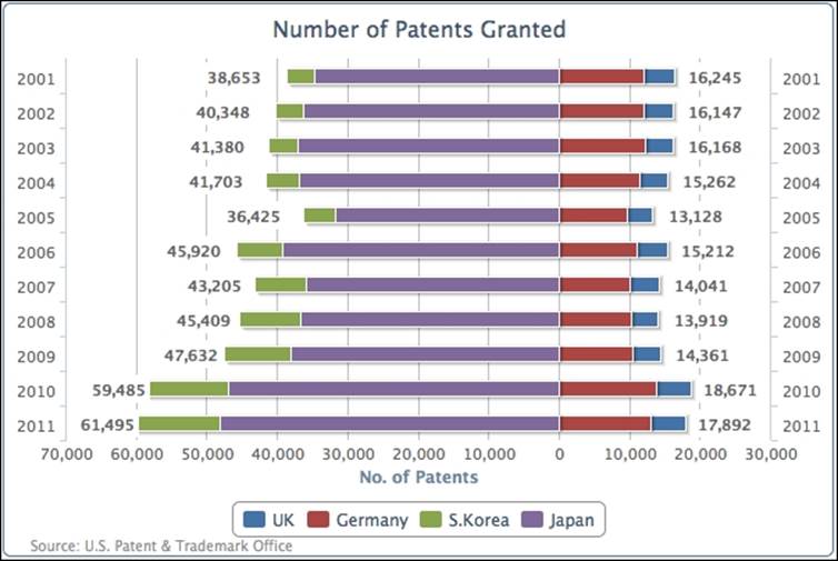
The South Korean and Japanese series are stacked together on the left-hand side (the negative side), whereas the UK and Germany are grouped on the right-hand side (the positive side). The only tricky bit in producing the preceding graph is how to output the data label boxes.
First of all, the South Korean and Japanese series data are manually set to negative values. Second, since South Korea and the UK are both the outer series of their own group, we enable the data label for these series. The following code snippet shows the series array configuration:
series: [{
name: 'UK',
data: [ 4351, 4190, 4028, ... ],
dataLabels : {
enabled: true,
backgroundColor: '#FFFFFF',
x: 40,
formatter: function() {
return
Highcharts.numberFormat(Math.abs(this.total), 0);
},
style: {
fontWeight: 'bold'
}
}
}, {
name: 'Germany',
data: [ 11894, 11957, 12140, ... ]
}, {
name: 'S.Korea',
data: [ -3763, -4009, -4132, ... ],
dataLabels : {
enabled: true,
x: -48,
backgroundColor: '#FFFFFF',
formatter: function() {
return
Highcharts.numberFormat(Math.abs(this.total), 0);
},
style: {
fontWeight: 'bold'
}
}
}, {
name: 'Japan',
data: [ -34890, -36339, -37248, ... ]
}]
Note that the definition for the formatter function is using this.total and not this.y, because we are using the position of the outer series to print the group's total value. The white background settings for the data labels are to avoid interfering with the y-axis interval lines.
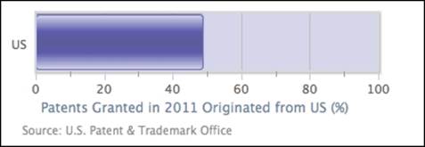
Converting a single bar chart into a horizontal gauge chart
A gauge chart is generally used as an indicator for the current threshold level, meaning the extreme values in the y axis are fixed. Another characteristic is the single value (one dimension) in the x axis that is the current time.
Next, we are going to learn how to turn a chart with a single bar into a gauge-level chart. The basic idea is to diminish the plot area to the same size as the bar. This means we have to fix the size of both the plot area and the bar, disregarding the dimensions of the container. To do that, we set chart.width and chart.height to some values. Then, we decorate the plot area with a border and background color to make it resemble a container for the gauge:
chart: {
renderTo: 'container',
type: 'bar',
plotBorderWidth: 2,
plotBackgroundColor: '#D6D6EB',
plotBorderColor: '#D8D8D8',
plotShadow: true,
spacingBottom: 43,
width: 350,
height: 120
},
We then switch off the y-axis title and set up a regular interval within the percentage, as follows:
xAxis: {
categories: [ 'US' ],
tickLength: 0
},
yAxis: {
title: {
text: null
},
labels: {
y: 20
},
min: 0,
max: 100,
tickInterval: 20,
minorTickInterval: 10,
tickWidth: 1,
tickLength: 8,
minorTickLength: 5,
minorTickWidth: 1,
minorGridLineWidth: 0
},
The final part is to configure the bar series, so that the bar width fits perfectly within the plot area. The rest of the series configuration is to brush up the bar with an SVG gradient effect, as follows:
series: [{
borderColor: '#7070B8',
borderRadius: 3,
borderWidth: 1,
color: {
linearGradient:
{ x1: 0, y1: 0, x2: 1, y2: 0 },
stops: [ [ 0, '#D6D6EB' ],
[ 0.3, '#5C5CAD' ],
[ 0.45, '#5C5C9C' ],
[ 0.55, '#5C5C9C' ],
[ 0.7, '#5C5CAD' ],
[ 1, '#D6D6EB'] ]
},
pointWidth: 50,
data: [ 48.9 ]
}]
Note
Multiple stop gradients are supported by SVG, but not by VML. For VML browsers, such as Internet Explorer 8, the number of stop gradients should be restricted to two.
The following is the final polished look of the gauge chart:
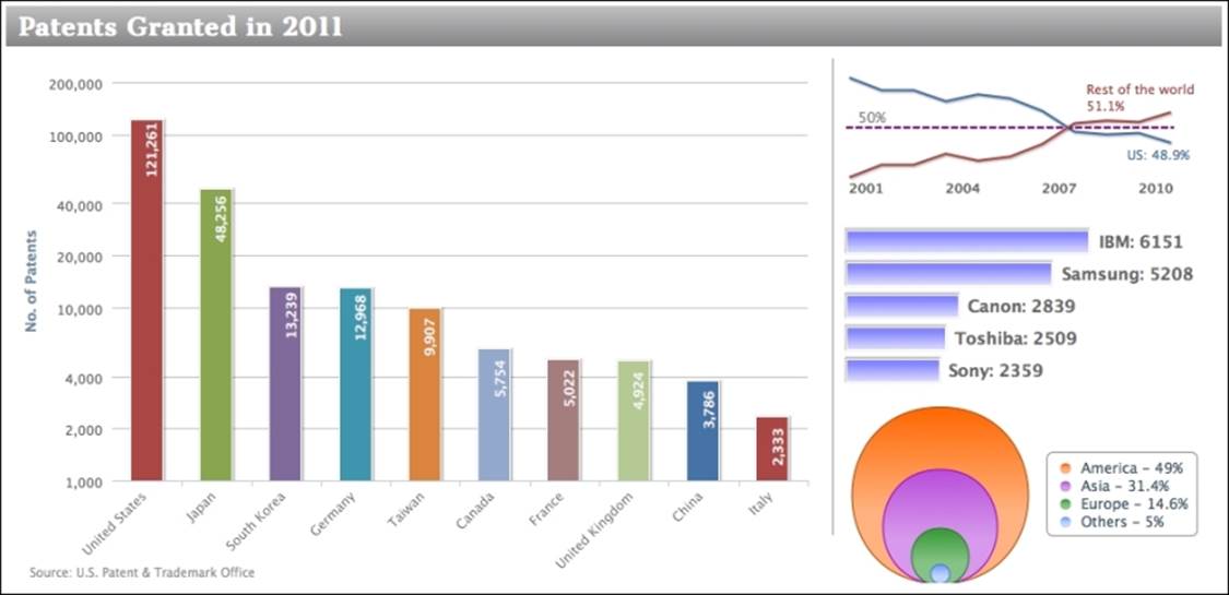
Sticking the charts together
In this section, we are building a page with a mixture of charts. The main chart is displayed in the left-hand side panel and three mini charts are displayed in the right-hand side panel in top-down order. The layout is achieved by HTML div boxes and CSS styles.
The left-hand side chart is from the multicolored column chart example that we discussed previously. All the axis lines and labels are disabled in the mini charts.
The first mini chart from the top is a two-series line chart with dataLabels enabled for the last point in each series only: the last point in the data array is a data object instead. The label color is set to the same color as its series. Then, plotLine is inserted into the y axis at the 50 percent value mark. The following is a sample of one of the series configurations:
pointStart: 2001,
marker: {
enabled: false
},
data: [ 53.6, 52.7, 52.7, 51.9, 52.4,
52.1, 51.2, 49.7, 49.5, 49.6,
{ y: 48.9,
name: 'US',
dataLabels: {
color: '#4572A7',
enabled: true,
x: -10,
y: 14,
formatter: function() {
return
this.point.name + ": " + this.y + '%';
}
}
}]
The second mini chart is a simple bar with data labels outside the categories. The style for the data label is set to a larger, bold font.
The last mini chart is basically a scatter chart where each series has a single point, so that each series can appear in the right-hand side legend. Moreover, we set the x value for each series to zero, so that we can have different sizes of data points, and stacked on top of each other as well. The following is an example for one of the scatter series configurations:
zIndex: 1,
legendIndex: 0,
color: {
linearGradient:
{ x1: 0, y1: 0, x2: 0, y2: 1 },
stops: [ [ 0, '#FF6600' ],
[ 0.6, '#FFB280' ] ]
},
name: 'America - 49%',
marker: {
symbol: 'circle',
lineColor: '#B24700',
lineWidth: 1
},
data: [
{ x: 0, y: 49, name: 'America',
marker: { radius: 74 }
} ]
The following is the screenshot of these multiple charts displayed next to each other:
Summary
In this chapter, we have learned how to use both column and bar charts. We utilized their options to achieve various presentation configurations of columns and bars for ease of comparison between sets of data. We also learned advanced configurations for different chart appearances such as mirror and gauge charts.
In the next chapter, we will explore the pie chart series.
All materials on the site are licensed Creative Commons Attribution-Sharealike 3.0 Unported CC BY-SA 3.0 & GNU Free Documentation License (GFDL)
If you are the copyright holder of any material contained on our site and intend to remove it, please contact our site administrator for approval.
© 2016-2026 All site design rights belong to S.Y.A.