R Data Mining Blueprints (2016)
Chapter 3. Visualize Diamond Dataset
Every data mining project is incomplete without proper data visualization. While looking at numbers and statistics it may tell a similar story for the variables we are looking at by different cuts, however, when we visually look at the relationship between variables and factors it shows a different story altogether. Hence data visualization tells you a message, that numbers and statistics fail to do that. From a data mining perspective, data visualization has many advantages, which can be summarized in three important points:
· Data visualization establishes a robust communication between the data and the consumer of the data
· It imprints a long lasting impact as people may fail to remember numbers but they do remember charts and shapes
· When data scales up to higher dimension, representation in numbers does not make sense, but visually it does
In this chapter, the reader will get to know the basics of data visualization along with how to create advanced data visualization using existing libraries in R programming language. Typically, data visualization approach can be addressed in two different ways:
· What do you want to display to the audience? Is it comparison, relationship, or any other functionality?
· How do you want to display the insights? Which one is the most intuitive way of chart or graph to display the insights?
Based on the preceding two points, let's have a look at the data visualization rules and theories behind each visualization, and then we are going to look at the practical aspect of implementing the graphs and charts using R Script.
From a functional point of view, the following are the graphs and charts which a data scientist would like the audience to look at to infer the information:
· Comparisons between variables: Basically, when it is needed to represent two or more categories within a variable, then the following charts are used:
· Bar chart
· Box plot
· Bubble chart
· Histogram
· Line graph
· Stacked bar chart
· Radar chart
· Pie chart
· Testing/viewing proportions: It is used when there is a need to display the proportion of contribution by one category to the overall level:
· Bubble chart
· Bubble map
· Stacked bar chart
· Word cloud
· Relationship between variables: Association between two or more variables can be shown using the following charts:
· Scatterplot
· Bar chart
· Radar chart
· Line graph
· Tree diagram
· Variable hierarchy: When it is required to display the order in the variables, such as a sequence of variables, then the following charts are used:
· Tree diagram
· Tree map
· Data with locations: When a dataset contains the geographic location of different cities, countries, and states names, or longitudes and latitudes, then the following charts can be used to display visualization:
· Bubble map
· Geo mapping
· Dot map
· Flow map
· Contribution analysis or part-to-whole: When it is required to display constituents of a variable and contribution of each categorical level towards the overall variable, then the following charts are used:
· Pie chart
· Stacked bar chart
· Donut chart
· Statistical distribution: In order to understand the variation in a variable across different dimensions, represented by another categorical variable, the following charts are used:
· Box plot
· Bubble chart
· Histogram
· Stem and leaf plot
· Unseen patterns: For pattern recognition and relative importance of data points on different dimensions of a variable, the following charts are used:
· Bar chart
· Box plot
· Bubble chart
· Scatterplot
· Spiral plot
· Line chart
· Spread of values or range: The following charts only give the spread of the data points across different bounds:
· Span chart
· Box plot
· Histogram
· Textual data representation: This is a very interesting way of representing the textual data:
· Word cloud
Keeping in mind the preceding functionalities that people use in displaying insights to the readers, we can see that one graph is referred by much functionality. In other words, one graph can be used in multiple functions to show the insights. These graphs and charts can be displayed by using various open source R packages, such as ggplot2, ggvis, rCharts, plotly, and googleVis by taking one open source dataset.
In the light of the previously mentioned ten points, the data visualization rules can be created to select the best representation depending on what you want to represent:
· Relationship between two variables can be represented using a scatterplot
· Relationship between more than two variables can be represented using a bubble chart
· For understanding the distribution of a single variable with few sample size, histogram is used
· For understanding the distribution of a single variable with large sample size, density plot is used
· Distribution of two variables can be represented using scatterplot
· For representation of distribution between 3 variables, 3D scatterplot is used
· Any variable with a time stamp, such as day, week, month, year, and so on, can be represented using line chart
· Time should always be on the horizontal axis and the metric to be measured should always be on the vertical axis
· Each graph should have a name and label so that the user does not have to go back to the data to understand what it is
In this chapter, we will primarily focus on the ggplot2 library and plotly library. Of course we will cover a few more interesting libraries to create data visualization. The graphics packages in R can be organized as per the following sequences:
· Plotting
· Graphic applications (such as effect ordering, large datasets and trees, and graphs)
· Graphics systems
· Devices
· Colors
· Interactive graphics
· Development
A detailed explanation of the various libraries supporting the previous functionalities can be found in the link https://cran.r-project.org/web/views/Graphics.html. For good visual object, we need more data points so that the density of the graphs can be more. In this context, we will be using two datasets, diamonds.csv and cars93.csv, to show data visualization.
Data visualization using ggplot2
There are two approaches to go ahead with data visualization, horizontally and vertically. Horizontal drill down means creating different charts and graphs using ggplot2 and vertical drill down implies creating one graph and adding different components to the graph. First, we will understand how to add and modify different components to a graph, and then we will move horizontally to create different types of charts.
Let's look at the dataset and libraries required to create data visualization:
> #getting the library
> library(ggplot2);head(diamonds);names(diamonds)
X carat cut color clarity depth table price x y z
1 1 0.23 Ideal E SI2 61.5 55 326 3.95 3.98 2.43
2 2 0.21 Premium E SI1 59.8 61 326 3.89 3.84 2.31
3 3 0.23 Good E VS1 56.9 65 327 4.05 4.07 2.31
4 4 0.29 Premium I VS2 62.4 58 334 4.20 4.23 2.63
5 5 0.31 Good J SI2 63.3 58 335 4.34 4.35 2.75
6 6 0.24 Very Good J VVS2 62.8 57 336 3.94 3.96 2.48
[1] "X" "carat" "cut" "color" "clarity" "depth" "table" "price" "x"
[10] "y" "z"
The ggplot2 library is also known as the grammar of graphics for data visualization. The process to start the graph requires a dataset and two variables, and then different components of a graph can be added to the base graph by using the + sign. Let's get into creating a nice visualization using the diamonds.csv dataset:
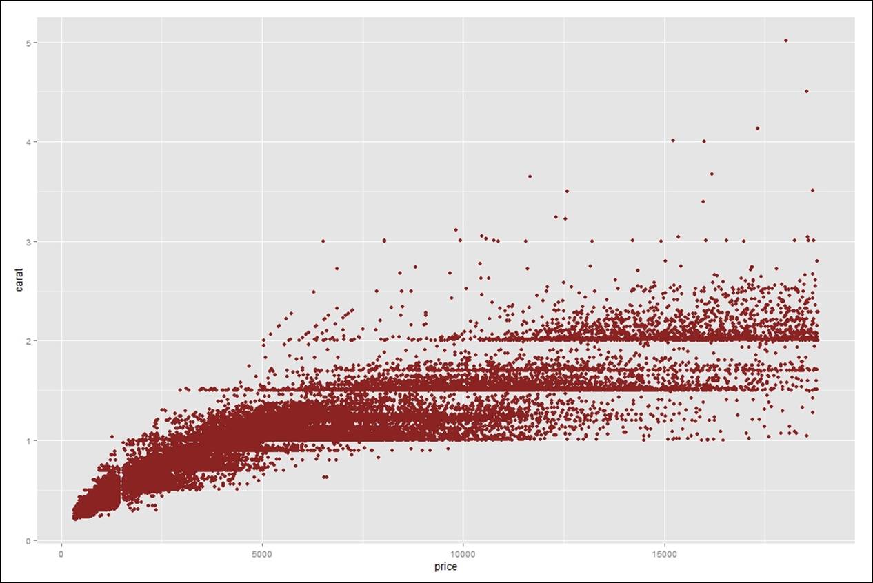
> #starting a basic ggplot plot object
> gg<-ggplot(diamonds,aes(price,carat))+geom_point(color="brown4")
> gg
In the preceding script, diamonds is the dataset, and carat and price are the two variables. Using ggplot function, the base graph is created and adding point to the ggplot, the object is stored in object gg.
Now we are going to add various components of a graph to make the ggplot graph more interesting:
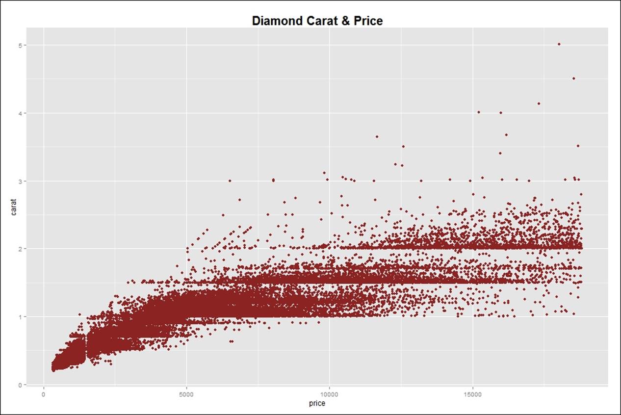
After creating the base plot, it is required to add title and label to the graph. This can be done using two functions, ggtitle or labs. Then, let's add a theme to the plot for customizing text element:
> #adding a title or label to the graph
> gg<-gg+ggtitle("Diamond Carat & Price")
> gg
> gg<-gg+labs("Diamond Carat & Price")
> gg
> #adding theme to the plot
> gg<-gg+theme(plot.title= element_text(size = 20, face = "bold"))
> gg
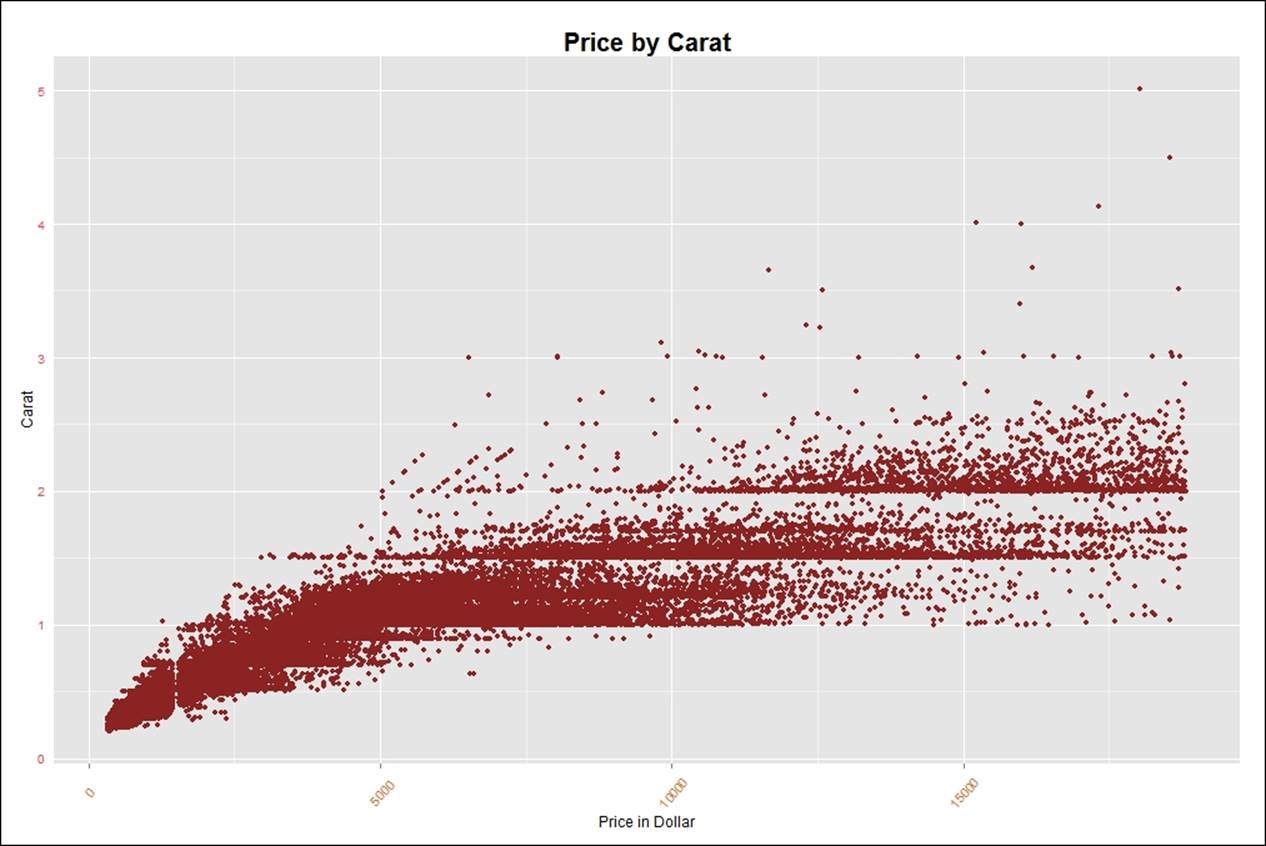
Currently, the graph looks a little congested. To make the graph more intuitive, we need to add labels to the x axis and y axis, removing ticks and text from any axis to make the graph more clear. Rotating text in any axis is required when the row name or the column name contains text or a large number which is difficult to read in full length:
> #adding labels to the graph
> gg<-gg+labs(x="Price in Dollar", y="Carat", )
> gg
> #removing text and ticks from an axis
> gg<-gg+theme(axis.ticks.y=element_blank(),axis.text.y=element_blank())
> gg
> gg<-gg + theme(axis.text.x=element_text(angle=50, size=10, vjust=0.5))
> gg
> gg<-gg + theme(axis.text.x=element_text(color = "chocolate", vjust=0.45),
+ axis.text.y=element_text(color = "brown1", vjust=0.45))
> gg
In order to focus on any specific portion of the plot, the x axis limit and y axis limit can be changed as follows. It also shows the number of rows removed while executing the limit on both the axes:
> #setting limits to both axis
> gg<-gg + ylim(0,0.8)+xlim(250,1500)
> gg
Warning message:
Removed 33937 rows containing missing values (geom_point).
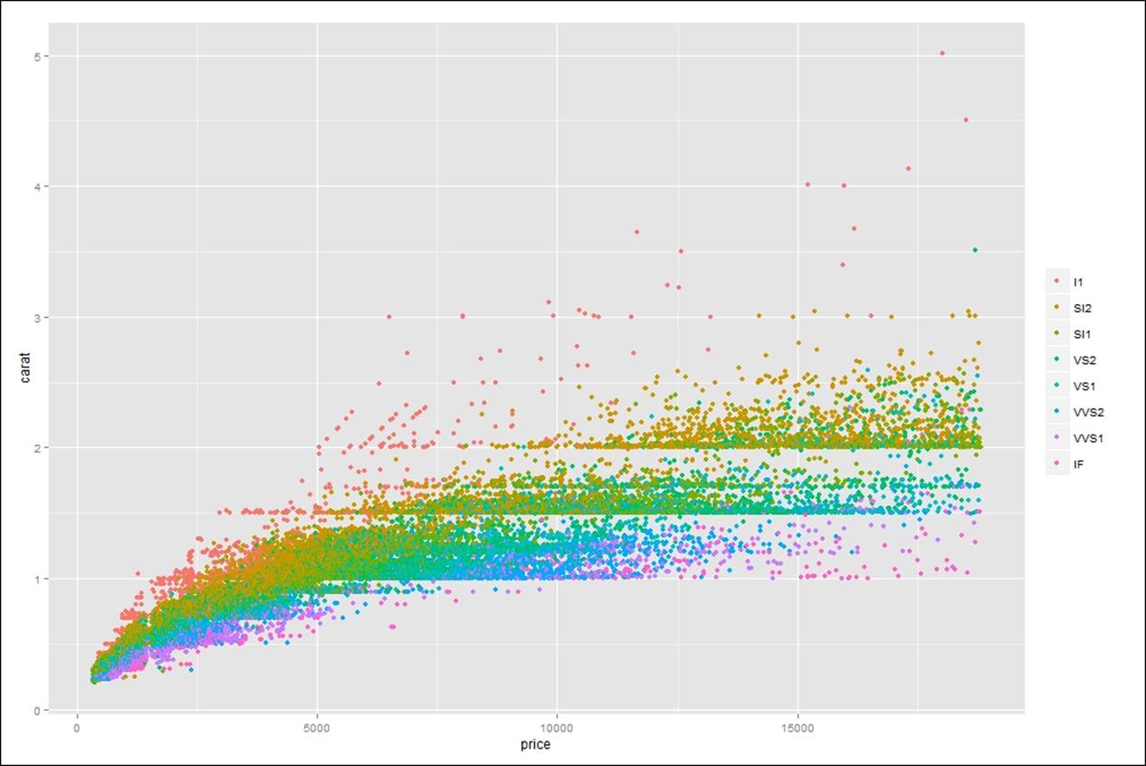
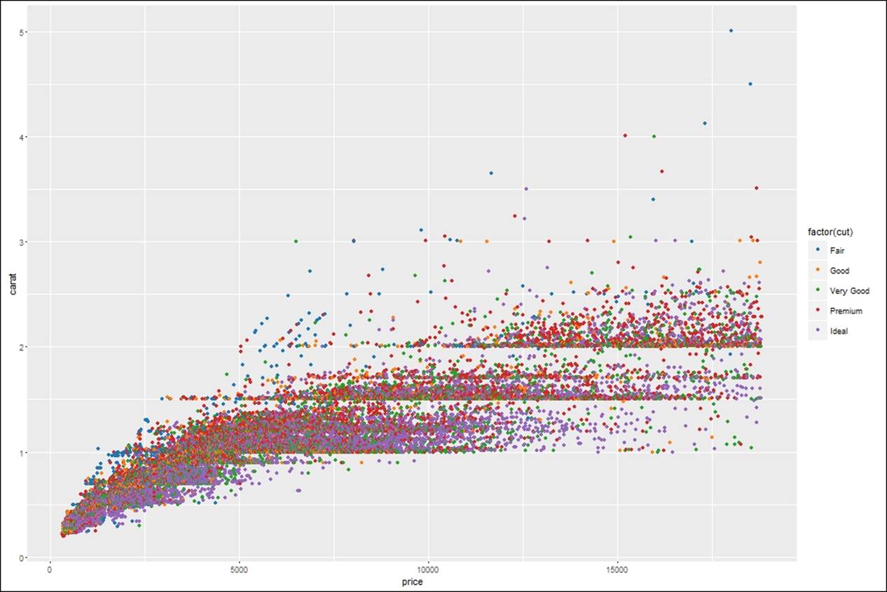
If both x axis and y axis represent continuous data, any third variable as a factor can be introduced to the ggplot object to set legends and look at the data how it is distributed across the factor variable:
> #how to set legends in a graph
> gg<-ggplot(diamonds,aes(price,carat,color=factor(cut)))+geom_point()
> gg
> gg<-ggplot(diamonds,aes(price,carat,color=factor(color)))+geom_point()
> gg
> gg<-ggplot(diamonds,aes(price,carat,color=factor(clarity)))+geom_point()
> gg
> gg<-gg+theme(legend.title=element_blank())
> gg
> gg<-gg+theme(legend.title = element_text(colour="darkblue", size=16,
+ face="bold"))+scale_color_discrete(name="By Different Grids of Clarity")
> #changing the backgroup boxes in legend
> gg<-gg+theme(legend.key=element_rect(fill='dodgerblue1'))
> gg
> #changing the size of the symbols used in legend
> gg<-gg+guides(colour = guide_legend(override.aes = list(size=4)))
> gg
> #changing the size of the symbols used in legend
> gg<-gg+guides(colour = guide_legend(override.aes = list(size=4)))
> gg
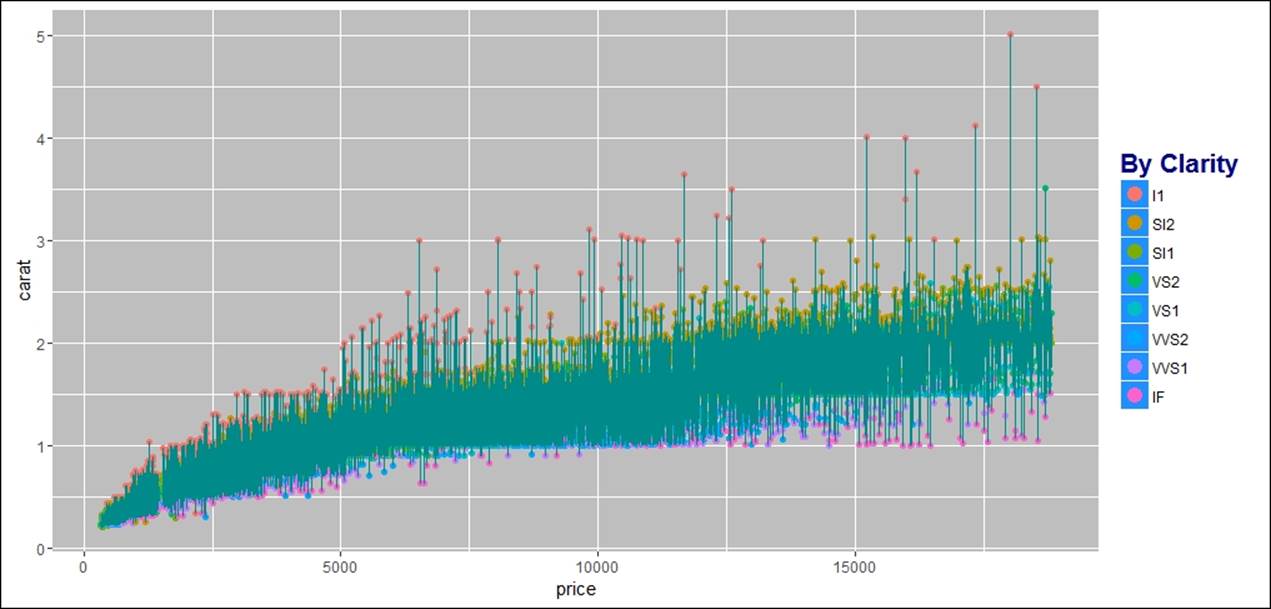
In addition to the previous visualization, it is required to connect the scatterplots and change the background. Add lines to the scatterplot in order to understand the sequence r pattern that exists between the variables which are related:
> #adding line to the data points
> gg<-gg+geom_line(color="darkcyan")
> gg
> #changing the background of an image
> gg<-gg+theme(panel.background = element_rect(fill = 'chocolate3'))
> gg
> #changing plot background
> gg<-gg+theme(plot.background = element_rect(fill = 'skyblue'))
> gg
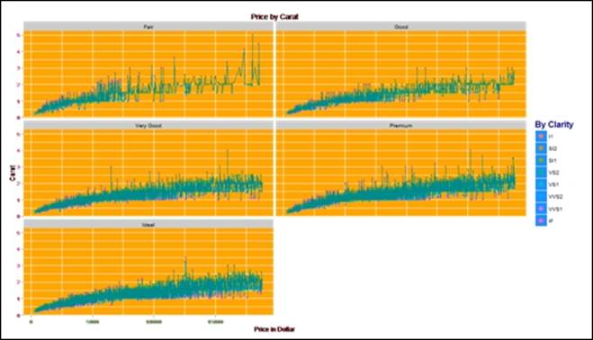
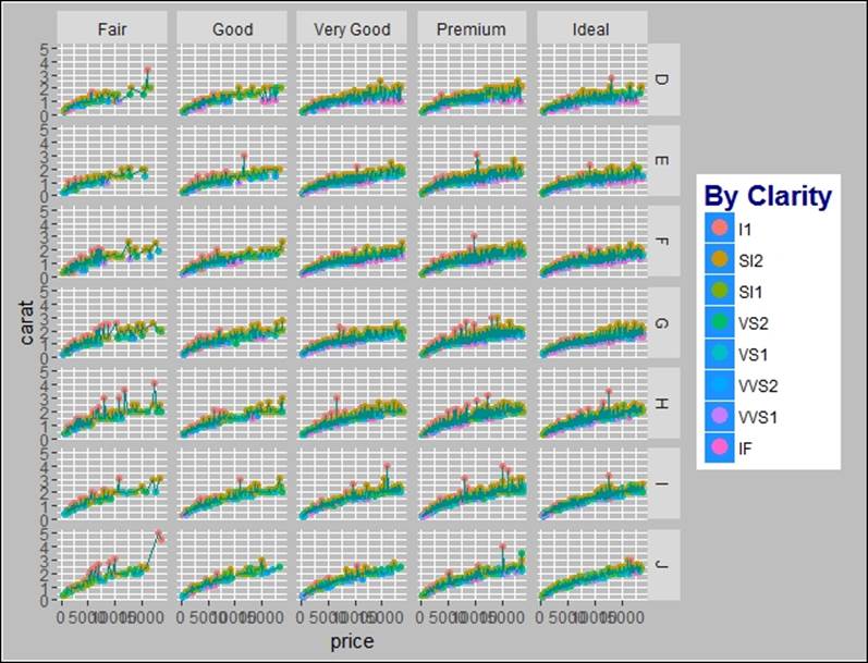
Another important aspect of data visualization is how to display multi-dimensional cuts in a plot. For example, in the diamonds datasets, we are currently looking at the relationship between the price of the diamond and the carat it contains. There are three more variables: cut, color, and clarity. It makes sense to understand if the relationship is consistent across those three variables. That means, understanding if we can plot the relationship between the carat and the price of the diamond by different cut, different color, and different clarity categories. Let's look at the distribution of the three categorical variables:
> table(diamonds$cut);table(diamonds$clarity);table(diamonds$color)
Fair Good Very Good Premium Ideal
1610 4906 12082 13791 21551
I1 SI2 SI1 VS2 VS1 VVS2 VVS1 IF
741 9194 13065 12258 8171 5066 3655 1790
D E F G H I J
6775 9797 9542 11292 8304 5422 2808
> #adding a multi-variable cut to the graph
> gg<-gg+facet_wrap(~cut, nrow=4)
> gg
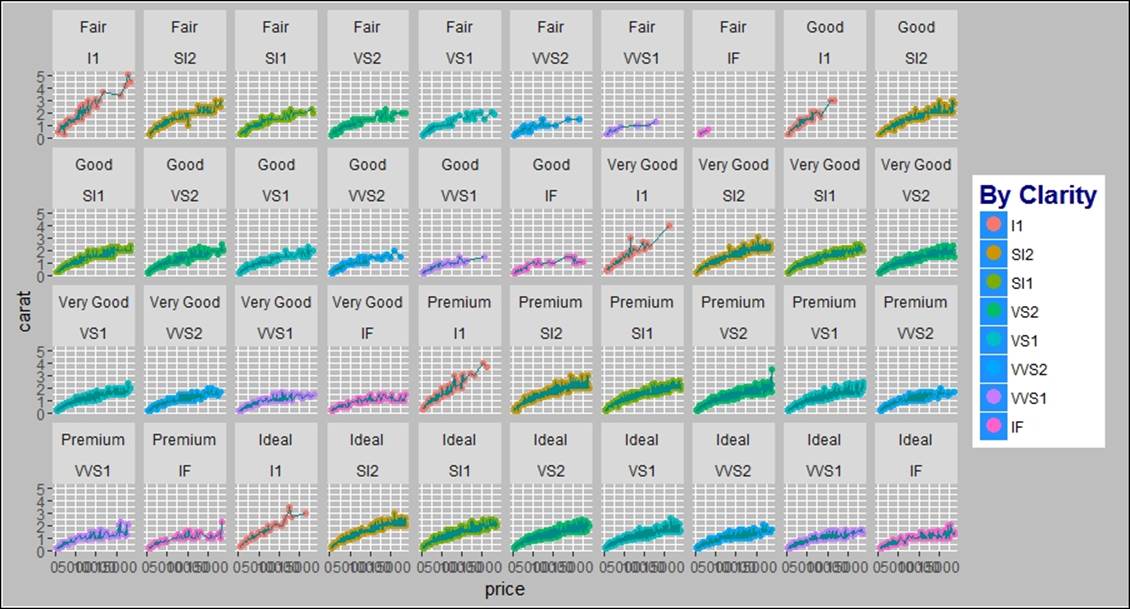
In the preceding graph, the cut variable is used to show the relationship between the carat and the price. The number of rows selected is four, to represent the graphs in a clear manner. If we add one more variable to the cut variable, that is clarity, the graph would be more intuitive and insightful:
> #adding two variables as cut to display the relationship
> gg<-gg+facet_wrap(~cut+clarity, nrow=4)
> gg
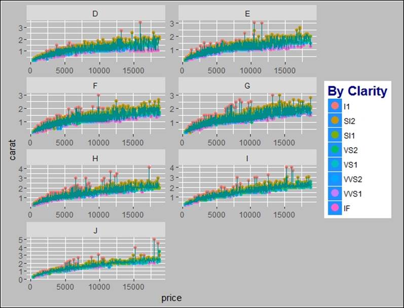
While creating the graphs using a multi-dimensional cut variable, it is not necessary that all the graphs would be on the same scale. In automatic mode, the scales become a standard for all the plots, hence, sometimes certain plots get compressed. Thus, it is required to make the graphs scale free in order to rearrange the scales based on observed values:
> #scale free graphs in multi-panels
> gg<-gg+facet_wrap(~color, ncol=2, scales="free")
> gg
Using the facet_grid() option, we can display the bi-variate relationship between two categorical variables using the ggplot2 library:
> #bi-variate plotting using ggplot2
> gg<-gg+facet_grid(color~cut)
> gg
There are certain external graphical themes which can be imported to the ggplot2 function for visualization, such as library(ggthemes). Tableau, which is a tool known for data visualization, its color, and themes, can also be used along with ggplots:
> #changing discrete category colors
> ggplot(diamonds, aes(price, carat, color=factor(cut)))+
+ geom_point() +
+ scale_color_brewer(palette="Set1")
> #Using tableau colors
> library(ggthemes)
> ggplot(diamonds, aes(price, carat, color=factor(cut)))+
+ geom_point() +
+ scale_color_tableau()
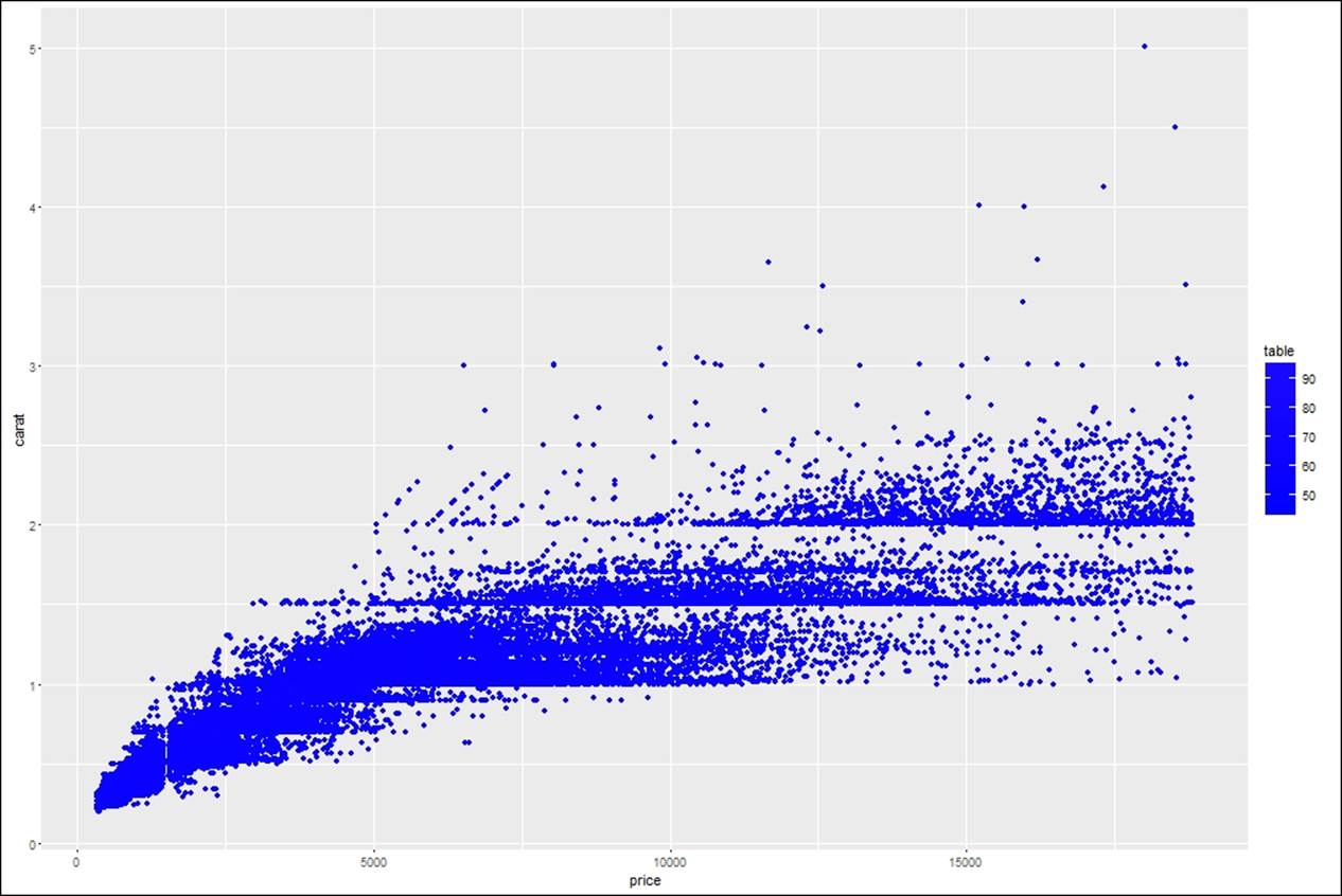
Plots created can be slightly modified using the color gradient and plotting a distribution on the graph itself:
> #using color gradient
> ggplot(diamonds, aes(price, carat))+
+ geom_point() +
+ scale_color_gradient(low = "blue", high = "red")
> #plotting a distribution on a graph
> mid<-mean(diamonds$price)
> ggplot(diamonds, aes(price, carat, color=depth))+geom_point()+
+ scale_color_gradient2(midpoint=mid,
+ low="blue", mid="white", high="red" )
Having discussed in depth about the components in a graph building process, now let's try to understand how to create different charts and graphs using ggplot2. qplot() is a basic plotting function in ggplot2, which is a wrapper for creating different types of plots. There are two options for a user, either go plotting with the qplot() or ggplot() function. To create different graphs, we are going to use the Cars93.csv dataset.
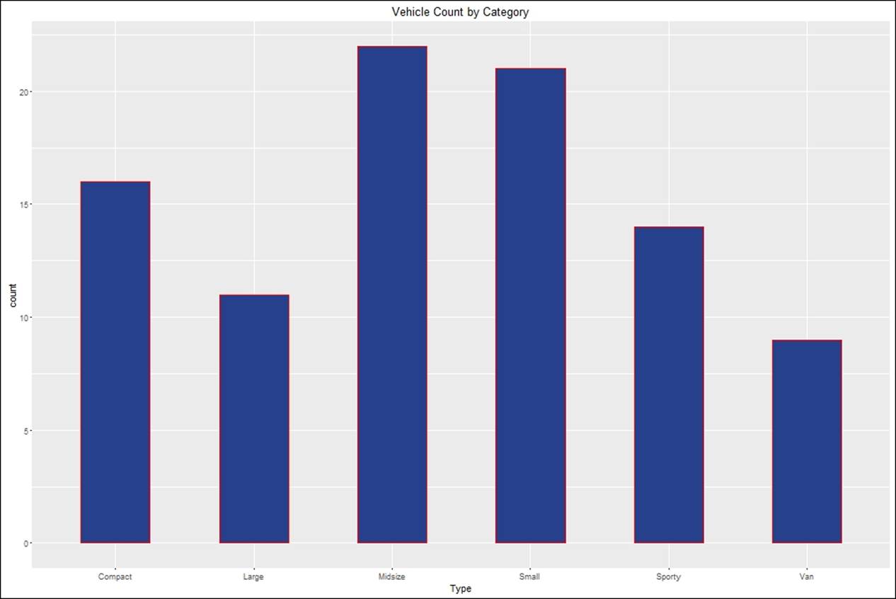
Bar chart
Bar charts are preferred as a method of visualization for the categorical variables, also used to represent the count or percentage of each group. The horizontal axis represents the categories and the vertical axis either represents the count or the percentage:
> #creating bar chart
> barplot <- ggplot(Cars93,aes(Type))+
+ geom_bar(width = 0.5,fill="royalblue4",color="red")+
+ ggtitle("Vehicle Count by Category")
> barplot
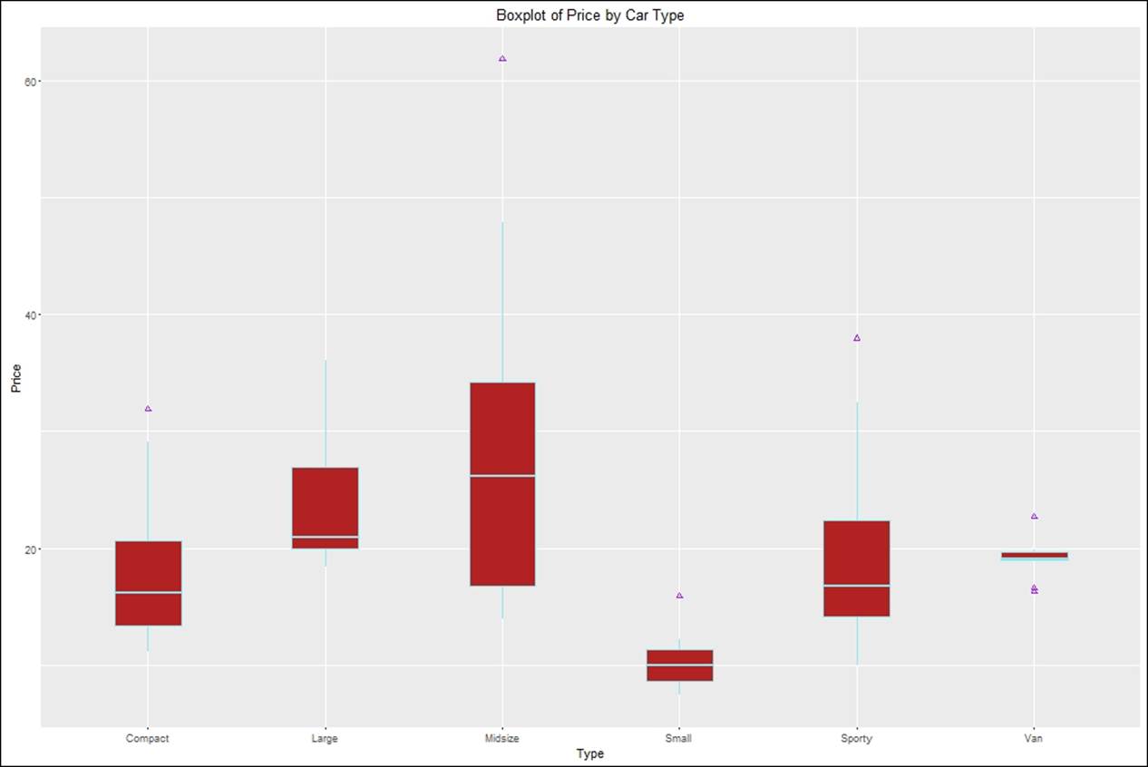
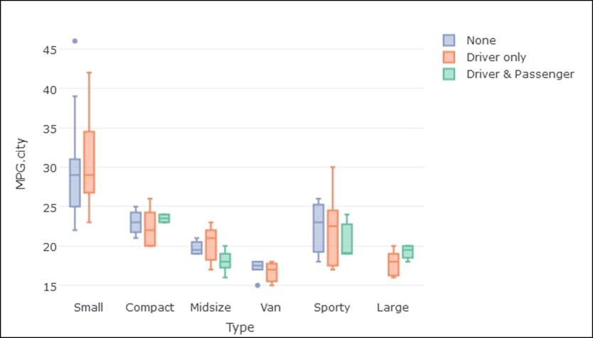
Boxplot
It is not only easy to interpret boxplots using the ggplot package, but also easy to customize the plot. One can easily recognize the outliers imposed on each of the corresponding boxplots:
> #creating boxplot
> boxplot <- ggplot(Cars93,aes(Type,Price))+
+ geom_boxplot(width = 0.5,fill="firebrick",color="cadetblue2",
+ outlier.colour = "purple",outlier.shape = 2)+
+ ggtitle("Boxplot of Price by Car Type")
> boxplot
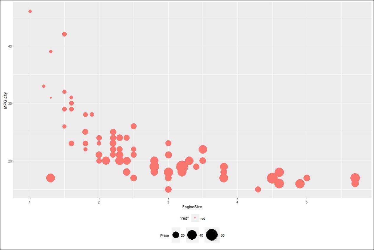
Bubble chart
The bubble chart belongs to the family of the scatterplot. It is preferred when it is required to represent three quantitative variables. Two quantitative variables are represented on two axis and one quantitative variable is used to represent the size of each bubble in a bubble chart:
> #creatting Bubble chart
> bubble<-ggplot(Cars93, aes(x=EngineSize, y=MPG.city)) +
+ geom_point(aes(size=Price,color="red")) +
+ scale_size_continuous(range=c(2,15)) +
+ theme(legend.position = "bottom")
> bubble
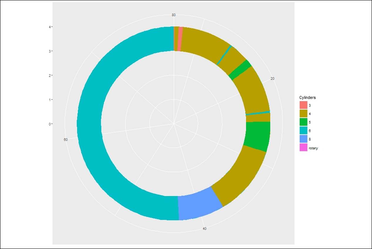
Donut chart
Donut chart is used in place of pie chart when the number of categories exceeds five:
> #creating Donut charts
> ggplot(Cars93) + geom_rect(aes(fill=Cylinders, ymax=Max.Price,
+ ymin=Min.Price, xmax=4, xmin=3)) +
+ coord_polar(theta="y") + xlim(c(0, 4))
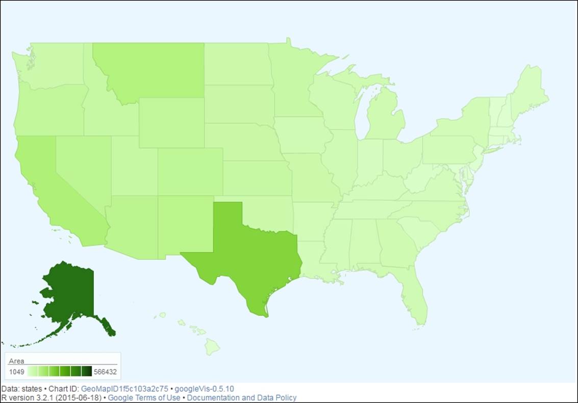
Geo mapping
Any dataset that has a city name and state name or a country name can be plotted on a geographical map using google visualization library in R. Using another open source dataset, state.x77 inbuilt in R, we can show how a geo map looks. The google visualization library, using Google maps API, tries to plot the geographic locations on the plot along with the enterprise data. It publishes the output in a browser which can be stored back as an image to use it further:
> library(googleVis)
> head(state.x77)
Population Income Illiteracy Life Exp Murder HS Grad Frost
Alabama 3615 3624 2.1 69.05 15.1 41.3 20
Alaska 365 6315 1.5 69.31 11.3 66.7 152
Arizona 2212 4530 1.8 70.55 7.8 58.1 15
Arkansas 2110 3378 1.9 70.66 10.1 39.9 65
California 21198 5114 1.1 71.71 10.3 62.6 20
Colorado 2541 4884 0.7 72.06 6.8 63.9 166
Area
Alabama 50708
Alaska 566432
Arizona 113417
Arkansas 51945
California 156361
Colorado 103766
> states <- data.frame(state.name, state.x77)
> gmap <- gvisGeoMap(states, "state.name", "Area",
+ options=list(region="US", dataMode="regions",
+ width=900, height=600))
> plot(gmap)
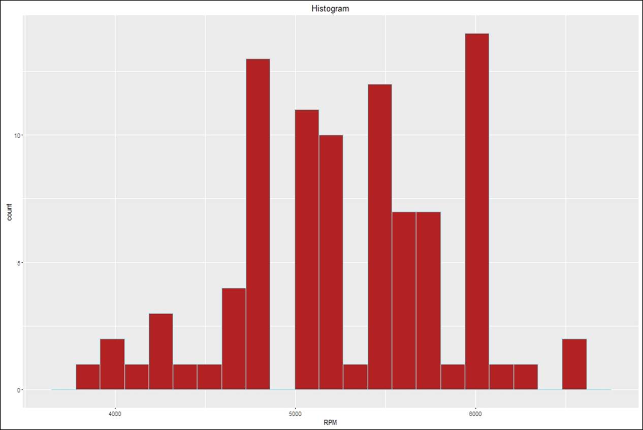
Histogram
This is probably the easiest plot that every data mining professional must be doing. The following code explains how a histogram can be created using the ggplot library:
> #creating histograms
> histog <- ggplot(Cars93,aes(RPM))+
+ geom_histogram(width = 0.5,fill="firebrick",color="cadetblue2",
+ bins = 20)+
+ ggtitle("Histogram")
> histog
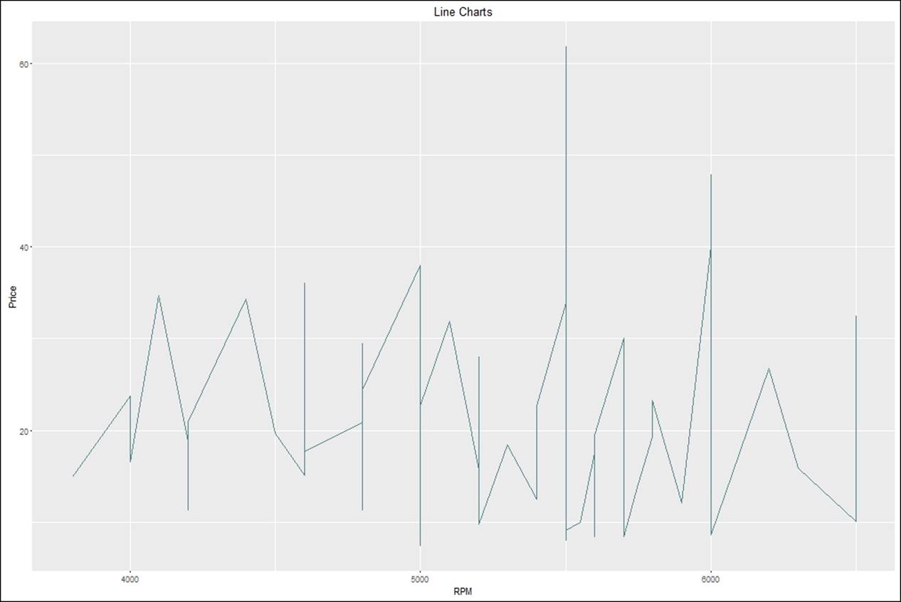
Line chart
Line chart is not a preferred chart while showing raw data. However, it is important while showing some variations across different categories relating to some metric. Though it is not a preferred chart, but it depends on the practitioner how he/she wants to display and tell a story to the reader:
> #creating line charts
> linechart <- ggplot(Cars93,aes(RPM,Price))+
+ geom_line(color="cadetblue4")+
+ ggtitle("Line Charts")
>
> linechart
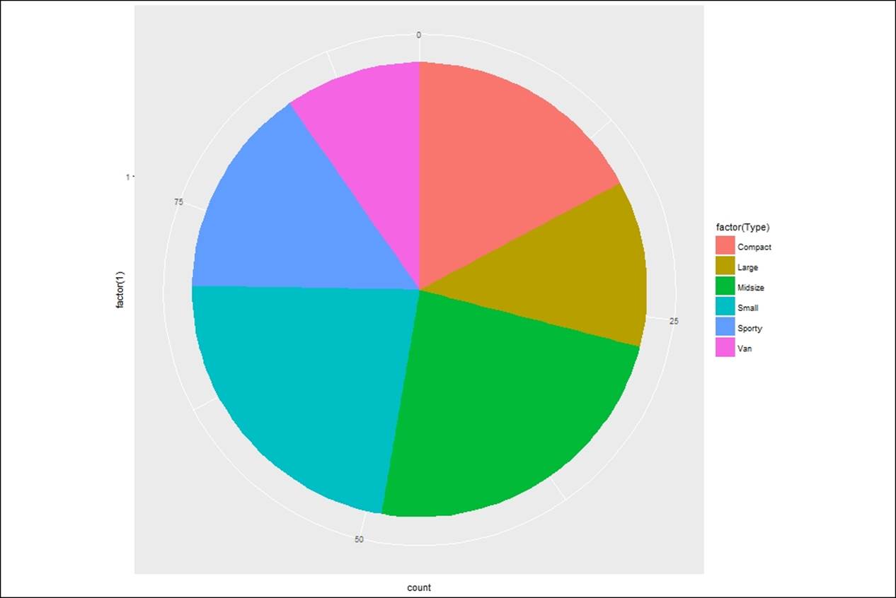
Pie chart
A pie chart is a representation of categorical variables when the label for each categorical variable is less than 10. If it exceeds 10, then it is suggested to look at a histogram or barplot for comparison. Using the ggplot library, the pie chart can be created. The script is as follows:
> #creating pie charts
> pp <- ggplot(Cars93, aes(x = factor(1), fill = factor(Type))) +
+ geom_bar(width = 1)
> pp + coord_polar(theta = "y")
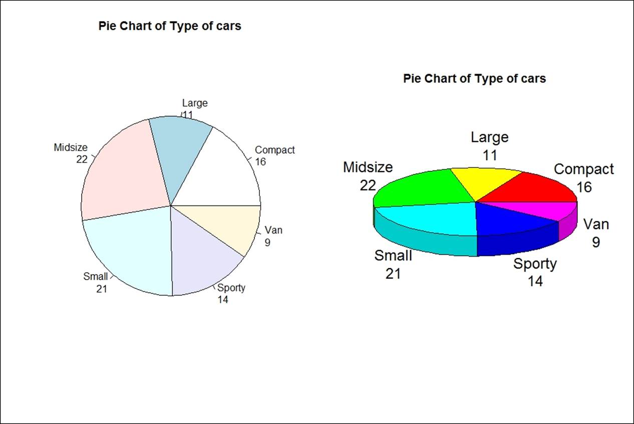
> # 3D Pie Chart from data frame
> library(plotrix)
> t <- table(Cars93$Type);par(mfrow=c(1,2))
> pct <- paste(names(t), "\n", t, sep="")
> pie(t, labels = pct, main="Pie Chart of Type of cars")
> pie3D(t,labels=pct,main="Pie Chart of Type of cars")
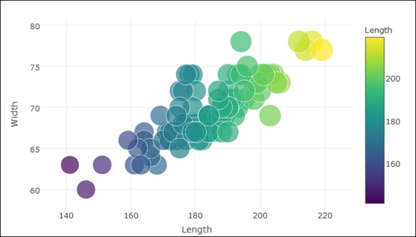
Scatterplot
Scatterplot is a very important plot to understand the bivariate relationship that exists in data. It also shows the pattern in which the data is stored over a period of time. It is also important to show the data in a proper way while showing it in scatterplots. The following example shows how a bivariate relationship can be displayed along with some third dimension dictating the visualization in a bivariate relationship. The third dimension could be a continuous variable or a categorical variable. Using the gridExtra()library, additional graphing window can be created where two or more plots can be represented side by side, with some relationship:
> library(gridExtra)
> sp <- ggplot(Cars93,aes(Horsepower,MPG.highway))+
+ geom_point(color="dodgerblue",size=5)+ggtitle("Basic Scatterplot")+
+ theme(plot.title= element_text(size = 12, face = "bold"))
> sp
> #adding a cantinuous variable Length to scale thee scatterplot points
> sp2<-sp+geom_point(aes(color=Length), size=5)+
+ ggtitle("Scatterplot: Adding Length Variable")+
+ theme(plot.title= element_text(size = 12, face = "bold"))
> sp2
>
> grid.arrange(sp,sp2,nrow=1)
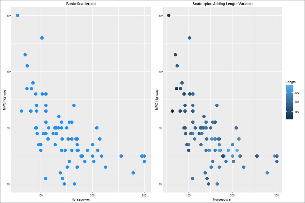
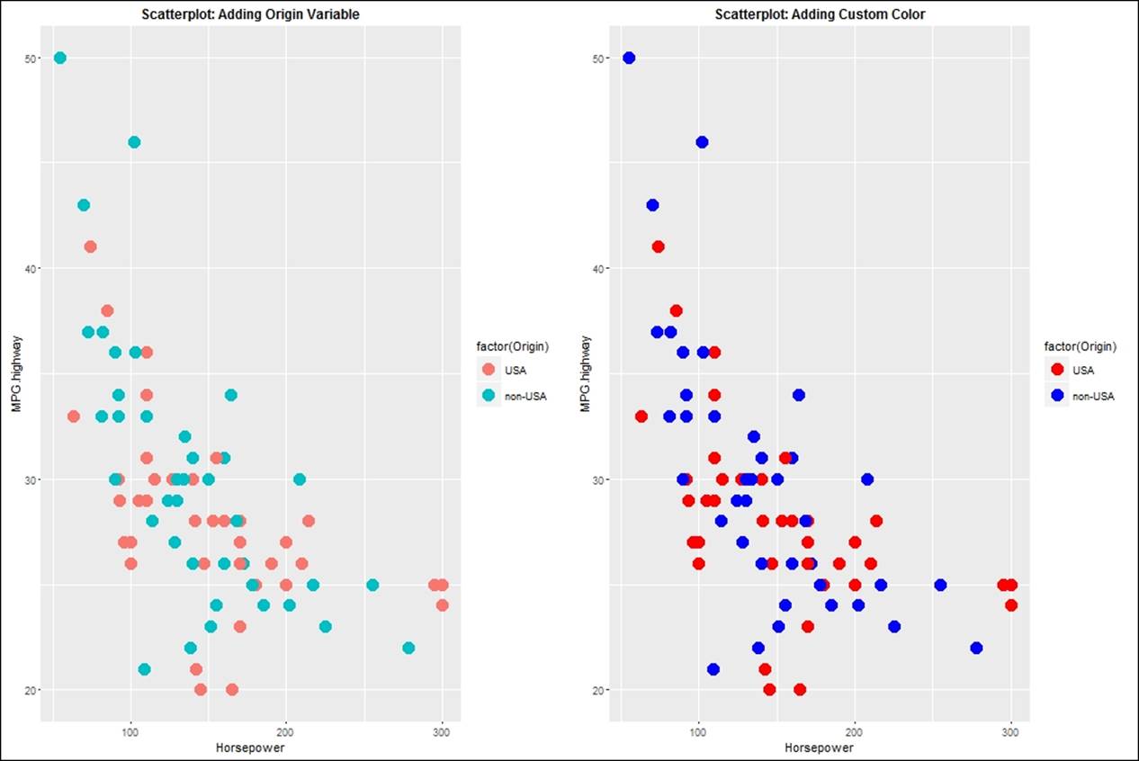
In the second graph in the preceding plot, the length variable, which is continuous, is dictating the relationship between the horsepower and the highway mileage per gallon. The light blue colored dots indicate lengthy cars while the darker dots indicate smaller cars. Instead of a continuous variable, if we use a factor variable to scale the relationship between the two variables, we will be able to see a plot like given in first graph in the following plot:
> #adding a factor variable Origin to scale the scatterplot points
> sp3<-sp+geom_point(aes(color=factor(Origin)),size=5)+
+ ggtitle("Scatterplot: Adding Origin Variable")+
+ theme(plot.title= element_text(size = 12, face = "bold"))
> sp3
> #adding custom color to the scatterplot
> sp4<-sp+geom_point(aes(color=factor(Origin)),size=5)+
+ scale_color_manual(values = c("red","blue"))+
+ ggtitle("Scatterplot: Adding Custom Color")+
+ theme(plot.title= element_text(size = 12, face = "bold"))
> sp4
> grid.arrange(sp3,sp4,nrow=1)
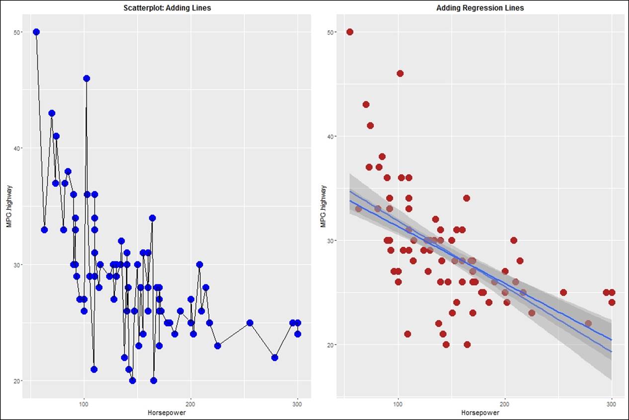
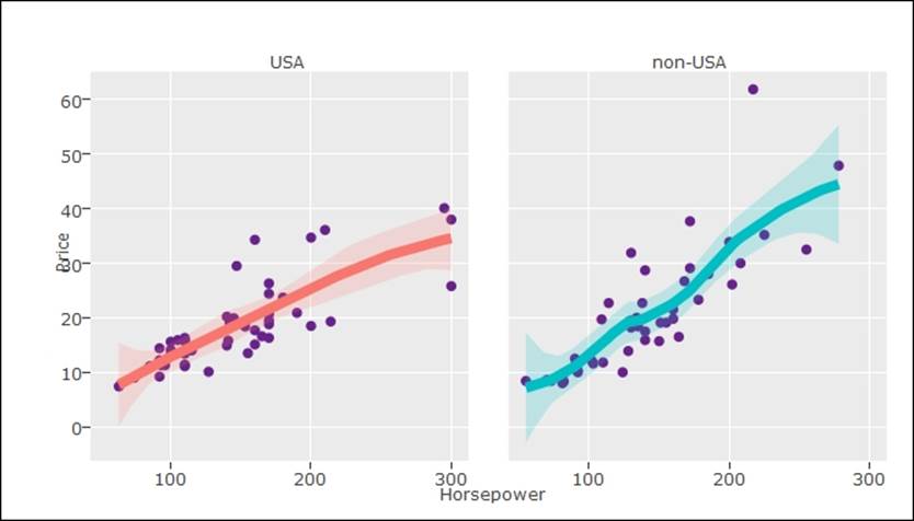
To display the cause and effect relationship, one needs to display a trendline or a regression line on a scatterplot. Using the ggplot2 library, different regression lines can be plotted, such as linear, non linear, generalized linear, and so on. When the number of observations in a dataset is less than 1000, the loess regression method is applied by default. However, when it is more than 1000, the generalized additive model is applied. The trend lines are displayed next. The first plot indicates a line graph connecting all the points, and the second plot indicates the robust linear model:
> sp5<-sp+geom_point(color="blue",size=5)+geom_line()+
+ ggtitle("Scatterplot: Adding Lines")+
+ theme(plot.title= element_text(size = 12, face = "bold"))
> sp5
> #adding regression lines to the scatterplot
> sp6<-sp+geom_point(color="firebrick",size=5)+
+ geom_smooth(method = "lm",se =T)+
+ geom_smooth(method = "rlm",se =T)+
+ ggtitle("Adding Regression Lines")+
+ theme(plot.title= element_text(size = 12, face = "bold"))
> sp6
> grid.arrange(sp5,sp6,nrow=1)
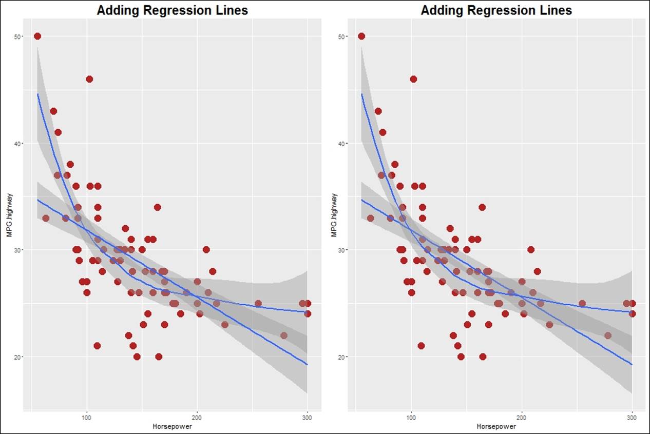
Adding the generalized regression model and loess as a non-linear regression model, we can modify the scatterplots as follows:
> sp7<-sp+geom_point(color="firebrick",size=5)+
+ geom_smooth(method = "auto",se =T)+
+ geom_smooth(method = "glm",se =T)+
+ ggtitle("Adding Regression Lines")+
+ theme(plot.title= element_text(size = 20, face = "bold"))
> sp7
> #adding regression lines to the scatterplot
> sp8<-sp+geom_point(color="firebrick",size=5)+
+ geom_smooth(method = "gam",se =T)+
+ ggtitle("Adding Regression Lines")+
+ geom_smooth(method = "loess",se =T)+
+ theme(plot.title= element_text(size = 20, face = "bold"))
> sp8
> grid.arrange(sp7,sp8,nrow=1)
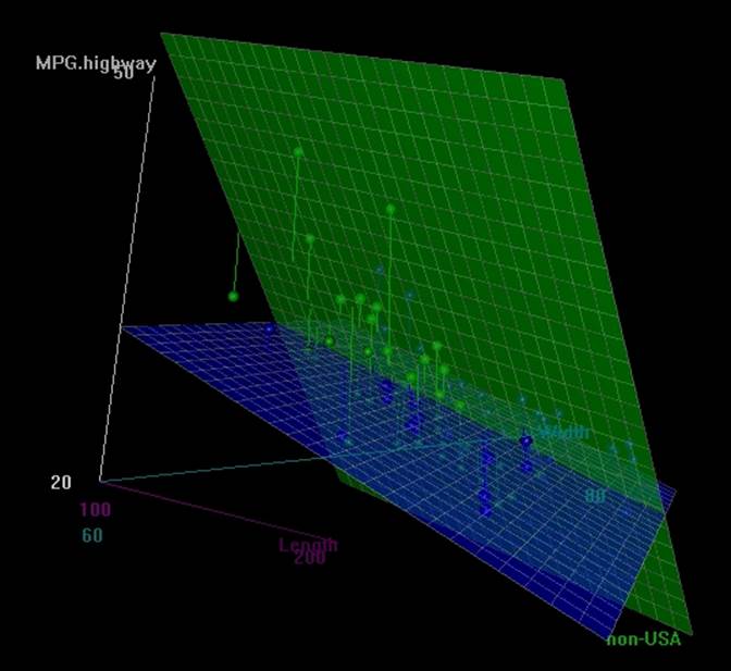
3D scatterplot is another addition to the list of scatterplot functions we are looking at. The 3D scatterplot library enables the users to look at the plot and rotate it, to view the data points from different angles. Once executed, the following script would open up a new rgl device window. Just rotate the graph and you would be able to see the data points from different angles:
> library(scatterplot3d);library(Rcmdr)
> scatter3d(MPG.highway~Length+Width|Origin, data=Cars93, fit="linear",residuals=TRUE, parallel=FALSE, bg="black", axis.scales=TRUE, grid=TRUE, ellipsoid=FALSE)
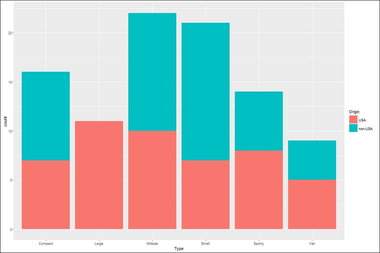
Stacked bar chart
Stacked bar charts are just another variant of bar charts, where more than two variables can be plotted with different combinations of color. The following example codes show some variants of stacked bar charts:
> qplot(factor(Type), data=Cars93, geom="bar", fill=factor(Origin))
>
> #or
>
> ggplot(Cars93, aes(Type, fill=Origin)) + geom_bar()
Stem and leaf plot
A stem and leaf plot is a textual representation of a quantitative variable that segments the values to their most significant numeric digits. For example, the stem and leaf plot for the mileage within the city variable from the Cars93.csv dataset is represented as follows:
> stem(Cars93$MPG.city)
The decimal point is 1 digit(s) to the right of the |
1 | 55666777777778888888888889999999999
2 | 0000000011111122222223333333344444
2 | 5555556688999999
3 | 01123
3 | 9
4 | 2
4 | 6
To interpret the results of a stem and leaf plot: if we need to know how many observations are there which are greater than 30, the answer is 8, the digit on the left of pipe indicates items and the numbers on the right indicate units, hence the respective numbers are 30, 31, 31, 32, 33, 39, 42, 46.
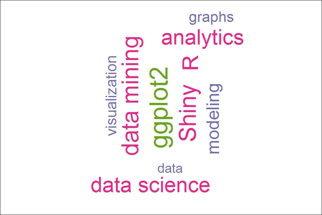
Word cloud
Word cloud is a data visualization method which is preferred when it is required to represent a textual data. For example, the representation of a bunch of text files with few words having frequent appearances across those set of documents would summarize the topic of discussion. Hence, word cloud representation is a visual summary of the textual unstructured data. This is mostly used to represent social media posts, such as Twitter tweets, Facebook posts, and so on. There are various pre-processing tasks before arriving to create a word cloud, the final output from a text mining exercise would be a data frame with words and their respective frequencies:
#Word cloud representation
library(wordcloud)
words<-c("data","data mining","analytics","statistics","graphs",
"visualization","predictive analytics","modeling","data science",
"R","Python","Shiny","ggplot2","data analytics")
freq<-c(123,234,213,423,142,145,156,176,214,218,213,234,256,324)
d<-data.frame(words,freq)
set.seed(1234)
wordcloud(words = d$words, freq = d$freq, min.freq = 1,c(8,.3),
max.words=200, random.order=F, rot.per=0.35,
colors=brewer.pal(7, "Dark2"))
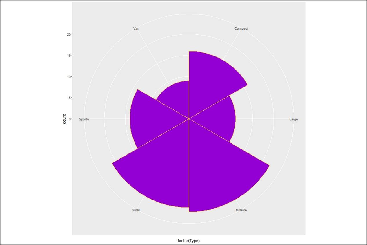
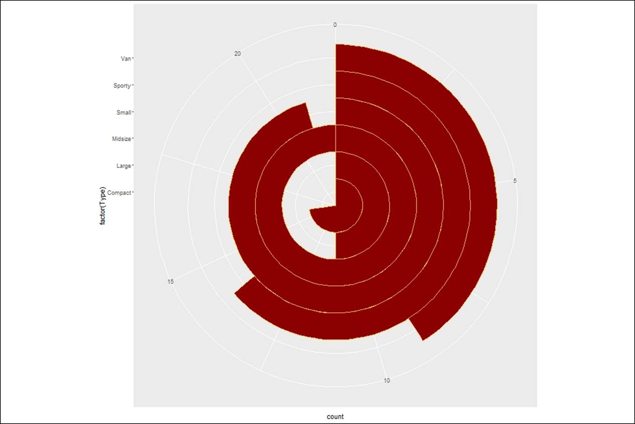
Coxcomb plot
The coxcomb chart, which is also known as polar chart or rose chart, is a combination of pie chart and bar chart. The area of each section is adjusted based on the values of that segment by changing the radius. Anyone can understand the insights represented using coxcomb chart and does not require any technical knowledge:
> #coxcomb chart = bar chart + pie chart
> cox<- ggplot(Cars93, aes(x = factor(Type))) +
+ geom_bar(width = 1, colour = "goldenrod1",fill="darkviolet")
> cox + coord_polar()
A new variant of coxcomb plot by changing the coordinate polar measure, which is theta:
> #coxcomb chart = bar chart + pie chart
> cox<- ggplot(Cars93, aes(x = factor(Type))) +
+ geom_bar(width = 1, colour = "goldenrod1",fill="darkred")
> cox + coord_polar()
> #a second variant of coxcomb plot
> cox + coord_polar(theta = "y")
Using plotly
So far, we have looked at various scenarios of creating plots using the ggplot2 library. In order to take the plotting to a new level, there are many libraries which can be referred to. Out of them, one library is plotly, which is designed as an interactive browser-based charting library built on the JavaScript library. Let's look at a few examples on how it works.
Bubble plot
Bubble plot is a nice visualization in which the size of the bubble indicates the weight of each variable as it is present in the dataset. Let's look at the following plot:
> #Bubble plot using plotly
> plot_ly(Cars93, x = Length, y = Width, text = paste("Type: ", Type),
+ mode = "markers", color = Length, size = Length)
The combination of ggplot2 with the plotly library makes for good visualization, as the features of both the libraries are embedded with the ggplotly library:
> #GGPLOTLY: ggplot plus plotly
> p <- ggplot(data = Cars93, aes(x = Horsepower, y = Price)) +
+ geom_point(aes(text = paste("Type:", Type)), size = 2, color="darkorchid4") +
+ geom_smooth(aes(colour = Origin, fill = Origin)) + facet_wrap(~ Origin)
>
> (gg <- ggplotly(p))
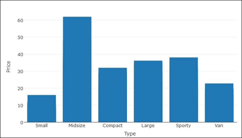
Bar charts using plotly
Bar charts using plotly look smarter than regular bar charts available in R, as a base functionality, let's have a look at the graph as follows:
> p <- plot_ly(
+ x = Type,
+ y = Price,
+ name = "Price by Type",
+ type = "bar")
> p
Scatterplot using plotly
Representation of two continuous variables can be shown using a scatterplot. Let's look at the data represented next:
> # Simple scatterplot
> library(plotly)
> plot_ly(data = Cars93, x = Horsepower, y = MPG.highway, mode = "markers")
> #Scatter Plot with Qualitative Colorscale
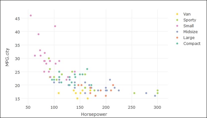
> plot_ly(data = Cars93, x = Horsepower, y = MPG.city, mode = "markers",
+ color = Type)
Boxplots using plotly
Following are examples of creating some interesting boxplots using the plotly library:
> #Box Plots
> library(plotly)
> ### basic boxplot
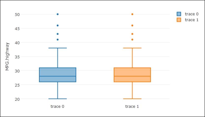
> plot_ly(y = MPG.highway, type = "box") %>%
+ add_trace(y = MPG.highway)
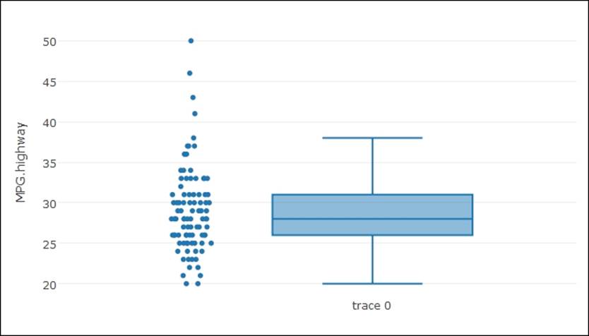
> ### adding jittered points
> plot_ly(y = MPG.highway, type = "box", boxpoints = "all", jitter = 0.3,
+ pointpos = -1.8)
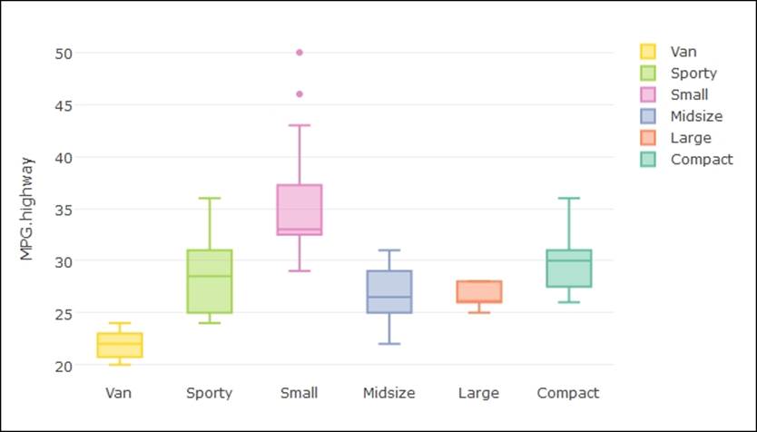
> ### several box plots
> plot_ly(Cars93, y = MPG.highway, color = Type, type = "box")
> ### grouped box plots
> plot_ly(Cars93, x = Type, y = MPG.city, color = AirBags, type = "box") %>%
+ layout(boxmode = "group")
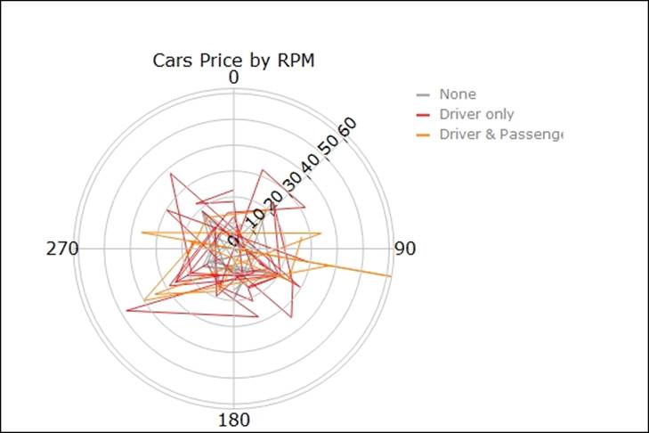
Polar charts using plotly
The polar chart visualization using plotly is more interesting to look at. This is because when you hover your cursor over the chart, the data values become visible and differences in pattern can be recognized. Let's look at the example code as given next:
> #Polar Charts in R
> library(plotly)
pc <- plot_ly(Cars93, r = Price, t = RPM, color = AirBags,
mode = "lines",colors='Set1')
layout(pc, title = "Cars Price by RPM", orientation = -90,
font='bold')
Polar scatterplot using plotly
Using the plotly library, there is one additional chart type which a user can create. It's called polar scatterplot. Instead of a two dimensional scatterplot, the points are plotted in a circular fashion:
> #Polar Scatter Chart
pc <- plot_ly(Cars93, r = Price, t = Horsepower, color = Type,opacity = 0.7,
mode = "markers",colors = 'Dark2')
layout(pc, title = "Price of Cars by Horsepower",plot_bgcolor = toRGB("coral"),
font='bold')
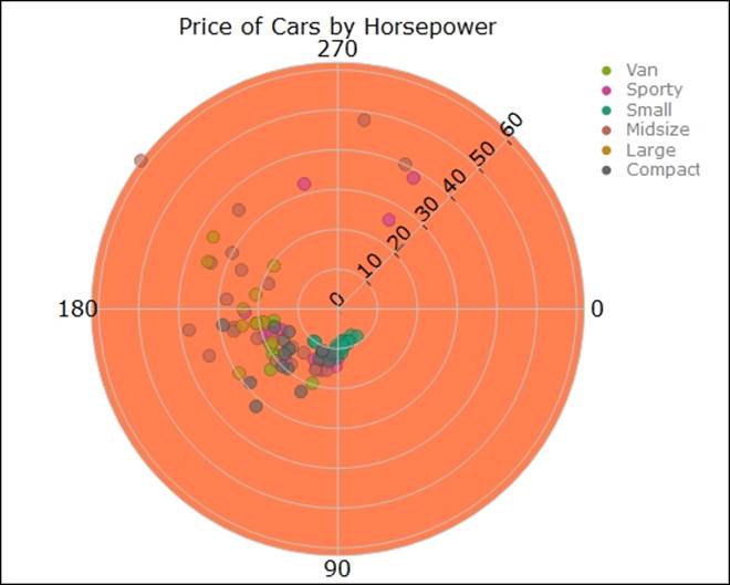
The graph polar scatterplot shows the price of cars by horsepower and the colors indicate the type of cars, the rings indicate proximity or closeness, one midsize car is very distinctly different from other variants as observed from the graph.
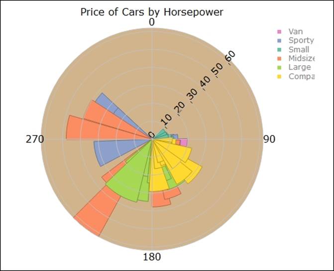
Polar area chart
The polar area chart, also known as the radar chart or coxcomb chart as renamed in some other packages, is shown next using a sample code. It shows the relationship between the of cars and horsepower by car type:
> #Polar Area Chart
pc <- plot_ly(Cars93, r = Price, t = Horsepower, color = Type, type = "area")
layout(pc,title = "Price of Cars by Horsepower",orientation = 270,
plot_bgcolor = toRGB("tan"),font='bold')
Creating geo mapping
Geo mapping is a type of chart which is used by data mining experts when the dataset contains location information. The geo mapping plots are supported by the ggmap library. The location information can be accessed in three different ways:
· By the name of the place, location name, and address
· By the latitude and longitude of the place
· By exact location, lower left longitude, lower left latitude, upper right longitude, and upper left latitude
Once the map location is identified, then by using the ggmap function the location can be identified on a map:
>library(ggmap)
>gc <- geocode("statue of liberty", source = "google")
>googMap <- get_googlemap(center = as.numeric(gc))
>(bb <- attr(googMap, "bb"))
>bb2bbox(bb)
>gc<-get_map(location = c(lon = gc$lon, lat = gc$lat))
>ggmap(gc)
Summary
In this chapter, we looked at the various types of charts. We briefly discussed the syntax to create those charts and we also discussed briefly where to use which type of chart. To create a visual display to explain the insights and message to the audience is a skill. It takes time and becomes perfect by experience. In this chapter, we only looked at the most important data visualization methods used in data mining domain. However, there is overabundance of graphs and charts to be selected to create innovative presentations. So the key take away from this chapter is that the reader now knows the data visualization rules, the types of charts and graphs used in data mining to show the relationship between various variables, and understands the distribution of various variables. At the same time, the reader has got hands on experience by doing side by side practice on two important data visualization libraries: ggplot2 and plotly. In the next chapter, we are going to learn about application of various regression techniques, interpretation of regression results, and visualization of regression results to understand the relationship between various variables.
All materials on the site are licensed Creative Commons Attribution-Sharealike 3.0 Unported CC BY-SA 3.0 & GNU Free Documentation License (GFDL)
If you are the copyright holder of any material contained on our site and intend to remove it, please contact our site administrator for approval.
© 2016-2026 All site design rights belong to S.Y.A.