Minitab Cookbook (2014)
Chapter 9. Multivariate Statistics
In this chapter, we will cover the following recipes:
· Finding the principal components of a set of data
· Using factor analysis to identify the underlying factors
· Analyzing the consistency of a test paper using item analysis
· Finding similarity in results by rows using cluster observations
· Finding similarity across columns using cluster variables
· Identifying groups in data using cluster K-means
· The discriminant analysis
· Analyzing two-way contingency tables with a simple correspondence analysis
· Studying complex contingency tables with a multiple correspondence analysis
Introduction
Multivariate tools can be useful in exploring large datasets. They help us find patterns and correlations in the data; or, try to identify groups from within a larger dataset.
Tools such as principal components analysis and factor analysis are used as a way to identify underlying correlations or factors that are hidden in the data. The clustering tools try to find a similarity between observations or columns; for example, finding the similarity between how close the rows and variables are to each other.
Correspondence analysis helps us investigate relationships between two-way tables and even more complex tabular data.
We may find the use of multivariate tools as a precursor to modeling data in regression or ANOVA as these techniques can often lead to an understanding of the relationships between variables and the dimensionality of our results.
The data files used in the recipes are available for download on the Packt website.
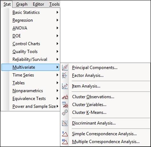
The Multivariate tools are found under the Stat menu as shown in the following screenshot:
Finding the principal components of a set of data
With Principal Components Analysis (PCA), we can try to explain the variance-covariance structure of a set of variables. We will use PCA to investigate linear associations between a large number of variables; or rather, we will change the dimensionality of a large dataset to a reduced number of variables. This can help identify the relationships in a dataset that are not immediately apparent.
As such, PCA can be a useful exploratory tool in data analysis and can often lead to more in-depth analysis.
This example looks at the tax revenue in the UK from April 2008 to June 2013.
How to do it…
The following steps will generate the principal components of the input factors and also plots to evaluate the impact of the first two principal components:
1. Open the Tax Revenue.MTW worksheet.
2. Go to the Stat menu, click on Multivariate, and select Principal Components...
3. For the Variables: section, select the numeric columns from PAYE Income to Customs duty.
4. In the Number of components to compute: section, enter 5.
5. Click on the Graphs… button and select all the charts.
6. Click on OK in each dialog box.
How it works…
In our study, we have a set of variables that correlate with each other to varying degrees. Using PCA, we convert these variables into a new set of linearly uncorrelated variables. We identify the first principal component by seeking to explain the largest possible variance in our data. The second component then seeks to explain the highest amount of variability in the remaining data, under the constraint that the second component is orthogonal to the first. Each successive component then must be orthogonal to the preceding components.
Ideally, this can help reduce many variables to fewer components, thereby reducing the dimensionality of the data down to a few principle components. The next step is the interpretation of the components that are then generated.
The results of the principal components, as shown in the following screenshot, give us an indication of the correlations between the variables. Next, we should study the principal components and their construction from the variables. Ideally, we would be able to identify a theme for the components.
The output in the session window will list an eigenanalysis of the correlation matrix plus the variables and their coefficients in the principal components.
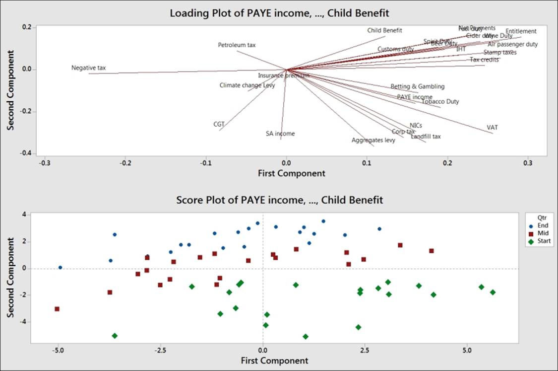
In the following screenshot, we should observe that PC1 accounts for a proportion of 0.233 of the overall variation and PC2, 0.426:
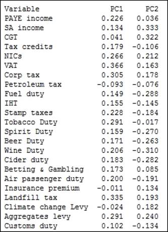
The coefficients for PC1 reveal a negative value for Petroleum tax with positive coefficients for tobacco, alcohol duties, income tax, corporation taxes, and others. A low score in PC1 indicates a high petroleum tax revenue with low income-tax-based revenues; highscores for PC1 would indicate higher employment-based taxes and social taxes such as alcohol duties and tobacco duties. PC1 may be representing an overall income-based tax.
PC2 shows us the positive values of the revenues of climate change levy (CCL), insurance premium taxes, Self Assessment (SA) income, and Capital Gains Tax (CGT). SA income and CGT are not collected automatically via wages paid to employees, but are taxes that have to be declared by an individual at specific times of the year.
The option for PCA allows us to choose between using a correlation matrix or a covariance matrix to analyze the data. A correlation matrix will standardize the variables while the covariance matrix will not. A covariance matrix is often best applied when we know that the data has similar scales. When the covariance matrix is used with variables of differing scales or variation, PC1 tends to get associated with the variable that has the highest variation. Using descriptive statistics from the Basic Statistics menu in Stat, we will observe that corporation tax has the highest standard deviation. If we were to run the PCA again with a covariance matrix, then we would observe the first principal component that is aligned strongly with corporation tax.
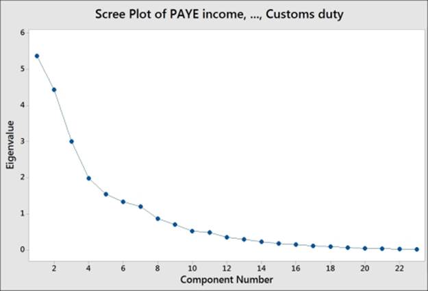
The following screenshot shows us the Scree Plot of eigenvalues of each component, where the highest eigenvalues are associated with components 1 and 2:
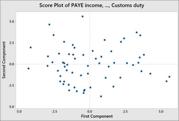
The following screenshot displays the Score Plot of the first two principal components; the graph is divided into quadrants for the positive and negative values of PC1 and PC2.
To help with the interpretation of the score plot, it would be useful to either apply a grouping variable by editing the points or brush the chart. The following steps can be used to turn the brush tool on and identify the country behind each point on the chart:
1. Right-click on the score plot and select Brush from the menu.
2. Right-click on the chart once again and select Set ID variables….
3. Double-click on the columns for Years and Month into the Variables: section.
4. Click on OK.
5. Use the cursor to highlight points on the chart.
Another option is to add data labels to the score plot. The following steps show us how to label each point with the country's name:
1. Right-click on the chart and go to the Add menu and select Data Labels….
2. Select the Use labels from column: option.
3. Enter Month into the section for labels.
4. Click on OK.
Note
If the brushing tool is still active, the right-click menu will show us options that are relevant to brushing the chart. We must return the chart to the select mode before running the preceding steps.
Comparing the score plot to the loading plot helps us understand the effect of the variables on the first two components. In the following screenshot, we can see the negative association between agricultural employment and PC1. Countries with negative PC1 will tend to have a high percentage of their population employed in agriculture.
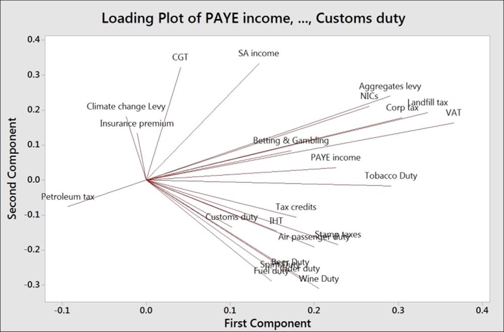
The upper-right corner of the loading and score plots are associated with higher taxes from self-declared income. The lower-right corner is associated with taxes from alcohol, stamp duty, and air passenger duties.
The biplot is useful in that it combines the loading and the score plots. The downside to the biplot is that the brushing tool does not work with it and we can't add data labels as well.
There's more…
The graphs generated for loading as well as the biplots from the dialog box use only PC1 and PC2. We can use the Storage option to store the scores for other components. If we wanted to store the scores for the first four principal components, we would enter four columns into the section for scores.
This can allow us to create scatterplots for the other components.
See also
· The Using factor analysis to identify the underlying factors recipe
Using factor analysis to identify the underlying factors
Factor analysis can be thought of as an extension to principal components. Here, we are interested in identifying the underlying factors that might explain a large number of variables. By finding the correlations between a group of variables, we look to find the underlying factors that describe them. The difference between the two techniques is that we are only interested in the correlations of the variables in PCA. Here, in factor analysis, we want to find the underlying factors that are not being described in the data currently. As such, rotations on the factors can be used to closely align the factors with structure in the variables.
The data has been collected from different automobile manufacturers. The variables look at weights of vehicles, fuel efficiency, engine power, capacity, and CO2 emissions.
We will use factor analysis to try and understand the underlying factors in the study. First, we try and identify the number of factors involved, and then we evaluate the study. Finally, we step through different methods and rotations to check for a suitable alignment between the factors and the component variables.
How to do it…
The following steps will help us identify the underlying factors in the jobs dataset:
1. Open the mpg.MTW worksheet.
2. Go to Stat, click on Multivariate, and select Factor Analysis.
3. Enter CO2, Cylinders, Weight, Combined mpg, Max hp, and Capacity into the Variables: section.
4. Select the Graphs… button and select Scree plot.
5. Click on OK in each dialog box.
6. Check the results in the scree plot and the session window to assess the number of factors, as shown in the following screenshots:
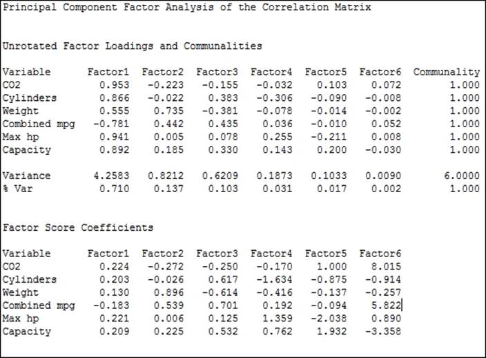
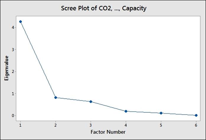
7. Here, the results indicate that factors 1 and 2 account for a majority of the variation, factors 3 and 4 account for a similar amount, and the components beyond factor 4 are small.
8. Next, we should assess how useful the factors are likely to be. The loadings for factor 1 have high values across most factors and pay particular attention to high CO2 and Max hp values, with a strong negative combined mpg.
9. Assess the model with only the first two factors by returning to the last dialog box by pressing Ctrl + E.
10. Enter 2 in the Number of factors to extract: section. Click on the Graphs… button and select Loading plot.
11. Click on OK to generate the loading plot for the first two factors.
12. Next, we will assess the model with a rotation. Do we see the same structure using an orthogonal rotation? Press Ctrl + E to return to the last dialog box.
13. Change the type of rotation to Varimax.
14. Click on OK.
15. Compare the loading plot from the varimax rotation to the original loading plot. The same structure should be observed with a rotation between the two factors.
16. Next, compare the results from the Maximum likelihood and Varimax rotation. Press Ctrl + E to return to the last dialog box and select the option for Maximum likelihood. Click on OK.
17. Compare the loading plots. All loading plots show a similar structure, but with our variables aligned differently to the factors across each rotation and method. The loading plot from the principal components study, using the varimax rotation, may be desirable as PC1 is closely tied to Combined Mpg, with PC2 showing a strong association with Weight; the factors associated with Capacity, cylinders, hp, and CO2 tend to the upper-right corner of the chart.
18. Press Ctrl + E to return to the last dialog box, select Principal components for Method of Extraction, and Varimax for Type of Rotation.
19. Click on the Graphs… button and select Score plot and Biplot to study the results.
20. Click on OK in each dialog box.
How it works…
The steps run through several steps to iteratively compare the factor analysis. The strategy of checking different fitting methods and rotations to settle on the most suitable technique is discussed in "Applied Multivariate Statistical Analysis 5th Edition",Richard A. Johnson and Dean W. Wichern, Prentice Hall, page 517.
The method and type of rotation is probably a less crucial decision, but one that can be useful in separating the loading of variables into the different factors rather than having two factors that are a mix of many component variables.
The strategy, as discussed by Johnson and Wichern in brief, is as follows:
1. Perform an analysis of a principal component.
2. Try a varimax rotation.
3. Perform maximum likelihood factor analysis and try a varimax rotation.
4. Compare the solutions to check whether the loadings are grouped together in a similar manner.
5. Repeat the previous steps for a different set of factors.
In this example, we will get similar groups of loadings with both fitting methods and rotations. The loadings will be different with each rotation, but they group in a similar way; we can observe this from the loading plot.
The suggestion that the principal components method with Varimax rotation is suitable for this data comes from the line along factor 1 and 2 in the loading plot, as shown in the following figure:
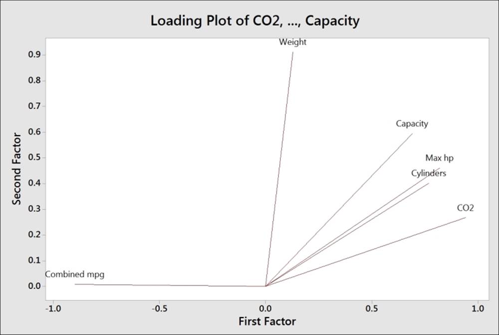
Factor 1 appears to be associated with fuel efficiency versus power and factor 2 with vehicle weight.
Minitab offers Equimax, Varimax, Quartimax rotations, and Orthomax, where the rotation gamma can be chosen by the user.
The storage option allow us to store loadings, coefficients, scores, and matrices. Stored loadings can be used to predict factor scores of new data by entering the stored loadings into the loadings section of the initial solution within options.
See also
· The Finding the principal components of a set of data recipe
Analyzing consistency of a test paper using item analysis
Typically, item analysis is used to check the test structure or questionnaires for internal consistency and reliability of the results. Cronbach's alpha is generated for item analysis and is usually referred to as a measure of internal consistency or reliability of the survey.
In this example, we use item analysis to compare the results of students' answers on a test paper. We are interested in investigating the correlation of the question results with each other and the consistency of the results.
The data is in the form of a short exam. 20 students are asked five questions. The results are 1 for a correct answer and 0 for an incorrect one.
How to do it…
The following steps will check the consistency of questions in a short test paper given to students:
1. Open the Item analysis.MTW worksheet.
2. Go to the Stat menu, click on Multivariate, and select Item Analysis….
3. Enter the columns from Q1 to Q5 in the Variables: section.
4. Click on OK to run the study.
How it works…
Item analysis will display the correlation matrix and the matrix plot to look at the association between variables. A covariance matrix can also be displayed from the Results… option.
Cronbach's alpha is displayed along with an alpha table for one variable removed at a time. With the results observed here, removing Q2 from the study would increase alpha to 0.5797.
There's more…
Cronbach's alpha is often referred to as a measure of internal consistency or reliability of the tests or questions. Values of 0.6 to 0.7 are thought to indicate a good level of consistency.
Note
Care must be taken with the use of Cronbach's alpha in isolation. A discussion, On the use, the misuse, and the Very Limited Usefulness of Cronbach's Alpha, by Klaas Sijtsma can be found at the following URL:
http://www.ncbi.nlm.nih.gov/pmc/articles/PMC2792363/
See also
· The Analyzing two-way contingency tables with simple correspondence analysis recipe
· The Studying complex contingency tables with multiple correspondence analysis recipe
Finding similarity in results by rows using cluster observations
The clustering tools look for similarities or distances in the data to form groups of results. Cluster observations find groups among the rows of the data, while variables look to find groups among the columns.
For both Cluster Observations and Variables, we will investigate a dataset on car fuel efficiency. Cars are listed as observations and we will look to find groups among the different vehicles.
How to do it…
The following steps will cluster vehicle types together to identify similar vehicles that are identified by rows and then label the dendrogram with a column of vehicle and fuel type:
1. Open the mpg.mtw worksheet .
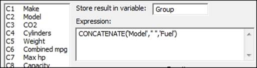
2. Go to the Calc menu and select Calculator….
3. In Store result in variable:, enter the name of the new column as Group.
4. In Expression:, enter the values as shown in the following screenshot. Then click on OK to create the Group column.
5. Go to the Stat menu, click on Multivariate, and select Cluster Observations….
6. Enter CO2, Cylinders, Weight, Combined mpg, Max hp, and Capacity into Variables or distance matrix:.
7. Check the to Show dendrogram box.
8. Click on the Customize… button.
9. In Case labels:, enter Group.
10. Click on OK in each dialog box.
11. Check the following dendrogram figure to identify the number of groups that may exist in the data:
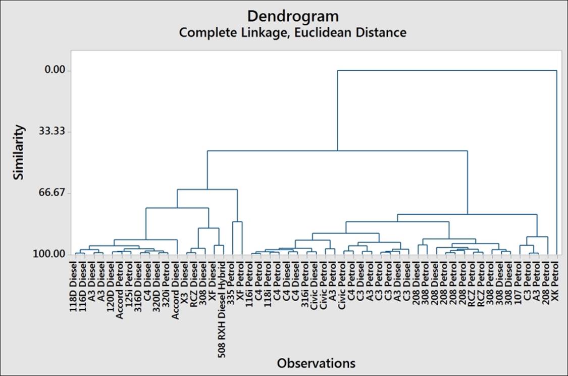
12. From the chart, we may decide to investigate how observations are clustered together using a similarity of 90.
13. Press Ctrl + E to return to the last dialog box.
14. Choose the Specify Final Partition by Similarity level: option and enter 90.
15. Store the group membership by going to the Storage… option. Enter a column name as Clusters within the Cluster membership column: section.
16. Click on Ok.
How it works…
With the single linkage method used in this example, Minitab will try to find the first cluster by looking at the differences between pairs of observations. The pair with the minimum distance is joined. With the second step, we look to find the next minimum distance. At each step, we join clusters by looking at the minimum distance between an item in one cluster and a single item or another cluster.
While the single linkage method looks for the minimum distance between observations, there are other linkage methods that we can use in Minitab. These are averages, centroids, maximum distances between the pairs of observations between clusters, medians, and more.
We can also choose a distance measure to link clusters from the following measures:
· Euclidean: This is the square root of the sum of squared distances
· Pearson: This is the square root of the sum of the squared distances divided by the variances
· Manhattan: This is the sum of the absolute differences
· Square Euclidean: This is the sum of the squared distances
· Squared Pearson: This is the sum of the squared distances divided by the variances
By observing the dendrogram, we can visually identify clusters of observations, use a similarity level, or ask to find a fixed number of groups in the data. Here, we used a similarity of 90 to define clusters. This gives us six clusters in the cars dataset.
It is advised that we be careful in the interpretation of the clusters to ensure that they make sense. By investigating the other linkage methods, we can compare the groupings that are found and try and identify the grouping that makes the most sense.
The Case labels option from the Customize… option allows us to use a column to name the rows displayed on the dendrogram. If this was not used, we would just display the row names.
There's more…
Different linkage methods can have different patterns and effects to watch out for. A single linkage, for example, can end up grouping the observations into long chains (as individual items can be close to each other) whereas the average-based methods can be influenced more by outliers in the data.
See also
· The Finding similarity across columns using cluster variables recipe
· The Identifying groups in data using cluster K-means recipe
Finding similarity across columns using cluster variables
Cluster variables work in a manner that is similar to cluster observations. Here, we are interested in the columns and variables in the worksheet rather than grouping the observations and rows.
We will look at the dataset for car fuel efficiency to identify groups of variables, or rather identify the columns that are similar to each other.
This dataset was collected from manufacturer-stated specifications.
How to do it…
1. Open the mpg.MTW worksheet.
2. Go to the Stat menu, click on Multivariate, and select Cluster Variables….
3. Enter the columns for CO2, Cylinders, Weight, Combined mpg, Max hp, and Capacity into the Variables or distance matrix: section.
4. Check the Show dendrogram option.
5. Click on OK to create the results.
6. Inspect the dendrogram to identify groups in the result. The higher the value of similarity along the the y axis, the greater the similarity between columns, as shown in the following figure:
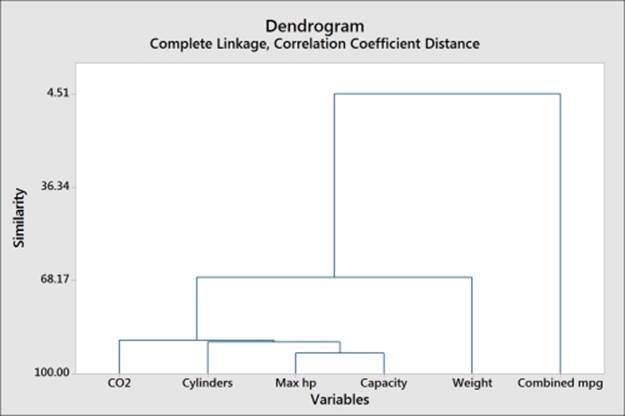
7. It looks like there are three main groups of variables. Press Ctrl + E to return to the last dialog box.
8. Under Number of clusters:, select 3.
9. Click on OK.
How it works…
As with cluster observations, we have used the single linkage method by default. We have the same options for the linkage method and distance measure as the ones used in cluster observations.
The results for the variables here show us that the combined mpg is very different when compared to the other variables.
For larger numbers of variables, dendrograms can be split into separate graphs by clusters. The Customize… option for the dendrogram can be set to the maximum number of observations per graph.
See also
· The Finding similarity in results by rows using cluster observations recipe
· The Identifying groups in data using cluster K-means recipe
Identifying groups in data using cluster K-means
Cluster K-means is a nonhierarchical technique to cluster items into groups based on their distances from the group centroid. Minitab uses the MacQueens algorithm to identify groups.
Here, we will look at finding groups of tax revenues for the UK from April 2008 until June 2013 in the data. The value of * for row 49 onwards, next to the dates in the second column, indicates provisional data.
The values are in millions of pounds sterling. We might expect tax revenue patterns to exhibit a measure of seasonality. We will use cluster K-means as a way of grouping the months of the year. As this is expected to be based on the month within a quarter, we will initially set the clusters to three.
In the How it works… section, we will compare the identified clusters with the results of a PCA for this data.
How to do it…
The following steps will identify the observations into three groups within the data, based on their distances from the centroids group:
1. Open the Tax Revenue.MTW worksheet by using Open Worksheet… from the File menu.
2. Go to the Stat menu, click on Multivariate, and select Cluster K-Means….
3. Enter all the columns from C4 PAYE income to C32 Child Benefit into the Variables: section.
4. In Number of clusters:, enter 3.
5. Check the Standardize variables option.
6. Click on the Storage… button.
7. In Cluster Membership column:, enter Group.
8. Click on OK in each dialog box.
How it works…
The output will generate tables to indicate the clusters and observations within each cluster. Minitab will create groups based on their average distance from centroids and maximum distances of centroids of each cluster.
It is useful to standardize the results in this example as the tax revenue has very different scales for each variable. Income-tax-based revenue has a much greater value and range than climate change levies.
By storing the cluster membership into a new column called Group, the worksheet will label each row 1, 2, or 3 in this column. To understand the implication of groupings in the data, compare the new column to the months in the second column. We should see that the group 123 is a repeating pattern. April is 1, May is 2, June is 3, then July is 1, and so on. April is the start of the second quarter of the year, May is the middle, and Jun is the end of the quarter.
In this example, we let the algorithm identify its own grouping in the data, and this is related to the exact month in a quarter. A more useful method is to provide a seed or starter group to identify the grouping in the data. To do this, we would need to use an indicator column to identify a group for an item in the worksheet.
To do this, create a column of zeroes and then enter a group number on known lines to seed the cluster K-means algorithm. The seed points form the basis of each group. The seed column needs to be the same length as the other columns in the study, hence the requirement to complete the column with.
The following steps will create a seed column that can be used with the tax revenue data:
1. A column of zeroes can be quickly created using the Make Patterned Data tools and Simple Set of Numbers… from within the Calc menu.
2. Name a column Seed within the Store patterned data in: section.
3. Enter 0 in the From first value: and To last value: boxes. In the Number of times to list the sequence: section, enter 63.
4. Then in the worksheet, change the values of 0 in the seed column to 1, 2, and 3 in rows 1, 2, and 3.
The final partitions found by cluster K-means will depend a lot on the specified initial conditions. Hence, the use of this tool is best when we have an idea of the number of groups we are looking for and some initial seed conditions to start each group.
There's more…
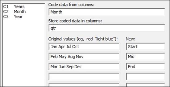
As additional checks on the data, we can check the results by coding the months in the second column and using this column on the score plot from the principal components analysis. Use Text to Text… by navigating to the Data | Code menus. By completing the dialog box shown in the following screenshot, we will code the months to the start, middle, and end of a financial quarter:
When comparing the coded values, we should see that they match the Group column identified in cluster K-means.
Next, use the Principal Components… analysis with loading and score plots from the Multivariate menu and enter columns C4 to C32 in the Variables: section.
Under the Graph… option, select the score plot and the loading plot and run the study.
To see the effect of the groups identified in cluster K-means, double-click on one of the data points on the score plot. Select the Groups tab and in the Categorical variables for grouping: section, enter either the Group column or the qtr column.
The resultant score plot should clearly separate the three stages in each quarter.
See also
· The Finding the principal components of a set of data recipe
The discriminant analysis
Discriminant analysis is a technique to classify observations into different groups. Here, we will use a linear discriminant function to predict the outcome of the battles in World War II. The example for this data is based on the study Discriminant Analysis: A Case Study of a War Dataset by Dr Nikolaos V. Karadimmas, M. Chalikias, G Kaimakais, and M Adam. This can be found at the following link for more details:
http://www.academia.edu/193503/Discriminant_Analysis_-_a_case_study_of_a_war_data_set
Wikipedia was used as a source to obtain the data in the worksheet. We should verify the correctness of this before drawing conclusions from the dataset.
Here, we will obtain the troop and tank ratios for each battle from the calculator before constructing the linear discriminant function as a method to predict the outcome of the battle.
Getting ready
Enter the results into the worksheet, as shown in the following screenshot:
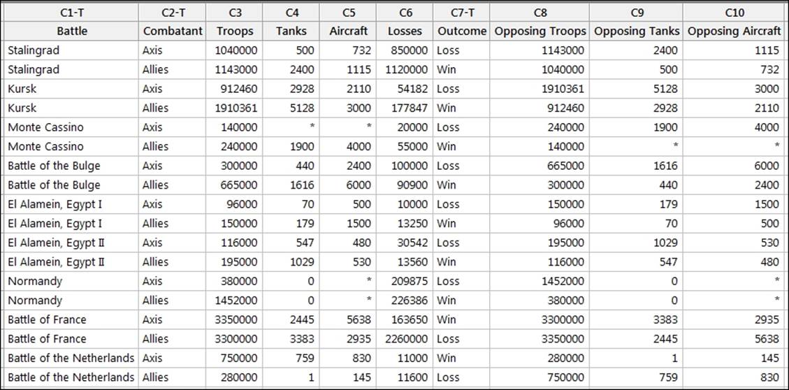
These figures are also included in the World War II.MTW worksheet.
How to do it…
The following steps will generate columns of Troop and Tank ratios for the results before finding a linear discriminant function to identify the outcome of a battle:
1. Go to the Calc menu and select Calculator….
2. In Store result in variable:, enter Troop Ratio.
3. In Expression:, enter 'Troops'/'Opposing troops'.
4. Click on OK to create the column.
5. Press Ctrl + E to return to the previous dialog box.
6. Press F3 to reset the dialog box to blank settings.
7. In Store result in variable:, enter Tank Ratio.
8. In Expression:, enter 'Tanks'/'Opposing Tanks'.
9. Click on OK to create the column.
Note
Note that the calculator will generate an error message as two battles had zero tanks. This is just a warning message that is missing in the resulting value in the worksheet. Click on Cancel to continue.
10. Go to the Stat menu, click on Multivariate, and select Discriminant Analysis….
11. Enter Outcome in Groups:.
12. In Predictors:, enter Troop Ratio and Tank Ratio.
13. Click on OK to run the study.
How it works…
The results in the session window will give us a summary of classification, as shown in the following screenshot:.
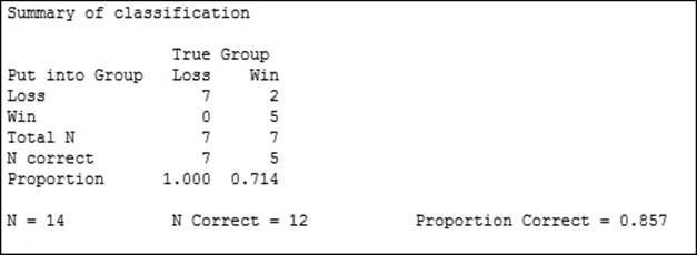
Only 14 of the 18 results are used, as four lines have missing values for the tank ratio. The summary table indicates the correctly identified number. Out of this study, two results were misclassified. The session window will indicate that these are row 2 and row 15.
The linear discriminant function is generated to classify the group. This is shown as follows:
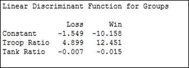
We have two linear expressions. One for loss and one for win. We can construct a column in the worksheet called Loss and use the following expression:
![]()
Then we can create a Win column and use the following expression:
![]()
We would classify a result as a loss if the Loss column has a greater value than the Win column. If Win is greater, the result is classified as a win.
The linear discriminant function uses the assumption that the covariance matrices are equal for all groups. If the covariance matrices are not equal for all groups, then the quadratic discriminant function is more appropriate.
The discriminant analysis can often show overly optimistic values when predicting the dataset used. To check how good the analysis really is, we could split the dataset into two parts. One part is used as a training dataset and the other part is used to predict the group membership by using the discriminant function from the training dataset. An alternative is to use cross validation. Cross validation will leave one result out of the study at each round and try and predict the group when the result is left out.
There's more…
We may want to use discriminant analysis to predict group membership for new observations. If we had a set troop number and tank number for battles where the outcome was unknown, then we would enter this in Options….
The discriminant analysis tool allows the use of prior probabilities and entries for columns to predict group membership from within the Options… section.
Analyzing two-way contingency tables with a simple correspondence analysis
We will use simple correspondence analysis to investigate the associations in a two-way contingency table. This is a technique to investigate frequencies of observations within the table.
The example dataset that is used is from the data and stat library and looks at the characteristics that students find important in a good teacher for academic success.
Here, we will use simple correspondence analysis to investigate the relationship between the behaviors in the rows and the count of how often they are identified as important (IM), neither important nor unimportant (NU), and not important (NI).
Getting ready
The data is available at the following link:
http://lib.stat.cmu.edu/DASL/Datafiles/InstructorBehavior.html
First, copy the data into Minitab. This will copy and paste the data directly, but use the information window to check the number of rows of data. Pasting the results may result in an extra blank cell at the end of the behavior column. Delete this cell before continuing.
The instructor behaviour.MTW worksheet also contains this data.
How to do it…
1. In the worksheet, create a new column in C5 and name this column names.
2. In the new column, enter the values IM, NU, and NI in rows 1 to 3.
3. Go to the Stat menu, click on Multivariate, and select Simple Correspondence Analysis….
4. In the dialog box, select the Columns of a contingency table: option.
5. Enter the columns of IM, NU, and NI into the Columns of a contingency table: section, as shown in the following screenshot:
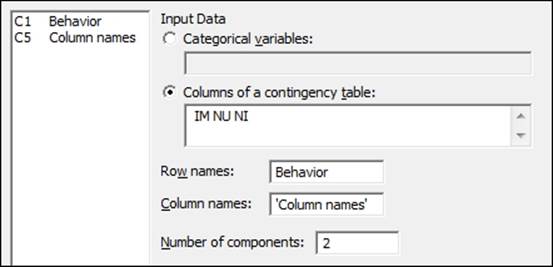
6. Enter Behavior into the Row names: section.
7. Enter 'Column names' into the Column names: section.
8. Click on the Results… button.
9. Check the boxes for Row profiles.
10. Click on OK.
11. Click on the Graphs… button.
12. Check the option for Symmetric plot showing rows only, Symmetric plot showing columns only and Symmetric plot showing rows and columns.
13. Click on OK in each dialog box.
How it works…
Using two components, we are attempting to plot a two-dimensional representation of our results. The output in the session window will give us Analysis of Contingency Table, which will show us the inertia and proportion of the inertia explained by the two components, as shown in the following screenshot:
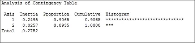
Inertia is the chi-squared statistic divided by n; it represents the amount of information retained in each dimension. Here, axis 1 accounts for over 90 percent of the inertia.
By checking the option for Row profiles in Results…, we will produce a table that indicates the proportion of each of the row categories by columns. We should see that the first questions have the highest proportions associated with IM and the last questions have increasing proportions associated with NU or NI.
The profiles, Expected, Observed-Expected and Chi Square column's values can also be generated from the Results… option.
Row contribution and column contribution tables are used to indicate how the rows and columns of the data are related to the components in the study.
Quality is a measure of the proportion of the inertia explained by the two components of that row. In this example, the total proportion of inertia explained by the two components was 1, hence all quality values are 1.
The Coordinate column is used to indicate the coordinates of component 1 and 2 for this row.
The Corr column is used to show the contribution to the inertia of that row or column. The example used here for quality is 1 for all rows; the total inertia explained by the two components is 1 for each row. The values of Corr for component 1 and 2 will, therefore, add to 1.
The Contribution column gives us the contribution to the inertia.
The Graph… option allows the use of symmetric or asymmetric plots. Here, we generated just the symmetric plots.
The column plot, which is shown in the following screenshot, shows NI as low in component 1 and IM as high in component 1. NU is shown as high in component 2.
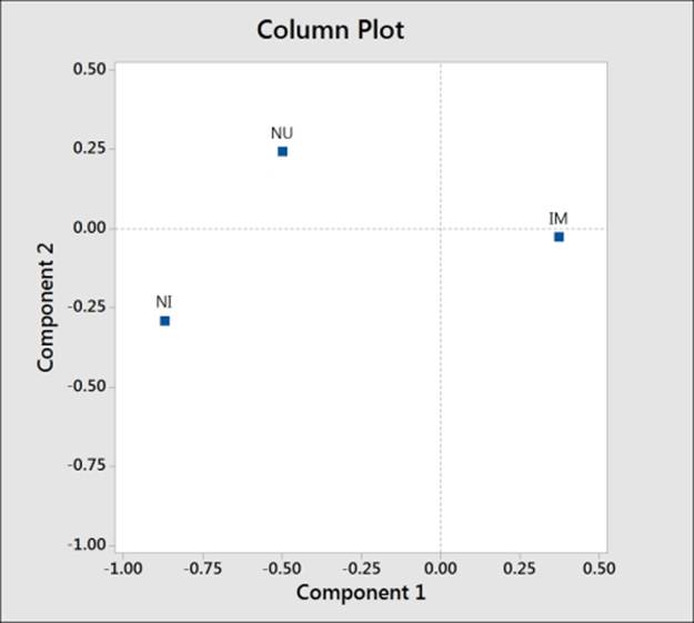
Comparing this to the row plot reveals the questions related to behaviors that are ranked as important and unimportant. We should also notice that with the behaviors labeled in longhand, the text on the charts, including the row, is difficult to read.
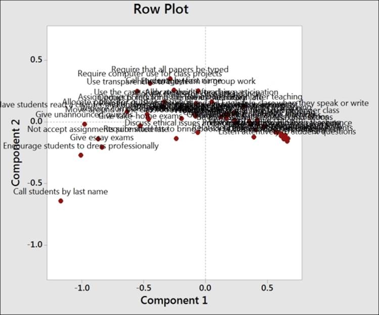
There are a few methods available to help tidy the results on charts such as the one shown in the previous screenshot. By leaving the Behavior column out of row names, the study will use the row numbers for the plot labels. Likewise, if we did not enter the column names as indicated in the fifth column, then Minitab would just report a number for each variable. Using row numbers instead of names can make the interpretation of this chart easier when we have a large number of variables.
We can also double-click on the labels on any of the charts to adjust the font size. Double-click on a label to go to the Font option and then type a value of 4 in the Size: section to reduce the fonts to a more manageable size.
There's more…
Supplementary data allows us to add extra information from other studies. The supplementary data is scored using the results from the main dataset and can be added to the charts as a comparison.
Supplementary rows must be entered as columns. For example, if we had an additional behavior to evaluate, it would be entered in a new column with the number of rows in this column equal to the number of columns in the contingency table.
Let's say we have a new behavior of Dress Casually; this would be entered as a column with three rows for the responses, as shown in the following screenshot:
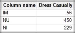
Here, a supplementary column would be required to have the same number of rows as the main data.
Axes on the charts can be changed by choosing the component that is plotted as y and x. In the Graph… option, this is initially set as 2 1. Here, 2 is our y axis and 1 is the x axis. If we have 3 2, then that would indicate that the component 3 is y and 2 is x. We can enter more components and they would be entered as y x pairs; all values are separated by a space.
We could also use more than two categories in a simple correspondence analysis. The Combine… option allows us to combine different categories into a single one to convert the results back into a two-way contingency table.
See also
· The Studying complex contingency tables with multiple correspondence analysis recipe
Studying complex contingency tables with a multiple correspondence analysis
We use multiple correspondence analyses on tables of three or more categorical variables. This expands the study of a simple correspondence analysis from the two-way table to more variables. One downside of this technique is the loss of how rows and columns relate.
The data that we will look at is based on a study of students and their gender—whether they live in urban, suburban, or rural locations—and their goals to be popular, that is, being good at sports or getting good grades.
This is a simplified dataset that is taken from the original located at DASL. The full dataset can be found at the following location:
http://lib.stat.cmu.edu/DASL/Datafiles/PopularKids.html
We will tally the results of the columns to observe the value order of the columns and then we need to create a categorical list of the labels for each item in the factor columns. We will list these figures in the fourth column in the correct value order before running the multiple correspondence analysis.
How to do it…
The following steps use Tally to identify the categories in the tables and then use them to identify student priorities:
1. Open the MCorrespondance.MTW worksheet.
2. Go to Stat, click on Tables, and select Tally Individual Variables….
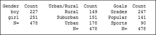
3. Enter the columns Gender, Urban/Rural, and Goals in Variables:.
4. Click on OK.
Note
The output will show that Minitab lists the text in columns alphabetically. We can change this by right-clicking on a column and selecting Value Order from the Column option.
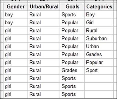
5. Return to the worksheet and name the fourth column as Categories.
6. In the fourth column, enter the categories of the factors as shown in the following screenshot, where categories must be listed in the order shown in the tally:
7. Go to the Stat menu, click on Multivariate, and select Multiple Correspondence analysis….
8. In the Categorical names: section, enter the columns of Gender, Urban/Rural, and Goals.
9. In the Category names: section, enter Categories.
10. Select the Results… button and check the option for Burt table.
11. Click on OK.
12. Click on the Graphs… button and check the Display column plot option.
13. Click on OK in each dialog box.
How it works…
As Minitab does not take the names of the categories inside the columns, we need to specify them in a separate column. Hence, we create the fourth column as Categories, in the study to specify the names in the dialog box.
Tally can be a useful step to check the order of the text as seen by Minitab. This is alphabetical by default. We can adjust this order by right-clicking on a text column and selecting Value Order… from the Column section.
The output of the multiple correspondence analysis will generate tables of the indicator matrix's analysis. Inertia and proportion can help identify the usefulness of the study. Column contributions are also generated to identify the effect of each of the categories.
Each of the levels of a factor are converted into an Indicator column internally by the multiple correspondence analysis commands. Hence, the levels of boy, girl, rural, urban and so on, are referred to as columns.
We could have used a worksheet generated as a set of indicator variables directly. Each column would be a 0 1 column that indicates the presence of that value. To create indicator columns very quickly, use the Make Indicator Variables… tool in the Calc menu.
Entering the Gender column into Make Indicator Variables will create a column for boy and a column for girl.
There's more…
As with simple correspondence analysis, we could include supplementary data.
We could also return to a two-way table structure in a worksheet of three or more categories using the Combine… option from Simple Correspondence Analysis. This would allow us to define how the variables are combined and whether they relate to rows or columns.
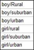
We cross the variables of gender(boy/girl) and urban/rural(Rural/SubUrban/Urban); this will create a combined variable in the order that is shown in the following screenshot:
See also
· The Analyzing two-way contingency tables with simple correspondence analysis recipe
All materials on the site are licensed Creative Commons Attribution-Sharealike 3.0 Unported CC BY-SA 3.0 & GNU Free Documentation License (GFDL)
If you are the copyright holder of any material contained on our site and intend to remove it, please contact our site administrator for approval.
© 2016-2026 All site design rights belong to S.Y.A.