Minitab Cookbook (2014)
Chapter 2. Tables and Graphs
In this chapter we will cover the following recipes:
· Finding the Tally of a categorical column
· Building a table of descriptive statistics
· Creating Pareto charts
· Creating bar charts of categorical data
· Creating a bar chart with a numeric response
· Creating a scatterplot of two variables
· Generating a paneled boxplot
· Finding the mean to a 95 percent confidence on interval plots
· Using probability plots to check the distribution of two sets of data
· Creating a layout of graphs
· Creating a time series plot
· Adding a secondary axis to a time series plot
Introduction
Minitab has a very powerful and flexible range of charts that can be created. In this chapter, we will make use of some simple tabulation tools, such as Tally or Descriptive Statistics tables and then explore some of the many graphs that are available to us.
There are many more charts available in Minitab than the ones shown here. Hopefully, seeing the range of charts and editing will give us ideas about what is possible.
We will also explore some of the editing options for graphs. This is a fairly simple routine. Most editing options are made available by double clicking on the item on the chart to edit, or from the right-click menu. Editing a scale on the chart is performed by double-clicking on the scale axis of interest. To add items not already a graph, we would go to the right-click menu. To place data labels on a bar chart, we would right click on the bar chart, go to the Add menu, and select Data Labels.
As is so often true in Minitab, there is more than one method to edit charts and on the right-click menu, there is an Edit item option.
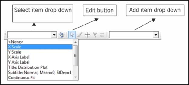
We also have a graph-editing toolbar. This contains a quick select drop-down menu, and a quick select add menu. The following figure shows us the graph editing toolbar illustrating the select and add drop-down menus.
Most of the tools used in this section are found in the Graph menu. We will also use a few Stat menu items. Tally and Descriptive statistics tables are located under Tables within the Stat menu.
Finding the Tally of a categorical column
The Tally tool can be useful for quickly summarizing counts or percentages. Tally is found in Tables under the Stat menu. We will open one of the sample data files that come with Minitab and find the count and percentages of males and females listed in the dataset.
How to do it…
The following instructions will open the Department.MTW worksheet and then display the counts and percentages of male and female staff:
1. Go to the File menu and select Open Worksheet….
2. Click on the button labeled Look in Minitab Sample Data folder.
3. Open the Department.MTW worksheet.
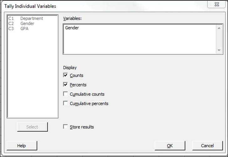
4. Navigate to Stat | Tables then Tally individual Variables….
5. Enter Gender into the Variables: section.
6. Check the box for Percents as shown in the following screenshot. We should have both Counts and Percents selected.
7. Click on OK.
How it works…
Tally can be used very quickly to show counts and percentages of data in columns:
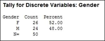
The results in the preceding screenshot show us that 52 percent of the 50 total individuals listed are female. We could also select cumulative counts/ percentages and store the results back into the worksheet.
See also
· The Building a table of descriptive statistics recipe
Building a table of descriptive statistics
In the previous recipe, we tallied the number of male and female staff in the department's dataset. Here, we will use a table to count the number of male and female staff in each department. We will also find the mean of the GPA column.
The descriptive statistics tables within Minitab are found with the Stat menu under the sub menu Tables. This menu also includes cross tabulation and Chi-square statistics.
How to do it…
The following instructions will create a table consisting of the department and gender sections. The table will contain the mean GPA score and the count of observations.
1. Go to the File menu and select Open Worksheet….
2. Click on the button labeled Look in Minitab Sample Data folder.
3. Open the Department.MTW worksheet.
4. Go to the Stat menu, select Tables, and then select Descriptive Statistics….
5. Enter Department in the For Rows: section.
6. Enter Gender in the For columns: section, as shown in the following screenshot:
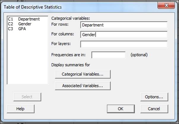
7. Click on Associated Variables… and then enter GPA in the Associated variables: section and select Means.
8. Click on OK in each dialog box.
How it works…
The levels of department are used to build rows of a table in the session's window and the Gender column creates the columns of this table. Summaries of categorical variables can be used to display percentages by the row, column, or by total. The default option here is to count the number of observations.
Numeric columns will be entered into the Associated variables: section and can be summarized with Means, Medians, Sums, and more.
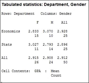
The preceding results show the means of GPA and counts of individuals, classified by gender and department. Multiple summaries can be included in each cell of the table.
See also
· The Finding the Tally of a categorical column recipe
· The Using Cross tabulation and Chi-Square recipe in Chapter 3, Basic Statistical Tools
Creating Pareto charts
A Pareto chart is a bar chart that is displayed in descending order by default. It is typically used to display the largest defect types. Here, we will create a Pareto defect chart with a frequency column. The data used in this example will look at manufacturing defects for textiles.
Column 1 contains the nature of the defect and column 2 contains the number of defects recorded.
How to do it…
The following instructions will create a Pareto chart from a table of defect and frequency:
1. Go to the File menu and select Open Worksheet….
2. Click on the button labeled Look in Minitab Sample Data folder and then open the ClothingDefect.MTW worksheet.
3. Go to the Stat menu and select Quality Tools… and then select Pareto Chart….
4. In the Defects or attribute data in: section, enter Defect.
5. In the Frequencies in: section, enter Count.
6. Select the Do not combine option and click on OK.
How it works…
Pareto charts always order the bars in descending order, showing the highest frequency first with the cumulative frequency displayed by the red line, as shown in the following screenshot:
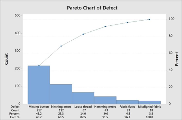
The data shown in this example was created as a table using types of defect and its frequency. Alternatively, the data could be left as a raw format and the Pareto chart command would count up the occurrence of each category.
The BY variable in: section can be used to split the chart out into separate graphs. This is useful if, for example, we wanted to show Pareto charts for different departments.
The Combine remaining defects into one category after this percent: and Do not combine options can be used to tidy up a graph. Combining the smallest categories into one column called Other is a great way to shrink a large number of small defect types into one category. When creating a Pareto chart, this is initially set to 95 percent. This means that a chart will show up only when the category crosses 95 percent; it will include only this category in the chart. Everything else will be put into a remainder bar called Other.
There's more…
A weighted Pareto chart can be created by looking at the cost or value. Here, we have results of total cost in column 4. By using this column instead of the frequency, the Pareto chart shows us the most categories with the most costly defect first.
If we have a worksheet without a total cost column, we will use the calculator to multiply them together.
See also
· The Calculator – basic functions recipe in Chapter 1, Worksheet, Data Management, and the Calculator
· The Creating bar charts of categorical data recipe
· The Creating a bar chart with a numeric response recipe
Creating bar charts of categorical data
The bar chart tools in Minitab offer some of the most flexible graphs for use. Many different styles of bar charts are available. The choices here allow us to use categorical data with the Counts of unique values selection. We could create bars of mean values, totals, medians of a set of numeric data from the Function of a variable option, or plot the values from a table.
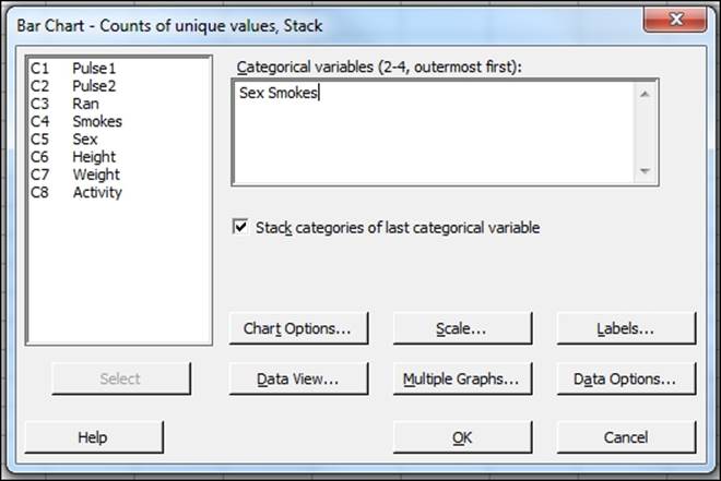
Here, we will create a bar chart of the data in the Pulse.MTW worksheet. We will display the number of smokers and nonsmokers by gender for a group of students. As the columns are categorical, we will use the Counts of unique values bar charts.
How to do it…
The following instructions will create a stacked bar chart showing the number of smokers and nonsmokers among a group of male and female students.
1. Go to the File menu and select Open Worksheet….
2. Click on the button labeled Look in Minitab Sample Data folder.
3. Open the Pulse.MTW worksheet.
4. Go the to Graph folder and select Bar Chart….
5. From the displayed charts, select the Stack style of the bar chart.
6. Enter Sex first and Smokes second; the dialog should appear as follows.
7. Click on OK.
How it works…
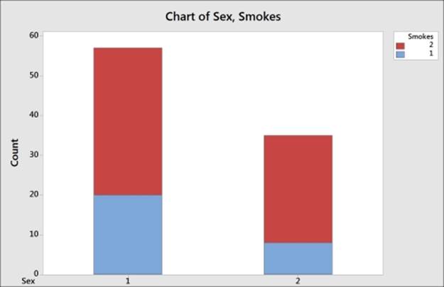
The first column is used as the outermost or the lowest category on the x axis. Here this is the Gender column. The final column is used as the stacked column. In the following graph, we will see the value of smokes being stacked inside the results for gender. The values of Sex are 1 for male and 2 for female; the values of Smokes are 1 for regular smokers and 2 for nonregular smokers. Up to four categorical columns can be used in stacked or unstacked bar charts
There's more…
The results can also be displayed as a percentage of all the data or as a percentage within each gender.
The option to show the results as a percentage can be found by right-clicking on the chart and then selecting Graph Options… from the right-click menu.
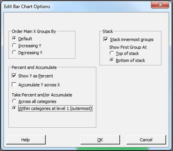
Across all categories will display each level as a percentage of the total result. For example, female smokers represent 8.7 percent of the students.
Within categories at level 1 (outermost) displays the levels of smokers as a percentage within that of gender. For example, 22.86 percent of females part of this study smoke.
You can use the example of coding data to convert numeric values to text present in Chapter 1, Worksheet, Data Management, and the Calculator, to display text instead of numbers on this chart.
See also
· The Coding a numeric column to text values recipe in Chapter 1, Worksheet, Data Management, and the Calculator
· The Creating a bar chart with a numeric response recipe
· The Creating Pareto charts recipe
Creating a bar chart with a numeric response
Bar charts can also be used with numeric responses. Using the graphs with the selected function of a variable, we can find the mean of a numeric column. Here, we will use the pulse data to see the difference in the mean pulse rate for the previous and next activity columns. We will also split the bars into those who ran on the spot and those who didn't.
How to do it…
The following instructions will create a bar chart of Pulse1 and Pulse2 clustered together within the Ran column:
1. Go to the File menu and select Open Worksheet….
2. Click on the button labeled Look in Minitab Sample Data folder.
3. Open the Pulse.MTW worksheet.
4. Go to the Graph menu and select Bar Chart….
5. Change the selection for Bars represent: to A function of a variable.
6. Select the Cluster bar chart under Multiple Y's and select OK.
7. Make sure the Function: section is set to Mean and then select the Graph variables: section. Enter Pulse1 and Pulse2 into the graph variables.
8. Select the Categorical variables for grouping (1-3, outermost first): section, enter Ran.
9. Choose the option under Scale Level for Graph Variables to Graph Variables displayed innermost on scale.
10. Click on OK.
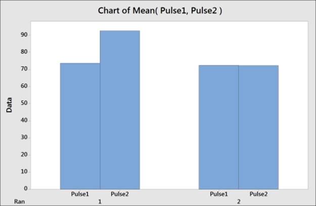
How it works…
The graph that is created will appear as shown in the previous screenshot. We chose the Multiple Y's option when selecting the graph so that we could use both the Pulse1 and Pulse2 columns on the same chart. The Ran column is used as the categorical scale. Numeric columns used with this type of bar chart can be displayed as means, totals (sum), count, medians, and more.
The position of the categories on the x axis can be selected from the options of the scale level for graph variables. Graph variables refer to the numeric columns, outermost refers to the lowest category on the x axis, and innermost refers to the highest category on the x axis. By putting graph variables innermost, we tell Minitab to place the columns of Pulse1 and Pulse2 within each category of Ran.
There's more…
The following instructions can be used to color the bars of Pulse1 and Pulse2 separately and tidy up the graph by removing extra labels on the x axis:
1. Double-click on the bars on the chart.
2. Select the tab labeled Groups.
3. Choose the Assign attributes by graph variables option (graph variables refers to columns and attribute refers to the bar color).
4. Click on OK.
5. Double-click on the y axis.
6. Select the tab labeled Show.
7. Uncheck the selection for Graph variables under Show labels by Scale Level.
See also
· The Creating bar charts of categorical data recipe
· The Creating Pareto charts recipe
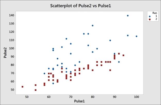
Creating a scatterplot of two variables
We will use a Scatterplot command to visualize the relationship between a resting pulse and the pulse after a group of students' activity.
How to do it…
The following instructions create a scatterplot of Pulse1—the resting pulse, Pulse2—the pulse after activity, and the Ran column. The Ran column indicates whether a student ran in his/her place or not:
1. Go to the File menu and select Open Worksheet….
2. Click on the button labeled Look in Minitab Sample Data folder.
3. Open the Pulse.MTW worksheet.
4. Go to the Graph menu and select Scatterplot….
5. From the graph selection screen, select the With Groups scatterplot.
6. Enter Pulse2 as the y variable and Pulse1 as the x variable.
7. Next, enter Ran as Categorical variable for grouping (0-3):. Then click on OK.
How it works…
In the graph, we have created our y variables that are placed on the vertical y axis, and the x variables along the horizontal x axis. The y axis most commonly plots outputs to our responses in the data. Predictors, which are our inputs, are entered on the x axis.
By entering the Ran column as a grouping variable, we change the style of points on the graph. Here, 1 under Ran is shown as circles, and 2 as squares. Our results in the scatterplot may lead us to believe that it was the first group that exercised.
There's more…
Least squares regression lines can be added to the scatterplot by right-clicking on the chart and selecting Add | Regression Fit…. A regression line added this way will not report the coefficient tables or analysis of variance tables.
The fitted model can be viewed with a pop-up textbox when hovering the cursor over the line. For statistical information on the model, use fitted line plots in regression.
The Crosshairs feature can be found from the right-click menu and is very useful for finding coordinates on the graph. The brushing tool is also a powerful tool to use in scatterplots. This is available from the right-click menu and is used to highlight individual or groups of data points. By default, it will report row numbers and can also be used to display row information from the worksheet.
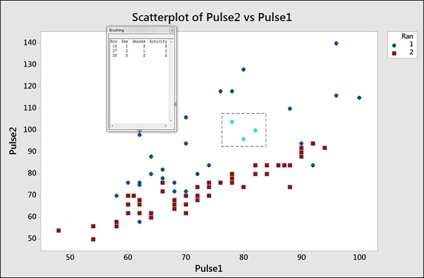
An example of brushing is shown in the previous screenshot. To brush the chart, right-click on the chart and select Brush. To add row information from the columns in the worksheet, right-click on the graph once more and select Set ID Variables… from the right-click menu. Then, double-click on the Sex, Smokes, and Activity columns in the Variables: section. Click on OK and highlight a few points on the chart to observe the values of the columns entered as variables in brushing.
See also
· The Visualizing simple regressions with fitted line plots recipe in Chapter 5, Regression and Modelling the Relationship between X and Y
· The Multiple regression with linear predictors recipe in Chapter 5, Regression and Modelling the Relationship between X and Y
Generating a paneled boxplot
Boxplots can offer a very clear way to observe location and spread of data. When comparing different groups of results, they are often more intuitive than histograms.
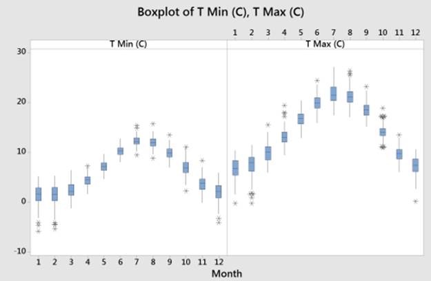
We will use a boxplot to investigate the average values for a set of data and see the range of values. In this recipe, we will create a boxplot of the mean maximum and minimum temperatures by month.
This example will also use the paneling options within Minitab to generate two separate graphs on one page.
Getting ready
We will use the data for the Oxford weather station in this example. This data is from the Met Office and is found at the following location:
http://www.metoffice.gov.uk/climate/uk/stationdata/
Select the Oxford station. The data is also made available in the Oxford data.txt file, which preserves the format from the website. Also, the Oxford weather (Cleaned).mtw Minitab file is correctly imported into Minitab for us.
How to do it…
The following instructions will copy the data from the website before generating boxplots of the mean maximum and minimum temperatures by month.
1. Follow the previous link to the Met Office weather station site.
2. Choose the Oxford 1853- station.
3. In your web browser, save the file as a text file.
4. In Minitab, go to File and select Open Worksheet….
5. Change Files of type: to Text (*.txt).
6. Select the file that we have just saved, or the provided Oxford Data.txt file.
7. Click on the Preview… button to see how the data will be imported. Notice that the data starts on line 8, and the variable names on row 6. All the data appears in one column.
8. Click on OK and select the Options… button.
9. In the Variable Names, select Use row: and enter 6.
10. For the First Row of Data, select Use row: and enter 8.
11. Set Field Definition to Free format.
12. Click on OK in each dialog.
13. Go to the Graph menu and select Boxplot….
14. From the graph selection, choose the With Groups chart under One Y.
15. Enter the mean maximum temperature, Tmax, and the mean minimum temperature, Tmin, in Graph Variables:.
16. Enter the month column, mm, in Categorical Variables for grouping (1-4, outermost first):.
17. Select the Multiple Graphs… button and choose the In separate panels of the same graph option in Show Graph Variables. Then tick the button for Same Y under Same Scales for Graphs.
How it works…
Steps 1 to 12 help us bring the text data into Minitab correctly. They can be skipped if we open the provided Minitab worksheet with the results in it. This is useful to show how we can use the Open Worksheet… command to bring text data in and ensure that the format is correct before opening. The use of Variable Names and First Row of Data helps us define where the data starts. We also used the Free format option to identify how to split out columns, but we could also use Tab, Comma, and other options to separate out columns.
Copy and paste will work as a method to import data. To copy and paste the weather data, we should select just the data without column headers. Copy this block into Minitab and then rename the columns. This is done because the text file has two column headers. These include the line for the column names and the line for units. We have only one column header in Minitab.
By default, the One Y selection for a graph creates a new graph page for each variable. The Multiple Graphs… options can be used to place separate graphs on the same page. In this scenario, it was also useful to set the y axis scales to remain fixed. The default option is independent scaling.
The maximum temperature graph is then displayed next to the minimum temperatures.
There's more…
We created a paneled graph page of maximum and minimum monthly mean temperatures. The previous graph shows the result of this side-by-side view. The same results can be displayed in a very different format by changing column orders or using a different boxplot style.
Try using the With Groups chart under Multiple Y's. This will place both variable columns within the same chart. Changing the option for graph variables that are displayed outermost on the scale to innermost will change the style of the chart from the side-by-side temperature columns to the maximum and minimum temperatures together within the month.
Edit the colors of the boxplot by double-clicking on one of the boxes. Within the Edit box tab, select the Groups section. Check the Assign attributes by graph variables option to color the boxes that are by the two separate columns.
See also
· The Finding the mean to a 95 percent confidence on interval plots recipe
Finding the mean to a 95 percent confidence on interval plots
Interval plots are used to display the mean of a group of data and an interval bar around the mean. The intervals can be either standard error bars or confidence intervals.
Here, we will use the Camshaft2.MTW worksheet from the Minitab example data folder. The data shows a recorded length of camshaft from the two suppliers. The interval plot is used to display the mean and confidence interval of the mean for each supplier.
How to do it…
The following instructions will create an interval plot showing 95 percent confidence intervals around the mean value.
1. Go to the File menu and select Open Worksheet….
2. Click on the button labeled Look in Minitab Sample Data folder.
3. Open the Camshaft2.MTW worksheet.
4. In the Graph menu, go to Interval Plot….
5. Select the With Groups chart under One Y.
6. Enter Length into the Graph variables: section.
7. Enter Supplier into the Categorical variables for grouping (1-4, outermost first): section and then click on OK.
How it works…
By default, the interval plot displays the data means and the 95 percent confidence intervals around the mean. The results in this graph reveal that supplier B has a wider interval because of greater variation in the data for B:
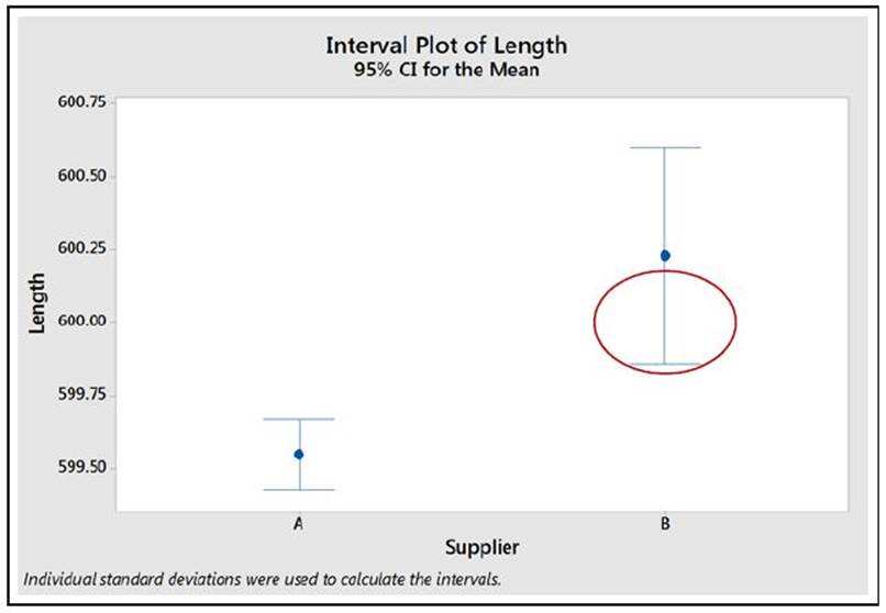
Double-clicking on Confidence interval as it is circled in the graph will allow us to change the options for this interval as shown in the following screenshot:
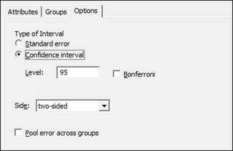
We can choose to display Standard error or Confidence interval. Confidence interval can be set as Bonferroni intervals and we can also adjust the confidence level.
The option to pool errors across groups would be used if we knew that sigma, the population standard deviation, is expected to have a similar value between the groups. The confidence intervals plotted here are such that they have an individual error rate of 1- the confidence interval. Bonferroni confidence intervals are used when we want to set the confidence intervals such that the simultaneous error rate across all groups would be a fixed value.
See also
· The Generating a paneled boxplot recipe
Using probability plots to check the distribution of two sets of data
We will use the probability plot tool to check if data from two suppliers could be normally distributed. The results are stacked in the second column, Length, where the first column, Supplier, informs us which supplier the result comes from. Probability plots from the graph menu allow more options than the normality test in the basic statistics tools. Using the probability plot, we can generate a chart for each supplier.
How to do it…
The following instructions will generate a probability plot for the results of two suppliers:
1. Go to the File menu and select Open Worksheet….
2. Click on the button labeled Look in Minitab Sample Data folder.
3. Open the Camshaft2.MTW worksheet.
4. Go to the Graph menu and select Probability Plot….
5. Select the Single graph option.
6. Enter Length as the graph variables.
7. Select the Multiple Graphs… button and then select the By Variables tab in the new subdialog.
8. Enter Supplier into the section labeled By variables with groups in separate panels:.
9. Click on OK in each dialog box to create the graphs.
How it works…
The Single chart option that we selected by default creates a probability plot of the columns entered into the graph variables. The Length column, though, is divided into two suppliers. To allow us to check if both suppliers A and B could follow a normal distribution, we have to split the chart. The options for multiple graphs allow us to split the graph into separate panels on one page, as the previous instructions show, or to create a new page for each level of the supplier column.
There's more
The Probability plots… option has more flexibility than just checking if data could be distributed normally. Within the graph dialog using options under the Distribution… button, we can change the type of distribution to be used and enter historical data for that distribution.
Creating a layout of graphs
The layout tool is a clever way to bring several graphs together onto one graph page. This can be a powerful way of presenting data or making comparisons.
Getting ready
The only requirement to run this example is to have a Minitab session open with at least two graphs available. The greater the amount of charts, the better this example.
How to do it…
Let's get started with the steps to bring several graphs together on to one graph page:
1. Make a graph an active window by selecting it with a left-click.
2. Go to the Editor menu, which will show you the editing options for graphs and select the Layout Tool… option.
3. Select a graph from the left-hand list, and double-click on it or click on the right arrow to move the chart across into the layout.
4. If you have more charts to add, select them from the list and double-click on them to add.
5. Once all the required graphs are in the layout, click on Finish to create the new page.
How it works…
Selected graphs will be moved into the section with the blue border. The following screenshot shows us that the next graph that is added would be placed in the lower-left section:
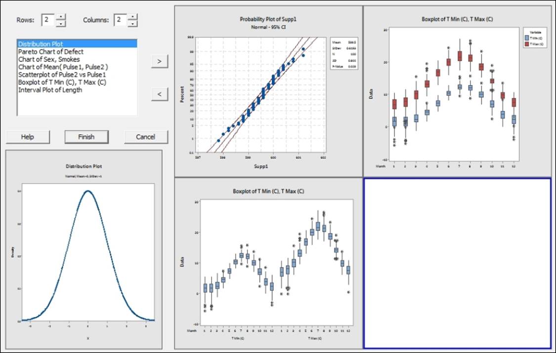
Charts already added to the layout can be orientated on the page by dragging them into the position.
The page is very flexible to change its set up. Notice in the screenshot the top-left corner provides a section for rows and columns. The default value for rows and columns is 2 creating a 2 x 2 panel of graphs. The values here can be changed from 1 to 9 allowing any combination of graphs up to a 9 x 9 layout.
Clicking on the Finish button fixes the charts in position and creates the page.
There's more…
The boxplot used in the screenshot for this section can be created by following the steps in the There's more… section of the Generating a paneled boxplot recipe.
To quickly move the layout in to PowerPoint, right click on the finished page and select the option Send Graph to Microsoft PowerPoint.
See also
· The Generating a paneled boxplot recipe
Creating a time series plot
Time series plots will generate a graph showing the values by their row number in the worksheet. As such, they will always generate a graph with an even distribution on the x axis.
In the following example, we will plot the mean maximum temperature that is recorded monthly at the Oxford weather station. As this data starts from 1853, we will subset this to all results from 2000 onwards.
Getting ready
We will use the data for the Oxford weather station in this example. This data is from the Met Office website and can be found at the following location:
http://www.metoffice.gov.uk/climate/uk/stationdata/
Select the Oxford station. The data is also made available in the Oxford data.txt file, which preserves the format from the website. Also, the Oxford weather (Cleaned).MTW Minitab file is correctly imported into Minitab for us.
When copying the data into Minitab, copy just the data starting at 1853. Then, paste it in the first row of the worksheet. After pasting the data, rename the columns.
For instructions on opening this data from a saved text file, see the Generating a paneled boxplot recipe.
How to do it…
The following instructions will create a time series plot of temperatures from the year 2000 to the end of the worksheet. We also stamp the year and month onto the x axis:
1. Go to the Graph menu and select Time Series Plot….
2. Choose the Simple time series plot.
3. Enter the column for mean maximum temperature into the Series: section of the dialog box.
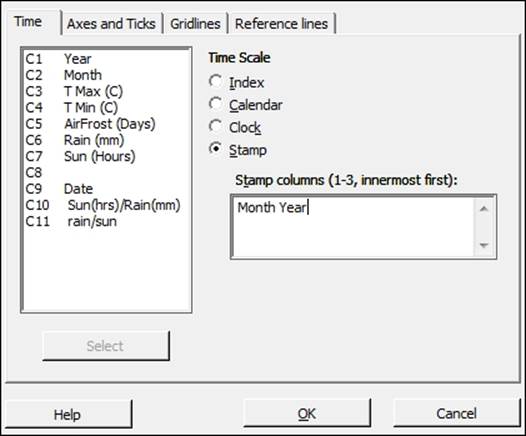
4. Click on the Time/Scale… button.
5. From the options, select Stamp and complete the dialog as shown in the following screenshot:
6. Click on OK and select the Data Options… button.
7. Make sure that the Specify which rows to Include option under Include or Exclude is selected.
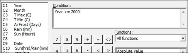
8. Then, select the Rows that match option and click on the Condition… button.
9. In the Condition: section, enter the values as shown in the following screenshot:
10. Click on OK thrice to create the chart.
How it works…
Time series plots display the results by row number. We should ensure that the data is in its correct time order before using a time series plot.
By selecting the scale and stamp button, it allows us to change the default time scale from the row number to year and month. The first column entered is at the top of the x axis and subsequent columns in the stamp section are placed below the previous columns. This shows only the relevant value in the year and month columns; it does not display the results in the date order if they are sorted differently.
Data options allows us to filter the data displayed on a graph. This option is available for all graphs created from the Graph menu. By setting the condition for the year to be greater than or equal to 2000, we display only the temperatures from 2000 onwards.
There's more…
When generating the time series plot for the data from the Met Office website or the saved text file, we notice that there are some missing points on the chart and in the worksheet. Check the data in the text that we copied; some of the results are indicated with *. These are provisional results. We would need to correct these manually in the worksheet or remove * from the original file.
The Oxford weather (cleaned).MTW worksheet provides this data with the missing data points corrected.
See also
· The Adding a secondary axis to a time series plot recipe
Adding a secondary axis to a time series plot
Time series plots and scatterplots can be used with a secondary axis. Here, we will use the Oxford weather station's data to plot the temperature and hours of sunlight on the same chart. Temperature will be displayed on the left y axis; Sun(Hours) will be displayed on the right axis.
Getting ready
As done in the previous recipe, we will use the Oxford weather station's data. See the details in the Creating a time series plot recipe. Most of the steps in this example will be similar to the time series plot instructions, except the use of the multiple time series plots instead of a single one.
How to do it…
Let's get started with the steps that would help us add a secondary axis to a time series plot:
1. Go to the Graph menu and select Time Series Plot….
2. Select the Multiple chart.
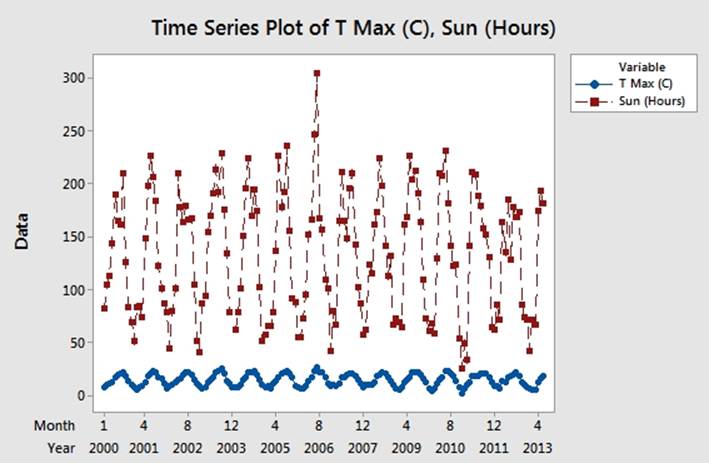
3. Enter the column for mean maximum temperature and the column for hours of sunlight into the section labeled Series:.
4. Follow the steps in the previous example to add the year and month on the x axis, and for the condition to display only the results from 2000 onwards, that is, from step 4 to step 9.
5. The graph should appear as shown in the following screenshot:
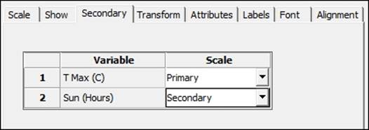
6. Double-click on the y axis to edit the scale as indicated on the screenshot.
7. From the Edit y axis options, choose the Secondary tab and use the dropdown to put the hours of sunlight column on the Secondary axis, as shown in the following screenshot:
How it works…
Multiple charts that are overlaid are displayed on the same graph. When the scales are very different, as in this case where temperatures are in degree Celcius and sunlight hours in hours of sunlight in a month, then one response can appear disproportionate to the other. The secondary axis allows independent scaling of both axes while using the same x axis.
This can be a useful tool to display correlations in the data.
All materials on the site are licensed Creative Commons Attribution-Sharealike 3.0 Unported CC BY-SA 3.0 & GNU Free Documentation License (GFDL)
If you are the copyright holder of any material contained on our site and intend to remove it, please contact our site administrator for approval.
© 2016-2026 All site design rights belong to S.Y.A.