Minitab Cookbook (2014)
Chapter 3. Basic Statistical Tools
In this chapter, we will cover the following recipes:
· Producing a graphical summary of data
· Checking if data follows a normal distribution
· Comparing the population mean to a target with a 1-Sample t-test
· Using the Power and Sample Size tool for a 1-Sample t-test
· Using the Assistant menu for a 1-Sample t-test
· Looking for differences in the population means between two samples with a 2-Sample t-test
· Using the Power and Sample Size tool for a 2-Sample t-test
· Using the Assistant menu to run a 2-Sample t-test
· Finding critical t-statistics using the probability distribution plots
· Finding correlation between multiple variables
· Using the 1 Proportion test
· Graphically presenting the 1 Proportion test
· Using the Power and Sample Size tool for a 1 Proportion test
· Testing two population proportions with the 2 Proportions test
· Using the Power and Sample Size tool for a 2 Proportions test
· Using the Assistant menu to run a 2 Proportions test
· Finding the sample size to estimate a mean to a given margin of error
· Using Cross tabulation and Chi-Square
· Using equivalence tests to prove zero difference between the mean and a target
· Calculating the sample size for a 1-Sample equivalence test
Introduction
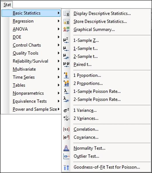
In this chapter, we will explore how to use inferential statistical tools in Minitab. The emphasis of this chapter is on discovering population parameters and comparisons of these parameters to targets or between two groups of data. The majority of the tools used in this chapter can be found by navigating to the Stat | Basic Statistics menu within Minitab. This is shown in the following screenshot:
Producing a graphical summary of data
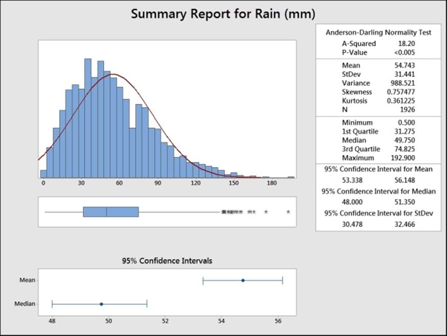
The Graphical Summary… tool is a quick way of producing an overview of a column of data. The following example shows us the output comprising a histogram, the Anderson-Darling test for normality, mean, standard deviation, and more.
Here, we will use the data from the Oxford weather station and produce a summary of the amount of rainfall in mm for each month, for all the results from 1853 onwards.
Getting ready
We will use the data from the Oxford weather station in this example. This data is from the Met Office website and can be found at http://www.metoffice.gov.uk/climate/uk/stationdata/. Select the Oxford station.
The data is made available in the Oxford Weather.txt file; this preserves the format from the website. This data is also available in the Minitab Oxford weather (cleaned).mtw file, and using this worksheet correctly imports itself into Minitab for us.
How to do it…
The following steps will import the weather station's data and then produce a summary of rainfall seen in each month from 1853 to 2013:
1. Follow the previously mentioned link to the Met Office weather station website.
2. Choose the Oxford (Oxford 1853-) station.
3. In your web browser, save the file as a text file.
4. In Minitab, go to File and select Open Worksheet….
5. Change Files of type to Text (*.txt).
6. Select the file that we have just saved or select the provided Oxford Weather.txt file.
7. Click on the Preview… button to see how the data will be imported. Notice that the data starts on line 8 and the variable names on row 6. All the data appears in one column.
8. Click on OK and select the Options… button.
9. In the Variable Names section, select Use row: and enter 6.
10. For the First Row of Data section, select Use row: and enter 8.
11. Set the Field Definition option to Free format.
12. Click on OK in the Open Worksheet dialog box and then click on Open.
13. Go to the Stat menu, then Basic Statistics and then click on Graphical Summary….
14. In the dialog box, enter the column for rainfall amount as the Variables: field, and the column for month into the By Variables field.
15. Click on OK.
How it works…
The columns in Variables populate the summary statistics and the optional selection of By variables (optional) allows us to split a set of data into separate summaries. Using the month as By variables (optional) creates a summary for each month. The following screenshot shows us the results for July:
There's more…
If we want to view the results from only one month, say July, instead of generating a summary for all months, we can use the Split Worksheet… or Subset Worksheet… tools. These can be used to generate new datasets using the results contained within a single month.
See also
· The Splitting a worksheet by categorical column recipe in Chapter 1, Worksheet, Data Management, and the Calculator
· The Creating a subset of data in a new worksheet recipe in Chapter 1, Worksheet, Data Management, and the Calculator
Checking if data follows a normal distribution
The normality test in basic statistics is a tool that is similar to the probability plot used in Chapter 2, Tables and Graphs. It is limited to testing normality but it does offer us the choice between Anderson-Darling statistics, Kolmogorov-Smirnov, and Ryan-Joiner tests.
Here, we will use the data from the Oxford weather station and check the normality of the mean maximum temperature for July.
Getting ready
The data for this example can be found on the Met Office website at http://www.metoffice.gov.uk/climate/uk/stationdata/oxforddata.txt.
The data is made available in the Oxford Weather.txtfile; this preserves the format from the website and also the Minitab Oxford weather (cleaned).mtwfile. This worksheet is correctly imported into Minitab for us. Follow steps 1 to 12 in the Producing a graphical summary of data recipe to import the results.
How to do it…
1. Go to the Data menu and select Split Worksheet….
2. In the By variables section, enter the column for month (C2 mm).
3. Click on OK.
4. From the new worksheets, select the worksheet for July.
5. Go to the Stat menu and then Basic Statistics and click on Normality Test….
6. In the dialog box, enter the column for mean maximum temperature in the Variable field.
7. Click on OK.
How it works…
The output will give us means, standard deviation, the test statistic, and the P-value. The Anderson-Darling test is more sensitive to deviations from normality in the tails of the distribution.
See also
· The Splitting a worksheet by categorical column recipe in Chapter 1, Worksheet, Data Management, and the Calculator
· The Using probability plots to check the distribution of two sets of data recipe in Chapter 2, Tables and Graphs
· The Producing a graphical summary of data recipe
Comparing the population mean to a target with a 1-Sample t-test
We will use the 1-Sample t-test to investigate the population mean for measures of the economy. The data here is for the UK Gross Domestic Product (GDP). This is often used as a measure of the health of an economy. We will test to see if the percentage growth of GDP per quarter for the UK is equal to zero.
Getting ready
The data for this example was obtained from the Guardian newspaper's website and can be found at http://www.guardian.co.uk/news/datablog/2009/nov/25/gdp-uk-1948-growth-economy.
A direct link to the Google Docs spreadsheet is provided at https://docs.google.com/spreadsheet/ccc?key=0AonYZs4MzlZbcGhOdG0zTG1EWkVPX1k1VWR6LTd1U3c#gid=10.
Enter the results shown in the following screenshot into the worksheet. The UK GDP file1.mtw file is also provided on the Packt Publishing website at http://www.packtpub.com/support.
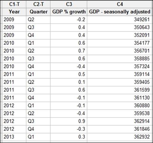
The percentages given in the previous screenshot are rounded figures. To obtain a more precise estimate of the change in percentage, we will calculate this figure. Then, we will run the t-test.
How to do it…
The following example will calculate the percentage change in GDP from the seasonally adjusted data before using a t-test to compare the mean percentage growth to 0:
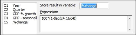
1. Go to the Calc menu, select Calculator…, and enter the expression as shown in the following screenshot:
2. Click on OK.
3. Go to the Stat menu and then Basic Statistics and select 1-Sample t….
4. Enter the %change column into the section for the variables as shown in the following screenshot:
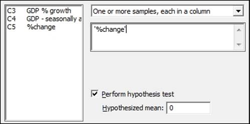
5. Check the option for Perform hypothesis test and enter a mean of 0.
6. Click on the Graphs… button, select Individual value plot, and click on OK twice.
How it works…
The calculator is used in the first step to find the percentage change using the lag function. The lag(c4,1) function moves the results of column 4 one row down, allowing a comparison of a column with itself one row later.
The null hypothesis of this test is set to a mean of 0 percent. The results come out with a mean of 0.255 percent and a 95 percent confidence interval between 0.017 percent and 0.493 percent. Finally, the P-value for this test is 0.038.
This indicates that the mean %change per quarter is not zero.
The drop-down box above the variables section allows us to choose between using data entered as columns in the worksheet or summarized values of means and standard deviations.
There's more…
We should check the assumptions of running a t-test. It is random, independent data, and that the population follows a normal distribution, although t-tests are relatively robust to greater than 20 samples that lack normality.
It is useful to run a time series plot to observe variation over time and a normality test.
See also
· The Time series plot recipe in Chapter 2, Tables and Graphs
· The Checking if data follows a normal distribution recipe
· The Finding critical t-statistics using the probability distribution plot recipe
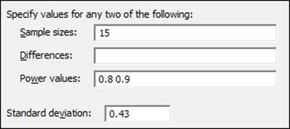
Using the Power and Sample Size tool for a 1-Sample t-test
In the previous example, we ran a t-test to compare the population mean against a hypothesized value. The results of the t-test on the data entered showed us a mean of 0.255 with a standard deviation of 0.43. In this example, we will check the size of difference that a 1-Sample t-test using 15 samples and a standard deviation of 0.43 can detect with 80 percent or 90 percent power.
Getting ready
We will use the results of the mean, standard deviation, and the sample size from the Comparing the population mean to a target with a 1-Sample t-test recipe. We would like to know the type of difference that this test can observe.
How to do it…
The following steps will generate the size of effect that we could observe using 80 percent or 90 percent of the results in the previous recipe:
1. Go to the Stat menu and select Power and Sample Size; it is last option in the menu.
2. Then select 1-Sample t….
3. In Sample sizes:, enter 15; in Power values:, enter 0.8 and 0.9; and in Standard deviation:, enter 0.43 as shown in the following screenshot:
How it works…
The result here indicates that if the population mean was really 0.3346 different from the target, we would be able to prove this difference 80 percent of the time we ran a 1-Sample t-test with 15 results. If the population was really 0.387 different from the hypothesized mean, this test would have a 90 percent chance of observing this difference.
By entering a difference that we would be interested in finding and a power value with which we would want to see that effect, we can obtain a suggested sample size.
Multiple values can be entered into the sample size, differences, or power values sections. They only need to be separated by a space. Power values should also be entered as a proportion rather than a percentage.
See also
· The Comparing the population mean to a target with a 1-Sample t-test recipe
· The Using the Assistant menu for a 1-Sample t-test recipe
Using the Assistant menu for a 1-Sample t-test
The Assistant menu offers us an alternative route to a t-test. In general, the Assistant tools offer us a lot more guidance in both the use and interpretation of results than the Stat menu. The Assistant tools are designed to be more accessible and because of this, there are less options to choose from, compared to the equivalent tool in the Stat menu.
Here, we will use the same economic results as the 1-Sample t-test.
Getting ready
The data for this example is from the UK GDP figures from 2009 to 2013. Enter the data shown in the following screenshot into the worksheet. Alternatively, open the data UK GDP file1.mtw file.
How to do it…
The following steps will use the Assistant tools to run the 1-Sample t-test:
1. In the Assistant menu, select Hypothesis Tests….
2. From the screen that asks us what our objective is, select 1-Sample t from the Compare one sample with a target field.
3. In the Data column: field, enter the percentage change results.
4. Enter 0 for the Target field.
5. Under What do you want to determine?, select Is the mean of '%change' different from 0.
6. Click on OK.
How it works…
The Assistant tool starts from a selection screen to guide us to a test. If we wanted more information on the presented choices, we would click on the top field under the first objective screen. Here, we would be presented with a decision tree to help us pick the right tool. Further guidance is found within each decision diamond.
Tip
When entering the fields in the 1-Sample t-test, the text for one-sided or two-sided tests is updated to reflect the column name being used and target entered.
By entering a difference that is of practical importance to us, the power of the test is calculated with the results and the suggested alternative sample sizes.
The output that is generated comprises several graphical report cards. The first page contains any warnings about the study. The second page contains diagnostic checks, a time series plot, and the power study. The last page contains the results of the t-test with an individual value plot, means, and confidence intervals, plus comments on whether we can conclude that the mean is different from the target or not.
See also
· The Comparing the population mean to a target with a 1-Sample t-test recipe
· The Using the Power and Sample Size tool for a 1-Sample t-test recipe
· The Finding critical t-statistics using the probability distribution plot recipe
Looking for differences in the population means between two samples with a 2-Sample t-test
For this recipe, we will use a 2-Sample t-test to compare two groups of data. The null hypothesis for the 2-Sample t-test is that the population means are the same.
Here, we will look at comparing the pulse rate of a group of students that exercised against a group that didn't.
Getting ready
The data is in the Minitab Pulse.mtw worksheet. The file can be found in the Minitab Sample Data folder.
How to do it…
The following steps will compare the mean pulse rate of two groups of students:
1. To open the worksheet, go to the Stat menu and select Open Worksheet….
2. Click on the Look in Minitab Sample Data folder button.
3. Open the Pulse.mtw worksheet.
4. Go to the Stat menu and select Basic Statistics, then click on 2-Sample t….
5. In Samples, enter the Pulse2 column.
6. In Sample IDs:, enter Ran.
7. Select the Graphs… button and check the option for Boxplots of data.
8. Click on OK twice.
How it works…
The 2-Sample t-test here uses the sample column for all the pulse measurements; the subscripts are then used to identify if a result was from the group that ran (1) or the group that didn't run (2). Alternatively, the two groups could have been in separate columns or we could have just entered the summarized results of sample size, mean, and standard deviations.
In Minitab v17, we can choose between samples in one column, different columns, or summarized data from the drop-down box at the top of the dialog.
There is also an option to run the test assuming equal variances; we use Welch's t-test for unequal variances by default.
There's more…
The 2 variance test under Basic Statistics can be used to test the assumption of equal variance.
See also
· The Using the Power and Sample Size tool for a 2-Sample t-test recipe
· The Using the Assistant menu to run the 2-Sample t-test recipe
Using the Power and Sample Size tool for a 2-Sample t-test
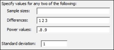
Here, we will use the power and sample size tools to find the number of samples needed to observe a difference in the means between two populations.
We will not need to open a dataset for this recipe. Using a standard deviation that has been set to 1, we will discover the number of samples required to observe a 1, 2, or 3 standard deviation difference between two population means.
How to do it…
The following steps will help us find the sample size required to detect differences of 1, 2, or 3 standard deviations between the means of two samples:
1. Go to the Stat menu and then Power and Sample Size and then select 2 Sample t….
2. Fill out the dialog box as shown in the following screenshot:
3. Click on OK.
How it works…
The differences are stated in terms of the value of the standard deviation from the results shown in the following screenshot:
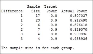
To observe a 1 standard deviation difference between the population means of two samples, we would need 17 samples to have an 80 percent chance of observing this difference or 23 samples to have a 90 percent chance of observing the difference. This sample size is for both groups of data.
The options for this test allow us to specify a one-sided test or change the significance level.
Using the Assistant menu to run the 2-Sample t-test
We can also use a 2-Sample t-test from the Assistant menu. Like the other Assistant tools, this provides a simpler interface and graphical report cards for the output. Here we will use the Pulse dataset as shown in the earlier example. We will compare the results ofPulse2 with the groups in the Ran column.
How to do it…
The following steps will help us compare the mean pulse rates of two groups of students using the Assistant tools. Initially, we will unstack the data before running the t-test:
1. To open the worksheet, go to the File menu and select Open Worksheet….
2. Click on the Look in Minitab Sample Data folder button.
3. Open the Pulse.mtw worksheet.
4. Go to the Data menu and select Unstack Columns….
5. Enter the Pulse2 column in the Unstack the data in: field.
6. Enter the Ran column in the Using subscripts in: section.
7. Click on OK.
8. Go to the Assistant menu and select Hypothesis Tests….
9. Select 2-Sample t.
10. In the dropdown for How are your data arranged in the worksheet?, select the option for Each sample is in it own column.
11. Enter the Pulse2_1 column in the section First sample column:.
12. Enter the column Pulse2_2 in the Second sample column: section.
13. Choose the option for Is the first mean of 'Pulse2_1' different from the mean of 'Pulse2_2'?.
14. Click on OK.
How it works…
The unstacked columns can be used to put the unstacked data into a new worksheet or after the last columns of the current worksheet. By default, it will name the new columns using the name of the unstacked column along with the grouping value used to unstack the data. Here, the grouping column for Ran has the levels 1 or 2. So, the columns are named Pulse2_1 and Pulse2_2.
In Minitab v17, we could also have used the data without unstacking the columns using the Both samples are in one column, IDs are in another column. option.
Assistant can also be used to help pick the type of test to be used with the Help me choose selection.
See also
· The Looking for differences in the population means between two samples using a 2-Sample t-test recipe
· The Using the Power and Sample Size tool for a 2-Sample t-test recipe
Finding critical t-statistics using the probability distribution plot
The critical t-statistic can be found from either the Calc menu tools under Probability Distributions, or from the Graph menu and Probability Distribution Plot…. Here, we will find the critical t-statistic using the graphical tools used in probability distribution plots. In this recipe, we will find the critical t-statistic with 14 degrees of freedom for a two-sided test.
How to do it…
The following steps will show us how we can use the probability distribution plot tools to find the critical t-statistic:
1. Go to the Graph menu and select Probability Distribution Plot….
2. Choose the View Probability chart.
3. From the Distribution: dropdown, select t and under Degrees of freedom:, enter 14.
4. Select the tab for Shaded Area. Ensure that the option for Define Shaded Area By is already Probability.
5. For a two-sided test, select Both Tails. Leave the Probability at 0.05.
6. Click on OK.
How it works…
Probability distribution plots allow us to easily create a graph of a distribution curve based on the parameters entered. Using the option to view probability, we will generate a distribution curve with a shaded area under the curve.
The previous steps created the t-distribution curve and shaded the area below 0.025 and above 0.975. Overall, 5 percent of the curve is shaded and the position of the 0.025 and 0.975 in T is displayed. This is our critical t-statistic for a t-test, as shown in the following screenshot:
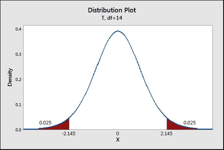
From the graph, the critical t for a two-sided test with df equal to 14 is 2.145.
There's more…
Under the Calc menu, the tools found under probability distributions can be used to calculate the probability's density functions, CDF, or inverse CDF. The same critical t-statistics can be calculated using the t-distribution and the inverse CDF.
Finding correlation between multiple variables
The correlation tool is used to investigate linear relationships between variables. In this recipe, we will use the example from the Oxford weather station and check the correlation between the mean maximum temperature, mean minimum temperature, air frost days, rainfall, and hours of sunlight.
Getting ready
The data from the Oxford weather station can be obtained from the Met office website at http://www.metoffice.gov.uk/climate/uk/stationdata/.
Open the Oxford weather (cleaned).mtw file. This is available on the Packt Publishing website. For more on importing this data directly, see the Producing a graphical summary of data recipe.
How to do it…
The following steps will generate the Pearson correlation coefficient and P-value for the results of the weather station data:
1. Go to Stat, click on Basic Statistics, and select Correlation….
2. Enter the columns for maximum temperature, minimum temperature, rainfall, and hours of sunlight into the Variables: section.
3. Click on OK.
How it works…
The output generates a table that compares all of the variables to one another. The top number is the correlation score and the lower number the P-value. Correlation scores range from -1 to +1, and a score of 0 indicates no correlation. The null hypothesis for this test is that there is no correlation; the alternative is that there is correlation. Strong correlations should be seen between the temperature columns and hours of sunlight.
There's more…
With a lot of variables, the correlation table can often be wider than the page width of the session window. The results are then displayed across multiple output tables. The session window's output width can be changed in Options… under the Tools menu.
Correlations can also be visualized very quickly using a matrix plot. This chart will plot a scatterplot of each variable versus one another.
Spearman Rank correlation is also available in Minitab v17 by changing the Method: option to Spearman rho.
See also
· The Producing a graphical summary of data recipe
Using the 1 Proportion test
In this recipe, in the pulse dataset, we will look at the proportion of students who smoke regularly. We want to check if the proportion is different now from a historical figure of 25 percent of students who smoke regularly. Additionally, we will convert the numeric values in the Smokes column to text. This step is not necessary for the proportions test but can be useful to display the results.
Getting ready
Open the Pulse.mtw dataset from the Minitab Sample Data folder. The column Smokes has values of 1 and 2; 1 refers to those who smoke regularly and 2 refers to those who don't smoke regularly.
How to do it…
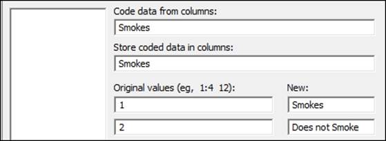
The following steps will recode the values in the smokes column to categories of Smokes and Does not Smoke before checking to see if the proportion of smokers is different from the historical proportion of 0.25:
1. Go to the Data menu, click on Code, and select Numeric to Text….
2. Enter the data shown in the following screenshot into the dialog box:
3. Click on OK.
4. Go to Stat and then Basic Statistics and select 1 Proportion….
5. Enter the Smokes column as the Samples in columns:.
6. Tick the option for Perform hypothesis test. Enter the Hypothesized proportion as 0.25.
7. Click on OK.
How it works…
It is not essential to code the Smokes column from numeric values to text but this can be a useful step in the interpretation of the results. Steps 1 to 3 on coding data from numeric to text could be skipped if we want to go straight to the proportion test.
We have used the 1 Proportion test to count the frequency of observations in the Smokes column. It is also possible to use the 1 Proportion test with summarized results by entering the number of events and the number of trials.
The options for the 1 Proportion test can be used to change the confidence interval and choose between a one-sided or two-sided test.
The null hypothesis for this test is no different from the hypothesized proportion. The alternative hypothesis is that there is a difference. Here, we fail to reject the null hypothesis with a P-value of 0.278.
See also
· The Graphically presenting the 1 Proportion test recipe
· The Using the Power and Sample Size tool for a 1 Proportion test recipe
· The Coding a numeric column to text values recipe in Chapter 1, Worksheet, Data Management, and the Calculator
Graphically presenting the 1 Proportion test
We can represent the results of the 1 Proportion test in the previous example using a probability distribution plot. Using the binomial distribution, we can show where the results of the study are in relation to the historical figures of 25 percent.
Getting ready
Following on from the previous example, we will use the figures of 92 students in total, out of which 28 smoke regularly. It is not necessary to open the dataset but it may be beneficial to run the previous example to compare the results.
How to do it…
The following steps will use probability distribution plots to generate a binomial distribution for 92 trials and an event probability of 0.25:
1. Go to the Graph menu and select Probability Distribution Plot….
2. Select the View Probability graph.
3. From the dropdown for Distribution:, select Binomial.
4. Under Number of trials:, enter 92 and for Event probability:, enter the hypothesized probability of 0.25.
5. Select the tab for Shaded Area, choose X Value, and select Both Tails.
6. For the X value field, enter 28.
7. Click on OK.
How it works…
The probability distribution plot creates a histogram of the probability density function. For our observed results of 28, we have shaded the area of the distribution above 28. This indicates that we have 0.1399 in the tails of the distribution above 28. As this is a two-sided test and we are checking for a difference, the values of 18 and lower are shaded as well. The area in the distribution below 18 is 0.1383.
Add the two tails together to obtain the P-value of the 1 Proportion test, 0.1383 plus 0.1399 equals 0.2782 - the result of previous example.
For a one-sided test, we can choose to shade just one tail of the distribution.
See also
· The Comparing the population mean to a target with a 1-Sample t-test recipe
· The Using the Power and Sample Size tool for a 1 Proportion test recipe
Using the Power and Sample Size tool for a 1 Proportion test
In the 1 Proportion test example, we have 92 students and 28 smokers in the group. The sample shows 30.4 percent of the group as smokers. The results from a 1 Proportion test will indicate that we cannot reject the null hypothesis.
For this recipe, we want to know how many students we need to sample in order to be able to observe a difference of 2.5 percent or 5 percent between the hypothesized and actual proportions that have a power of 80 percent. We will use a hypothesized proportion of 25 percent and differences of 2.5 and 5 percent.
How to do it…
The following steps will help us find the number of samples needed to identify a difference of 2.5 percent or 5 percent with at least an 80 percent chance of identifying this difference:
1. Go to the Stat menu, click on Power and Sample Size, and select 1 Proportion….
2. Enter .25 in the Hypothesized proportion: field.
3. Enter .2 .225 .275 .3 in the Comparison proportions: field and .8 in the Power values: field.
4. Click on OK.
How it works…
To achieve a power of 80 percent to observe a population with a different proportion to 0.25, we would require a sample size of over 2300 for a 0.025 difference or around 600 samples for a 0.05 difference.
We should also note that we require less samples for the same power to observe a decrease than an increase in the proportion. The results show us that we need 2305 samples to see a proportion of 0.225 or 2399 for a proportion of .275.
By specifying two of the values of Sample sizes:, Power values:, and Comparison proportions:, Minitab will calculate the third value. Each of these three fields will accept multiple values.
Try thinking about the difference that could be observed with only 300 surveyed students. This test can also be made more sensitive by changing the alternative from different to a one-sided test.
See also
· The Using the 1 Proportion test recipe
· The Graphically presenting the 1 Proportion test recipe
Testing two population proportions with the 2 Proportions test
Using the data in the Pulse worksheet, we previously checked to see if the number of regular smokers in a group of students was different to a historical proportion of 0.25. We will use the 2 Proportions test to check if the proportion of regular smokers is different by gender.
Getting ready
Open the Pulse.mtw dataset from the Minitab Sample Data folder. The Smokes column has values of 1 or 2; 1 refers to students who smoke regularly and 2 refers to students who don't smoke regularly. The Sex column uses 1 for male and 2 for female.
How to do it…
The following steps will help us compare the proportion of smokers and nonsmokers between male and female students:
1. Go to the Stat menu and then Basic Statistics and select 2 Proportions….
2. Enter the Smokes column as Samples: and the Sex column as Sample IDs:.
3. Click on OK.
How it works…
The results will show Event as level 2 in the response column. 2 refers to the nonsmokers, the X values in the table indicate the count of nonsmokers, and the Sample p values indicate the proportion of nonsmokers in the group. The following screenshot indicates where this event is indicated:
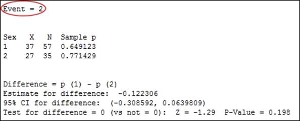
Event is alphabetically chosen as the last value by default. The preceding screenshot shows 2 as the event, that is, the nonsmokers. 65 percent of the male students were nonsmokers, compared to 77 percent of female students. If we coded the columns to text values as in the Using the 1 Proportion test recipe, Smokes - Does Not Smoke, then the Event would be Smokes.
The P-value is calculated from a standard normal approximation, which is the Z-score in the previous output. This can be inaccurate if there are less than 5 events or nonevents in either of the samples. Fisher's exact test is also calculated and can be used when the normal approximation is not valid.
The dialog can also accept data as summarized results or separate columns by changing the options available in the drop-down box.
The null hypothesis for the 2 Proportions test is p1-p2 = 0. The alternative for the two-sided test is p1-p2 ≠ 0.
See also
· The Using the 1 Proportion test recipe
· The Using the Power and Sample Size tool for a 2 Proportions test recipe
· The Using the Assistant menu to run a 2 Proportions test recipe
Using the Power and Sample Size tool for a 2 Proportions test
In the previous recipe, we checked if we could prove a difference in the population of smokers between a group of students. Now, we will check how many students we need to sample to observe a difference of 5 percent or 10 percent between smokers of each gender.
Getting ready
We will use the figures from the previous recipe, Testing two population proportions with the 2 Proportions test, but there is no need to open a dataset.
How to do it…
The following steps will find the number of male and female students that need to be included in a sample to be able to observe a difference in the proportion of smokers in each group of 0.05 or 0.1 with at least 80 percent or 90 percent power:
1. Go to the Stat menu, select Power and Sample Size, and click on 2 Proportions….
2. Enter 0.25 in the Baseline proportion (p2): field; in Comparison proportions (p1):, enter 0.15 0.2 0.3 0.35.
3. In Power values:, enter .8 .9.
4. Click on OK.
How it works…
The sample size that is calculated is for each group, not overall. To have an 80 percent chance of seeing a population difference of 0.25 to 0.35 in the proportion of smokers, we would need 329 male and female students.
See also
· The Testing two population proportions with the 2 Proportions test recipe
· The Using the Assistant menu to run a 2 Proportions test recipe
Using the Assistant menu to run a 2 Proportions test
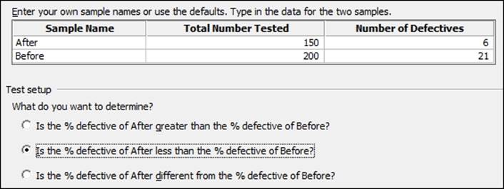
The Assistant tool also provides us with a 2 Proportions test. We will enter summarized results and check if there is a difference between the observed number of defectives before and after a process change.
No dataset is needed for this recipe as we will be using summarized results. We will use the results for a Before group of 200 samples and 21 defective items. After a change was made, we took a sample of 150 items and observed only 6 defectives.
How to do it…
The following steps will use the Assistant tool to run a 2 Proportions test to check the difference between 6 defective items in 150 and 21 in 200:
1. Go to the Assistant menu and select Hypothesis Tests….
2. Choose the 2-Sample % Defective option from under the Compare two samples with each other group.
3. Complete the dialog box as shown in the following screenshot:
4. Click on OK.
How it works…
The Assistant test for 2 percent defectives only uses summarized data, but provides a series of report slides as the output. The Assistant can also make the choice of a one-sided or two-sided test very simple. The choice of what we want to determine will be updated to reflect the sample names that have been entered.
See also
· The Testing two population proportions with the 2 Proportions test recipe
· The Using the Power and Sample Size tool for a 2 Proportions test recipe
Finding the sample size to estimate a mean to a given margin of error
Here, we want to obtain the sample size required to estimate a population parameter to a given margin of error. We will not use specific values but will find the number of samples required to estimate a mean with a confidence interval ±0.5 and ±1 standard deviation wide.
How to do it…
The following steps will identify the number of samples required to find an estimate of the population mean to a confidence interval of +/- 0.5 and +/-1 standard deviations wide:
1. Go to the Stat menu, go to Power and Sample Size, and select Sample Size for Estimation….
2. In the Parameter section, select Mean (Normal) from the dropdown.
3. Under Planning Value, enter Standard deviation: as 1.
4. In Margins of error for confidence intervals:, enter 0.5 and 1 (separated by a space).
5. Click on OK.
How it works…
We are trying to find the sample size required to estimate the population mean as +/- 0.5 or 1 standard deviations. Eighteen samples would give us a confidence interval that is 1 standard deviation wide; seven samples would give us a confidence interval of 2 standard deviations wide. This tool does not tell us the number of samples required to prove a difference, only the number of samples required for a given confidence interval.
We have entered the standard deviation in the dialog box as 1 and then entered the margin of error as a ratio of the standard deviation. We could have used actual standard deviations and margins of error. If we use the example of the GDP figures in the UK from 2009 to 2013, we will find a standard deviation of 0.43 from the Comparing the population mean to a target with a 1-Sample t-test recipe. By entering the standard deviation as 0.43, we could check how many samples are needed to estimate the mean percentage growth to a margin of error of 0.1 percent.
See also
· The Comparing the population mean to a target with a 1-Sample t-test recipe
Using Cross tabulation and Chi-Square
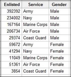
We can use a Chi-Square test to check if proportions are equal across several groups of data. The example here is of the proportion of enlisted men and women in the US armed forces. Does the proportion of men and women in the US armed forces differ by service?
The data is obtained from the Statisticbrain website and can be found at http://www.statisticbrain.com/demographics-of-active-duty-u-s-military/.
Getting ready
Enter the data into a blank worksheet as shown in the following screenshot:
How to do it…
The following steps will compare the proportion of enlisted male and female personnel in the US armed services using a Chi-Square test:
1. Go to the Stat menu, click on Tables, and select Cross Tabulation and Chi-Square.
2. Enter Service in the field For rows: column.
3. Enter Gender in the field For columns: column.
4. Enter Enlisted in the field Frequencies are in: column.
5. Select the Chi-Square… button.
6. Check the options for Chi-square test, Expected cell counts, and Each cell's contribution to the Chi-Square statistics.
7. Click on OK twice.
How it works…
The Cross Tabulation and Chi-Square tools are a great way to build a table of frequencies. We have used rows and columns in this example, but we could also use layers to split the table by a third factor. The default view is to display the counts within the table.
The null hypothesis for this test is that the Chi-Square score is zero; the alternative is that it is not zero.
We can find the expected cell count for women in the services using this formula: (total number of females/total number of personnel) * number of personnel in that service.
The same can be run for the number of males in each service.
The contribution to Chi-Square for a cell is found from this formula: (Observed-Expected)^2/Expected.
Pearsons Chi-Square is the sum of the contributions.
There's more…
Bar charts would be a great way to present the results of this Chi-Square test. Read about bar charts in Chapter 2, Tables and Graphs. Use Values from a table bar chart, One column of values and select the Stacked graph. Graph options can be used to show the percentages; set these options within columns that are at level 1.
Using equivalence tests to prove zero difference between the mean and a target
Equivalence tests are new in Minitab v17. We will use an equivalence test to determine if the mean of a sample can be found to be equivalent for a target value.
These tests are similar to t-tests, but where the t-test null hypothesis is no difference, an equivalence test uses a null hypothesis of there is a difference.
The example dataset here is fill volumes of syringes. The target fill volume is 15 ml; we would like to know if the fill volumes of this process are equivalent to the goal of 15 to within +/- .25 ml around the target.
Getting ready
Open the equivalence 1 sample.mtw worksheet from the support files.
How to do it…
The following steps compare the measured volumes to the target of 15:
1. Navigate to Stat | Equivalence Tests | 1 Sample….
2. Enter Volume for the Sample: column.
3. Enter 15 as Target:.
4. For Lower limit:, enter -.25.
5. For Upper limit:, enter .25.
6. Click on OK.
How it works…
Equivalence tests are also known as two one-Sided t-tests. The 1-Sample equivalence test uses two 1-Sample t-tests. The first null hypothesis is that the mean - target is less than equal to lower limit, with an alternative of greater than.
The second null hypothesis is that the mean - target is greater than or equal to upper limit with an alternative of less than.
When both null hypotheses can be rejected, we can prove that the mean - target is greater than the lower limit, and lesser than the upper limit, proving that the mean-target is within the equivalence limits.
If one null hypothesis cannot be rejected, then the mean - target is outside the equivalence region.
This is the opposite of a t-test. With a t-test, we can only prove a difference between a target or between means. With the equivalence test, we swap the null hypothesis to be a difference so that we can then look for evidence of no difference.
This becomes useful when we would like to prove that a process is on target.
T-tests cannot be used to prove that we are on target. This is because we never prove the null hypothesis. A t-test can show us that we cannot prove a difference, but this may be because we didn't take enough data to be able to observe that difference.
Equivalence tests, unlike t-tests, look for evidence to prove that there is no difference. If we do not have enough data to prove no difference, then we would fail to reject the null hypothesis that there is a difference.
There's more…
Like t-tests, Minitab has power and sample size tools for the equivalence tests, tests for 2 samples, and paired equivalence. See the Calculating the sample size for a 1-Sample equivalence test recipe.
It is also possible to set a limit based on a multiplication around the target instead of a difference. Setting a lower limit at -0.1 and the upper at +0.1 will put the equivalence limits at -1.5 or +1.5 around the target of 15. This can be useful if specifying equivalence to a stated percentage of the target.
See also
· The Calculating the sample size for a 1-Sample equivalence test recipe
Calculating the sample size for a 1-Sample equivalence test
The power and sample size tools enable us to calculate the number of samples we require to prove that a test sample is equivalent to a target or another sample.
Here, we check the number of samples required to prove that a batch of syringes have a fill volume with a mean of 15 ml. To be equivalent, the mean fill volume should be within +/- 0.25 of the target. The goal is to be able to identify that the mean is less than 0.1 different to the target, with at least 80 percent or 90 percent power.
We will use a standard deviation of 0.27 for this study.
Getting Ready
We will not open a dataset for this study. This example follows the previous recipe, Using equivalence tests to prove zero difference between the mean and a target.
How to do it…
The following steps will calculate a sample size required to check for equivalence with at least 80 percent power:
1. Navigate to Stat | Power and Sample Size | Equivalence Tests | 1-Sample….
2. Set Lower limit: to -0.25 and Upper limit: to 0.25.
3. Enter Differences (within the limits): as 0.1.
4. Enter Power values: as .8 .9.
5. Enter Standard deviation: of 0.27.
6. Click on OK.
How it works…
The difference within the limits is the size of difference that we want to be able to declare is equivalent 80 percent or 90 percent. For example, if the mean is .1 different to the target, we will want to know how many samples are required to prove that this result is equivalent with 80 percent or 90 percent power.
The equivalent limits are the range within which the confidence interval must fall to be able to prove that the mean is no further away than the equivalence limit.
See also
· The Using equivalence tests to prove zero difference between the mean and a target recipe
All materials on the site are licensed Creative Commons Attribution-Sharealike 3.0 Unported CC BY-SA 3.0 & GNU Free Documentation License (GFDL)
If you are the copyright holder of any material contained on our site and intend to remove it, please contact our site administrator for approval.
© 2016-2026 All site design rights belong to S.Y.A.