Minitab Cookbook (2014)
Chapter 5. Regression and Modeling the Relationship between X and Y
In this chapter, we will cover the following recipes:
· Visualizing simple regressions with fitted line plots
· Using the Assistant tool to run a regression
· Multiple regressions with linear predictors
· Model selection tools – the best subsets regression
· Model selection tools – the stepwise regression
· Binary logistic regression
· Fitting a nonlinear regression
Introduction
The regression tools in Minitab cover the very simple studies with a single predictor, fitted line plot, or the assistant regression tools, up to the very complex ones, such as nonlinear regression. This chapter starts with a fitted line plot and works through multiple regressions, logistic regression, and finally, nonlinear regression tools.
Minitab v17 has added new features to regression, compared to previous versions. The regression tools are now expanded to store fitted regression models in the response column. We can fit models for continuous data, binary, and poisson responses. Once a model has been analyzed, we can use it to predict responses, display contour plots of the response, find optimal values from the response optimizer, and more.
Majority of the steps in this chapter will take place in the Regression menu, which is found under the Stat menu, as shown in the following screenshot:
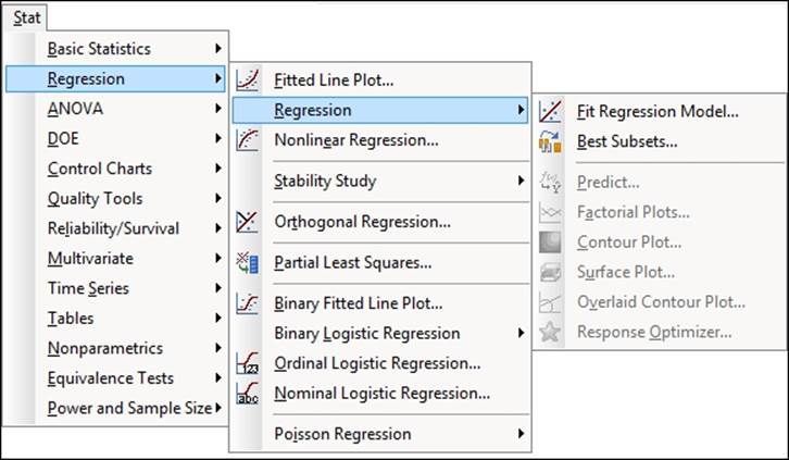
Similar to other menus, Regression is divided into subsections. The first group of tools are used to fit a numeric response and cover tools for single predictors, multiple regression, and model-fitting techniques. Orthogonal regression is held in its own group as this tool considers the errors to be in both the x and y coordinates. Here we would estimate the ratio of the y/x variance to estimate the regression model.
Partial least square regression covers a multivariate regression technique. The next group is for logistic regression models where the predictor is categorical.
Another new feature in the regression tools for Minitab v17 is Poisson Regression at the end of the menu.
Visualizing simple regressions with fitted line plots
The fitted line plot is a simple regression tool in Minitab that produces a scatterplot with a least square regression line fitted to the data. It provides additional output to the regression fits that are provided under scatterplot tools, such as the analysis of variance and R-squared statistics.
This will only use a single predictor; multiple predictors are best used with Regression… or General Regression….
We will use the data from the Oxford weather station to investigate the relationship between the mean maximum temperature and hours of sunlight per month.
Getting ready
We will use the data from the Oxford weather station in this example. This data is from the Met Office website and is found at the following location:
http://www.metoffice.gov.uk/climate/uk/stationdata/
Select the Oxford station. The data is also made available in the Oxford data.txt files, which preserve the format from the website. Also, the Oxford weather (Cleaned).MTW Minitab file will be correctly imported into Minitab for us.
How to do it…
The following steps will plot the relationship between the hours of sunlight and mean maximum temperature. This will fit a least squares regression line and generate the analysis of variance statistics.
1. Follow the given link to the Met Office weather station site.
2. Choose the Oxford station.
3. In your web browser, save the file as a text file.
4. In Minitab, go to File and select Open Worksheet….
5. Change Files of type: to Text (*.txt).
6. Select the file that we have just saved or the provided Oxford Data.txt file.
7. Go to the Stat menu, then go to Regression and select Fitted Line Plot….
8. In the Response(Y): section, enter the column for the maximum temperature.
9. In the Predictor(X): section, enter the column for Sun(hours).
10. Select Options… and check the boxes for confidence and prediction intervals.
11. Click on OK.
12. Select Graphs… and select the Four in one residual plots.
13. Click on OK in each dialog box.
How it works…
The results of the fitted line plot are generated as a graphical page, displaying the scatterplot and least squares regression line. There is also an Analysis of Variance table in the session window. This output will give us the regression model and the R-squared and R-squared adjusted values. We should be careful with R-squared values. They are not a measure of the quality of the model; they report the amount of variation that we have explained in the data. We should observe in the study that 67 percent of the variation in the mean maximum temperature is accounted for by the hours of sunlight. Rather than looking for R-squared values of 80 or 90 percent, we should consider the implications on the results.
We have accounted for over two-thirds of the variation with a metric of the hours of sunlight, and its result seems quite high.
We should also be careful of correlation and causation. Are hours of sunlight really the cause? Hours of sunlight will be affected by the time of the year and weather conditions.
Selecting the options for prediction intervals and confidence intervals will place 95 percent CI and 95 percent PI lines around the fitted line.
Residual plots are an important diagnostic in informing us of problems related to the fit of the data. The four in one residuals generate a page displaying Normal Probability Plot, Histogram, Versus Fits, and Versus Order of the data to check the assumptions of the regression model. These should be used to check the assumptions of the normality of the residual error, homoscedasticity, and check patterns over time.
Here, the residuals versus order of the data will show a gap at the start of the results. This relates to the data for only the hours of sunlight being collected after 1929.
There's more…
Quadratic and Cubic models can be easily selected from the main dialog box. When selecting either of these models, we generate the sequential sum of squares in the session window. The sequential output will show us the amount of the sum of squares accounted for by the linear term, and then the amount the quadratic term that has been added to the model. If we include the cubic term, this will show the additional sum of squares accounted for by the cubic term over the quadratic term.
See also
· The Using the Assistant tool to run a regression recipe
Using the Assistant tool to run a regression
The Assistant tool provides us with two methods of regression and a response optimizer for multiple regression. As with all the assistant tools, guidance is offered on the setup of the study and on the output. There are less options to choose from but the dialog box is simpler to use.
Here, we will use the Assistant tool to run a fitted line plot and then pick between Linear, Quadratic, and Cubic models for data on Hubble's constant.
Hubble's law describes the relationship between the distance of a galaxy and the velocity at which it is moving away from us. The greater the distance, the greater the velocity of recession. The data comes from observations on recession velocity of Nebula and its distance from the Earth.
Getting ready
The data can be obtained from the Data and Story Library. The following link will take us to the Hubble results:
http://lib.stat.cmu.edu/DASL/Datafiles/Hubble.html
The data can be copied and pasted directly into Minitab.
How to do it…
The following steps will use the Assistant menu to generate a fitted line plot.
1. Go to the Assistant menu and select Simple Regression from the decision tree.
2. In Y column:, enter Recession Velocity.
3. In X column:, enter distance.
4. Ensure that the Choose for me option is selected for the type of regression model and then click on OK.
How it works…
The assistant regression model will output several graphical report pages. The first page is a report card with many notes or warnings on the analysis. This will check the number of samples in the study and unusual data, and will contain notes about the normality of the residuals.
The second page, that is, the prediction report, contains the fitted regression model and prediction intervals. Also included on this output are prediction intervals for a table of x values and their predicted y values.
Unusual data points are highlighted for values that are more than two standard errors from the predicted values. In this example, the result in row 16 is flagged up as unusually high.
The residual plots will indicate the types of patterns that may indicate problems with the fitted model under the residual plots. By default, only the residuals versus fitted values is generated. If we know that the data is in a time order, then we would tick the option within the dialog box stating that data is in the time order. This would then generate the residuals versus order of the data.
The fourth page, that is, the model selection report, shows the model fitted. It will pick between the Linear, Quadratic and Cubic models by using the R-squared adjusted term. Should we wish to pick a different model to the one fitted we would select the relevant option directly from the dialog box.
The last page, that is, the summary report, presents the results of the regression. The P-value for the study is listed and the null hypothesis is restated as the question "Is there a relationship between Y and X?", which can make interpretation of the P-value easier. When a linear regression model is fitted, the correlation score is also produced. Comments are automatically completed for the data and can be edited.
There's more…
Strictly speaking, Hubble's law is stated as Recession velocity = H0*Distance, where H0 refers to Hubble's constant. The recession velocity at 0 distance should be 0. Both the fitted line plot and the assistant regression will fit the data for a nonzero intercept. To fit a regression model without an intercept, we would use the Regression or General Regression tools. We can remove the fit for the intercept from the option's subdialog.
See also
· The Multiple regression with linear predictors recipe
Multiple regression with linear predictors
This recipe will look at studying a multiple regression on determining the sleep duration of mammals. The dataset is available at StatSci.org.
We will run the study with all predictors included for the initial model and then remove the terms in the model step-by-step. Our goal is to reduce the terms until only the significant ones are left. As this data does have a degree of correlation among the predictors, we will use matrix plots, correlation, and variance inflation factors to highlight the degree of multicollinearity.
We will initially produce the matrix plots and the correlation scores before moving on to the analysis of the regression.
After reducing the model to only significant terms, we will then produce the residual plots to gradually verify assumptions on the analysis.
The value of alpha for the decision level used here will be 0.05.
Getting ready
The data is available at the following link from StatSci.org:
http://www.statsci.org/data/general/sleep.html
The data is tab delimited and can be copied directly into the worksheet.
How to do it…
The following steps will run a regression that studies the sleep duration. We will produce a matrix plot and correlation scores to check for multicollinearity before using regression to gradually reduce the model until only the significant terms remain included:
1. Go to the Graph menu and select Matrix Plot….
2. From the selection, choose the Simple matrix plot.
3. Enter the columns BodyWt, BrainWt, TotalSleep, Lifespan, Gestation, Predation, Exposure, and Danger as Graph variables:.
4. Click on Matrix Options… and then select the option to display Lower left of Matrix Display.
5. Click on OK in each dialog box to produce a matrix of scatterplots.
6. Display the correlation scores by going to Stat, then Basic Statistics, and then Correlation….
7. Enter the same columns as before into the Variables: section and click on OK to generate the correlation scores.
8. Navigate to Stat | Regression | Regression… and select Fit Regression Model….
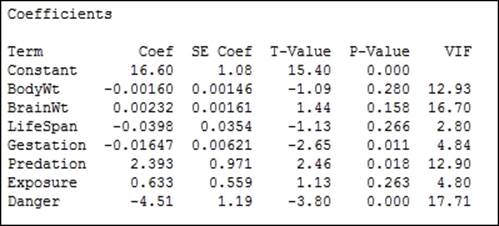
9. Enter TotalSleep as the column for Response.
10. In the section for Continuous predictors:, enter the columns for BodyWt, BrainWt, Lifespan, Gestation, Predation, Exposure, and Danger.
11. Click on OK to run the regression.
12. Return to the session window and check the results for the regression. Check the terms for the highest P-value, as shown in the following screenshot:
13. Press Ctrl+E to return to the last dialog box and remove the term with the highest P-value, BodyWt, from the Continuous predictors.
14. Return to the session window and look for the term with the highest P-value.
15. Repeat steps 12 to 14 until only the terms with a P-value below 0.05 are included.
16. With only those terms included for the final results, go back to the Regression dialog box by pressing Ctrl+E and then go to the Graphs… button. Select the Normal plot of residuals and Residuals vs fits.
17. Click on OK in each dialog box.
How it works…
The model is reduced sequentially to minimize the problems of multicollinearity in the predictors. The reason for generating the matrix plots and correlation scores is to observe the relationships in the predictors that we have to be careful of. We should observe strong correlations between body weight and brain weight, predation and danger, exposure and danger, among others. We will find it difficult to isolate the effects of highly correlated predictors.
Variance inflation factors (VIF) in the output also identifies strong correlations between predictors. The variance inflation factor is a measure of how the variance of the coefficients is inflated by multicollinearity. High VIF scores can indicate that terms in the model are difficult to interpret. Predation and danger, as observed in the correlation scores and the matrix plots, will show a high VIF. Values of 1 will indicate no inflation of the variance and values above 5 will indicate high correlations. As such, we should be careful of any terms with high VIF scores such as predation and danger, as these are strongly correlated.
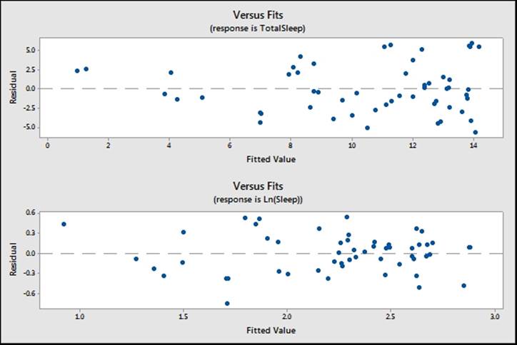
Residual plots for order of the data are not needed as the worksheet is ordered alphabetically. When our results do not appear to follow a logical order in the dataset, we should not run the versus order charts. The residual versus fits for this study may seem to indicate a degree of funneling, as shown the following screenshot:
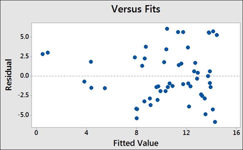
Funneling is an indicator that the response does not possess equal variance across the fitted values and that we are observing heteroscedasticity.
The assumptions for a regression analysis include normally distributed residuals and homoscedasticity. When we are concerned about unequal variance in the residuals, a transformation of the response may be used. Here, a natural log of the sleep duration can be used to return the residuals to show equal variance.
The effect of unequal variance on the results can be to calculate coefficients and variance figures incorrectly. Transformations on the response can help find the values of the variance and coefficients with a better precision. However, we must be careful that we understand the reasons behind transformation of the data. Transformation of the data is not a technique to fix outliers or special causes in our results.
We can run a transformation on the response directly from the regression options. Minitab can be allowed to pick an optimal lambda for the transformation or it can be specified directly. Try running the same regression with the Box-Cox… options. You should obtain a similar model with transformed and untransformed data.
Interactions, Quadratic, and Cubic terms can be easily specified from within the Model… options of the Fit Regression Model… dialog box.
Predictors can be standardized as well. Standardizing the predictors can be a useful method to reduce multicollinearity between predictors. The Coding… options give us five methods to standardize predictors.
The Stepwise… options allow us to use a stepwise model fitting technique. Here, we can choose between stepwise, forward, or backward selection.
There's more…
The session window is 93 characters wide by default. With large correlation tables or long column names in a study, this can cause a table to be presented across several lines, with the last columns spilling over into a new table.
The options for Minitab, found in the Tools menu, can expand the session window's width to 132 characters.
See also
· The Model selection tools – the best subsets regression recipe
· The Model selection tools – the stepwise regression recipe
Model selection tools – the best subsets regression
We will use the sleep duration dataset to illustrate the use of best subsets regression as a model reduction tool. The best subsets will check through all possible linear models and display the best models at each step.
When running the regression of sleep duration in the Multiple regression with linear predictors recipe, we observed that the residuals showed unequal variance. Initially, we will transform the data by taking the lognormal of the sleep duration response. The transformed response will show homoscedasticity.
We will use best subsets regression to show only the best model at each number of variables to include from 1 to all predictors. After identifying the model, we will enter the results into the general regression study.
Getting ready
The data is available at the following link from StatSci.org:
http://www.statsci.org/data/general/sleep.html
The data is tab delimited and can be copied directly into the worksheet.
How to do it…
The following steps will transform the sleep duration response by taking the natural log of the results. Then, best subsets regression is used to identify a regression model to use.
1. Go to the Calc menu and select Calculator….
2. Enter a column name of Ln(Sleep) in the section for Store result in variable: to create the transformed data.
3. Enter the expression as shown in the following screenshot:
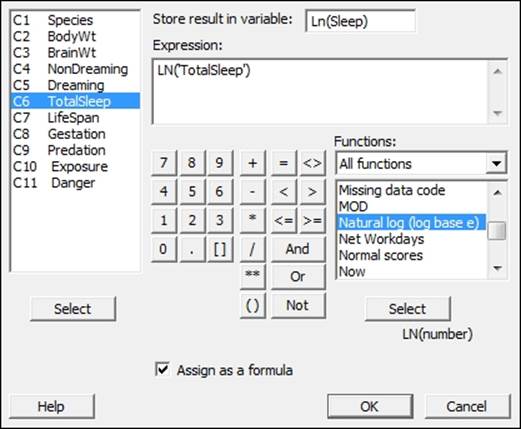
4. Check the Assign as a formula option and click on OK.
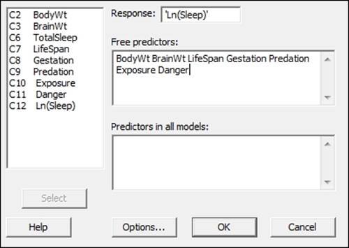
5. Navigate to Stat | Regression | Regression and select Best Subsets Regression….
6. Enter the Ln(Sleep) column in the Response: section.
7. Enter the following columns as Free Predictors:, as shown in the following screenshot:
8. Click on Options… and change the Models of each size to print: section from 2 to 1.
9. Click on OK in each dialog box.
10. Check the results in the session window, as shown in the following screenshot:
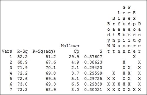
11. Compare the results for highest R-Sq(adj), lowest standard deviation, and Mallows Cp for a score close to the number of predictors. Find the row that corresponds to that result.
12. Navigate to Stat | Regression | Regression and then select Fit Regression Model….
13. Enter the Ln(sleep) column as the response.
14. In the Model: section, enter the columns for our chosen predictors as selected from the best subset results, which are Gestation, Predation, and Danger.
15. To check the assumptions of running a regression, create residual plots by clicking on the Graphs… button and selecting Normal plot of residuals and Residuals versus fits.
16. Click on OK in each dialog box to run the regression.
How it works…
In the previous recipe, we obtained residual plots that appear to show the funneling of the residuals versus fits. This seems to indicate that the variance is changing with the predicted values. By taking the natural log of the recorded sleep duration, we can ensure that the variances of the natural log of sleep durations remains roughly constant across fitted values. The following screenshot shows the results of the regression coefficients in Minitab:
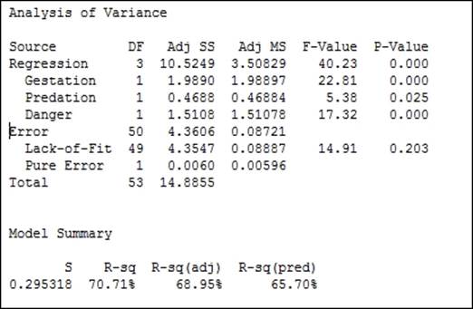
The following chart shows the comparison of the residuals using the TotalSleep results and the natural log of TotalSleep. We should also notice that the use of the natural log of the sleep durations results in a slightly improved fit to the results from measures such as R-Sq(pred) and R-sq(adj).
Fit Regression Model… can use a Box-Cox transformation on the original data as part of the analysis. This is found inside the Options… section. As the best subsets regression does not have this option, we will need to use the calculator to transform the results.
The best subsets procedure will identify models that produce the highest R-squared terms and display these in the session window. The options for this tool allow us to pick how many R-squared terms at each number of variables are displayed. The default options will display the two best models with a 1 predictor, then 2, and then 3, until we reach the full model.
Entering columns as Free Predictors allows these variables to be included or excluded from the model. Entering a variable into the Predictors in all models: section will force the best subsets regression to always include this variable.
Best subsets will only look for linear model terms. Interactions or quadratics cannot be specified in this dialog box.
See also
· The Model selection tools – the stepwise regression recipe
· The Multiple regression with linear predictors recipe
Model selection tools – the stepwise regression
The stepwise regression has been changed in Minitab v17. In the previous versions, this was its own tool. Now, stepwise regression is an option within the Fit Regression Model… tools. This includes the fit regression models for binary logistic regression and poisson regression. The same options for stepwise regression are used in all three of the fit regression model tools.
We will use the sleep dataset with stepwise regression to select predictors for a regression model.
We will use the total sleep column for the study and specify using the Box-Cox transformation on the response before running the stepwise regression on all two-way interactions.
Getting ready
The data is available at the following link from StatSci.org:
http://www.statsci.org/data/general/sleep.html
The data is tab delimited and can be copied directly into the worksheet. Once the data is in Minitab, calculate the natural log of total sleep. See steps 1 to 5 in the Model Selection, best subsets recipe.
How to do it…
The following steps will use a stepwise regression to identify a regression model within the Fit General Linear Model function:
1. Navigate to Stat | Regression | Regression and select Fit Regression Model….
2. Enter TotalSleep in the Responses: section.
3. In Continuous predictors:, enter BodyWt, BrainWt, Lifespan, Gestation, Predation, Exposure, and Danger.
4. To add interactions to the study, click on the Model… button and highlight Predictors: in the top-left section of the dialog box. Then click on the Add button next to Interactions through order: 2.
5. Click on OK and then select the Stepwise… button.
6. From the Method: drop down, select Stepwise and click on OK.
7. Go to the Graphs… button and select the Four in one residual plots and click on OK in each dialog box to run the model.
8. Check the results in the session window to observe the fitted model, as shown in the following screenshot:
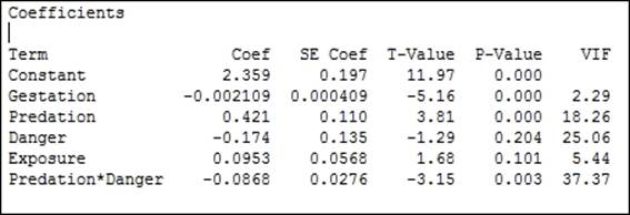
9. From the results of the preceding stepwise regression, we should observe that the model converged on a solution of Gestation, Predation, Danger, Exposure, and Predation*Danger.
10. To observe predicted responses, navigate to Stat | Regression | Regression and select Factorial Plots.
11. Select all available predictors to put them in the plots and click on OK.
Tip
Use the >> arrow to move everything into the charts.
12. To observe the interaction of Predation and Danger, generate a contour plot. Navigate to Stat | Regression | Regression and select Contour Plot.
13. Change the X Axis: section to Danger and click on OK.
How it works…
The stepwise regression will initially run forwards, including terms in the regression model. The first round is to select the predictor with the lowest P-value. The second round continues in the same way, looking to add the predictor that would be the best addition to the model. This continues round by round until no more terms can be added.
The default stepwise method will work forwards and backwards. If a term that was added on a previous round has an increase in P-value above the decision level, it will be removed during the next round. Because of this selection method, we do not study all possible models, unlike the Best Subsets… tool.
If the results here show exposure at round three with a P-value of 0.815, then the fourth round will remove this term.
The stepwise selection method can be changed to forward selection, where terms are added but cannot be removed; or, it can be changed to backwards elimination, where all variables are included in round 1; each subsequent round uses the P-value to exclude a term.
With the steps here, we do not see the decision at each step in the regression; we see only the final fitted model. The Stepwise options can be selected to include the details for each step in the session window. This will reveal the terms included or removed at each point in the model. This will also display R-sq, R-sq(adj), R-sq(pred), and Mallows' Cp for each step as well.
The decision method is based on the alpha risk or the decision for the P-value. The default can be changed along with the method to allow model hierarchy to be calculated as well.
See also
· The Model selection tools – the best subsets regression recipe
· The Multiple regression with linear predictors recipe
Binary logistic regression
Logistic regression models allow us to fit a regression model to categorical data. Here, we will look at the survival rates of passengers on the Titanic. This data is binomial in that we list the survivors or casualties of the disaster.
We will initially recode the Survival columns to state 1 as survived and 0 as casualty. Then, we study the effects of age, class, and gender on the chances of survival. This isn't essential but can be a useful aid to the interpretation of the results.
The final steps will store the event probability calculated from the fitted model to plot the results in a scatterplot.
Getting ready
The data is contained in test format at the StatSci website. The direct link to the Titanic data is as follows:
http://www.statsci.org/data/general/titanic.txt
The data will copy and paste directly into Minitab. The data columns are listed as Passenger class, Age, Gender, and Survival.
Do make sure that you check the dataset, as a couple of passenger details are shuffled into the wrong columns; for example, rows 296 and 307 need to be corrected manually.
Not all the passengers' ages are listed in this dataset and it is possible to find a listing of this data in other formats with a quick web search.
The Titanic data is available in different formats; performing a search on the Internet will reveal other datasets.
The data at the American statistical association lists passengers as child or adult rather than listing them by age.
How to do it…
The following steps recode the results from numeric values to categorical ones. Then, we fit a binary logistic regression to find how the age, gender, and class affected survival chances. We will then use factorial plots to visualize the fitted model.
1. Navigate to Data | Code and select Numeric to Text….
2. Enter Survived into the Code data from columns: and the Store coded data in columns: sections.
3. Enter the original values and the new values as shown in the following screenshot:
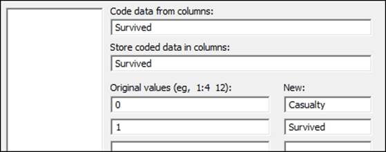
4. Click on OK.
5. Navigate to Stat | Regression | Binary logistic Regression and select Fit Binary Logistic Regression.
6. Enter Survived in the Response: section, then enter Age in the Continuous predictors: section, and PClass and Sex as Categorical predictors:, as shown in the following screenshot:
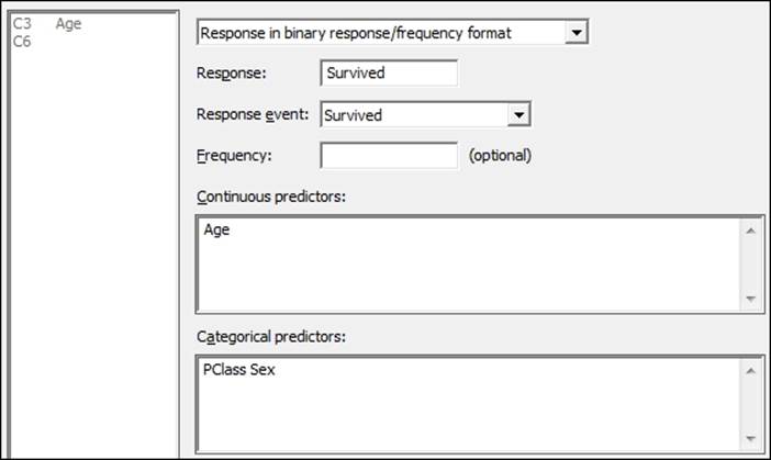
7. Select the Model… button and highlight Age, PClass, and Sex in the Predictors: section; in the Interactions through order: section, enter 2, then click on the Add button. Click on OK in each dialog box.
8. Return to the session window and check the results, as shown in the following screenshot.
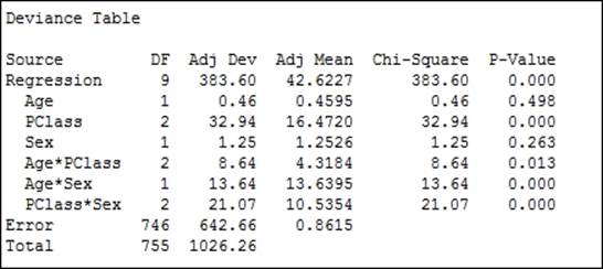
9. Use the regression table to look for interactions with a P-value above 0.05, or the Chi-square for interactions with low values.
10. As all interactions are significant, we will not reduce the model. To produce diagnostic plots, return to the last dialog box by pressing Ctrl+E.
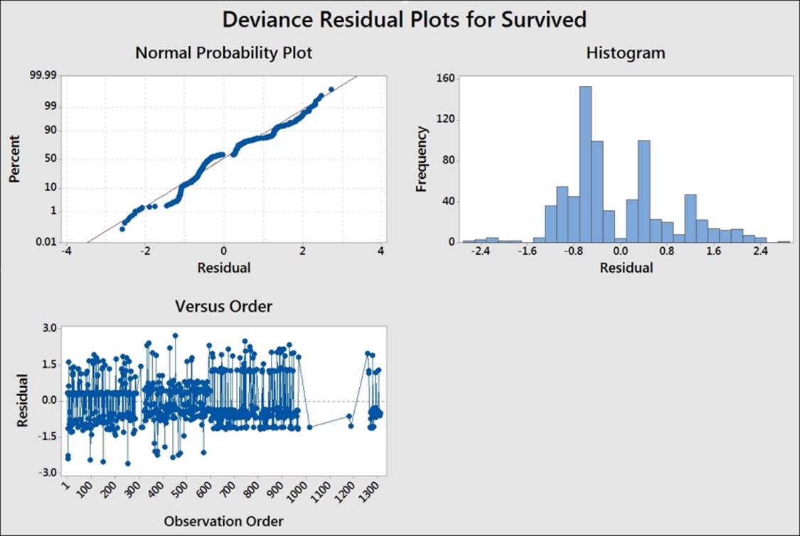
11. Click the Graphs… button and select the Three in one residuals. Click on OK in each dialog box.
12. To plot the calculated event probabilities, we will use the factor plots. Navigate to Stat | Regression | Binary logistic Regression and select Factorial Plots….
13. Move Age from the Available factors: section to the Selected: section by double-clicking on Age. Then click on OK.
How it works…
The code tool used in steps 1 to 4 works in a way that is similar to an IF statement in the calculator. Although we cannot use this to create a formula in the worksheet, it is a very visual way to recode the data. Ranges of numbers can be coded using a colon as the range separator. For example, 1:10 would specify a range from 1 to 10.
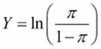
By default, the Binary logistic regression model uses a logit transform with a probability of 0 to 1. The regression is then fitted to the logit transform, which is shown as follows:
Normit and Gompit transformations are also available to be selected from options within Binary Logistic Regression. The Normit transformation uses the inverse CDF of the standard normal distribution to map the probability. For example, a result at +2.326 from 0 has a 99 percent probability of occurring and -2.326 from 0 has a 1 percent probability of occurring.
The Gompit or log model is useful in growth models of biological data as the curve of the function is not symmetric like the Logit or Normit functions.
Minitab has picked the event for the regression model as Survived. The model then calculates the probability of survival. The event is indicated at the start of the analysis. The default event is picked reverse alphabetically. We can change Response event: from the main dialog box to Fit Binary Logistic Regression. This drop down can be used to change between the two possible outcomes.
The Coding… options allow us to choose the reference level of the categorical predictors. Also, here we can change the increment used in calculating the odds ratios for the continuous predictors.
Minitab provides residual plots for either Pearson or Deviance residuals. The residuals can be used to check for outliers or patterns over time in the results, as shown in the following example:
Factorial plots are used to help visualize the result of the logistic regression. Main effects and interaction plots of the fitted probabilities are generated for the three sets of interactions, as shown in the following screenshot:
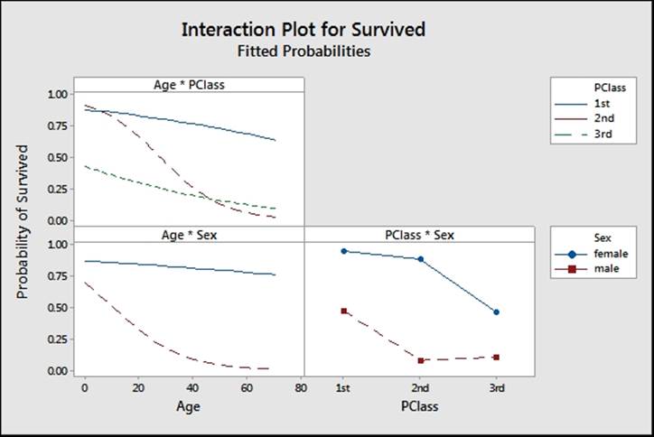
The results show some dramatic interactions between the three predictors used in the model.
We can also generate predicted probabilities with confidence intervals and prediction intervals from the Predict… tool. This has the same options as the predict tool for Regression and Poisson regression.
The Fit Binary Logistic Regression tool can also run a stepwise analysis for us. The options are the same as Fit Regression Model….
See also
· The Coding a numeric column to text values recipe in Chapter 1, Worksheet, Data Management, and the Calculator
Fitting a nonlinear regression
Nonlinear regression tools give us the ability to specify an expectation function that goes beyond the Linear, Quadratic, or Cubic models. Applications of nonlinear regression are present where the Linear models fail to fit very well. Models for exponential growth and decay rates are good examples, where the nonlinear tools will provide a better fit to the data. The use of nonlinear regression tools is more complicated than the Linear models, and initial estimates of the coefficients must be provided.
Here we will use the data from the Oxford weather station to define our own expectation function, set the initial parameters of the function, and find the parameters of the coefficients. We will concentrate on the results from 2000 onwards, hence the initial steps will be to subset the worksheet.
From these results, we will define a regression model to predict the mean maximum monthly temperature from the month of the year.
Getting ready
The data for this example can be found on the Met Office website at the following link:
http://www.metoffice.gov.uk/climate/uk/stationdata/oxforddata.txt
Follow steps 1 to 12 from the Generating a paneled boxplot recipe in Chapter 2, Tables and Graphs, to import the results.
The data is also made available in the Oxford data.txt files; this preserves the format from the website. Also, the Oxford weather (Cleaned).MTW Minitab file is correctly imported into Minitab for us.
How to do it…
The following steps will create a subset of the worksheet using just the data from 2000 onwards. Then, we will use a Sine function to fit the mean maximum temperature by month:
1. First, we will subset the data; use the Data menu and Subset Worksheet….
2. Enter the name of the new worksheet as Year 2000 onwards.
3. Select the Condition… button and enter the condition as 'Year' >= 2000.
4. Click on OK in each dialog box to create the new worksheet.
5. To view the shape of the results, we will use a time series plot. Go to Graph and then select Time Series Plot….
6. Select the Simple time series.
7. Enter the column for mean maximum temperature in the Series: section.
8. Click on the Time/Scale… button.
9. Select the Stamp option and then select month and year as the stamp columns, as shown in the following screenshot:
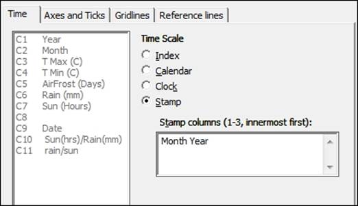
10. Click on OK in each dialog box.
11. The results should generate a regular pattern as shown in the following screenshot:
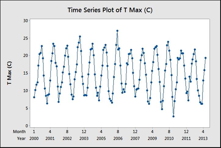
Note
Gaps in the chart will correspond to estimated temperatures. The table on the Met Office website marks these as values with a * symbol at the end. For example, 13.6* is an estimated temperature. Minitab will replace these values with a * symbol for the missing data when copying into the worksheet. These values can be corrected manually.
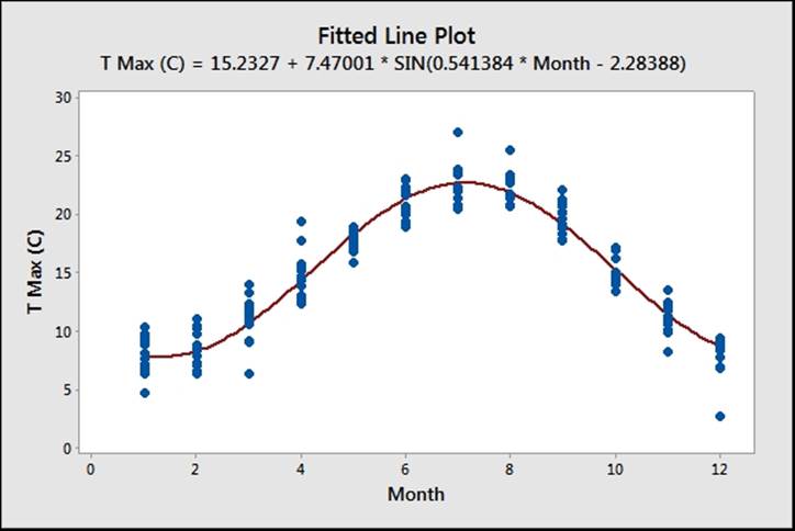
12. We need to estimate an expectation function for temperature. The results follow a sinusoidal repeating pattern, with a range from minimum to maximum of roughly 20 degrees. The frequency of the Sine wave is every 12 months, with a mean value of roughly 15 degrees.
13. A suitable form for the expectation function would be Mean + Magnitude *Sine(months). This can be written as follows:
![]()
The respective parameters are explained as follows:
![]()
![]()
![]()
![]()
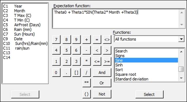
14. To fit the model, navigate to Stat | Regression and select Non Linear Regression.
15. In the Response: section, enter TMax for mean maximum temperature.
16. Click on the Use Calculator… button to specify your expectation function.
17. Enter values in the Expectation function: section, as shown in the following screenshot:
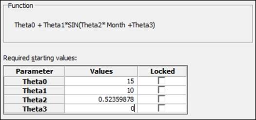
18. Click on OK and then select the Parameters… button.
19. Set the parameters with the following values as the starting points of the coefficients. Theta0 corresponds roughly to the mean temperature of 15 degrees. Theta1 is placed roughly at the magnitude of the wave at 10 degrees. Theta2 becomes 2*Pi/12 andTheta3 will be the start position of the sine wave that can be estimated at 0, as shown in the following screenshot:
20. Click on OK and select the Options… button. Change Algorithm to Levenberg-Marquardt.
21. Click on OK and select the Graphs… button.
22. To check the assumptions of running the regression, select the Four in one residuals and click on OK in each dialog box.
How it works…
Theta is traditionally used as our coefficient in nonlinear regression rather than beta, although it does not matter what name is used for the coefficients. Any text that is not recognized as a function, a column, or a constant is defined as a coefficient.
With the nonlinear regression, finding coefficients is not as simple as linear regression. We have to start with an estimate for the values of the coefficients. These starting points are then searched around with either the Gauss-Newton or Levenberg-Marquardt algorithms. Options within the main dialog box allow us to choose between the two search algorithms and specify the maximum number of iterations to find a solution.
If we are very wrong with the initial estimates, then the search algorithms may fail to converge on a solution. The session window will indicate whether this has happened. We could then expand the number of iterations, change the search algorithm, or recheck the estimates of the coefficients.
We have set the coefficients in this example as the mean temperature for Theta0; Theta1 is defined by the range/2 and Theta2 becomes 2*Pi/12; they give us the full number of radians in 12 months. Theta3 is defined as the offset to start the Sine function. Its parameters can be locked to fix the values of Theta. In this example, we may wish to lock Theta2 to 2*Pi/12.
Nonlinear regression has the same assumptions for the residuals and we should check the residuals for normality, equal variance, and independence over time.
This tool also contains a catalogue of predefined functions. We could select a number of these based on our knowledge of the process being studied or by the shape of the function.
As we define our own functions, these are saved within the catalogue as well. They are saved within the drop down under My functions. They can also be renamed and given a category.
There's More…
With the study here, we looked at the relationship of month and temperature for the results after 2000. We could run the same study for all data from 1853 onwards. When running these results, try looking at the residual plots and see if there is anything unusual.
The benefit of the nonlinear regression tools is their ability to fit models where the standard Linear models do not quite work. Linear models also refer to Quadratic or Cubic models, which can be slightly confusing.
We could compare the results of this nonlinear regression using the Sine function to fit the month to a Quadratic model. We would obtain a result that seems to fit reasonably well; you should notice that around July and August and towards January and December, the data deviates appreciably from the fitted quadratic. The use of residual plots will reveal that the residuals versus fits still has a curved pattern, indicating poor fits across the line.
The use of the Sine function gives us a closer-fitting model over the results and a better predictive model. The simple sine function doesn't account for other random weather patterns, but still keeps a good fit for expected temperatures by month. The inclusion of terms to fit to trends over years or other predictors can help reveal more structure in the results.
A trend component can be added by including ![]() .
.
If we analyze this data using General Linear Model (GLM) or a one-way ANOVA, we will obtain a similar result. GLM will find the mean response for each month, rather than the equation obtained here.
See also
· The Using one-way ANOVA with unstacked columns recipe in Chapter 4, Using Analysis of Variance
· The Using GLM for unbalanced designs recipe in Chapter 4, Using Analysis of Variance
All materials on the site are licensed Creative Commons Attribution-Sharealike 3.0 Unported CC BY-SA 3.0 & GNU Free Documentation License (GFDL)
If you are the copyright holder of any material contained on our site and intend to remove it, please contact our site administrator for approval.
© 2016-2026 All site design rights belong to S.Y.A.