Minitab Cookbook (2014)
Chapter 7. Capability, Process Variation, and Specifications
This chapter contains the following recipes:
· A capability and control chart report using the capability analysis sixpack
· Capability analysis for normally distributed data
· Capability analysis for nonnormal distributions
· Using a Box-Cox transformation for capability
· Using a Johnson transformation for capability
· Using the Assistant tool for short-run capability analysis
· Comparing the capability of two processes using the Assistant tool
· Creating an acceptance sampling plan for variable data
· Creating an acceptance sampling plan for attribute data
· Comparing a previously defined sampling plan – C = 0 plans
· Generating run charts
· Generating tolerance intervals for summarized data
· Datasets that do not transform or fit any distribution
Introduction
This chapter looks at some of the quality tools found within Minitab. The majority of the functions used here are of the different capability analysis available. We will look at both normal and nonnormal distributions. Also, we take a look at a couple of the Assistanttools for capability as Assistant offers some great options for capability and presentation of data.
The final recipe in this chapter is more a note for a typical scenario that occurs with the data, namely, the problem that occurs when our data does not fit a distribution or a transformation comfortably.
It should be noted that capability analysis should only be run after we can establish that the process is stable. The results of capability, when a process is varying over time with trends or shifts in the mean or variation, will give an inaccurate estimate of capability. It should also be mentioned that the measurement systems are also expected to be verified as precise and accurate. For more on checking measurement systems, see Chapter 8, Measurement Systems Analysis. For control charts and checking for stability, seeChapter 6, Understanding Process Variation with Control Charts.
Along with the capability tools, we also look at acceptance sampling plans. These are shown for creating acceptance plans and a way to look at acceptance plans when the acceptance number is 0; these are known as C = 0 plans. The acceptance on 0 or C = 0 plans are popular in pharmaceutical applications.
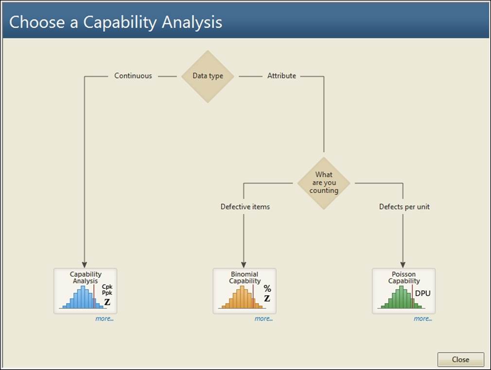
For this chapter, the tools we are using are found in the Stat menu and Quality Tools as shown in the following screenshot. The relevant tools are found in the Capability Analysis option.
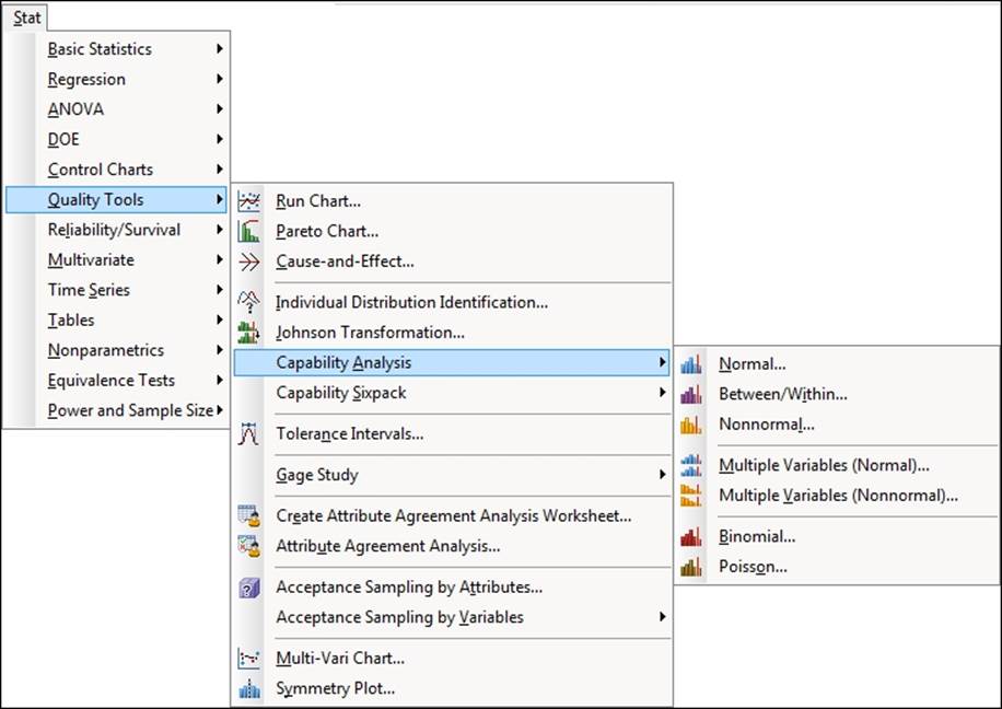
Gage R&R and other measurement systems analysis tools are also found in the Quality Tools menu. We will investigate these in the next chapter.
A capability and control chart report using the capability analysis sixpack
The sixpack function lets us generate six charts to give the control charts and capability in a single page. This forms a useful overview of the stability of our process and how well we fit to customer specifications. It also helps to avoid the common error of trying to fit specifications to control charts.
The example we will be using looks at the fill volumes of syringes. We check the capability of the fill volumes against a target fill volume of 15 ml and specifications of 14.25 ml and 15.75 ml.
Within the worksheet, 40 results are collected per day, taken at the rate of five samples per hour. The data is presented as these subgroups across rows; each row representing the results of the five samples within that hour.
How to do it...
The following steps will generate Xbar-R charts, normality tests, capability histograms, and Cpk and Ppk, all on a six-panel graph page:
1. Open the worksheet Volume3.mtw by using Open Worksheet from the File menu.
2. Navigate to Stat | Quality tools | Capability Sixpack and then select Normal.
3. Select the option Subgroups across rows of from the drop-down menu at the top. Insert columns C2 to C6 into the section under the section Subgroups across rows of.
4. In Lower spec, enter 14.25.
5. In Upper Spec, enter 15.75.
6. Click on the Options button.
7. Enter 15 in the Target field.
8. Click on OK in each dialog box.
How it works…
The Capability Sixpack option produces a page of six charts. These give an overview of the process from control charts, capability histograms, and a normality test on the data. This creates a very visual summary page.
The control chart displayed for the sixpack will be chosen from I-MR, Xbar-R, or Xbar-S charts, based on the subgroup size.
Results that can be used are either listed in one column or where the data is laid out in the worksheet with subgroups across rows. Each row has the five samples measured every hour. The drop-down selection at the top of the dialog box is used to specify the layout of the data. See the Capability analysis for normally distributed data recipe for data used in one column.
There are four sets of tools that we can use on capability studies. They are as follows:
· Transform: This option allows a Box-Cox or Johnson transformation to be used on the data.
Using a normal distribution to fit to nonnormal data will give us an incorrect estimate of capability. Depending on the nature of the results, the direction they are skewed in can cause the capability to be over or underestimated. One method of finding a more accurate estimate of capability is to apply a transform to return the data to a normal distribution.
Transformation of data should only be used if we understand why the data is not normally distributed and we are confident that the natural shape of the data is not normal. See the examples on Box-Cox or Johnson transformation. Transformations are only found in the capability tools for normal distributions.
· Tests: This allows us to specify the tests for special causes used in the control charts. The Tests option is only used in the sixpack charts.
· Estimate: This gives options on the methods of estimating within a subgroup variation.
· Options: This gives us the choice to add a target or change the tolerance for capability statistics. We can also choose between Cpk/Ppk or Benchmark Z's.
There's more…
The Capability Sixpack can also be run on nonnormal data and as a between within study as well. These are not covered here, but the instructions are similar to those here and the capability analysis for data that does not fit a normal distribution.
See also
· The Capability analysis for normally distributed data recipe
· The Capability analysis for nonnormal distributions recipe
· The Using a Box-Cox transformation for capability recipe
· The Using a Johnson transformation for capability recipe
Capability analysis for normally distributed data
The Normal tool in Capability Analysis fits a normal distribution to the data before calculating its capability. The sixpack in the previous recipe provides an overview page with control charts, whereas here, we focus on using just the capability histogram. We obtain a more detailed capability metrics output compared to the sixpack without the control charts or distribution plot.
Just like the previous recipe, we will use the study on the fill volume of syringes. The target fill volume is 15 ml with specifications of 14.25 ml and 15.75 ml.
Within the worksheet, 40 results are collected per day at the rate of five samples per hour. The data is presented as subgroups across rows, each row representing the results of the five samples within that hour.
We will generate a capability analysis and add confidence limits to the capability calculations.
How to do it...
The following steps will generate a histogram of the data with specification limits and capability metrics to assess how well the results meet customer specifications:
1. Open the worksheet Volume3.mtw by using Open Worksheet from the File menu.
2. Navigate to Stat | Quality Tools | Capability analysis and select Normal.
3. Select the radio button for Subgroups across rows of.
4. Insert the first five measure columns by selecting Measure1 and dragging down to highlight all the columns till Measure5. Click on Select to move the columns to the section Subgroups across rows of:.
5. Enter the Lower spec: as 14.25 and the Upper spec: as 15.75. The dialog box should look as the following screenshot:
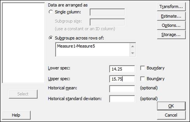
6. Click on the Options button, and enter 15 in Target.
7. Check the box Include confidence intervals and click on OK in each dialog box.
How it works…
The following screenshot shows the histogram of the data and the two normal distribution curves for the within and overall standard deviation. As with the six pack example in the previous recipe, we use the option for subgroups across rows. For an example of data used in a single column, refer to the Capability analysis for nonnormal distributions recipe.
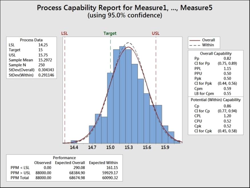
The capability metrics of Cpk and Ppk are calculated as follows:
· Cpk is found from the smaller of the  and
and  quantities.
· Ppk is found by substituting the overall standard deviation for the within standard deviation.
The calculations for within standard deviation use the pooled standard deviation when the subgroup size is greater than one. We could change this to use either Rbar or Sbar by navigating to Capability Analysis | Normal | Options.
When the subgroup size is one, the default option for within standard deviation is the average moving range. This can be changed to use the median moving range or the square root of MSSD instead.
Along with changing the calculation for within standard deviation, Options allows us to choose between displaying parts per million out of spec, percentage figures for the performance, confidence intervals, and Zbench figures.
Zbench is a capability metric derived from Z LSL and Z USL. Z LSL is a measure of the number of standard deviations from the mean to the lower specification limit, while Z USL is a measure of the the upper specification limit. Z bench takes the area of the normal distribution curve outside both limits and combines the two values to give an overall sigma level.
Confidence intervals are selected to give us a 95 percent confidence interval for the Cpk and the Ppk values.
When we have only one specification limit, the fill volume must only be above 14.25 ml. Then we need to enter only the single specification. The other specification limit must be left blank.
The Boundary checkbox is used to identify a hard limit for the data that cannot be crossed. In most situations, this need not be specified; it could be used when we have a hard limit at zero. We could identify this as a boundary to ignore the results below this figure. As the boundaries indicate that it is impossible to have a value outside this region, we will only calculate the capability to nonboundary limits.
There's more…
The two measures of capability, Cpk or Ppk, can be confusing. Cpk is calculated based on the within variation of the process. This variation is found from the average range of the subgroups, the average standard deviation of the subgroups, or the pooled standard deviation.
Ppk is calculated from the standard deviation across all the data that are considered as individual values.
The effect is that, the within standard deviation should typically be smaller than the overall. The within standard deviation can be considered as an estimate of the variation when the subgroups have the same mean value. The larger the variation between the subgroups, the greater the difference between the within and overall standard deviation.
We can consider Cpk as an estimate of the capability if our process is stable and Ppk as an estimate of the process performance.
See also
· The A capability and control chart report using the capability analysis sixpack recipe
· The Capability analysis for nonnormal distributions recipe
Capability analysis for nonnormal distributions
In the previous recipes, we used normal distribution to estimate capability. When data is not distributed normally, the normal distribution will incorrectly estimate the amount of the results that we find outside of the specifications, and it makes the calculation of the capability inaccurate. Here, we will look to find an appropriate nonnormal distribution or transformation to fit to the data.
It is vital to indicate that before looking at transformations or nonnormal distributions, we must understand the process that we are investigating. We must consider the reasons for the data not being normal. An unstable process can fail the normality test because the mean or variation is moving over time. There may be trends or process shifts. With this data, we should investigate the issues of the unstable process before using transformations as a fix.
Other issues may be that we have several distributions within the block of data. Different machines produce the parts at different means, each machine makes items with a normal distribution, but combined together, we get a bimodal or multimodal distribution.
Measurement systems can also cause nonnormal data. If the measurement device is not accurate across the whole measurement range, a linearity problem may cause kurtosis. Resolution problems may mean that the results come from a discrete scale instead of a continuous scale.
Even a human error or intervention can cause data that is not normal. Specifications and deadlines can drive operators to behavior that places results just inside specification.
Lastly, if we are using an alpha risk of 0.05— the decision for the P-value—then there is still a 5 percent chance that normally distributed continuous data may fail the normality test just through random variation.
There should be a physical reason why our data follows a given distribution, and we would want to satisfy ourselves that the process is stable, the measurement system is verified, and that we have a single distribution. Finally, we understand why such data may not follow a normal distribution before we really look for the distribution that it does follow.
A good example of nonnormal distributions would be the process times. These typically follow a lognormal or a similar distribution due to there being a boundary at 0 time. To fit a nonnormal distribution, we will look at the waiting time experienced at an accident and emergency ward by all the patients across a day. The data set contains two columns of wait times reported at 1-minute intervals, and the same wait times reported at 5-minute intervals. The goal is that patients arriving at the A&E unit should be seen by a doctor within four hours (240 minutes).
We will initially use Distribution ID plots for the reported 1-minute wait times to find a distribution that fits the data. Then, we use capability analysis with the appropriate distribution and an upper specification limit of 240 minutes. See the example at the end of this chapter where we use the same data reported to the nearest 5-minute interval.
How to do it...
The following steps will identify a distribution that fits the wait time data before using a capability analysis with a lognormal distribution:
1. Go to the File menu and click on Open Worksheet.
2. Open the worksheet Wait time.mtw.
3. Navigate to Stat | Quality tools | Individual Distribution Identification.
4. Enter the Wait time (1 Mins) column in the Single column field and the Subgroup size as 1, as shown in the following screenshot:
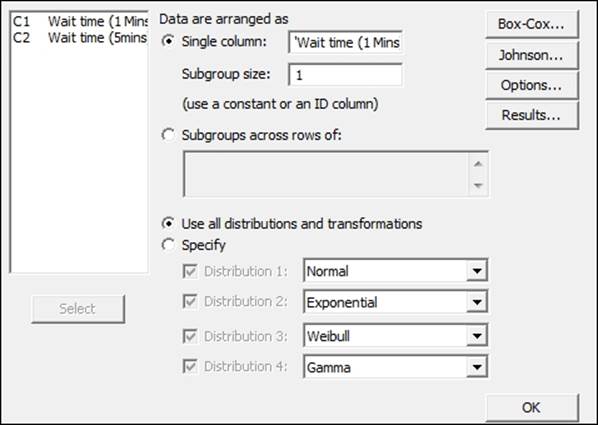
5. Click on OK to generate the ID plots.
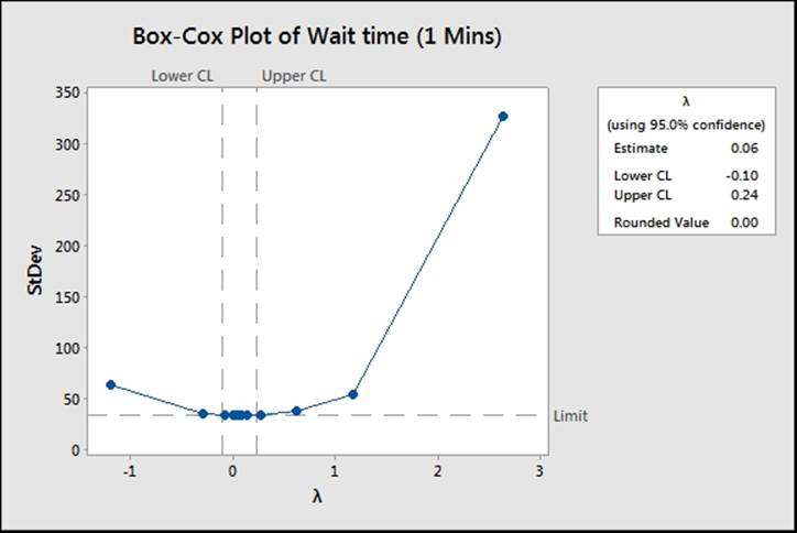
6. Scan through each page, looking at the closeness of the fitted data looking graphically, the AD scores, and P-values for each distribution. An example of a distribution is shown in the following screenshot:
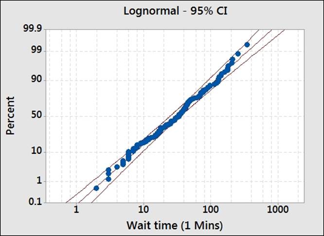
7. We will use the lognormal distribution, as the data seems to fit the distribution. The Anderson-Darling test has low values and a P-value greater than 0.05.
8. Navigate to Stat | Quality Tools | Capability Analysis and select Nonnormal.
9. Insert the column Wait time (1Mins) into the section Single column.
10. From the section Fit Distribution, select Lognormal.
11. In Upper spec field, enter 240.
12. Select Options.
13. In the Display section, select Percents.
14. Click on OK in each dialog box.
How it works…
The distribution ID plot generates probability plots for 14 different distributions and two transformations to find a fit to the data. We will use a visual inspection of the probability plots to identify which distributions give us a close fit to our results. Each probability plot will also run the Anderson-Darling statistics and generate a P-value.
Goodness of fit tests are generated in the session window. This allows a quick comparison across all the options. For the results here, we can see that several of the possible distributions may work for the wait times.
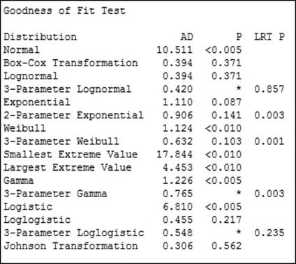
Some of the 3-parameter distributions do not have a P-value calculated; it can not be calculated easily and will show a missing value. In such instances, the LRT P value generated by the likelihood ratio test is a good test to use.
LRT P is generated for the 3- or 2-parameter extensions to a distribution. For example, the Weibull distribution with a threshold as the third parameter. LRT P tests the likelihood of whether the 3-parameter Weibull fits better than the standard Weibull distribution. In the above results, we can see that the 3-parameter Weibull has an LRT P of less than 0.05 and will give a different fit compared to the Weibull test.
The aim is to find the distribution to fit to the population. We should also consider what distribution is expected to fit the distribution. As we are dealing with times in this example, we can expect that the population of wait times will follow a lognormal distribution. As the P-value for the lognormal is above 0.05, we cannot prove that it does not fit this distribution. When selecting a distribution, we would want to preferentially use the expected or historically observed distribution. In practice, distributions that fit in similar ways will give similar results.
We used the nonnormal capability analysis here to use the lognormal distribution. If we had wanted to apply a transformation to the data, we would use the normal capability analysis. See the Box-Cox and Johnson transformation subjects.
There is no calculation of within group variation with nonnormal distributions. Due of this, only Ppk for the overall capability is calculated. Within capability is only calculated for a normal distribution. To obtain an estimate of Cpk, we would need to use a Box-Cox transformation. Also, without Cpk and within variation, there is no requirement to enter the subgroup size for the nonnormal capability.
We could run a similar sixpack on nonnormal capability, as illustrated in the normal capability sixpack. This will require a subgroup size only to be used with the control charts.
As we only have an upper specification, we will only obtain Ppu, the capability to the upper specification. There will be no estimate of Pp.
There's more…
Strictly speaking, capability is calculated as the number of standard deviations to a specification from the mean divided by 3. As the data is not normally distributed, this is not an accurate technique to use. There are two methods that Minitab can use to calculate capability for nonnormal data.
The ISO method uses the distance from the 50th percentile to the upper or lower specification divided by the distance from the 50th percentile to the 99.865th or 0.135th percentile.
For the example here with only an upper specification, we have the Ppk calculated from the PpU by using the formula
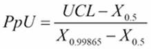
Here, X0.5 refers to the 50th percentile and X0.99865 refers to the 99.865th percentile.
This formula uses the equivalent positions of the +/-3 standard deviation point of a normal distribution. It does not always give the same capability indices like a transformed data set using the normal capability formula. The proportion outside the specification will be similar throughout. See the Box-Cox transformation in Minitab for more information.
An alternative is to use the Minitab method. It can be selected from the options for Minitab under the Tools menu, which is in Quality tools under Control Charts.
This method finds the proportion of the distribution outside the specification. Then, it finds the equivalent position on a standard normal distribution. This equivalent position for Z is divided by 3 to give the capability.
We should also look at the data for waiting times that has been recorded to the nearest five minutes. When used with the distribution ID plots, notice what happens to our results. For more on this, see the datasets that do not transform or fit any distribution.
See also
· The A capability and control chart report using the capability analysis sixpack recipe
· The Capability analysis for normally distributed data recipe
· The Using a Box-Cox transformation for capability recipe
· The Using a Johnson transformation for capability recipe
Using a Box-Cox transformation for capability
Box-Cox transformations are used to transform a dataset that is not normally distributed. The transformed data is then fitted to a normal distribution and used to find a value for the capability of the process.
Nonnormal distributions in continuous data are typically associated with some form of boundary condition. Limits restrict the distribution in one direction. Good scenarios are where we have the boundary at 0. An example may include a measure of particle contamination in a packaging. The ultimate goal for medical devices would be to achieve zero particles; negative particle counts are not possible, and the closer we get to achieving the goal of zero, the more skewed our data can become.
Process times, again, are restricted to the 0 boundary; for example, we could study telephone answer times at a call centre. The time taken for an operator to pick up a call that is coming through to their phone cannot be negative; the phone must ring for them to answer the call.
We will use the example from the previous recipe for nonnormal distribution. The data is for patient waiting times at an accident and emergency ward. Patients should wait no more than 240 minutes before being seen by a doctor.
In the previous example, we used a distribution ID plot to find a distribution to fit to the data. Just like the lognormal distribution, the Box-Cox transformation also provided a reasonable fit.
Here, we will check the fit using the Box-Cox transformation under control charts before analyzing the capability with the normal distribution tools.
How to do it...
The following steps will check to see if the Box-Cox transformation will work on our data and then use the Capability Analysis tool's normal distribution with the transformation:
1. Open the worksheet Wait time.mtw by using Open Worksheet from the File menu.
2. Navigate to Stat | Control charts and select Box-Cox Transformation.
3. Enter the column Wait time (1Mins) in the section under the drop-down list and select All observations for a chart are in one column in the list.
4. Enter Subgroup sizes as 1.
5. Click on OK.
6. The Box-Cox results indicate the use of Lambda for the transformation of 0. To use this with the capability analysis, navigate to Stat | Quality Tools | Capability Analysis and select Normal.
7. Enter Wait time (1 Mins) in the single column field and 1 in the Subgroup size.
8. Enter 240 in the Upper spec field.
9. Click on the Transform button and select the Box-Cox power transformation radio button.
10. Click on OK; then click on the button Options. Check the box Include confidence intervals. Change the Display section to percents.
11. Click on OK in each dialog box.
How it works…
The use of the Box-Cox Transformation tool in steps 1 to 4 is not necessary to run the capability. By using the distribution ID plots as in the previous recipe, we will see that the Box-Cox transformation will work on our results. The Box-Cox Transformation tool can show us the potential range of Lambda and can be used to store the transformed results back into the worksheet. The following screenshot shows the range of Lambda that would work for this data:
Box-Cox transformations are simple power transforms. The response Y is transformed by the function ![]() . When Lambda is 0, we use the natural log of the data. While the Box-Cox transformation used in steps 1 to 4 calculates an estimate for the Lambda value of 0.06, Minitab will work from a convenient rounded value, hence the value is 0.
. When Lambda is 0, we use the natural log of the data. While the Box-Cox transformation used in steps 1 to 4 calculates an estimate for the Lambda value of 0.06, Minitab will work from a convenient rounded value, hence the value is 0.
By transforming the times and the specification, this allows a fit for the normal distribution and a calculation of Cpk.
While choosing to transform the data within the Capability Analysis dialog box, we can specify the value of Lambda to use or let Minitab pick the best value itself. Minitab will use the rounded value when it picks the best value.
There's more…
The Ppk value for the transformed results is 0.65. This is a slightly different result as compared to the previous recipe using the lognormal data. This is because we use the calculation of Cpk from a normal distribution here. The nonnormal capability uses an approximation based on the ISO method. Both the overall performance figures will be the same no matter what method is used to calculate capability.
The Assistant tool can also transform the data with a Box-Cox transformation. If the data is not normally distributed, the assistant will check the transformation and prompt us to ask if we would want to transform the results if it is possible. Note that we should not transform the data just because it is possible to; we should first investigate the cause of the data being nonnormal.
See also
· The Capability analysis for normally distributed data recipe
· The Capability analysis for nonnormal distributions recipe
· The Using the Assistant tool for short-run capability analysis recipe
Using a Johnson transformation for capability
Johnson transformations are used in a way similar to Box-Cox transformations. First, apply a transformation to the response, and then use the transformed data with a normal distribution to find capability.
As with using other distributions to fit to nonnormal data, we should investigate the reasons for our data being in the shape it is before attempting Johnson transformations. For more notes on what to look out for, see the Capability analysis for nonnormal distributionsrecipe.
The main benefit of Johnson transformations over Box-Cox transformations is the ability of the former to transform data with negative values or 0 values. They can also be useful in situations where a process or data set has an extreme boundary condition that makes other distributions difficult to fit to. One example of where this may be used is for breaking stresses.
As with the previous examples on nonnormal distributions and Box-Cox transformations, we will use the data on patient waiting times at an accident and emergency ward. To do this, let's compare the output with the lognormal distribution and the Box-Cox transformation.
We need to check that the transformation is appropriate with the Johnson transformation from the Quality Tools menu before running a normal capability analysis on the transformed results.
How to do it...
The following steps will help us use the Johnson transformation for our data:
1. Open the worksheet Wait time.mtw by using Open Worksheet from the File menu.
2. Navigate to Stat | Quality Tools and select Johnson Transformation.
3. Enter Wait time (1 Mins) in the Single Column field and click on OK.
4. Check the results in the chart to see if the transformation and the function used to transform the data will work.
5. Navigate to Stat | Quality Tools | Capability and select Normal.
6. Insert the wait time column in the Single column field.
7. Enter the Subgroup sizes as 1.
8. In the Upper spec field, enter 240.
9. Click on the Transform button.
10. Select the option Johnson Transformation.
11. Click on OK in each dialog box.
How it works…
Steps 1 to 3 are used to check if the Johnson transformation will work on the data and if we ran the distribution ID plots as in the Capability analysis for nonnormal distributions recipe. It would not be essential to check the transformation using the Johnson Transformation tool. This tool is used to show if the transformation will work and if this is the optimum transformation function. It also allows the transformed data to be stored directly in the worksheet. The graphical page displayed shows that Minitab searches for the highest P-value to find the transformation.
The Johnson transformation in Minitab considers three transformation functions. These are for bounded, lognormal, and unbounded functions. The parameters of the transformation function are found from the function that has the highest P-value that is greater than the decision level. The default value used here is 0.1.
By selecting the Johnson transformation from the transformation functions within the normal capability analysis, we will automatically find the best transformation. If no transformation is possible, it will return an untransformed result.
See also
· The Capability analysis for normally distributed data recipe
· The Capability analysis for nonnormal distributions recipe
Using the Assistant tool for short-run capability analysis
Short-run capability is run on the assumption that the data is taken from a single period of time. The idea is to view data from a single sample point without any information about time. There is no subgrouping of the data or time information as the results may come from a small batch of products. Because of this, no within standard deviation can be found, this means Cpk will not be calculated and only Ppk will be used.
The Assistant tool for capability analysis helps us find the type of study to run and provides guidance in term of output and preparation of the data. Like all the Assistant tools, the dialog box is presented without any options in order to make the choices simpler and easier to use.
Because the emphasis is on ease of use, with the Assistant tool, we will not use a sample data set for this recipe. Instead, try following the instructions with your own results.
How to do it...
The following instructions show the steps to choose the capability analysis in the assistant:
1. Go to the Assistant menu and select Capability Analysis.
2. From the decision tree, scroll to Continuous and select the Capability Analysis option at the bottom of the tree, as shown in the following screenshot:
3. Change Type of analysis to Snapshot, and then enter your data column in the section labeled Column.
4. Enter the lower and upper specifications where indicated, and click on OK.
How it works…
As the snapshot considers data from a single time point, we do not produce Cpk. This is because Cpk is calculated from within the group variation that we cannot have with a snapshot of the data. Only Ppk for the overall variation of the samples is given.
The Assistant menu's capability tools offer a simplified dialog box to produce capability. If we had used a complete capability analysis, then Assistant would also produce control charts. This generates control charts for Xbar-R, Xbar-S, or I-MR, based on the subgroup's size.
While the Assistant tool does not offer a capability for nonnormal data, it will transform the results with the Box-Cox transformation. Minitab will ask before performing the transformation.
There's more…
We could generate the same capability measures from the Stat menu tools by turning off the options for calculating within capability and only displaying Ppk.
See also
· The Capability analysis for normally distributed data recipe
Comparing the capability of two processes using the Assistant tool
Multiple capability tools are available in both the Stat menu and the Assistant menu. The Assistant menu comparison tool will run a T-test and a two-variance test to compare the differences between means and standard deviations. The multiple variables capability within the Stat menu tools will allow more datasets to be used, but without the use of T-tests or tests of equal variances to check differences between the populations.
In the following recipe, we will look at comparing the fill volumes of syringes. The worksheet Volume4 uses two columns. The data is held in the columns before and after 75 syringes are measured from the process before a change. After an improvement has been made, the next 75 individual values are measured.
We will study the change in capability using the capability comparison tools from the Assistant menu. The subgroup size for both columns is 1.
How to do it...
The following steps will compare the capability of a process before and after a change; this will output how much of an improvement has been made:
1. Open the worksheet Volume4.mtw by using Open Worksheet from the File menu.
2. Go to the Assistant menu and select Before/After Capability Analysis.
3. Using the decision tree, follow the choice to the right for the Capability Comparison of Continuous data. Enter the Before and After columns as shown in the following screenshot. Enter the Subgroup size as 1 for both, the Before and After data.
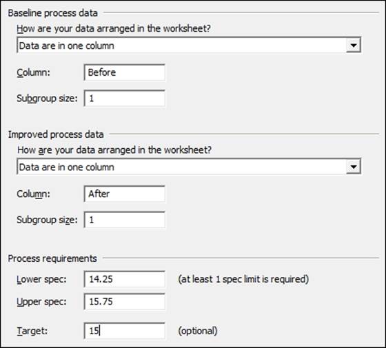
4. Enter the Lower spec as 14.25 and the Upper spec as 15.75. Enter the Target as 15.
5. Click on OK to run the reports.
How it works…
The Assistant menu's capability comparison tool will generate four report pages. The first page is a report card indicating the stability of the data, any issues with subgroups, normality, and amount of data.
The second page shows the process performance report. Both the capability histograms are displayed along with the metrics of Cpk, Ppk, Z.Bench, % out of spec, and the PPM figures.
The third report checks the process stability and normality of the data. Here, Minitab plots control charts and normality charts.
The final page is the summary report containing information on the capability stats once more. The change in capability is displayed along with two variance tests and a T-test on the mean to check for variation and mean changes.
There's more…
The Assistant menu does not have an option to use nonnormal data. Should our results not follow a normal distribution, they will try to find a transformation. This is restricted to using the Box-Cox transformation.
Minitab will warn us when the data is not normally distributed on running a capability via the Assistant tool. It will present the option to use the Box-Cox transformation if an appropriate value of Lambda will transform the data back to normal.
See also
· The Capability analysis for normally distributed data recipe
Creating an acceptance sampling plan for variable data
Acceptance sampling is used to check a lot or a batch of product to identify if it is acceptable to the customer. Typically, a customer or a regulatory body will require a guarantee of quality.
Note
AQL and RQL can change depending on the product and the industry. The Food and Drug Agency (FDA), has different guidelines for the use of the product. An example of these can be found in CFR 21 sec 800.10, where the AQL levels of surgical gloves and examination gloves are discussed.
The number of nonconforming product or nonconformities observed in a sample from the population can act as an indicator for the amount of problems in the whole lot. By observing fewer defects or defective items than the upper limit in the acceptance plan, we can state that the total of these in the population is likely to be less than the critical Acceptable Quality Level (AQL). If we observe more defects in the sample, then it is likely that the population does not meet the Rejectable Quality Level (RQL). In this recipe, we will find the number of samples and the critical distance to identify if a lot is acceptable.
Using the example of the syringe fill volumes, we have specifications of 14.25 ml and 15.75 ml. Each lot is of 5000 samples, and we will accept the lot if less than 0.1 percent is defective and reject if more than 1 percent is defective.
How to do it...
The following steps will generate a number of samples that should be collected from a population to verify the quality of that population:
1. Navigate to Stat | Quality Tools | Acceptance Sampling by Variables and select Create/Compare.
2. We will select Create a Sampling plan from the first drop-down list.
3. Select the Units for quality levels to be used as Percent defective.
4. Enter 0.1 in the Acceptable quality level (AQL) field.
5. Enter 1 in the Rejectable quality level (RQL or LTPD) field.
6. Enter the Lower spec as 14.25 and the Upper spec as 15.75.
7. Enter the Lot Size as 5000.
8. Click on OK.
How it works…
By creating an acceptance plan, we generate a series of charts to compare the performance of the plan and a table of results in the session window. We should obtain the result in the session window as shown in the following screenshot:
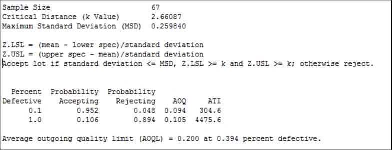
The sample size and critical distance are found to satisfy the condition that if the percentage defective in the population is really 0.1 percent defective there is less than a 5 percent chance of rejecting the lot. And if the population is really 1 percent defective, then we would have a 90 percent chance of rejecting the lot.
The plan will generate four charts to indicate the performance of the acceptance sampling plan. The operating characteristic curve shows the chance of accepting lots with a population percent of a specification between 0.1 percent and 1 percent.
The AOQ specifies the average outgoing quality of a lot with the stated percent defective. This figure is arrived at by assuming the reinspection and rework of rejected lots.
Average Total Inspection (ATI) is a figure that represents how many items, including the defective ones, are inspected on average. Even with lots at 0.1 percent defective, there will be 304.6 items inspected per batch on an average due to the 5 percent chance of rejecting a batch at 1 percent defective.
The critical distance k is the number of standard deviations from the mean to the closest specification limit. Here, If the specification limits are further than 2.66 standard deviations away from the mean then we can pass the lot.
There's more…
The Accept/Reject Lot… tool for variable data can be used with the measured samples of an acceptance plan. This will return a reject or accept result based on the mean and standard deviation of the samples, and the critical distance of the plan.
We could compare a current acceptance sampling plan by using the Compare user defined sampling plan option. The output then evaluates the ability to accept or reject at the AQL and RQL values for the given number of samples and critical distance.
Acceptance sampling is often used with attribute data to identify if a binomial passes/fails or if the Poisson count of defects is acceptable.
See also
· The Creating an acceptance sampling plan for attribute data recipe
Creating an acceptance sampling plan for attribute data
Attribute acceptance sampling plans are used when the assessment of the samples is either a binomial judgment of pass/fail or a Poisson count of defects. We will want to generate a figure for the number of items that should be sampled in order to decide if a lot can be considered acceptable or not. The amount of items that need to be inspected will be based on the amount of defects or defective items that we can accept and the amount that we would reject in a lot.
Defective items can be specified as percent, proportion, or defectives per million. Defects can be specified as per unit, per hundred, or per million.
AQL and RQL are used here to define the acceptable quality level and the rejectable quality level. Here, we will use the same AQL, RQL, and lot number as in the Creating an acceptance sampling plan for variable data recipe. This will highlight the difference in the sample sizes between variable and attribute plans.
The response will be used as a binomial, samples being good or rejected, to create a sampling plan. We will identify the number of samples that need to be inspected from each lot in order to decide if the lot can be accepted.
A lot is judged on the percentage defective product; we will want to accept lots with less than 0.1 percent defective and reject lots with more than 1 percent defective. The total lot size being judged is 5000 items.
Getting ready
There is no datasheet to open for this recipe. We will use an AQL of 0.1 percent with an RQL of 1 percent.
How to do it...
The following steps will create an acceptance sampling plan for an AQL of 0.1 percent and an RQL of 1 percent with a total lot size of 5000 items. The producer's risk will be set at 0.05 percent and that of the consumers at 0.1 percent.
1. Navigate to Stat | Quality tools and select Acceptance Sampling by Attributes.
2. Use the drop-down menu to select Create a Sampling Plan.
3. Measurement type needs to be set to Go/no go (defective) for binomial data.
4. Set Units for quality levels as Percent defective.
5. Set the AQL to 0.1.
6. Set the RQL to 1.
7. Enter 5000 as the Lot size.
8. Click on OK.
How it works…
The results will indicate that we need to sample 531 items from a lot. A lot is acceptable if we observe two or fewer defective items from the sample.
This figure is much larger than the equivalent sampling plan by variables in the previous recipe. With attribute data, we lose information about the position that is collected with the variable data, and as such, this information is made up with more samples.
The acceptance plan that we have generated used binomial distribution to create the sampling plan. Our assumption is that the lot we are sampling comes from an ongoing process. The total number of items is very large. Occasionally, we may have a lot size that is finite, a one-off shipment, or product that is unique to each order. In these cases, we should select the hypergeometric distribution and not the binomial distribution. This is found from Options within the Acceptance Sampling by Attributes dialog box.
Another issue that arises here is the idea of an AQL and an RQL. The closer the two numbers, the more difficult it is to distinguish between them. To identify a result at 0.1 percent defective and a lot at 0.5 percent defective, we would need 1335 samples. To know definitively if a result is at 0.1 percent or is just above 0.1 percent, we would need to measure everything in the lot.
There's more…
Often, acceptance plans that talk about an acceptance number of zero are discussed. These are known as C= 0 plans and are commonly used as a check for outgoing lots of pharmaceutical products. These plans also use only one quality level, and this can cause confusion over the use of AQL and RQL. C = 0 plans are more commonly associated with one quality level. This is usually the RQL, although it can be referred to as the AQL, or rather, the Lot Tolerance Percent Defective (LTPD). For acceptance plans that only accept on zero defective items, see the next recipe.
See also
· The Creating an acceptance sampling plan for variable data recipe
· The Comparing a previously defined sampling plan–C = 0 plans recipe
Comparing a previously defined sampling plan – C = 0 plans
C = 0 refers to an acceptance sampling plan where the acceptance number is zero. When samples are collected from the lot, observing any rejected items will cause the whole lot to be rejected. The C = 0 acceptance plans tend to need fewer samples than other acceptance plans. The offset for this is that lots are only reliably accepted when the defective levels are very close to 0.
Here, we will compare a previously defined plan, using Minitab, to tell us how the acceptance plan will behave. We can use the same tool to create an acceptance sampling plan and compare plans that we currently use. This can be useful to check the chance of acceptance or rejecting lots at different levels of quality. Changing the plan to a comparison also allows us to see the impact of using an acceptance level of 0.
The current plan inspects 230 samples and rejects the lot if any defectives are found. This is for an RQL or LTPD of 1 percent. No AQL is defined for this plan.
Getting ready
There is no data to be opened for this recipe. The current acceptance plans takes 230 samples from a lot. The lot is rejected if any defective items are found. We want to compare the performance of this plan for an AQL of 0.1 percent and an RQL of 1 percent.
How to do it...
The following steps will identify the chance of accepting or rejecting lots with an AQL of 0.1 percent and an RQL of 1 percent for 230 samples, with an acceptance value of 0:
1. Navigate to Stat | Quality Tools and select Acceptance Sampling by Attributes.
2. Enter details in the dialog box as shown in the following screenshot:
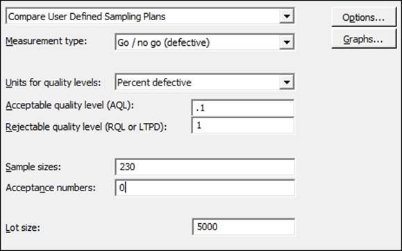
3. Click on OK to run the study.
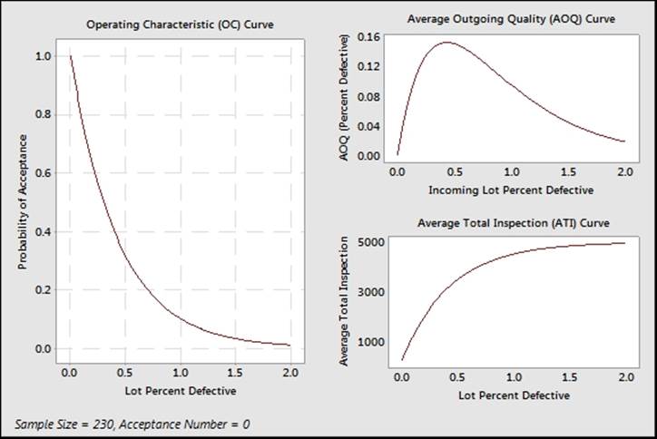
How it works…
With C = 0 plans, the value of interest to define is the RQL or LTPD. LTPD is used to define the point at which we will reject lots. The outcome is that acceptable lots are the ones that tend to be 0 percent defective.
The graph of operating characteristics in the following screenshot will show a much steeper response with C = 0 plans than other acceptance plans. This shows that while we have a 90 percent chance of rejecting a lot with more than 1 percent defective, we roughly have only an 80 percent chance of accepting a lot with 0.1 percent defective. Notice that high levels of acceptance are only observed as the lot approaches 0 percent defective.
There's more…
There can be confusion over the use of the terms AQL or RQL. In C= 0 plans, we would set the RQL or LTPD value. In many pharmaceutical applications, a plan is used, where anything above the RQL is rejected, but this does not imply that lots below the RQL are accepted but not to a high degree.
We can also use the Acceptance Sampling by Attributes dialog box to create a C = 0 sampling plan. We need to enter the RQL or LTPD as normal, but for the AQL, we need to enter a low value. The dialog box must have a value for the AQL and it must be above 0. Entering 0.0001 for the AQL though, will generate a C = 0 plan.
See also
· The Creating an acceptance sampling plan for variable data recipe
· The Creating an acceptance sampling plan for attribute data recipe
Generating run charts
Run charts are similar in application to control charts. We are interested in finding nonrandom patterns in data over time. These patterns are identified as either runs about the median, or runs up or down. These rules identify clusterings, mixtures, trends, or oscillations in our data.
In this example, we will plot the time in the office of all the US Presidents. For ease of use, this data is supplied in a Minitab worksheet. The data was gathered from Wikipedia and the White House website. More up-to-date results can also be found from a more recent visit to these sites.
We will use a run chart to plot the time in office to check for evidence of clusterings, mixtures, trends, or oscillations.
How to do it...
The following steps will generate a run chart for the days in office of each President of the United States of America:
1. The data is saved in the worksheet Presidents.mtw. Go to File and then go to Open Worksheet to open the dataset.
2. Navigate to Stat | Quality Tools and select Run Chart.
3. Enter Days in the Single column field.
4. Enter the Subgroup size as 1.
5. Click on OK.
How it works…
Run charts use the number of runs about the median and the number of runs up or down to identify patterns in the data. A run about the median refers to one or more consecutive points on one side of the median. A new run starts when the median line is crossed. The following diagram illustrates how runs are counted:
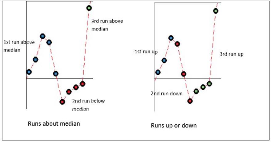
A run up or down refers to a number of points that continue in one direction. A new run begins when the data changes direction. More runs about the median than expected indicate clustering, less runs indicate mixtures.
Runs up or down that are more than expected suggest oscillations in the data; runs that are less than expected indicate trends.
There's more…
The president data does have an interesting pattern to it that the run chart does not reveal. Other means of displaying the data can be used and it is worth looking at histograms of the data or using a graphical summary, as used in Chapter 3, Basic Statistical Tools.
See also
· The Xbar-R charts and applying stages to a control chart recipe in Chapter 6, Understanding Process Variation with Control Charts
· The Using I-MR charts recipe in Chapter 6, Understanding Process Variation with Control Charts
· The Producing a graphical summary of data recipe in Chapter 3, Basic Statistical Tools
Generating tolerance intervals for summarized data
Tolerance intervals are used to find where a given percentage of the population can be expected to be found. For example, we could use a small sample taken from a population of results to inform us about where we can expect to find 95 percent of the population. Further, we can specify that we are 95 percent confident that 95 percent of the population would be found within the stated interval.
Here, we will use the tolerance interval tool to find the interval in which we expect a percentage of the population to be found. We have investigated capability with the fill weights of syringe volumes in the previous recipes of this chapter.
Summarized results for means, sample size, and standard deviation are supplied. From these, we want to know where we could expect to find 99 percent of the population of syringe fill volumes with a 95 percent confidence interval. From a recent trial, 30 samples were taken, and these had a mean of 15.15 and a standard deviation of 0.231.
How to do it...
The following steps will use the values of mean, standard deviation, and sample size to generate a tolerance interval that will show 99% of the population with a 95 percent confidence interval:
1. Navigate to Stat | Quality Tools and select Tolerance Intervals.
2. In the drop-down list for Data, select Summarized data.
3. Enter the Sample size as 30.
4. Enter the Sample mean as 15.15.
5. Enter the Sample standard deviation as 0.231.
6. Click on the Options button.
7. In the Minimum percentage of population in the interval field, enter 99.
8. Click on OK.
How it works…
The results generate a 95 percent tolerance for both a normal distribution and a nonparametric method. With summarized results from a mean, standard deviation, and sample size, we only obtain the normal method.
As we specified, 99 percent of the population between the interval of 14.374 to 15.926 show that we are 95 percent confident that 99 percent of the population may be found within this interval.
Here, we specified the summarized results. It is more advisable to use the raw data than the summarized results. Only referring to the mean and standard deviation does not reveal outliers in the data or other issues, such as time dependant errors.
Raw data is entered as a column, and this would then generate a graphical page showing a histogram of the data with confidence intervals and the normal probability plot.
See also
· The Capability analysis for normally distributed data recipe
· The Capability analysis for nonnormal distributions recipe
Datasets that do not transform or fit any distribution
Frequently, we obtain data that does not want to easily fit any distribution or any transformation. The key to using this data is often to understand the reasons for the data not fitting a distribution.
We can find many reasons for not fitting a distribution and the strategies for running a capability analysis can be varied, depending on the cause. For more on some of the issues that we should be careful of when declaring that our data is not normally distributed, see the Capability analysis for nonnormal distributions recipe.
The very first step in any analysis of data that is not normally distributed should be to understand why the data appears as it does.
This recipe explores several issues that may occur in data. This looks at a processing time example. Such data has the lower boundary at 0; this can give us a distribution skewed to the right. The other issue is that of discrete intervals in the data; the measurement system is not truly continuous for these.
Here, we will look at using the wait time data as they were used in the nonnormal examples earlier. This dataset contains wait times at the A&E department of a hospital across one day. Column one contains the data reported in one-minute intervals and column two contains the same data but rounded to the nearest five minutes.
For this recipe, we will use the column of wait time data that has been reported in five-minute intervals. We will try and find the right distribution to fit to the results using ID plots. This should reveal the discrete nature of the results before deciding on a solution to analyze the data in the How it works… section.
How to do it...
The following steps will generate the distribution ID plots for results given in the nearest five minutes:
1. Open the worksheet Wait time.mtw by using Open Worksheet from the File menu.
2. Navigate to Stat | Quality Tools and select Individual Distribution Identification.
3. Enter Wait time (5 Mins) in the Single column field.
4. Enter Subgroup size as 1.
5. Click on OK to generate probability plots for the 14 distributions and two transformations.
6. Check the probability plots to find a fit to the data.
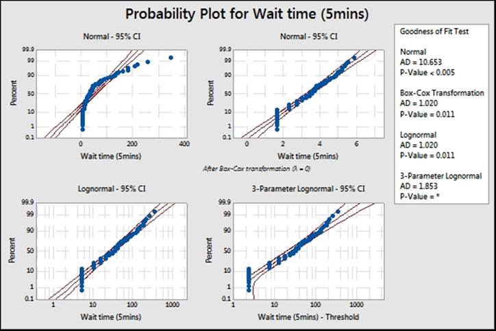
7. All available P-values will be below 0.05, indicating that we can prove that none of those distributions fit those results. Instead, find the closest fits visually.
How it works…
The ID plots will show P-values as below 0.05 for all distributions. The shape of the distributions also shows discrete intervals on most of the charts. In the preceding screenshot, you will notice the straight lines of the data points. The gaps and dots aligned are for the five-minute intervals. There is a large initial amount of data at five minutes, then a gap with no observations until the 10 minute result. The reason for not fitting any distribution is due to the data being discrete. Wait times really do not have exact five-minute gaps, but are an artifact of the measurement system.
In this recipe, we can still find the closest fit to the distribution graphically. As we know, the data has been split into discrete measurements and the actual times will really be from a continuous scale.
The lognormal distribution still provides a reasonable fit visually. Compare this to the result in the Capability analysis for nonnormal distributions recipe when using the one-minute interval data. In this case, we will analyze the data as a lognormal distribution. Run the five-minute interval column as a nonnormal capability analysis, follow the instructions for the earlier recipe, and substitute the five-minute interval data.
It is useful to compare the results either by using columns to see the effect that the discrete nature of the five-minute intervals has on the results. They will generate similar capability figures.
There's more…
Examples of other data that may not fit a distribution include unstable processes, where the data exhibits shifts in the mean or variance, or other special causes. The results could be declared as not normal because the tails of the data show too many results or because outliers make the data not normal. Ideally, we would want to find the reason behind the unstable process rather than trying to find a distribution or transformation to use.
Another common set of data are measurement systems that do not report values below a certain number. Typically, we might see these types of measurements on recording amount or size of particles as a measure of contamination. The measurement device reports all values below a threshold as 0. The actual results are too small to resolve, and we do not know the true value for any figure recorded as zero. It could be zero or any value in the intervals from zero to 0.02. Recording the figures at zero creates a dataset with a gap and some start point, say 0.02.
As the actual value is unknown, rather than reporting the value as zero, data from this sort of measurement system can be reported as missing below the threshold of resolution. Alternatively, the zero values can be adjusted by adding a random value. Find the variation of the measurement device from a Gage study. Then generate random values with a mean of zero and the standard deviation of the measurement device. Add these values to the zeroes to generate a pseudo data point. Any negative values should be left as zero.
See also
· The Capability analysis of nonnormal distributions recipe
All materials on the site are licensed Creative Commons Attribution-Sharealike 3.0 Unported CC BY-SA 3.0 & GNU Free Documentation License (GFDL)
If you are the copyright holder of any material contained on our site and intend to remove it, please contact our site administrator for approval.
© 2016-2026 All site design rights belong to S.Y.A.