Pentaho Analytics for MongoDB (2014)
Chapter 6. Pentaho Report Designer Fundamentals
Pentaho Report Designer (PRD) gives users the power to build real-time reports sourced directly from MongoDB databases. This chapter introduces users to the Report Designer GUI and provides a quick tutorial for building a report from the sample website clickstream data stored in MongoDB.
The following are the topics that we will cover in this chapter:
· Pentaho Report Designer features
· Navigating through Pentaho Report Designer
· Creating a MongoDB connection and query
· Adding and formatting report elements
By the end of this chapter, you will be familiar with the Pentaho Report Designer GUI and will have developed your first real-time production report on a MongoDB database.
Pentaho Report Designer features
PRD is a powerful client-based reporting tool for building highly formatted, parameterized reports. With PRD, you can connect to virtually any data source and display data on one or more pages, with each page containing multiple tables and charts. Once a report is developed and tested, it can be published to the Pentaho BA server and accessed via a web browser.
Data sources
PRD provides connectivity to a variety of data sources including the following:
· MongoDB
· Relational databases
· Pentaho analysis cubes
· PDI transformations (access to inline ETL, Big Data, and web services)
· Pentaho metadata
· XML files via XPath queries
· Manually-defined data tables
Report elements
Report elements are the basic building blocks for a PRD report. They can be added to a report by dragging-and-dropping them from the palette of elements. Each report element has a comprehensive list of attributes and styles for configuration. Standard report elements include the following:
· Labels, messages, numbers, and data fields
· Static and dynamic images
· A variety of barcode standards
· Charts and sparklines
· Data- and query-driven parameters
· Cascading prompts
· Subreports
PRD subreports are a powerful and commonly used feature allowing you to create a single master report with multiple subreports across different data sources. Each subreport can have its own query, which receives query parameters from the master report query. We will build subreports in later exercises to enable multiple queries in a single report.
Aggregations and calculations
PRD supports the most common aggregation types including sum, average, count, count-distinct, min, and max. Additionally, all element properties in Report Designer can have formulas. There is a built-in formula editor for graphically designing expressions that can be used for conditional formatting or data-driven report elements. More in-depth calculation documentation is provided by Pentaho at http://infocenter.pentaho.com/help/topic/report_designer_user_guide/topic_adding_calculations.html.
For complex calculations, calculations such as OpenFormula for MS Excel and scriptable expressions are supported. More information on OpenFormula can be found at http://en.wikipedia.org/wiki/OpenFormula and https://www.oasis-open.org/committees/download.php/16826/openformula-spec-20060221.html.
Formatting and output
PRD gives you the flexibility to control the look and feel of every reporting element, including conditional formatting using style and attribute expressions. The report definition can even be dynamically changed at runtime. Lastly, reports can be output to a variety of different formats including the following:
· Excel and CSV
· HTML
· Text and RTF
· XML
Navigating through Pentaho Report Designer
PRD is launched from your Windows Start menu under the Pentaho application folder. Within that folder, you will find the Report Designer item within the Pentaho Business Analytics subdirectory. Alternatively, you can launch PRD from the Windows batch file located under \pentaho\design-tools\report-designer\report-designer.bat.
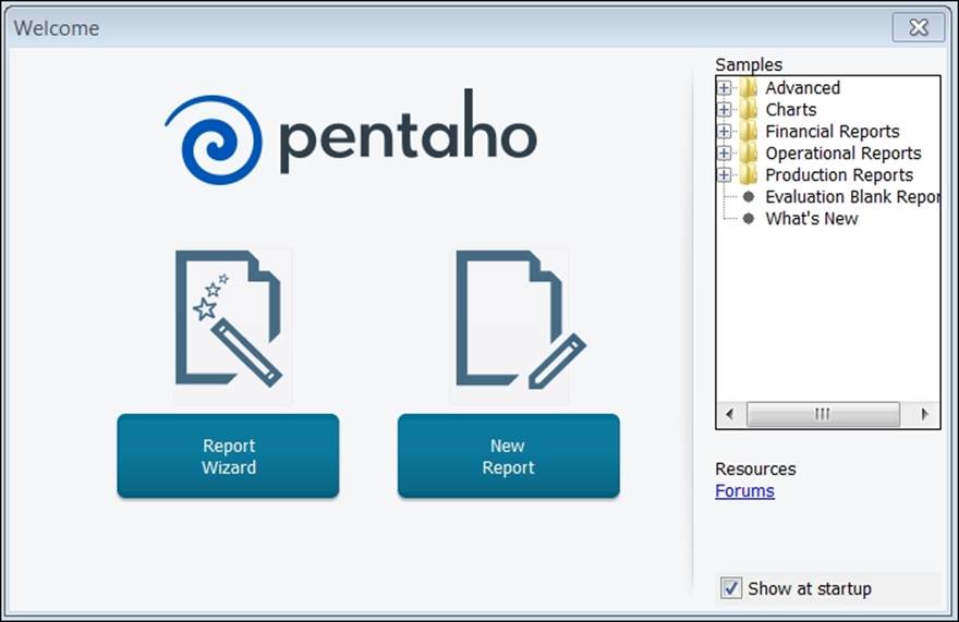
Upon launching PRD, the Welcome screen will appear to help new users get started with running sample reports, creating a new report, or using the Report Wizard to assist in developing a simple report:
Report workspace
Upon clicking on New Report, a blank report will be created as a new tab in the report workspace. PRD is a banded report writer because the workspace is divided into horizontal layout bands that extend across the page. Each band contains different information for constructing a logical report layout. PRD will display a default set of layout bands, as shown in the following screenshot:
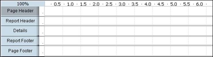
The currently selected Page Header band is highlighted in gray by clicking in the white band area to the right of the band title. Bands are resized by clicking-and-dragging the horizontal band border lines up or down. The following table describes the different report bands:
|
Band |
Description |
|
Page Header |
The Page Header band contains elements at the absolute top of each page. The content in this band will be included at the top of each page in a multipage report. |
|
Report Header |
The Report Header band contains elements only on the first page of a report, just below the Page Header band. |
|
Group Header |
The Group Header band is enabled only when you want to display headers for each grouping in your data query. |
|
Details |
The Details band contains the bulk of your report data. It also contains the Details Header and Details Footer bands, hidden by default, and used to help format table column headers and footers. |
|
No Data |
If your query does not return any data, the No Data band contents that you add will appear in your report. |
|
Group Footer |
The Group Footer band is enabled only when you want to display footers for each grouping in your data query. |
|
Report Footer |
The Report Footer band contains elements only on the last page of a report, just above the Page Footer band. |
|
Page Footer |
The Page Footer band contains elements at the absolute bottom of each page. It will be included at the bottom of each page in a multipage report. |
|
Watermark |
The contents of the Watermark band become a watermark to your report. |
The No Data and Watermark bands are hidden by default. You can go to each element in the Structure pane, and in the Attributes pane, select hide-on-canvas and false to make it show on the canvas.
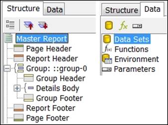
The Structure tab
Every band and element in the workspace also appears as a hierarchy in the Structure tab in the upper-right corner of PRD. The workspace and the Structure tab mirror each other, and can be used to add or delete elements from the report. Notice in the following screenshot, how the default structure elements match the order of the workspace bands, starting with Page Header and ending with Page Footer:
You can right-click on layout bands in the Structure tab to add report elements to that band.
The Data tab
The Data tab is also shown in the previous screenshot. This tab is where you begin development—by defining a new data source connection and query. You can define multiple queries for a report, and they will all reside here. However, you are allowed only one active query per master or subreport. The Data tab is also the location for adding functions, environment variables, and parameters. Once you define a query, you can drag-and-drop query data elements from the Data tab to one of the layout bands.
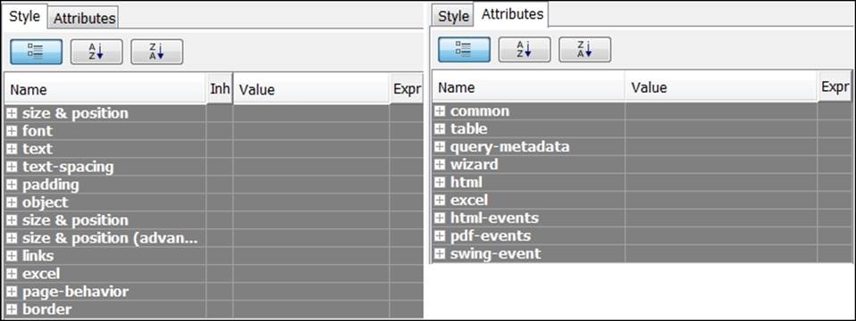
The Style and Attributes tabs
The top-level Master Report element is selected on the Structure tab in the previous screenshot. When you select any element in the Structure tab, a detailed list of element properties organized by category will appear on the Style and Attribute tabs below it. The following screenshot shows a collapsed view of all property categories for both tabs:
The palette
The palette contains all of the reporting elements used to build a report. You can click on any element icon from the palette and drag it onto a layout band. The following table describes the different report elements:
|
Element icon |
Element name |
Element description |
|
|
Label |
A static text string that cannot be changed dynamically. |
|
|
Text Field |
A dynamic text field that can be changed dynamically through a query or function. |
|
|
Number Field |
A dynamic numerical field that displays numerical data from a query. |
|
|
Date Field |
A dynamic date field that displays date information from a query. |
|
|
Message Field |
A combination static/dynamic report element typically used to combine static text along with dynamic elements. |
|
|
Resource Label |
A static text string that maps to a resource bundle, allowing you to localize labels. |
|
|
Resource Field |
A dynamic text string that maps to a resource bundle, allowing you to localize any database field. |
|
|
Resource Message |
A dynamic text string that combines multiple elements and maps to a resource bundle, allowing you to localize the combined content. |
|
|
Image Field |
A dynamic image field that displays images stored in a database. |
|
|
Image |
A static image report element that displays images embedded in the report. |
|
|
Ellipse |
A round or oval vector graphic. |
|
|
Rectangle |
A rectangle vector graphic. |
|
|
Horizontal Line |
A horizontal line vector graphic. |
|
|
Vertical Line |
A vertical line vector graphic. |
|
|
Survey Scale |
A sliding scale chart element. |
|
|
Chart |
A graphical chart element that displays query data in a chart. |
|
|
Simple Barcodes |
A barcode chart element. |
|
|
Bar Sparkline |
A bar sparkline chart element. |
|
|
Line Sparkline |
A line sparkline chart element. |
|
|
Pie Sparkline |
A pie sparkline chart element. |
|
|
Band |
A layout report element used to group other elements together. |
|
|
Sub report |
A separate report page that is nested inside the master report. Subreports can reference separate queries that can be linked to the master report. |
|
|
Table of Content |
A subreport element that generates a table of contents based on the groups in your report. |
|
|
Index |
A subreport element that generates an index based on fields in your report. The index will display instances and page numbers in which the field name appears. |
The main menu and toolbar
The main toolbar at the top of the Report Designer window is used for common file operations such as cut, copy, and paste. You can hover the mouse pointer over an icon to reveal the purpose of each button. The main menu houses several features for designing your report. The View menu exposes a few important alignment features that you should be aware of before we begin developing a report. By default, Grids should be enabled. Grids provide an X and Y axis with evenly-spaced hash marks to help you align your report elements. You can set the distance between the hash marks by navigating to View | Grids | Settings. In addition, Guides are vertical or horizontal lines that help you align elements. Guides are created by clicking on the page rulers at the top-left corner of the report page. They can be removed by right-clicking on the guide and selecting Delete.
Additional alignment features from the View menu worth mentioning are Element Alignment Hints, Snap to Elements, and Show Overlapping Elements. Element Alignment Hints can be helpful as you begin your report, but the hint lines become cumbersomeonce you have several objects on the page. For our first report, be sure to disable Element Alignment Hints and enable Snap to Elements and Show Overlapping Elements.
The tab toolbar
Each open report will have its own tab in Report Designer. You can have multiple report tabs open with the currently selected report highlighted in blue. Beneath the Report tab is a tab toolbar for modifying fonts and previewing your report. The eye icon to the far left of the tab toolbar will often be used to execute the report and preview how it looks when published. Click on the eye icon to preview your report and it will change to a pencil (edit) icon. Click on the pencil icon to return to the edit mode.
Interface reference
The following screenshot divides the Report Designer interface into 13 sections for reference:
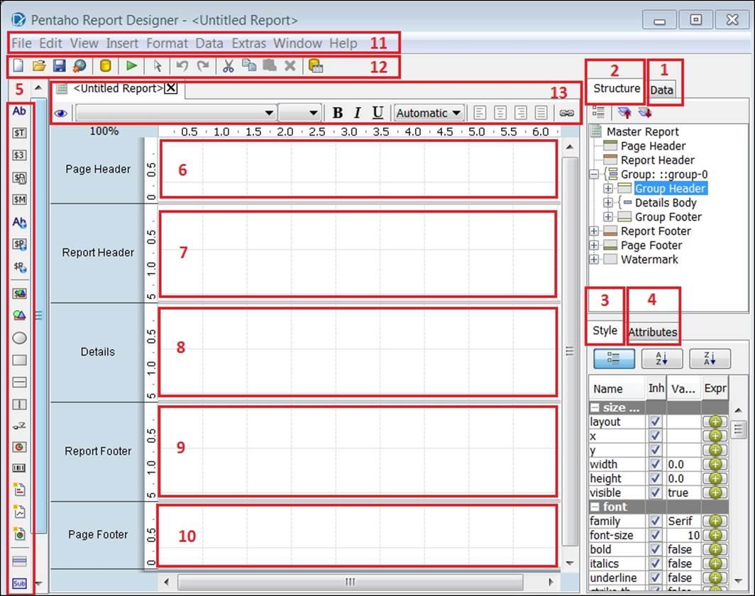
The following table lists each section, numbered as per the preceding screenshot:
|
Section# |
Section name |
|
1 |
The Data tab |
|
2 |
The Structure tab |
|
3 |
The Style tab |
|
4 |
The Attributes tab |
|
5 |
Palette |
|
6 |
The Page Header band |
|
7 |
The Report Header band |
|
8 |
The Details band |
|
9 |
The Report Footer band |
|
10 |
The Page Footer band |
|
11 |
The main menu |
|
12 |
The main toolbar |
|
13 |
The tab toolbar |
Creating a MongoDB connection and query
The first step in PRD report development is to create a database connection and execute one or more queries. This section explains how to create a MongoDB connection and query. When creating a MongoDB connection, there are several MongoDB-specific configuration options. We do not use some of the more advanced configuration options for exercises in this book, but it is important to be aware of them. MongoDB-specific configuration features, which are not used in the exercises, include the following:
· Use all replica set members: Replica sets provide redundancy and increase data availability. If there is a replica set with more than one host, Pentaho discovers all hosts listed in the host field.
· Read preference: This tells Pentaho which node to read first—primary, primaryPreferred, secondary, secondaryPreferred, or nearest.
· Tag set: Tag sets let you customize write concern and read preferences for a replica set.
· Fields expression: This controls the query fields to return. This is called projection in MongoDB terms. This is enabled only when the query is not an aggregation pipeline query. If empty, all fields are returned.
For more information on replication in MongoDB, visit http://docs.mongodb.org/manual/replication/.
Adding a MongoDB data source
A PRD report template, report_template_chapter06.prpt, has been provided to give you a head start developing your first report. You will need to open this report template in PRD to begin. Perform the following steps to add a MongoDB datasource:
1. If you are on the Welcome screen, close it to return to the main window.
2. Click on the open icon on the menu toolbar or navigate to File | Open from the main menu and browse to the report_template_chapter06.prpt file provided with this book.
Note
The report template will save you time and give you a head start by providing a Report Header band with label elements and a Details band with vector graphic, image, label, and number-field elements prearranged in the workspace. You can click on any preexisting element in the workspace, and PRD will highlight that element in the Structure tab and display the associated element properties in the Style and Attribute tabs.
3. Click on the Data tab, right-click on Data Sets and select MongoDB from the list.
4. While in the MongoDB Data Source dialog box, click on the green circle with a plus symbol to add a new query.
5. Rename Query 1 to metrics_summary_query.
6. We now need to complete the four data source tabs starting with the Configure connection tab. Type localhost for Host name and 27017 for Port.
7. On the Input Options tab, click on Get DBs and select pentaho from the list of databases.
8. Click on Get collections and select sessions_events from the list of collections.
9. On the Query tab, type or paste the following query into the Query expression input box. This query is located in the code files provided with this book so that you can copy and paste the code:
10.{ $unwind : "$event_data" },
11.{ $group : {
12. _id: 1,
13. Visits : {$sum: { $cond: [ { $eq: [ "$event_data.event", "Visited Site" ]},1,0]}},
14. Offers : {$sum: { $cond: [ { $eq: [ "$event_data.event", "Signup Free Offer" ]},1,0]}},
15. Leads : {$sum: { $cond: [ { $eq: [ "$event_data.event", "Completed Lead Form" ]},1,0]}},
16. Purchases : {$sum: { $cond: [ { $eq: [ "$event_data.event", "Added Item To Cart" ]},1,0]}},
17. Total_Events: {$sum: 1}
}}}
18. Be sure to check the Query is aggregation pipeline option.
Note
This query is an aggregation pipeline because it uses aggregation framework operators such as $unwind, $group, and $sum. The $unwind operator will unwind the event data array so that we can then accurately count and summarize each instance of an event. The result of this query will be five summary metrics for the report. For more information on the aggregation framework, visit http://docs.mongodb.org/manual/reference/operator/aggregation/.
19. On the Fields tab, click on Get fields. Pentaho will scan the sessions_events collection to detect the collection schema and parse the available document fields.
20. Click on the Preview button to run the query and view the results. Your query results should match the numbers in the following screenshot:
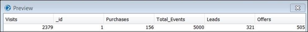
21. Click on OK to return to the workspace.
Note
On the Data tab, notice Data Sets has a new MongoDB entry, and beneath that entry is a metrics_summary_query folder. You can expand this folder by double-clicking on it to see the six available fields from your query.
Adding and formatting report elements
The next step in the Report Designer report development is to add data elements from the metrics_summary_query folder to the report and modify the element formats. This section explains how to easily add message and number-fields to the report.
Adding a message field to your report
1. Click on the message field icon from the palette on the left-hand side and drag it directly above the rectangular Event Counts label on the Details band, as shown in the following screenshot:
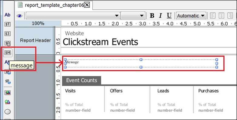
2. Resize the Message field to the width of the page by selecting and dragging the right-hand side border of the Message field to the right.
3. Double-click on the Message field and an edit button will appear on the right-hand side of the Message field. Click on this edit button to make edits.
4. Type or paste the following code in the Edit Property input box and then click on OK. This query is located in the code files provided with this book, so that you can copy and paste the code.
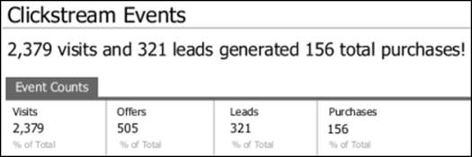
$(Visits, number, #,###) visits and$(Leads, number, #,###) leads generated$(Purchases, number, #,###) total purchases!
The following screenshot shows the mentioned query in the Edit Property window:

Tip
Documentation on the calculation syntax using LibFormula, as used in the previous calculation, is provided on the Pentaho wiki at http://wiki.pentaho.com/display/Reporting/LibFormulaSyntax.
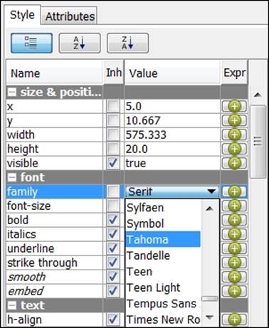
5. Click on the Structure tab and locate the font-size property in the Style tab.
6. Change the font of the Message field to Tahoma and the font size to 20, as shown in the following screenshot:
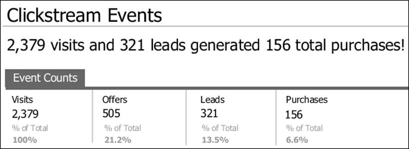
7. Click on the eye icon on the tab toolbar to preview your report and test the code. You should see the Message field display 2,379 visits and 321 leads generated 156 total purchases!.
8. Click on the pencil icon (edit) to return to the edit mode.
Adding number-fields to your report
There are a couple of methods for adding number-fields to your report. The first method is to drag a number-field from the palette and then assign it to a field from the data query. The second method is to drag query fields from the Data tab directly onto the report. Because the query fields are of the integer data type, they will be added as number-fields in the workspace. We will use the second method because it requires fewer steps to complete. The steps are as follows:
1. On the Data tab, click on the Visits data field from under metrics_summary_query and drag it underneath the Visits label on the Details band, as shown in the following screenshot:
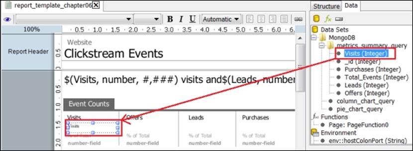
2. Click on the Offers query element from under metrics_summary_query and drag it underneath the Offers label on the Details band.
3. Click on the Leads query element from under metrics_summary_query and drag it underneath the Leads label on the Details band.
4. Click on the Purchases query element from under metrics_summary_query and drag it underneath the Purchases label on the Details band.
Note
To align the left-hand side edge of each number-field to the left edge of the label above it, you can drag the left border of either element, and the snap-to-grid feature will assist with alignment. Alternatively, you can click on both elements keeping the Shiftkey pressed and then right-click on one of the highlighted elements to navigate to Alignment | Left.
5. Click on all four new number-fields, keeping the Shift key pressed, to select them together for editing.
6. With all four number-fields highlighted, right-click on one of the highlighted fields and navigate to Alignment | Top.
7. With all four number-fields still highlighted, click on the Structure tab and locate the font-size property in the Style tab.
8. Change the font to Tahoma and font-size to 20.
9. Click on the eye icon on the tab toolbar to preview your report. Your report should match the following screenshot:
Note
Notice how the % of Total fields are not yet complete in the preceding screenshot. You'll learn how to fix that in the next exercise.
Adding calculated values to your report
This last section of this chapter steps you through adding the percentage of total calculations to number-fields. These calculations use the metrics_summary_query values as numerators and denominators in calculating each metric's percentage of total Visits.
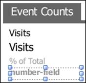
1. While in edit mode, notice the four existing number-fields just below the % of Total labels for each of the four metrics in the details workspace.
2. Highlight the first number-field under Visits:
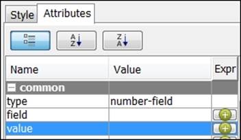
3. With number-field highlighted, click on the Structure tab and then the Attributes tab below it.
4. Locate the value property within the common category.
5. Click on the round, green Expr button for the value property:
6. This will open the Edit Expression dialog box. Type or paste the following code into the Formula input box:
=[Visits]/[Visits]
7. Click on OK.
Note
Notice that the round, green Expr button has changed to a pencil icon, indicating that edits have occurred for this property. Now, let's make a similar calculation edit for the remaining three metrics.
8. Click on the number-field element under Offers to select it and then edit its value property by clicking on the Expr button.
9. Type or paste the following code into the Edit Expression formula input box and then click on OK:
=[Offers]/[Visits]
10. Click on the number-field element under Leads to select it and then edit its value property by clicking on the Expr button.
11. Type or paste the following code into the Edit Expression formula input box and then click on OK:
=[Leads]/[Visits]
12. Click on the number-field element under Purchases to select it and then edit its value property by clicking on the Expr button.
13. Type or paste the following code into the Edit Expression formula input box and then click OK:
=[Purchases]/[Visits]
14. Click on the eye icon on the tab toolbar to preview your report. Your report should match the following screenshot:
15. From the main menu navigate to File | Save As and save the report on your local hard drive as chapter06_clickstream_report.
Summary
Congratulations! You have just completed the first of two chapters on building a Pentaho report that queries real-time data from a MongoDB database! This chapter has exposed you to the powerful integration between Pentaho Report Designer and MongoDB, and this is just the beginning. The next chapter will continue the development of this PRD report by adding new queries, charts, and prompts.