Machine Learning with R Cookbook (2015)
Chapter 11. Dimension Reduction
In this chapter, we will cover the following topics:
· Performing feature selection with FSelector
· Performing dimension reduction with PCA
· Determining the number of principal components using a scree test
· Determining the number of principal components using the Kaiser method
· Visualizing multivariate data using biplot
· Performing dimension reduction with MDS
· Reducing dimensions with SVD
· Compressing images with SVD
· Performing nonlinear dimension reduction with ISOMAP
· Performing nonlinear dimension deduction with Local Linear Embedding
Introduction
Most datasets contain features (such as attributes or variables) that are highly redundant. In order to remove irrelevant and redundant data to reduce the computational cost and avoid overfitting, you can reduce the features into a smaller subset without a significant loss of information. The mathematical procedure of reducing features is known as dimension reduction.
The reduction of features can increase the efficiency of data processing. Dimension reduction is, therefore, widely used in the fields of pattern recognition, text retrieval, and machine learning. Dimension reduction can be divided into two parts: feature extraction and feature selection. Feature extraction is a technique that uses a lower dimension space to represent data in a higher dimension space. Feature selection is used to find a subset of the original variables.
The objective of feature selection is to select a set of relevant features to construct the model. The techniques for feature selection can be categorized into feature ranking and feature selection. Feature ranking ranks features with a certain criteria and then selects features that are above a defined threshold. On the other hand, feature selection searches the optimal subset from a space of feature subsets.
In feature extraction, the problem can be categorized as linear or nonlinear. The linear method searches an affine space that best explains the variation of data distribution. In contrast, the nonlinear method is a better option for data that is distributed on a highly nonlinear curved surface. Here, we list some common linear and nonlinear methods.
Here are some common linear methods:
· PCA: Principal component analysis maps data to a lower dimension, so that the variance of the data in a low dimension representation is maximized.
· MDS: Multidimensional scaling is a method that allows you to visualize how near (pattern proximities) objects are to each other and can produce a representation of your data with lower dimension space. PCA can be regarded as the simplest form of MDS if the distance measurement used in MDS equals the covariance of data.
· SVD: Singular value decomposition removes redundant features that are linear correlated from the perspective of linear algebra. PCA can also be regarded as a specific case of SVD.
Here are some common nonlinear methods:
· ISOMAP: ISOMAP can be viewed as an extension of MDS, which uses the distance metric of geodesic distances. In this method, geodesic distance is computed by graphing the shortest path distances.
· LLE: Locally linear embedding performs local PCA and global eigen-decomposition. LLE is a local approach, which involves selecting features for each category of the class feature. In contrast, ISOMAP is a global approach, which involves selecting features for all features.
In this chapter, we will first discuss how to perform feature ranking and selection. Next, we will focus on the topic of feature extraction and cover recipes in performing dimension reduction with both linear and nonlinear methods. For linear methods, we will introduce how to perform PCA, determine the number of principal components, and its visualization. We then move on to MDS and SVD. Furthermore, we will introduce the application of SVD to compress images. For nonlinear methods, we will introduce how to perform dimension reduction with ISOMAP and LLE.
Performing feature selection with FSelector
The FSelector package provides two approaches to select the most influential features from the original feature set. Firstly, rank features by some criteria and select the ones that are above a defined threshold. Secondly, search for optimum feature subsets from a space of feature subsets. In this recipe, we will introduce how to perform feature selection with the FSelector package.
Getting ready
In this recipe, we will continue to use the telecom churn dataset as the input data source to train the support vector machine. For those who have not prepared the dataset, please refer to Chapter 5, Classification (I) – Tree, Lazy, and Probabilistic, for detailed information.
How to do it...
Perform the following steps to perform feature selection on a churn dataset:
1. First, install and load the package, FSelector:
2. > install.packages("FSelector")
3. > library(FSelector)
2. Then, we can use random.forest.importance to calculate the weight for each attribute, where we set the importance type to 1:
3. > weights = random.forest.importance(churn~., trainset, importance.type = 1)
4. > print(weights)
5. attr_importance
6. international_plan 96.3255882
7. voice_mail_plan 24.8921239
8. number_vmail_messages 31.5420332
9. total_day_minutes 51.9365357
10.total_day_calls -0.1766420
11.total_day_charge 53.7930096
12.total_eve_minutes 33.2006078
13.total_eve_calls -2.2270323
14.total_eve_charge 32.4317375
15.total_night_minutes 22.0888120
16.total_night_calls 0.3407087
17.total_night_charge 21.6368855
18.total_intl_minutes 32.4984413
19.total_intl_calls 51.1154046
20.total_intl_charge 32.4855194
21.number_customer_service_calls 114.2566676
3. Next, we can use the cutoff function to obtain the attributes of the top five weights:
4. > subset = cutoff.k(weights, 5)
5. > f = as.simple.formula(subset, "Class")
6. > print(f)
7. Class ~ number_customer_service_calls + international_plan +
8. total_day_charge + total_day_minutes + total_intl_calls
9. <environment: 0x00000000269a28e8>
4. Next, we can make an evaluator to select the feature subsets:
5. > evaluator = function(subset) {
6. + k = 5
7. + set.seed(2)
8. + ind = sample(5, nrow(trainset), replace = TRUE)
9. + results = sapply(1:k, function(i) {
10.+ train = trainset[ind ==i,]
11.+ test = trainset[ind !=i,]
12.+ tree = rpart(as.simple.formula(subset, "churn"), trainset)
13.+ error.rate = sum(test$churn != predict(tree, test, type="class")) / nrow(test)
14.+ return(1 - error.rate)
15.+ })
16.+ return(mean(results))
17.+ }
5. Finally, we can find the optimum feature subset using a hill climbing search:
6. > attr.subset = hill.climbing.search(names(trainset)[!names(trainset) %in% "churn"], evaluator)
7. > f = as.simple.formula(attr.subset, "churn")
8. > print(f)
9. churn ~ international_plan + voice_mail_plan + number_vmail_messages +
10. total_day_minutes + total_day_calls + total_eve_minutes +
11. total_eve_charge + total_intl_minutes + total_intl_calls +
12. total_intl_charge + number_customer_service_calls
13.<environment: 0x000000002224d3d0>
How it works...
In this recipe, we present how to use the FSelector package to select the most influential features. We first demonstrate how to use the feature ranking approach. In the feature ranking approach, the algorithm first employs a weight function to generate weights for each feature. Here, we use the random forest algorithm with the mean decrease in accuracy (where importance.type = 1) as the importance measurement to gain the weights of each attribute. Besides the random forest algorithm, you can select other feature ranking algorithms (for example, chi.squared, information.gain) from the FSelector package. Then, the process sorts attributes by their weight. At last, we can obtain the top five features from the sorted feature list with the cutoff function. In this case, number_customer_service_calls, international_plan, total_day_charge, total_day_minutes, and total_intl_calls are the five most important features.
Next, we illustrate how to search for optimum feature subsets. First, we need to make a five-fold cross-validation function to evaluate the importance of feature subsets. Then, we use the hill climbing searching algorithm to find the optimum feature subsets from the original feature sets. Besides the hill-climbing method, one can select other feature selection algorithms (for example, forward.search) from the FSelector package. Lastly, we can find that international_plan + voice_mail_plan + number_vmail_messages + total_day_minutes + total_day_calls + total_eve_minutes + total_eve_charge + total_intl_minutes + total_intl_calls + total_intl_charge + number_customer_service_calls are optimum feature subsets.
See also
· You can also use the caret package to perform feature selection. As we have discussed related recipes in the model assessment chapter, you can refer to Chapter 7, Model Evaluation, for more detailed information.
· For both feature ranking and optimum feature selection, you can explore the package, FSelector, for more related functions:
· > help(package="FSelector")
Performing dimension reduction with PCA
Principal component analysis (PCA) is the most widely used linear method in dealing with dimension reduction problems. It is useful when data contains many features, and there is redundancy (correlation) within these features. To remove redundant features, PCA maps high dimension data into lower dimensions by reducing features into a smaller number of principal components that account for most of the variance of the original features. In this recipe, we will introduce how to perform dimension reduction with the PCA method.
Getting ready
In this recipe, we will use the swiss dataset as our target to perform PCA. The swiss dataset includes standardized fertility measures and socio-economic indicators from around the year 1888 for each of the 47 French-speaking provinces of Switzerland.
How to do it...
Perform the following steps to perform principal component analysis on the swiss dataset:
1. First, load the swiss dataset:
2. > data(swiss)
2. Exclude the first column of the swiss data:
3. > swiss = swiss[,-1]
3. You can then perform principal component analysis on the swiss data:
4. > swiss.pca = prcomp(swiss,
5. + center = TRUE,
6. + scale = TRUE)
7. > swiss.pca
8. Standard deviations:
9. [1] 1.6228065 1.0354873 0.9033447 0.5592765 0.4067472
10.
11.Rotation:
12. PC1 PC2 PC3 PC4 PC5
13.Agriculture 0.52396452 -0.25834215 0.003003672 -0.8090741 0.06411415
14.Examination -0.57185792 -0.01145981 -0.039840522 -0.4224580 -0.70198942
15.Education -0.49150243 0.19028476 0.539337412 -0.3321615 0.56656945
16.Catholic 0.38530580 0.36956307 0.725888143 0.1007965 -0.42176895
17.Infant.Mortality 0.09167606 0.87197641 -0.424976789 -0.2154928 0.06488642
4. Obtain a summary from the PCA results:
5. > summary(swiss.pca)
6. Importance of components:
7. PC1 PC2 PC3 PC4 PC5
8. Standard deviation 1.6228 1.0355 0.9033 0.55928 0.40675
9. Proportion of Variance 0.5267 0.2145 0.1632 0.06256 0.03309
10.Cumulative Proportion 0.5267 0.7411 0.9043 0.96691 1.00000
5. Lastly, you can use the predict function to output the value of the principal component with the first row of data:
6. > predict(swiss.pca, newdata=head(swiss, 1))
7. PC1 PC2 PC3 PC4 PC5
8. Courtelary -0.9390479 0.8047122 -0.8118681 1.000307 0.4618643
How it works...
Since the feature selection method may remove some correlated but informative features, you have to consider combining these correlated features into a single feature with the feature extraction method. PCA is one of the feature extraction methods, which performs orthogonal transformation to convert possibly correlated variables into principal components. Also, you can use these principal components to identify the directions of variance.
The process of PCA is carried on by the following steps: firstly, find the mean vector, ![]() , where
, where ![]() indicates the data point, and n denotes the number of points. Secondly, compute the covariance matrix by the equation,
indicates the data point, and n denotes the number of points. Secondly, compute the covariance matrix by the equation, ![]() . Thirdly, compute the eigenvectors,
. Thirdly, compute the eigenvectors,![]() , and the corresponding eigenvalues. In the fourth step, we rank and choose the top k eigenvectors. In the fifth step, we construct a d x k dimensional eigenvector matrix, U. Here, d is the number of original dimensions and k is the number of eigenvectors. Finally, we can transform data samples to a new subspace in the equation,
, and the corresponding eigenvalues. In the fourth step, we rank and choose the top k eigenvectors. In the fifth step, we construct a d x k dimensional eigenvector matrix, U. Here, d is the number of original dimensions and k is the number of eigenvectors. Finally, we can transform data samples to a new subspace in the equation, ![]() .
.
In the following figure, it is illustrated that we can use two principal components, ![]() , and
, and ![]() , to transform the data point from a two-dimensional space to new two-dimensional subspace:
, to transform the data point from a two-dimensional space to new two-dimensional subspace:
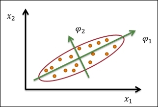
A sample illustration of PCA
In this recipe we use the prcomp function from the stats package to perform PCA on the swiss dataset. First, we remove the standardized fertility measures and use the rest of the predictors as input to the function, prcomp. In addition to this, we set swiss as an input dataset; the variable should be shifted to the zero center by specifying center=TRUE; scale variables into the unit variance with the option, scale=TRUE, and store the output in the variable, swiss.pca.
Then, as we print out the value stored in swiss.pca, we can find the standard deviation and rotation of the principal component. The standard deviation indicates the square root of the eigenvalues of the covariance/correlation matrix. On the other hand, the rotation of the principal components shows the coefficient of the linear combination of the input features. For example, PC1 equals Agriculture * 0.524 + Examination * -0.572 + Education * -0.492 + Catholic* 0.385 + Infant.Mortality * 0.092. Here, we can find that the attribute, Agriculture, contributes the most for PC1, for it has the highest coefficient.
Additionally, we can use the summary function to obtain the importance of components. The first row shows the standard deviation of each principal component, the second row shows the proportion of variance explained by each component, and the third row shows the cumulative proportion of the explained variance. Finally, you can use the predict function to obtain principal components from the input features. Here, we input the first row of the dataset, and retrieve five principal components.
There's more...
Another principal component analysis function is princomp. In this function, the calculation is performed by using eigen on a correlation or covariance matrix instead of a single value decomposition used in the prcomp function. In general practice, using prcomp is preferable; however, we cover how to use princomp here:
1. First, use princomp to perform PCA:
2. > swiss.princomp = princomp(swiss,
3. + center = TRUE,
4. + scale = TRUE)
5. > swiss.princomp
6. Call:
7. princomp(x = swiss, center = TRUE, scale = TRUE)
8.
9. Standard deviations:
10. Comp.1 Comp.2 Comp.3 Comp.4 Comp.5
11.42.896335 21.201887 7.587978 3.687888 2.721105
12.
13. 5 variables and 47 observations.
2. You can then obtain the summary information:
3. > summary(swiss.princomp)
4. Importance of components:
5. Comp.1 Comp.2 Comp.3 Comp.4 Comp.5
6. Standard deviation 42.8963346 21.2018868 7.58797830 3.687888330 2.721104713
7. Proportion of Variance 0.7770024 0.1898152 0.02431275 0.005742983 0.003126601
8. Cumulative Proportion 0.7770024 0.9668177 0.99113042 0.996873399 1.000000000
3. You can use the predict function to obtain principal components from the input features:
4. > predict(swiss.princomp, swiss[1,])
5. Comp.1 Comp.2 Comp.3 Comp.4 Comp.5
6. Courtelary -38.95923 -20.40504 12.45808 4.713234 -1.46634
In addition to the prcomp and princomp functions from the stats package, you can use the principal function from the psych package:
1. First, install and load the psych package:
2. > install.packages("psych")
3. > install.packages("GPArotation")
4. > library(psych)
2. You can then use the principal function to retrieve the principal components:
3. > swiss.principal = principal(swiss, nfactors=5, rotate="none")
4. > swiss.principal
5. Principal Components Analysis
6. Call: principal(r = swiss, nfactors = 5, rotate = "none")
7. Standardized loadings (pattern matrix) based upon correlation matrix
8. PC1 PC2 PC3 PC4 PC5 h2 u2
9. Agriculture -0.85 -0.27 0.00 0.45 -0.03 1 -6.7e-16
10.Examination 0.93 -0.01 -0.04 0.24 0.29 1 4.4e-16
11.Education 0.80 0.20 0.49 0.19 -0.23 1 2.2e-16
12.Catholic -0.63 0.38 0.66 -0.06 0.17 1 -2.2e-16
13.Infant.Mortality -0.15 0.90 -0.38 0.12 -0.03 1 -8.9e-16
14.
15. PC1 PC2 PC3 PC4 PC5
16.SS loadings 2.63 1.07 0.82 0.31 0.17
17.Proportion Var 0.53 0.21 0.16 0.06 0.03
18.Cumulative Var 0.53 0.74 0.90 0.97 1.00
19.Proportion Explained 0.53 0.21 0.16 0.06 0.03
20.Cumulative Proportion 0.53 0.74 0.90 0.97 1.00
21.
22.Test of the hypothesis that 5 components are sufficient.
23.
24.The degrees of freedom for the null model are 10 and the objective function was 2.13
25.The degrees of freedom for the model are -5 and the objective function was 0
26.The total number of observations was 47 with MLE Chi Square = 0 with prob < NA
27.
28.Fit based upon off diagonal values = 1
Determining the number of principal components using the scree test
As we only need to retain the principal components that account for most of the variance of the original features, we can either use the Kaiser method, scree test, or the percentage of variation explained as the selection criteria. The main purpose of a scree test is to graph the component analysis results as a scree plot and find where the obvious change in the slope (elbow) occurs. In this recipe, we will demonstrate how to determine the number of principal components using a scree plot.
Getting ready
Ensure that you have completed the previous recipe by generating a principal component object and save it in the variable, swiss.pca.
How to do it...
Perform the following steps to determine the number of principal components with the scree plot:
1. First, you can generate a bar plot by using screeplot:
2. > screeplot(swiss.pca, type="barplot")
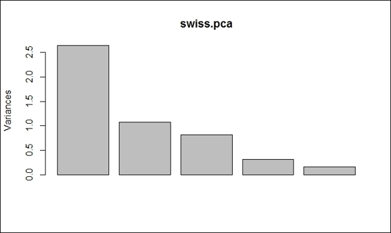
The scree plot in bar plot form
2. You can also generate a line plot by using screeplot:
3. > screeplot(swiss.pca, type="line")
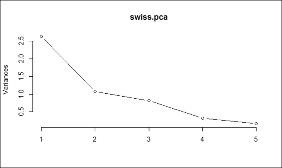
The scree plot in line plot form
How it works...
In this recipe, we demonstrate how to use a scree plot to determine the number of principal components. In a scree plot, there are two types of plots, namely, bar plots and line plots. As both generated scree plots reveal, the obvious change in slope (the so-called elbow or knee) occurs at component 2. As a result, we should retain component 1, where the component is in a steep curve before component 2, which is where the flat line trend commences. However, as this method can be ambiguous, you can use other methods (such as the Kaiser method) to determine the number of components.
There's more...
By default, if you use the plot function on a generated principal component object, you can also retrieve the scree plot. For more details on screeplot, please refer to the following document:
> help(screeplot)
You can also use nfactors to perform parallel analysis and nongraphical solutions to the Cattell scree test:
> install.packages("nFactors")
> library(nFactors)
> ev = eigen(cor(swiss))
> ap = parallel(subject=nrow(swiss),var=ncol(swiss),rep=100,cent=.05)
> nS = nScree(x=ev$values, aparallel=ap$eigen$qevpea)
> plotnScree(nS)
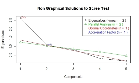
Non-graphical solution to scree test
Determining the number of principal components using the Kaiser method
In addition to the scree test, you can use the Kaiser method to determine the number of principal components. In this method, the selection criteria retains eigenvalues greater than 1. In this recipe, we will demonstrate how to determine the number of principal components using the Kaiser method.
Getting ready
Ensure that you have completed the previous recipe by generating a principal component object and save it in the variable, swiss.pca.
How to do it...
Perform the following steps to determine the number of principal components with the Kaiser method:
1. First, you can obtain the standard deviation from swiss.pca:
2. > swiss.pca$sdev
3. [1] 1.6228065 1.0354873 0.9033447 0.5592765 0.4067472
2. Next, you can obtain the variance from swiss.pca:
3. > swiss.pca$sdev ^ 2
4. [1] 2.6335008 1.0722340 0.8160316 0.3127902 0.1654433
3. Select components with a variance above 1:
4. > which(swiss.pca$sdev ^ 2> 1)
5. [1] 1 2
4. You can also use the scree plot to select components with a variance above 1:
5. > screeplot(swiss.pca, type="line")
6. > abline(h=1, col="red", lty= 3)

Select component with variance above 1
How it works...
You can also use the Kaiser method to determine the number of components. As the computed principal component object contains the standard deviation of each component, we can compute the variance as the standard deviation, which is the square root of variance. From the computed variance, we find both component 1 and 2 have a variance above 1. Therefore, we can determine the number of principal components as 2 (both component 1 and 2). Also, we can draw a red line on the scree plot (as shown in the preceding figure) to indicate that we need to retain component 1 and 2 in this case.
See also
In order to determine which principal components to retain, please refer to:
· Ledesma, R. D., and Valero-Mora, P. (2007). Determining the Number of Factors to Retain in EFA: an easy-to-use computer program for carrying out Parallel Analysis. Practical Assessment, Research & Evaluation, 12(2), 1-11.
Visualizing multivariate data using biplot
In order to find out how data and variables are mapped in regard to the principal component, you can use biplot, which plots data and the projections of original features on to the first two components. In this recipe, we will demonstrate how to use biplot to plot both variables and data on the same figure.
Getting ready
Ensure that you have completed the previous recipe by generating a principal component object and save it in the variable, swiss.pca.
How to do it...
Perform the following steps to create a biplot:
1. You can create a scatter plot using component 1 and 2:
2. > plot(swiss.pca$x[,1], swiss.pca$x[,2], xlim=c(-4,4))
3. > text(swiss.pca$x[,1], swiss.pca$x[,2], rownames(swiss.pca$x), cex=0.7, pos=4, col="red")
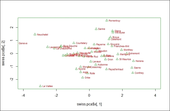
The scatter plot of first two components from PCA result
2. If you would like to add features on the plot, you can create biplot using the generated principal component object:
3. > biplot(swiss.pca)
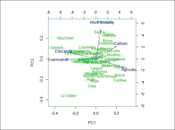
The biplot using PCA result
How it works...
In this recipe, we demonstrate how to use biplot to plot data and projections of original features on to the first two components. In the first step, we demonstrate that we can actually use the first two components to create a scatter plot. Furthermore, if you want to add variables on the same plot, you can use biplot. In biplot, you can see the provinces with higher indicators in the agriculture variable, lower indicators in the education variable, and examination variables scores that are higher in PC1. On the other hand, the provinces with higher infant mortality indicators and lower agriculture indicators score higher in PC2.
There's more...
Besides biplot in the stats package, you can also use ggbiplot. However, you may not find this package from CRAN; you have to first install devtools and then install ggbiplot from GitHub:
> install.packages("devtools")
> library(ggbiplot)
> g = ggbiplot(swiss.pca, obs.scale = 1, var.scale = 1,
+ ellipse = TRUE,
+ circle = TRUE)
> print(g)
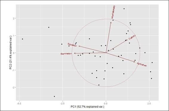
The ggbiplot using PCA result
Performing dimension reduction with MDS
Multidimensional scaling (MDS) is a technique to create a visual presentation of similarities or dissimilarities (distance) of a number of objects. The multi prefix indicates that one can create a presentation map in one, two, or more dimensions. However, we most often use MDS to present the distance between data points in one or two dimensions.
In MDS, you can either use a metric or a nonmetric solution. The main difference between the two solutions is that metric solutions try to reproduce the original metric, while nonmetric solutions assume that the ranks of the distance are known. In this recipe, we will illustrate how to perform MDS on the swiss dataset.
Getting ready
In this recipe, we will continue using the swiss dataset as our input data source.
How to do it...
Perform the following steps to perform multidimensional scaling using the metric method:
1. First, you can perform metric MDS with a maximum of two dimensions:
2. > swiss.dist =dist(swiss)
3. > swiss.mds = cmdscale(swiss.dist, k=2)
2. You can then plot the swiss data in a two-dimension scatter plot:
3. > plot(swiss.mds[,1], swiss.mds[,2], type = "n", main = "cmdscale (stats)")
4. > text(swiss.mds[,1], swiss.mds[,2], rownames(swiss), cex = 0.9, xpd = TRUE)
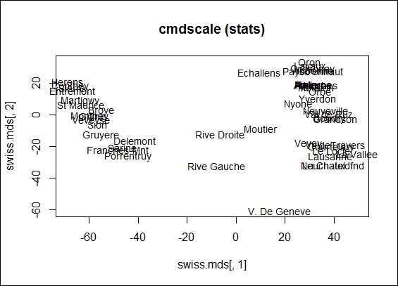
The 2-dimension scatter plot from cmdscale object
3. In addition, you can perform nonmetric MDS with isoMDS:
4. > library(MASS)
5. > swiss.nmmds = isoMDS(swiss.dist, k=2)
6. initial value 2.979731
7. iter 5 value 2.431486
8. iter 10 value 2.343353
9. final value 2.338839
10.converged
4. You can also plot the data points in a two-dimension scatter plot:
5. > plot(swiss.nmmds$points, type = "n", main = "isoMDS (MASS)")
6. > text(swiss.nmmds$points, rownames(swiss), cex = 0.9, xpd = TRUE)
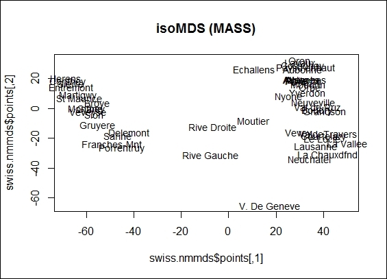
The 2-dimension scatter plot from isoMDS object
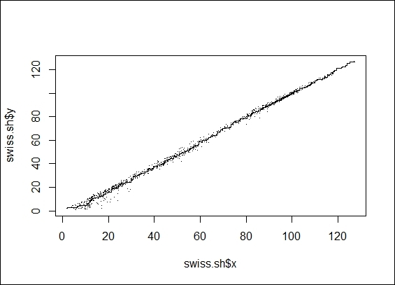
5. You can then plot the data points in a two-dimension scatter plot:
6. > swiss.sh = Shepard(swiss.dist, swiss.mds)
7. > plot(swiss.sh, pch = ".")
8. > lines(swiss.sh$x, swiss.sh$yf, type = "S")
The Shepard plot from isoMDS object
How it works...
MDS reveals the structure of the data by providing a visual presentation of similarities among a set of objects. In more detail, MDS places an object in an n-dimensional space, where the distances between pairs of points corresponds to the similarities among the pairs of objects. Usually, the dimensional space is a two-dimensional Euclidean space, but it may be non-Euclidean and have more than two dimensions. In accordance with the meaning of the input matrix, MDS can be mainly categorized into two types: metric MDS, where the input matrix is metric-based, nonmetric MDS, where the input matrix is nonmetric-based.
Metric MDS is also known as principal coordinate analysis, which first transforms a distance into similarities. In the simplest form, the process linearly projects original data points to a subspace by performing principal components analysis on similarities. On the other hand, the process can also perform a nonlinear projection on similarities by minimizing the stress value, ![]() , where
, where ![]() is the distance measurement between the two points,
is the distance measurement between the two points, ![]() and
and ![]() , and
, and ![]() is the similarity measure of two projected points,
is the similarity measure of two projected points, ![]() and
and ![]() . As a result, we can represent the relationship among objects in the Euclidean space.
. As a result, we can represent the relationship among objects in the Euclidean space.
In contrast to metric MDS, which use a metric-based input matrix, a nonmetric-based MDS is used when the data is measured at the ordinal level. As only the rank order of the distances between the vectors is meaningful, nonmetric MDS applies a monotonically increasing function, f, on the original distances and projects the distance to new values that preserve the rank order. The normalized equation can be formulated as 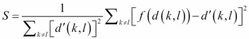 .
.
In this recipe, we illustrate how to perform metric and nonmetric MDS on the swiss dataset. To perform metric MDS, we first need to obtain the distance metric from the swiss data. In this step, you can replace the distance measure to any measure as long as it produces a similarity/dissimilarity measure of data points. You can use cmdscale to perform metric multidimensional scaling. Here, we specify k = 2, so the maximum generated dimensions equals 2. You can also visually present the distance of the data points on a two-dimensional scatter plot.
Next, you can perform nonmetric MDS with isoMDS. In nonmetric MDS, we do not match the distances, but only arrange them in order. We also set swiss as an input dataset with maximum dimensions of two. Similar to the metric MDS example, we can plot the distance between data points on a two-dimensional scatter plot. Then, we use a Shepard plot, which shows how well the projected distances match those in the distance matrix. As per the figure in step 4, the projected distance matches well in the distance matrix.
There's more...
Another visualization method is to present an MDS object as a graph. A sample code is listed here:
> library(igraph)
> swiss.sample = swiss[1:10,]
> g = graph.full(nrow(swiss.sample))
> V(g)$label = rownames(swiss.sample)
> layout = layout.mds(g, dist = as.matrix(dist(swiss.sample)))
> plot(g, layout = layout, vertex.size = 3)
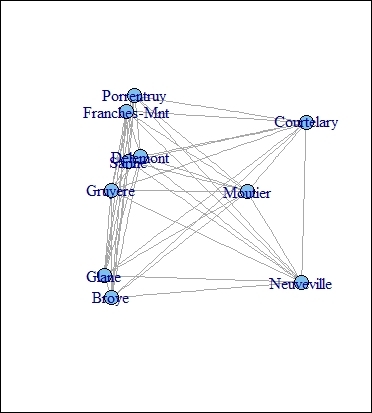
The graph presentation of MDS object
You can also compare differences between the generated results from MDS and PCA. You can compare their differences by drawing the projected dimensions on the same scatter plot. If you use a Euclidean distance on MDS, the projected dimensions are exactly the same as the ones projected from PCA:
> swiss.dist = dist(swiss)
> swiss.mds = cmdscale(swiss.dist, k=2)
> plot(swiss.mds[,1], swiss.mds[,2], type="n")
> text(swiss.mds[,1], swiss.mds[,2], rownames(swiss), cex = 0.9, xpd = TRUE)
> swiss.pca = prcomp(swiss)
> text(-swiss.pca$x[,1],-swiss.pca$x[,2], rownames(swiss),
+ ,col="blue", adj = c(0.2,-0.5),cex = 0.9, xpd = TRUE)
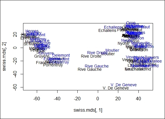
The comparison between MDS and PCA
Reducing dimensions with SVD
Singular value decomposition (SVD) is a type of matrix factorization (decomposition), which can factorize matrices into two orthogonal matrices and diagonal matrices. You can multiply the original matrix back using these three matrices. SVD can reduce redundant data that is linear dependent from the perspective of linear algebra. Therefore, it can be applied to feature selection, image processing, clustering, and many other fields. In this recipe, we will illustrate how to perform dimension reduction with SVD.
Getting ready
In this recipe, we will continue using the dataset, swiss, as our input data source.
How to do it...
Perform the following steps to perform dimension reduction using SVD:
1. First, you can perform svd on the swiss dataset:
2. > swiss.svd = svd(swiss)
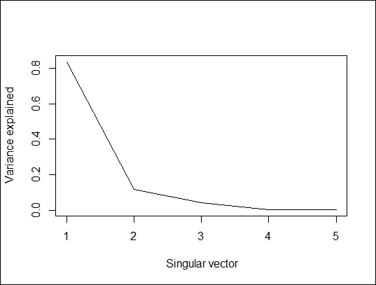
2. You can then plot the percentage of variance explained and the cumulative variance explained in accordance with the SVD column:
3. > plot(swiss.svd$d^2/sum(swiss.svd$d^2), type="l", xlab=" Singular vector", ylab = "Variance explained")
The percent of variance explained
> plot(cumsum(swiss.svd$d^2/sum(swiss.svd$d^2)), type="l", xlab="Singular vector", ylab = "Cumulative percent of variance explained")
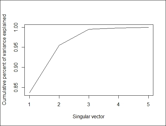
Cumulative percent of variance explained
3. Next, you can reconstruct the data with only one singular vector:
4. > swiss.recon = swiss.svd$u[,1] %*% diag(swiss.svd$d[1], length(1), length(1)) %*% t(swiss.svd$v[,1])
4. Lastly, you can compare the original dataset with the constructed dataset in an image:
5. > par(mfrow=c(1,2))
6. > image(as.matrix(swiss), main="swiss data Image")
7. > image(swiss.recon, main="Reconstructed Image")
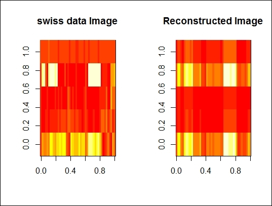
The comparison between original dataset and re-constructed dataset
How it works...
SVD is a factorization of a real or complex matrix. In detail, the SVD of m x n matrix, A, is the factorization of A into the product of three matrices, ![]() . Here, U is an m x m orthonormal matrix, D has singular values and is an m x n diagonal matrix, and VT is an n x n orthonormal matrix.
. Here, U is an m x m orthonormal matrix, D has singular values and is an m x n diagonal matrix, and VT is an n x n orthonormal matrix.
In this recipe, we demonstrate how to perform dimension reduction with SVD. First, you can apply the svd function on the swiss dataset to obtain factorized matrices. You can then generate two plots: one shows the variance explained in accordance to a singular vector, the other shows the cumulative variance explained in accordance to a singular vector.
The preceding figure shows that the first singular vector can explain 80 percent of variance. We now want to compare the differences from the original dataset and the reconstructed dataset with a single singular vector. We, therefore, reconstruct the data with a single singular vector and use the image function to present the original and reconstructed datasets side-by-side and see how they differ from each other. The next figure reveals that these two images are very similar.
See also
· As we mentioned earlier, PCA can be regarded as a specific case of SVD. Here, we generate the orthogonal vector from the swiss data from SVD and obtained the rotation from prcomp. We can see that the two generated matrices are the same:
· > svd.m = svd(scale(swiss))
· > svd.m$v
· [,1] [,2] [,3] [,4] [,5]
· [1,] 0.52396452 -0.25834215 0.003003672 -0.8090741 0.06411415
· [2,] -0.57185792 -0.01145981 -0.039840522 -0.4224580 -0.70198942
· [3,] -0.49150243 0.19028476 0.539337412 -0.3321615 0.56656945
· [4,] 0.38530580 0.36956307 0.725888143 0.1007965 -0.42176895
· [5,] 0.09167606 0.87197641 -0.424976789 -0.2154928 0.06488642
· > pca.m = prcomp(swiss,scale=TRUE)
· > pca.m$rotation
· PC1 PC2 PC3 PC4 PC5
· Agriculture 0.52396452 -0.25834215 0.003003672 -0.8090741 0.06411415
· Examination -0.57185792 -0.01145981 -0.039840522 -0.4224580 -0.70198942
· Education -0.49150243 0.19028476 0.539337412 -0.3321615 0.56656945
· Catholic 0.38530580 0.36956307 0.725888143 0.1007965 -0.42176895
· Infant.Mortality 0.09167606 0.87197641 -0.424976789 -0.2154928 0.06488642
Compressing images with SVD
In the previous recipe, we demonstrated how to factorize a matrix with SVD and then reconstruct the dataset by multiplying the decomposed matrix. Furthermore, the application of matrix factorization can be applied to image compression. In this recipe, we will demonstrate how to perform SVD on the classic image processing material, Lenna.
Getting ready
In this recipe, you should download the image of Lenna beforehand (refer to http://www.ece.rice.edu/~wakin/images/lena512.bmp for this), or you can prepare an image of your own to see how image compression works.
How to do it...
Perform the following steps to compress an image with SVD:
1. First, install and load bmp:
2. > install.packages("bmp")
3. > library(bmp)
2. You can then read the image of Lenna as a numeric matrix with the read.bmp function. When the reader downloads the image, the default name is lena512.bmp:
3. > lenna = read.bmp("lena512.bmp")
3. Rotate and plot the image:
4. > lenna = t(lenna)[,nrow(lenna):1]
5. > image(lenna)
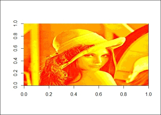
The picture of Lenna
4. Next, you can perform SVD on the read numeric matrix and plot the percentage of variance explained:
5. > lenna.svd = svd(scale(lenna))
6. > plot(lenna.svd$d^2/sum(lenna.svd$d^2), type="l", xlab=" Singular vector", ylab = "Variance explained")
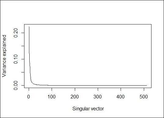
The percentage of variance explained
5. Next, you can obtain the number of dimensions to reconstruct the image:
6. > length(lenna.svd$d)
7. [1] 512
6. Obtain the point at which the singular vector can explain more than 90 percent of the variance:
7. > min(which(cumsum(lenna.svd$d^2/sum(lenna.svd$d^2))> 0.9))
8. [1] 18
7. You can also wrap the code into a function, lenna_compression, and you can then use this function to plot compressed Lenna:
8. > lenna_compression = function(dim){
9. + u=as.matrix(lenna.svd$u[, 1:dim])
10.+ v=as.matrix(lenna.svd$v[, 1:dim])
11.+ d=as.matrix(diag(lenna.svd$d)[1:dim, 1:dim])
12.+ image(u%*%d%*%t(v))
13.+ }
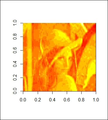
8. Also, you can use 18 vectors to reconstruct the image:
9. > lenna_compression(18)
The reconstructed image with 18 components
9. You can obtain the point at which the singular vector can explain more than 99 percent of the variance;
10.> min(which(cumsum(lenna.svd$d^2/sum(lenna.svd$d^2))> 0.99))
11.[1] 92
12.> lenna_compression(92)

The reconstructed image with 92 components
How it works...
In this recipe, we demonstrate how to compress an image with SVD. In the first step, we use the package, bmp, to load the image, Lenna, to an R session. Then, as the read image is rotated, we can rotate the image back and use the plot function to plot Lenna in R (as shown in the figure in step 3). Next, we perform SVD on the image matrix to factorize the matrix. We then plot the percentage of variance explained in regard to the number of singular vectors.
Further, as we discover that we can use 18 components to explain 90 percent of the variance, we then use these 18 components to reconstruct Lenna. Thus, we make a function named lenna_compression with the purpose of reconstructing the image by matrix multiplication. As a result, we enter 18 as the input to the function, which returns a rather blurry Lenna image (as shown in the figure in step 8). However, we can at least see an outline of the image. To obtain a clearer picture, we discover that we can use 92 components to explain 99 percent of the variance. We, therefore, set the input to the function, lenna_compression, as 92. The figure in step 9 shows that this generates a clearer picture than the one constructed using merely 18 components.
See also
· The Lenna picture is one of the most widely used standard test images for compression algorithms. For more details on the Lenna picture, please refer to http://www.cs.cmu.edu/~chuck/lennapg/.
Performing nonlinear dimension reduction with ISOMAP
ISOMAP is one of the approaches for manifold learning, which generalizes linear framework to nonlinear data structures. Similar to MDS, ISOMAP creates a visual presentation of similarities or dissimilarities (distance) of a number of objects. However, as the data is structured in a nonlinear format, the Euclidian distance measure of MDS is replaced by the geodesic distance of a data manifold in ISOMAP. In this recipe, we will illustrate how to perform a nonlinear dimension reduction with ISOMAP.
Getting ready
In this recipe, we will use the digits data from RnavGraphImageData as our input source.
How to do it...
Perform the following steps to perform nonlinear dimension reduction with ISOMAP:
1. First, install and load the RnavGraphImageData and vegan packages:
2. > install.packages("RnavGraphImageData")
3. > install.packages("vegan")
4. > library(RnavGraphImageData)
5. > library(vegan)
2. You can then load the dataset, digits:
3. > data(digits)
3. Rotate and plot the image:
4. > sample.digit = matrix(digits[,3000],ncol = 16, byrow=FALSE)
5. > image(t(sample.digit)[,nrow(sample.digit):1])
A sample image from the digits dataset
4. Next, you can randomly sample 300 digits from the population:
5. > set.seed(2)
6. > digit.idx = sample(1:ncol(digits),size = 600)
7. > digit.select = digits[,digit.idx]
5. Transpose the selected digit data and then compute the dissimilarity between objects using vegdist:
6. > digits.Transpose = t(digit.select)
7. > digit.dist = vegdist(digits.Transpose, method="euclidean")
6. Next, you can use isomap to perform dimension reduction:
7. > digit.isomap = isomap(digit.dist,k = 8, ndim=6, fragmentedOK = TRUE)
8. > plot(digit.isomap)
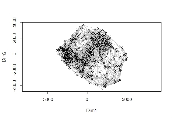
A 2-dimension scatter plot from ISOMAP object
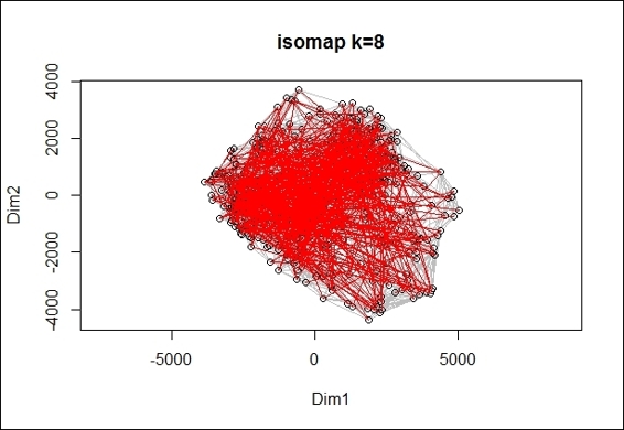
7. Finally, you can overlay the scatter plot with the minimum spanning tree, marked in red;
8. > digit.st = spantree(digit.dist)
9. > digit.plot = plot(digit.isomap, main="isomap k=8")
10.> lines(digit.st, digit.plot, col="red")
A 2-dimension scatter plot overlay with minimum spanning tree
How it works...
ISOMAP is a nonlinear dimension reduction method and a representative of isometric mapping methods. ISOMAP can be regarded as an extension of the metric MDS, where pairwise the Euclidean distance among data points is replaced by geodesic distances induced by a neighborhood graph.
The description of the ISOMAP algorithm is shown in four steps. First, determine the neighbor of each point. Secondly, construct a neighborhood graph. Thirdly, compute the shortest distance path between two nodes. At last, find a low dimension embedding of the data by performing MDS.
In this recipe, we demonstrate how to perform a nonlinear dimension reduction using ISOMAP. First, we load the digits data from RnavGraphImageData. Then, after we select one digit and plot its rotated image, we can see an image of the handwritten digit (the numeral 3, in the figure in step 3).
Next, we randomly sample 300 digits as our input data to ISOMAP. We then transpose the dataset to calculate the distance between each image object. Once the data is ready, we calculate the distance between each object and perform a dimension reduction. Here, we use vegdist to calculate the dissimilarities between each object using a Euclidean measure. We then use ISOMAP to perform a nonlinear dimension reduction on the digits data with the dimension set as 6, number of shortest dissimilarities retained for a point as 8, and ensure that you analyze the largest connected group by specifying fragmentedOK as TRUE.
Finally, we can use the generated ISOMAP object to make a two-dimension scatter plot (figure in step 6), and also overlay the minimum spanning tree with lines in red on the scatter plot (figure in step 7).
There's more...
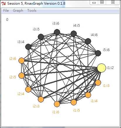
You can also use the RnavGraph package to visualize high dimensional data (digits in this case) using graphs as a navigational infrastructure. For more information, please refer to http://www.icesi.edu.co/CRAN/web/packages/RnavGraph/vignettes/RnavGraph.pdf.
Here is a description of how you can use RnavGraph to visualize high dimensional data in a graph:
1. First, install and load the RnavGraph and graph packages:
2. > install.packages("RnavGraph")
3. > source("http://bioconductor.org/biocLite.R")
4. > biocLite("graph")
5. > library(RnavGraph)
2. You can then create an NG_data object from the digit data:
3. > digit.group = rep(c(1:9,0), each = 1100)
4. > digit.ng_data = ng_data(name = "ISO_digits",
5. + data = data.frame(digit.isomap$points),
6. + shortnames = paste('i',1:6, sep = ''),
7. + group = digit.group[digit.idx],
8. + labels = as.character(digits.group[digit.idx]))
3. Create an NG_graph object from NG_data:
4. > V = shortnames(digit.ng_data)
5. > G = completegraph(V)
6. > LG =linegraph(G)
7. > LGnot = complement(LG)
8. > ng.LG = ng_graph(name = "3D Transition", graph = LG)
9. > ng.LGnot = ng_graph(name = "4D Transition", graph = LGnot)
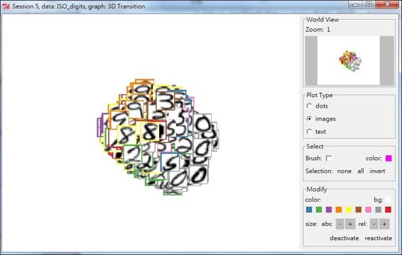
4. Finally, you can visualize the graph in the tk2d plot:
5. > ng.i.digits = ng_image_array_gray('USPS Handwritten Digits',
6. + digit.select,16,16,invert = TRUE,
7. + img_in_row = FALSE)
8. > vizDigits1 = ng_2d(data = digit.ng_data, graph = ng.LG, images = ng.i.digits)
9. > vizDigits2 = ng_2d(data = digit.ng_data, graph = ng.LGnot, images = ng.i.digits)
10.> nav = navGraph(data = digit.ng_data, graph = list(ng.LG, ng.LGnot), viz = list(vizDigits1, vizDigits2))
A 3-D Transition graph plot
5. One can also view a 4D transition graph plot:
A 4D transition graph plot
Performing nonlinear dimension reduction with Local Linear Embedding
Locally linear embedding (LLE) is an extension of PCA, which reduces data that lies on a manifold embedded in a high dimensional space into a low dimensional space. In contrast to ISOMAP, which is a global approach for nonlinear dimension reduction, LLE is a local approach that employs a linear combination of the k-nearest neighbor to preserve local properties of data. In this recipe, we will give a short introduction of how to use LLE on an s-curve data.
Getting ready
In this recipe, we will use digit data from lle_scurve_data within the lle package as our input source.
How to do it...
Perform the following steps to perform nonlinear dimension reduction with LLE:
1. First, you need to install and load the package, lle:
2. > install.packages("lle")
3. > library(lle)
2. You can then load ll_scurve_data from lle:
3. > data( lle_scurve_data )
3. Next, perform lle on lle_scurve_data:
4. > X = lle_scurve_data
5. > results = lle( X=X , m=2, k=12, id=TRUE)
6. finding neighbours
7. calculating weights
8. intrinsic dim: mean=2.47875, mode=2
9. computing coordinates
4. Examine the result with the str and plot function:
5. > str( results )
6. List of 4
7. $ Y : num [1:800, 1:2] -1.586 -0.415 0.896 0.513 1.477 ...
8. $ X : num [1:800, 1:3] 0.955 -0.66 -0.983 0.954 0.958 ...
9. $ choise: NULL
10. $ id : num [1:800] 3 3 2 3 2 2 2 3 3 3 ...
11.>plot( results$Y, main="embedded data", xlab=expression(y[1]), ylab=expression(y[2]) )
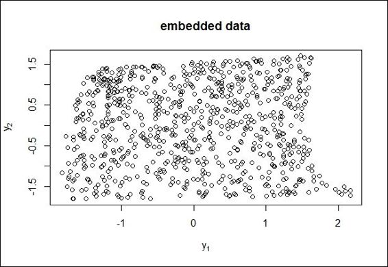
A 2-D scatter plot of embedded data
5. Lastly, you can use plot_lle to plot the LLE result:
6. > plot_lle( results$Y, X, FALSE, col="red", inter=TRUE )
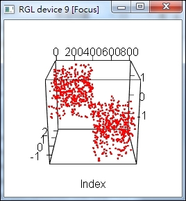
A LLE plot of LLE result
How it works...
LLE is a nonlinear dimension reduction method, which computes a low dimensional, neighborhood, preserving embeddings of high dimensional data. The algorithm of LLE can be illustrated in these steps: first, LLE computes the k-neighbors of each data point, ![]() . Secondly, it computes a set of weights for each point, which minimizes the residual sum of errors, which can best reconstruct each data point from its neighbors. The residual sum of errors can be described as
. Secondly, it computes a set of weights for each point, which minimizes the residual sum of errors, which can best reconstruct each data point from its neighbors. The residual sum of errors can be described as ![]() , where
, where ![]() if
if ![]() is not one of
is not one of ![]() 's k-nearest neighbor, and for each i,
's k-nearest neighbor, and for each i, ![]() . Finally, find the vector, Y, which is best reconstructed by the weight, W. The cost function can be illustrated as
. Finally, find the vector, Y, which is best reconstructed by the weight, W. The cost function can be illustrated as ![]() , with the constraint that
, with the constraint that ![]() , and
, and ![]() .
.
In this recipe, we demonstrate how to perform nonlinear dimension reduction using LLE. First, we load lle_scurve_data from lle. We then perform lle with two dimensions and 12 neighbors, and list the dimensions for every data point by specifying id =TRUE. The LLE has three steps, including: building a neighborhood for each point in the data, finding the weights for linearly approximating the data in that neighborhood, and finding the low dimensional coordinates.
Next, we can examine the data using the str and plot functions. The str function returns X,Y, choice, and ID. Here, X represents the input data, Y stands for the embedded data, choice indicates the index vector of the kept data, while subset selection and ID show the dimensions of every data input. The plot function returns the scatter plot of the embedded data. Lastly, we use plot_lle to plot the result. Here, we enable the interaction mode by setting the inter equal to TRUE.
See also
· Another useful package for nonlinear dimension reduction is RDRToolbox, which is a package for nonlinear dimension reduction with ISOMAP and LLE. You can use the following command to install RDRToolbox:
· > source("http://bioconductor.org/biocLite.R")
· > biocLite("RDRToolbox")
· > library(RDRToolbox)
All materials on the site are licensed Creative Commons Attribution-Sharealike 3.0 Unported CC BY-SA 3.0 & GNU Free Documentation License (GFDL)
If you are the copyright holder of any material contained on our site and intend to remove it, please contact our site administrator for approval.
© 2016-2026 All site design rights belong to S.Y.A.