Machine Learning with R Cookbook (2015)
Chapter 2. Data Exploration with RMS Titanic
In this chapter, we will cover the following recipes:
· Reading a Titanic dataset from a CSV file
· Converting types on character variables
· Detecting missing values
· Imputing missing values
· Exploring and visualizing data
· Predicting passenger survival with a decision tree
· Validating the power of prediction with a confusion matrix
· Assessing performance with the ROC curve
Introduction
Data exploration helps a data consumer to focus on searching for information, with a view to forming a true analysis from the gathered information. Furthermore, with the completion of the steps of data munging, analysis, modeling, and evaluation, users can generate insights and valuable points from their focused data.
In a real data exploration project, there are six steps involved in the exploration process. They are as follows:
1. Asking the right questions.
2. Data collection.
3. Data munging.
4. Basic exploratory data analysis.
5. Advanced exploratory data analysis.
6. Model assessment.
A more detailed explanation of these six steps is provided here:
1. Asking the right questions: When the user presents their question, for example "What are my expected findings after the exploration is finished?", or "What kind of information can I extract through the exploration?," different results will be given. Therefore, asking the right question is essential in the first place, for the question itself determines the objective and target of the exploration.
2. Data collection: Once the goal of exploration is determined, the user can start collecting or extracting relevant data from the data source, with regard to the exploration target. Mostly, data collected from disparate systems appears unorganized and diverse in format. Clearly, the original data may be from different sources, such as files, databases, or the Internet. To retrieve data from these sources requires the assistance of the file IO function, JDBC/ODBC, web crawler, and so on. This extracted data is called raw data, which is because it has not been subjected to processing, or been through any other manipulation. Most raw data is not easily consumed by the majority of analysis tools or visualization programs.
3. Data munging: The next phase is data munging (or wrangling), a step to help map raw data into a more convenient format for consumption. During this phase, there are many processes, such as data parsing, sorting, merging, filtering, missing value completion, and other processes to transform and organize the data, and enable it to fit into a consume structure. Later, the mapped data can be further utilized for data aggregation, analysis, or visualization.
4. Basic exploratory data analysis: After the data munging phase, users can conduct further analysis toward data processing. The most basic analysis is to perform exploratory data analysis. Exploratory data analysis involves analyzing a dataset by summarizing its characteristics. Performing basic statistical, aggregation, and visual methods are also crucial tasks to help the user understand data characteristics, which are beneficial for the user to capture the majority, trends, and outliers easily through plots.
5. Advanced exploratory data analysis: Until now, the descriptive statistic gives a general description of data features. However, one would like to generate an inference rule for the user to predict data features based on input parameters. Therefore, the application of machine learning enables the user to generate an inferential model, where the user can input a training dataset to generate a predictive model. After this, the prediction model can be utilized to predict the output value or label based on given parameters.
6. Model assessment: Finally, to assess whether the generating model performs the best in the data estimation of a given problem, one must perform a model selection. The selection method here involves many steps, including data preprocessing, tuning parameters, and even switching the machine learning algorithm. However, one thing that is important to keep in mind is that the simplest model frequently achieves the best results in predictive or exploratory power; whereas complex models often result in over fitting.
For the following example, we would like to perform a sample data exploration based on the dataset of passengers surviving the Titanic shipwreck. The steps we demonstrate here follow how to collect data from the online source, Kaggle; clean data through data munging; perform basic exploratory data analysis to discover important attributes that might give a prediction of the survival rate; perform advanced exploratory data analysis using the classification algorithm to predict the survival rate of the given data; and finally, perform model assessment to generate a prediction model.
Reading a Titanic dataset from a CSV file
To start the exploration, we need to retrieve a dataset from Kaggle (https://www.kaggle.com/). We had look at some of the samples in Chapter 1, Practical Machine Learning with R. Here, we introduce methods to deal with real-world problems.
Getting ready
To retrieve data from Kaggle, you need to first sign up for a Kaggle account (https://www.kaggle.com/account/register). Then, log in to the account for further exploration:

Kaggle.com
How to do it...
Perform the following steps to read the Titanic dataset from the CSV file:
1. Go to http://www.kaggle.com/c/titanic-gettingStarted/data to retrieve the data list.
2. You can see a list of data files for download, as shown in the following table:
|
Filename |
Available formats |
|
train |
.csv (59.76 kb) |
|
genderclassmodel |
.py (4.68 kb) |
|
myfirstforest |
.csv (3.18 kb) |
|
myfirstforest |
.py (3.83 kb) |
|
gendermodel |
.csv (3.18 kb) |
|
genderclassmodel |
.csv (3.18 kb) |
|
test |
.csv (27.96 kb) |
|
gendermodel |
.py (3.58 kb) |
3. Download the training data (https://www.kaggle.com/c/titanic-gettingStarted/download/train.csv) to a local disk.
4. Then, make sure the downloaded file is placed under the current directory. You can use the getwd function to check the current working directory. If the downloaded file is not located in the working directory, move the file to the current working directory. Or, you can use setwd() to set the working directory to where the downloaded files are located:
5. > getwd()
6. [1] "C:/Users/guest"
5. Next, one can use read.csv to load data into the data frame. Here, one can use the read.csv function to read train.csv to frame the data with the variable names set as train.data. However, in order to treat the blank string as NA, one can specify that na.strings equals either "NA" or an empty string:
6. > train.data = read.csv("train.csv", na.strings=c("NA", ""))
6. Then, check the loaded data with the str function:
7. > str(train.data)
8. 'data.frame': 891 obs. of 12 variables:
9. $ PassengerId: int 1 2 3 4 5 6 7 8 9 10 ...
10. $ Survived : int 0 1 1 1 0 0 0 0 1 1 ...
11. $ Pclass : int 3 1 3 1 3 3 1 3 3 2 ...
12. $ Name : Factor w/ 891 levels "Abbing, Mr. Anthony",..: 109 191 358 277 16 559 520 629 417 581 ...
13. $ Sex : Factor w/ 2 levels "female","male": 2 1 1 1 2 2 2 2 1 1 ...
14. $ Age : num 22 38 26 35 35 NA 54 2 27 14 ...
15. $ SibSp : int 1 1 0 1 0 0 0 3 0 1 ...
16. $ Parch : int 0 0 0 0 0 0 0 1 2 0 ...
17. $ Ticket : Factor w/ 681 levels "110152","110413",..: 524 597 670 50 473 276 86 396 345 133 ...
18. $ Fare : num 7.25 71.28 7.92 53.1 8.05 ...
19. $ Cabin : Factor w/ 148 levels "","A10","A14",..: 1 83 1 57 1 1 131 1 1 1 ...
20. $ Embarked : Factor w/ 4 levels "","C","Q","S": 4 2 4 4 4 3 4 4 4 2 ...
How it works...
To begin the data exploration, we first downloaded the Titanic dataset from Kaggle, a website containing many data competitions and datasets. To load the data into the data frame, this recipe demonstrates how to apply the read.csvfunction to load the dataset with the na.strings argument, for the purpose of converting blank strings and "NA" to NA values. To see the structure of the dataset, we used the str function to compactly display train.data; you can find the dataset contains demographic information and survival labels of the passengers. The data collected here is good enough for beginners to practice how to process and analyze data.
There's more...
On Kaggle, much of the data on science is related to competitions, which mostly refer to designing a machine learning method to solve real-world problems.
Most competitions on Kaggle are held by either academia or corporate bodies, such as Amazon or Facebook. In fact, they create these contests and provide rewards, such as bonuses, or job prospects (see https://www.kaggle.com/competitions). Thus, there are many data scientists who are attracted to registering for a Kaggle account to participate in competitions. A beginner in a pilot exploration can participate in one of these competitions, which will help them gain experience by solving real-world problems with their machine learning skills.
To create a more challenging learning environment as a competitor, a participant needs to submit their output answer and will receive the assessment score, so that each one can assess their own rank on the leader board.
Converting types on character variables
In R, since nominal, ordinal, interval, and ratio variable are treated differently in statistical modeling, we have to convert a nominal variable from a character into a factor.
Getting ready
You need to have the previous recipe completed by loading the Titanic training data into the R session, with the read.csv function and assigning an argument of na.strings equal to NA and the blank string (""). Then, assign the loaded data from train.csv into the train.data variables.
How to do it...
Perform the following steps to convert the types on character variables:
1. Use the str function to print the overview of the Titanic data:
2. > str(train.data)
3. 'data.frame': 891 obs. of 12 variables:
4. $ PassengerId: int 1 2 3 4 5 6 7 8 9 10 ...
5. $ Survived : int 0 1 1 1 0 0 0 0 1 1 ...
6. $ Pclass : int 3 1 3 1 3 3 1 3 3 2 ...
7. $ Name : Factor w/ 891 levels "Abbing, Mr. Anthony",..: 109 191 358 277 16 559 520 629 417 581 ...
8. $ Sex : Factor w/ 2 levels "female","male": 2 1 1 1 2 2 2 2 1 1 ...
9. $ Age : num 22 38 26 35 35 NA 54 2 27 14 ...
10. $ SibSp : int 1 1 0 1 0 0 0 3 0 1 ...
11. $ Parch : int 0 0 0 0 0 0 0 1 2 0 ...
12. $ Ticket : Factor w/ 681 levels "110152","110413",..: 524 597 670 50 473 276 86 396 345 133 ...
13. $ Fare : num 7.25 71.28 7.92 53.1 8.05 ...
14. $ Cabin : Factor w/ 147 levels "A10","A14","A16",..: NA 82 NA 56 NA NA 130 NA NA NA ...
15. $ Embarked : Factor w/ 3 levels "C","Q","S": 3 1 3 3 3 2 3 3 3 1 ...
2. To transform the variable from the int numeric type to the factor categorical type, you can cast factor:
3. > train.data$Survived = factor(train.data$Survived)
4. > train.data$Pclass = factor(train.data$Pclass)
3. Print out the variable with the str function and again, you can see that Pclass and Survived are now transformed into the factor as follows:
4. > str(train.data)
5. 'data.frame': 891 obs. of 12 variables:
6. $ PassengerId: int 1 2 3 4 5 6 7 8 9 10 ...
7. $ Survived : Factor w/ 2 levels "0","1": 1 2 2 2 1 1 1 1 2 2 ...
8. $ Pclass : Factor w/ 3 levels "1","2","3": 3 1 3 1 3 3 1 3 3 2 ...
9. $ Name : Factor w/ 891 levels "Abbing, Mr. Anthony",..: 109 191 358 277 16 559 520 629 417 581 ...
10. $ Sex : Factor w/ 2 levels "female","male": 2 1 1 1 2 2 2 2 1 1 ...
11. $ Age : num 22 38 26 35 35 NA 54 2 27 14 ...
12. $ SibSp : int 1 1 0 1 0 0 0 3 0 1 ...
13. $ Parch : int 0 0 0 0 0 0 0 1 2 0 ...
14. $ Ticket : Factor w/ 681 levels "110152","110413",..: 524 597 670 50 473 276 86 396 345 133 ...
15. $ Fare : num 7.25 71.28 7.92 53.1 8.05 ...
16. $ Cabin : Factor w/ 147 levels "A10","A14","A16",..: NA 82 NA 56 NA NA 130 NA NA NA ...
17. $ Embarked : Factor w/ 3 levels "C","Q","S": 3 1 3 3 3 2 3 3 3 1 ...
How it works...
Talking about statistics, there are four measurements: nominal, ordinal, interval, and ratio. Nominal variables are used to label variables, such as gender and name; ordinal variables, and are measures of non-numeric concepts, such as satisfaction and happiness. Interval variables shows numeric scales, which tell us not only the order but can also show the differences between the values, such as temperatures in Celsius. A ratio variable shows the ratio of a magnitude of a continuous quantity to a unit magnitude. Ratio variables provide order, differences between the values, and a true zero value, such as weight and height. In R, different measurements are calculated differently, so you should perform a type conversion before applying descriptive or inferential analytics toward the dataset.
In this recipe, we first display the structure of the train data using the str function. From the structure of data, you can find the attribute name, data type, and the first few values contained in each attribute. From the Survived and Pclass attribute, you can see the data type as int. As the variable description listed in Chart 1 (Preface), you can see that Survived (0 = No; 1 = Yes) and Pclass (1 = 1st; 2 = 2nd; 3 = 3rd) are categorical variables. As a result, we transform the data from a character to a factor type via the factor function.
There's more...
Besides factor, there are more type conversion functions. For numeric types, there are is.numeric() and as.numeric(); for character, there are: is.character() and as.character(). For vector, there are: is.vector() and as.vector(); for matrix, there are is.matrix() and as.matrix(). Finally, for data frame, there are: is.data.frame() and as.data.frame().
Detecting missing values
Missing values reduce the representativeness of the sample, and furthermore, might distort inferences about the population. This recipe will focus on detecting missing values within the Titanic dataset.
Getting ready
You need to have completed the previous recipes by the Pclass attribute and Survived to a factor type.
In R, a missing value is noted with the symbol NA (not available), and an impossible value is NaN (not a number).
How to do it...
Perform the following steps to detect the missing value:
1. The is.na function is used to denote which index of the attribute contains the NA value. Here, we apply it to the Age attribute first:
2. > is.na(train.data$Age)
2. The is.na function indicates the missing value of the Age attribute. To get a general number of how many missing values there are, you can perform a sum to calculate this:
3. > sum(is.na(train.data$Age) == TRUE)
4. [1] 177
3. To calculate the percentage of missing values, one method adopted is to count the number of missing values against nonmissing values:
4. > sum(is.na(train.data$Age) == TRUE) / length(train.data$Age)
5. [1] 0.1986532
4. To get a percentage of the missing value of the attributes, you can use sapply to calculate the percentage of all the attributes:
5. > sapply(train.data, function(df) {
6. + sum(is.na(df)==TRUE)/ length(df);
7. + })
8. PassengerId Survived Pclass Name Sex Age
9. 0.000000000 0.000000000 0.000000000 0.000000000 0.000000000 0.198653199
10. SibSp Parch Ticket Fare Cabin Embarked
11.0.000000000 0.000000000 0.000000000 0.000000000 0.771043771 0.002244669
5. Besides simply viewing the percentage of missing data, one may also use the Amelia package to visualize the missing values. Here, we use install.packages and require to install Amelia and load the package. However, before the installation and loading of the Amelia package, you are required to install Rcpp, beforehand:
6. > install.packages("Amelia")
7. > require(Amelia)
6. Then, use the missmap function to plot the missing value map:
7. > missmap(train.data, main="Missing Map")
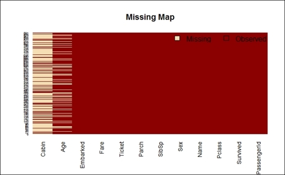
Missing map of the Titanic dataset
How it works...
In R, a missing value is often noted with the "NA" symbol, which stands for not available. Most functions (such as mean or sum) may output NA while encountering an NA value in the dataset. Though you can assign an argument such as na.rm to remove the effect of NA, it is better to impute or remove the missing data in the dataset to prevent propagating the effect of the missing value. To find out the missing value in the Titanic dataset, we first sum up all the NA values and divide them by the number of values within each attribute, Then, we apply the calculation to all the attributes with sapply.
In addition to this, to display the calculation results using a table, you can utilize the Amelia package to plot the missing value map of every attribute on one chart. The visualization of missing values enables users to get a better understanding of the missing percentage within each dataset. From the preceding screenshot, you may have observed that the missing value is beige colored, and its observed value is dark red. The x-axis shows different attribute names, and the y-axis shows the recorded index. Clearly, most of the cabin shows missing data, and it also shows that about 19.87 percent of the data is missing when counting the Age attribute, and two values are missing in the Embarked attribute.
There's more...
To handle the missing values, we introduced Amelia to visualize them. Apart from typing console commands, you can also use the interactive GUI of Amelia and AmeliaView, which allows users to load datasets, manage options, and run Amelia from a windowed environment.
To start running AmeliaView, simply type AmeliaView() in the R Console:
> AmeliaView()

AmeliaView
Imputing missing values
After detecting the number of missing values within each attribute, we have to impute the missing values since they might have a significant effect on the conclusions that can be drawn from the data.
Getting ready
This recipe will require train.data loaded in the R session and have the previous recipe completed by converting Pclass and Survived to a factor type.
How to do it...
Perform the following steps to impute the missing values:
1. First, list the distribution of Port of Embarkation. Here, we add the useNA = "always" argument to show the number of NA values contained within train.data:
2. > table(train.data$Embarked, useNA = "always")
3.
4. C Q S <NA>
5. 168 77 644 2
2. Assign the two missing values to a more probable port (that is, the most counted port), which is Southampton in this case:
3. > train.data$Embarked[which(is.na(train.data$Embarked))] = 'S';
4. > table(train.data$Embarked, useNA = "always")
5.
6. C Q S <NA>
7. 168 77 646 0
3. In order to discover the types of titles contained in the names of train.data, we first tokenize train.data$Name by blank (a regular expression pattern as "\\s+"), and then count the frequency of occurrence with the tablefunction. After this, since the name title often ends with a period, we use the regular expression to grep the word containing the period. In the end, sort the table in decreasing order:
4. > train.data$Name = as.character(train.data$Name)
5. > table_words = table(unlist(strsplit(train.data$Name, "\\s+")))
6. > sort(table_words [grep('\\.',names(table_words))], decreasing=TRUE)
7.
8. Mr. Miss. Mrs. Master.
9. 517 182 125 40
10. Dr. Rev. Col. Major.
11. 7 6 2 2
12. Mlle. Capt. Countess. Don.
13. 2 1 1 1
14.Jonkheer. L. Lady . Mme.
15. 1 1 1 1
16. Ms. Sir.
17. 1 1
4. To obtain which title contains missing values, you can use str_match provided by the stringr package to get a substring containing a period, then bind the column together with cbind. Finally, by using the table function to acquire the statistics of missing values, you can work on counting each title:
5. > library(stringr)
6. > tb = cbind(train.data$Age, str_match(train.data$Name, " [a-zA-Z]+\\."))
7. > table(tb[is.na(tb[,1]),2])
8.
9. Dr. Master. Miss. Mr. Mrs.
10. 1 4 36 119 17
5. For a title containing a missing value, one way to impute data is to assign the mean value for each title (not containing a missing value):
6. > mean.mr = mean(train.data$Age[grepl(" Mr\\.", train.data$Name) & !is.na(train.data$Age)])
7. > mean.mrs = mean(train.data$Age[grepl(" Mrs\\.", train.data$Name) & !is.na(train.data$Age)])
8. > mean.dr = mean(train.data$Age[grepl(" Dr\\.", train.data$Name) & !is.na(train.data$Age)])
9. > mean.miss = mean(train.data$Age[grepl(" Miss\\.", train.data$Name) & !is.na(train.data$Age)])
10.> mean.master = mean(train.data$Age[grepl(" Master\\.", train.data$Name) & !is.na(train.data$Age)])
6. Then, assign the missing value with the mean value of each title:
7. > train.data$Age[grepl(" Mr\\.", train.data$Name) & is.na(train.data$Age)] = mean.mr
8. > train.data$Age[grepl(" Mrs\\.", train.data$Name) & is.na(train.data$Age)] = mean.mrs
9. > train.data$Age[grepl(" Dr\\.", train.data$Name) & is.na(train.data$Age)] = mean.dr
10.> train.data$Age[grepl(" Miss\\.", train.data$Name) & is.na(train.data$Age)] = mean.miss
11.> train.data$Age[grepl(" Master\\.", train.data$Name) & is.na(train.data$Age)] = mean.master
How it works...
To impute the missing value of the Embarked attribute, we first produce the statistics of the embarked port with the table function. The table function counts two NA values in train.data. From the dataset description, we recognize C, Q, and S(C = Cherbourg, Q = Queenstown, S = Southampton). Since we do not have any knowledge about which category these two missing values are in, one possible way is to assign the missing value to the most likely port, which is Southampton.
As for another attribute, Age, though about 20 percent of the value is missing, users can still infer the missing value with the title of each passenger. To discover how many titles there are within the name of the dataset, we suggest the method of counting segmented words in the Name attribute, which helps to calculate the number of missing values of each given title. The resultant word table shows common titles such as Mr, Mrs, Miss, and Master. You may reference an English honorific entry from Wikipedia to get the description of each title.
Considering the missing data, we reassign the mean value of each title to the missing value with the corresponding title. However, for the Cabin attribute, there are too many missing values, and we cannot infer the value from any referencing attribute. Therefore, we find it does not work by trying to use this attribute for further analysis.
There's more...
Here we list the honorific entry from Wikipedia for your reference. According to it (http://en.wikipedia.org/wiki/English_honorific):
· Mr: This is used for a man, regardless of his marital status
· Master: This is used for young men or boys, especially used in the UK
· Miss: It is usually used for unmarried women, though also used by married female entertainers
· Mrs: It is used for married women
· Dr: It is used for a person in the US who owns his first professional degree
Exploring and visualizing data
After imputing the missing values, one should perform an exploratory analysis, which involves using a visualization plot and an aggregation method to summarize the data characteristics. The result helps the user gain a better understanding of the data in use. The following recipe will introduce how to use basic plotting techniques with a view to help the user with exploratory analysis.
Getting ready
This recipe needs the previous recipe to be completed by imputing the missing value in the age and Embarked attribute.
How to do it...
Perform the following steps to explore and visualize data:
1. First, you can use a bar plot and histogram to generate descriptive statistics for each attribute, starting with passenger survival:
2. > barplot(table(train.data$Survived), main="Passenger Survival", names= c("Perished", "Survived"))
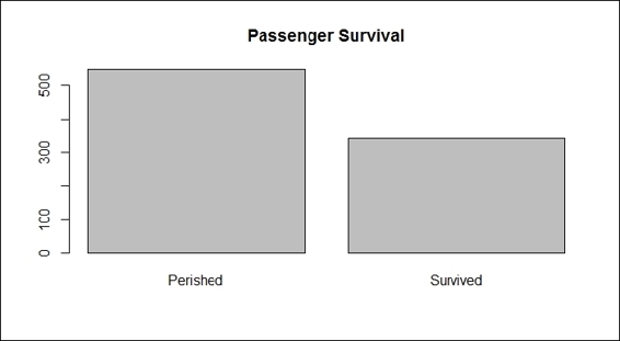
Passenger survival
2. We can generate the bar plot of passenger class:
3. > barplot(table(train.data$Pclass), main="Passenger Class", names= c("first", "second", "third"))
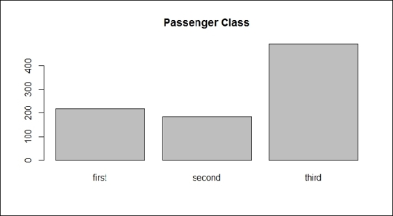
Passenger class
3. Next, we outline the gender data with the bar plot:
4. > barplot(table(train.data$Sex), main="Passenger Gender")
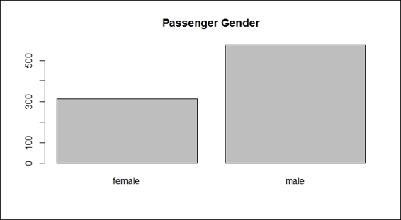
Passenger gender
4. We then plot the histogram of the different ages with the hist function:
5. > hist(train.data$Age, main="Passenger Age", xlab = "Age")
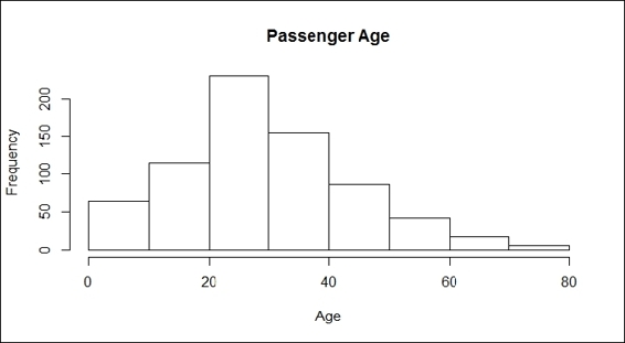
Passenger age
5. We can plot the bar plot of sibling passengers to get the following:
6. > barplot(table(train.data$SibSp), main="Passenger Siblings")
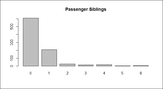
Passenger siblings
6. Next, we can get the distribution of the passenger parch:
7. > barplot(table(train.data$Parch), main="Passenger Parch")
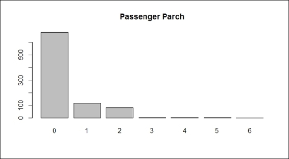
Passenger parch
7. Next, we plot the histogram of the passenger fares:
8. > hist(train.data$Fare, main="Passenger Fare", xlab = "Fare")
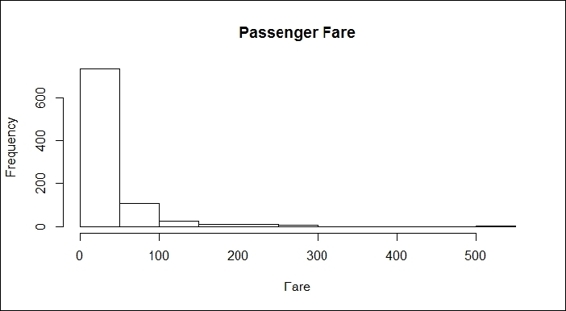
Passenger fares
8. Finally, one can look at the port of embarkation:
9. > barplot(table(train.data$Embarked), main="Port of Embarkation")
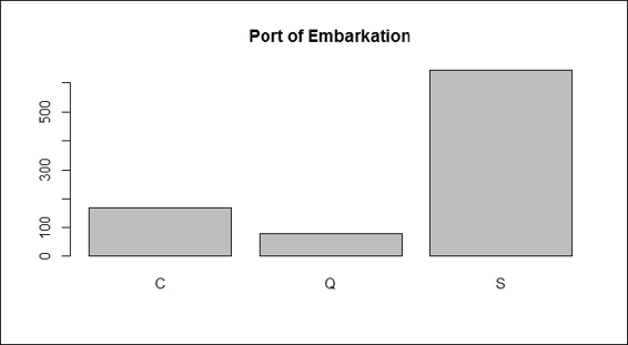
Port of embarkation
9. Use barplot to find out which gender is more likely to perish during shipwrecks:
10.> counts = table( train.data$Survived, train.data$Sex)
11.> barplot(counts, col=c("darkblue","red"), legend = c("Perished", "Survived"), main = "Passenger Survival by Sex")
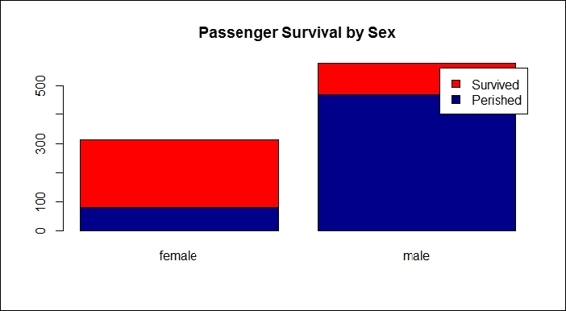
Passenger survival by sex
10.Next, we should examine whether the Pclass factor of each passenger may affect the survival rate:
11.> counts = table( train.data$Survived, train.data$Pclass)
12.> barplot(counts, col=c("darkblue","red"), legend =c("Perished", "Survived"), main= "Titanic Class Bar Plot" )
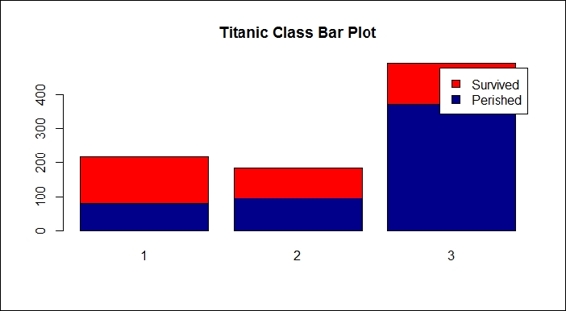
Passenger survival by class
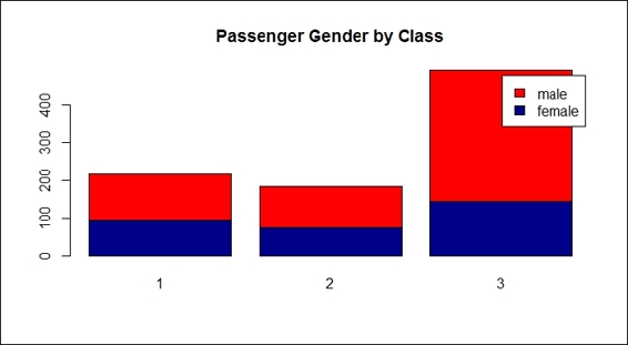
11.Next, we examine the gender composition of each Pclass:
12.> counts = table( train.data$Sex, train.data$Pclass)
13.> barplot(counts, col=c("darkblue","red"), legend = rownames(counts), main= "Passenger Gender by Class")
Passenger gender by class
12.Furthermore, we examine the histogram of passenger ages:
13.> hist(train.data$Age[which(train.data$Survived == "0")], main= "Passenger Age Histogram", xlab="Age", ylab="Count", col ="blue", breaks=seq(0,80,by=2))
14.> hist(train.data$Age[which(train.data$Survived == "1")], col ="red", add = T, breaks=seq(0,80,by=2))
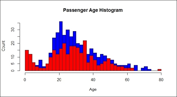
Passenger age histogram
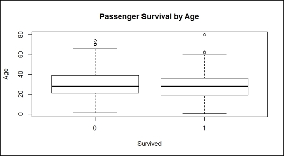
13.To examine more details about the relationship between the age and survival rate, one can use a boxplot:
14.> boxplot(train.data$Age ~ train.data$Survived,
15.+ main="Passenger Survival by Age",
16.+ xlab="Survived", ylab="Age")
Passenger survival by age
14.To categorize people with different ages into different groups, such as children (below 13), youths (13 to 19), adults (20 to 65), and senior citizens (above 65), execute the following commands:
15.>train.child = train.data$Survived[train.data$Age < 13]
16.> length(train.child[which(train.child == 1)] ) / length(train.child)
17. [1] 0.5797101
18.
19.> train.youth = train.data$Survived[train.data$Age >= 15 & train.data$Age < 25]
20.> length(train.youth[which(train.youth == 1)] ) / length(train.youth)
21.[1] 0.4285714
22.
23.> train.adult = train.data$Survived[train.data$Age >= 20 & train.data$Age < 65]
24.> length(train.adult[which(train.adult == 1)] ) / length(train.adult)
25. [1] 0.3659218
26.
27.> train.senior = train.data$Survived[train.data$Age >= 65]
28.> length(train.senior[which(train.senior == 1)] ) / length(train.senior)
29.[1] 0.09090909
How it works...
Before we predict the survival rate, one should first use the aggregation and visualization method to examine how each attribute affects the fate of the passengers. Therefore, we begin the examination by generating a bar plot and histogram of each attribute.
The plots from the screenshots in the preceding list give one an outline of each attribute of the Titanic dataset. As per the first screenshot, more passengers perished than survived during the shipwreck. Passengers in the third class made up the biggest number out of the three classes on board, which also reflects the truth that the third class was the most economical class on the Titanic (step 2). For the sex distribution, there were more male passengers than female (step 3). As for the age distribution, the screenshot in step 4 shows that most passengers were aged between 20 to 40. According to the screenshot in step 5, most passengers had one or fewer siblings. The screenshot in step 6 shows that most of the passengers have 0 to 2 parch.
In the screenshot in step 7, the fare histogram shows there were fare differences, which may be as a result of the different passenger classes on the Titanic. At last, the screenshot in step 8 shows that the boat made three stops to pick up passengers.
As we began the exploration from the sex attribute, and judging by the resulting bar plot, it clearly showed that female passengers had a higher rate of survival than males during the shipwreck (step 9). In addition to this, the Wikipedia entry for RMS Titanic (http://en.wikipedia.org/wiki/RMS_Titanic) explains that 'A disproportionate number of men were left aboard because of a "women and children first" protocol followed by some of the officers loading the lifeboats'. Therefore, it is reasonable that the number of female survivors outnumbered the male survivors. In other words, simply using sex can predict whether a person will survive with a high degree of accuracy.
Then, we examined whether the passenger class affected the survival rate (step 10). Here, from the definition of Pclass, the fares for each class were priced accordingly with the quality; high fares for first class, and low fares for third class. As the class of each passenger seemed to indicate their social and financial status, it is fair to assume that the wealthier passengers may have had more chances to survive.
Unfortunately, there was no correlation between the class and survival rate, so the result does not show the phenomenon we assumed. Nevertheless, after we examined sex in the composition of pclass (step 11), the results revealed that most third-class passengers were male; the assumption of wealthy people tending to survive more may not be that concrete.
Next, we examined the relationship between the age and passenger fate through a histogram and box plot (step 12). The bar plot shows the age distribution with horizontal columns in which red columns represent the passengers that survived, while blue columns represent those who perished. It is hard to tell the differences in the survival rate from the ages of different groups. The bar plots that we created did not prove that passengers in different age groups were more likely to survive. On the other hand, the plots showed that most people on board were aged between 20 to 40, but does not show whether this group was more likely to survive compared to elderly or young children (step 13). Here, we introduced a box plot, which is a standardized plotting technique that displays the distribution of data with information, such as minimum, first quartile, median, third quartile, maximum, and outliers.
Later, we further examined whether age groups have any relation to passenger fates, by categorizing passenger ages into four groups. The statistics show the the children group (below 13) was more likely to survive than the youths (13 to 20), adults (20 to 65), and senior citizens (above 65). The results showed that people in the younger age groups were more likely to survive the shipwreck. However, we noted that this possibly resulted from the 'women and children first' protocol.
There's more...
Apart from using bar plots, histograms, and boxplots to visualize data, one can also apply mosaicplot in the vcd package to examine the relationship between multiple categorical variables. For example, when we examine the relationship between the Survived and Pclass variables, the application is performed as follows:
> mosaicplot(train.data$Pclass ~ train.data$Survived,
+ main="Passenger Survival Class", color=TRUE,
+ xlab="Pclass", ylab="Survived")
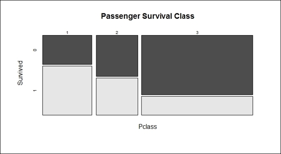
Passenger survival by class
See also
· For more information about the shipwreck, one can read the history of RMS Titanic (please refer to the entry Sinking of the RMS Titanic in Wikipedia http://en.wikipedia.org/wiki/Sinking_of_the_RMS_Titanic), as some of the protocol practiced at that time may have substantially affected the passenger survival rate.
Predicting passenger survival with a decision tree
The exploratory analysis helps users gain insights into how single or multiple variables may affect the survival rate. However, it does not determine what combinations may generate a prediction model, so as to predict the passengers' survival. On the other hand, machine learning can generate a prediction model from a training dataset, so that the user can apply the model to predict the possible labels from the given attributes. In this recipe, we will introduce how to use a decision tree to predict passenger survival rates from the given variables.
Getting ready
We will use the data, train.data, that we have already used in our previous recipes.
How to do it...
Perform the following steps to predict the passenger survival with the decision tree:
1. First, we construct a data split split.data function with three input parameters: data, p, and s. The data parameter stands for the input dataset, the p parameter stands for the proportion of generated subset from the input dataset, and the s parameter stands for the random seed:
2. > split.data = function(data, p = 0.7, s = 666){
3. + set.seed(s)
4. + index = sample(1:dim(data)[1])
5. + train = data[index[1:floor(dim(data)[1] * p)], ]
6. + test = data[index[((ceiling(dim(data)[1] * p)) + 1):dim(data)[1]], ]
7. + return(list(train = train, test = test))
8. + }
2. Then, we split the data, with 70 percent assigned to the training dataset and the remaining 30 percent for the testing dataset:
3. > allset= split.data(train.data, p = 0.7)
4. > trainset = allset$train
5. > testset = allset$test
3. For the condition tree, one has to use the ctree function from the party package; therefore, we install and load the party package:
4. > install.packages('party')
5. > require('party')
4. We then use Survived as a label to generate the prediction model in use. After that, we assign the classification tree model into the train.ctree variable:
5. > train.ctree = ctree(Survived ~ Pclass + Sex + Age + SibSp + Fare + Parch + Embarked, data=trainset)
6. > train.ctree
7.
8. Conditional inference tree with 7 terminal nodes
9.
10.Response: Survived
11.Inputs: Pclass, Sex, Age, SibSp, Fare, Parch, Embarked
12.Number of observations: 623
13.
14.1) Sex == {male}; criterion = 1, statistic = 173.672
15. 2) Pclass == {2, 3}; criterion = 1, statistic = 30.951
16. 3) Age <= 9; criterion = 0.997, statistic = 12.173
17. 4) SibSp <= 1; criterion = 0.999, statistic = 15.432
18. 5)* weights = 10
19. 4) SibSp > 1
20. 6)* weights = 11
21. 3) Age > 9
22. 7)* weights = 282
23. 2) Pclass == {1}
24. 8)* weights = 87
25.1) Sex == {female}
26. 9) Pclass == {1, 2}; criterion = 1, statistic = 59.504
27. 10)* weights = 125
28. 9) Pclass == {3}
29. 11) Fare <= 23.25; criterion = 0.997, statistic = 12.456
30. 12)* weights = 85
31. 11) Fare > 23.25
32. 13)* weights = 23
5. We use a plot function to plot the tree:
6. > plot(train.ctree, main="Conditional inference tree of Titanic Dataset")
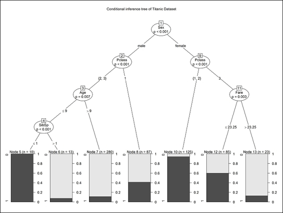
Conditional inference tree of the Titanic dataset
How it works...
This recipe introduces how to use a conditional inference tree, ctree, to predict passenger survival. While the conditional inference tree is not the only method to solve the classification problem, it is an easy method to comprehend the decision path to predict passenger survival.
We first split the data into a training and testing set by using our implemented function, split.data. So, we can then use the training set to generate a prediction model and later employ the prediction model on the testing dataset in the recipe of the model assessment. Then, we install and load the party package, and use ctree to build a prediction model, with Survived as its label. Without considering any particular attribute, we put attributes such as Pclass, Sex, Age, SibSp, Parch, Embarked, and Fare as training attributes, except for Cabin, as most of this attribute's values are missing.
After constructing the prediction model, we can either print out the decision path and node in a text mode, or use a plot function to plot the decision tree. From the decision tree, the user can see what combination of variables may be helpful in predicting the survival rate. As per the preceding screenshot, users can find a combination of Pclass and Sex, which served as a good decision boundary (node 9) to predict the survival rates. This shows female passengers who were in first and second class mostly survived the shipwreck. Male passengers, those in second and third class and aged over nine, almost all perished during the shipwreck. From the tree, one may find that attributes such as Embarked and Parch are missing. This is because the conditional inference tree regards these attributes as less important during classification.
From the decision tree, the user can see what combination of variables may be helpful in predicting the survival rate. Furthermore, a conditional inference tree is helpful in selecting important attributes during the classification process; one can examine the built tree to see whether the selected attribute matches one's presumption.
There's more...
This recipe covers issues relating to classification algorithms and conditional inference trees. Since we do not discuss the background knowledge of the adapted algorithm, it is better for the user to use the help function to view the documents related to ctree in the party package, if necessary.
There is a similar decision tree based package, named rpart. The difference between party and rpart is that ctree in the party package avoids the following variable selection bias of rpart and ctree in the party package, tending to select variables that have many possible splits or many missing values. Unlike the others, ctree uses a significance testing procedure in order to select variables, instead of selecting the variable that maximizes an information measure.
Besides ctree, one can also use svm to generate a prediction model. To load the svm function, load the e1071 package first, and then use the svm build to generate this prediction:
> install.packages('e1071')
> require('e1071')
> svm.model = svm(Survived ~ Pclass + Sex + Age + SibSp + Fare + Parch + Embarked, data = trainset, probability = TRUE)
Here, we use svm to show how easy it is that you can immediately use different machine learning algorithms on the same dataset when using R. For further information on how to use svm, please refer to Chapter 6, Classification (II) – Neural Network, SVM.
Validating the power of prediction with a confusion matrix
After constructing the prediction model, it is important to validate how the model performs while predicting the labels. In the previous recipe, we built a model with ctree and pre-split the data into a training and testing set. For now, users will learn to validate how well ctree performs in a survival prediction via the use of a confusion matrix.
Getting ready
Before assessing the prediction model, first be sure that the generated training set and testing dataset are within the R session.
How to do it...
Perform the following steps to validate the prediction power:
1. We start using the constructed train.ctree model to predict the survival of the testing set:
2. > ctree.predict = predict(train.ctree, testset)
2. First, we install the caret package, and then load it:
3. > install.packages("caret")
4. > require(caret)
3. After loading caret, one can use a confusion matrix to generate the statistics of the output matrix:
4. > confusionMatrix(ctree.predict, testset$Survived)
5. Confusion Matrix and Statistics
6.
7. Reference
8. Prediction 0 1
9. 0 160 25
10. 1 16 66
11.
12. Accuracy : 0.8464
13. 95% CI : (0.7975, 0.8875)
14. No Information Rate : 0.6592
15. P-Value [Acc > NIR] : 4.645e-12
16.
17. Kappa : 0.6499
18. Mcnemar's Test P-Value : 0.2115
19.
20. Sensitivity : 0.9091
21. Specificity : 0.7253
22. Pos Pred Value : 0.8649
23. Neg Pred Value : 0.8049
24. Prevalence : 0.6592
25. Detection Rate : 0.5993
26. Detection Prevalence : 0.6929
27. Balanced Accuracy : 0.8172
28.
29. 'Positive' Class : 0
How it works...
After building the prediction model in the previous recipe, it is important to measure the performance of the constructed model. The performance can be assessed by whether the prediction result matches the original label contained in the testing dataset. The assessment can be done by using the confusion matrix provided by the caret package to generate a confusion matrix, which is one method to measure the accuracy of predictions.
To generate a confusion matrix, a user needs to install and load the caret package first. The confusion matrix shows that purely using ctree can achieve accuracy of up to 84 percent. One may generate a better prediction model by tuning the attribute used, or by replacing the classification algorithm to SVM, glm, or random forest.
There's more...
A caret package (Classification and Regression Training) helps make iterating and comparing different predictive models very convenient. The package also contains several functions, including:
· Data splits
· Common preprocessing: creating dummy variables, identifying zero- and near-zero-variance predictors, finding correlated predictors, centering, scaling, and so on
· Training (using cross-validation)
· Common visualizations (for example, featurePlot)
Assessing performance with the ROC curve
Another measurement is by using the ROC curve (this requires the ROCR package), which plots a curve according to its true positive rate against its false positive rate. This recipe will introduce how we can use the ROC curve to measure the performance of the prediction model.
Getting ready
Before applying the ROC curve to assess the prediction model, first be sure that the generated training set, testing dataset, and built prediction model, ctree.predict, are within the R session.
How to do it...
Perform the following steps to assess prediction performance:
1. Prepare the probability matrix:
2. > train.ctree.pred = predict(train.ctree, testset)
3. > train.ctree.prob = 1- unlist(treeresponse(train.ctree, testset), use.names=F)[seq(1,nrow(testset)*2,2)]
2. Install and load the ROCR package:
3. > install.packages("ROCR")
4. > require(ROCR)
3. Create an ROCR prediction object from probabilities:
4. > train.ctree.prob.rocr = prediction(train.ctree.prob, testset$Survived)
4. Prepare the ROCR performance object for the ROC curve (tpr=true positive rate, fpr=false positive rate) and the area under curve (AUC):
5. > train.ctree.perf = performance(train.ctree.prob.rocr, "tpr","fpr")
6. > train.ctree.auc.perf = performance(train.ctree.prob.rocr, measure = "auc", x.measure = "cutoff")
5. Plot the ROC curve, with colorize as TRUE, and put AUC as the title:
6. > plot(train.ctree.perf, col=2,colorize=T, main=paste("AUC:", train.ctree.auc.perf@y.values))
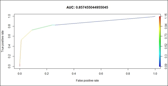
ROC of the prediction model
How it works...
Here, we first create the prediction object from the probabilities matrix, and then prepare the ROCR performance object for the ROC curve (tpr=true positive rate, fpr=false positive rate) and the AUC. Lastly, we use the plot function to draw the ROC curve.
The result drawn in the preceding screenshot is interpreted in the following way: the larger under the curve (a perfect prediction will make AUC equal to 1), the better the prediction accuracy of the model. Our model returns a value of 0.857, which suggests that the simple conditional inference tree model is powerful enough to make survival predictions.
See also
· To get more information on the ROCR, you can read the paper Sing, T., Sander, O., Berenwinkel, N., and Lengauer, T. (2005). ROCR: visualizing classifier performance in R. Bioinformatics, 21(20), 3940-3941.
All materials on the site are licensed Creative Commons Attribution-Sharealike 3.0 Unported CC BY-SA 3.0 & GNU Free Documentation License (GFDL)
If you are the copyright holder of any material contained on our site and intend to remove it, please contact our site administrator for approval.
© 2016-2026 All site design rights belong to S.Y.A.