Machine Learning with R Cookbook (2015)
Chapter 3. R and Statistics
In this chapter, we will cover the following topics:
· Understanding data sampling in R
· Operating a probability distribution in R
· Working with univariate descriptive statistics in R
· Performing correlations and multivariate analysis
· Operating linear regression and a multivariate analysis
· Conducting an exact binomial test
· Performing student's t-test
· Performing the Kolmogorov-Smirnov test
· Understanding the Wilcoxon Rank Sum and Signed Rank test
· Working with Pearson's Chi-squared test
· Conducting a one-way ANOVA
· Performing a two-way ANOVA
Introduction
The R language, as the descendent of the statistics language, S, has become the preferred computing language in the field of statistics. Moreover, due to its status as an active contributor in the field, if a new statistical method is discovered, it is very likely that this method will first be implemented in the R language. As such, a large quantity of statistical methods can be fulfilled by applying the R language.
To apply statistical methods in R, the user can categorize the method of implementation into descriptive statistics and inferential statistics:
· Descriptive statistics: These are used to summarize the characteristics of the data. The user can use mean and standard deviation to describe numerical data, and use frequency and percentages to describe categorical data.
· Inferential statistics: Based on the pattern within a sample data, the user can infer the characteristics of the population. The methods related to inferential statistics are for hypothesis testing, data estimation, data correlation, and relationship modeling. Inference can be further extended to forecasting, prediction, and estimation of unobserved values either in or associated with the population being studied.
In the following recipe, we will discuss examples of data sampling, probability distribution, univariate descriptive statistics, correlations and multivariate analysis, linear regression and multivariate analysis, Exact Binomial Test, student's t-test, Kolmogorov-Smirnov test, Wilcoxon Rank Sum and Signed Rank test, Pearson's Chi-squared Test, One-way ANOVA, and Two-way ANOVA.
Understanding data sampling in R
Sampling is a method to select a subset of data from a statistical population, which can use the characteristics of the population to estimate the whole population. The following recipe will demonstrate how to generate samples in R.
Getting ready
Make sure that you have an R working environment for the following recipe.
How to do it...
Perform the following steps to understand data sampling in R:
1. In order to generate random samples of a given population, the user can simply use the sample function:
2. > sample(1:10)
2. To specify the number of items returned, the user can set the assigned value to the size argument:
3. > sample(1:10, size = 5)
3. Moreover, the sample can also generate Bernoulli trials by specifying replace = TRUE (default is FALSE):
4. > sample(c(0,1), 10, replace = TRUE)
How it works...
As we saw in the preceding demonstration, the sample function can generate random samples from a specified population. The returned number from records can be designated by the user simply by specifying the argument of size. Assigning the replace argument to TRUE, you can generate Bernoulli trials (a population with 0 and 1 only).
See also
· In R, the default package provides another sample method, sample.int, where both n and size must be supplied as integers:
· > sample.int(20, 12)
Operating a probability distribution in R
Probability distribution and statistics analysis are closely related to each other. For statistics analysis, analysts make predictions based on a certain population, which is mostly under a probability distribution. Therefore, if you find that the data selected for prediction does not follow the exact assumed probability distribution in experiment design, the upcoming results can be refuted. In other words, probability provides the justification for statistics. The following examples will demonstrate how to generate probability distribution in R.
Getting ready
Since most distribution functions originate from the stats package, make sure the library stats are loaded.
How to do it...
Perform the following steps:
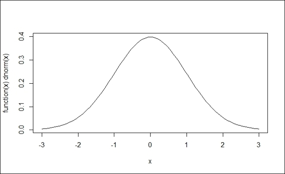
1. For a normal distribution, the user can use dnorm, which will return the height of a normal curve at 0:
2. > dnorm(0)
3. [1] 0.3989423
2. Then, the user can change the mean and the standard deviation in the argument:
3. > dnorm(0,mean=3,sd=5)
4. [1] 0.06664492
3. Next, plot the graph of a normal distribution with the curve function:
4. > curve(dnorm,-3,3)
Standard normal distribution
4. In contrast to dnorm, which returns the height of a normal curve, the pnorm function can return the area under a given value:
5. > pnorm(1.5)
6. [1] 0.9331928
5. Alternatively, to get the area above a certain value, you can specify the option, lower.tail, to FALSE:
6. > pnorm(1.5, lower.tail=FALSE)
7. [1] 0.0668072
6. To plot the graph of pnorm, the user can employ a curve function:
7. > curve(pnorm(x), -3,3)
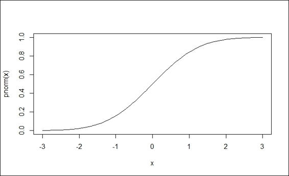
Cumulative density function (pnorm)
7. To calculate the quantiles for a specific distribution, you can use qnorm. The function, qnorm, can be treated as the inverse of pnorm, which returns the Z-score of a given probability:
8. > qnorm(0.5)
9. [1] 0
10.> qnorm(pnorm(0))
11.[1] 0
8. To generate random numbers from a normal distribution, one can use the rnorm function and specify the number of generated numbers. Also, one can define optional arguments, such as the mean and standard deviation:
9. > set.seed(50)
10.> x = rnorm(100,mean=3,sd=5)
11.> hist(x)
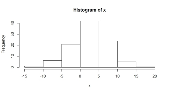
Histogram of a normal distribution
9. To calculate the uniform distribution, the runif function generates random numbers from a uniform distribution. The user can specify the range of the generated numbers by specifying variables, such as the minimum and maximum. For the following example, the user generates 100 random variables from 0 to 5:
10.> set.seed(50)
11.> y = runif(100,0,5)
12.> hist(y)
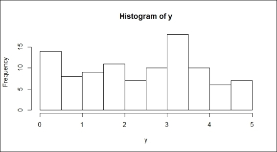
Histogram of a uniform distribution
10.Lastly, if you would like to test the normality of the data, the most widely used test for this is the Shapiro-Wilks test. Here, we demonstrate how to perform a test of normality on both samples from the normal and uniform distributions, respectively:
11.> shapiro.test(x)
12.
13. Shapiro-Wilk normality test
14.
15.data: x
16.W = 0.9938, p-value = 0.9319
17.> shapiro.test(y)
18.
19. Shapiro-Wilk normality test
20.
21.data: y
22.W = 0.9563, p-value = 0.002221
How it works...
In this recipe, we first introduce dnorm, a probability density function, which returns the height of a normal curve. With a single input specified, the input value is called a standard score or a z-score. Without any other arguments specified, it is assumed that the normal distribution is in use with a mean of zero and a standard deviation of one. We then introduce three ways to draw standard and normal distributions.
After this, we introduce pnorm, a cumulative density function. The function, pnorm, can generate the area under a given value. In addition to this, pnorm can be also used to calculate the p-value from a normal distribution. One can get the p-value by subtracting 1 from the number, or assigning True to the option, lower.tail. Similarly, one can use the plot function to plot the cumulative density.
In contrast to pnorm, qnorm returns the z-score of a given probability. Therefore, the example shows that the application of a qnorm function to a pnorm function will produce the exact input value.
Next, we show you how to use the rnrom function to generate random samples from a normal distribution, and the runif function to generate random samples from the uniform distribution. In the function, rnorm, one has to specify the number of generated numbers and we may also add optional augments, such as the mean and standard deviation. Then, by using the hist function, one should be able to find a bell-curve in figure 3. On the other hand, for the runif function, with the minimum and maximum specifications, one can get a list of sample numbers between the two. However, we can still use the hist function to plot the samples. It is clear that the output figure (shown in the preceding figure) is not in a bell-shape, which indicates that the sample does not come from the normal distribution.
Finally, we demonstrate how to test data normality with the Shapiro-Wilks test. Here, we conduct the normality test on both the normal and uniform distribution samples, respectively. In both outputs, one can find the p-value in each test result. The p-value shows the changes, which show that the sample comes from a normal distribution. If the p-value is higher than 0.05, we can conclude that the sample comes from a normal distribution. On the other hand, if the value is lower than 0.05, we conclude that the sample does not come from a normal distribution.
There's more...
Besides the normal distribution, you can obtain a t distribution, binomial distribution, and Chi-squared distribution by using the built-in functions of R. You can use the help function to access further information about this:
· For a t distribution:
· > help(TDist)
· For a binomial distribution:
· >help(Binomial)
· For the Chi-squared distribution:
· >help(Chisquare)
To learn more about the distributions in the package, the user can access the help function with the keyword distributions to find all related documentation on this:
> help(distributions)
Working with univariate descriptive statistics in R
Univariate descriptive statistics describes a single variable for unit analysis, which is also the simplest form of quantitative analysis. In this recipe, we introduce some basic functions used to describe a single variable.
Getting ready
We need to apply descriptive statistics to a sample data. Here, we use the built-in mtcars data as our example.
How to do it...
Perform the following steps:
1. First, load the mtcars data into a data frame with a variable named mtcars:
2. > data(mtcars)
2. To obtain the vector range, the range function will return the lower and upper bound of the vector:
3. > range(mtcars$mpg)
4. [1] 10.4 33.9
3. Compute the length of the variable:
4. > length(mtcars$mpg)
5. [1] 32
4. Obtain the mean of mpg:
5. > mean(mtcars$mpg)
6. [1] 20.09062
5. Obtain the median of the input vector:
6. > median(mtcars$mpg)
7. [1] 19.2
6. To obtain the standard deviation of the input vector:
7. > sd(mtcars$mpg)
8. [1] 6.026948
7. To obtain the variance of the input vector:
8. > var(mtcars$mpg)
9. [1] 36.3241
8. The variance can also be computed with the square of standard deviation:
9. > sd(mtcars$mpg) ^ 2
10.[1] 36.3241
9. To obtain the Interquartile Range (IQR):
10.> IQR(mtcars$mpg)
11.[1] 7.375
10.To obtain the quantile:
11.> quantile(mtcars$mpg,0.67)
12. 67%
13.21.4
11.To obtain the maximum of the input vector:
12.> max(mtcars$mpg)
13.[1] 33.9
12.To obtain the minima of the input vector:
13.> min(mtcars$mpg)
14.[1] 10.4
13.To obtain a vector with elements that are the cumulative maxima:
14.> cummax(mtcars$mpg)
15. [1] 21.0 21.0 22.8 22.8 22.8 22.8 22.8 24.4 24.4 24.4 24.4 24.4 24.4 24.4 24.4 24.4
16.[17] 24.4 32.4 32.4 33.9 33.9 33.9 33.9 33.9 33.9 33.9 33.9 33.9 33.9 33.9 33.9 33.9
14.To obtain a vector with elements that are the cumulative minima:
15.> cummin(mtcars$mpg)
16. [1] 21.0 21.0 21.0 21.0 18.7 18.1 14.3 14.3 14.3 14.3 14.3 14.3 14.3 14.3 10.4 10.4
17.[17] 10.4 10.4 10.4 10.4 10.4 10.4 10.4 10.4 10.4 10.4 10.4 10.4 10.4 10.4 10.4 10.4
15.To summarize the dataset, you can apply the summary function:
16.> summary(mtcars)
16.To obtain a frequency count of the categorical data, take cyl of mtcars as an example:
17.> table(mtcars$cyl)
18.
19. 4 6 8
20.11 7 14
17.To obtain a frequency count of numerical data, you can use a stem plot to outline the data shape; stem produces a stem-and-leaf plot of the given values:
18.> stem(mtcars$mpg)
19.
20. The decimal point is at the |
21.
22. 10 | 44
23. 12 | 3
24. 14 | 3702258
25. 16 | 438
26. 18 | 17227
27. 20 | 00445
28. 22 | 88
29. 24 | 4
30. 26 | 03
31. 28 |
32. 30 | 44
33. 32 | 49
18.You can use a histogram of ggplot to plot the same stem-and-leaf figure:
19.> library(ggplot2)
20.> qplot(mtcars$mpg, binwidth=2)
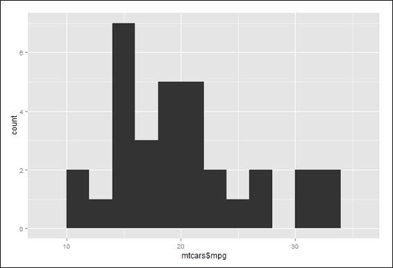
Histogram of mpg of mtcars
How it works...
Univariate descriptive statistics generate the frequency distribution of datasets. Moreover, they can be used to identify the obvious patterns in the data and the characteristics of the variates to provide a better understanding of the data from a holistic viewpoint. Additionally, they can provide information about the central tendency and descriptors of the skewness of individual cases. Therefore, it is common to see that univariate analysis is conducted at the beginning of the data exploration process.
To begin the exploration of data, we first load the dataset, mtcars, to an R session. From the data, we apply range, length, mean, median, sd, var, IQR, quantile, min, max, cumin, and cumax to obtain the descriptive statistic of the attribute, mpg. Then, we use the summary function to obtain summary information about mtcars.
Next, we obtain a frequency count of the categorical data (cyl). To obtain a frequency count of the numerical data, we use a stem plot to outline the data shape. Lastly, we use a histogram with the binwidth argument in 2 to generate a plot similar to the stem-and-leaf plot.
There's more...
One common scenario in univariate descriptive statistics is to find the mode of a vector. In R, there is no built-in function to help the user obtain the mode of the data. However, one can implement the mode function by using the following code:
> mode = function(x) {
+ temp = table(x)
+ names(temp)[temp == max(temp)]
+ }
By applying the mode function on the vector, mtcars$mpg, you can find the most frequently occurring numeric value or category of a given vector:
> x = c(1,2,3,3,3,4,4,5,5,5,6)
> mode(x)
[1] "3" "5"
Performing correlations and multivariate analysis
To analyze the relationship of more than two variables, you would need to conduct multivariate descriptive statistics, which allows the comparison of factors. Additionally, it prevents the effect of a single variable from distorting the analysis. In this recipe, we will discuss how to conduct multivariate descriptive statistics using a correlation and covariance matrix.
Getting ready
Ensure that mtcars has already been loaded into a data frame within an R session.
How to do it...
Perform the following steps:
1. Here, you can get the covariance matrix by inputting the first three variables in mtcars to the cov function:
2. > cov(mtcars[1:3])
3. mpg cyl disp
4. mpg 36.324103 -9.172379 -633.0972
5. cyl -9.172379 3.189516 199.6603
6. disp -633.097208 199.660282 15360.7998
2. To obtain a correlation matrix of the dataset, we input the first three variables of mtcars to the cor function:
3. > cor(mtcars[1:3])
4. mpg cyl disp
5. mpg 1.0000000 -0.8521620 -0.8475514
6. cyl -0.8521620 1.0000000 0.9020329
7. disp -0.8475514 0.9020329 1.0000000
How it works...
In this recipe, we have demonstrated how to apply correlation and covariance to discover the relationship between multiple variables.
First, we compute a covariance matrix of the first three mtcars variables. Covariance can measure how variables are linearly related. Thus, a positive covariance (for example, cyl versus mpg) indicates that the two variables are positively linearly related. On the other hand, a negative covariance (for example, mpg versus disp) indicates the two variables are negatively linearly related. However, due to the variance of different datasets, the covariance score of these datasets is not comparable. As a result, if you would like to compare the strength of the linear relation between two variables in a different dataset, you should use the normalized score, that is, the correlation coefficient instead of covariance.
Next, we apply a cor function to obtain a correlation coefficient matrix of three variables within the mtcars dataset. In the correlation coefficient matrix, the numeric element of the matrix indicates the strength of the relationship between the two variables. If the correlation coefficient of a variable against itself scores 1, the variable has a positive relationship against itself. The cyl and mpg variables have a correlation coefficient of -0.85, which means they have a strong, negative relationship. On the other hand, the disp and cyl variables score 0.90, which may indicate that they have a strong, positive relationship.
See also
· You can use ggplot to plot the heatmap of the correlation coefficient matrix:
· > library(reshape2)
· > qplot(x=Var1, y=Var2, data=melt(cor(mtcars[1:3])), fill=value, geom="tile")
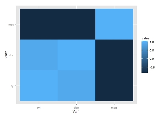
The correlation coefficient matrix heatmap
Operating linear regression and multivariate analysis
Linear regression is a method to assess the association between dependent and independent variables. In this recipe, we will cover how to conduct linear regression for multivariate analysis.
Getting ready
Ensure that mtcars has already been loaded into a data frame within an R session.
How to do it...
Perform the following steps:
1. To fit variables into a linear model, you can use the lm function:
2. > lmfit = lm(mtcars$mpg ~ mtcars$cyl)
3. > lmfit
4.
5. Call:
6. lm(formula = mtcars$mpg ~ mtcars$cyl)
7.
8. Coefficients:
9. (Intercept) mtcars$cyl
10. 37.885 -2.876
2. To get detailed information on the fitted model, you can use the summary function:
3. > summary(lmfit)
4.
5. Call:
6. lm(formula = mtcars$mpg ~ mtcars$cyl)
7.
8. Residuals:
9. Min 1Q Median 3Q Max
10.-4.9814 -2.1185 0.2217 1.0717 7.5186
11.
12.Coefficients:
13. Estimate Std. Error t value Pr(>|t|)
14.(Intercept) 37.8846 2.0738 18.27 < 2e-16 ***
15.mtcars$cyl -2.8758 0.3224 -8.92 6.11e-10 ***
16.---
17.Signif. codes: 0 '***' 0.001 '**' 0.01 '*' 0.05 '.' 0.1 ' ' 1
18.
19.Residual standard error: 3.206 on 30 degrees of freedom
20.Multiple R-squared: 0.7262, Adjusted R-squared: 0.7171
21.F-statistic: 79.56 on 1 and 30 DF, p-value: 6.113e-10
3. To create an analysis of a variance table, one can employ the anova function:
4. > anova(lmfit)
5. Analysis of Variance Table
6.
7. Response: mtcars$mpg
8. Df Sum Sq Mean Sq F value Pr(>F)
9. mtcars$cyl 1 817.71 817.71 79.561 6.113e-10 ***
10.Residuals 30 308.33 10.28
11.---
12.Signif. codes: 0 '***' 0.001 '**' 0.01 '*' 0.05 '.' 0.1 ' ' 1
4. To plot the regression line on a scatter plot of two variables, you first plot cyl against mpg in it, then use the abline function to add a regression line on the plot:
5. > lmfit = lm(mtcars$mpg ~ mtcars$cyl)
6. > plot(mtcars$cyl, mtcars$mpg)
7. > abline(lmfit)
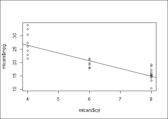
The regression plot of cyl against mpg
How it works...
In this recipe, we apply the linear model function, lm, which builds a linear fitted model of two variables and returns the formula and coefficient. Next, we apply the summary function to retrieve the detailed information (including F-statistic and P-value) of the model. The purpose of F-statistic is to test the statistical significance of the model. It produces an F-value, which is the ratio of the model mean square to the error mean square. Thus, a large F-value indicates that more of the total variability is accounted for by the regression model. Then, we can use the F-value to support or reject the null hypothesis that all of the regression coefficients are equal to zero. In other words, the null hypothesis is rejected if the F-value is large and shows that the regression model has a predictive capability. On the other hand, P-values of each attribute test the null hypothesis that the coefficient is equal to zero (no effect on the response variable). In other words, a low p-value can reject a null hypothesis and indicates that a change in the predictor's value is related to the value of the response variable.
Next, we apply the anova function on the fitted model to determine the variance. The function outputs the sum of squares, which stands for the variability of the model's predicted value. Further, to visualize the linear relationship between two variables, the abline function can add a regression line on a scatter plot of mpg against cyl. From the preceding figure, it is obvious that the mpg and cyl variables are negatively related.
See also
· For more information on how to perform linear and nonlinear regression analysis, please refer to the Chapter 4, Understanding Regression Analysis
Conducting an exact binomial test
While making decisions, it is important to know whether the decision error can be controlled or measured. In other words, we would like to prove that the hypothesis formed is unlikely to have occurred by chance, and is statistically significant. In hypothesis testing, there are two kinds of hypotheses: null hypothesis and alternative hypothesis (or research hypothesis). The purpose of hypothesis testing is to validate whether the experiment results are significant. However, to validate whether the alternative hypothesis is acceptable, it is deemed to be true if the null hypothesis is rejected.
In the following recipes, we will discuss some common statistical testing methods. First, we will cover how to conduct an exact binomial test in R.
Getting ready
Since the binom.test function originates from the stats package, make sure the stats library is loaded.
How to do it...
Perform the following step:
1. Assume there is a game where a gambler can win by rolling the number-six-on a dice. As part of the rules, gamblers can bring their own dice. If a gambler tried to cheat in a game, he would use a loaded dice to increase his chance of winning. Therefore, if we observe that the gambler won 92 out of 315 games, we could determine whether the dice was fair by conducting an exact binomial test:
2. > binom.test(x=92, n=315, p=1/6)
3.
4. Exact binomial test
5.
6. data: 92 and 315
7. number of successes = 92, number of trials = 315, p-value = 3.458e-08
8. alternative hypothesis: true probability of success is not equal to 0.1666667
9. 95 percent confidence interval:
10. 0.2424273 0.3456598
11.sample estimates:
12.probability of success
13. 0.2920635
How it works...
A binomial test uses the binomial distribution to find out whether the true success rate is likely to be P for n trials with the binary outcome. The formula of the probability, P, can be defined in following equation:
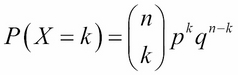
Here, X denotes the random variables, counting the number of outcomes of the interest; n denotes the number of trials; k indicates the number of successes; p indicates the probability of success; and q denotes the probability of failure.
After we have computed the probability, P, we can then perform a sign test to determine whether the success probability is similar to what we expected. If the probability is not equal to what we expected, we can reject the null hypothesis.
By definition, the null hypothesis is a skeptical perspective or a statement about the population parameter that will be tested. The null hypothesis is denoted by H0. An alternative hypothesis is represented by a range of population values, which are not included in the null hypothesis. The alternative hypothesis is denoted by H1. In this case, the null and alternative hypothesis, respectively, are illustrated as:
· H0 (null hypothesis): The true probability of success is equal to what we expected
· H1 (alternative hypothesis): The true probability of success is not equal to what we expected
In this example, we demonstrate how to use a binomial test to determine the number of times the dice is rolled, the frequency of rolling the number six, and the probability of rolling a six from an unbiased dice. The result of the t-test shows that the p-value = 3.458e-08 (lower than 0.05). For significance, at the five percent level, the null hypothesis (the dice is unbiased) is rejected as too many sixes were rolled (the probability of success = 0.2920635).
See also
· To read more about the usage of the exact binomial test, please use the help function to view related documentation on this:
· > ?binom.test
Performing student's t-test
A one sample t-test enables us to test whether two means are significantly different; a two sample t-test allows us to test whether the means of two independent groups are different. In this recipe, we will discuss how to conduct one sample t-test and two sample t-tests using R.
Getting ready
Ensure that mtcars has already been loaded into a data frame within an R session. As the t.test function originates from the stats package, make sure the library, stats, is loaded.
How to do it...
Perform the following steps:
1. First, we visualize the attribute, mpg, against am using a boxplot:
2. > boxplot(mtcars$mpg, mtcars$mpg[mtcars$am==0], ylab = "mpg", names=c("overall","automobile"))
3. > abline(h=mean(mtcars$mpg),lwd=2, col="red")
4. > abline(h=mean(mtcars$mpg[mtcars$am==0]),lwd=2, col="blue")
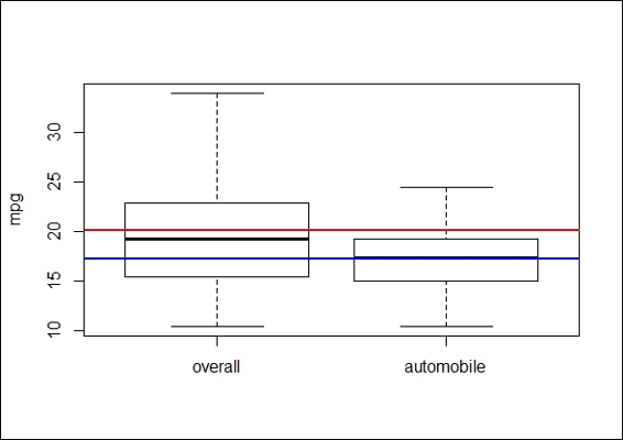
The boxplot of mpg of the overall population and automobiles
2. We then perform a statistical procedure to validate whether the average mpg of automobiles is lower than the average of the overall mpg:
3. > mpg.mu = mean(mtcars$mpg)
4. > mpg_am = mtcars$mpg[mtcars$am == 0]
5. > t.test(mpg_am,mu = mpg.mu)
6.
7. One Sample t-test
8.
9. data: mpg_am
10.t = -3.3462, df = 18, p-value = 0.003595
11.alternative hypothesis: true mean is not equal to 20.09062
12.95 percent confidence interval:
13. 15.29946 18.99528
14.sample estimates:
15.mean of x
16. 17.14737
3. We begin visualizing the data by plotting a boxplot:
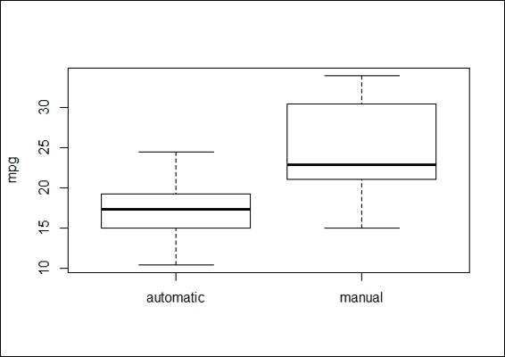
4. >boxplot(mtcars$mpg~mtcars$am,ylab='mpg',names=c('automatic','manual'))
5. > abline(h=mean(mtcars$mpg[mtcars$am==0]),lwd=2, col="blue")
6. > abline(h=mean(mtcars$mpg[mtcars$am==1]),lwd=2, col="red")
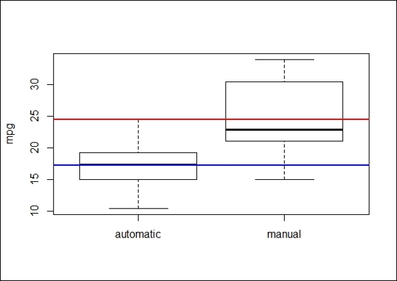
The boxplot of mpg of automatic and manual transmission cars
4. The preceding figure reveals that the mean mpg of automatic transmission cars is lower than the average mpg of manual transmission vehicles:
5. > t.test(mtcars$mpg~mtcars$am)
6.
7. Welch Two Sample t-test
8.
9. data: mtcars$mpg by mtcars$am
10.t = -3.7671, df = 18.332, p-value = 0.001374
11.alternative hypothesis: true difference in means is not equal to 0
12.95 percent confidence interval:
13. -11.280194 -3.209684
14.sample estimates:
15.mean in group 0 mean in group 1
16. 17.14737 24.39231
How it works...
Student's t-test is where the test statistic follows a normal distribution (the student's t distribution) if the null hypothesis is true. It can be used to determine whether there is a difference between two independent datasets. Student's t-test is best used with the problems associated with an inference based on small samples.
In this recipe, we discuss one sample student's t-test and two sample student's t-tests. In the one sample student's t-test, a research question often asked is, "Is the mean of the population different from the null hypothesis?" Thus, in order to test whether the average mpg of automobiles is lower than the overall average mpg, we first use a boxplot to view the differences between populations without making any assumptions. From the preceding figure, it is clear that the mean of mpg of automobiles (the blue line) is lower than the average mpg (red line) of the overall population. Then, we apply one sample t-test; the low p-value of 0.003595 (< 0.05) suggests that we should reject the null hypothesis that the mean mpg for automobiles is less than the average mpg of the overall population.
As a one sample t-test enables us to test whether two means are significantly different, a two sample t-test allows us to test whether the means of two independent groups are different. Similar to a one sample t-test, we first use a boxplot to see the differences between populations and then apply a two-sample t-test. The test results shows the p-value = 0.01374 (p< 0.05). In other words, the test provides evidence that rejects the null hypothesis, which shows the mean mpg of cars with automatic transmission differs from the cars with manual transmission.
See also
· To read more about the usage of student's t-test, please use the help function to view related documents:
· > ?t.test
Performing the Kolmogorov-Smirnov test
A one-sample Kolmogorov-Smirnov test is used to compare a sample with a reference probability. A two-sample Kolmogorov-Smirnov test compares the cumulative distributions of two datasets. In this recipe, we will demonstrate how to perform the Kolmogorov-Smirnov test with R.
Getting ready
Ensure that mtcars has already been loaded into a data frame within an R session. As the ks.test function is originated from the stats package, make sure the stats library is loaded.
How to do it...
Perform the following steps:
1. Validate whether the dataset, x (generated with the rnorm function), is distributed normally with a one-sample Kolmogorov-Smirnov test:
2. > x = rnorm(50)
3. > ks.test(x,"pnorm")
4.
5. One-sample Kolmogorov-Smirnov test
6.
7. data: x
8. D = 0.1698, p-value = 0.0994
9. alternative hypothesis: two-sided
2. Next, you can generate uniformly distributed sample data:
3. > set.seed(3)
4. > x = runif(n=20, min=0, max=20)
5.
6. > y = runif(n=20, min=0, max=20)
3. We first plot ecdf of two generated data samples:
4. > plot(ecdf(x), do.points = FALSE, verticals=T, xlim=c(0, 20))
5. > lines(ecdf(y), lty=3, do.points = FALSE, verticals=T)
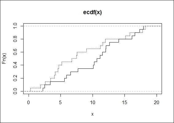
The ecdf plot of two generated data samples
4. Finally, we apply a two-sample Kolmogorov-Smirnov test on two groups of data:
5. > ks.test(x,y)
6.
7. Two-sample Kolmogorov-Smirnov test
8.
9. data: x and y
10.D = 0.3, p-value = 0.3356
11.alternative hypothesis: two-sided
How it works...
The Kolmogorov-Smirnov test (K-S test) is a nonparametric and statistical test, used for the equality of continuous probability distributions. It can be used to compare a sample with a reference probability distribution (a one sample K-S test), or it can directly compare two samples (a two sample K-S test). The test is based on the empirical distribution function (ECDF). Let ![]() be a random sample of size, n; the empirical distribution function,
be a random sample of size, n; the empirical distribution function, ![]() , is defined as:
, is defined as:
Here, ![]() is the indicator function. If
is the indicator function. If ![]() , the function equals to 1. Otherwise, the function equals to 0.
, the function equals to 1. Otherwise, the function equals to 0.
The Kolmogorov-Smirnov statistic (D) is based on the greatest (where supx denotes the supremum) vertical difference between F(x) and Fn(x). It is defined as:
![]()
H0 is the sample follows the specified distribution. H1 is the sample does not follow the specified distribution.
If Dn is greater than the critical value obtained from a table, then we reject H0 at the level of significance α.
We first test whether a random number generated from a normal distribution is normally distributed. At the 5 percent significance level, the p-value of 0.0994 indicates that the input is normally distributed.
Then, we plot an empirical cumulative distribution function (ecdf) plot to show how a two-sample test calculates the maximum distance D (showing 0.3), and apply the two-sample Kolmogorov-Smirnov test to discover whether the two input datasets possibly come from the same distribution.
The p-value is above 0.05, which does not reject the null hypothesis. In other words, it means the two datasets are possibly from the same distribution.
See also
· To read more about the usage of the Kolmogorov-Smirnov test, please use the help function to view related documents:
· > ?ks.test
· As for the definition of an empirical cumulative distribution function, please refer to the help page of ecdf:
· > ?ecdf
Understanding the Wilcoxon Rank Sum and Signed Rank test
The Wilcoxon Rank Sum and Signed Rank test (or Mann-Whitney-Wilcoxon) is a nonparametric test of the null hypothesis, which shows that the population distribution of two different groups are identical without assuming that the two groups are normally distributed. This recipe will show how to conduct the Wilcoxon Rank Sum and Signed Rank test in R.
Getting ready
Ensure that mtcars has already been loaded into a data frame within an R session. As the wilcox.test function is originated from the stats package, make sure the library, stats, is loaded.
How to do it...
Perform the following steps:
1. We first plot the data of mtcars with the boxplot function:
2. > boxplot(mtcars$mpg~mtcars$am,ylab='mpg',names=c('automatic','manual'))
The boxplot of mpg of automatic cars and manual transmission cars
2. Next, we still perform a Wilcoxon Rank Sum test to validate whether the distribution of automatic transmission cars is identical to that of manual transmission cars:
3. > wilcox.test(mpg ~ am, data=mtcars)
4.
5. Wilcoxon rank sum test with continuity correction
6.
7. data: mpg by am
8. W = 42, p-value = 0.001871
9. alternative hypothesis: true location shift is not equal to 0
10.
11.Warning message:
12.In wilcox.test.default(x = c(21.4, 18.7, 18.1, 14.3, 24.4, 22.8, :
13. cannot compute exact p-value with ties
How it works...
In this recipe, we discuss a nonparametric test method, the Wilcoxon Rank Sum test (also known as the Mann-Whitney U-test). For student's t-test, it is assumed that the differences between the two samples are normally distributed (and it also works best when the two samples are normally distributed). However, when the normality assumption is uncertain, one can adopt the Wilcoxon Rank Sum Test to test a hypothesis.
Here, we used a Wilcoxon Rank Sum test to determine whether the mpg of automatic and manual transmission cars in the dataset, mtcars, is distributed identically. From the test result, we see that the p-value = 0.001871 (< 0.05) rejects the null hypothesis, and also reveals that the distribution of mpg in automatic and manual transmission cars is not identical. When performing this test, you may receive the warning message, "cannot compute exact p-value with ties", which indicates that there are duplicate values within the dataset. The warning message will be cleared once the duplicate values are removed.
See also
· To read more about the usage of the Wilcoxon Rank Sum and Signed Rank Test, please use the help function to view the concerned documents:
· > ? wilcox.test
Working with Pearson's Chi-squared test
In this recipe, we introduce Pearson's Chi-squared test, which is used to examine whether the distributions of categorical variables of two groups differ. We will discuss how to conduct Pearson's Chi-squared Test in R.
Getting ready
Ensure that mtcars has already been loaded into a data frame within an R session. Since the chisq.test function is originated from the stats? package, make sure the library, stats, is loaded.
How to do it
Perform the following steps:
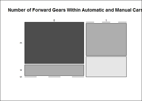
1. To make the counting table, we first use the contingency table built with the inputs of the transmission type and number of forward gears:
2. > ftable = table(mtcars$am, mtcars$gear)
3. > ftable
4.
5. 3 4 5
6. 0 15 4 0
7. 1 0 8 5
2. We then plot the mosaic plot of the contingency table:
3. > mosaicplot(ftable, main="Number of Forward Gears Within Automatic and Manual Cars", color = TRUE)
Number of forward gears in automatic and manual cars
3. Next, we perform the Pearson's Chi-squared test on the contingency table to test whether the numbers of gears in automatic and manual transmission cars is the same:
4. > chisq.test(ftable)
5.
6. Pearson's Chi-squared test
7.
8. data: ftable
9. X-squared = 20.9447, df = 2, p-value = 2.831e-05
10.
11.Warning message:
12.In chisq.test(ftable) : Chi-squared approximation may be incorrect
How it works...
Pearson's Chi-squared test is a statistical test used to discover whether there is a relationship between two categorical variables. It is best used for unpaired data from large samples. If you would like to conduct Pearson's Chi-squared test, you need to make sure that the input samples satisfy two assumptions: firstly, the two input variables should be categorical. Secondly, the variable should include two or more independent groups.
In Pearson's Chi-squared test, the assumption is that we have two variables, A and B; we can illustrate the null and alternative hypothesis in the following statements:
· H0: Variable A and variable B are independent
· H1: Variable A and variable B are not independent
To test whether the null hypothesis is correct or incorrect, the Chi-squared test takes these steps.
It calculates the Chi-squared test statistic, ![]() :
:
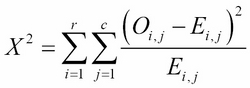
Here, r is the number of rows in the contingency table, c is the number of columns in the contingency table, Oi,j is the observed frequency count, Ei,j is the expected frequency count.
It determines the degrees of freedom, df, of that statistic. The degree of freedom is equal to:
![]()
Here, r is the number of levels for one variable, and c is the number of levels for another variable.
It compares ![]() to the critical value from the Chi-squared distribution with the degrees of freedom.
to the critical value from the Chi-squared distribution with the degrees of freedom.
In this recipe, we use a contingency table and mosaic plot to illustrate the differences in count numbers. It is obvious that the number of forward gears is less in automatic transmission cars than in manual transmission cars.
Then, we perform the Pearson's Chi-squared test on the contingency table to determine whether the gears in automatic and manual transmission cars are the same. The output, p-value = 2.831e-05 (< 0.05), refutes the null hypothesis and shows the number of forward gears is different in automatic and manual transmission cars. However, the output message contains a warning message that Chi-squared approximation may be incorrect, which is because the number of samples in the contingency table is less than five.
There's more...
To read more about the usage of the Pearson's Chi-squared test, please use the help function to view the related documents:
> ? chisq.test
Besides some common hypothesis testing methods mentioned in previous examples, there are other hypothesis methods provided by R:
· The Proportional test (prop.test): It is used to test whether the proportions in different groups are the same
· The Z-test (simple.z.test in the UsingR package): It compares the sample mean with the population mean and standard deviation
· The Bartlett Test (bartlett.test): It is used to test whether the variance of different groups is the same
· The Kruskal-Wallis Rank Sum Test (kruskal.test): It is used to test whether the distribution of different groups is identical without assuming that they are normally distributed
· The Shapiro-Wilk test (shapiro.test): It is used test for normality
Conducting a one-way ANOVA
Analysis of variance (ANOVA) investigates the relationship between categorical independent variables and continuous dependent variables. It can be used to test whether the means of several groups are equal. If there is only one categorical variable as an independent variable, you can perform a one-way ANOVA. On the other hand, if there are more than two categorical variables, you should perform a two-way ANOVA. In this recipe, we discuss how to conduct a one-way ANOVA with R.
Getting ready
Ensure that mtcars has already been loaded into a data frame within an R session. Since the oneway.test and TukeyHSD functions originated from the stats package, make sure the library, stats, is loaded.
How to do it...
Perform the following steps:
1. We begin exploring by visualizing the data with a boxplot:
2. > boxplot(mtcars$mpg~factor(mtcars$gear),xlab='gear',ylab='mpg')
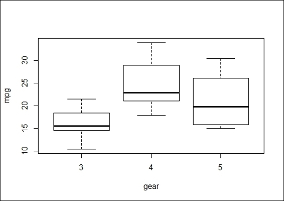
Comparison of mpg of different numbers of forward gears
2. Next, we conduct a one-way ANOVA to examine whether the mean of mpg changes with different numbers of forward gears. We use the function, oneway.test:
3. > oneway.test(mtcars$mpg~factor(mtcars$gear))
4.
5. One-way analysis of means (not assuming equal variances)
6.
7. data: mtcars$mpg and factor(mtcars$gear)
8. F = 11.2848, num df = 2.000, denom df = 9.508, p-value = 0.003085
3. In addition to oneway.test, a standard function, aov, is used for the ANOVA analysis:
4. > mtcars.aov = aov(mtcars$mpg ~ as.factor(mtcars$gear))
5. > summary(mtcars.aov)
6. Df Sum Sq Mean Sq F value Pr(>F)
7. as.factor(mtcars$gear) 2 483.2 241.62 10.9 0.000295 ***
8. Residuals 29 642.8 22.17
9. ---
10.Signif. codes: 0 '***' 0.001 '**' 0.01 '*' 0.05 '.' 0.1 ' ' 1
4. The model generated by the aov function can also generate a summary as a fitted table:
5. > model.tables(mtcars.aov, "means")
6. Tables of means
7. Grand mean
8.
9. 20.09062
10.
11. as.factor(mtcars$gear)
12. 3 4 5
13. 16.11 24.53 21.38
14.rep 15.00 12.00 5.00
5. For the aov model, one can use TukeyHSD for a post hoc comparison test:
6. > mtcars_posthoc =TukeyHSD(mtcars.aov)
7. > mtcars_posthoc
8. Tukey multiple comparisons of means
9. 95% family-wise confidence level
10.
11.Fit: aov(formula = mtcars$mpg ~ as.factor(mtcars$gear))
12.
13.$`as.factor(mtcars$gear)`
14. diff lwr upr p adj
15.4-3 8.426667 3.9234704 12.929863 0.0002088
16.5-3 5.273333 -0.7309284 11.277595 0.0937176
17.5-4 -3.153333 -9.3423846 3.035718 0.4295874
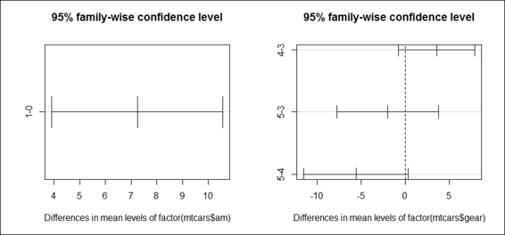
6. Further, we can visualize the differences in mean level with a plot function:
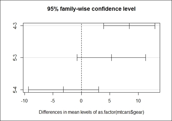
The Tukey mean-difference plot of groups with different numbers of gears
How it works...
In order to understand whether cars with a different number of forward gears have different means in mpg, we first plot the boxplot of mpg by the numbers of forward gears. This offers a simple indication if cars with a different number of forward gears have different means of mpg. We then perform the most basic form of ANOVA, a one-way ANOVA, to test whether the populations have different means.
In R, there are two functions to perform the ANOVA test: oneway.test and aov. The advantage of oneway.test is that the function applies a Welch correction to address the nonhomogeneity of a variance. However, it does not provide as much information as aov, and it does not offer a post hoc test. Next, we perform oneway.test and aov on the independent variable, gear, with regard to the dependent variable, mpg. Both test results show a small p-value, which rejects the null hypothesis that the mean between cars with a different number of forward gears have the same mpg mean.
As the results of ANOVA only suggest that there is a significant difference in the means within overall populations, you may not know which two populations differ in terms of their mean. Therefore, we apply the TukeyHSD post hoc comparison test on our ANOVA model. The result shows that cars with four forward gears and cars with three gears have the largest difference, as their confidence interval is the furthest to the right within the plot.
There's more...
ANOVA relies on an F-distribution as the basis of all probability distribution. An F score is obtained by dividing the between-group variance by the in-group variance. If the overall F test was significant, you can conduct a post hoc test (or multiple comparison tests) to measure the differences between groups. The most commonly used post hoc tests are Scheffé's method, the Tukey-Kramer method, and the Bonferroni correction.
In order to interpret the output of ANOVA, you need to have a basic understanding of certain terms, including the degrees of freedom, the sum of square total, the sum of square groups, the sum of square errors, the mean square errors, and the F statistic. If you require more information about these terms, you may refer to Using multivariate statistics (Fidell, L. S., & Tabachnick, B. G. (2006) Boston: Allyn & Bacon.), or refer to the Wikipedia entry of Analysis of variance (http://en.wikipedia.org/wiki/Analysis_of_variance#cite_ref-31).
Performing a two-way ANOVA
A two-way ANOVA can be viewed as the extension of a one-way ANOVA, for the analysis covers more than two categorical variables rather than one. In this recipe, we will discuss how to conduct a two-way ANOVA in R.
Getting ready
Ensure that mtcars has already been loaded into a data frame within an R session. Since the twoway.test, TukeyHSD and interaction.plot functions are originated from the stats package, make sure the library, stats, is loaded.
How to do it...
Perform the following steps:
1. First we plot the two boxplots of factor gears in regard to mpg, with the plot separated from the transmission type:
2. > par(mfrow=c(1,2))
3. > boxplot(mtcars$mpg~mtcars$gear,subset=(mtcars$am==0),xlab='gear', ylab = "mpg",main='automatic')
4. > boxplot(mtcars$mpg~mtcars$gear,subset=(mtcars$am==1),xlab='gear', ylab = "mpg", main='manual')
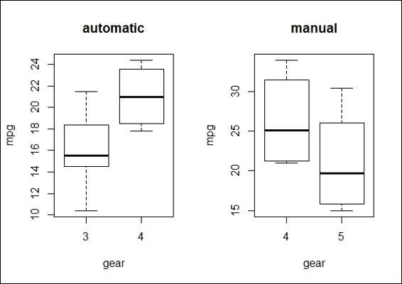
The boxplots of mpg by the gear group and the transmission type
2. Also, you may produce a boxplot of mpg by the number of forward gears * transmission type, with the use of the * operation in the boxplot function:
3. > boxplot(mtcars$mpg~factor(mtcars$gear)* factor(mtcars$am),xlab='gear * transmission', ylab = "mpg",main='Boxplot of mpg by gear * transmission')
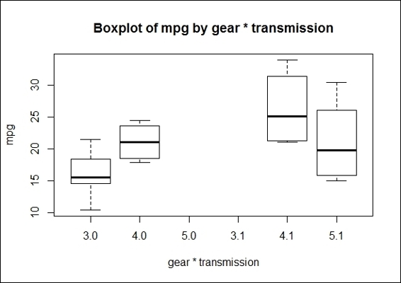
The boxplot of mpg by the gear * transmission type
3. Next, we use an interaction plot to characterize the relationship between variables:
4. > interaction.plot(mtcars$gear, mtcars$am, mtcars$mpg, type="b", col=c(1:3),leg.bty="o", leg.bg="beige", lwd=2, pch=c(18,24,22), xlab="Number of Gears", ylab="Mean Miles Per Gallon", main="Interaction Plot")
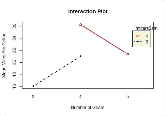
Interaction between the transmission type and the number of gears with the main effects, mpg
4. We then perform a two-way ANOVA on mpg with a combination of the gear and transmission-type factors:
5. > mpg_anova2 = aov(mtcars$mpg~factor(mtcars$gear)*factor(mtcars$am))
6. > summary(mpg_anova2)
7. Df Sum Sq Mean Sq F value Pr(>F)
8. factor(mtcars$gear) 2 483.2 241.62 11.869 0.000185 ***
9. factor(mtcars$am) 1 72.8 72.80 3.576 0.069001 .
10.Residuals 28 570.0 20.36
11.---
12.Signif. codes: 0 '***' 0.001 '**' 0.01 '*' 0.05 '.' 0.1 ' ' 1
5. Similar to a one-way ANOVA, we can perform a post hoc comparison test to see the results of the two-way ANOVA model:
6. > TukeyHSD(mpg_anova2)
7. Tukey multiple comparisons of means
8. 95% family-wise confidence level
9.
10.Fit: aov(formula = mtcars$mpg ~ factor(mtcars$gear) * factor(mtcars$am))
11.
12.$`factor(mtcars$gear)`
13. diff lwr upr p adj
14.4-3 8.426667 4.1028616 12.750472 0.0001301
15.5-3 5.273333 -0.4917401 11.038407 0.0779791
16.5-4 -3.153333 -9.0958350 2.789168 0.3999532
17.
18.$`factor(mtcars$am)`
19. diff lwr upr p adj
20.1-0 1.805128 -1.521483 5.13174 0.2757926
6. We then visualize the differences in mean levels with the plot function:
7. > par(mfrow=c(1,2))
8. > plot(TukeyHSD(mpg_anova2))
The comparison plot of differences in mean levels by the transmission type and the number of gears
How it works...
In this recipe, we perform a two-way ANOVA to examine the influences of the independent variables, gear and am, on the dependent variable, mpg. In the first step, we use a boxplot to examine the mean of mpg by the number of gears and the transmission type. Secondly, we apply an interaction plot to visualize the change in mpg through the different numbers of gears with lines separated by the transmission type.
The resulting plot shows that the number of gears does have an effect on the mean of mpg, but does not show a positive relationship either. Thirdly, we perform a two-way ANOVA with the aov function. The output shows that the p-value of the gear factor rejects the null hypothesis, while the factor, transmission type, does not reject the null hypothesis. In other words, cars with different numbers of gears are more likely to have different means of mpg. Finally, in order to examine which two populations have the largest differences, we perform a post hoc analysis, which reveals that cars with four gears and three gears, respectively, have the largest difference in terms of the mean, mpg.
See also
· For multivariate analysis of variances, the function, manova, can be used to examine the effect of multiple independent variables on multiple dependent variables. Further information about MANOVA is included within the help function in R:
· > ?MANOVA
All materials on the site are licensed Creative Commons Attribution-Sharealike 3.0 Unported CC BY-SA 3.0 & GNU Free Documentation License (GFDL)
If you are the copyright holder of any material contained on our site and intend to remove it, please contact our site administrator for approval.
© 2016-2026 All site design rights belong to S.Y.A.