Machine Learning with R Cookbook (2015)
Chapter 9. Clustering
In this chapter, we will cover the following topics:
· Clustering data with hierarchical clustering
· Cutting a tree into clusters
· Clustering data with the k-means method
· Drawing a bivariate cluster plot
· Comparing clustering methods
· Extracting silhouette information from clustering
· Obtaining optimum clusters for k-means
· Clustering data with the density-based method
· Clustering data with the model-based method
· Visualizing a dissimilarity matrix
· Validating clusters externally
Introduction
Clustering is a technique used to group similar objects (close in terms of distance) together in the same group (cluster). Unlike supervised learning methods (for example, classification and regression) covered in the previous chapters, a clustering analysis does not use any label information, but simply uses the similarity between data features to group them into clusters.
Clustering can be widely adapted in the analysis of businesses. For example, a marketing department can use clustering to segment customers by personal attributes. As a result of this, different marketing campaigns targeting various types of customers can be designed.
The four most common types of clustering methods are hierarchical clustering, k-means clustering, model-based clustering, and density-based clustering:
· Hierarchical clustering: It creates a hierarchy of clusters, and presents the hierarchy in a dendrogram. This method does not require the number of clusters to be specified at the beginning.
· k-means clustering: It is also referred to as flat clustering. Unlike hierarchical clustering, it does not create a hierarchy of clusters, and it requires the number of clusters as an input. However, its performance is faster than hierarchical clustering.
· Model-based clustering: Both hierarchical clustering and k-means clustering use a heuristic approach to construct clusters, and do not rely on a formal model. Model-based clustering assumes a data model and applies an EM algorithm to find the most likely model components and the number of clusters.
· Density-based clustering: It constructs clusters in regard to the density measurement. Clusters in this method have a higher density than the remainder of the dataset.
In the following recipes, we will discuss how to use these four clustering techniques to cluster data. We discuss how to validate clusters internally, using within clusters the sum of squares, average silhouette width, and externally, with ground truth.
Clustering data with hierarchical clustering
Hierarchical clustering adopts either an agglomerative or divisive method to build a hierarchy of clusters. Regardless of which approach is adopted, both first use a distance similarity measure to combine or split clusters. The recursive process continues until there is only one cluster left or you cannot split more clusters. Eventually, we can use a dendrogram to represent the hierarchy of clusters. In this recipe, we will demonstrate how to cluster customers with hierarchical clustering.
Getting ready
In this recipe, we will perform hierarchical clustering on customer data, which involves segmenting customers into different groups. You can download the data from this Github page: https://github.com/ywchiu/ml_R_cookbook/tree/master/CH9.
How to do it...
Perform the following steps to cluster customer data into a hierarchy of clusters:
1. First, you need to load data from customer.csv and save it into customer:
2. > customer= read.csv('customer.csv', header=TRUE)
3. > head(customer)
4. ID Visit.Time Average.Expense Sex Age
5. 1 1 3 5.7 0 10
6. 2 2 5 14.5 0 27
7. 3 3 16 33.5 0 32
8. 4 4 5 15.9 0 30
9. 5 5 16 24.9 0 23
10.6 6 3 12.0 0 15
2. You can then examine the dataset structure:
3. > str(customer)
4. 'data.frame': 60 obs. of 5 variables:
5. $ ID : int 1 2 3 4 5 6 7 8 9 10 ...
6. $ Visit.Time : int 3 5 16 5 16 3 12 14 6 3 ...
7. $ Average.Expense: num 5.7 14.5 33.5 15.9 24.9 12 28.5 18.8 23.8 5.3 ...
8. $ Sex : int 0 0 0 0 0 0 0 0 0 0 ...
9. $ Age : int 10 27 32 30 23 15 33 27 16 11 ...
3. Next, you should normalize the customer data into the same scale:
4. > customer = scale(customer[,-1])
4. You can then use agglomerative hierarchical clustering to cluster the customer data:
5. > hc = hclust(dist(customer, method="euclidean"), method="ward.D2")
6. > hc
7.
8. Call:
9. hclust(d = dist(customer, method = "euclidean"), method = "ward.D2")
10.
11.Cluster method : ward.D2
12.Distance : euclidean
13.Number of objects: 60
5. Lastly, you can use the plot function to plot the dendrogram:
6. > plot(hc, hang = -0.01, cex = 0.7)
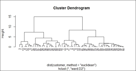
The dendrogram of hierarchical clustering using "ward.D2"
6. Additionally, you can use the single method to perform hierarchical clustering and see how the generated dendrogram differs from the previous:
7. > hc2 = hclust(dist(customer), method="single")
8. > plot(hc2, hang = -0.01, cex = 0.7)
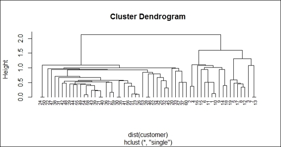
The dendrogram of hierarchical clustering using "single"
How it works...
Hierarchical clustering is a clustering technique that tries to build a hierarchy of clusters iteratively. Generally, there are two approaches to build hierarchical clusters:
· Agglomerative hierarchical clustering: This is a bottom-up approach. Each observation starts in its own cluster. We can then compute the similarity (or the distance) between each cluster and then merge the two most similar ones at each iteration until there is only one cluster left.
· Divisive hierarchical clustering: This is a top-down approach. All observations start in one cluster, and then we split the cluster into the two least dissimilar clusters recursively until there is one cluster for each observation:
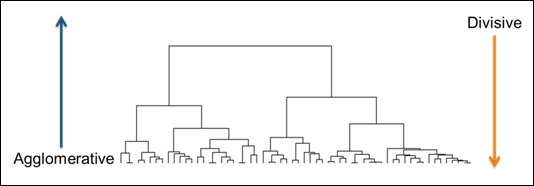
An illustration of hierarchical clustering
Before performing hierarchical clustering, we need to determine how similar the two clusters are. Here, we list some common distance functions used for the measurement of similarity:
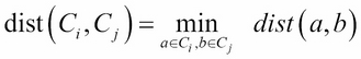
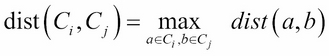
· Single linkage: This refers to the shortest distance between two points in each cluster:
· Complete linkage: This refers to the longest distance between two points in each cluster:
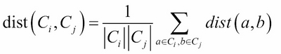
· Average linkage: This refer to the average distance between two points in each cluster (where ![]() is the size of cluster
is the size of cluster ![]() and
and ![]() is the size of cluster
is the size of cluster ![]() ):
):
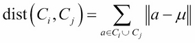
· Ward method: This refers to the sum of the squared distance from each point to the mean of the merged clusters (where ![]() is the mean vector of
is the mean vector of ![]() ):
):
In this recipe, we perform hierarchical clustering on customer data. First, we load the data from customer.csv, and then load it into the customer data frame. Within the data, we find five variables of customer account information, which are ID, number of visits, average expense, sex, and age. As the scale of each variable varies, we use the scale function to normalize the scale.
After the scales of all the attributes are normalized, we perform hierarchical clustering using the hclust function. We use the Euclidean distance as distance metrics, and use Ward's minimum variance method to perform agglomerative clustering.
Finally, we use the plot function to plot the dendrogram of hierarchical clusters. We specify hang to display labels at the bottom of the dendrogram, and use cex to shrink the label to 70 percent of the normal size. In order to compare the differences using the ward.D2 and single methods to generate a hierarchy of clusters, we draw another dendrogram using single in the preceding figure (step 6).
There's more...
You can choose a different distance measure and method while performing hierarchical clustering. For more details, you can refer to the documents for dist and hclust:
> ? dist
> ? hclust
In this recipe, we use hclust to perform agglomerative hierarchical clustering; if you would like to perform divisive hierarchical clustering, you can use the diana function:
1. First, you can use diana to perform divisive hierarchical clustering:
2. > dv = diana(customer, metric = "euclidean")
2. Then, you can use summary to obtain the summary information:
3. > summary(dv)
3. Lastly, you can plot a dendrogram and banner with the plot function:
4. > plot(dv)
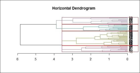
If you are interested in drawing a horizontal dendrogram, you can use the dendextend package. Use the following procedure to generate a horizontal dendrogram:
1. First, install and load the dendextend and magrittr packages (if your R version is 3.1 and above, you do not have to install and load the magrittr package):
2. > install.packages("dendextend")
3. > library(dendextend)
4. > install.packages("margrittr")
5. > library(magrittr)
2. Set up the dendrogram:
3. > dend = customer %>% dist %>% hclust %>% as.dendrogram
3. Finally, plot the horizontal dendrogram:
4. dend %>% plot(horiz=TRUE, main = "Horizontal Dendrogram")
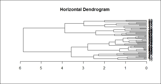
The horizontal dendrogram
Cutting trees into clusters
In a dendrogram, we can see the hierarchy of clusters, but we have not grouped data into different clusters yet. However, we can determine how many clusters are within the dendrogram and cut the dendrogram at a certain tree height to separate the data into different groups. In this recipe, we demonstrate how to use the cutree function to separate the data into a given number of clusters.
Getting ready
In order to perform the cutree function, you need to have the previous recipe completed by generating the hclust object, hc.
How to do it...
Perform the following steps to cut the hierarchy of clusters into a given number of clusters:
1. First, categorize the data into four groups:
2. > fit = cutree(hc, k = 4)
2. You can then examine the cluster labels for the data:
3. > fit
4. [1] 1 1 2 1 2 1 2 2 1 1 1 2 2 1 1 1 2 1 2 3 4 3 4 3 3 4 4 3 4
5. [30] 4 4 3 3 3 4 4 3 4 4 4 4 4 4 4 3 3 4 4 4 3 4 3 3 4 4 4 3 4
6. [59] 4 3
3. Count the number of data within each cluster:
4. > table(fit)
5. fit
6. 1 2 3 4
7. 11 8 16 25
4. Finally, you can visualize how data is clustered with the red rectangle border:
5. > plot(hc)
6. > rect.hclust(hc, k = 4 , border="red")
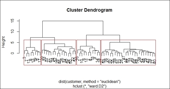
Using the red rectangle border to distinguish different clusters within the dendrogram
How it works...
We can determine the number of clusters from the dendrogram in the preceding figure. In this recipe, we determine there should be four clusters within the tree. Therefore, we specify the number of clusters as 4 in the cutreefunction. Besides using the number of clusters to cut the tree, you can specify the height as the cut tree parameter.
Next, we can output the cluster labels of the data and use the table function to count the number of data within each cluster. From the counting table, we find that most of the data is in cluster 4. Lastly, we can draw red rectangles around the clusters to show how data is categorized into the four clusters with the rect.hclust function.
There's more...
Besides drawing rectangles around all hierarchical clusters, you can place a red rectangle around a certain cluster:
> rect.hclust(hc, k = 4 , which =2, border="red")
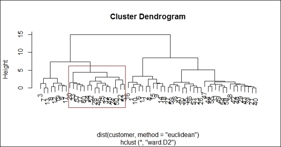
Drawing a red rectangle around a certain cluster.
Also, you can color clusters in different colors with a red rectangle around the clusters by using the dendextend package. You have to complete the instructions outlined in the There's more section of the previous recipe and perform the following steps:
1. Color the branch according to the cluster it belongs to:
2. > dend %>% color_branches(k=4) %>% plot(horiz=TRUE, main = "Horizontal Dendrogram")
2. You can then add a red rectangle around the clusters:
3. > dend %>% rect.dendrogram(k=4,horiz=TRUE)
Drawing red rectangles around clusters within a horizontal dendrogram
3. Finally, you can add a line to show the tree cutting location:
4. > abline(v = heights_per_k.dendrogram(dend)["4"] + .1, lwd = 2, lty = 2, col = "blue")
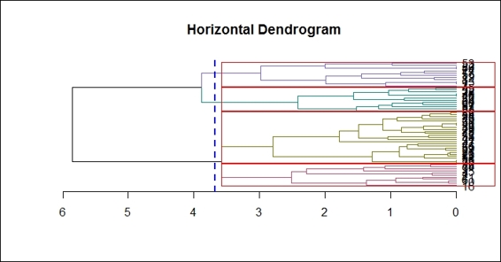
Drawing a cutting line within a horizontal dendrogram
Clustering data with the k-means method
k-means clustering is a flat clustering technique, which produces only one partition with k clusters. Unlike hierarchical clustering, which does not require a user to determine the number of clusters at the beginning, the k-means method requires this to be determined first. However, k-means clustering is much faster than hierarchical clustering as the construction of a hierarchical tree is very time consuming. In this recipe, we will demonstrate how to perform k-means clustering on the customer dataset.
Getting ready
In this recipe, we will continue to use the customer dataset as the input data source to perform k-means clustering.
How to do it...
Perform the following steps to cluster the customer dataset with the k-means method:
1. First, you can use kmeans to cluster the customer data:
2. > set.seed(22)
3. > fit = kmeans(customer, 4)
4. > fit
5. K-means clustering with 4 clusters of sizes 8, 11, 16, 25
6.
7. Cluster means:
8. Visit.Time Average.Expense Sex Age
9. 1 1.3302016 1.0155226 -1.4566845 0.5591307
10.2 -0.7771737 -0.5178412 -1.4566845 -0.4774599
11.3 0.8571173 0.9887331 0.6750489 1.0505015
12.4 -0.6322632 -0.7299063 0.6750489 -0.6411604
13.
14.Clustering vector:
15. [1] 2 2 1 2 1 2 1 1 2 2 2 1 1 2 2 2 1 2 1 3 4 3 4 3 3 4 4 3
16.[29] 4 4 4 3 3 3 4 4 3 4 4 4 4 4 4 4 3 3 4 4 4 3 4 3 3 4 4 4
17.[57] 3 4 4 3
18.
19.Within cluster sum of squares by cluster:
20.[1] 5.90040 11.97454 22.58236 20.89159
21. (between_SS / total_SS = 74.0 %)
22.
23.Available components:
24.
25.[1] "cluster" "centers" "totss"
26.[4] "withinss" "tot.withinss" "betweenss"
27.[7] "size" "iter" "ifault
2. You can then inspect the center of each cluster using barplot:
3. > barplot(t(fit$centers), beside = TRUE,xlab="cluster", ylab="value")
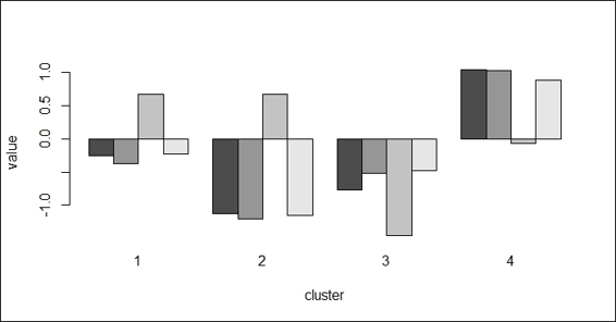
The barplot of centers of different attributes in four clusters
3. Lastly, you can draw a scatter plot of the data and color the points according to the clusters:
4. > plot(customer, col = fit$cluster)
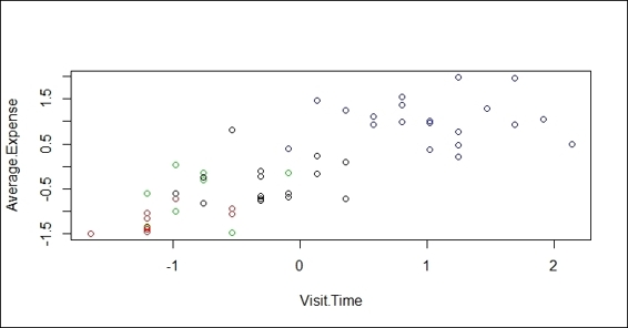
The scatter plot showing data colored with regard to its cluster label
How it works...
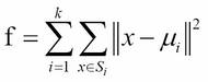
k-means clustering is a method of partitioning clustering. The goal of the algorithm is to partition n objects into k clusters, where each object belongs to the cluster with the nearest mean. The objective of the algorithm is to minimize the within-cluster sum of squares (WCSS). Assuming x is the given set of observations, S = ![]() denotes k partitions, and
denotes k partitions, and ![]() is the mean of
is the mean of ![]() , then we can formulate the WCSS function as follows:
, then we can formulate the WCSS function as follows:
The process of k-means clustering can be illustrated by the following five steps:
1. Specify the number of k clusters.
2. Randomly create k partitions.
3. Calculate the center of the partitions.
4. Associate objects closest to the cluster center.
5. Repeat steps 2, 3, and 4 until the WCSS changes very little (or is minimized).
In this recipe, we demonstrate how to use k-means clustering to cluster customer data. In contrast to hierarchical clustering, k-means clustering requires the user to input the number of K. In this example, we use K=4. Then, the output of a fitted model shows the size of each cluster, the cluster means of four generated clusters, the cluster vectors with regard to each data point, the within cluster sum of squares by the clusters, and other available components.
Further, you can draw the centers of each cluster in a bar plot, which will provide more details on how each attribute affects the clustering. Lastly, we plot the data point in a scatter plot and use the fitted cluster labels to assign colors with regard to the cluster label.
See also
· In k-means clustering, you can specify the algorithm used to perform clustering analysis. You can specify either Hartigan-Wong, Lloyd, Forgy, or MacQueen as the clustering algorithm. For more details, please use the helpfunction to refer to the document for the kmeans function:
· >help(kmeans)
Drawing a bivariate cluster plot
In the previous recipe, we employed the k-means method to fit data into clusters. However, if there are more than two variables, it is impossible to display how data is clustered in two dimensions. Therefore, you can use a bivariate cluster plot to first reduce variables into two components, and then use components, such as axis and circle, as clusters to show how data is clustered. In this recipe, we will illustrate how to create a bivariate cluster plot.
Getting ready
In this recipe, we will continue to use the customer dataset as the input data source to draw a bivariate cluster plot.
How to do it...
Perform the following steps to draw a bivariate cluster plot:
1. Install and load the cluster package:
2. > install.packages("cluster")
3. > library(cluster)
2. You can then draw a bivariate cluster plot:
3. > clusplot(customer, fit$cluster, color=TRUE, shade=TRUE)
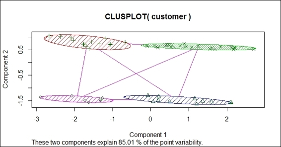
The bivariate clustering plot of the customer dataset
3. You can also zoom into the bivariate cluster plot:
4. > par(mfrow= c(1,2))
5. > clusplot(customer, fit$cluster, color=TRUE, shade=TRUE)
6. > rect(-0.7,-1.7, 2.2,-1.2, border = "orange", lwd=2)
7. > clusplot(customer, fit$cluster, color = TRUE, xlim = c(-0.7,2.2), ylim = c(-1.7,-1.2))
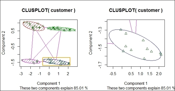
The zoom-in of the bivariate clustering plot
How it works...
In this recipe, we draw a bivariate cluster plot to show how data is clustered. To draw a bivariate cluster plot, we first need to install the cluster package and load it into R. We then use the clusplot function to draw a bivariate cluster plot from a customer dataset. In the clustplot function, we can set shade to TRUE and color to TRUE to display a cluster with colors and shades. As per the preceding figure (step 2) we found that the bivariate uses two components, which explains 85.01 percent of point variability, as the x-axis and y-axis. The data points are then scattered on the plot in accordance with component 1 and component 2. Data within the same cluster is circled in the same color and shade.
Besides drawing the four clusters in a single plot, you can use rect to add a rectangle around a specific area within a given x-axis and y-axis range. You can then zoom into the plot to examine the data within each cluster by using xlim and ylim in the clusplot function.
There's more
The clusplot function uses princomp and cmdscale to reduce the original feature dimension to the principal component. Therefore, one can see how data is clustered in a single plot with these two components as the x-axis and y-axis. To learn more about princomp and cmdscale, one can use the help function to view related documents:
> help(cmdscale)
> help(princomp)
For those interested in how to use cmdscale to reduce the dimensions, please perform the following steps:
> mds = cmdscale(dist(customer), k = 2)
> plot(mds, col = fit$cluster)
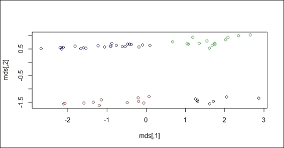
The scatter plot of data with regard to scaled dimensions
Comparing clustering methods
After fitting data into clusters using different clustering methods, you may wish to measure the accuracy of the clustering. In most cases, you can use either intracluster or intercluster metrics as measurements. We now introduce how to compare different clustering methods using cluster.stat from the fpc package.
Getting ready
In order to perform a clustering method comparison, one needs to have the previous recipe completed by generating the customer dataset.
How to do it...
Perform the following steps to compare clustering methods:
1. First, install and load the fpc package:
2. > install.packages("fpc")
3. > library(fpc)
2. You then need to use hierarchical clustering with the single method to cluster customer data and generate the object hc_single:
3. > single_c = hclust(dist(customer), method="single")
4. > hc_single = cutree(single_c, k = 4)
3. Use hierarchical clustering with the complete method to cluster customer data and generate the object hc_complete:
4. > complete_c = hclust(dist(customer), method="complete")
5. > hc_complete = cutree(complete_c, k = 4)
4. You can then use k-means clustering to cluster customer data and generate the object km:
5. > set.seed(22)
6. > km = kmeans(customer, 4)
5. Next, retrieve the cluster validation statistics of either clustering method:
6. > cs = cluster.stats(dist(customer), km$cluster)
6. Most often, we focus on using within.cluster.ss and avg.silwidth to validate the clustering method:
7. > cs[c("within.cluster.ss","avg.silwidth")]
8. $within.cluster.ss
9. [1] 61.3489
10.
11.$avg.silwidth
12.[1] 0.4640587
7. Finally, we can generate the cluster statistics of each clustering method and list them in a table:
8. > sapply(list(kmeans = km$cluster, hc_single = hc_single, hc_complete = hc_complete), function(c) cluster.stats(dist(customer), c)[c("within.cluster.ss","avg.silwidth")])
9. kmeans hc_single hc_complete
10.within.cluster.ss 61.3489 136.0092 65.94076
11.avg.silwidth 0.4640587 0.2481926 0.4255961
How it works...
In this recipe, we demonstrate how to validate clusters. To validate a clustering method, we often employ two techniques: intercluster distance and intracluster distance. In these techniques, the higher the intercluster distance, the better it is, and the lower the intracluster distance, the better it is. In order to calculate related statistics, we can apply cluster.stat from the fpc package on the fitted clustering object.
From the output, the within.cluster.ss measurement stands for the within clusters sum of squares, and avg.silwidth represents the average silhouette width. The within.cluster.ss measurement shows how closely related objects are in clusters; the smaller the value, the more closely related objects are within the cluster. On the other hand, a silhouette is a measurement that considers how closely related objects are within the cluster and how clusters are separated from each other. Mathematically, we can define the silhouette width for each point x as follows:
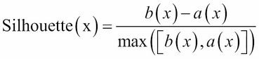
In the preceding equation, a(x) is the average distance between x and all other points within the cluster, and b(x) is the minimum of the average distances between x and the points in the other clusters. The silhouette value usually ranges from 0 to 1; a value closer to 1 suggests the data is better clustered.
The summary table generated in the last step shows that the complete hierarchical clustering method outperforms a single hierarchical clustering method and k-means clustering in within.cluster.ss and avg.silwidth.
See also
· The kmeans function also outputs statistics (for example, withinss and betweenss) for users to validate a clustering method:
· > set.seed(22)
· > km = kmeans(customer, 4)
· > km$withinss
· [1] 5.90040 11.97454 22.58236 20.89159
· > km$betweenss
· [1] 174.6511
Extracting silhouette information from clustering
Silhouette information is a measurement to validate a cluster of data. In the previous recipe, we mentioned that the measurement of a cluster involves the calculation of how closely the data is clustered within each cluster, and measures how far different clusters are apart from each other. The silhouette coefficient combines the measurement of the intracluster and intercluster distance. The output value typically ranges from 0 to 1; the closer to 1, the better the cluster is. In this recipe, we will introduce how to compute silhouette information.
Getting ready
In order to extract the silhouette information from a cluster, you need to have the previous recipe completed by generating the customer dataset.
How to do it...
Perform the following steps to compute the silhouette information:
1. Use kmeans to generate a k-means object, km:
2. > set.seed(22)
3. > km = kmeans(customer, 4)
2. You can then compute the silhouette information:
3. > kms = silhouette(km$cluster,dist(customer))
4. > summary(kms)
5. Silhouette of 60 units in 4 clusters from silhouette.default(x = km$cluster, dist = dist(customer)) :
6. Cluster sizes and average silhouette widths:
7. 8 11 16 25
8. 0.5464597 0.4080823 0.3794910 0.5164434
9. Individual silhouette widths:
10. Min. 1st Qu. Median Mean 3rd Qu. Max.
11. 0.1931 0.4030 0.4890 0.4641 0.5422 0.6333
3. Next, you can plot the silhouette information:
4. > plot(kms)
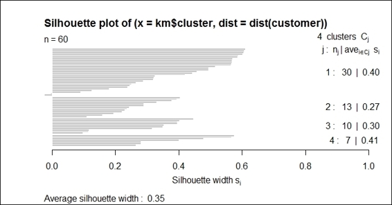
The silhouette plot of the k-means clustering result
How it works...
In this recipe, we demonstrate how to use the silhouette plot to validate clusters. You can first retrieve the silhouette information, which shows cluster sizes, the average silhouette widths, and individual silhouette widths. The silhouette coefficient is a value ranging from 0 to 1; the closer to 1, the better the quality of the cluster.
Lastly, we use the plot function to draw a silhouette plot. The left-hand side of the plot shows the number of horizontal lines, which represent the number of clusters. The right-hand column shows the mean similarity of the plot of its own cluster minus the mean similarity of the next similar cluster. The average silhouette width is presented at the bottom of the plot.
See also
· For those interested in how silhouettes are computed, please refer to the Wikipedia entry for Silhouette Value: http://en.wikipedia.org/wiki/Silhouette_%28clustering%29
Obtaining the optimum number of clusters for k-means
While k-means clustering is fast and easy to use, it requires k to be the input at the beginning. Therefore, we can use the sum of squares to determine which k value is best for finding the optimum number of clusters for k-means. In the following recipe, we will discuss how to find the optimum number of clusters for the k-means clustering method.
Getting ready
In order to find the optimum number of clusters, you need to have the previous recipe completed by generating the customer dataset.
How to do it...
Perform the following steps to find the optimum number of clusters for the k-means clustering:
1. First, calculate the within sum of squares (withinss) of different numbers of clusters:
2. > nk = 2:10
3. > set.seed(22)
4. > WSS = sapply(nk, function(k) {
5. + kmeans(customer, centers=k)$tot.withinss
6. + })
7. > WSS
8. [1] 123.49224 88.07028 61.34890 48.76431 47.20813
9. [6] 45.48114 29.58014 28.87519 23.21331
2. You can then use a line plot to plot the within sum of squares with a different number of k:
3. > plot(nk, WSS, type="l", xlab= "number of k", ylab="within sum of squares")
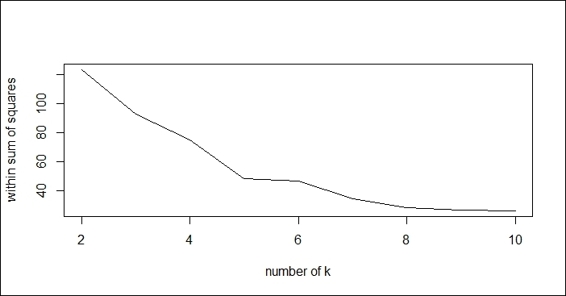
The line plot of the within sum of squares with regard to the different number of k
3. Next, you can calculate the average silhouette width (avg.silwidth) of different numbers of clusters:
4. > SW = sapply(nk, function(k) {
5. + cluster.stats(dist(customer), kmeans(customer, centers=k)$cluster)$avg.silwidth
6. + })
7. > SW
8. [1] 0.4203896 0.4278904 0.4640587 0.4308448 0.3481157
9. [6] 0.3320245 0.4396910 0.3417403 0.4070539
4. You can then use a line plot to plot the average silhouette width with a different number of k:
5. > plot(nk, SW, type="l", xlab="number of clusers", ylab="average silhouette width")
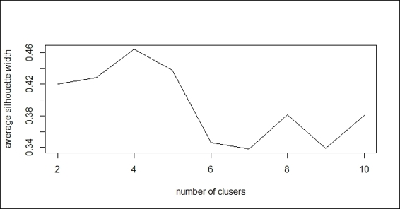
The line plot of average silhouette width with regard to the different number of k
5. Retrieve the maximum number of clusters:
6. > nk[which.max(SW)]
7. [1] 4
How it works...
In this recipe, we demonstrate how to find the optimum number of clusters by iteratively getting within the sum of squares and the average silhouette value. For the within sum of squares, lower values represent clusters with better quality. By plotting the within sum of squares in regard to different number of k, we find that the elbow of the plot is at k=4.
On the other hand, we also compute the average silhouette width based on the different numbers of clusters using cluster.stats. Also, we can use a line plot to plot the average silhouette width with regard to the different numbers of clusters. The preceding figure (step 4) shows the maximum average silhouette width appears at k=4. Lastly, we use which.max to obtain the value of k to determine the location of the maximum average silhouette width.
See also
· For those interested in how the within sum of squares is computed, please refer to the Wikipedia entry of K-means clustering: http://en.wikipedia.org/wiki/K-means_clustering
Clustering data with the density-based method
As an alternative to distance measurement, you can use a density-based measurement to cluster data. This method finds an area with a higher density than the remaining area. One of the most famous methods is DBSCAN. In the following recipe, we will demonstrate how to use DBSCAN to perform density-based clustering.
Getting ready
In this recipe, we will use simulated data generated from the mlbench package.
How to do it...
Perform the following steps to perform density-based clustering:
1. First, install and load the fpc and mlbench packages:
2. > install.packages("mlbench")
3. > library(mlbench)
4. > install.packages("fpc")
5. > library(fpc)
2. You can then use the mlbench library to draw a Cassini problem graph:
3. > set.seed(2)
4. > p = mlbench.cassini(500)
5. > plot(p$x)
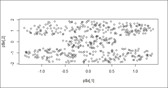
The Cassini problem graph
3. Next, you can cluster data with regard to its density measurement:
4. > ds = dbscan(dist(p$x),0.2, 2, countmode=NULL, method="dist")
5. > ds
6. dbscan Pts=500 MinPts=2 eps=0.2
7. 1 2 3
8. seed 200 200 100
9. total 200 200 100
4. Plot the data in a scatter plot with different cluster labels as the color:
5. > plot(ds, p$x)
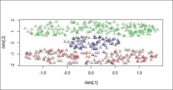
The data scatter plot colored with regard to the cluster label
5. You can also use dbscan to predict which cluster the data point belongs to. In this example, first make three inputs in the matrix p:
6. > y = matrix(0,nrow=3,ncol=2)
7. > y[1,] = c(0,0)
8. > y[2,] = c(0,-1.5)
9. > y[3,] = c(1,1)
10.> y
11. [,1] [,2]
12.[1,] 0 0.0
13.[2,] 0 -1.5
14.[3,] 1 1.0
6. You can then predict which cluster the data belongs to:
7. > predict(ds, p$x, y)
8. [1] 3 1 2
How it works...
Density-based clustering uses the idea of density reachability and density connectivity, which makes it very useful in discovering a cluster in nonlinear shapes. Before discussing the process of density-based clustering, some important background concepts must be explained. Density-based clustering takes two parameters into account: eps and MinPts. eps stands for the maximum radius of the neighborhood; MinPts denotes the minimum number of points within the eps neighborhood. With these two parameters, we can define the core point as having points more than MinPts within eps. Also, we can define the board point as having points less than MinPts, but is in the neighborhood of the core points. Then, we can define the core object as if the number of points in the eps-neighborhood of p is more than MinPts.
Furthermore, we have to define the reachability between two points. We can say that a point, p, is directly density reachable from another point, q, if q is within the eps-neighborhood of p and p is a core object. Then, we can define that a point, p, is generic and density reachable from the point q, if there exists a chain of points, p1,p2...,pn, where p1 = q, pn = p, and pi+1 is directly density reachable from pi with regard to Eps and MinPts for 1 <= i <= n:
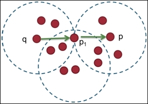
Point p and q is density reachable
With a preliminary concept of density-based clustering, we can then illustrate the process of DBSCAN, the most popular density-based clustering, as shown in these steps:
1. Randomly select a point, p.
2. Retrieve all the points that are density-reachable from p with regard to Eps and MinPts.
3. If p is a core point, then a cluster is formed. Otherwise, if it is a board point and no points are density reachable from p, the process will mark the point as noise and continue visiting the next point.
4. Repeat the process until all points have been visited.
In this recipe, we demonstrate how to use the DBSCAN density-based method to cluster customer data. First, we have to install and load the mlbench and fpc libraries. The mlbench package provides many methods to generate simulated data with different shapes and sizes. In this example, we generate a Cassini problem graph.
Next, we perform dbscan on a Cassini dataset to cluster the data. We specify the reachability distance as 0.2, the minimum reachability number of points to 2, the progress reporting as null, and use distance as a measurement. The clustering method successfully clusters data into three clusters with sizes of 200, 200, and 100. By plotting the points and cluster labels on the plot, we see that three sections of the Cassini graph are separated in different colors.
The fpc package also provides a predict function, and you can use this to predict the cluster labels of the input matrix. Point c(0,0) is classified into cluster 3, point c(0, -1.5) is classified into cluster 1, and point c(1,1) is classified into cluster 2.
See also
· The fpc package contains flexible procedures of clustering, and has useful clustering analysis functions. For example, you can generate a discriminant projection plot using the plotcluster function. For more information, please refer to the following document:
· > help(plotcluster)
Clustering data with the model-based method
In contrast to hierarchical clustering and k-means clustering, which use a heuristic approach and do not depend on a formal model. Model-based clustering techniques assume varieties of data models and apply an EM algorithm to obtain the most likely model, and further use the model to infer the most likely number of clusters. In this recipe, we will demonstrate how to use the model-based method to determine the most likely number of clusters.
Getting ready
In order to perform a model-based method to cluster customer data, you need to have the previous recipe completed by generating the customer dataset.
How to do it...
Perform the following steps to perform model-based clustering:
1. First, please install and load the library mclust:
2. > install.packages("mclust")
3. > library(mclust)
2. You can then perform model-based clustering on the customer dataset:
3. > mb = Mclust(customer)
4. > plot(mb)
3. Then, you can press 1 to obtain the BIC against a number of components:
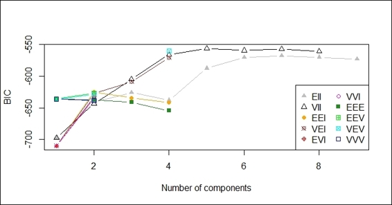
Plot of BIC against number of components
4. Then, you can press 2 to show the classification with regard to different combinations of features:
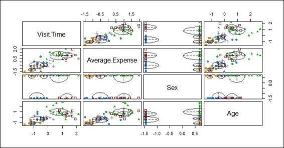
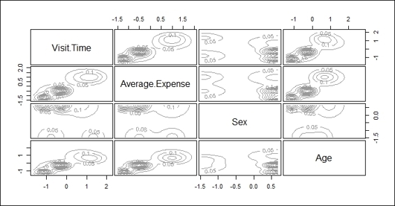
Plot showing classification with regard to different combinations of features
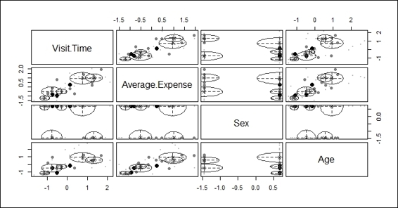
5. Press 3 to show the classification uncertainty with regard to different combinations of features:
Plot showing classification uncertainty with regard to different combinations of features
6. Next, press 4 to plot the density estimation:
A plot of density estimation
7. Then, you can press 0 to plot density to exit the plotting menu.
8. Lastly, use the summary function to obtain the most likely model and number of clusters:
9. > summary(mb)
10.----------------------------------------------------
11.Gaussian finite mixture model fitted by EM algorithm
12.----------------------------------------------------
13.
14.Mclust VII (spherical, varying volume) model with 5 components:
15.
16. log.likelihood n df BIC ICL
17. -218.6891 60 29 -556.1142 -557.2812
18.
19.Clustering table:
20. 1 2 3 4 5
21.11 8 17 14 10
How it works...
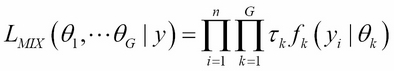
Instead of taking a heuristic approach to build a cluster, model-based clustering uses a probability-based approach. Model-based clustering assumes that the data is generated by an underlying probability distribution and tries to recover the distribution from the data. One common model-based approach is using finite mixture models, which provide a flexible modeling framework for the analysis of the probability distribution. Finite mixture models are a linearly weighted sum of component probability distribution. Assume the data y=(y1,y2…yn) contains n independent and multivariable observations; G is the number of components; the likelihood of finite mixture models can be formulated as:
Where ![]() and
and ![]() are the density and parameters of the kth component in the mixture, and
are the density and parameters of the kth component in the mixture, and ![]() (
(![]() and
and ![]() ) is the probability that an observation belongs to the kth component.
) is the probability that an observation belongs to the kth component.
The process of model-based clustering has several steps: First, the process selects the number and types of component probability distribution. Then, it fits a finite mixture model and calculates the posterior probabilities of a component membership. Lastly, it assigns the membership of each observation to the component with the maximum probability.
In this recipe, we demonstrate how to use model-based clustering to cluster data. We first install and load the Mclust library into R. We then fit the customer data into the model-based method by using the Mclust function.
After the data is fit into the model, we plot the model based on clustering results. There are four different plots: BIC, classification, uncertainty, and density plots. The BIC plot shows the BIC value, and one can use this value to choose the number of clusters. The classification plot shows how data is clustered in regard to different dimension combinations. The uncertainty plot shows the uncertainty of classifications in regard to different dimension combinations. The density plot shows the density estimation in contour.
You can also use the summary function to obtain the most likely model and the most possible number of clusters. For this example, the most possible number of clusters is five, with a BIC value equal to -556.1142.
See also
· For those interested in detail on how Mclust works, please refer to the following source: C. Fraley, A. E. Raftery, T. B. Murphy and L. Scrucca (2012). mclust Version 4 for R: Normal Mixture Modeling for Model-Based Clustering, Classification, and Density Estimation. Technical Report No. 597, Department of Statistics, University of Washington.
Visualizing a dissimilarity matrix
A dissimilarity matrix can be used as a measurement for the quality of a cluster. To visualize the matrix, we can use a heat map on a distance matrix. Within the plot, entries with low dissimilarity (or high similarity) are plotted darker, which is helpful to identify hidden structures in the data. In this recipe, we will discuss some techniques that are useful to visualize a dissimilarity matrix.
Getting ready
In order to visualize the dissimilarity matrix, you need to have the previous recipe completed by generating the customer dataset. In addition to this, a k-means object needs to be generated and stored in the variable km.
How to do it...
Perform the following steps to visualize the dissimilarity matrix:
1. First, install and load the seriation package:
2. > install.packages("seriation")
3. > library(seriation)
2. You can then use dissplot to visualize the dissimilarity matrix in a heat map:
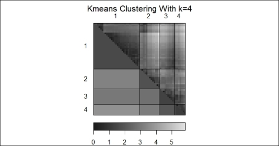
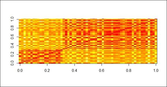
3. > dissplot(dist(customer), labels=km$cluster, options=list(main="Kmeans Clustering With k=4"))
A dissimilarity plot of k-means clustering
3. Next, apply dissplot on hierarchical clustering in the heat map:
4. > complete_c = hclust(dist(customer), method="complete")
5. > hc_complete = cutree(complete_c, k = 4)
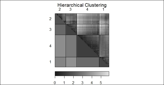
6. > dissplot(dist(customer), labels=hc_complete, options=list(main="Hierarchical Clustering"))
A dissimilarity plot of hierarchical clustering
How it works...
In this recipe, we use a dissimilarity plot to visualize the dissimilarity matrix. We first install and load the package seriation, and then apply the dissplot function on the k-means clustering output, generating the preceding figure (step 2).
It shows that clusters similar to each other are plotted darker, and dissimilar combinations are plotted lighter. Therefore, we can see clusters against their corresponding clusters (such as cluster 4 to cluster 4) are plotted diagonally and darker. On the other hand, clusters dissimilar to each other are plotted lighter and away from the diagonal.
Likewise, we can apply the dissplot function on the output of hierarchical clustering. The generated plot in the figure (step 3) shows the similarity of each cluster in a single heat map.
There's more...
Besides using dissplot to visualize the dissimilarity matrix, one can also visualize a distance matrix by using the dist and image functions. In the resulting graph, closely related entries are plotted in red. Less related entries are plotted closer to white:
> image(as.matrix(dist(customer)))
A distance matrix plot of customer dataset
In order to plot both a dendrogram and heat map to show how data is clustered, you can use the heatmap function:
> cd=dist(customer)
> hc=hclust(cd)
> cdt=dist(t(customer))
> hcc=hclust(cdt)
> heatmap(customer, Rowv=as.dendrogram(hc), Colv=as.dendrogram(hcc))
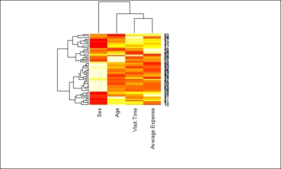
A heat map with dendrogram on the column and row side
Validating clusters externally
Besides generating statistics to validate the quality of the generated clusters, you can use known data clusters as the ground truth to compare different clustering methods. In this recipe, we will demonstrate how clustering methods differ with regard to data with known clusters.
Getting ready
In this recipe, we will continue to use handwriting digits as clustering inputs; you can find the figure on the author's Github page: https://github.com/ywchiu/ml_R_cookbook/tree/master/CH9.
How to do it...
Perform the following steps to cluster digits with different clustering techniques:
1. First, you need to install and load the package png:
2. > install.packages("png")
3. > library(png)
2. Then, please read images from handwriting.png and transform the read data into a scatter plot:
3. > img2 = readPNG("handwriting.png", TRUE)
4. > img3 = img2[,nrow(img2):1]
5. > b = cbind(as.integer(which(img3 < -1) %% 28), which(img3 < -1) / 28)
6. > plot(b, xlim=c(1,28), ylim=c(1,28))
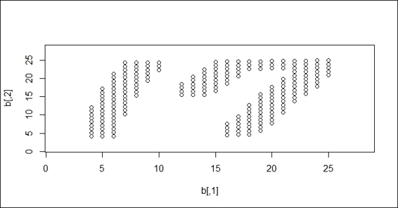
A scatter plot of handwriting digits
3. Perform a k-means clustering method on the handwriting digits:
4. > set.seed(18)
5. > fit = kmeans(b, 2)
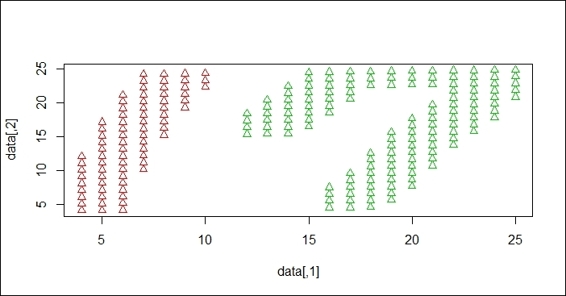
6. > plot(b, col=fit$cluster)
7. > plot(b, col=fit$cluster, xlim=c(1,28), ylim=c(1,28))
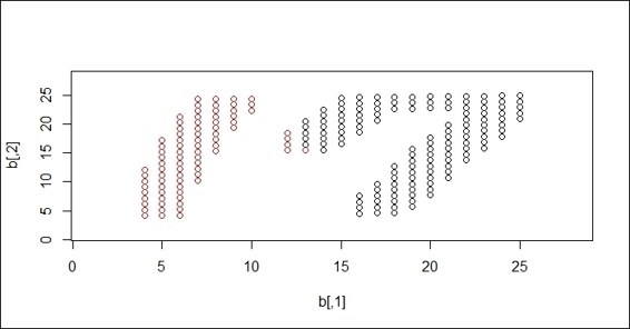
k-means clustering result on handwriting digits
4. Next, perform the dbscan clustering method on the handwriting digits:
5. > ds = dbscan(b, 2)
6. > ds
7. dbscan Pts=212 MinPts=5 eps=2
8. 1 2
9. seed 75 137
10.total 75 137
11.> plot(ds, b, xlim=c(1,28), ylim=c(1,28))
DBSCAN clustering result on handwriting digits
How it works...
In this recipe, we demonstrate how different clustering methods work in regard to a handwriting dataset. The aim of the clustering is to separate 1 and 7 into different clusters. We perform different techniques to see how data is clustered in regard to the k-means and DBSCAN methods.
To generate the data, we use the Windows application paint.exe to create a PNG file with dimensions of 28 x 28 pixels. We then read the PNG data using the readPNG function and transform the read PNG data points into a scatter plot, which shows the handwriting digits in 17.
After the data is read, we perform clustering techniques on the handwriting digits. First, we perform k-means clustering, where k=2 on the dataset. Since k-means clustering employs distance measures, the constructed clusters cover the area of both the 1 and 7 digits. We then perform DBSCAN on the dataset. As DBSCAN is a density-based clustering technique, it successfully separates digit 1 and digit 7 into different clusters.
See also
· If you are interested in how to read various graphic formats in R, you may refer to the following document:
· > help(package="png")
All materials on the site are licensed Creative Commons Attribution-Sharealike 3.0 Unported CC BY-SA 3.0 & GNU Free Documentation License (GFDL)
If you are the copyright holder of any material contained on our site and intend to remove it, please contact our site administrator for approval.
© 2016-2026 All site design rights belong to S.Y.A.