R Recipes: A Problem-Solution Approach (2014)
Chapter 14. Working with Financial Data
Individuals and organizations work with financial data on a daily basis. While accountants are interested in money from an accrual basis, individuals and financial managers in organizations are usually more interested in money from a cash basis. That is, they are interested in revenues and expenses only with respect to the actual inflows and outflows of cash. Both individuals and organizations maintain solvency by acquiring the cash flows necessary to satisfy their obligations and to obtain the assets needed to achieve their goals. In this chapter, you will learn how to use R to analyze financial data, and we will primarily adopt the perspective of cash flow rather than accrual.
Recipe 14-1. Getting and Visualizing Financial Data
Problem
Financial data are everywhere, but often may seem inaccessible. You learned in Chapter 7 that you can retrieve financial information such as stock prices from the Yahoo! Finance web site. The Internet provides a wide variety of financial data ripe for the plucking. Those who invest in stock and other equities need to be able to visualize the patterns of change over time, and one of the best ways to do that is to use various charts, such as the bar chart, the candle chart (which bears a superficial resemblance to a boxplot), and the line chart. The quantmod package provides charts—both alone and in combination, as you will observe next.
Solution
You can use R to analyze financial data of various sorts. The quantmod package provides many options for analyzing stock data. Let us use Yahoo! Finance as the source to retrieve Netflix stock information from January 2007 to September 2014. The getSymbols function loads the data directly into the R workspace:
> install.packages("quantmod")
> library(quantmod)
> getSymbols("NFLX", src = "yahoo")
[1] "NFLX"
> head(NFLX)
NFLX.Open NFLX.High NFLX.Low NFLX.Close NFLX.Volume NFLX.Adjusted
2007-01-03 26.00 26.77 25.74 26.61 2348700 26.61
2007-01-04 26.41 26.80 25.10 25.35 2279900 25.35
2007-01-05 25.34 25.34 24.45 24.81 2170100 24.81
2007-01-08 24.82 24.89 23.57 23.83 2620700 23.83
2007-01-09 23.99 24.08 23.52 23.99 1515900 23.99
2007-01-10 23.97 24.25 23.88 24.07 1635500 24.07
> tail(NFLX)
NFLX.Open NFLX.High NFLX.Low NFLX.Close NFLX.Volume NFLX.Adjusted
2014-09-23 441.23 448.01 440.50 443.90 1638800 443.90
2014-09-24 444.46 451.66 442.54 450.56 1364500 450.56
2014-09-25 449.90 452.35 442.42 443.49 1405700 443.49
2014-09-26 445.00 450.64 443.89 448.75 1486400 448.75
2014-09-29 444.07 450.54 442.02 449.56 1359500 449.56
2014-09-30 452.30 457.19 449.80 451.18 1781800 451.18
We see the traditional open, high, low, close (OHLC) data for each trading day, along with the daily trading volume and the adjusted closing price. Let us restrict our data to the second quarter of 2014 in order to get a better view of some of the charting options available in quantmod. It is very easy to subset the data by year and month, as follows. Note the use of the::operator to select the range of dates.
> NFLX2Q <- NFLX["2014-04::2014-06"] # April 2014 through June 2014
> head(NFLX2Q)
NFLX.Open NFLX.High NFLX.Low NFLX.Close NFLX.Volume NFLX.Adjusted
2014-04-01 351.75 365.25 351.74 364.69 3048400 364.69
2014-04-02 365.66 371.05 358.30 362.88 3456300 362.88
2014-04-03 361.33 365.10 350.10 354.69 3140500 354.69
2014-04-04 355.45 356.00 335.88 337.31 4994000 337.31
2014-04-07 340.51 348.19 331.11 338.00 5335900 338.00
2014-04-08 340.05 350.79 338.39 348.89 3680200 348.89
> tail(NFLX2Q)
NFLX.Open NFLX.High NFLX.Low NFLX.Close NFLX.Volume NFLX.Adjusted
2014-06-23 439.36 441.86 435.55 439.52 1524700 439.52
2014-06-24 438.05 449.94 435.50 436.36 2909600 436.36
2014-06-25 435.00 444.76 433.33 444.21 2250300 444.21
2014-06-26 440.79 442.14 436.75 439.61 2033900 439.61
2014-06-27 438.32 443.19 437.40 442.08 2226800 442.08
Figure 14-1 is a candle chart for the selected period. The color scheme chosen (multi.col = TRUE) means the following (taken from the function documentation): a “gray candle” means that the opening price is lower than the closing price on two consecutive trading days; a white one means the opening price is lower than the closing price on the second day, but higher than the closing price on the previous day; red means the opening price is higher than the closing price on the second day, but lower on the previous day; and black means the opening price is higher than the closing price on both trading days (see Figure 14-1). The argument TA = NULL removes the overlay, which defaults to a volume chart.
· gray => Op[t] < Cl[t] and Op[t] < Cl[t-1]
· white => Op[t] < Cl[t] and Op[t] > Cl[t-1]
· red => Op[t] > Cl[t] and Op[t] < Cl[t-1]
· black => Op[t] > Cl[t] and Op[t] > Cl[t-1]
> candleChart(NFLX2Q, multi.col = TRUE, theme = "white", TA = NULL)
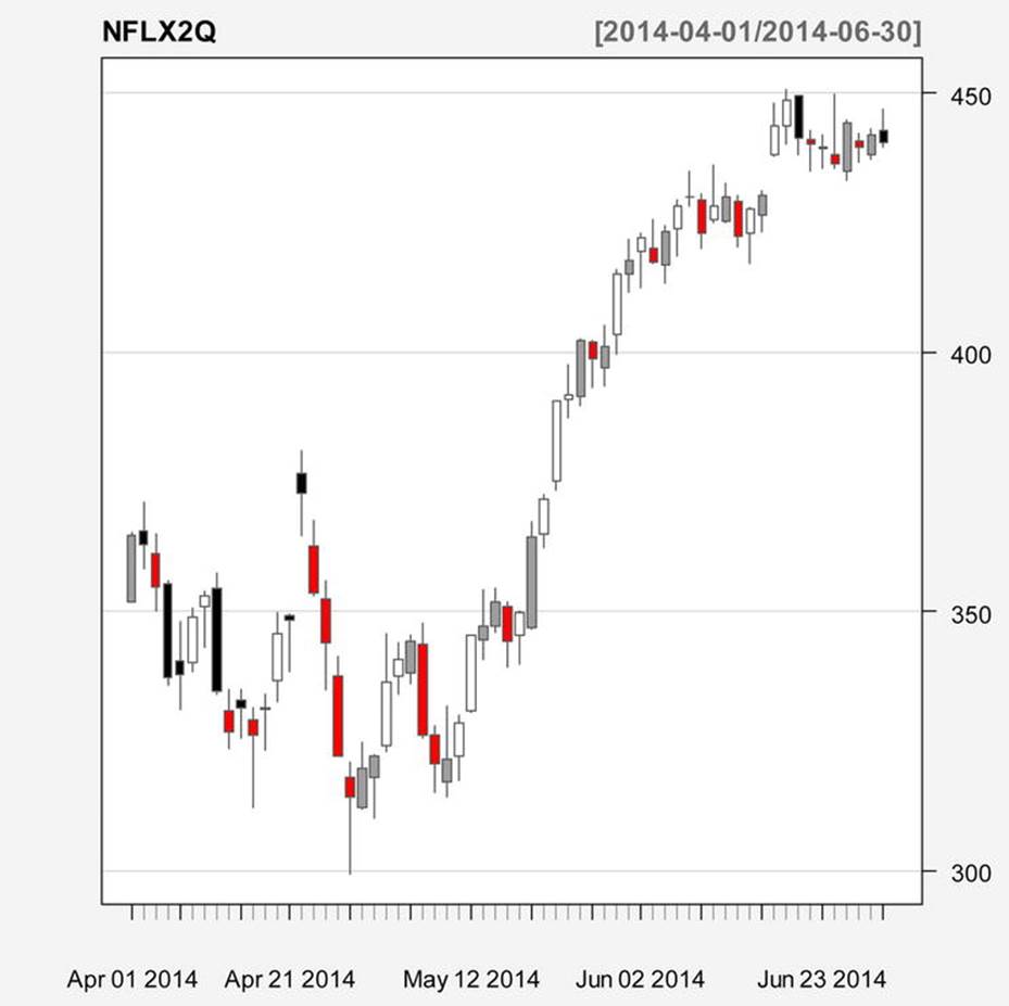
Figure 14-1. Candle chart for Netflix stock prices, 2nd quarter 2014
A bar chart is similarly easily implemented (see Figure 14-2). In order to see the white bars, let us replace the “white” theme with the “black” theme:
> barChart(NFLX2Q, multi.col = TRUE, theme = "black", bar.type = "hlc", TA = NULL)
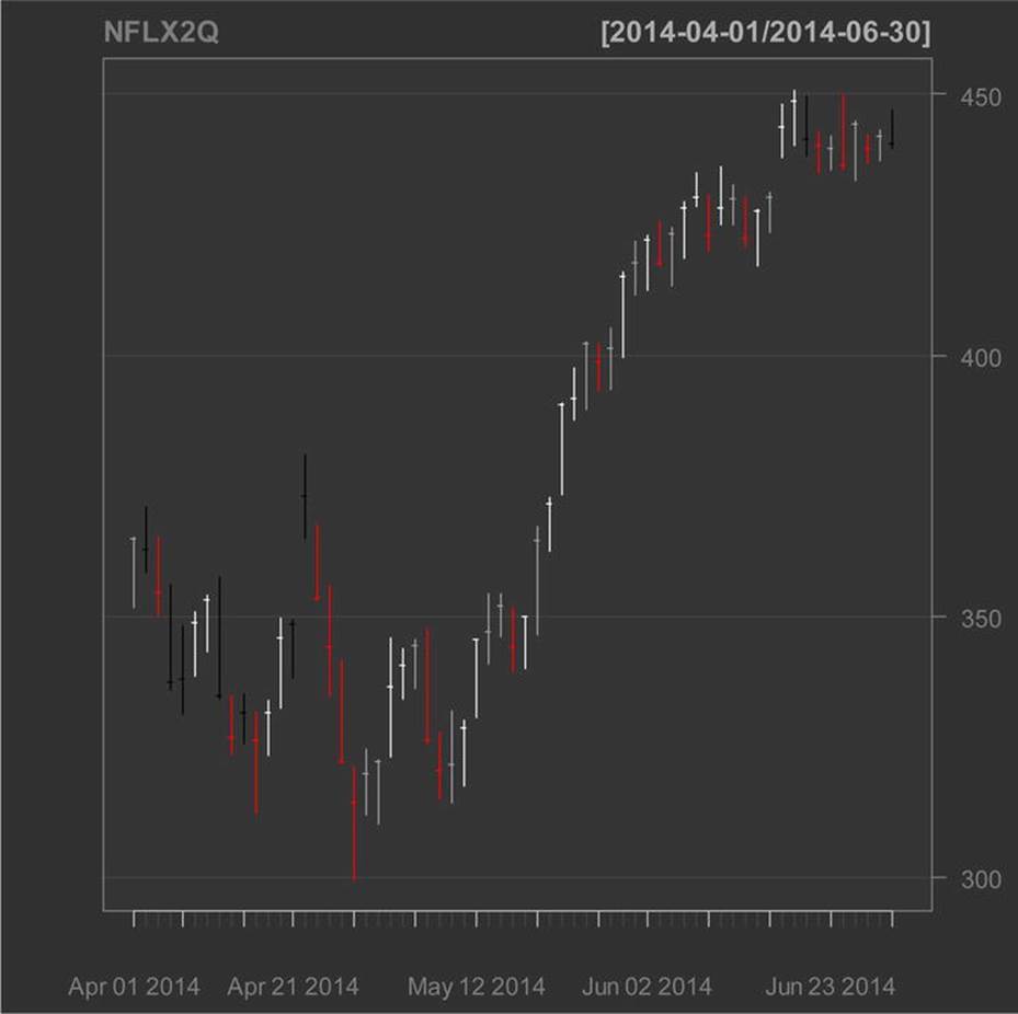
Figure 14-2. Bar chart for 2nd quarter 2014 Netflix stock prices
Note that the “bar chart” is not a bar graph in the traditional sense, but a plot for each trading day of the high, low, and closing price of the stock. We use the same color scheme for the bar chart and the candle chart. The line chart (not shown) has similar options. The chartSeriesfunction combines charts as follows (see Figure 14-3).
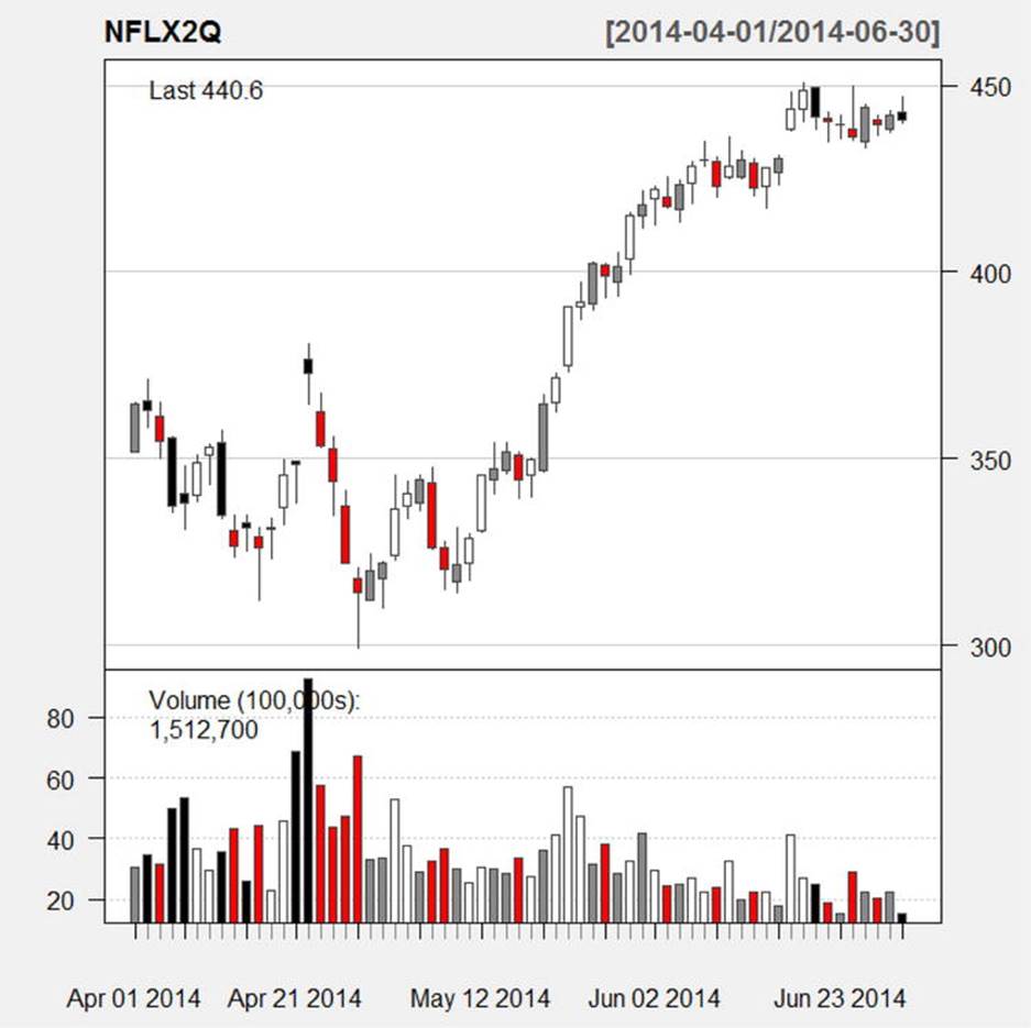
Figure 14-3. A combined candle and volume chart produced by the chartSeries function
Recipe 14-2. Analyzing Stock Returns
Problem
Making good investment decisions involves understanding risk and reward, and balancing the two. Many factors are at play in the decision to invest, including the time frame, the person’s age (or the organization’s purpose for the investment), the expected return, and the tax implications of the investment. R provides tools to help a person or an organization make sound investment decisions.
Solution
We continue with our use of the quantmod package, but also explore other packages that focus on financial applications and analysis. Let us examine the performance of Netflix stock and determine if investing in Netflix is a good investment. In the process, we will examine the simple return and the continuously compounded return on our investment in Netflix.
We have the following data (taken from Yahoo! Finance, as discussed earlier), which represent the OHLC data for Netflix stock on a monthly basis from May 2009 to October 2014. We will use the adjusted closing price, which takes splits and dividends into account. Note that most financial analysts would use the end-of-month rather than first-of-month data, but Yahoo! provides the first of month.
![]() Tip To find the data, simply search for the Netflix historical data and select monthly. Set the dates to select the data from May 1, 2009 to October 1, 2009, and then click Download to Spreadsheet at the bottom of the screen.
Tip To find the data, simply search for the Netflix historical data and select monthly. Set the dates to select the data from May 1, 2009 to October 1, 2009, and then click Download to Spreadsheet at the bottom of the screen.
> NFLX_monthly <- read.csv("NFLX_monthly.csv")
> head(NFLX_monthly)
date open high low close vol adjusted
1 5/1/2009 45.25 45.83 36.25 39.42 1963600 39.42
2 6/1/2009 39.99 42.81 37.05 41.34 1859400 41.34
3 7/1/2009 41.58 47.69 37.93 43.94 1762400 43.94
4 8/3/2009 44.35 46.67 42.51 43.63 1073100 43.63
5 9/1/2009 43.19 48.20 39.27 46.17 1326900 46.17
6 10/1/2009 45.75 57.50 44.30 53.45 1496700 53.45
> tail(NFLX_monthly)
date open high low close vol adjusted
61 5/1/2014 324.05 421.74 314.36 417.83 3762400 417.83
62 6/2/2014 419.48 450.82 412.50 440.60 2471000 440.60
63 7/1/2014 456.23 475.87 418.52 422.72 2879700 422.72
64 8/1/2014 421.76 485.30 412.51 477.64 1932600 477.64
65 9/2/2014 478.50 489.29 438.88 451.18 1909100 451.18
66 10/1/2014 448.69 450.49 437.29 449.98 3736900 449.98
First, let us examine the growth pattern by using a line chart. To demonstrate R’s flexibility, let us use the ggplot2 package to produce the line chart (see Figure 14-4). We can create an index for the number of rows in the Netflix monthly data and use that index as our x axis, as follows:
> install.packages("ggplot2")
> library(ggplot2)
> n <- nrow(NFLX_monthly)
> index <- 1:n
> index
[1] 1 2 3 4 5 6 7 8 9 10 11 12 13 14 15 16 17 18 19 20 21 22
[23] 23 24 25 26 27 28 29 30 31 32 33 34 35 36 37 38 39 40 41 42 43 44
[45] 45 46 47 48 49 50 51 52 53 54 55 56 57 58 59 60 61 62 63 64 65 66
> ggplot(NFLX_monthly, aes(x=index,y=adjusted))+geom_line()
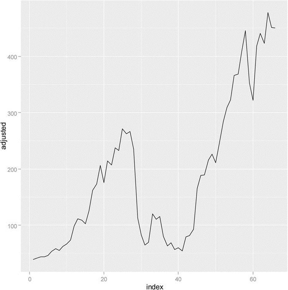
Figure 14-4. Netflix monthly adjusted closing price from 5/1/2009 to 10/1/2014
The growth pattern certainly looks encouraging. Let us calculate the simple return for the Netflix stock over the months. We will use the following formula for our calculations:
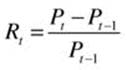
where Rt is the simple rate of return, and Pt is the adjusted closing price for month t. We will create a vector of the simple return.
The continuously compounded monthly rate of return is found from the following formula, where rt is the rate of return at time t, Pt is the adjusted closing price at time t, and Pt–1 is the adjusted closing price at time t–1. The log() function in R finds the natural logarithm:
![]()
We can also calculate a vector for the compounded return and compare the two with a line chart. Take the number of rows in the Netflix monthly data and call that n. We will use that as our index for calculating the differences for our formulas for simple and continuously compounded returns:
> n <- nrow(NFLX_monthly)
> t <- NFLX_monthly[2:n, 7]
> tminus1 <- NFLX_monthly[1:(n-1), 7]
> Rt <- (t - tminus1)/tminus1
> ccret <- log(t) - log(tminus1)
> plot(Rt, type = "l", col = "red")
> lines(ccret, col = "blue")
We observe that the compounded rate of return (the line rendered in blue) is always slightly lower than the simple rate of return (see Figure 14-5).
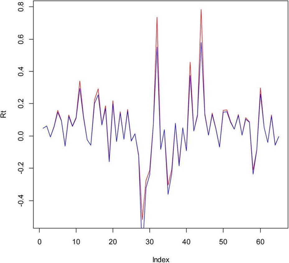
Figure 14-5. Comparison of simple and continuously compounded returns for Netflix stock
Now, we have enough information to answer an important question: “If we invested a dollar in Netflix stock on the first trading day of 2013, what would our investment be worth at the end of 2013?” Let’s select the daily trading information for Netflix from 2013, and perform the necessary calculations. We will use the Yahoo! Finance web site once again and select the Netflix data for 2013, which you can download in CSV format and then read into R:
> nflx_2013 <- read.csv("nflx_2013.csv")
> head(nflx_2013)
date open high low clos vol adj
1 1/2/2013 95.21 95.81 90.69 92.01 2775900 92.01
2 1/3/2013 91.97 97.92 91.53 96.59 3987500 96.59
3 1/4/2013 96.54 97.71 95.54 95.98 2537300 95.98
4 1/7/2013 96.39 101.75 96.12 99.20 6507200 99.20
5 1/8/2013 100.01 100.99 96.80 97.16 3530700 97.16
6 1/9/2013 97.12 97.95 94.55 95.91 2889000 95.9
We can calculate the simple return as before, and then use the cumprod() function to calculate the cumulative product of our investment, which, as we see from inspection of Figure 14-6, would have been a very good one.
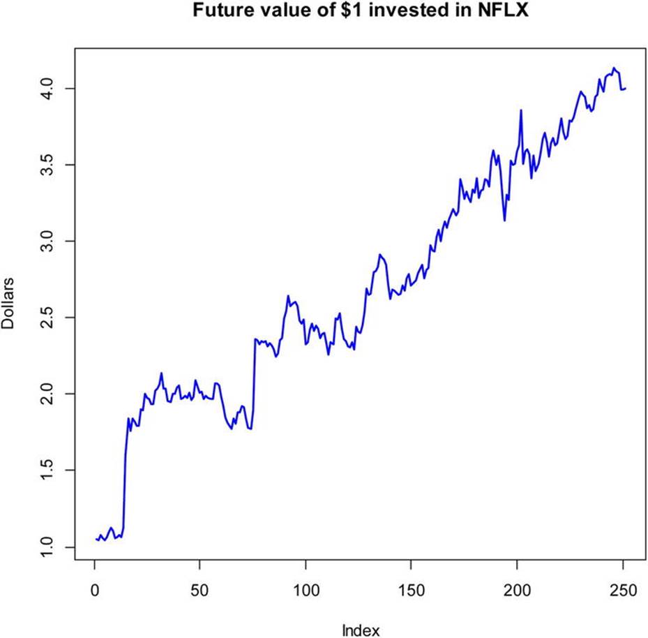
Figure 14-6. Future value of $1 invested in Netflix stock
Recipe 14-3. Comparing Stocks
Problem
Most individual and corporate investors would rather have a portfolio of stocks and other investments, instead of investing in a single stock. In Recipe 14-3, you get a brief introduction into the analysis of stock performance of several stocks at the same time. We will keep our examples simple, but in the process, you will learn how to use the same approach with more complex investments.
Solution
We will use three R packages in our solution, the PerformanceAnalytics package, the zoo package, and the tseries package. As you remember, the quantmod package requires both the zoo package and the xts package.
Let us continue with our analysis of Netflix stocks, but add two companies, in this case, Starbucks and Microsoft, to the mix. We want to determine the performance of these three stocks taken together and see if the combination is a good investment. We will get the data from Yahoo! Finance as before, and then get it into the format we need for our analysis. The “zoo” class stands for “Z’s ordered observations,” and allows the user to work with both regular and irregular time series data. We will retrieve the historical prices for our three stocks from January 2012 to December 2013, and then change the date format to the year and month. Last, we will merge the three sets of prices into one dataset.
> install.packages("PerformanceAnalytics")
> library(PerformanceAnalytics);library(zoo);library(tseries);
> NFLX_prices = get.hist.quote(instrument="nflx", start="2012-01-01",end="2013-12-31",
+ quote="AdjClose",provider="yahoo", origin="1970-01-01",compression="m", retclass="zoo")
> SBUX_prices = get.hist.quote(instrument="sbux", start="2012-01-01",end="2013-12-31",
+ quote="AdjClose",provider="yahoo", origin="1970-01-01",compression="m", retclass="zoo")
> MSFT_prices = get.hist.quote(instrument="msft", start="2012-01-01",end="2013-12-31",
+ quote="AdjClose",provider="yahoo", origin="1970-01-01",compression="m", retclass="zoo")
> index(NFLX_prices) = as.yearmon(index(NFLX_prices))
> index(SBUX_prices) = as.yearmon(index(SBUX_prices))
> index(MSFT_prices) = as.yearmon(index(MSFT_prices))
> portfolio_prices <- merge(NFLX_prices,SBUX_prices,MSFT_prices)
> colnames(portfolio_prices) <- c("NFLX","SBUX","MSFT")
> head(portfolio_prices)
NFLX SBUX MSFT
Jan 2012 120.20 46.11 27.30
Feb 2012 110.73 46.89 29.54
Mar 2012 115.04 53.96 30.02
Apr 2012 80.14 55.39 29.80
May 2012 63.44 53.16 27.34
Jun 2012 68.49 51.64 28.66
To calculate the continuously compounded returns for our three stocks, we can use the following syntax. Note that the continuously compounded return is the difference in the log prices for each column.
> portfolio_returns <- diff(log(portfolio_prices))
> head(portfolio_returns)
NFLX SBUX MSFT
Feb 2012 -0.08206222 0.01677459 0.078858575
Mar 2012 0.03818509 0.14043860 0.016118549
Apr 2012 -0.36150479 0.02615604 -0.007355433
May 2012 -0.23368053 -0.04109284 -0.086157562
Jun 2012 0.07659317 -0.02900967 0.047151591
Jul 2012 -0.18627153 -0.16352185 -0.037324396
We can use the PerformanceAnalytics package’s chart.TimeSeries function to create a chart of the returns (see Figure 14-7). We see that the Netflix stock is somewhat more variable than the other two, but also appears to have gained more value overall.
Figure 14-7. Continuously compounded returns for three stocks
Calculating and plotting the simple returns will make our analysis more meaningful. The simple returns are calculated for each column in the same way we did before, by dividing the differences between the prices at times t and t–1 and dividing by the price at time t–1. However, thePerformanceAnalytics package has the difference and lag functions built in to make the calculations easier. The k parameter shows we are using a time lag of one month. The chart.CumReturns function produces a very attractive chart (see Figure 14-8).
simple_returns = diff(portfolio_prices)/lag(portfolio_prices, k=-1);
chart.CumReturns(simple_returns, legend.loc="topleft", wealth.index = TRUE, main= "Future Value of $1 invested")
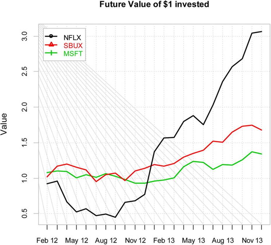
Figure 14-8. Cumulative return chart for three stocks
We can also use boxplots to compare the three investments, as follows (see Figure 14-9 for the resulting chart):
chart.Boxplot(simple_returns)
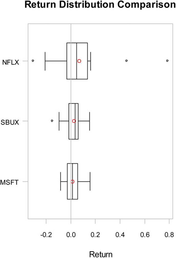
Figure 14-9. Boxplots of the simple returns for three stocks
Recipe 14-4. A Brief Introduction to Portfolios
Problem
Now that you have seen how we might analyze stocks and make comparisons of different stocks, important questions still remain. If we want to invest in a diversified combination of stocks or other investments, what will be our expected return? What is our expected risk? To answer these questions, we will briefly explore the constant expected return (CER) model. This model is used quite often in finance for portfolio analysis, Capital Asset Pricing, and option pricing models. The CER model assumes an asset’s return over time is independent and normally distributed, with a constant mean and variance. The model allows us to correlate the expected returns on different assets, assuming that the correlations are constant over time. The CER model is equivalent to the measurement error model in statistics. We state that each asset return is equal to a constant μi (the expected return) plus a normally distributed random variable εit with a mean of zero and a constant variance.
![]()
This model serves as the basis for “modern portfolio theory” (MPT), and is widely used, as mentioned earlier. Of course, it is only a model, and like most models, it fails to capture the entirety of what happens in the real world, where markets are not always efficient and investors are not always rational. But it is a good place to start when analyzing different combinations of investments as to their expected return and risk. Just as the assumption of normality is often incorrect in statistics, it is often incorrect in stock performance. To the extent that the assumptions of the CRR model are met, the MPT is an effective representation of the performance of an investment over time, and serves as a benchmark for more complicated models. MPT assumes that investors are averse to risk, and that given two portfolios with the same expected return, investors would choose the less risky one. Generally, assets with higher expected returns are riskier, and each investor must decide how much risk is acceptable. We use the standard deviation of return as an indicator of risk. This is not a particularly good choice if the asset returns are not normally distributed, as discussed briefly.
Solution
Let us simplify our example and include only Netflix and Starbucks stock as our “risky assets.” Once you understand the theory, you will be able to apply the same analysis to a more complicated portfolio with more equities. The expected return for a given portfolio is the proportion-weighted combination of the constituent assets’ returns. We will use wi to represent the weighting of a constituent asset (in this case Netflix and Starbucks). Note that the weightings can be negative. Calculate the expected return as follows:
![]()
where Rp is the return on the portfolio, Ri is the return on asset i, and wi is the weighting of asset i, which is the proportion of asset i in the portfolio. Let us develop a series of weights for each asset. The weights must add to 1 for each combination.
> weights_NFLX <- seq(-1,2,.1)
> weights_SBUX <- 1 - weights_NFLX
> weights_NFLX
[1] -1.0 -0.9 -0.8 -0.7 -0.6 -0.5 -0.4 -0.3 -0.2 -0.1 0.0 0.1 0.2 0.3 0.4
[16] 0.5 0.6 0.7 0.8 0.9 1.0 1.1 1.2 1.3 1.4 1.5 1.6 1.7 1.8 1.9
[31] 2.0
> weights_SBUX
[1] 2.0 1.9 1.8 1.7 1.6 1.5 1.4 1.3 1.2 1.1 1.0 0.9 0.8 0.7 0.6
[16] 0.5 0.4 0.3 0.2 0.1 0.0 -0.1 -0.2 -0.3 -0.4 -0.5 -0.6 -0.7 -0.8 -0.9
[31] -1.0
Thanks to the excellent instructions of Dr. Eric Zivot of the University of Washington, who teaches computational finance and makes his course available via Coursera, I was able to learn how to develop a graph of my portfolio’s relative expected return and relative risk, as follows. First, let us get more current performance data on our two stocks, Netflix and Starbucks. I use the same approach as in Recipe 14-3 to retrieve the monthly adjusted closing prices for the period from January 2013 to September 2014. Merge the two stocks and rename the columns:
> NFLX_prices = get.hist.quote(instrument="nflx", start="2013-01-10",end="2014-09-
+ 30",quote="AdjClose",provider="yahoo", origin="1970-01-01",compression="m", retclass="zoo")
> SBUX_prices = get.hist.quote(instrument="sbux", start="2013-01-10",end="2014-09-
+ 30",quote="AdjClose",provider="yahoo", origin="1970-01-01",compression="m", retclass="zoo")
> colnames(myPortfolio) <- c("NFLX","SBUX")
> head(myPortfolio)
NFLX SBUX
2013-01-10 165.24 54.79
2013-02-01 188.08 53.75
2013-03-01 189.28 55.81
2013-04-01 216.07 59.62
2013-05-01 226.25 62.08
2013-06-03 211.09 64.41
> tail(myPortfolio)
NFLX SBUX
2014-04-01 322.04 70.13
2014-05-01 417.83 72.99
2014-06-02 440.60 77.12
2014-07-01 422.72 77.42
2014-08-01 477.64 77.81
2014-09-02 451.18 75.46
> myPortfolio_returns <- diff(myPortfolio)/lag(myPortfolio, k = -1)
Now, assuming the return is constant over months, we calculate the annualized mean, variance, standard deviation, covariance matrix, covariance of the two stocks, and correlation of the two stocks, as follows. We will use these statistics to calculate the expected return (mean) and the expected risk (the standard deviation) for each combination of weightings defined earlier.
> mean_annual <- apply(myPortfolio,2,mean)*12
> var_annual <- apply(myPortfolio,2,var)*12
> sd_annual <- sqrt(var_annual)
> covMat_annual <- cov(myPortfolio)*12
> covHat_annual <- cov(myPortfolio)[1,2]*12
> corr_annual <- cor(myPortfolio)[1,2]
Let us now calculate the mean expected performance for each portfolio, and then calculate the variance and standard deviation for each portfolio, as follows. The variance of a portfolio relies on the previously calculated statistics. The formula is
![]()
where the w’s are the portfolio weights, σ2 is the variance, and σAB is the covariance of the two stocks. Here is the vector of means for the different portfolios:
> mean_portfolio <- weights_NFLX*mean_annual["NFLX"] + weights_SBUX*mean_annual["SBUX"]
> mean_portfolio
[1] -0.27792745 -0.22954062 -0.18115378 -0.13276695 -0.08438012 -0.03599329
[7] 0.01239354 0.06078037 0.10916721 0.15755404 0.20594087 0.25432770
[13] 0.30271453 0.35110137 0.39948820 0.44787503 0.49626186 0.54464869
[19] 0.59303552 0.64142236 0.68980919 0.73819602 0.78658285 0.83496968
[25] 0.88335651 0.93174335 0.98013018 1.02851701 1.07690384 1.12529067
[31] 1.17367751
We can now calculate the variance and standard deviation of our portfolios in the following way:
#var_portfolio = weights_NFLX^2 * var_NFLX + weights_SBUX^2 * var_SBUX + 2 * weights_NFLX*weights_SBUX*cov_NFLX_SBUX
#sd_portfolio = sqrt(var_portfolio)
At last we can plot our different portfolios. An efficient portfolio is one that produces a reasonable expected return with a reasonable risk level. See Figure 14-10 for the plot, which is in the shape of a hyperbola.
plot(sd_portfolio, mean_portfolio, type="b", pch=16, ylim=c(0, max(mean_portfolio)), xlim=c(0,
+ max(sd_portfolio)), xlab=expression(sigma[p]), ylab=expression(mu[p]), col=c(rep("green", 11), + rep("red", 20)))
text(x=sd_NFLX, y=mean_NFLX, labels="Netflix", pos=4)
text(x=sd_SBUX, y=mean_SBUX, labels="Starbucks", pos=2)
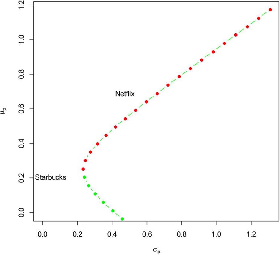
Figure 14-10. Plotting the different portfolios
Dr. Zivot has provided an R function for his computational finance class at the University of Washington that calculates the global minimum variance portfolio, which provides the lowest possible volatility for the underlying assets. This and Dr. Zivot’s other R functions are available athttp://faculty.washington.edu/ezivot/econ424/portfolio.r.
We will find the global minimum variance portfolio and plot its position on a slightly modified version of our previous graph (see Figure 14-11). The globalMin.portfolio() function requires only the input of the expected returns (the means_annual in our case) and the covariance matrix (covMat_annual in this case).
> GMV <- globalMin.portfolio(mean_annual, covMat_annual)
> GMV$sd
[1] 0.1556587
> GMV$er
[1] 0.2570875
> plot(sd_portfolio, mean_portfolio, type="b", pch=16, ylim=c(0, max(mean_portfolio)), xlim=c(0, max(sd_portfolio)), xlab=expression(sigma[p]), ylab=expression(mu[p]), col=c(rep("green", 11), rep("red", 20)))
> text(x=sd_NFLX, y=mean_NFLX, labels="NFLX", pos=4)
> text(x=sd_SBUX, y=mean_SBUX, labels="SBUX", pos=4)
> text(x=GMV$sd,y=GMV$er,labels="Gobal Min", pos = 2)
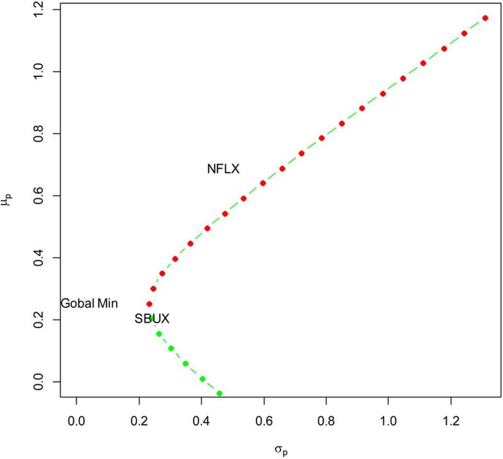
Figure 14-11. Plotting the location of the global minimum variance portfolio
All materials on the site are licensed Creative Commons Attribution-Sharealike 3.0 Unported CC BY-SA 3.0 & GNU Free Documentation License (GFDL)
If you are the copyright holder of any material contained on our site and intend to remove it, please contact our site administrator for approval.
© 2016-2026 All site design rights belong to S.Y.A.