Introduction to Android Application Development, Fourth Edition (2014)
Part V. Publishing and Distributing Android Applications
Chapter 17. Planning the Android Application Experience
Knowing how to use the newest Android APIs is a great start, but there is more to building Android applications than just programming a bunch of code and adding more features to your application. Implementing a slick-looking user interface is also wonderful, but if it is difficult to figure out how to use your application and it does not provide any real benefit to the user, it will most likely never become that “killer app.” In order to truly set your application apart from the myriad of other applications available to users, you really must think differently about what user problem your application solves. Solving that problem in a graceful way, rather than developing an application that is just a collection of Android features, is one of the best pieces of advice the authors have to share.
The purpose of this chapter is to present many different concepts and techniques that should enable you to make better decisions about how to design your application with your users in mind. The information presented in this chapter is not exhaustive, nor is it meant to be the default methodology that you have to use when planning your applications. Rather, the information should be adapted to fit your particular development situation. The authors have seen that the most successful projects are not always performed by developers who follow one particular rigorous development methodology that has been handed to them. Usually, the most successful projects are completed by developers who work together to create their own system and develop a methodology that works best for them, within their own resource constraints.
Thinking about Objectives
When starting a new Android development project, it is always a good idea to set some expectations early on, before writing code. The most helpful expectations to think about are in the form of objectives. Usually, there are at least two parties who have objectives in relation to a given Android development project, if not more. People who use your application obviously have reasons for doing so; therefore, they have objectives they are working to achieve with your application. On the other hand, you, the developer or team of developers, have reasons for building the application. In addition, besides users and team, there may be additional stakeholders who have objectives in relation to your project.
User Objectives
Users install an application usually because of a need they are trying to fulfill. User objectives may vary widely; for example, users who are forgetful may be looking for an application that can keep track of important information for them, such as a note-taking application or a calendar application. On the other hand, certain users may want to be entertained by a game but have only short bursts of time they can devote to playing.
Focusing your development efforts around a clear set of user objectives should help you determine who your target users will be. As an application developer, if you try to fulfill the objectives of too many different types of users, you may end up not pleasing any users at all. If you set out without thinking about who your target users are, you may end up building a note-taking game for a forgetful busy user looking for help remembering important information while being entertained in short bursts.
Not only will knowing your users’ objectives help you focus your development efforts to create a superior experience for a particular type of user, but it will also help you discover if there are applications that may already be fulfilling the same or similar needs. Building an application that is just like other applications already available is not a good use of your efforts. But narrowing in on the pain points that your target users have, and knowing what the current competition is, should help you make better decisions with your development efforts.
Take the time early on to think about what a realistic set of user objectives is for a particular need you want your application to fill, and think about how to differentiate yourself from the competition. Then design your application to fulfill those objectives. You may be pleasantly surprised when your users thank you for fulfilling their needs.
Team Objectives
Whether you are a team of one working alone on your Android project, or one person on a team of many at a large corporation, your team is probably building the application with specific objectives in mind. Those team objectives could be achieving 5,000 downloads in the first month or generating $50,000 in revenue in the first quarter. Other examples of team objectives could be releasing the first version of an application in one month, or something different altogether, such as generating a measurable quantity of brand recognition.
Whatever those team objectives are, it is a good idea to start thinking about them as early as possible. Fulfilling your users’ objectives is only part of the equation. Failure to have a clear set of team objectives may result in developing software that is late or over budget, or it may even result in the project never being completed.
Objectives of Other Stakeholders
Not all Android application projects have other stakeholders involved, but some projects do. Other stakeholders could include advertisers that provide ads for placing within your application. Their objectives may be to maximize their revenues, maintaining their brand recognition without harming the user experience of your application. Think about other stakeholders in addition to users and team early in the planning process.
Not thinking about the needs of other stakeholders up front may result in harming any types of business partnerships that you may have developed with those stakeholders. Failure to consider their needs could damage your relationship.
Techniques for Focusing Your Product Efforts
Knowing that you should target your project efforts around a clear set of objectives is the first step. Now we will discuss practical techniques that you can begin using right now to help you think about what your users’ objectives are and how you can fulfill them.
Personas
One way to keep your target user or users in mind during your Android project is to create a fictional persona. The purpose of using a persona during development is to think about your users’ problems from their perspective. Defining that persona and the problems the persona has is just one way to fine-tune not just who the target users will be, but also how to differentiate your product from other available applications.
Personas are fairly easy to create. Some of the information that you should consider defining for your fictional personas includes
 Name
Name
Gender
Age range
Occupation
Android sophistication level
Favorite applications
Most-used Android features
Attitude toward or awareness of your application’s objective
Education
Income
Marital status
Hobbies
This list is not comprehensive, but it is a good start to help you narrow in on exactly who your target users are. You should create only one or two different personas. As we mentioned earlier in this chapter, if you try to please every single type of user, your application may never actually solve any particular need for any users at all.
You can create these personas on paper and keep them nearby and visible while you work. Sometimes it even helps to attach a picture of a person to this fictional character; that way your character has a face to go with the name. Then when you are making decisions for your Android application, you can refer back to your target user to see if you are fulfilling that user’s needs.
Entity Discovery and Organization
Early in your project’s life, you should start thinking about the entities, classes, and objects that describe the information within your application. Drawing simple diagrams on paper can help you determine how to organize your code. Here are a few techniques that you can use:
Domain modeling: A domain model provides names for all of the entities used within a project. The domain model usually evolves over the life of a project. It usually includes the entity names, which should be nouns, and their relationships to other entities.
Class modeling: A class model is very similar to a domain model, just more specific. A class model is usually derived from a domain model but includes much more detail. This diagram usually includes class names, attributes, operations, and relationships to other classes.
Entity relationship modeling: An entity relationship model is used specifically for describing an application’s data model. The data model describes the tables of a database. This diagram usually includes the entity names, their attributes, relationships to other entities, and cardinalities.
With the information you gather from these diagrams, combined with the Android classes that your project requires, it becomes increasingly important to think about where and how to implement classes in relation to one another as your project progresses. The larger your project gets without proper organization and planning, the more your code base becomes like spaghetti code: that is, unstructured, tangled, overly complex, and very difficult to follow.
Use Cases and Use Case Diagrams
Another way to think about your target users is to develop a set of use cases and use case diagrams for how they will use your application. A use case generally describes the scenarios and interactions that an actor (or user) has with your application, and a use case diagram visually represents the actor and the application and the interactions that occur between them. You should think about use cases as actions that your target user is trying to do when using your application. Use cases are good for helping you determine how your application behaves when a user interacts with it.
Here is a simple use case for a task management application:
On first launch, the application displays an empty task management screen asking the user to enter the first task. An Add Task button is available on the task management screen, and when the user selects it, the application responds by presenting an Enter Task form for entering a new task. The entry form includes a Create Task button. After the user enters a new task into the form, the user presses the Create Task button, and the application then creates and stores the task. Then the task management screen displays the task just created for the user to review.
Figure 17.1 is a diagram of this use case.
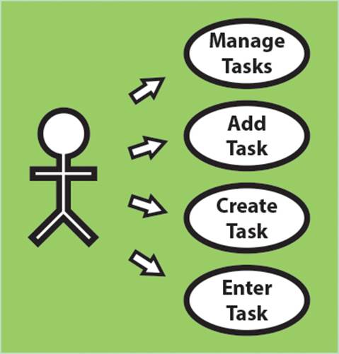
Figure 17.1 A simplistic use case diagram for a task management application.
The quickest way to create a use case diagram is to draw it on paper or on a whiteboard, although you may also use a graphics editing program or something more sophisticated such as a use case management and diagramming application if you so choose. Usually, the simplest and quickest tools for drawing use cases are the most effective, and drawing them by hand is highly recommended.
Charting Your Application’s Navigation
Now that you are on track for understanding who your target users are and how they intend to use your application, take some time to figure out how to implement navigation so users can accomplish the tasks that you will be providing.
 Tip
Tip
Before we talk about how to design navigation within your own application, you should take a moment to read about how users navigate within the Android System UI, if you have not already done so. You can learn more at the following URL:http://d.android.com/design/get-started/ui-overview.html. This article will help you learn about the different screens within Android—the Home, All Apps, and Recents screens—in addition to different system bars, such as the status bar, navigation bar, and combined bar.
Tip
Many of the code examples provided in this section are taken from the SimpleNavigation application. The source code for this application is provided for download on the book’s website.
Android Application Navigation Scenarios
In order to understand how to program navigation within your application, you first must understand the different types of navigation that Android provides. There is more than one way that Android allows users to navigate to and within an application as well as to and from one application and another. The following sections describe the navigation scenarios that Android allows.
Entry Navigation
Entry navigation is how a user navigates into an application. There are many different ways this can occur, such as from a Home screen widget, from the All Apps screen, from a notification listed within the status bar, or even from another application altogether.
Lateral Navigation
Lateral navigation is mainly for applications that have screens residing on the same hierarchy level within an application. If your application has more than one screen residing on the same level, you may want to provide users the ability to navigate laterally across that particular hierarchy level by implementing swipe navigation, tabs, or both. Figure 17.2 is a depiction of lateral navigation.
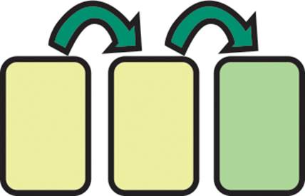
Figure 17.2 A depiction of navigating an Android application laterally.
To implement lateral navigation for activities, all you need to do is make a call to startActivity() using an Intent with the lateral Activity and ensure that each of the activities is on the same hierarchy level. If your activities are on the same hierarchy level but not the top level, you can define the parentActivityName attribute in your manifest and set the parent Activity to be the same for each of the activities that should reside on the same hierarchy level.
Descendant Navigation
Descendant navigation is used when your application has more than one hierarchy level. This means that users can navigate deeper into your application’s hierarchy levels. Usually, this is done by creating a new Activity with startActivity(). Figure 17.3 shows a depiction of navigating from a top-level Activity to a lower-level Activity.

Figure 17.3 A depiction of performing descendant navigation within an Android application.
To implement descendant navigation, make sure that the descendant Activity declares parentActivityName in your application manifest and set the Activity to be the ancestor. Then, from the ancestor Activity, create an Intent with the descendant Activity, and simply callstartActivity().
Back Navigation
Back navigation is used when a user clicks the Back button located on the Android navigation bar or presses a hardware Back button. The default behavior navigates the user to the last Activity or Fragment that was placed on the back stack. To override this behavior, call onBackPressed() from within your Activity. Figure 17.4 shows a depiction of navigating back within an application after having performed the lateral navigation seen in Figure 17.2.
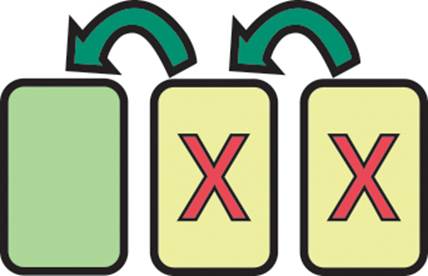
Figure 17.4 A depiction of navigating back after having navigated laterally as in Figure 17.2.
You do not have to do anything special to implement back navigation in your application, unless you are working with fragments. With fragments, if you want to navigate back, you need to make sure that you add your Fragment to the back stack with a call to addToBackStack().
Ancestral Navigation
Ancestral navigation, or up navigation, is used when your application has more than one hierarchy level and you must provide a means for navigating to a higher level. Figure 17.5 shows up navigation enabled within an application, and Figure 17.6 shows a depiction of performing ancestral navigation after having performed descendant navigation as in Figure 17.3.

Figure 17.5 Showing up navigation as enabled.
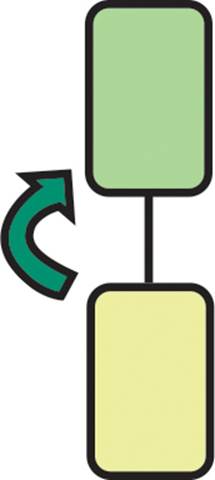
Figure 17.6 A depiction of performing ancestral navigation within an Android application.
To implement ancestral navigation within your application, you must do two things. The first is to make sure that your descendant Activity defines the correct parentActivityName attribute within your application manifest. Then, in the onCreate() method of your Activity, simply call the following:
getActionBar().setDisplayHomeAsUpEnabled(true);
External Navigation
External navigation is when the user navigates from one application to another. Sometimes this is done in order to retrieve a result from another application using startActivityForResult(), or it could be done to leave the current application altogether.
Launching Tasks and Navigating the Back Stack
A task is one or more activities that are used for accomplishing a specific goal. The back stack is where Android manages these activities with a last-in-first-out ordering. As the activities of a task are created, they are added to the back stack in order. If the default behavior applies to anActivity, and the user presses the Back button, Android removes the last Activity added to the stack. In addition, if the user instead were to press the Home button, the task would then move itself and the activities to the background. The task may be resumed by the user at a later time, as moving it to the background does not destroy the Activity or task.
Tip
You may customize the default behavior of activities in the back stack. To learn how this can be done, you should read the following Android documentation: http://d.android.com/guide/components/tasks-and-back-stack.html#ManagingTasks.
Navigating with Fragments
We have covered extensively how the various navigation scenarios work when using activities. With fragments, let’s just say that how navigation should be handled depends. If you have implemented a descendant ViewPager with fragments, and there are dozens or potentially hundreds of fragments that a user could page through, it is probably not a good idea to add each of the fragments to the back stack just to give the user the ability to navigate back up to its ancestor Activity. If so, and the user has a habit of using the Back button rather than the Up button, he or she may become extremely frustrated at having to navigate through dozens of fragments just to get to the ancestral Activity. It is clear that ancestral navigation should be used to handle this scenario, but not every user knows to use the Up button.
When the Fragment count is small, supporting back navigation should be OK. When designing your application, think about what a user would experience if you do support adding each and every Fragment to the back stack. After all, your application may require supporting that for various reasons, but be sure to be conscious of how users may experience your application.
Planning Application Navigation
Now that you know about the different ways that Android handles both system and application navigation, you should be ready to plan how users navigate through your application. You can begin planning your navigation by thinking about user flows and creating screen maps.
User Flows
A user flow is the path the user takes through an application to accomplish a particular goal. This goal may be closely related to one or more use cases, as many times a user must take multiple actions in order to accomplish a particular goal. When designing user flows, remember to keep the steps to the minimum required in order to accomplish the goal while maintaining an optimal experience for the user. Too many steps may lead to unnecessary confusion or frustration.
You should also limit the number of user flows your application provides. As we mentioned earlier, you should not try to create a solution for every type of user. Instead, specialize by fulfilling a need that helps users make their lives easier. A few user flows per application are common, but you probably will design at least one or two key flows that a user performs frequently.
Screen Maps
One way to determine the user flows or key flows for your application is by designing a screen map. A screen map is a way to visualize the relationships among the screens of your application. The organization of a screen map will vary from application to application. Some maps may involve just one or two screens, whereas others could have dozens.
You can assemble a screen map by first creating a list of all the screens that your application will need, then connecting them to show their navigational relationships. Figure 17.7 shows an extremely simple screen map of the hierarchical relationship between the screens for theSimpleNavigation sample application accompanying this chapter.
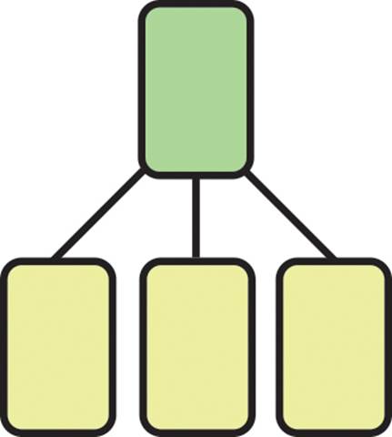
Figure 17.7 An extremely simple screen map showing the hierarchical relationship of the activities of the SimpleNavigation code sample.
When designing your screen maps, there are a few things you should be aware of:
A screen does not necessarily mean you need an Activity. Instead, use reusable fragments for displaying like content.
Group content fragments together when in a multipane layout and separately when in a single-pane layout.
When possible, use one or more of the navigation design patterns that are commonly recommended for use in Android applications.
Tip
To learn more about creating screen maps and planning your application’s navigation, please read the Android documentation found here: http://d.android.com/training/design-navigation/index.html.
Android Navigation Design Patterns
There are many design patterns commonly found within Android applications. Many of these patterns are highlighted within the Android documentation due to their effectiveness. We describe a few of these common navigation design patterns here.
Tabs
Use fixed (Figure 17.8, left) or scrollable (Figure 17.8, right) tabs when you have three or fewer related content sections within the same hierarchy level. Implementing fixed tabs with swipe functionality using ViewPager is recommended.
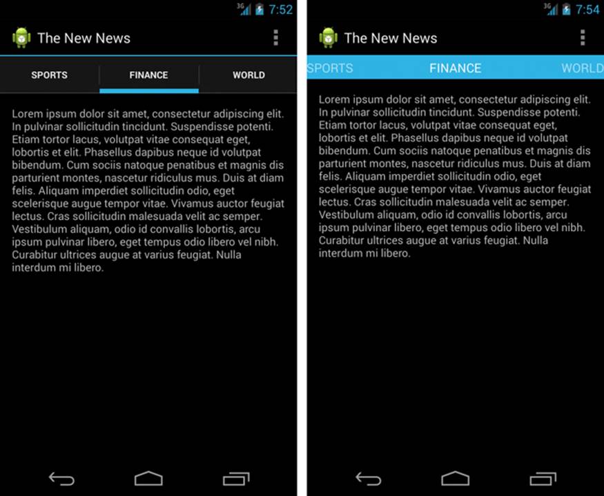
Figure 17.8 Two different types of tab design patterns for Android applications: fixed (left) and scrollable (right).
Drop-down
Use drop-down navigation (shown in Figure 17.9) when your application has more than three content sections within the same hierarchy level and when the other patterns are not appropriate.
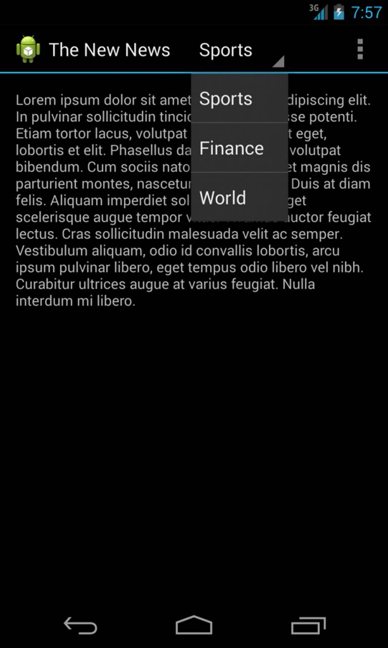
Figure 17.9 An Android application using drop-down navigation.
Navigation Drawer
Use the navigation drawer when you have more than three top-level sections within your application and if you need to provide quick access to lower-level sections in addition to the top-level sections. Figure 17.10 shows an application using a navigation drawer. More information on using the navigation drawer can be found at the Android documentation website: http://d.android.com/training/implementing-navigation/nav-drawer.html.
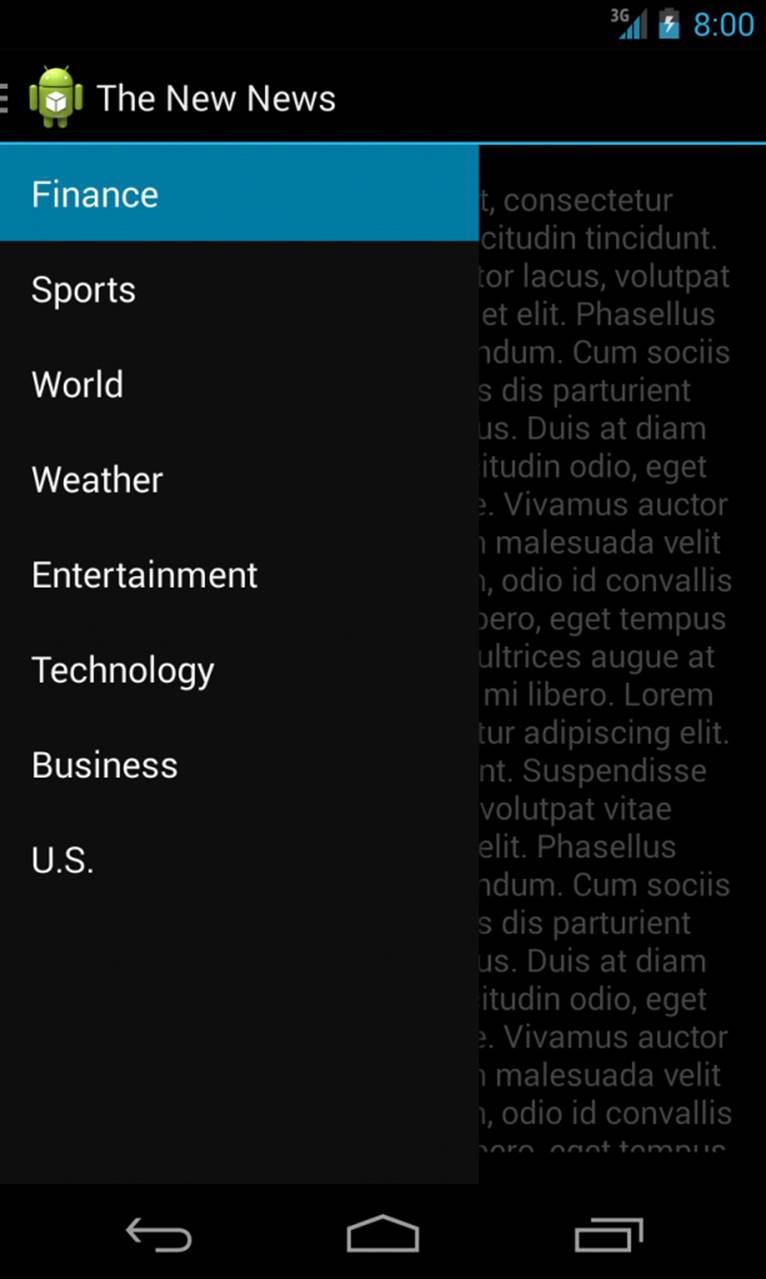
Figure 17.10 A screenshot of an application using the navigation drawer.
Master Detail Flow
Use the master detail flow with fragments when using views such as lists or grids, one Fragment for the list or grid and the other Fragment for the associated detail view. When selecting an item in the Fragment list or grid on a single-pane layout, launch a new Activity to display the Fragmentdetail view. Figure 17.11 shows a master detail flow application running in a single-pane layout, the left side showing the master list Activity and the right side showing the detail Activity. In multipane layout, touching an item within the list or grid should display the accompanying detailFragment alongside the list or grid. Figure 17.12 shows the same master detail flow application from Figure 17.11, only this time within a multipane layout with the master list Fragment on the left and the detail Fragment on the right.
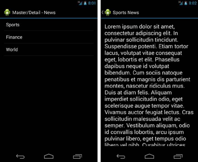
Figure 17.11 Two screenshots of a master detail flow application shown in a single-pane layout.
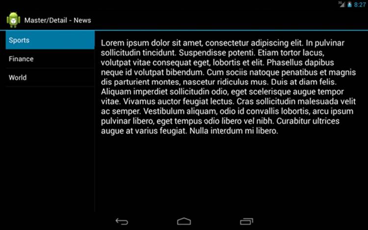
Figure 17.12 A screenshot of a master detail flow application shown in a multipane layout.
Targets
Use targets such as buttons when your application needs to replace the current screen entirely and none of the other patterns apply. Figure 17.13 shows the SimpleNavigation application launcher Activity with three target navigational buttons.
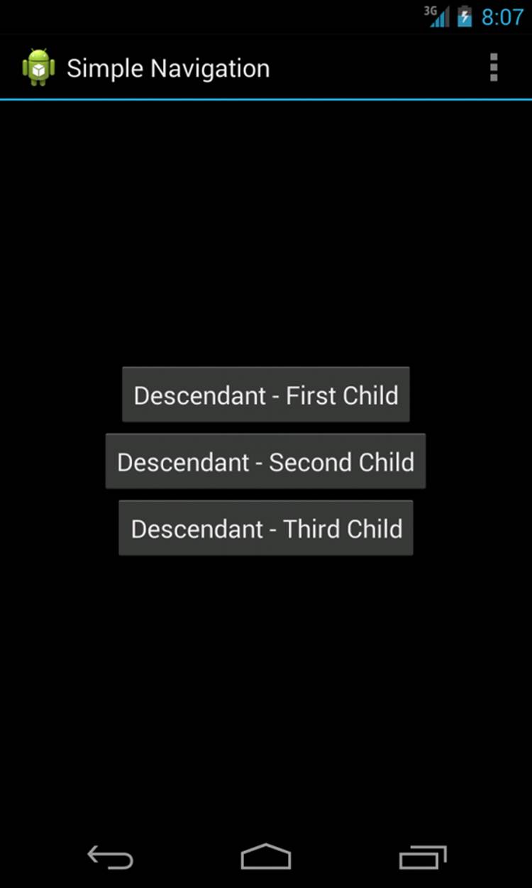
Figure 17.13 A screenshot of the SimpleNavigation sample application displaying three descendant Activity navigation buttons.
Encouraging Action
Determining how to navigate your application is only half the battle when designing your product. The other challenge is figuring out how to get your users to perform the actions made available within your application.
Actions differ from navigation as they are usually designed to permanently alter the user’s data. With that said, there are a few common design patterns that have evolved on the Android platform for presenting actions to users.
Menus
The concept of presenting menus to users to provoke action from them has been around since Android API Level 1. With Android API Level 11, menus have been replaced with a newer design pattern known as the ActionBar for presenting actions to users. For applications prior to API Level 11, you may want to consider implementing menus for presenting actions to your users. There are three different types of menus available for use:
Options menu: An options menu is where you should present actions available to a particular Activity. The maximum number of actions that you can present within an options menu is six. If you need to include more than six menu items, an overflow menu will be created and your actions will be accessible from there. It is a good idea to order your most common actions to be presented in the options menu first.
Context menu: You can use a context menu to present actions when a selection event is initiated by a user from a long press. If your Activity supports a context menu upon a selection event, once an item has been selected, a dialog will be displayed presenting the various actions that you support.
Pop-up menu: A pop-up menu looks like an overflow-style menu item and is used for displaying actions relevant to the content displayed within an Activity.
Action Bars
As mentioned in the preceding section, the ActionBar has become the preferred way to present actions to users. The ActionBar is where to place actions that you want to make available to a particular Activity. You can add actions to or remove them from the ActionBar from within an Activityor Fragment.
 Tip
Tip
Many of the code examples provided in this section are taken from the SimpleActionBar application. The source code for this application is provided for download on the book’s website.
You can use an ActionBar to display various elements, which are detailed in the following sections.
Application Icon
You may place your application’s icon within the ActionBar. If your application supports up navigation, the application icon would be where a user would press to navigate up a level.
View Control
A View control may be placed on your ActionBar for enabling actions such as search or navigation using tabs or a drop-down menu.
Action Buttons
Action buttons are usually icons, text, or both icons and text for displaying the actions you would like to make available to users from within your Activity. Figure 17.14 shows two action buttons, the Add and Close buttons, each with an associated icon.
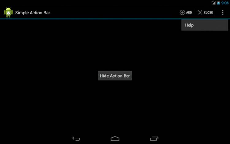
Figure 17.14 A screenshot of the SimpleActionBar sample application showing both action buttons and their icons along with an action overflow menu item.
To add action buttons to the ActionBar you must add a menu layout to your Activity. Here is the menu layout used in the SimpleActionBar application:
<menu xmlns:android="http://schemas.android.com/apk/res/android" >
<item
android:id="@+id/menu_add"
android:icon="@android:drawable/ic_menu_add"
android:orderInCategory="2"
android:showAsAction="ifRoom|withText"
android:title="@string/action_add"/>
<item
android:id="@+id/menu_close"
android:icon="@android:drawable/ic_menu_close_clear_cancel"
android:orderInCategory="4"
android:showAsAction="ifRoom|withText"
android:title="@string/action_close"/>
<item
android:id="@+id/menu_help"
android:icon="@android:drawable/ic_menu_help"
android:orderInCategory="5"
android:showAsAction="never"
android:title="@string/action_help"/>
</menu>
Then, in your Activity, you need to inflate the menu using the onCreateOptionsMenu() method like so:
@Override
public boolean onCreateOptionsMenu(Menu menu) {
getMenuInflater().inflate(R.menu.simple_action_bar, menu);
return true;
}
This will add the action items to the ActionBar. Notice the item icon attributes in our menu layout. Android provides default icons for many common action types such as add, close, clear, cancel, or help. Using these default icons will save you a great amount of time, in addition to providing a consistent user experience across all applications that use those icons. Using your own icons may seem desirable, but doing so may confuse users who are not used to seeing the icon you provide for a common action.
Action Overflow
Action items that you are not able to fit on the main ActionBar will be placed within the overflow section. Make sure to order your action items in the order of their importance and frequency of use. Figure 17.14 also shows an action overflow menu item named Help. This action item is accessible only after the overflow icon in the upper-right corner of the screen is touched.
If your application supports both small screens and large tablets, you may want your ActionBar to display differently based on the type of device. Since there is more room on the ActionBar on large tablets, you are able to fit more actions. With smaller screens, rather than having all of the actions displayed in the overflow, you are able to tell your application that you would like to split the ActionBar (see Figure 17.15, left). This means that your ActionBar will also appear at the bottom of the screen if there are more actions than will fit in the top ActionBar. To support a splitActionBar, set the uiOptions attribute within either the <application> or <activity> tag of your application’s manifest file like so:
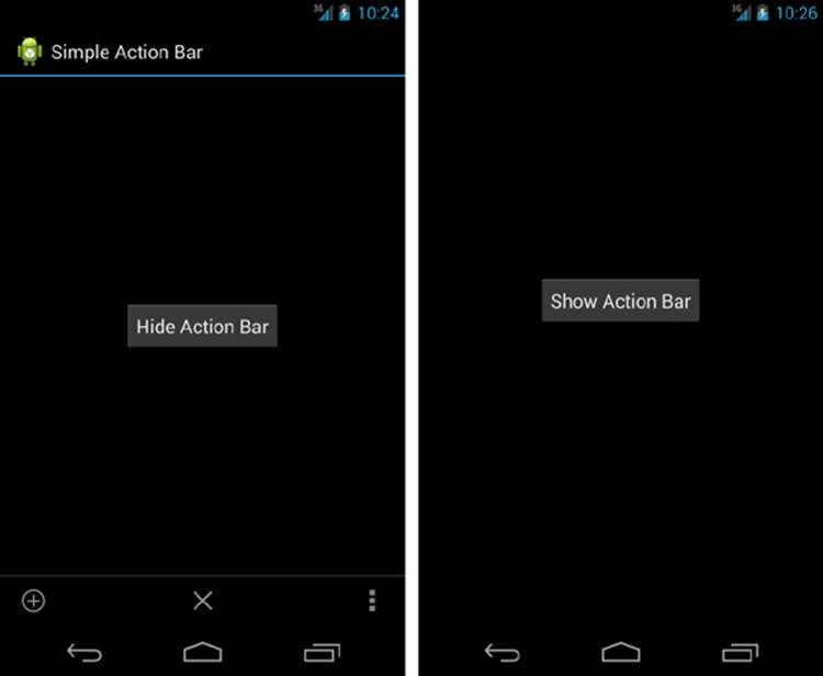
Figure 17.15 Two screenshots of the SimpleActionBar sample application showing (left) a visible split ActionBar with two action buttons and (right) no visible ActionBar after the Hide Action Bar button is pressed.
android:uiOptions="splitActionBarWhenNarrow"
In certain scenarios, you may want to hide the ActionBar. This can be useful if your application requires going into full-screen mode, or if you have designed a game and don’t always want the ActionBar to be present. In order to hide the ActionBar, just add the following to your Activity:
getActionBar().hide();
If you need to show the ActionBar again at a later point, you can do so with the following:
getActionBar().show();
In Figure 17.15, in the left screenshot, the ActionBar is displayed; in the right screenshot, it is hidden.
In order to make your action item respond to touch events, you need to override the onOptionsItemSelected() method in your Activity. Here is how we defined the method in the SimpleActionBar sample application:
@Override
public boolean onOptionsItemSelected(MenuItem item) {
switch (item.getItemId()) {
case R.id.menu_add:
Toast.makeText(this, "Add Clicked", Toast.LENGTH_SHORT).show();
return true;
case R.id.menu_close:
finish();
return true;
case R.id.menu_help:
Toast.makeText(this, "Help Clicked", Toast.LENGTH_SHORT).show();
return true;
default:
return super.onOptionsItemSelected(item);
}
}
The onOptionsItemSelected() allows us to detect which item in the menu was interacted with, and we use a simple switch() statement to determine which item was selected using the IDs we defined within the menu layout file. Our example is very simple. For the Add and Help action items, we simply make a Toast display to the screen, and the Close action item actually ends the Activity by calling the finish() method.
ActionBar Compatibility
To add an ActionBar to legacy applications running on devices with Android versions all the way back to 2.1 (API Level 7), you can use the Android Support Library (Revision 18) in your project. Rather than using the regular Activity or FragmentActivity classes, you must use theActionBarActivity class, which extends the FragmentActivity class of the v4 Support Library. In addition, you must set the theme of your application or Activity to Theme.AppCompat. Finally, in order to access the ActionBar in your code, you must call the getSupportActionBar() method.
Contextual Action Mode
Contextual action mode is useful for displaying actions you would like to make available to users when they have selected something from within an Activity.
Dialogs
Dialogs are yet another way to present actions to your users. The best time to use a Dialog is when your application needs to confirm or acknowledge an action a user has taken that will permanently alter the user’s data.
If you allow users to edit their application data directly from within a Dialog, you should present actions within the Dialog for the user to either confirm or deny the changes before actually committing them.
Actions Originating from Your Application’s Content
You may need to make certain actions available from within your application’s content areas. If so, there are various UI elements that you can use for enabling actions. These UI elements include
Buttons
Check boxes
Radio buttons
Toggle buttons and switches
Spinners
Text fields
Seek bars
Pickers
For a detailed look at these various user interface controls, see Chapter 7, “Exploring User Interface Building Blocks.”
Communicating Your Application’s Identity
To set your application apart from other applications, you should think about the identity that you would like users to associate with your product. Some of the most common ways to communicate identity are as follows:
Develop consistent style guidelines and follow those guidelines throughout your application.
Choose a specific color palette and theme for your application. Use colors to establish uniformity or contrast among the different visual elements of your user interface.
Create a unique application launcher icon that your users will remember. Try to associate the purpose of your application with the design of your icon. In addition, any other icons that you create should instantly communicate to users what the icon means.
Emphasize content with various font styles.
Use white space or empty space effectively.
Do not cram user interface components together. Instead, use padding and margins to provide spacing between user interface components.
If you plan on having your application run on different-size displays, make sure your application remains flexible with its layouts to accommodate differences across devices displays.
Tip
For a comprehensive overview of style recommendations, see the Android documentation that can be found here: http://d.android.com/design/style/index.html.
Designing Screen Layouts
Before investing a great deal of time or money in developing your application, you should spend some time deciding how you would like your user interface layout to appear. There are a few different methods you can use for determining your screen layouts.
Sketches
You should start making decisions about your layouts very early on by quickly creating rough sketches, on paper or on a whiteboard, to determine how your screens and their visual components should be organized in their layout. This is a very quick way to determine any screens that may be required and should help uncover any usability issues prior to investing a lot of time in writing code. Don’t be concerned with accuracy or detail at this stage.
Wireframes
Wireframes are slightly more sophisticated and structured than sketches but serve a similar purpose. Once you determine that your sketches are appropriate, a more structured wireframe may be created to further solidify how the application layout should appear. Wireframes typically do not involve details such as color, images, or typography. Like sketches, you may create wireframes on paper or on a whiteboard, with a little more attention to accuracy and detail. You may even want to consider using a software program for designing your wireframes.
Design Comps
A design comp is a high-fidelity mock-up of an application’s layouts. Usually, it would be created in a graphic design program. In a design comp, your application’s identity should be taken seriously, as this is usually the stage where major decisions on the branding of an application are made. You may even want more than one design comp created, to allow you to choose the one that communicates your application’s identity best. A design comp is created prior to finalizing the design and identity, and prior to spending a great amount of time coding the design.
Tip
Google provides a great set of high-fidelity stencils, icons, colors, and fonts that can be used for making design comps. The stencils include real-looking mock-ups of common Android user interface controls. When you are ready to create your design comps, you may opt to roll your own, although using these downloads will make your job a whole lot easier and save you a great amount of time. Many different formats are available for download, so you can choose your graphics editor of choice. You can download these files here:http://d.android.com/design/downloads/index.html.
Reacting Properly with Visual Feedback
Provide visual feedback following your style guidelines, to let users know that something is about to happen or has happened when they interact with the user interface, especially when the interaction involves initiating application operations or behaviors.
Some ways to provide visual feedback include
Using color states, animations, and transitions.
Displaying alert messages or dialogs to confirm or acknowledge before making a final decision. An alternative to confirming or acknowledging is the Undo pattern, similar to what is found in the Gmail application. When a user deletes an email, rather than asking for confirmation or acknowledgment, a Toast message with an Undo option is made available in case the message was unintentionally deleted.
Using Toast messages to provide feedback that does not require important decisions to be confirmed or acknowledged.
Displaying validation when users interact with forms or provide input, letting them know whether they have provided the correct type or format.
Observing Target Users for Usability
The quicker you present your design to actual target users, the quicker you will be able to discover any problems in your application’s design. In addition, observing the users’ interactions with your application and receiving their feedback could prove to be invaluable and help you get your design right.
You may want to start presenting your design to friends or family. This is definitely a cheap way to begin testing usability. The only problem is that your friends or family may not fit the profile of your target user. Therefore, you may need to use other means to find your target users. Once you have found them, have them test your design and see what you can learn from their interactions with it.
Mocking Up the Application
The fastest way to receive feedback on your design is to present your work to your target users even before you have written any code. You may be wondering how this is done, but the answer is simple. As we recommended earlier in this chapter, you may have already created rough sketches on paper. If so, presenting these mock-ups to users, without a real working application, is definitely the most cost-effective approach to testing your design up front, with very little effort.
UI Storyboards
A UI storyboard is usually a collection of screen mock-ups derived from designs. You may want to create a storyboard of all the screens required for your application, or you may decide that you just want to test the most important user flows. Usually, you would present the UI storyboard in paper format and ask a target user to begin using the storyboard as if it were an actual application.
There are drawbacks to presenting just a UI storyboard to a target user, especially because the design is not working on an actual device. But the immediate benefits that you receive may far outweigh the drawbacks. As we mentioned earlier, presenting a storyboard to a user, even if it is a series of paper mock-ups, may actually help you uncover major design issues early on.
Prototypes
You may consider building a prototype. A prototype is similar to a UI storyboard, only more sophisticated in that the prototype actually works on a real device. The prototype’s functionality is usually extremely limited and is definitely not meant to be a real application. Depending on the effort you want to invest, the prototype may be merely capable of navigating through your screens and used just to validate the user flows, or you may decide that you would like to spend more time providing some of the most important functions of your application.
A prototype usually does not have much styling, if any, but it should reflect how you presume the layout will actually appear. The main point of the prototype is not to impress users with the beauty of the application, but to help uncover any usability issues that may not be readily apparent. Presenting your target users a minimally functioning prototype is another great way to discover any usability issues early in the development process.
Testing the Release Build
You should present your release build to your target users prior to an official launch to validate your design. Even if you have tested and verified your application’s usability with UI storyboards or with a prototype, you still want to be sure that the real application does not have any major usability issues.
The release build is usually much more sophisticated than a prototype and more than likely has received styling and an application identity. Problems not apparent in the storyboard or prototype phases may be evident when your target users begin testing the release build. One reason may be due to any styling that may have been applied. Major styling decisions typically are not applied to storyboards or prototypes, so usability issues caused from styling are not uncovered until real users test the release build.
Testing and validating your design prior to release is just as important and valuable to the overall success of your application as it is early on in the process.
Summary
In this chapter, you have learned many different methods for planning the Android application experience. You have learned how to think about your application from your users’ perspective and have picked up valuable tips for how to structure your application. You have also learned that focusing on one or two key flows can help set your application apart from your competitors. You have also learned different methods and patterns used for implementing user navigation and actions. You have also learned that getting your application in front of users as quickly as possible may be the best way to validate your design. Go forth with the knowledge learned in this chapter and begin creating incredible Android application experiences for your users.
Quiz Questions
1. What is required to perform lateral navigation between activities?
2. What must you define in your application manifest for supporting lateral, descendant, or ancestral navigation?
3. What method should you override to change the default behavior of a Back press within your application?
4. What method do you call in your Activity to support up navigation?
5. What attribute and value do you add to your <application> or <activity> XML to support a split ActionBar?
6. What method do you use in an Activity to hide the ActionBar?
Exercises
1. Come up with a simple application idea. Create your first persona and define one or two main use cases for your idea.
2. Make a list of screens that will be required for implementing your idea, and create a screen map.
3. Create a simple mock-up of the application on paper and ask someone to use the paper mock-up. Determine if there is anything wrong with your application or if there is anything you could do to improve the design after presenting it.
References and More Information
Wikipedia: persona (user experience):
http://en.wikipedia.org/wiki/Persona_(user_experience)
Wikipedia: use case:
http://en.wikipedia.org/wiki/Use_case
Android Training: “Best Practices for User Experience & UI”:
http://d.android.com/training/best-ux.html
Android API Guides: “Tasks and Back Stack”:
http://d.android.com/guide/components/tasks-and-back-stack.html
Android Design: “Patterns”:
http://d.android.com/design/patterns/index.html
Android API Guides: “Supporting Tablets and Handsets”:
http://d.android.com/guide/practices/tablets-and-handsets.html
Android Distribute: “App Quality”:
http://d.android.com/distribute/googleplay/quality/index.html
Android Training: “Advertise without Compromising User Experience”:
http://d.android.com/training/monetization/ads-and-ux.html
Android Design: “Downloads”:
http://d.android.com/design/downloads/index.html
Android Design: “Videos”:
http://d.android.com/design/videos/index.html
YouTube: Android Developers Channel: “Android Design in Action”:
https://www.youtube.com/playlist?list=PLWz5rJ2EKKc8j2B95zGMb8muZvrIy-wcF