Designing and Developing for Google Glass (2015)
Part II. Design
Chapter 5. The Five Noble Truths of Great Glassware Design
What does it take to build effective Glassware that users will thoroughly enjoy and use often? Great frameworks. Google started out by providing developers with the cloud-based Mirror API and an accompanying set of core design principles, initially with four guidelines and then later expanded to add a fifth member that came with the rollout of the Glass Development Kit (GDK). Imagine the Beatles or Metallica adding a keyboardist.
(OK…that’s a terrible analogy, but still.)
By understanding exactly what Glass is as a revolutionary technology and what it brings to the table, these concepts dictate the pace for assembling services that are in line with the overall theme for Glass: keep technology out of the way when it’s not needed. The guidelines, as described on the Google Developers site, introduce a dramatic shift in the types of experiences software creators have been accustomed to building. The upside is that each rule is interwoven with the others, so there’s perfect synergy. Once you conform to building your service according to one, the others naturally fall in line. That’s not to say that applying one relieves you from needing to use the others, but their interdependence makes going from one to the next much easier.
We present them here as the Five Noble Truths, your means to understanding program design in the Glass world. They are collectively and individually essential in order to achieve the ultimate experience—a nirvana, if you will—for usability, convenience, aesthetics, flow, efficiency, and timeliness: the Glass UX. The Think for Glass philosophy is an extension of and complement to these guidelines. And as an abstract framework to guide you in building great Glassware, the lead that can’t afford to be buried is that the Five Noble Truths aren’t bound to any particular programming language, software engineering methodology, or coding idiom. You’re free to use the tools and techniques you’re most comfortable with on top of the ideals of great design for wearable computing applications.
As a Glassware architect you’re dealing with a new dimension of human–computer interaction, designing your application primarily around the user’s active participation in the real world. This has a direct impact on usability. We’ve not been challenged with this concern before, historically needing only to worry about aesthetics, the arrangement of user interface components, networking, and performance impacts. And you want to do this because this in turn will create designs that encourage more use out of the convenience and fun factor they provide. Stay true to the Glass UX; this involves using larger fonts, understanding constraints within the display, and encouraging microinteractions—smaller, lightweight activities requiring bursty attention spans and minimal user input.
Just like the experience of using Glass itself the Five Noble Truths are short, simple, and to the point. And knowing them and how to apply them in your design of Glassware is essential in being a successful Glass developer.
Noble Truth 1: Design for Glass
Keeping in mind that Glass is an entirely new computing experience is critical to how you design Glassware. You can’t just port old code or massage legacy libraries, or point resources to some server and simply hope they work. Likewise, you can’t merely force-feed existing fragments of raw text and HTML or RSS feeds at a subscriber, or just spend time jamming on CSS. You need to apply all of these techniques to some degree, but you need to do them a little differently than you’re probably used to.
The output may be pure hypertext (in the case of Glassware written with the Mirror API), but this isn’t the mobile web, and it’s certainly not WAP. And it’s not merely rescaling an iOS app that works on iPod Touches and iPhones up to dimensions so it looks good on an iPad. Perhaps the most poignant insight on this theory was made from Gene Reddick, who founded KitchMe.com, which has Glassware offering recipe searches and a catalog of meal preparation lessons. He said, “Simplicity isn’t easy to get right.”
You need to approach this as a completely new way of working with information, because that’s precisely what it is.
Targeting Microinteractions
So far we have, and will continue to, emphasize the importance of microinteractions as the core unit of usability for the Glass experience. Cards on the timeline are an expression of this, but it goes much deeper. The thing to remember is that well-designed Glassware doesn’t apply only to situations where low intrusion is the norm. Apps and services that are effective with wearable users actually shift their use cases toward microinteractions.
You can see this with the layout of the cards available from most Glassware—graphics on the left let you identify who or what the message is about or with, bolder headers provide a subject summary, and footer captions can quickly identify a full-bleed background image; all of these help users quickly determine if they wish to have the full text of the event read aloud to them, or if this is an item that should be dealt with later or via another device.
The Android Wear design principles, which aren’t too different from the Noble Truths for Glass, refer to this phenomenon as “the Glanceable UI,” noting how the metaphor of cards on a timeline is meant to be quick. The message is short and sweet: get in, get out, and get on with your life. We sometimes like to point out that Glass is uncomfortable to look at for more than a couple of seconds, so if the user is going to, it had better be for a good reason.
Remember, if you manage an existing application don’t try to do a seamless feature-by-feature translation of it, simply because it’s probably not going to work. Glass is admittedly feature-reduced—and that’s actually a good thing! In giving your platform a new home on the wearable computing landscape, keep commands simple. More menus mean more timeline cards to page through, which means more swipes for the wearer, which means less time spent in the real world, which means a violation of the Five Noble Truths, which means a lousy user experience, which means unsubscribers. Try to prioritize only the most pertinent functionality and build interactivity around that.
You wouldn’t want to watch entire newscasts, but streaming just the highlights would be nice. OVGuide Videos for Google Glass does this and does it very well for entertainment news. Conferences, speeches, and debates can often be long (and boring) events, so how about getting a snapshot of just the most meaningful soundbytes? Hulu already features a massive library of shortform videos like trailers and clips, so this might be a possibility—another way a service can creatively adjust its core competency to embrace the platform and drive activity toward its own much broader ecosystem.
A major part of this Noble Truth for Mirror API Glassware is structuring your cards intelligently—their data, the menu items they use (and the careful ordering of them to make sure the most useful or most frequently used menu items are listed first to ensure single-swipe access), and any sharing capability they might contain. Some don’t even use a UI at all. YouTube’s Glassware is a one-way write-only uploader utility, and as such has no visual presence whatsoever—it’s just a sharing service.
But it does what it does very well, because it works within the UI/UX parameters of the platform, and achieves minimal user input in a short amount of time (a microinteraction).
Tactical Wearable Design
As far as the cosmetic appeal of your services is concerned, most UIs will be a candidate for an “addition by subtraction” overhaul. Thinking for Glass emphasizes minimalism in design and data brevity, but overall high impact. Depending on the goal you’re trying to achieve, you may find this a refreshing and fun change…or a daunting challenge. As we touched upon earlier, working to achieve a simple result is often a huge amount of work.
Because of spacing gutters and the box model, plan on having a 427 x 240 viewport available as usable space for content—about 67% of the prism display. Google strongly encourages as a best practice using its official templates to design your timeline cards. They rely on the Roboto typeface, bright text on a dark background, and use spacing to give content some breathing room within the prism display.
There are also several free tools you can use to rapidly design specifically for the Glass experience, including the Mirror API Playground and the Glassware Flow Designer. Additionally, integrated development environments (IDEs) like Eclipse and Android Studio include pre-fab projects you can learn from and modify to build effective applications.
You’ll also need to drop the tendency to think of application design in terms of controls—no form elements, spinners, calendars or date/time pickers, menus, context menus, etc. Glass shouldn’t be viewed as a data entry medium. Information can be submitted by sharing resources like images, photos, and videos and other posts, but text input is extracted from text-to-speech, which means it isn’t going to be very much. Your UI design should emphasize sensory controls—sight, sound, and touch—with low-friction usability.
You want a wearer to have a minimum number of input steps to interact with your service. Work within the scope of timeline cards. Try to keep everything one level deep—that means at most one trackpad tap or one swipe, with only a few menu options. This isn’t the Web with infinite link depth or a mobile app that can have menus within menus within menus, and options upon options within those. Glass doesn’t use any modal dialogs. If you already have a complex UI on other platforms, you may need to rework it or leave some control mechanisms out. Prioritize the core of your platform. Having reduced features doesn’t mean a bad experience, because the overall result is still a nonintrusive way to use your product.
Just like the Noble Truths, the patterns on which to base your UX have solid foundations and are always expanding as the APIs mature. Check out the official documentation for design patterns to see the latest best practices for creating effective interfaces that are consistent with the rest of the community.
Don’t Neglect Audio
One of the most popular features of Glass, and one that you get for free right out of the box, is the ability to have the text content of timeline cards read aloud to a wearer. It’s a simple menu item that requires only a couple of lines of code—just hook it up to a property one time and you’ve got a great feedback medium that gives your Glassware rich usability. Audio on Glass is a valid, powerful, and flexible user interface, and is an important format for output. It greatly enhances immersive experiences like games, multiplies the usability of static items so the user can do other things, and is a standalone medium when reading content to the user without any accompanying visual elements.
Keep in mind that microinteractions are measured in terms of the required attentiveness of the wearer, not just how long the wearer engaged with the system. And with audio you’ve got a bit more leeway than with visual media, since microinteractions naturally don’t mandate staring at them and since Glass will gracefully go to sleep if there’s no interaction with the device even while the wearer is actively reading an item. The Glassware for Google Play Music streams songs and talkshow content without constant ocular interaction. Native cards can sound-off in the middle of other running operations, like when getting directions during turn-by-turn navigation. This enables users to have the freedom to multitask in the real world—they can walk, drive, shop, fold clothes, exercise, pay bills, or any number of other IRL activities.
However, there are some requirements when designing how to use audio. With the Mirror API, you can’t set automatic reading of content with the built-in Read aloud functionality, so this is 100% an on-demand feature, like any other static menu item. Also, while Glass will continue to annunciate card content even after it’s returned to an idle state, the user has to stay put on the card that contains it. If Glass wakes up mid-reading, the timeline’s position will still be on that card, but swiping away from this card in either a horizontal direction or downward cancels the operation. There’s also no concept of a playhead like there is with the Glass video player, so any interrupted reading will need to be restarted from the beginning. Upon completion, the timeline returns to the home screen.
You also want to be careful not to neglect poor uses of audio. The Mirror API by default audibly recites whatever value has been set in the Timeline.speakableText property (we get into the Timeline object model in Chapter 9). If that property isn’t set, the API reads the value of theTimeline.text property, which is the visual content populating a card, never null, and normally short bits of content like a headline. So don’t get lazy and fail to set some speakable text, because that’s bad design. With a wearer having to glance at card before selecting the Read aloud menu item, Glass would read a user the blurb he literally just looked at. And that’s, well, stupid.
These factors should provide an idea of how you should design audible output into your Glassware. Like everything else involved in Thinking for Glass, you want to implement it sparingly and tastefully. And that means anticipating the user’s situation first and foremost and catering to that, within the scope of a microinteraction. Figure out the comfortable range of how much audible content is acceptable, and how often it should be read back.
YOUR CONTENT OUT LOUD—SHAKESPEARE IT’S NOT
The text dictation service in Glass is strikingly accurate and fast…but don’t expect James Earl Jones–caliber enunciation, inflection, and emphasis for your content when it’s read back to a user. Punctuation for dramatic effect like commas, semicolons, and hyphens are largely ignored, so a pause won’t be translated very well.
That said, there is opportunity to improve upon this! Umano built Glassware featuring professional voice actors who narrate news items with a little more pizzazz than the staccato female tone Glass uses by default.
(But if you happen to get Morgan Freeman to do voicework for your Glassware, do let us know.)
Delete Versus Dismiss
One other thing that Glass users tend to be especially fidgety about is keeping vtheir timelines clean. Users often want a way to remove items to preserve disk space, and this is possible for many (but not all) items on your timeline with the Delete menu item. Traditional timelines and streams like those seen on social systems theoretically never end—but with the Glass timeline, you should almost never need to do anything to it administratively. Glass manages it for you, deleting older items routinely and automatically. Google’s server manages the timeline by keeping only the last 7 days worth of cards resident, or the most recent 200 cards, and also purges any items older than 30 days. People can almost always safely ignore older posts.
Lastly, understand the difference between deleting and dismissing within your Glassware. The purpose of each is very clearly defined by Google, and your Glassware and the naming of your menu items and voice commands need to explicitly reflect how actions will affect their data or use of the program. Delete deletes the card and you should delete any related item on your end. Dismiss should just remove the card (and it isn’t really necessary since the timeline will automatically purge items, as noted). See Figure 5-1.
Google also has rules pertaining to deletion of data on its Developer Policies page, so review those.
Will choosing a certain command cancel an action or eliminate a resource completely? Are there recovery methods? While Glass does provide the ability to let a user swipe downward to cancel an in-process action like saving or sending, which is analogous to pressing the “back” button on an Android handheld device, the system doesn’t enforce modal dialogs. Good Glassware design strongly discourages using modal dialogs, as doing so is very un-Glass-like.
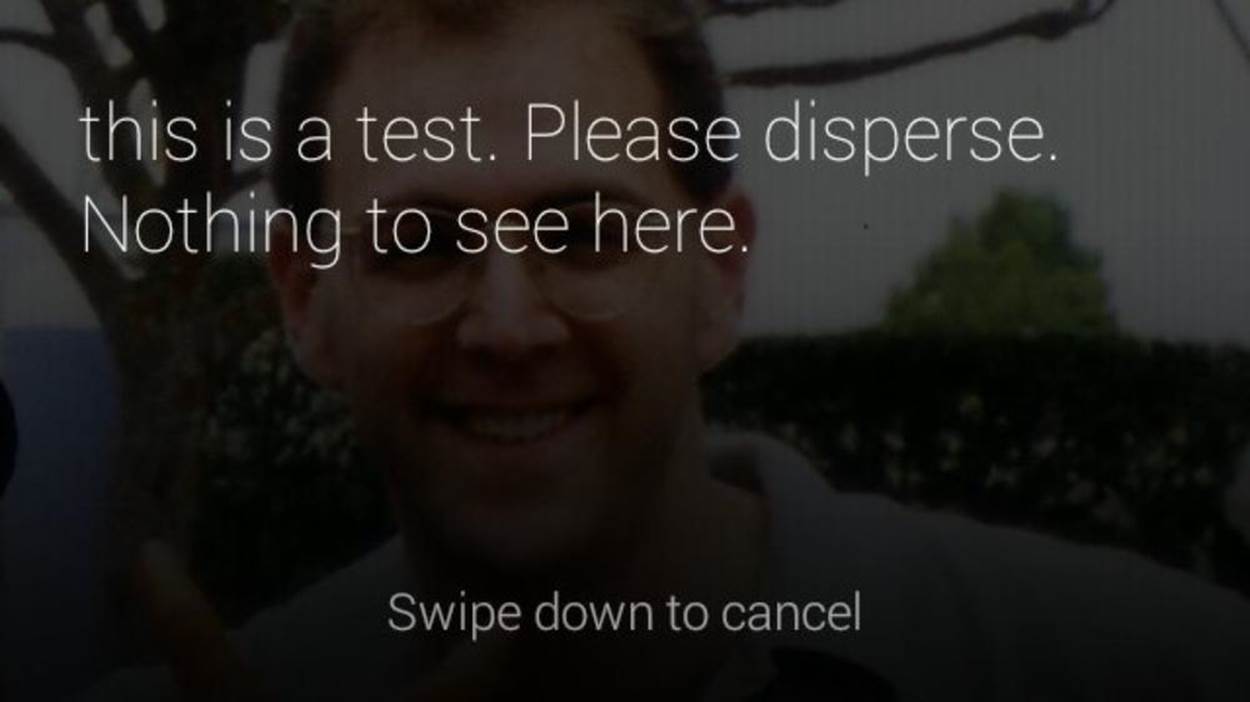
Figure 5-1. Cancelling actions in cards
We’re all just one tap or swipe away from losing what could be a valuable piece of data, so be up front and clear about what impacts the choices and input controls your Glassware makes available will have.
Provide Web-Based Configuration
You would also be wise to keep configuration tasks like choosing certain categories of content or picking what time to not receive notifications from a service away from Glass. Sending users to more capable web UIs in a browser interface allows form elements to be used to their fullest, including some of the newer HTML5 controls like datepickers, without trying to implement workarounds that would be tedious to use on Glass.
Persistent values that span multiple sessions such as user configuration settings, and application preferences should be stored on the server in a database, not directly within timeline cards, even for native apps built with the GDK, which we detail in the Develop section of this book. The Glassware developed by CNN, Elle, and LynxFit each feature browser-based configuration so that complex forms, web menus, and categorical choices aren’t forced into the prism. And administration of your service should be relegated to a web-based interface and accessible via desktop or mobile browsers, and/or an accompanying mobile app.
Herein lies one of the main advantages of Glassware—Mirror API services run on HTTP servers, so they talk to other HTTP services easily. Just write a web form to configure user settings for your Glassware and wire it up to your Glassware backend to associate it with your user database. This makes using your stuff inherently multiplatform, which is a major victory for building your brand.
Noble Truth 2: Don’t Get in the Way
The second Noble Truth of Glass service creation is essentially a “No Loitering!” policy for third-party programs, upholding the nonintrusive nature of how Glass was built from the ground up. Put it this way: the system software doesn’t barge in on its wearer, so neither should your Glassware. This isn’t to say that you shouldn’t make your presence known; just don’t linger around when the user’s done using your stuff, and don’t make the act of using it time-consuming. In wearable computing the top priority is the wearer, so the objective is to let her get on with her life.
Notify Responsibly
Another big area of designing your service is respecting the product’s ambition to stay the heck out of the user’s way. You may have a really popular social application across multiple platforms, or while reading this book you may have been dropkicked by your muse or guardian angel and came up with an amazing idea—but recognize the fact that even though you may have a ton of data the user may want, Glass is still meant to be a low-intrusion medium.
Despite having one of most voluminous archives of content in the world, the New York Times Glassware only generates headlines once per hour, and deviates from this workflow only when pushing breaking news items when they occur. The Times sticks to its intelligent distribution schedule for the day’s major events through batch processing, which is predictable and expected and thus does not interfere with the users’ daily activities as they go about their day. This is also efficient in terms of the backend; the timeline card bundles that the Times delivers contain one or more stories, but generating them involves just a single sync operation for Glass, and one notification.
A wise design decision is to avoid bombarding your subscribers with constant notifications, and knowing how to reshape your data into a manageable load that respects the ongoing activity of the Glass user is a powerful skill to hone. A big culprit for this will be social software applications, which are challenged to find a way to condense their users’ data, consisting of their graphs and accompanying messages, into a concise format. Twitter has done great work to this end with its Glassware, not forcing people to ingest the entirety of their timeline, as we detailed in Chapter 4.
You may very well have a veritable firehose of updates to offer to an audience, but knowing what pulses are acceptable across desktop, web, mobile, and Glass applications, and knowing how to properly spread them around with each of those platforms, is the sign of a champ.
Even in cases where batch processing might mean receiving a whole slew of updates at once, it’s probably not necessary to send a notification for each one. Winkfeed, a Mirror API–built service that lets users subscribe to multiple information channels, gets around this problem by issuing bundles of cards during times when two or more sources are pushing alerts at a user, rather than pushing multiple timeline cards independently (Figure 5-2). It even goes a step further by laying out a helpful summary of the bundle’s sources within the cover card. What could be a very noisy problem at scale is handled beautifully, respecting the user’s bandwidth…and sanity. Your customers will appreciate it.
BUNDLE OR DIE
One of the most consistent patterns in use by the best Glassware is that services publishing multiple timeline cards do so by organizing them into bundles, where appropriate. So keep this in mind if you want your stuff to make it into the official channel and get top exposure.
We all share the same space, so let’s not drown the user with new timeline cards every eight seconds.
Remember that while other developers may in practice be your competitors, as part of this community they’re designing for Glass, too. Your goods actually become more useful when not in the user’s face all the time. People will appreciate the breathing room.
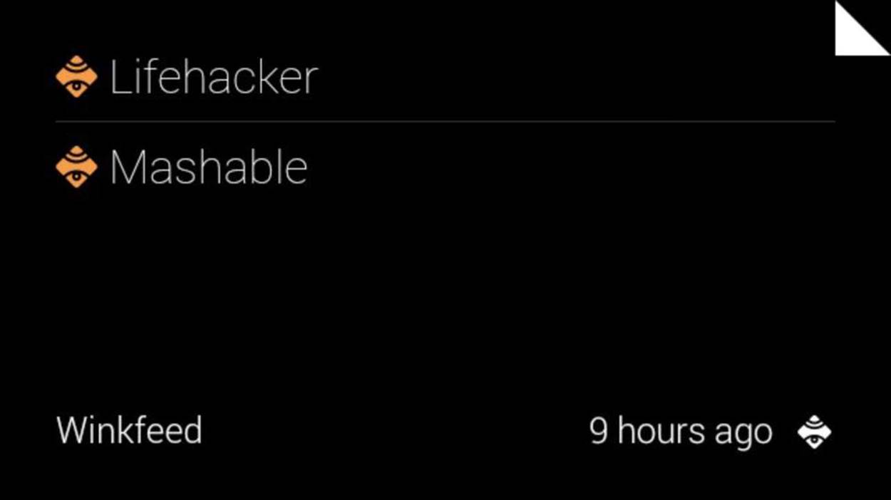
Figure 5-2. Winkfeed uses bundles
Less Is More
An example of not getting in the wearer’s way while still providing great usability is Strava’s fitness apps—Strava Run and Strava Cycling. They deliver great usability by giving measurements during your workout, comfortably placed in a card that pins itself to the left of the home screen that shows running stats while you work out, and slips quietly into the background when Glass goes to sleep rather than stay present in your periphery with the display on, possibly distracting you and draining the battery. The apps are always accessible at the moment’s notice, completely hands-free, by waking up Glass with a head nod. There you’ll get real-time measurements and progress reports read to you audibly every half-mile about your pace and progress, even if the device’s display isn’t awake—the audio is delivered as you hit your milestones. The same feature is available with turn-by-turn navigation when getting directions to a destination.
This is a technique that’s easy to do regardless of whether you’re working with the Mirror API or the GDK, and proves how a major part of a high-impact user Glass interface sometimes means having no visual element at all. The user’s interaction in the real world takes precedence over the user’s interaction with the system. This could even include in some cases that your target viewer may not get your notification, may never see your item on the timeline, or may just ignore you completely—and you have to deal with that. Good Glassware design means having some contingency.
Strava’s Glassware also uploads your progress to your profile as you’re working out, so your friends can see and compete against you. But you also get the ability to control certain aspects, such as marking splits with menu items. It’s an effective mix of automated and manual input that doesn’t take you out of the moment.
The Exceptions Make the Rule
The sole exceptions are immersions for GDK apps, which completely take over the Glass UI and keep the user constantly captive and engaged. While we’ve stated the overall goal to facilitate microinteractions, Glass is capable of handling larger, more demanding UIs, too, where appropriate—and what’s more, it isn’t appropriate for most things. Some situations in life are more critical than others and might require constant attention for longer periods of time, like surgeries, air traffic control towers, baby monitoring, or safety inspections.
Turn-by-turn navigation scenarios are an example of an immersive application—having a map dynamically display and update your position in relation to a destination, and making this resource available as a live card is significantly better usability than having to swipe to a specific point in the timeline to find a static map with location data updated only every few minutes.
Glass is designed to let people interact better with those things surrounding them, and Glassware needs to make sure it honors that. With regards to your service, this means getting rid of UI elements quickly and hiding long-running operations, so as not to unnecessarily draw the user’s attention. The Timer Glassware proceeds with user-defined countdowns quietly and in the background, but a live card app is pinned to the left of the home screen for the duration of its use and becomes immediately available and the first thing the user sees when Glass is woken up. The app is still a microinteraction-friendly conduit, not taking significant attention away from the user.
There are facilities to allow processes like backups and silent updates to run in the background, so leverage those if you need them.
Exhibiting altruism toward your fellow developers is also important, as well. Yours more than likely isn’t the only Glassware users are running on their headset, so keep notifications light and grouped logically. Rather than seeing this in terms of modern mobile applications where installed applications wage a perpetual battle for their owner’s eyeballs and time, Glass promotes respectful coexistence.
Noble Truth 3: Keep It Relevant
Interacting with Glass is very much helping you stay in the now. Doing things that don’t contribute to that will lead to negative experiences with your service. Again, you’re not trying to take the users away from the real world, you’re keeping them in it by having technology be a transient presence. And with Glass being a contextual platform, providing information and interactivity capabilities in real time for variables like location, time, and any associated events from other applications is a big opportunity.
To illustrate the point, say you maintain Glassware that tracks the variance of stock prices throughout a day’s trading. Rather than provide a constant stream of new timeline cards each time a security’s price changed, you would want to initiate a fresh pinned card to start off, and then update that same card when certain criteria are matched (e.g., percentage or price fluctuations above/below a set threshold), as opposed to generating a series of new cards each and every time an event occurs and flooding the user’s timeline.
NOTE
It’s worth noting that this Noble Truth was modified from its original dictum of “Keep it timely.” Emphasizing relevance, of which time is inclusive, speaks more to making information truly contextual based on multiple signals, as well as both time-sensitive and location-aware, which dramatically increases its value. This is the greater good and gives a better sense of what the user is doing at that precise moment.
Consider, for example, the desire that everyone has to get on the “OK Glass” voice command main menu, or to have their Glassware’s cards pinned. This is an app-centric focus—we want our applications prominent for the user. But it forces the users into our world instead of trying to understand the world that they want to be in. They don’t want to sort through dozens of pinned cards to find the one they want. They want us to deliver information to them when, and only when, they want it. They want to take action, not start an app. They want to be able to easily ask for new information. They want to quickly find the data they know is there…somewhere. They don’t want clutter.
Context FTW
It’s also vitally important to note that when Thinking for Glass, relevance applies not only to time, but also to space. This goes back to the point we can’t stress enough that Glass is a conduit for contextual data, which these days is multidimensional. Where the user is, what those conditions are (i.e., weather and traffic), and who is in his or her proximity are among the additional signals you can use to add richness to your Glassware and make it more meaningful. Take for instance Field Trip—after the Glassware has been enabled, helpful information pops up wherever you are right at the moment when it makes the most sense, without being invoked by you.
Additionally, weather monitoring applications are always going to be big, and eyeFlame built Glassware that tracks tropical storms. It has a neat twist: it lets you customize the geographic zones you wish to keep tabs on (including your own) to receive timely storm data.
We can also predict seeing a similar service that might push card bundles containing the local time, currency exchange rate, news headlines, and common phrases to ask when a wearer gets off the plane in a new country. It could even hail taxicab owners for the area. Or, how about a more complex app that would illuminate your prism display with factoids about the movie or TV show you’re currently watching? Further, let Glass talk to your DVR and send you recommendations based on who’s starring in a particular show. Or, consider a home automation application that uses the Glass sensors to display suggested cards that would let you wirelessly adjust thermostat, air conditioning, and lamp settings based on the surrounding temperature and available sunlight. Or maybe Glassware suitable for a hotel would save road-weary guests from the arduous task of standing in line to check in, getting their room key, seeing about any messages, ordering a pay-per-view movie and room service, booking a seat for the dinner show later that night, and then queueing up the next morning’s wakeup call.
Or you could even build an app having nothing to do with Glass but geared toward its users—a bar or club owner could define a geofence at their establishment that would alert friends within the same Google+ circle or Path clique of each other’s presence there on their devices when each arrived, and when 10 or more of them arrived, they all got a free round on the house.
See what we mean? Context rules!
How Soon Is Now?
So the stage is set for Glass to relay the freshest content, the most relevant information, and the most up-to-the-second data available. Impressed with the responsiveness that Glass offers, noted tech critic Steve Gillmor said of the Glass experience, “The whole world is not only watching but feeding the real time stream. Social meets mainstream.” Nowadays people online expect their applications to reflect the latest information. And they will with Glass. Any message a user gets she’ll expect to have just happened.
But again, with respect to the first Noble Truth, this doesn’t mean blasting inbound notifications at subscribers nonstop. A bit of restraint needs to be applied in shaping the contextual value of your message and exactly how quickly you need it to be delivered.
Don’t rush into this, really give it some thought. How critical is your information? Is it time-sensitive? How in sync is it from the source in relation to the person using Glass? For example, Glassware from a government utility agency informing 90,000 subscribers that they’ve got a power outage to look forward to nine hours from now is a lot different than an early-warning weather system informing 90,000 subscribers that a tsunami alert was declared three minutes ago and to seek high ground immediately, which is a lot different than an auto dealer informing 90,000 subscribers that a brand-new Lamborghini Murciélago is on sale for only $100 and ends in nine minutes. Get it? It’s all about context.
Timeline cards generated with the Mirror API are not real-time entities—even though data on an existing card can be modified on-the-fly and will change as a user is looking at it. Just update a card that’s already been inserted and if Glass is awake and that card has focus, the user will see the new data without having to refresh. Only the GDK is capable of producing items for the timeline that are truly zero latency, based on sensor readings and programmatically using live cards as a frontend.
The Glass sync operation for Mirror services is driven by a special build of Google Cloud Messaging, and while the system does deliver messages incredibly quickly, message delivery isn’t guaranteed as soon as an event fires (it may attempt a series of retries or queue the message temporarily). Also, Glassware using the Mirror API that uses search tends to take longer than Google’s search feature on Glass (which is a native app). Search features in Glassware from KitchMe and Fancy are known to take as long as a minute before returning matching listings when queried for recipes and shopping, respectively.
So with information being delivered online as it happens—more or less—these are very exciting times, and this is a big part of the thrill of writing Glassware.
(Even if the numbers are fudged just a little for dramatic effect.)
Noble Truth 4: Avoid the Unexpected
Any respectable book on software development will stress the importance of defensive programming. And that’s certainly true as you begin and progress through your adventure in Glass development…with a twist. Because of the intimacy Glass creates between itself and its owner, unexpected or out-of-context behavior with any aspect of the system disrupts this bond. As such, bothersome actions feel significantly more disturbing than with other distributed platforms. So maintaining this relationship should be of utmost concern to you.
Content
If you’re writing a Glass service that’s content-centric, there are a few gotchas to be on the lookout for. If your service spits out preformatted hypertext, like that generated by a content management system, you may need to scrub your HTML through a regular expression to filter out unsupported tags and attributes.
The complexity and length of your content is also a biggie. You might want to extend a multiplatform CRM app you manage, which is great, but keep the complicated stack charts out of Glass. If you’re building something with social integration, temper how your user input and interface elements are applied within timeline cards to fit the microinteraction motif. Emoticons? Absolutely. Presence indicators? Sweet! Geolocation and check-ins? Knock yourself out. Image tagging? Maybe. Long status updates? Perhaps. Feature-length articles? Not so much. We stress again the need for terseness.
Even with features that let cards handle longer chunks of text like bundles and automatic pagination, your optimal goal should still be to shoot for a single screen. People anticipate the body of an electronic post to be the main course, and especially for a new medium like Glass, probably won’t assume multiple pages. The best microinteraction is the one that requires as little input as possible. If a user gets an alert from you and with a simple head nod is able to get all the content on a single screen, that’s a perfect situation. Even with hands-free, aim to be completely hands-off.
Even if you’ve got nothing but text in a timeline card and use the full space available to you, there’s not a whole lot of room to work with. Keep an eye on excessive information within them and spread extended messages out over multiple cards, or utilize ellipsizing or truncating material or having it bleed out of the display. This highlights the need to manage expectations—using the various visual cues that are available to indicate there is more text that isn’t visible. Less is more, once again.
Performance
There are a number of things that programmers can do to cause Glass to quickly heat up. These mostly apply to those using the GDK, as direct programmatic access to the hardware, running long loops, or running computationally expensive background services tax the processor, which results in it generating excessive heat, which also quickly drains the battery. A failsafe feature in the Glass OS blocks any Glassware from running in cases where the device is overheating, letting the system naturally cool down for a couple of minutes and giving the system a much-needed break. We’re still aiming at small usage, so even custom-built applications shouldn’t be used for more than a few minutes to ensure the reliability of the system.
Generating cards in obnoxiously large loops can be dangerous overall and you don’t want to tax the system. Even if you send cards in bundles, try not to do too many. Instagram could easily generate hundreds of cards with images for its high-end users that follow 10,000 profiles; and while that works for a smartphone or tablet, it’s not a positive Glass experience. It requires lots of user attention, and lots of interaction to page through them, which forces the display to stay on, causes alerts to constantly go off, and drains the battery.
Judicious management of the camera and processor and not keeping the projector unit active for long periods of time is therefore a must, because you don’t want the system overriding what your service and the user are trying to do, stalling what should be productive time with defensive procedures in what is essentially the Glass version of a fire drill. Simply stated: when you’re good to the system, the system’s good to you.
Don’t Be a Bandwidth Hog
And also, dear reader, while animated GIFs are supported within timeline cards by specifying their URL in the “src” attribute in <img> elements, you’ll want to steer clear from using those haphazardly assembled files that take movie scenes and turn them into 45-second miniclips based on rasterized JPGs. The end result is file sizes that are insanely hard to work with, take longer to download, and make the system crawl.
(Mercifully, the Mirror API caps media uploads at 10MB.)
Further, this is bad content design and a card that appears like in Figure 5-3 would certainly be considered unexpected behavior, due to the fact that a user isn’t able to visually discern between a broken image and one that’s loading in the background. The timeline doesn’t use any sort of “loading” icon or status bar for large images like Google+ has for animated GIFs within streams, or Vine or Instagram use for embedded videos—so a Glass user won’t know if an image placeholder icon in a card is simply a mis-referenced image, one that’s loading, or severed connectivity, as Figure 5-3 demonstrates. If a file is tremendously large, nothing may load as the card’s background anyway, and they’d not see anything, except for perhaps a confusing caption with no context.
Figure 5-3. A nonloaded image
A broken image icon within a card when connectivity is spotty…the users can’t tell what’s going on with the image, just that it’s not loading. We’d bet that most of the time they’d just swipe on through—they’ve got better things to do than wait for images to load. Avoid these situations at all costs.
The best practice in our community is to defer to the native Glass media player, which streams video playback from the source. If you really want to have moving pictures with your card, include a snapshot and link to a movie file, or reference a clip and let Glass handle it gracefully with its own dedicated player. Don’t try to be sneaky and force an animation to loop within a card. Thinking for Glass means being responsible, and a good neighbor.
And if you see someone using them, make a Netizen’s arrest under the charges of Not Cool Design.
Permissions
Another area where not forcing unanticipated behavior upon the user is crucial is in service-level permissions. If you’ve developed some neat functionality you’ve put in a custom action, make sure the user knows about it. Mirror API services follow the same sandboxing model that Chrome extensions and server-side applications do in that they can’t access and/or manipulate each other’s data, but this doesn’t mean you should just go merrily along without thoroughly informing the user about what your stuff’s capable of. Don’t be cheap and fly under the OAuth 2.0 radar and assume that it’ll provide blanket coverage for you working with the user’s data.
Fear not, we’ll fully get into permissions and authorization in Chapter 8, so you’ve got that to look forward to.
In Glass development, the operations that should be declared up front are working with a user’s location, writing data to a cloud storage service like Google Drive or Dropbox, doing work when the user isn’t using the system, incorporating her contact entities, or using her credentials for another system like a social network such as Google+. To do otherwise might seem nefarious to the end user, and there’s no better way to earn unsavory ratings and reviews for your products than being shady.
This speaks to a big part of development on any platform, but it’s something that has particular relevance to Glass, since context is the order of the day: user expectations. We mentioned wisely futureproofing earlier, but this doesn’t mean including permissions and OAuth scopes you’re not currently using. All Mirror API Glassware will need read/write access to the user’s timeline; optionally, the Glassware may need to ascertain location data, and possibly even profile information about the wearer. Figure 5-4 highlights Ice Breaker, which requires the user to confirm granting several such permissions. Be up front and state in simple terms what your Glassware does and what data it requires. Some people get skittish about nonmap apps using location data (recall the conspiracy theories from Chapter 3).
Honesty truly is the best policy here, so make sure to do the right thing.
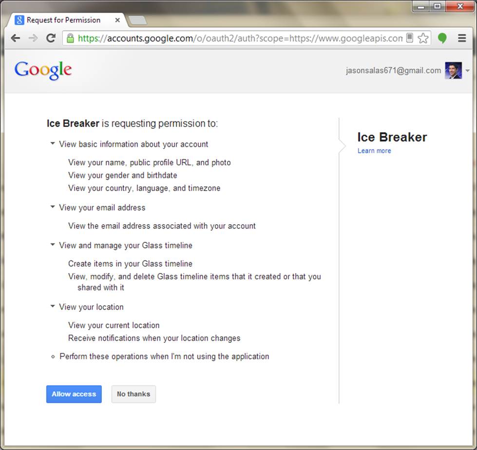
Figure 5-4. Permissions for Glassware
Error Handling
Simply stated, error handling is different when you Think for Glass. Robust an operating system as Android is, things will go wrong. As opposed to web programming where astute practices normally involve recording an error, handling it in a graceful manner, and displaying some sort of friendly message within the client app (or as friendly as it can be to say, “Oops, we messed up”), in the Glass world just sidestep anything visual altogether. You’ll want to avoid sending wonky error codes to the user and waste a sync cycle and do not want to uselessly generate or update a timeline card. Have some facility that logs an error code and informs you as the developer that something went awry (SMTP, SMS, IM, etc.) so that you can quickly take action to remedy the situation. Including timestamps on your timeline cards is helpful in this regard, as a sly reference to let the user (and you) know when the last successful sync occurred.
For native Glassware, you might consider implementing a messaging feature where crash reports could be logged and sent back to you, complete with stack trace information.
Figure 5-5 shows how Fancy’s Glassware handles issues with searches against its database, and Figure 5-6 is a default error card inserted into the timeline when GDK Glassware experiences problems installing on the device.
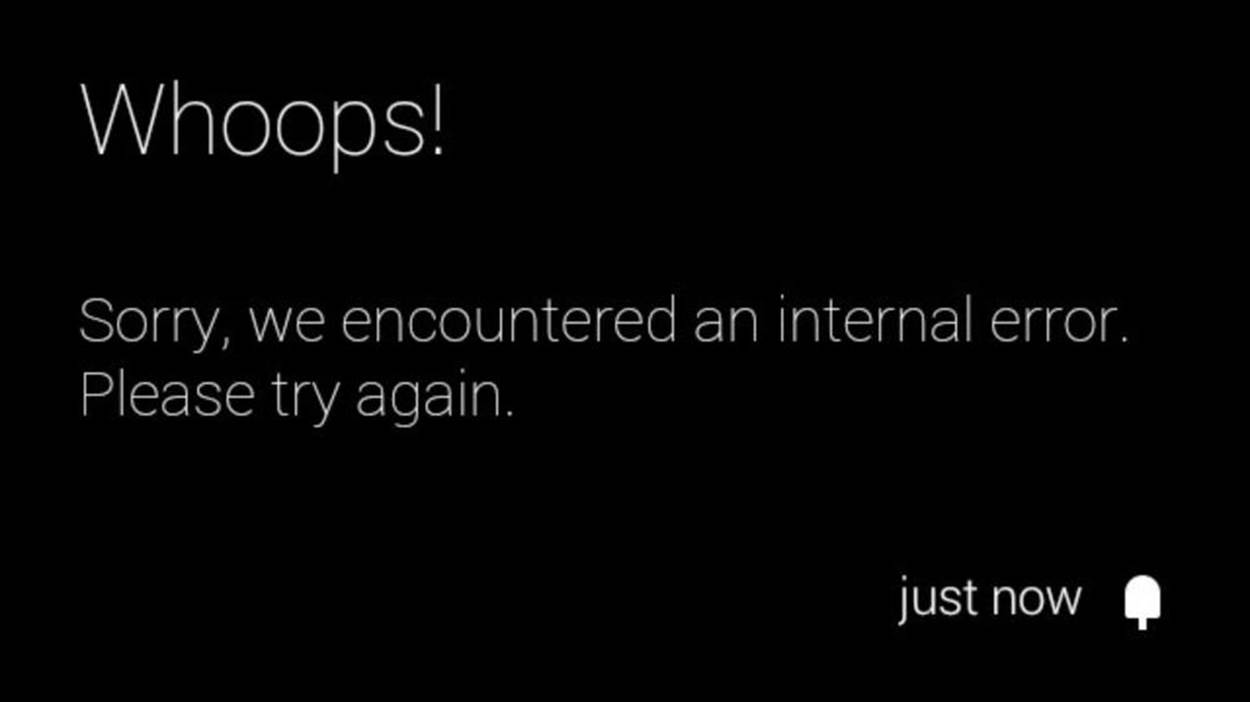
Figure 5-5. Error reporting
Because the service you’re writing is in the cloud, there’s no need to inform the user that there’s some new feature or the all-encompassing “various bug fixes” and then push an update. Assuming you don’t apply a change to your application code that requires one or more new permissions, you just update your service and let the changes silently roll out to subscribers naturally the next time they sync with the cloud or run the app. This again borrows from one of the prime advantages of web development and having your codebase sit on and be served from an HTTP server: you just hit “save” and deployment happens. You also don’t have to worry about client compatibility and fragmentation issues or whether your Glassware will work—it will.
Figure 5-6. Installation glitches
But for those unfortunate occasions when you have to suffer through periods of system maintenance, unforeseen downtime, getting hacked, a younger sibling downloading malware that locks up your server, or your dog chewing on your CAT 5 cable (all of which we sincerely hope never happen to any of you), just don’t send anything. Make system uptime status reports accessible on the Web and in a mobile app and tweet out updates, and make sure to note this in your Glass service documentation. A good application these days is multiplatform, so utilize the ecosystem you’ve built.
For a straight-from-the-horse’s mouth approach to error handling, consider Google’s best practices documentation about how to handle glitches when using the Google Mirror API to upload media.
Synchronization Across Platforms
A final tip for strategic design relative to keeping things clean is that you take care to follow a pattern of replicating notifications across as many devices as the user is signed into with his Google account as they occur. But this is only half the battle. The bigger concern at your application’s backend is that you should take care, especially when dealing with GDK Glassware that’s able to tap into cron-like alarms, to not let notifications linger across other devices after they’ve been dismissed elsewhere. As we embrace more screens in our daily lives, it gets more tedious to have to chase notifications around those screens, or swipe off a notification on your tablet or Glass that you dismissed on your smartphone three hours earlier.
Android has done this incredibly well since its Jelly Bean version (v4.3), and you shouldn’t neglect using the various synchronization tools that the Android SDK provides. Even for systems that rely on RESTful APIs, good multiplatform design dictates that notifications read on one device or OS shouldn’t hang around on another as if they’ve never been viewed. It’s causing more repetitive work for the user and goes against the microinteraction model.
An example of Glassware that does this really well is Hangouts. Imagine that you’re sitting at your desk and chatting with friends on your laptop using the desktop Hangouts widget in Chrome, while your phone and tablet sit idle on your coffee table, and Glass sits asleep on your head. As you post instant messages to your recipient(s), the other devices tend not to go off with the “new chat message arrived” tone whenever a participant responds as long as the group chat widget has focus in the current browser tab. Should you switch to another tab or minimize Chrome completely and someone sends you a message, one of the other devices in some indeterminate order will sound its alert.
The Hangouts Glassware does a really good job of not buzzing the bone conduction transducer each and every time during a lengthy chat session if another connected device has the focus. It’s very helpful and aids the overall experience by not inundating you with notifications across every single device and platform you are signed in to. While you should notify users about activity and cleanup alerts that the user has dismissed, Hangouts goes a step further to achieve this objective by suppressing excess noise.
In a similar fashion, Gmail’s Glassware lets you mark messages as archived or starred, which sync online to mobile and desktop clients within seconds. If you build a system where users are able to set their mood in text or graphically, make sure to apply updates across any listening channels, whether Glass was the client that applied the change or just is a connected destination that pulls down the new data.
This type of feature is common to popular web APIs, and pulling it off isn’t the same for everyone. It may be as simple as setting flags in your system as to the state of certain messages or as complex as concurrency and managing race conditions, so get creative here. The point is that you’d be wise to keep things tight if you exist on two or more platforms.
Work to bridge the digital divide!
Surprises Should Be Pleasant Surprises
Before moving on to the final Noble Truth, keep in mind that sometimes a little surprise can be a good thing. Not all unexpected behaviors result in negative experiences, and you should balance the amount of usability and functionality that your customers anticipate with innovation that they’d probably never ask for based on your domain expertise and creativity. Maybe gift them with a coupon from a partner based on how many times they’ve interacted with your app, or apply some gamification and set up a leaderboard based on the number of times people share your stuff. Perhaps a card-based tooltip for power users might be just the thing they need. Or plant the occasional funny easter egg just to show them you’ve got a sense of humor.
But this, of course, should complement, not supplant, rock-solid engineering and intelligent design—and basic common sense. You don’t need to have a master’s degree in marketing to know that sending people time-sensitive discount vouchers for a big sale at the department store isn’t practical during times when they’re asleep or if they arrive during periods when they can’t make use of them. Several Glassware programs let the users define their time zone for things like notifications. A time-sensitive buffer to ensure the wearer will actually see an alert for things like incentives is a great idea for campaigns like this.
Maybe you could even structure your Glassware so that over time it learns how each user interacts with it and adjusts the ordering of its menu items to be those that the wearer uses most frequently. This wouldn’t hurt your image and would plant the seed in the user’s mind that you’re looking out for his best interests, that your development team is really good.
They certainly won’t object to that.
Noble Truth 5: Build for People
The newest member of the bunch, the fifth principle reinforces the need to maintain the experience that Glass is a personal technology, by designing your Glassware in a way that adjusts to a user’s life and lifestyle. And let’s face it—the average human being is busy, scatterbrained, and lazy. So base the blueprint of your Glassware in a way that takes this into account. Exploit mobility, incorporate contextual input signals, leverage external configuration, emphasize gestures and voice as primary program control mechanisms, use lightweight data payloads, and lean toward limited attention demands.
As Glass gains in popularity and market share and the ecosystem expands, people are going to see the true benefits of integrating the device into their daily lives, so don’t outline a service that demands their full attention for long periods of time and requires constant manipulation.
Voice is a powerful component both as a user control and also as output. Because Glass is fully intended to be used in all sorts of situations and scenarios, inside and outside, supplement text in cards with the Read more built-in menu item action. Transcribe content and let people enjoy it at their leisure. In this sense, you’re offloading any need for a UI whatsoever!
This is a new way of presenting data and organizing an application’s user interface that you’re likely not used to, so don’t save this one for last or do it on the cheap. Really take some time to consider how your data will be delivered, how your application will be interacted with, how someone can easily share and receive resources while they’re on the go, and how someone would want to use your Glassware all the time. The blissful simplicity of Glass makes for an interesting design challenge.
As mentioned in Chapter 4, this involves predicting what specific activities the wearer will be doing when using your Glassware, and using that as the base for proper design. It’s the mother of all ambiguous statements, but in Glass the wearer’s environment is an active part of the UI.
Zynga’s achievements with its line of video games brought to light the fact that gaming didn’t have to be an all-encompassing experience; players could interact with them while in line at the supermarket. Its titles not only leaned heavily on being social, but also on existing as casualactivities. This is a great lesson that speaks to the heart of the Glass experience, not just within the gaming space but also with much broader implications. To flip the script, you might design produce-shopping Glassware you could comfortably use while waiting at the video game store.
Advocate Multitasking
You also want to put a premium on supporting multitasking as a core part of your Glassware’s usability. This can involve three key areas, depending on your implementation and which development framework you’re using:
Managing micronteractions
You do not want to impose too much effort in either interacting with the system or consuming content.
Integrate the real world with Glassware
You want to make the users’ actual experiences part of the Glassware for things like photo taking, time-sensitive news updates, and geo-accurate coupons and offers.
Using the timeline while your Glassware is running
This is a feature that’s promoted for designing great live cards with the GDK, as it allows the user to have a running service while browsing other content that’s arrived.
Glass Is Naturally Social
One other thing to mention is that the development model for Glassware is very conducive to writing social software. The mechanism for sharing a resource practically begs you to do it. Libby Chang, a Silicon Valley–based environmental engineer and a leader in both the Society of Glass Enthusiasts chapters for San Francisco and Asia, says a key factor in the Glassware design phase is “designing for community”, noting the ease with which resources can be Liked, retweeted, +1’ed, approved, and exchanged on social graphs and platforms, and ultimately distributed between them.
In designing great Glassware, it’s important to provide a solid feedback loop so Glass users know the actions they took on their device actually happened on your system. Two great examples that epitomize this effect for the social crowd are, again, Google+ and Twitter. When users want to endorse a post shared to their timeline, Google+ features a dedicated +1 menu item, and Twitter has its familiar Favorite and Retweet menu items. When a user taps “+1,” an animated status bar fills from left to right and sounds an alert, confirming the response. Twitter’s goes about this somewhat differently.
Choosing its Retweet or Favorite selections in a card immediately shows the “working” icon in the footer of the tweet, which then disappears after a few seconds. The card the user is endorsing is then copied and placed at the front of the user’s timeline to the right of the home screen, and an alert tone is sounded. Both services use the Mirror API’s provided tools with different implementations to achieve the same effect. The user knows her actions were posted, visually and audibly, and that her choices are now reflected on any other online platform. Their design tactics took different routes but delivered the same end result.
Evernote is also among several services with a neat feedback mechanism, allowing items to be shared from its web UI to Glass. Then when wearers use the Read aloud built-in action in their timeline items, the Glassware prefaces the content with “Evernote…” just to remind the user what service the item came from. It’s very simple and extremely helpful. This is a pattern encouraged for items to identify their source.
These examples are use-case specific, but demonstrate the flexibility of the platform while providing a new way to confirm actions. These same ideas can and should be applied for any type of Glassware.
THE POWER OF COMMUNITY
An important part of the Glass ecosystem is also the communities it’s spawned, like the Society of Glass Enthusiasts (SoGE), user groups that are completely independent and community-run. There are more than 25 chapters, spanning five continents throughout the United States, Canada, South America, Europe, Asia, and Australia. Some are regional, some are statewide, some are within a city. There’s even a SoGE chapter dedicated to Glass filmmakers! And UbiTech NYC is a thriving and eclectic group of wearable computing designers, engineers, and entrepreneurs in the northeast US.
Most user groups have frequent meetups, hackathons, and photowalks, and all focus on networking, listing events for the Glass community, exchanging ideas, sharing tips, and experiencing their surroundings through Glass.
If you can’t find a chapter near you, start your own! The SoGE logo templates are open source and freely available from Noble Ackerson’s GitHub repository so you can come up with your own design and charter your own local membership.
You can also get in touch with the numerous Google Developer Groups (Google the topic to find the closest one to you), or communities like UbiTech NYC, run by Katy Kasmai.
So…That’s It? Really?
From soup to nuts, Glass is a totally new way of working with data, users, and their environments. And as far as designing effective software solutions, that’s what you need to concentrate on. The Noble Truths ring true regardless of which developmental framework for Glass you’re using—but depending on whether you’re using the Google Mirror API or the Glass Development Kit, you do have some challenges and opportunities.
Because of the general streamlined model that follows from everything we’ve talked about in this chapter, keeping all five of the Noble Truths always in mind as you create the next great Glassware will make sure it honors the Glass experience and makes your users happy. Keeping these truths in mind is important, but not always so simple. Glass is so new that it is easy to fall into old habits that don’t work so well in our new world.
We’ll be looking at those traps next.