Android Development Patterns: Best Practices for Professional Developers (2016)
Chapter 9. Drawing and Animation
Creating rich experiences in Android applications cannot be done with amazing code alone. There must be visual allure—something that draws users in and gives their minds something to play with for those moments between view changes, swipes, and loading events.
This can be done with shapes, drawables, bitmaps, 3D graphics, and animation. This chapter explains the classes, frameworks, and best practices to add visuals to your application.
Graphics
Whether you are displaying a bitmap or using OpenGL ES to create textures and shapes, there are multiple ways to display visuals with Android. In this section, you learn about bitmaps, drawables, and rendering with OpenGL ES.
Bitmaps
Bitmaps are collections of pixel information that contain data that can be used to construct an image. Bitmaps are commonly used as icons and image assets in applications.
The supported file types when working with Android include PNG, JPEG, and GIF. If at all possible, you should avoid GIF files and use PNG files because the format will give you the best features of GIF along with a rich color palette and alpha channels.
To display an image in your application, you may want to start with an ImageView. An ImageView is a widget that is used specifically for displaying image content.
Warning
You may want to use large bitmaps to increase the detail and presentation of image assets used in your application. This may seem like a great idea, but you need to remember that mobile devices are limited on the amount of memory available. An image snapped with a device camera may come out to 5248×3936 (20 megapixels). To put this image into memory with a bitmap configuration of ARGB_8888 will take almost 79MB of system memory. This will immediately take up all available system memory and your application will crash, displaying an OutofMemoryError.
To avoid potential application crashes due to a lack of memory, you can scale your images before you load them. This can be done with an ImageView by setting the scaling type.
Each scaling type will do something different with your image, and you will need to do as much testing as possible to avoid aspect ratio and zooming issues.
The available scale types are as follows:
 CENTER (android:scaleType="center"): Even though this is a scale type, the image will be centered with no scaling applied.
CENTER_CROP (android:scaleType="centerCrop"): This will scale while matching the aspect ratio of the image to the maximum size of the parent container, but will cut off any part of the image that does not fit.
CENTER_INSIDE (android:scaleType="centerInside"): This will scale while matching the aspect ratio of the image to the maximum size of the parent container while showing all of the image.
FIT_CENTER (android:scaleType="fitCenter"): Uses a matrix to resize the image to fit while maintaining the aspect ratio and places the image in the center of the container.
FIT_END (android:scaleType="fitEnd"): Uses a matrix to resize the image to fit while maintaining aspect ratio and aligning the image to the bottom-right corner of the container.
FIT_START (android:scaleType="fitStart"): Uses a matrix to resize the image to fit while maintaining the aspect ratio and aligning the image to the top-left corner of the container.
FIT_XY (android:scaleType="fitXY"): Uses a matrix to scale the width and height of the image independently to fit a container. Does not maintain the aspect ratio of the image.
MATRIX (android:scaleType="matrix"): Uses a matrix to scale the image. Does not maintain the aspect ratio when scaling to fit the container.
The following shows an example of an ImageView added to a layout XML file:
<ImageView
android:layout_width="wrap_content"
android:layout_height="wrap_content"
android:src="@drawable/skyline" />
Figure 9.1 shows how these settings change the way a picture is displayed.
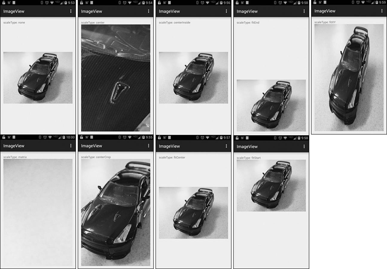
Figure 9.1 The scaleType settings used in the top row, moving from left to right: none, center, centerInside, fitEnd, and fitX. The settings used in the bottom row, moving from left to right: matrix, centerCrop, fitCenter, and fitStart.
NinePatch
A NinePatch is an image made from a bitmap that is capable of being stretched when displayed. The stretched areas of the image are made from repeating pixels and saved in PNG format with a .9.png extension. Figure 9.2 shows what a NinePatch looks like.
Figure 9.2 This NinePatch is used for the background and coloring of a button.
If you examine the NinePatch closely, you can see that there is 1 pixel of padding around the main image and that there are black lines around the top, left, right, and bottom. These lines define which areas of the NinePatch are repeatable that will be used as the stretchable area.
NinePatch files do not have to be perfectly square; you can use rectangles, circles, and even have some areas that contain an image or logo and will not be stretched. This allows you to create custom buttons and backgrounds that match the theme of your application that are the smallest size possible while working on as many different screens as possible.
To create your own NinePatch file, you can use the Draw 9-patch tool (draw9patch) that is included with the Android SDK. This tool can be launched from the sdk/tools directory via the command-line or terminal where you downloaded and uncompressed or installed the Android SDK.
When you open the utility, it asks you for a file to work with. If you do not have a file, you should either acquire or create one before proceeding.
Once you select the image file that you want to work with, you are shown the image along with information that will help you determine where the repeatable sections should be, along with where they should not be repeated. This window should look similar to Figure 9.3, which shows the program open with an image that contains a slight gradient.
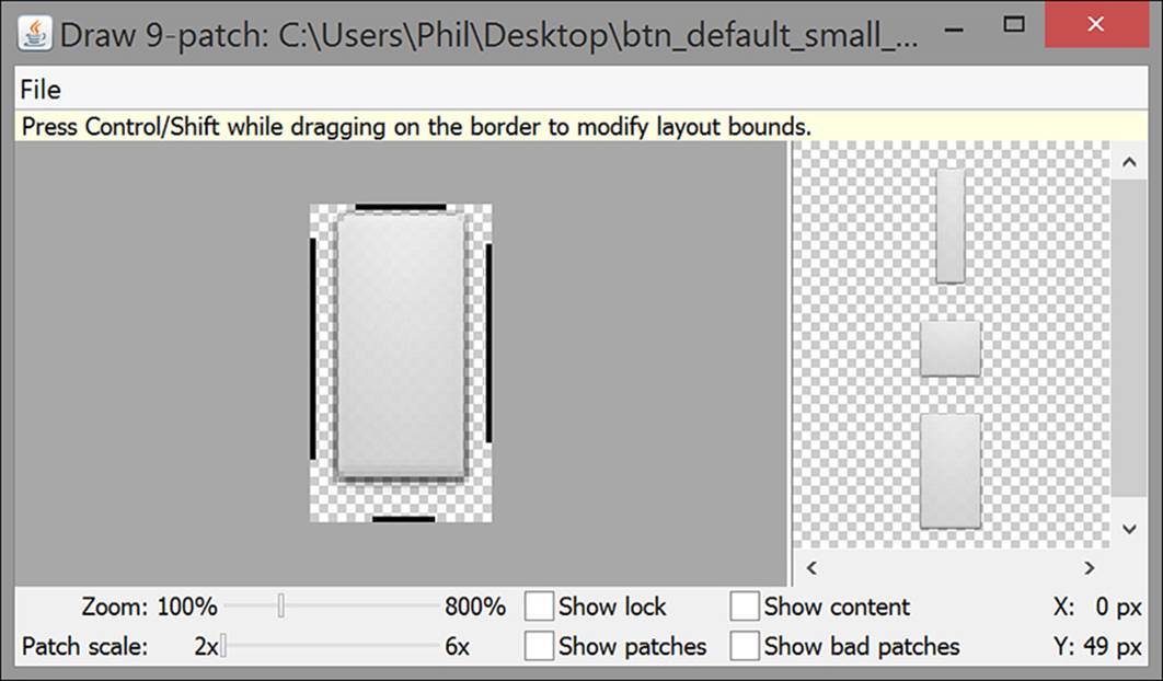
Figure 9.3 The Draw 9-patch tool allows you to edit, preview what your NinePatch will look like, and export .9.png files
After you have adjusted the image to your liking, you can then save the image out by using the File menu and selecting “Save 9-patch.” This will bring up a prompt of where you would like to save your newly created NinePatch file.
You can now use your custom NinePatch in your application by placing it in the /res/drawable/ folder of your project and referencing it in your layout XML file. The following demonstrates using the custom NinePatch (named customninepatch.9.png) as the background for a button:
<Button
android:layout_height="wrap_content"
android:layout_width="wrap_content"
android:background="@drawable/customninepatch" />
Drawables
The term drawable is a generic description of resources that can be drawn. Android has support for many built-in drawable objects, as well as the ability to allow you to create your own.
When something visual is rendered on the screen, this counts as a drawable. This explains why graphical resources, such as PNG files, count as a drawable. It also gives reason to why image assets are stored in the res/drawables directory of your project.
Note
Images placed in the res/drawable directory may be automatically optimized and replaced by more memory-efficient versions. If you prefer to keep the exact file you put in, you should place the drawable resource in the res/raw folder.
Some drawables do not require a resource to be placed in the res/drawable directory. Instead, you may be interested in using primitive shapes.
Using a primitive shape will help with memory and also allow you to create visuals purely from code. The following is an example of drawing a square shape in a custom view:
// Create variable for ImageView
ImageView myDrawnImageView;
// populate the variable
myDrawnImageView = (ImageView) this.findViewById(R.id.myDrawnImageView);
// Need to get dimensions of the screen
Display display = getWindowManager().getDefaultDisplay();
Point size = new Point();
display.getSize(size);
int screen_width = size.x;
int screen_height = size.y;
// Create a bitmap
Bitmap bitmap = Bitmap.createBitmap((int) screen_width, (int) screen_height,
Bitmap.Config.ARGB_8888);
// Create a canvas and attach the bitmap
Canvas canvas = new Canvas(bitmap);
myDrawnImageView.setImageBitmap(bitmap);
// use Paint() and drawRect() to draw a rectangle
Paint p = new Paint();
p.setColor(Color.BLUE);
p.setStyle(Paint.Style.FILL_AND_STROKE);
p.setStrokeWidth(40);
float rectLeft = 80;
float rectTop = 80;
float rectRight = 200;
float rectBottom = 200;
canvas.drawRect(rectLeft, rectTop, rectRight, rectBottom, p);
Note that in the previous snippet, both a stroke and fill are set. You do not have to set a stroke if it will be the same color as the fill, but you will have to adjust the size of your drawable to make up for the lost space that the stroke covered. Figure 9.4 shows the square that was created.
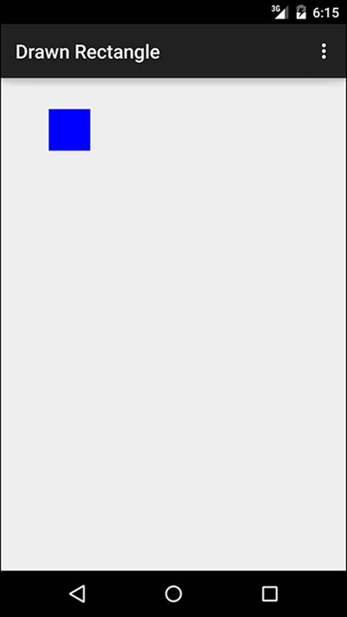
Figure 9.4 A blue square has been drawn using a bitmap, a canvas, and the drawRect() method.
Shapes can also be defined in XML by using the <shape> element. This is done by creating an XML file and placing it in the res/drawable directory.
In the same manner as working with bitmaps, the asset will be identified by the name of the XML file. If the file was named my_circle.xml, it would be referenced by my_circle.
The following is an example of a custom shape defined in XML:
<?xml version="1.0" encoding="utf-8"?>
<shape xmlns:android="http://schemas.android.com/apk/res/android"
android:shape="oval">
<solid android:color="#FF00FF00"/>
</shape>
This shape will draw either a green oval or a circle. By defining the basic elements of the shape, a View can reference this shape as the background and apply various constraints to show it as either a circle or an oval.
Figure 9.5 shows what the shape looks like when rendered as a background for a view with a height and width of 50dp.
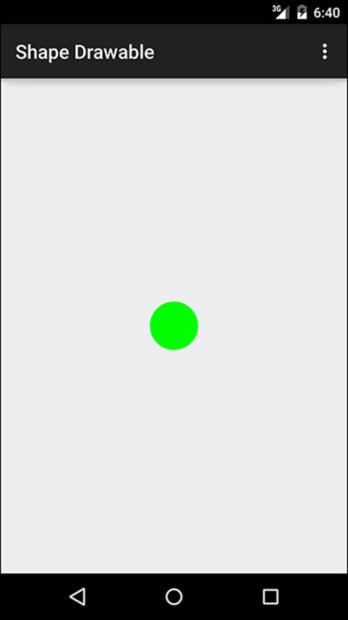
Figure 9.5 With a rendering container that shares the same width and height, a small green circle is rendered on the screen, even though the shape is defined as an oval.
You can also use system drawables in your projects. These resources can, however, be a double-edged sword. They enable you to match the system theme, allowing a user to quickly understand what the icon or image means, but if used improperly, they confuse and destroy the trust a user may have for your application.
Another issue you may run into is that because they are part of the system, they may change from version to version. This means that you have no control over the past, present, or future visual styles.
Should you find that you still want to use these resources, visit http://androiddrawables.com/. Here, you will find a list of available resources and what they look like in various versions of Android.
OpenGL ES
OpenGL for Embedded Systems (OpenGL ES) has been supported by Android from version 1.0 of the Android system. This, however, does not mean that every version of OpenGL ES is compatible with every version of Android.
As a quick reference, the following lists the version of OpenGL that can be used with various Android versions:
OpenGL ES 1.0–1.1 supports Android 1.0+.
OpenGL ES 2.0 supports Android 2.2+.
OpenGL ES 3.0 supports Android 4.3+, provided the manufacturer has built in support for the graphics pipeline.
OpenGL ES 3.1 supports Android 5.0+.
Tip
Due to breaking changes with OpenGL ES 1.4 and 2.0, you cannot mix and match the API calls and usage. OpenGL ES 3.X is backward compatible with 2.0. This allows you to code for 3.0 and set your feature level to 2.0 and then use a runtime check to see if the device will support 3.0, allowing the use of the advanced 3.X features.
To use OpenGL ES in your application without the APK, you first need to modify your application manifest to add OpenGL ES as a feature. Depending on the version you plan on using, this can be done as follows:
<!-- to use version OpenGL ES 2.0 - Android 2.2+ -->
<uses-feature android:glEsVersion="0x00020000" android:required="true" />
<!-- to use version OpenGL ES 3.0 - Android 4.3+ -->
<uses-feature android:glEsVersion="0x00030000" android:required="true" />
<!-- to use version OpenGL ES 3.1 - Android 5.0+ -->
<uses-feature android:glEsVersion="0x00030001" android:required="true" />
While you are modifying your application manifest, if you plan on using texture compression, you need to declare it in the manifest as well. Remember that not all texture compression types are compatible with all Android devices. By placing the type of compression used in the manifest, you allow the Play store to filter out your application from devices that cannot support the compression type.
Now that you have your application manifest properly set up, you are ready to start using OpenGL ES in your application. To do this you will want to work with the GLSurfaceView and GLSurfaceView.Renderer.
In your Activity, you will want to start by creating the GLSurfaceView object and then setting it as the primary view in the onCreate() callback method. After setting the GLSurfaceView as the main view, you will also need to implement callback methods for theGLSurfaceView. The following shows a minimal framework that could be used to set up a GLSurfaceView in an application:
// Create GLSurfaceView object
private GLSurfaceView myGLSView;
@Override
public void onCreate(Bundle savedInstanceState) {
super.onCreate(savedInstanceState);
// Set myGLSView to the MyGLSurfaceView class
myGLSView = new MyGLSurfaceView(this);
// Set the myGLSView as the main view for the activity
setContentView(mGLSurfaceView);
}
@Override
protected void onResume()
{
super.onResume();
// set the onResume callback of the GLSurfaceView
myGLSView.onResume();
}
@Override
protected void onPause()
{
super.onPause();
// set the onPause callback of the GLSurfaceView
myGLSView.onPause();
}
In the previous example, the myGLSView object is set to an inner class. This allows you to set the version of OpenGL ES that you want to use as well as to set up the renderer. The following shows another minimal setup of that class:
class MyGLSurfaceView extends GLSurfaceView {
private final MyGLRenderer myRenderer;
public MyGLSurfaceView(Context context){
super(context);
// Set context to OpenGL ES 2.0
setEGLContextClientVersion(2);
// Set the renderer
myRenderer = new MyGLRenderer();
// Set the Renderer for drawing on the GLSurfaceView
setRenderer(myRenderer);
}
}
The renderer also points to another class to handle the initial setup and implementation of the onDrawFrame() and onSurfaceChanged() methods. This is shown as follows:
public class MyGLRenderer implements GLSurfaceView.Renderer {
public void onSurfaceCreated(GL10 unused, EGLConfig config) {
// Set the background frame color
GLES20.glClearColor(0.0f, 0.0f, 0.0f, 1.0f);
}
public void onDrawFrame(GL10 unused) {
// Redraw background color
GLES20.glClear(GLES20.GL_COLOR_BUFFER_BIT);
}
public void onSurfaceChanged(GL10 unused, int width, int height) {
GLES20.glViewport(0, 0, width, height);
}
}
To then begin drawing shapes, you need to create a class for your shape, create the coordinates of your shape, pass the coordinates by using a ByteBuffer, and then draw it out. An example of creating a triangle follows:
public void myTriangle() {
private FloatBuffer vertexBuffer;
// Set number of coordinates
static final int COORDS_PER_VERTEX = 3;
static float triangleCoords[] = {
10.0f, 200f, 0.0f,
10.0f, 100f, 0.0f,
100f, 100f, 0.0f
};
// Set color with red, green, blue and alpha (opacity) values
float color[] = { 0.5f, 1.0f, 0.5f, 1.0f };
public Triangle() {
// Set ByteBuffer for shape coordinates
ByteBuffer bb = ByteBuffer.allocateDirect(triangleCoords.length * 4);
// Set native byte order per device setting
bb.order(ByteOrder.nativeOrder());
// Set a floating point buffer from the ByteBuffer
vertexBuffer = bb.asFloatBuffer();
// add the coordinates to the vertexBuffer
vertexBuffer.put(triangleCoords);
// set the buffer to read the first coordinate
vertexBuffer.position(0);
}
}
Beyond drawing shapes, you will want to study the official docs for working with OpenGL ES at https://www.khronos.org/opengles/. This will give you the specifications for the available versions of OpenGL ES as well as online reference manuals and cards.
For those looking for a “bare-metal” approach to using OpenGL ES, you can use the Native Development Kit (NDK), which you may also want to use for calculation-intensive operations, including writing RenderScript.
Animation
If you are not using a 2D- or 3D-rendering engine for your application, you can still add some eye candy and visual splendor to it by using view and property animations.
View Animation
A view animation is used when you have two views and would like to animate between them. Those with animation experience know that when a transition is built between one view and another, there are many in-between (or tween) frames that must be drawn to smoothly show the change between one view and another.
Note that even if you are not building a transition, the tween frames are still needed to animate a single view with changes such as scale, rotation, and translation. The view animation does all the math, calculation, and drawing for you to handle smoothly animating changes to views.
To create a view animation, either you can use an XML file that contains the details of the animation and is stored in the /res/anim directory of your project or you can use the AnimationSet and Animator classes to define an animation with Java.
To define an animation in XML, you need to define a <set> element that will contain sub-elements to start defining an animation.
There are four basic animation effects you can use:
alpha: Controls the opacity or visibility
rotate: Controls the degree of rotation
scale: Controls size
translate: Controls the placement in both the X and Y planes
Each of these animation basics can be used in the animation XML. The following demonstrates a sample animation XML:
<scale
android:interpolator="@android:anim/accelerate_decelerate_interpolator"
android:fromXScale="1.0"
android:toXScale="1.5"
android:fromYScale="1.0"
android:toYScale="0.5"
android:pivotX="50%"
android:pivotY="50%"
android:fillAfter="false"
android:duration="800" />
The <scale> element designates that this animation will scale what it is used with. The properties listed are how the scale is controlled. It is worth noting that the easing of the effect is controlled by an interpolator. This is set with android:interpolator with many different values that can be used. A list of subclasses that can be used can be found at http://developer.android.com/reference/android/view/animation/BaseInterpolator.html.
If you want to perform more than one animation, you may use a <set> element and even nest more <set> elements to run animations in sequence or at the same time.
For a complete list of the properties that can be used with view animation, visit http://developer.android.com/guide/topics/resources/animation-resource.html.
Property Animation
View animation is great for working with specific animations and views, but not everything that you may want to animate is a view or is one of the four basic animations.
Property animation allows you to animate properties of any object, including views. This opens up new options because you may not have thought about animating properties such as text and background color.
Similar to using a view animation, you can use XML to define a property animation. Property animation XML files can contain <set> elements as well as <objectAnimator> and <valueAnimator> elements to control the animations. Unlike a view animation XML, property animation XML files should be placed in the res/animator directory of your project.
The following shows an example of a property animation XML file:
<set android:ordering="sequentially">
<set>
<objectAnimator
android:propertyName="x"
android:duration="600"
android:valueTo="500"
android:valueType="intType"/>
<objectAnimator
android:propertyName="y"
android:duration="600"
android:valueTo="350"
android:valueType="intType"/>
</set>
<objectAnimator
android:propertyName="alpha"
android:duration="800"
android:valueTo="1f"/>
</set>
In similarity to view animation XML files, the <set> element can be used to control when and if animations will run together or separately. In this example, there is a containing <set> element with a property of android:ordering="sequentially" that informs the system to start at the top and run through any child <set> elements before running the next animation.
To call the animation that was defined in XML, you need to inflate the XML into an AnimatorSet object as well as use the setTarget() method to attach the animation to a target. This can be done as follows:
AnimatorSet aniSet = (AnimatorSet) AnimatorInflater.loadAnimator(myContext,
R.anim.property_animator);
aniSet.setTarget(myObject);
aniSet.start();
Note that R.anim.property_animator is used to load the XML file even though it is stored in the res/animator directory. This is normal behavior and has more to do with the layout editor for the legacy Eclipse ADT plugin, which only checks the res/animator folder for resources.
Due to the extra control and complexity of using a property animation, more set up is required to create animations than using a view animation. Three subclasses extend the Animator class that you will be using to adjust and create property animations:
ValueAnimator: This subclass handles the calculation for values used in the animation.
ObjectAnimator: This is actually a subclass of ValueAnimator that is used to target an object with an animation value.
AnimatorSet: This is used to create sets of animations that relate to each other.
ValueAnimator
The ValueAnimator allows you to change the values of an object. This is done by setting a beginning and ending value, a duration (in milliseconds), and then starting the animation.
Note that because ValueAnimator cannot change an object or property directly, you must implement ValueAnimator.AnimatorUpdateListener.
The following demonstrates setting up a ValueAnimator:
// set up a beginning and ending value
ValueAnimator animation = ValueAnimator.ofInt(1,20);
// set duration of animation to 1.5 seconds
animation.setDuration(1500);
// begin animation
animation.start();
Instead of calling animation.start(), you may instead want to perform an animated value change based on the current event of an animation.
To do this, use one of the animation event listeners:
onAnimationStart(): Runs on animation start.
onAnimationRepeat(): Runs when an animation is repeated.
onAnimationCancel(): Runs when an animation is stopped or cancelled.
onAnimationEnd(): Runs at the end of an animation regardless of how it was ended. This is also called when onAnimationCancel() is called.
ObjectAnimator
Whereas the ValueAnimator could not be directly called on an object, the ObjectAnimator allows you to target an object property. The following shows how to use an ObjectAnimator:
// Target myObject for an alpha animation
ObjectAnimator oAnimation = ObjectAnimator.ofFloat(myObject, "alpha", 0f);
// Set the duration to 1.5 seconds
oAnimation.setDuration(1500);
// Start the animation
oAnimation.start();
As commented, the object myObject has been targeted to have the alpha property adjusted to 0 (not visible) over a duration of 1.5 seconds when the animation starts.
AnimatorSet
Animations can be combined to have multiple properties changed at the same time, start running at the same time, or run in a specific sequence by using an AnimatorSet.
The following shows several animations created with ObjectAnimator that will be added to a set and executed in order:
// Change alpha and set to 1.5 second duration
ObjectAnimator fadeOut = ObjectAnimator.ofFloat(myObj, "alpha", 0f);
fadeOut.setDuration(1500);
// Change the position of the object with 1.5 second duration
ObjectAnimator transX = ObjectAnimator.ofFloat(myObj, "translationX", -300f,
0f);
transX.setDuration(1500);
// Change alpha from 0 to 1 with a 1.5 second duration
ObjectAnimator fadeIn = ObjectAnimator.ofFloat(myObj, "alpha", 0f, 1f);
fadeIn.setDuration(1500);
// create AnimatorSet
AnimatorSet animatorSet = new AnimatorSet();
// fadeOut first, then run fadeIn and transX
animatorSet.play(fadeIn).with(transX).after(fadeOut);
// start the animation sequence
animatorSet.start();
By using the play(), with(), and after() methods, you can control when animations in an AnimatorSet will run. The animation used in the after() method will run first and the other methods will run when it completes.
Drawable Animation
The last type of animation you may wish to use is a drawable animation. The best way to think of this is like creating a flipbook, or even an animated GIF.
A drawable animation is composed of a list of drawables that will be played frame by frame. These resources are grouped in an <animation-list> element in an XML file that is stored in the /res/drawable directory of your project. The following shows an example of an XML file:
<animation-list xmlns:android="http://schemas.android.com/apk/res/android"
android:oneshot="false">
<item android:drawable="@drawable/andy_run1" android:duration="200" />
<item android:drawable="@drawable/andy_run2" android:duration="200" />
<item android:drawable="@drawable/andy_run3" android:duration="200" />
<item android:drawable="@drawable/andy_run4" android:duration="200" />
<item android:drawable="@drawable/andy_run5" android:duration="200" />
</animation-list>
Note the use of android:oneshot="false". This means that the animation will continually run from start to end. Should you decide that you would only like to run the animation one time, you can change the value from false to true.
The XML file is then referenced from your code during the onCreate() method. You can then invoke the animation in a variety of ways, including using an onTouchEvent:
// set up the animation for use
ImageView andyImage = (ImageView) findViewById(R.id.andy_image);
andyImage.setBackgroundResource(R.drawable.andy_running);
andyAnimation = (AnimationDrawable) andyImage.getBackground();
// ...
public boolean onTouchEvent(MotionEvent event) {
if (event.getAction() == MotionEvent.ACTION_DOWN) {
andyAnimation.start();
return true;
}
return super.onTouchEvent(event);
}
Tip
Some animations may need to use many bitmaps in order to appear smooth and buttery. This means that you need to take care in choosing the animation you would like to perform and strike a balance between file size and how smooth the animation appears. This is especially important when working with animations on wearable devices.
Transition Framework
The transition framework was added in Android 4.4 and allows developers to create scenes that can then be transitioned. This is useful when you have two different view hierarchies that you want to change between.
This will be accomplished by using the starting and ending layouts as scenes and then applying a transition to them that is controlled with a TransitionManager.
Warning
Views that contain AdapterView or ListView are not compatible with the transition framework. Attempting to use one anyway may result in an unresponsive UI.
Because there are going to be two scenes, I define these in XML. First, the contents of /res/layout/scene_a.xml:
<?xml version="1.0" encoding="utf-8"?>
<RelativeLayout xmlns:android="http://schemas.android.com/apk/res/android"
android:id="@+id/scene_container"
android:layout_width="match_parent"
android:layout_height="match_parent" >
<TextView
android:layout_width="wrap_content"
android:layout_height="wrap_content"
android:text="TextView 1"
android:id="@+id/textView"
android:layout_alignParentTop="true"
android:layout_alignParentStart="true" />
<TextView
android:layout_width="wrap_content"
android:layout_height="wrap_content"
android:text="TextView 2"
android:id="@+id/textView2"
android:layout_alignParentTop="true"
android:layout_alignParentEnd="true" />
<Button
android:layout_width="wrap_content"
android:layout_height="wrap_content"
android:text="Go!"
android:id="@+id/button"
android:layout_centerVertical="true"
android:layout_centerHorizontal="true" />
</RelativeLayout>
The contents of /res/layout/scene_b.xml:
<?xml version="1.0" encoding="utf-8"?>
<RelativeLayout xmlns:android="http://schemas.android.com/apk/res/android"
android:id="@+id/scene_container"
android:layout_width="match_parent"
android:layout_height="match_parent" >
<TextView
android:layout_width="wrap_content"
android:layout_height="wrap_content"
android:text="TextView 2"
android:id="@+id/textView2"
android:layout_alignParentTop="true"
android:layout_alignParentStart="true" />
<TextView
android:layout_width="wrap_content"
android:layout_height="wrap_content"
android:text="TextView 1"
android:id="@+id/textView"
android:layout_alignParentTop="true"
android:layout_alignParentEnd="true" />
</RelativeLayout>
Rather than using three different layout XML files, I instead give the RelativeLayout an ID of scene_container to signify that this is the containing element that will contain the transitioned scenes. It is important that the ID is set because it is used to initially set the scene.
The following demonstrates the code needed to set the scenes and transition to them:
Scene mySceneA;
Scene mySceneB;
@Override
protected void onCreate(Bundle savedInstanceState) {
super.onCreate(savedInstanceState);
setContentView(R.layout.scene_a);
RelativeLayout mySceneRoot = (RelativeLayout)findViewById(R.id.scene_container);
mySceneA = Scene.getSceneForLayout(mySceneRoot, R.layout.scene_a, this);
mySceneB = Scene.getSceneForLayout(mySceneRoot, R.layout.scene_b, this);
Button button = (Button)findViewById(R.id.button);
button.setOnClickListener(new View.OnClickListener() {
@Override
public void onClick(View v) {
TransitionManager.go(mySceneB);
}
});
}
When this code is run, the default transition will execute. This may vary per the version of Android used, but generally this equates to a fade-out, then fade-in transition.
If you want to specify a transition yourself, you can either create a transition in XML or it can be invoked by using a particular subclass such as Fade().
By using a transitionSet in a transition XML file, you can apply multiple transitions. The following is an example of a transition XML file that resides at res/transitions/transition_fader.xml in your project:
<transitionSet xmlns:android="http://schemas.android.com/apk/res/android"
android:transitionOrdering="sequential">
<fade android:fadingMode="fade_out" />
<changeBounds />
<fade android:fadingMode="fade_in" />
</transitionSet>
This transition will run sequentially (thanks to the android:transitionOrdering="sequential" setting) and fade elements out, apply property changes, and then fade the elements back in.
If you decide to use an XML file for your transition, you will need to inflate it into your code. This can be done as follows:
Transition myTransitionFader = TransitionInflater.from(this)
.inflateTransition(R.transition.transition_fader)
Now that the scenes and transition have been defined, you can kick the transition off by running the following:
TransitionManager.go(mySceneB, myTransitionFader);
Summary
In this chapter, you learned about the tools, utilities, and frameworks that can be leveraged to add visuals to your application that will deliver the interface magic that unites the data and presentation of your application.
Starting out with bitmaps, you learned that you can use PNG, JPEG, and GIF images in your application. You also learned how these can be displayed in an ImageView.
You learned about NinePatches and how they can be small image resource files that can be used for backgrounds and contain repeatable sections that will stretch. Using the draw9patch tool in the sdk/tools directory brings up an application that can be used to import and adjust NinePatches.
You also learned about drawables, including using ones that come bundled in each version of Android. You learned that images that are placed into the res/drawables folder may be optimized and come out at a different quality level. You also learned that by using drawables and a canvas, you can create 2D objects with primitive shapes.
You then learned a little about using OpenGL ES and the versions that are compatible with each version of Android. You were given an example of creating a GLSurfaceView to render the visuals on and how to set some properties.
Finally, you were shown how animations work, including how to animate views, properties, and drawables. You were also shown how the transition framework could be used to do the calculations and display the changing from one scene to another.
All materials on the site are licensed Creative Commons Attribution-Sharealike 3.0 Unported CC BY-SA 3.0 & GNU Free Documentation License (GFDL)
If you are the copyright holder of any material contained on our site and intend to remove it, please contact our site administrator for approval.
© 2016-2026 All site design rights belong to S.Y.A.