Android Programming: The Big Nerd Ranch Guide (2015)
Chapter 20. Styles and Themes
Now that BeatBox sounds intimidating, it is time to make it look intimidating, too.
So far, BeatBox sticks with the default user interface styles. The buttons are stock. The colors are stock. The app does not stand out. It does not have its own brand.
We can restyle it. We have the technology.
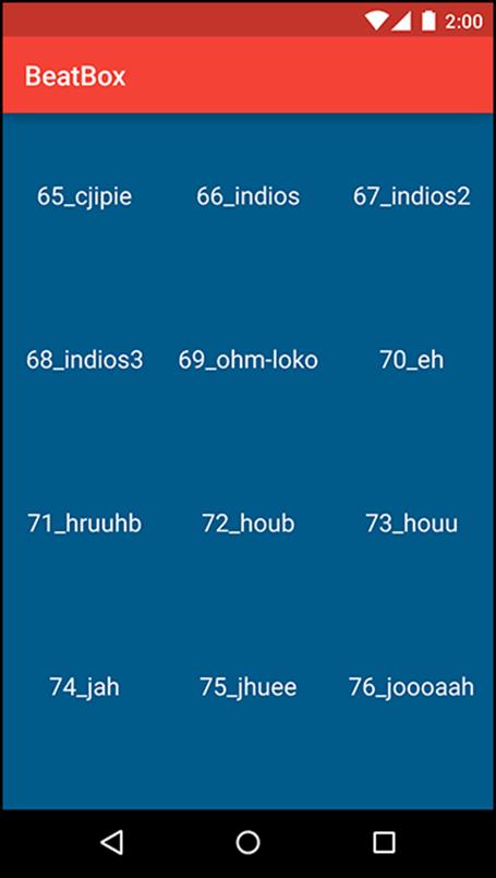
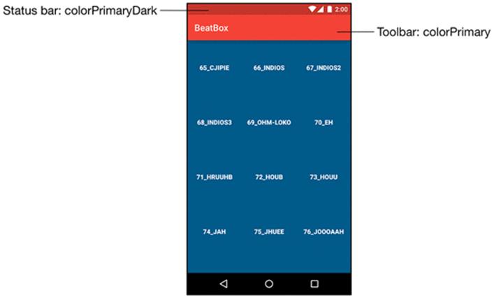
Figure 20.1 shows the better, stronger, faster – or at least more stylish – BeatBox.
Figure 20.1 A themed BeatBox
Color Resources
Begin by defining a few colors that you will use throughout the chapter. Create a colors.xml file in res/values.
Listing 20.1 Defining a few colors (res/values/colors.xml)
<resources>
<color name="red">#F44336</color>
<color name="dark_red">#C3352B</color>
<color name="gray">#607D8B</color>
<color name="soothing_blue">#0083BF</color>
<color name="dark_blue">#005A8A</color>
</resources>
Color resources are a convenient way to specify color values in one place that you reference throughout your application.
Styles
Now, update the buttons in BeatBox with a style. A style is a set of attributes that you can apply to a widget.
Navigate to res/values/styles.xml and add a style named BeatBoxButton. (When you created BeatBox, your new project should have come with a built-in styles.xml file. If your project did not, create the file.)
Listing 20.2 Adding a style (res/values/styles.xml)
<resources>
<style name="AppTheme" parent="Theme.AppCompat.Light.DarkActionBar">
</style>
<style name="BeatBoxButton">
<item name="android:background">@color/dark_blue</item>
</style>
</resources>
Here, you create a style called BeatBoxButton. This style defines a single attribute, android:background, and sets it to a dark blue color. You can apply this style to as many widgets as you like and then update the attributes of all of those widgets in this one place.
Now that the style is defined, apply BeatBoxStyle to your buttons in BeatBox.
Listing 20.3 Using a style (res/layout/list_item_sound.xml)
<Button xmlns:android="http://schemas.android.com/apk/res/android"
xmlns:tools="http://schemas.android.com/tools"
style="@style/BeatBoxButton"
android:id="@+id/button"
android:layout_width="match_parent"
android:layout_height="120dp"
tools:text="Sound name"/>
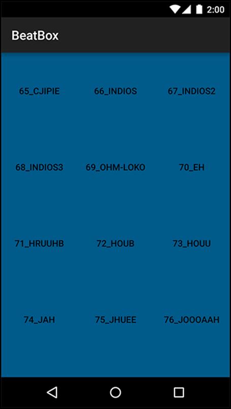
Run BeatBox and you will see that all of your buttons now have a dark blue background color (Figure 20.2).
Figure 20.2 BeatBox with button styles
You can create a style for any set of attributes that you want to reuse in your application. Pretty handy.
Style inheritance
Styles also support inheritance. A style can inherit and override attributes from some other style.
Create a new style called BeatBoxButton.Strong that inherits from BeatBoxButton but also bolds the text.
Listing 20.4 Inheriting from BeatBoxButton (res/layout/styles.xml)
...
<style name="BeatBoxButton">
<item name="android:background">@color/dark_blue</item>
</style>
<style name="BeatBoxButton.Strong">
<item name="android:textStyle">bold</item>
</style>
...
(While you could have added the android:textStyle attribute to the BeatBoxButton style directly, you created BeatBoxButton.Strong to demonstrate style inheritance.)
The naming convention here is a little strange. When you name your style BeatBoxButton.Strong, you are saying that your theme inherits attributes from BeatBoxButton.
There is also an alternative inheritance naming style. You can specify a parent when declaring the style:
<style name="BeatBoxButton">
<item name="android:background">@color/dark_blue</item>
</style>
<style name="StrongBeatBoxButton" parent="@style/BeatBoxButton">
<item name="android:textStyle">bold</item>
</style>
Stick with the BeatBoxButton.Strong style in BeatBox.
Update list_item_sound.xml to use your newer, stronger style.
Listing 20.5 Using a bolder style (res/layout/list_item_sound.xml)
<Button xmlns:android="http://schemas.android.com/apk/res/android"
xmlns:tools="http://schemas.android.com/tools"
style="@style/BeatBoxButton.Strong"
android:id="@+id/button"
android:layout_width="match_parent"
android:layout_height="120dp"
tools:text="Sound name"/>
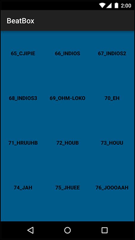
Run BeatBox and verify that your button text is indeed bold, as in Figure 20.3.
Figure 20.3 A bolder BeatBox
Themes
Styles are cool. They allow you to define a set of attributes in one place and then apply them to as many widgets as you want. The downside of styles is that you have to apply them to each and every widget, one at a time. What if you had a more complex app with lots of buttons in lots of layouts? Adding your BeatBoxButton style to them all could be a huge task.
That is where themes come in. Themes take styles a step further: they allow you to define a set of attributes in one place, like a style – but then those attributes are automatically applied throughout your app. Theme attributes can store a reference to concrete resources, such as colors, and they can also store a reference to styles. In a theme, you can say, for example, “I want all buttons to use this style.” And you do not then need to find every button widget and tell it to use the theme.
Modifying the theme
When you created BeatBox, it was given a default theme. Navigate to the AndroidManifest.xml and look at the theme attribute on the application tag.
Listing 20.6 BeatBox’s theme (AndroidManifest.xml)
<manifest xmlns:android="http://schemas.android.com/apk/res/android"
package="com.bignerdranch.android.beatbox" >
<application
android:allowBackup="true"
android:icon="@mipmap/ic_launcher"
android:label="@string/app_name"
android:theme="@style/AppTheme">
...
</application>
</manifest>
The theme attribute is pointing to a theme called AppTheme. AppTheme was declared in the styles.xml file that you modified earlier.
As you can see, a theme is also a style. But themes specify different attributes than a style does (as you will see in a moment). Themes are also given superpowers by being declared in the manifest. This is what causes the theme to be applied across the entire app automatically.
Navigate to the definition of the AppTheme theme by Command-clicking (or Ctrl-clicking on Windows) on @style/AppTheme. Android Studio will take you to res/values/styles.xml.
Listing 20.7 BeatBox’s AppTheme (res/values/styles.xml)
<resources>
<style name="AppTheme" parent="Theme.AppCompat.Light.DarkActionBar">
</style>
<style name="BeatBoxButton">
<item name="android:background">@color/dark_blue</item>
</style>
...
</resources>
(As of this writing, when new projects are created in Android Studio, they are given an AppCompat theme. If you do not have an AppCompat theme in your solution, follow the instructions from Chapter 13 to convert BeatBox to use the AppCompat library.)
AppTheme is inheriting attributes from Theme.AppCompat.Light.DarkActionBar. Within AppTheme, you can add or override additional values from the parent theme.
The AppCompat library comes with three main themes:
· Theme.AppCompat – a dark theme
· Theme.AppCompat.Light – a light theme
· Theme.AppCompat.Light.DarkActionBar – a light theme with a dark toolbar
Change the parent theme to Theme.AppCompat to give BeatBox a dark theme as its base.
Listing 20.8 Changing to a dark theme (res/values/styles.xml)
<resources>
<style name="AppTheme" parent="Theme.AppCompat.Light.DarkActionBar">
</style>
...
</resources>
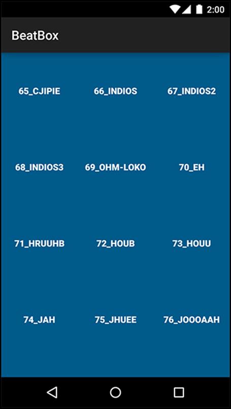
Run BeatBox to see your new dark theme (Figure 20.4).
Figure 20.4 A dark BeatBox
Adding Theme Colors
With the base theme squared away, it is time to customize the attributes of BeatBox’s AppTheme.
In the styles.xml file, define three attributes on your theme.
Listing 20.9 Setting theme attributes (res/values/styles.xml)
<resources>
<style name="AppTheme" parent="Theme.AppCompat.Light.DarkActionBar">
<item name="colorPrimary">@color/red</item>
<item name="colorPrimaryDark">@color/dark_red</item>
<item name="colorAccent">@color/gray</item>
</style>
...
</resources>
Here, you define three theme attributes. These theme attributes look similar to the style attributes that you set up earlier, but they specify different properties. Style attributes specify properties for an individual widget, such as the textStyle that you used to bold the button text. Theme attributes have a larger scope: they are properties that are set on the theme that any widget can access. For example, the toolbar will look at the colorPrimary attribute on the theme to set its background color.
These three attributes have a large impact. The colorPrimary attribute is the primary color for your app’s brand. This color will be used as the toolbar’s background as well as in a few other places.
colorPrimaryDark is used to color the status bar, which shows up at the top of the screen. Typically colorPrimaryDark will be a slightly darker version of your colorPrimary color. Status bar theming is a feature that was added to Android in Lollipop. Keep in mind that the status bar will be black on older devices (no matter what the theme specifies). Figure 20.5 shows the effect of these two theme attributes on BeatBox.
Figure 20.5 BeatBox with AppCompat color attributes
Finally, you set colorAccent to a gray color. colorAccent should contrast with your colorPrimary attribute; it is used to tint some widgets, such as an EditText.
You will not see the colorAccent attribute affect BeatBox because Buttons do not support tinting. You still specify colorAccent because it is a good idea to think about these three color attributes together. These colors should mesh and the default colorAccent attribute from your parent theme may clash with the other colors that you specified. This sets you up well for any future additions.
Run BeatBox to see the new colors in action. Your app should look like Figure 20.5.
Overriding Theme Attributes
Now that the colors are worked out, it is time to dive in and see what theme attributes exist that you can override. Be warned, theme spelunking is tough. There is little to no documentation about which attributes exist, which ones you can override yourself, and even what the attributes do. You are going off the map here. It is a good thing you brought along your guide (this book).
Your first goal is to change the background color of BeatBox by altering the theme. While you could navigate to res/layout/fragment_beat_box.xml and manually set the android:background attribute on your RecyclerView – and then repeat the process in every other fragment and activity layout file that might exist – this would be wasteful. Wasteful of your time, obviously, but also wasteful of app effort.
The theme is always setting a background color. By setting another color on top of that, you are doing extra work. You are also writing code that is hard to maintain by duplicating the background attribute throughout the app.
Theme spelunking
Instead, you want to override the background color attribute on your theme. To discover the name of this attribute, take a look at how this attribute is set by your parent theme: Theme.AppCompat.
You might be thinking, “How will I know which attribute to override if I don’t know its name?” You won’t. You will read the names of the attributes and you will think, “That sounds right.” Then you will override that attribute, run the app, and hope that you chose wisely.
What you want to do is find the ultimate ancestor of your theme: your theme’s great-great-great … well, who-knows-how-great grandparent. To do this, you will keep on navigating up to one parent after another until you find a theme that is outside of the AppCompat library – maybe even a theme with no parent at all.
Open your styles.xml file and Command-click (or Ctrl-click on Windows) on Theme.AppCompat. Let’s see how deep the rabbit hole goes.
(If you are unable to navigate through your theme attributes directly in Android Studio, or you want to do this outside of Android Studio, you can find Android’s theme sources in: your-SDK-directory/platforms/android-21/data/res/values directory.)
At the time of this writing, you are brought to a very large file with a focus on this line:
<style name="Theme.AppCompat" parent="Base.Theme.AppCompat" />
The theme, Theme.AppCompat inherits attributes from Base.Theme.AppCompat. Interestingly, Theme.AppCompat does not override any attributes itself. It just points to its parent.
Command-click on Base.Theme.AppCompat. Android Studio will tell you that this theme is resource qualified. There are a few different versions of this theme depending on the version of Android that you are on.
Choose the values-v14/values.xml version and you will be brought to Base.Theme.AppCompat’s definition (Figure 20.6).
Figure 20.6 Choosing the v14 parent
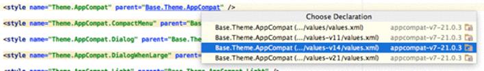
(You chose the v14 version because BeatBox supports API level 16 and higher. If you had chosen the v21 version, you might have come across features that were added in API level 21. See the challenge at the end of the chapter for more information about this.)
<style name="Base.Theme.AppCompat" parent="Base.V14.Theme.AppCompat">
<item name="android:actionModeCutDrawable">?actionModeCutDrawable</item>
<item name="android:actionModeCopyDrawable">?actionModeCopyDrawable</item>
<item name="android:actionModePasteDrawable">?actionModePasteDrawable</item>
<item name="android:actionModeSelectAllDrawable">?actionModeSelectAllDrawable</item>
<item name="android:actionModeShareDrawable">?actionModeShareDrawable</item>
</style>
There are a few attributes in this theme but nothing looks like it will meet your goal: changing the background color. Navigate to Base.V14.Theme.AppCompat.
<style name="Base.V14.Theme.AppCompat" parent="Base.V11.Theme.AppCompat" />
Base.V14.Theme.AppCompat is another theme that exists only for its name and does not override any attributes. Continue along to its parent theme: Base.V11.Theme.AppCompat.
<style name="Base.V11.Theme.AppCompat" parent="Base.V7.Theme.AppCompat" />
Another empty theme. Move to its parent.
<style name="Base.V7.Theme.AppCompat" parent="Platform.AppCompat">
<item name="windowActionBar">true</item>
<item name="windowActionBarOverlay">false</item>
...
</style>
You are getting closer. Base.V7.Theme.AppCompat has many attributes, but it is still not quite what you want. Once you break free of the AppCompat themes, you will find many more attributes. Navigate to Platform.AppCompat. You will see that this is resource qualified. Choose the values-v11/values.xml version.
<style name="Platform.AppCompat" parent="android:Theme.Holo">
<item name="android:windowNoTitle">true</item>
<item name="android:windowActionBar">false</item>
<item name="buttonBarStyle">?android:attr/buttonBarStyle</item>
<item name="buttonBarButtonStyle">?android:attr/buttonBarButtonStyle</item>
<item name="selectableItemBackground">?android:attr/selectableItemBackground</item>
...
</style>
Finally, here you see that the parent of the Platform.AppCompat theme is android:Theme.Holo.
Notice that the Holo theme is not referenced just as Theme.Holo. Instead it has the android namespace in front of it.
You can think of the AppCompat library as something that lives within your own app. When you build your project, you include the AppCompat library and it brings along a bunch of Java and XML files. Those files are just like the files that you wrote yourself. If you want to refer to something in the AppCompat library, you do it directly. You would just write Theme.AppCompat, because those files exist in your app.
Themes that exist in the Android OS, like Theme.Holo, have to be declared with the namespace that points to their location. The AppCompat library uses android:Theme.Holo because the Holo theme exists in the Android OS.
Navigate to android:Theme.Holo.
<style name="Theme.Holo">
<item name="colorForeground">@color/bright_foreground_holo_dark</item>
<item name="colorForegroundInverse">…</item>
<item name="colorBackground">@color/background_holo_dark</item>
<item name="colorBackgroundCacheHint">…</item>
<item name="disabledAlpha">0.5</item>
<item name="backgroundDimAmount">0.6</item>
...
</style>
You have finally arrived. Here you see all of the attributes that you can override in your theme. You can of course navigate to Theme.Holo’s parent: Theme, but this is not necessary. The Holo theme overrides all of the attributes that you will need to use.
Right at the top, colorBackground is declared. It sounds like this attribute is the background color for the theme.
<style name="Theme.Holo">
<item name="colorForeground">@color/bright_foreground_holo_dark</item>
<item name="colorForegroundInverse">…</item>
<item name="colorBackground">@color/background_holo_dark</item>
...
</style>
This is the attribute that you want to override in BeatBox. Navigate back to your styles.xml file and override the colorBackground attribute.
Listing 20.10 Setting the window background (res/values/styles.xml)
<style name="AppTheme" parent="Theme.AppCompat">
<item name="colorPrimary">@color/red</item>
<item name="colorPrimaryDark">@color/dark_red</item>
<item name="colorAccent">@color/gray</item>
<item name="android:colorBackground">@color/soothing_blue</item>
</style>
Notice that you must use the android namespace when overriding this attribute, because colorBackground is declared in the Android OS.
Run BeatBox, scroll down to the bottom of your recycler view and verify that the background, where it is not covered with a button, is a soothing blue, as in Figure 20.7.
Figure 20.7 BeatBox with a themed background
The steps that you just went through to find the colorBackground attribute are the same steps that every Android developer takes when modifying an app’s theme. You will not find much documentation on these attributes. Most people go straight to the source to see what is available.
To recap, you navigated through the following themes:
· Theme.AppCompat
· Base.Theme.AppCompat
· Base.V14.Theme.AppCompat
· Base.V11.Theme.AppCompat
· Base.V7.Theme.AppCompat
· Platform.AppCompat
· android:Theme.Holo
You navigated through the theme hierarchy until you arrived at one of the Android OS’s themes (outside of the AppCompat library). As you become more familiar with your theme options, you may opt to skip ahead to the appropriate Android theme in the future. But it is nice to follow the hierarchy so you can see your theme’s roots.
Be aware that this theme hierarchy may change over time. But the task of walking the hierarchy will not. You follow your theme hierarchy until you find the attribute that you want to override.
Modifying Button Attributes
Earlier you customized the buttons in BeatBox by manually setting a style attribute in the res/layout/list_item_sound.xml file. If you have a more complex app, with buttons throughout many fragments, setting a style attribute on each and every button does not scale well. You can take your theme a step further by defining a style in your theme for every button in your app.
Before adding a button style to your theme, remove the style attribute from your res/layout/list_item_sound.xml file.
Listing 20.11 Be gone! We have a better way (res/layout/list_item_sound.xml)
<Button xmlns:android="http://schemas.android.com/apk/res/android"
xmlns:tools="http://schemas.android.com/tools"
style="@style/BeatBoxButton.Strong"
android:id="@+id/button"
android:layout_width="match_parent"
android:layout_height="120dp"
tools:text="Sound name"/>
Run BeatBox and verify that your buttons are back to the old, bland look.
Navigate back to the Theme.Holo definition and look for a group of button attributes.
<style name="Theme.Holo">
...
<!-- Button styles -->
<item name="buttonStyle">@style/Widget.Holo.Button</item>
<item name="buttonStyleSmall">@style/Widget.Holo.Button.Small</item>
<item name="buttonStyleInset">@style/Widget.Holo.Button.Inset</item>
...
</style>
Notice the attribute named buttonStyle. This is the style of any normal button within your app.
The buttonStyle attribute points to a style resource rather than a value. When you updated the colorBackground attribute, you passed in a value: the color. In this case, buttonStyle should point to a style. Navigate to Widget.Holo.Button to see the button style.
<style name="Widget.Holo.Button" parent="Widget.Button">
<item name="background">@drawable/btn_default_holo_dark</item>
<item name="textAppearance">?attr/textAppearanceMedium</item>
<item name="textColor">@color/primary_text_holo_dark</item>
<item name="minHeight">48dip</item>
<item name="minWidth">64dip</item>
</style>
Every Button that you use in BeatBox is given these attributes.
Duplicate what happens in Android’s own theme in BeatBox. Change the parent of BeatBoxButton to inherit from the existing button style. Also, remove your BeatBoxButton.Strong style from earlier.
Listing 20.12 Creating a button style (res/values/styles.xml)
<resources>
<style name="AppTheme" parent="Theme.AppCompat">dark_blue
<item name="colorPrimary">@color/red</item>
<item name="colorPrimaryDark">@color/dark_red</item>
<item name="colorAccent">@color/gray</item>
<item name="android:colorBackground">@color/soothing_blue</item>
</style>
<style name="BeatBoxButton" parent="android:style/Widget.Holo.Button">
<item name="android:background">@color/dark_blue</item>
</style>
<style name="BeatBoxButton.Strong">
<item name="android:textStyle">bold</item>
</style>
</resources>
You specified a parent of android:style/Widget.Holo.Button. You want your button to inherit all of the properties that a normal button would receive and then selectively modify attributes.
If you do not specify a parent theme for BeatBoxButton, you will notice that your buttons devolve into something that does not look like a button at all. Properties you expect to see, such as the text centered in the button, will be lost.
Now that you have fully defined BeatBoxButton, it is time to use it. Look back at the buttonStyle attribute that you found earlier when digging through Android’s themes. Duplicate this attribute in your own theme.
Listing 20.13 Using the BeatBoxButton style (res/values/styles.xml)
<resources>
<style name="AppTheme" parent="Theme.AppCompat">
<item name="colorPrimary">@color/red</item>
<item name="colorPrimaryDark">@color/dark_red</item>
<item name="colorAccent">@color/gray</item>
<item name="android:colorBackground">@color/soothing_blue</item>
<item name="android:buttonStyle">@style/BeatBoxButton</item>
</style>
<style name="BeatBoxButton" parent="android:style/Widget.Holo.Button">
<item name="android:background">@color/dark_blue</item>
</style>
</resources>
You are now overriding the buttonStyle attribute from Android’s themes and substituting your own style: BeatBoxButton.
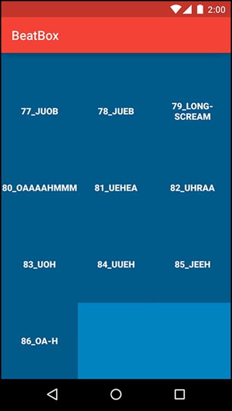
Run BeatBox and notice that all of your buttons are dark blue (Figure 20.8). You changed the look of every normal button in BeatBox without modifying any layout files directly. Behold the power of theme attributes in Android!
Figure 20.8 The completely themed BeatBox
As you press the buttons, you will notice that the buttons do not change when you press them. There is no style change for the pressed state. In the next chapter, you will fix this issue and make these buttons really shine.
For the More Curious: More on Style Inheritance
The description of style inheritance earlier in the chapter does not explain the full story. You may have noticed a switch in inheritance style as you were exploring the theme hierarchy. The AppCompat themes used the name of the theme to indicate inheritance until you arrive at thePlatform.AppCompat theme.
<style name="Platform.AppCompat" parent="android:Theme.Holo">
...
</style>
Here, the inheritance naming style changes to the more explicit parent attribute style. Why?
Specifying the parent theme in the theme name only works for themes that exist in the same package. So you will see the Android OS themes use the theme name inheritance style most of the time, and you will see the AppCompat library do the same. But once the AppCompat library crosses over to a parent outside of itself, the explicit parent attribute is used.
In your own applications, it is a good idea to follow the same convention. Specify your theme parent in the name of your theme if you are inheriting from one of your own themes. If you inherit from a style or theme in the Android OS, explicitly specify the parent attribute.
For the More Curious: Accessing Theme Attributes
Once attributes are declared in your theme, you can access them in XML or in code.
To access a theme attribute in XML, you use the notation that you saw on the divider attribute in Chapter 17. When referencing a concrete value in XML, such as a color, you use the @ notation. @color/gray points to a specific resource.
When referencing a resource in the theme, you use the ? notation.
<Button xmlns:android="http://schemas.android.com/apk/res/android"
xmlns:tools="http://schemas.android.com/tools"
android:id="@+id/button"
android:layout_width="match_parent"
android:layout_height="120dp"
android:background="?attr/colorAccent"
tools:text="Sound name"/>
The ? notation says to use the resource that the colorAccent attribute on your theme points to. In your case, this is the gray color that you defined in your colors.xml file.
You can also use theme attributes in code, although it is much more verbose.
Resources.Theme theme = getActivity().getTheme();
int[] attrsToFetch = { R.attr.colorAccent };
TypedArray a = theme.obtainStyledAttributes(R.style.AppTheme, attrsToFetch);
int accentColor = a.getInt(0, 0);
a.recycle();
On the Theme object, you ask to resolve the attribute R.attr.colorAccent that is defined in your AppTheme: R.style.AppTheme. This call returns a TypedArray, which holds your data. On the TypedArray, you ask for an int value to pull out the accent color. From here, you can use that color to change the background of a button, for example.
The toolbar and buttons in BeatBox are doing exactly this to style themselves based on your theme attributes.
Challenge: An Appropriate Base Theme
When you created BeatBoxButton, you inherited attributes from android:style/Widget.Holo.Button. While inheriting from the Holo theme works, you are not taking advantage of the latest theme available.
In Android 5.0 (Lollipop), the material theme was released. This theme makes changes to various properties of your button, including the font size. It is a good idea to take advantage of this new look on a device that supports the material theme.
Your challenge is to create a resource-qualified version of your styles.xml file: values-v21/styles.xml. Next, create two versions of your BeatBoxButton style. One should inherit attributes from Widget.Holo.Button, and the other from Widget.Material.Button.