Android Programming: The Big Nerd Ranch Guide (2015)
Chapter 21. XML Drawables
Now that BeatBox has been themed it is time to do something about those buttons.
Currently, the buttons do not show any kind of response when you press on them, and they are just blue boxes. In this chapter, you will use XML drawables to take BeatBox to the next level (Figure 21.1).
Figure 21.1 BeatBox makeover
Android calls anything that is intended to be drawn to the screen a drawable, whether it is an abstract shape, a clever bit of code that subclasses the Drawable class, or a bitmap image. You have already seen one kind of drawable: BitmapDrawable, which wraps an image. In this chapter, you will see a few more kinds of drawables: state list drawables, shape drawables, and layer list drawables. All three are defined in XML files, so we group them together in the broader category of XML drawables.
Making Uniform Buttons
Before creating any XML drawables, modify list_item_sound.xml.
Listing 21.1 Spacing the buttons out (res/layout/list_item_sound.xml)
<Button xmlns:android="http://schemas.android.com/apk/res/android"
xmlns:tools="http://schemas.android.com/tools"
android:id="@+id/list_item_sound_button"
android:layout_width="match_parent"
android:layout_height="120dp"
tools:text="Sound name"/>
<FrameLayout
xmlns:android="http://schemas.android.com/apk/res/android"
xmlns:tools="http://schemas.android.com/tools"
android:layout_margin="8dp"
android:layout_width="wrap_content"
android:layout_height="wrap_content">
<Button
android:id="@+id/list_item_sound_button"
android:layout_width="100dp"
android:layout_height="100dp"
android:layout_gravity="center"
tools:text="Sound name"/>
</FrameLayout>
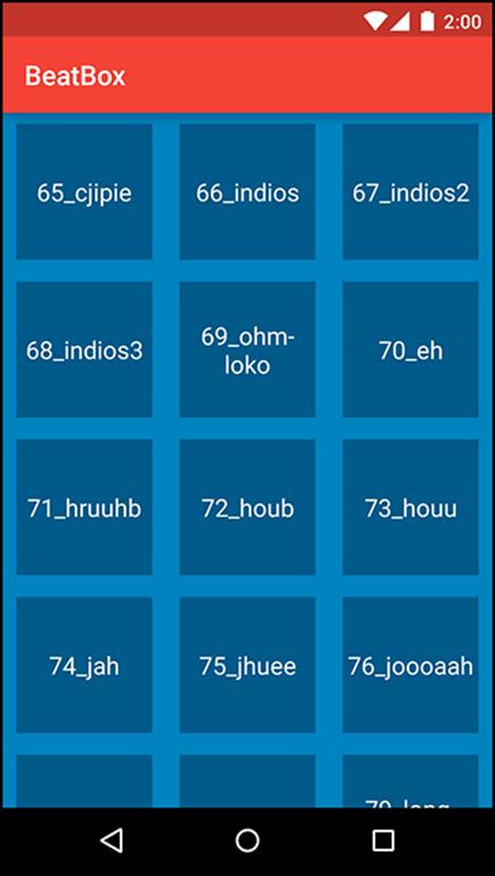
You gave each button a width and height of 100dp so that when the buttons are circles later on they will not be skewed.
Your recycler view will always show three columns, no matter what the screen size is. If there is extra room, the recycler view will stretch those columns to fit the device. You do not want the recycler view to stretch your buttons, so you wrapped your buttons in a frame layout. The frame layout will be stretched and the buttons will not.
Run BeatBox and you will see that your buttons are all the same size and have some space between them (Figure 21.2).
Figure 21.2 Spaced-out buttons
Shape Drawables
Now, make your buttons round with a ShapeDrawable. Since XML drawables are not density specific, they are placed in the default drawable folder instead of a density-specific one.
In the Project tool window, create a new file in res/drawable called button_beat_box_normal.xml. (Why is this one “normal”? Because soon it will have a not-so-normal friend.)
Listing 21.2 Making a round shape drawable (res/drawable/button_beat_box_normal.xml)
<shape xmlns:android="http://schemas.android.com/apk/res/android"
android:shape="oval">
<solid
android:color="@color/dark_blue"/>
</shape>
This file creates an oval shape drawable that is filled in with a dark blue color. There are additional customization options with shape drawables, including rectangles, lines, and gradients. Check out the documentation at http://developer.android.com/guide/topics/resources/drawable-resource.html for details.
Apply button_beat_box_normal as the background for your buttons.
Listing 21.3 Modifying the background drawable (res/values/styles.xml)
<resources>
<style name="AppTheme" parent="Theme.AppCompat">
...
</style>
<style name="BeatBoxButton" parent="android:style/Widget.Holo.Button">
<item name="android:background">@color/dark_blue</item>
<item name="android:background">@drawable/button_beat_box_normal</item>
</style>
</resources>
Run BeatBox. Your buttons are now nice circles (Figure 21.3).
Figure 21.3 Circle buttons
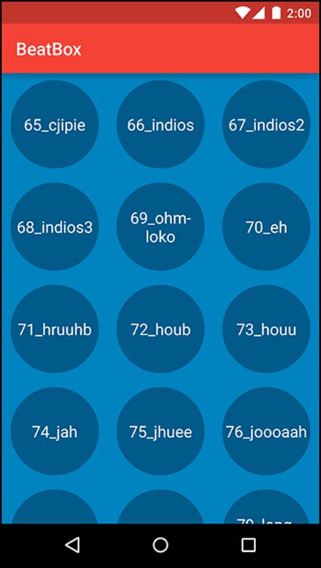
Press a button. You will hear the sound, but the button will not change its appearance. It would be better if the button looked different once it was pressed.
State List Drawables
To fix this, first define a new shape drawable that will be used for the pressed state of the button.
Create button_beat_box_pressed.xml in res/drawable. Make this pressed drawable the same as the normal version but with a red background color.
Listing 21.4 Defining a pressed shape drawable (res/drawable/button_beat_box_pressed.xml)
<shape xmlns:android="http://schemas.android.com/apk/res/android"
android:shape="oval">
<solid
android:color="@color/red"/>
</shape>
Next, you are going to use this pressed version when the user presses the button. To do this, you will make use of a state list drawable.
A state list drawable is a drawable that points to other drawables based on the state of something. A button has a pressed and an unpressed state. You will use a state list drawable to specify one drawable as the background when pressed and a different drawable when not pressed.
Define a state list drawable in your drawable folder.
Listing 21.5 Creating a state list drawable (res/drawable/button_beat_box.xml)
<selector xmlns:android="http://schemas.android.com/apk/res/android">
<item android:drawable="@drawable/button_beat_box_pressed"
android:state_pressed="true"/>
<item android:drawable="@drawable/button_beat_box_normal" />
</selector>
Now, modify your button style to use this new state list drawable as the button background.
Listing 21.6 Applying a state list drawable (res/values/styles.xml)
<resources>
<style name="AppTheme" parent="Theme.AppCompat">
...
</style>
<style name="BeatBoxButton" parent="android:style/Widget.Holo.Button">
<item name="android:background">@drawable/button_beat_box_normal</item>
<item name="android:background">@drawable/button_beat_box</item>
</style>
</resources>
When the state of the button is pressed, button_beat_box_pressed will be used as the background. Otherwise, button_beat_box_normal will be the background of the button.
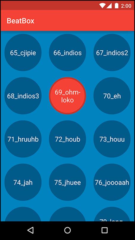
Run BeatBox and press a button. The button’s background changes (Figure 21.4). Pretty slick, right?
Figure 21.4 BeatBox, now with a pressed button state
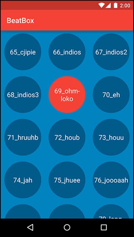
State list drawables are a handy customization tool. Many other states are also supported including disabled, focused, and activated. Check out the documentation at http://developer.android.com/guide/topics/resources/drawable-resource.html#StateList for details.
Layer List Drawables
BeatBox is looking good. You now have round buttons and they visually respond to presses. Time for something a little more advanced.
Layer list drawables allow you to combine two XML drawables into one. Armed with this tool, add a dark ring around your button when in the pressed state.
Listing 21.7 Using a layer list drawable (res/drawable/button_beat_box_pressed.xml)
<layer-list xmlns:android="http://schemas.android.com/apk/res/android">
<item>
<shape
android:shape="oval">
<solid
android:color="@color/red"/>
</shape>
</item>
<item>
<shape
android:shape="oval">
<stroke
android:width="4dp"
android:color="@color/dark_red"/>
</shape>
</item>
</layer-list>
You specified two drawables in this layer list drawable. The first drawable is a red circle, as it was before this change. The second drawable will be drawn on top of the first. In the second drawable, you specified another oval with a stroke of 4dp. This will create a ring of dark red.
These two drawables combined form the layer list drawable. You can combine more than two drawables with a layer list to make something even more complex.
Run BeatBox and press on a button or two. You will see a nice ring around the pressed interface (Figure 21.5). Even slicker.
Figure 21.5 BeatBox complete
With the layer list drawable addition, BeatBox is now complete. Remember how plain BeatBox used to look? You now have something special and uniquely identifiable. Making your app a pleasure to look at makes it fun to use, and that will pay off in popularity.
For the More Curious: Why Bother with XML Drawables?
You will always want a pressed state for your buttons, so state list drawables are a critical component of any Android app. But what about shape drawables and layer list drawables? Should you use them?
XML drawables are flexible. You can use them for many purposes and you can easily update them in the future. With a combination of layer list drawables and shape drawables, you can create complex backgrounds without using an image editor. If you decide to change the color scheme in BeatBox, updating the colors in an XML drawable is easy.
In this chapter, you defined your XML drawables in the drawable directory with no resource qualifiers for the screen density. This is because XML drawables are density independent. With a standard background that is an image, you will typically create multiple versions of that same image in different densities so that the image will look crisp on most devices. XML drawables only need to be defined once and will look crisp at any screen density.
For the More Curious: 9-Patch Images
Sometimes (or maybe often), you will fall back to regular old image files for your button backgrounds. But what happens to those image files when your button can be displayed at many different sizes? If the width of the button is greater than the width of its background image, the image just stretches, right? Is that always going to look good?
Uniformly stretching your background image will not always look right. Sometimes you need more control over how the image will stretch.
This section will convert BeatBox to use a 9-patch image as the background for the buttons. First, list_item_sound.xml should be modified to allow the button size to change based on the available space.
Listing 21.8 Let those buttons stretch (res/layout/list_item_sound.xml)
<FrameLayout
xmlns:android="http://schemas.android.com/apk/res/android"
xmlns:tools="http://schemas.android.com/tools"
android:layout_margin="8dp"
android:layout_width="wrap_content"
android:layout_height="wrap_content">
<Button
android:id="@+id/list_item_sound_button"
android:layout_width="match_parent"
android:layout_height="match_parent"
android:layout_gravity="center"
tools:text="Sound name"/>
</FrameLayout>
Now the buttons will take up the available space, leaving an 8dp margin. The image in Figure 21.6, with a snazzy folded corner and shadow, will be used as the new button background for BeatBox.
Figure 21.6 A new button background image (res/drawable-xxhdpi/ic_button_beat_box_default.png)

In the solutions for this chapter (see the section called “Adding an Icon” in Chapter 2), you can find this image along with a pressed version in the xxhdpi drawable folder. Copy these two images into your project’s drawable-xxhdpi folder and apply them as your button background by modifying button_beat_box.xml.
Listing 21.9 Applying the new button background images (res/drawable/button_beat_box.xml)
<selector xmlns:android="http://schemas.android.com/apk/res/android">
<item android:drawable="@drawable/ic_button_beat_box_pressed"
android:state_pressed="true"/>
<item android:drawable="@drawable/ic_button_beat_box_default" />
</selector>
Running BeatBox, you will see the new button background (Figure 21.7).
Figure 21.7 BeastBox
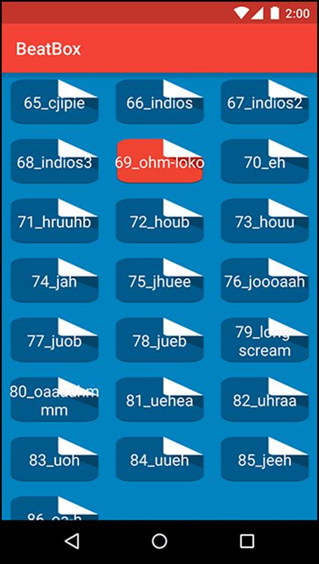
Whoa. That looks… bad.
Why does it look bad? Android is uniformly stretching ic_beat_box_button.png, including the dog-eared edge and the rounded corners. It would look better if you could specify which parts of the image to stretch and which parts not to stretch. Enter 9-patch images.
A 9-patch image file is specially formatted so that Android knows which portions can and cannot be scaled. Done properly, this ensures that the edges and corners of your background remain consistent with the image as it was created.
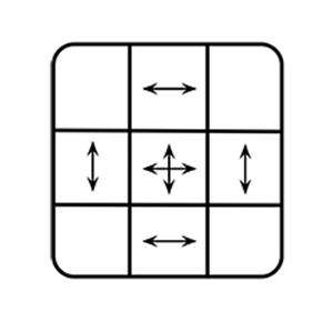
Why are they called 9-patches? A 9-patch breaks your image into a 3 x 3 grid – a grid with 9 sections, or patches. The corners of the grid remain unscaled, the sides are only scaled in one dimension, and the center is scaled in both dimensions, as shown in Figure 21.8.
Figure 21.8 How a 9-patch scales
A 9-patch image is like a regular PNG image in everything except two aspects: its filename ends with .9.png, and it has an additional one-pixel border around the edge. This border is used to specify the location of the center square of the 9-patch. Border pixels are drawn black to indicate the center and transparent to indicate the edges.
You can create a 9-patch using any image editor, with the draw9patch tool provided as part of the Android SDK, or using Android Studio. As of this writing, Android Studio’s 9-patch editor can be flaky. If you need to use the draw9patch tool, you can find it in the tools directory of your SDK installation.
First, convert your two new background images to 9-patch images by right-clicking on ic_button_beat_box_default.png in the Project tool window and selecting Refactor → Rename... to rename the file to: ic_button_beat_box_default.9.png. Then, repeat the process to rename the pressed version to:ic_button_beat_box_pressed.9.png.
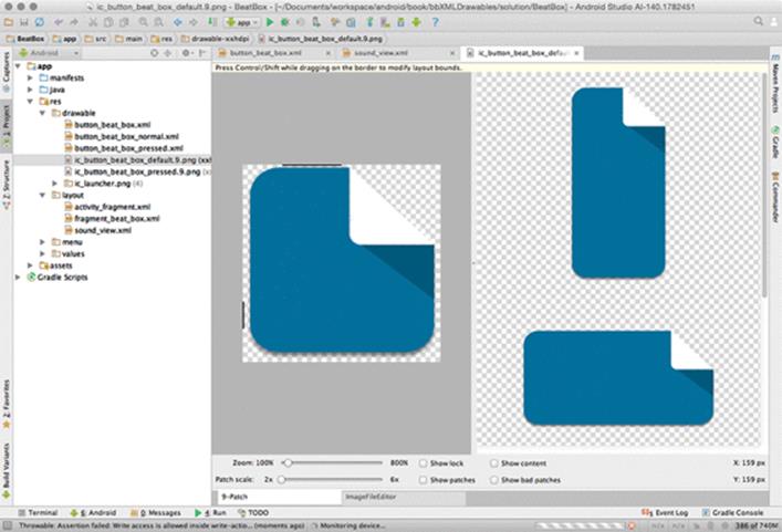
Next, double-click on the default image in the Project tool window to open it in Android Studio’s built-in 9-patch editor, as shown in Figure 21.9. (If Android Studio does not open the editor, try closing the file and collapsing your drawable folder in the Project tool window. Then re-open the default image.)
In the 9-patch editor, fill in black pixels on the top and left borders to mark the stretchable regions of the image, as shown.
Figure 21.9 Creating a 9-patch image
With these two lines, you are telling Android not to stretch the top-right area of the image and each corner if this file changes size. Repeat the process with the pressed version.
So the top and left lines indicate the areas of the image to stretch. What about the bottom and right borders? You use them to define an optional drawable region for the 9-patch image. The drawable region is the area where content (usually text) should be rendered. If you do not include a drawable region, it defaults to be the same as your stretchable region. This is what you want here – that is, you want the buttons’ text to be on the stretchable region – so you will not define a separate drawable region.
Run BeatBox to see your new 9-patch image in action (Figure 21.10).
Figure 21.10 New and improved
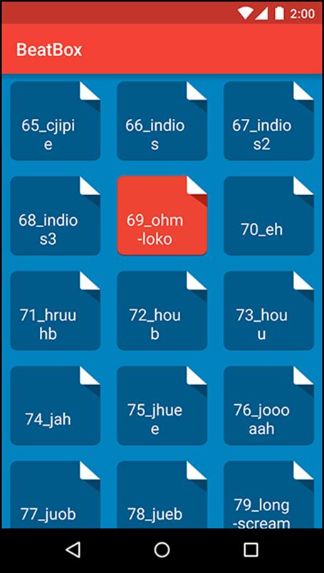
Try rotating to landscape. The images are even more stretched, but your button backgrounds still look good.
For the More Curious: Mipmap Images
Resource qualifiers and drawables are handy. When you need an image in your app, you generate the image at a few different sizes and add them to your resource-qualified folders: drawable-mdpi, drawable-hdpi, etc. Then, you reference the image by name and Android figures out which density to use based on the current device.
However, there is a downside to this system. The APK file that you release to the Google Play Store will contain all of the images in your drawable directories at each density that you added to your project – even though many of them will not be used. That is a lot of extra bloat.
To reduce this bloat, you can generate separate APKs for each screen density. You would have an mdpi APK of your app, an hdpi APK, and so on. (For more info on APK splitting, see the tools documentation: http://tools.android.com/tech-docs/new-build-system/user-guide/apk-splits.)
But, there is one exception. You want to maintain every density of your launcher icon.
A launcher on Android is a home screen application (you will learn much more about launchers in Chapter 22). When you press the Home button on your device, you are taken to the launcher.
Some newer launchers display app icons at a larger size than launchers have traditionally displayed them. To make this larger icon look nice, these launchers will take the icon from the next density bucket up. If your device is an hdpi device, the launcher will use the xhdpi icon to represent your app. But if the xhdpi version has been stripped from your APK, the launcher will have to fall back to the lower resolution version.
Scaled-up low-res icons look fuzzy. You want your icon to look crisp.
The mipmap directory is Android’s solution to this problem. As of this writing, new projects in Android studio are set up to use a mipmap resource for their launcher icon (Figure 21.11).
Figure 21.11 Mipmap icons
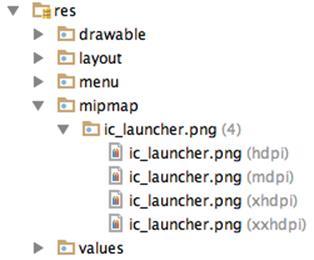
When APK splitting is enabled, mipmaps are not pruned from the APKs. Otherwise, mipmaps are identical to drawables.
So, we recommend putting just your launcher icon in the various mipmap directories. All other images belong in the drawable directories.