Android Programming: The Big Nerd Ranch Guide (2015)
Chapter 8. Creating User Interfaces with Layouts and Widgets
In this chapter, you will learn more about layouts and widgets while adding a crime’s date and status to CriminalIntent.
Upgrading Crime
Open Crime.java and add two new fields. The Date field represents the date a crime occurred. The boolean field represents whether the crime has been solved.
Listing 8.1 Adding more fields to Crime (Crime.java)
public class Crime {
private UUID mId;
private String mTitle;
private Date mDate;
private boolean mSolved;
public Crime() {
mId = UUID.randomUUID();
mDate = new Date();
}
...
}
Android Studio may find two classes with the name Date. Use the Option+Return (or Alt+Enter) shortcut to manually import the class. When asked which version of the Date class to import, choose the java.util.Date version.
Initializing the Date variable using the default Date constructor sets mDate to the current date. This will be the default date for a crime.
Next, generate getters and setters for your new fields (right-click in the file and choose Generate..., then Getter and Setter).
Listing 8.2 Generated getters and setters (Crime.java)
public class Crime {
...
public void setTitle(String title) {
mTitle = title;
}
public Date getDate() {
return mDate;
}
public void setDate(Date date) {
mDate = date;
}
public boolean isSolved() {
return mSolved;
}
public void setSolved(boolean solved) {
mSolved = solved;
}
}
Your next steps will be updating the layout in fragment_crime.xml with new widgets and wiring up those widgets in CrimeFragment.java.
Updating the Layout
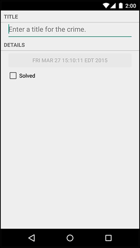
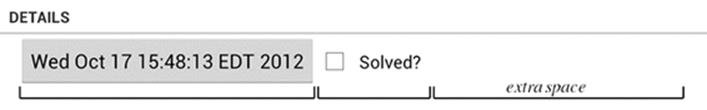
Figure 8.1 shows what CrimeFragment’s view will look like by the end of this chapter.
Figure 8.1 CriminalIntent, episode 2
To get this on screen, you are going to add four widgets to CrimeFragment’s layout: two TextView widgets, a Button, and a CheckBox.
Open fragment_crime.xml and make the changes shown in Listing 8.3. You may get errors from missing string resources; you will create them in a moment.
Listing 8.3 Adding new widgets (fragment_crime.xml)
<?xml version="1.0" encoding="utf-8"?>
<LinearLayout xmlns:android="http://schemas.android.com/apk/res/android"
android:layout_width="match_parent"
android:layout_height="wrap_content"
android:orientation="vertical"
>
<TextView
android:layout_width="match_parent"
android:layout_height="wrap_content"
android:text="@string/crime_title_label"
style="?android:listSeparatorTextViewStyle"
/>
<EditText android:id="@+id/crime_title"
android:layout_width="match_parent"
android:layout_height="wrap_content"
android:layout_marginLeft="16dp"
android:layout_marginRight="16dp"
android:hint="@string/crime_title_hint"
/>
<TextView
android:layout_width="match_parent"
android:layout_height="wrap_content"
android:text="@string/crime_details_label"
style="?android:listSeparatorTextViewStyle"
/>
<Button android:id="@+id/crime_date"
android:layout_width="match_parent"
android:layout_height="wrap_content"
android:layout_marginLeft="16dp"
android:layout_marginRight="16dp"
/>
<CheckBox android:id="@+id/crime_solved"
android:layout_width="match_parent"
android:layout_height="wrap_content"
android:layout_marginLeft="16dp"
android:layout_marginRight="16dp"
android:text="@string/crime_solved_label"
/>
</LinearLayout>
Notice that you did not give the Button an android:text attribute. This button will display the date of the Crime being displayed, and its text will be set in code.
Why display the date on a Button? You are preparing for the future. For now, a crime’s date defaults to the current date and cannot be changed. In Chapter 12, you will wire up the button so that a press presents a DatePicker widget from which the user can set the date.
There are some new things in this layout to discuss, such as the style attribute and the margin attributes. But first let’s get CriminalIntent up and running with the new widgets.
Open res/values/strings.xml and add the necessary string resources.
Listing 8.4 Adding string resources (strings.xml)
<resources>
<string name="app_name">CriminalIntent</string>
<string name="hello_world">Hello world!</string>
<string name="action_settings">Settings</string>
<string name="crime_title_hint">Enter a title for the crime.</string>
<string name="crime_title_label">Title</string>
<string name="crime_details_label">Details</string>
<string name="crime_solved_label">Solved</string>
</resources>
Check for typos and save your files.
Wiring Widgets
Next, you are going to make the CheckBox display whether a Crime has been solved. You also need to update the Crime’s mSolved field when a user toggles the CheckBox.
For now, all the new Button needs to do is display the date in the Crime’s mDate field.
In CrimeFragment.java, add two new instance variables.
Listing 8.5 Adding widget instance variables (CrimeFragment.java)
public class CrimeFragment extends Fragment {
private Crime mCrime;
private EditText mTitleField;
private Button mDateButton;
private CheckBox mSolvedCheckBox;
@Override
public void onCreate(Bundle savedInstanceState) {
...
Next, in onCreateView(…), get a reference to the new button, set its text as the date of the crime, and disable it for now.
Listing 8.6 Setting Button text (CrimeFragment.java)
@Override
public View onCreateView(LayoutInflater inflater, ViewGroup parent,
Bundle savedInstanceState) {
View v = inflater.inflate(R.layout.fragment_crime, parent, false);
...
mTitleField.addTextChangedListener(new TextWatcher() {
...
});
mDateButton = (Button)v.findViewById(R.id.crime_date);
mDateButton.setText(mCrime.getDate().toString());
mDateButton.setEnabled(false);
return v;
}
Disabling the button ensures that it will not respond in any way to the user pressing it. It also changes its appearance to advertise its disabled state. In Chapter 12, you will enable the button when you set its listener.
Moving on to the CheckBox, get a reference and set a listener that will update the mSolved field of the Crime.
Listing 8.7 Listening for CheckBox changes (CrimeFragment.java)
...
mDateButton = (Button)v.findViewById(R.id.crime_date);
mDateButton.setText(mCrime.getDate().toString());
mDateButton.setEnabled(false);
mSolvedCheckBox = (CheckBox)v.findViewById(R.id.crime_solved);
mSolvedCheckBox.setOnCheckedChangeListener(new OnCheckedChangeListener() {
@Override
public void onCheckedChanged(CompoundButton buttonView, boolean isChecked) {
// Set the crime's solved property
mCrime.setSolved(isChecked);
}
});
return v;
}
When creating the OnCheckedChangeListener, you will see two import options. Be sure to choose the android.widget.CompoundButton version.
Run CriminalIntent. Toggle the new CheckBox and admire your disabled Button that displays the date.
More on XML Layout Attributes
Let’s go back over some of the attributes you added in fragment_crime.xml and answer some lingering questions you might have about widgets and attributes.
Styles, themes, and theme attributes
A style is an XML resource that contains attributes that describe how a widget should look and behave. For example, the following is a style resource that configures a widget with a larger-than-normal text size.
<style name="BigTextStyle">
<item name="android:textSize">20sp</item>
<item name="android:padding">3dp</item>
</style>
You can create your own styles (and you will in Chapter 20). You add them to a styles file in res/values/ and refer to them in layouts like this: @style/my_own_style.
Take another look at the TextView widgets in fragment_crime.xml; each has a style attribute that refers to a style created by Android. This particular style makes the TextViews look like list separators and comes from the app’s theme. A theme is a collection of styles. Structurally, a theme is itself a style resource whose attributes point to other style resources.
Android provides platform themes that your apps can use. When you created CriminalIntent, the wizard set up a theme for the app that is referenced on the application tag in the manifest.
You can apply a style from the app’s theme to a widget using a theme attribute reference. This is what you are doing in fragment_crime.xml when you use the value ?android:listSeparatorTextViewStyle.
In a theme attribute reference, you tell Android’s runtime resource manager, “Go to the app’s theme and find the attribute named listSeparatorTextViewStyle. This attribute points to another style resource. Put the value of that resource here.”
Every Android theme will include an attribute named listSeparatorTextViewStyle, but its definition will be different depending on the overall look and feel of the particular theme. Using a theme attribute reference ensures that the TextViews will have the correct look and feel for your app.
You will learn more about how styles and themes work in Chapter 20.
Screen pixel densities and dp and sp
In fragment_crime.xml, you specify the margin attribute values in terms of dp units. You have seen these units in layouts before; now it is time to learn what they are.
Sometimes you need to specify values for view attributes in terms of specific sizes (usually in pixels but sometimes points, millimeters, or inches). You see this most commonly with attributes for text size, margins, and padding. Text size is the pixel height of the text on the device’s screen. Margins specify the distances between views, and padding specifies the distance between a view’s outside edges and its content.
As you saw in the section called “Adding an Icon” in Chapter 2, Android automatically scales images to different screen pixel densities using density qualified drawable folders (such as drawable-xhdpi). But what happens when your images scale, but your margins do not? Or what happens when the user configures a larger-than-default text size?
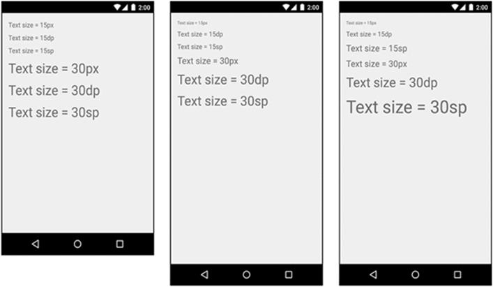
To solve these problems, Android provides density-independent dimension units that you can use to get the same size on different screen densities. Android translates these units into pixels at runtime, so there is no tricky math for you to do (Figure 8.2).
Figure 8.2 Dimension units in action on TextView (left: MDPI; middle: HDPI; right: HDPI with large text)
|
dp (ordip) |
Short for density-independent pixel and usually pronounced “dip.” You typically use this for margins, padding, or anything else for which you would otherwise specify size with a pixel value. When your display is a higher density, density-independent pixels will expand to fill a larger number of screen pixels. One dp is always 1/160th of an inch on a device’s screen. You get the same size regardless of screen density. |
|
sp |
Short for scale-independent pixel. Scale-independent pixels are density-independent pixels that also take into account the user’s font size preference. You will almost always use sp to set display text size. |
|
pt, mm,in |
These are scaled units like dp that allow you to specify interface sizes in points (1/72 of an inch), millimeters, or inches. However, we do not recommend using them: not all devices are correctly configured for these units to scale correctly. |
In practice and in this book, you will use dp and sp almost exclusively. Android will translate these values into pixels at runtime.
Android’s design guidelines
Notice that for your margins, you use a 16dp value in Listing 8.3. This value follows Android’s material design guideline. You can find all of the Android design guidelines at http://developer.android.com/design/index.html.
Modern Android apps should follow these guidelines as closely as possible. The guidelines rely heavily on newer Android SDK functionality that is not always available or easy to achieve on older devices. Many of the design recommendations can be followed using the AppCompat library, which you can read about in Chapter 13.
Layout parameters
By now, you have probably noticed that some attribute names begin with layout_ (android:layout_marginLeft) and others do not (android:text).
Attributes whose names do not begin with layout_ are directions to the widget. When it is inflated, the widget calls a method to configure itself based on each of these attributes and their values.
When an attribute’s name begins with layout_, that attribute is a direction to that widget’s parent. These attributes are known as layout parameters, and they tell the parent layout how to arrange the child element within the parent.
Even when a layout object like LinearLayout is the root element of a layout, it is still a widget with a parent and has layout parameters. When you defined the LinearLayout in fragment_crime.xml, you gave it attributes for android:layout_width and android:layout_height. These attributes will be used by the LinearLayout’s parent layout when it is inflated. In this case, the LinearLayout’s layout parameters will be used by the FrameLayout in CrimeActivity’s content view.
Margins vs. padding
In fragment_crime.xml, you have given widgets margin and padding attributes. Beginning developers sometimes get confused between these attributes. Now that you understand what a layout parameter is, the difference is easier to explain. Margin attributes are layout parameters. They determine the distance between widgets. Given that a widget can only know about itself, margins must be the responsibility of the widget’s parent.
Padding, on the other hand, is not a layout parameter. The android:padding attribute tells the widget how much bigger than its contents it should draw itself. For example, say you wanted the date button to be spectacularly large without changing its text size (Figure 8.3). You could add the following attribute to the Button, save your layout, and run again.
Listing 8.8 Padding in action (fragment_crime.xml)
<Button android:id="@+id/crime_date"
android:layout_width="match_parent"
android:layout_height="wrap_content"
android:layout_marginLeft="16dp"
android:layout_marginRight="16dp"
android:padding="80dp"
/>
Figure 8.3 I like big buttons and I cannot lie...
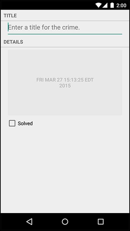
Alas, you should probably remove this attribute before continuing.
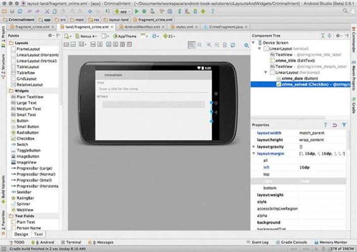
Using the Graphical Layout Tool
So far, you have created layouts by typing XML. In this section, you will use the graphical layout tool. In particular, you are going to make an alternative landscape layout for CrimeFragment.
Most built-in layout classes, like LinearLayout, will automatically stretch and resize themselves and their children on rotation. Sometimes, however, the default resizing does not make the best use of the available space.
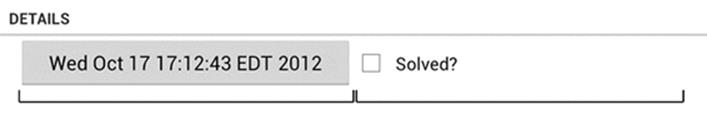
Run CriminalIntent and rotate the device to see the CrimeFragment layout in landscape orientation (Figure 8.4).
Figure 8.4 CrimeFragment in landscape mode
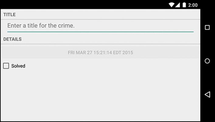
The date button becomes oddly long; it would be better if the landscape layout had the button and checkbox side by side.
To make these changes, switch to the graphical layout tool. Open fragment_crime.xml and select the Design tab at the bottom of the file.
In the middle of the graphical layout tool is the preview you have already seen. On the lefthand side is the palette. This view contains all the widgets you could wish for, organized by category (Figure 8.5).
Figure 8.5 Views in the graphical layout tool
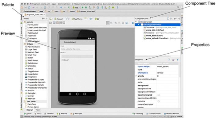
The component tree is to the right of the preview. The tree shows how the widgets are organized in the layout.
Beneath the component tree is the properties view. In this view, you can view and edit the attributes of the widget selected in the component tree.
Creating a landscape layout
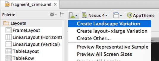
The graphical layout editor can generate the landscape version of a layout file for you. Locate the button that looks like a piece of paper with an Android in the bottom right, as shown in Figure 8.6. Click that button and select Create Landscape Variation.
Figure 8.6 Creating an alternative layout in the graphical layout editor
A new layout appears. Behind the scenes, the res/layout-land directory was created for you and the existing fragment_crime.xml layout file was copied to that new directory.
Now let’s consider what changes to make to this landscape layout. Take a look at Figure 8.7.
Figure 8.7 Landscape layout for CrimeFragment
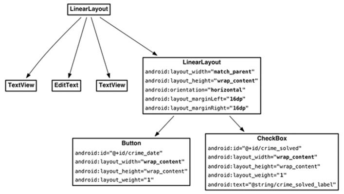
The changes can be broken into four parts:
· add a new LinearLayout widget to the layout
· edit the attributes of the LinearLayout
· make the Button and CheckBox widgets children of the LinearLayout
· update the layout parameters of the Button and CheckBox
Adding a new widget
You can add a widget by selecting it in the palette and then dragging to the component tree. Click the Layouts category in the palette if it is not already expanded. Select LinearLayout (Horizontal) and drag it to the component tree. Drop this LinearLayout just above the date button. Ensure that the newLinearLayout is a child of the root LinearLayout, as shown in Figure 8.8.
Figure 8.8 LinearLayout added to fragment_crime.xml
You can add widgets by dragging from the palette to the preview, too. However, layout widgets are often empty or obscured by other views, so it can be hard to see exactly where to drop a widget in the preview to get the hierarchy you want. Dragging to the component tree makes this much easier.
Editing attributes in properties view
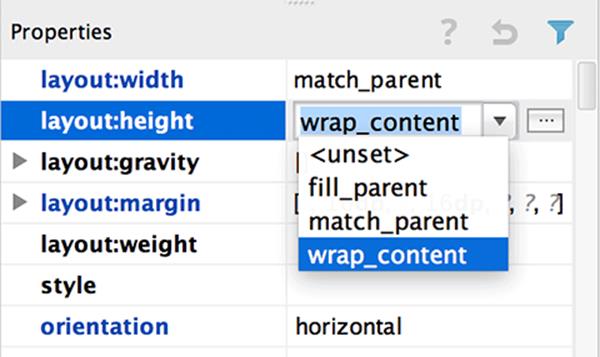
Select the new LinearLayout in the component tree to display its attributes in the properties view. Examine the layout:width and layout:height attributes.
Modify the layout:width attribute to match_parent and the layout:height attribute to wrap_content, as shown in Figure 8.9. Now, the LinearLayout will fill the available width and take up as much height as it needs to display the CheckBox and Button.
Figure 8.9 Changing LinearLayout’s width and height
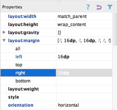
You also want to update the LinearLayout’s margins to match your other widgets. Expand the layout:margin attribute. Select the field next to Left and type 16dp. Do the same for the right margin (Figure 8.10).
Figure 8.10 Margins set in properties view
Save your layout file and switch to the XML by selecting the text tab at the bottom of the preview. You should see a LinearLayout element with the size and margin attributes you just added.
Reorganizing widgets in the component tree
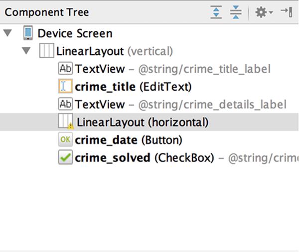
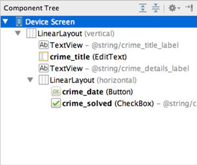
The next step is to make the Button and CheckBox children of the new LinearLayout. Return to the graphical layout tool, and, in the component tree, select the Button and drag it on top of the LinearLayout.
The component tree should reflect that the Button is now a child of the new LinearLayout (Figure 8.11). Do the same for the CheckBox.
Figure 8.11 Button and CheckBox are now children of the new LinearLayout
If widget children are out of order, you can reorder them in the component tree by dragging. You can also delete widgets from the layout in the component tree, but be careful: deleting a widget also deletes its children.
Back in the preview, the CheckBox seems to be missing. The Button is obscuring it. The LinearLayout considered the width (match_parent) of its first child (the Button) and gave the first child all of the space, leaving nothing for the CheckBox (Figure 8.12).
Figure 8.12 The first-defined Button child obscures the CheckBox
You can introduce some equity in the LinearLayout’s parenting by adjusting the layout parameters of its children.
Updating child layout parameters
First, select the date button in the component tree. In the properties view, click on the current layout:width value and change it to wrap_content.
Next, delete both of the button’s 16dp margin values. The button will not need these margins now that it is inside the LinearLayout.
Finally, find the layout:weight field and set its value to 1. This field corresponds to the android:layout_weight attribute shown in Figure 8.7.
Select the CheckBox in the component tree and make the same attribute changes: layout:width should be wrap_content, the margins should be empty, and layout:weight should be 1.
Check the preview to confirm that both widgets are now visible. Then save your file and return to the XML to confirm your changes. Listing 8.9 shows the relevant XML.
Listing 8.9 XML for the graphically created layout (layout-land/fragment_crime.xml)
...
<TextView
android:layout_width="match_parent"
android:layout_height="wrap_content"
android:text="@string/crime_details_label"
style="?android:listSeparatorTextViewStyle"
/>
<LinearLayout
android:layout_width="match_parent"
android:layout_height="wrap_content"
android:layout_marginLeft="16dp"
android:layout_marginRight="16dp" >
<Button
android:id="@+id/crime_date"
android:layout_width="wrap_content"
android:layout_height="wrap_content"
android:layout_weight="1" />
<CheckBox
android:id="@+id/crime_solved"
android:layout_width="wrap_content"
android:layout_height="wrap_content"
android:layout_weight="1"
android:text="@string/crime_solved_label" />
</LinearLayout>
</LinearLayout>
Run CriminalIntent, rotate to landscape, and pat yourself on the back for optimizing the layout for a new configuration of the device.
How android:layout_weight works
The android:layout_weight attribute tells the LinearLayout how to distribute its children. You have given both widgets the same value, but that does not necessarily make them the same width on screen. To determine the width of its child views, LinearLayout uses a mixture of the layout_widthand layout_weight parameters.
LinearLayout makes two passes to set the width of a view. In the first pass, LinearLayout looks at layout_width (or layout_height, for vertical orientation). The value for layout_width for both the Button and CheckBox is now wrap_content, so each view will get only enough space to draw itself (Figure 8.13).
(It is hard to see how layout weights work in the preview because your button’s contents are not part of the layout itself. The following figures show what the LinearLayout would look like if the button already had its contents.)
Figure 8.13 Pass 1: space given out based on layout_width
In the next pass, LinearLayout allocates any extra space based on the values for layout_weight (Figure 8.14).
Figure 8.14 Pass 2: extra space given out based on 1:1 layout_weight
In your layout, the Button and CheckBox have the same value for layout_weight, so they split the extra space 50/50. If you set the weight for your Button to 2, then it would receive 2/3 of the extra space, leaving 1/3 for the CheckBox (Figure 8.15).
Figure 8.15 Extra space divided unevenly based on 2:1 layout_weight
Any floating point number can be a valid weight. Programmers have different conventions for the kinds of weights they use. In fragment_crime.xml, you are using a “cocktail recipe” style weighting. Another common convention is to have weights add up to 1.0 or 100, which would make the weight for the button in the last example 0.66 or 66, respectively.
What if you want the LinearLayout to allocate exactly 50% of its width to each view? You simply skip the first pass by setting the layout_width of each widget to 0dp instead of wrap_content. This leaves layout_weight the sole component in the LinearLayout’s decision making (Figure 8.16).
Figure 8.16 When layout_width="0dp", only layout_weight values matter
The graphical layout tool and you
The graphical layout tool is useful, and it is improving with every Android Studio release. However, it can be buggy at times and may be hard to use with complex layouts. You can switch between making changes in the graphical layout tool and in the XML directly at any time.
Feel free to use the graphical layout tool to create layouts in this book. From now on, we will show you a diagram like Figure 8.7 when you need to create a layout. You can decide how to create it – XML, graphical layout tool, or some of each.
Widget IDs and multiple layouts
The two layouts that you have created for CriminalIntent do not vary significantly, but there may be times when your layouts will. When this is the case, you should ensure that widgets actually exist before you access them in code.
If you have a widget in one layout and not another, use null-checking in the code to determine if the widget is present in the current orientation before calling methods on it:
Button landscapeOnlyButton = (Button)v.findViewById(R.id.landscapeOnlyButton);
if (landscapeOnlyButton != null) {
// Set it up
}
Finally, remember that a widget must have the same android:id attribute in every layout in which it appears so that your code can find it.
Challenge: Formatting the Date
The Date object is more of a timestamp than a conventional date. A timestamp is what you see when you call toString() on a Date, so that is what you have on your button. While timestamps make for good documentation, it might be nicer if the button just displayed the date as humans think of it – like “Jul 22, 2015.” You can do this with an instance of the android.text.format.DateFormat class. The place to start is the reference page for this class in the Android documentation.
You can use methods in the DateFormat class to get a common format. Or you can prepare your own format string. For a more advanced challenge, create a format string that will display the day of the week as well – for example, “Wednesday, Jul 22, 2015.”