Android Wearables (2015)
Part II. Basic Building Blocks
Chapter 5. Developing Wear Apps
WHAT’S IN THIS CHAPTER?
· ➤ Notes on designing for Android Wear
· ➤ Creating Android Wear projects
· ➤ Using the new Android Wear Views
· ➤ Working with round and rectangular screens
· ➤ Working with lists on small screens
· ➤ Adding feedback to your Android Wear app
WROX.COM CODE DOWNLOADS FOR THIS CHAPTER
The wrox.com code downloads for this chapter are found at www.wrox.com/go/androidwearables on the Download Code tab. The code is in the Chapter 5 download and the filenames correspond to the code listing numbers noted throughout the chapter.
THE WEAR SDK
Unlike notifications, Wear apps behave (almost) like normal Android apps. They are built using a native SDK called Wear SDK, and they run in separate processes on the wearable device, making them completely standalone from your phone. Even though the behavior is similar, you should keep a few points in mind when developing apps for Wear.
Design Considerations
The first thing you should consider is the connectivity of your Wear device. It has no built-in connectivity options such as WiFi or USB for you to use when building your apps. Accessing the Internet on your Wear apps is impossible without an attached phone. But this is not a major problem, because you need to build a companion app (or, rather, a master app) for your Wear app. Without it you can’t distribute your new Wear app on Google Play.
Google has published a number of general guidelines that you should keep in mind when creating your Wear app. For example, all Wear interactions should fall into one of two categories that Google calls suggest and demand. This means that everything found on Wear should be contextually connected. Everything you create for Wear, whether a notification or native running app, should interrupt only if absolutely necessary, and it should quickly provide a correct answer depending on the user’s context.
A continuation of this rule of thumb is that you should create apps that don’t require focused attention from your users. They should be able to quickly get the gist of what your app is trying to tell them. Or your apps should promptly suggest actions. Google calls this making the app glanceable.
A reasonable goal when creating Wear apps, or notifications, is that your users should interact with the device for only a few seconds. If they have to spend more time than that, your app could probably be more optimized and streamlined. Always try to focus your app on doing only one thing, and try to do that one thing as quickly as possible by helping the user in any way you can. For example, you can highlight the most plausible action.
A good strategy when helping your users complete actions quickly on such a small screen is to use simple gestures and interactions. Always avoid using complicated or detailed interactions. If users find your app difficult to interact with while on the move, you should redesign the user interface.
Wearable UI Library
With the introduction of Wear, Google added a number of new classes and UI widgets that help you create apps that follow Wear’s design guidelines—and those of other small screens. Table 5.1 summarizes the new widgets.
All of these classes can be found in the android.support.wearable.view package.
Table 5.1 New Classes and UI Widgets in Wear
|
WIDGET NAME |
DESCRIPTION |
|
CardFragment |
A fragment that holds a scrollable card. By default the card layout includes a title, descriptive text, and an optional icon. You can also build your own custom layout for this fragment. |
|
CardFrame |
Creates a frame with a white background and rounded corners for its contents. This is useful if you want your app to have a more detailed background—rather than the standard black—while the content remains readable. |
|
CardScrollView |
A container for one CardFrame that makes it scrollable. Appropriate for cards that hold more text. |
|
CircledImageView |
The standard widget for including images in Wear. It has an optional circle that you can give some style. An optional border on the circle supports progress. You can use it for countdowns in your app or to show progress. |
|
ConfirmationActivity |
A helper class for creating attractive animations as feedback for user actions. |
|
CrossfadeDrawable |
Lets you fade between two different drawables, creating a nice effect for your UI. |
|
DelayedConfirmationView |
A subclass to CircledImageview, with the added functionality of performing an action after a set period of time. Often used before you send an action to the mobile so that the user has time to cancel the action if needed. |
|
DismissOverlayView |
A simple view for adding interactions to dismiss your activity. |
|
FragmentGridPagerAdapter |
A page adapter that handles fragments. Used together with GridViewPager. |
|
GridPagerAdapter |
Another adapter for GridViewPager. This one is not for fragments. |
|
GridViewPager |
A two-dimensional grid of pages that allows the user to scroll in both dimensions. |
|
InsetActivity |
An activity with built-in support for detecting screen types on Wear devices. A good alternative to using WatchViewStub. |
|
WatchViewStub |
One of the most important additions in Wear. Use it to detect the device’s screen type—round or square—and then load the correct layout for that device. |
|
WearableListView |
A list view implementation that is optimized for very small screens. |
|
WearableListView.Adapter |
An adapter for WearableListView. This is an abstract class, which means you need to subclass it when working with lists. |
CREATING THE WEAR PROJECT
When working with Android Wear you need to have Android Studio version 0.8.0 or later installed to have access to the Wear-specific workflow and dialogs.
Follow these steps to create your new Android Wear project:
1. Click New Project in the Android Studio startup dialog, as shown in Figure 5.1.
2. Enter the correct information for your app. I’m calling mine “Chapter 5” and using the Company Domain wrox.wiley.com, as shown in Figure 5.2. Then click Next or press Alt+N.
3. As shown in Figure 5.3, select Phone and Tablet API 21. Also select Wear API 20. Then click Next.
4. Choose Blank Activity to add a blank activity to your mobile, as shown in Figure 5.4, and click Next twice to accept the default parameters.
5. Choose Blank Wear Activity, as shown in Figure 5.5. By default this is a standard activity with WatchViewStub as the main layout file. Click Next.
6. Notice in Figure 5.6 that Android Studio creates two layouts, round_activity_my and rect_activity_my. Leave them as they are for now. To create your new Mobile + Wear app, click Finish.
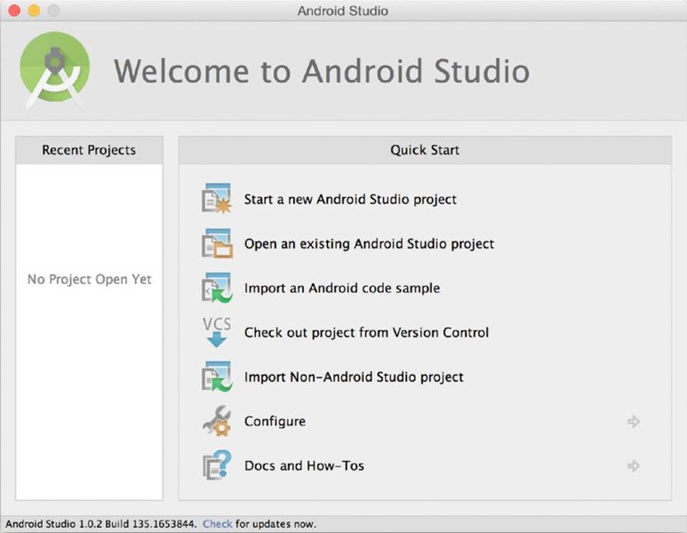
FIGURE 5.1 New project startup
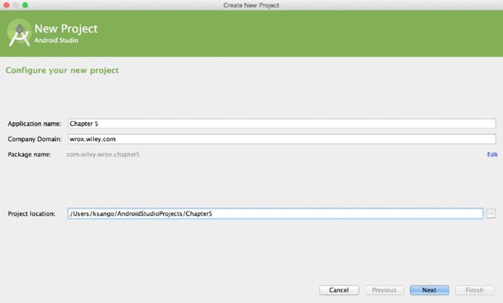
FIGURE 5.2 Entering project information
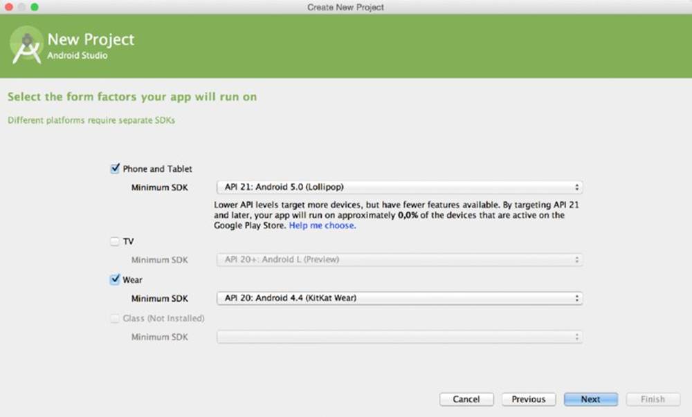
FIGURE 5.3 Select form factors and API levels for your app
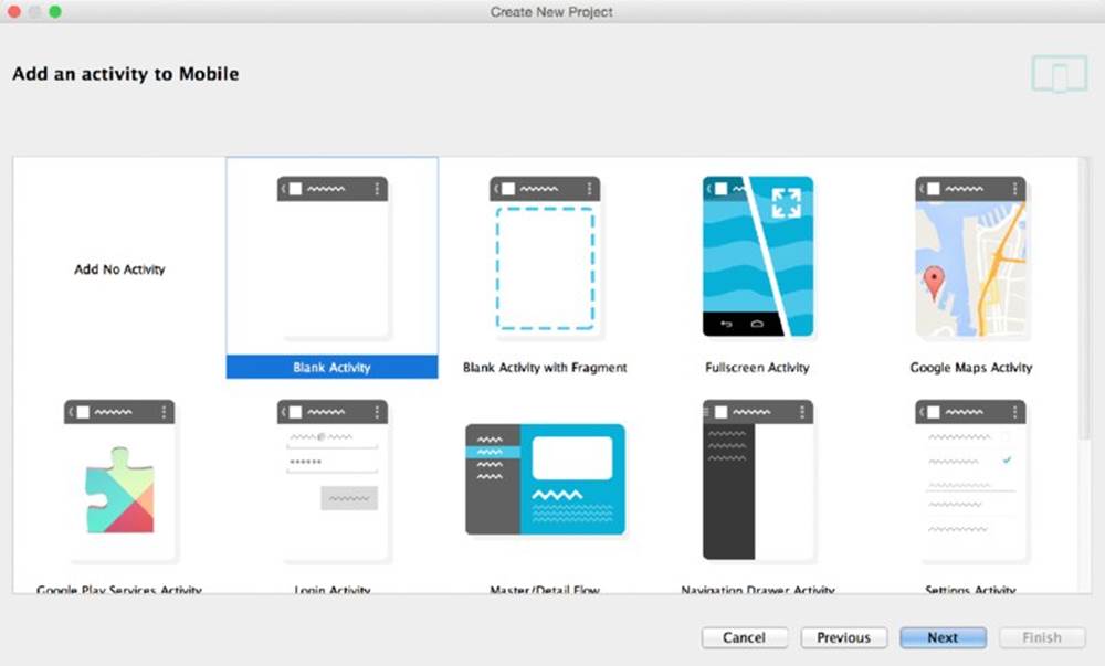
FIGURE 5.4 Add a blank phone activity
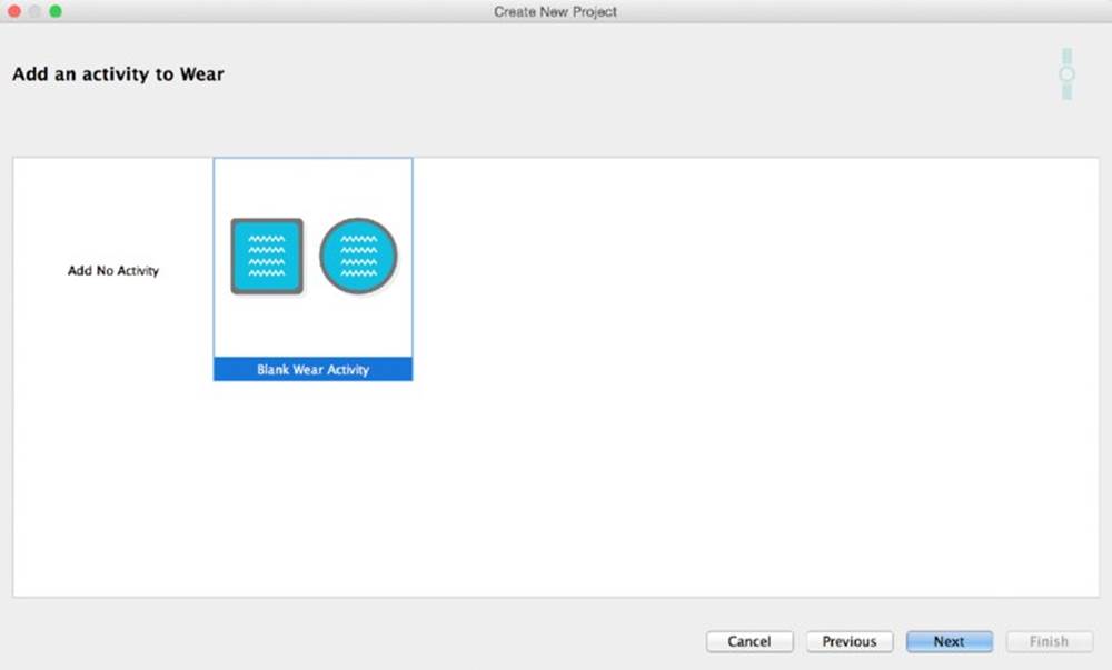
FIGURE 5.5 Add a blank Wear activity
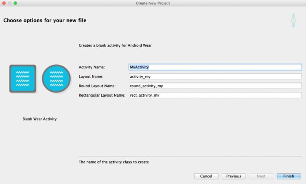
FIGURE 5.6 Edit the properties for your Wear activity and layouts
You should now have an Android Studio project that has two application structures within it called mobile and wear. Let’s review some of the news introduced by Android Wear in the project.
Editing the Gradle Files
Open the mobile gradle file and scroll down to the dependencies. They should look something like Listing 5-1.
LISTING 5-1: Project dependencies for mobile
dependencies {
compile fileTree(dir: 'libs', include: ['*.jar'])
wearApp project(':wear')
compile 'com.google.android.gms:play-services-wearable:+'
}
Notice the dependencies. These two lines are not present in normal Android app projects. The first line specifies that this particular Android app has a Wear component that is located in the wear folder.
The second line includes the Google Play services repository as part of the project. This part is optional. You may remove it if you don’t plan on using any of the new Wear-specific features such as data sync between the two devices.
If you open the Wear gradle file and look at the dependencies, they should look something like Listing 5-2.
LISTING 5-2: Project dependencies for Wear
dependencies {
compile fileTree(dir: 'libs', include: ['*.jar'])
compile 'com.google.android.support:wearable:+'
compile 'com.google.android.gms:play-services-wearable:+'
}
You’ll notice that this project also has two new dependencies specific to Android Wear. First is the wearable support repository, which adds all the new Wear components (see Table 5.1) to the project. The second is the play services repository, which is also optional in the Wear project. If you don’t plan on using any of the functionalities in the Google Play services repository, you may remove this line.
To use the new Wear notifications in your apps, you should also add the support repository to your dependencies. This project doesn’t need it, however, so leave it out for now.
Since Android Wear comes in two different screen shapes, you need to plan your app for both shapes using at least two different layouts.
Loading Layouts
You have two ways to load the correct layout in Android Wear projects. The default method is to use a normal activity and load a layout with WatchViewStub. The second way is to use InsetActivity.
Using WatchViewStub
WatchViewStub is a smart UI widget that can detect the device’s screen shape. Listing 5-3 shows the default main layout. Notice the attributes called rectLayout and roundLayout.
LISTING 5-3: Selecting different layouts for different shapes
<?xml version="1.0" encoding="utf-8"?>
<android.support.wearable.view.WatchViewStub
xmlns:android="http://schemas.android.com/apk/res/android"
xmlns:app="http://schemas.android.com/apk/res-auto"
xmlns:tools="http://schemas.android.com/tools"
android:id=@+id/watch_view_stub"
android:layout_width="match_parent"
android:layout_height="match_parent"
app:rectLayout="@layout/rect_activity_my"
app:roundLayout="@layout/round_activity_my"
tools:context=".MyActivity"
tools:deviceIds="wear">
</android.support.wearable.view.WatchViewStub>
The attributes found in the tools namespace are merely for convenience and helping you when you design the app. They are stripped when the application is packaged.
TOOLS NAMESPACE
For more information on using the tools attributes, see http://tools.android.com/tech-docs/tools-attributes.
When you design your actual layouts, you should always use the same components. It’s critical to use identical ids when you work with WatchViewStub.
To get a reference to a UI widget in your layout, you listen for the onLayoutInflated event on the WatchViewStub root. Listing 5-4 shows how to add the listener.
LISTING 5-4: Listening for the onLayoutInflated event
@Override
protected void onCreate(Bundle savedInstanceState) {
super.onCreate(savedInstanceState);
setContentView(R.layout.activity_my);
final WatchViewStub stub = (WatchViewStub) findViewById(R.id.watch_view_stub);
stub.setOnLayoutInflatedListener(new WatchViewStub.OnLayoutInflatedListener() {
@Override
public void onLayoutInflated(WatchViewStub stub) {
}
});
}
When you’ve attached the listener, you can safely load references to the UI widgets, as shown in Listing 5-5.
LISTING 5-5: Loading references to your UI widgets
Button mButton;
@Override
protected void onCreate(Bundle savedInstanceState) {
super.onCreate(savedInstanceState);
setContentView(R.layout.activity_my);
final WatchViewStub stub = (WatchViewStub) findViewById(R.id.watch_view_stub);
stub.setOnLayoutInflatedListener(new WatchViewStub.OnLayoutInflatedListener() {
@Override
public void onLayoutInflated(WatchViewStub stub) {
mButton = (Button) stub.findViewById(R.id.button);
}
});
}
This example shows the importance of having identical ids in the layouts for round screens and rectangular screens. The alternative way of loading layouts in Wear is a bit more lenient when it comes to ids.
Using InsetActivity
When using InsetActivity, you don’t need the extra initial layout component, WatchViewStub. Instead of selecting the correct layout in XML, you load the correct layout directly in your activity. Listing 5-6 shows how to create InsetActivity.
LISTING 5-6: Creating InsetActivity
public class MyActivity extends InsetActivity {
@Override
protected void onCreate(Bundle savedInstanceState) {
super.onCreate(savedInstanceState);
}
@Override
public void onReadyForContent() {
if( isRound() ){
setContentView(R.layout.round_activity_my);
}else{
setContentView(R.layout.rect_activity_my);
}
}
}
The benefit of InsetActivity is that you may use completely different layouts for different screens. You don’t need to make sure that they match in widgets or widget ids.
The biggest catch of InsetActivity is the loading of the content view. It must be loaded in the life-cycle method onReadyForContent(). Only in this method does the app know with certainty which screen type the device has. You may then load the correct layout depending on the type of screen the device has—round or rectangular. Using the isRound() method, you can select the correct layout to load as content view.
Loading references in InsetActivity is identical to loading references in any normal Android app. Using findViewById() in the activity, as shown in Listing 5-7, lets you load the correct widget. You’re not required to use identical ids, unlike with WatchViewStub. But doing so is recommended so that you avoid duplicate code.
LISTING 5-7: Loading views with different ids depending on layout
public class MyActivity extends InsetActivity {
private TextView rectText, roundText;
@Override
protected void onCreate(Bundle savedInstanceState) {
super.onCreate(savedInstanceState);
}
@Override
public void onReadyForContent() {
if( isRound() ){
setContentView(R.layout.round_activity_my);
rectText = (TextView) findViewById(R.id.rectText);
}else{
setContentView(R.layout.rect_activity_my);
roundText = (TextView) findViewById(R.id.roundText);
}
}
}
I prefer to use a third method for loading the user interface to keep the life-cycle method clean. Doing so also ensures that the two screen types present the same information and enable the same interactions. Listing 5-8 shows how I usually organize myInsetActivity.
LISTING 5-8: Loading the user interface in a separate method
public class MyActivity extends InsetActivity {
private TextView mTextView;
@Override
protected void onCreate(Bundle savedInstanceState) {
super.onCreate(savedInstanceState);
}
@Override
public void onReadyForContent() {
if( isRound() ){
setContentView(R.layout.round_activity_my);
}else{
setContentView(R.layout.rect_activity_my);
}
loadUi();
}
private void loadUi() {
mTextView = (TextView) findViewById(R.id.myText);
mTextView.setText("Hello InsetActivity");
}
}
Figure 5.7 shows the application running on both screen types.
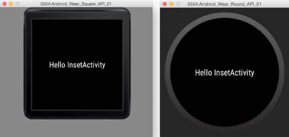
FIGURE 5.7 InsetActivity running on both screen types
Another cool function that InsetActivity provides is the exit button. Tapping the screen displays a typical exit application button, as shown in Figure 5.8.
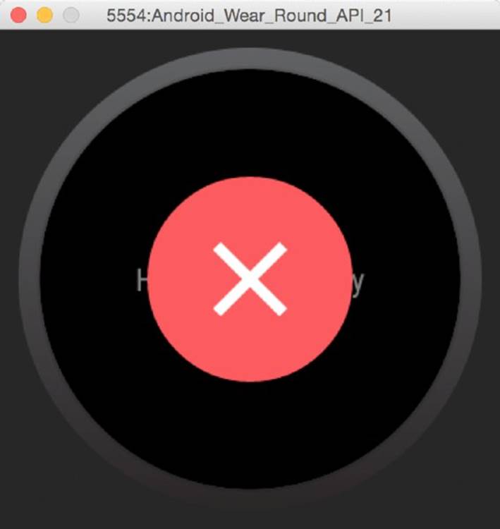
FIGURE 5.8 The exit app button as shown on a round device
Now that you know about some of the basic differences between the Wear app and the mobile app in terms of project structure, let’s explore Wear’s user interface widgets.
BUILDING THE USER INTERFACE
When working with Wear-specific UI widgets, it’s important to add another namespace to your layouts. Without it, adding Wear attributes to views would be impossible. Listing 5-9 shows how to add the Wear namespace.
LISTING 5-9: Adding the XML namespace for Wear
<?xml version="1.0" encoding="utf-8"?>
<RelativeLayout
xmlns:android="http://schemas.android.com/apk/res/android"
xmlns:tools="http://schemas.android.com/tools"
xmlns:wear="http://schemas.android.com/apk/res-auto"
android:layout_width="match_parent"
android:layout_height="match_parent"
android:orientation="vertical"
tools:context=".MyActivity"
tools:deviceIds="wear_square">
...
</RelativeLayout>
Adding Text to Your User Interface
Working with text in Android Wear isn’t so different from normal Android apps. Technically speaking, it’s not the text component that changes; it’s how you should design apps containing text in Wear that changes. Remember that context is important to both notifications and apps. Most often the context is provided with a visual background image and an application icon. Presenting textual information over an image may become a bit messy. Therefore, we strongly recommend that you use a frame of some sort that makes the text more legible.
Luckily Google provides several new classes for dealing with this problem—CardFrame, CardScrollView, and CardFragment.
CardFrame
The most basic of the three components for displaying text, CardFrame is a simple white card with rounded edges and an optional icon. Listing 5-10 shows how to wrap a simple TextView within a CardFrame.
LISTING 5-10: Adding a CardFrame to your layout
<android.support.wearable.view.CardFrame
android:layout_width="wrap_content"
android:layout_height="wrap_content"
android:id="@+id/view"
android:layout_centerVertical="true"
android:layout_centerHorizontal="true">
<TextView
android:layout_width="wrap_content"
android:layout_height="wrap_content"
android:text="R.strings.newtext"
android:id="@+id/myText"
android:layout_centerVertical="true"
android:layout_centerHorizontal="true"/>
</android.support.wearable.view.CardFrame>
The result is a simple frame around our TextView, as shown in Figure 5.9. It has rounded corners and a drop shadow, which is difficult to see in these figures. I promise it’s there.
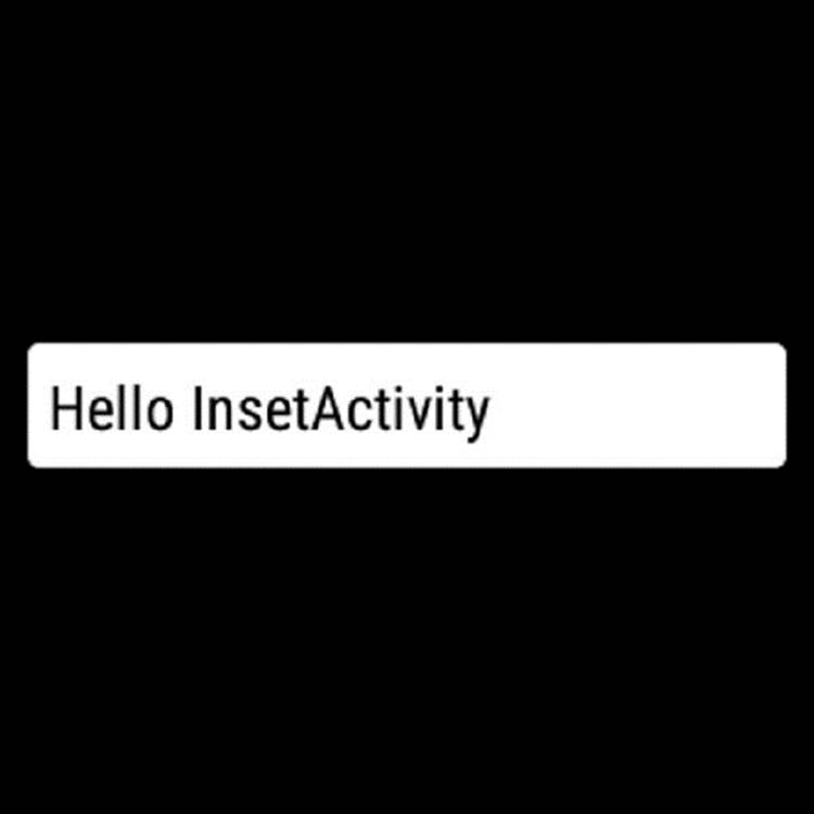
FIGURE 5.9 CardFrame
CardFrame doesn’t give you many other options when it comes to customizing your UI. This is where CardScrollView comes in handy.
CardScrollView
CardScrollView is basically a container for a single CardFrame with the added option of adding scroll functionality to the card in two directions, up and down. You also can set the card’s anchor edge to either top or bottom.
CardScrollView can hold only one CardFrame at a time, as shown in Listing 5-11.
LISTING 5-11: The CardScrollView layout
<android.support.wearable.view.CardScrollView
android:layout_width="wrap_content"
android:layout_height="wrap_content"
android:id="@+id/myScrollView"
android:layout_centerVertical="true"
android:layout_centerHorizontal="true">
<android.support.wearable.view.CardFrame
android:layout_width="wrap_content"
android:layout_height="wrap_content"
android:id="@+id/myCardFrame"
android:layout_centerVertical="true"
android:layout_centerHorizontal="true">
<TextView
android:layout_width="wrap_content"
android:layout_height="wrap_content"
android:text="@string/lipsum"
android:textColor="#000"
android:id="@+id/myText"
android:layout_centerVertical="true"
android:layout_centerHorizontal="true"/>
</android.support.wearable.view.CardFrame>
</android.support.wearable.view.CardScrollView>
Table 5.2 lists the properties you can change for CardScrollView. None of these parameters can be set in XML.
Table 5.2 CardScrollView Properties
|
PROPERTY |
DESCRIPTION |
METHOD |
|
Expansion enabled |
Allows or disallows CardFrame from being taller than the screen height. |
setExpansionEnabled(Boolean) |
|
Expansion direction |
The direction in which the child CardFrame expands. When the card is taller than the screen, this edge is also faded to indicate that it is scrollable. |
setExpansionDirection(int) This value can be either CardFrame.EXPAND_UP or CardFrame.EXPAND_DOWN |
|
Expansion factor |
Sets the expansion factor. |
setExpansionFactor(float) |
|
Card gravity |
Sets the edge that the CardFrame child anchors to when the content is shorter than the screen’s height. |
setCardGravity(int)This value can be either Gravity.TOP or Gravity.BOTTOM |
CardFragment
CardFragment is the best option for displaying text (or any other framed content, for that matter) on Wear devices. It combines CardFrame and CardScrollView and includes an icon as well.
CardFragment comes with two handy static builder methods. If the default layout doesn’t suit your needs, you can simply extend CardFragment and load your own layout. Listing 5-12 shows how to create a simple card using the builder methods.
LISTING 5-12: Building a card using CardFragment builder methods
CardFragment myCard = CardFragment.create("My card", "A longer description",
R.drawable.ic_launcher);
getFragmentManager().beginTransaction().replace(R.id.container, myCard,
"myCard").commit();
Because this is a fragment, you need to adjust your layout slightly to create a container for your CardFragment. Figure 5.10 shows the resulting simple card.
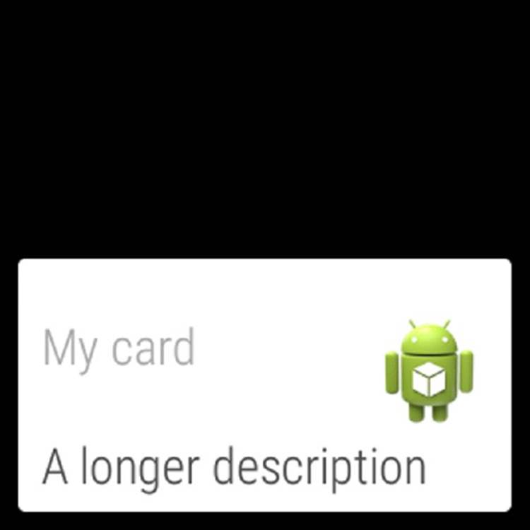
FIGURE 5.10 The basic CardFragment
Using your own custom layout for the CardFragment class is simple. Just extend the CardFragment class and override the onCreateContentView() method. Listing 5-13 shows our custom card layout with three TextViews.
LISTING 5-13: The custom card layout
<?xml version="1.0" encoding="utf-8"?>
<LinearLayout
xmlns:android="http://schemas.android.com/apk/res/android"
android:layout_width="match_parent"
android:layout_height="match_parent"
android:orientation="vertical">
<TextView
android:layout_width="wrap_content"
android:layout_height="wrap_content"
android:textAppearance="?android:attr/textAppearanceLarge"
android:text="Large Text"
android:id="@+id/textView1"/>
<TextView
android:layout_width="wrap_content"
android:layout_height="wrap_content"
android:textAppearance="?android:attr/textAppearanceMedium"
android:text="Medium Text"
android:id="@+id/textView2"
/>
<TextView
android:layout_width="wrap_content"
android:layout_height="wrap_content"
android:textAppearance="?android:attr/textAppearanceSmall"
android:text="Small Text"
android:id="@+id/textView3"/>
</LinearLayout>
Listing 5-14 shows how to load this custom layout in our own card class.
LISTING 5-14: Loading the custom layout in our custom card
public class MyCard extends CardFragment {
TextView mTextView1, mTextView2, mTextView3;
@Override
public View onCreateContentView(LayoutInflater inflater, ViewGroup container,
Bundle savedInstanceState) {
View root = inflater.inflate(R.layout.custom_card, container, false);
mTextView1 = (TextView) root.findViewById(R.id.textView1);
mTextView2 = (TextView) root.findViewById(R.id.textView2);
mTextView3 = (TextView) root.findViewById(R.id.textView3);
return root;
}
}
Showing this custom card is as easy as loading your custom fragment into the container, as shown in Listing 5-15.
LISTING 5-15: Loading the custom card fragment
MyCard myCard = new MyCard();
getFragmentManager().beginTransaction().replace(R.id.container, myCard,
"myCard").commit();
Figure 5.11 shows the resulting card.
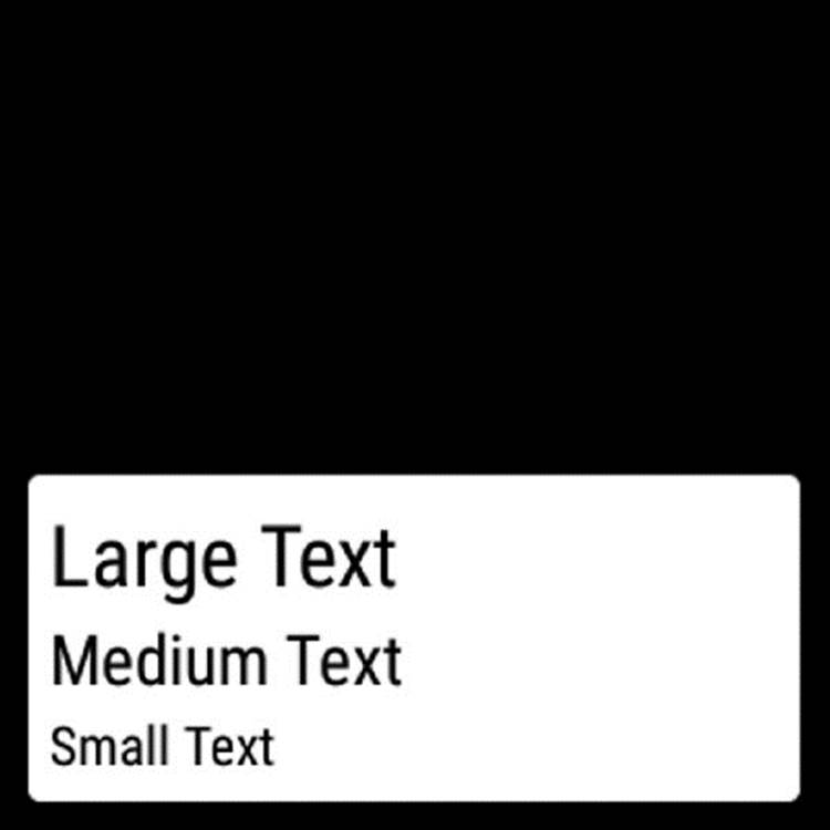
FIGURE 5.11 The custom CardFragment
Table 5.3 shows some of the available properties for CardFragment.
Table 5.3 CardFragment Properties
|
PROPERTY |
DESCRIPTION |
|
Scroll position |
With the methods scrollToTop() and scrollToBottom() you can scroll the card contents to the very top and very bottom of the card. |
|
Card gravity |
Sets the card’s anchor edge. Can be either Gravity.TOP or Gravity.BOTTOM. |
|
Expansion direction |
Selects in which direction the card expands. Can be either CardFragment.EXPAND_UP or CardFragment.EXPAND_DOWN. |
|
Expansion state |
With the method setExpansionEnabled(), you can allow or disallow the expansion for this CardFragment. |
|
Expansion factor |
Sets the card’s allowed height. It’s adjusted in multiples of the parent container. 1.5 means that CardFragment will be at most 1.5 times the height of its container. |
Displaying Images
Images in Android Wear are used slightly differently than in normal Android apps. I like to categorize them into two groups: context images and action images.
Context images are your backgrounds; they provide context for the card currently displayed. It could be a photo of a contact who just sent you a message. Action images are part of the interactions in Wear. All action images in Wear are loaded with the newCircledImageView, which has special properties related to Wear user interfaces.
Loading a Static Image
The simplest image to load in Wear is the static image. Listing 5-16 is the simplest example of the image with a circled background.
LISTING 5-16: The basic CircledImageView
<?xml version="1.0" encoding="utf-8"?>
<RelativeLayout
xmlns:android="http://schemas.android.com/apk/res/android"
xmlns:wear="http://schemas.android.com/apk/res-auto"
android:layout_width="match_parent"
android:layout_height="match_parent">
<android.support.wearable.view.CircledImageView
android:layout_width="wrap_content"
android:layout_height="wrap_content"
android:id="@+id/view"
android:layout_centerVertical="true"
android:layout_centerHorizontal="true"
android:src="@drawable/ic_launcher"
wear:circle_radius="50dp"
wear:circle_color="#f063c7"/>
</RelativeLayout>
This layout should render a result similar to that shown in Figure 5.12.
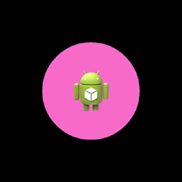
FIGURE 5.12 The basic CircledImageView
Adding a Progress Update
With the simple images in Wear, you need to use the limited amount of space wisely. A neat thing about CircledImageView is the optional progress bar—or countdown timer, depending on how you use it. Imagine a download is under way, and you want to show it on the watch’s user interface. You’d probably create an AsyncTask, and, in the onProgressUpdate() method, you’d update the progress of CircledImageView, as shown in Figure 5.13.
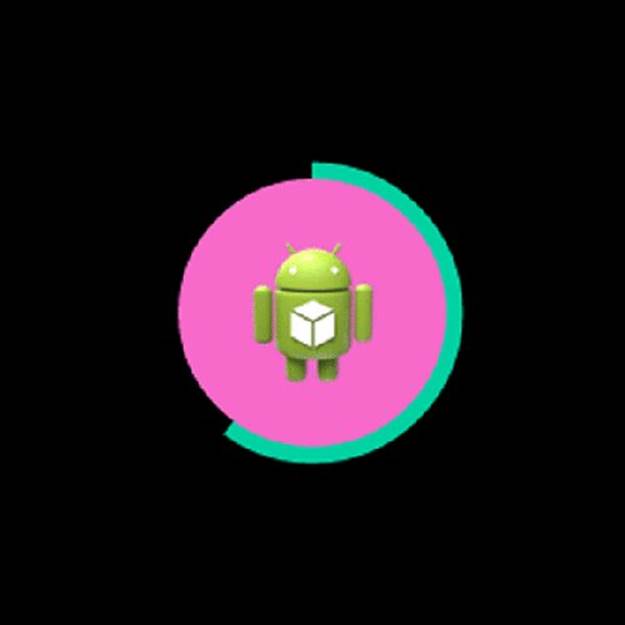
FIGURE 5.13 The progress bar at 60%
To build the progress bar shown in Figure 5.13, you start by setting the color and weight of the circle border, as shown in Listing 5-17.
LISTING 5-17: Setting the border information
<?xml version="1.0" encoding="utf-8"?>
<RelativeLayout
xmlns:android="http://schemas.android.com/apk/res/android"
xmlns:wear="http://schemas.android.com/apk/res-auto"
android:layout_width="match_parent"
android:layout_height="match_parent">
<android.support.wearable.view.CircledImageView
android:layout_width="wrap_content"
android:layout_height="wrap_content"
android:id="@+id/circledImageView"
android:layout_centerVertical="true"
android:layout_centerHorizontal="true"
android:src="@drawable/ic_launcher"
wear:circle_radius="50dp"
wear:circle_color="#f063c7"
wear:circle_border_color="#00cc99"
wear:circle_border_width="10dp"/>
</RelativeLayout>
To update the progress bar, you use the setProgress() method, as shown in Listing 5-18. The example isn’t quite as complex as the scenario presented earlier, but it should give you a good idea of how to work with the circular progress bar.
LISTING 5-18: Enabling the progress bar
CircledImageView mCircledImageView = (CircledImageView) findViewById(R.id
.circledImageView);
mCircledImageView.setProgress(0.6f);
Table 5.4 lists all the possible attributes for the CircledImageView class.
Table 5.4 CircledImageView Attributes
|
XML ATTRIBUTE |
DESCRIPTION |
|
circle_color |
Defines the circle’s background color. In the layout file you can use normal RGB values. In Java you use the Color class. This property is required if you want the circle background to be displayed. |
|
circle_radius |
Sets the size of the background circle. Without it the circle is invisible. |
|
circle_border_color |
Sets the border’s color. The circle’s border is also the optional progress bar. |
|
circle_border_width |
Set the border’s stroke weight. This is required if you want the border to show. |
|
circle_padding |
Sets the border’s padding. |
Handling Lists in Wear
Just like in standard Android apps, the list is one of the most important aspects of a user interface. In Wear the lists have changed to be easier to interact with while you’re on the move.
You have two options when dealing with lists in Android Wear: WearableListView and GridView.
Using WearableListView
WearableListView is optimized for small screens. It scrolls vertically and has a snapping effect. To add WearableListView to your project, you need three things: the layout, the adapter, and the data. Let’s start with the layout of the list (Listing 5-19).
LISTING 5-19: Creating the list row layout
<?xml version="1.0" encoding="utf-8"?>
<RelativeLayout
xmlns:android="http://schemas.android.com/apk/res/android"
xmlns:wear="http://schemas.android.com/apk/res-auto"
android:orientation="vertical"
android:layout_width="match_parent"
android:layout_height="wrap_content">
<android.support.wearable.view.CircledImageView
android:layout_width="wrap_content"
android:layout_height="wrap_content"
android:id="@+id/row_image"
android:src="@drawable/ic_launcher"
wear:circle_radius="20dp"
wear:circle_color="#00cc99"
android:layout_centerVertical="true"
android:layout_alignParentStart="true"/>
<TextView
android:layout_width="wrap_content"
android:layout_height="wrap_content"
android:textAppearance="?android:attr/textAppearanceLarge"
android:text="Large Text"
android:id="@+id/row_text"
android:layout_gravity="center_horizontal"
android:layout_toEndOf="@+id/view"
android:layout_centerVertical="true"
android:layout_centerHorizontal="true"/>
</RelativeLayout>
The WearableListView.Adapter class is slightly different from what you’re probably used to in standard Android. It’s an abstract class, which means you need to create a subclass. It has three methods you need to work with: onCreateViewHolder(), onBindViewHolder(), andgetItemCount(). Listing 5-20 shows a simple example of how to use them.
LISTING 5-20: Building the list adapter
public class MyAdapter extends WearableListView.Adapter {
Context mContext;
LayoutInflater mLayoutInflater;
String[] listData;
public MyAdapter(Context context, String[] data) {
mContext = context;
mLayoutInflater = LayoutInflater.from(context);
listData = data;
}
@Override
public WearableListView.ViewHolder onCreateViewHolder(ViewGroup viewGroup,
int type) {
return new WearableListView.ViewHolder(mLayoutInflater.inflate(R.layout
.my_listitem, null));
}
@Override
public void onBindViewHolder(WearableListView.ViewHolder viewHolder, int pos) {
TextView text = (TextView) viewHolder.itemView.findViewById(R.id.row_text);
text.setText(listData[pos]);
viewHolder.itemView.setTag("item" + pos);
}
@Override
public int getItemCount() {
return listData.length;
}
}
In Wear the adapter has become much simpler than it was in standard Android. For one thing, you don’t need to build your own holders anymore—which is something I occasionally forget. In the method onCreateViewHolder() you simply inflate a layout for your row. The returning view is the ViewHolder for your list.
onBindViewHolder() is where you link your data to the respective UI widgets inside your layout file.
Finally, you return the length of your list data in the getItemCount() method. Where you store your data is up to you. In this example I chose to pass it as a reference to the constructor of the adapter.
When it’s time to put your list to the test, all you need is three lines of code, as shown in Listing 5-21, the data (in this example a String array), the list, and the adapter.
LISTING 5-21: Putting it all together
String[] data = {"Item 1", "Item 2", "Item 3", "Item 4", "Item 5"};
WearableListView list = (WearableListView) findViewById(R.id.listview);
list.setAdapter(new MyAdapter(this, data));
Figure 5.14 shows the list in all its glory.
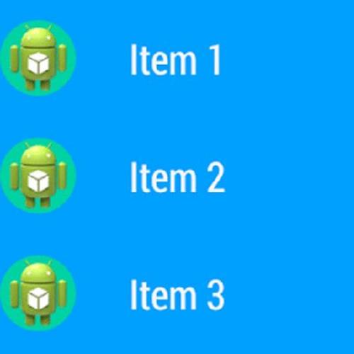
FIGURE 5.14 The list view with custom row layout
Of course, you also can add click actions to your WearableListView, just like you can with any other View. Use the special ClickListener interface located in the WearableListView class, as shown in Listing 5-22.
LISTING 5-22: Making the ClickListener class
private class MyListListener implements WearableListView.ClickListener {
@Override
public void onClick(WearableListView.ViewHolder viewHolder) {
Toast.makeText(MyActivity.this, "Clicked on: " + viewHolder.itemView
.getTag(), Toast.LENGTH_LONG).show();
}
@Override
public void onTopEmptyRegionClick() {
}
}
Then simply attach the listener to your list, as shown in Listing 5-23.
LISTING 5-23: Attaching a listener
String[] data = {"Item 1", "Item 2", "Item 3", "Item 4", "Item 5"};
WearableListView list = (WearableListView) findViewById(R.id.listview);
list.setAdapter(new MyAdapter(this, data));
list.setClickListener(new MyListListener());
As you’ve seen, WearableListView is very handy. It gives you a list that follows the general guidelines for Wear apps and is very easy to implement. You also have alternatives such as GridViewPager, also known as 2D Picker.
The 2D Picker
Much like the list, the grid consists of a layout, an adapter, and data. But the big difference is the data. In a normal list it’s one-dimensional, but in grid view its two-dimensional—the user can scroll in both dimensions freely. This example uses CardFragment to quickly produce pages, but you can create your own page layout too.
Start by creating your adapter. It should inherit from the GridPagerAdapter class, as shown in Listing 5-24.
LISTING 5-24: Creating the grid adapter
public class MyGridAdapter extends FragmentGridPagerAdapter {
String[][] mData;
public MyGridAdapter(FragmentManager fm, String[][] data) {
super(fm);
mData = data;
}
@Override
public Fragment getFragment(int row, int col) {
CardFragment fragment = CardFragment.create("A page", "Page " + row + "," +
"" + col);
return fragment;
}
@Override
public int getRowCount() {
return mData.length;
}
@Override
public int getColumnCount(int row) {
return mData[row].length;
}
}
When the Adapter is ready, the next step is to add a GridViewPager to your layout, as shown in Listing 5-25.
LISTING 5-25: Building your app layout
<?xml version="1.0" encoding="utf-8"?>
<LinearLayout
xmlns:android="http://schemas.android.com/apk/res/android"
android:orientation="vertical"
android:layout_width="match_parent"
android:layout_height="match_parent">
<android.support.wearable.view.GridViewPager
android:layout_width="match_parent"
android:layout_height="match_parent"
android:id="@+id/grid"/>
</LinearLayout>
Finally, glue it all together in your activity, as shown in Listing 5-26.
LISTING 5-26: Composing the 2D Picker
GridViewPager pager = (GridViewPager) findViewById(R.id.grid);
String[][] data = {
{"Row 1, col 1", "Row 1, col 2", "Row 1, col 3"},
{"Row 2, col 1", "Row 2, col 2", "Row 2, col 3"},
{"Row 3, col 1", "Row 3, col 2", "Row 3, col 3"}};
pager.setAdapter(new MyGridAdapter(getFragmentManager(), data));
Your result should resemble Figure 5.15.
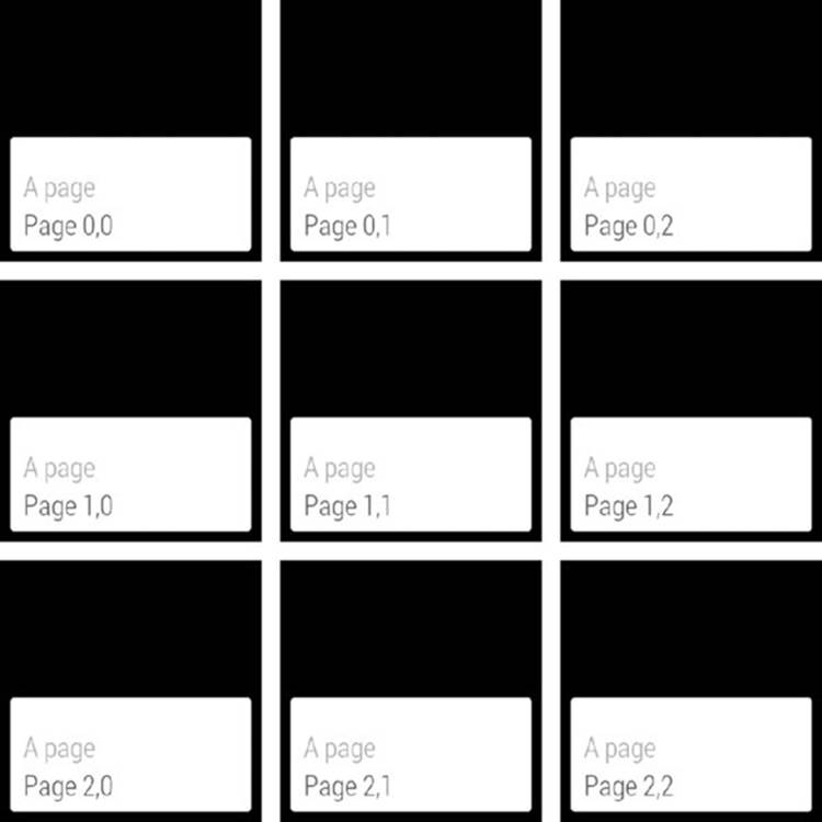
FIGURE 5.15 The 2D Picker
PROVIDING POSITIVE FEEDBACK
A key feature of Wear is feedback. It’s critical that you give your users clear and timely feedback within the short period of time that you have their attention. Google provides three kinds of basic animation feedback that you can use as necessary. All of them are launched using the ConfirmationActivity class:
· ➤ The confirmation animation is a green check box that disappears by itself. It is often used to show that something was done for you on the phone, such as adding an event to a calendar or taking a note. The idea is that the user doesn’t have to open the phone and verify that the item was added.
· ➤ Open-on-phone shows an animated check box that indicates that something was sent to the phone. It’s a hint that the user should review the action on the phone.
· ➤ The action-failed animation—the sad cloud—stays onscreen until the user actively removes it and attempts to complete the action again.
To use ConfirmationActivity, you create a subclass and add it to your manifest. Then you start the activity with the correct parameters. You have beautiful animations that run smoothly on your users’ Wear device. Listing 5-27 shows how to subclassConfirmationActivity.
LISTING 5-27: Creating a subclass of ConfirmationActivity
public class MyConfirmations extends ConfirmationActivity {
}
Add your new activity to your AndroidManifest.xml file, as shown in Listing 5-28.
LISTING 5-28: Adding your confirmation activity to the manifest
<?xml version="1.0" encoding="utf-8"?>
<manifest xmlns:android="http://schemas.android.com/apk/res/android"
package="com.wiley.wrox.chapter5">
<uses-feature android:name="android.hardware.type.watch"/>
<application
android:allowBackup="true"
android:icon=@drawable/ic_launcher"
android:label=@string/app_name"
android:theme=@android:style/Theme.DeviceDefault">
...
<activity android:name=".MyConfirmations"/>
</application>
</manifest>
After you have registered the class for your app, it must be started with the correct settings. Table 5.5 lists the extra information you need to pass with the intent.
Table 5.5 Extra information for ConfirmationActivity
|
FIELD |
DESCRIPTION |
|
EXTRA_ANIMATION_TYPE |
The type of the animation. Can be either FAILURE_ANIMATION, OPEN_ON_PHONE_ANIMATION, or SUCCESS_ANIMATION. |
|
EXTRA_MESSAGE |
A short text message to display along with the animation. |
Starting the Success Feedback
Listing 5-29 shows how to start the success animation.
LISTING 5-29: Starting the success confirmation
Intent success = new Intent(MyActivity.this, MyConfirmations.class);
success.putExtra(ConfirmationActivity.EXTRA_ANIMATION_TYPE,
ConfirmationActivity.SUCCESS_ANIMATION);
success.putExtra(ConfirmationActivity.EXTRA_MESSAGE, "This is OK!");
startActivity(success);
Figure 5.16 shows the success animation in all its glory.
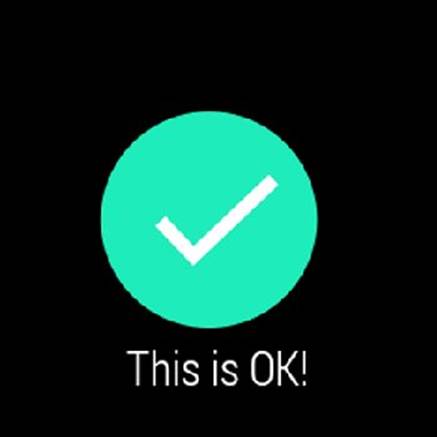
FIGURE 5.16 The success animation
Starting the Open-on-Phone Animation
Starting the open-on-phone animation is no different, as shown in Listing 5-30.
LISTING 5-30: Starting the open-on-phone animation
phone.putExtra(ConfirmationActivity.EXTRA_ANIMATION_TYPE,
ConfirmationActivity.OPEN_ON_PHONE_ANIMATION);
phone.putExtra(ConfirmationActivity.EXTRA_MESSAGE, "Check your phone!");
startActivity(phone);
This animation is slightly different, as shown in Figure 5.17.
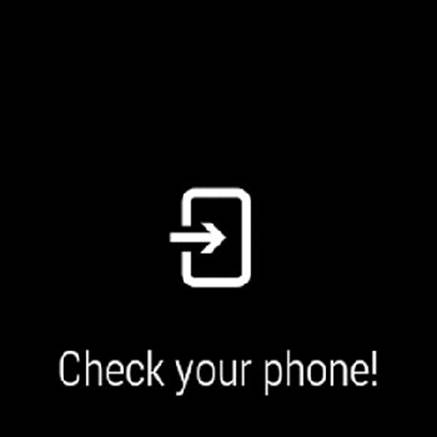
FIGURE 5.17 The open-on-phone animation
Starting the Failure Feedback
The failure feedback is almost identical to the other two; only the type is different. See Listing 5-31.
LISTING 5-31: Starting the failure animation
Intent fail = new Intent(this, MyConfirmations.class);
fail.putExtra(ConfirmationActivity.EXTRA_ANIMATION_TYPE,
ConfirmationActivity.FAILURE_ANIMATION);
fail.putExtra(ConfirmationActivity.EXTRA_MESSAGE, "Not OK!");
startActivity(fail);
Your result should look like Figure 5.18. Note that the failure animation stays until the user clicks it away.
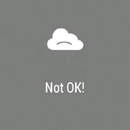
FIGURE 5.18 The failure animation
SUMMARY
This chapter has described the new UI widgets available in Android Wear. You learned how to build apps using some of these new classes.
This chapter also introduced design principles for very small screens and gave you some points to keep in mind when building apps with Android Wear.
The next chapter explores how to add connectivity to Android Wear apps.
RECOMMENDED READING
1. Creative Vision for Android Wear, https://developer.android.com/design/wear/creative-vision.html.
2. Design Principles for Wear, https://developer.android.com/design/wear/principles.html.
3. UI Patterns for Wear, https://developer.android.com/design/wear/patterns.html.
4. Style for Wear, https://developer.android.com/design/wear/style.html.