Programming 3D Applications with HTML5 and WebGL (2013)
Part II. Application Development Techniques
Chapter 12. Developing Mobile 3D Applications
As HTML5 evolved over the past decade, an even more revolutionary set of developments was taking place in mobile phones and tablets. The designs first popularized by Apple’s iPhone and iPad have blurred the lines between mobile devices and traditional computers. Mobile devices now outpace traditional computers in terms of units shipped annually, as consumers look to simpler, smaller, and more portable devices for playing games, watching videos, listening to music, emailing, surfing the Internet, and, yes, even making phone calls. These new handheld computers have also unleashed an explosion of features, including location-based services, touchscreen interfaces, and device orientation input.
To access the new capabilities of smartphones and tablets, developers have typically had to learn new programming languages and operating systems. For example, building applications for Apple’s devices requires using the APIs of the iOS operating system and programming in the Objective-C language (or bridging to it from other native languages such as C++); programming for the Android operating system requires learning a different set of APIs and building applications in Java; and so on. For some time now, mobile platforms have provided a limited ability to develop with HTML5, via use of WebKit-based controls that can be included in an application. This allowed programmers to develop the presentation and some application logic using markup, CSS, and JavaScript, but they still wrote much of the application using native code in order to access platform features—including OpenGL-based 3D graphics—not present in the mobile web browsers at the time.
Over the past few years, the browser has caught up. Most of the features innovated initially in mobile platforms have found their way into the HTML5 specifications. The once separate worlds of native, device-specific mobile programming and web development look like they are about to converge. For many web and mobile application developers, this represents a boon: HTML5 and JavaScript for ease of development, plus the potential to create true cross-platform code. 3D is one of the more recent additions to this set of tools. CSS3 mobile support is ubiquitous, and WebGL is now nearly universally adopted in mobile platforms. In this chapter, we look at the issues surrounding developing mobile HTML5-based 3D applications.
Mobile 3D Platforms
While native mobile APIs are still ahead of HTML5 in terms of features, the gap is rapidly closing. 3D has arrived in most mobile browsers, though there are limitations. Most browsers have WebGL, but some—like Mobile Safari—do not. At the time of this writing, here’s what the landscape looks like for developing HTML5-based 3D applications on mobile devices:
§ WebGL is supported in many, but not all, mobile browsers. Table 12-1 summarizes the mobile browsers that support WebGL.
§ CSS 3D Transforms, Transitions, and Animations are supported in all mobile browsers. The examples developed in Chapter 6 should work in any modern mobile environment. If your application’s 3D needs are simple, consisting of primarily 3D effects on 2D page elements, then you should seriously consider using CSS3 over WebGL, due to WebGL’s lack of complete coverage on mobile devices.
§ The 2D Canvas API is supported in all mobile browsers. This can be used as a potential fallback for mobile platforms that do not support WebGL, albeit with a performance penalty, since the 2D Canvas element is not hardware-accelerated.
Table 12-1. WebGL support on mobile devices and operating systems
|
Platform/device |
Supported browsers |
|
Amazon Fire OS (Android-based) |
Amazon Silk (Kindle Fire HDX only) |
|
Android |
Mobile Chrome, Mobile Firefox |
|
Apple iOS |
Not supported in Mobile Safari or Chrome; supported in iAds framework for creating HTML5-based ads for use within applications |
|
BlackBerry 10 |
BlackBerry Browser |
|
Firefox OS |
Mobile Firefox |
|
Intel Tizen |
Tizen Browser |
|
Windows RT |
Internet Explorer (requires Windows RT 8.1 or higher) |
The most obvious gap in the preceding table is the lack of support for WebGL in Mobile Safari and Mobile Chrome on iOS. Though Android has made major strides in mobile market share, and the other systems are gaining in popularity, iOS is a still a very popular mobile platform and commands significant developer attention. The situation with iOS may change in the future, but the reality today is that WebGL does not run in web browsers on iOS.
On platforms for which WebGL is not enabled in the browser, there are adapter technologies, so-called “hybrid” solutions that provide the WebGL API to applications. Developers can write their applications using JavaScript code that talks to a set of native code responsible for implementing the API. The result won’t be a browser-based application, but it can perform at native speeds and still reap the benefits of rapid, easy JavaScript development. We will explore one such technology, Ludei’s CocoonJS, later in the chapter.
For the mobile platforms that do support WebGL, there are often two avenues of deployment: browser-based applications, and packaged applications usually referred to as web apps. For browser-based mobile WebGL, you simply develop your application as you would for the desktop, and deliver it as a set of files from your servers. For web apps, you use the platform’s tools to package the files—usually the same files as you would deploy from your server, perhaps with the addition of an icon and some metadata information—which are then distributed through the platform’s app store or similar service.
Regardless of how you deploy your application, there are going to be special concerns when you are developing 3D for mobile. First, you will want to add support for device capabilities such as touch input, location, and device orientation. You also have to be much more mindful about performance, given the smaller memory footprint and (generally) less capable CPU and GPU processors present on the devices. These topics will be covered later in the chapter.
NOTE
HTML5 mobile platforms are a moving target; new platforms seem to be hitting the scene on a daily basis. There is a good overview and other background information in the Wikipedia entry.
Developing for Mobile Browsers
If you already have experience creating a WebGL application for desktop browsers, getting started with mobile development can be as easy as pointing the browser at the URL. If your mobile platform claims support for WebGL, it should just work. Performance can vary. The devices and operating system platforms support many different hardware configurations: some are quite low end, such as the Firefox OS phones from GeeksPhone; others, such as the newer Samsung Galaxy and Google Nexus tablets, have very fast performance. But they all should at least render something on the screen to get you started.
One of the most impressive devices I tested was the Amazon Kindle Fire HDX. Released in October 2013, this upgrade to the Kindle Fire line features solid hardware specs—a quad-core Snapdragon processor and Adreno 330 GPU from Qualcomm—plus first-class HTML5 support. The seven-inch version worked very well with the book examples. See Figure 12-1 for a screenshot of the Futurgo concept car site (see Chapter 10) running on the Kindle Fire HDX in the Amazon Silk browser. Note how it looks exactly like the desktop example from Chapter 10. Swipe a finger in the canvas area to rotate the Futurgo. Pinch the screen with two fingers in the canvas area to zoom the model in/out. Tap on the Interior and LTD Racing tabs to start the animations. Tap on a part of the Futurgo body to bring up the overlay. The performance is great, beyond anything you would expect from a super-lightweight, seven-inch handheld device.
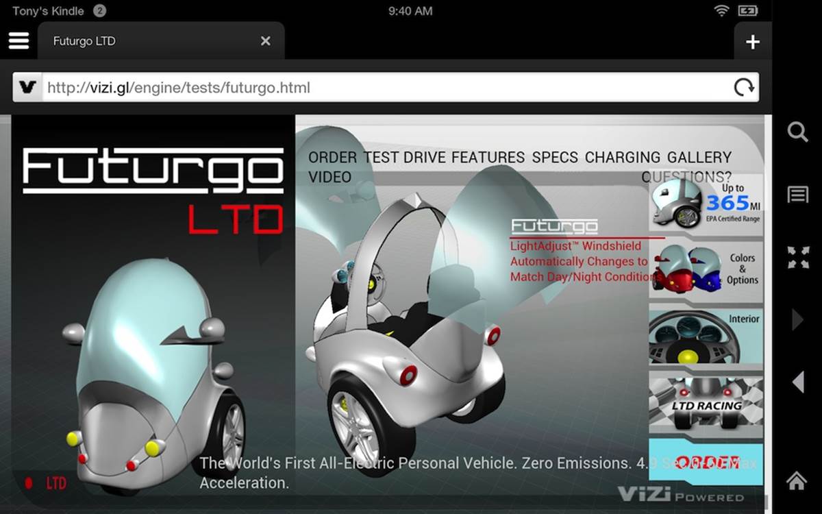
Figure 12-1. Futurgo application on the Kindle Fire HDX
It is worth nothing that I did no additional work initially to get this example running on the Kindle device. I simply typed a URL into the browser, and within a few seconds, the page was fully rendered and animating. A mobile device like this has no mouse, so in order to implement interaction, I needed to add touch input support.
Adding Touch Support
Mobile HTML5 browsers automatically handle touch input for page elements, generating the appropriate mouseclick events. The tabs on the righthand side of the Futurgo page just worked, triggering the animations to open the car and rotate the wheels. However, the browsers do not automatically generate mouse events for Canvas elements. We need to add the support ourselves, by handling browser touch events.
Touch events were added to web browsers as touch interfaces became popular on mobile devices. They are somewhat similar to mouse events, in that they supply client-, page- and screen-relative x and y coordinates. However, they also include some different information; in particular, because most devices support more than one source of touch input simultaneously (for example, one per finger touching the screen), touch events include separate information for each source.
The browser also defines new event types, as summarized in Table 12-2.
Table 12-2. Browser touch events
|
Event |
Description |
|
touchstart |
Triggered when a touch is detected (e.g., when a finger first touches the screen) |
|
touchmove |
Triggered when a touch position changes (e.g., when a finger moves across the screen) |
|
touchend |
Triggered when the touch ends (e.g., the finger is removed from the screen) |
|
touchcancel |
Triggered when a touch moves outside the touch-sensitive area of the screen, or the touch has been interrupted in some other implementation-specific manner (e.g., too many touch points) |
NOTE
The complete browser touch events specification can be found on the W3C recommendations pages.
Note that touch events support is still a work in progress in some browsers, and you may encounter browser-specific issues. Desktop Internet Explorer, for example, supports touch events for touch-enabled PCs; however, there are differences in the DOM event types, and browser-specific CSS properties (-ms- prefix) are required for proper functioning. Consult the developer documentation for your target browsers.
To add touch support to the Futurgo application, we will need to implement event handlers for the aforementioned events. We want to add them to the model controller used by the Vizi viewer, to support rotating and zooming the model. We also want to implement touch on the Futurgo application itself to handle when the user touches a part of the car.
Implementing touch-based model rotation in the viewer
One of the neat features of the desktop Futurgo application is the ability to rotate the model with the mouse, and zoom in and out using the mouse wheel and trackpad. Since neither of these input sources is available on a mobile device, we will use touch instead.
Recall from Chapter 10 that the Futurgo application uses the Vizi.Viewer object, and its built-in model controller, to manipulate the model with the mouse. We will modify the model controller to use touch input. The source code for this class can be found in the Vizi sources in the filesrc/controllers/orbitControls.js.
First, we add an event listener for touchstart, which will call the method onTouchStart().
this.domElement.addEventListener( 'touchstart', onTouchStart,
false );
The other touch event listeners are added in the body of onTouchStart() as follows. (Note that the variable scope is a JavaScript closure scope variable, the saved value of this for the orbit control object.)
scope.domElement.addEventListener( 'touchmove', onTouchMove,
false );
scope.domElement.addEventListener( 'touchend', onTouchEnd,
false );
Now we are ready to handle touch events. Example 12-1 shows the code for the handler onTouchStart(); we basically fake a mouse down event and call the event handler, onMouseDown(), used by the mouse event handling code. The detail for each touch input source is stored in the event’s touches lists, an array of Touch objects. We assume a single touch here, ignoring anything but the 0th object in the list. Values from the object are copied into our fake mouse event and passed to onMouseDown(), and the event is then handled like a regular mouse down event.
In the immortal words of Mr. Spock: “Crude methods—but effective.”
Example 12-1. Handling touch start by synthesizing a mouse down event
// synthesize a left mouse button event
var mouseEvent = {
'type': 'mousedown',
'view': event.view,
'bubbles': event.bubbles,
'cancelable': event.cancelable,
'detail': event.detail,
'screenX': event.touches[0].screenX,
'screenY': event.touches[0].screenY,
'clientX': event.touches[0].clientX,
'clientY': event.touches[0].clientY,
'pageX': event.touches[0].pageX,
'pageY': event.touches[0].pageY,
'button': 0,
'preventDefault' : function() {}
};
onMouseDown(mouseEvent);
We implement similar cheap hacks for touchmove and touchend, except that we use the event.changedTouches array instead. changedTouches contains new values for any touch input source that has moved. Again, this all assumes single-touch operation. That’s OK; we have other plans for multitouch. See the code for the onTouchMove() and onTouchEnd() methods for the details.
Implementing multitouch-based model zoom
Most devices support more than one touch input, or multitouch operation. A common multitouch interface paradigm is to use two fingers to “pinch” the screen, moving the fingers either closer together or farther apart to zoom the view in or out. For the Vizi model controller, we are going to do just that.
Programming multitouch is a little more involved than simple single-touch, because we have to track the separate movements of more than one touch input. Each Touch object in the event’s touches or changedTouches list contains an identifier property, a unique id for the touch that is guaranteed to stay the same for its duration (from touchstart through touchmove, until touchend or touchcancel).
Let’s look at the code. In the beginning of onTouchStart(), we check to see if we have more than one touch. If so, we are treating this as a pinch-to-zoom gesture, not a model rotation. We use the first two items of the touches array to calculate the distance between the touches, saving them into the property touchDistance. This will be used later to determine whether we have pinched inward or outward.
if ( event.touches.length > 1 ) {
scope.touchDistance = calcDistance(event.touches[0],
event.touches[1]);
scope.touchId0 = event.touches[0].identifier;
scope.touchId1 = event.touches[1].identifier;
}
We also have to save the string identifiers for the two touch objects in the properties touchId0 and touchId1. We do this because, as we receive subsequent touchmove events, we must determine which touches have moved; there is no guarantee that the individual touch objects will be stored in the same order in the new events’ changedTouches lists as they were during the original touchstart event. The only information that uniquely identifies each Touch object is its identifier property. So we save these for later.
Now it’s time to handle touchmove. See Example 12-2. In the method onTouchMove(), we first figure out if we have a multitouch event. If so, we search changedTouches for the two identifiers we saved previously, touchId0 and touchId1. Touch objects with those identifiers are the ones we are interested in. Once we have those, we can calculate the new distance using the helper function calcDistance(). We compare that to the previous distance. If the difference is positive, that means our fingers are moving farther apart and we zoom the camera in so the model appears closer; if the difference is negative, that means we are moving our fingers closer together, and we zoom out.
Example 12-2. Handling a pinch with multiple touch events
if ( event.changedTouches.length > 1 ) {
var touch0 = null;
var touch1 = null;
for (var i = 0; i < event.changedTouches.length; i++) {
if (event.changedTouches[i].identifier ==
scope.touchId0)
touch0 = event.changedTouches[i];
else if (event.changedTouches[i].identifier ==
scope.touchId1)
touch1 = event.changedTouches[i];
}
if (touch0 && touch1) {
var touchDistance = calcDistance(touch0, touch1);
var deltaDistance = touchDistance −
scope.touchDistance;
if (deltaDistance > 0) {
scope.zoomIn();
}
else if (deltaDistance < 0) {
scope.zoomOut();
}
scope.touchDistance = touchDistance;
}
}
Let’s look at how distance is calculated. Example 12-3 shows calcDistance() in its entirety. The calculation is simple, using the classic Pythagorean distance formula.
Example 12-3. Calculating pinch distance
function calcDistance( touch0, touch1 ) {
var dx = touch1.clientX - touch0.clientX;
var dy = touch1.clientY - touch0.clientY;
return Math.sqrt(dx * dx + dy * dy);
}
Turning off user scaling in the web page
There is one small but very important detail remaining to get our touch implementation right. By default, mobile web browsers allow the user to scale the page content using touch. However, that will interfere with our ability to pinch to scale the 3D content. The good news is that there is a way to turn this feature off from within the markup. By including the following HTML5 meta tag, we can prevent user scaling of the page (see Chapter 12/futurgo.html):
<meta name="viewport"
content="width=device-width, initial-scale=1.0, user-scalable=no">
Adding Vizi.Picker touch events to the Futurgo model
The desktop version of Futurgo contained a really nice feature: informational callouts for different parts of the car model. Rolling the mouse over a part of the car (windshield, body, tires) pops up a DIV with additional information on that part. However, mobile devices don’t have mice, so rollover-based callouts don’t work. Instead, we would like to be able to launch the callouts when different parts of the model are touched. Vizi.Picker includes support for touch events. See Chapter 12/futurgo.js, line 44, for the code we added to Futurgo to trigger callouts based on touch. Note the lines in bold in Example 12-4.
Example 12-4. Adding Vizi.Picker touch events to the Futurgo model
// Add entry fade behavior to the windows
var that = this;
scene.map(/windows_front|windows_rear/, function(o) {
var fader = new Vizi.FadeBehavior({duration:2, opacity:.8});
o.addComponent(fader);
setTimeout(function() {
fader.start();
}, 2000);
var picker = new Vizi.Picker;
picker.addEventListener("mouseover", function(event) {
that.onMouseOver("glass", event); });
picker.addEventListener("mouseout", function(event) {
that.onMouseOut("glass", event); });
picker.addEventListener("touchstart", function(event) {
that.onTouchStart("glass", event); });
picker.addEventListener("touchend", function(event) {
that.onTouchEnd("glass", event); });
o.addComponent(picker);
});
The touch event handlers are simple: again, we pull the cheap trick of just dispatching to an existing mouse handler.
Futurgo.prototype.onTouchEnd = function(what, event) {
console.log("touch end", what, event);
this.onMouseOver(what, event);
}
NOTE
Thankfully, there is nothing in onMouseOver() that expects an actual DOM MouseEvent, or this code would break. We got off easy here—try to not do this kind of thing in your production code, or you might find bugs much later on, when you least expect them.
Debugging Mobile Functionality in Desktop Chrome
Once we learned how to handle touch events, it was pretty easy to add the support to the Vizi core and the Futurgo application. Even the multitouch handling for pinch-to-zoom, while a bit detailed, was not rocket science. Though this kind of thing comes easy, we are still human and make mistakes, so we need to be able to debug and test the new features as we add them.
Each mobile HTML5 platform listed in Table 12-1 provides a different way of connecting debuggers to debug the application on the device. Some of these systems work well; others are, in my experience, pretty painful to deal with. Be that as it may, at some point you will find yourself needing to get into that process. We are not going to cover the specifics of any of the tools here. Consult the documentation for your target platform for more information.
In the meantime, it would be great if we could use the desktop version to do some debugging before moving the application to the device. Thankfully, the debugger tools in desktop Chrome provide a way to do this by allowing you to emulate certain mobile features, such as touch events. When touch event emulation is turned on, you can use the mouse to trigger the touch events. Here is a quick walkthrough:
1. Launch your application in the Chrome browser.
2. Open the Chrome debugger.
3. Click on the settings (cog) icon on the bottom right. You should see a user interface pane come up over the debugging area. See Figure 12-2. The relevant input fields are circled.
4. Select the Overrides tab in the Settings section (leftmost column).
5. Check the Enable checkbox in the column labeled Overrides.
6. Scroll down until you see “Emulate touch events” in the detail area on the right. Select that checkbox.
7. Now you can click the close box on the top left to dismiss this pane. However, make sure to keep the debugger open.
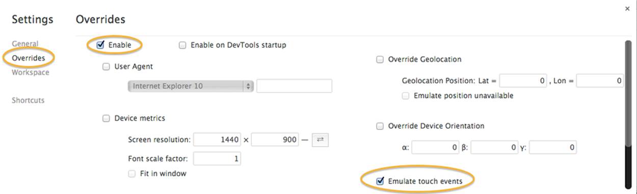
Figure 12-2. Enabling touch event emulation in desktop Chrome
NOTE
Note that Chrome touch event emulation works only when the debugger is open. When you close the debugger, you lose touch overrides.
At this point, browser touch event emulation is enabled in Chrome. Mouse events will be converted to touch events and sent to your application. See Figure 12-3. Note the black rectangle with red text at the top right of the window (circled in the figure). This tells us what event overrides have been turned on. Now use the mouse to click on the Futurgo; we can see the messages written to the console when touchstart and touchend events are triggered, circled within the console window. This simple capability is a great way to debug your touch code before trying out the application on the device. Unfortunately, only single-touch emulation is supported.
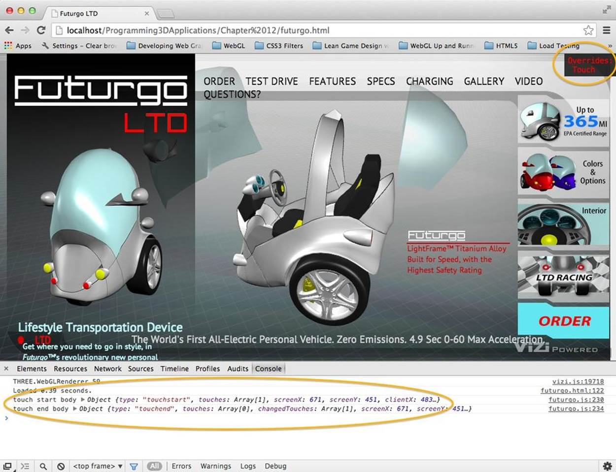
Figure 12-3. Debugging touch events for the Futurgo in desktop Chrome
Creating Web Apps
Sometimes, you would like to package your creation as a finished application to deploy to the device. Perhaps you want to use in-app purchase, or other platform features provided for applications but not available to code running in the browser. Or you may simply wish to install an icon onto the user’s device so that he or she can directly launch your application. Most of the new mobile device platforms support developing in JavaScript and HTML5, and then packaging the result as a finished application, or web app.
Web App Development and Testing Tools
The developer tools to create web apps in HTML5 differ from platform to platform; each has its own way to test-launch, debug, and then package the app for distribution.
Amazon provides a Web App Tester for Amazon Fire OS on Kindle devices. Fire OS is an Android-based operating system developed at Amazon for use with Kindle Fire devices. The Web App Tester is a Kindle Fire application available on the Amazon store. For details, go tohttps://developer.amazon.com/sdk/webapps/tester.html. The Web App Tester is depicted in Figure 12-4.
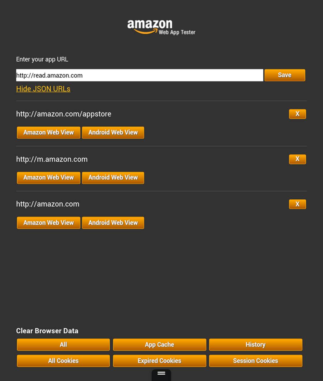
Figure 12-4. Amazon’s Web App Tester
This utility couldn’t be simpler: just type a URL to your page, and it will launch the page in a full-screen view. After you have typed it once, the Tester stores the URL in its history so that you can easily launch it again.
NOTE
As mentioned, the developer tools for creating web apps differ from platform to platform. This is true even for different vendor-specific versions of Android: though Kindle Fire OS is Android-based, Amazon has added a lot of value with a custom set of tools for developing, testing, and packaging. For other Android-based systems, check the vendor documentation or have a look at the Android developer web app pages.
Packaging Web Apps for Distribution
Once you have debugged and tested your apps, it’s time to deploy. This is another area where each platform differs greatly. Amazon provides the Amazon Mobile App Distribution Portal, which allows registered Amazon developers to create Kindle Fire and Android apps published by the company. Publishing your apps through this portal requires going through several steps. One of the first steps is to create a manifest file for the application; that is, a file that contains data about the contents and features of the application. Here is a sample from a very simple Amazon web app manifest file. The only required field is verification_key, a value generated by Amazon as part of the publishing process. Other metadata about the application, such as icons and a description, is supplied online as part of app submission, not in the manifest file itself. Complete information on Amazon manifest files can be found at https://developer.amazon.com/sdk/webapps/manifest.html.
{
"verification_key":
"insert your verification key from the App File(s) tab",
"launch_path": "index.html",
"permissions": [
"iap",
"geolocation",
"auth"
],
"type": "web",
"version": "0.1a",
"last_update": "2013-04-08 13:30:00-0800",
"created_by": "webappdev"
}
By contrast, Firefox OS has a different app distribution process for use with the Firefox Marketplace, and a different syntax for manifest files. Here is a simple example:
{
"name": "Your_Application_Name_Here",
"description": "Your Application Description Here",
"version": 1,
"installs_allowed_from": ["*"],
"default_locale": "en",
"launch_path": "/index.html",
"fullscreen": "true",
"orientation": ["landscape"],
"icons": {
"128": "/images/icon-128.png"
},
"developer": {
"name": "Your Name Here",
"url": "http://your.company.url.com"
}
}
In Firefox manifest files, we specify the files contained in the package, an icon for the app, an app name and description, and some developer information. Find more information on Firefox OS app creation at https://developer.mozilla.org/en-US/Apps/Developing/Packaged_apps.
Developing Native/HTML5 “Hybrid” Applications
HTML5 and mobile platform APIs appear to be on a collision course. You could imagine a very near future where any application could be developed once in HTML5, and simply deployed on the various mobile platforms using those vendors’ packaging technologies. However, that future is not here yet. There are still several differences among the platforms, and 3D in particular is still shaking out. As discussed, WebGL is enabled in nearly all the mobile browsers already, but it is not ubiquitous.
For this reason and others, you may want to consider using one of a handful of technologies that enable WebGL on the target device by providing a native library, or adapter, that makes a version of the WebGL API accessible to JavaScript. Using an adapter technology, you can combine JavaScript and HTML with native code into a packaged application—a “hybrid,” if you will—that has the best of both worlds in one application.
Developers may turn to the hybrid approach for any of the following reasons:
Lack of browser support
Even though iOS is the remaining holdout on implementing WebGL, it’s a big one. For platforms like iOS, or other mobile platforms (such as earlier versions of Android) that may or may not support WebGL, a hybrid solution provides a path that allows the developer to build a 3D application on the WebGL API using JavaScript, and deploy on the target platform.
Performance
The adapter libraries tend to offer slightly higher performance than the equivalent browser-based WebGL application for a couple of reasons. First, they can provide an optimized, better-tuned JavaScript virtual machine. Second, they can circumvent the additional layers of WebGL security that are required per the browser’s security mode—essential for a web-based application, but unnecessary in a native application.
Deployment as an application
If the intent is to deliver the finished product as a mobile application instead of a browser-based website, then it’s OK, maybe even desirable, to use a hybrid solution. Some of these even offer value-added JavaScript access to features that would otherwise be unavailable in a pure browser-based application, such as in-app purchase, native ad SDKs, and push notifications.
Over the years, several adapter technologies have emerged that support this hybrid approach. While many of them provide hardware-accelerated Canvas and other special features—the most well known being Adobe’s PhoneGap—only a few hybrid frameworks include support for WebGL. The two most notable are CocoonJS and Ejecta. While the two tools attempt to solve the same problem, they approach it quite differently. Here is a quick comparison:
CocoonJS
CocoonJS runs on Android and iOS. It hides the details of the underlying system, in an easy-to-use application container for HTML5 and JavaScript code. It provides implementations of Canvas, WebGL, Web Audio, Web Sockets, and more. CocoonJS also comes with a system for building projects in the cloud, so all you have to do is sign your project and build it; developers do not need to understand the intricacies of creating applications using native platform tools such as Xcode for iOS. CocoonJS is a closed source project tightly controlled by its developer, San Francisco–based Ludei.
Ejecta
Ejecta is an open source library that supplies many of the same features as CocoonJS, but for iOS only. Ejecta was born out of ImpactJS, a project to create a game engine for HTML5. Ejecta is a bit more DIY, requiring the developer to have a fair amount of knowledge about Xcode and native platform APIs.
Even though Ejecta is open source, its reliance on iOS-specific features and Xcode make it inappropriate for this book. We will instead use CocoonJS for our tour of developing a hybrid application.
CocoonJS: A Technology to Make HTML Games and Applications for Mobile Devices
CocoonJS is an adapter technology to make hybrid HTML5 applications that run on mobile devices. It acts as an HTML5 native wrapper: the application or game is executed as a native application, while executing JavaScript and HTML inside. CocoonJS runs on both iOS and Android, providing an identical environment for execution across these platforms and a variety of devices.
CocoonJS allows the developer to supply an HTML file and associated JavaScript code that will be rendered in a full-screen 2D or 3D Canvas using the standard 2D and WebGL APIs, plus Web Audio, image loading, XMLHttpRequest for Ajax development, and WebSockets support. CocoonJS implements native, hardware-accelerated versions of these APIs and provides a customized JavaScript virtual machine (VM) specially tuned by Ludei to provide better performance. Figure 12-5 shows a screenshot of the Futurgo running as a full-screen native iOS application on the Apple iPad 4.
To make development and testing easier, CocoonJS comes with a Launcher application that allows the developer to load a URL and preview the result, or to drop a ZIP archive containing all the content into the Launcher app on the device. The CocoonJS Launcher, depicted in Figure 12-6, can be downloaded from the Apple and Android app stores. To test your application, click the Your App button and either type URLs to your test files in the text window, or open ZIP files that have been dropped into the Launcher using iTunes or Android SDK tools. Consult the CocoonJS documentation for all the details.
Once you’ve previewed and tested the application with the Launcher, you can build it as a native app using Ludei’s cloud-hosted service: upload the application files, and a few minutes later you will be ready to download a final bundle suitable for distribution through iOS, Amazon, GooglePlay, and other app stores.
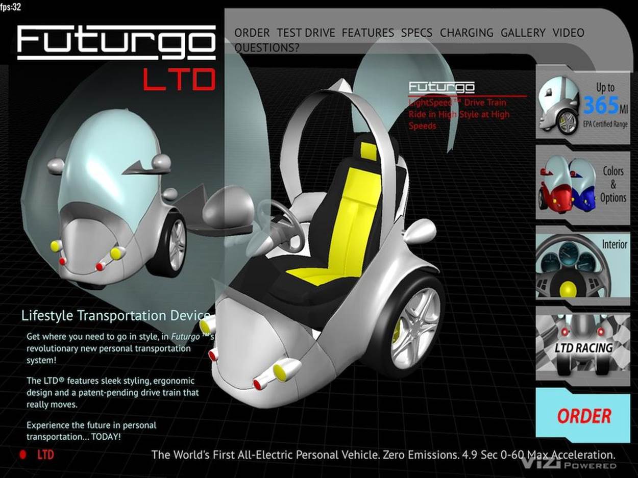
Figure 12-5. The Futurgo running as a native iPad application, built with Ludei CocoonJS

Figure 12-6. CocoonJS Launcher home screen
Assembling an Application with CocoonJS
Though the makers of CocoonJS contend that it can be used to build any kind of native/HTML5 application, their main focus so far has been to enable the creation of high-performance games. To that end, let’s put together a very simple game to show off how to build an application. This is really more of a game demo than a whole game, designed to show off the process. Before we get into the CocoonJS particulars, let’s look at a version of the game that runs on the desktop. Then we will adapt it for use with CocoonJS.
Launch the file Chapter 12/omegacity/omegacity.html in your browser. You will see the start screen depicted in Figure 12-7. The model should look familiar; it is the “virtual city” sample scene loaded from a glTF file using the example program from Chapter 8 (Chapter 8/pipelinethreejsgltfscene.html).
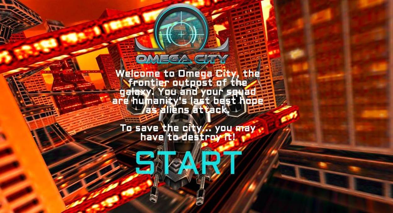
Figure 12-7. Omega City game start screen: 2D art and design by GameSalad, virtual city scene courtesy of 3DRT, and sounds from FreeSound; all rights reserved
NOTE
This awesome model was purchased from 3DRT. The demo shown here was developed in collaboration with Austin-based GameSalad, the makers of an easy-to-use 2D game creation tool for HTML and mobile games. Remember that this model, like the others distributed with the book, is subject to copyright and therefore you cannot use it in your own applications, or outside of the purpose of learning with this book, without purchasing your own copy of the model.
Welcome to Omega City, the frontier outpost of the galaxy. You and your squad are humanity’s last best hope as aliens attack. To save the city…you may have to destroy it! Click the blinking START label to enter the game. This will take you to the main screen shown in Figure 12-8. The ship is on autopilot; you can only fire weapons. Hit the up arrow on the keypad to shoot lasers; you will see blue laser fire converging in the center of the view. Hit the space bar to launch a missile; after a power-up sound, the missile will fire from the heart of the ship and, once it hits its target, explode in a green flash. This is simple stuff, designed only to show off how to build something game-like so that we can get a taste of hybrid iOS development using CocoonJS.
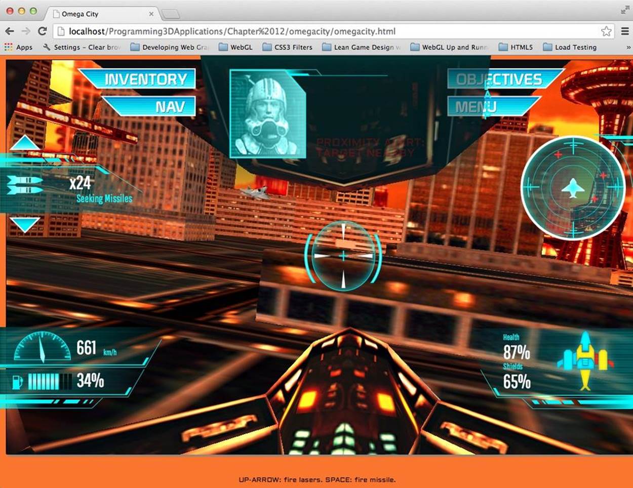
Figure 12-8. Omega City game demo running on the desktop
Creating the main and overlay views
You may have noticed a subtle difference between the Futurgo running on Kindle Fire HDX using pure HTML5, shown in Figure 12-1, and the native version running in iOS with CocoonJS (Figure 12-5). The Kindle Fire version looks exactly like the desktop web version, with a purple image gradient showing through behind the 3D model and wireframe grid, whereas the CocoonJS iOS version has a black background showing through behind the grid. This is because CocoonJS is not a full HTML5 browser and compositing engine, but rather a native implementation of the Canvas element, intended to make native 2D and 3D graphics development accessible to JavaScript programmers. CocoonJS can read and parse HTML tags, but it ignores most of the tags and style information.
CocoonJS interprets the HTML tag for the main canvas, plus any associated JavaScript files, but that’s about it. You should not expect random CSS styling to work. The background image for the Futurgo is specified in the CSS for the container DIV element, which CocoonJS ignores when it processes the HTML file. If we want this kind of background imagery to work in CocoonJS, we have to draw it ourselves on the canvas. For example, we could add a Three.js object in the far background, or perhaps a Vizi skybox (see Chapter 11). This is hardly worth the bother for the quick-and-dirty exercise we have here, but you will have to deal with this issue in your own applications if you require the feature.
Even though CocoonJS is weak on styling background elements, Ludei realizes that as a practical matter, many web developers will want to use HTML to lay out and program game user interfaces. So it provides a way to layer a second HTML file, rendered in a WebView window, on top of the main canvas. The key to making this work is to split the canvas and overlay HTML elements into two separate files, or views. Figure 12-9 shows the contents of the two views side by side.
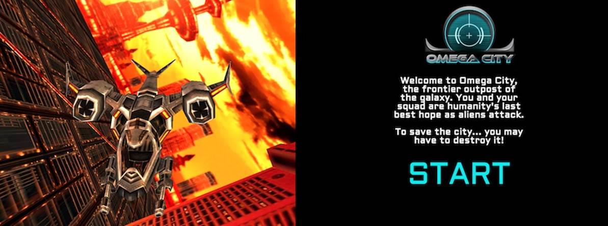
Figure 12-9. Left to right: canvas and overlay views for the CocoonJS version of Omega City
To adapt Omega City for use with CocoonJS, we first have to split up the original file, omegacity.html, into two separate files. The new files are index.html and wv.html. index.html contains the code for the main canvas. wv.html contains the code for the overlay view. Once the files have been broken up, we add CocoonJS-specific helper code from JavaScript files supplied by Ludei. Those files will manage adding the overlay view using a WebView control, and provide facilities so that the two views can communicate with each other—more on this in a moment. The CocoonJS JavaScript libraries have been designed to also work with desktop browsers, so we can preview the result in desktop Chrome before testing it in Cocoon’s app launcher.
The code for the main canvas view can be found in Chapter 12/omegacity-iOS/index.html, listed in Example 12-5. First, we include some CocoonJS-specific files. Then, on page load, we build the game object, which is the object that will render to the main WebGL canvas. The source for the game object can be found in Chapter 12/omegacity-iOS/omegacity.js. We then create an object to manage the overlay view, or heads-up display (HUD), and an object to manage the sounds in the game. (Note the use of the prefix proxy for the HUD class; we will be looking at this momentarily.)
Example 12-5. Main view code for CocoonJS application
<script src="./libs/cocoon_cocoonjsextensions/CocoonJS.js">
</script>
<script src="./libs/cocoon_cocoonjsextensions/CocoonJS_App.js">
</script>
<script
src="./libs/cocoon_cocoonjsextensions/CocoonJS_App_ForCocoonJS.js">
</script>
<script src="./libs/vizi/vizi.js"></script>
<script src="omegacity.js"></script>
<script src="omegacityProxyHUD.js"></script>
<script src="omegacitySound.js"></script>
<script>
var game = null;
var hud = null;
var sound = null;
var gameLoadComplete = false;
var wvLoadComplete = false;
var handleLoad = function() {
var container = document.getElementById("container");
game = new OmegaCity({ container : container,
loadCallback : onLoadComplete,
loadProgressCallback : onLoadProgress,
});
hud = new ProxyHUD({game : game});
sound = new OmegaCitySound({game : game});
After creating the game objects, we then load the overlay view in file wv.html, by calling the CocoonJS application method loadInTheWebView():
setTimeout(function() {
CocoonJS.App.onLoadInTheWebViewSucceed.addEventListener(
function(url) {
CocoonJS.App.showTheWebView();
Vizi.System.log("load web view succeeded.");
wvLoadComplete = true;
if (gameLoadComplete) {
gameReady();
}
}
);
CocoonJS.App.onLoadInTheWebViewFailed.addEventListener(
function(url) {
Vizi.System.log("load web view failed.", url);
}
);
CocoonJS.App.loadInTheWebView("wv.html");
}, 10);
sound.enterState("load");
game.load();
}
The overlay view contains all the markup and JavaScript code to implement the HTML elements the overlay comprises (Example 12-6). Open the file Chapter 12/omegacity-iOS/wv.html to see an excerpt. After the markup for the HUD objects, we include CocoonJS-specific files to help manage the view, and then we create some objects of our own, but these are only for use in the user interface. (Again, there are proxy objects, this time for the game and sound classes. We will go through this shortly.)
Example 12-6. Overlay view code for CocoonJS application
<!-- Loading message -->
<div id="loadStatus" style="display:none">
Loading...
</div>
<!-- Click-to-start screen -->
<div id="startScreen" style="display:none">
<!-- Logo -->
<div id="logowtext"></div>
<div id="startScreenText">
Welcome to Omega City, the frontier outpost of the galaxy.
You and your squad are humanity's
last best hope as aliens attack.<br></br>
To save the city... you may have to destroy it!
</div>
... <!-- more markup here -->
<script src="./libs/cocoon_cocoonjsextensions/CocoonJS.js">
</script>
<script src="./libs/cocoon_cocoonjsextensions/CocoonJS_App.js">
</script>
<script
src="./libs/cocoon_cocoonjsextensions/CocoonJS_App_ForWebView.js">
</script>
<script src="omegacityGameProxy.js"></script>
<script src="omegacityProxySound.js"></script>
<script src="omegacityHUD.js"></script>
<script>
var hud = null;
var game = null;
var sound = null;
var onload = function() {
hud = new OmegaCityHUD();
sound = new ProxySound();
game = new OmegaCityGameProxy();
}
We need to do one more thing to bring these two views together: make sure that we can see through the overlay view. So we modify the CSS for the overlay view by setting the background color of all body elements to transparent. See the file Chapter 12/omegacity-iOS/css/omegacity.css. Here is the CSS:
body {
background-color:rgba(0, 0, 0, 0);
color:#11F4F7;
padding:0;
margin-left:0;
margin-right:0;
overflow:hidden;
}
Managing communication between the canvas and overlay views
The overlay web view provided by CocoonJS is implemented as a WebView control that is layered on top of the main CocoonJS canvas view. This architecture has a major implication: the JavaScript virtual machine driving the canvas view is actually completely separate from the JavaScript virtual machine running scripts in the WebView. In other words, the two scripting engines are executing in different contexts, most likely even using two completely different JavaScript virtual machines! The VM for the main view is using the CocoonJS VM, while the WebView control on top is using whatever scripting engine comes native with the platform. If you write code in the main view that tries to call functions in the overlay view, your code will fail because those functions are not implemented, and vice versa. However, CocoonJS provides a way for the two views to talk to each other, by sending messages. Happily, it does this without our having to understand the details.
CocoonJS provides an application method, forwardAsync(), which allows us to pass strings between the two contexts. The strings will be evaluated via JavaScript eval(). So, to call a function in the other context, just create a string that, when evaluated, calls the function.
To make this kind of code more readable, we’ll wrap each forwardAsync() call into a straightforward method call on a “proxy” object: calling the method of the proxy object, under the hood, calls forwardAsync(), which in turn sends the message to the other (“remote”) context. When the message is evaluated, the function in the other context is called, and it can finally call the method of the remote object.
To illustrate, let’s look at the code that starts the game when the START label is clicked. This code, in Chapter 12/omegacity-iOS/omegacityProxyHUD, shows a method from the OmegaCityGameProxy class that forwards a message from the overlay view to the main view:
OmegaCityGameProxy.prototype.play = function() {
CocoonJS.App.forwardAsync("playGame();");
}
The code in the main view that handles receiving the playGame() message tells the sound engine to play the main game sounds, and then tells the real game object to start playing.
function playGame() {
sound.enterState("play");
game.play();
}
In the other direction, there are events occurring within the game that can update the display, such as decrementing the missile counter when a missile is fired. And when the alien ship gets close, we set a proximity alert, which updates the message area at the top with new blinking red text. We implement these methods of the HUD using a proxy object for the HUD that sends messages in the other direction—that is, from the main view to the overlay view.
ProxyHUD.prototype.enterState = function(state, data) {
CocoonJS.App.forwardAsync("hudEnterState('" + state + "','" +
data + "');");
}
The overlay view code then handles the hudEnterState() message by calling the real HUD object’s enterState() method:
function hudEnterState(state, data) {
console.log("HUD state: " + state + " " + data);
hud.enterState(state, data);
}
NOTE
The design patterns just shown may seem strange, but they are actually fairly common in systems that feature interprocess communication (IPC) using techniques such as remote procedure calls (RPC), where two separate computer processes communicate with each other via messages that are wrapped in function calls.
The CocoonJS two-view architecture essentially requires use of RPC if we want to build an HTML5-based overlay on our hybrid application. The process of writing proxy code in both directions is a bit tedious, and could be made easier with automated tools; in my discussions with Ludei’s developers, they have hinted that this is in the works.
Hybrid WebGL Development: The Bottom Line
In this section, we explored developing a mobile 3D application with HTML5, using a hybrid approach: a native app that uses a WebView for the HTML, plus a native library to emulate the WebGL API. This approach is something we need to consider for environments such as iOS, where WebGL is not enabled in the Mobile Safari and Mobile Chrome browsers.
We took a look at Ludei’s CocoonJS as one possible hybrid solution. CocoonJS allowed us to easily assemble the application without requiring us to learn native APIs like Cocoa for iOS. We did, however, need to go through an extra step to enable an HTML5 overlay view. Because CocoonJS is not a full web browser, just a canvas renderer, we needed to separate all HTML5 UI elements into a second WebView control, and mediate communication between that view and the canvas using special JavaScript APIs. While that solution isn’t without its limitations, it is good enough for many uses. CocoonJS, however, is not open source, and the company is actively exploring options for licensing the tool to developers. An open source alternative is Impact Ejecta, but using that library requires extensive iOS development knowledge. It is also a little less polished, a work in progress.
The bottom line with 3D hybrid development is that there is no one ideal solution. But there are viable development options, depending on your needs and budget.
Mobile 3D Performance
Mobile platforms are more resource-challenged than their desktop counterparts, typically having less physical memory, and less powerful CPUs and GPUs. Depending on the network setup and/or data plan for the device, mobile platforms can also be bandwidth-challenged. Whether you are building a browser-based web application, a pure HTML5 packaged web app, or a native/HTML5 hybrid using CocoonJS or Ejecta, you will need to pay special attention to performance when developing your mobile 3D applications.
While a full treatment of performance issues is out of scope for this book, we can take a quick look at some of the more prominent concerns and cover a few techniques to keep in our back pocket. In no particular order, here are some performance topics to bear in mind:
JavaScript memory management
JavaScript is an automatically garbage-collected language. What this means in plain English is that programmers do not explicitly allocate memory, the virtual machine does it; it also frees memory when it is no longer used and reclaims it for later use, in a process known as garbage collection. By design, garbage collection happens whenever the VM decides it’s a good time. As a consequence, applications can suffer from palpable delays when the VM needs to spend time garbage collecting. There are many techniques for reducing the amount of time the VM spends in garbage collection, including:
§ Preallocating all memory at application startup
§ Creating reusable “pools” of objects that can be recycled at the behest of the developer
§ Returning complex function values in place by passing in objects, instead of by returning newly created JavaScript objects
§ Avoiding closures (i.e., objects that hang on to other objects outside the scope of a function that uses them)
§ In general, avoiding using the new operator except when necessary
Mobile platforms in particular can really feel the pain of garbage collection, given that they have less memory to work with in the first place.
Less powerful CPUs and GPUs
One way that manufacturers are able to make mobile devices lighter and less expensive is to use less powerful, less expensive parts, including the central processing unit (CPU) and the graphics processing unit (GPU). While mobile platforms are becoming surprisingly powerful, they are still not as fierce as desktops. To go easy on smaller CPUs and GPUs, providing a better user experience and potentially saving battery life, consider the following strategies:
§ Delivering lower-resolution 3D content. 3D content can tax both the CPU and the GPU of a mobile device. For phones especially, there may not be a reason to deliver very high resolution, since there aren’t that many pixels on the display. Why waste the extra resolution? This technique will also help alleviate the data payload for less powerful data networks, via smaller download sizes. On the flipside, the newer tablets are providing very high resolution for their size. So a careful balance must be struck.
§ Watching your algorithms. A really fast machine might mask bad code; however, a mobile device will likely cast a sharp spotlight on it. As an example, try tapping on the metal body of the Futurgo on the Kindle Fire HDX version. Sometimes you will see a pregnant pause as the code tries to figure out which object was hit. This is a side effect of the picking implementation inside Three.js; the code uses algorithms that were never optimized, and it shows on a small device. Someday this code will either get fixed in Three.js or implemented differently and better in a framework like Vizi, but for now, keep an eye on potential performance gotchas like this, and if need be, work around them to give the processors a break.
§ Simplifying shaders. GLSL-based shaders can get complex—so complex that in fact the compiled code on the machine can blow out hardware limits on the more limited chips in some mobile devices. Take care to simplify your shaders when deploying on those platforms.
Limited network resources
For devices on mobile data networks or using restricted data plans, it is good to try to economize on data transfer. 3D content is rich, and presents the possibility of pushing more bits down the wire. Think about the following ideas when designing your applications:
§ Prepackaging assets. If you are able to deliver a packaged web app, this is ideal. The content is delivered exactly once, when the app is installed.
§ Using the browser cache. If possible, design your assets to take advantage of the browser cache to avoid downloading them more than necessary.
§ Batching assets. This now-classic web performance technique can save on the number of network requests and server roundtrips. If delivering multiple bitmaps, for example to implement a progress bar, consider packing the bitmaps into CSS image sprites (i.e., all images are stored in one file, with offsets into the file specified in CSS).
§ Using binary formats and data compression. A big motivation for the glTF file format described in Chapter 8 is to reduce file sizes, and therefore download times, by using a binary representation. This technique can be combined with server-side compression and even domain-specific compression algorithms, such as 3D geometry compression, to further reduce download times and the burden on the data network.
Chapter Summary
This chapter surveyed the brave new world of developing mobile 3D applications using HTML5 and WebGL. Mobile platforms are reaching parity with desktop platforms in terms of power; at the same time, HTML5 has been infused with new features directly influenced by the great new capabilities of today’s mobile devices. Most mobile platforms now support 3D: CSS3 is everywhere, and WebGL works in all mobile browsers except for Mobile Safari and Mobile Chrome on iOS.
The process of developing WebGL for mobile browsers is remarkably simple. Existing applications generally just work with no modification. However, mouse-based input must be replaced with touch input. We looked at how touch events were added to the Vizi viewer to implement swiping to rotate and pinching to zoom. We also added tap handling to the Futurgo model so that touching various parts of the car brings up overlays. To facilitate developing and testing touch features on the desktop, we can set up desktop Chrome to emulate touch events. We can also use WebGL code to create packaged 3D applications, “web apps” for the platform, using packaging and distribution technologies provided by the platform vendor, such as Amazon’s Mobile App Distribution Portal.
For browser platforms that do not support WebGL, we can use adapter technologies such as CocoonJS and Ejecta to create “hybrid” applications combining HTML5 with native code. This allows us to build in JavaScript and deploy a fast, platform-compliant native application, and potentially access features only available on the native platform, such as in-app purchases and push notifications.
Finally, we took a quick look at mobile performance issues. While mobile platforms have progressed by leaps and bounds in the last few years, they still tend to be less powerful than desktop systems. We need to be mindful about performance—in particular, memory management, CPU and GPU usage, and bandwidth—and design accordingly.