Programming 3D Applications with HTML5 and WebGL (2013)
Part I. Foundations
Chapter 6. CSS3: Advanced Page Effects
The last several chapters showed you how to use WebGL to create stunning content featuring hardware-accelerated rendering of 3D objects, scenes, and animations. As powerful as WebGL is, as of this writing it has a fundamental limitation in that arbitrary HTML content cannot be mapped as a texture on the surface of a 3D object. If we want to apply the 3D techniques we have seen in previous chapters to elements on a page, we have to turn to another HTML5 innovation: CSS3.
With CSS3, single elements or entire pages can be brought to life with animation, image filtering, and 2D or 3D transformations. These features enable the creation of a variety of 3D effects for use in simple games, engaging banner ads, and intuitive user interfaces. In contrast with WebGL, which requires at least rudimentary 3D programming knowledge plus mastery of a library such as Three.js, using CSS3 requires knowing only markup, CSS, and basic JavaScript, perhaps with an assist from a framework like jQuery. This makes CSS3 development much easier than WebGL; however, developers have access only to the features built into the browser. Put another way, 3D CSS trades simplicity and ease of use for power and flexibility.
The 3D features of CSS3 trace their roots back to 3D transitions initially developed by Apple for its Core Animation framework, powering now-familiar user interface effects such as the screen transitions in the iOS Weather application, depicted in Figure 6-1. The 3D advances in CSS3 were originally proposed by the WebKit development team in 2009 and 2010, and first taken to market by Apple’s Safari teams for Mac OS and iOS. They were later adopted in Chrome and, ultimately, by all browser makers.
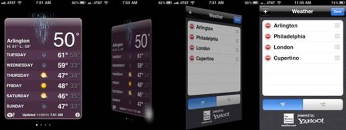
Figure 6-1. Screen transitions in the iOS Weather app
The ability to apply 3D effects to HTML elements opens up similar possibilities for web page content. Figure 6-2 shows Snowstack, a showcase developed by the Safari team. Snowstack is a photo-viewing visual effects library that uses pure HTML, 3D CSS, and JavaScript to render a Flickr feed in perspective. With Snowstack, the user can navigate through an apparently infinite set of photo tiles using the arrow keys on the keyboard. The application works in all browsers and devices. While Snowstack is really a technology demo, it points to the potential for using 3D CSS to visualize and explore vast amounts of information.

Figure 6-2. Snowstack, a CSS-based 3D photo viewer
Many developers are exploring 3D CSS to create innovative web content. Beyond simply transforming flat tiles, some programmers have figured out how to simulate rendering of full 3D objects, and as we will see later in the chapter, one enterprising soul has even used 3D CSS to build prototypes of a first-person shooter game! 3D CSS can also be used in conjunction with WebGL, with the latter handling true 3D rendering tasks and the former used to overlay and/or integrate HTML elements for the user interface.
CSS3 is a collection of specifications that allow dynamic effects to be applied to the elements on a page. This chapter covers the various CSS technologies used to build 3D effects:
CSS Transforms
3D operations (translate, rotate, scale) applied to an entire element.
CSS Transitions
Simple changes applied to CSS properties over time. Like tweens (discussed in the previous chapter), CSS Transitions are excellent for one-time effects.
CSS Animations
Complex changes applied to CSS properties over time, using key frame data.
CSS Transforms
Core to 3D CSS development is the ability to manipulate page elements using CSS Transforms. The CSS Transforms specification represents the convergence of earlier 2D and 3D work on using CSS to modify the position, orientation, scale, and other layout properties of page elements using transformation operations rather than simple left/top and width/height properties.
As a refresher, 3D graphics use a three-dimensional coordinate system that employs a third axis, z, to represent positions in and out of the screen, creating a sense of depth. Figure 6-3 depicts the 3D coordinate system used for CSS. Note that, in contrast with traditional 3D systems, the positive y-axis points down instead of up, to be consistent with the 2D xy system used for the web browser’s page and window coordinates.
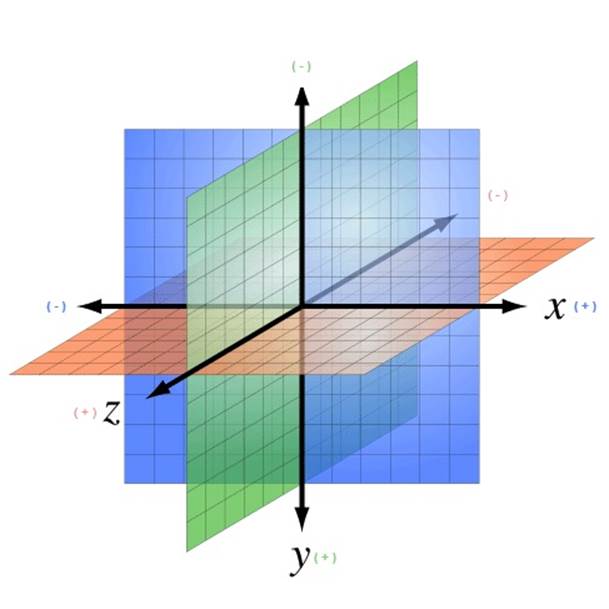
Figure 6-3. The 3D coordinate system for CSS, with positive y-axis pointing down (adapted from http://bit.ly/wikimedia-3d-coordinate; Creative Commons Attribution-Share Alike 3.0 unported license)
Using 3D Transforms
You specify CSS 3D transforms like any other CSS: using properties. The CSS3 specification defines several properties for transforming elements. Let’s start with an example. Figure 6-4 depicts three elements with different transforms applied: translation, rotation, and scale.
The source code for this example can be found in the file Chapter 6/css3dtransforms.html and the corresponding CSS file, css/css3dtransforms.css. The fragment in Example 6-1 shows the HTML that defines the first DIV element, applying a 3D translation.
Example 6-1. Element with CSS 3D transforms applied
<div id="card1" class="container perspective">
<div class="legend">
Translate
</div>
<div class="code">{translateX(20px) translateY(20px) translateZ(-100px);}</div>
<div class="cardBorder">
<div class="card translate">
<p>This element is translated.</p>
<img width=96 height=96 src="../images/HTML5rawkes.png"></img>
<p>Transformed elements can contain anything: text, images,
divs, tables...</p>
</div>
</div>
</div>
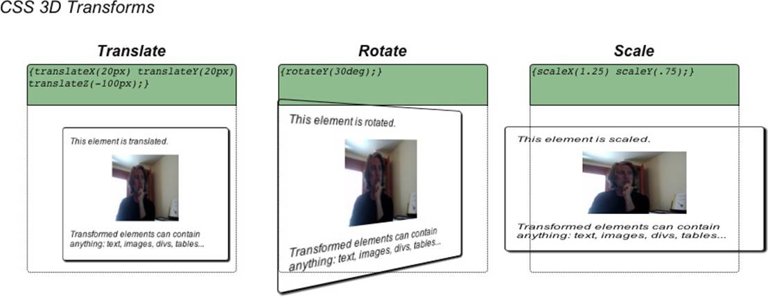
Figure 6-4. CSS 3D transforms: translate, rotate, and scale
The text in bold specifies two classes for the innermost DIV element: card and translate. card defines the properties common to all three of the “card” elements on the page—for example, the solid border, drop shadow, and rounded corners. The translate class defines the 3D translation. Example 6-2 shows the CSS definitions for these two classes, as well as cardBorder, which is used on the parent element of the card to display a dotted-line border indicating where the card would be if it had no transforms applied to it. For now, ignore the –moz-transform-style property in these declarations. They are required for proper functioning in Firefox, as I will describe in the next section on perspective.
Example 6-2. CSS to define a translation transform
.cardBorder {
position: absolute;
width: 100%;
height: 80%;
top:30%;
border:1px dotted;
border-radius:0 0 4px 4px;
-moz-transform-style: preserve-3d;
}
.card {
position: absolute;
width: 99%;
height: 99%;
border:1px solid;
border-radius: 4px;
box-shadow: 2px 2px 2px;
-moz-transform-style: preserve-3d;
}
.translate {
-webkit-transform: translateX(20px) translateY(20px) translateZ(-100px);
-moz-transform: translateX(20px) translateY(20px) translateZ(-100px);
-o-transform: translateX(20px) translateY(20px) translateZ(-100px);
transform: translateX(20px) translateY(20px) translateZ(-100px);
}
The translate class specifies a CSS 3D transform by setting its transform property. In this example, the element is translated 20 pixels in x and y, respectively, and 100 pixels along negative z (into the screen). In general, you can use transform to create transforms by applying one or more transform methods to the element. In addition to translation, CSS supports methods for rotation and scale, arbitrary matrix transformation, and perspective projection. The CSS 3D transform methods are summarized in Table 6-1.
Table 6-1. CSS 3D transform methods
|
Method |
Description |
|
translateX(x) |
Translation along the x-axis |
|
translateY(y) |
Translation along the y-axis |
|
translateZ(z) |
Translation along the z-axis |
|
translate3d(x, y, z) |
Translation along the x-, y-, and z- axes |
|
rotateX(angle) |
Rotation about the x-axis |
|
rotateY(angle) |
Rotation about the y-axis |
|
rotateY(angle) |
Rotation about the z-axis |
|
rotate3d(x, y, z, angle) |
Rotation about an arbitrary axis |
|
scaleX(x) |
Scale along the x-axis |
|
scaleY(y) |
Scale along the y-axis |
|
scaleZ(z) |
Scale along the z-axis |
|
scale3d(x, y, z) |
Scale along the x-, y-, and z- axes |
|
matrix3d(...) |
Define arbitrary 4×4 transformation matrix with 16 values |
|
perspective(depth) |
Define perspective projection of depth pixels |
The second and third cards are transformed in a similar manner, by using the classes rotate and scale defined in the CSS:
.rotate {
-webkit-transform: rotateY(30deg);
-moz-transform: rotateY(30deg);
-o-transform: rotateY(30deg);
transform: rotateY(30deg);
}
.scale {
-webkit-transform: scaleX(1.25) scaleY(.75);
-moz-transform: scaleX(1.25) scaleY(.75);
-o-transform: scaleX(1.25) scaleY(.75);
transform: scaleX(1.25) scaleY(.75);
}
Rotation values can be specified in degrees, radians, or gradians (1/400 of a circle)—for example, 90deg, 1.57rad, or 100grad. Scale values are scalars that multiply along each axis (i.e., an unscaled element has a scale of 1 along each axis).
NOTE
Note the use of browser-specific prefixes in the CSS (e.g., –webkit-transform). This is required to ensure cross-browser support because CSS Transforms were experimental among browsers for several years. This is cumbersome, but it is among many such CSS features that require use of browser prefixes, and developers have grown accustomed to dealing with it. If you find all the duplication annoying, you may want to look into using a style sheet–generation tool such as LESS to ease the pain. From time to time I will omit the browser-specific prefixes in our examples, for brevity. Always make sure to use them in your code.
CSS supports an additional property, transform-origin, which allows the developer to specify the origin of transformations. This property defaults to 50% 50% 0—that is, the center of the coordinate system. By changing it, you can have objects rotate about a different point than the center. transform-origin can be specified in any CSS offset unit, such as left, center, right, %, or a CSS distance value (pixels, inches, em spaces, etc.).
Applying Perspective
You may have noticed the use of the class perspective for each of the top-level DIV elements in the previous example. You can apply CSS 3D transforms with or without using a perspective projection, though it is more useful when using a perspective projection.
Perspective projections are very simple to define in CSS3. Example 6-3 shows the CSS for defining perspective.
Example 6-3. CSS perspective property
.perspective {
-webkit-perspective: 400px;
-moz-perspective: 400px;
-o-perspective: 400px;
perspective: 400px;
}
.noperspective {
-webkit-perspective: 0px;
-moz-perspective: 0px;
-o-perspective: 0px;
perspective: 0px;
}
We define a CSS class, perspective, for use with elements to which we want to apply perspective projection. The value we supply represents the distance from the view plane to the xy plane (z=0). Perspective can be specified in any CSS distance unit: pixels, points, inches, em spaces, and so on. The CSS file also defines a second class, noperspective, which is handy for ensuring an element is not rendered with perspective. The values in this class are set to zero, which is the default.
NOTE
While the details of CSS perspective are different from those of WebGL, the concepts are the same. If you need a refresher on the topic, there is a detailed discussion in Chapter 1.
To illustrate the contrast between elements rendered with and without perspective, let’s look at an example. Open the example file Chapter 6/css3dperspective.html. You will see two cards. The left one is rendered with perspective, the right one without. The only difference between the two elements is the use of the CSS perspective property; each card is rotated by 30 degrees about the y-axis; however, without the use of perspective, the element on the right appears squished horizontally instead of rotated. See Figure 6-5.
You can also apply perspective to elements using the perspective() transform function described in Table 6-1. However, in practice it is usually better to keep the perspective value separate from the transform value using the two distinct properties. Otherwise, you will need to resupply the perspective value every time you want to change the other transform function values.
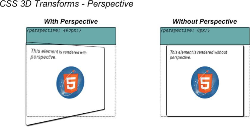
Figure 6-5. CSS Transforms and perspective: the element on the left is rendered with perspective, the element on the right without (HTML5 Rawkes Logo by Phil Banks)
Creating a Transform Hierarchy
CSS3 allows 3D transforms to be inherited throughout the DOM object hierarchy. An element with 3D transforms defined for it can either inherit those of its ancestors or ignore them, based on the value of the transform-style property.
Figure 6-6 illustrates how transform-style can be used to create a transform hierarchy. Each of the card elements is transformed with a 30-degree rotation about y. Each card also has a childCard with its own 30-degree rotation about y. Note that the left card’s child appears to be rotated 30 degrees away from the plane of its parent; however, the right card’s child appears to be in the same plane as its parent.
The code for this example can be found in the files Chapter 6/css3dhierarchy.html and css/css3dhierarchy.css. The HTML defines two DOM element hierarchies that are nearly identical, except that the first card uses a class hierarchy, while the second uses one called nohierarchy.
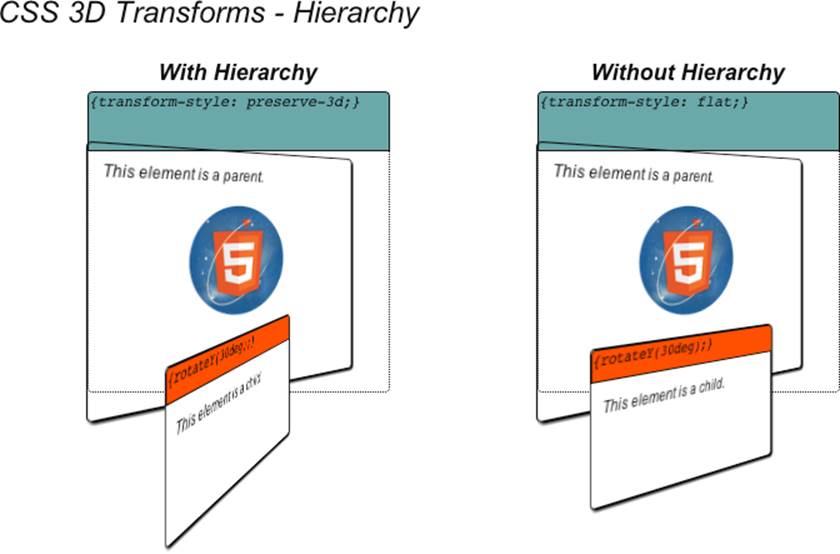
Figure 6-6. Creating a 3D transform hierarchy with CSS
<div id="hierarchy1" class="container perspective">
<div class="legend">
With Hierarchy
</div>
<div class="code">{transform-style: preserve-3d;}</div>
<div class="cardBorder">
<div class="card hierarchy rotate">
<p>This element is a parent.</p>
<img width=96 height=96 src="../images/HTML5rawkes.png"></img>
<p></p>
<div class="childCard rotate">
<div class="code">{rotateY(30deg);}</div>
<p>This element is a child.</p>
</div>
</div>
</div>
</div>
<div id="hierarchy2" class="container perspective">
<div class="legend">
Without Hierarchy
</div>
<div class="code">{transform-style: flat;}</div>
<div class="cardBorder">
<div class="card nohierarchy rotate">
<p>This element is a parent.</p>
<img width=96 height=96 src="../images/HTML5rawkes.png"></img>
<p></p>
<div class="childCard rotate">
<div class="code">{rotateY(30deg);}</div>
<p>This element is a child.</p>
</div>
</div>
</div>
</div>
The CSS definitions for the classes hierarchy and nohierarchy are as follows:
.hierarchy {
-webkit-transform-style: preserve-3d;
-moz-transform-style: preserve-3d;
-o-transform-style: preserve-3d;
transform-style: preserve-3d;
}
.nohierarchy {
-webkit-transform-style: flat;
-moz-transform-style: flat;
-o-transform-style: flat;
transform-style: flat;
}
The transform-style property accepts two values: flat (the default), which specifies that transforms in descendant DOM elements not be applied; and preserve-3d, which tells the browser to apply transforms in descendants. By using preserve-3D throughout, an application can create a deep hierarchy of 3D objects, especially in combination with the other techniques described in this chapter.
NOTE
Browser compatibility alert: In the first example in this section, we glossed over one detail in the definitions of the card and cardBorder CSS classes. They contained the statement:
-moz-transform-style: preserve-3d;
Apparently the Firefox browser, unlike WebKit-based browsers, does not propagate the value of transform-style to its descendants. Without our explicitly setting it in each descendant, not only will child transforms not work, but perspective rendering is also disabled. The workaround is to set transform-style to preserve-3d for every descendant in the DOM hierarchy. This is unfortunate but necessary.
The worst part of this situation is that the interpretation varies across browsers. Apparently Internet Explorer version 10 doesn’t support the feature at all, but the plan is to add it for IE 11.
Controlling Backface Rendering
In classic 3D rendering, when a polygon faces away from the viewer, the rendering system can either display the back of the polygon, known as the backface, or not display it, depending on settings controlled by the programmer. CSS3 transforms also provide this capability. If an element is rotated such that it faces away from the viewer, it will be displayed or not based on the backface-visibility transform property.
CSS3 backface rendering is important for creating the illusion of double-sided objects. Let’s say we want to create a screen flip transition like those in the iOS Weather app depicted in Figure 6-1. Creating this effect requires careful construction of our markup, and correct use of backface-visibility. Figure 6-7 illustrates how to use the technique in practice.
Open the file Chapter 6/css3dbackfaces.html to see backface rendering in action. There are four cards. On the top row, there are two single-sided cards, rendered with backface visibility on and off, respectively. The card on the top left is rotated to face away from the viewer and rendered with backfaces visible; the one on the top right is rotated away from the viewer and rendered with backfaces hidden. Note that we can see the card on the top left, but the text “FRONT” is rendered in reverse, while the card on the top right is not visible.
On the bottom row we see two double-sided cards, rendered with backface visibility on and off, respectively. Again, the objects have been rotated such that their front faces are away from the viewer. However, these cards define an additional element, with the text “BACK,” that is rotated toward the viewer to simulate a double-sided object. The bottom-left card has backface visibility on, and because it also has a 0.8 opacity value, we can see through the front face to the reversed text “FRONT.” Conversely, the bottom-right card turns backface visibility off and so hides the front side of the card. The bottom-right card demonstrates the proper technique for using CSS to simulate a double-sided object. Let’s look at the code.
Example 6-4 shows the HTML code for this page. Elements with backfaces visible are defined through the class backface; elements with backfaces hidden are defined through the class nobackface. In order to create the double-sided cards on the bottom row, we actually need to create twocard elements: one for the front and another for the back, as defined in the CSS classes frontside and backside, respectively. The card on the bottom right of the page combines those classes with the nobackface class to create a card that displays correctly no matter which side is facing the viewer.
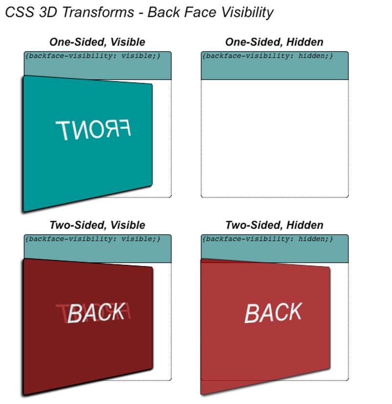
Figure 6-7. Using backface visibility to create double-sided objects
Example 6-4. Constructing a double-sided HTML element
<div id="backface1" class="container perspective ">
<div class="legend">
One-Sided, Visible
</div>
<div class="code">{backface-visibility: visible;}</div>
<div class="cardBorder">
<div class="card backface frontside">
FRONT
</div>
</div>
</div>
<div id="backface2" class="container perspective ">
<div class="legend">
One-Sided, Hidden
</div>
<div class="code">{backface-visibility: hidden;}</div>
<div class="cardBorder">
<div class="card nobackface frontside">
FRONT
</div>
</div>
</div>
<div id="backface3" class="container perspective ">
<div class="legend">
Two-Sided, Visible
</div>
<div class="code">{backface-visibility: visible;}</div>
<div class="cardBorder">
<div class="card backface frontside">
FRONT
</div>
<div class="card backface backside">
BACK
</div>
</div>
</div>
<div id="backface4" class="container perspective ">
<div class="legend">
Two-Sided, Hidden
</div>
<div class="code">{backface-visibility: hidden;}</div>
<div class="cardBorder">
<div class="card nobackface frontside">
FRONT
</div>
<div class="card nobackface backside">
BACK
</div>
</div>
</div>
Example 6-5 shows the style declarations from the file css/css3dbackfaces.css. First, we define the frontside and backside classes somewhat counterintuitively. frontside is intended for the front of the card, but because our example is intended to illustrate backface rendering, we are going to rotate the card away from the viewer by applying a 210-degree rotation about the y-axis. Conversely, the back of the card is rotated toward the viewer by 30 degrees. The two sides of the card line up because their rotations are 180 degrees apart. When combined with hiding the backface using the nobackface class, we get a perfect two-sided card like the card on the bottom right. The class nobackface sets the property backface-visibility to hidden to produce the desired result.
Example 6-5. CSS declarations for creating double-sided objects
.frontside {
-webkit-transform: rotateY(210deg);
-moz-transform: rotateY(210deg);
-o-transform: rotateY(210deg);
transform: rotateY(210deg);
line-height:160px;
font-size:40px;
color:White;
background-color:DarkCyan;
border-color:Black;
box-shadow:2px 2px 2px Black;
}
.backside {
-webkit-transform: rotateY(30deg);
-moz-transform: rotateY(30deg);
-o-transform: rotateY(30deg);
transform: rotateY(30deg);
line-height:160px;
font-size:40px;
color:White;
background-color:DarkRed;
border-color:Black;
box-shadow:2px 2px 2px Black;
opacity:0.8;
}
.backface {
-webkit-backface-visibility: visible;
-moz-backface-visibility: visible;
-o-backface-visibility: visible;
backface-visibility: visible;
}
.nobackface {
-webkit-backface-visibility: hidden;
-moz-backface-visibility: hidden;
-o-backface-visibility: hidden;
backface-visibility: hidden;
}
A Summary of CSS Transform Properties
This section covered the transform properties CSS provides for adding 3D effects to HTML elements. These properties are summarized in Table 6-2.
Table 6-2. CSS transform properties
|
Property |
Description |
|
transform |
Applies a transformation using one or more transform methods (see Table 6-1) |
|
transform-origin |
Defines the origin of all transformations (default: 50%, 50%, 0) |
|
perspective |
Specifies perspective depth in CSS distance units (default: 0 = no perspective) |
|
perspective-origin |
Specifies the perspective vanishing point in xy coordinates |
|
transform-style |
Specifies whether descendants of a 3D element are rendered flat or in 3D |
|
backface-visibility |
Specifies whether or not elements facing away from the screen are rendered |
As we have seen, CSS Transforms provide a powerful way to add 3D effects to page elements. CSS Transforms become even more powerful when we create dynamic effects, by combining them with transitions and animations.
NOTE
The examples in this section were heavily inspired by David DeSandro’s great blog site “24 Ways” (as in, 24 ways to impress your friends). David was kind enough to grant me permission to liberally adapt his work. Refer to the examples on his site and other postings for a wealth of CSS 3D information.
CSS Transitions
CSS Transitions allow gradual changes to properties over time. CSS Transitions are a lot like the Tween.js tweens we explored in the previous chapter. However, these effects are built into the browser; there is no need for a helper JavaScript library. While our focus in this chapter is on animating 3D properties, it is worth noting that CSS Transitions can be used to animate most (though not all) CSS properties: width, position, color, z-index, opacity, and so on.
The basic syntax for a CSS Transition is as follows:
transition : property-name duration timing-function delay-time;
where:
property-name
Is the name of an individual property, the keyword all to specify that this transition applies to all properties being changed, or the keyword none to specify that it applies to none of the properties.
duration
Is a time value, in seconds or milliseconds, that specifies the length of time the transition will take.
timing-function
Is the name of a timing function for animating the transition. It can be one of linear, ease, ease-in, ease-out, ease-in-out, or cubic-bezier.
delay-time
Specifies an amount of time to wait (in seconds or milliseconds) before beginning the transition.
transition is actually a shorthand CSS property for the four individual CSS properties transition-property, transition-duration, transition-timing-function, and transition-delay. Let’s see how this works with an example. Open the file Chapter 6/css3dtransitions.html, depicted in Figure 6-8. There are two cards. Clicking on either causes it to flip to the other side, using the double-sided technique described in the previous section. The flip transition takes two seconds, with a slight ease in and out. The cards also change color, from their original DarkCyan to Goldenrod. However, the card on the left changes color as it flips, while the card on the right changes color after it flips.
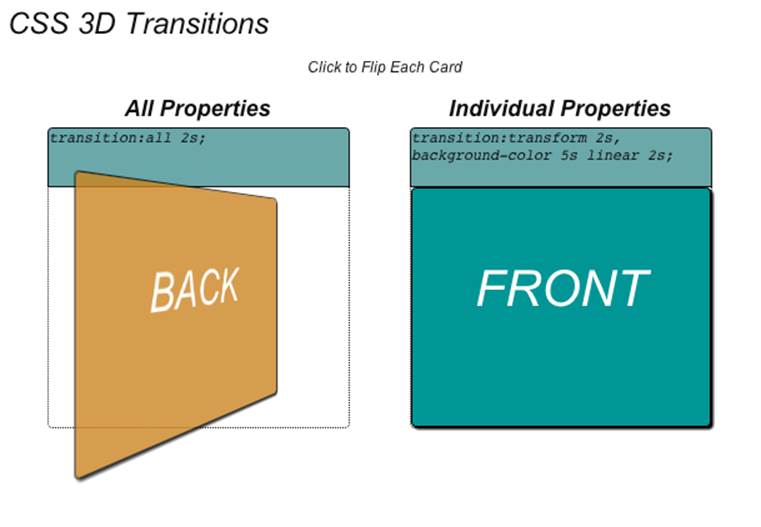
Figure 6-8. Using CSS Transitions to animate properties
The HTML defines the front and back of each card similarly. The primary difference between the two cards is the use of class easeAll2sec for the card on the left and class easeTransform2secColor5secDelay for the card on the right. We will look at those classes in a moment.
<div id="transition1" class="container perspective ">
<div class="legend">
All Properties
</div>
<div class="code">transition:all 2s;</div>
<div class="cardBorder">
<div id="front1"
class="card nobackface frontside clickable easeAll2sec">
FRONT
</div>
<div id="back1"
class="card nobackface backside clickable easeAll2sec">
BACK
</div>
</div>
</div>
<div id="transition2" class="container perspective ">
<div class="legend">
Individual Properties
</div>
<div class="code">transition:transform 2s,
background-color 5s linear 2s;</div>
<div class="cardBorder">
<div id="front2"
class="card nobackface frontside clickable easeTransform2secColor5secDelay">
FRONT
</div>
<div id="back2"
class="card nobackface backside clickable easeTransform2secColor5secDelay">
BACK
</div>
</div>
</div>
The effect is triggered on a mouse click. We make this happen with a little jQuery magic that adds click handlers to the front and back of each card. It uses a Boolean for each to keep track of which side is showing, and adds or removes the flip and goGold classes as needed. flip rotates the card 180 degrees; goGold sets the color to Goldenrod. Without CSS Transitions, these changes would take effect immediately, but with Transitions, they animate smoothly from one state to the other over time.
<script type="text/javascript">
var front1 = true;
var front2 = true;
$(document).ready(
function() {
$('#transition1 .clickable').click(function(){
// alert("Clicked");
if (front1)
{
$('#front1').addClass('flip');
$('#back1').addClass('flip');
$('#front1').addClass('goGold');
$('#back1').addClass('goGold');
}
else
{
$('#front1').removeClass('flip');
$('#back1').removeClass('flip');
$('#front1').removeClass('goGold');
$('#back1').removeClass('goGold');
}
front1 = !front1;
});
$('#transition2 .clickable').click(function(){
if (front2)
{
$('#front2').addClass('flip');
$('#back2').addClass('flip');
$('#front2').addClass('goGold');
$('#back2').addClass('goGold');
}
else
{
$('#front2').removeClass('flip');
$('#back2').removeClass('flip');
$('#front2').removeClass('goGold');
$('#back2').removeClass('goGold');
}
front2 = !front2;
});
}
);
</script>
The CSS for this example can be found in the file css/css3dtransitions.css. See the listing in Example 6-6.
The front and back of the card are defined with the appropriate rotations defined in the classes frontside and backside; when combined with the class flip, they rotate by 180 degrees to flip the card over. goGold is the class used to change the element’s background color to goldenrod. The classes in bold define the two different transitions. easeAll2sec is simple: it transitions all changed properties in two seconds with a subtle ease in/out (using the default value of ease).
easeTransform2secColor5secDelay is more involved. It actually contains two separate transitions, one for the transform and one for the background color, separated by commas. The transform transition is exactly like easeAll2Sec, a two-second transition with subtle easing. The background color transition is different: it is a five-second linear interpolation of the color that starts after two seconds, using the fourth argument to the transition property, delay time.
Example 6-6. Specifying CSS Transitions
.frontside {
-webkit-transform: rotateY(0deg);
-moz-transform: rotateY(0deg);
-o-transform: rotateY(0deg);
transform: rotateY(0deg);
...
}
.backside {
-webkit-transform: rotateY(180deg);
-moz-transform: rotateY(180deg);
-o-transform: rotateY(180deg);
transform: rotateY(180deg);
...
}
.frontside.flip {
-webkit-transform: rotateY(-180deg);
-moz-transform: rotateY(-180deg);
-o-transform: rotateY(-180deg);
transform: rotateY(-180deg);
}
.backside.flip {
-webkit-transform: rotateY(0deg);
-moz-transform: rotateY(0deg);
-o-transform: rotateY(0deg);
transform: rotateY(0deg);
}
.goGold {
background-color:Goldenrod;
}
.easeAll2sec {
-webkit-transition:all 2s;
-moz-transition:all 2s;
-o-transition:all 2s;
transition:all 2s;
}
.easeTransform2secColor5secDelay {
-webkit-transition:-webkit-transform 2s, background-color 5s linear 2s;
-moz-transition:-moz-transform 2s, background-color 5s linear 2s;
-o-transition:-o-transform 2s, background-color 5s linear 2s;
transition:transform 2s, background-color 5s linear 2s;
}
NOTE
This section just scratches the surface of using CSS Transitions. There is an excellent article on the feature by Microsoft CSS development wizard Kirupa Chinnathambi on his blog.
Transitions are a straightforward way to create effects. But their use is limited to simple, one-time effects. If we want to create complex sequences and loops, we need to turn to another CSS3 technology: CSS Animations.
CSS Animations
CSS Animations provide a more general animation solution than CSS Transitions. Like the 3D key frame animations covered in the previous chapter, CSS Animations use a sequence of key frames, plus properties to control duration, timing function, delay time, and looping. Let’s take a look at some examples.
Open the file Chapter 6/css3danimations.html. You will see three cards; click on each to trigger a different animation (Figure 6-9). The card on the top left does a simple one-time rotation about the y-axis. The card on the top right shakes left and right forever. The card on the bottom “flies” up and to the right, rotating about y as it moves.
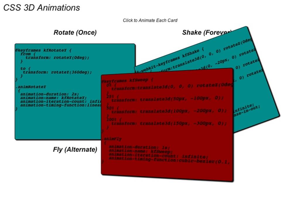
Figure 6-9. CSS 3D Animations
The CSS for creating animations comprises two parts: an @keyframe rule, which creates a block of CSS in which you place the key frame data, and several properties you can define for an element:
animation-name
The name of a set of key frames declared in an @keyframe rule, to be used as the source of key frame data.
animation-duration
Specifies the length of the animation in seconds or milliseconds.
animation-timing-function
The name of a timing function for animating the key frames. It can be one of linear, ease, ease-in, ease-out, ease-in-out, or cubic-bezier.
animation-delay
Specifies an amount of time to wait (in seconds or milliseconds) before beginning the animation.
animation-iteration-count
Specifies the number of times to play the animation. The default is 1. The keyword infinite may also be used to define a forever looping animation.
animation-direction
Determines whether the animation plays forward, in reverse, or alternates forward and reverse playback for multiple iterations. Valid values are normal (forward), reverse, alternate (play forward and then reverse, alternating), and alternate-reverse (play in reverse and then forward, alternating).
We can combine all of the preceding properties using the CSS shorthand property animation as follows:
animation: name duration timing-function delay iteration-count direction;
The CSS for the example in Figure 6-9 can be found in the example file css/css3danimations.css. The excerpt in Example 6-7 shows the important fragments. We have @keyframe rules that set up the key frames kfRotateY and kfRotateMinusY (for rotating the front and back sides of the card, respectively), kfShake for the shaking animation, and kfFly for the flying animation. We then define individual classes for each of the animations, with different parameters. The classes animRotateY and animRotateMinusY define infinitely looping linear interpolation animations to rotate the element about the y-axis. These are created with simple key frame data that goes from the initial frame to the end frame.
The kfShake class is more complicated: it uses key frame data with four frames at 0%, 25%, 50%, and 100%, respectively, to define translations in x and y and a rotation about z. Finally, the kfFly class is still more complex, defining a series of translations in the key frames, a custom cubic Bézier function for interpolating, and multiple iterations with the direction alternating from forward to reverse. kfFly defines only the flight path of the element; it also appears to “flap its wings” because the classes animRotateY and animRotateMinusY are added to the front/back of the element when clicked. So there are actually nested animations being applied to the card on the bottom.
Example 6-7. CSS declarations to create key frame animations
@-webkit-keyframes kfRotateY {
from {
-webkit-transform: rotateY(0deg);
}
to {
-webkit-transform: rotateY(360deg);
}
}
.animRotateY
{
-webkit-animation-duration: 2s;
-webkit-animation-name: kfRotateY;
-webkit-animation-iteration-count: infinite;
-webkit-animation-timing-function:linear;
}
@-webkit-keyframes kfRotateMinusY {
from {
-webkit-transform: rotateY(-180deg);
}
to {
-webkit-transform: rotateY(180deg);
}
}
.animRotateMinusY
{
-webkit-animation-duration: 2s;
-webkit-animation-name: kfRotateMinusY;
-webkit-animation-iteration-count: infinite;
-webkit-animation-timing-function:linear;
}
@-webkit-keyframes kfShake {
0% {
-webkit-transform:translate3d(0, 0, 0) rotateZ(0deg);
}
25% {
-webkit-transform: translate3d(0, −20px, 0) rotateZ(20deg);
}
50% {
-webkit-transform: translate3d(0, 0, 0) rotateZ(-20deg);
}
100% {
-webkit-transform: translate3d(0, −20px, 0) rotateZ(-20deg);
}
}
.animShake
{
-webkit-animation-duration: .5s;
-webkit-animation-name: kfShake;
-webkit-animation-iteration-count: infinite;
-webkit-animation-timing-function:ease-in-out;
}
@-webkit-keyframes kfFly {
0% {
-webkit-transform:translate3d(0, 0, 0);
}
25% {
-webkit-transform: translate3d(100px, −100px, 20px0);
}
50% {
-webkit-transform: translate3d(200px, −200px, 40px);
}
100% {
-webkit-transform: translate3d(400px, −300px, 20px);
}
}
.animFly
{
-webkit-animation-duration: 2s;
-webkit-animation-name: kfFly;
-webkit-animation-iteration-count: 2;
-webkit-animation-timing-function:cubic-bezier(0.1, 0.2, 0.8, 1);
-webkit-animation-direction:alternate;
}
You may have noticed that animRotateY and animRotateMinusY are defined with an animation-iteration-count of infinite, yet the top-left card rotates only once. This is because the jQuery code for click handling stops the animation after an iteration (see code in bold):
$('#front1').click(function(){
$('#front1').addClass('animRotateY');
$('#back1').addClass('animRotateMinusY');
setTimeout(function(){
$('#front1').removeClass('animRotateY');
$('#back1').removeClass('animRotateMinusY');
}, 2000);
}
);
These classes were designed to infinitely loop so they could be reused in different animation effects, such as when they are combined with the class animFly. By defining them as infinitely looping, we can easily control start and stop within the JavaScript for specific uses.
Pushing the Envelope of CSS
So far, the examples in this chapter largely consist of moving around flat tiles. These are excellent techniques for creating 3D user interface elements and transition effects, but fall a bit short of the 3D rendering we expect in today’s games and other full 3D applications. That said, some developers are pushing the boundaries of what can be done with this technology. The rest of this chapter surveys just how far we can take CSS3 to create great 3D effects.
Rendering 3D Objects
In previous sections, we saw that it took a bit of HTML and CSS work to make a two-sided flat object. It takes even more effort to create an object with depth, such as a cube. There are several sites dedicated to CSS3 that show great examples of how to do this. Figure 6-10 depicts a 3D virtual product box created by German-based Dirk Weber for his HTML5 development site http://www.eleqtriq.com. The box has front, back, sides, top, and bottom, and can be rotated. It even has simulated reflections!
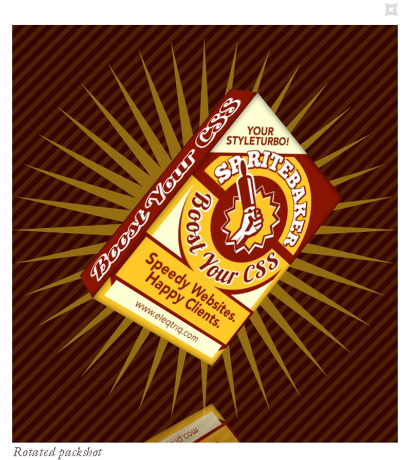
Figure 6-10. Rotatable 3D object built with CSS
The team at Codrops, a web design and development blog, has taken the box concept a step further, creating a 3D virtual book. You can open the cover to look inside, and even turn the pages. See Figure 6-11.
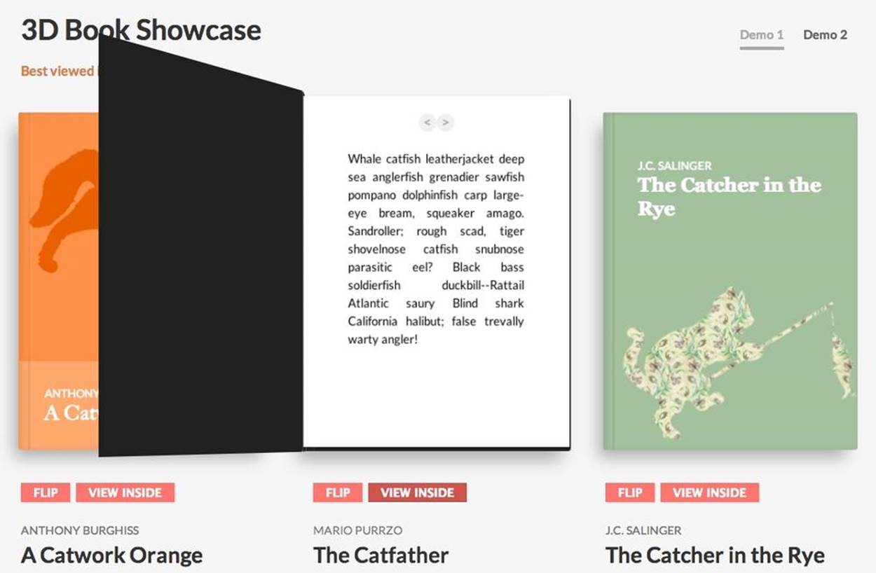
Figure 6-11. 3D virtual book showcase
Creating full 3D objects like these involves making one or more HTML elements for each face, defining several CSS classes and typically some JavaScript for the logic. It is not exactly easy, but the results can be worth it. Check out the sites on CSS3 listed here and in the Appendix to see the groundbreaking work developers are doing with CSS 3D. Most of these sites share their code freely, so you will have a great starting point for your own CSS 3D work.
Rendering 3D Environments
Given the foundations of CSS 3D—essentially a technology for manipulating rectangular objects—it may seem out of reach to attempt to build something like an immersive game environment. Incredibly, UK-based developer Keith Clark has done just that, creating a demo of a first-person shooter environment in the style of Doom, built entirely with JavaScript and CSS 3D transforms. The result is depicted in Figure 6-12.
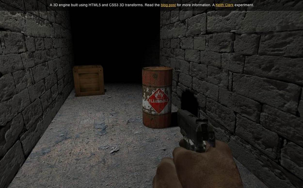
Figure 6-12. First-person shooter demo built with CSS 3D and JavaScript
Clark’s work demonstrates features that barely seem possible in CSS3, even with 3D transforms. These include:
3D geometry
CSS allows us to work only with rectangles. That appears limiting at first until we realize that even true 3D rendering systems typically work by composing many flat polygons—usually triangles or quads—into more complex shapes. Also, PNG images can make use of the alpha channel to create cutout shapes within a single quad. Working with those two components, Clark was able to build cylinders, guns, the shooter’s hand, and other realistic 3D geometry.
Camera, navigation, and collision
CSS support for perspective is rudimentary, but Clark figured out how to move a virtual camera in real time based on keyboard input, and calculate collisions by projecting the player’s position onto the 2D ground plane and comparing it to a hand-crafted 2D height map.
Lighting and shadows
CSS doesn’t support lighting of elements. To create a realistic lighting model, Clark needed to construct normal vectors for each quad, create virtual light sources in JavaScript, and render off-screen texture maps to a <canvas> element that was then blended with the base texture map to create a lit surface.
Keith Clark’s work goes beyond what most developers would venture to do. An environment like this would be much more straightforward to create using WebGL with a library like Three.js. However, the project represents a significant case study in what is possible with CSS3. For more information, see his description of the project.
Using CSS Custom Filters for Advanced Shader Effects
Some browsers are experimenting with allowing developers to use the GLSL shading language to manipulate CSS elements by applying arbitrary 3D effects. This technology, pioneered by Adobe Systems, is known as CSS Custom Filters (formerly CSS Shaders). Figure 6-13 shows the before/after of a DOM element using a CSS Custom Filter to create a “crumple” effect. When the mouse is rolled over the element, a shader program distorts the vertices that compose the display rectangle for the element, animating the vertices over a short time interval until they appear like crumpled paper. What is most significant about animating with CSS Custom Filters is that the contents of the DOM element are standard HTML: a few bits of text with styles, plus an image. CSS Custom Filters allow web developers to leverage their existing knowledge of HTML while creating new eye-catching interactive effects.
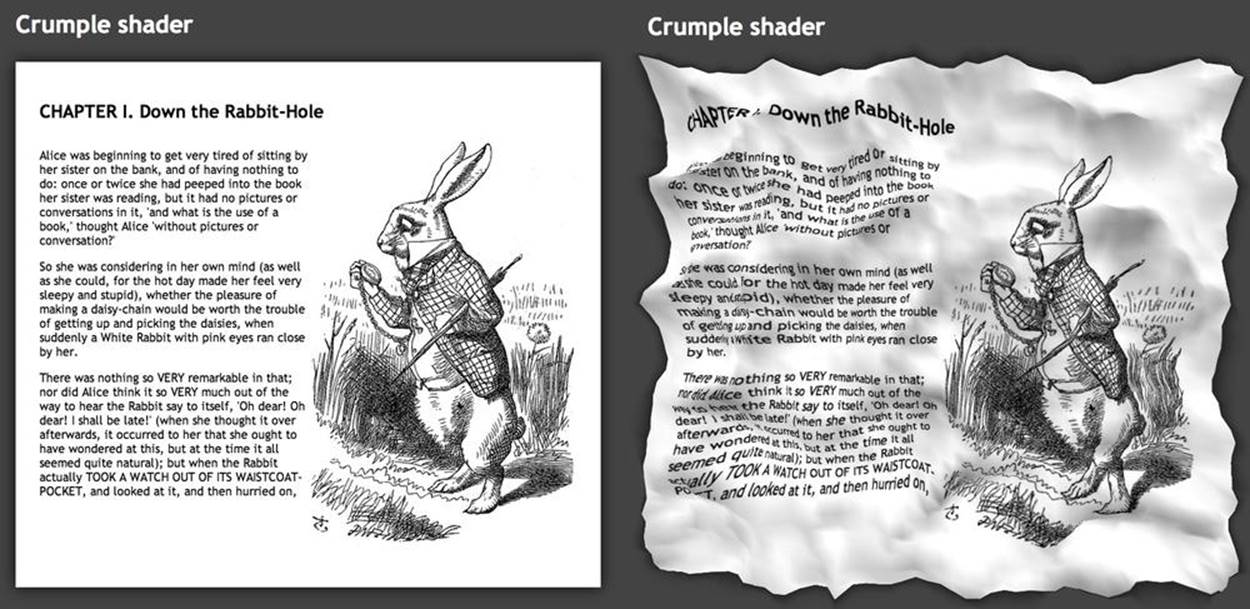
Figure 6-13. Crumple shader, a CSS3 Custom Filter by Altered Qualia
CSS Custom Filters use a subset of the GLSL shading language (GLSL ES). While it is nearly identical to the GLSL ES used in WebGL, there are a few very small differences. For security reasons, a CSS Custom Filter is not allowed to directly access the pixel color of any page element; rather, the filter must generate a blend color that is ultimately combined with the destination pixel of the element to produce a final color. In addition, the browsers supply a few predefined values as built-in uniform variables, such as the element’s 3D transformation matrix as defined by its standard CSS 3D transform (see earlier discussion). One other important difference is that the use of a CSS Custom Filter is optional, whereas a shader is required in order to render with WebGL.
NOTE
Note that CSS Custom Filters are still an experimental feature, and supported only in some browsers. As of this writing, the feature is also in danger of being shelved in favor of integrating DOM elements into the WebGL specification by allowing their use as texture maps. This is all very much a work in progress. In the meantime, the feature is still supported in Chrome and can be accessed via a special command-line switch (--enable-css-shaders), or the user preference Enable CSS Shaders.
Rendering CSS 3D Using Three.js
Even today, in 2014, there are some browsers that do not support WebGL. Mobile Safari for iOS comes to mind. So there may be occasions when it is necessary to use other web technologies as fallbacks for creating 3D. CSS3 is one, as we have seen. However, doing deep 3D development can get pretty labor-intensive, involving dozens of classes and HTML elements to create a small set of 3D objects.
Recently, Mr.doob got inspired to create a CSS-based rendering system for Three.js. One of the great things about this library is that it can render using various browser display technologies. Three.js has a plug-in rendering architecture, with renderers built for WebGL, 2D Canvas, SVG, and now, CSS.
The Three.js CSS renderer translates, rotates, and scales objects using CSS 3D transforms, which is ideal for mapping interactive page elements into a 3D space. Refer to Figure 6-14, which depicts an interactive periodic table. Each entry in the table is a fully functioning DIV tag, so it can be populated with HTML and styled using CSS. The CSS renderer is a great choice for creating innovate layouts of mostly rectangular, text-rich objects.
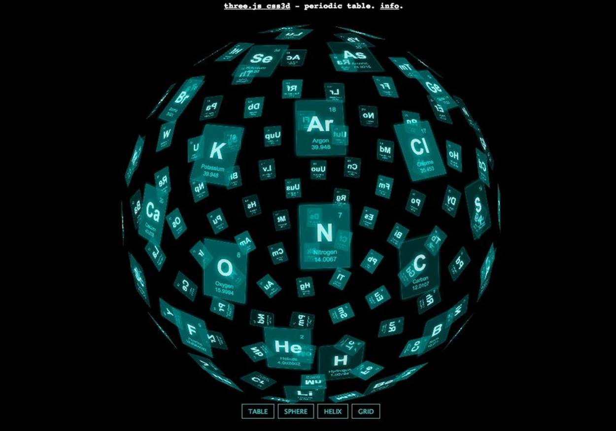
Figure 6-14. An interactive periodic table, built with Three.js, rendered with CSS 3D transforms
Chapter Summary
This chapter explored the browser’s built-in CSS3 features for creating 3D effects: CSS Transforms, CSS Transitions, and CSS Animations. You saw how to use CSS Transforms to apply 3D translation, rotation, and scale to elements; render them with and without perspective; propagate 3D transforms down through the DOM hierarchy; and control rendering of an element’s backfaces. We created simple animation effects using CSS Transitions, and more complex ones using CSS Animations.
CSS3 provides powerful capabilities for creating 3D user interface elements and transition effects, but it falls a bit short of the 3D rendering we expect in today’s games and other graphically intensive 3D applications. On the other hand, the effects are easy to create; they can be done mostly in CSS with a little JavaScript; they run universally across browsers and devices; and, most significantly, they are built into the browsers and therefore require no additional libraries. In some rare cases, when we want to push the envelope on using CSS3, we can do serious JavaScript hacking or lean on a library like Three.js that renders to CSS3.