HTML5, JavaScript and jQuery (Programmer to Programmer) - 2015
Part I HTML and CSS
Lesson 10 Dynamic Elements
This lesson is based around four additional features added in HTML5 that provide dynamic components: a native progress bar, a meter element, a range control, and a set of tags that allow the user to expand a summary to view its details.
These differ from many other tags you have examined because browser support is not consistent. Therefore, you will also look at a concept called polyfills that enables you to upgrade the functionality of a browser when a feature is missing.
Summary and Details Tags
One of the most frequent pieces of JavaScript I find myself writing is code to show extra information to a user when he or she chooses based on a summary.
Because this is such common functionality, the HTML5 specification defines two tags that combine to provide native support for this functionality. In order to see this in action, create the following web page:
<!DOCTYPE html>
<html lang="en">
<head>
<meta charset="utf-8">
</head>
<body>
<header>This page provides an example of the summary and details tags</header>
<details>
<summary>Table of contents</summary>
<ul><li>Lesson 1</li>
<li>Lesson 2</li>
<li>Lesson 3</li>
<li>Lesson 4</li>
<li>Lesson 5</li></ul>
</details>
</body>
</html>
This page includes a tag called details, which then has a child element called summary. In addition, the details tag itself contains additional information: an unordered list in this case. If you open this in Chrome, it will display as you see in Figure 10.1.
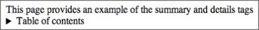
Figure 10.1
By default, this shows only the contents of the summary tag. If you then click on the arrow to the left of the summary, it displays the full details (see Figure 10.2).
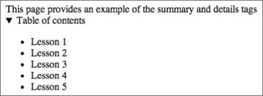
Figure 10.2
Notice that the arrow automatically points down to indicate that the details are being displayed. Naturally, it is possible to style these elements with CSS; you have a lot of flexibility regarding how this arrow will look to users.
Although these tags are a great addition to HTML, unfortunately browser support is currently minimal. The functionality works fine in Chrome, but if you open this same page in IE or Firefox, you will be disappointed.
If you want to know whether features are supported in various browsers, the best website available is www.caniuse.com. This details support levels for all HTML5 and CSS3 features across a wide variety of browsers. If you view the web page, www.caniuse.com/details, you can see the support level for this specific tag.
Progress Bar and Meter
HTML5 also provides a native progress bar and a related element called a meter.
You will begin by looking at the meter element because this is slightly simpler. This element can be used to show a value within a range. For instance, if you wanted to show a value that was 60 percent of a target, you could add the following element to a web page:
<meter value="6" min="0" max="10">6 our of 10</meter>
If you add this to a simple template web page, it should display as you see in Figure 10.3:
Figure 10.3
Notice that, in this case, you have specified a minimum and a maximum value of 0 and 10 respectively, and then set the value of the element to 6. Because min and max default to 0 and 1 respectively, this could also have been expressed as follows:
<meter value="0.6" >60%</meter>
The value between the tags is not needed; I have just added that for clarity.
The color used for the meter can take on meaning when you use additional attributes supported by the element. For instance, the following meter contains an expected range along with a possible range:
<meter value="1" high="8" low="3" min="0" max="10">6 our of 10</meter>
In this case, you have stated that the value is expected to be between 3 and 8. Because the value is lower than the expected range, the color of the bar changes from green to orange.
Alternatively, the following example, which is above the maximum range, displays in red:
<meter low="60" high="80" max="100" value="95"></meter>
Naturally it is possible to change these colors using CSS.
A progress bar is similar to a meter, except it is expected to change its value as an event occurs. Typically, you will use JavaScript to update the progress bar as you perform other processing.
It is possible to add a progress bar to a web page as follows:
<progress value="20" max="100" min="0" ></progress>
Figure 10.4 shows a static progress bar, one-fifth complete.
Figure 10.4
Naturally a static progress bar is not much use; therefore, the following is an example of a progress bar that updates 1 percent every 200 milliseconds seconds. Don't worry about the JavaScript for now; this will be explained over the next few lessons:
<!DOCTYPE html>
<html lang="en">
<head>
<meta charset="utf-8">
<script>
setInterval(updateProgessBar, 200);
function updateProgessBar() {
var progressBar = document.getElementById("progressBar");
progressBar.value += 1;
}
</script>
</head>
<body>
<progress id="progressBar" value="0" max="100"></progress>
</body>
</html>
One of the hardest things about progress bars is that it is often not possible to determine how far through an operation you are. If you would like to indicate to the user that you do not know how much time is remaining, you can simply remove the value and the progress bar will look like Figure 10.5.
Figure 10.5
This is referred to as a progress bar with an indeterminate value.
Range Element
The progress and meter elements you have looked at are a mechanism for displaying a value to the user. The range element is similar, except it is designed to allow the user to choose a value within a range.
The range element is therefore a form input type, except the possible values that the user can select are controlled by the minimum and maximum values for the range.
As an example, consider a case where you want the user to indicate how complete a task is as a percentage. You might add the following to a form:
0%<input type="range" name="percentComplete" min="0" max="100"
step="5" value="50">100%
Notice that this is a simple input element, but the type is set to range.
This example specifies a minimum possible value of 0, a maximum possible value of 100, and a default value of 50. It also states that any movement of the range will step by 5. Thus, it is not possible to choose a value of 23—the user would need to choose 20 or 25.Figure 10.6 shows an example of a range element.
Figure 10.6
Notice that the labels for the minimum and maximum value have been added manually: These are not part of the element.
My biggest criticism of the range element is that browser implementations typically do not provide an easy mechanism to show the user the value that they have chosen; it is therefore necessary to do this manually with JavaScript. For instance, in the preceding example, it would be difficult for the user to know whether they had chosen a value of 20 or 25.
Polyfills
The features outlined in this lesson pose a quandary to programmers. Although these elements provide interesting functionality, all browsers do not support them. For instance, IE, prior to IE 10, does not support the meter and progress elements.
Thus, if you elect to use these features, some users may receive a lower-quality experience. For instance, when the range element is not supported, it simply displays as an input field. This is becoming less of an issue as browsers move to use auto-updating release models because most users have up-to-date browsers; many users in corporate environments, however, are still restricted to older versions of browsers.
This section will look at an approach that provides a workaround to browser support issues. It allows you to use native HTML5 functionality where it is available but provide custom implementations where it is not: This is a technique referred to as “polyfills.”
In order to support polyfills, your web page needs to perform two distinct tasks:
· Determine whether the browser supports the features you wish to use
· Provide a JavaScript-based implementation if support is missing
Modernizr is a popular JavaScript library for performing these tasks. It is available from http://modernizr.com/.
The example that follows uses a version of Moderinzr from the Lesson 10 resources, or you can download your own version. The basic usage of Modernizer typically looks like this:
<!DOCTYPE html>
<html lang="en">
<head>
<meta charset="utf-8">
<script src="modernizr.js"></script>
<script>
if (!Modernizr.inputtypes.range) {
// provide JavaScript implementation
}
</script>
</head>
<body>
0%<input type="range" name="percentComplete" min="0"
max="100" step="5" value="50">100%
</body>
</html>
In the head section, the Modernizr script is imported. Once this has been imported, it is possible to test whether features are available. In this example, you will notice the code:
if (!Modernizr.inputtypes.range) {
This states that if the range element is not available, the JavaScript block following the statement should be executed. Modernizr allows you to test for a wide range of features using similar statements that return true or false, depending on whether the feature is supported.
Within this block, it is necessary to provide a polyfill. The Modernizr website has links to many JavaScript polyfills, each with their own instructions on how they should be used.
Try It
This Try It will allow you to experiment with the elements introduced in this lesson. It will not contribute anything to the Contacts web application so you do not need to follow the instructions exactly if you choose. Instead, it is an opportunity to experiment.
The website for this book contains a file called tryit.html with a complete example, or you can watch the screencast online if you need extra help.
Lesson Requirements
You will also need a text editor and a web browser.
Step-by-Step
1. Start by creating a simple HTML5 web page that you can use to add the elements outlined in this lesson.
2. Imagine you wish to provide information on a patient's heart rate for a medical website. Start by creating a meter tag with a maximum possible value of 200 and a minimum possible value of 0.
3. Indicate the likely range for a healthy individual: Set the low value to 60 and the high range to 100.
4. Experiment with various different values for the meter—for instance, 20, 70, or 120—and observe what happens to the color of the bar.
5. Now imagine that instead of presenting the heart rate to the user, you want to allow a doctor to input a patient's heart rate.
6. Add a range element to the web page and set the minimum and maximum possible values to 0 and 200 respectively. In addition, set the step to be 3 because you do not need the input to be so precise.
7. Add a summary and detail section to the bottom of the page. Within this, the summary section should state “List of patients with high heart rates.”
8. When the user clicks to view details, show a table with patient names and heart rates.
Your completed version should look like the screenshot in Figure 10.7.
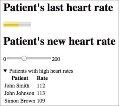
Figure 10.7
Reference
Please select the video for Lesson 10 online at www.wrox.com/go/html5jsjquery24hr. You will also be able to download the code and resources for this lesson from the website.