Beginning HTML5 & CSS3 For Dummies® (2013)
Part V
Enhancing Your Pages’ Look and Feel
19
Multimedia and Animation with CSS
In This Chapter
 Creating a print style sheet
Using paged media styles
Switching styles with @media
Understanding keyframes
Animating color
One of the best things about HTML5 and CSS3 is the increased ability of web designers to venture beyond the computer screen. With just HTML5 and CSS3, you can make your web pages available on different types of media, and you can enable multimedia capabilities. In the not-so-distant past, scripting, plug-ins, and additional software were required in order to do much of anything interesting on the web. Not so today!
In Chapter 17, we introduce you to the @font-face rule, which gives designers the ability to use any font they want in web designs. In Chapter 18, we introduce you to shadows and transform, which give designers the ability to handle complex effects without the use of a paint or photo manipulation tool. In this chapter, we take a look at two more CSS3 capabilities, media queries and animation, which are both rapidly changing the way we design and think of web pages.
Using CSS with Multimedia
CSS3 is useful for much more than styling text for desktop browsers.
People use web pages with their phones, tablets, projectors, TVs, and even watches and glasses. Some people even print out web pages for reading later.
With different style sheets, you can style the same content to work well on all these different devices. The key is to detect the type — or size — of device the user has and then serve them a custom style sheet for that particular device or media. Unfortunately, detecting what type of device a user is using is a best guess scenario. Viewport size is the only thing we can be sure of.
With the @media rule, you can specify how you want your web pages to look or behave on different media types.
Table 19-1 lists all the media types that CSS can recognize, as well as their uses.
Table 19-1 Recognized Media Types
|
Media Type |
Description |
|
All |
Suitable for all devices |
|
braille |
For Braille tactile-feedback devices |
|
embossed |
For paged Braille printers |
|
handheld |
For hand-held devices (such as those with a small screen, monochrome monitor, and limited bandwidth) |
|
|
For paged, opaque material and for documents viewed onscreen but in Print Preview mode |
|
projection |
For projected presentations, such as projectors or transparencies |
|
screen |
For color computer screens |
|
speech |
For speech synthesizers |
|
tty |
For media that use a fixed-pitch character grid, such as teletypes, terminals, or portable devices with limited display capabilities |
|
tv |
For television-type devices (such as those with low resolution, color capability, limited-scrollability screens, and some sound available) |
CSS can make changes to customize how the same pages
 Render onscreen
Print
 A nifty color background might make your page a mess when it’s printed on a black-and-white laser printer, but proper use of print-media styles can keep this sort of thing from happening!
Sound when read out loud
Certain CSS properties apply only to specific types of media. For example, the page-break-before property, which specifies where a page break should occur, applies only to printed media. Other properties apply to multiple media. For example, width and font-family are important to all the visual media types (such as projection, screen, and print) but may require different values for each of these media types.
Visual media styles
Table 19-2 lists the CSS properties you’re most likely to use in a typical web page. Our online content for this book includes brief descriptions of the most commonly used CSS properties and HTML tags and attributes.
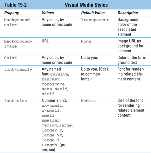
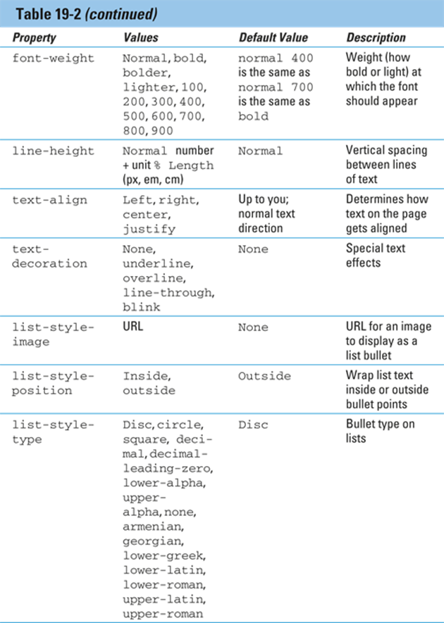
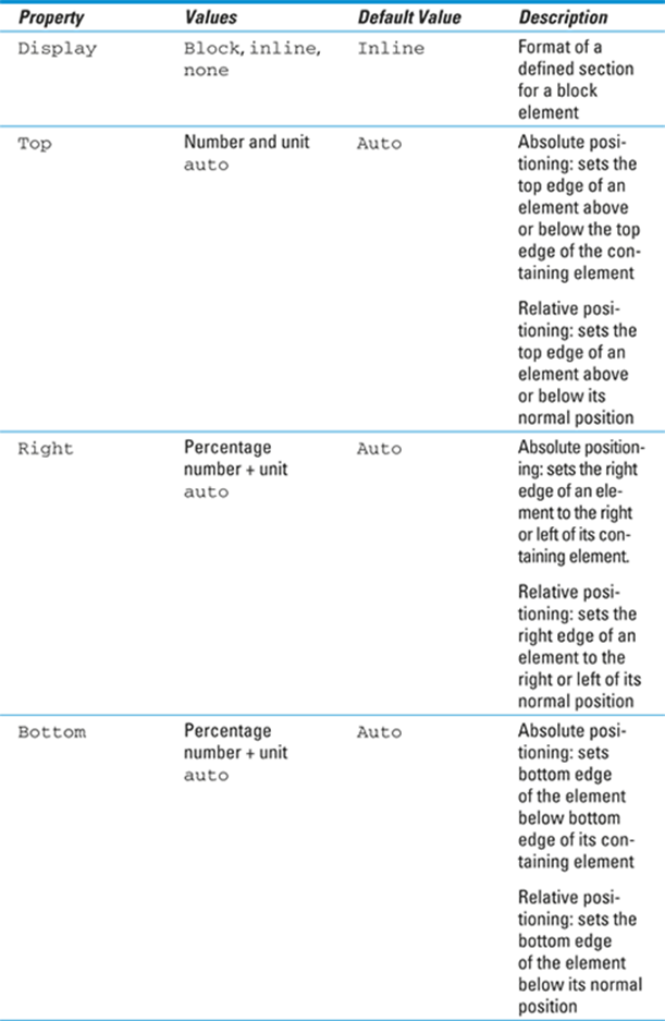
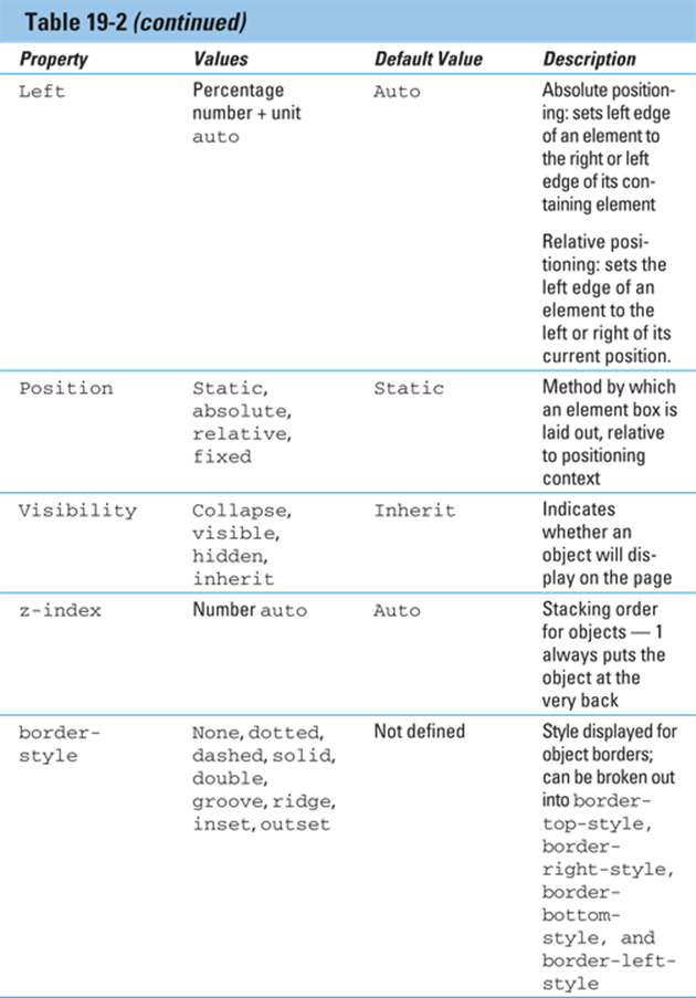
 All the properties listed in Table 19-2 are safe to use in any visual browser today. If you're unsure whether something will work in all browsers, the best way to find out is to test, of course. However, a lot of different browsers out are available, and it's often difficult and impractical to have different versions of a browser installed on the same computer. Professional web developers visit http://caniuse.com as a first step to find out what tricks might be necessary to get a property working with a certain browser.
Paged media styles
CSS can customize how a page looks when it’s printed. We recommend these guidelines:
Replace sans-serif fonts with serif fonts.
Serif fonts, which have small lines trailing from the edges of letters and symbols (called serifs) are easier to read than sans-serif fonts.
Insert advertisements that
• Make sense when they aren’t animated
• Are useful without clicking
In general, paged media styles help ensure that text looks as good when it’s printed as it does in a web browser. Paged media styles also help you hide irrelevant content when pages are printed (banners, ads, and so forth), thus reducing wasted paper and user frustration. See Table 19-3 for an explanation of paged media properties in CSS.
The example in Listing 19-1 uses these options for paged media styles:
Make the output black text on a white background.
Replace sans-serif fonts with serif fonts.
Listing 19-1: Adding a Print Style Sheet
<!DOCTYPE html>
<html>
<head>
<title>This is my page</title>
<style type="text/css">
body {background-color: black; color: white; font-family: sans-serif;}
@media print {
body {background-color: white; color: black; font-family: serif}
}
</style>
</head>
<body>
This page will look very different when sent to the printer.
</body>
</html>
If you’re now wondering why none of the properties in Table 19-3 were set but other properties were, it’s because (in this example) their defaults worked fine. Just because those page properties can be set doesn’t mean that you can’t set other properties also — it isn’t an either/or situation.
Getting Animated
CSS animations provide a very simple way to animate transitions between styles. Unlike other ways of doing animation on the web, CSS animation requires no scripting and no plug-ins. It also generally performs better and uses fewer system resources (CPU cycles and memory) than other types of animation.
Before we get to the details, we step back and review some basic animation concepts.
Animation works by displaying a series of images to create the illusion of movement.
If you have two points, all you need to create an animation of something moving in a straight line between those points is a length of time that the movement should take. In this most basic example, the beginning and ending points are known and everything inbetween can be inferred or computed. The known points in the animation are called keyframes.
Speech styles
Speech synthesizers, which convert text into speech, aren’t just for the visually impaired. They’re also useful for web users who
 Have reading problems
Need information while driving
The following example recommends voices to be played using male and female characters to make it clear which characters are speaking:
<style>
@media speech {
p.stanley {voice-family: male;}
p.stella {voice-family: female;}
}
</style>
Usually, you don’t have to worry much about adding speech styles to your page. Today’s speech synthesizers should work just fine if
Your page is mostly text.
You don’t have a strong opinion about how it sounds, so any clearly male or female voice will do.
That said, you can find a complete listing of all speech style properties on this book’s companion website.
Note: Most people who use these technologies have either set up their own custom styles or are used to the default styles, which are used to convey specific meanings to the listener. It can be disruptive to the user if they are unexpectedly different. Change voices with caution.
In traditional hand-drawn animation, keyframes are drawn by a senior artist, and the frames between keyframes are drawn by an assistant. These frames between the keyframes are called inbetweens.
In CSS animation, the CSS author creates keyframes, and the browser draws the inbetweens.
If you want the object to move in a way other than a straight line, you can specify additional keyframes between the beginning and ending points. Figure 19-1 shows an illustration of animation path involving start and end points and a keyframe between them. We’ve placed partially transparent frames between the keyframes to show some of the inbetweens.
CSS animations can be used to smoothly change the size of an element, change its color, rotate it, or move it from one location to another, for example.
 For a list of all the animatable CSS properties, visit
https://developer.mozilla.org/en-US/docs/Web/CSS/CSS_animated_properties
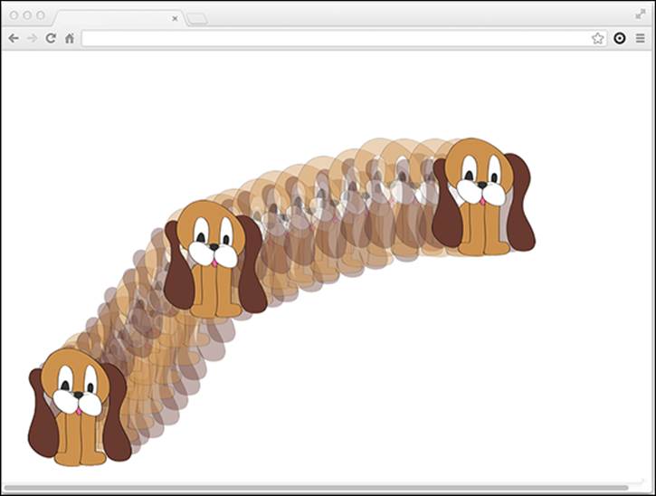
Figure 19-1: Keyframe animation.
Using the animation properties
The CSS animation properties configure how an animation will run. They don't actually animate anything — that's the job of the @keyframes rule.
The animation property is a shorthand for the following subproperties:
animation-name: Used for assigning a name to an animation's keyframes.
animation-duration: Specifies how long the animation should take to run.
animation-timing-function: Used to specify acceleration curves that determine how the animation transitions through the keyframes. For example, an animation may start and end slowly and move faster in the middle.
animation-delay: Configures the delay before the start of the animation.
animation-iteration-count: Tells how many times to run the animation.
animation-direction: Can be used to set an animation to run backwards when it reaches the end.
The following example configures an animation of the <figure> element on the home page of HTML5 Cafe:
#home-image {animation-duration: 4s;
animation-name: slideup;}
At this point, there's no animation. But, you've set the stage by specifying that an animation named slideup should be applied and that it should take four seconds to run.
The animation named slideup doesn't exist yet. To create it, we need to use the @keyframes rule.
Creating animations with @keyframes
In the most basic use of @keyframes, you specify the beginning and end and then name the animation. After you've named an animation, it's available to be used by any element, through the animation-name property. Here's a simple animation that animates the bottom margin of an element from a negative value to 0:
@keyframes slideup {
from {margin-top: 200px;}
to {margin-top: 0px;}
When defined and called as part of a style rule for an element, this new animation will transition from margin-top: 200px to margin-top: 0px. The result is that the #home-image will slide up into position after it's loaded.
 Ah, but only if it were so simple! Once again, CSS animation is still not quite finished and approved, so vendor prefixes may be necessary. To avoid adding a whole lot of extra code here, we've left them out. However, be aware that you may need to add -moz or -webkit to the animation properties and the @keyframe rule in order for them to work in your browser.
Animating color
You can also use CSS animation to gradually change the color of an element from one color to another. When you do this, the color will start at the from value and transition through the RGB scale until it reaches the next keyframe.
For example, here’s a color animation that goes from red to blue:
@keyframes redtoblue {
from {color: #ff0000;}
to {color: #0000ff;}
To apply this animation to an object, just add the animation-name and animation-duration (along with any of the other animation subproperties you want to specify) to a style rule, as follows:
h1 {animation-name:redtoblue;
animation-duration: 8s;}
This animation takes exactly eight seconds to run. When it's done, the color of the <h1> element resets to the color it was before the transition. So, if you want the color to remain blue after the animation happens, add a color declaration to the style rule.
Figure 19-2 shows, as best as we can in print, the animation from red to blue.
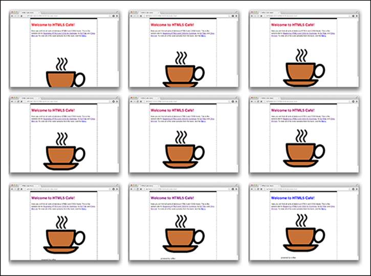
Figure 19-2: Animating color from red to blue.