Releasing HTML5 Games for Windows 8 (2013)
Chapter 3. Screen Resolution and Artwork
Windows 8 Resolutions
If you have done any desktop software development before, you may be familiar with the dizzying amount of resolution possibilities out there. While Windows 8 still has its share of resolution options, the form factors and the push towards tablets simplifies your baseline of supported resolutions.
Out of the box, Windows 8’s native resolution is 1366×768. While Windows 8’s minimum resolution is 1024×786, almost all new tablets and convertibles will have their minimum resolution set to 1366×768. But this isn’t the full story. Let’s take a look at the three main resolutions our game will need to support to pass certification for the Windows Store:
§ Full Screen – This is the default resolution when the game is running in full-screen mode. This can be anywhere from 1366×768 and up.
§ Snapped – This happens when your game is docked on the side of the screen and another application is running next to it. The minimum width of this resolution is 320 pixels wide.
§ Filled – This would be the full-screen resolution minus 320 for the snap view. This resolution happens when you have another app docked in snapped view on the side of your game.
You can easily detect resolution changes by adding an event listener to the window like so:
window.addEventListener("resize", onViewStateChanged);
And, here is an example handler for the resize event.
function onViewStateChanged(event) {
var viewStates = Windows.UI.ViewManagement.ApplicationViewState;
var newViewState = Windows.UI.ViewManagement.ApplicationView.value;
if (newViewState === viewStates.snapped) {
// is snapped
}else if (newViewState === viewStates.filled) {
// is filled
} else if (newViewState === viewStates.fullScreenLandscape) {
// is full screen
} else if (newViewState === viewStates.fullScreenPortrait) {
//is portrait
}
}
}
Notice how we can also detect screen rotation? You can disable that for your game, but in order to be approved by the store, you need to handle the other three view states properly. As of now, the majority of Windows 8 devices are probably running in landscape mode. While portrait mode is the default orientation on phones, you’ll find that Windows 8 is designed for landscape due to its desktop heritage. That’s not to say that you should totally ignore portrait mode, but if you are working on minimizing scope creep, especially for your first Windows 8 game, I would suggest sticking to landscape. Likewise, if your game was designed to run in portrait mode since it was created for a mobile device first, you may have to consider centering it on a background image while in landscape mode, which is a popular technique many games are already utilizing in the Windows Store when running on larger resolutions the game wasn’t ideally intended to support.
Scaling Games for Full Screen
By design, all Windows 8 apps run at full screen at any resolution. What that means is that, given the huge user base of Windows 7 and the potential of upgrading desktops attached to large monitors, your game will have to support resolutions higher than 1366×768. Let’s be practical. While HTML5 games run great on Windows 8 at normal resolutions, the bigger the display, the slower your game will run. This is directly attributed by the increase of pixels your game will be trying to update to the display; the larger the resolution the more pixels being rendered. Fortunately, we can take advantage of a few techniques to stretch out our canvas in a way that will help balance performance and maintain the ascetics of your game.
There are two ways to stretch the canvas:
§ Scale to Fit – This stretches out the canvas to fill the screen, and while most people may not notice, your game could look wide or squished on odd resolutions.
§ Maintain Aspect Ratio – While this maintains the quality of your artwork, you may end up with black bars on the sides of your game.
This is a hard decision to make. Luckily, it’s very easy for us to test both out. We’ll start with scale to fit since you can simply do this in the CSS.
<style type="text/css">
html, body {
margin: 0px;
padding: 0px;
}
#canvas {
width: 100%;
height: 100%;
}
</style>
This will work great on Windows 8, but be careful if you try this on the Web. Since most monitors are designed to be at fixed aspect ratios, like 4:3 or 16:9, your game will always look relatively fine. In the browser, however, the user can set the window to any arbitrary size, and this could look horrible depending on what they set it to. That is why it is sometimes better to try and maintain the aspect ratio, which is something we can do via JavaScript.
The basic concept of maintaining a game’s aspect ratio is to figure out its ideal size and divide the width by the height. From there we can attempt to fit the game into the current resolution by using its height as a point of reference. This means that your game will constrain its width to always make sure that the height of the canvas is set to 100 percent. Most likely this will yield black bars on the right and left sides of the game canvas unless the display matches your game’s aspect ratio. On the flip side, if your width is smaller than the max height, we will need to add black bars to the top and bottom of the game. This scenario will most likely happen if you design your game to run at a native resolution of 1366×768 and the person snaps another app next to your game, which will lower the resolution to 1024×768.
If you are not familiar with all of this, it may be a hard concept to wrap your head around. Let’s look at the code and add this to your own game to see how it affects the visuals at different resolutions. We’ll start with the basic CSS.
<style type="text/css">
html, body {
background-color: #000;
color: #333;
font-family: helvetica, arial, sans-serif;
padding: 0;
font-size: 12pt;
margin: 0px;
padding: 0px;
}
#canvas {
width: 100%;
height: 100%;
-ms-touch-action: none; /* Disable touch behaviors, like pan and zoom */
position: absolute;
left: 50%;
top: 50%;
} </style>
Next, we will have to add a little bit of JS to control resizing the canvas.
<script type="text/javascript">
window.addEventListener('resize', resizeGame, false);
function resizeGame() {
var canvas = ig.system.canvas;
var canvasRatio = canvas.width / canvas.height;
var width = window.innerWidth;
var height = window.innerHeight;
var windowRatio = width / height;
if (windowRatio > canvasRatio) {
width = height * canvasRatio;
canvas.style.height = height + 'px';
canvas.style.width = width + 'px';
} else {
height = width / canvasRatio;
canvas.style.width = width + 'px';
canvas.style.height = height + 'px';
}
canvas.style.top = (window.innerHeight - height) / 2 + "px";
canvas.style.left = (window.innerWidth - width) / 2 + "px"; }
</script>
This also assumes that you have the following setup in your index.html or default.html with the canvas inside a div with an ID called game.
<body>
<canvas id="canvas"></canvas>
</body>
What’s great about this code is that it will work well on the Web as well as on the desktop, so you can consolidate your game’s scaling to a single function. Also, you can call window.resizeGame() whenever you need to manually correct the scaling, such as when the game is finished initializing.
Hopefully, after running the two different examples on your game at different resolutions, you can pick the best one for your use case. No matter which one you chose, the benefits you will get at higher resolutions will be monumental. Rescaling the game on larger monitors with higher resolutions will still yield fast, fluid, responsive playback.
Understanding Snap View
Your game will not be approved for the Window Store unless you fully support snap view. This can be something as simple as throwing up a graphic telling the player they are in snap view and can’t continue playing, or doing something even more elaborate. Just keep in mind that making use of the snap view will not only encourage players to keep the game open while they check their email or do other things, but it will also get more attention by the curators of the Windows Store who look to feature developers who are making the best use of Windows 8’s new features and capabilities.
There are two basic ways we can handle snap view: using CSS meta tags or managing it via code with JavaScript. Both options allow you to mix and match HTML and Canvas elements, so it’s really about finding the right solution for the way your game is already created. Here are two examples to review in order to give you a better idea of how you want to implement it yourself.
In my index.html file, I have my canvas and my snap view image wrapped in the same game div I talked about previously in the scaling part of this chapter.
<body>
<div id="game">
<canvas id="canvas"></canvas>
<img id="snap-view" src="media/snap-view.png"/>
</game>
</body>
Make sure your snap view image is no larger than 320×768 (Figure 3-1).
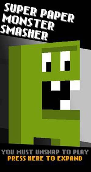
Figure 3-1. The snap view image I am using for my game Super Paper Monster Smasher.
The basic concept is that, while the canvas is automatically being stretched out to take up the full screen, the snap-view image isn’t visible. To make sure, we’ll alter its CSS properties to hide it. When I detect snap view, I simply hide the canvas and show the snap-view image.
First, let’s take a look at the CSS-only approach.
@media screen and (-ms-view-state: fullscreen-landscape) {
#canvas{
display: block;
}
#snap-view{
display: none;
}
}
@media screen and (-ms-view-state: filled) {
#canvas{
display: block;
}
#snap-view{
display: none;
}
}
@media screen and (-ms-view-state: snapped) {
#canvas{
display: none;
}
#snap-view{
display: block;
}
}
As you can see, I have set up a CSS meta selector for detecting the snap view. You can also use a min-width meta selector if you want to use this code on the Web and in Windows 8 to help maintain constancy between your code base.
Now, let’s take a look at how to maintain this via JavaScript. Here is what the code for that looks like in my game.
if (newViewState === viewStates.snapped) {
canvas.style.display = "none";
snapView.style.display = "block";
} else if (newViewState === viewStates.filled) {
canvas.style.display = "block";
snapView.style.display = "none";
} else if (newViewState === viewStates.fullScreenLandscape) {
canvas.style.display = "block";
snapView.style.display = "none";
}
As you can see, I simply tied this conditional into the earlier example where I detect the window’s resize event.
You may have also noticed from my snap view picture that I added some text telling the player to click on the image in order to expand the game and exit snap view. This is very easy to do. Simply add a click event to the image like this:
var snapView = document.getElementById("snap-view");
snapView.addEventListener('click', function(e) {
var boolean = Windows.UI.ViewManagement.ApplicationView.tryUnsnap();
})
As you can see, I have a simple image that fits perfectly in the 320-pixels-wide area provided by the snap view and can also center it vertically in case the game is running at a higher resolution. Remember that the height of the snap view is determined by the maximum resolution of the attached monitor, so it can be larger than 786 pixels high.
The final thing we will want to make sure of is that whenever we enter snap view we pause our game. Hopefully your game has a way to pause itself. We can simply listen to the same resize event and determine if the game needs to be paused.
WARNING
It is critical that you also pause the game and any sounds or music playing to offer up a clean experience when transitioning to snap view. If you are using a CSS-based solution, make sure you don’t forget to shut everything down in your game via JavaScript. The last thing you want is for your game to be running in the background when the player can’t interact with it under the snap view image.
To play it safe, you should pause the game any time you detect a resize event. The simple act of moving from snap to full or full to filled will probably be a little jarring for your players, and they wouldn’t have time to react on their own. Also, I wouldn’t un-pause your game if you leave snap view. You have to take into consideration that the player may have been doing something else when the app was unsnapped, such as closing another app, and may not be ready to jump back into the game. Whenever you change resolutions from full screen to filled and down to snap view, you should pause the game and let the player manually resume when they are ready.
NOTE
In Windows 8.1, the user now has more control over how two apps run side by side. In addition to snap view, the user can split the screen between two apps so that each one takes up 50% of the usable screen resolution. That means that your game should be able to scale to accommodate this dynamic resolution changing. If you included the aspect ratio scaling code example from the previous section your game should handle this fine but it’s still important to keep in mind in case your game becomes unplayable at half of the screen’s resolution. This only applies to devices with a resolution higher than 1024 ×768.
As you can see, supporting snap view is a simple process and something that you don’t want to overlook when submitting your game to the Windows Store.
Upscaling Artwork
Another thing to consider is how to upscale your artwork. If you are coming from an existing game, you may have built the game for a lower resolution. Or maybe you are thinking of making a new game from scratch and looking to get an authentic-looking 8- or 16-bit feel. There are some great techniques we can use in order to upscale the artwork in a way that will not only help support higher resolutions but also add a unique look and feel to your game.
Upscaling allows you to show a smaller graphic at a much larger resolution. Since I work with pixel art, the effect tends to accentuate the pixels more, giving it the retro look most people are familiar with. There is no exact science behind how much to scale up, but I tend to do it in multiples of two. So, if I have a 16×16 pixel sprite, I can display it at 24×24 pixels by increasing the scale factor by two or even up to four times its original size.
Figure 3-2, Figure 3-3, and Figure 3-4 are an example of how this works.

Figure 3-2. 1x (actual size 63×42 pixels).
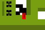
Figure 3-3. 2x (new size 126×84 pixels).
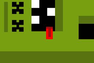
Figure 3-4. 4x (new size 251×167 pixels).
As you can see, the higher the scale factor the more pixelated the artwork looks. This is incredibly effective when you have smaller sized sprites and map tiles.
NOTE
When resizing artwork in an image editor such as PhotoShop, make sure you use nearest pixel scaling to preserve the crispness of the pixel art.
The one thing you want to make sure of when it comes to upscaling your artwork is that you pre-render the artwork at the higher size ahead of time. Many popular game frameworks allow you to resample the artwork on the fly to an off-screen canvas, but this will double the memory usage of your app and slow down the load time of your game.
If you don’t anticipate changing the scale size of your game based on different resolutions, then it may make more sense to output everything at the correct scale factor ahead of time. This is especially important on slower devices. When it comes to getting the best performance out of Windows 8 games, you have to build for the lowest common denominator. If you are forced to resample your artwork on the fly, I suggest caching the generated art to the player’s computer and only regenerating it on major resolution changes, or when the app loads up for the first time.
Designing for Multiple Resolutions
While this section may not help you if you already have a completed game, I still want to spend a little time talking about some great ways to better handle multiple resolutions with forward-thinking design. There are a lot of simple tricks you can implement to help accommodate multiple resolutions. Most of the problems usually come up with the game’s UI. The first thing I do is open up my design tool and map out a few resolutions to see how they will look in my game. This is a similar technique to what I used to do in video editing to find a “safe zone” where the TV’s edges would clip text or video. Here is an example from my game Super Paper Monster Smasher.
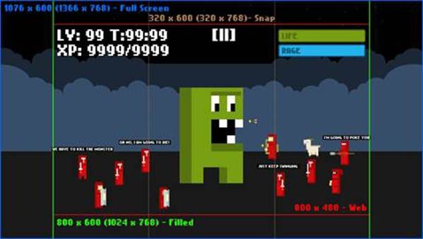
Figure 3-5. Here is my design from Photoshop showing off what is visible at each resolution.
Here you can see I have mapped out four different resolutions: full screen, filled, snap, and Web. In Figure 3-5 you will notice that my game’s native resolution is 800×480, since this started out as a Web game, and from there I can expand out the camera that renders the in-game graphics to offer more visible area at different sizes.
Having a dynamic camera is a great way to handle resolution changes. Simply expand the view of the game and you can easily fill in the screen and offer more visible real estate for the player. The downside is that you have to have a UI that can also be flexible enough to handle the resolution changes. Also, you run the risk of increasing performance issues since you are rendering more of the game, which is why I made sure to design my maximum resolution just under the 1366×768 pixel resolution of Windows 8 so I can stretch the canvas to fill in the difference.
When it comes to UI for your game, try to keep things as simple as possible because you will use up precious resources trying to render more to the screen, and you want to maximize your game’s screen real estate on tablets. Remember that your game will most likely be held in landscape mode on the left- and right-hand sides of the screen, so avoid putting important UI at the bottom of the screen, which could be blocked by a player’s hands.
Another important design technique for UI on multiple resolutions is to “dock” them to corners of the screen (Figure 3-6). Here are two examples of how the UI realigns itself based on the screen size.
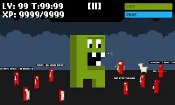
Figure 3-6. Here is the UI and camera clipping at 800×480 pixels for the Web version of the game.
As you can see in Figure 3-7, the UI elements on the left-hand side always move to the left corner of the screen and the right-hand side elements move to the right. The pause button, which is a critical UI element, is centered inside of the empty space between each side’s UI. Another technique you can use on Windows 8 is to completely hide the pause button and non-critical UI and expose them through the commands bar, which you access by swiping up from the bottom of the screen or right clicking. I tend to avoid doing this because, while modern UI standards dictate all non-essential UI should be hidden from view, games get a lot more leeway during approval. In a game, you want instant access to pausing the game, so make it easy for the player to hit it. If you rely on a gesture, you could make the player do something in the game that would potentially cause a problem.
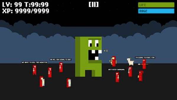
Figure 3-7. The UI and camera clipping at 1024×768 pixels for the Windows 8 version of the game.
Live Tiles
Live Tiles are probably one of Windows 8’s most prominent features. Live Tiles are the icons on the new start screen, but these are more than just app icons. Like the name implies, these tiles are animated and can contain a wealth of high-level information about the app. When it comes to games, we can do some interesting things, such as display player stats and high scores, and even entice the player to come back to the game if they haven’t played in awhile. For the purposes of getting your first Windows 8 game to be published, I am just going to focus on the basics of setting up Live Tiles.
Luckily, the easiest thing you can do in order to set up a Live Tile is simply replace the default tile image in your project’s images folder. This was automatically created for you by Visual Studio. If you open up your .appxmanifest (Figure 3-8), you will see all the default Live Tile options.
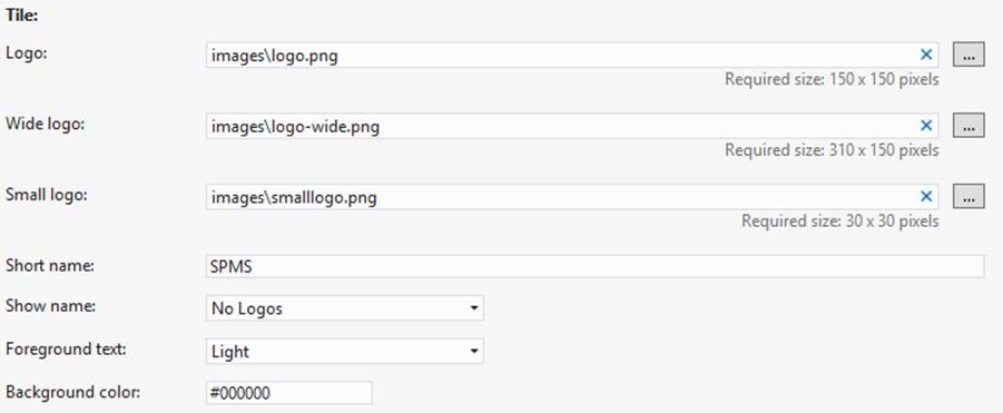
Figure 3-8. These are the options in Visual Studio to add your own images for the default Live Tile graphic.
Figures 3-9, 3-10, and 3-11 show the images I am using in my own game along with their sizes.
Figure 3-9. The default logo is 150×150 pixels.

Figure 3-10. The wide logo is 310×150 pixels.

Figure 3-11. The small logo is 30×30 pixels.
NOTE
In Windows 8, the wide logo is optional. In the Windows Store on 8.1 the app listings actually uses the wide logo which was not done in the earlier version of the store. This means that you should give additional thought into the design of that logo to help it stand out better in the store listing. If you do not supply a wide logo in your game it will automatically be centered on a wide side tile and given a grey background.
Once you have your Live Tile images set up, you can also control if the game’s name is displayed automatically for you by Windows 8. Below where you set the Live Tile images, you will see an option to supply a short name and a dropdown with options on how to show the title (Figure 3-12), if you want to.
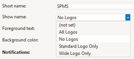
Figure 3-12. Options for adding text to your Live Tile.
As you can see, you can show the text on all logo types, not at all, on the default logo, or on the wide tile. Likewise, if you don’t want Windows 8 to automatically display your game’s name, I suggest simply setting it to “No Logos” and putting the game’s name in the artwork itself.
Splash Screen
You may have noticed an additional graphic in the images folder called splashscreen.png. You can set this in the .appxmanifest (Figure 3-13), just like we did with our game’s Live Tile graphics.
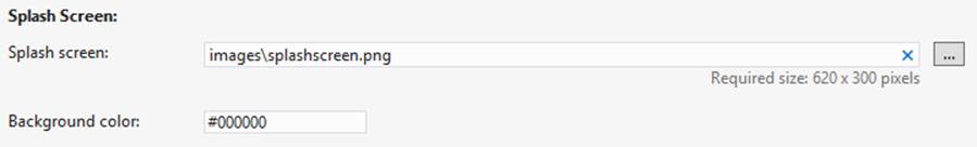
Figure 3-13. Option to customize the splash screen in Visual Studio.
The splash screen is automatically displayed as the game loads up. Its deafult resolution is 620×300 pixels. In Figure 3-14 you will see a sample of what my own game’s splash screen looks like.

Figure 3-14. This is the splash screen graphic I use in Super Paper Monster Smasher.
There is nothing fancy about this. The image is centered on the screen and you can set the background color to help match up to your own splash image. I highly suggest making the background color of your splash screen solid so it looks seamless on the default background color. Remember that this image will be centered when the game is loading up so, if you are on a higher resolution monitor, you are going to see a lot of background color surrounding your splash screen image. There is no way to stretch this out to fill the screen.
You can also line up your own splash image to show up after the game is loaded to make this a seamless transition. Simply center the same image on the page and then hide it when you are ready to display the game.
Tips and Tricks for Working with Artwork on Windows 8
Working with images on Windows 8 is similar to how you would on the Web. The best advantage, however, is that you don’t have to worry about loading files from a server. Instead, you will need to focus on optimizing your files so they don’t take up a lot of memory and also limit your draw calls so you can increase performance on larger monitors. Here are some tips to do just that.
Use Sprite Sheets or Texture Atlases
Try to combine images as much as possible into a single graphic. Not only will this cut down on the number of images you need to manage in memory, it also helps speed up drawing to the Canvas by removing the overhead of having to manage multiple images.
There are generally two different ways to combine images: sprite sheets and texture atlases. Sprite sheets are usually used for images that are the same size and can easily be divisible by their width. A player may be 16×16 pixels wide, so you can line up all the player animations horizontally, vertically, or in a grid. By using the fixed width of the sprite, you can find each frame in the image.
Likewise, if you have lots of graphics that are not perfectly square, or you want to combine all of your game’s artwork into larger files, you can use a texture atlas. This is common when working in 3D and allows you to package up all of your textures into a single image and use an atlas file, which defines the coordinates of each image and where to find it on the texture. These atlas files can be in .xml, .json, or .txt. There are lots of free and paid texture packagers out there that can help you optimize your sprites.
Render for Native Resolution
Some JavaScript frameworks, such as ImpactJS, can automatically upscale your graphics when the game starts. While this works well on some devices, I have noticed considerable slowdown on lower-powered Windows 8 devices trying to do the resizing. Instead, you should have all of your artwork pre-rendered at the correct scale factor.
You can also supply multiple scale images to choose from at runtime or, if you must have your game generate images at runtime, cache them and save them to the hard drive to use later. I’ve seen many games use this so that you only have one long load time the first time you run the game and then it resizes everything so consecutive loads are faster.
Handling Edge Cases
Be prepared for edge cases and situations where you can’t totally anticipate the resolution your game is going to run on. Because of this, it is important to test your game at multiple resolutions and DPIs. You can easily do this with the Windows 8 Device Simulator in Visual Studio.
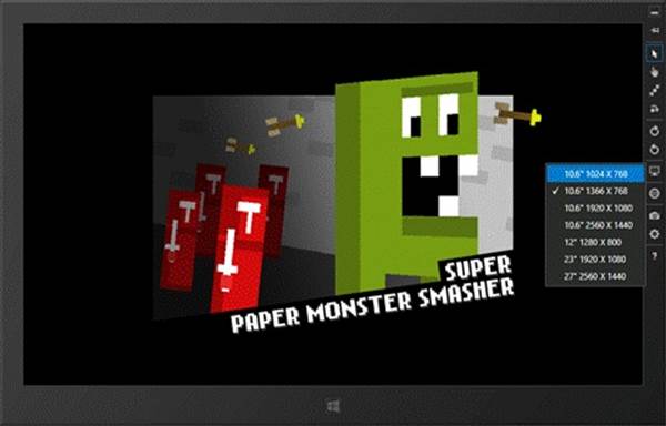
Figure 3-15. Testing out different resolutions in the simulator.
As you can see in Figure 3-15, simply select the icon that looks like a monitor on the right-hand side and select a different resolution to test your game out and see how it responds.
Set a Maximum Resolution
No matter what you end up doing to support multiple resolutions, just keep in mind the maximum resolution your game should render then scale the game up after that. For my Super Paper Monster Smasher game, my max resolution is 1076×600 pixels, which scales up perfectly to 1366×768 pixels. Anything higher than this and I simply scale the canvas up. This way the game is always rendering at a resolution I am comfortable knowing will perform well. There is very little performance impact for scaling the canvas via CSS. If you were to create your game to run at 2560×1440, which is the native resolution on my 27″ monitor, the game would run incredibly slow.