Pro HTML5 Accessibility: Building an Inclusive Web (2012)
C H A P T E R 10
Tools, Tips, and Tricks: Assessing Your Accessible HTML5 Project
In this chapter, you'll look at some tools and techniques available to help you make your accessible HTML5 site be the best it can be. By spending a little time with the some of the tools I'll outline here, you can avoid some common pitfalls, as well as test your work (or indeed the work of others) to get some idea of its level of accessibility and assess some aspects of its usability.
![]() Note The good news is there are lots of plugins for your favorite browser; the bad news is that there are lots of plugins for your favorite browser! In this chapter, I'll outline some that I am most familiar with or that I use in my day-to-day assessment of web sites for my clients.
Note The good news is there are lots of plugins for your favorite browser; the bad news is that there are lots of plugins for your favorite browser! In this chapter, I'll outline some that I am most familiar with or that I use in my day-to-day assessment of web sites for my clients.
We'll discuss topics such as validation and automated accessibility checking, and you'll see how to use a screen reader in testing (both how to do it and how not to do it). You'll also look at how to do quick “Guerilla User Testing” (which should be fresh in your mind after the last chapter). And, in the event that you don't have the facility to do user testing with real people, the chapter shows some simple simulation techniques that might help you understand how people with disabilities might experience your web site.
Useful Tools for Developers
Coming up now we will look at some indispensable tools that you can use to improve the accessibility of your HTML5 projects.
The Chris Pederick Web Developer Toolbar
I'm sad to say that the first tool you'll look at no longer is being maintained by the developer. However, it was one of best. It's the Chris Pederick Web Developer Toolbar for Firefox, shown in Figure 10-1.
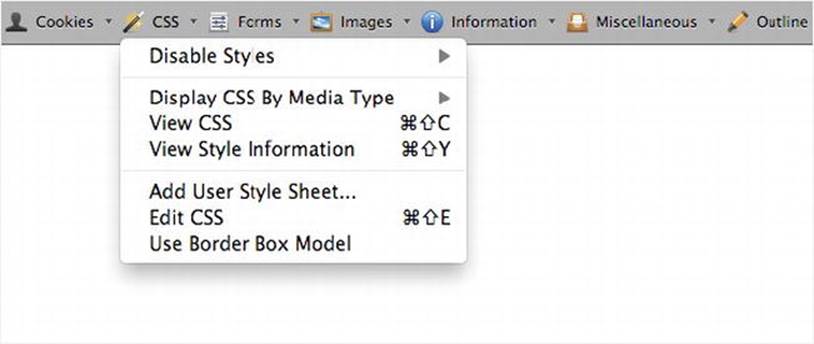
Figure 10-1. The Web Developer Toolbar in Firefox
This was an elegant tool you could use to test pages for the presence of HTML headings, unlabeled form controls, images with missing @alt, and many other very useful accessibility-related things. The last official release of it was for Firefox 4, and there was a Chrome release also. Having said that, the plugin still works in one of my instances of Firefox 9 (that I use), but it might be buggy. I hope that in the future an updated plugin will be released that will work with newer browsers. It is worth mentioning purely because it was so good. For more details, keep an eye onhttp://chrispederick.com/work/web-developer.
WAT-C Web Accessibility Toolbar (Internet Explorer and Opera)
The Web Accessibility Tools Consortium (WAT-C) developed the tool that Jim Thatcher (who developed one of the first screen readers) described as, “The best thing that has happened for accessibility in recent years.” Developed by Steve Faulkner (of TPG) and Jun (of WAT-C), the WAT-C Web Accessibility Toolbar is shown in Figure 10-2.

Figure 10-2. The Web Accessibility Toolbar in Internet Explorer
This is a great tool for both identifying the various components of a webpage and giving you access to alternate views of page content. You can use it to get an overview of the structure (or lack of structure), how well tables are marked up (for example, if they have table headers, suitable captioning, or summary data), and so on. The Web Accessibility Toolbar is available in languages such as English, French, Italian, German, and Chinese. WAT-C is always working on new versions of its tools—a full range of which can be found on the WAT-C web site at www.wat-c.org/tools.
Colour Contrast Analyser
Another excellent tool that I use often is the Colour Contrast Analyser, shown in Figure 10-3.
![]() Note I first came across this tool as a browser plugin for Firefox that was originally developed by Gez Lemon (of TPG, Juicy Studio).
Note I first came across this tool as a browser plugin for Firefox that was originally developed by Gez Lemon (of TPG, Juicy Studio).
I'm on a Mac (most of the time), so I like to use tools native to that platform (although I do a lot of testing on a PC also). I was really glad when Cédric Trévisan (of TPG) developed the Colour Contrast Analyser for Mac, a really nice tool I use to check the foreground and background color of a user interface. It can tell me if these colors might be problematic for vision-impaired people.
The tool checks foreground and background color combinations to determine if they provide good color visibility. It also contains functionality to create simulations of certain visual conditions, such as color blindness.
The idea of color visibility is based on the Contrast Ratio algorithm suggested by the Worldwide Web Consortium (W3C).
![]() Note The contrast ratio is a W3C recommendation to help determine whether or not the contrast between two colors can be read by people with color blindness or other visual impairments.
Note The contrast ratio is a W3C recommendation to help determine whether or not the contrast between two colors can be read by people with color blindness or other visual impairments.
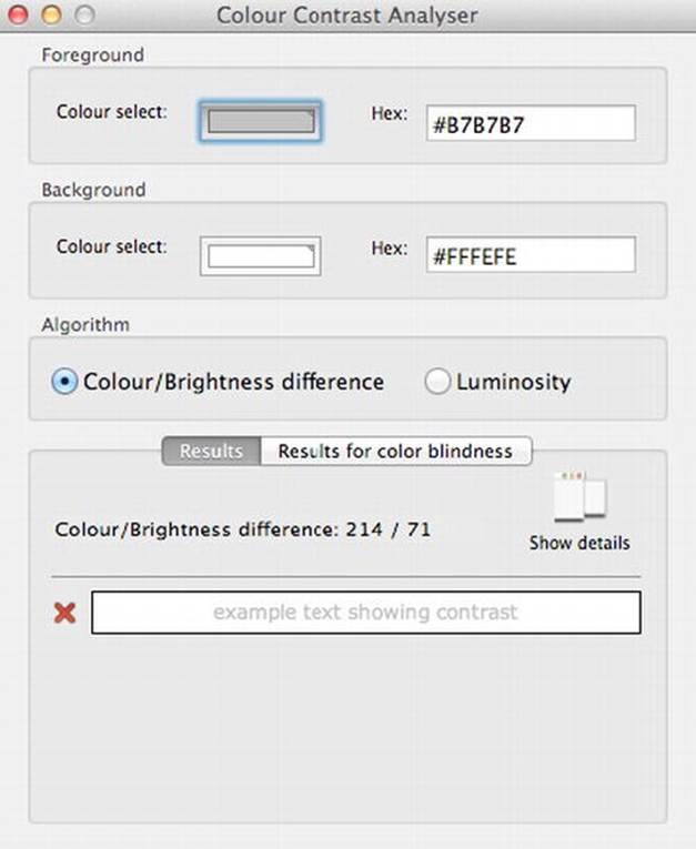
Figure 10-3. The Colour Contrast Analyser (Mac version)
You can use the tool to help determine, in particular, the legibility of text on a webpage and the legibility of image-based representations of text. It is particularly useful when you want to see if your content is compliant with Web Content Accessibility Guidelines (WCAG). For example, the WCAG2.0 Guideline 1.4, which addresses making content distinguishable, states that you should do the following:
“Make it easier for users to see and hear content including separating foreground from background.” 1
Guideline 1.4.3 Contrast (Minimum) states the following:
___________
1 www.w3.org/TR/UNDERSTANDING-WCAG20/visual-audio-contrast.html
The visual presentation of text and images of text has a contrast ratio of at least 4.5:1, except for the following (Level AA):
· Large Text: Large-scale text and images of large-scale text have a contrast ratio of at least 3:1.
· Incidental: Text or images of text that are part of an inactive user interface component, that are pure decoration, that are not visible to anyone, or that are part of a picture that contains significant other visual content, have no contrast requirement.
· Logotypes: Text that is part of a logo or brand name has no minimum contrast requirement.
Guideline 1.4.6: Contrast (Enhanced) states this:
The visual presentation of text and images of text has a contrast ratio of at least 7:1, except for the following: (Level AAA):
· Large Text: Large-scale text and images of large-scale text have a contrast ratio of at least 4.5:1.
· Incidental: Text or images of text that are part of an inactive user interface component, that are pure decoration, that are not visible to Logotypes: Text that is part of a logo or brand name has no minimum contrast requirement.
The Colour Contrast Analyser is really useful to help you test if your color contrast is sufficient to satisfy these two points. It proves a clever way of providing you with instant feedback, as you can see in Figure 10-4.
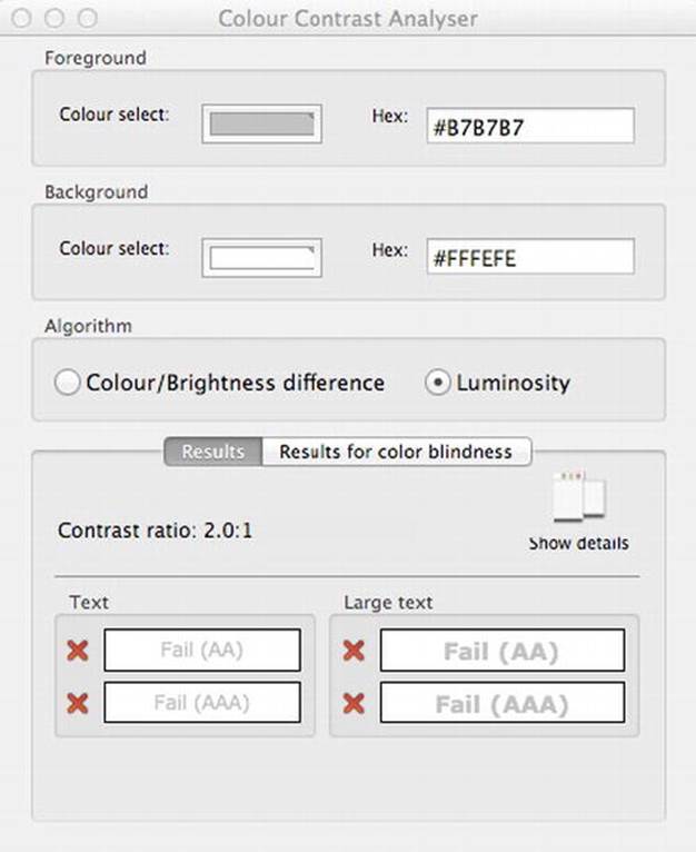
Figure 10-4. Colour Contrast Analyser feedback (Mac version)
WAVE
WAVE is my current favorite tool for checking webpage accessibility and quickly spotting potential problems. It is one that I turn to again and again these days. It is a free accessibility evaluation tool developed by the WebAIM crew (whose work you can explore at the excellentwww.WebAIM.org web site). The WebAIM site itself is a fantastic resource for all things related to accessibility, and it has become a hub for the accessibility community worldwide, including practitioners, experts, and newbies alike. I highly recommend you point your browser in that direction.
So what does WAVE do? The idea is that WAVE is used to aid humans in the web-accessibility evaluation process. Rather than providing a complex technical report, WAVE shows the original webpage with embedded icons and indicators that reveal the accessibility of that page.
There are a few different ways to WAVE a page. You can use the web site and enter a URL, upload a file, or input HTML code directly. Figure 10-5 is a screen shot of the WAVE web site.
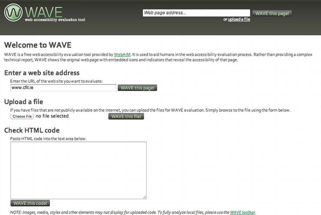
Figure 10-5. The WAVE home page at http://wave.webaim.org
If you have some local files that you want to evaluate for accessibility, you can download and install the WAVE plugin for Firefox, and there is also a Dream Weaver extension. There are other options too, such as adding WAVE into your webpages via links or WAVE buttons. You can create quick links and bookmarks for automatically processing pages in WAVE, or you can implement WAVE in other tools, such as the Google toolbar.
My preference is to use the WAVE tool as a plugin for Firefox. This approach is shown in Figure 10-6.

Figure 10-6. WAVE plugin for Firefox
The great thing about WAVE for me is that I find that it functions in a very elegant way. If you take a web site, such as my own for the NCBI Centre for Inclusive Technology (CFIT), you can see before and after pictures of a WAVE evaluation. Figure 10-7 is the page before WAVE is applied.
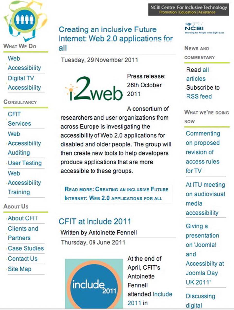
Figure 10-7. The CFIT web site pre-WAVE
Later, by adding the URL to the WAVE tool, you see the result shown in Figure 10-8. This shows how WAVE evaluates the page giving you excellent visual feedback highlighting both errors and aspects of the site that are accessible.
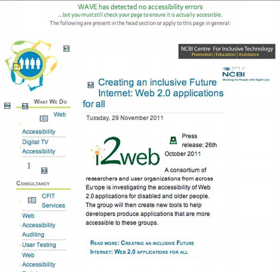
Figure 10-8. The CFIT web site post-WAVE
So my work home page gets a pretty good bill of health. You can see that the tool has added useful icons to indicate where there are headings present on the page, as well as some null @alt text, which I added. The WAVE tool also gives you the option to look at structural outlines of a page in more detail. When the Outline option is activated, the WAVE tool displays the page shown in Figure 10-9.
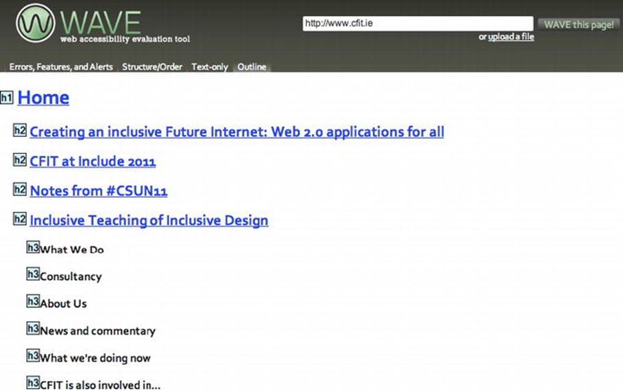
Figure 10-9. The WAVE page outline feature
![]() Note The tool has other options you might find useful, such as being able to explore the Structure/Order option, or see text only. The most common option is to activate errors, features and alerts. This option gives you exactly that, doing just what it says on the tin.
Note The tool has other options you might find useful, such as being able to explore the Structure/Order option, or see text only. The most common option is to activate errors, features and alerts. This option gives you exactly that, doing just what it says on the tin.
How about testing the Errors, Features And Alerts options on a page that might have some accessibility errors? By running the Irishtimes.com web site through the WAVE tool, you get the results shown in Figure 10-10. It's fair to say that the site is actually not too bad from an accessibility perspective, but there is always room for improvement.

Figure 10-10. Using WAVE on the Irishtimes.com home page
You can see that the WAVE tool has detected 15 possible accessibility errors. These are brought to your attention by the really useful little icons that are embedded in the page by the evaluation tool.
![]() Note WAVE also shows you good things about your site! It's the red icons that are possibly problematic.
Note WAVE also shows you good things about your site! It's the red icons that are possibly problematic.
You can see that the search box area on the Irish Times web site needs some attention and might be problematic, so let's explore that a little further. Figure 10-11 shows the error detail that appears when you mouse over an icon.
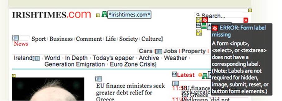
Figure 10-11. Mouse over an error to see more details
By moving your mouse over the icon, you'll get more info about the potential problem. You can see from Figure 10-11 that the search <input> text box is missing a suitable label. The absence of a label makes it harder for screen-reader users to know what the <input> is for. So this is important. This easy way of being able to quickly spot problem areas makes the WAVE tool very usable and effective.
You can find explanations of the icons that WAVE uses by clicking the Icons Key button in the toolbar. Doing so will give you the icon legend shown in Figure 10-12, which outlines the icons used for Errors and Alerts (such as HTML, scripting-related, and media alerts). By clicking this button, you also can see the structural and semantic elements of a site as well as some accessibility features.
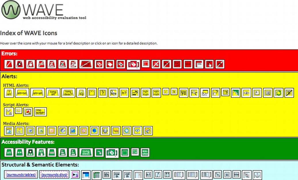
Figure 10-12. The index of WAVE icons
![]() Tip Something that I really like about WAVE is that it quickly implemented support for some WAI-ARIA roles, states, and other items. It's great to be able to also detect these easily using WAVE.
Tip Something that I really like about WAVE is that it quickly implemented support for some WAI-ARIA roles, states, and other items. It's great to be able to also detect these easily using WAVE.
Firebug
Another current jewel in the crown of “really useful tools that you just gotta use” is Firebug. You can see the home page of the company's web site in Figure 10-13.

Figure 10-13. Go to www.getfirebug.com. Now!
This tool really is a game-changer, and I was delighted when I first came across it. It has many useful things to recommend it.
Firebug is a browser plugin that allows you to edit and debug CSS, HTML, and JavaScript live in your webpages. You can view and edit your code within Firebug. You can examine your own code (as well as other people's code) to help you improve what you are building as well as reverse engineer how others do things. Firebug has other nifty features you can use to accelerate your JavaScript runtimes as well as debug JavaScript. You can use it to check HTTP header data and do XMLHttpRequest monitoring. I could just go on saying how great it is, but I won't. Just point your browser at getfirebug.com/ and check it out of yourself.
Tools in the Browser
Note that browsers such as Safari (Figure 10-14) and Opera (Figure 10-15) have built-in DOM and CSS inspection tools. What you use ultimately comes down to your preferences and whatever fits the way you like to work.
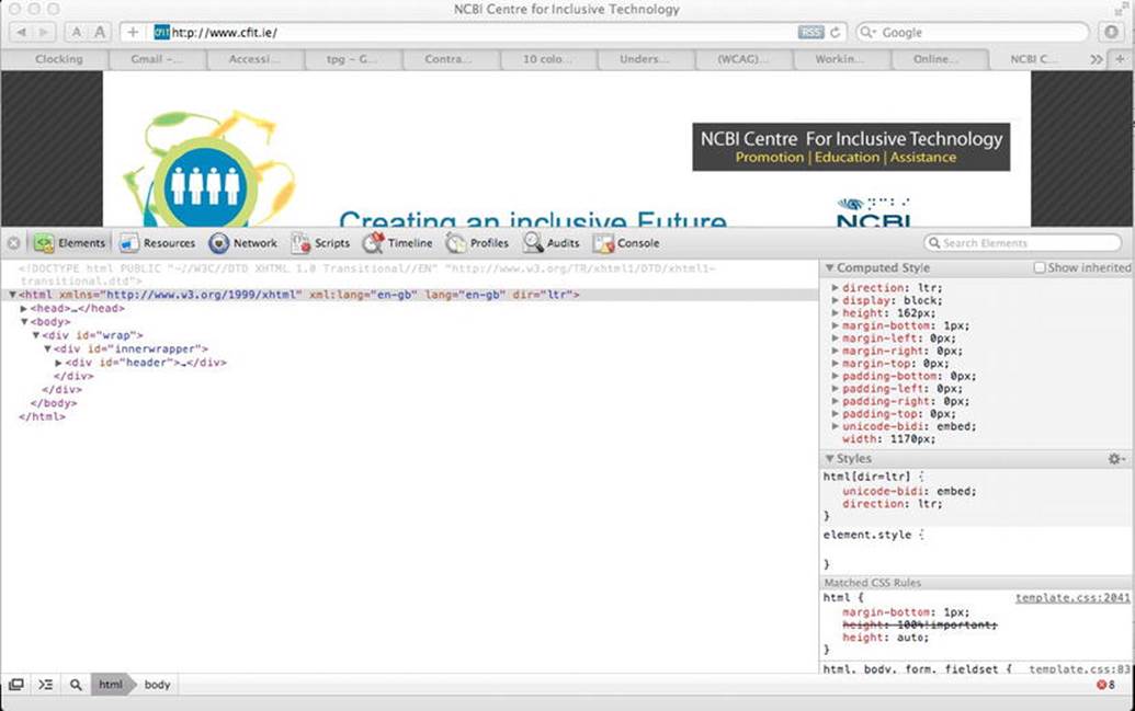
Figure 10-14. Safari Web Inspection Tool
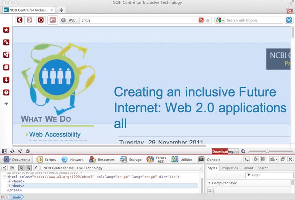
Figure 10-15. Opera Dragonfly
Automated Accessibility Evaluation Tools
There are actually many automated accessibility tools. One of the first tools I used after reading Jeffery Zeldmans' book Designing with Web Standards (New Riders Press, 2009) and Joe Clark's book Building Accessible Websites (New Riders Press, 2002)—which, by the way, are both great reads—were A-Prompt and A-Checker. Both were developed by the Adaptive Technology Resource Center (ATRC) at the University of Toronto.
A fairly comprehensive list of automated accessibility tools, “Complete List of Web Accessibility Evaluation Tools,” is available at www.w3.org/WAI/RC/tools/complete. In reality, these tools are a varied bag, and what you use in your projects really comes down to personal preference.
You might find the output from some of these tools difficult to parse. When I first started to become interested in Web accessibility, the greatest challenge for me was knowing what was a serious error and what was not. Ultimately, I caution you against being overly reliant on or zealous about the output from these tools. An expert evaluation of the site or, ideally, a user test with someone who has a disability might lead you to discover that the issue isn't critical. Having said that, tools like WAVE are winners for me, because they are very intuitive and simple and fit in nicely with my own workflow. You might find that if you are working on very large sites that the enterprise-level solution fits your needs. When you use any of these tools (big or small), I recommend you do so only as part of your total evaluation suite and not take their output as gospel. Ideally, you should use a combination of methods when checking for accessibility and usability, because a skilled accessibility expert will be able to spot false positives and read the nuances of an issue in the way that software just cannot do.
![]() Note Some automated accessibility checkers have lite versions that are free to use and give you the choice of upgrading your subscription for more enterprise-level solutions if you need to.
Note Some automated accessibility checkers have lite versions that are free to use and give you the choice of upgrading your subscription for more enterprise-level solutions if you need to.
Want to Examine Accessibility APIs? Try AccProbe or Inspect32
If you want to get more under-the-hood detail about how a control is exposed to an accessibility API, a couple of useful tools (for Windows) are AccProbe and Inspect32. These tools perform simple but useful tasks, such as exposing an HTML element's properties (such as its name, role, and state).
Inspect32 has been around for some time and focuses on the accessibility-related properties of an HTML component.
Other tools similar to Inspect32 are the newer AccEvent (or “Accessible Event watcher”). AccEvent allows developers to validate that an application's UI elements raise proper Microsoft UI Automation and Microsoft Active Accessibility events when UI changes occur. There are many changes that can happen on a focus change, for example, or when a webpage component has some property or state change.
![]() Note The preceding tools come as part of the Microsoft Windows SDK.
Note The preceding tools come as part of the Microsoft Windows SDK.
AccProbe is a standalone, Eclipse Rich-Client Product (RCP) application that provides a view of the Microsoft Active Accessibility (MSAA) or IAccessible2 hierarchy, exposing the properties of the accessible objects of that application or document. It can also serve as an event monitor for tracking the events fired by these accessible objects.
Developers are meant to combine the functionality of tools like Microsoft Inspect32, AccExplore, and AccEvent into one easy-to-use application for accessibility testing and debugging. See http://accessibility.linuxfoundation.org/a11yweb/util/accprobe/ for more information.
For UIAutomation API testing, you can use UISpy (http://msdn.microsoft.com/en-us/library/ms727247.aspx). UISpy enables developers to explore, view, and interrogate the structure, property values, and so on of their page content. It is useful for checking things like UI Automation event information, whether an element is navigable, and whether it can receive keyboard focus.
![]() Note Michael Squillace of IBM wrote an interesting article from the perspective of blind users' experience of using these tools. His article, “Writing accessible accessibility tools” is available at www-03.ibm.com/able/resources/accessible_tools.html.
Note Michael Squillace of IBM wrote an interesting article from the perspective of blind users' experience of using these tools. His article, “Writing accessible accessibility tools” is available at www-03.ibm.com/able/resources/accessible_tools.html.
Disability Simulation Tools: aDesigner
There are some disability simulation tools you can look into, in particular aDesigner. With these tools, you can get an idea of the accessibility and usability of a webpage for a person who is blind or who has low vision.
![]() Note Get aDesigner at www.eclipse.org/actf/downloads.
Note Get aDesigner at www.eclipse.org/actf/downloads.
I have mixed feelings about these simulation tools because you cannot beat getting feedback directly from real people when you do user testing. However, this just isn't always possible. My view is that simulation tools are the poor second cousin to user testing; however, if these tools have the net effect of helping you to be more aware of the needs of people with disabilities, as well as helping you to identify possible problem areas with your designs, then they have done their job and are worthwhile.
Guerilla User Testing
This is the “Using what ya' got DIY punk rock approach” to user testing we covered in Chapter 9. It's where you literally use the people around you (the more diverse the better in terms of age, level of computer literacy, colleagues with disabilities if they are agreeable, and so on), as well as using any equipment you can beg for or borrow or open source software, to do some quick-and-dirty user testing of your web sites or prototypes. If you can video tape the session with a hand-held camera, that's even better.
Enjoy these informal sessions, and over time you'll find that they can be useful. If you are relaxed while running these tests, your users will pick up on that and also relax and give you good feedback. You'll also find that your ability to quickly come up with a “test script” (that outlines some tasks) and spot possible usability fails will improve. Have fun and don't be shy! People like to get involved and feel they are helping. Don't worry about being scientific or too formal. In my experience, even the best user-testing environment is totally contrived. By acknowledging this, you'll get better results.
Validation
Code validation via the W3C validator (available at http://validator.w3.org and shown in Figure 10-16) is a way of checking that your document conforms to a particular style of grammar. This could be a version of HTML, CSS, XHTML, MathML, and more.
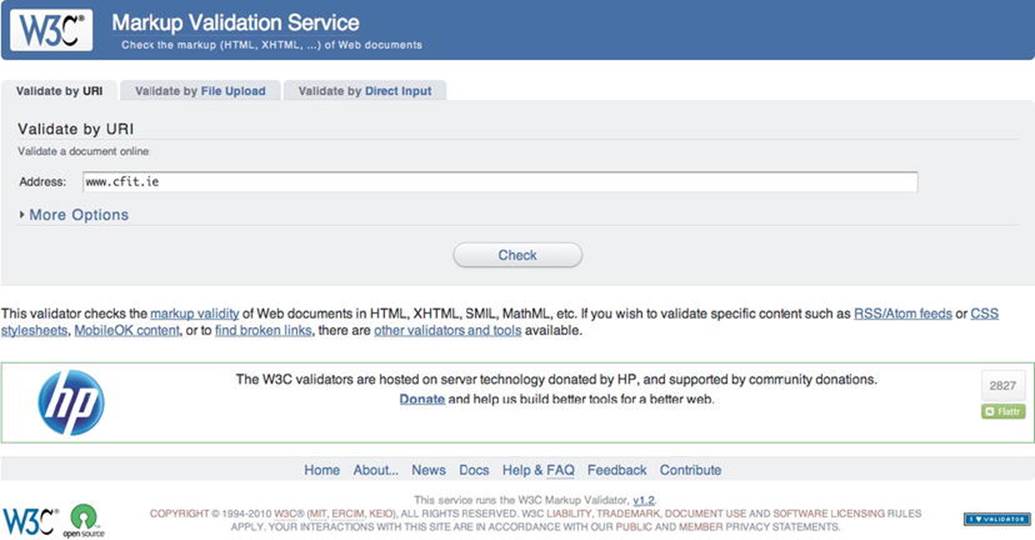
Figure 10-16. The W3C validator
In my early days in the field of accessibility, I loved the validator. This seemed to be a tool that gave you feedback (totally incomprehensible, but feedback nonetheless) you could use to help to make sites more accessible. Also, if you were assessing webpages for accessibility, it was a go-to resource you could use to show your clients errors it threw up that just had to be fixed. Lots of people who knew little about accessibility or, indeed, web development started to turn to it to test how accessible their web sites were. There were complaints if you saw the little red x's (as shown in Figure 10-17) that just had to be fixed ASAP!
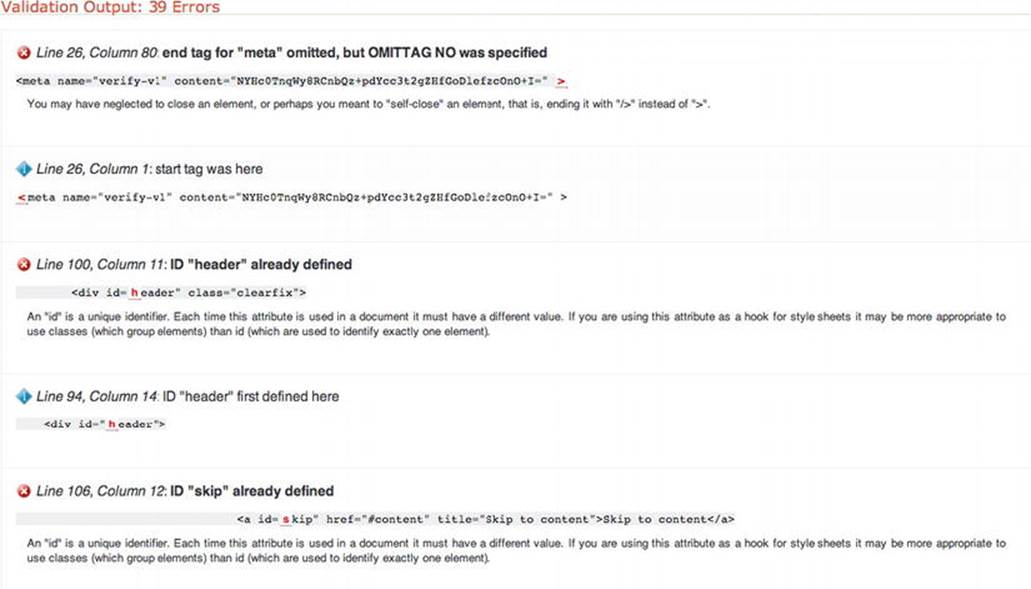
Figure 10-17. Sample validation errors spotted by the W3C validator
But did they really need to be fixed ASAP? Were these errors critical? How could you tell what was a serious problem and what wasn't? The maxim, “A little knowledge is a dangerous thing,” springs to mind. A real lack of awareness about what the validator is (and isn't) caused confusion for everyone. I think it came to be relied on in a way that was almost counterproductive, because the tool made it easy for a person to become a validation zealot. You could hide behind the validator and mask deficiency in your own knowledge of real accessibility issues. The truth is that there just isn't a one-to-one mapping between the validator and accessibility. So while you might like to think validation is equivalent to a11y - it isn't the case. In reality, just because your page passes the validator doesn't mean it is accessible. Not passing the validator also doesn't mean that your page is inaccessible.
The validator checks that your page content conforms to the grammar you defined in the DOCTYPE (DTD). It runs algorithms that check if you have stuck to best practice for that language as defined in its specification. This is certainly very useful, and the validator can help with well-formedness and indicate if a page is more likely to be accessible. However, this likelihood is only a probability and not a certainty. So try to treat the validator as it is intended: as a way of assessing document conformance and not as an accessibility checker.
Cascading Style Sheets
You might have noticed that there isn't a lot of CSS3 covered in this book. This is really by design. There are many excellent books available on the topic and tutorials online that will give you up-to-date tips and techniques on CSS3. This book focused on the semantics that assistive technologies (AT), such as a screen reader, that are provided by HTML5 and WAI-ARIA. CSS doesn't provide any of these and operates in a different layer.
However, using CSS to help make your page content suitable for people with vision impairments by ensuring sufficient color contrast is a great help, as well as using CSS to ensure your text can be resized from the keyboard by using relative font sizes (em or %).
A welcome big leap forward with CSS3 is its more sophisticated typography. Using media queries to resize page content is also neat. However, there are effects I just don't like, such as nausea-inducing CSS transforms where webpages can now fly in and out of your browser, or up and down, for no good reason other than “You can do this now!” Also, CSS offers accordion menus that are so jumpy, dynamic (in a bad way), or clever-clever as to be practically unusable. These all get the thumbs-down from me. Use all this stuff with caution. A little restraint never hurt anybody.
Simulation Exercises
As mentioned in Chapter 1, a good way to experience your web content the way a disabled person might is to turn off all the bells and whistles in your browser. This section provides some simple exercises you can use to get a feel for what accessing a webpage would be like if you couldn't use some of the features as you would normally. They are an attempt to get you to put yourself in another person's shoes by turning off many of the features within the browser that you might just take for granted or use without a second thought.
Simulation Exercise 1:No-Frills Browsing
To kick off the no-frills experience, I suggest that in your browser of choice you turn off the following items:
· Style sheets
· Images
· Sound
· JavaScript
· Java
· Support for Flash/Silverlight
· Pop-up windows
You don't have to do this all at once, but doing so can certainly help you get a feel for the core of your page content and experience what a limited browsing experience can be like for someone with a disability.
Blocking JavaScript/Java and Flash Content with NoScript
A useful plugin for Firefox is NoScript, shown in Figure 10-18. While its main usage or purpose is for increased security, it can be good to use as a part of the no-frills browsing experience. It is easy to install and use. This can be useful as a simulation exercise because you can experience how JavaScript-powered menus or widgets behave if they have been coded in a way that they don't degrade gracefully.

Figure 10-18. NoScript in action
Disabling Pop-ups
Pop-up windows can be rather disorienting for people with cognitive impairments. They can be both confusing and distracting, and therefore make it hard to understand what is going on. They can also be problematic for nonsighted users because a blind user might have to toggle between the pop-up and the main browser window when inputting data. Or there might be a disconnect between where data is entered and the page state. For more advanced computer users, this might not be a significant problem apart from a usability hit, but for a novice user it can be disorienting. A person with low vision might not be aware that the pop-up even exists. They might not see the pop-up. A rule of thumb is that if there are <input> controls and similar that your user needs to log in and perform other such tasks, just include them in the main browser window. It is good practice to try to avoid pop-ups completely, and certainly do avoid spawning many instances or browser windows. This also means you really shouldn't link to external sites in new browser windows/instances if you can at all avoid it. If you must do it, however, you should inform the user that this is going to happen by including the notification “[Opens in new Browser Window]” or similar in your link text.
Working Without Your Mouse
Now I want you to throw away your mouse.
Then browse the Web doing what you usually do, and see how you get on with booking your concert tickets! It can be a good idea to browse a mix of sites you are familiar with (for a new perspective on them) and then follow that with some sites you haven't been to before.
Try it for 30 minutes or so at a time, and you should get a good sense of what the Web can be like for many people with different disabilities who rely on the keyboard, or who can't get at Flash content, or who have JavaScript off (for whatever reason), and so on.
This brief experiment should provide enough food for thought. You'll also find that no-frills browsing is a good way of finding possible problems.
Simulation Exercise 2: Turning Off Your Display and Using a Screen Reader
To really try to simulate and understand what the Web is like for blind screen-reader users, you can try some browsing using a screen reader. If you have no experience using a screen reader, it isn't an easy task and does require a certain determination (on your part) to stick with it. The screen reader is a complex application. Before you even start the software, I recommend that you read up on it (most have quick start guides) and stick with some basic browsing. If you have a Mac. you already have the excellent VoiceOver installed, and I recommend that you spend time using it. It can be equally fun and frustrating, as well as enlightening. If you are using a PC, there are demos of JAWS that can be downloaded from the Freedom Scientific web site, or free options like NVDA that you can try. They all perform variations of a similar theme.
![]() Note The demo option of JAWS runs for 40 minutes, which is a good time for a learning session while you test drive a screen reader.2
Note The demo option of JAWS runs for 40 minutes, which is a good time for a learning session while you test drive a screen reader.2
You should practice as often as possible using your screen reader of choice. If you do need some help, I urge you to contact your local service provider for people with vision impairments. They will be really glad to help. This could also be a great way to get to know people who are blind and understand their browsing strategies.
For your early screen-reader road tests, I recommend some short task-based sessions. For example, focus on an aspect of a site and try to do something like buy concert tickets, as mentioned previously. This will focus your attention on one aspect of the site (such as how accessible the forms are) and give the session some structure. It might also help you feel a little less all over the place as you find your way around the Web using a screen reader.
_____________
2 www.freedomscientific.com/downloads/jaws/jaws-downloads.asp
![]() Note As previously mentioned, screen-reader users have different browsing strategies as well as levels of digital literacy. This is really important to remember. Although testing on your own can be both frustrating and fun, it is no substitute for user testing by people who really are blind and really need to use the screen reader. The psychology is also different if you are sighted—you can just choose to turn on the display or pick up the mouse the moment you become frustrated. Your tests are just a shadow of the real experience, no matter how proficient you become in your testing.
Note As previously mentioned, screen-reader users have different browsing strategies as well as levels of digital literacy. This is really important to remember. Although testing on your own can be both frustrating and fun, it is no substitute for user testing by people who really are blind and really need to use the screen reader. The psychology is also different if you are sighted—you can just choose to turn on the display or pick up the mouse the moment you become frustrated. Your tests are just a shadow of the real experience, no matter how proficient you become in your testing.
Conclusion
This chapter marks the end of the book. I really hope you learned a thing or two. Accessibility is really a continuum—an evolving line and not a mountain top to be conquered. Just do your best, and people will appreciate that. Finally, don't be shy about getting involved with the accessibility community to learn more and share what you do know. There is a vibrant Web community worldwide of good-hearted people who gladly share expertise and knowledge to try to make the Web a better and more inclusive place for everyone.
All materials on the site are licensed Creative Commons Attribution-Sharealike 3.0 Unported CC BY-SA 3.0 & GNU Free Documentation License (GFDL)
If you are the copyright holder of any material contained on our site and intend to remove it, please contact our site administrator for approval.
© 2016-2026 All site design rights belong to S.Y.A.