Custom SharePoint Solutions with HTML and JavaScript: For SharePoint 2013 and SharePoint Online (2015)
5. Using JSLink to Style List Web Parts
Brandon Atkinson1
(1)
VA, US
In SharePoint, you have many different out-of-the-box web parts that you can place on your pages. These offer views into lists, searching, calendars, external data, and more. One of the most popular and widely used of these is the List View Web Part. Creating custom lists and then displaying their content to users via these web parts is quite common. These web parts allow you to quickly and easily expose data to users, and most users are very familiar with them.
The List View Web Part offers a number of different ways to customize the data that is shown. Some of these options include:
· Choosing the columns to display
· Sorting
· Filtering
· Grouping
This is a good amount of functionality that is provided for you out of the box. In a lot of scenarios, these options provide everything you need to customize the data for your needs; however, if you needed something really custom, these options just aren’t enough. Imagine a scenario where the business requirement is to show an image based on the status of an item in the list. Perhaps there is a column with statuses like “On Time” and “Late”. For each status, you need to display a smiley face or a frowny face based on this status. With the out-of-the-box List View Web Part, you would have had to use a rendering technology called XSLT. Now, you can utilize JSLink to perform this kind of data manipulation in the List View Web Part. In this chapter, we’ll explore how JSLink works, as well as what you can accomplish with it.
JSLink and a Simple Example
Prior to SharePoint 2013, if you wanted to perform any type of styling on a List View Web Part you had to use XSLT. XSLT stands for EXtensible Stylesheet Language Transformation and it was used to style and render XML content. Not only is it hard to say, it was even more difficult to work with. You were hard-pressed to find a developer that not only knew how to effectively write XSLT, but who wanted to even touch it. It was difficult to write and hard to understand. A typical XSLT file would look something like the following:
<?xml version="1.0"?>
<xsl:stylesheet version="1.0"
xmlns:xsl=" http://www.w3.org/1999/XSL/Transform ">
<xsl:template match="/">
<html>
<body>
<h2>My CD Collection</h2>
<table border="1">
<tr bgcolor="#9acd32">
<th>Title</th>
<th>Description</th>
</tr>
<xsl:for-each select="catalog/cd">
<tr>
<td><xsl:value-of select="title"/></td>
<td><xsl:value-of select="description"/></td>
</tr>
</xsl:for-each>
</table>
</body>
</html>
</xsl:template>
</xsl:stylesheet>
Microsoft knew the challenges of working with XSLT and needed to provide developers with a better way of developing these types of solutions. JSLink was born from this need and it is a perfect alternative. The beauty of JSLink lies in the fact that it is basically JavaScript! Anyone who is comfortable writing JavaScript can quickly write JSLink code. In addition, JSLink can be combined with other JavaScript files to create very robust solutions.
JSLink is basically a property on the web part that provides a location(s) for JavaScript files. If this property is set with a valid URL to a file, when the web part is rendered, it picks up the file and uses it to render the contents to the browser. Since it’s all JavaScript, all the rendering is handled by the browser, thus taking a load off the SharePoint server, which only has the job of returning data. This provides for easy customizations that do not impact the server performance.
Let’s take a look at a quick example of using JSLink to style a web part. We’ll expand on what we’ve built in the previous chapters by utilizing the Webparts document library and the Demo List. Navigate to the page where you placed the Content Editor Web Part and then delete it, so that you have a clean page. Insert a List View Web Part for the Demo List using the Ribbon, as shown in Figure 5-1.
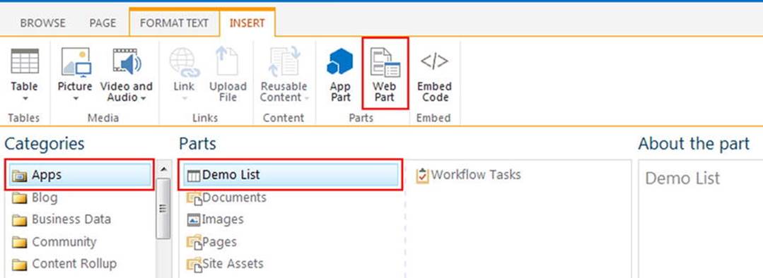
Figure 5-1.
Adding the List View Web Part for the Demo List
If it’s not already highlighted, click the Apps category. The Demo List should be at the top of the list, depending on how many lists you have in your site. Insert the web part onto the page and save it. The resulting view will simply display the list items, as shown in Figure 5-2.
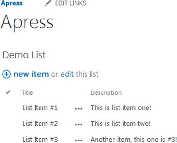
Figure 5-2.
The out-of-the-box List View Web Part for the Demo List
We’ll need to create a folder to hold our scripts for this example. Navigate back to the Webparts document library and create a new folder called JSLink, as shown in Figure 5-3. For this chapter, we’ll place all of our scripts into this folder; however, in a production environment, you would want to follow the Etherson method and have a folder for each web part you are styling using JSLink.
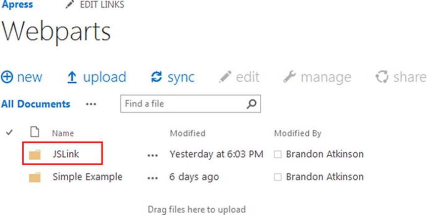
Figure 5-3.
Adding a new folder for JSLink in the Webparts document library
Open Visual Studio and create a new file by going to File ➤ New ➤ File. Choose the Web category and then choose “JavaScript file” from the options. We’ll start with a very basic script that will take each item in the web part and style it. Place the following code into the file:
(function () {
var overrideContext = {};
overrideContext.Templates = {};
overrideContext.Templates.Item = overrideTemplate;
SPClientTemplates.TemplateManager.RegisterTemplateOverrides(overrideContext);
})();
function overrideTemplate(ctx) {
return "<div style='font-size:18px;border:solid 1px Silver;margin-bottom:6px;padding:4px;width:200px;'>"
+ ctx.CurrentItem.Title
+ "</div>";
}
This script is about as streamlined as we can make a JSLink JavaScript file; however, it will provide an excellent introduction to how these scripts function. First, you’ll notice that we declare a function that has no name. This function serves as the entry point for the script and where all the setup takes place. Next, we declare a new variable with the following line:
var overrideContext = {};
This is a simple JavaScript variable that we named overrideContext and set to an empty object using the {} syntax. What’s important to note here is that there is no magic to what this is named. We could call it “myObject” or “SomeCoolNewThing”, or anything for that matter. We’re calling itoverrideContext because we are providing an override of the default styling. Next, we declare another object called Templates with the following line:
overrideContext.Templates = {};
This object is used to hold a reference to all the different templates that we want to override the styling on. For instance, you can add Item to override styling on the entire list item, or Field to override styling on an individual column in the list. We do this with the following line:
overrideContext.Templates.Item = overrideTemplate;
This line indicates that we want to override the Item template with another function, called overrideTemplate. Again, there is nothing magical about the name of this function; it can be anything. Finally, we register the override with the following line:
SPClientTemplates.TemplateManager.RegisterTemplateOverrides(overrideContext);
SPClientTemplates.TemplateManager.RegisterTemplateOverrides is a built-in SharePoint function that will register your code for rendering. You pass in the base object that you created at the beginning. Once the override is registered, the last piece is the function to actually perform the rendering:
function overrideTemplate(ctx) {
return "<div style='font-size:18px;border:solid 1px Silver;margin-bottom:6px;padding:4px;width:200px;'>"
+ ctx.CurrentItem.Title
+ "</div>";
}
This function takes in a single argument named ctx. As with the other items in this script, the name means nothing. ctx is the list context and will be used to render the list items based on what is inside this function. We’ll keep it simple, and for each item in the list we’ll return a DIV element with the list item title in it. We can access the title using ctx.CurrentItem.Title. Since this function will fire for each item in the list, CurrentItem is just that—the current list item in the loop. The DIV has some inline CSS so that the custom rendering really stands out.
Save the file and name it JSLinkDivExample.js, and then upload it to the JSLink folder in the Webparts document library. The complete file in Visual Studio is shown in Figure 5-4.
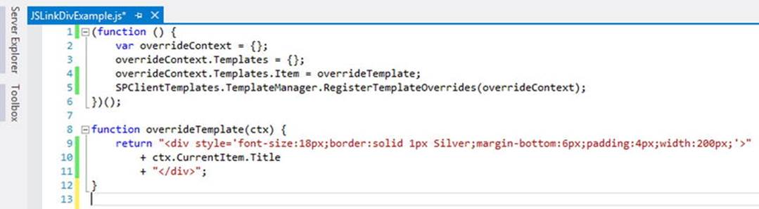
Figure 5-4.
JSLinkDivExample.js file in Visual Studio
Once the file is uploaded, we need to grab the URL of the file. In the previous chapter, we saw how you could right-click the file and choose Copy Link Location from the context menu. You can also obtain the URL by opening the file’s menu and copying it from the text menu in the pop-out, as shown in Figure 5-5.
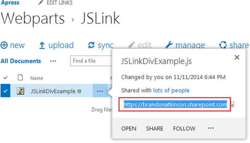
Figure 5-5.
Copying the URL of the JavaScript file from the menu
Navigate back to the page where the List View Web Part was placed. Place the page into edit mode, and then place the List View Web Part into Edit mode as well. In the tool pane of the web part, scroll to the bottom and expand the Miscellaneous accordion panel. At the bottom of this panel, you will find the JSLink property, as shown in Figure 5-6.
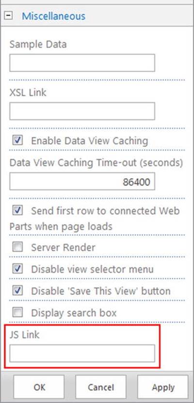
Figure 5-6.
JSLink property in the web part tool pane
When using a URL with the Content Editor Web Part, you can simply paste in the URL and SharePoint will automatically convert it to a relative path URL. Meaning, SharePoint will strip off the domain from the URL and leave only the parts it needs to locate the file. For instance, theJSLinkDivExample.js file path in my environment looks like the following:
https://brandonatkinson.sharepoint.com/apress/Webparts/JSLink/JSLinkDivExample.js
If you paste this into the JSLink property and save the web part, SharePoint will convert the URL to the following:
/apress/Webparts/JSLink/JSLinkDivExample.js
Normally, SharePoint prefers its URLs, due to the fact that SharePoint can be configured to serve up content from multiple domains. By utilizing relative path URLs (those without a domain), SharePoint can easily figure out where content is located, no matter which domain it’s served from. This works great with the Content Editor Web Part, but it will fail when used with JSLink.
Luckily, SharePoint provides an easy way to remedy this by using URL tokens. Tokens provide a way to pass in a placeholder for the parts of the URL that SharePoint wants to remove. The following list shows some of the more common tokens:
· ∼site - The URL of the current site
· ∼sitecollection - The URL of the site collection of the current site
· ∼layouts - The URL of the _layouts/15 folder
Using these tokens, the URL can be updated to the following:
∼sitecollection /apress/Webparts/JSLink/JSLinkDivExample.js
or
∼site/Webparts/JSLink/JSLinkDivExample.js
Either of these new URLs will work because they both point to the same location. Since our Webparts document library is located in the same site as the page where our web part is placed, we can use the shorter of the two. Type this URL into the JSLink property, as shown in Figure 5-7.
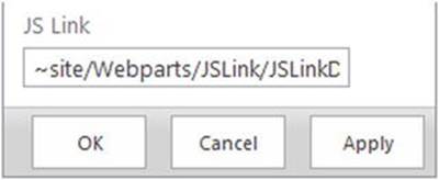
Figure 5-7.
URL to the JavaScript file using the URL token
Click OK and save the page. When the page reloads, the JSLinkDivExample.js file will be loaded and the list items will be rendered based on the overrideTemplate function inside it. The results are shown in Figure 5-8.
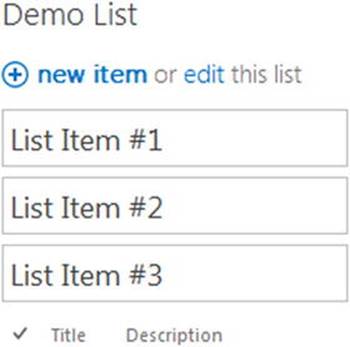
Figure 5-8.
JSLink rendering of the Demo List items
As you can see, each list item was rendered inside a DIV with a border and larger text, as per the inline CSS in the JavaScript file. In our function, the only piece of data that we rendered was the Title property, which is what is shown inside the DIV. This simple example should begin to illustrate the power that JSLink provides for styling the List View Web Part, as well as a way to begin building robust custom solutions.
Working with the Item Template
The prior example was a quick sample of what can be done with JSLink. However, it’s far from a realistic solution and it has some issues. For instance, the sorting links for the Title and Description columns are still present and shown under the list items. Clearly, that is not the way you would want this to appear to end users. In this section, we’ll dig a bit deeper into the Item template and how you can work with it.
When using the Item template, you will usually style all aspects of the List View Web Part. By this I mean that it usually won’t look like a List View anymore. JSLink provides a lot of ways to help you achieve this goal. Let’s start by providing a template for the header and footer of the List View using the following code:
(function () {
var overrideContext = {};
overrideContext.Templates = {};
overrideContext.Templates.Item = overrideTemplate;
overrideContext.Templates.Header = "<h2>Custom Header</h2>";
overrideContext.Templates.Footer = "<h3>Custom Footer</h3>";
SPClientTemplates.TemplateManager.RegisterTemplateOverrides(overrideContext);
})();
This sample is exactly the same as before, only we added two additional lines:
overrideContext.Templates.Header = "<h2>Custom Header</h2>";
overrideContext.Templates.Footer = "<h3>Custom Footer</h3>";
By using these lines we are telling SharePoint that we want to override the default header and footer using the supplied HTML. The HTML is very simple—it just returns some text wrapped inside an H2 and H3 tag. However, the result quickly shows the power of these overrides, as seen in Figure 5-9.
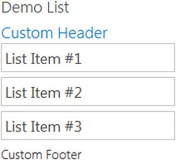
Figure 5-9.
Custom header and footer being rendered on the List View Web Part
You can further extend this by providing a function to return the header and footer, rather than having HTML declared in the same line, like the following:
overrideContext.Templates.Header = overrideHeader;
overrideContext.Templates.Footer = overrideFooter;
The resulting functions would look like the following:
function overrideHeader() {
return "<h2>Custom Header</h2>";
}
function overrideFooter() {
return "<h3>Custom Footer</h3>";
}
Placing this code inside its own function opens the door for increased functionality. You can imagine a scenario where you need to make a web service call to retrieve the data that you want to display in the header. This allows for very robust code to fire off and perform any task that is available to you. You can begin to create very rich user experiences in this manner. The complete code in Visual Studio is shown in Figure 5-10.
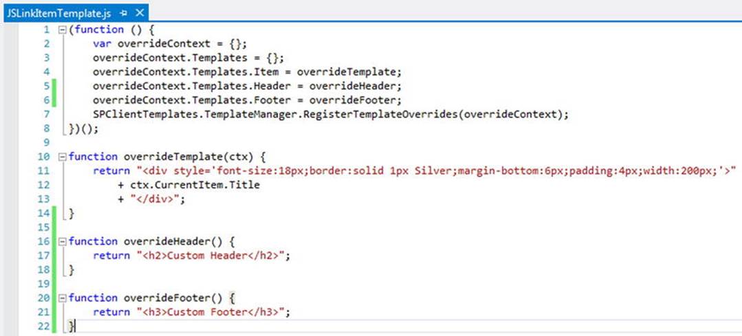
Figure 5-10.
Providing header and footer overrides via JavaScript functions
Save this file under a new name using File ➤ Save As. Call it JSLinkItemTemplate.js. Upload it to the JSLink folder in the Webparts document library. Navigate back to the List View Web Part, place it in Edit mode, and update the JSLink property to the following:
∼site/Webparts/JSLink/JSLinkItemTemplate.js
The web part should be using the new JSLink file. This example is still far from a real-world experience. Let’s update the Demo List with some data that could represent a task list or some other type of list that would have a status. Navigate to the Demo List and access the List Settings from the Ribbon. On the List Settings page, create a new Choice column called Status. Provide the following choices (see Figure 5-11):
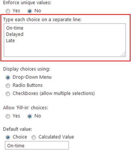
Figure 5-11.
Adding a Choice field to the Demo List called Status
· On-time
· Delayed
· Late
We’ll use this new status column to display an image based on the status that is chosen. However, before we do that, let’s populate the Demo List with some data that would make more sense for a business. Figure 5-12 shows the list with some more appropriate data to work with.
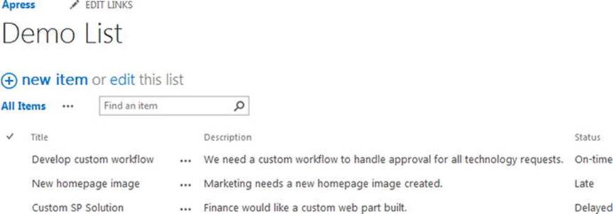
Figure 5-12.
Demo List with more real-world data populated
To make this example a little more realistic, we’ll update our script so that the following requirements will be met:
· When the web part is rendered, each item will display only the title.
· A custom header and footer will be displayed with instructions for the user.
· When the user clicks the item title, the status and description will be displayed underneath.
· The status will be shown as an image.
Let’s begin with the header and footer, since these functions already exist and we only need to update what is returned. The custom code can be updated with the following:
function overrideHeader() {
return "<h3>These items are tasks from the Demo List:</h3>";
}
function overrideFooter() {
return "<h4>Click an item to view it's details.</h4>";
}
We actually haven’t changed the code much at all. We’ve changed the H2/H3 to an H3/H4, respectively, and updated the text that gets returned. We’ll use the customer header as our title in the web part, and the custom footer now provides instructions to the user. Next, we’ll update theoverrideTemplate function; this is where the major changes will be implemented. Take the following code:
function overrideTemplate(ctx) {
var status = ctx.CurrentItem.Status;
var image = "";
if (status == "Delayed")
image = "/apress/Webparts/JSLink/Status-Delayed.png";
if (status == "On-time")
image = "/apress/Webparts/JSLink/Status-Ontime.png";
if (status == "Late")
image = "/apress/Webparts/JSLink/Status-Late.png";
return "<div style='font-size:18px;margin-bottom:6px;padding:4px;cursor:pointer;' class='list-item-div'>"
+ ctx.CurrentItem.Title
+ "<div style='font-size:14px;display:none;'>"
+ "<span style='display:inline-block;'>" + ctx.CurrentItem.Status + "<br /><img src='" + image + "' /></span>"
+ "<span style='display:inline-block;vertical-align:top;'>" + ctx.CurrentItem.Description + "</span>"
+ "</div>"
+ "</div>";
}
The overrideTemplate function has been updated quite a bit. Although it may look like a lot more functionality at first glance, there isn’t a whole lot more going on here. There is additional logic as well as more HTML. Let’s break down each piece individually to better understand what is going on.
var status = ctx.CurrentItem.Status;
var image = "";
These two lines simply declare a couple of variables to be used in the rest of the code. First, we declare a variable called status and assign it the value of the current list item’s Status property. This just simplifies the code and makes it more readable. Next, we declare an empty string called image. This will hold the URL of an image that we want to show based on the status of the item.
if (status == "Delayed")
image = "/apress/Webparts/JSLink/Status-Delayed.png";
if (status == "On-time")
image = "/apress/Webparts/JSLink/Status-Ontime.png";
if (status == "Late")
image = "/apress/Webparts/JSLink/Status-Late.png";
This section is a simple grouping of if statements. We check the value of the status variable, checking it against the known values of the list column. Once a status match has been found, we set the image variable to the appropriate URL for the image we want to show.
Note
The images used in this example can be downloaded from the Apress site. Visit the Apress site and search for this book’s title to locate the image files and source code. For this example, I’ve uploaded the images into the same folder with the JavaScript files for simplicity.
return "<div style='font-size:18px;margin-bottom:6px;padding:4px;cursor:pointer;' class='list-item-div'>"
+ ctx.CurrentItem.Title
+ "<div style='font-size:14px;border-top:solid 1px Silver;display:none;'>"
+ "<span style='display:inline-block;'>" + ctx.CurrentItem.Status + "<br /><img src='" + image + "' /></span>"
+ "<span style='display:inline-block;vertical-align:top;padding-left:16px;'>"
+ "<strong>Description</strong><br />"
+ ctx.CurrentItem.Description + "</span>"
+ "</div>"
+ "</div>"
Finally, we’ve updated the HTML that gets returned so that we can dramatically change the results. First, we create a DIV element with some additional inline CSS, as well as a CSS class list-item-div. This CSS class will be used later when we target the element using jQuery. Next, we display the current list item title, and then create a child DIV element to hold the status and description. This DIV also has some inline CSS that includes display:none;. This will keep the DIV hidden until we want to view it. We continue to create HTML to hold the item status, the status image, and the description, finally closing off all the DIV elements.
At this point, the page would render and you would see the Title for each list item on the page, but the status and description information would be hidden. We need to provide a way to view this information easily. The following function will handle this:
function listItemClick() {
$(".list-item-div").on("click", function () {
var childDiv = $(this).children()[0];
$(childDiv).toggle("slow");
});
}
When we created each child DIV in the previous function, we hid those using CSS and applied a CSS class. The class is there only to provide a means to target it via jQuery. We use the on function that is built into jQuery to attach a click event to each DIV. So by using $(".list-item-div").on("click", function ()..., we are telling jQuery to find all the elements with the list-item-div CSS class and attach an on click event to each one. The function provided is fired when the element is clicked. Inside this function, we ask jQuery to give us the first child element in the DIV. $(this).children()[0] tells jQuery that for the item that was just clicked (“this”), give us the first child object in its “children” collection. Because we crafted our HTML to have a parent DIV with one child DIV, we know that this will return the DIV element that holds the status and description information.
Next, we use a jQuery function called toggle to show the element. The toggle will actually toggle the visibility of the element. So if the element is currently hidden, toggle will show it—and vice versa. By using this function we can easily supply open and close functionality with a single line of code.
Once we have the function used to attach a click event to the DIVs, we need a way to fire it. Simply writing this function and having it in the script will do nothing until it’s called. Normally, we would include a jQuery Document .ready call to ensure that the events are wired up properly using a $(function()... call. In JSLink, however, this does not work and it will produce an error. The reason is that JSLink onload functions will fire before jQuery is loaded. This means that the reliable Document.ready function from jQuery is useless in JSLink. However, SharePoint provides its own built-in function that does the same thing:
_spBodyOnLoadFunctions.push(listItemClick);
The _spBodyOnLoadFunctions allows you to register your own JavaScript functions to fire when the page is loaded. It’s very similar to jQuery’s Document.ready, but it plays nicely with JSLink, so it’s the method we need to use when wiring up jQuery events. The full script in Visual Studio is shown in Figure 5-13.
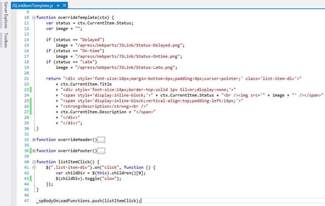
Figure 5-13.
The updated JSLinkItemTemplate.js script in Visual Studio. The custom header and footer functions have been collapsed for readability
Save the updated file and upload it to the JSLink folder in the Webparts library. Before this script will work properly, you need to update some properties on the List View Web Part. When you first place the List View Web Part on the page, the data that gets returned is the bare minimum for the list type. For instance, the Demo List is a custom list, so only the Title and Description are returned by default. This is the same for a Task list; for instance, only the columns that are present at the time of creation get returned when the List View Web Part is added to the page. Of course, you can update this easily. Navigate to the page where the List View Web Part is placed, and place it and the web part into Edit mode. In the tool pane of the web part, the first property is called Selected View. Using the drop-down choose the All Items view, as shown in Figure 5-14.
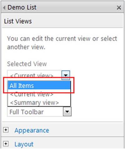
Figure 5-14.
Changing the Selected View on the List View Web Part
Changing this view ensures that the new Status property will be returned and available to our JSLink code. Next, since we are using the custom header in our code to render a title, we’ll remove the Chrome from the web part. Expand the Appearance accordion in the tool pane. At the very bottom of this section, you’ll find the Chrome Type property. From the drop-down choose None, as shown in Figure 5-15.
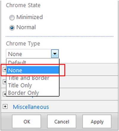
Figure 5-15.
Changing the Chrome Type on the List View Web Part
Click OK and then save the page. The List View Web Part should now display properly using the JSLink file for rendering. The results are shown in Figure 5-16. The custom header and footer are displayed, which provide a web part title as well as instructions to the user on how to use the web part. The Chrome is no longer displayed and each item only displays the item title. Hover over the item and the mouse cursor will change to a pointer, indicating that it can be clicked. Clicking the item causes the jQuery toggle function to fire, opening and closing the item.
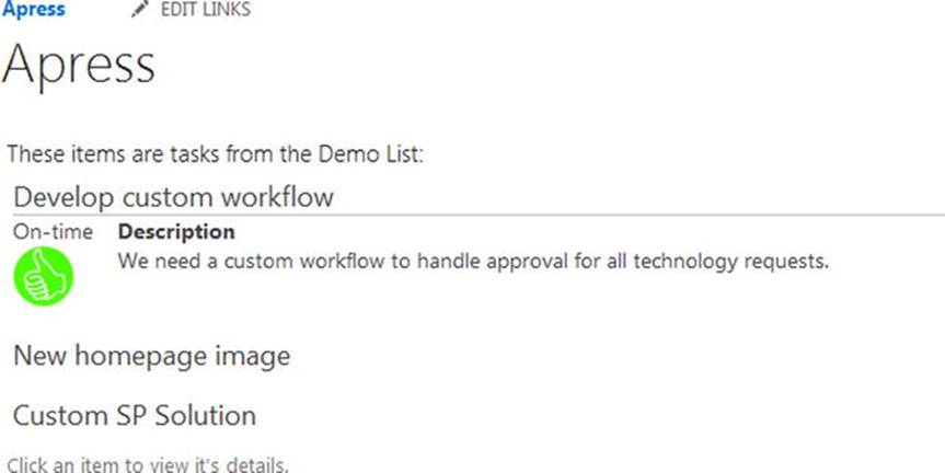
Figure 5-16.
The Demo List items displayed using the JSLink file
As you can see, this is a drastic change from the out-of-the-box List View Web Part you saw earlier. In fact, it looks and acts like what you would expect—a custom web part built to the needs of the business! In the past, this type of solution would have required server-side coding and a custom web part that would have been deployed to the SharePoint server. Now all this is possible in the browser with JavaScript! Next, let’s look at how we can manipulate individual columns rather than all the data at once.
Working with the Field Template
The Field template in JSLink allows you to target specific fields or columns in the list for custom rendering. You can use the Field template when your custom rendering needs are not as complex. You can certainly end up with very complex custom rendering using this template. However, unlike the Item template, where you usually end up with something that looks nothing like a List View Web Part, the Item template is much more targeted. The end result is something that looks like a List View Web Part on steroids.
The code looks very similar to the Item template code. We’ll continue to work with the Status column. For this solution, we’ll inspect the Status column and return the corresponding image, but this time it will be in the List View Web Part as column data. Create a new file in Visual Studio and begin with the following code:
(function () {
var overrideContext = {};
overrideContext.Templates = {};
overrideContext.Templates.Fields =
{
'Status': { 'View': overrideTemplate }
};
SPClientTemplates.TemplateManager.RegisterTemplateOverrides(overrideContext);
})();
This code looks very similar to the Item template code, with a couple major changes. First, we are no longer using a custom header and footer. The reason is that this template will not override the standard functions of the web part. So we still want the regular column headers, sorting, and so forth. Next, we specify that this is a Fields template with the following lines:
overrideContext.Templates.Fields =
{
'Status': { 'View': overrideTemplate }
};
'Status' is telling JSLink that we are targeting the Status field on the list. 'View' specifies which function to fire when the Status column is rendered. So we need to declare the function called overrideTemplate to render the column by using the following code:
function overrideTemplate(ctx) {
var status = ctx.CurrentItem.Status;
var image = "";
if (status == "Delayed")
image = "/apress/Webparts/JSLink/Status-Delayed.png";
if (status == "On-time")
image = "/apress/Webparts/JSLink/Status-Ontime.png";
if (status == "Late")
image = "/apress/Webparts/JSLink/Status-Late.png";
return "<img class='status-image' src='" + image + "' data-val='" + status + "' />";
}
This function is nearly identical to the previous example. We still declare a couple of variables to hold the current item’s Status and the image URL. By using the if statements, we are setting the image URL based on the status, just as before. What’s different is the return, which is an image HTML element. We set the SRC attribute to the image URL we determined from the if statements. We also set a CSS class of status-image and an attribute called data-val that holds the text value of the status. These last two attributes will be used with a jQuery click event. This function simply returns an image for the Status rather than the text of the status.
Next, with the following code we’ll set up the function to attach the click event to each image:
function listItemClick() {
$(".status-image").on("click", function () {
var status = $(this).attr("data-val");
alert(status);
});
}
This function also looks very familiar to the previous example. We set up a jQuery click event using the CSS class “status-image”. Next, we grab the text of the status using $(this).attr("data-val"). jQuery’s “attr” function returns the value of any attribute on an HTML element, so we can easily access this value. Then, we fire a standard alert with the status text in it. Finally, we wire up the function using the _spBodyOnLoadFunctions.push function:
_spBodyOnLoadFunctions.push(listItemClick);
This example is much smaller than the Item template example. This is because the override is targeting only a single field rather than all the columns, as well as the header and footer. The complete code sample in Visual Studio is shown in Figure 5-17.
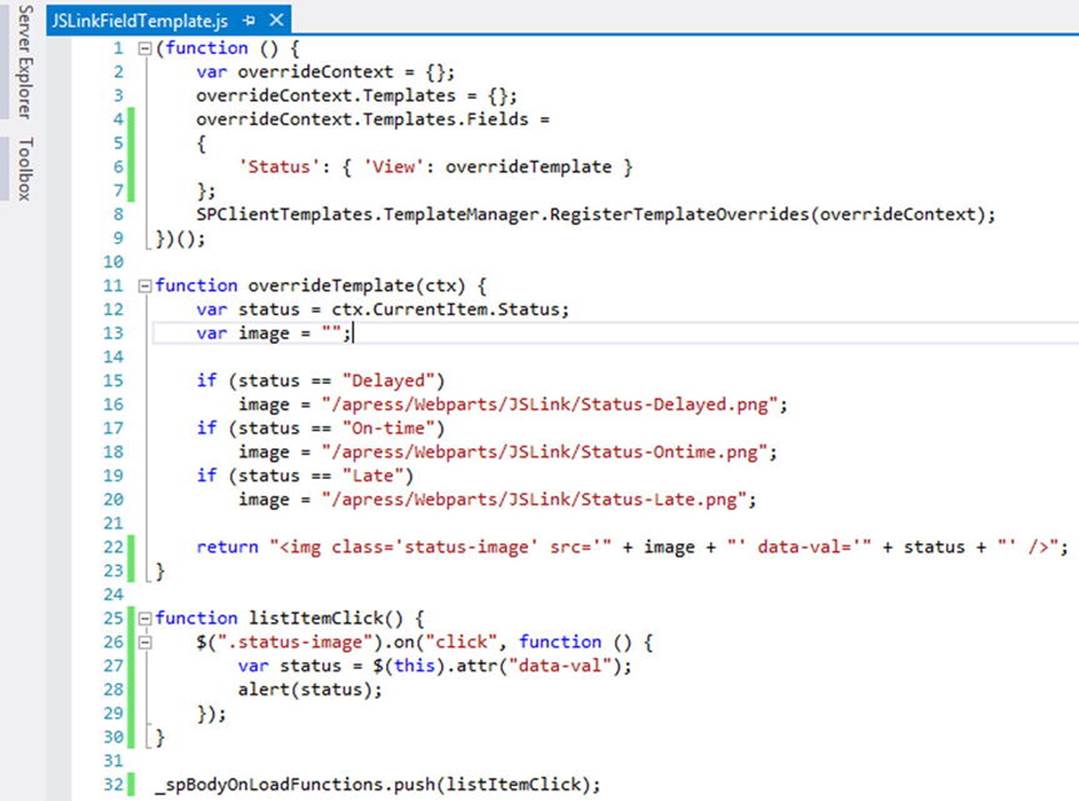
Figure 5-17.
JSLinkFieldTemplate.js file in Visual Studio
Save this file and name it JSLinkFieldTemplate.js. Upload it to the JSLink folder in the Webparts document library where the other JSLink files are located. Navigate back to the List View Web Part, place it in Edit mode, and update the JSLink property to the following:
∼site/Webparts/JSLink/JSLinkFieldTemplate.js
As with the Item template, you may need to set the appropriate View using the Selected View property. You can also set the Chrome type back to Default so that the web part title is displayed again. The new JSLink file rendered in the List View Web Part is shown in Figure 5-18.
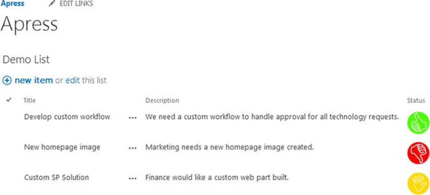
Figure 5-18.
Field template rendering using JSLink
You can also click the image and see the status text in a JavaScript alert, as shown in Figure 5-19.
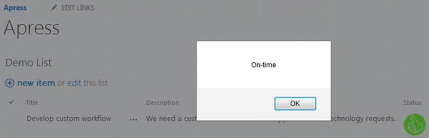
Figure 5-19.
Click event on the status image
You can override multiple fields by supplying multiple override functions. For instance, if we wanted to apply a custom render to the Description field as well, we could update the code to the following:
(function () {
var overrideContext = {};
overrideContext.Templates = {};
overrideContext.Templates.Fields =
{
'Status': { 'View': overrideTemplate },
'Description': { 'View': overrideDescTemplate }
};
SPClientTemplates.TemplateManager.RegisterTemplateOverrides(overrideContext);
})();
function overrideDescTemplate(ctx) {
return "<span style='font-weight:bold;'>" + ctx.CurrentItem.Description + "</span>";
}
The Fields property will accept multiple overrides by simply placing a comma between each one. In this example, we’ve created another function, called overrideDescTemplat e, which simply returns the current item’s Description field wrapped in a SPAN element that provides a bold font. The complete script in Visual Studio is shown in Figure 5-20.
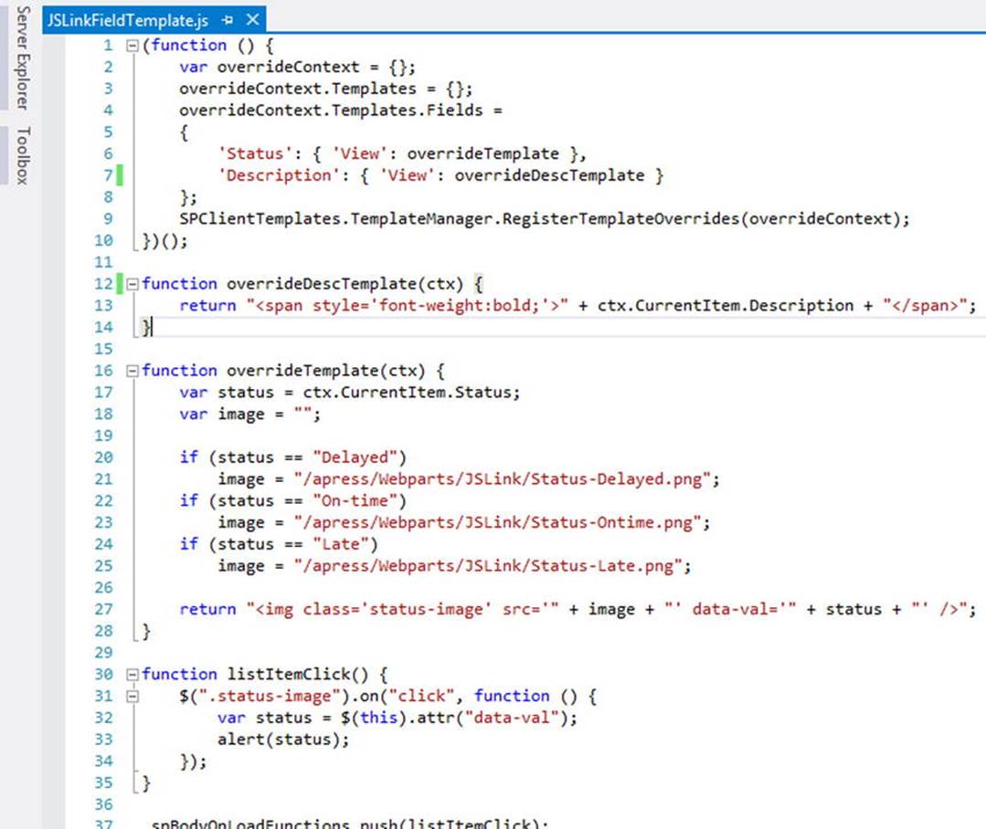
Figure 5-20.
The updated JSLinkFieldTemplate.js file in Visual Studio
Note
Some fields cannot be overridden using JSLink. A Taxonomy field, for instance, does not allow a different rendering. You can imagine the headaches this would cause if you could override the rendering of a field as complex as a managed metadata column. If you try to override any field that does not allow this, it will simply result in SharePoint ignoring your custom rendering function. This is nice because it means your script will not break the page; however, it can be frustrating because nothing seems to happen! If you notice this, take a step back and remember that some fields can’t be overridden.
As you can see in this updated code sample, JSLink provides all the tools needed to override one or more fields. Simply provide a function to handle the rendering and define the override. Save this file and upload it to the document library. Figure 5-21 shows the List View Web Part rendered with the new JSLink file.
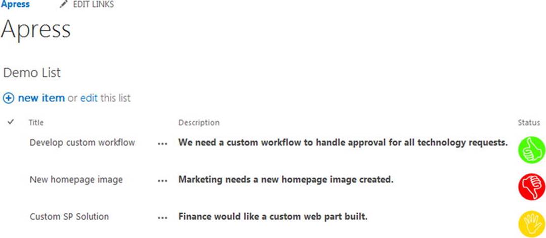
Figure 5-21.
Updated JSLink file rendering multiple fields on the web part
Now you’ve seen multiple examples of using JSLink to render your List View Web Parts. Whether you need to override specific fields or completely change the way that the web part looks, you have all the tools you need to get a custom solution. You can take JSLink even further by loading multiple scripts to help you create robust solutions.
Loading Multiple Scripts
In your development efforts with JSLink, you may find that your file is getting large, or perhaps you have some other scripts that you would like to load as well. Luckily, this is easily done with JSLink. JSLink allows multiple files to be added by simply using a pipe, |, placing it between each file path in the JSLink property. For instance, if we had multiple files in our folder, we could use the following path:
∼site/Webparts/JSLink/File1.js|∼site/Webparts/JSLink/File2.js
The combined paths with the | separator would be placed in the JSLink property of the List View Web Part. We can update the previous code example to illustrate this. First, we’ll go back to a simplified version of the sample with the following code:
(function () {
var overrideContext = {};
overrideContext.Templates = {};
overrideContext.Templates.Fields =
{
'Status': { 'View': overrideTemplate }
};
SPClientTemplates.TemplateManager.RegisterTemplateOverrides(overrideContext);
})();
function overrideTemplate(ctx) {
var status = ctx.CurrentItem.Status;
var image = "";
if (status == "Delayed")
image = "/apress/Webparts/JSLink/Status-Delayed.png";
if (status == "On-time")
image = "/apress/Webparts/JSLink/Status-Ontime.png";
if (status == "Late")
image = "/apress/Webparts/JSLink/Status-Late.png";
return "<img class='status-image' src='" + image + "' data-val='" + status + "' />";
}
This sample is basically back to the first Field code sample where we are only overriding the Status field with an image. The custom jQuery code that rendered an alert has been removed, so we’ll move this to another file. The script in Visual Studio is shown in Figure 5-22.
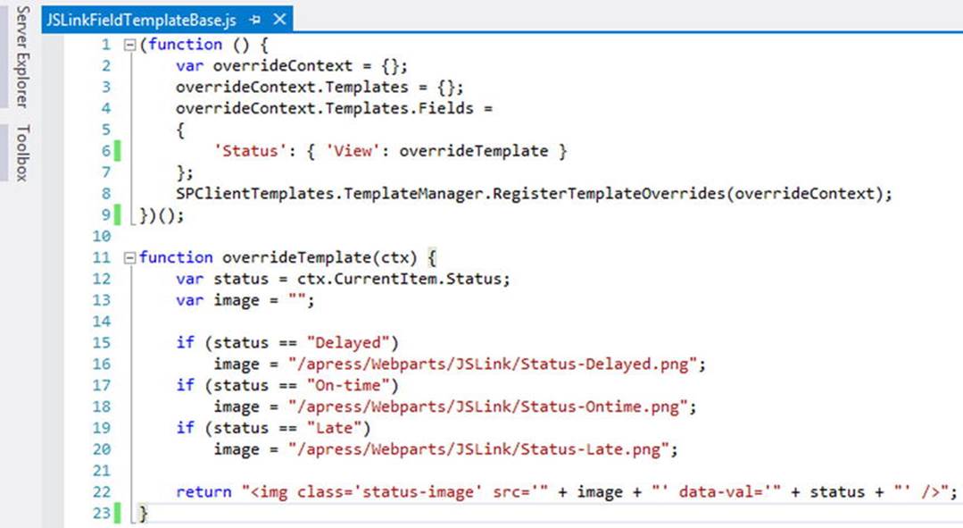
Figure 5-22.
JSLink file that only renders the Status field on the list
Save this file and name it JSLinkFieldTemplateBase.js. Next, we’ll create the companion file to handle the jQuery click event functionality. Create a new file using File ➤New ➤ File. Choose the Web category, and then choose “JavaScript file” from the options. We’ll use the code from the previous section, which added the click event to the DIV using jQuery with the following:
function listItemClick() {
$(".status-image").on("click", function () {
var status = $(this).attr("data-val");
alert("STATUS: " + status);
});
}
_spBodyOnLoadFunctions.push(listItemClick);
This is the same code as before, with the addition of the text “STATUS:” in the alert. This is mainly to show that we are using a new file and that JSLink is loading both files. Save this file and name it JSLinkFieldTemplateExt.js. The script in Visual Studio is shown in Figure 5-23.
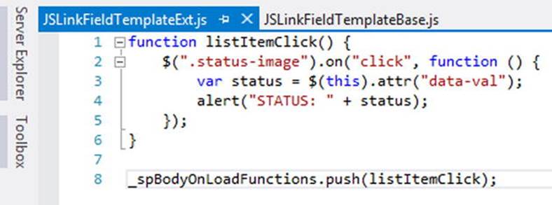
Figure 5-23.
JSLinkFieldTemplateExt.js file in Visual Studio
Now that both files have been created, upload these to the JSLink folder in the Webparts document library. Once the files are uploaded, you can craft the combined paths, and it should look like the following:
∼site/Webparts/JSLink/JSLinkFieldTemplateBase.js|∼site/Webparts/JSLink/ JSLinkFieldTemplateExt.js
Place the List View Web Part into Edit mode and update the JSLink property with the combined path. Click Apply and then save the page. At first glance, the custom rendering has not changed much. Click a status image to trigger the click event, as shown in Figure 5-24.
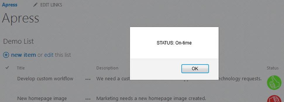
Figure 5-24.
Updated click event from the second JavaScript file
In the alert, you can see the status with the additional “STATUS:” text displayed. This is confirmation that the two JavaScript files have been loaded via JSLink. Although this is a very simple example, it should illustrate the power of loading multiple files. As your scripts get larger and larger, you now have the flexibility to split your code into multiple files and reference them all via JSLink.
Summary
In this chapter, we explored the power of JSLink as a way to build custom solutions in SharePoint. We saw how you can use this method to override the default rendering of the List View Web Part. You can use either the “Item” template to completely customize the overall rendering, or use the “Fields” template to override single or multiple fields in the list. We also saw how to break up your code into multiple files. Hopefully, this chapter demonstrated what is possible with JSLink. In the next chapter, we’ll continue to look at new functionality in SharePoint using display templates and result sources to create custom search solutions.
© Brandon Atkinson 2015
Brandon AtkinsonCustom SharePoint Solutions with HTML and JavaScript10.1007/978-1-4842-0544-0_6
All materials on the site are licensed Creative Commons Attribution-Sharealike 3.0 Unported CC BY-SA 3.0 & GNU Free Documentation License (GFDL)
If you are the copyright holder of any material contained on our site and intend to remove it, please contact our site administrator for approval.
© 2016-2026 All site design rights belong to S.Y.A.