Creating a Website: The Missing Manual (2015)
.
Part 1. Building Basic Web Pages
Chapter 3. Building a Style Sheet
Last chapter, you learned HTML’s dirty little secret: It doesn’t have much formatting muscle. As a result, if you want your web pages to look sharp, you need to add style sheets into the page-creation mix.
A style sheet is simply a document filled with formatting rules. Browsers read these rules and apply them when they display web pages. For example, a style sheet rule might say, “Make all the headings on this site bold and fuchsia, and draw a box around each one.”
You want to put formatting instructions in a style sheet instead of embedding them in a web page for several reasons. The most obvious is reusability. Thanks to style sheets, for example, you can create a single rule to, say, format all level-3 headings a certain way. When you apply this rule to your site, it changes the appearance of every level-3 heading on every web page.
The second reason is that style sheets help you write tidy, readable, and manageable HTML files. Because style sheets handle all your site’s formatting, your HTML document doesn’t need to do that work. All it needs to do is organize your pages into logical sections.
Finally, style sheets give you more extensive formatting choices than HTML does. Using style sheets, you can control colors, borders, margins, alignment, and fonts. These formatting features are either out of reach in HTML, or they require some seriously messy markup.
In this chapter, you’ll learn how style sheets work, and how to attach one to a web page. Once you have these basics under control, you’ll study the finer details of CSS, including how to get the colors, alignment, fonts, and borders you want in your pages.
The trick to using color is finding the code that indicates the exact shade of electric blue you love. You can go about this several ways. First, you can use a plain English name (“lime”), as you’ve seen in the examples so far. This system limits you to a relatively small set of 140 colors, including the original standards: aqua, black, blue, fuchsia, gray, green, lime, maroon, navy, olive, purple, red, silver, teal, white, and yellow). For the full list, see www.cssportal.com/css3-color-names.
NOTE
A set of 140 colors might seem like a lot, but it’s actually pretty limited. For example, in typical design work you might start with two or three basic colors, and then flesh out a whole color palette with similar colors that have slightly different shades or intensities. (The color-picking tools on Finding the Right Color can help with this job.) But if you’re stuck with a grab-bag of 140 colors, you won’t have the variety you need.
Today’s computers can display millions of colors. And even though CSS doesn’t name these colors, you can add them to your web pages using two different color-specifying options: hexadecimal color values and RGB (or red-green-blue) values.
Hexadecimal Color Values
With hexadecimal color values, you use a strange-looking code that starts with a number sign (#). Technically, hexadecimal color values use three numbers to represent the amounts of red, green, and blue that go into creating a color. (You can create any color by combining various amounts of these three primary colors.) However, the hexadecimal color value combines these three ingredients into an arcane code that’s perfectly understandable to computers but utterly baroque to normal people.
You’ll find hexadecimal color notation kicking around the Web a lot, because it’s the original format for specifying colors under HTML. However, it’s about as intuitive as reading the 0s and 1s that power your computer.
Here’s an example:
body {
background-color: #E0E0E0
}
Even a computer nerd can’t tell that #E0E0E0 applies a light-gray background. To figure out the code for your favorite color, check out the section Finding the Right Color below.
RGB Color Values
The other approach to specifying color is RGB values. According to this more logical approach, you simply specify how much red, green, and blue you want to “mix in” to create your final color. Each component takes a number from 0 to 255. For example, a color composed of red, green, and blue, each set to 255, appears white; on the other hand, all those values set to 0 generates black.
Here’s an example of a nice lime color:
body {
background-color: rgb(177,255,20)
}
Finding the Right Color
Style sheets can handle absolutely any color you can imagine. But how do you find the color code for the perfect shade of sunset orange (or dead salmon) you need?
Sadly, there’s no way this black-and-white book can show you your choices. But there are a lot of excellent color-picking programs online. For example, try www.colorpicker.com, where all you need to do is drag your mouse around a color gradient to preview the color you want (and to see its hexadecimal code). Or try www.colorschemer.com/online.html, which groups complementary colors together, which is especially helpful for creating websites that look professionally designed. Some web design tools, like Dreamweaver, make life even easier with built-in color-picking (Working with a Set of Files).
NOTE
The RGB system lets you pick any of 16.7 million colors, which means that no color-picking website will show you every single possible RGB color code (if they do, make sure you don’t hit the Print button; even with 10 colors per line, you’d wind up with thousands of pages). Instead, most sites limit you to a representative sampling of colors. This works, because many colors are so similar they’re nearly impossible to distinguish.
The RGB color standard is also alive and well in many computer programs. For example, if you see a color you love in a professional graphics program like Photoshop (or even in a not-so-professional graphics program like Windows Paint), odds are there’s a way to get the red, green, and blue values for that color. This gives you a great way to match the text in your web page with a color in a picture. Now that’s a trick that will please even the strictest interior designer.
DESIGN TIME: MAKING COLOR LOOK GOOD
Nothing beats black text on a white background for creating crisp, clean, easy-to-read web pages with real presence. This black-and-white combination also works best for pages that have a lot of colorful pictures. It’s no accident that almost every top website, from news sites (www.cnn.com) to search engines (www.google.com) to ecommerce shops (www.amazon.com) and auction houses (www.ebay.com), use the winning combination of black on white.
But what if you’re just too colorful a person to leave your web page in plain black and white? The best advice is to follow the golden rule of color: Use restraint. Unless you’re creating a sixties revival site or a Led Zeppelin tribute page, you don’t want your pages to run wild with color. Here are some ways to inject a splash of color without letting it take over your web page:
§ Go monochrome. That means use black, white, and one other dark color. Use the new color to emphasize an important design element, like subheadings in an article. For example, the Time magazine website uses its trademark red for some links and text.
§ Use lightly shaded backgrounds. Sometimes, a faint wash of color in the background is all you need to perk up a site. For example, a gentle tan or gold can suggest elegance or sophistication (see the Harvard library site at http://lib.harvard.edu). Or light pinks and yellows can get shoppers ready to buy sleepwear and other feminine accouterments at Victoria’s Secret (www.victoriassecret.com).
§ Use color in a box. Web designers frequently use shaded boxes to highlight important areas of a web page (check out the Wikipedia page at http://en.wikipedia.org). You’ll learn how to create boxes later in this chapter.
§ Be careful about using white text. White text on a black or dark blue background can be striking—and strikingly hard to read. The rule of thumb is to avoid it unless you’re trying to make your website seem futuristic, alternative, or gloomy. (Even if you do fall into one of these categories, you might get a stronger effect with a white background and a few well-chosen graphics with splashy electric colors.)
Text Alignment and Spacing
At first, text alignment may seem like a boring subject. You can be forgiven for thinking that the way lines and paragraphs meet the borders of a page is a microscopically small detail. But the truth is that the flow of text shapes the feeling of your pages—and sets the first impression for new visitors. For example, crisp, crowded text might suggest a news magazine or a professional journal. By comparison, text with room to breathe may feel more casual, relaxed, or modern. Either way, choosing your text alignment and spacing is one of the ways that you establish the personality of your site.
CSS includes a great many properties that let you control how text appears on a web page. If you’ve ever wondered how to indent paragraphs, space out lines, or center a title, these are the tools you need.
Table 3-2 details your alignment options.
Table 3-2. Alignment and spacing properties.
|
PROPERTY |
DESCRIPTION |
COMMON VALUES |
CAN BE INHERITED? |
|
text-align |
Lines up text on one or both edges of a page. |
left, right, center, justify |
Yes |
|
text-indent |
Indents the first line of text (typically in a paragraph). |
A pixel value (indicating the amount to indent) or a percentage of the width of the containing element. |
Yes |
|
margin |
Sets the spacing around the outside of a block element (The 10 Most Important Elements (and a Few More)). To change the margin on just one edge, use the similar properties margin-bottom, margin-left,margin-right, and margin-top. |
A pixel value or a percentage indicating the amount of space to add around the element. |
No |
|
padding |
Sets the spacing around the inside of a block element. Has the same effect as margin, unless you have an element with a border or a background color. |
A pixel value or a percentage indicating the amount of space to add around the element. |
No |
|
wordspacing |
Sets the space between words. |
A pixel value or a percentage. |
Yes |
|
letterspacing |
Sets the space between letters. |
A pixel value or a percentage. |
Yes |
|
line-height |
Sets the vertical space between lines. |
A pixel value or a percentage. You can also use a multiple (for example, use 2 for double spacing). |
Yes |
|
white-space |
Tells the browser how to deal with spaces in your text. |
normal, pre, nowrap |
Yes |
For example, if you want to create a page with indented paragraphs (like those in a novel or a newspaper), use this style sheet rule:
p {
text-indent: 20px
}
In the following sections, you’ll see examples that use the alignment and margin properties.
Alignment
Ordinarily, all the text on a web page lines up on the left side of the browser window. Using the text-align property, you can center that text, line it up on the right edge of the page, or justify it (that is, line it up along both edges). Figure 3-6 shows your options.
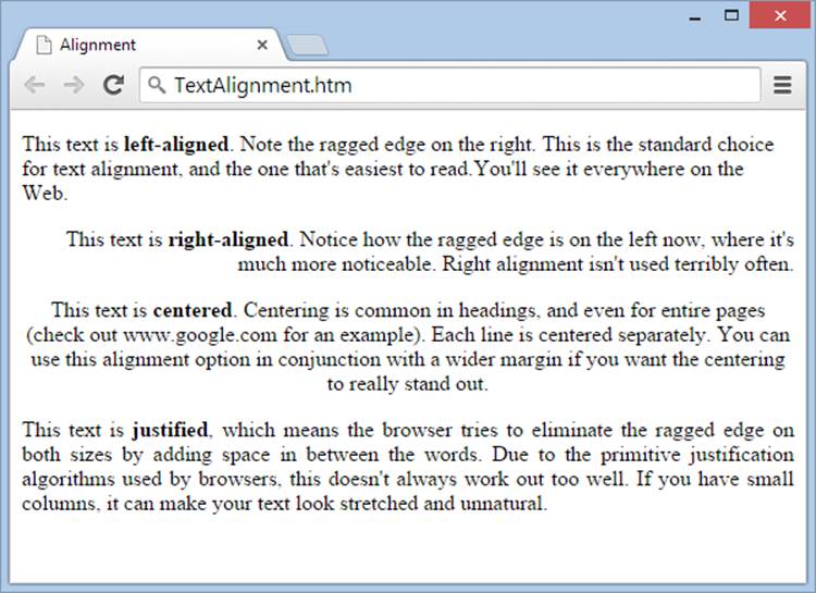
Figure 3-6. This page shows common types of text alignment.
The most interesting alignment choice is full justification, which formats text so that it appears flush with both the left and right margins of a page, like the text in this book. You specify full justification with the justify setting. Originally, printers preferred full justification because it crams more words onto each page, reducing a book’s page count and, therefore, its printing cost. These days, it’s a way of life. Many people feel that text with full justification looks neater and cleaner than text with a ragged edge, even though tests show plain, unjustified text is easier to read.
Justification doesn’t work as well in the web world as it does in print. A key problem is a lack of rules that split long words into syllables, hyphenates them, and extends them over two lines. Browsers use a relatively simplistic method to justify text. Essentially, they add words to a line one at a time, until no more words can fit, at which point they add extra spacing between the words to pad the line to its full length. By comparison, the best page layout systems for print analyze an entire paragraph and find the justification strategy that best satisfies every line. In problematic cases, a skilled typesetter may need to step in and adjust line breaks manually. Compared to this approach, web browsers are irredeemably primitive, as you can see in Figure 3-7.
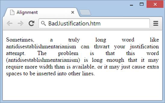
Figure 3-7. If you decide to use full justification on a web page, make sure you use fairly wide paragraphs. Otherwise, you’ll quickly wind up with gaps and rivers of white space. Few websites use justification.
NOTE
Right now, all the text flows through the middle of your page. Later, in Chapter 8, you’ll learn to divide your content into multiple columns and use styles to create more complex layouts.
Spacing
To adjust the spacing around any element, use the margin property. For example, here’s a rule that adds 8 pixels of space to all sides of a paragraph:
p {
margin: 8px;
}
This particular rule doesn’t have much effect, because web browsers already apply 8 pixels of margin around block elements on all sides to ensure a basic bit of breathing space. If you want to create dense pages of information, however, you might find this space allowance a bit too generous. Therefore, many website developers look for ways to slim down the margins a bit.
One common technique is to close the gap between headings and the text that follows them. Here’s an example that puts this tightening into action using inline styles:
<h2 style="margin-bottom: 0px">This heading has no bottom margin</h2>
<p style="margin-top: 0px">This paragraph has no top margin.</p>
You’ll notice that this style rule uses the more targeted margin-top and margin-bottom properties to home in on just one edge at a time. You can use margin-left and margin-right to set side margins. Figure 3-8 compares some different margin choices.
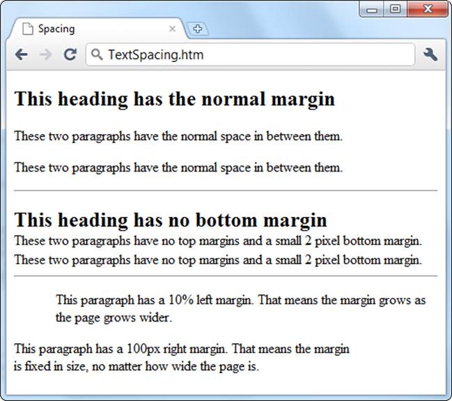
Figure 3-8. When you change the spacing between page elements like headers and paragraphs, consider both the element above and the element below. For example, if you stack two paragraphs on top of each other, two factors come into play—the bottom margin of the top paragraph and the top margin of the bottom paragraph. Browsers use the larger of these two values. That means there’s no point in shrinking the top margin of the bottom element unless you also shrink the bottom margin of the top element. On the other hand, if you want more space, you need to increase the margin of only one of the two elements.
Many CSS properties support a shorthand syntax that can compress several properties into one setting. For example, instead of setting your four margin properties separately (margin-top, margin-bottom, margin-left, and margin-right), you can set them at once with a rule like this:
p {
margin: 5px 10px 15px 20px;
}
This sets the top margin to 5 pixels, the right margin to 10 pixels, the bottom margin to 15 pixels, and the left margin to 20 pixels. The key is to make sure you separate each number by a space—don’t add commas or extra semicolons.
If you’re daring, you can even use negative margins. Taken to its extreme, this can cause two elements to overlap. However, a better approach for overlapping elements is absolute positioning, a style treatment you’ll pick up on Fixed Boxes.
NOTE
Unlike most other CSS properties, elements never inherit margin settings. That means that if you change the margins of one element, other elements inside that element aren’t affected.
White Space
As you learned in earlier chapters, HTML has a quirky way of dealing with spaces. If you put several blank spaces in a row, HTML treats the first one as a true space character but ignores the others. That makes it easy for you to write clear HTML markup, because you can add spaces wherever you like without worrying about it affecting your web page.
In the previous chapter, you learned two ways to change how browsers deal with spaces: the character entity and the <pre> element. You can replace both of these workarounds with the white-space style sheet property.
First, consider the character entity. It serves two purposes—it lets you insert spaces that a browser won’t ignore, and it prevents a browser from wrapping a line in the middle of a company name or some other important term. Here’s an example of the latter technique:
<p>You can trust the discretion of
Hush Hush Private Plumbers</p>
This works (the page displays the text “Hush Hush Private Plumbers” and doesn’t wrap the company name to a second line), but it makes the markup hard to read. Here’s the style-sheet equivalent with the white-space property set to nowrap:
<p>You can trust the discretion of
<span style="white-space: nowrap">Hush Hush Private Plumbers</span></p>
To make this work, your HTML needs to wrap the company name in a container that applies the formatting. The <span> element (Divisions and Spans) is a good choice, because it doesn’t apply any formatting except where you explicitly add it.
Now consider the <pre> element, which tells a browser to pay attention to every space in the content inside it. On Quotes, you saw how you could use <pre> to apply the correct spacing to an e. e. cummings poem. You can get the same effect by setting the white-space property of an element (say, a <div>, <span>, or <p> element) to pre:
<p style="white-space: pre">Your browser won't ignore these
s p a c e s .</p>
When you use the pre value for the white-space property, the browser displays all spaces, tabs, and hard returns (the line breaks you create when you press the Enter key). But unlike the <pre> element, the pre value of the white-space property doesn’t change the text font. If you want to use a fixed-width font like Courier to space your letters and spaces proportionally, you need to add a font-family property (see the next section).
Basic Fonts
So far, your pages have been limited to the standard but somewhat old-fashioned Times font. Most sites use a different typeface, and many use more than one—for example, they might use one font for headings and another for the rest of their text.
Using the CSS font properties, you can choose a font family, font weight (its boldness setting), and font size (see Table 3-3). Be prepared, however, for a bit of web-style uncertainty, as this is one case where life isn’t as easy as it seems.
Table 3-3. Font properties.
|
PROPERTY |
DESCRIPTION |
COMMON VALUES |
CAN BE INHERITED? |
|
font-family |
A list of font names. The browser scans through the list until it finds a font that’s on your visitor’s computer. If it doesn’t find a supported font, it uses the standard font the browser always uses. |
A font name (like Verdana, Times, or Arial) or a generic font-family name: serif, sans-serif, monospace. |
Yes |
|
font-size |
Sets the size of the font. |
A specific size, or one of these values: xx-small, x-small, small, medium, large, x-large, xx-large, smaller,larger. |
Yes |
|
font-weight |
Sets the weight of the font (how bold it appears). |
normal, bold, bolder, lighter |
Yes |
|
font-style |
Lets you apply italic formatting. |
normal, italic |
Yes |
|
font-variant |
Lets you apply small caps, which turns lowercase letters into smaller capitals (like this). |
normal, small-caps |
Yes |
|
text-decoration |
Applies a few miscellaneous text changes, like underlining and strikeout. Technically speaking, these aren’t part of the font (the browser adds these). |
none, underline, overline, line-through |
Yes |
|
text-transform |
Transforms text so that it’s in all capital or all lowercase letters. |
none, uppercase, lowercase |
Yes |
Finding the Right Font
Although most CSS font properties are straightforward, the font-family property has a nasty surprise—it doesn’t work the way you probably expect. The problem you face is that no two computers have the same set of fonts installed, so the fonts you want to use for your web page won’t necessarily exist on your visitors’ machines. And if your visitor doesn’t have a font you specify, his browser simply ignores your font-family setting and goes back to using ordinary Times text.
You can solve this problem in two ways:
§ Use a standard, web-safe font. These are guaranteed to work on almost every computer and web-connected device there is. The tradeoff is that you’re limited to a very small collection of typefaces.
§ Use a downloadable font (also known as a web font). This is a newer option that was standardized with CSS3, though most browsers already supported it. It’s a bit more complicated to set up (and you need to use a font that explicitly lets you share it with your guests). The great advantage is that you’ll have thousands of distinctive typefaces to choose from.
In this chapter, you’ll start with the easiest and least-risky approach, web-safe fonts. Then you’ll delve into web typefaces using Google Fonts.
So what are the standard fonts that a web page can use? Unfortunately, web experts aren’t always in consensus. If you want to be conservative, you won’t go wrong with any of these fonts:
§ Times
§ Arial
§ Helvetica
§ Courier
Of course, all of them are insanely boring. If you want to take more risk, you can use one of the following fonts, found on almost all Windows and Mac computers (but not necessarily on other PCs running other operating systems, like Unix):
§ Verdana
§ Georgia
§ Tahoma
§ Comic Sans MS
§ Arial Black
§ Impact
As you’ll see in the following section, you can create a whole list of font preferences, so if one font (like Georgia) isn’t available, the visitor’s browser goes to the next choice in the list (like Times). This gives you an ironclad safeguard, and it’s the approach most websites use.
To compare these fonts, see Figure 3-9.
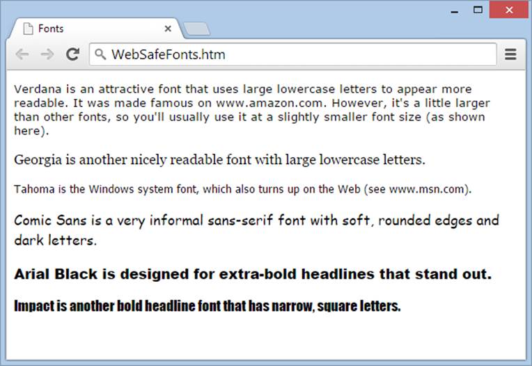
Figure 3-9. Have you spotted these fonts at large on the Web?
Verdana, Georgia, and Tahoma can all help give your web pages a more up-to-date look. However, the characters in Verdana and Tahoma start off a bit large, so you usually need to ratchet them down a notch using the font-size property (Font Sizes).
For a good discussion of fonts, the platforms that reliably support them, and the pros and cons of each font family (some fonts look nice onscreen, for example, but lousy when you print them out) see http://tinyurl.com/cr9oyx and http://tinyurl.com/325f9qs.
Specifying a Font
You use the font-family property to assign a font. Here’s an example that changes the font of an entire page:
body {
font-family: Arial;
}
Arial is a sans-serif font found on just about every modern computer, including those running Windows, Mac OS, Unix, and Linux operating systems. (See Figure 3-10 for more about the difference between serif and sans-serif fonts.)
NOTE
When you set the font of the <body> element, it affects your whole page. That’s because every other HTML element on the page is inside the <body> element, and so those other elements inherit the font-family setting from the <body> element (as described on The Cascade). Of course, you can change the font of a specific element by creating an additional style sheet rule that targets its font-family property.
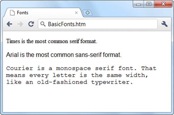
Figure 3-10. Serif fonts use adornments, or serifs, that make them easier to read in print. For example, if you look closely at the letter “T” that’s at the beginning of the first line in this web page, you’ll see tiny curlicues on the top-left, top-right, and bottom corners. On the other hand, sans-serif fonts have a spare, streamlined look. They can make pages seem less bookish, less formal, more modern, and colder. Examples include the Arial font that appears in the second line of this web page, and the font that’s used in the paragraph you’re reading right now.
The font you specify with font-family is just a recommendation. If a computer doesn’t have the font you request, the browser reverts to its standard font (Times). So instead of specifying a single font and blindly hoping that it’s available to a browser, you should create a list of font preferences for your pages. That way, a browser tries to match your first choice and, if it fails, your second choice, and so on. At the end of this list, you should specify a generic font-family name. Every computer supports three generic fonts, named serif, sans-serif, andmonospace.
Here’s the modified style rule:
body {
font-family: Arial, sans-serif;
}
At this point, you might be tempted to get a little creative by adding support for a less common sans-serif font. Here’s an example:
body {
font-family: Eras, Arial, sans-serif;
}
If Eras is relatively similar to Arial, this technique might not be a problem. But if the fonts are significantly different, it’s a bad idea.
The first problem is that by using a nonstandard font, you’re creating a page whose appearance may vary dramatically depending on the fonts installed on your visitor’s computer. Whenever pages vary, it becomes more difficult to tweak them to perfection because you don’t know exactly how they’ll appear elsewhere. Different fonts take up different amounts of space, and if text grows or shrinks, the layout of other elements (like pictures) changes, too. And if you’re really unlucky, a visitor’s computer might have a font with the same name that looks completely different. Worst-case scenario: your lovingly crafted content turns into illegible text.
NOTE
To avoid this problem, stick to the standard fonts, or—if you really must have fancier lettering—use the web fonts discussed on Web Fonts with Google.
Lastly, if a font name has spaces or special characters, it’s a good idea to wrap the whole thing in apostrophes or quotation marks so the browser reads the font name as a cohesive whole, rather than trying to interpret the spaces as something else. That means you should write:
body {
font-family: "Comic Sans MS";
}
rather than:
body {
font-family: Comic Sans MS;
}
Most browsers won’t care, but this practice helps avoid potential problems.
Font Sizes
Once you sort out the thorny issue of choosing a font, you need to choose an appropriate font size. Here’s where things get messy. Although the font-size property seems straightforward, you can set it using a dizzying range of units of measure, and these units don’t behave the same when you use them in a densely nested page of elements. Some older browsers don’t support the newer units, and even seasoned web designers can trip over the finer points.
In the following sections, you’ll consider the simplest, most straightforward ways to size your text. You’ll use three approaches that work on every browser and are almost impossible to mess up.
Keyword Sizing
The simplest way to specify the size of your text is to use one of the size values listed in Table 3-3 (Basic Fonts). For example, to create a really big heading and ridiculously small text, you can use these two rules:
body {
font-size: xx-small;
}
h1 {
font-size: xx-large;
}
These size keywords are often called absolute sizes, because they create text that’s a precise size. Exactly what size, you ask? Well, that’s where it gets a bit complicated. The basic rule of thumb is that the font size medium corresponds to a browser’s standard text size, which is 12 points, and what it uses if a website doesn’t specify a text size. Every time you go up a level, you add about 20 percent in size. (For math geeks, that means that every time you go down a level, you lose about 17 percent.)
The standard font size for most browsers is 12 points (although text at this size typically appears smaller on Macs than on Windows PCs). That means large text measures approximately 15 points, x-large text is 18 points, and xx-large text is 27 points.
Figure 3-11 shows the basic sizes you can choose from.
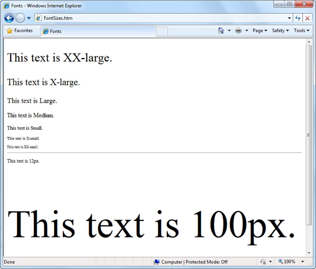
Figure 3-11. HTML offers seven standard text sizes, ranging from xx-large to xx-small. You can dictate font size by specifying a pixel measurement, too (see page 102).
NOTE
When using size keywords, make sure your web page includes a doctype (Understanding HTML Documents). If it doesn’t, Internet Explorer renders your page in the dreaded “quirks” mode, which makes your text one size larger than it should be. As a result, your page won’t look the same in Internet Explorer as it does in other browsers, like Firefox.
Relative Sizing
Another approach for setting font size is to use one of two relative size values—larger or smaller. This takes the current text size of an element and bumps it up or down a bit.
The easiest way to understand how this works is to consider the following style sheet, which has two rules:
body {
font-size: xx-small;
}
b {
font-size: larger;
}
The first rule applies an absolute xx-small size to the whole page. If your page includes a boldfaced element (<b>), the text inside that <b> element inherits the xx-small size, and then the second style rule steps the text up one notch, to x-small.
Now consider what happens if you edit the <body> style in the example above to use a larger font, like this:
body {
font-size: x-small;
}
b {
font-size: larger;
}
Now all bold text will be one level up from x-small, which is small.
Relative sizes are a little trickier to get used to than absolute sizes. You might use them to write more flexible style rules. For example, you could use a relative size for bold text to make sure bold text is always a little bit bigger than the text around it. If you were to use an absolute size instead, the bold text would still appear larger than the small-sized paragraph text, but it wouldn’t stand out in a large-sized heading.
TIP
When you use absolute or relative sizes, you create flexible pages. If a visitor ratchets up the text using his browser’s preferences, the browser resizes all your other fonts proportionately.
Pixel Sizing
For precise control over the size of your text, specify it using a pixel size. Pixel sizes can range wildly, with 12 or 14 pixels being about normal for body text. To specify a pixel size, use a number immediately followed by the letters px, as shown here:
body {
font-size: 11px;
}
h1 {
font-size: 24px;
}
NOTE
Don’t put a space between the number and the letters “px.” If you do, your rule may work in Internet Explorer, but it will thoroughly confuse other browsers.
As always, you need to test, refine, and retest your font choice to get the sizes right. Some fonts look bigger than others, so you should specify smaller sizes for them. Other fonts work well at larger sizes but become less legible as you scale them down.
NOTE
In the not-so-distant past, specifying a type size in pixels was discouraged. It caused problems with mobile browsers (the ones that run on smartphones and tablets), by locking the text in at a vanishingly small size. They also made it impossible (in some web browsers) for visually impaired people to scale up web pages and make the text larger and easier to read. But today, most of these problems have been solved. Modern mobile browsers deal with pixel sizes painlessly, and every web browser offers a zooming feature that magnifies the entire page, including pixel-sized text.
Web Fonts with Google
For most of the Web’s history, page designers had to live with the limited capabilities of the font-family property. They learned to get the most out of the small set of standard fonts. But then CSS3 introduced a feature called @font-face, which provides a way for browsers to download the fonts for a web page on the fly (placing them in its temporary cache of pages and pictures). As a result, designers can use virtually any computer typeface.
At first glance, @font-face seems like the perfect solution to the font-family woes web designers face. Unfortunately, there are two significant challenges:
§ Font formats. For each typeface you want to use, you need to have a normal, italic, and bold variation (so you can use bold and italic styling wherever you want). Then you need to have each of these variations in several formats, because different browsers require different formats. In the end, you need to juggle more than a dozen font files on your website, along with some fairly complex style sheet rules.
§ Font licensing. Many fonts require a licensing fee. Even if you learn how to take a font from your computer and convert it into the right web font formats, you can’t just slap it on your website without breaking a few dozen copyright laws. Instead, you’re better off looking for a free (or cheap) web-optimized font.
You can solve both of these problems on your own, the do-it-yourself way. If that’s the approach you want to take, start with the detailed Six Revisions article at http://tinyurl.com/font-face-guide, or try the comprehensive tutorial in HTML5: The Missing Manual (O’Reilly). Both of these resources explain how to use the @font-face style rule on your own. But if you don’t have an appetite for unnecessary extra challenges, there’s an easier alternative: the Google Fonts service.
Google Fonts hosts free fonts that anyone can use. Their beauty lies in the fact that guests don’t need to worry about font formats, because Google Fonts detects the kind of browser they use and automatically sends them the right font file. You don’t even need to write the complex @font-face style rule, because Google provides the proper HTML, which you copy and paste into your style sheet.
To use a Google font in your pages, follow these steps:
1. Go to www.google.com/fonts.
Google displays a long list of available fonts (Figure 3-12).
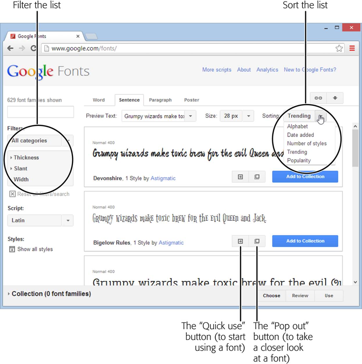
Figure 3-12. Google Fonts offers a relentlessly expanding selection of typefaces. When you look for a font, you probably want to tweak the font list’s sorting and filtering options (circled). For example, you can sort alphabetically or put the most popular fonts first, and you can pare the results to just serif, sans-serif, or handwritten (cursive) fonts.
2. At the top of the page, click a tab title (Word, Sentence, or Paragraph) to choose how you preview fonts.
For example, if you’re hunting for a font to use in a heading, you’ll probably choose Word or Sentence to take a closeup look at a single word or line of text. But if you’re looking for a font to use in your body text, you’ll probably choose Paragraph to study a whole paragraph of text at once. No matter what option you choose, you can type in your own preview text and set an exact font size for it.
3. Set your search options.
If you have a specific font in mind, type its name into the search box. Otherwise, you’ll need to scroll down, and that could take ages. To help you get what you want more quickly, start by setting a sort order (to list fonts by, for example, popularity, name, or date added) and perhaps some filtering options (to see serif fonts only, for example). Figure 3-12 shows you where to find these options.
4. When you see a font you like, click the “Pop out” button (it looks like nested squares).
Google opens an informative window that describes the font and shows each of its characters.
5. If you like the font, click the “Quick-use” button to get the information you need to use it.
Google gives you two bits of information. The first is the style sheet link, which you must add to your web page (so a browser knows where to find the font). The second is an example of a style sheet rule that uses the font.
6. Add the Google Fonts link to your page.
For example, if you picked the Metrophobic font, Google wants you to place the following link in the <head> section of your page:
<link href="http://fonts.googleapis.com/css?family=Metrophobic"
rel="stylesheet">
NOTE
Remember to put the link for the Google font style sheet before your other style sheet links. That way, your other style sheets can use the Google font.
7. Use the font, by name, wherever you want.
For example, here’s how you could apply the newly registered Metrophobic font to the resume.htm example you formatted in the tutorial earlier in this chapter (Tutorial: Attaching a Style Sheet to a Page):
body {
font-family: 'Metrophobic', arial, serif;
}
Figure 3-13 shows a revamped version of the resumé page with the Metrophobic font.

Figure 3-13. The Metrophobic font gives Lee Park’s resumé a different, unique personality. Best of all, Google has hundreds more fonts you can use. And there’s no limit to how many web fonts you can put in a page, so why not use one for headings and another for body text?
NOTE
Before continuing on, take the time to give Google web fonts a spin. Pick a font (any font that catches your fancy—it doesn’t need to be Metrophobic) and alter the resume.htm file to use it. If you run into any trouble, double-check your work against the resume_WebFont.htm and resume_WebFont.css files, which provide a working solution and are found in the sample content on the companion site at http://prosetech.com/web.
POWER USERS’ CLINIC: CREATING A FONT COLLECTION
These steps show you the fastest way to get the markup you need for a font. But if you have a bunch of fonts you like, you may want to create a font collection.
A font collection lets you tap all your favorite fonts using just a single line of HTML in your pages. To create one, start by clicking the “Add to Collection” button next to a font you like. As you add fonts to your collection, each one appears in the fat blue footer at the bottom of the page.
When you finish picking your fonts, click the Use button in the footer. Google displays a page that looks like the “Quick-use” page, except that it gives you a single style-sheet reference that lets you use any of the fonts in your custom-picked collection.
Once you create a font collection, you might want to use two buttons at the top right of the Google Fonts page. Click the Bookmark button (which looks like a link in a chain) to create a browser bookmark that takes you to your collection so you can review and tweak it, and click the Download button (which looks like a down-pointing arrow) to save copies of the fonts to your computer, so you can install them and use them for print work.
Borders
The last group of style sheet properties you’ll learn about in this chapter lets you add borders to your page (Figure 3-14). Borders are a great way to separate small pieces or entire blocks of content. You can add borders on one side of an element or all around it. You’ll use borders throughout this book to separate content and delineate headings, columns, footers, and the other ingredients on your page (such as ads, pictures, or menu panels).
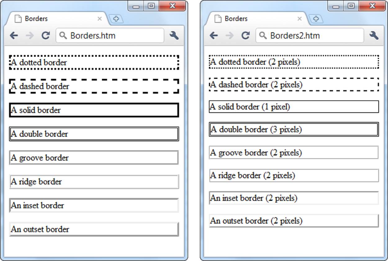
Figure 3-14. Left: The basic border styles look a bit old-fashioned in today’s sleek websites. Right: Shrink these borders down to 1 or 2 pixels, and they blend in much better.
Table 3-4 lists the three key border properties.
Table 3-4. Border properties.
|
PROPERTY |
DESCRIPTION |
COMMON VALUES |
CAN BE INHERITED? |
|
border-width |
Sets the thickness of the border line. Usually, you want to pare this down. |
A pixel width. |
No |
|
border-style |
Browsers offer eight built-in styles for borders. |
none, dotted, dashed, solid, double, groove, ridge, inset, outset |
No |
|
border-color |
The color of the border. |
A color name, hexadecimal color code, or RGB value (see Specifying a Color). |
No |
Basic Borders
The first choice you make when you create a border is the style you want it to have. You can use a dashed or dotted line, a groove or a ridge, or just a normal thin hairline (which often looks best). Here’s a style rule that creates a dashed border:
.noteBox {
border-style: dashed;
}
You don’t want to apply the border to all <p> elements, because that would make for one cluttered page. Instead, use a class rule. To try these border settings, remember to apply the noteBox class to an element somewhere in your page, like this paragraph:
<p class="noteBox">There is a border around this text.</p>
The standard border width is almost always too clunky. To make a border look respectable, reduce the width to 1 or 2 pixels, depending on the border style:
.noteBox {
border-style: dashed;
border-width: 2px;
}
You can also use properties like border-top-style and border-left-width to set different styles, widths, and colors for every side of your element. Using many properties at once can occasionally create an odd effect, but you usually don’t need to get this detailed. Instead, check out the border optimization tips in the next section.
Making Better Borders
In Figure 3-14, the actual borders look fine, but they’re too close to the text inside. To remedy that, and to make your borders stand out, consider using the border property in conjunction with three other properties:
§ background-color (Colors) applies a background hue to your element. Used in conjunction with a border, it makes your element look like a floating box, much like a sidebar in a magazine.
§ margin (Spacing) lets you set the spacing between your border box and the rest of your page. Increase the margin so that your boxes aren’t crowded up against the rest of the page’s content or the sides of a browser window.
§ padding works like the margin property, but it sets spacing inside your element, between the edges of the box and the actual content within it. Increase the padding so that there’s a good amount of space between a border and the text in the box. Figure 3-15 shows the difference between margin and padding.
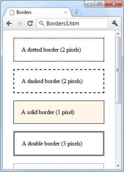
Figure 3-15. Usually, you can’t tell the difference between margins and padding, because you can’t see the edges of the element. For example, a <p> element displays a paragraph in an invisible box, but you won’t see its sides. When you add a border, this changes. To get a good-looking box, you need to increase both the margin and the padding. For added effect, throw in a light background color (like the solid border box shown here).
Here’s an example of a paragraph that looks like a shaded box:
.noteBox {
background-color: #FDF5E6;
margin: 20px;
padding: 20px;
border-style: solid;
border-width: 1px;
}
The third box in Figure 3-15 shows how this combination of margin, padding, and background-color properties changes an ordinary paragraph into a shaded box.
Rounded Corners
In this book, we focus on style sheet properties that work everywhere, even in your granddad’s browser. But every once in a while you can sneak in a newer setting because older browsers simply ignore style sheet properties they don’t understand.
For example, consider the border-radius property, which rounds the corners of bordered boxes. Officially, it’s a part of the relatively new CSS3 standard. If you’re set up with Chrome, Firefox, or Safari, your browser almost certainly supports border-radius, because these browsers update themselves frequently and automatically. But if you come across a computer that’s languishing in the past with Internet Explorer 8 (for example, a corporate computer saddled with this ancient but still-popular Windows XP operating system), it won’t understand border-radius. The person using this computer will see ordinary square corners, which may not be as attractive but certainly won’t hamper the overall visual effect or usability of your site.
When using the border radius property, you supply a size (usually in units of pixels). Technically, this is the length of the radius of the circle used to draw the rounded edge. However, you don’t see the entire circle—just enough to connect the vertical and horizontal sides of the box. Set a bigger border-radius value, and you’ll get a bigger curve and a more gently rounded corner. Finding the right size usually requires a bit of trial and error.
.noteBox {
background: yellow;
border-radius: 25px;
}
You can also round each of the four corners differently, by supplying four distinct values:
.noteBox {
background: yellow;
border-radius: 25px 50px 25px 85px;
}
But that’s not all—you can also stretch the circle into an ellipse, creating a curve that stretches longer in one direction. To do this, you need to target each corner separately (using properties like border-top-left-radius) and then supply two numbers: one for the horizontal radius, the other for the vertical radius:
.noteBox {
background: yellow;
border-top-left-radius: 150px 30px;
border-top-right-radius: 150px 30px;
}
Figure 3-16 shows some examples.
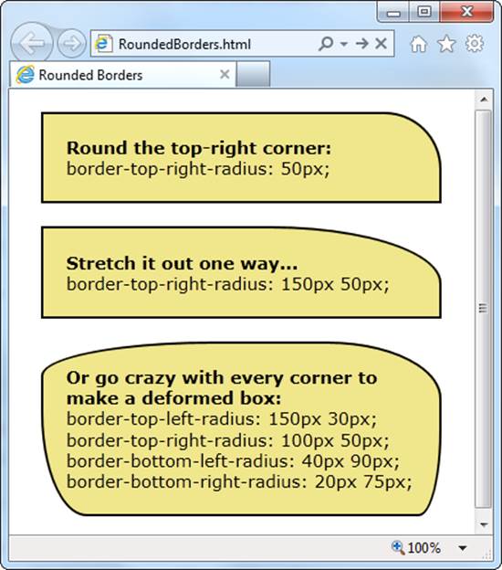
Figure 3-16. A clever application of the border-radius property can create virtually any sort of curve in a border.
Using Borders with Tables
As you learned in Chapter 2 (HTML Elements for Tables), a table starts out as a borderless collection of cells. Using a style sheet, you can easily outfit your table with custom borders. You simply need to apply the border properties to some combination of the <tr>, <td>, <th>, and<table> elements.
For example, the following style sheet rules set a thin blue border around every cell and a thick blue border around the table itself:
table {
border-width: 3px;
border-style: solid;
border-color: blue;
}
td, th {
border-width: 1px;
border-style: solid;
border-color: blue;
}
Figure 3-17 shows the result.
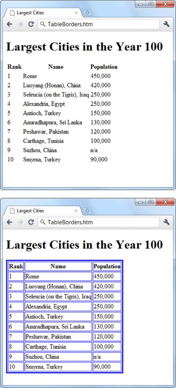
Figure 3-17. Compare a standard HTML table, which has no border (top), to the same table with a custom border added using style rules (bottom).
DESIGN TIME: GOOD DESIGN: THE ART OF NOT MAKING BAD SITES
Now that you’ve completed this chapter, you know just enough CSS to be dangerous. To prevent your site from winding up on the dark side, you now need to master the critically important art of Not Making Bad Websites. Here are a few general principles that can help you out:
§ Keep it simple (and don’t annoy your visitors). We all have an impulse to play with color and texture. But unless your formatting frills serve a purpose, just say no. You’ll find that exercising restraint can make a few fancy touches seem witty and sophisticated. Adding a lot of fancy touches can make your site seem heady and delusional. If you pare down the tricks, you’ll make sure that your graphical glitz doesn’t overshadow your site’s content and drive your visitors away in annoyance.
§ Be consistent. No matter how logical you think your website is, the majority of visitors probably won’t think the same way. To cut down on the confusion, organize your pages the same way, using similar headings, similar graphics and links, a single navigation bar, and so on. These touches help make visitors feel right at home. Best of all, a style sheet can help you stay consistent and codify the formatting rules you want to follow on all your pages. (You’ll learn more about this way of thinking in Chapter 7.)
§ Know your audience. Every type of site has its own unwritten conventions. You don’t need to follow the same design in an ecommerce store as you do on a promotional page for an experimental electric harmonica band. To help you decide what is and isn’t suitable, check out lots of other sites that deal with the same sort of material as yours.