Building Polyfills: Web Platform APIs for the Present and Future (2014)
Part II. Prollyfilling and the Future of the Web Platform
In Part I, we looked at polyfilling in its original context: a strategy for “filling in the gaps” of older browsers with modern web APIs and technologies. In Part II, we’ll shift our focus from the past and present and look toward the future. Specifically, we’ll talk about a variation of polyfilling that enables developers to experiment with not-yet-standardized APIs and developer-driven ideas that could make their way into the browsers in the future. In Chapter 6, I’ll introduce the future of polyfilling, the prollyfill, and will provide several examples of popular and notable prollyfilling libraries that push the boundaries of the web platform. Then, in Chapter 7, I’ll close this book with a hands-on exploration of prollyfill construction, and how it compares to our polyfill construction exercise in Part I.
Chapter 6. The Future of Polyfilling
As our browsers release updates at a faster and faster clip, and legacy browsers like IE6–8 decline in global use, it’s easy to fall into the trap of thinking that polyfilling, as an idea, is becoming increasingly irrelevant. And while it’s true that “classical” polyfills for popular HTML5 and CSS3 features are being used less and less, for every mainstream feature in the web platform, like CSS3 animations, we’re seeing three or four new ideas and technologies introduced via the W3C or WHATWG and landing in one or more browsers. HTML5 and friends may have modernized the Web and our browsers in key ways, but don’t think for a moment that they also brought feature parity along for the ride.
Polyfilling: Not Just For Older Browsers
The bottom line is this: each new feature that’s supported in Firefox but has yet to be implemented in Chrome, IE, or Safari needs a polyfill just as much as that local storage feature you’d like to offer to IE7 users. If newer technologies are to take off and become accepted by developers, we need to use them on actual sites. In some cases, we might take a forked experience approach and support the feature only where native to the browser. In many cases, however, new features bring capabilities that we wish to share with as many of our users as possible. In this case, pollyfilling is a must.
Prollyfilling: Extending the Web Forward
Sometimes, pollyfilling specified features isn’t always enough for us, as web developers. We’re a smart, ambitious bunch, and this is our platform too. Most of the time, we think we’re just as qualified as browser vendors when it comes to determining what capabilities the web platform, and our browsers, really need.
In Chapter 1, I mentioned something called the Extensible Web Manifesto, a rallying cry of sorts for frontend developers. It’s one that calls us to “extend the Web forward” by working on speculative and cutting-edge ideas in our browsers. It also calls upon browser vendors to unlock low-level capabilities in the browser (for instance, the browser’s networking stack or its HTML parser) and allow developers to write their own JavaScript libraries and APIs on top of those capabilities. The core idea that the manifesto argues for is that, with access to these low-level APIs, developers can experiment with real-world ideas that solve real-world problems. I use the term real-world here, because, on occasion, the W3C will pursue ideas that, while academically sound, are rejected by developers when subjected to actual use.
Take the oft-maligned Application Cache, for instance. This specification, which enjoys wide support across all modern desktop and mobile browsers, was introduced as a declarative API intended to solve the very real problem of caching websites and applications for offline use. It’s a fantastic idea, and developers everywhere applauded the introduction of the technology when it was first introduced several years ago.
But the honeymoon hasn’t lasted. After being subjected to real-world use on sites and applications of all sizes, developers discovered that AppCache is plagued by a series of bugs and bug-like features that make the technology difficult or sometimes impossible to rely on. Ironically, while the Application Cache seems well suited for content-driven and static sites, it is weakest when used for dynamic web-based applications.
If the authors and advocates of the Extensible Web Manifesto have their way, new technologies like Application Cache would not be introduced for full-blown standardization without first spending some time in the hands of developers. And by unlocking certain low-level browser APIs, like those mentioned previously, developers can not only vet new ideas, but can also be a source of new ideas and feature proposals.
At its core, this idea is referred to as forward polyfilling, or prollyfilling, the latter term being half-jokingly coined by Alex Sexton to describe building a polyfill for a not-yet-standardized API (ostensibly, this term is a mixture of “probably” and “polyfill”). Prollyfilling builds on the core ideas of polyfilling, building cross-browser functionality on which developers can rely, but places it square in the mix of the standardization process, which I believe will make the practice critical to the success of the web platform over the next decade.
Prollyfills In Action: Prollyfilling CSS
So what does a prollyfill look like? It varies, and sometimes pretty widely. There are prollyfills in use today that not only provide experimental JavaScript APIs to developers, but also allow developers to author custom HTML or CSS. We’ll look at examples of all three types of prollyfills in this chapter, starting with a library that allows developers to try out experimental CSS features, and even create some of our own.
If you’re a CSS aficionado, you know that there are some great new features on the horizon, like filter effects, grid layout, regions, exclusions, and more. Another exciting set of enhancements are being proposed in the CSS Selectors Level 4 specification, through which the CSS Working Group hopes to add a bevy of new, powerful selectors, while also upgrading some selectors introduced with CSS3.
For example, consider the new :matches pseudoclass selector. This selector allows developers to group matching elements with simpler syntax than is possible currently. For instance, consider the following:
ul.tasks li a:link,
ul.tasks li a:hover,
ul.tasks li a:visited,
ul.tasks li a:focus {
color: blue;
}
With the new :matches pseudoclass selector, this rule could be shortened, like so:
ul.tasks li a:matches(:link, :hover, :visited, :focus) {
color: blue;
}
It’s a simple change, but it greatly cleans up the authoring experience, while also making your CSS just a bit more readable, which is nice. :matches is just one example of the great new CSS selectors in the Level 4 spec. The only problem is that we can’t exactly try these experimental new selectors out for ourselves because they’re still being discussed in the CSS Working Group and have not yet landed in any browser. But in the meantime, wouldn’t it be great if we could actually start using new pseudoclass selectors like :matches and even try out a few of our own? And not just to be early adopters, but to really try these new features on for size and see if they work as designed.
Using HitchJS to Experiment with CSS
This sounds like a sweet spot for prollyfilling and, thankfully, there’s a library available that allows you to experiment with CSS selectors and even define your own. The library is called HitchJS because it allows you to “hitch new capabilities to the browser,” according to its creator Brian Kardell. Out of the box, Hitch provides support for a series of experimental selectors like oneof, anyof, and allof, and also provides a mechanism that allows you to define your own hitches that activate whatever CSS selectors you define. We’ll create our own hitch in the next section, but first, let’s take a look at how you can get started with Hitch and use some of the built-in features.
First things first: you’ll need to download Hitch, which is distributed as a script file, and then include a reference to the file anywhere in your page:
<script src="js/hitch-0.6.3.min.js"></script>
Next, you activate Hitch by decorating <style> and <link> tags with the data-hitch-interpret attribute, which tells Hitch to scan the CSS at the location for library-specific selectors:
<link rel="stylesheet" href="css/styles.css" data-hitch-interpret>
In this example, I’m telling Hitch to look for rules in the styles.css file. Example 6-1 contains the contents of that file.
Example 6-1. Custom CSS using HitchJS’s built-in rules
#todo-list li:-hitch-anyof(.urgent, .overdue) label {
color: red;
}
#todo-list li:-hitch-noneof(.urgent, .overdue) label {
color: green;
}
#todo-list li:-hitch-allof(.urgent, .overdue) label {
font-weight: bold;
}
Notice the pseudoclass selectors that start with -hitch-. All three of these, -hitch-anyof, -hitch-noneof, and -hitch-allof are selectors that Hitch provides out of the box. Anyof will match any element in the comma-delimited list; noneof is a negation selector that will apply the rule only if the li has none of the classes in the list; and allof is inclusive (only li elements with both classes will match and apply the rule).
Now let’s take a look at the source HTML (in Example 6-2), which is a list of to-dos decorated with classes where the to-do is urgent, overdue, or both:
Example 6-2. To-do list HTML
<ul id="todo-list">
<li class="">
<div class="view">
<input class="toggle" type="checkbox">
<label>Take out the trash</label>
</div>
</li>
<li class="">
<div class="view">
<input class="toggle" type="checkbox">
<label>Wash the cars</label>
</div>
</li>
<li class="overdue">
<div class="view">
<input class="toggle" type="checkbox">
<label>Buy stamps</label>
</div>
</li>
<li class="urgent overdue">
<div class="view">
<input class="toggle" type="checkbox">
<label>Pay taxes</label>
</div>
</li>
<li class="urgent" id="next-action">
<div class="view">
<input class="toggle" type="checkbox">
<label>Catch up on Breaking Bad</label>
</div>
</li>
</ul>
With everything in place, I should be able to load my to-do list and see the additional styling that my Hitch-based rules provide, as illustrated in Figure 6-1.
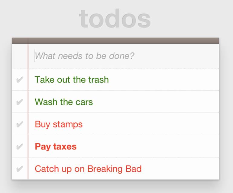
Figure 6-1. To-do list with HitchJS-based styling
CAUTION
You might notice a flash of unstyled content as you load a page that uses Hitch.js features. Because Hitch processes custom CSS rules after the rest of the CSS in the document has been applied, this is to be expected. What’s more, since we’re testing ideas here and not building production apps with our prollyfills, I think we can live with this.
As you can see, HitchJS is easy to get started with and use in your own apps. By default, Hitch provides support for four logical selectors (:-hitch-anyof, :-hitch-allof, :-hitch-oneof, :-hitch-noneof) and one structural selector (:-hitch-has), but the library also provides a great extensibility story so that you can create your own selector support in the form of hitches that are imported and processed by HitchJS. In the next section, we’ll create our own hitch to mimic a new CSS Selector.
Building Your Own Hitches
Earlier in this chapter, I introduced the new :matches pseudoclass selector being considered for inclusion in the Selectors Level 4 spec. Rather than waiting for one or more browsers to implement support for this new selector, I’d like to try it on for size in my own apps—and possibly even share my experiences with other developers and members of the CSS Working Group. HitchJS allows me to do this. I should probably note that, functionally, the -hitch-anyof selector is very similar to how :matches is specified. I’m building our own hitch, however, to adhere to the name and also experiment with my own implementations. With the library as a dependency, I can create a hitch, or a JavaScript module of my own that defines the logic for my selector. I then import that custom logic into my app, and when HitchJS is activated, it calls my module to determine whether the element in question matches my custom selector.
So, to define my custom hitch for the CSS :matches selector, I’ll first need to create a new file called selector-matches.js in my project. Then, I’ll add the initial module definition that Hitch requires, as illustrated in Example 6-3.
Example 6-3. Creating a hitch for the matches selector in selector-matches.js
var matchesHitch = {
name: "matches",
base: "*",
type: "selector",
filter: function(el, arguments){
// Hitch logic here
}
};
Hitch.add(matchesHitch);
The matchesHitch object contains all of the properties that HitchJS requires when I define my own hitches. Most important, the name represents the CSS selector value, and the filter represents a function that runs against every element that matches the base selector, but that needs to be filtered further by my hitch. This method should contain the core logic for my hitch and should return a Boolean after I determine whether the element in question meets the filter criteria.
To emulate the CSS Selectors Level 4 :matches pseudoclass selector, I’ll need to test a comma-delimited string of class and id values against an element. If the element contains any of the values specified in the :matches selector, I’ll return true, at which point Hitch will apply the CSS defined inside my custom selector. The source for my Hitch’s filter method can be found in Example 6-4.
Example 6-4. Custom matches selector method in selector-matches.js
filter: function(el, selectorArgs){
var i, len,
match = false,
args = selectorArgs.split(','),
list = el.parentElement;
for (i = 0, len = args.length; i < len; i++) {
var q = list.querySelector(args[i].trim());
if (q && q === el) {
match = true;
}
}
return match;
}
After setting up some helper variables, I split my selectorArgs variable, which contains the comma-delimited list of classes and ids into an array. Then, I loop over that array and attempt to match each selector argument against the current element. If the element has all of the values defined in the selectorArgs array, I’ll return true, and the styles inside the :matches-dependent rule will be applied.
Now that we have our custom hitch, let’s try out our new rule in CSS. First, I’ll need to import my hitch by using Hitch’s @-hitch-requires directive at the top of my styles.css file:
@-hitch-requires ../js/selector-matches.js;
Then, I’ll add a new rule using my hitch:
#todo-list li:matches(.urgent, #next-action) label {
font-weight: bold;
color: blue;
}
With this rule, I’m instructing my custom hitch to look for any li with a class of urgent and an id of next-action, and to style the label for that li to be bold and have a blue color. And with that, we have prollyfill-based support for the CSS :matches rule, courtesy of HitchJS! The result can be seen in Figure 6-2. Note that the styles in the image are taken from the fantastic TodoMVC project. If you’re following along at home and want to emulate the same styles, you can grab them from any of the samples in the project website.
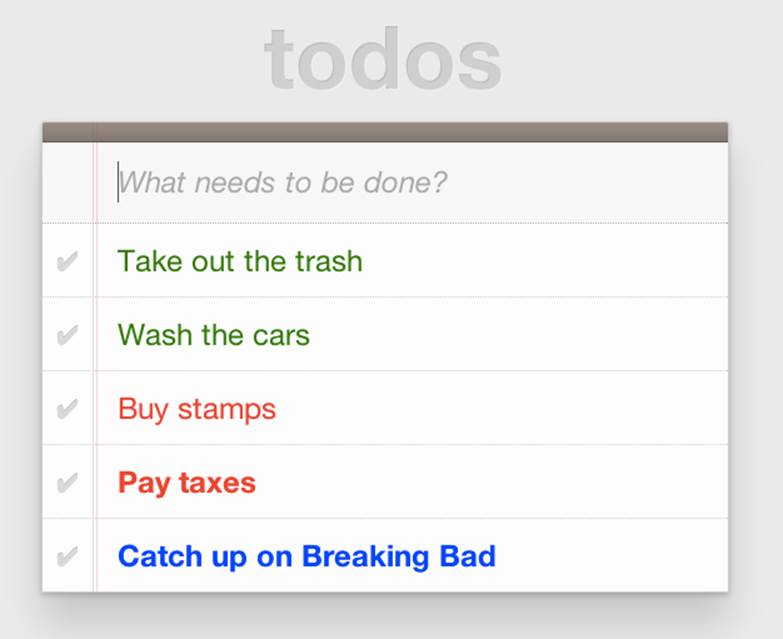
Figure 6-2. Our custom hitch in action
HitchJS is a versatile library, and now that you’ve seen how easy it is to create your own hitches, you’ve got everything you need to try our experimental CSS features, or even prototype and play with your own!
Prollyfills in Action: ServiceWorker
In the previous section, we explored how prollyfills can be useful for experimenting with new or unstable CSS selectors. Next, we’ll shift focus to JavaScript prollyfilling. Specifically, we’ll look at a proposal for one of those low-level APIs that could open up a wealth of new opportunities for frontend developers: ServiceWorker.
ServiceWorker is a proposal, spearheaded by Alex Russell of Google and others, designed to make the browser’s networking stack more programmable via JavaScript. Specifically, a ServiceWorker enables developers to use JavaScript to cache and handle every inbound request for resources in an app, even when the user is offline.
If you’re thinking that this is starting to sound a lot like a JavaScript-based version of the oft-maligned Application Cache, you’d be right, and also wrong at the same time. Because ServiceWorker is meant to be a low-level API, it’s far broader than an imperative AppCache. It can certainly be used to handle application asset and resource caching, but it’s also far broader than that. In a very general sense, a ServiceWorker is a script that, when installed in your app, listens for network events. When those events occur, a ServiceWorker can intercept the network request and serve cached resources before the browser ever attempts to connect to a remote server.
The first step in using a ServiceWorker is to install a worker on a page after a user visits for the first time. This means that the page, and all of its resources, will be served from the network at least once before the worker takes over. Example 6-5 shows an example of what the API for creating a new worker could look like.
CAUTION
At the time of writing, ServiceWorker is not available in any browser. As such, the following snippets are not runnable.
Example 6-5. Creating a new ServiceWorker object
<!DOCTYPE html>
<!-- http://www.gifsemporium.com/index.html -->
<html>
<head>
<link rel="stylesheet" href="/css/base.css">
<script src="/js/app.js"></script>
<script>
navigator.registerServiceWorker("/*", "sWorker.js").then(
function(serviceWorker) {
// Use the worker right away
window.location.reload();
},
function(err) {
console.error("Worker install failed:", err);
});
</script>
</head>
<body>
<img src="/images/logo.gif" alt="Gif Emporium Logo">
<h1>Animated Gifs Galore!</h1>
</body>
</html>
The key snippet here is the call to navigator.registerServiceWorker, which takes two parameters: a route or set of routes to handle with our ServiceWorker, and the path to a JavaScript file that contains the worker logic. The API is also promise-based, so I can call then() on the API with success and error handlers and notify the system of a successful or failed worker registration. A sample sWorker.js file can be found in Example 6-6.
Example 6-6. A sample ServiceWorker controller
// hosted at: js/sWorker.js
var base = "http://www.gifsemporium.com";
var inventory = new URL("/services/gifs.json", base);
this.addEventListener("install", function(e) {
// this worker can handle fetch events
e.services = ["fetch"];
});
this.addEventListener("fetch", function(e) {
var url = e.request.url;
// If we already have the data, load from cache
if (url.toString() == inventory.toString()) {
e.respondWith(new SameOriginResponse({
statusCode: 200,
body: JSON.stringify({
gifs: { /* ... */ }
})
}));
}
});
The ServiceWorker exposes several events that workers can respond to, if they wish. If a worker is installed and has registered a fetch listener, as we have in this example, the worker is allowed to handle the network request on behalf of the browser. In this case, we’re checking to see whether the URL being requested matches an existing resource and, if so, we’ll use the new respondWith method on the fetch event to construct a cached response containing the data requested by the browser, and the network never even needs to be consulted!
The public API for the ServiceWorker proposal can be found in a TypeScript file in the project’s GitHub repository, and I also recommend checking out the explainer document put together by the people working on the proposal. ServiceWorker is still in its early days, so it doesn’t yet enjoy browser support, but the proposal is exactly the kind of API described in the Extensible Web Manifesto: a set of low-level browser capabilities that provide developers with ground-floor access to building robust, JavaScript-based prollyfills and APIs that push the Web forward faster than ever.
Prollyfills in Action: Web Components
So far, we’ve looked at how prollyfills can help us work with experimental CSS and JavaScript, but what about experimenting with HTML itself? Before you laugh me out of town and put down the book, bear with me.
As it turns out, there are a handful of W3C specifications that have been in the making for the last few years that do just that: provide an official way for developers and site authors to extend the semantics of HTML for apps. These specifications are typically referred to using the umbrella term of Web Components. According to the W3C, “Web components enable web application authors to define widgets with a level of visual richness and interactivity not possible with CSS alone, and ease of composition and reuse not possible with script libraries today.”
Widgets? Composition? Reuse? If you’ve been a developer for any length of time, these terms are familiar to you, but did you ever think you’d hear them in the context of HTML? Me neither, and yet here we are, talking about ways to bring a first-class widget construction workflow to the Web.
Web Components are made up of five key, standalone W3C specifications. One of these, Decorators is the least relevant to our discussion and the most raw of the specs, so I’ll skip it. Here’s a brief summary of the other four.
Templates
Templates are defined as “inert chunks of markup” that can be activated for use later. This spec will be the most familiar to developers because it essentially formalizes what we’ve long accomplished using <script> elements with a non-JavaScript type attribute. Example 6-7 shows a simple <template> element and the JavaScript activation code.
Example 6-7. An example use of the <template> element
<template id="commentTemplate">
<div>
<img src="">
<div class="comment-text"></div>
</div>
</template>
<script>
function addComment(imageUrl, text) {
var t = document.querySelector("#commentTemplate");
var comment = t.content.cloneNode(true);
// Populate content.
comment.querySelector('img').src = imageUrl;
comment.querySelector('.comment-text').textContent = text;
document.body.appendChild(comment);
}
</script>
In this example, I’ve created a simple <template> element to hold some DOM that represents a comment block on a blog. The block contains a source-less image and an empty div for the text. In the next script block, I have an addComment function that takes an image URL and some text. The function then selects my template block, clones it into a new HTMLElement object, sets the image and text values, and then appends the DOM fragment to the body of the document. At that final step, the browser parses and renders the template-based content.
As I said, it should seem familiar, because it is. Thankfully, having first-class template support in the browser means we can put all of those templating libraries to rest and use speedy, built-in functionality.
Shadow DOM
The next Web Components spec is Shadow DOM, a feature that allows developers to encapsulate DOM subtrees and hide widget implementation details. It sounds a bit cryptic, I know, so let’s take a look at Shadow DOM in the context of an HTML element already using this capability: the HTML <video> tag.
Take a look at Figure 6-3. What do you see? A rectangle with a video canvas and several controls, right? Right, but have you ever wondered how the browsers actually implement tags like <video> and <audio>?

Figure 6-3. An HTML <video> element in action
With the Chrome Developer Tools, you can find out. All you need to do is open your Chrome DevTools and click the gear icon in the lower-right corner. Then, look for the “Show Shadow DOM” option and make sure that it’s checked. Then, you can navigate to any page with a <video> tag, right-click it, and select “Inspect Element.”
What you’ll see looks like Figure 6-4. Inside the innocent-looking <video> tag lies <divs>, <inputs>, buttons, and more. Browser vendors like Google actually use standard HTML tags and inputs—though the specific tags are up to the vendor—to create complex visual elements like<video>. Shadow DOM is, simply put, the technology that allows Chrome and other browsers to hide those implementation details behind a single tag that developers can rely on.
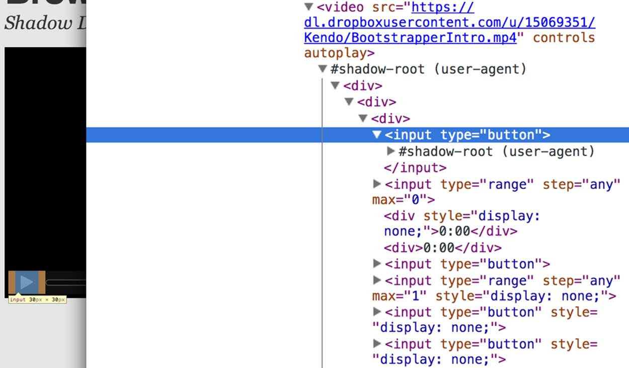
Figure 6-4. Shadow DOM in action
By making Shadow DOM developer-accessible and supported in the browsers, we can do the same. We can build our own complex widgets and features that are easy for developers to use, but that also hide their implementation details and can even prevent unauthorized access to subelements and widget styles.
Custom Elements
The next Web Components technology is Custom Elements. Custom Elements provide a formal way for developers to create their own valid HTML tags and define the API for those elements. You can also extend the semantics and behavior of existing elements, as shown in Example 6-8.
Example 6-8. Defining a custom element that extends the <button> element
<!-- Define the element -->
<element extends="button" name="fancy-button">
<style>
@host {
font-size: 20em; /* make it huge */
color: salmon; /* make it BOLD! */
}
</style>
<content></content>
</element>
<!-- Put it to use -->
<button is="fancy-button">Do something fancy</button>
Here, I’m using the new <element> element to define a Custom Element that extends <button> with a larger font size and a default color. Then, when I want to put my Custom Element to use, I’ll create a <button> element on the page—if this was a completely new element, I’d use my custom tag—and use the is attribute to tell the parser that this is my Custom Element. With Custom Elements, it’s that easy to add your own semantics and behavior to HTML.
HTML Imports
The final piece of the Web Components umbrella is HTML Imports. This is the most straightforward of the Web Components specs. Simply put, Imports provide a mechanism for importing Templates and Custom Elements into a site or app. For instance, let’s say that I define my fancy-button element from Example 6-8 in a separate file called fancy-button.html. HTML Imports provide the mechanism for, well, importing this element into my app, as shown in Example 6-9.
Example 6-9. Using imports with custom elements
<!DOCTYPE html>
<html>
<head>
<link rel="import" href="fancy-button.html">
</head>
<body>
<button is="fancy-button"></button>
<!-- Element definition is in fancy-button.html -->
</body>
</html>
Imports are enabled via a new rel value of import on the HTML link element. When this value is encountered, the browser will load the linked element and make it available to my app. HTML Imports are a simple concept, but an important one because they enable me to manage Custom Elements and Templates in separate files.
Web Components hold a lot of promise for the future, but because most of the ideas are still very cutting edge, they don’t enjoy wide browser support. Templates and Shadow DOM are supported in Chrome and Firefox, but, at the time of writing, there’s not a single browser that supports all four of the specs. If we want to start building and using Custom Elements today, we need a prollyfill! At present, there are two ways to start working with Custom Elements: one approach that’s available via a popular open source library, and another that requires adopting a bleeding-edge prollyfill provided by members of the Google Chrome team.
Creating Custom Elements with AngularJS
If the idea of creating your own semantics in HTML is appealing, but you’re not as concerned with formally prollyfilling Web Components, you might want to take a look at AngularJS. If you’re familiar with AngularJS, you’re no doubt aware of the directives feature of the library, which allows you to link imperative functionality to declarative semantics via HTML elements and attributes. For instance, let’s say that I want to create a <calendar> element that will, via an AngularJS directive, create a Kendo UI Calendar widget. The Angular code I need to enable this can be seen in Example 6-10.
Example 6-10. Creating custom elements via AngularJS directives
<div ng-app="myApp">
<calendar></calendar>
</div>
<script>
angular.module('myApp', []).directive('calendar', function() {
return {
restrict: 'E',
link: function(scope, element, attrs) {
$(element).kendoCalendar();
}
}
});
</script>
Notice that AngularJS enables me to go all out and use my directive via a <calendar> element on my page. It’s a nice trick, for sure, but it’s not valid HTML. What’s more, AngularJS’s approach wasn’t built with Web Components in mind, so we couldn’t classify it as a prollyfill. If we’re interested in something that’s built with Web Components in mind, we need to look no further than the Polymer project.
Creating Custom Elements with Polymer
Polymer is a Google-sponsored project designed to speed up the adoption of cutting-edge web platform technologies by providing a series of robust prollyfills that work across evergreen browsers. The Polymer project actually provides a number of prollyfills, but the core of the offering is support for Shadow DOM, Templates, Custom Elements, and HTML Imports.
In our discussion on Web Components, I shared some code snippets meant to communicate the “perfect world” approach for building components, as defined by the current draft of each spec. Polymer enables us to create Web Components using much of the same syntax, with only a few small differences.
At the time of writing, the Polymer authors are careful to note that the library is in an Alpha state. You’ll want to keep this in mind when using, or even installing, the library.
Let’s say, for instance, and in keeping with our previous AngularJS example, that I want to create a custom <calendar> element that provides a declarative way of working with a Kendo UI Calendar widget. To create my custom element with Polymer, I’ll create a new file called x-calendar.html and populate it with my custom element definition, as illustrated in Example 6-11:
Example 6-11. Creating a <calendar> custom element with Polymer
<script src="jquery-1.10.2.min.js"></script>
<!-- Kendo UI Scripts -->
<script src="kendo.web.min.js"></script>
<polymer-element name="x-calendar" attributes="selected">
<link rel="stylesheet" href="kendo.common.min.css">
<link rel="stylesheet" href="kendo.default.min.css">
<!-- Element Here -->
<template>
<div id="calendar"></div>
</template>
<script>
Polymer('x-calendar', {
selected: new Date(),
created: function() {
$(this.$.calendar).kendoCalendar({
value: this.selected
});
}
});
</script>
</polymer-element>
While the syntax for my element is similar to the Custom Elements spec, there are a few key differences. First, instead of using the proposed <element> element, I use <polymer-element>. Inside my <polymer-element> declaration, I give my element a name that, according to the Custom Elements spec, must always contain a dash. I use the attributes attribute to specify a list of properties that I want to publish on my element. Published attributes become part of the public API for my element, which allows them to be set declaratively via HTML or JavaScript.
The second Polymer-specific aspect to this element is the call to the Polymer method. This method formally registers my custom element so that it can be used in my app while also setting the default values for properties (selected) and subscribing to element life-cycle events. In this example, I’m subscribing to the created event, which fires when a new instance of my custom element is used in an app. When my event callback fires, I create a new Kendo UI Calendar from the current element and set its current date to either the default date or the user-specified date.
The rest of the process of working with custom elements in Polymer is pretty straightforward, as illustrated in Example 6-12. In this sample, the key difference is in the <head>, where I include the minified Polymer source. When included, Polymer does everything required to work with my custom element import, process the element, and then render the element when called upon. The end result of the snippet in Example 6-12 is a full Kendo UI Calendar with a selected date of October 5, 2013. To the component-consuming developer, it’s a totally declarative approach that works great across browsers, thanks to Polymer.
Example 6-12. Using Polymer elements
<!DOCTYPE html>
<html lang="en">
<head>
<title>Polymer Calendar</title>
<script src="lib/js/polymer.min.js"></script>
<!-- Import Calendar -->
<link rel="import" href="components/x-calendar.html">
</head>
<body>
<div class="container">
<div class="jumbotron">
<!-- Calendar here -->
<h1>What day is it?</h1>
<x-calendar selected="2013/10/05"></x-calendar>
</div>
</div>
</body>
</html>
Strategies for Polyfilling Experimental APIs
Over the course of this chapter, we’ve discussed a handful of great prollyfilling libraries that allow us to experiment with new and cutting-edge ideas in CSS, HTML, and JavaScript. In the next and final chapter of this book, we’re going to try our hand at constructing our own prollyfill. But before we do, let’s look briefly at a few things to keep in mind when building prollyfills for untested or experimental APIs.
Expect the API to Change
One of the key differences between classical polyfills and future-leaning prollyfills is in the API. As we discussed in early chapters, a key to building a robust, responsible polyfill is in respecting the specified API for the feature you’re looking to fill. Prollyfills, however, are built to work with bleeding-edge features. Sometimes there is no specified API because you’re the first person to explore this idea. In other cases, the specification is so new and unstable that you can expect the API to change before things settle down. In either case, you’re building your prollyfill against something of a moving target, so it’s important to think about how to design with a flexible API in mind. There are no quick answers here other than to make sure that the public API for your prollyfill is flexible from the outset, easy to change, and, when it does change, that you can quickly change your online samples, docs, and demos.
Don’t Be Afraid to Try Something New
Prollyfilling is all about experimentation. It’s about taking cutting-edge ideas and building a library that allows you and other developers to put those ideas to the test. It’s about refining those ideas, suggesting changes, and even taking those ideas in a totally new direction. If you’re building a prollyfill, you’re likely not doing so with the goal of getting some new web platform feature into your production apps tomorrow. Instead, you’ve probably undertaken a prollyfill because you want to play a role in moving the Web forward. In that spirit, you should feel free to think and innovate well outside the box as you work on your library. If, when building a prollyfill for a new spec or proposal, you encounter something you don’t like in the spec, or a new feature you want to see added, build your argument right into the library. Code speaks louder than words on the Web, and if you can communicate a counter proposal, changes, or a new idea in the context of a working sample that also highlights some aspects of a specified feature, you make your argument that much more powerful.
Now that we’ve explored the ins and outs of prollyfilling, and some high-level strategies for building our own prollyfills, let’s turn our attention to building a prollyfill of our own. In the next chapter, we’ll take a brand new web platform feature and craft a simple prollyfill for it.